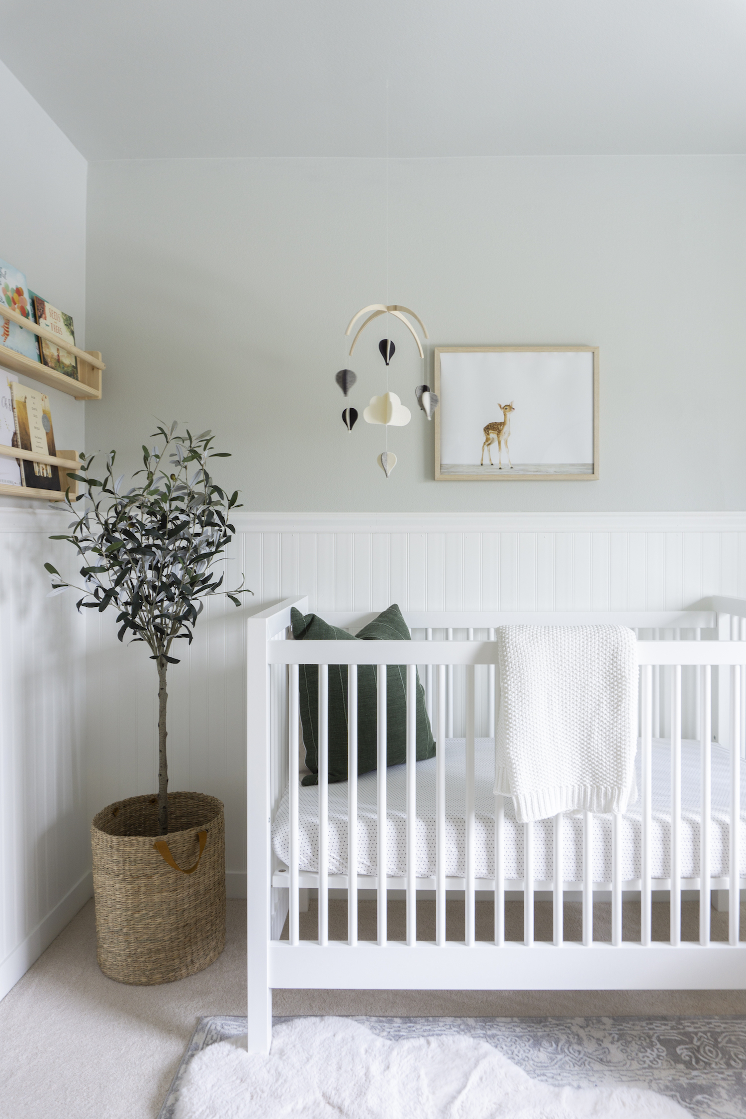
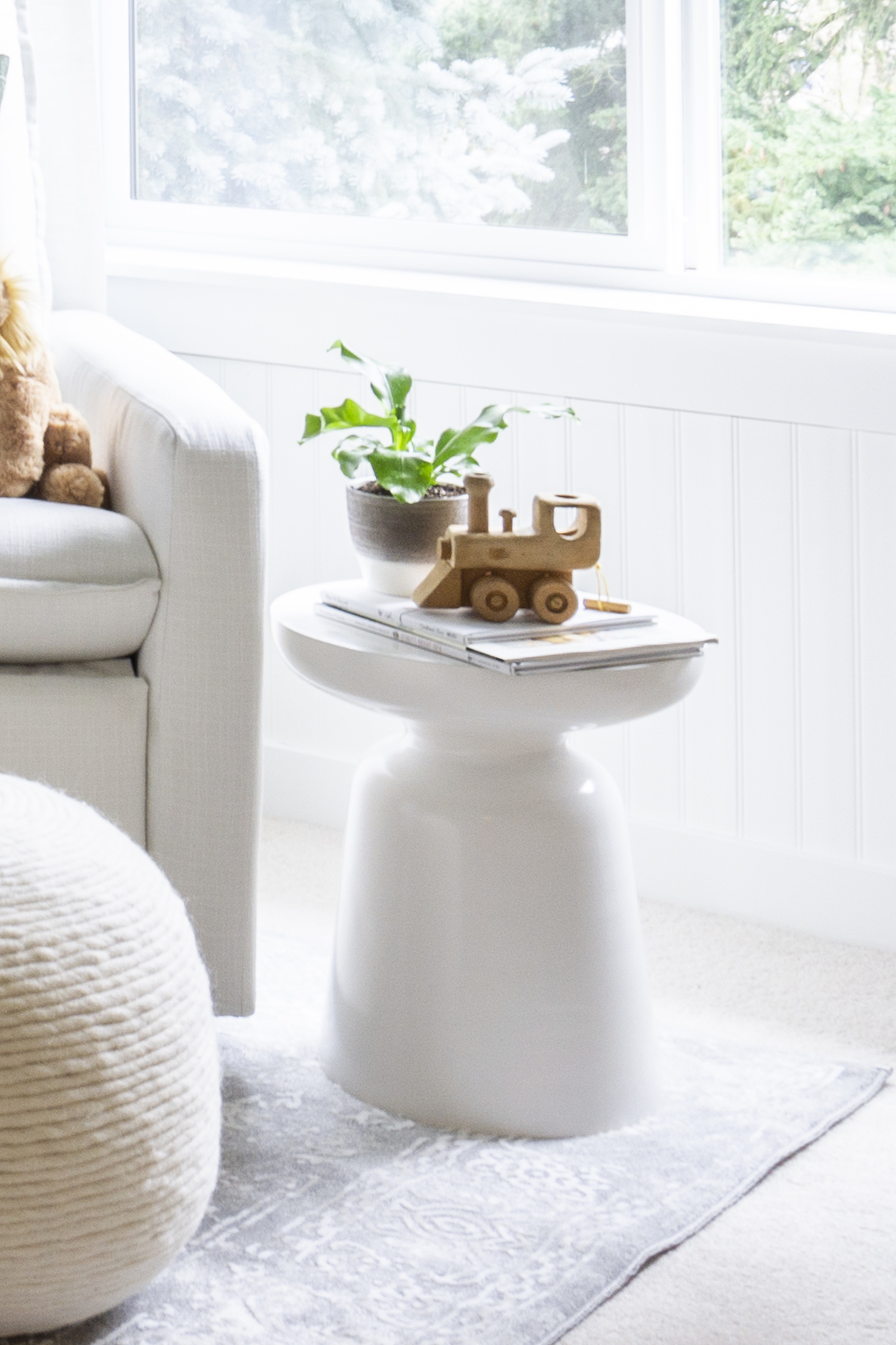
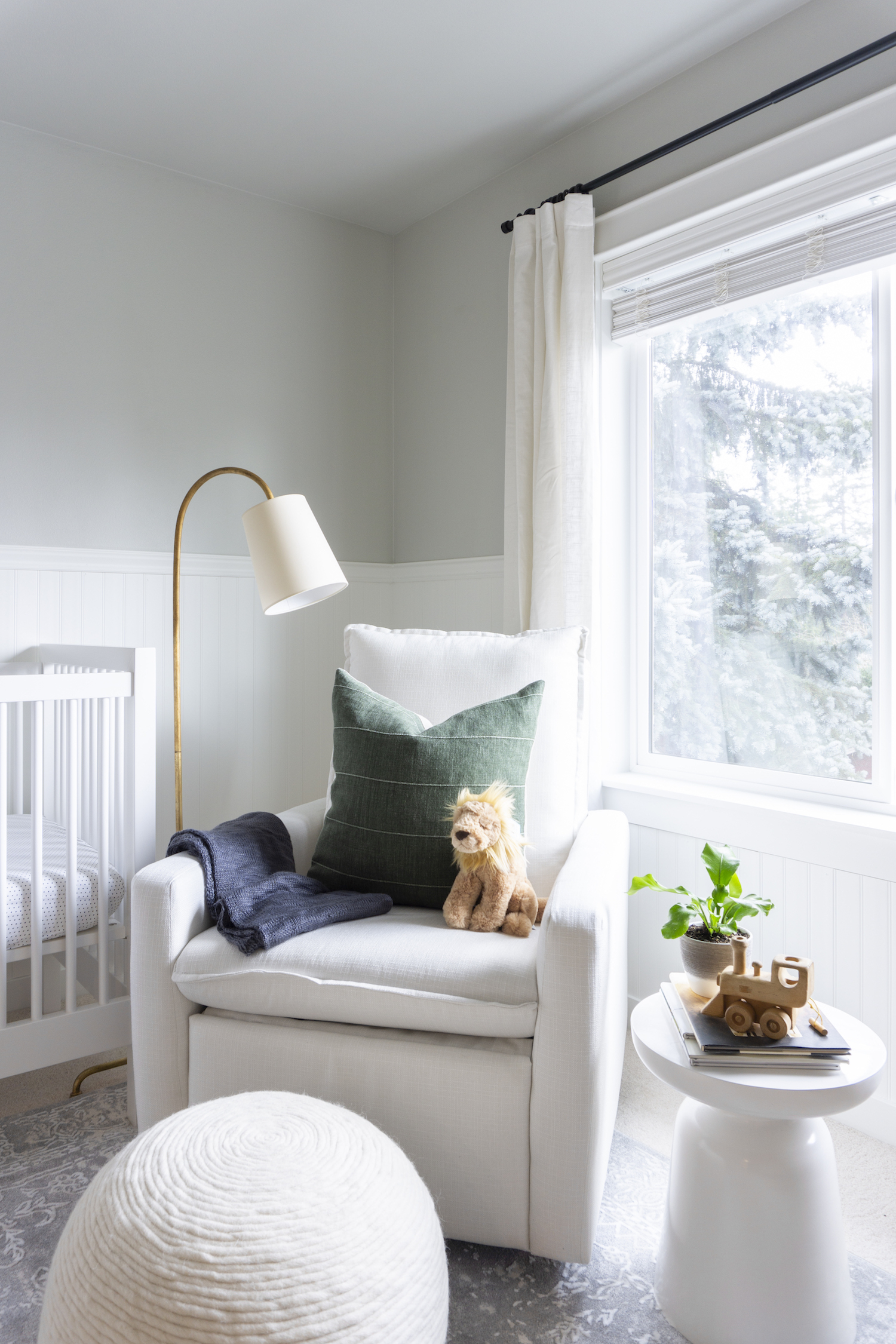
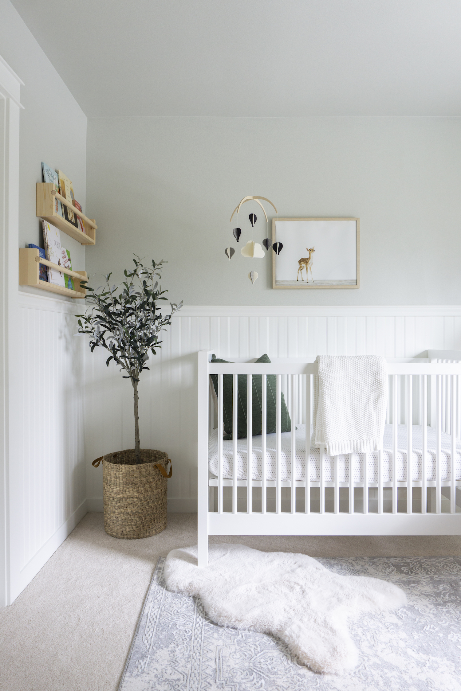
Every parent’s wish is to create a cozy, quiet place for their little one to dream. When homeowners and soon-to-be parents brought Nita on board to design their nursery that’s just what she did. By using a versatile mix of transitional furniture and plush neutral textiles, Nita created not only a space for baby to dream, but to grow too. We invite you to take a tour of this bright and serene nursery, just don’t wake the baby.
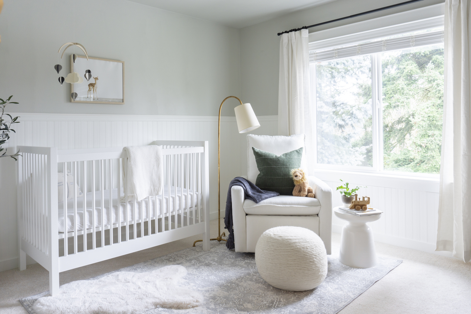
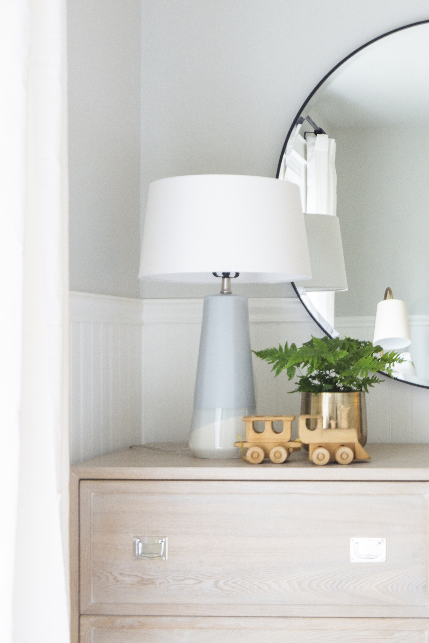
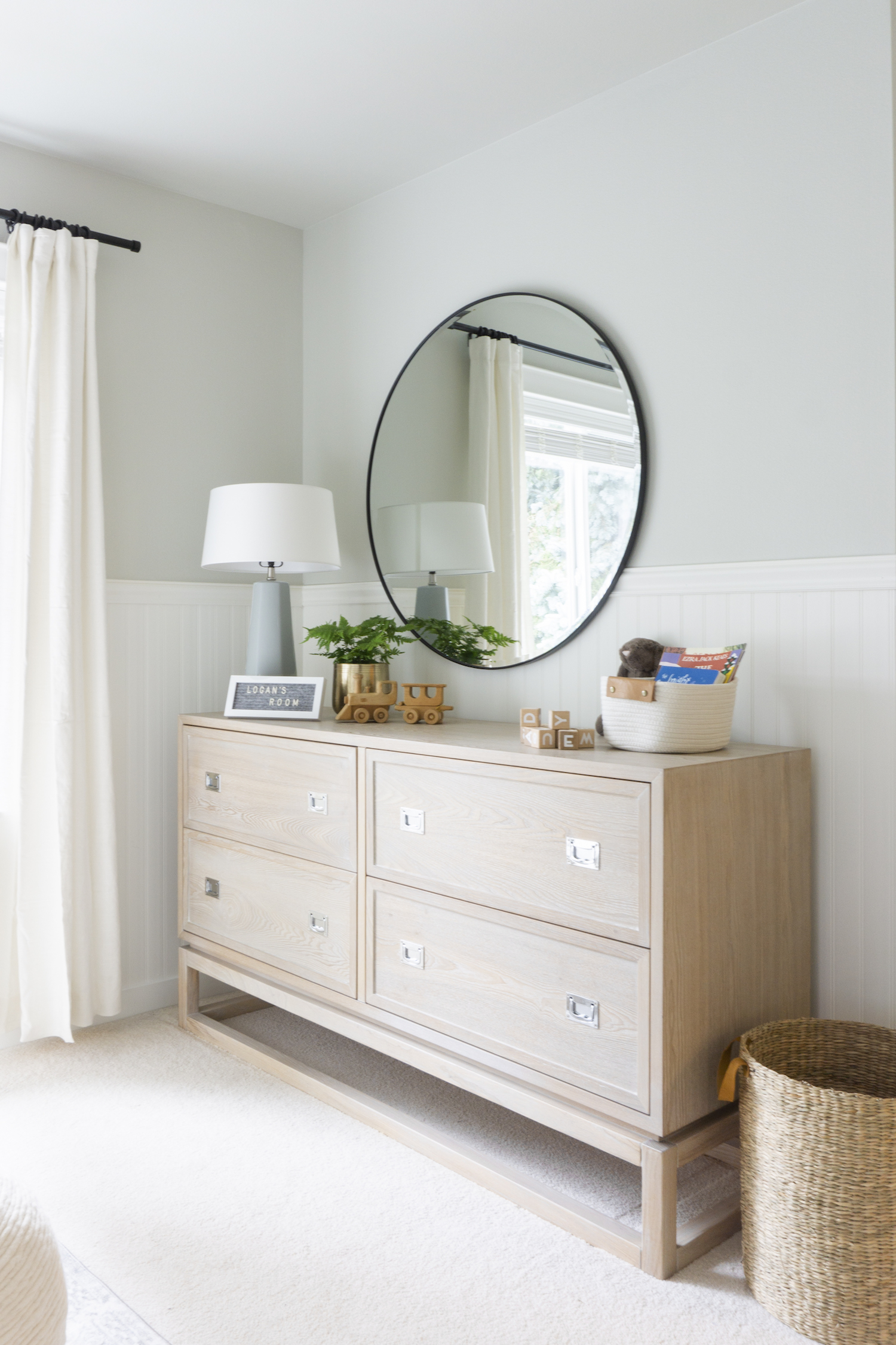
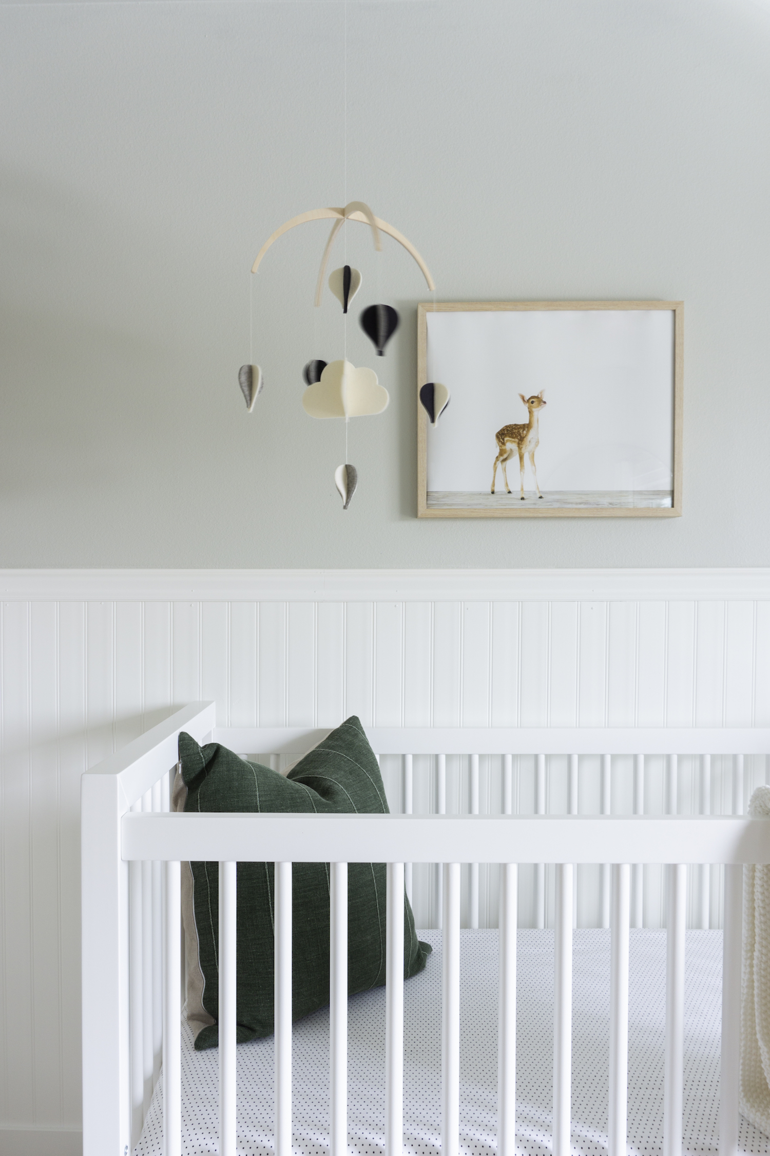
In the design of the nursery, it was important to create an adaptable space that could evolve over time as our clients’ child grew, so we incorporated flexible furnishings or pieces that can be used in different ways over time. The crib converts into a toddler bed, and the dresser can be repurposed for use in different rooms in their home. With the furnishings, we kept the foundational pieces neutral but layered in color and simple patterns through the textiles and accessories for a playful feel.
When we first started designing this nursery, one of the client’s requests was to update the look of the walls without using wallpaper. We suggested the use of beadboard for depth and dimension. The beauty of wall treatments is that they create a timeless look and elevate the feel of a space. The clients loved the result and soon after extended the use of wall treatments to a few other rooms in their home!
Because other rooms in the home, and its exterior, were modern traditional in aesthetic, we wanted the nursery to honor that style, while also taking on a personality of its own. To do this, we selected furniture with clean, simple lines, and pulled a few colors used in other rooms into the nursery to keep things cohesive from space to space. With its neutral color palette, we mixed lots of texture into the design to create an inviting atmosphere.
Like what you see? Take a peek at the talent behind the story… Interior Design & Photography: Tandon Interiors · Photography Editing: Kate Osborne
