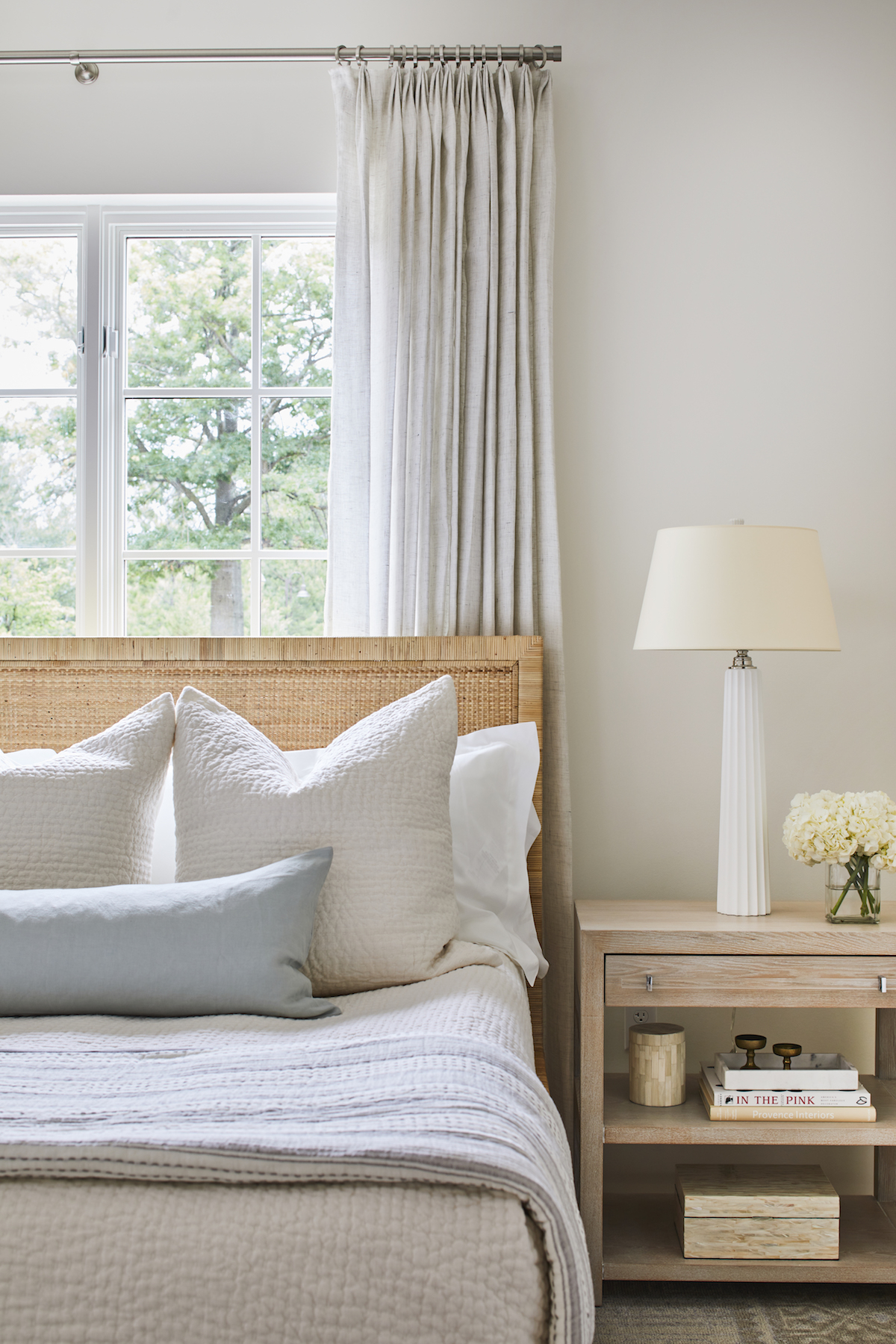
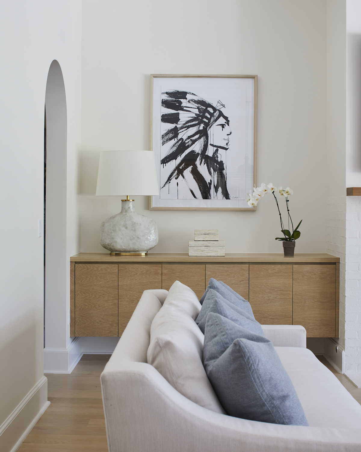
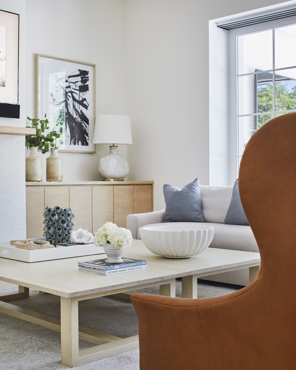
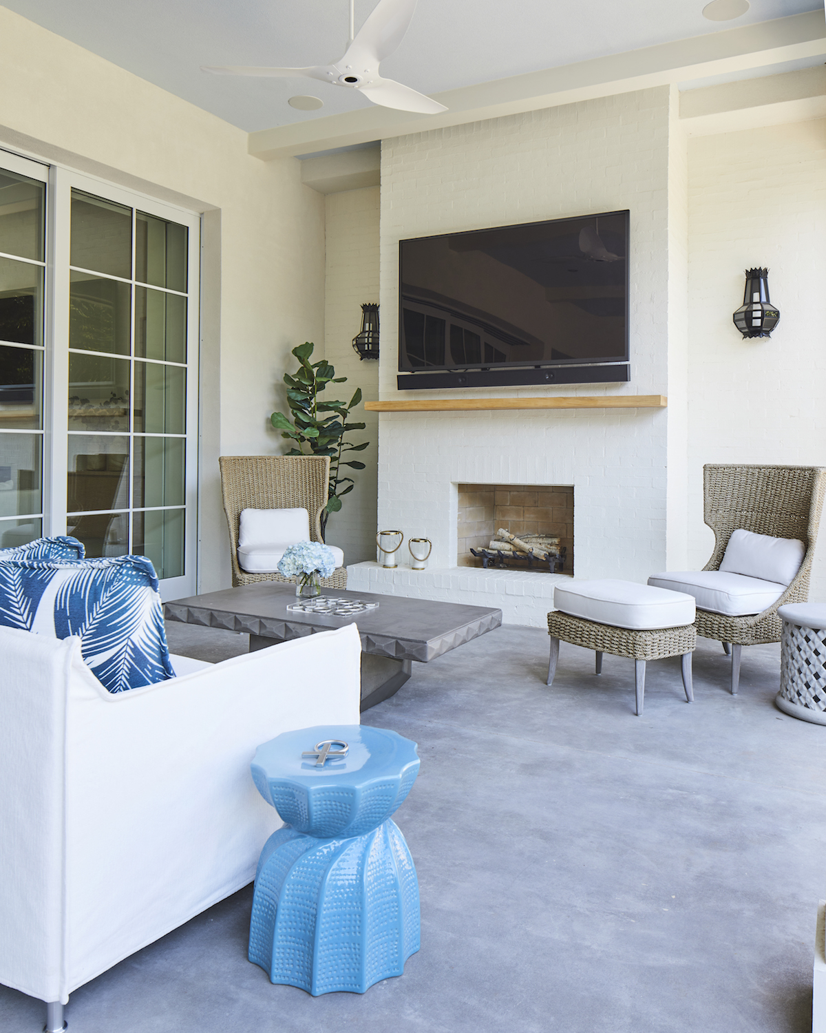
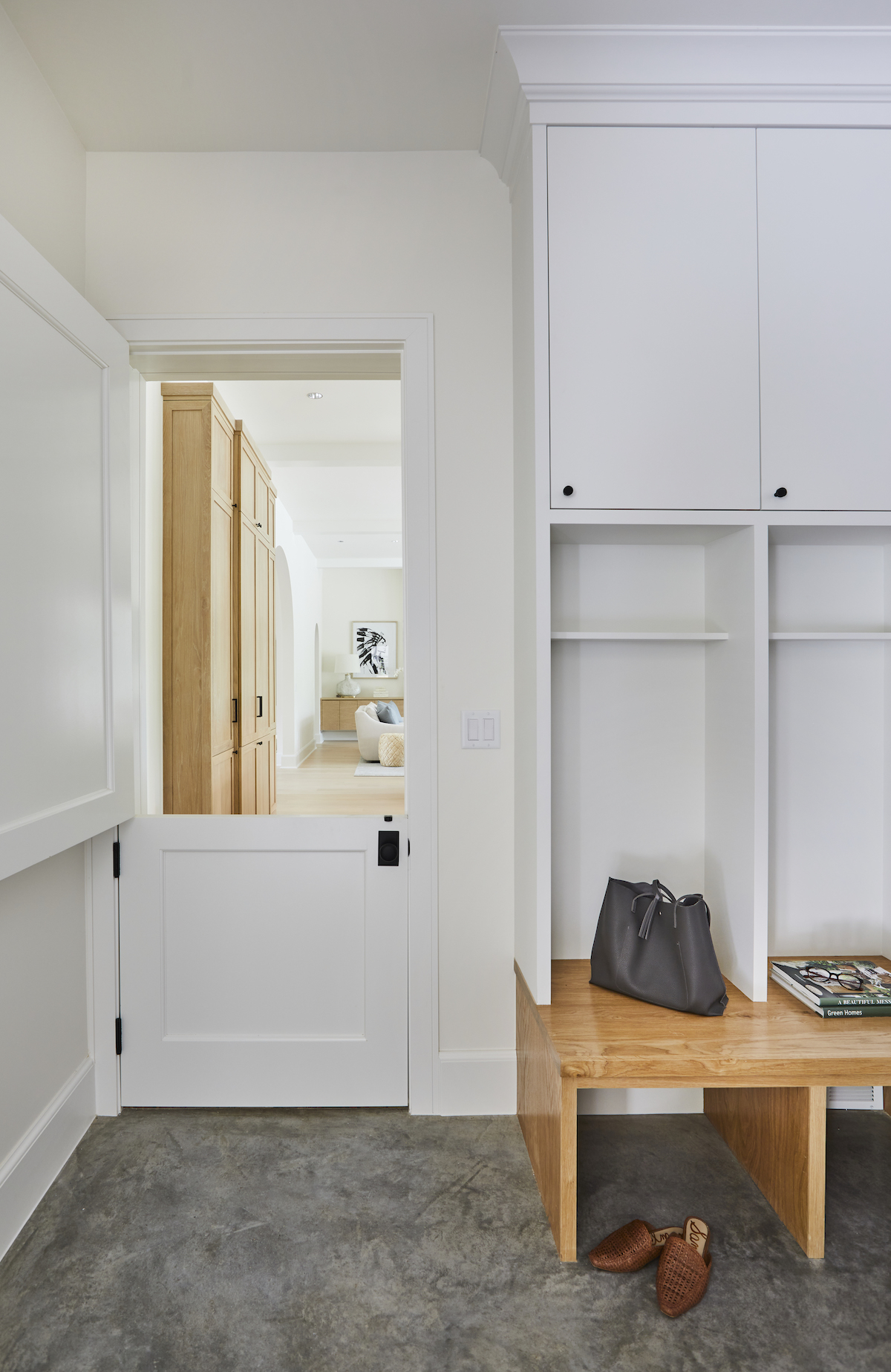
When designer, Mel Bean, began work on this 6,000 square foot new build, her clients already had a vision for their home. She took their inspiration to the next level with design choices that featured neutral textiles, subtle blue tones, and rich leathers inspired by nature to create a one-of-a-kind aesthetic and a truly unique space. Take a peek at the beautiful photos snapped by Laurey Glenn to see how this wonderful designer-client collaboration turned out.
Describe how you first discovered this space? Or is this a new build?
When we began working with these clients, the project was a total remodel of their existing home. However, during the design phase, a property on an usually large parcel became available just a few doors down. Ultimately, they purchased this property and built an entirely new structure on this wonderful lot. They now have an incredible home with stunning and spacious outdoor space, and still have plenty of lawn for the kids to play. I can imagine future baseball games happening in their backyard!
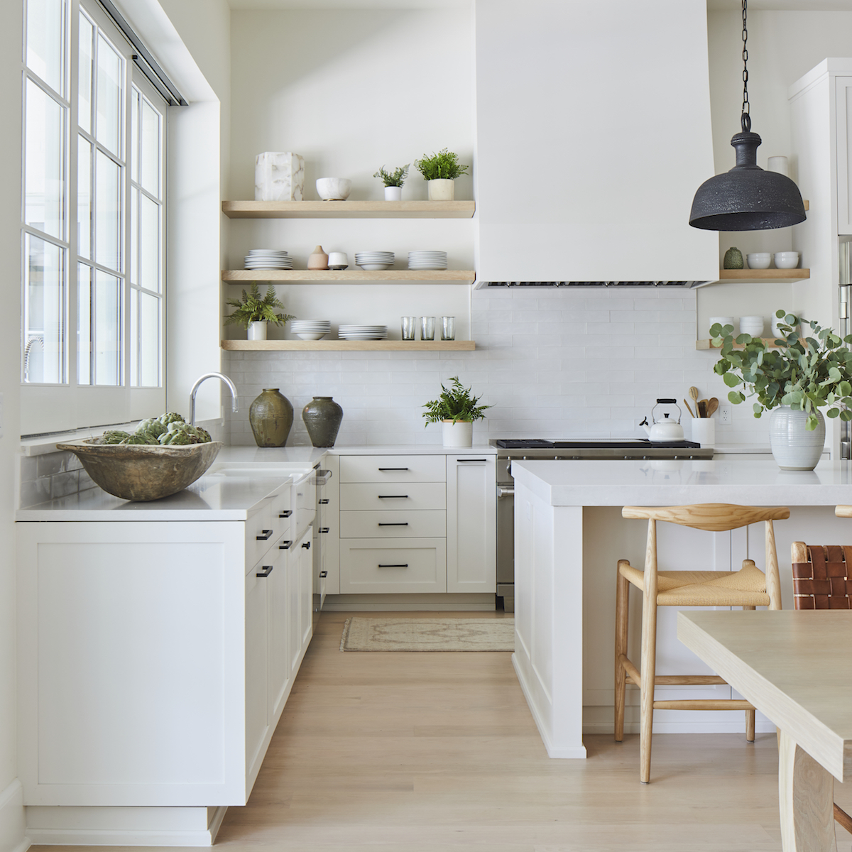
Do you have a favorite piece of furniture? If so, what makes this piece perfect for this particular project?
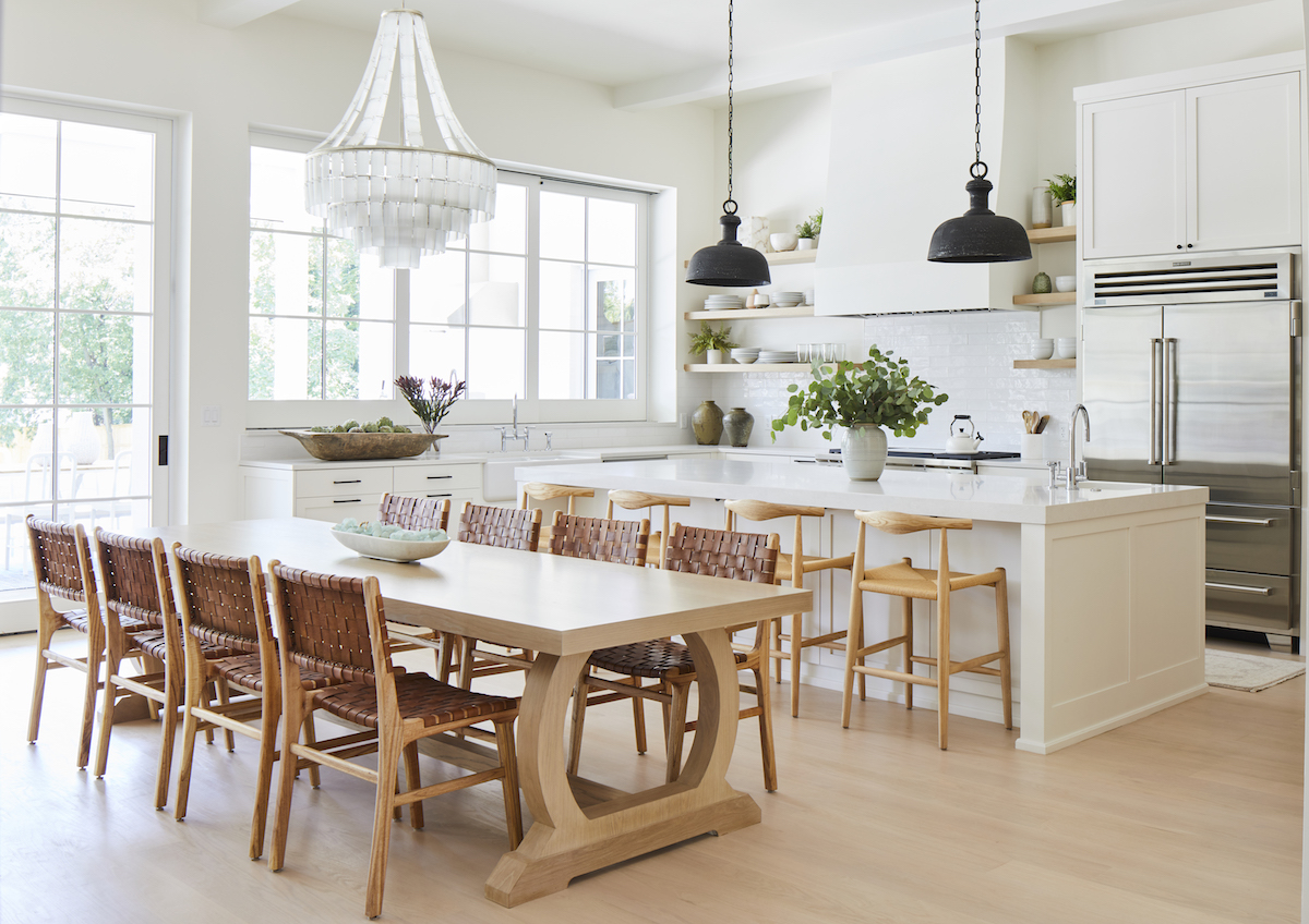
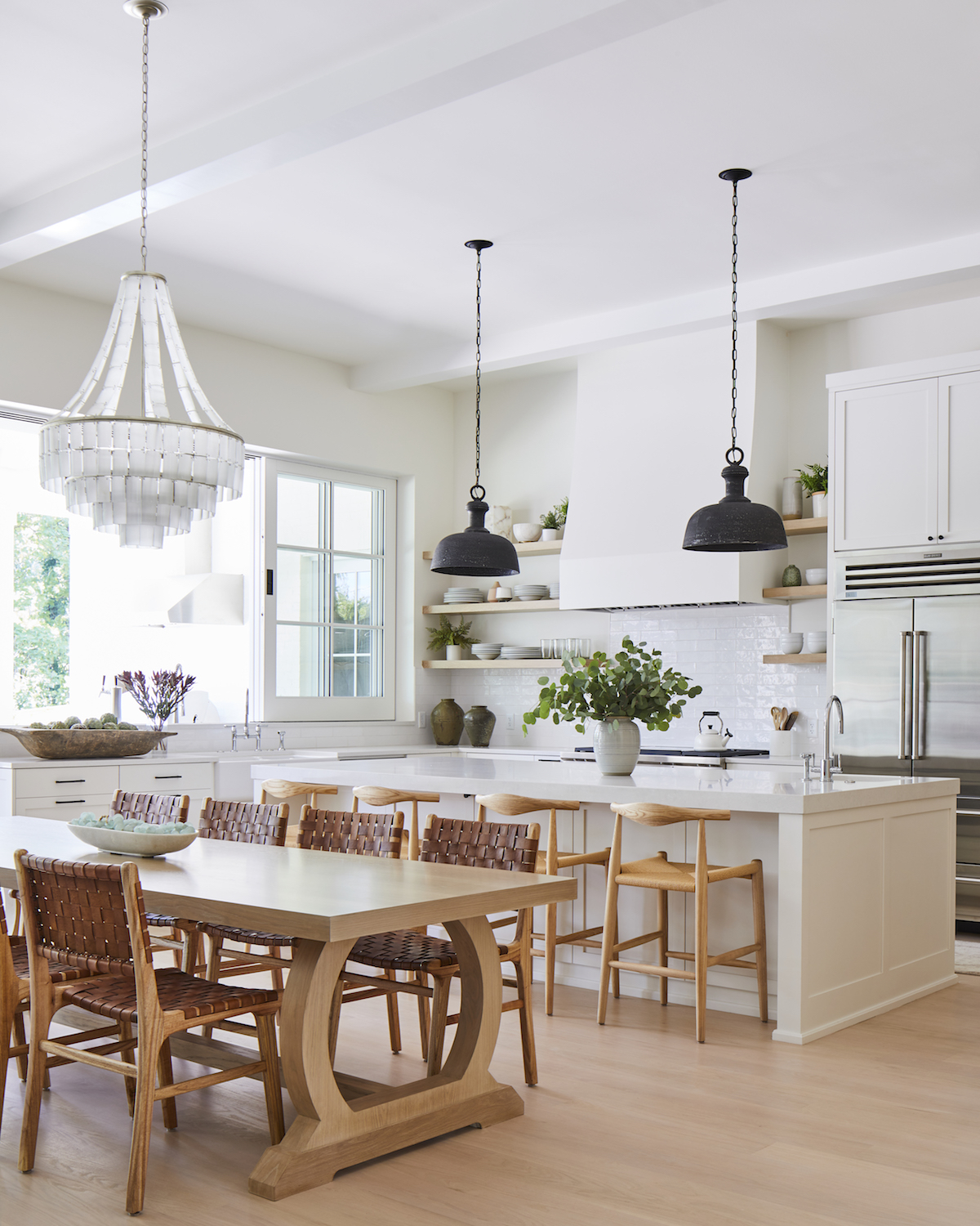
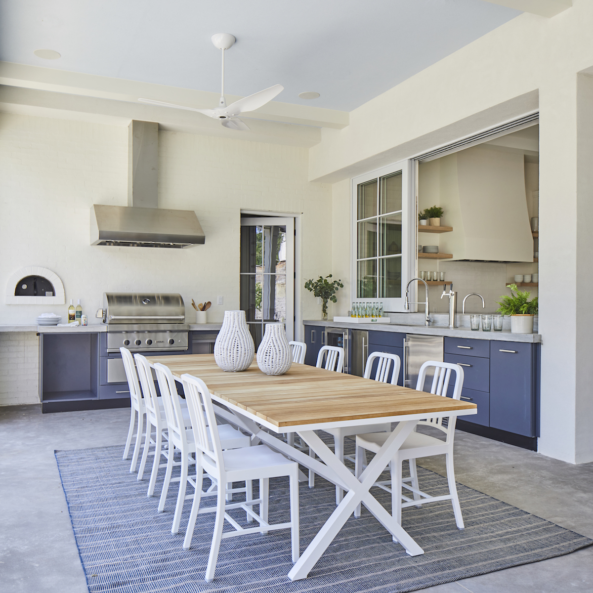
I really do love every single piece in this house…but I swoon every time I see the custom dining table! It was sized perfectly for the space and the circular base and feet details are perfection. The finish also turned out beautifully.
Talk us through the surrounding neighborhood — does this home adhere to the surrounding vibe or totally break the mold?
Bren Rose is a gorgeous neighborhood in the heart of Midtown Tulsa. Bren Rose has a variety of home styles, from historic 1920’s Tulsa homes to luxurious new builds. This home has a classic style that suits the neighborhood without replicating the existing homes.
Do you have a favorite design feature? If so, did it take much convincing?
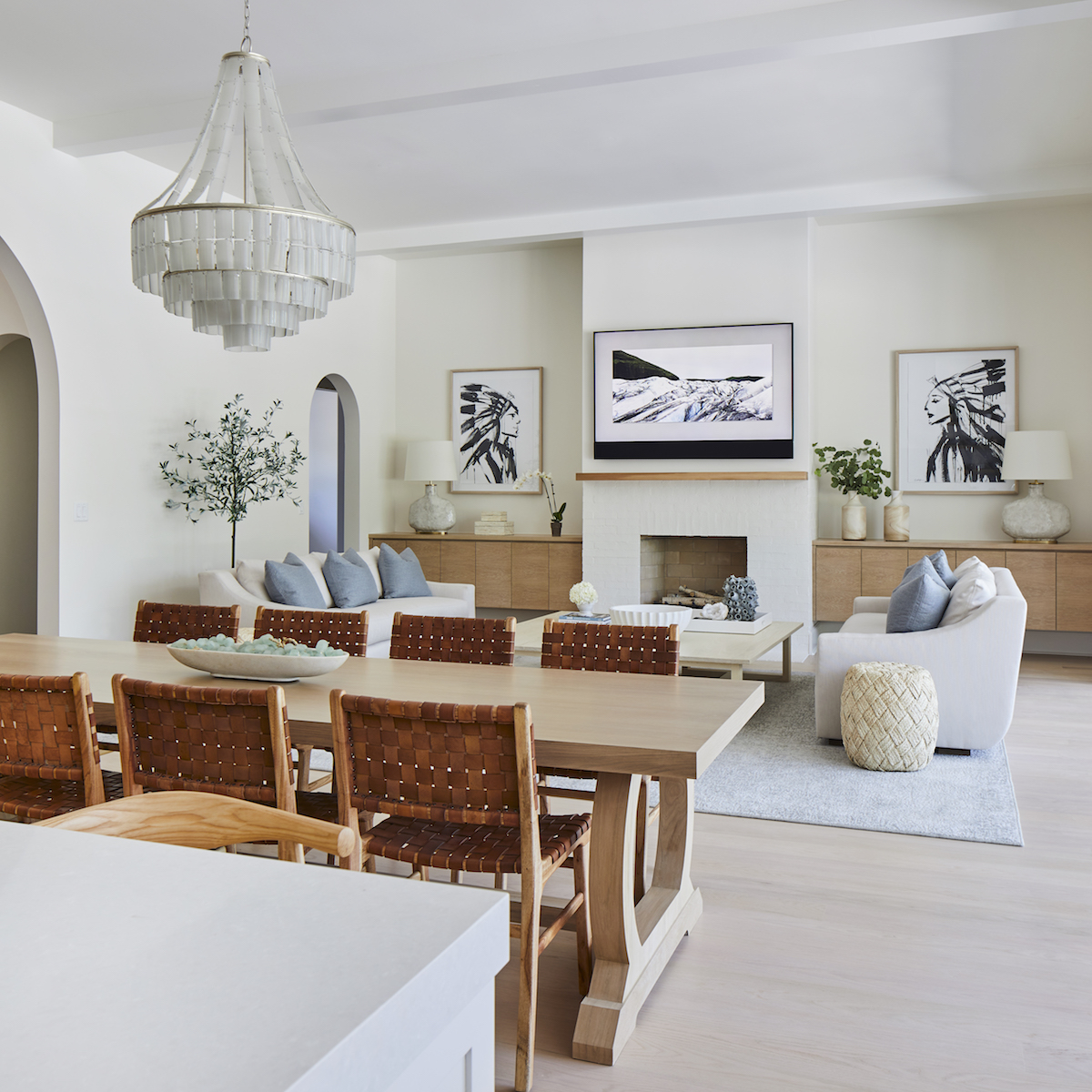
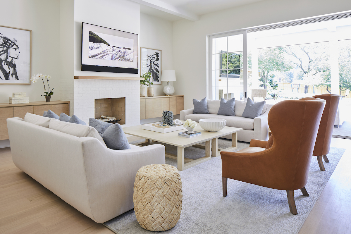
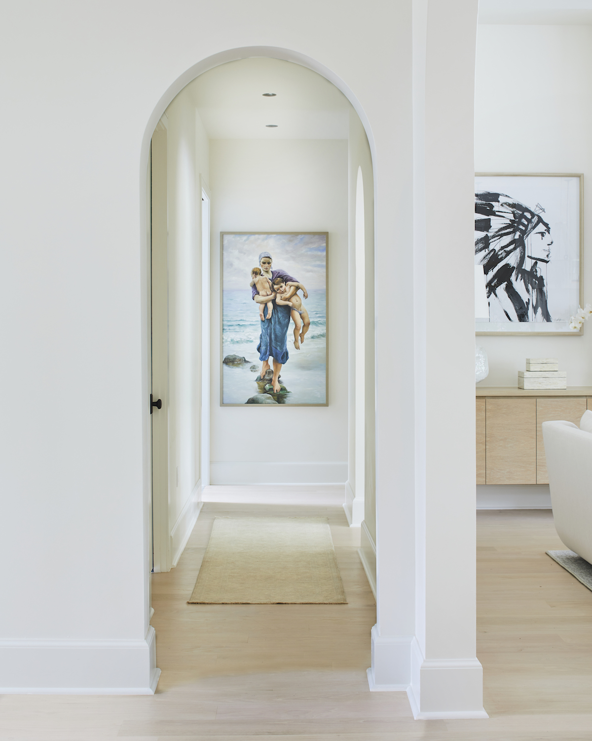
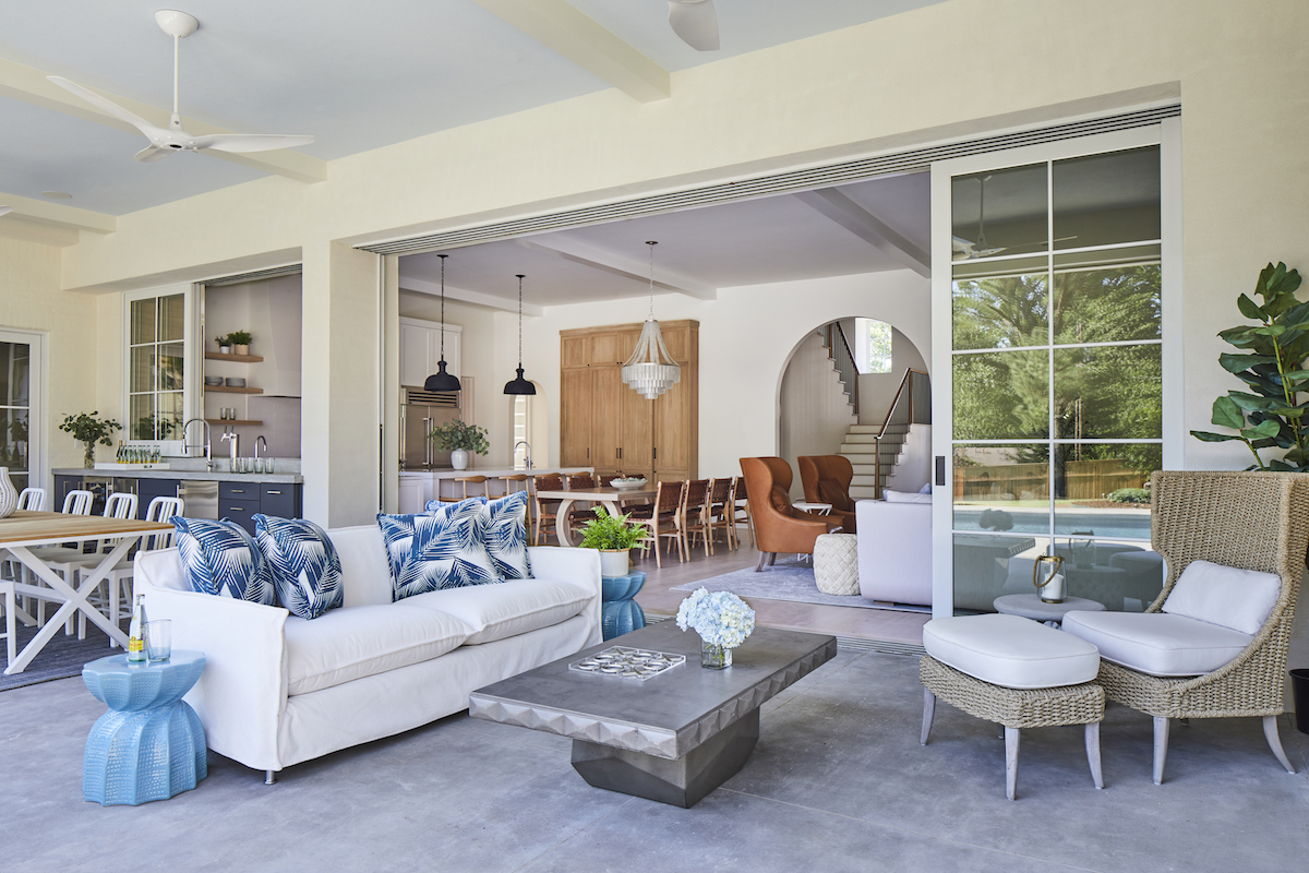
I am so happy with the overall vibe of this home. It feels expansive and cozy, filled with natural light and casual textures. The Great Room is my favorite space- from the oversized arched entry and general volume to the layers of white oak and painted white cabinetry, leathers, sisal, and velvet. It’s even more incredible when the massive doors and windows are completely open to the outdoor living space and pool beyond.
Do you have a favorite room? If so, what makes this unique?
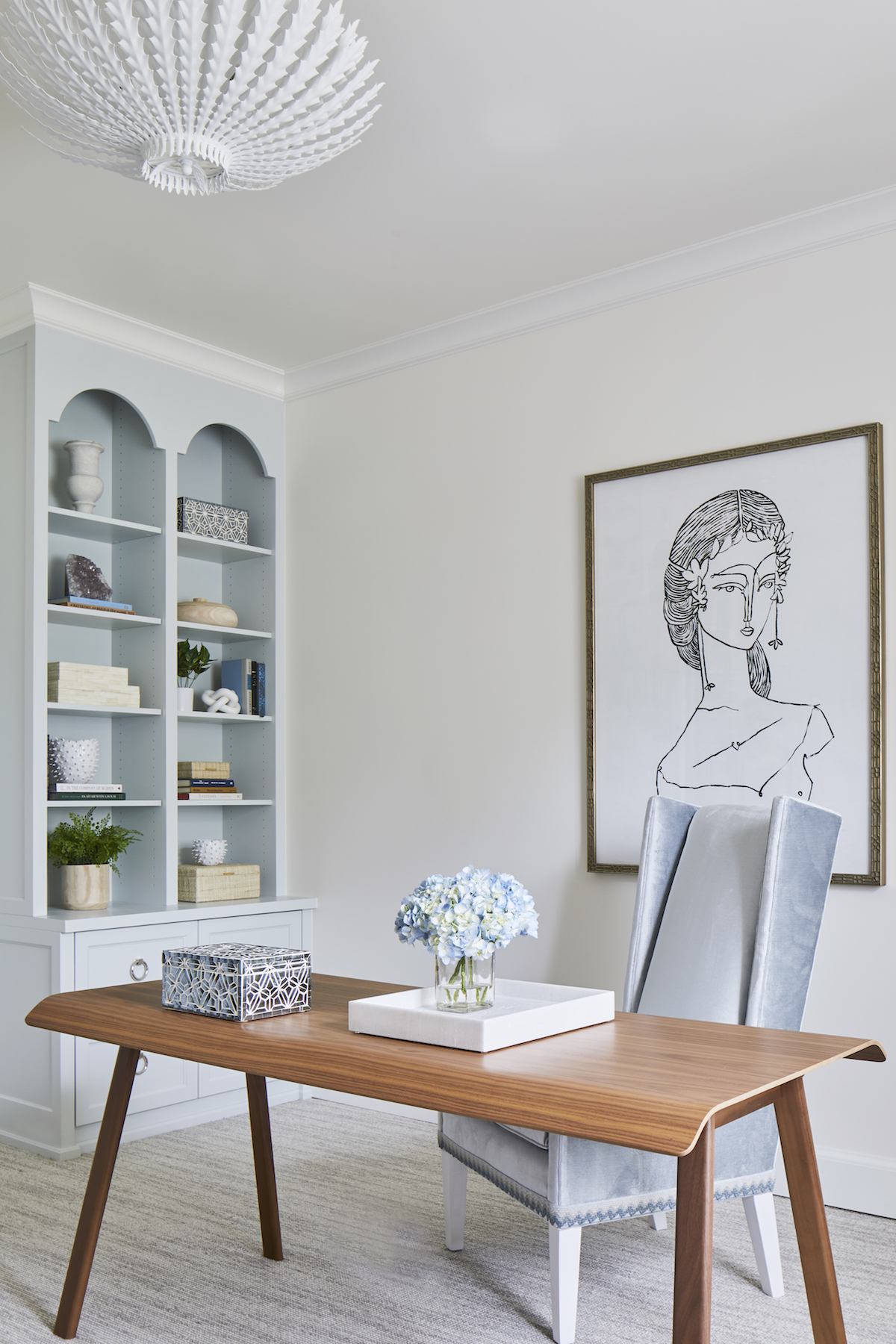
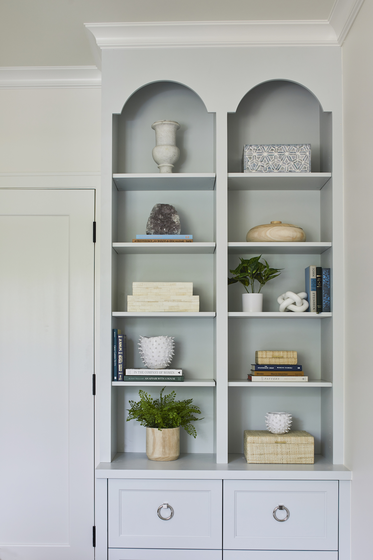
I could live in the Great Room with its effortless transition into the outdoor space! But I also adore Maddie’s study. It’s such a feminine space, with drama that feels subtle, from the pale blue arched cabinets and gorgeous art, to the super luxurious velvet desk chair with the sweetest trim. You can see it’s a variation of the Great Room theme of cozy neutrals, warm tones, textures, and glazed finishes with a bit more playful color and sophisticated style.
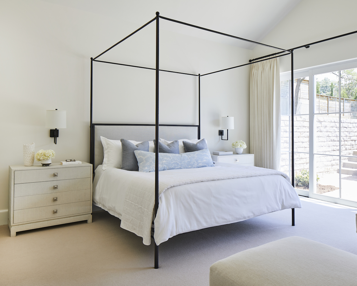
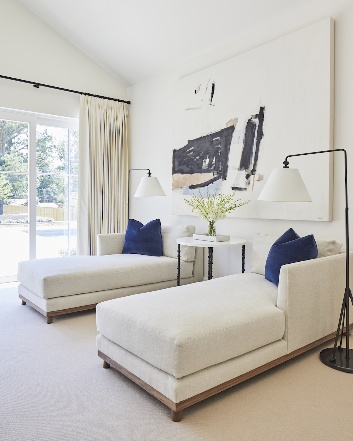
Then again, the Primary Bedroom is an absolute dream! The dramatic four poster iron bed is elegant and rustic, but combined with luxurious chaises, plush fabrics, and tons of natural light it strikes a perfect balance of refinement with comfort.
Did you deviate from the given brief at all?
Maddie is one of the most organized people I know! She brought with her a pretty clear sense of style- approachable and livable design, and elements of Danish Hygge concepts. This gave us a dreamy launch pad for our design vision: creamy neutral textiles punctuated with blue-gray tones, cognac leathers, various warm but pale wood tones, glazed ceramics, black metals, and some traditional touches. I really feel the design developed within a consistent dialogue with Maddie contributing as much to the process as we did! Her trust in us really did allow for a smoother process, some decisions that expanded her comfort zone, and results that we are all obsessed with!
Did you run into any budget or timing constraints? If so, how did you work to resolve them?
Maddie and Will committed to the majority of the design selections early on, which allowed us to have a more accurate idea of the budget. This also minimized design fees. In some cases, clients resist committing to a design and instead turn the design choices over and over. Pinterest and Instagram are invaluable tools for inspiration and communication, but can also lead to analysis paralysis in clients, which in turn leads to higher project costs.
Describe the aesthetic of this project in three simple adjectives.
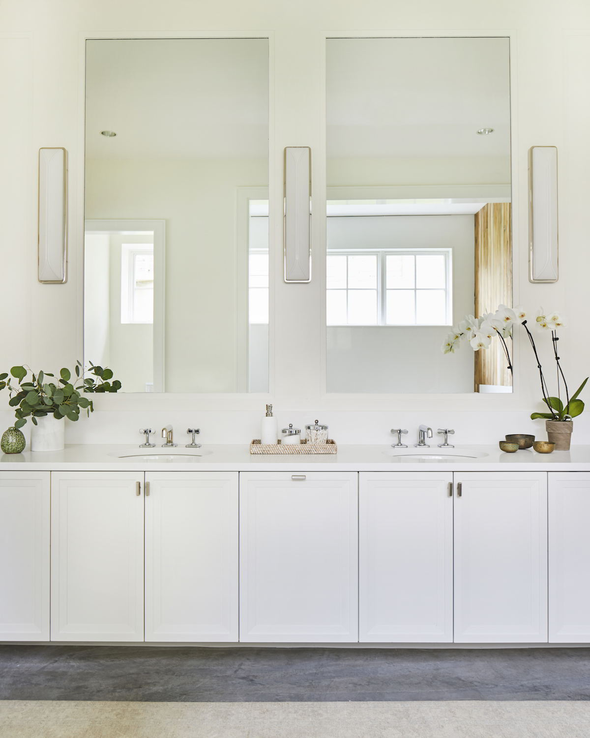
We named this project “Hygge Haven” which sums it up well, but for three adjectives: cozy, elegant, functional.
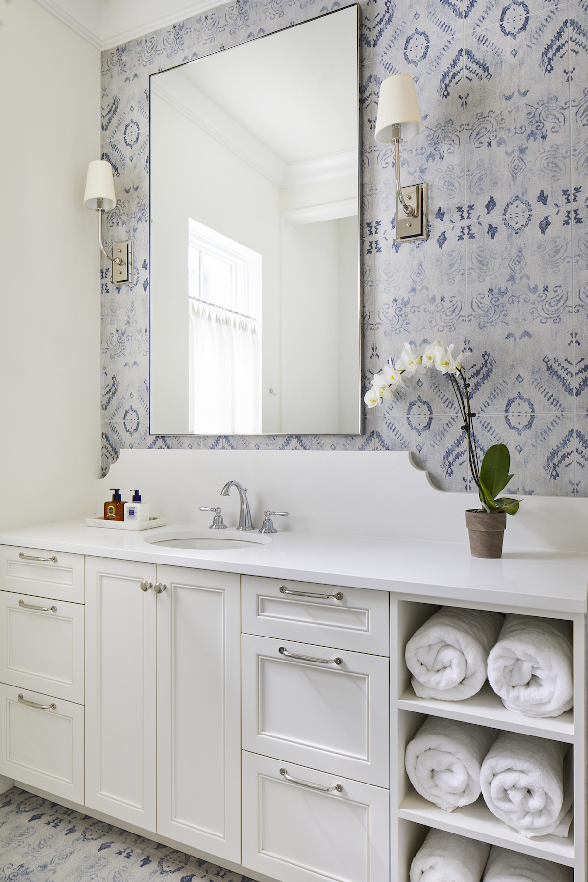
We love the use of wallpaper and pops of various shades of blue throughout — any tips or tricks for design-lovers looking to channel a similar aesthetic?
So much of the success of this project is in the editing! When using bold wallpapers, it’s best for the pattern to be contained for maximum impact rather than as an element in a larger space. In the powder bathroom, we covered the walls in a bold tropical leaf pattern, painting the trim and doors a rich green pulled from the pattern itself. The incorporation of living plants and green elements in each room allows this wall covering to make sense in this home. The green is also picked up in the son’s bedroom and bathroom.
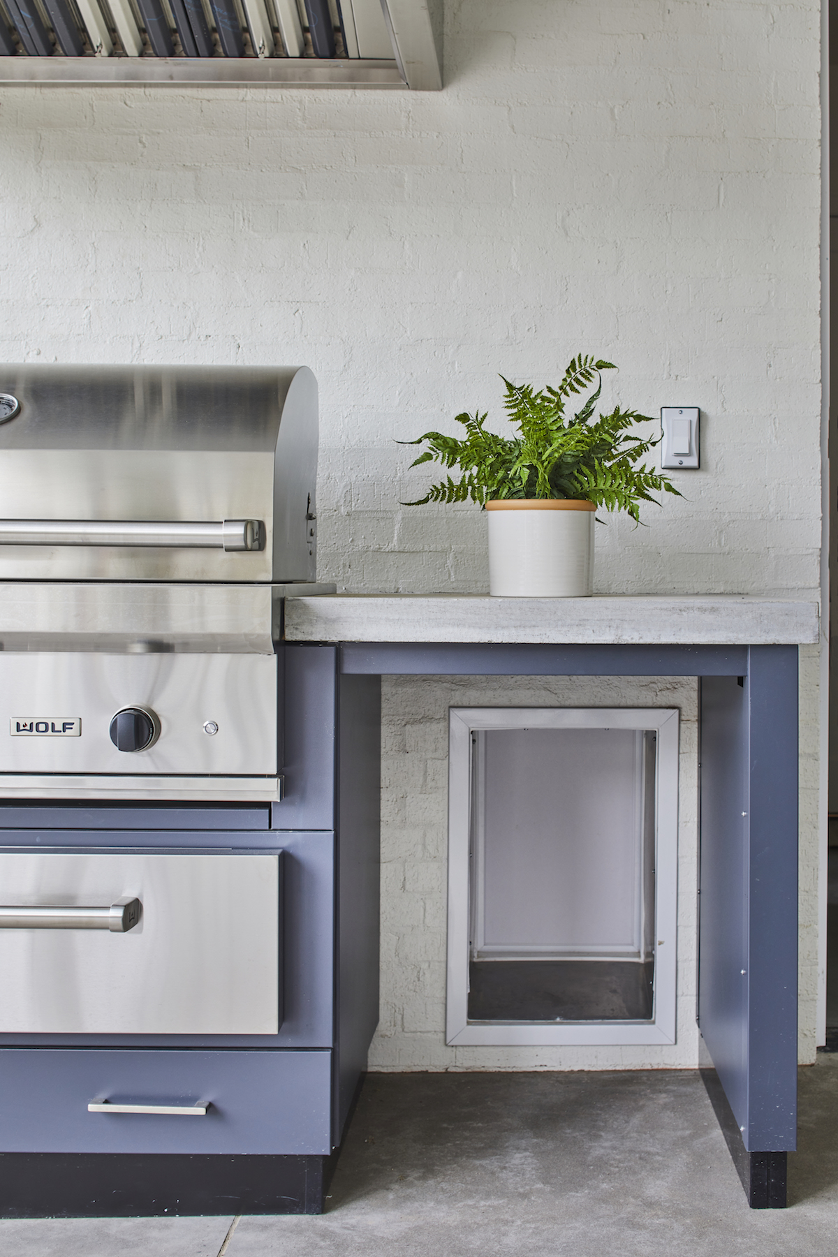
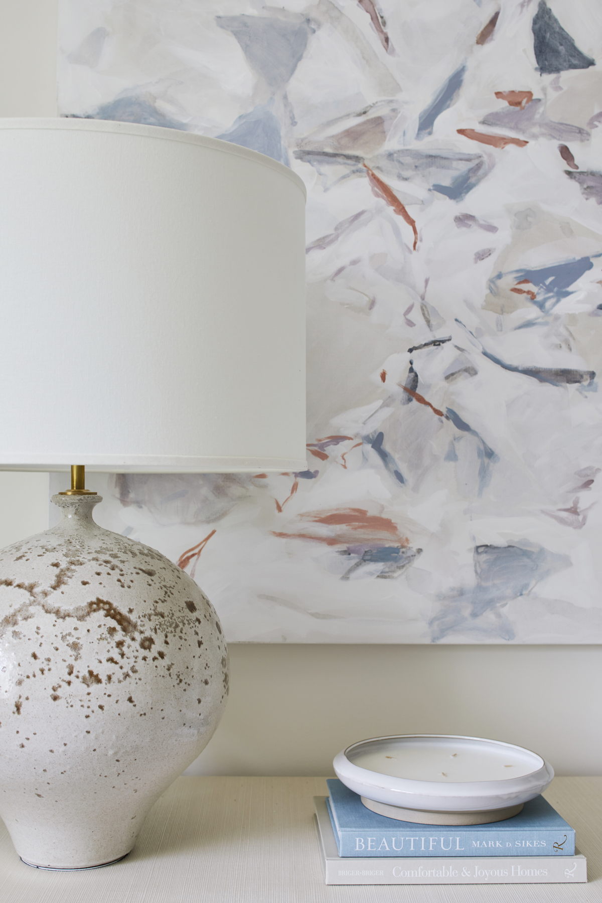
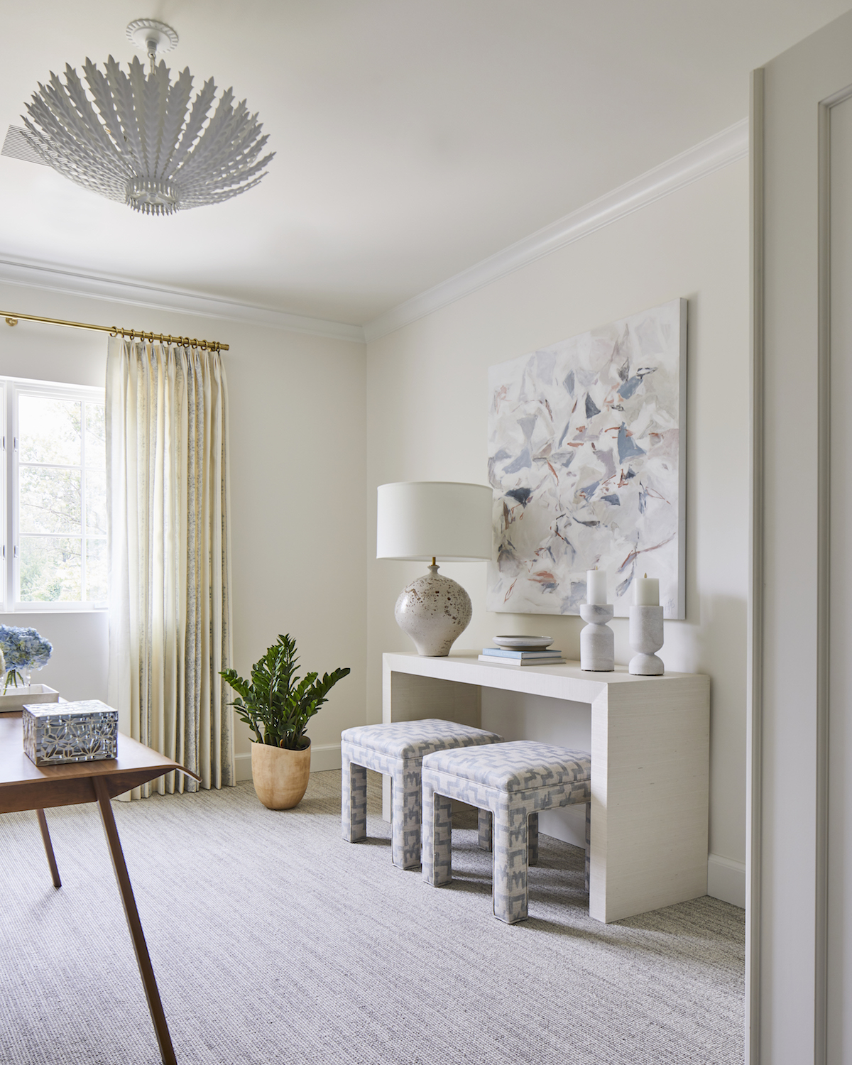
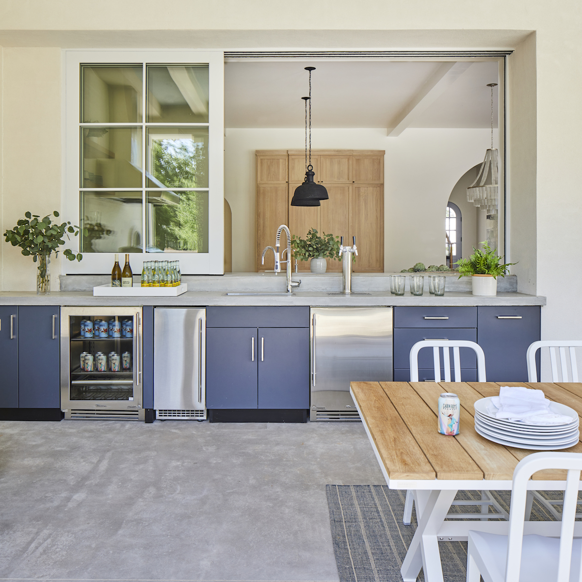
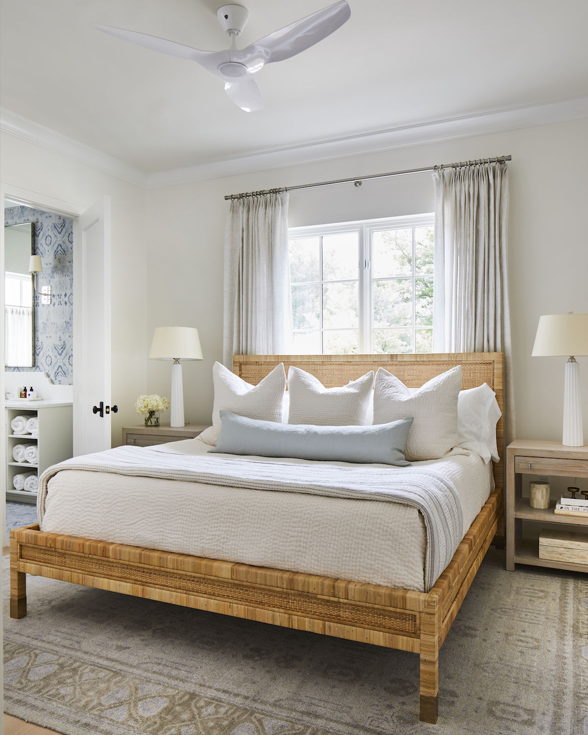
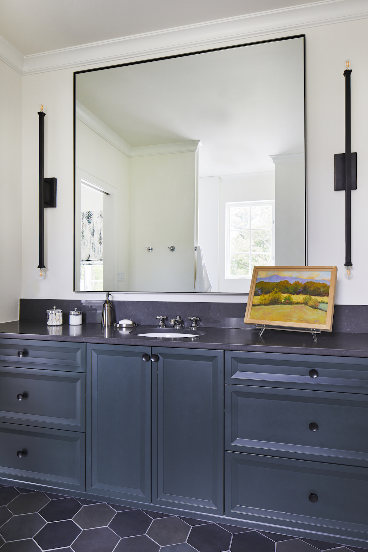
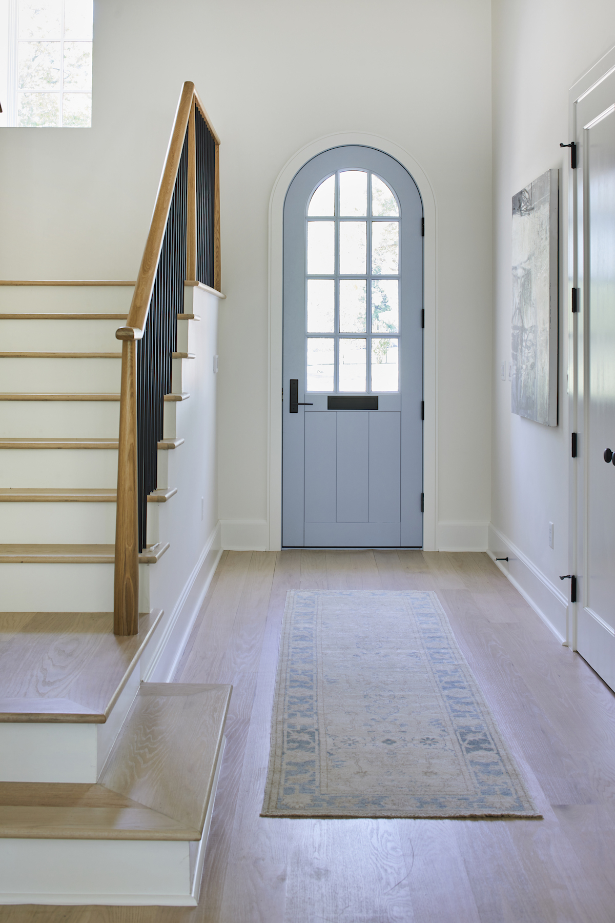
Otherwise, blue is the main, but not dominant, color in this home. Soothing shades of blues and blue-grays grace the front door and garage doors, textiles and art in each space, featured cabinets, the guest bathroom tile and even the darker exterior kitchen cabinets. As a whole, the colors in the home remain in the cool blue, green, and purple families but are combined with wood and other natural textures, such as sisal, grasscloth, leather, to offer plenty of warmth.
What design influences did you draw from?
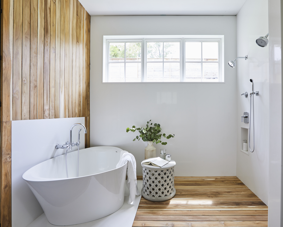
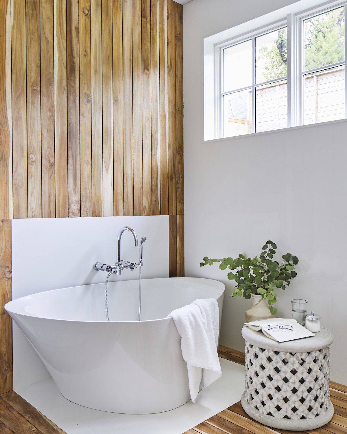
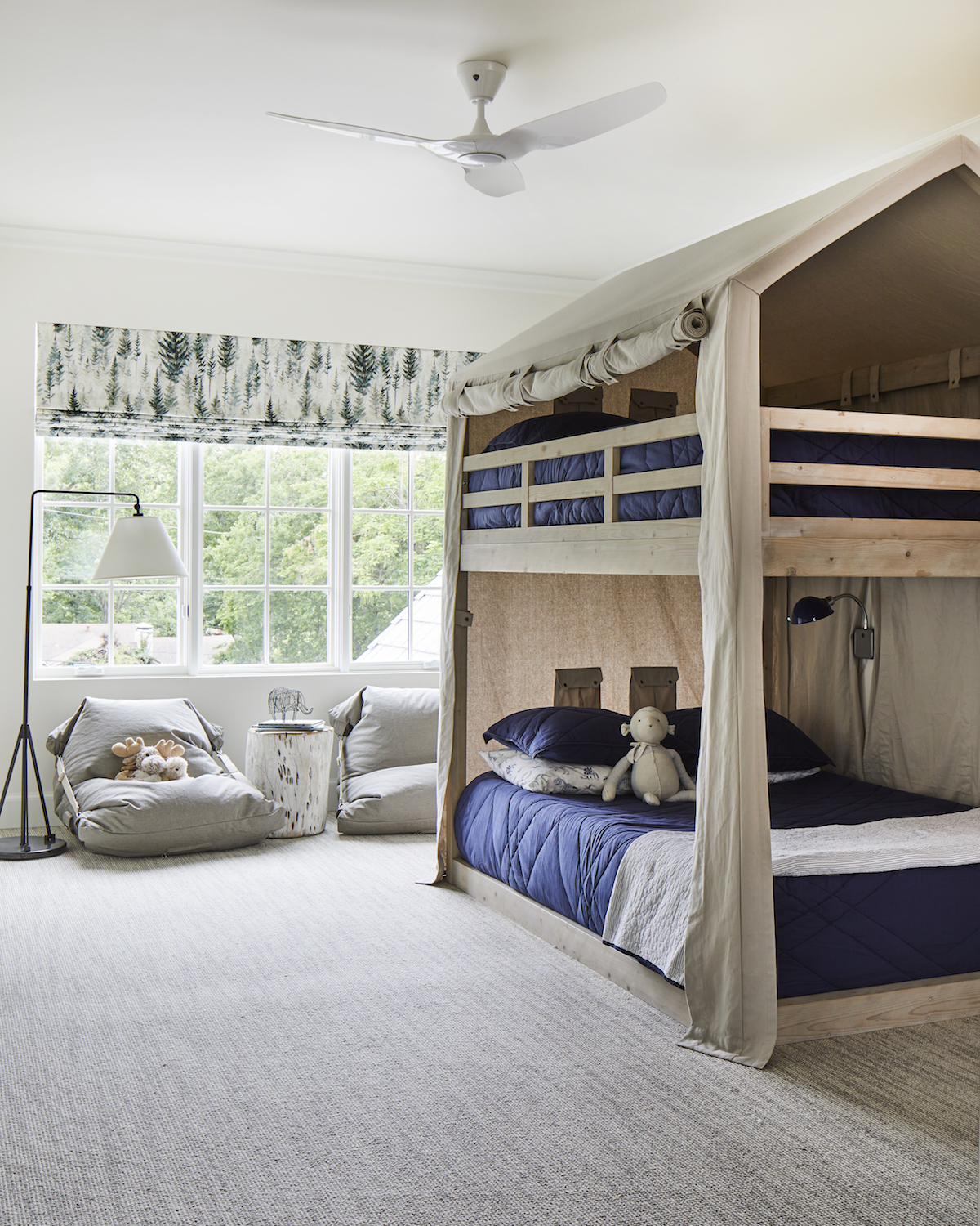
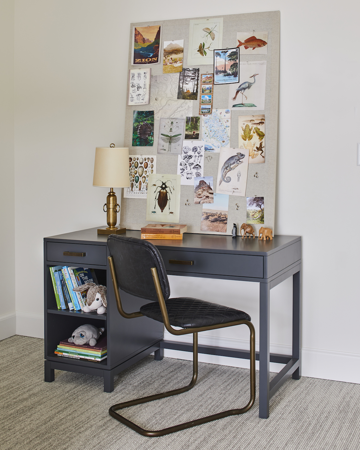
As a mother of twin boys myself, I knew Maddie and Will needed a home their family felt welcome in, that functions expertly and with incredible organization, but is also their idea of a dream to live in. Serene is a word that came to mind often during this design and to me, this home is well described as a dream- so cozy, light, and spacious. Nature inspired much of this design- the varied blues of sky and water, living plants and those represented in the powder bath wallpaper and the son’s window treatments, wood, the textural guest bedroom bed, and the connection to the outdoors through the stunning windows and doors throughout. The Primary Bathroom is spa-like, with its wood planked shower and sculptural tub – escapism at home. And in these times of spending more time at home than ever before, who would want a serene escape in their own home?
How can design-lovers achieve a similar look and feel, on a modest budget?
Analyze what you already own through the lens of this project. Pull aside items that would stand out as not belonging in this space- such as a dark painting in primary colors, or shades that feel too intense in tone. The colors we used all have a slightly muted effect. Pay attention to forms that feel classic rather than overtly contemporary. Much of this aesthetic is about what you leave out of the space. You can then add elements and layers over time, each one taking you a step closer to the Hygge Haven vibe.
Love what you see? Take a peek at the talent behind the story… Interior Design: Mel Bean · Photographer: Laurey Glenn · Architect: Brian Henley, Silo Design & Build
