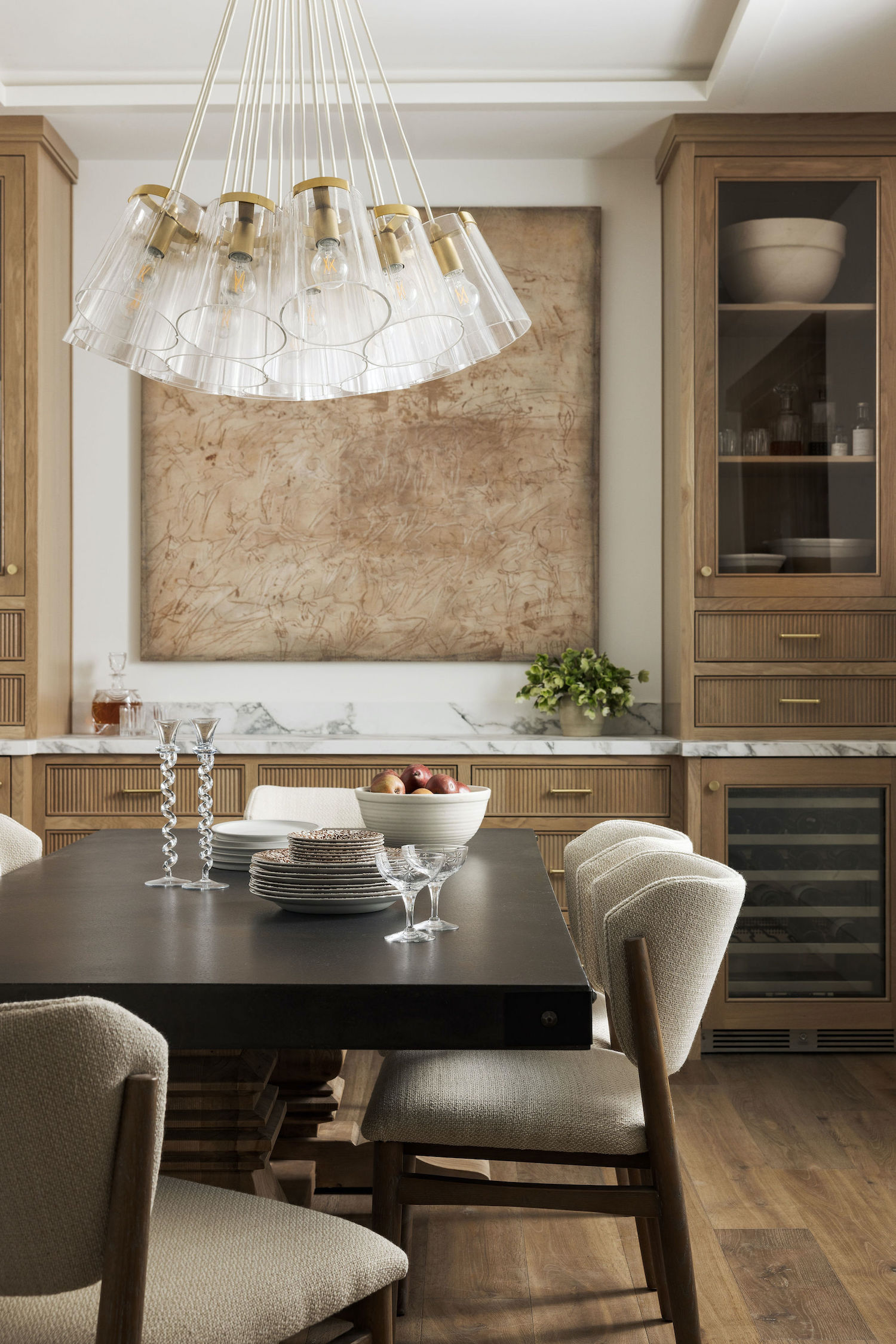
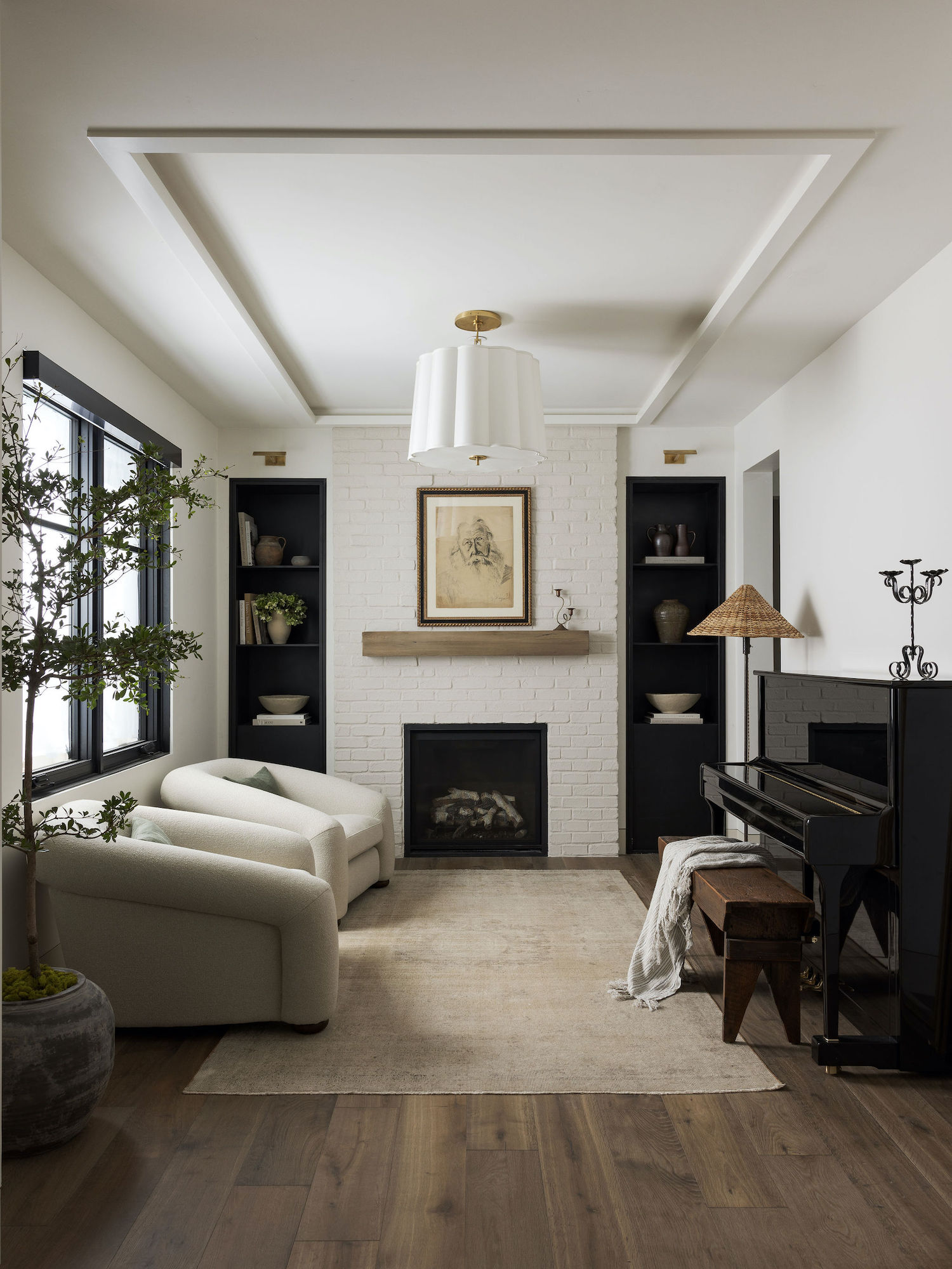
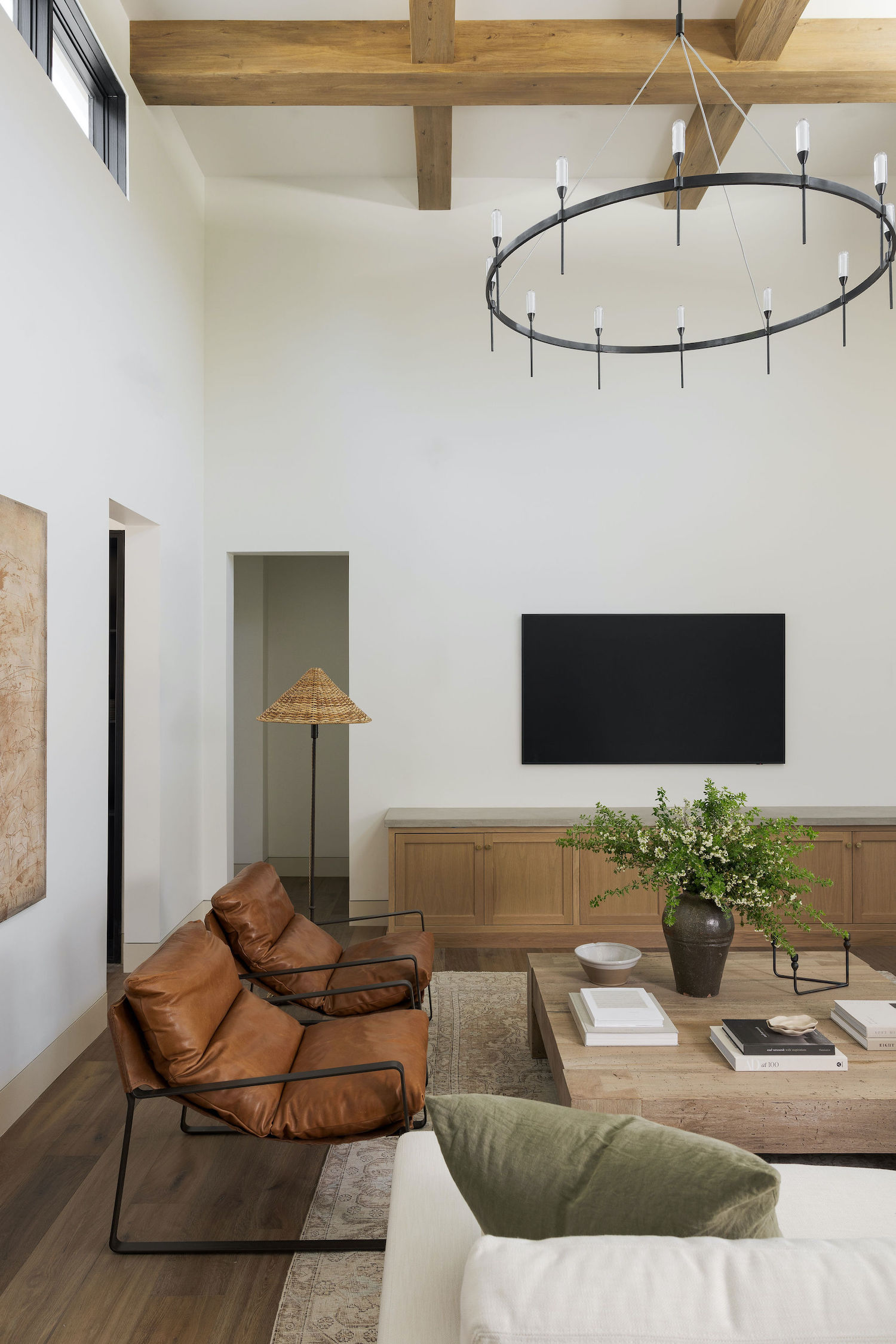
Combining modern minimalism with traditional charm, Marin Design Co. crafted a harmonious living space for a young family of five. From the sleek yet charming kitchen to the luxurious stone-clad primary bath, every corner embodies a refined, intentional design that celebrates the fusion of contemporary lines and vintage flair. Stephanie Russo beautifully captured the photos you’ll see in the tour below.
From the designer… This home is set on the third hole of a serene golf course surrounded by massive oak trees. The neighboring homes on the golf course are all custom, dating back to the 70s. Our clients’ new build was one of the last coveted lots in the neighborhood. The goal for the Country Club Retreat was to create a harmonious living space that celebrates the fusion of natural elements, contemporary lines, and carefully curated art and vintage pieces. The result is a home that exudes warmth, authenticity, and timeless appeal.
Marin Design Co. was brought on in the early stages to help this young family of five build their dream home where they will watch their children grow up. Our clients had differing design styles. He liked more modern, minimalistic design. Whereas she was drawn to traditional elements, earthy tones, and vintage flair. We worked to marry these two design styles, creating the #CountryClubRetreat.
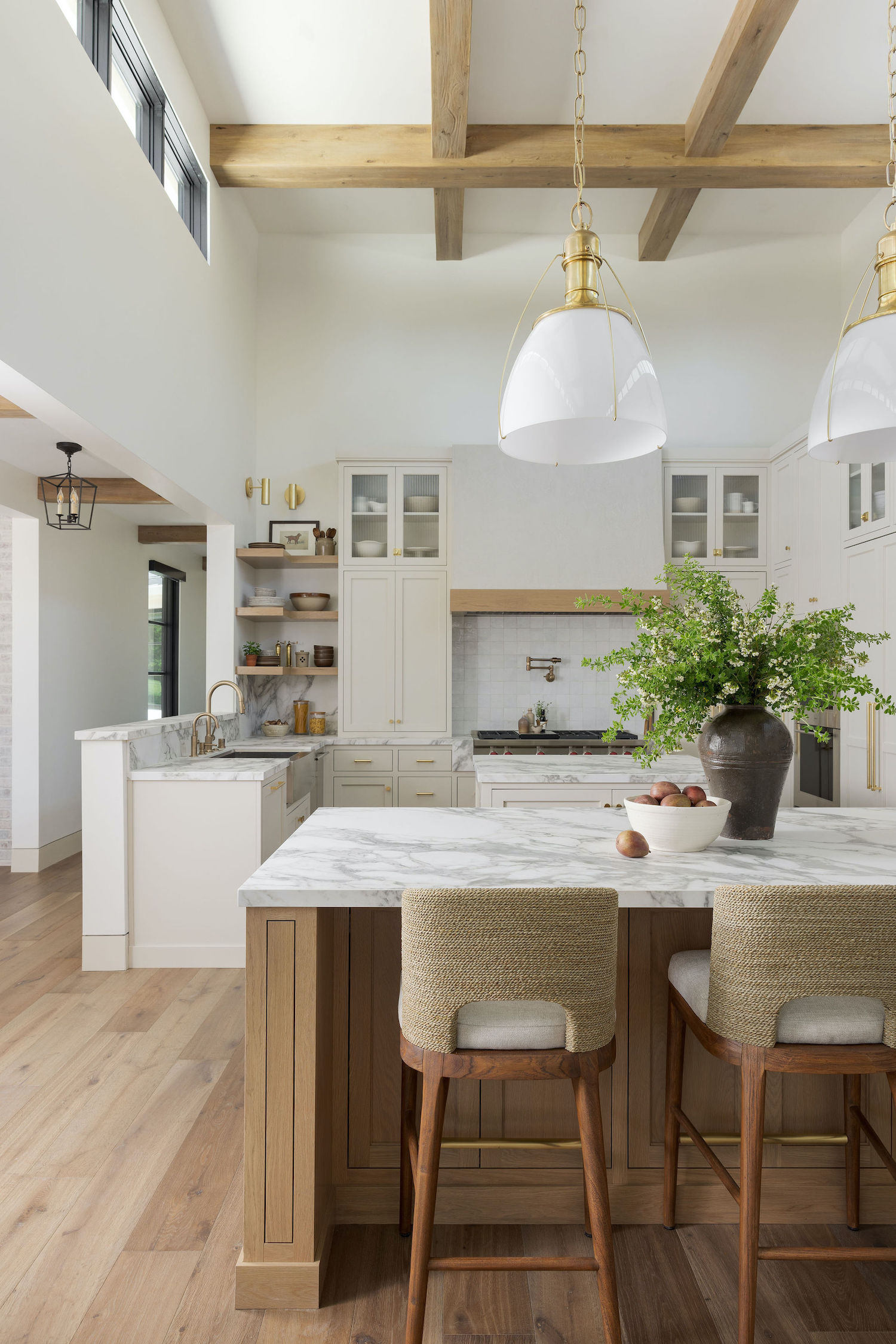
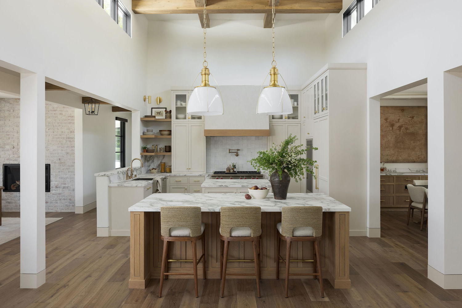
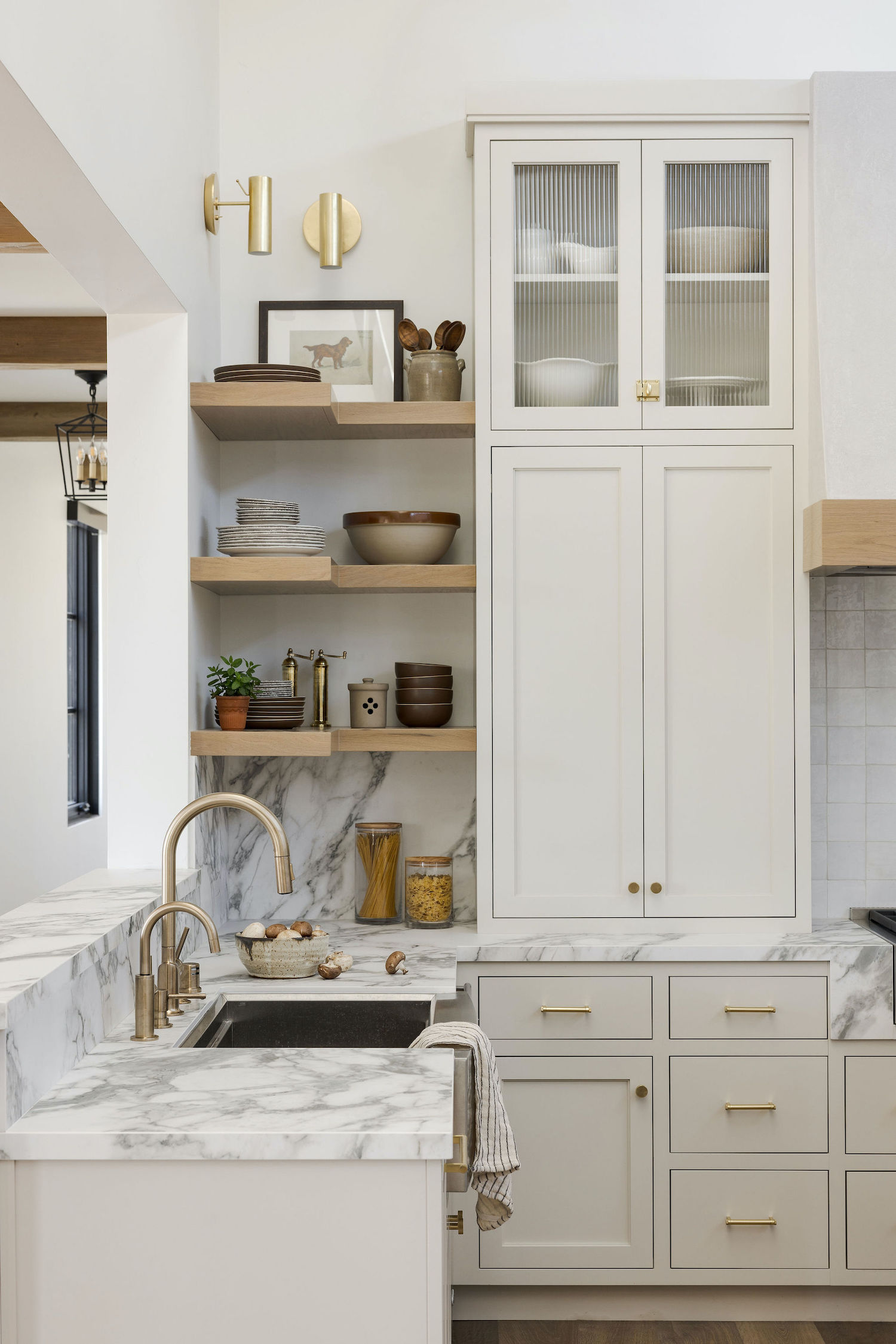
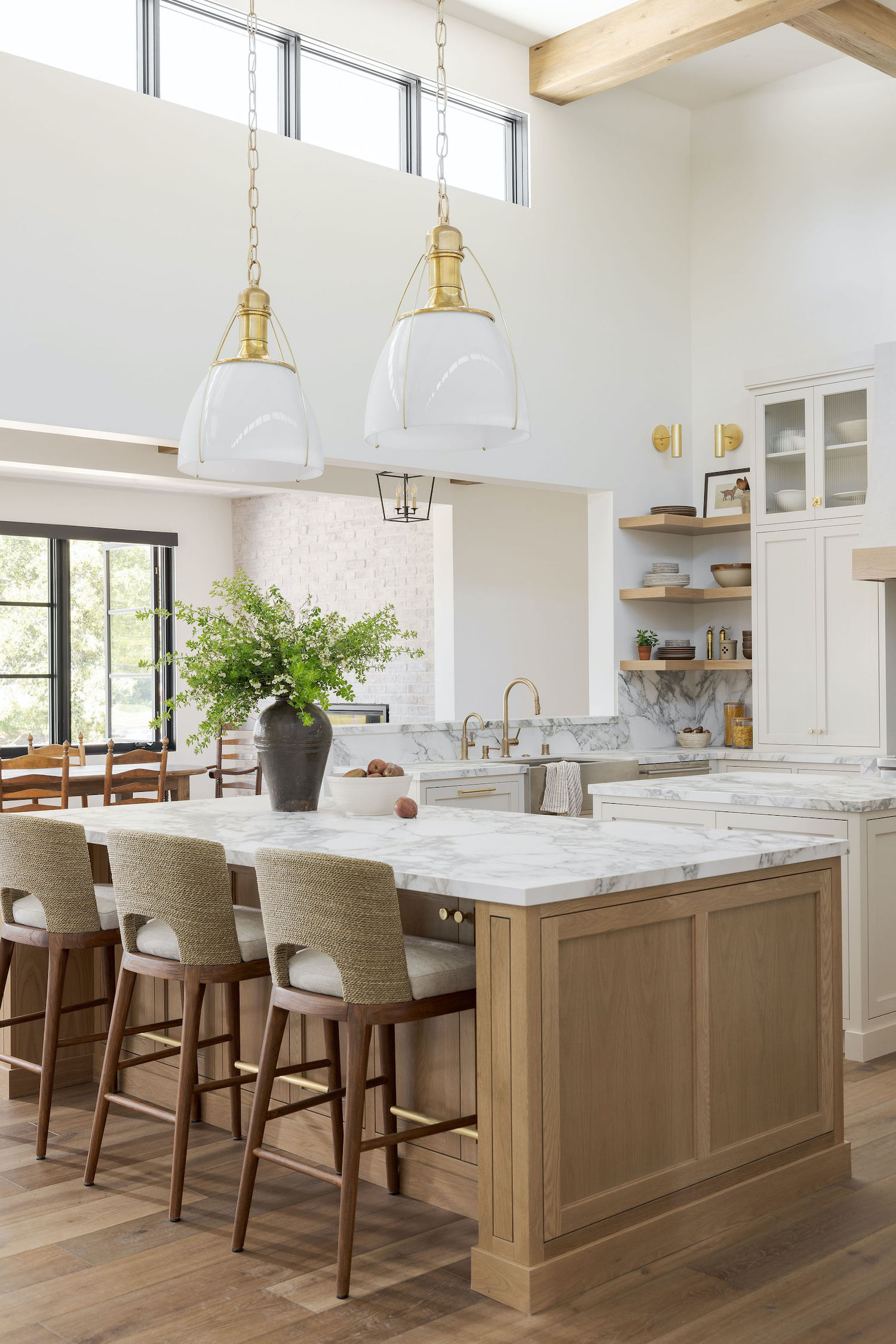
At the heart of the home, our kitchen design strikes a balance between functionality and aesthetics. Alongside sleek modern features, we have incorporated vintage touches with styling pieces, infusing the space with character and charm. The highlights, a hand-plastered range hood, white oak cabinetry, and dramatic-veined marble add an air of texture and sophistication. One of the challenges we faced during the design of the home was keeping symmetry and balance in the kitchen design. We wanted the range to be the focal point of the kitchen. This meant centering it on the back wall and designing a hidden pantry to maximize space and keep an open floor plan. To keep with the symmetry and character of the home, we heavily focused on clean, straight lines and removed any harsh angles or dead space to provide a refined, intentional design.
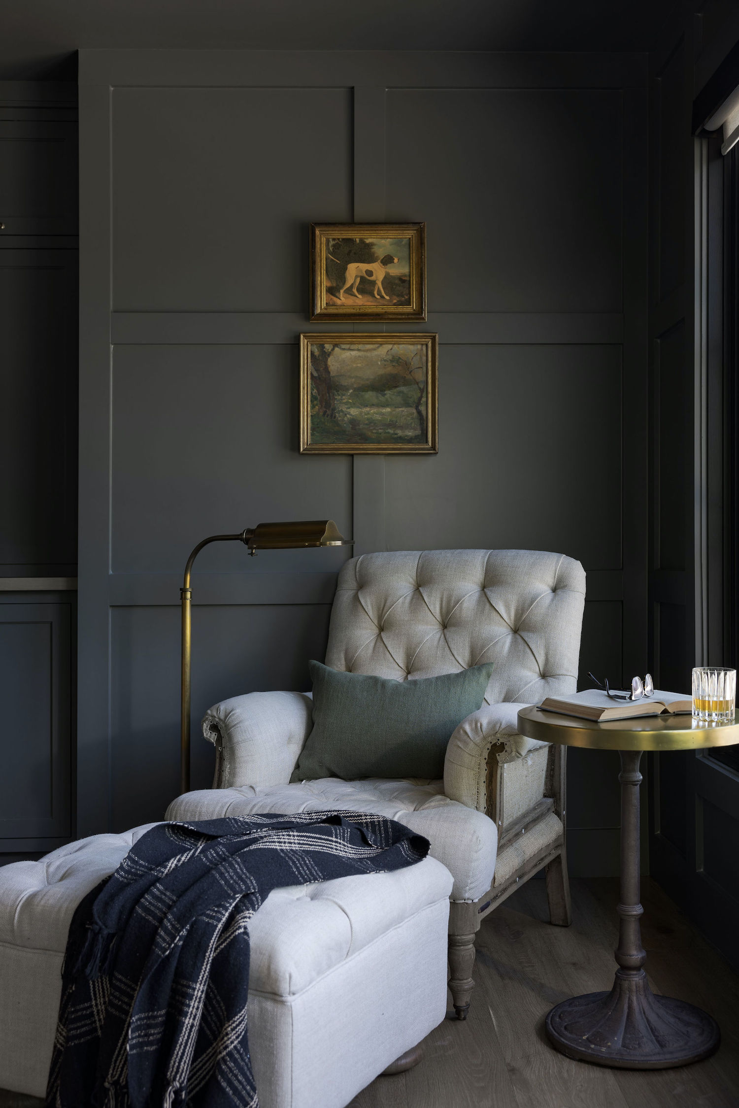
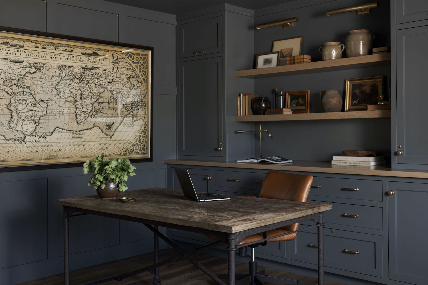
The home office conveys the feeling of being in an old world library, surrounded by hundreds of years old historical books. The moody blue-gray color creates an ambiance of concentration and calmness, making work from home equally comfortable and productive.
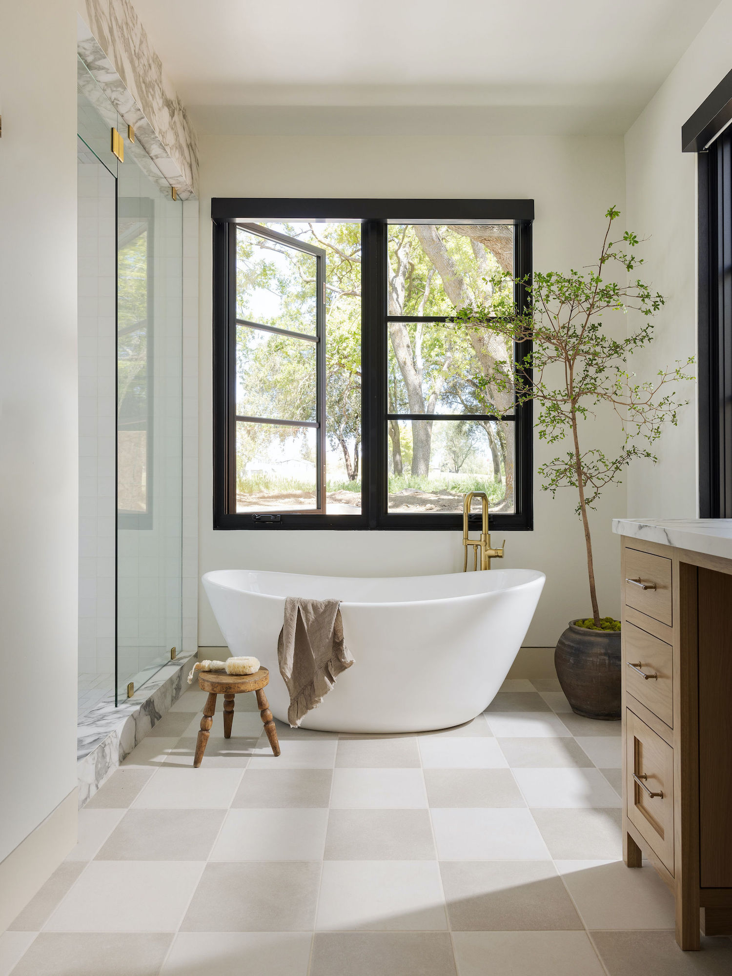
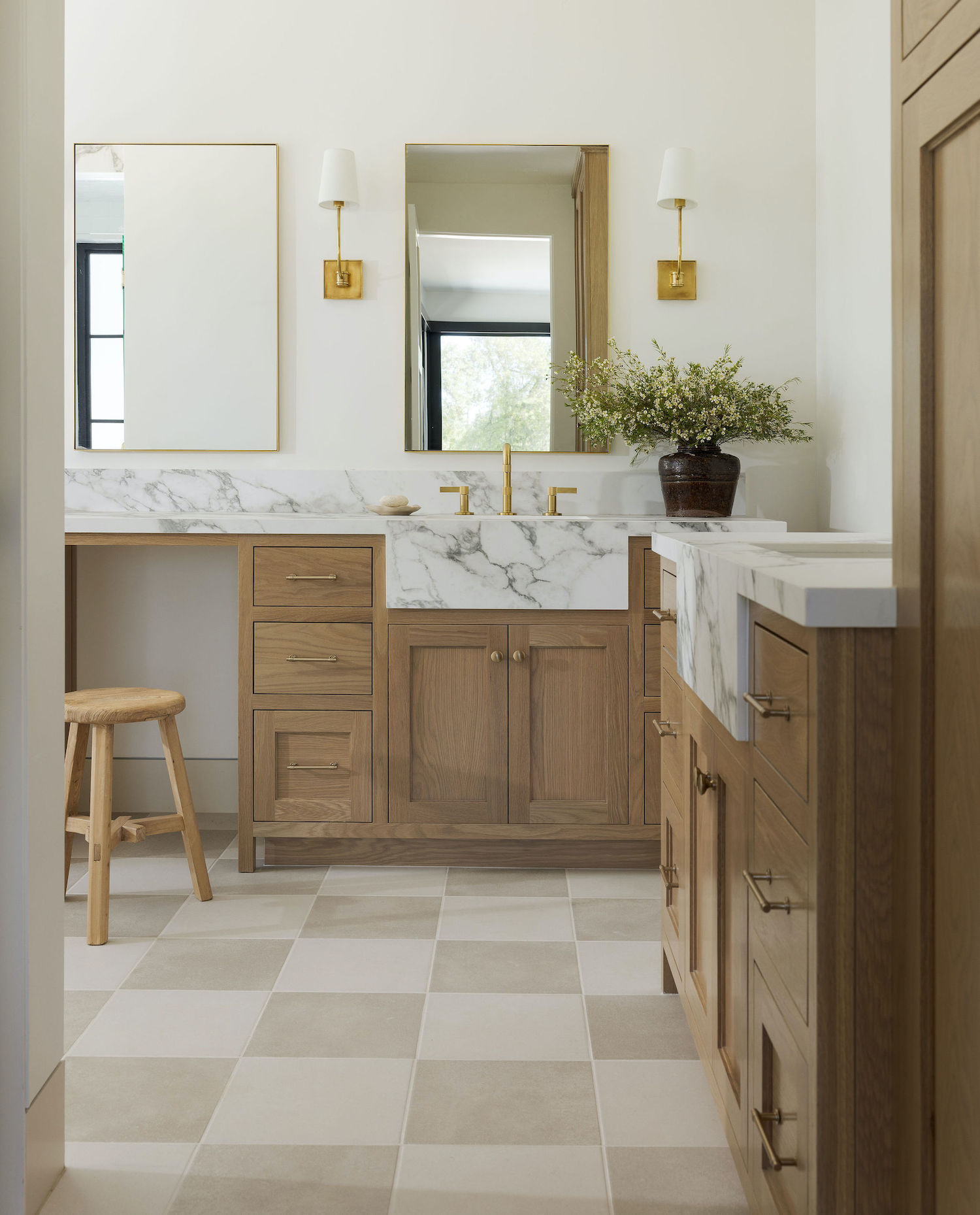
In the primary bath, we embraced the concept of a private oasis. Luxurious stone surfaces, a freestanding soaking tub, and a spacious walk-in steam shower transform this space into a serene sanctuary that inspires rejuvenation.
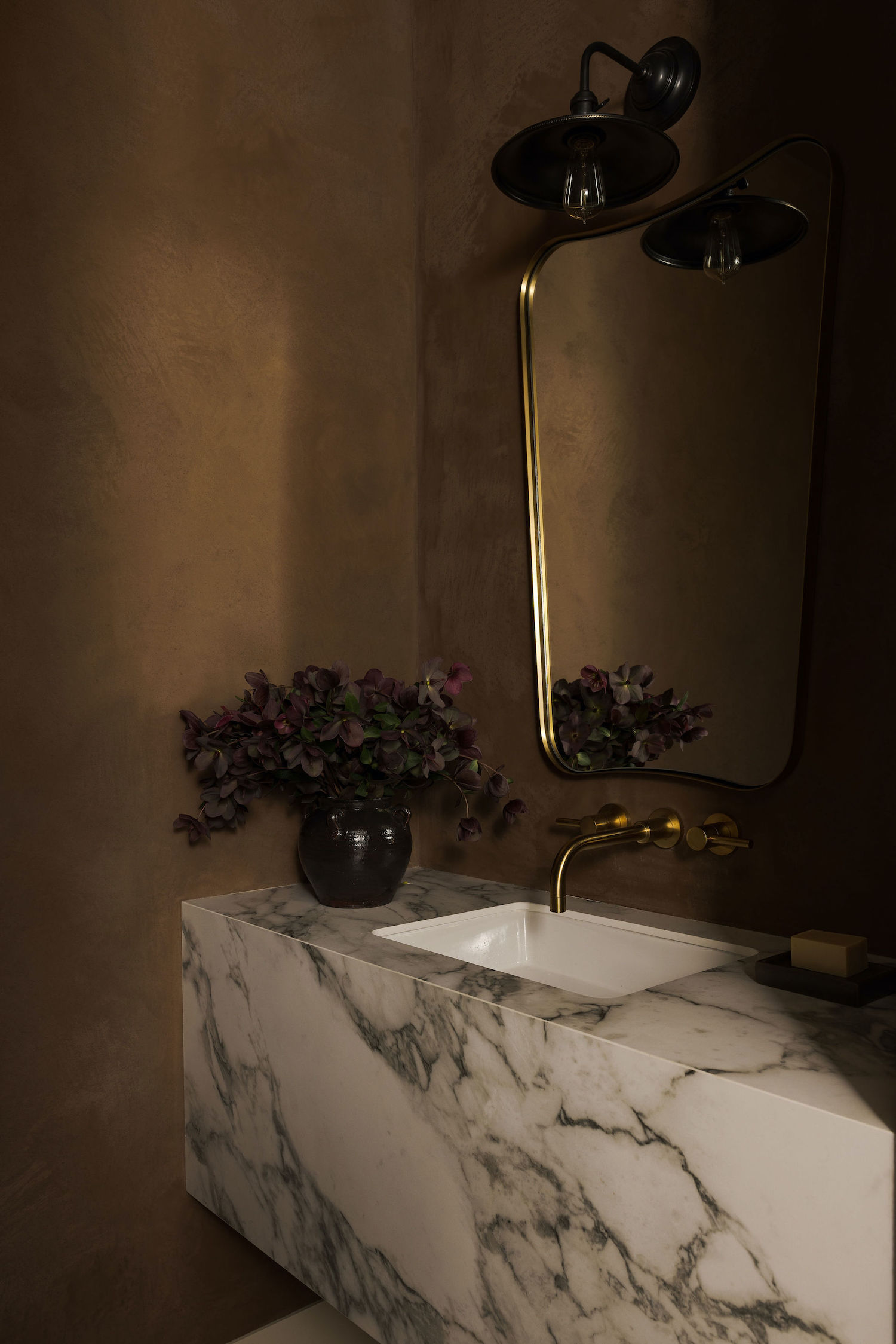
A small space with a large impact, the powder bathroom walls are coated in a dark, moody plaster, adding depth and character to the space. The centerpiece of the room is the large, stone sink that catches the eye and is reminiscent of an Italian villa.
Like what you see? Take a peek at the talent behind the story… Interior Design: Marin Design Co. · Photography: Stephanie Russo · Videographer: Avision Creative Agency · Cabinetry: Case 1 · Architect: Schneider Design Associates · Builder: Nelms Construction