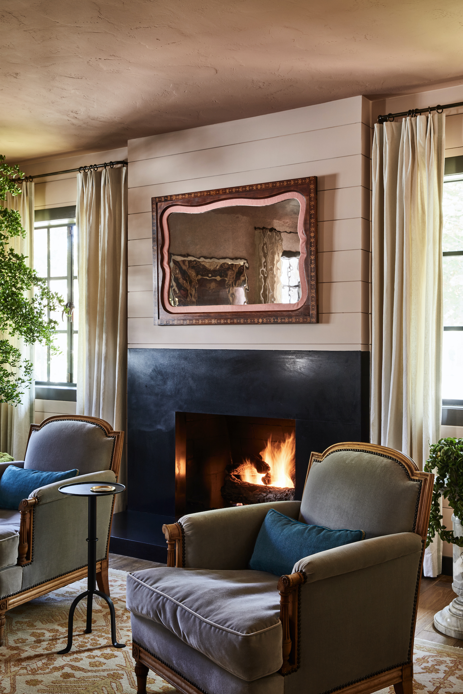
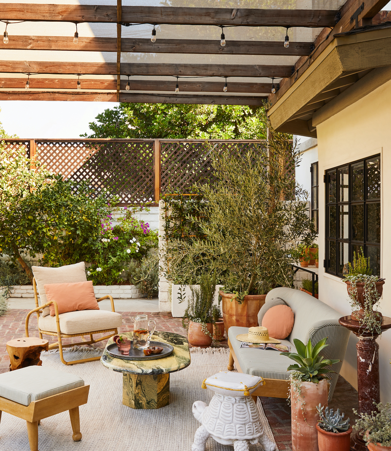
White walls have their place, but not in this home. Stefani Stein was given the design directive to create a rich color story, artful surroundings, and a comfortable vibe for her clients’ Los Angeles remodel. What she did was so much more. She created a home that speaks to the nature of its inhabitants and allows them to be enveloped by the lifestyle that they so truly love. Photographer Sam Frost beautifully captured the spirit of this home in the photos below.
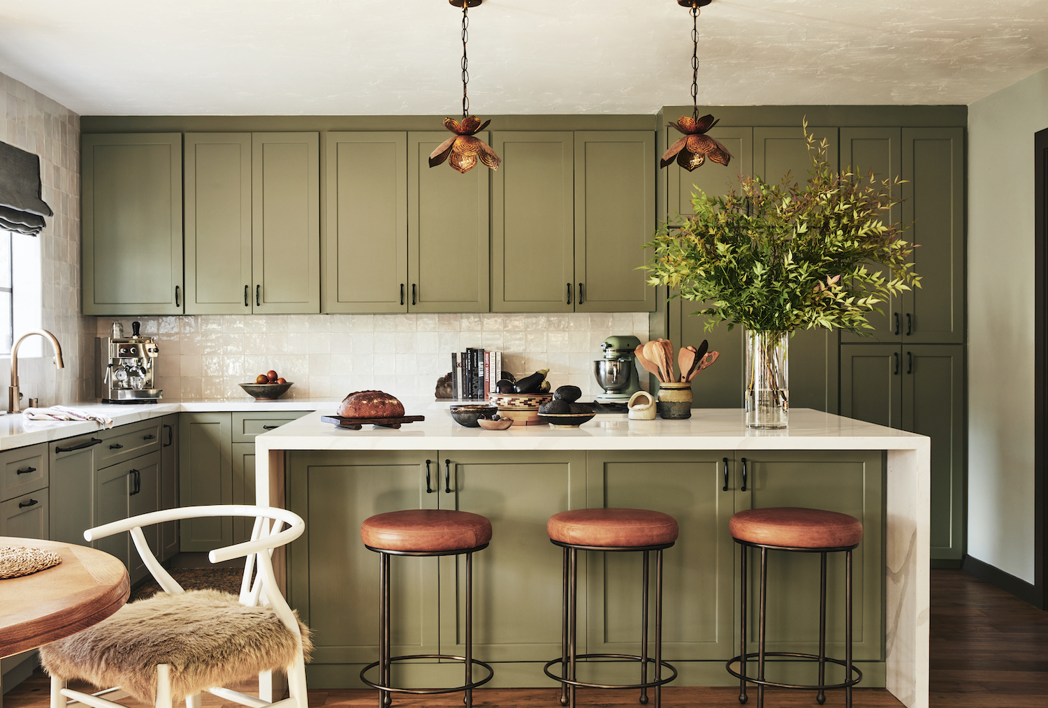
From the designer… Our design direction for clients Samira Wiley & Lauren Morelli incorporates nods to the clients’ East Coast roots. We crafted a cozy color story rich in authenticity and duality. A traditional palette is juxtaposed with contemporary California pieces and elevated vintage finds. The designs honor the creative energy and playful spirit of its inhabitants.
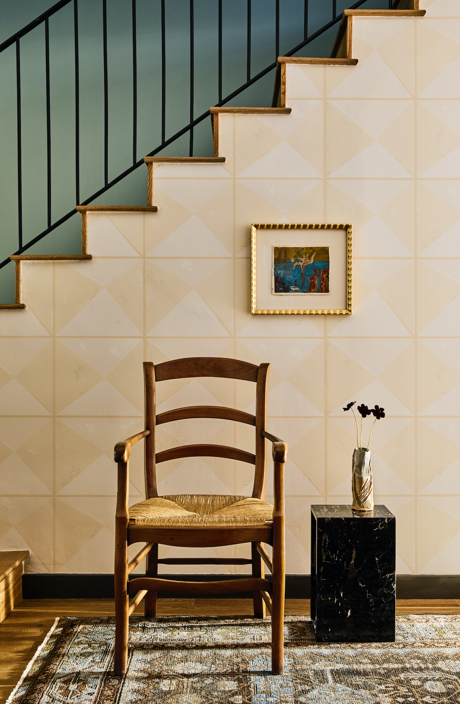
When the clients purchased the house, much of its character had been lost. It had been newly renovated by a property developer. Many of the materials selections, were very pared down and a little too modern-farmhouse for the clients’ preferences. Honestly, it was a little bit of a hodgepodge architecturally. Some elements felt like remnants of California Spanish style, while other elements leaned towards 1970s California Ranch Style architecture. We worked to create a cohesive aesthetic for the space and steer it toward a more authentic version of itself. We added millwork and joinery details throughout—infusing the home with classic charm. We wanted the space to feel cozy and comfortable, but simultaneously elevated and artful.
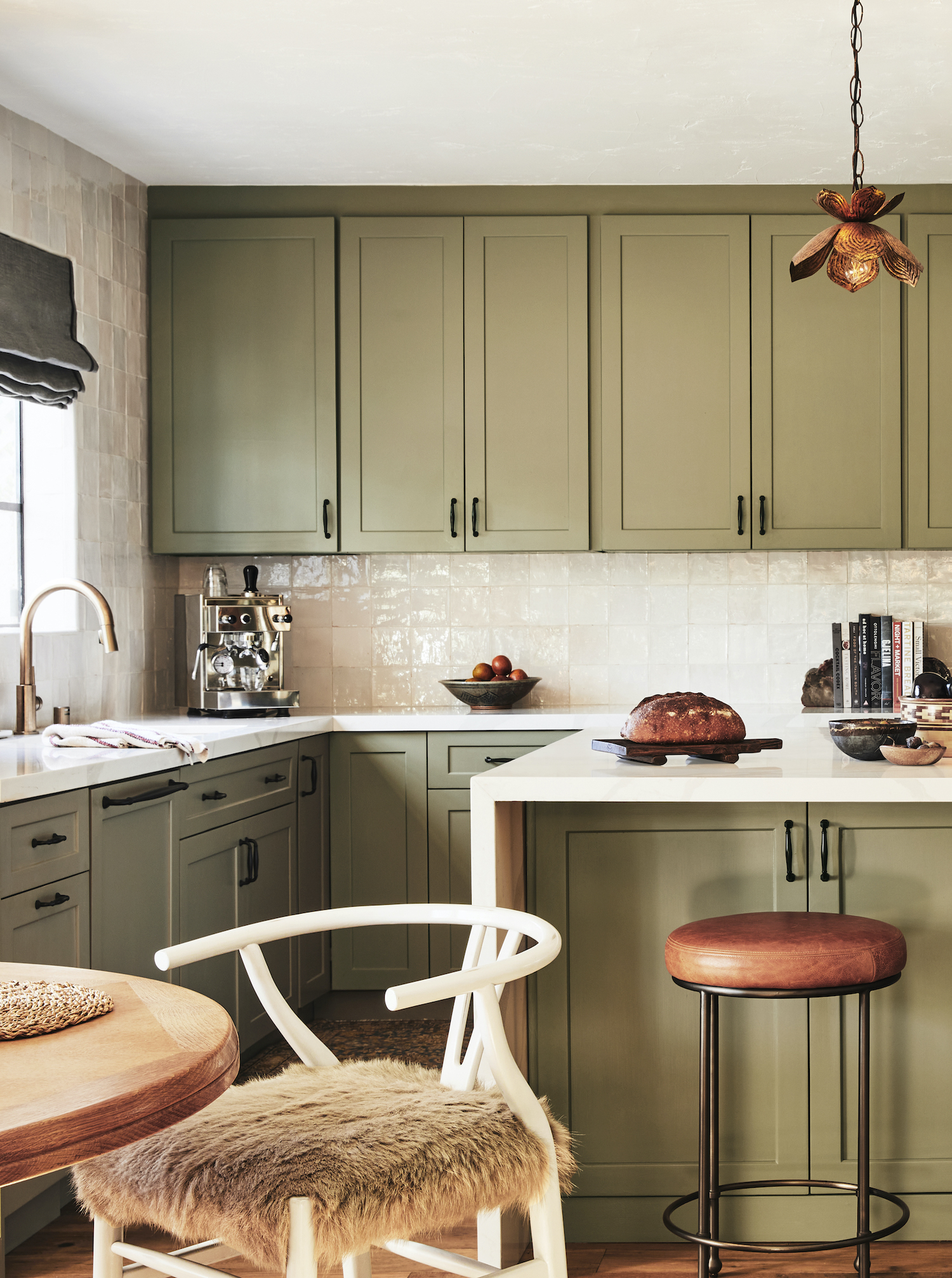
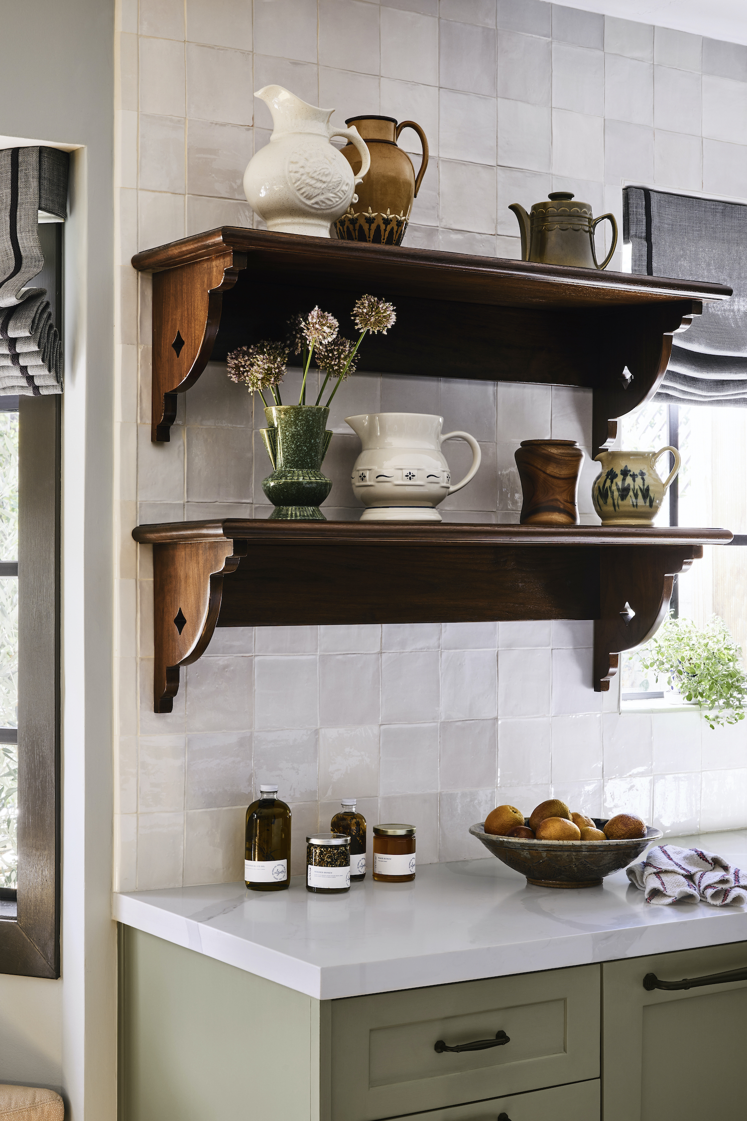
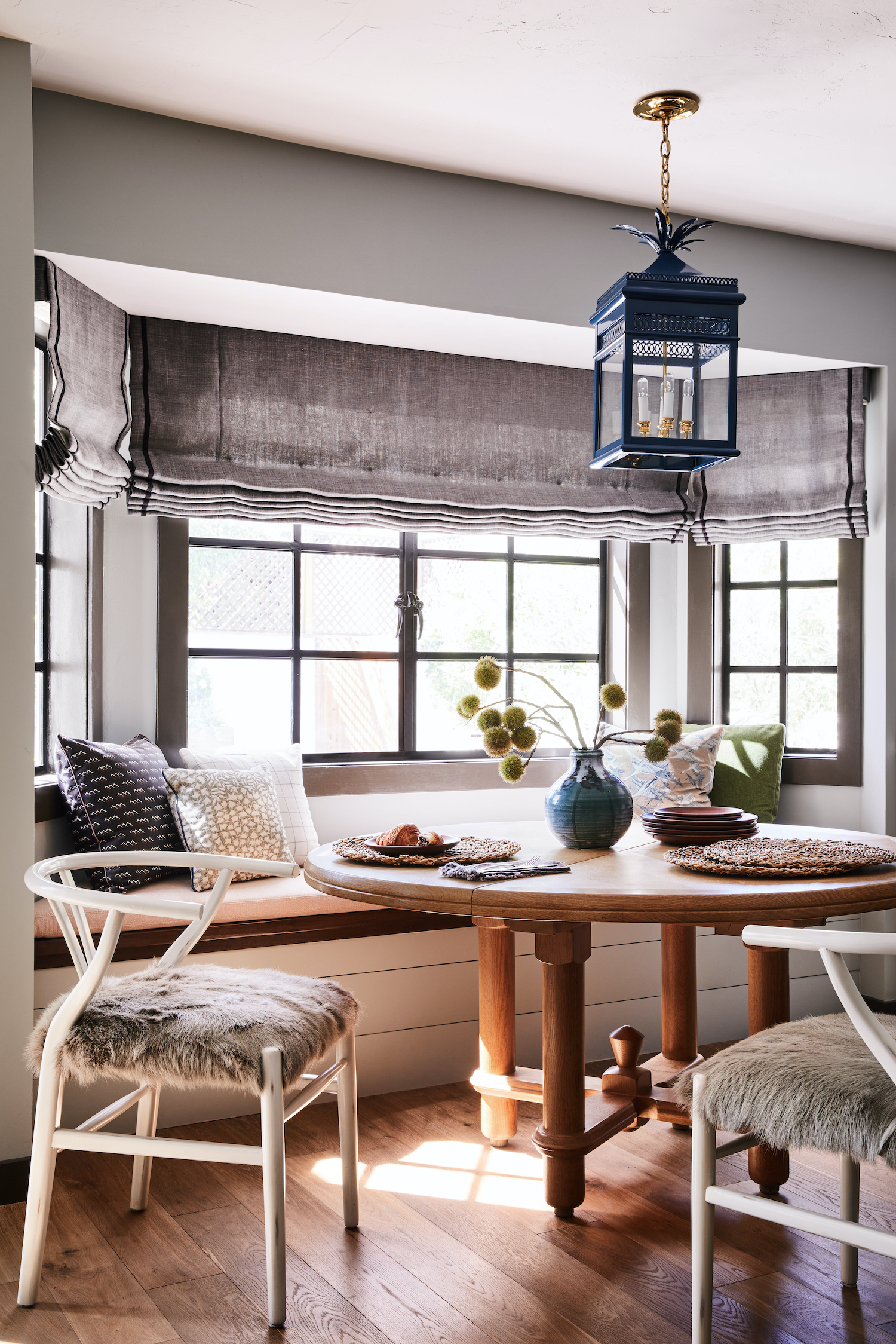
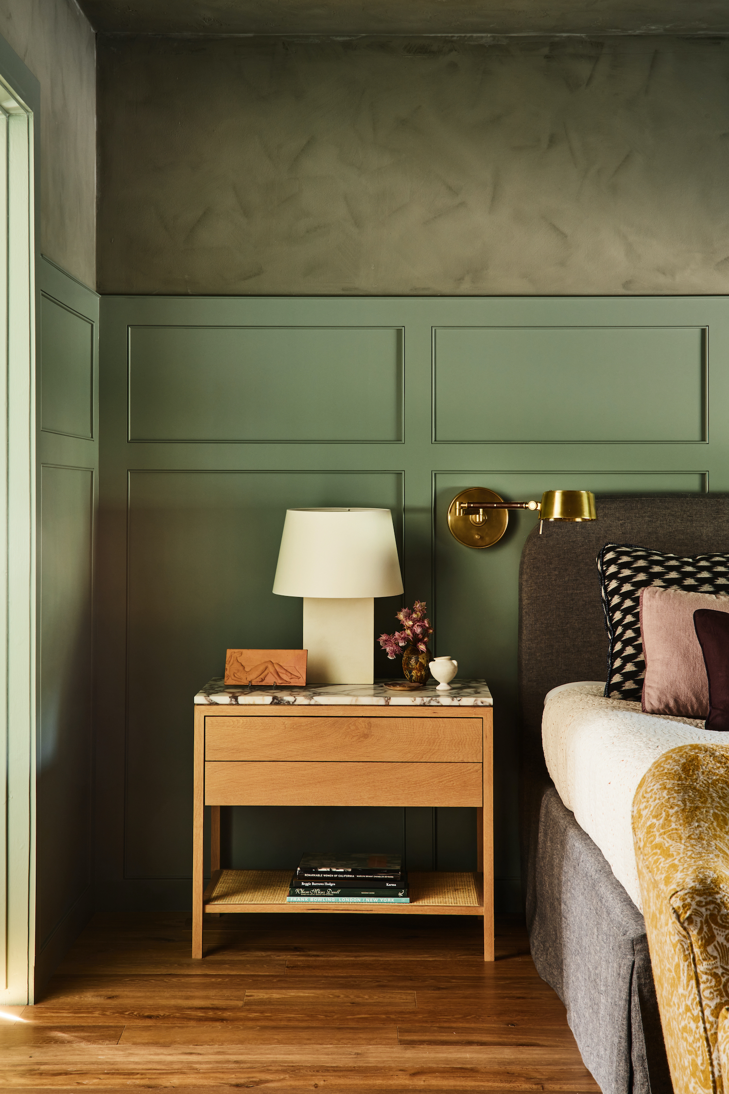
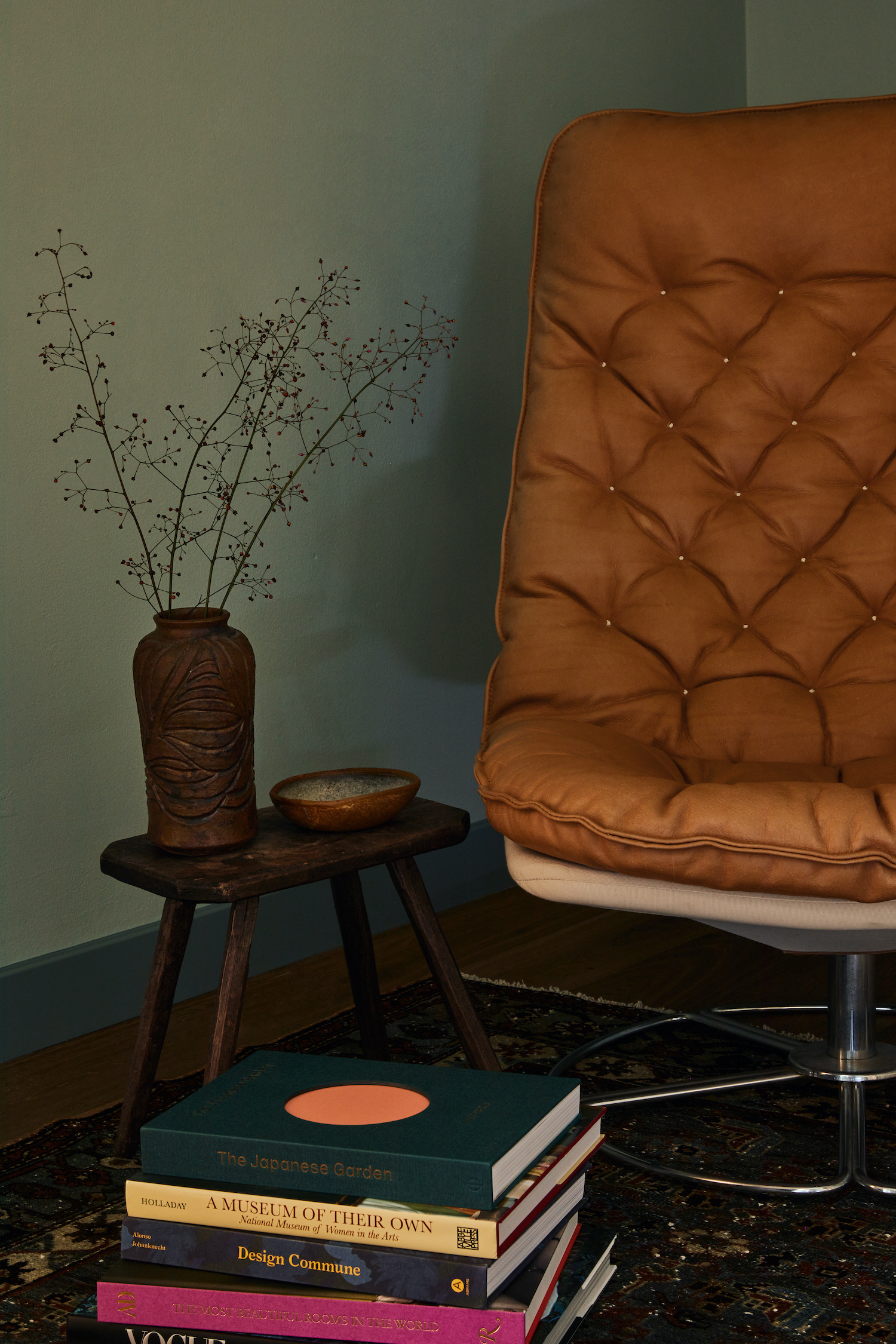
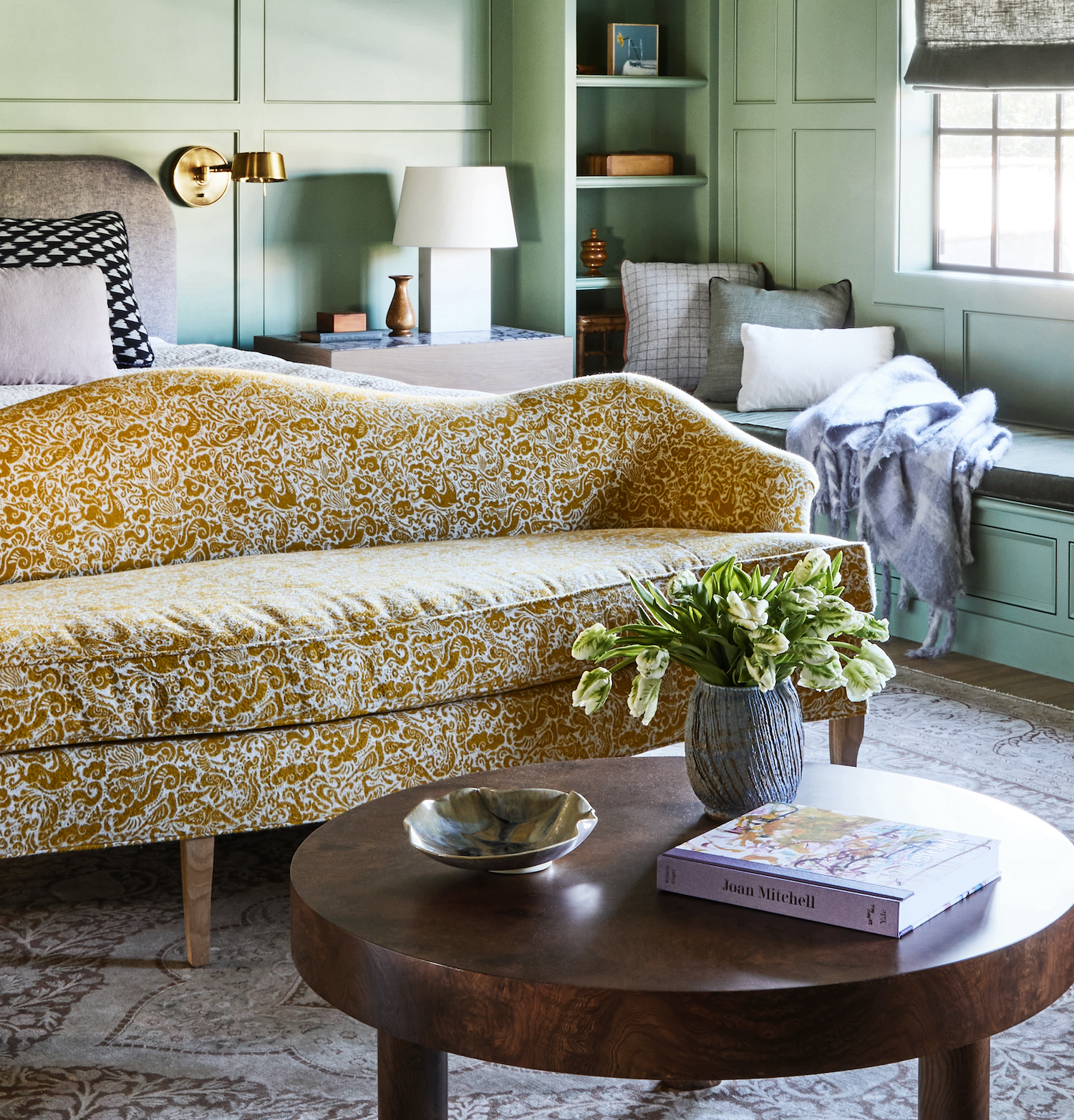
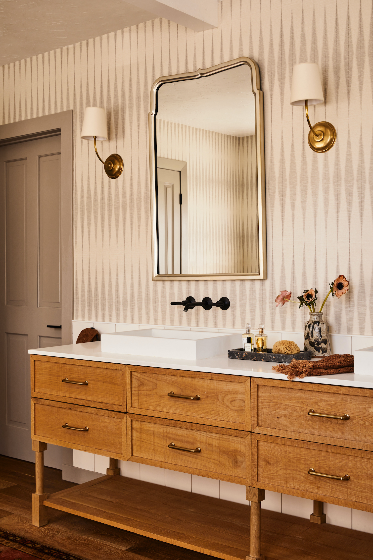
One important design directive from the clients was “no white walls.” They liked the idea of more color, with the palette transitioning, from room to room. Lauren loves bright and cheerful hues with dramatic pops, but Samira was craving something a bit calmer and more relaxed than their previous home.
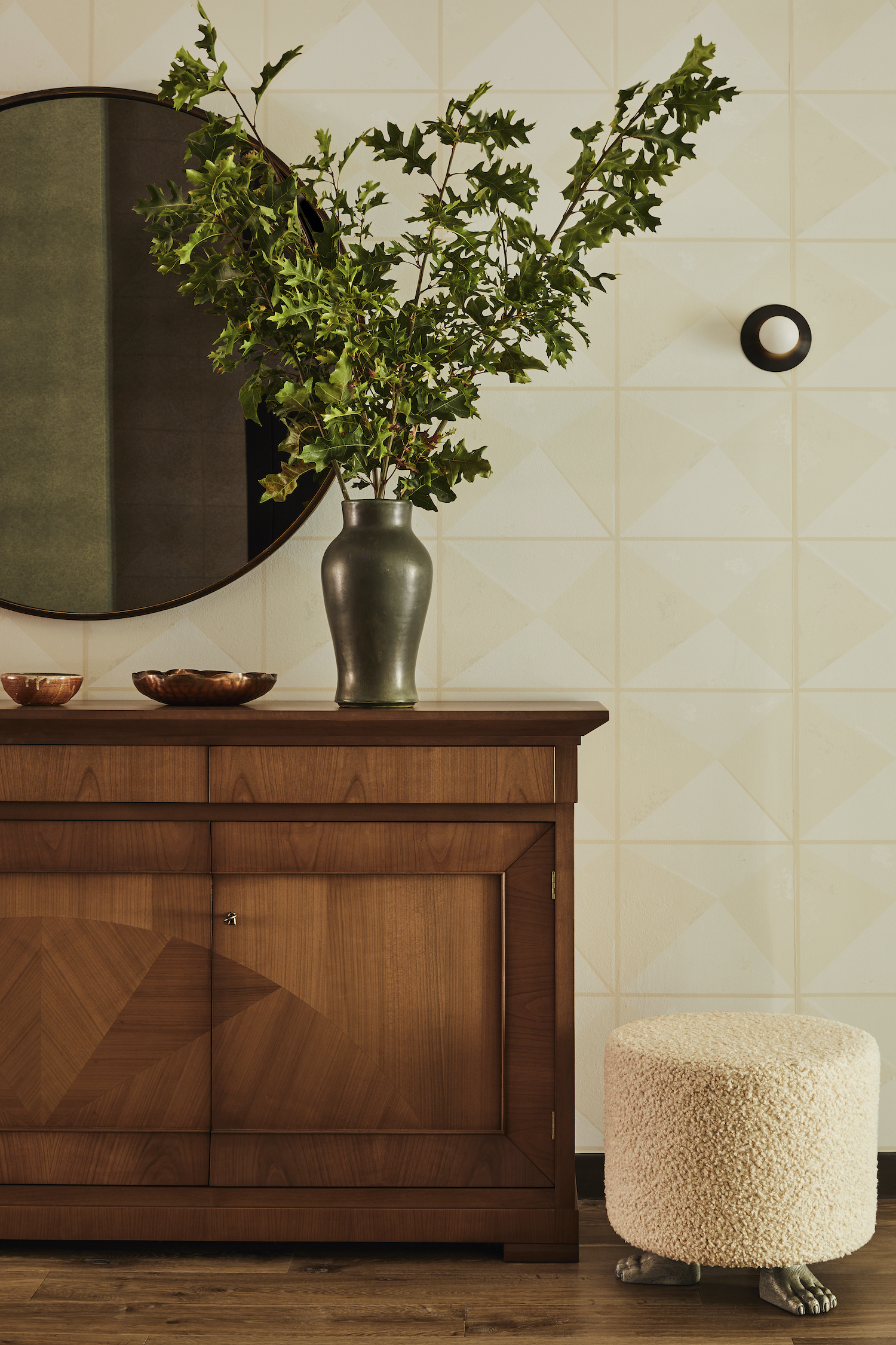
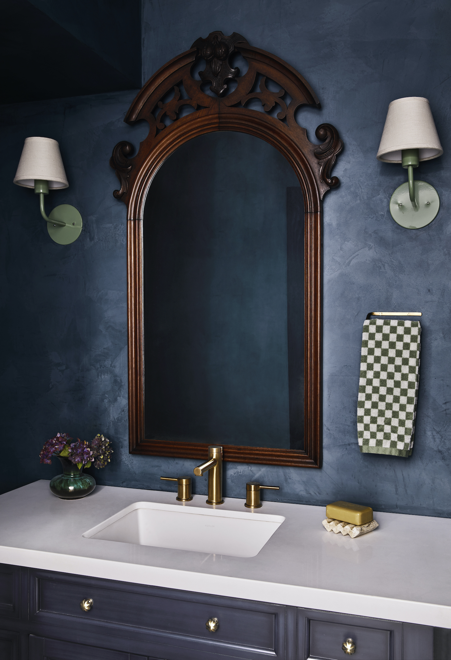
When it comes to color, I tend to gravitate towards an earthier, dustier color palette, which struck a nice balance between calm and colorful for the clients as well. These foundational colors selected lend the home a comfortable quality, reminiscent of an older, lived-in space. Pairing this with furnishings that meander from modernist to antique, with a sprinkling of both vintage and statement items kept things fresh and unexpected. For me, this composition is about that balance between studied and whimsy–edited and layered.
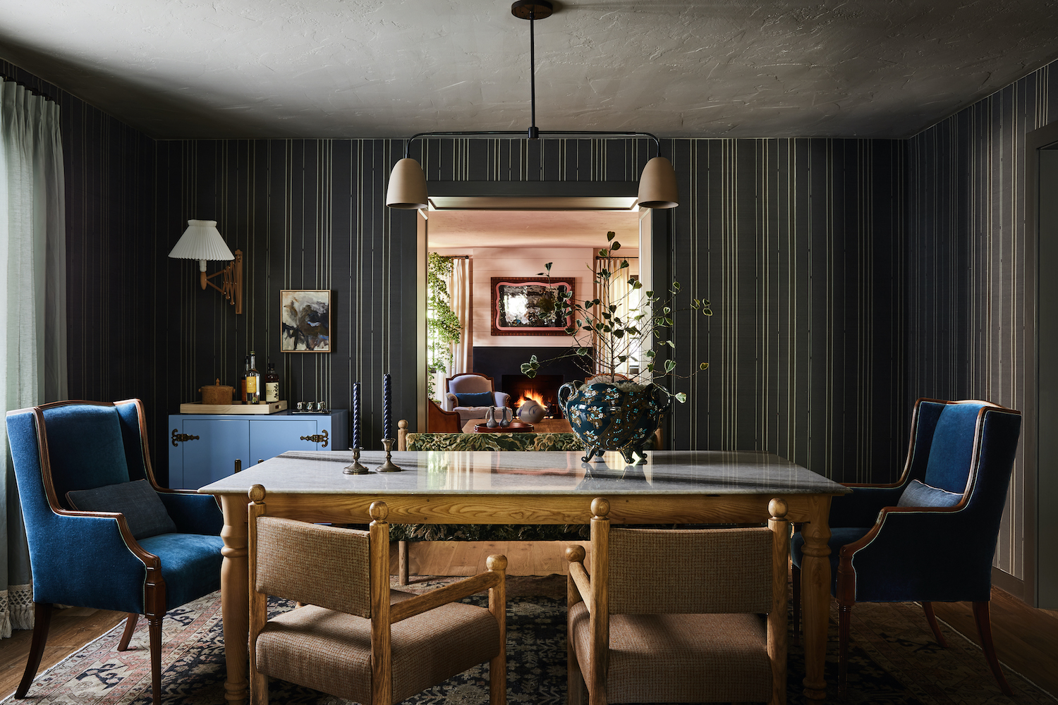
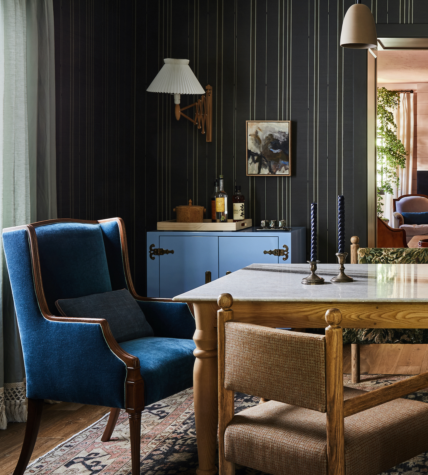
Lauren was craving a little drama. She loves bold and vibrant hues. The typical interpretation of that didn’t really work for the overarching design direction of the home. However, with the open plan, the Dining Room was an area that could be a little more bold than the adjacent spaces and provide a nice delineation. By creating this moody alcove between the Kitchen and Salon, I was able to meet the client’s requests, but doing so in a manner that felt cohesive with the adjacent palettes and overall design direction.
We created a custom wallpaper color for this project, on a grasscloth ground, infusing the room with an imperfect texture that is just lovely. I’m especially fond of the combination of this wallcovering with the Henri II tapestry textile on the dining bench. We were also able to repurpose a custom Lawson Fenning cabinet from their prior home. The periwinkle hue is completely unexpected in the space, and nicely also countered the earthiness of the rest of the selections, which Lauren loved.
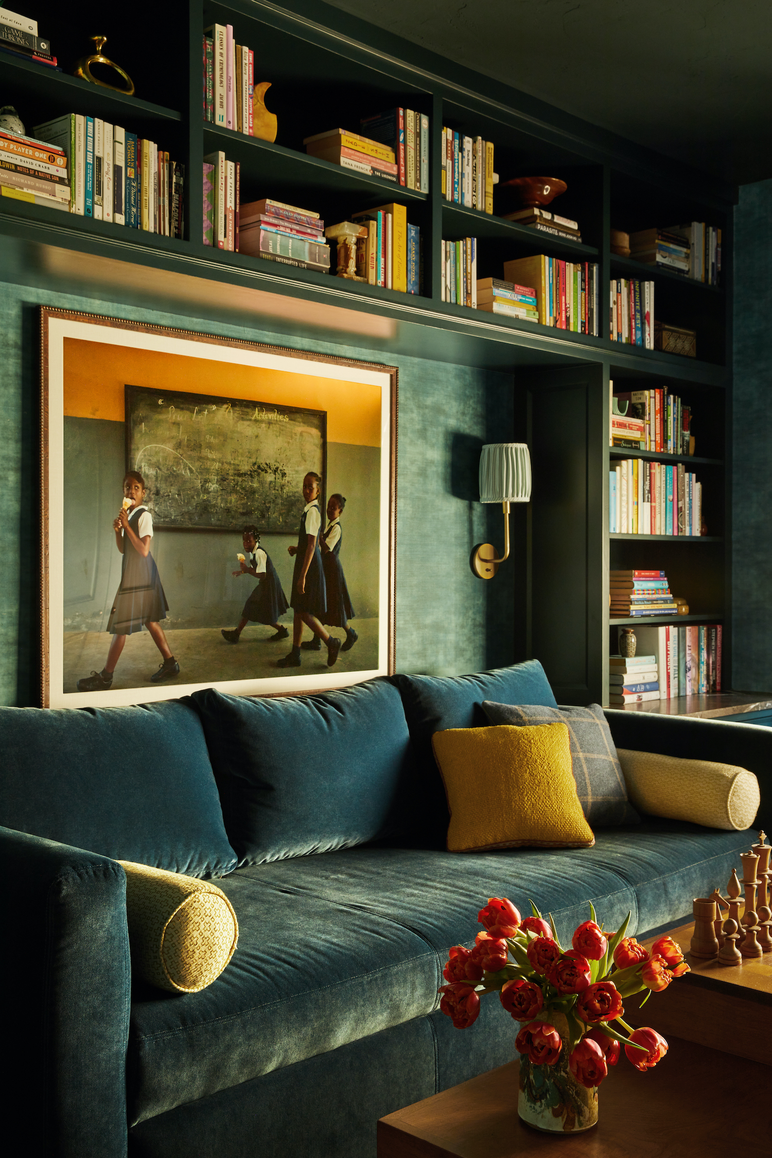
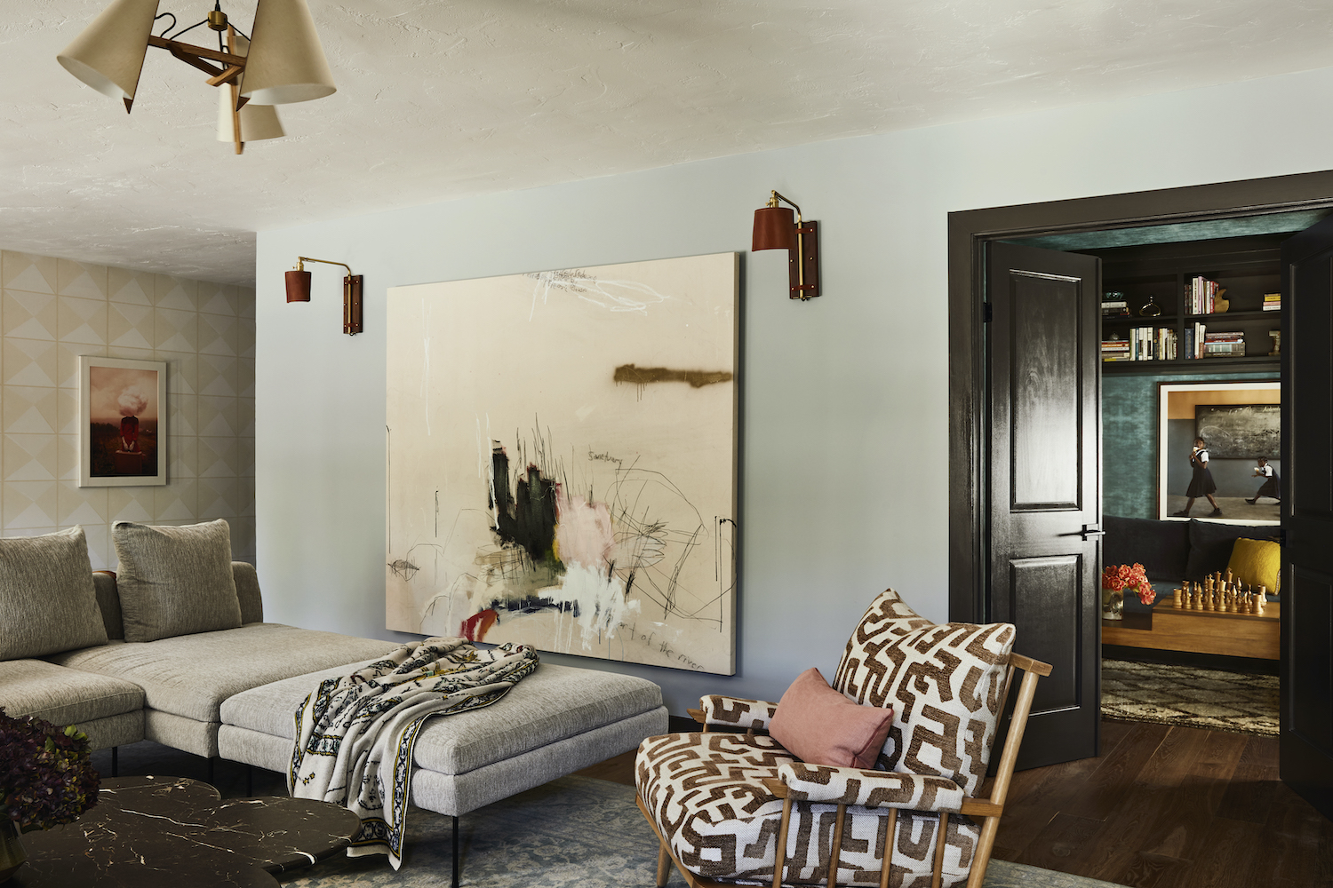
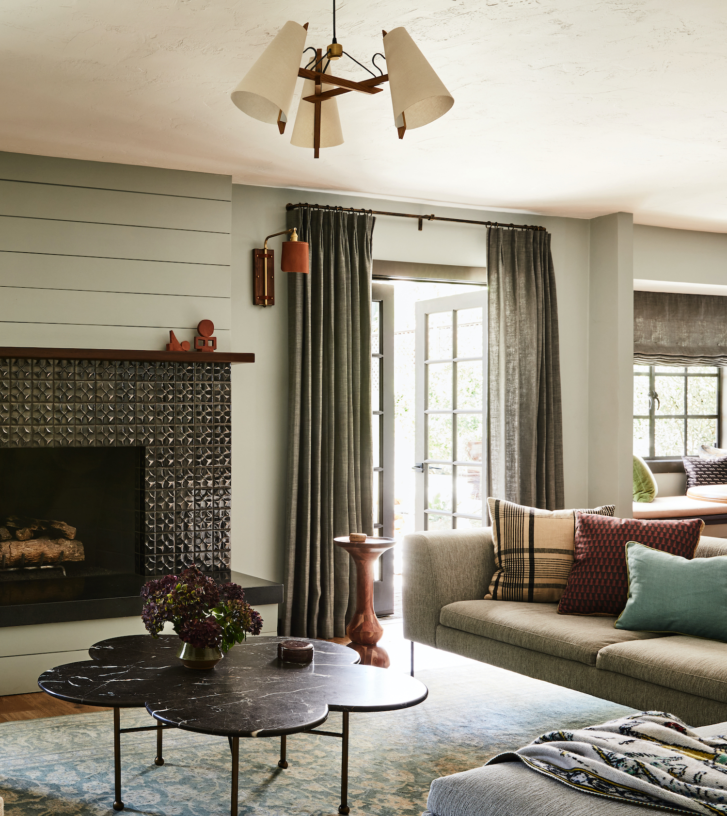
Samira’s favorite color is teal and she loved the idea of weaving this hue into the designs. I was drawn to the idea of creating a monochromatic space to highlight this color. The library was ideally suited, as a small space that could be completely enveloped in color. I wanted the room to feel cozy—with a moodier, less vibrant interpretation of what is normally a rather cheerful hue in this small reading alcove off the family room. It is located off a larger room and central area of the home; through the double doors you have a view of both the garden and the fireplace. The vintage Mid-Century chess coffee table was our very first furnishings purchase. We came across it on a shopping outing and Samira, an avid chess player, instantly loved it.
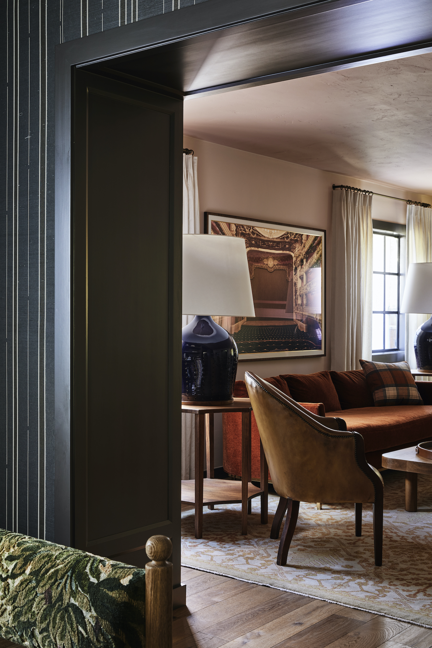
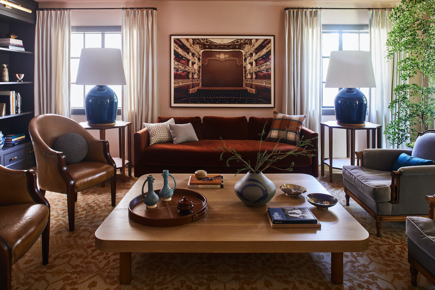
My favorite room is the Salon (also known as the living room). The clients wanted this room to be a place for gathering, for discourse and ideas, and for games with friends. The 17th & 18th-century French Salons came to mind while we were exploring how this room would be used, and the name stuck. We dubbed the living room the Salon throughout the process. The clients wanted the space to feel slightly more formal than some of the other areas of the home, but still comfortable and inviting. The dusty, pale pink walls have a slightly darker iteration on the ceiling. Paired with the rust mohair sofa, the room is bathed in this lovely soft light that is quite magical, especially when the fireplace is lit.
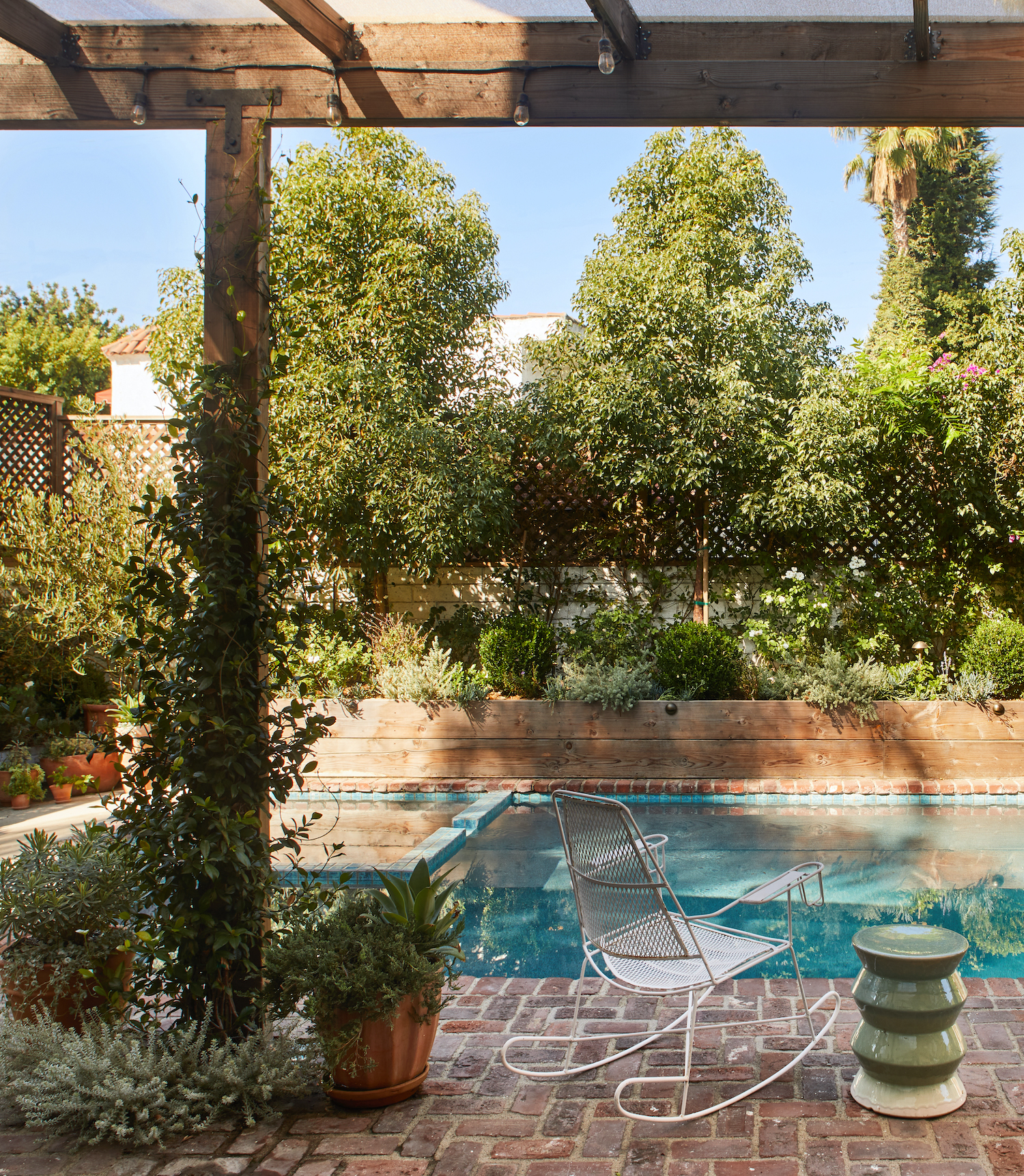
Like what you see? Take a peek at the talent behind the story… Interior Design: Stefani Stein · Photography: Sam Frost · Stylist: Lisa Rowe · Landscape Design: Wildflora Design Studio
