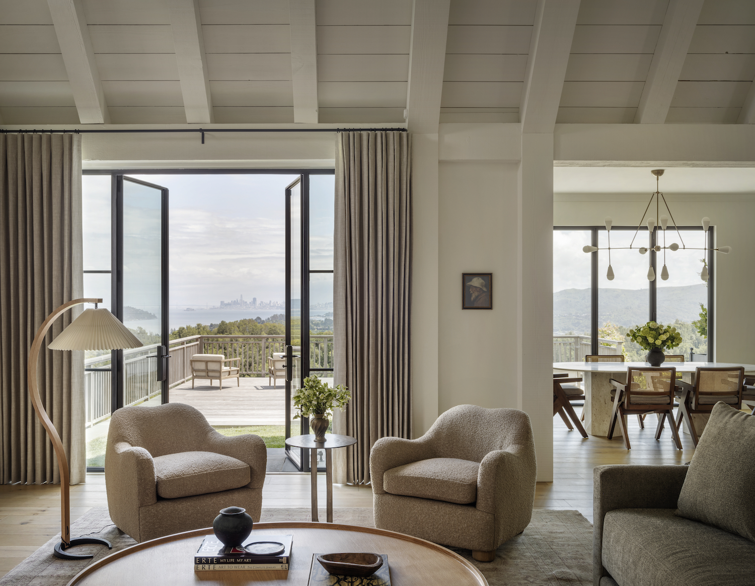
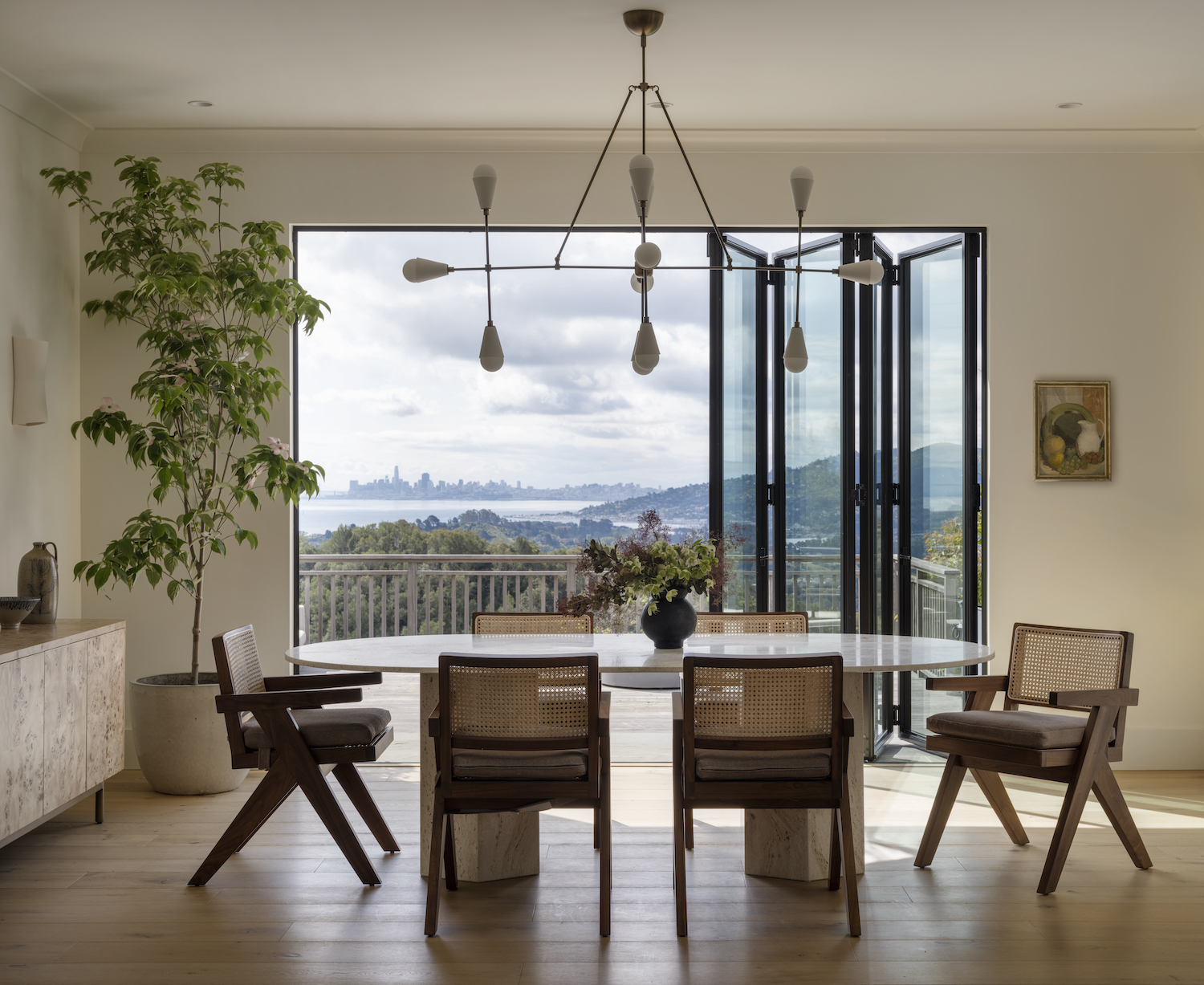
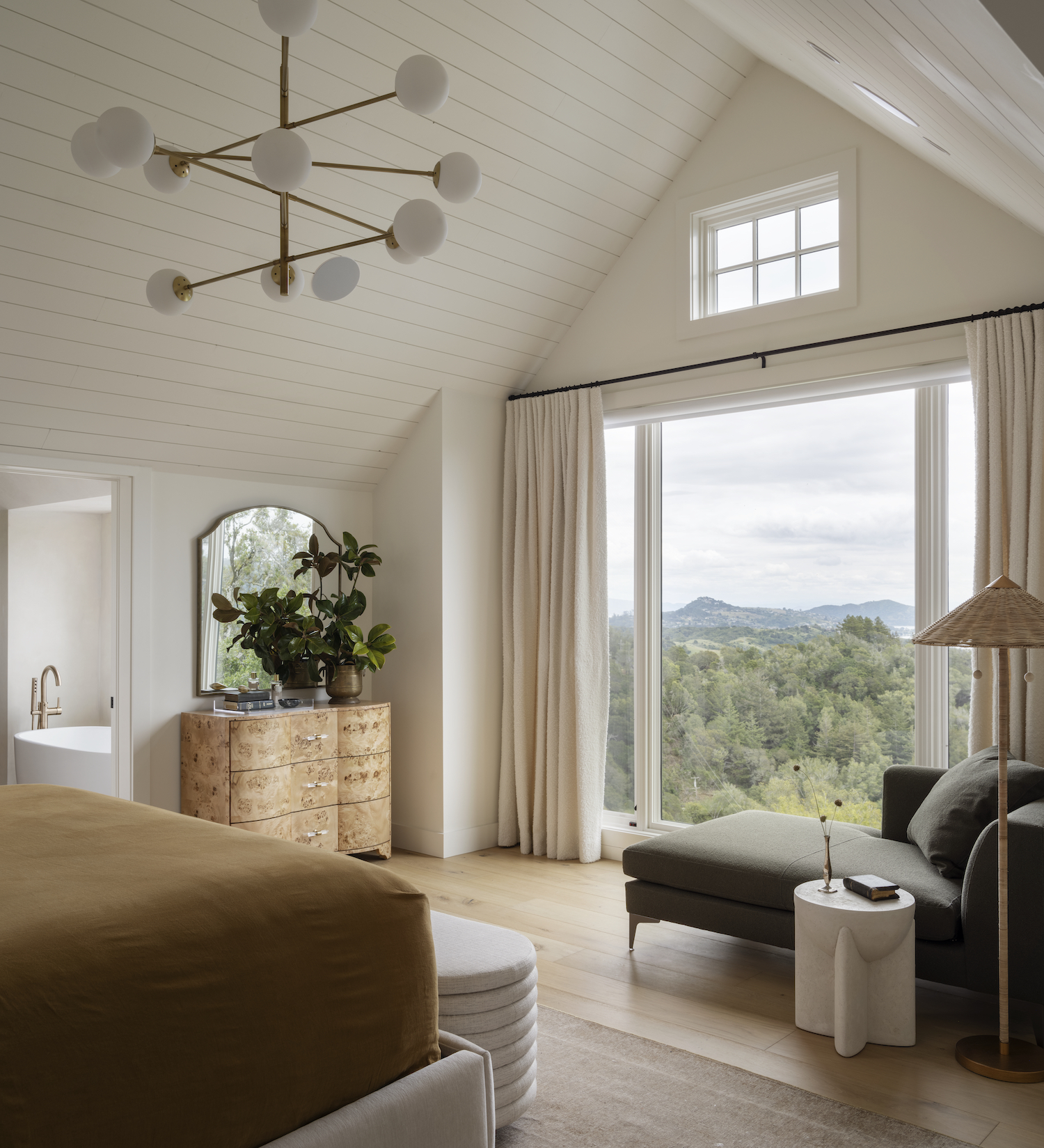
Corine Maggio Design reimagined this Mill Valley home, eschewing its Hampton’s vibe to embrace a more relaxed, vintage feeling. Corine’s minimalist approach, with neutral tones and fewer embellishments, brought a sense of calm to the space, allowing the picturesque views outside to truly shine. Discover the transformation in the tour below, shot by the incredible Aaron Leitz.
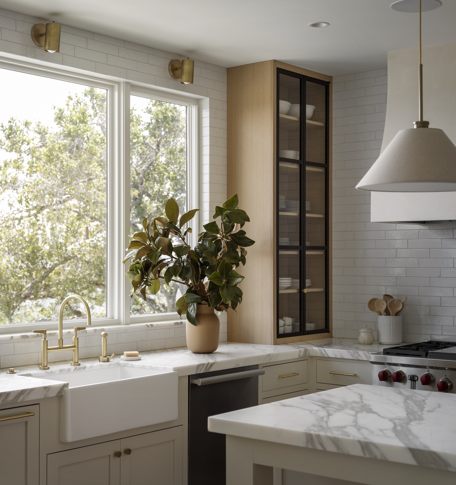
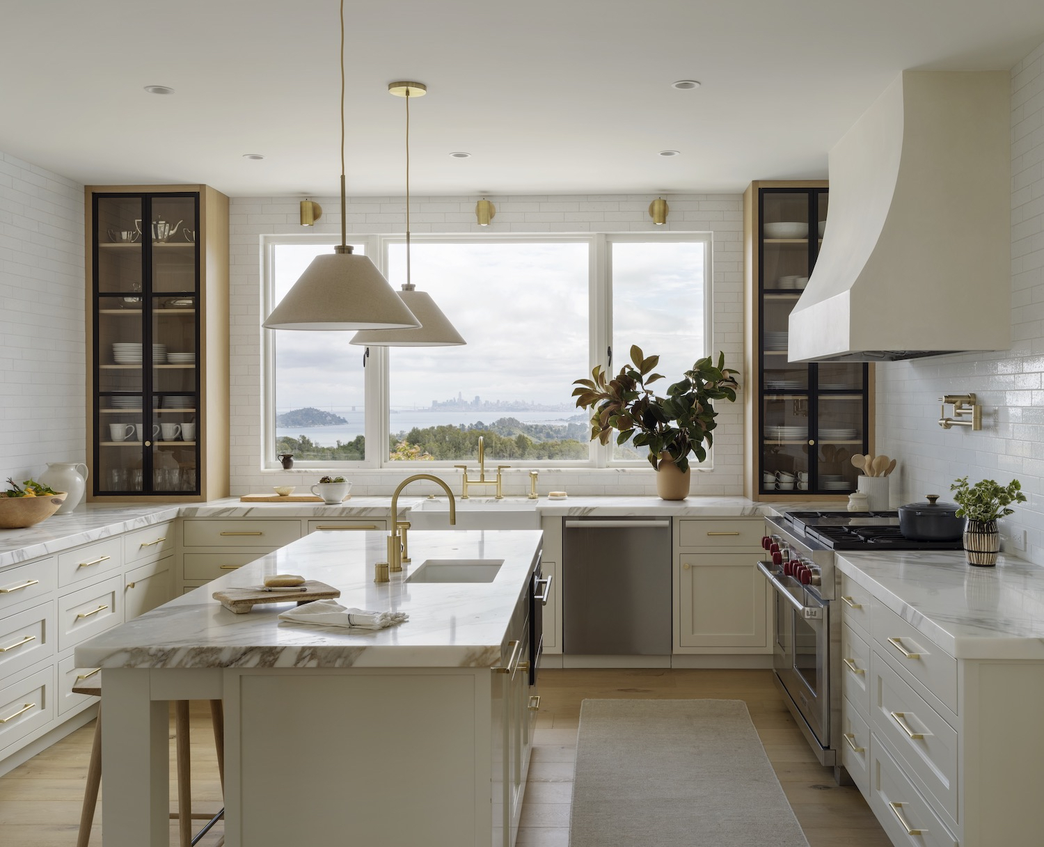
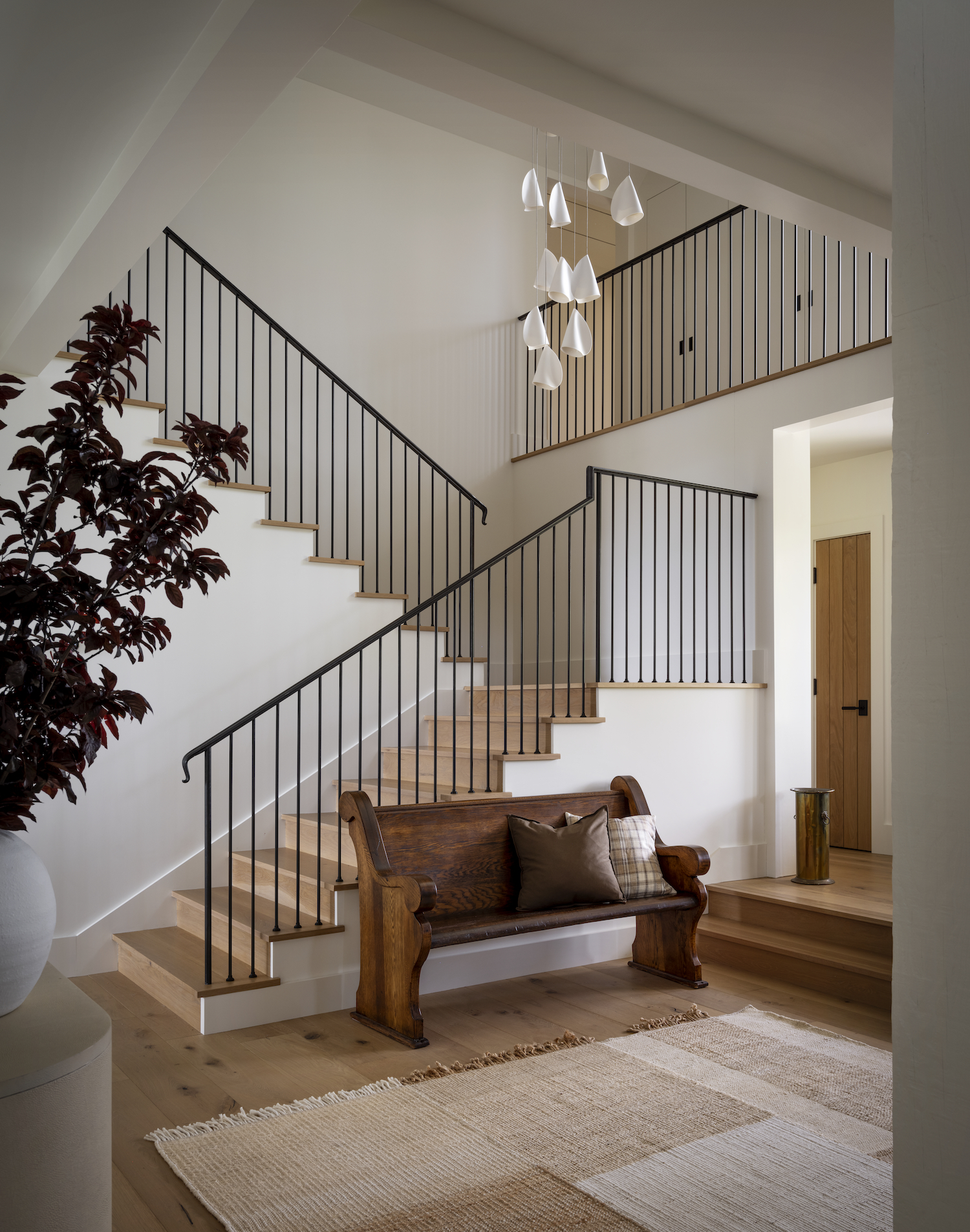
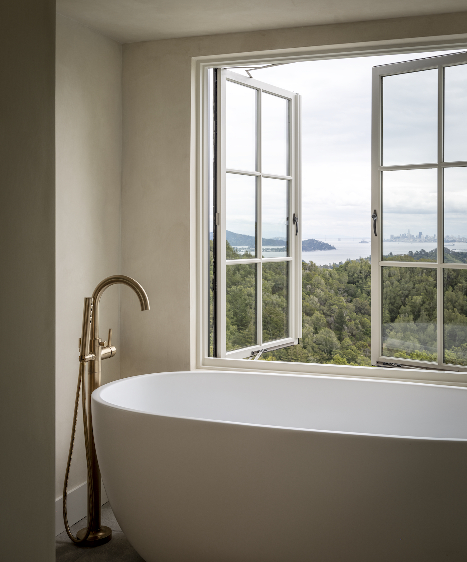
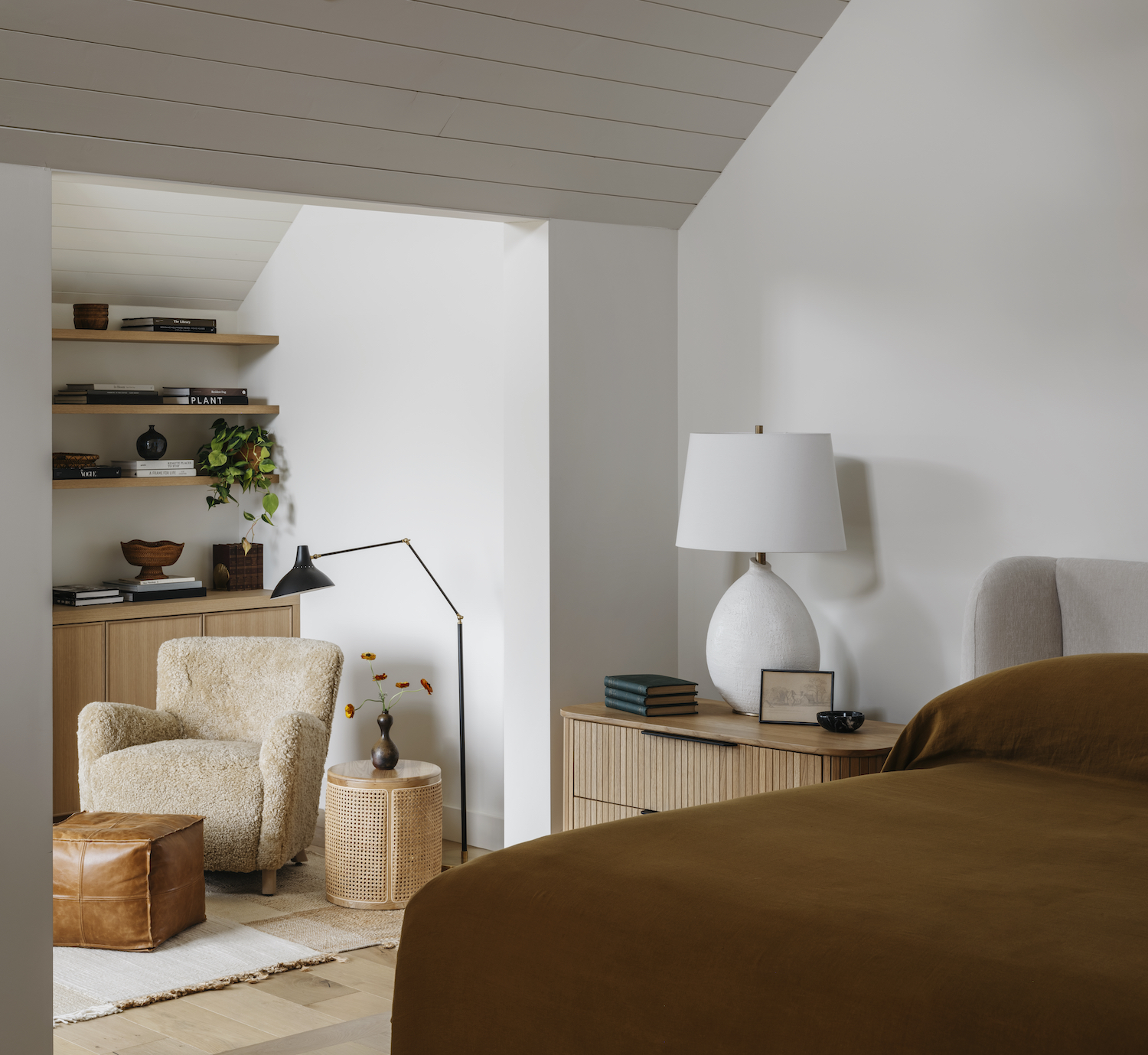
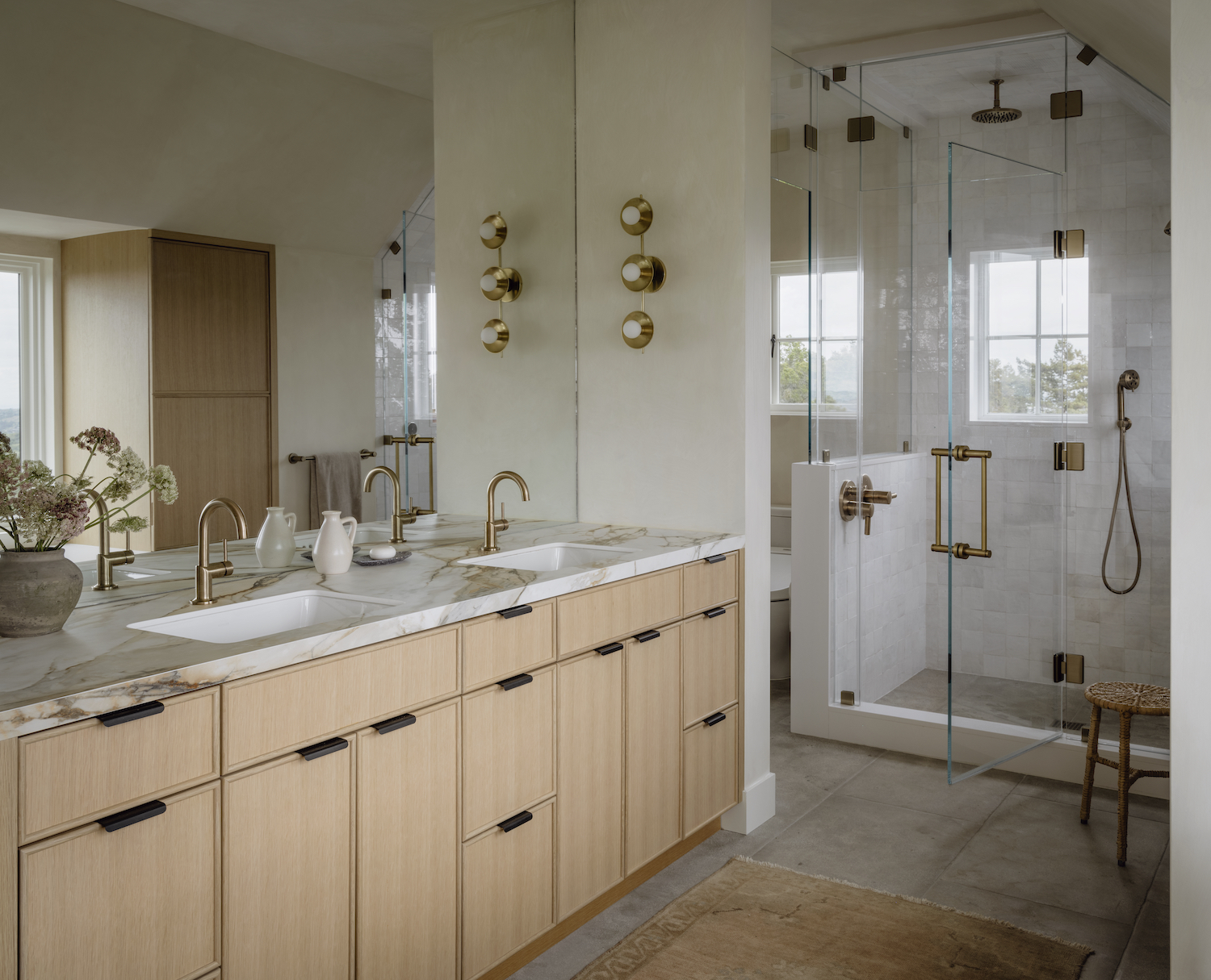
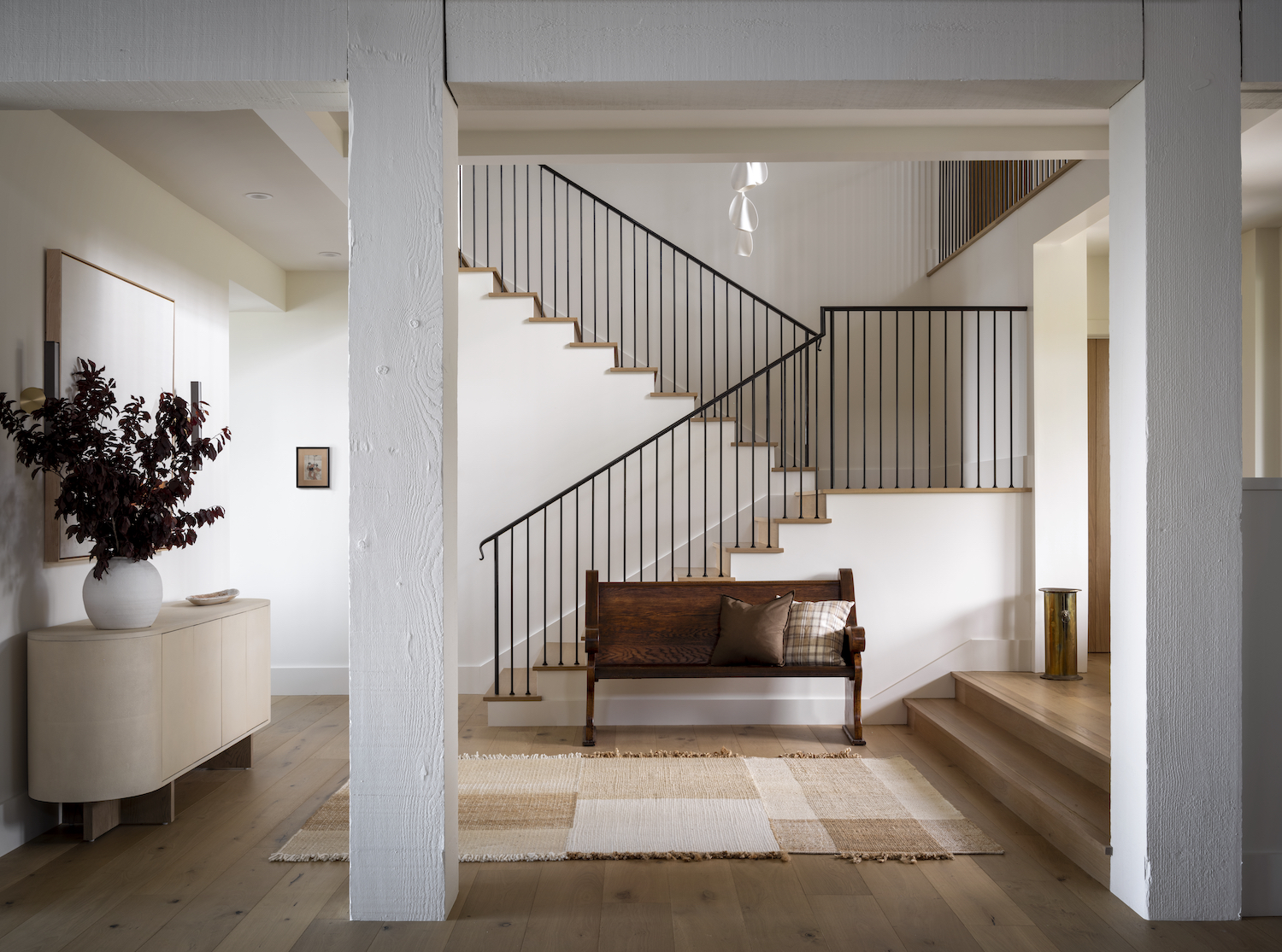
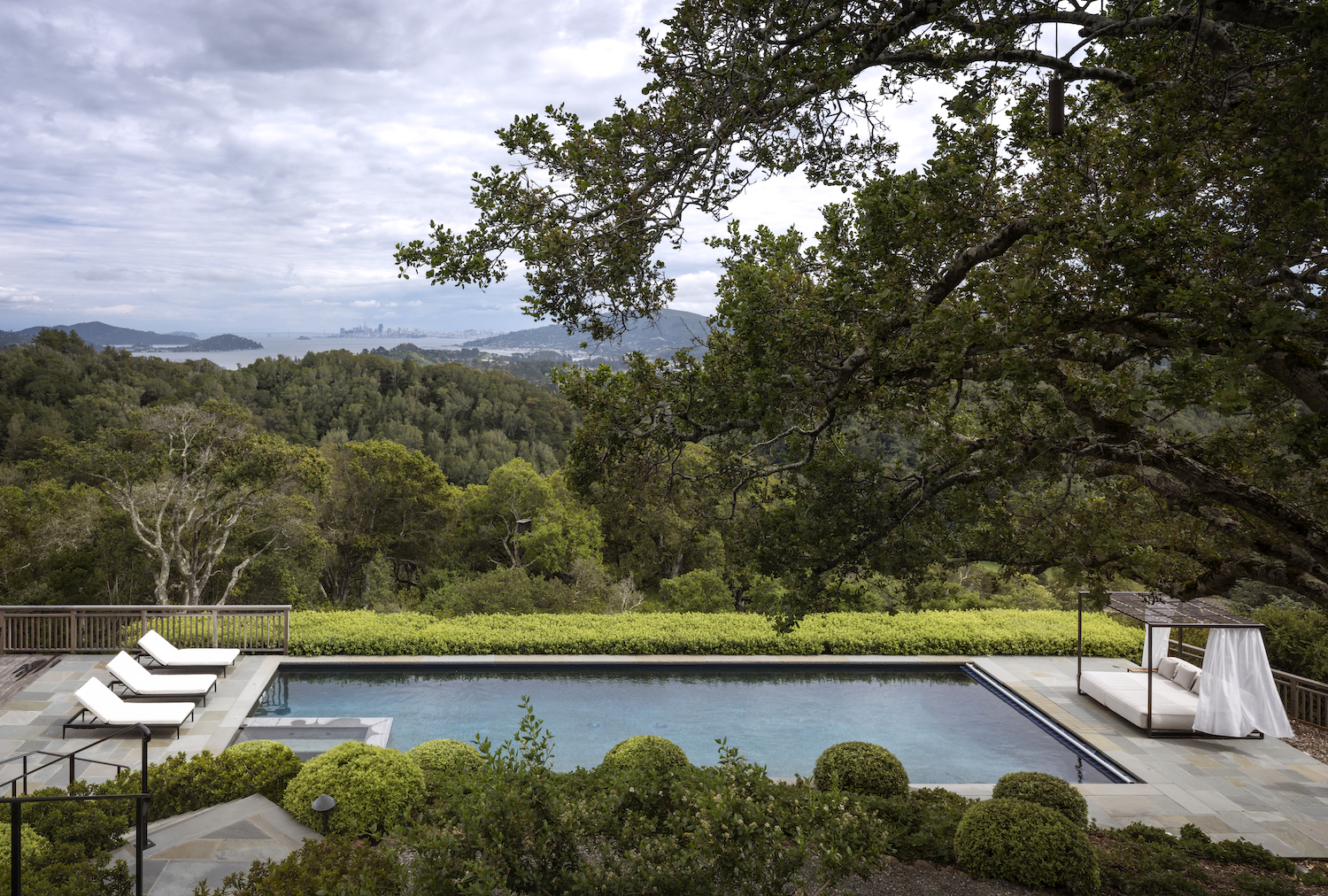
From Corine Maggio Design… This project was for a special client of ours that we had worked with before. The previous owners had given it a Hampton vibe, which was nice, but not my client’s style. We stripped down a lot of the decorative elements to give it a serene and peaceful vibe. The views are obviously incredible so we wanted to make sure the interiors didn’t distract too much from that. To accomplish these goals we used a lot of neutrals, textures, and natural materials. When bringing in color we kept to earth tones. We were careful and deliberate about contrast so that nothing would feel too heavy yet everything would feel dynamic. The client likes and appreciates antiques and vintage pieces so we were able to incorporate them throughout. I find that this adds an energy that is really difficult to recreate when everything is new.
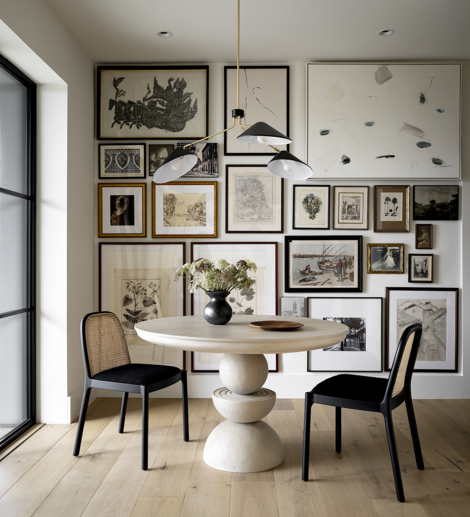
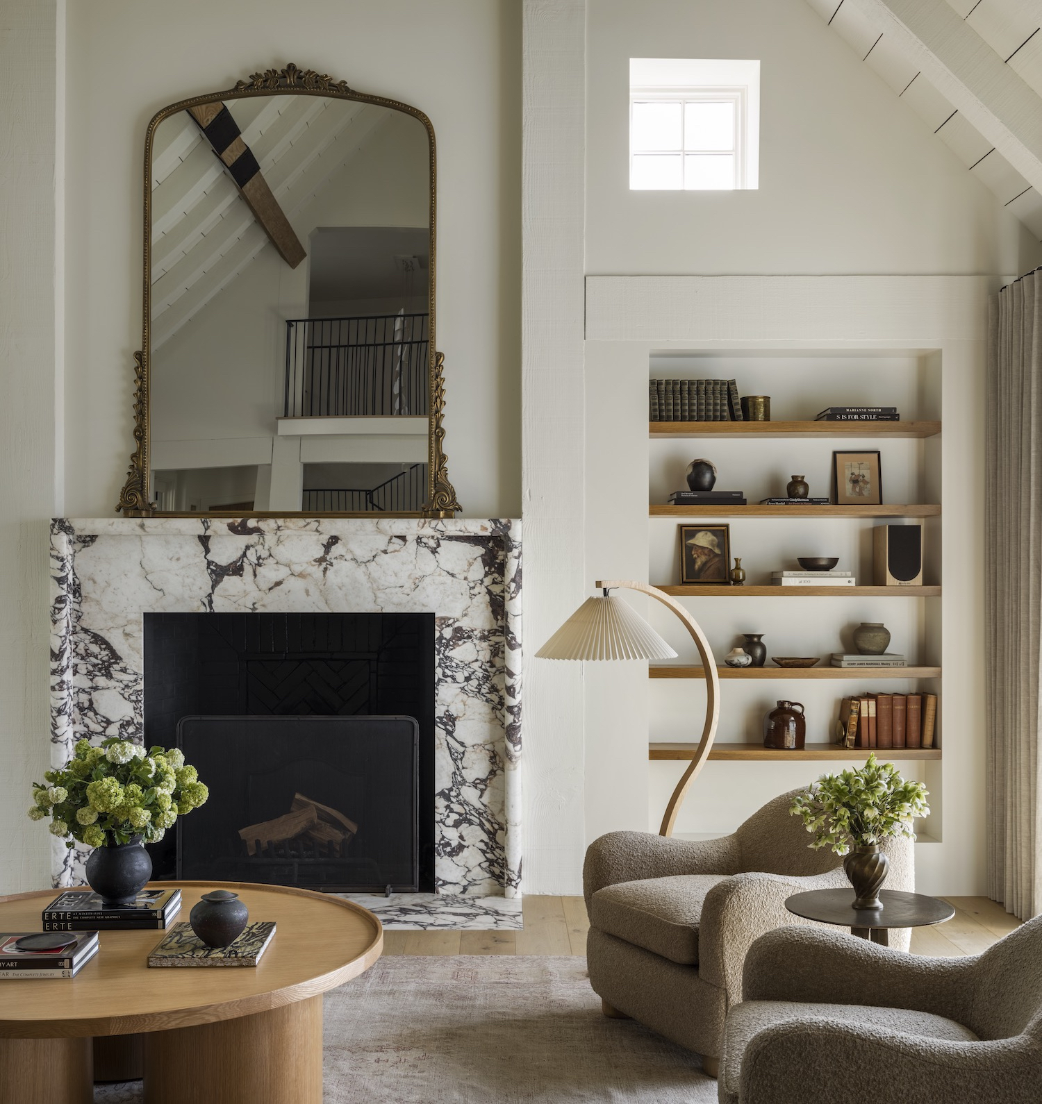
We had some show-stopping moments. The one that stands out to me the most is the breakfast nook. We created a gallery wall with pieces the client already had, old family photographs, and then filled in the gap with a few new paintings. One of the other more striking moments is the living room fireplace. The marble is so organic and the decorative floor length mirror sitting on top of it adds a grandness that was necessary given the scale of the room.
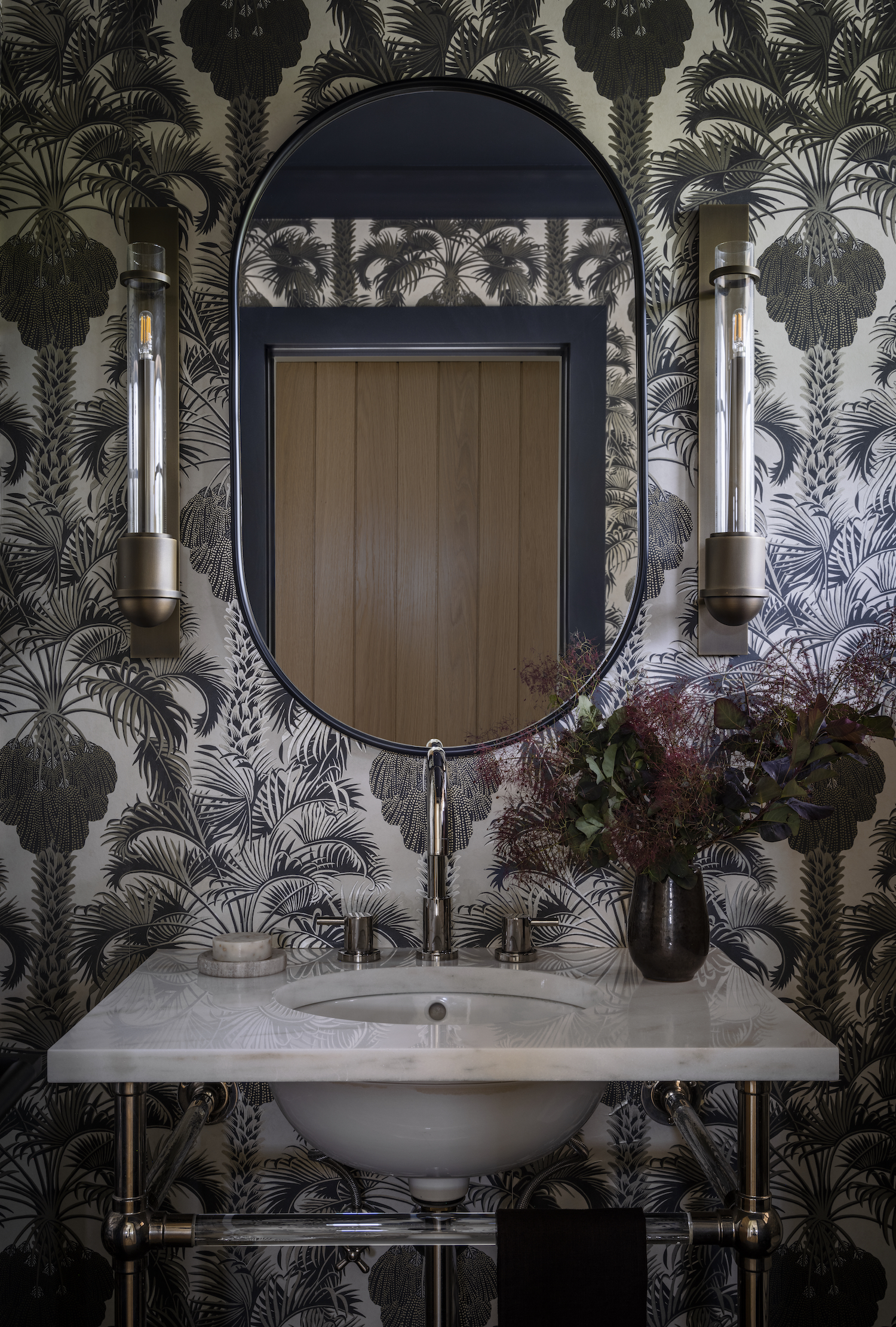
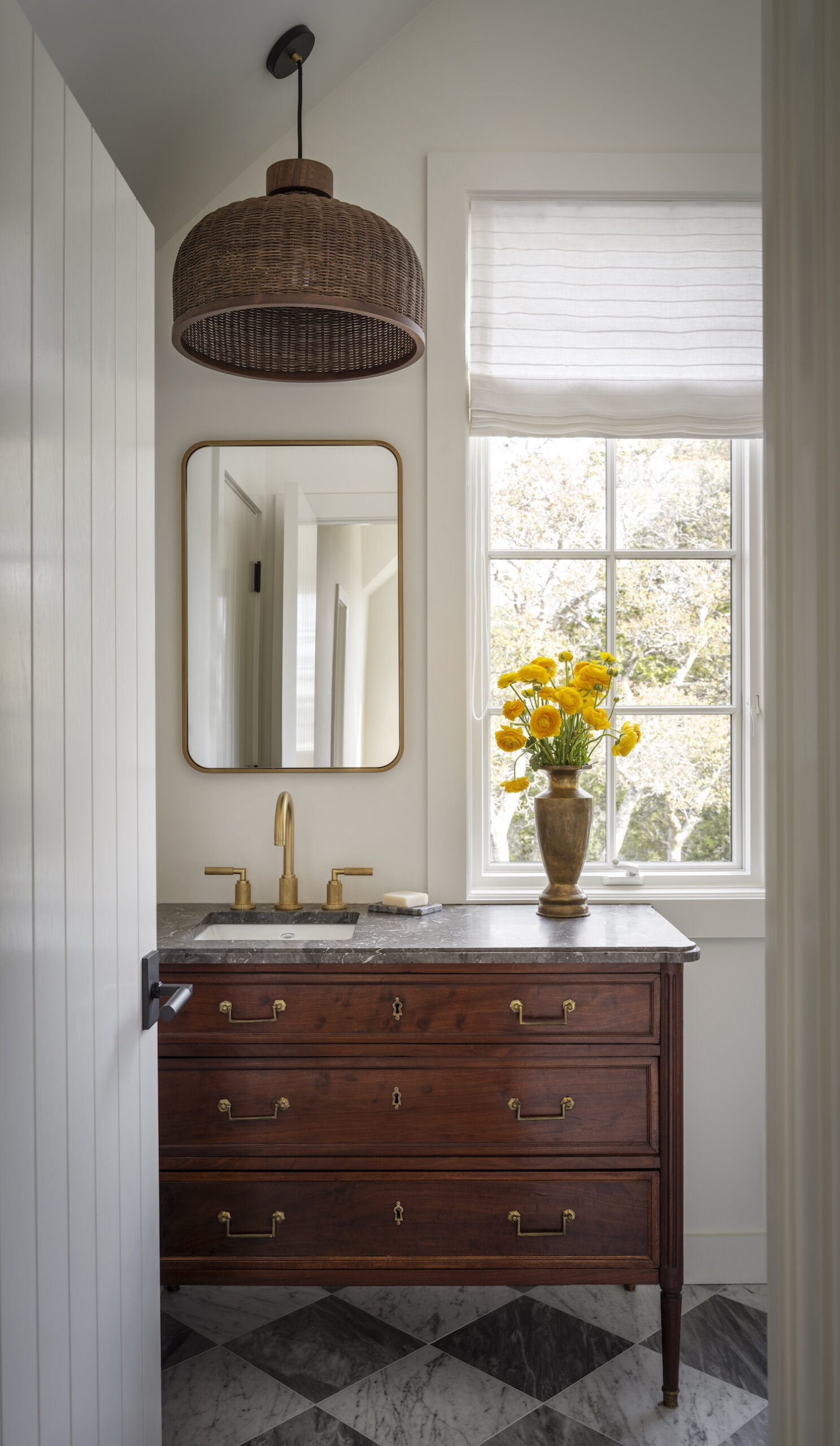
Perhaps my personal favorite is the guest bathroom. We found a gorgeous antique dresser with a black marble top which had been fabricated with a stunning edge detail and converted it into the vanity. Given the odd placement because of the window, we had to get creative with the mirror and lighting so we leaned into it and placed it all to the left side of the vanity along with the sink. The added benefit is that there is more usable counter space. It’s such a charming space that it might actually be my favorite bathroom we’ve ever done.
Like what you see? Take a peek at the talent behind the story… Interior Design: Corine Maggio Design · Photography: Aaron Leitz · Stylist: Yedda Morrison · Builder: Redhorse Constructors