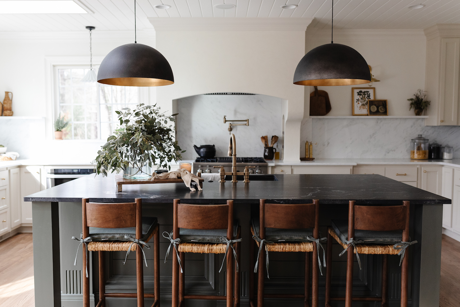
Bold, contrasting finishes paired with soft and creamy paint create a warm and lived-in ambiance that makes this kitchen an enchanting place to spend some time. Stevie Interiors focused on the functional use of the space during this redesign, so not only is this space beautiful, it’s completely practical. See how they pulled it all together in the charming tour below.

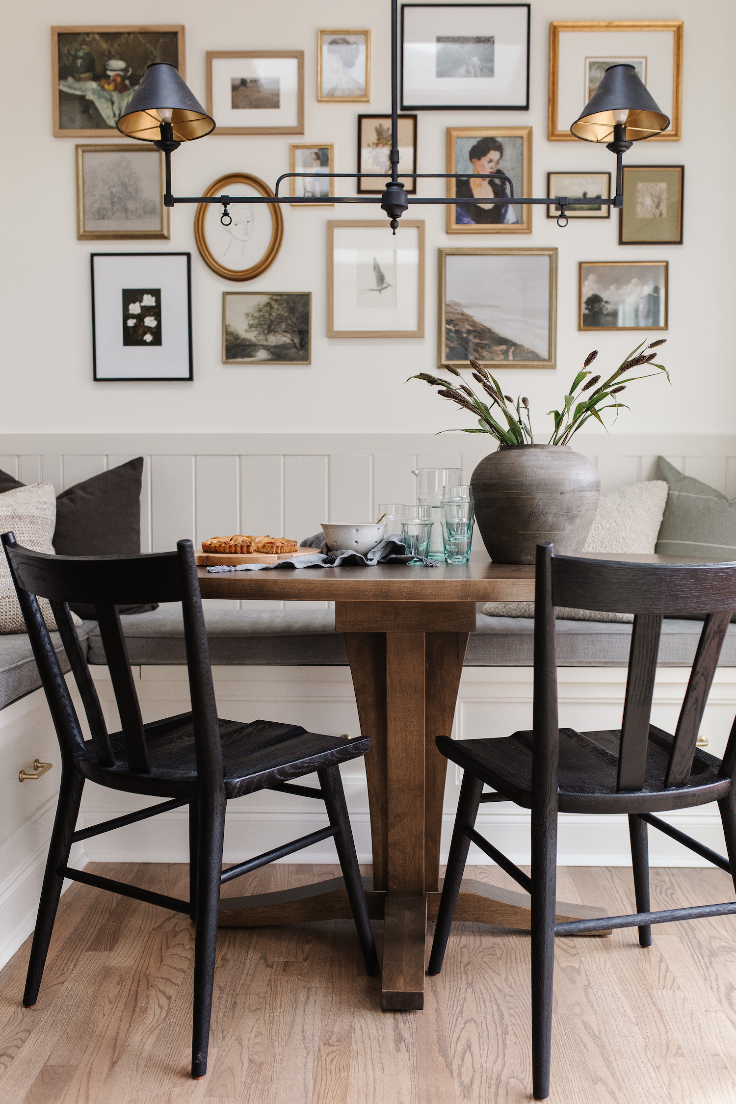
From the designer… The Colonnade home is a classic built in the early 2000s with great bones and a functional layout. The house had seen previous renovations but the style was dated. The kitchen, fireplace, and stairway in the heart of the home were the first priority to breathe new life into the home. By creating a large island and keeping a dedicated kitchen table space with an eat-in nook, we were able to add functionality and elevated coziness to the space.
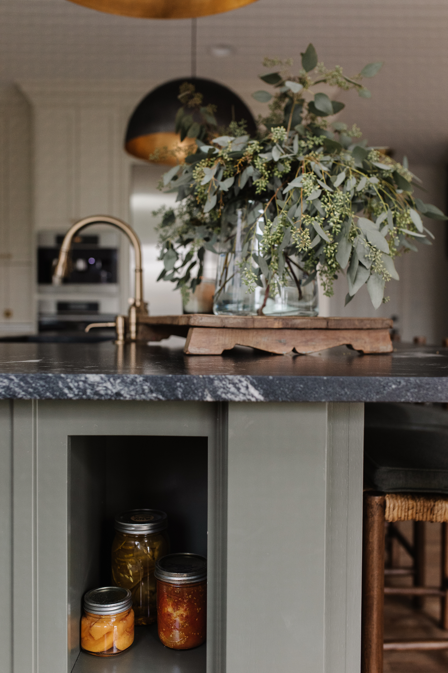
Like any design, we thought of the big picture for the space. For this particular project we focused on the functional arrangement and style of cabinets, accommodating a spacious pantry, and opening it up to the main living area. We then turned our attention to the design details like the mix of dark and light cabinet colors, countertop materials, and a combination of black and brass hardware finishes. The final piece was adding in all the found and vintage inspired decor and finishing touches.
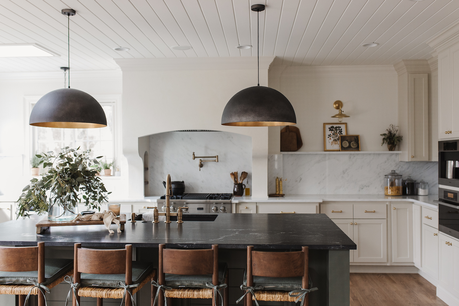
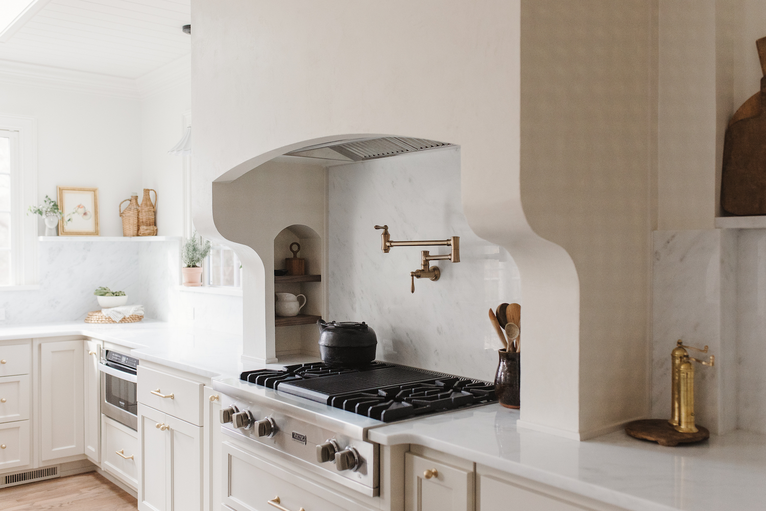

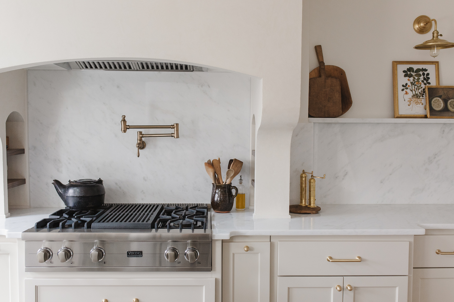
The key features of the kitchen that make it unique and custom are the skylights, all the natural light, vast hood, and dark island. The fine details of the ceiling, plaster finish on the hood, accent sconces, pendants, rich wood tones, and custom-built kitchen table make the space feel like a warm and welcoming home.

Like what you see? Take a peek at the talent behind the story… Interior Design: Aliesha Porto for Stevie Interiors · Photography: Elizabeth Lauren Granger