Abundant with texture and subtle pattern this nursery is a soothing place for both baby and parents. Giana Shorthouse, of Studio Giana, carefully blended two seemingly opposite styles to create this cozy, cohesive space. Photographer, Brittany Wages captured the sweet images below.
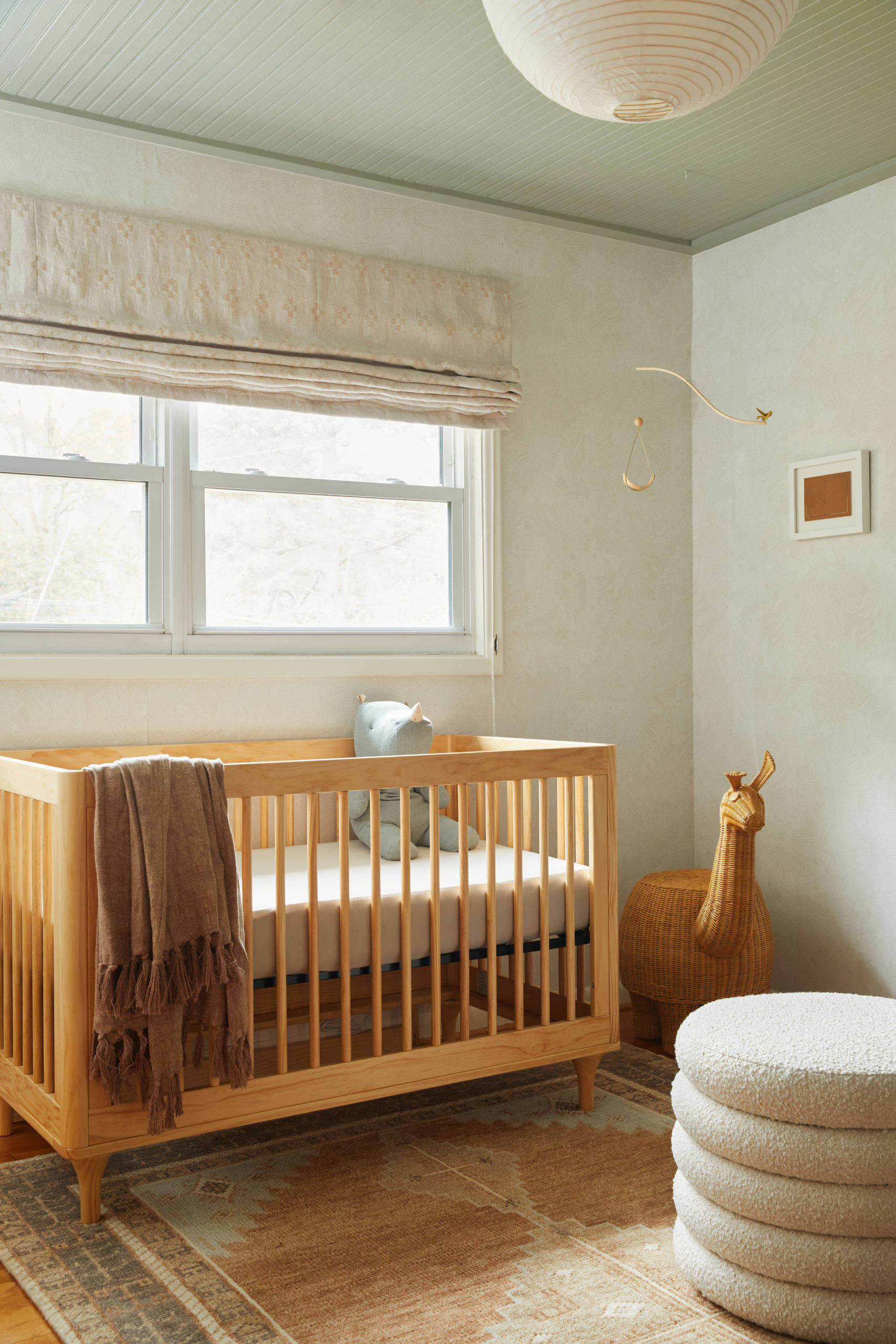
From the designer… This project was presented to us by a young couple with a background in two fascinating cultures that we blended together through a minimal and thoughtful design approach. The influence of the room was inspired by both of the homeowners’ deep-rooted appreciation of Southwestern design and their connection to their family in the Netherlands.
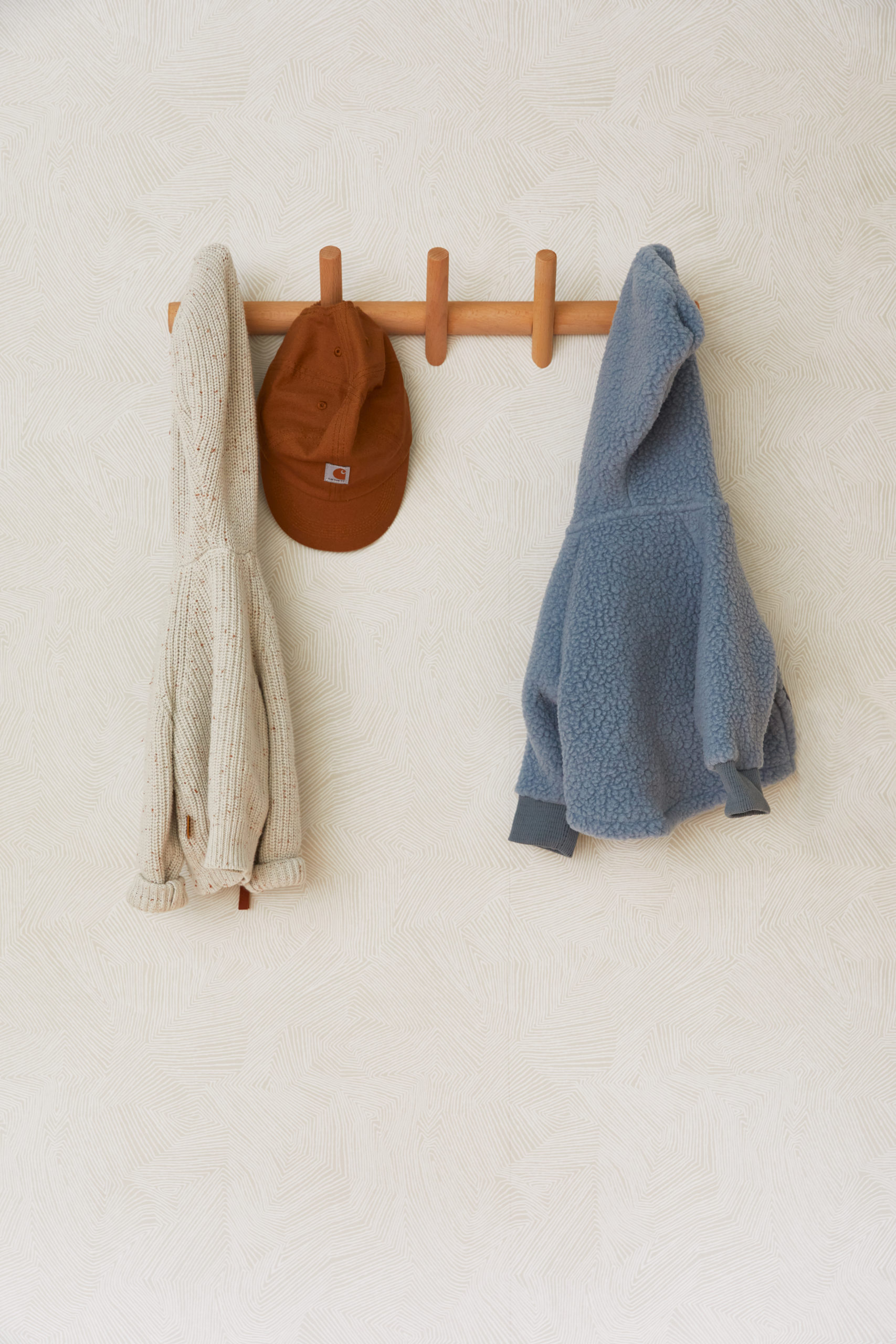
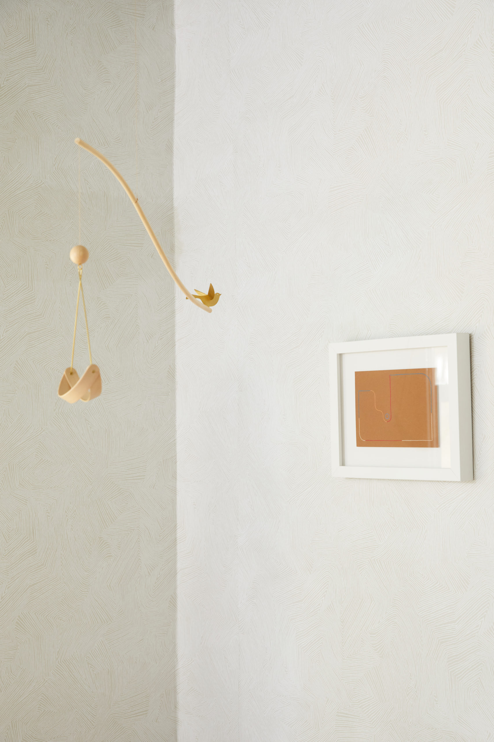
The subtle movement in the wallpaper, texture in the window treatments, and pattern in the rug, plus the overall color palette were chosen to mimic the colors and motifs that you’d find in the American desert, while the honest wood tones and the minimal silhouettes of the furniture were mindfully chosen to not overpower the overall feel of the room. Our ultimate goal was not to just provide a peaceful, neutral space for their newborn to grow into but was also equally important for it to feel comfortable and inspiring for the adults to spend time in.
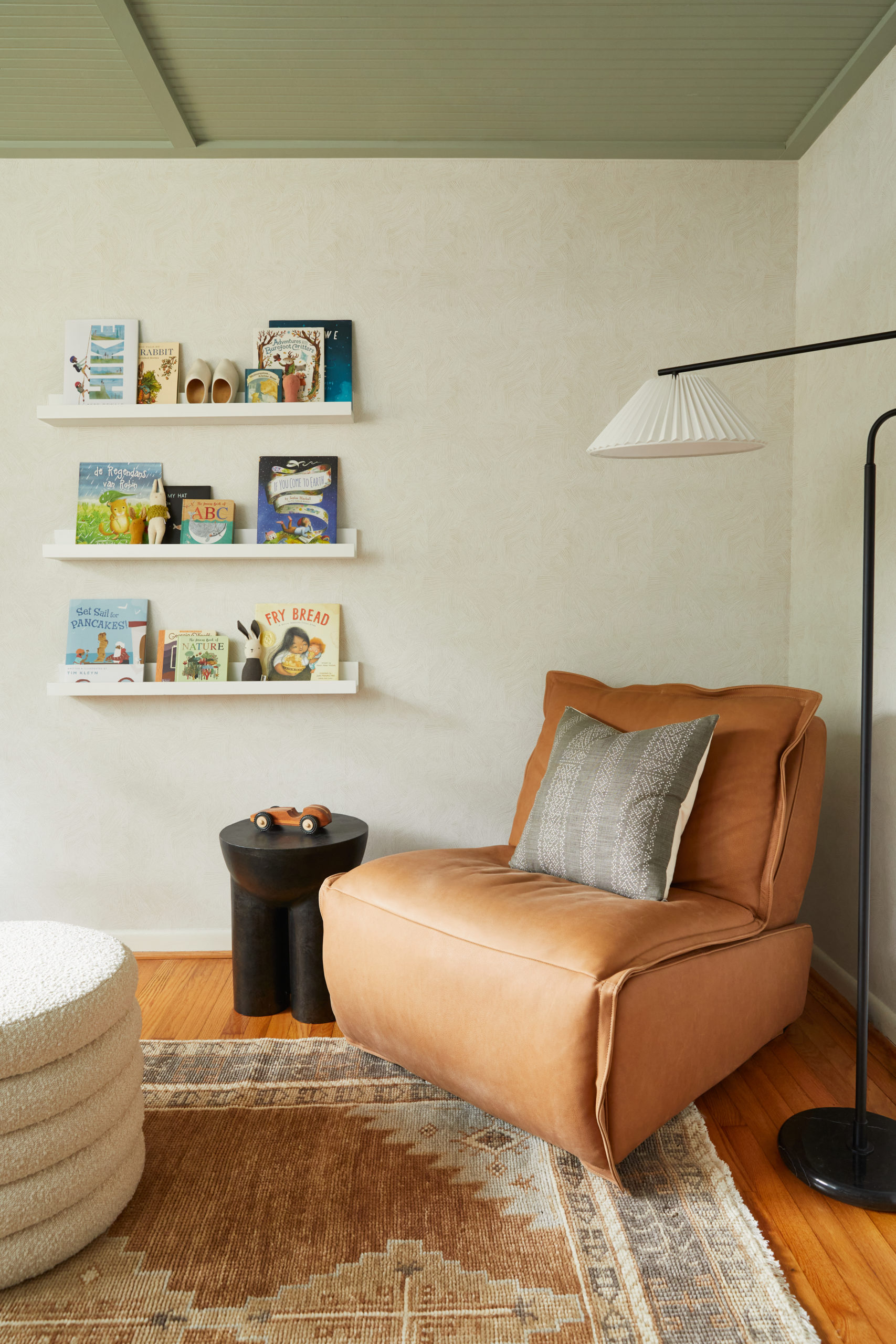
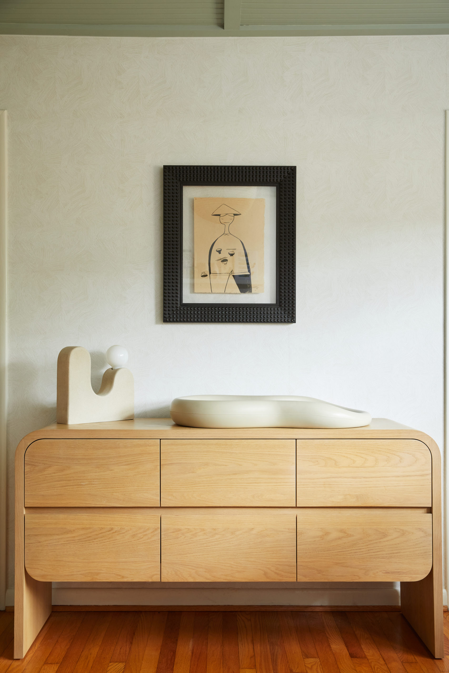
Our greatest challenge for the room was that our team was approached and brought on board just three months before the baby’s due date. It was a tight deadline, but we got it done, even with a few logistical challenges thrown our way, just in time for their newborn to arrive home. The other design-driven challenge was the short ceilings in this ranch-style home. Because the ceilings were low, just under nine feet, we opted for a ceiling treatment with a slightly darker color to give the illusion of a little more height to the room and to add interest to draw the eye up.
Like what you see? Take a peek at the talent behind the story… Interior Design & Styling: Giana Shorthouse of Studio Giana · Photography: Brittany Wages