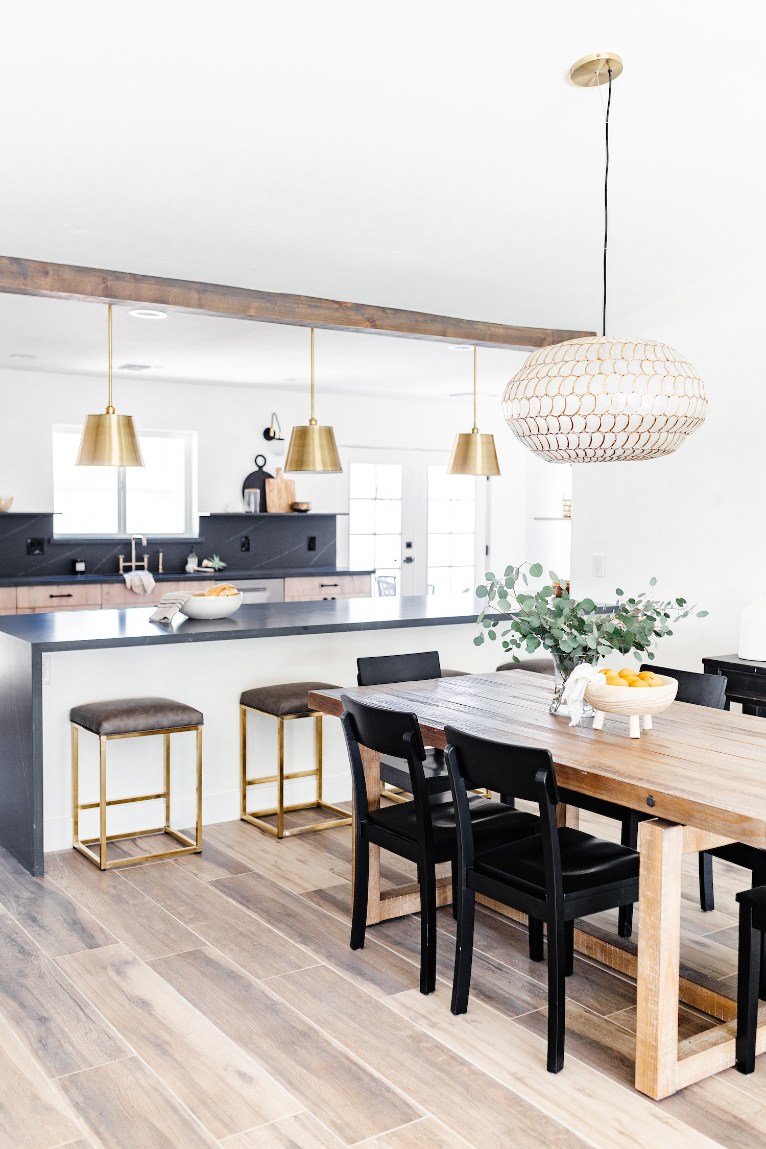
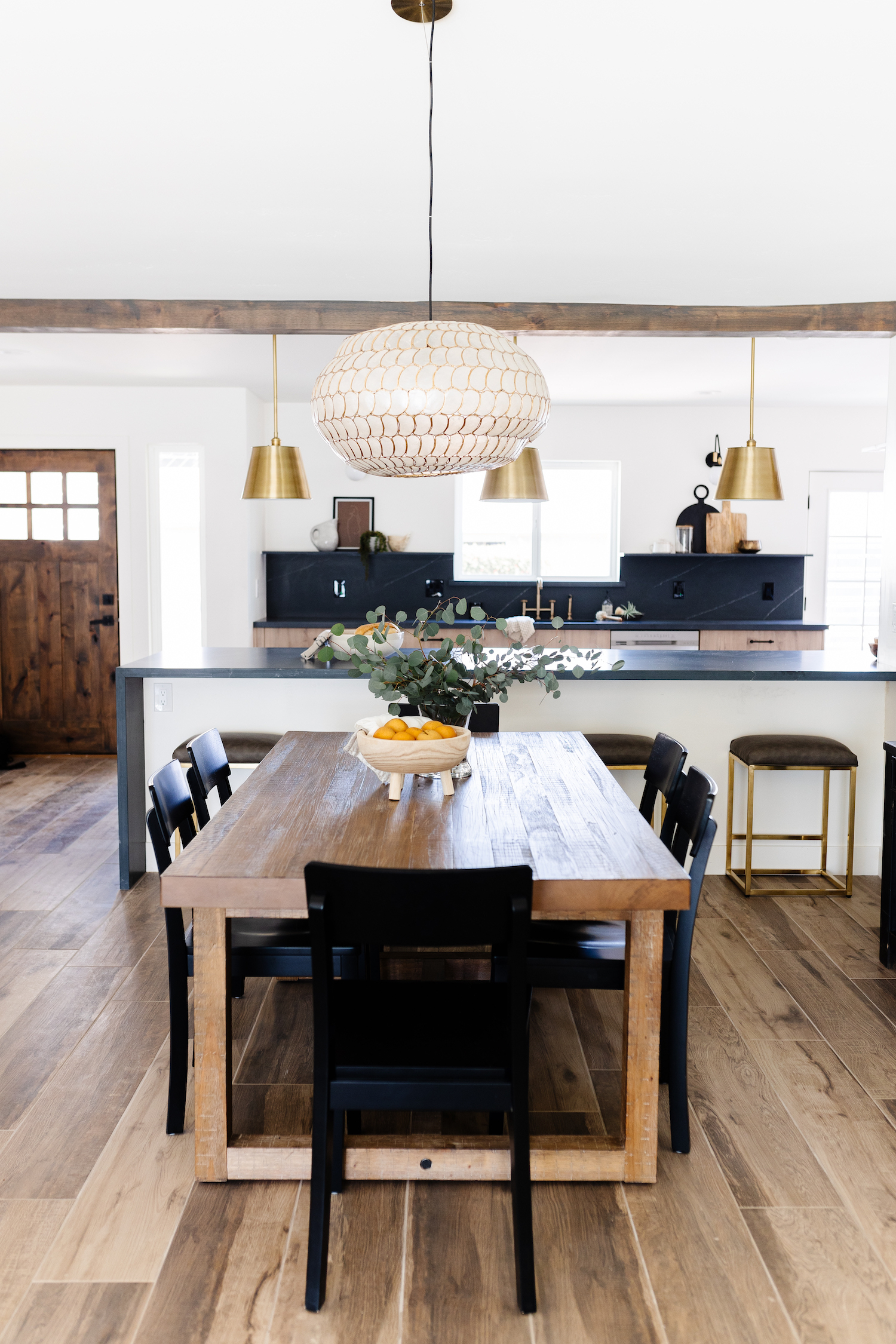
Being a designer and flipping homes seems like a career combination that would yield unlimited options. But when working within time and budget constraints, even designers can feel that work becomes humdrum. That’s not the case with this home, renovated by designer, Brittany Krupnik. She decided to have some fun with this flip and brought sleek modern cabinetry and moody quartz countertops to this transitional space. Photographer, Elizabeth Lawlor, captured the spectacular results of their hard work in the snaps below.
From the designer… This remodel is probably my favorite project that we’ve completed in the last few months. I get to design and stage a lot of fun projects flipping homes with my husband. Sometimes it feels like we get stuck doing the same thing due to budget and time constraints, but I knew that this location and price point allowed me the opportunity to have fun and take some risks in the design.
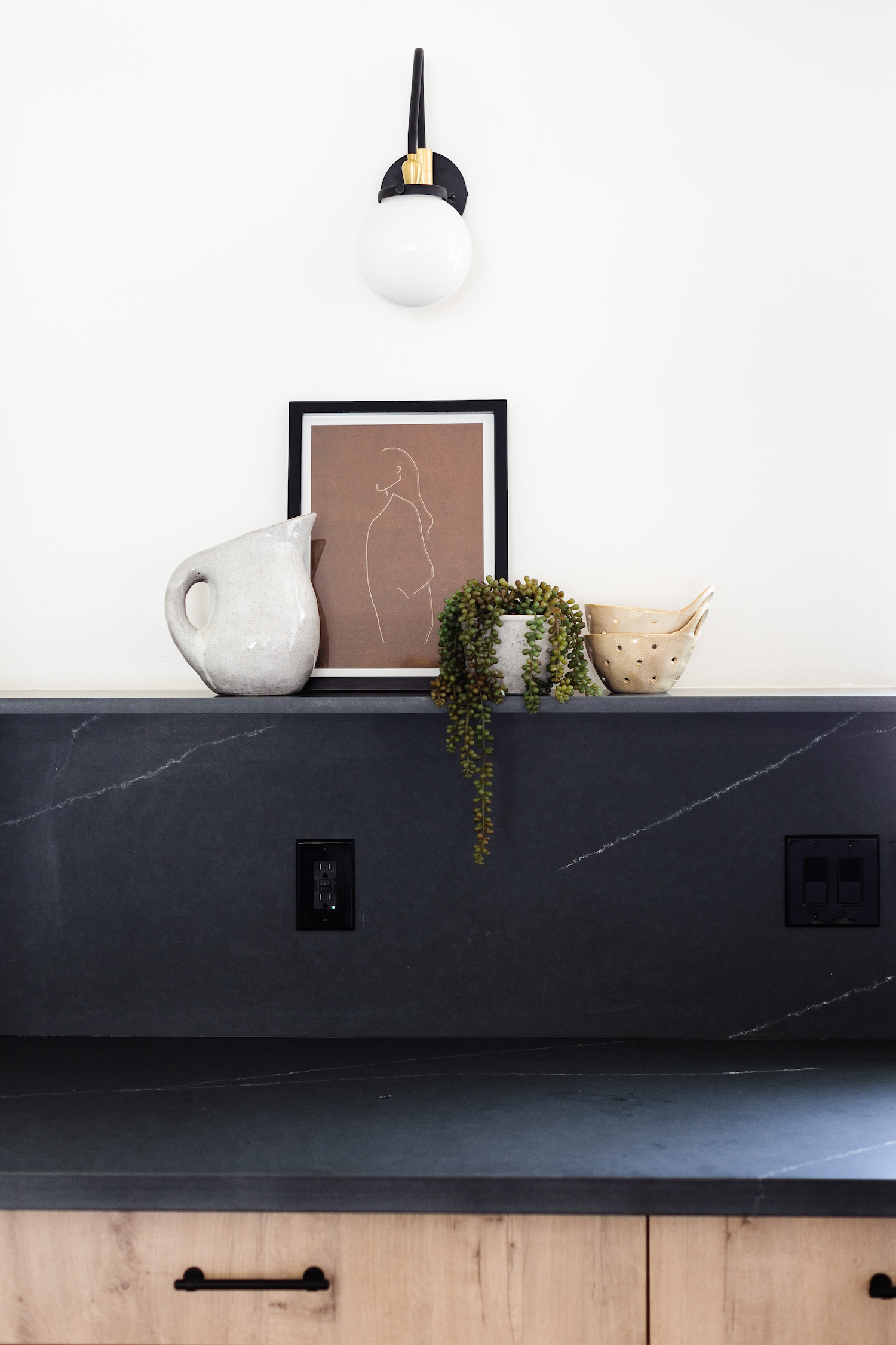
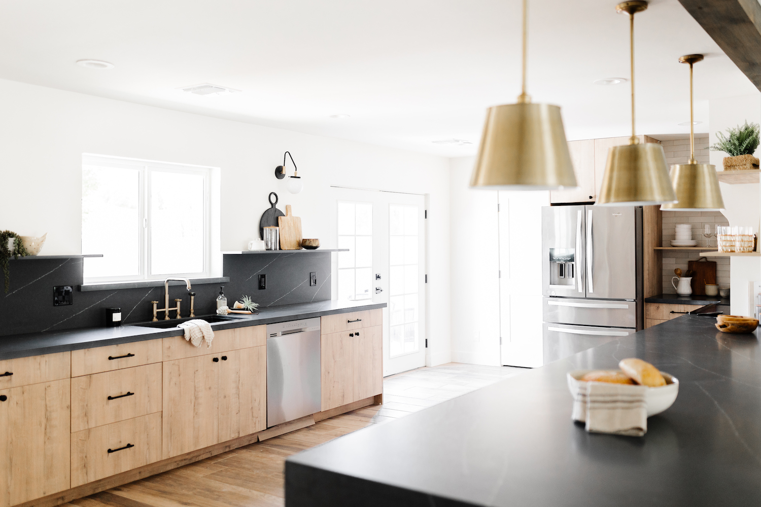
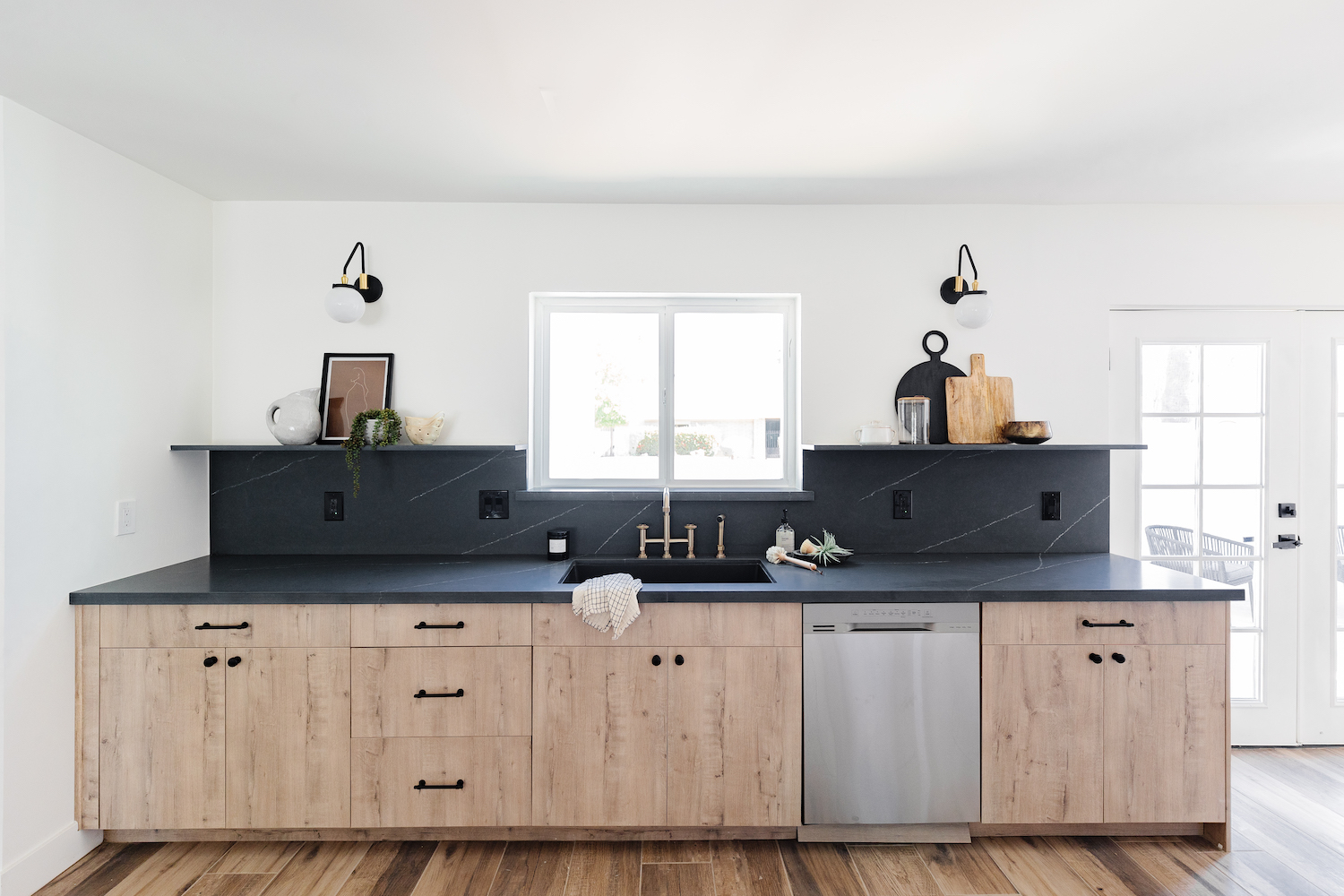
The kitchen had some floor plan limitations. We knocked out a pantry and took down walls to give us as much space as possible, but to get as much workable countertop space as we could, decided on doing a run under the window for the sink and then having a large peninsula that ran into the range. The kitchen now has a lot of great space and a lot of really fun design moments, like the quartz open shelves on either side of the sink, the alcove range hood, and the waterfall peninsula.
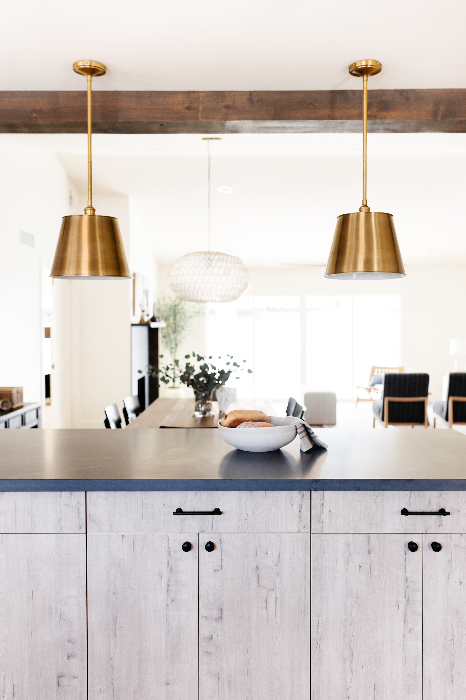
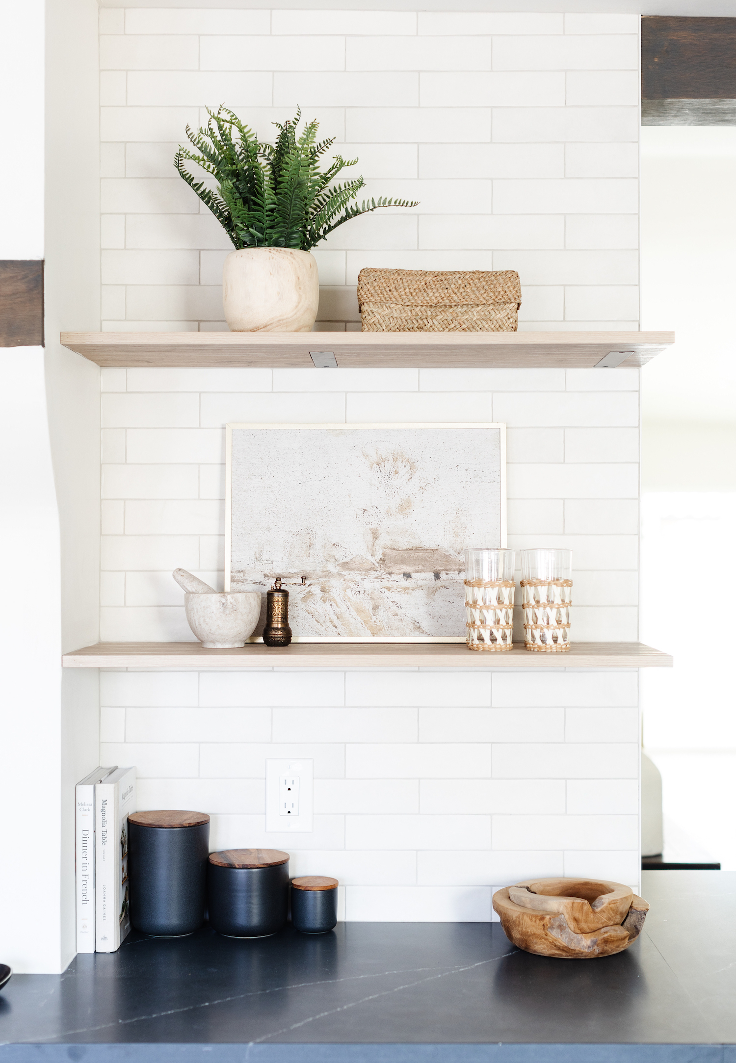
The kitchen was the jumping off point for the overall feeling that the rest of the house would have. I was excited to do something a little moodier and to mix more modern cabinetry with traditional elements. I really loved the color of these flat front Euro style cabinets and I wanted to choose a countertop that had a more traditional feel. I fell in love with this soapstone look quartz. I would have loved to use the real thing, but quartz is more in line with our budget and I chose to spend money on some other areas like lighting. I really love how the rest of the lighting in the kitchen and dining room has both modern and traditional elements and ties into the feeling I wanted the spaces to have.
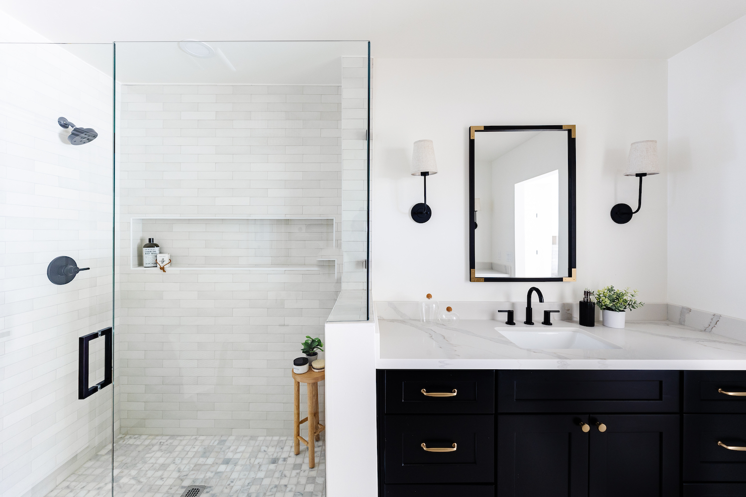
The primary bathroom was a mess when I first saw it. Wallpaper covered the walls and ceiling and it felt small and compartmentalized. We added a second vanity for a more functional space, filled in a sunken bathtub to create a beautiful shower, and added a freestanding bathtub. I love the black cabinetry against the natural looking stone floor. It feels light and bright in there but has some really great contrast as well.
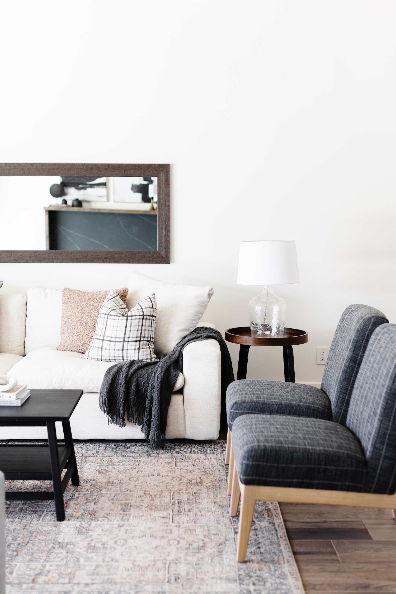
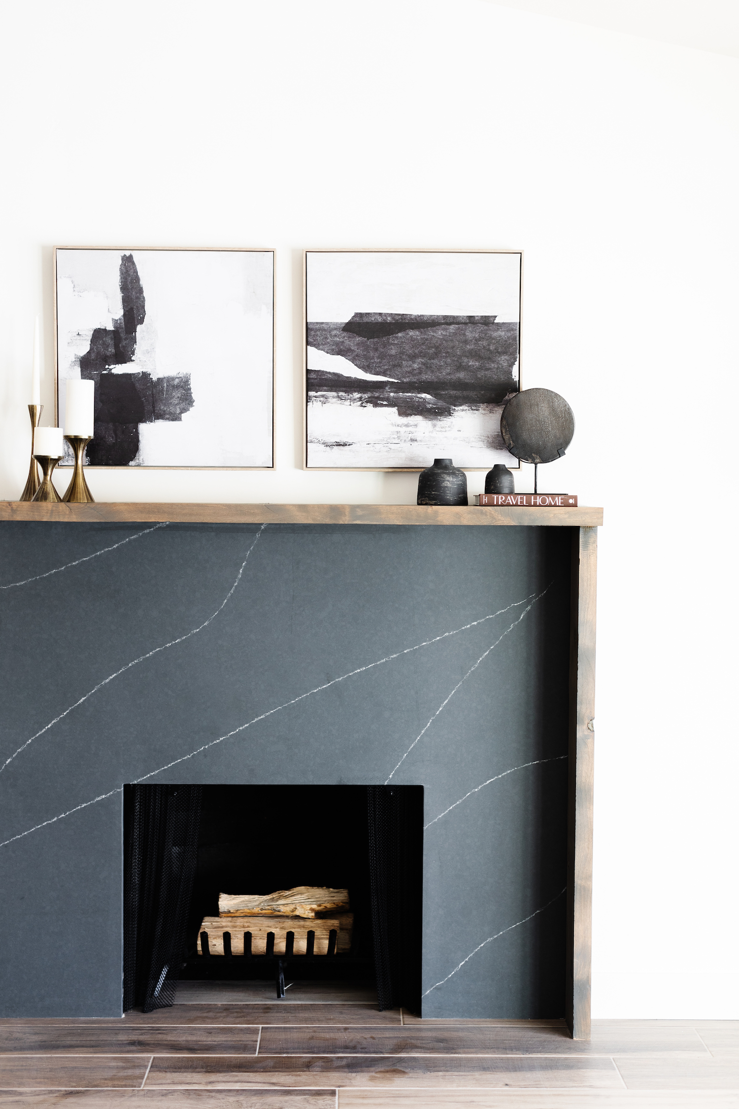
Staging really came into play in the living and dining rooms. The living room had the fireplace with the quartz surround and the asymmetrical wood mantle, which I really loved designing, but the space was large and it was about creating a cozy seating area that filled out the space. I love using a lot of layers and texture to create a collected and lived-in feeling. I think that makes a difference in how the potential buyers feel when they are in the space. In the dining room, we kept it simple with a pretty wood table and black chairs and added a console table, which is perfect for entertaining. The rest of the styling in the other spaces was kept pretty and functional.
Like what you see? Take a peek at the talent behind the story… Interior Design: Brittany Krupnik · Photography: Elizabeth Lawlor · Staging: Blissful Design Studio
