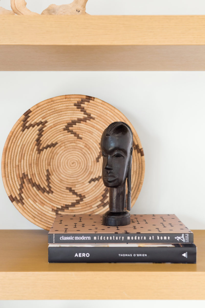
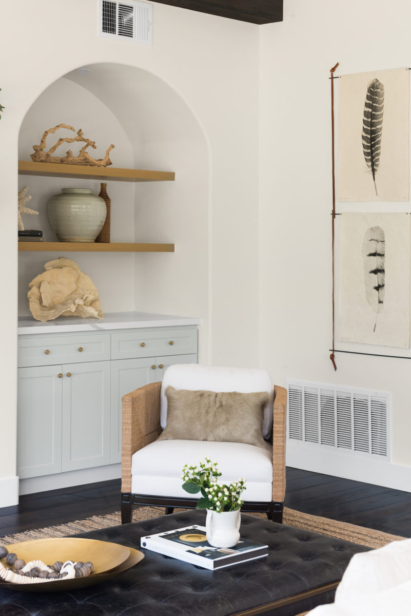
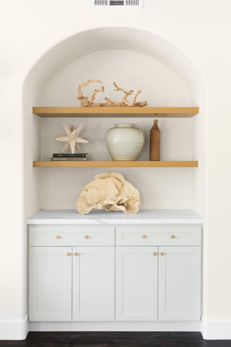
My favorite home tours aren’t the ones that have one exclusive style, but those that blend various styles for a truly distinct look—one that makes a home irreplicable. That’s just the kind of home that Melissa Marie Interiors is delivering to us today. It’s modern yet rustic, Spanish yet Cali and I have a feeling you’ll be saving at least a few of Michael Radford‘s images to your home Pinterest board—it’s that good.
Tell us about your journey to becoming an interior designer.
I was interested in design as a kid but pursued art rather than design once I went to college at San Diego State. Then one day my dad asked, as all good dads do, “You’re an artist… how will you make a living?” That conversation spurred me to consider my goals with art, and I decided to go into interior design. I graduated from the program in 2010, moved east, and got a job in the design industry in Virginia. Then I jumped back across the country and landed in Redding, CA. I mainly worked with spacial layouts, until my boss encouraged me to start my own business on the side doing remodels. This was the catalyst that took me to the next level in my career and led to a move to Orange County. My ex-husband had become a project manager, and we started working together on a few huge remodels.
I fell in love with full remodels, especially projects where we go down to the studs. It’s exciting to see a total transformation like that, and it’s the type of project that currently brings me the most joy.
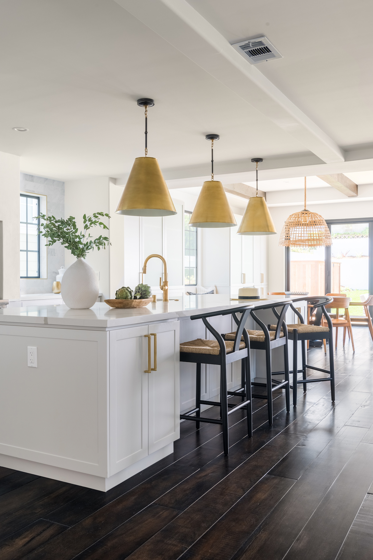
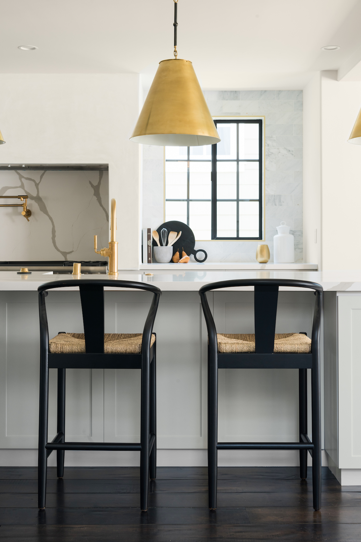
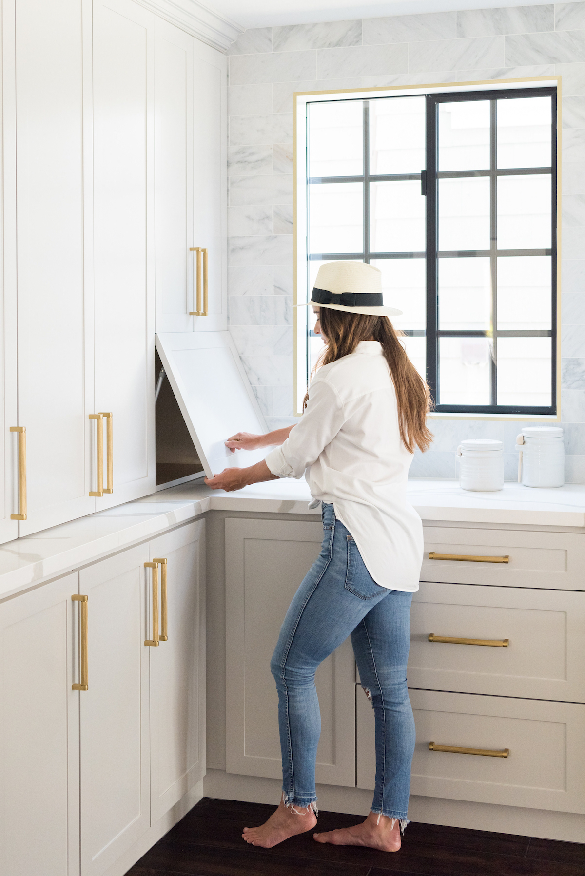
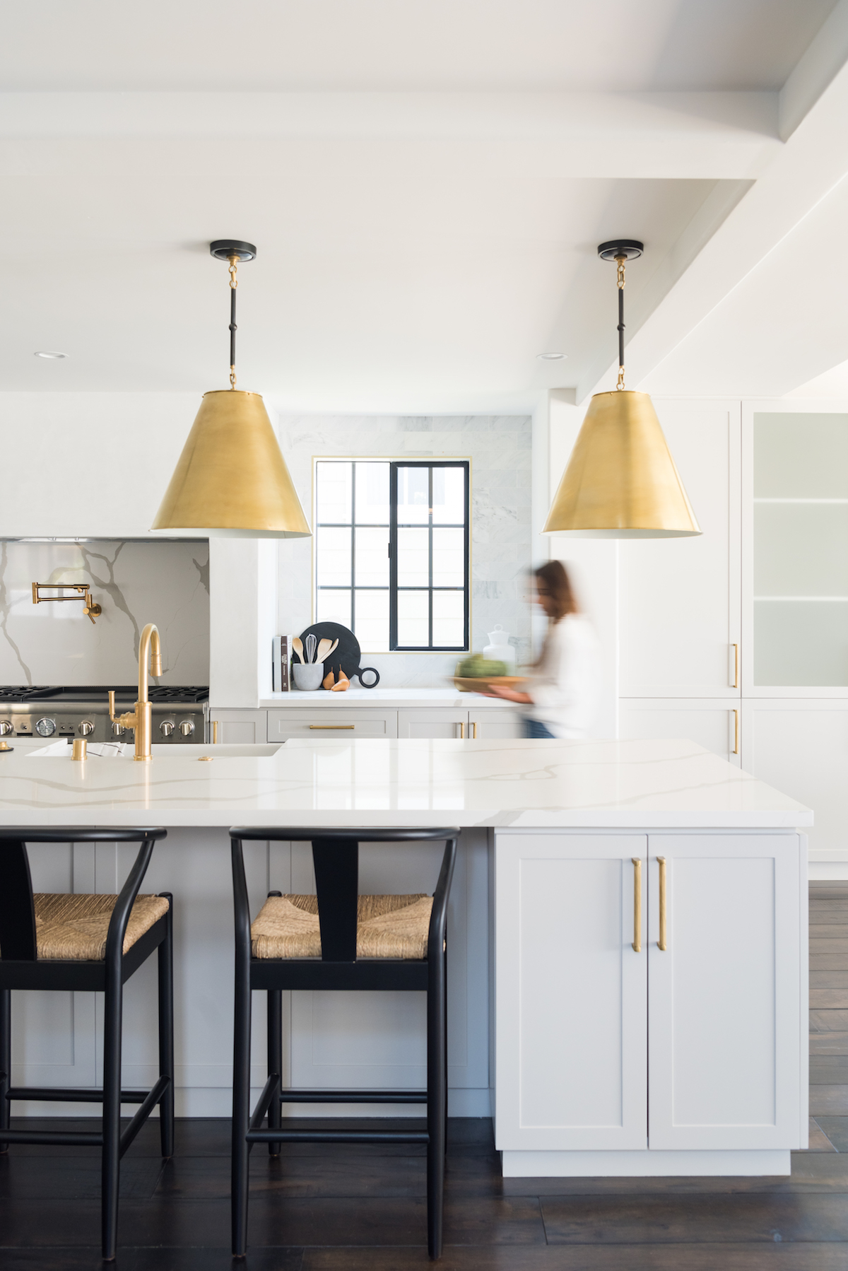
Tell us about the inspiration behind the design? How would you describe the style?
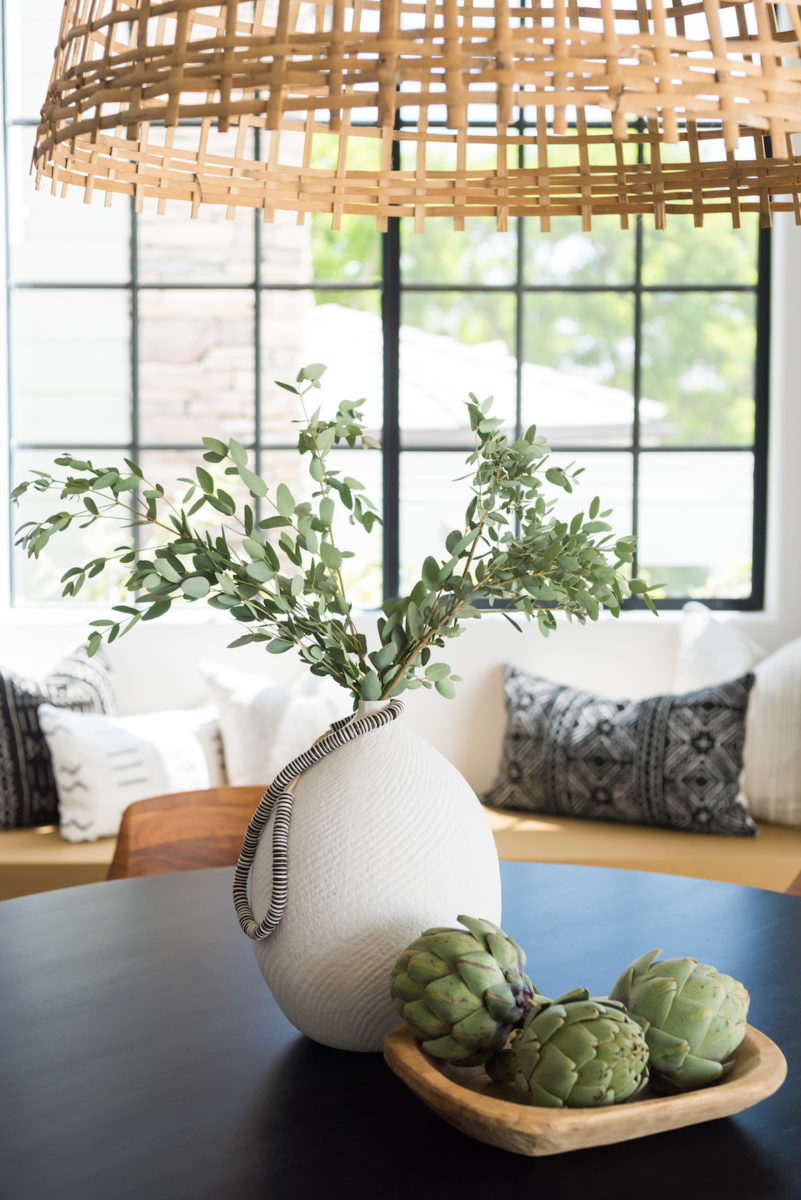
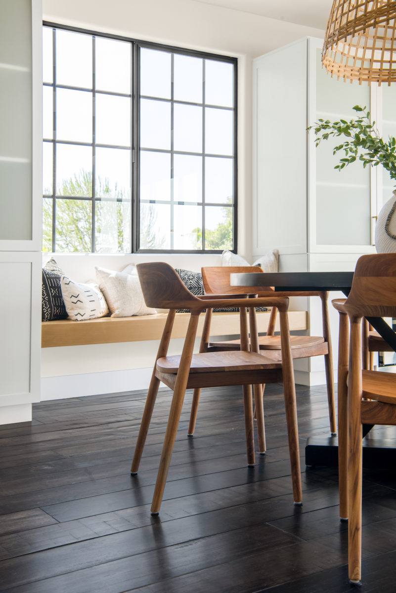
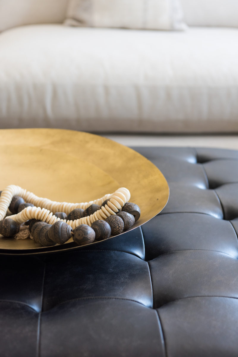
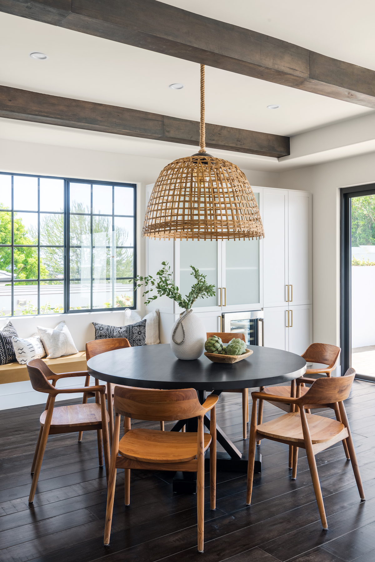
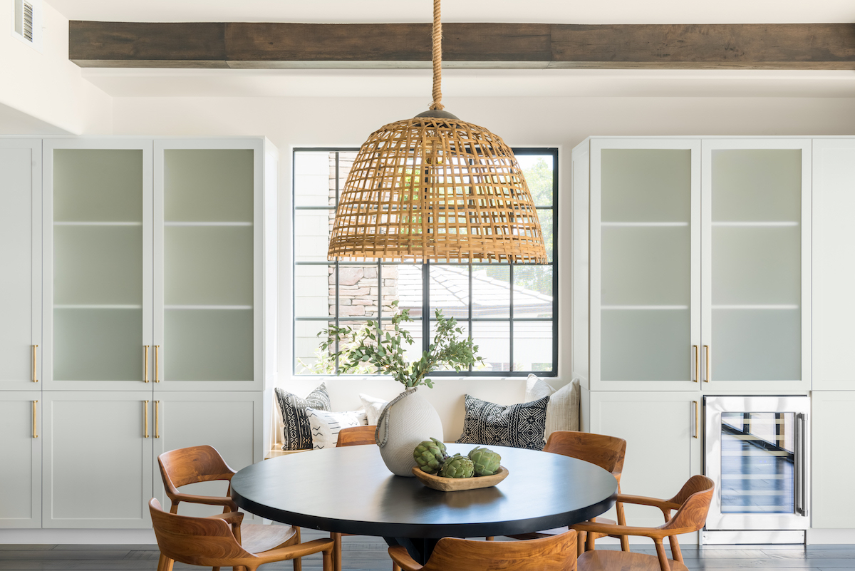
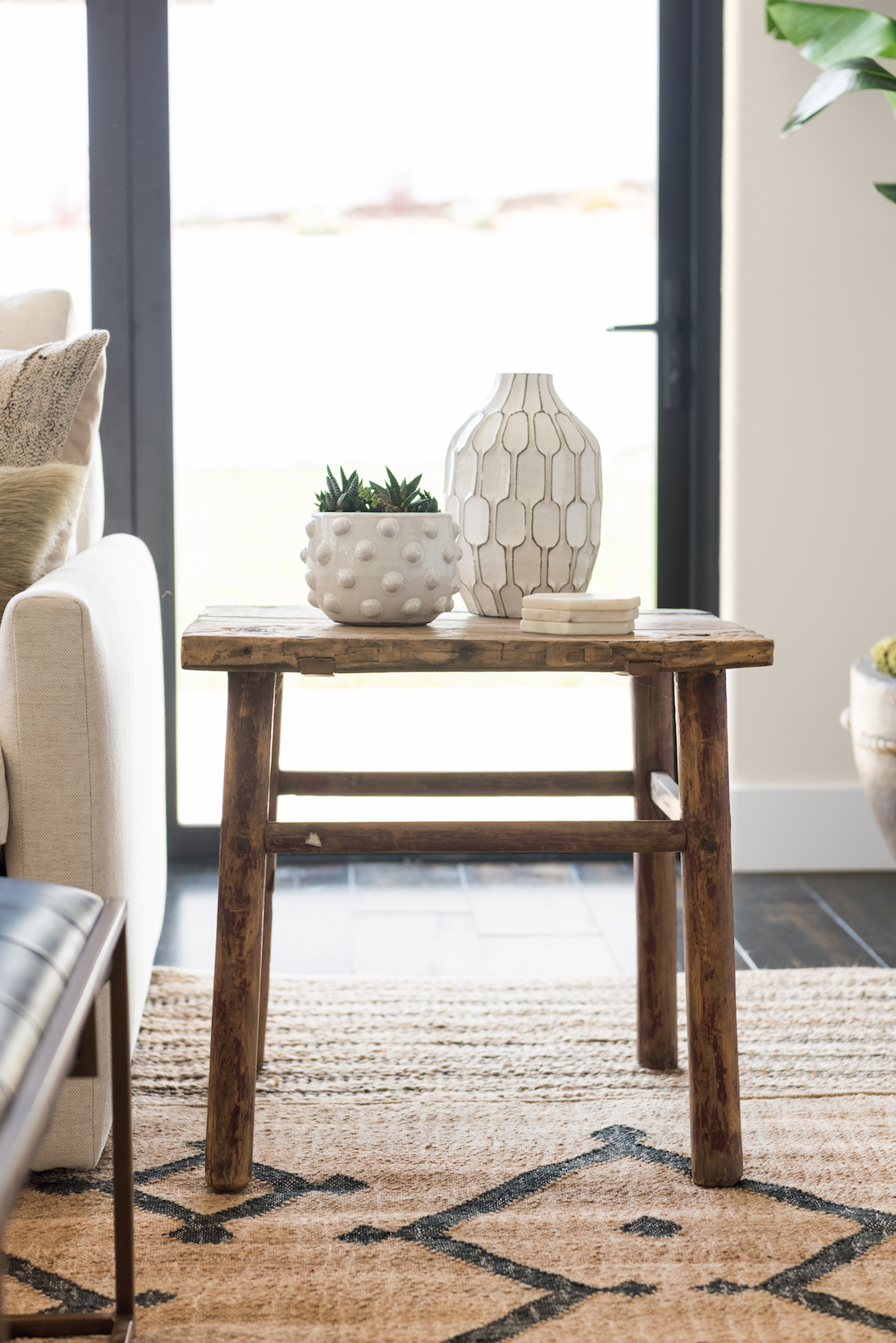
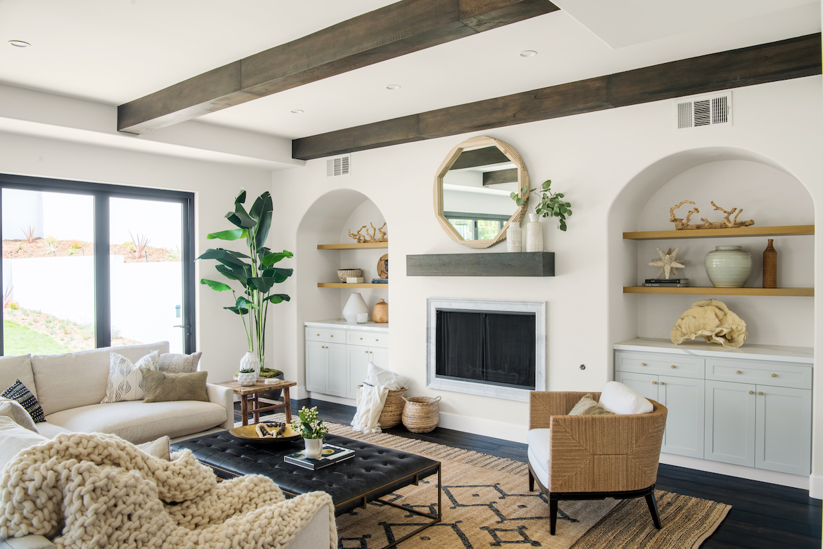
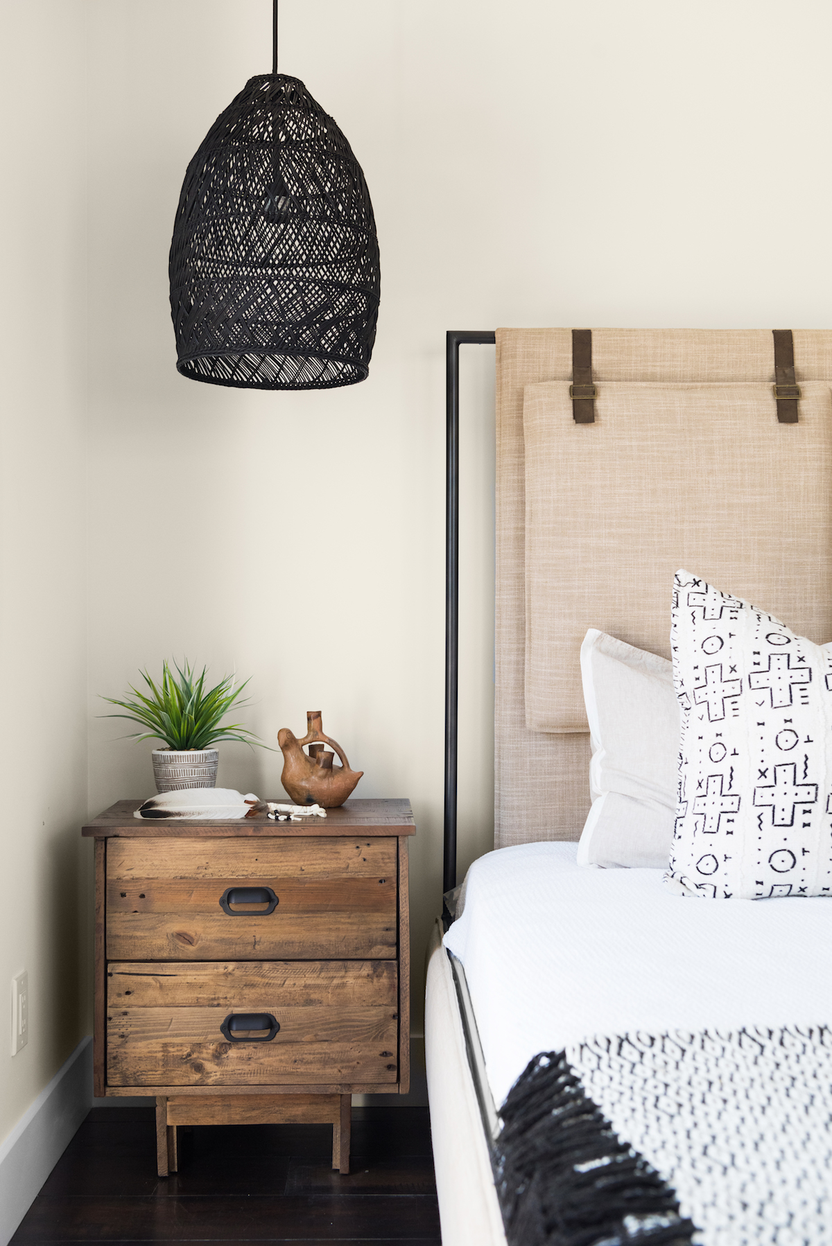
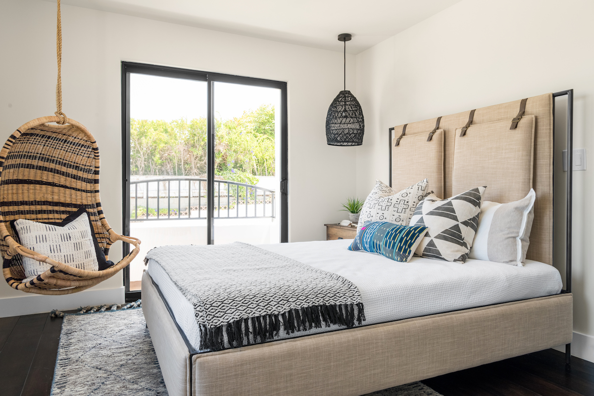
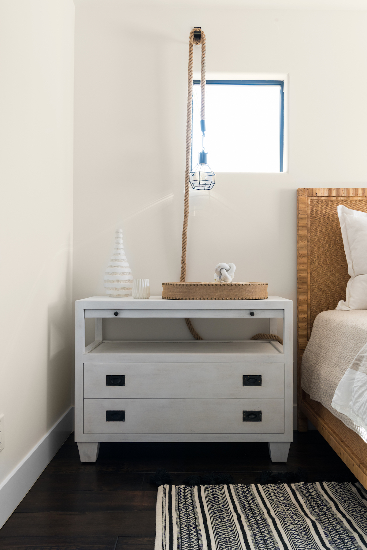
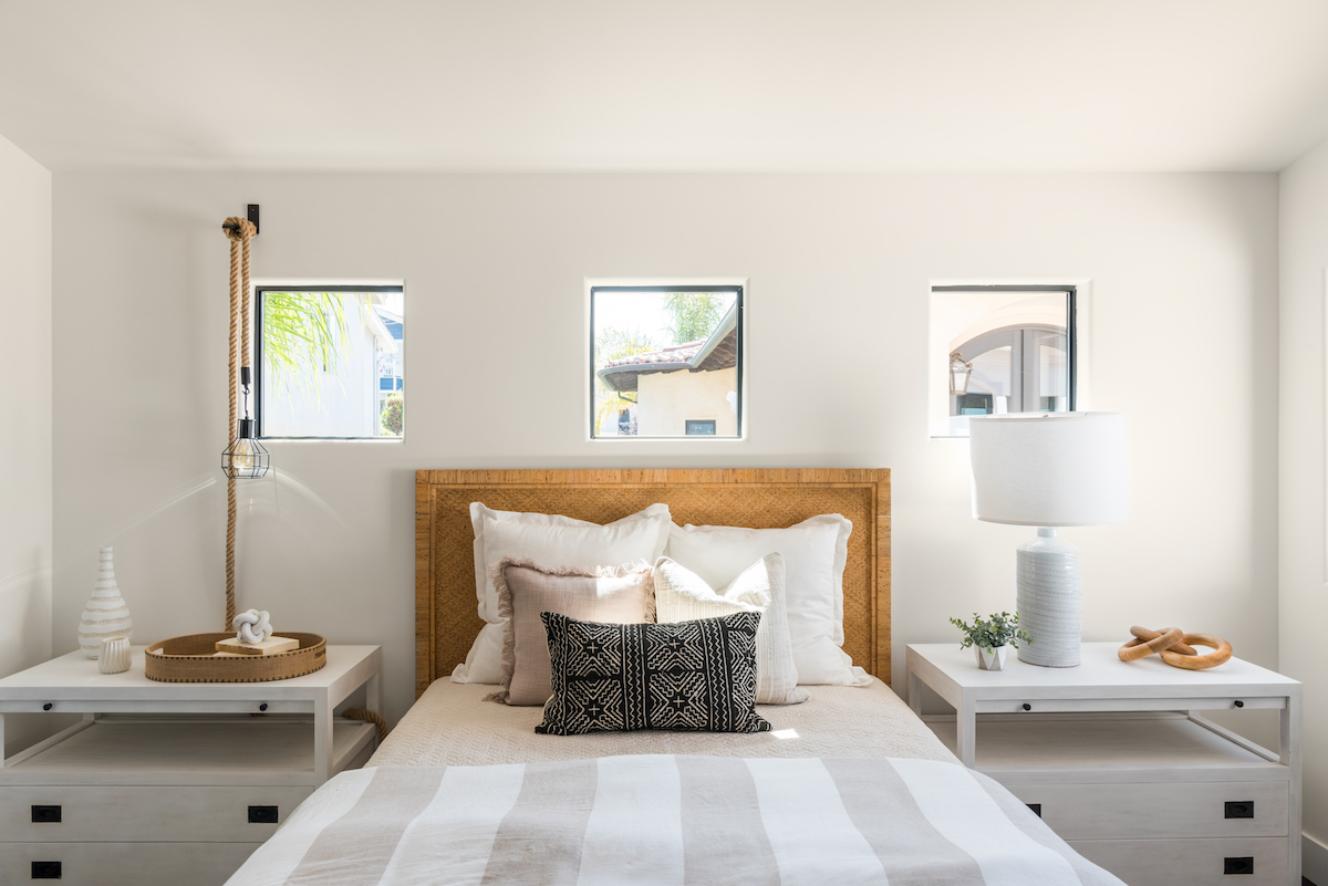
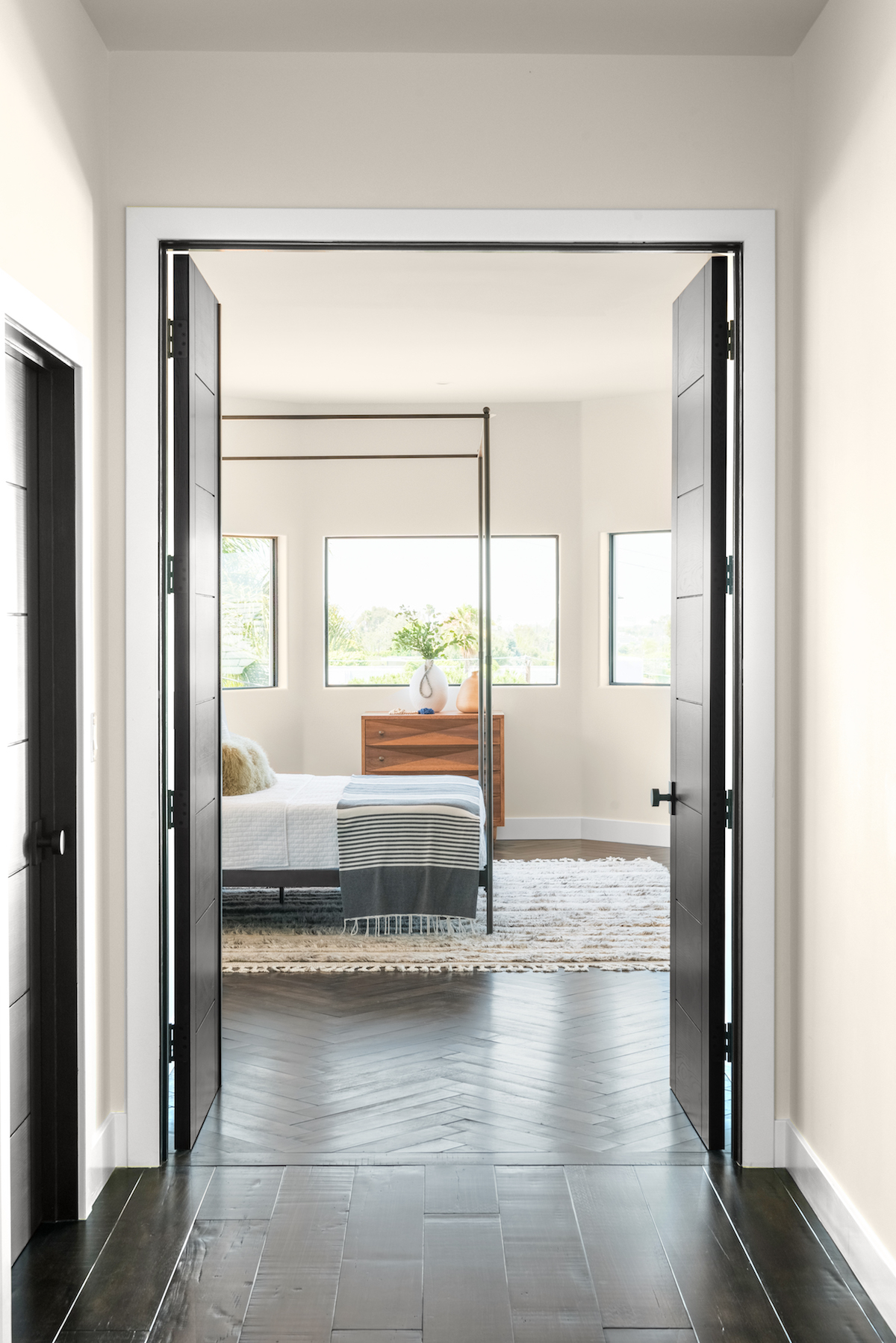
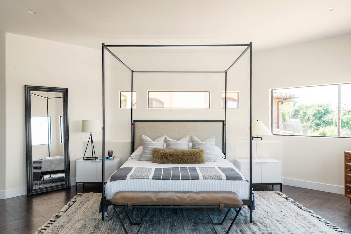
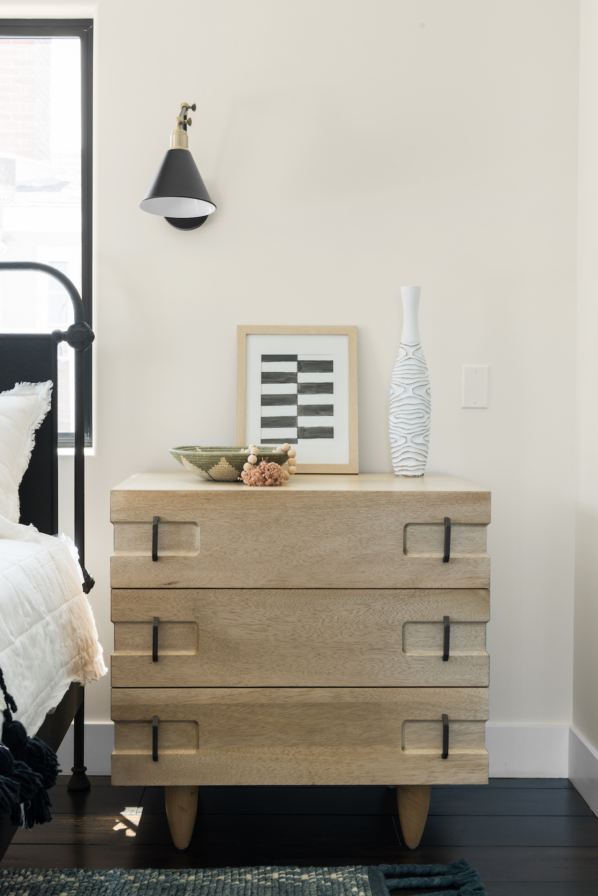
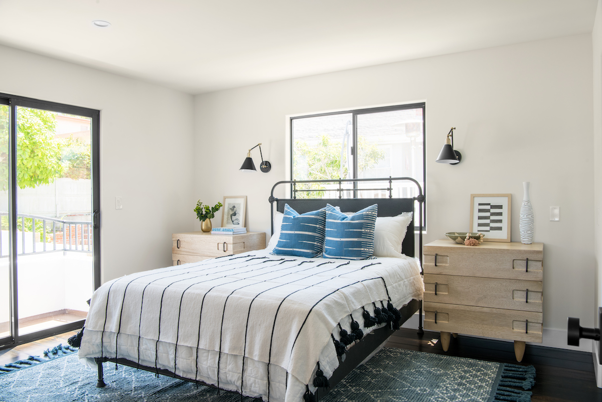
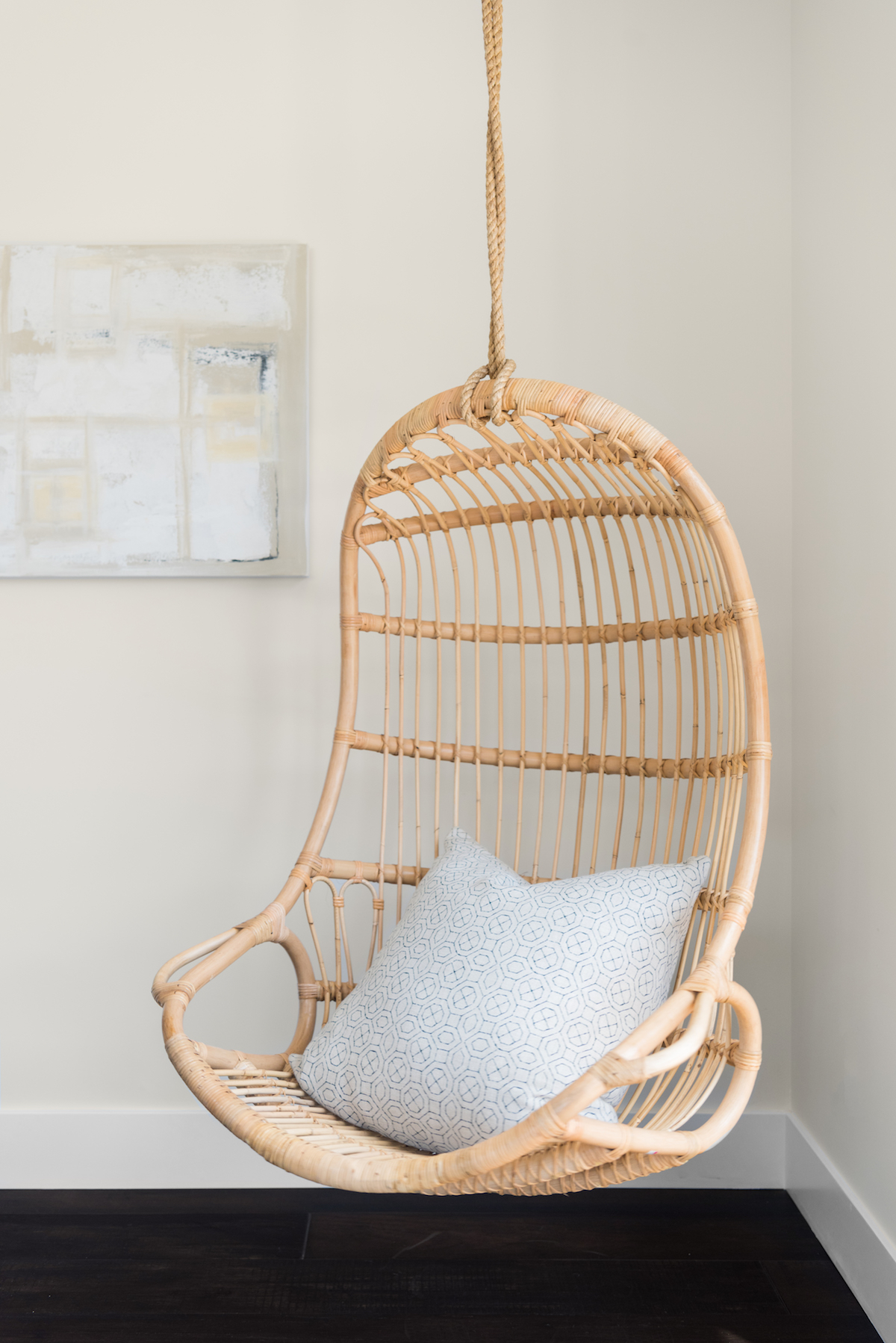
The vision for this home was really driven by the client, who had a clear, articulate style in mind. She had a great sense of what she wanted – a modern Spanish, Santa Barbara home. We used a lot of neutral, rustic, and modern elements, incorporating black iron, creams, and a camel-colored brown. We sought out heavy materials and textures, as opposed to patterns, and we brought in black to ground the design.
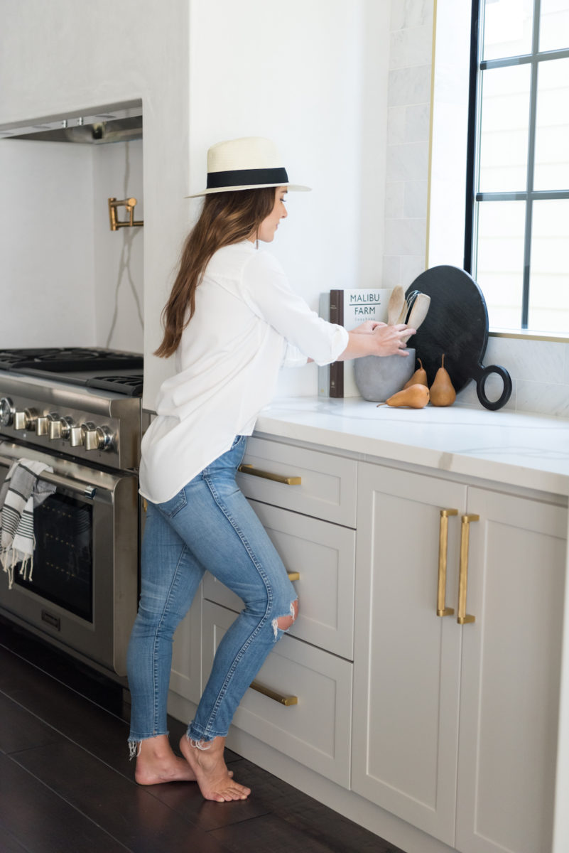
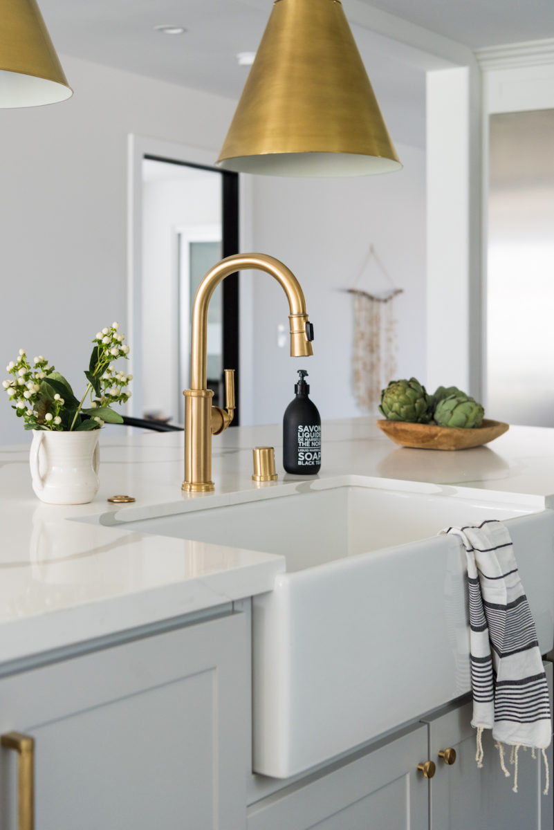
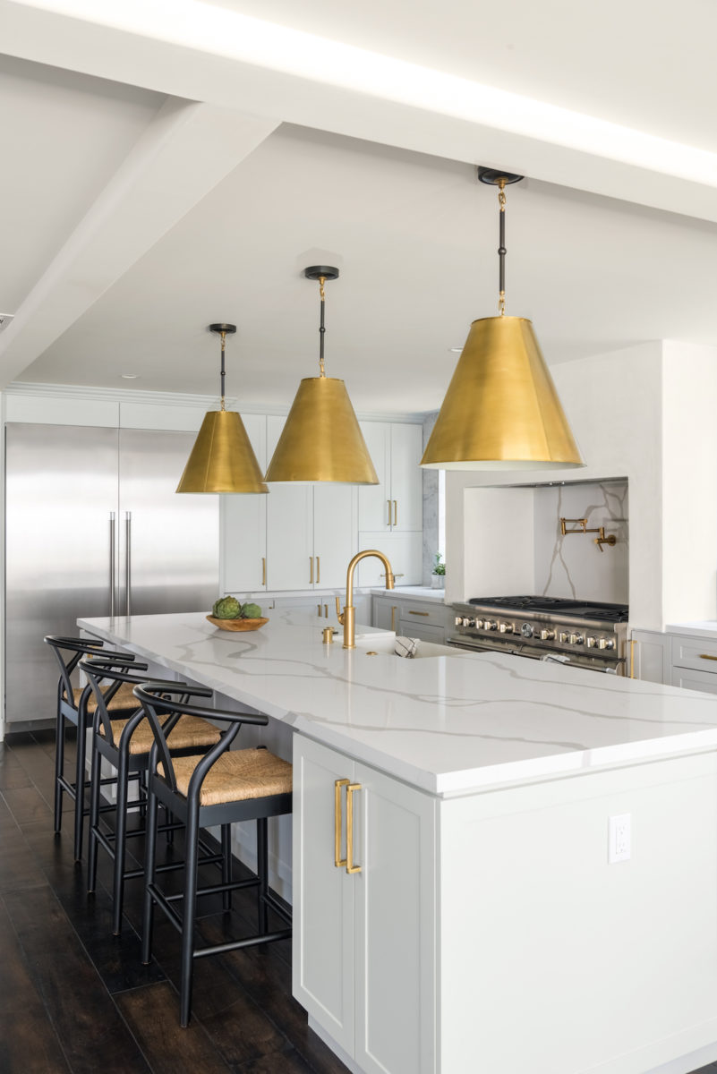
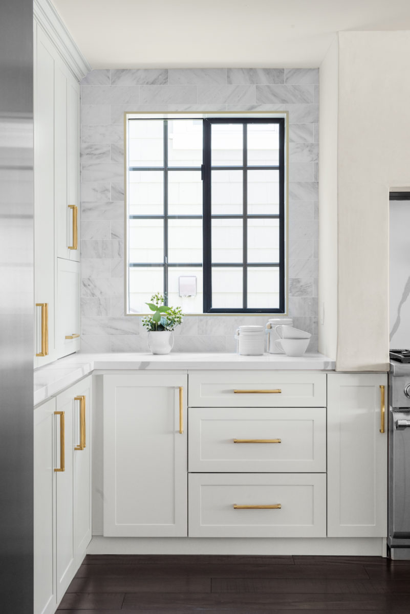
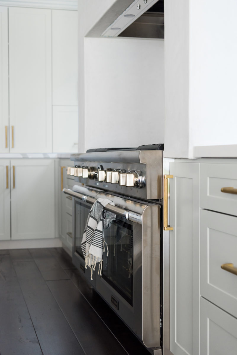
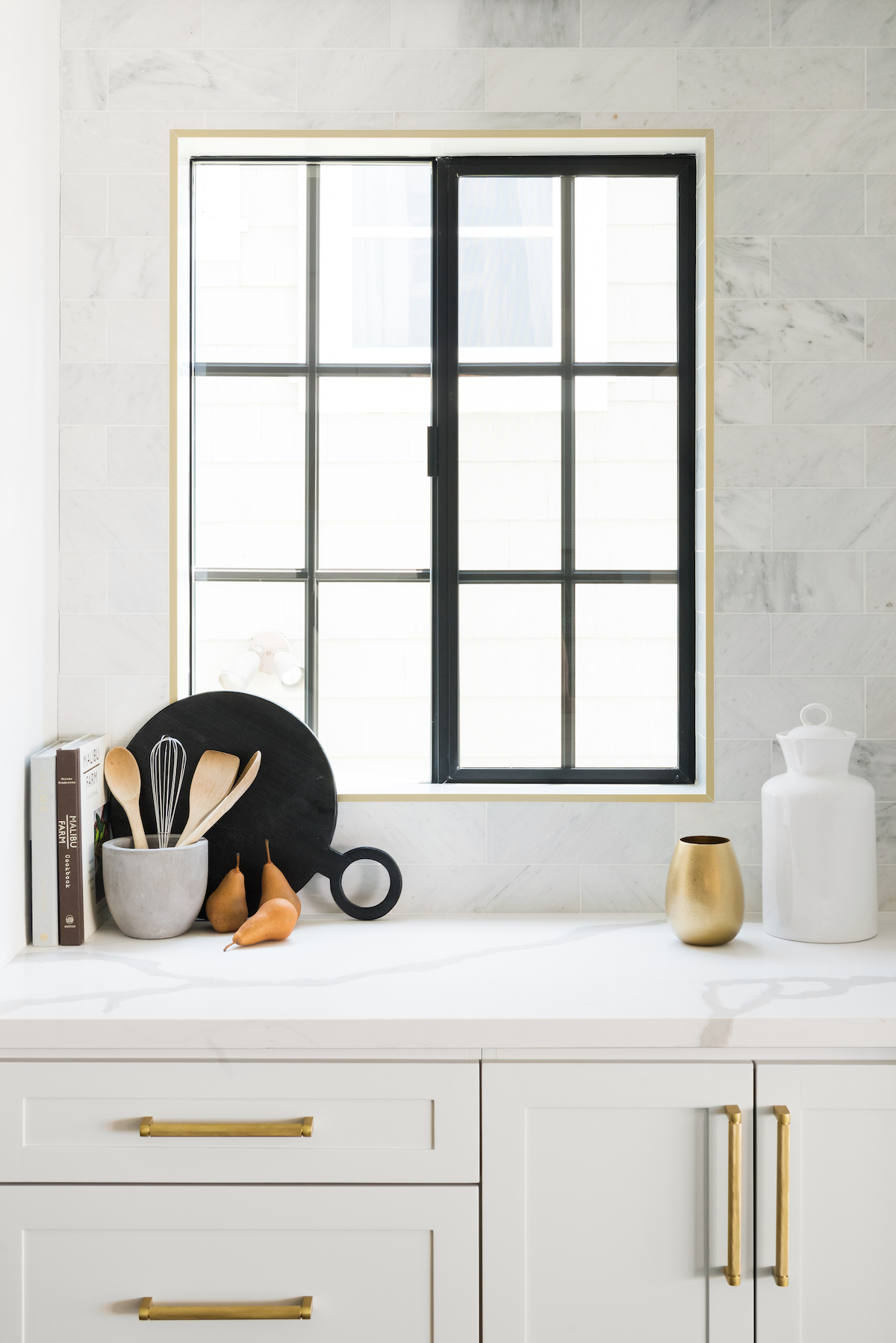
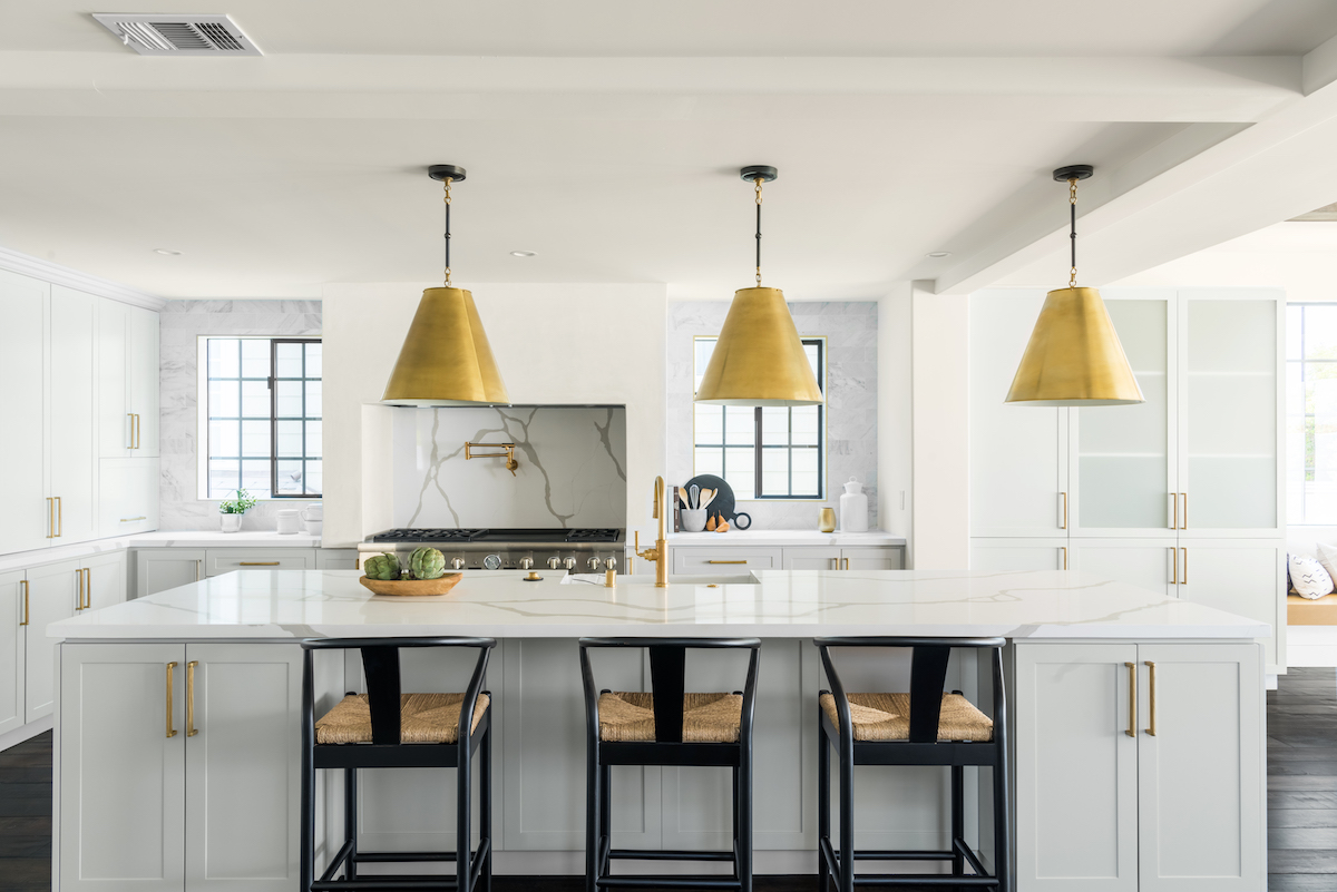
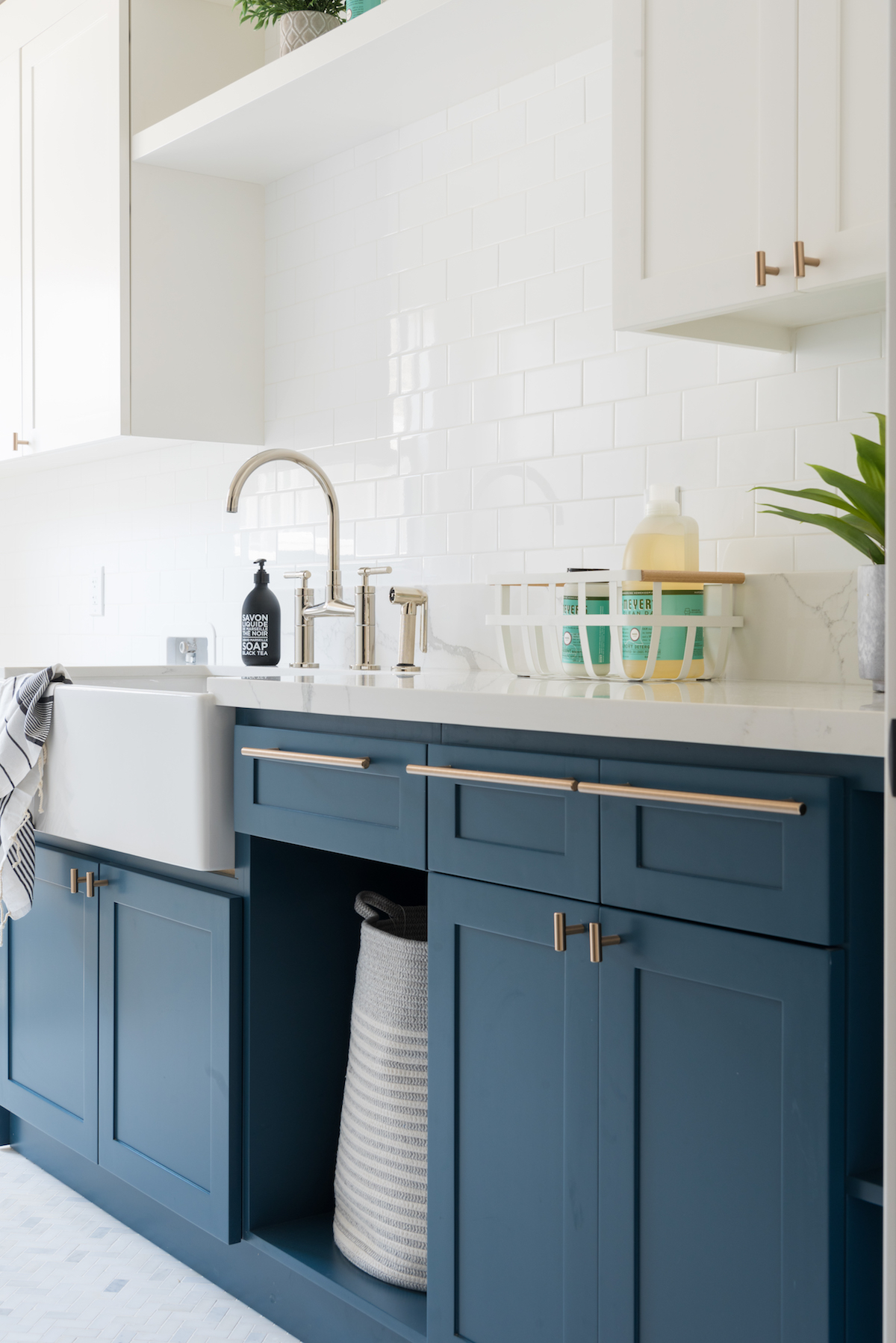
I love how the kitchen came together—it’s so light and fun, and will be a great gathering space for the family. Most of the cabinets are pale oak by Benjamin Moore, and we added brass hardware throughout. The white apron farm sink is a key piece that looks great in this setting.

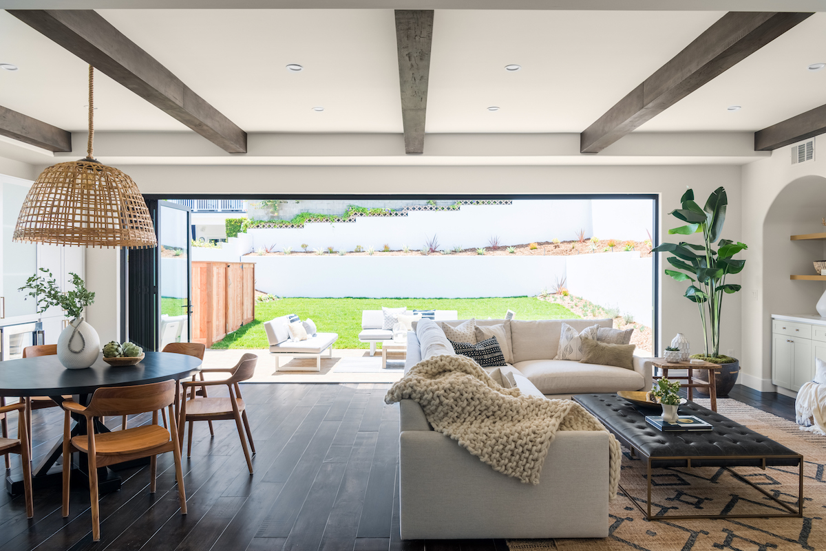
This home features incredible LaCantina doors between the family room and backyard. When open, it becomes a big indoor/outdoor room that brings in some great SoCal vibes.
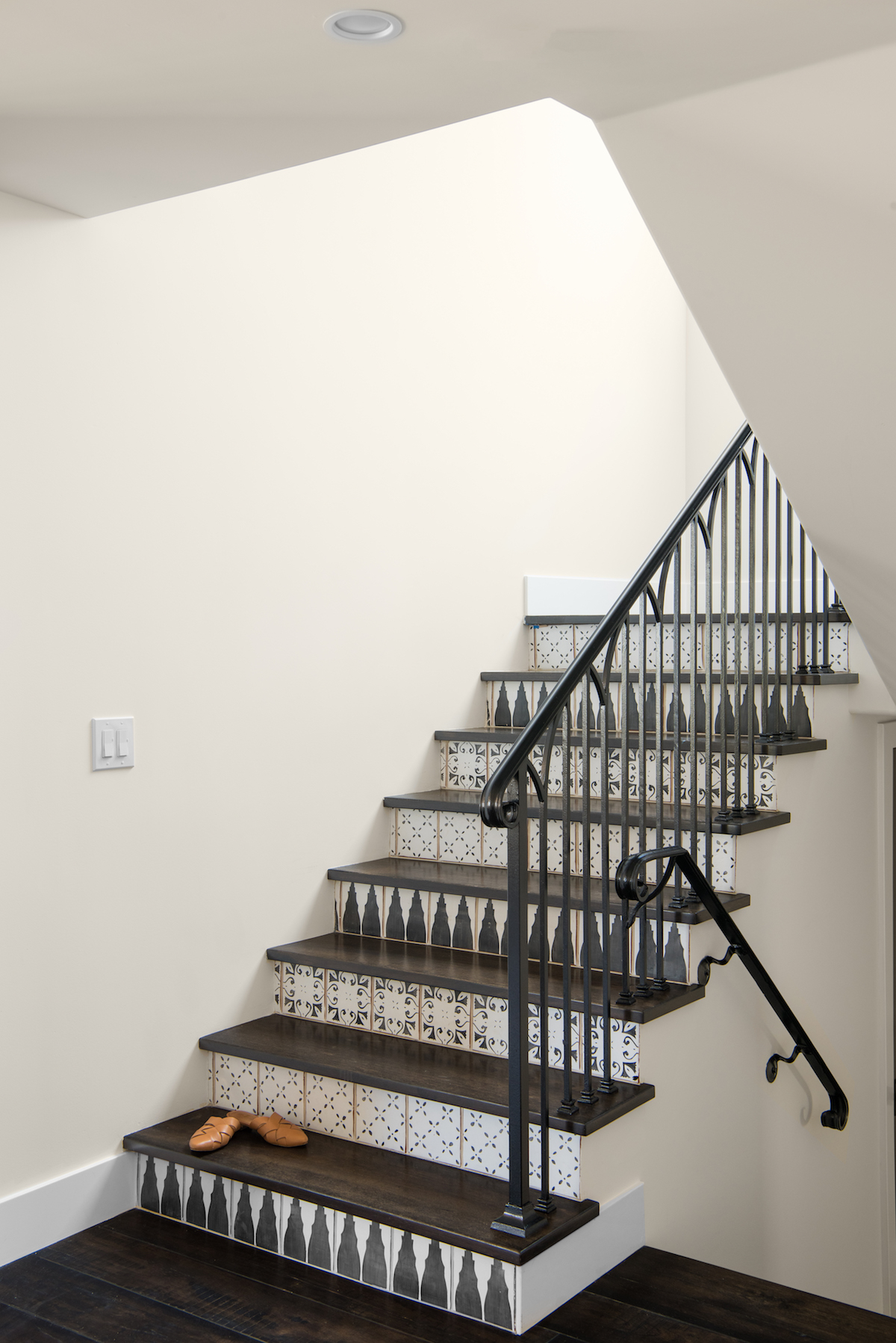
One of my favorite design elements is the Tabarka tiles on the front of the stairs. We knew we wanted to incorporate these custom tiles from the beginning, and love the Spanish flair they create.
Which room did you most love dreaming up in this home?
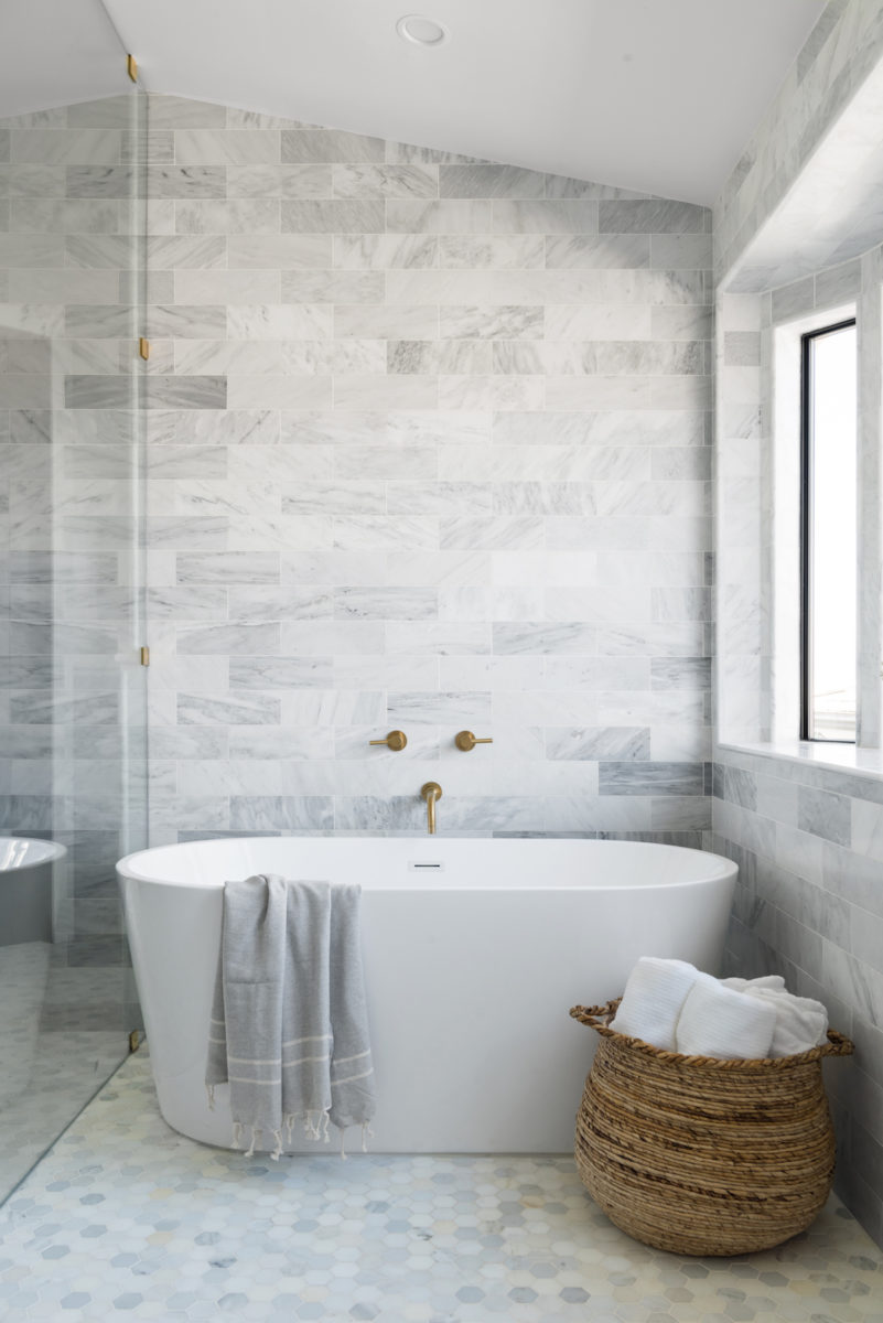
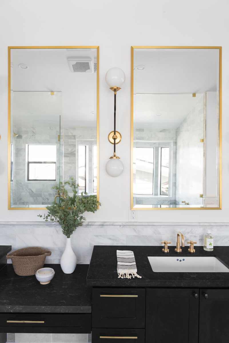
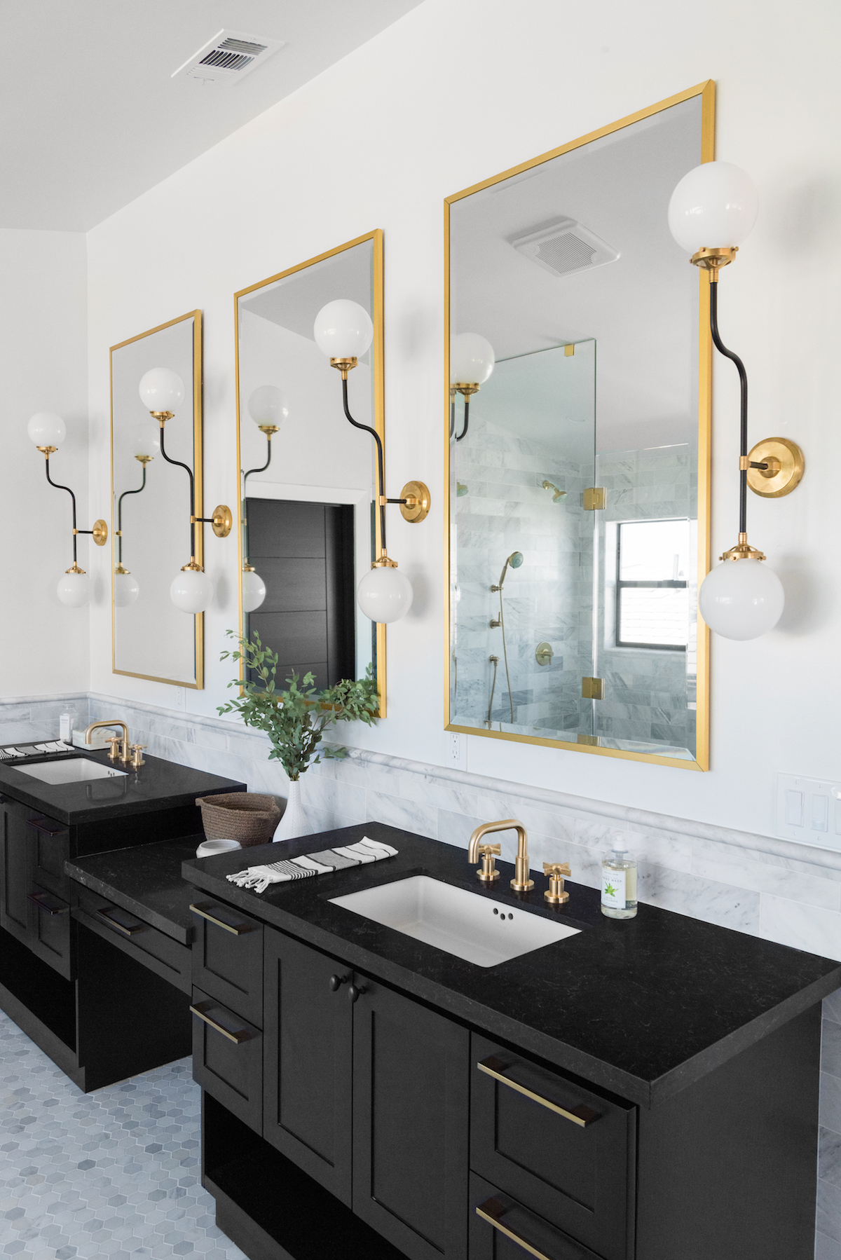
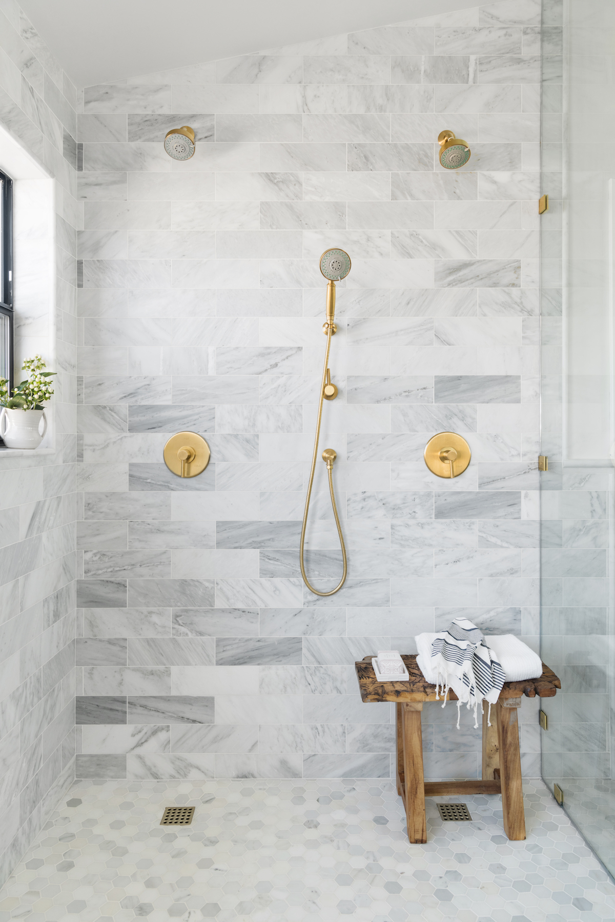
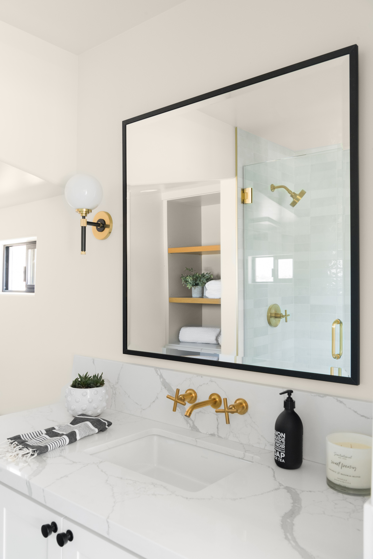
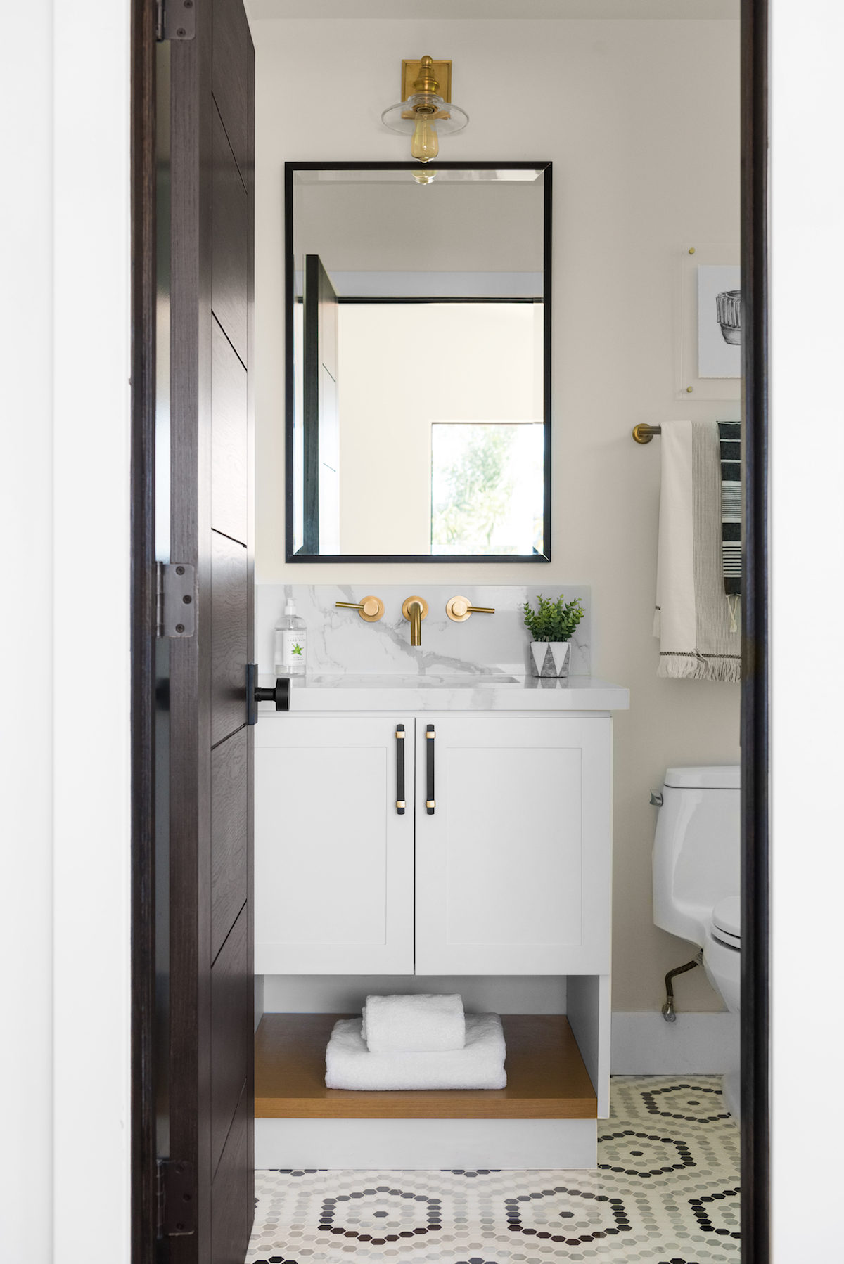
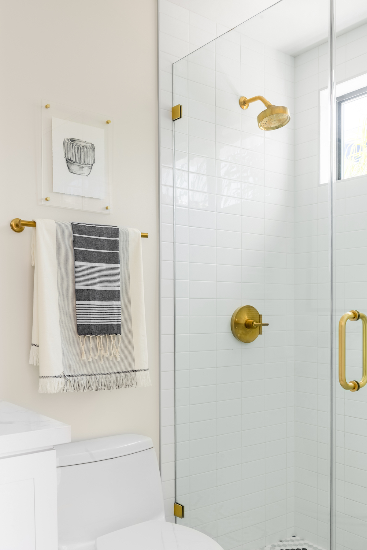
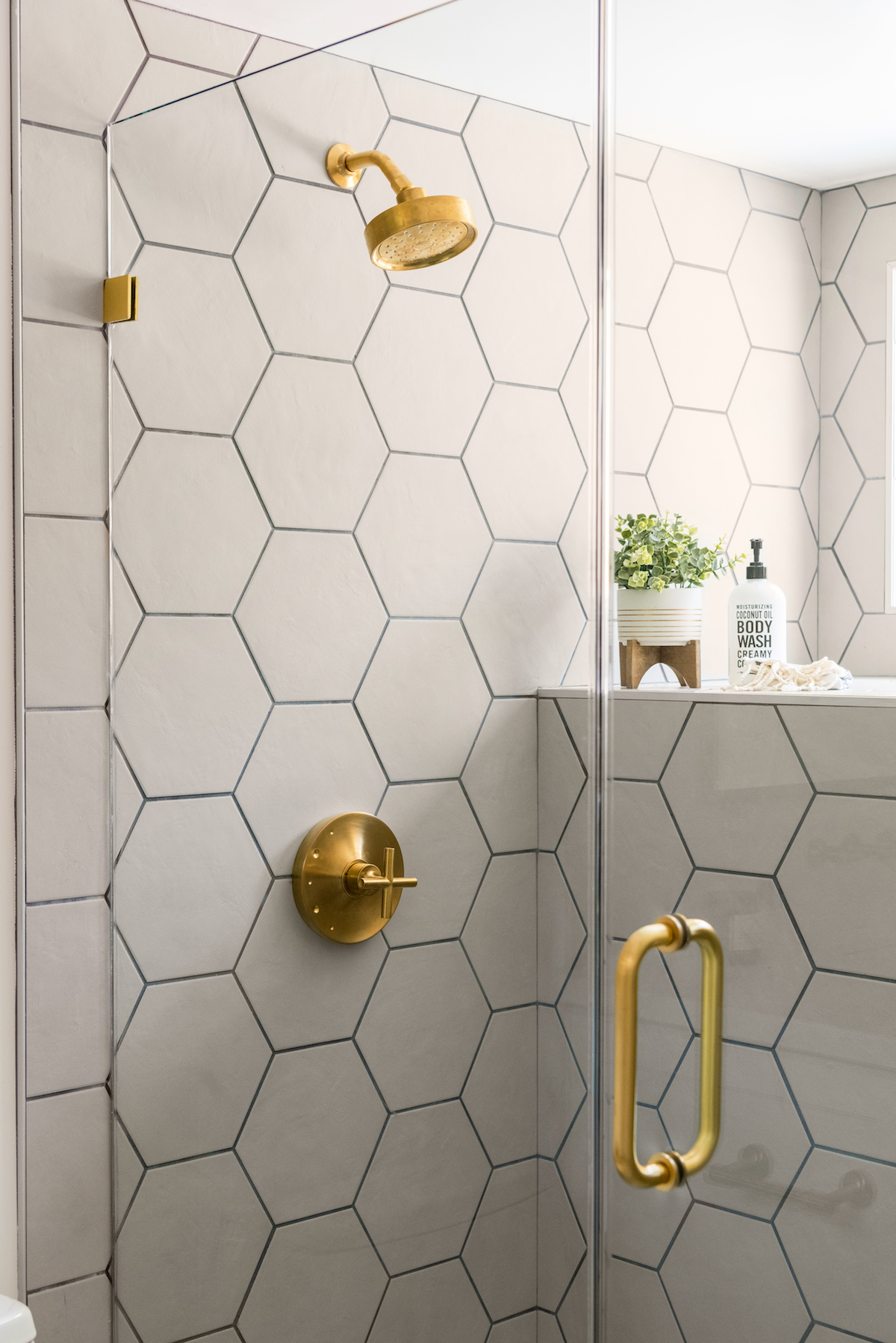
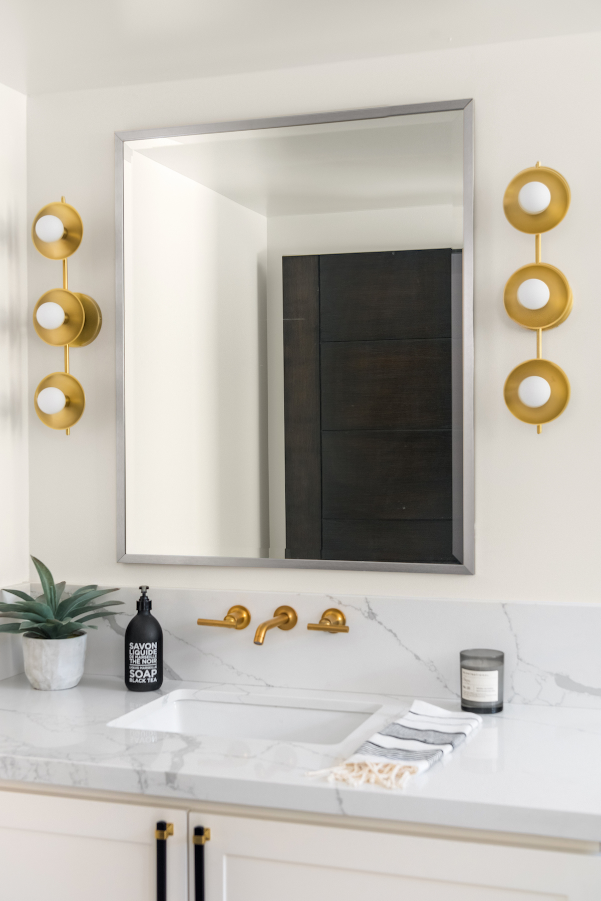
The master bathroom was the most fun! We were pretty excited about the wall-to-wall shower, so we moved the tub into the shower and added dual showerheads. I designed a lot around the marble wainscoting, complementing it with the black-stained vanity and black soapstone counters. I love how the sconces give a heavy contrast with the vanity—they are so fun and grand and give an upscale feel.
Love what you see? Take a peek at the talent behind the story… Interior Design: Melissa Marie Interiors · Photography: Michael Radford · Build: Dutch Turley · Staging: CA Dreamin Designs
