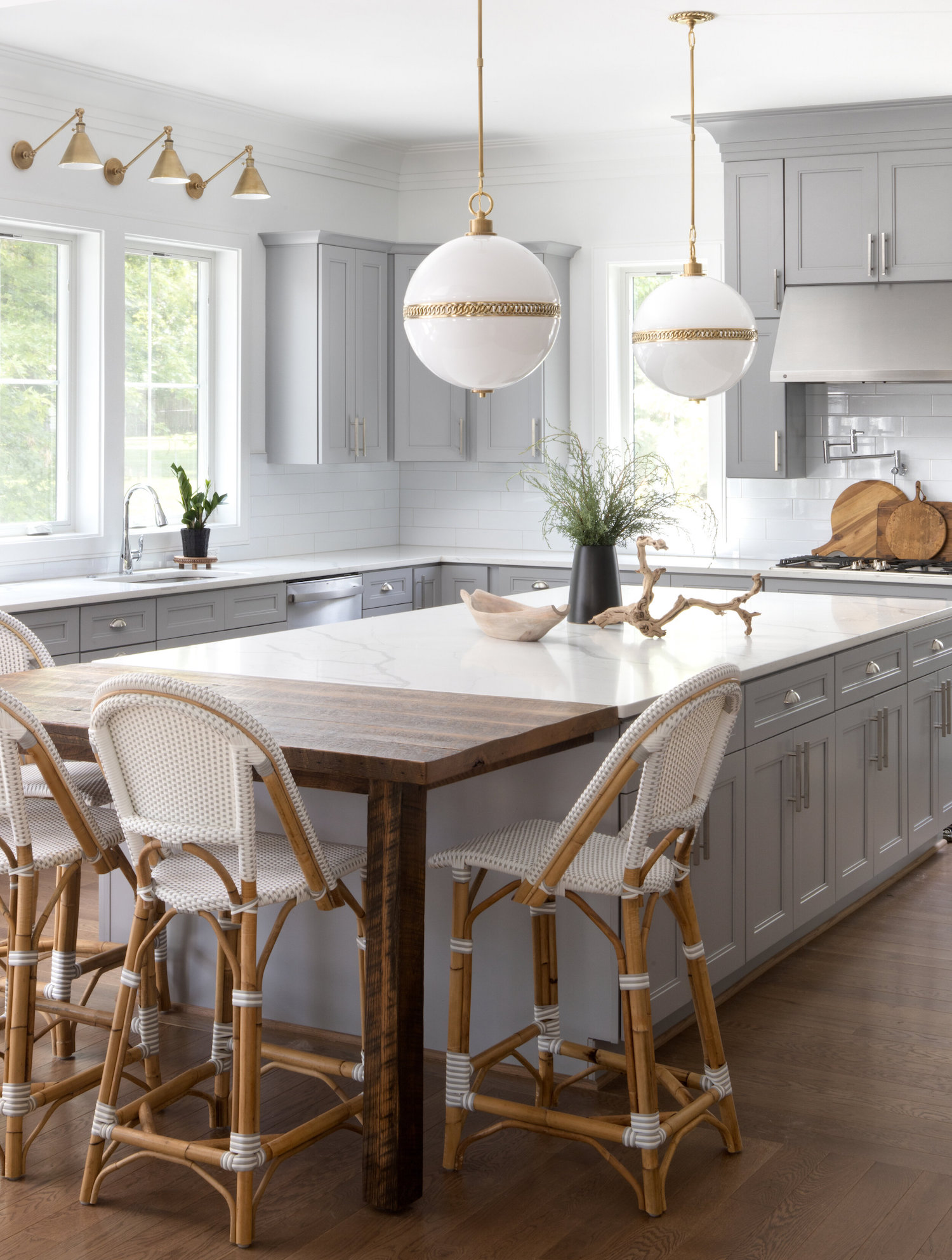
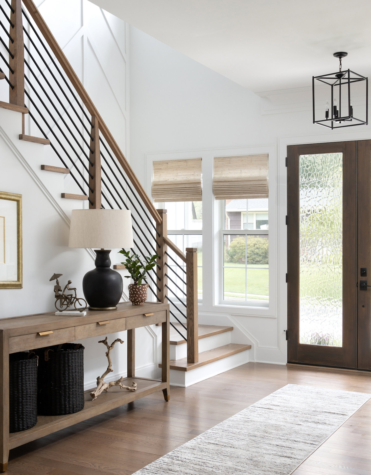
Today’s home tour shows us that cool does not equal cold. Asha Maia Design brilliantly balanced cool greys and blues with warm wood tones to give her client a contemporary space that is cozy and inviting. Functioning both as a soothing sanctuary and as a stunning entertaining space, this home is a beautiful example of perfect balance. Take a peek at the gorgeous photos by Jenn Verrier below.
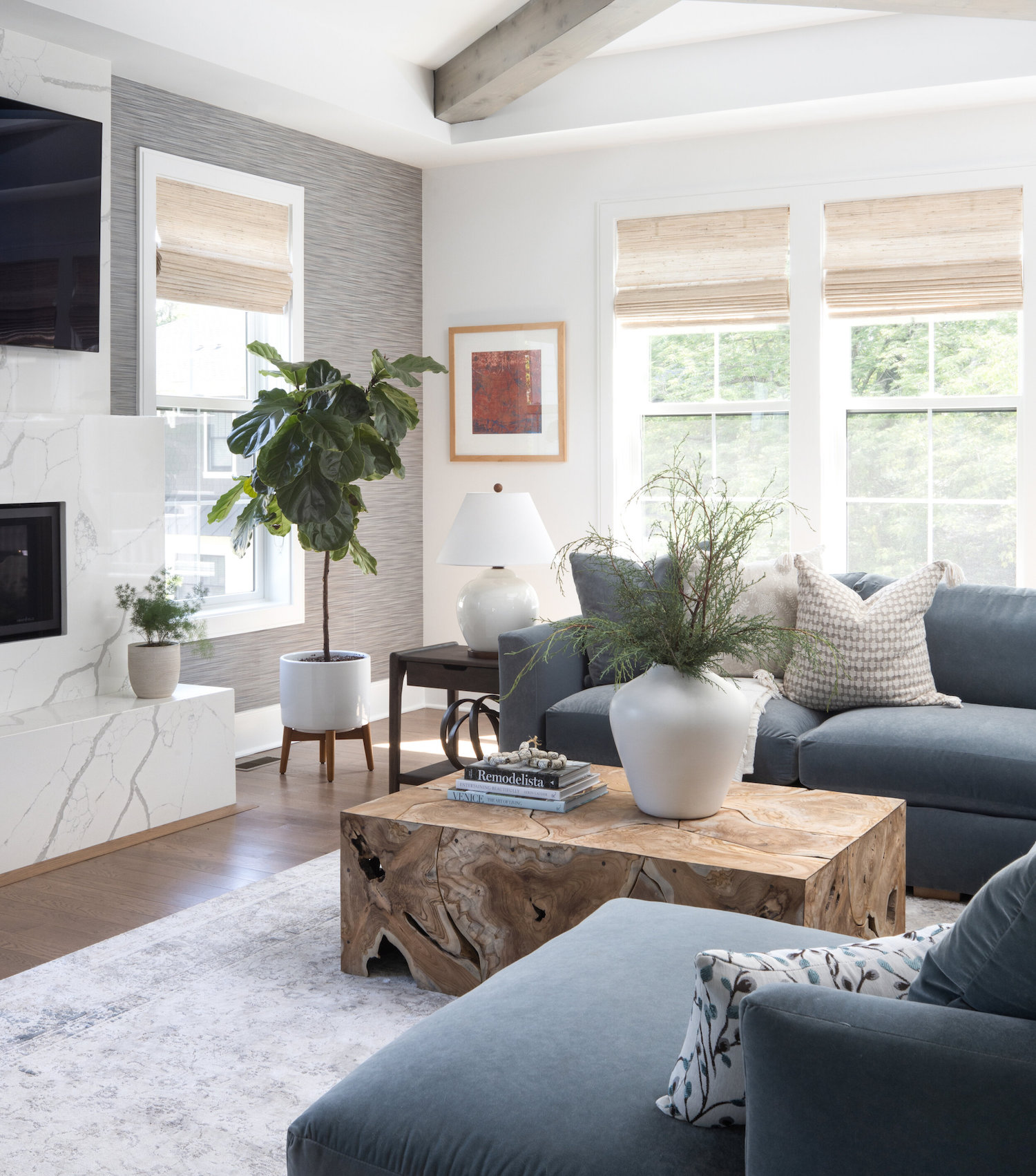
From the designer… Our client for this project was a busy doctor who recently moved to the area to take on a new role in her career and wanted a home that showed off her style and accomplishments but would also be a great place to host guests and entertain. She gravitated towards classic pieces in a contemporary style, loving calming blues and grays.
The modern farmhouse-style home was built with a large kitchen featuring a spacious and beautiful statement island. However, the kitchen lacked a place for gathering, something that was important to our client. The kitchen was also centered around a cool color palette, making it feel stark and cold. We wanted to infuse life and personality into the space by integrating accents that elevated the space and added warmth. We balanced the coolness of the kitchen by incorporating sconces above the sink that not only brought in the much-needed warmth but also paired beautifully with the vintage-inspired globe pendants we added above the island. To address the lack of seating, we had a custom island extension made, creating a much desired place to gather within in the kitchen. The extension fabricated out of reclaimed white oak was a nod to the existing beams in the adjoining family room.
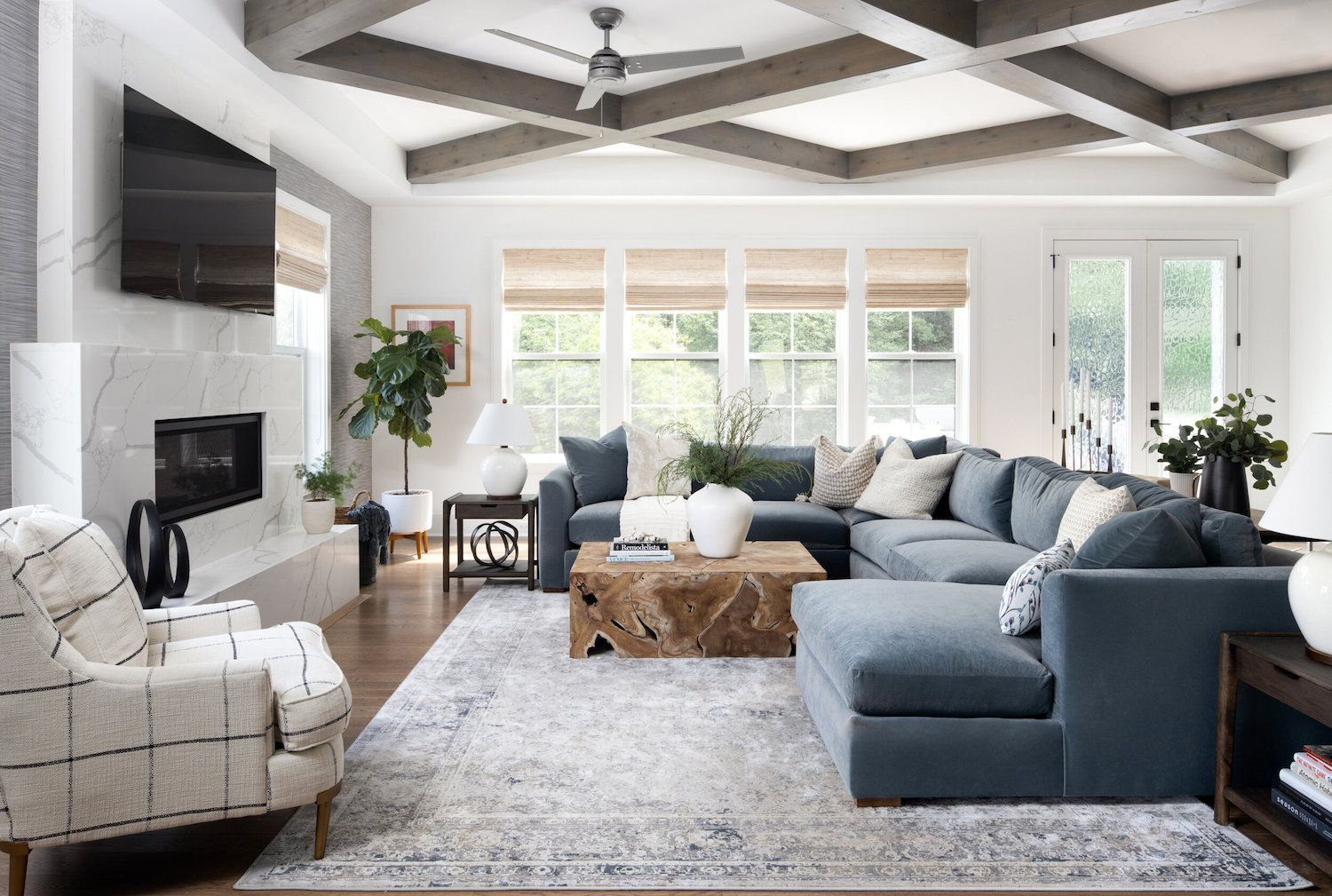
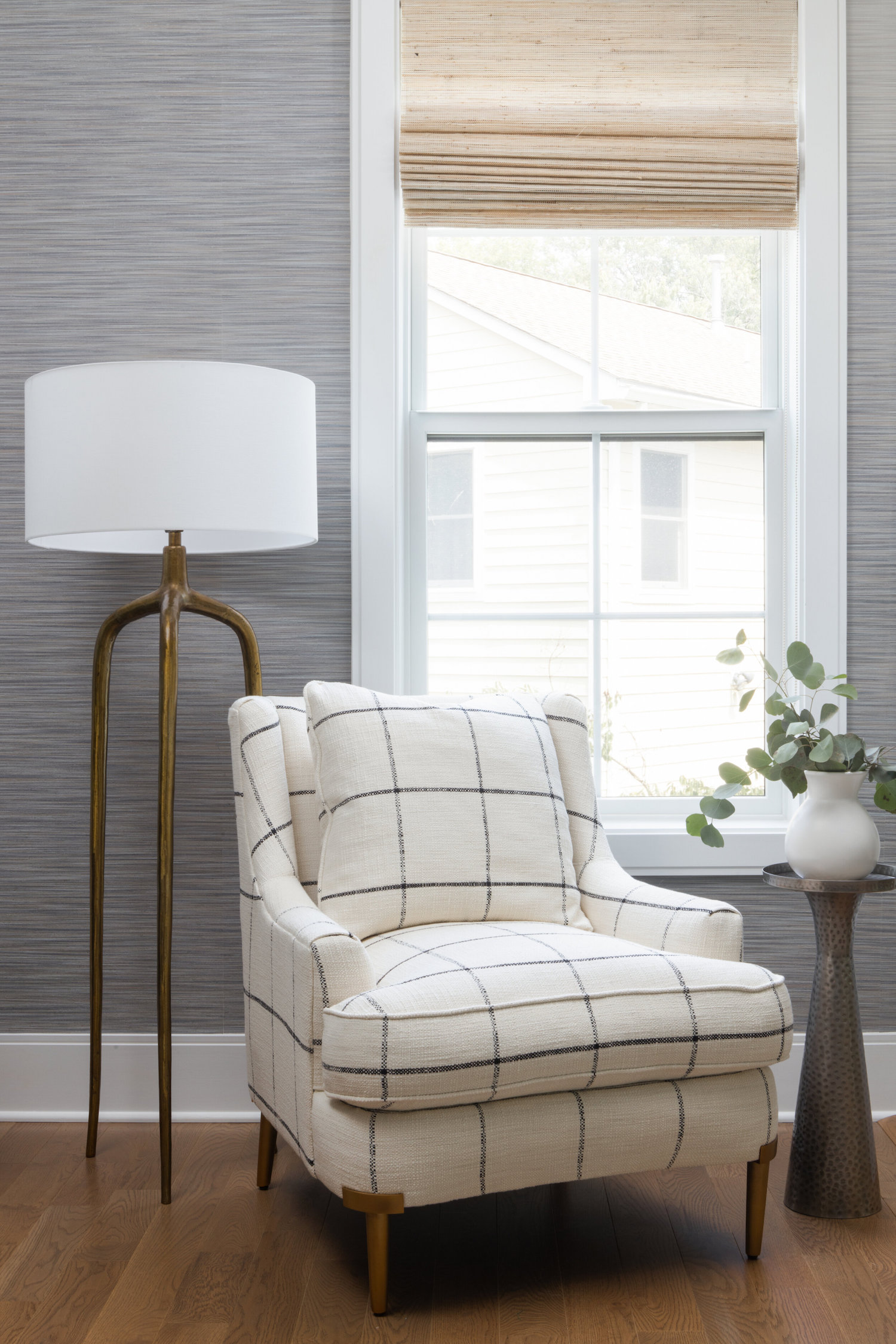
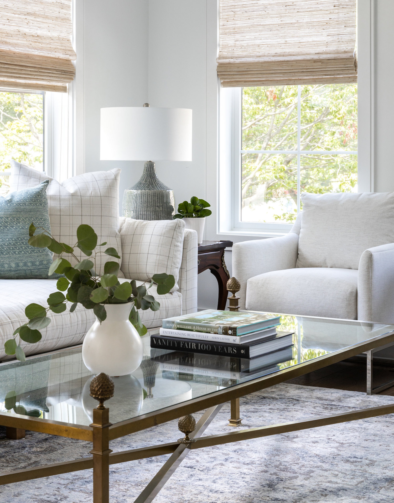
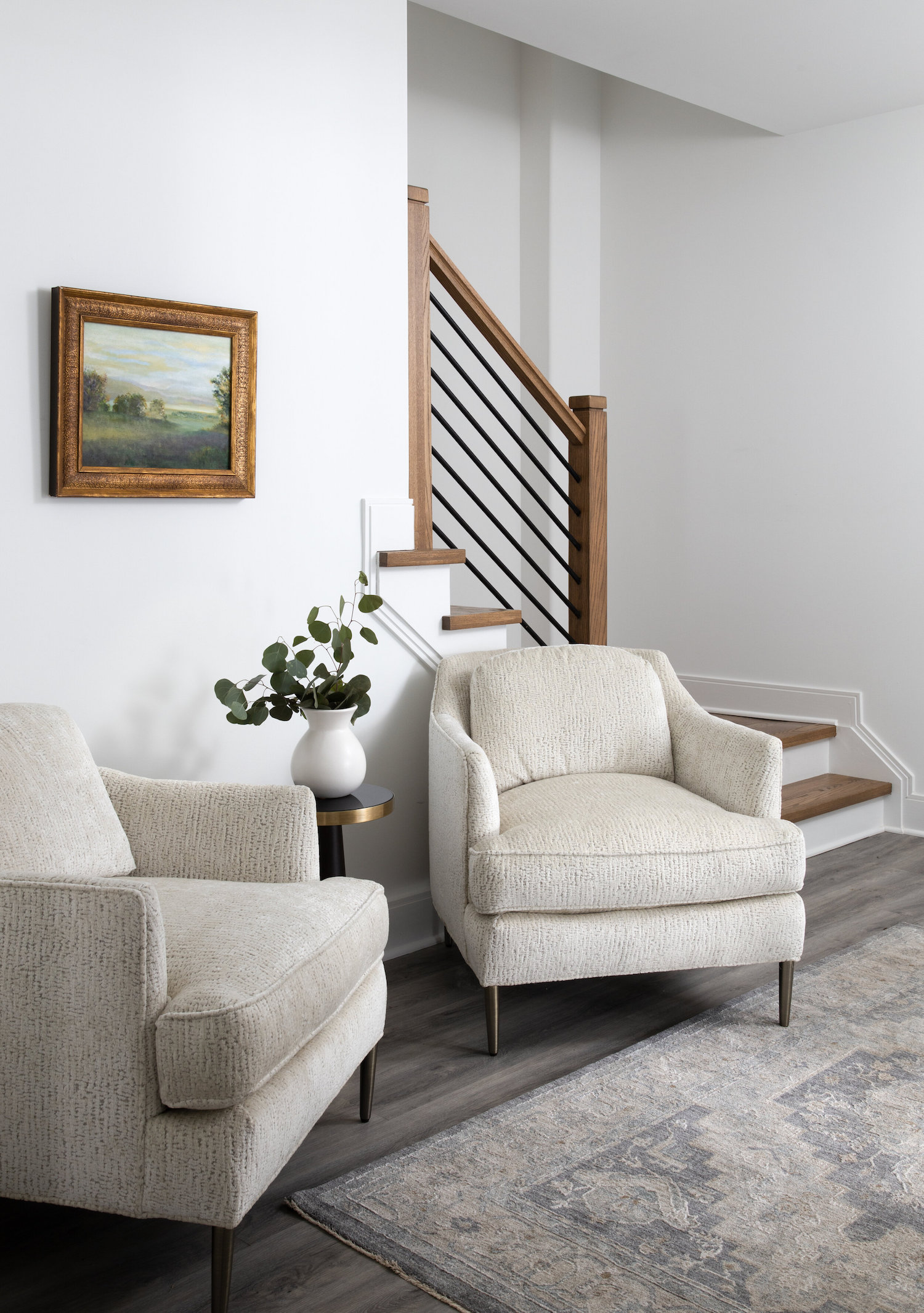
We carried the same concept of balancing the cool and calm color palette with warm accents throughout the home. We wanted to elevate the simple palette with interesting patterns and textures, and we did this in the upholstery and other soft finishes. We just can’t get enough of the subtle plaid performance fabric in which we upholstered the living room sofa. It was such an unexpected way to bring interest to the clean and neutral space. We felt using velvet in our selections would elevate the spaces making them feel luxe and timeless. So we stayed true to the client’s love for calming blues and grays but chose colors that were interesting and somewhat bold.
Like what you see? Take a peek at the talent behind the story… Interior Design: Asha Maia Design · Photography: Jenn Verrier
