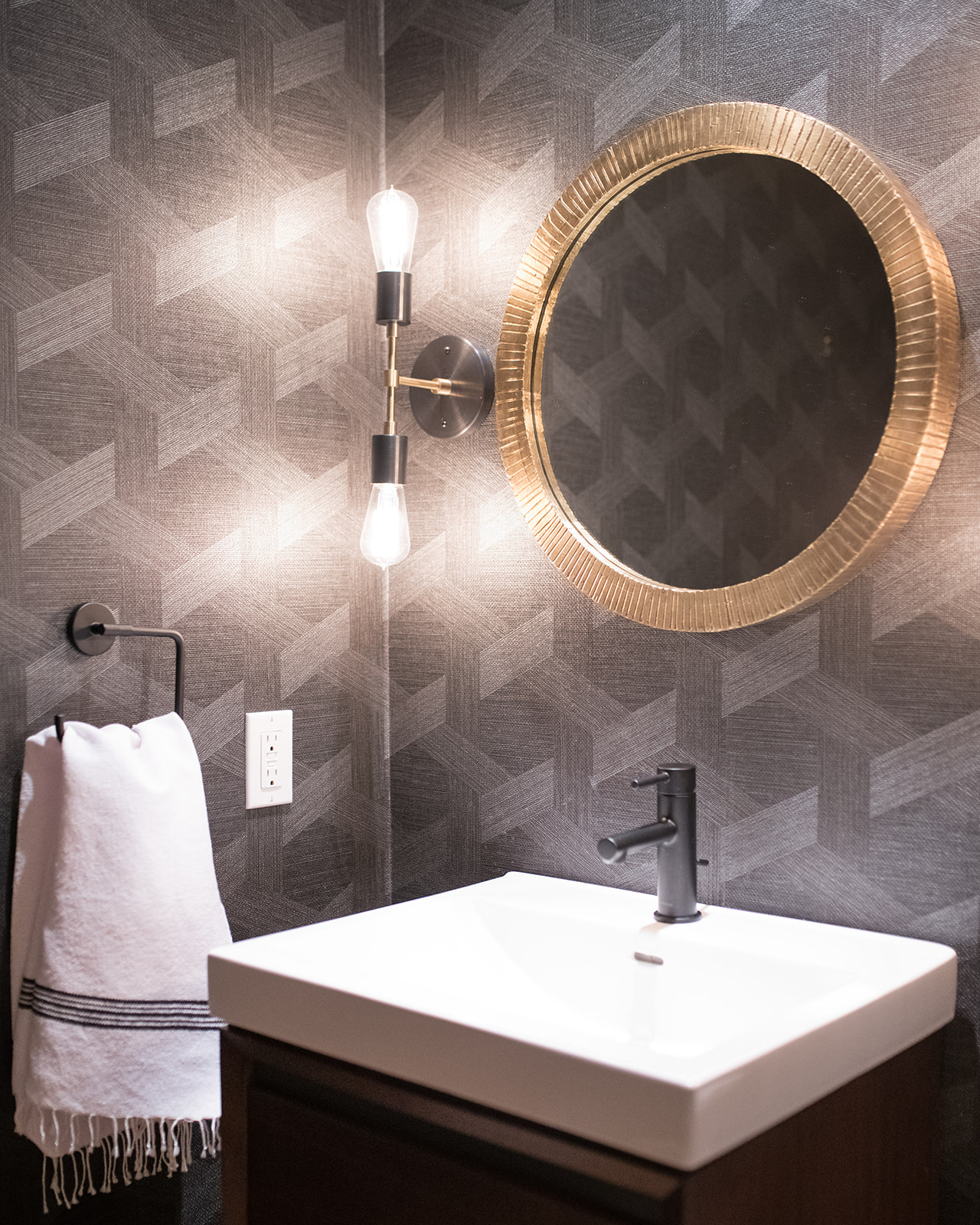
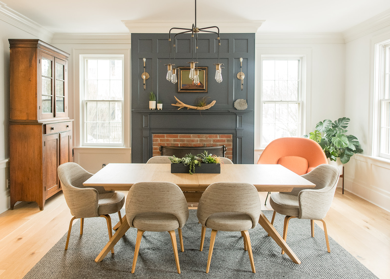
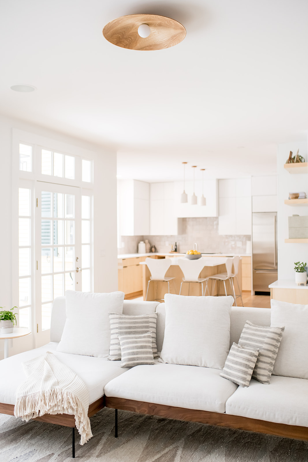
Admittedly, mid-century modern isn’t a style that I personally gravitate toward, but today’s tour with SAGE Interior Design has me rethinking that. This Newburyport home offers a subtle hint of the style that’ll lure you in like no other, with the scale tipping to modern and clean—a true signature of SAGE and co-founded mother-and-daughter-team, Jordan and Beverly. Custom features throughout include a stucco-finish fireplace, ash wood details, flush mount lighting (that took 13 weeks to arrive!)—all topped with intricate texture, patterns and wallpaper to boot. Freebird Photography captured every angle with care, dive in below!
Can you tell us a bit about this project and your clients?
We worked with a young couple, who purchased the house because they loved the layout for their family (two young girls). It had a beautiful backyard but the house was a traditional federal style home and they wanted to really make it their own.
Where did you begin with this project?
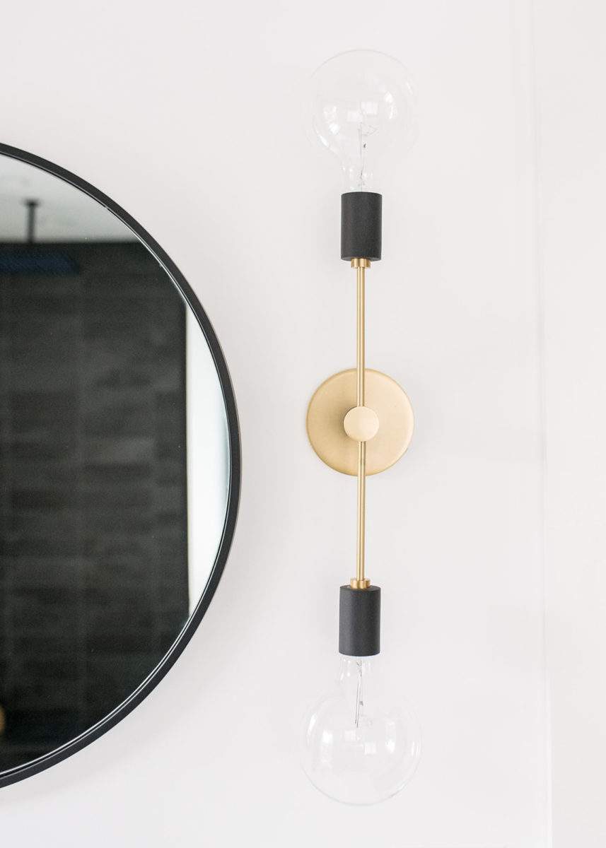
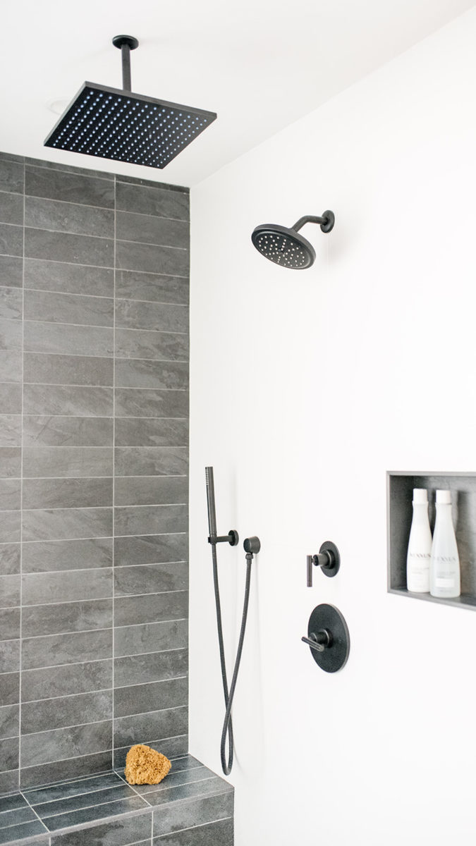
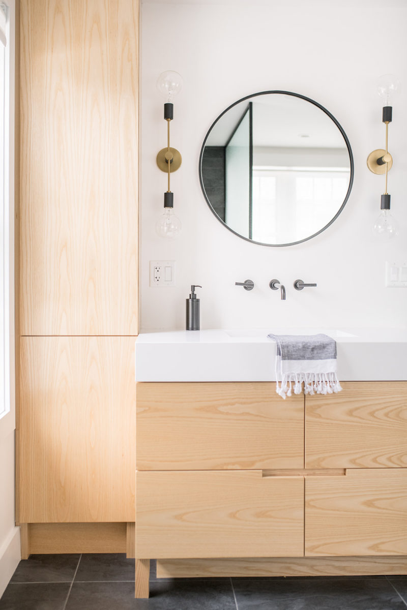
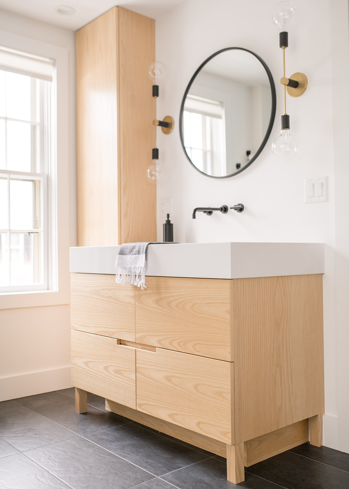
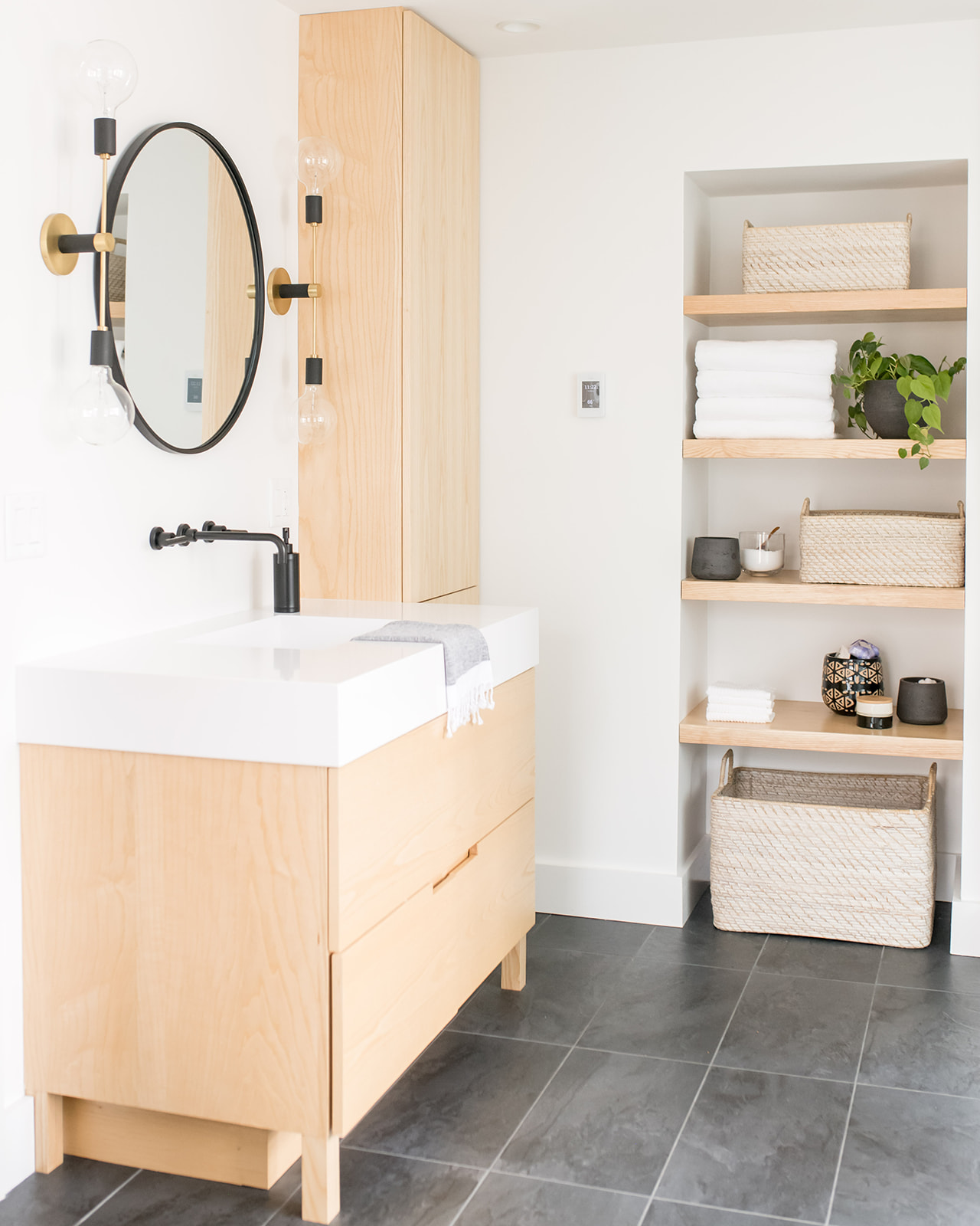
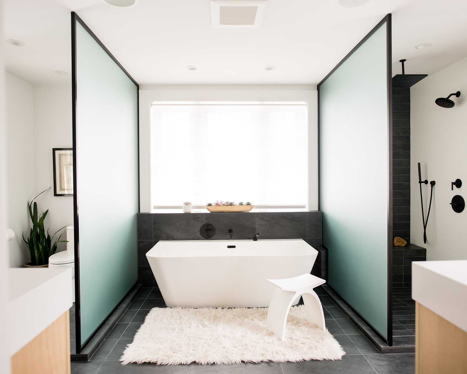
We started with the master bath with the goal of making a true oasis for them. We took down two diving walls and replaced them with floor to ceiling privacy glass walls that were framed and just that alone made such a difference, making the space feel more modern and open. We worked with a fantastic custom cabinetry company and had both his and her vanities custom made in Ash. We also removed the door to a storage closet and had matching floating shelves made with the same wood. This not only still gave the homeowners storage but it also made for a space to display the beautiful bathroom accessories that we styled with.
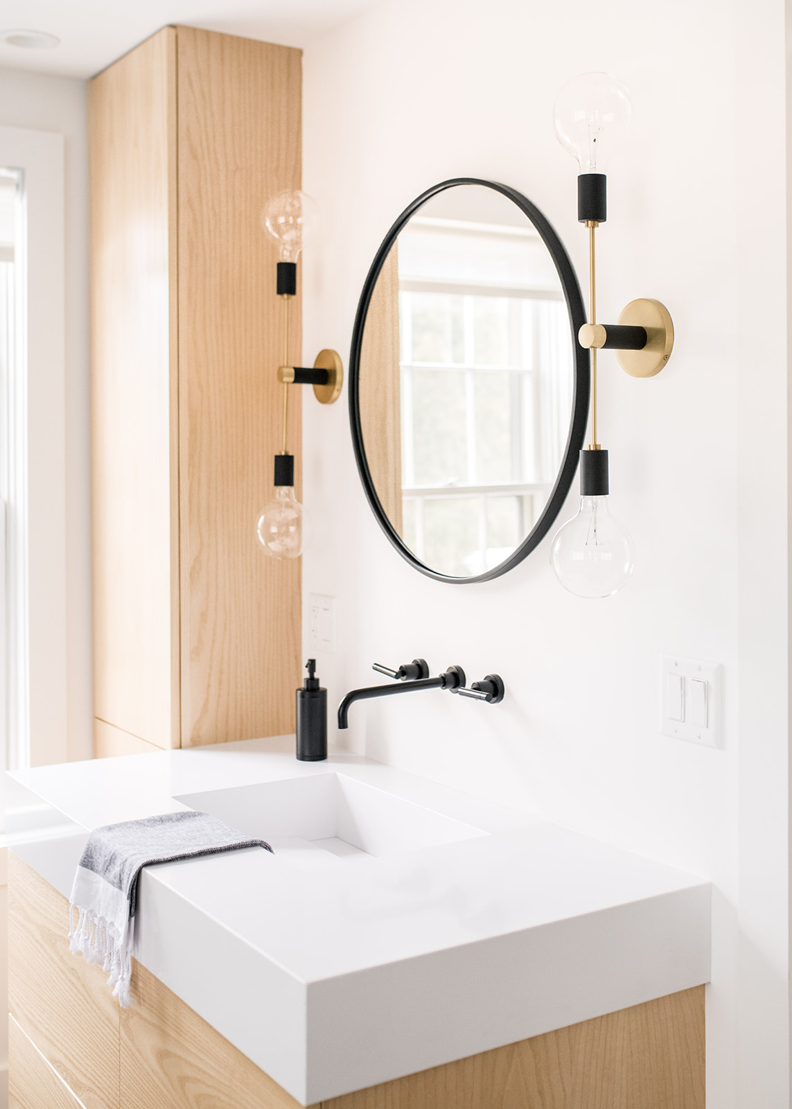
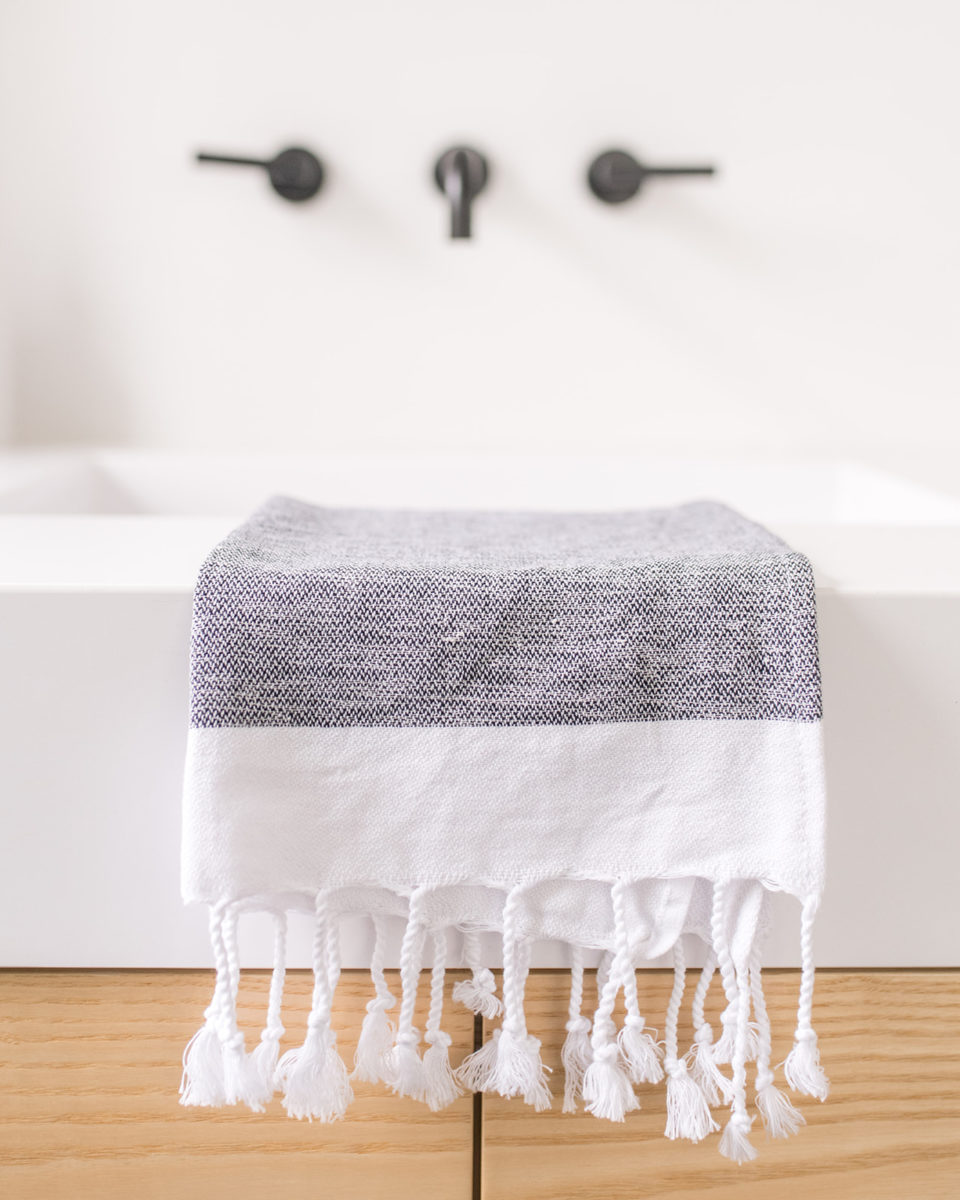
The custom vanity tops were a custom design we came up with that our local fabricator nailed but they took longer than expected to come in. We chose matte white quartz that had integrated sinks with a slot drain but we added in a piece that could be removed for easy cleaning around the drain.
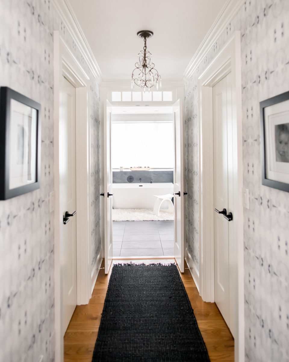
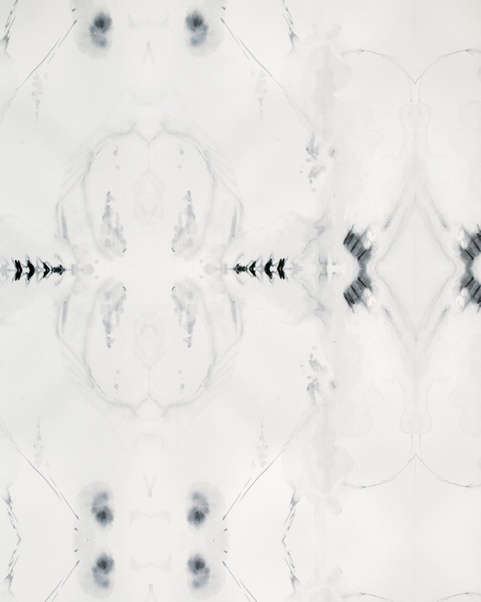
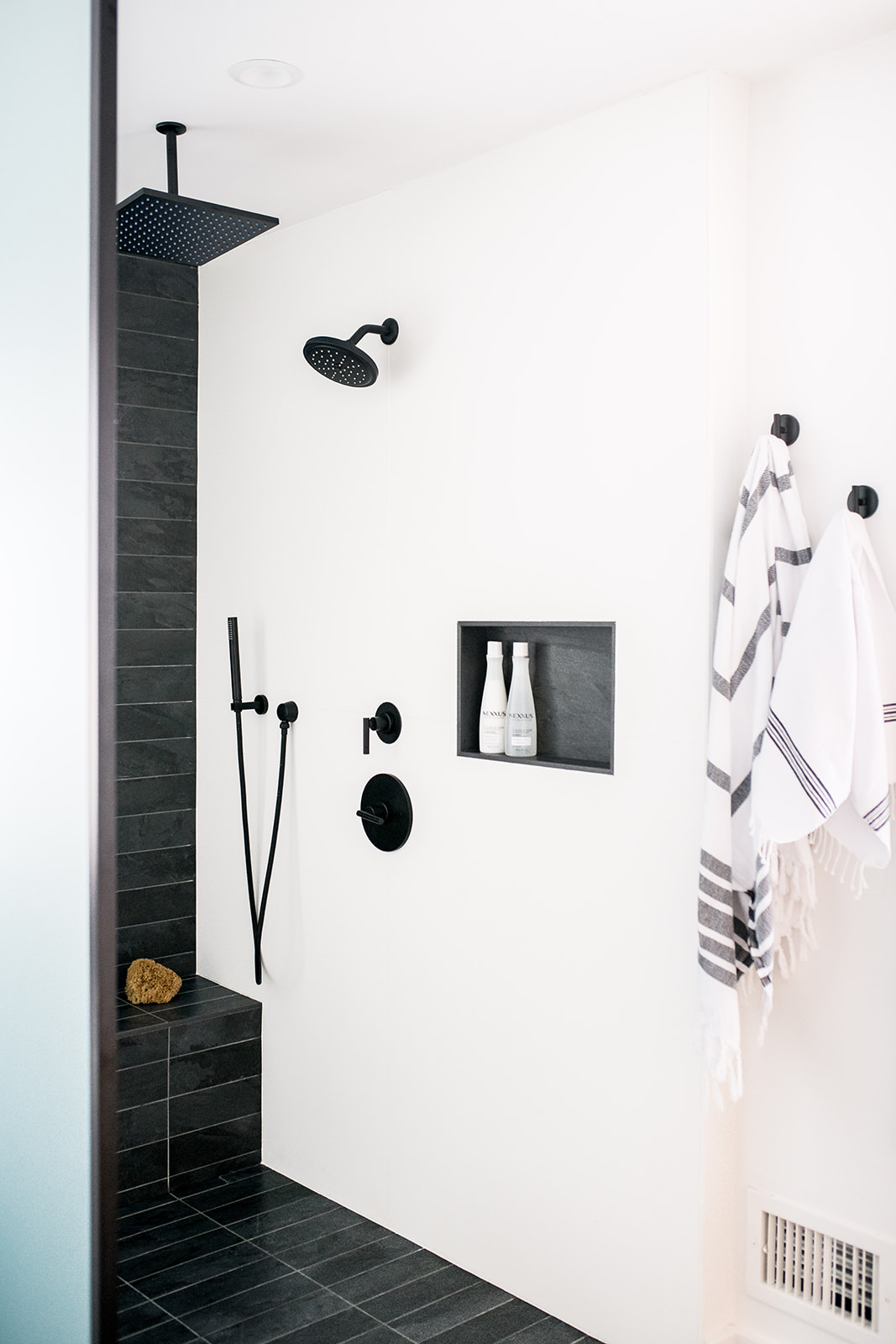
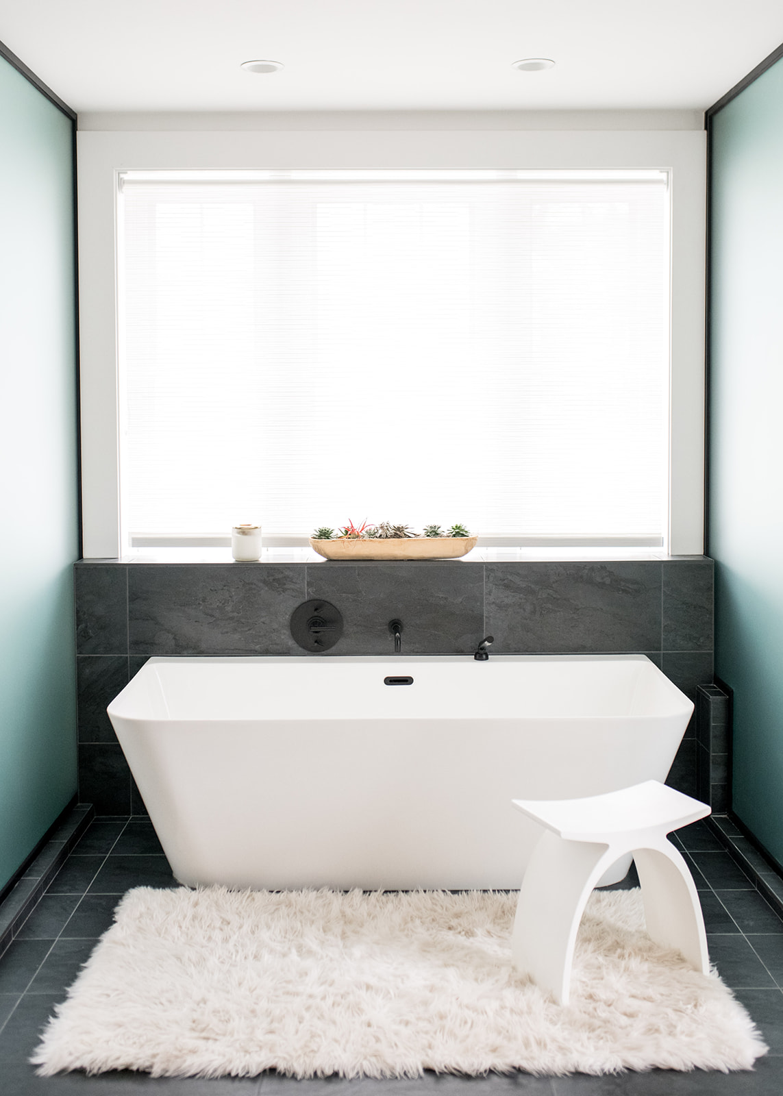
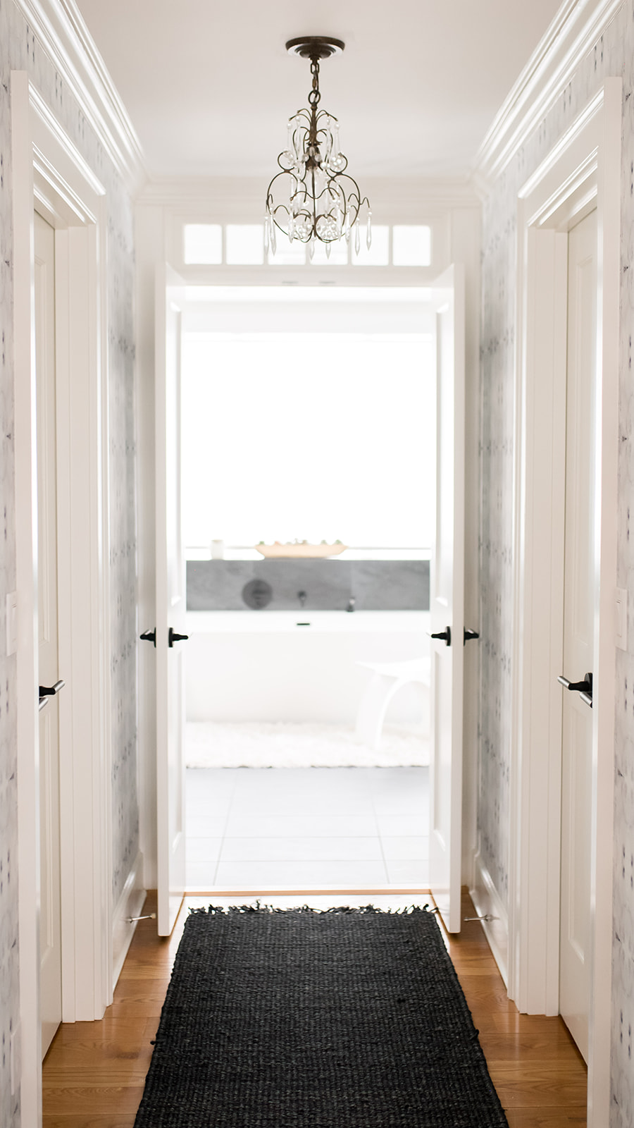
The tub was really important to our client and we’re really happy with the style selection! We had a pony wall built behind the tub so that items could be placed on it and then we had it wrapped in the same dark tile as the floor so it created a waterfall-like look. We chose a dark tile and matte black fixtures to pop off the Ash wood cabinetry and white walls. We wallpapered the hall leading from the master bedroom to the bathroom with amazing paper by Eskayel, added a black runner and switched out the door hardware to black to really make the entry dramatic.
How did you go about creating a more modern vibe in the kitchen, living room and mudroom?
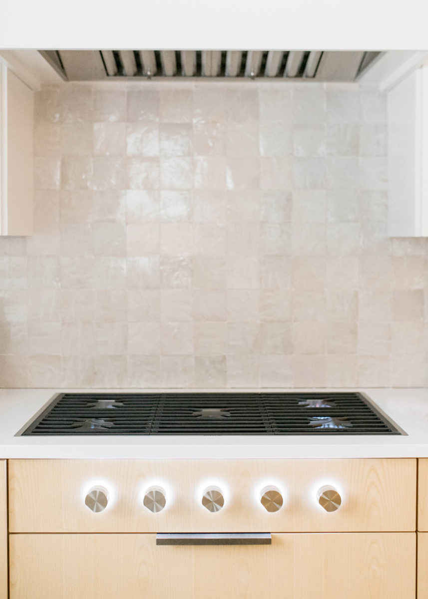
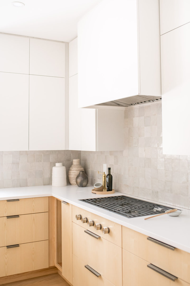
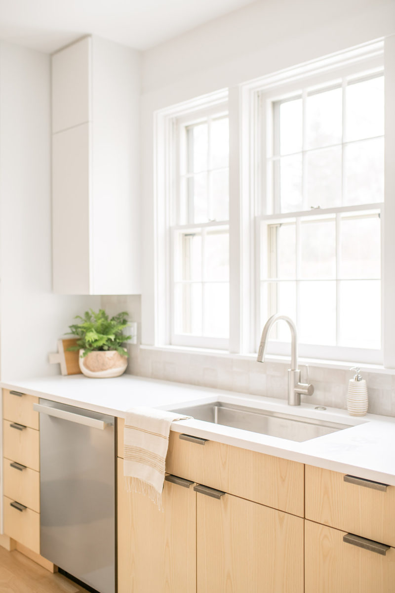
Our goal was to create a modern and clean vibe in the kitchen and living room while honoring functional for their family. The gorgeous two-tone custom cabinetry helped to achieve that. We moved the old pantry as it was at an odd angle in the corner of the kitchen and we closed up the window next to it and moved the refrigerator to that space. This allowed us to come in a few inches into the kitchen to make room for the new mudroom built-ins that would be on the other side of the wall.
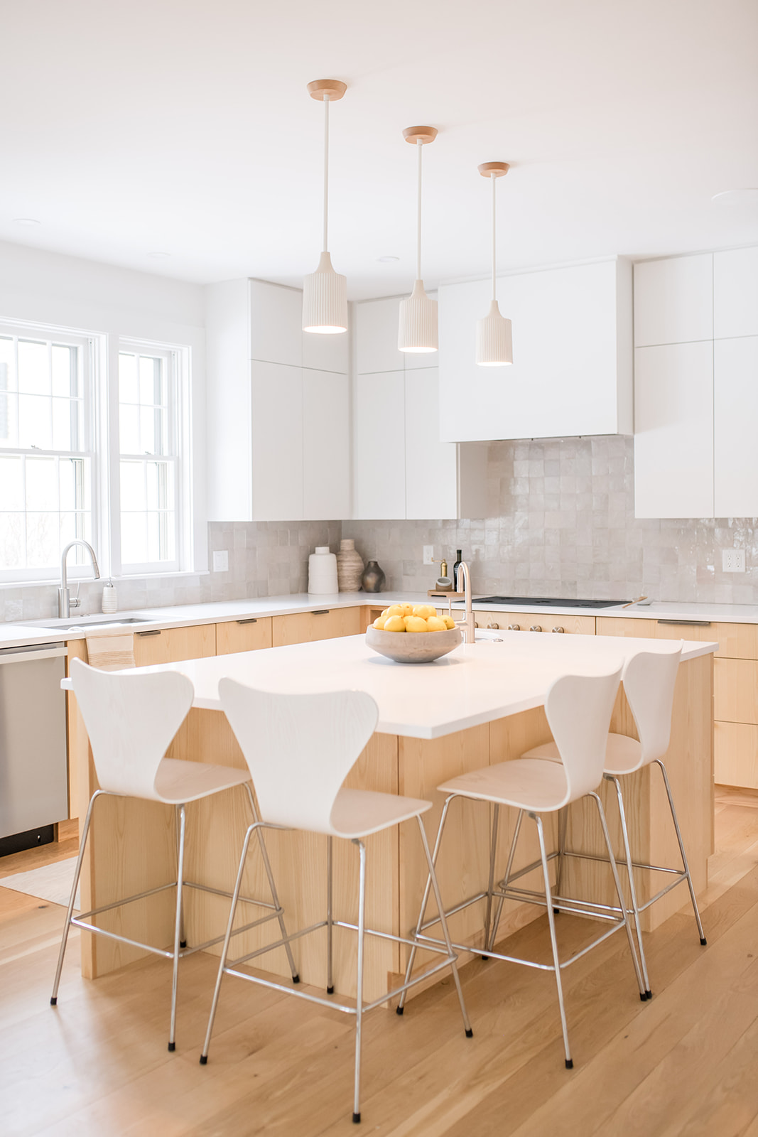
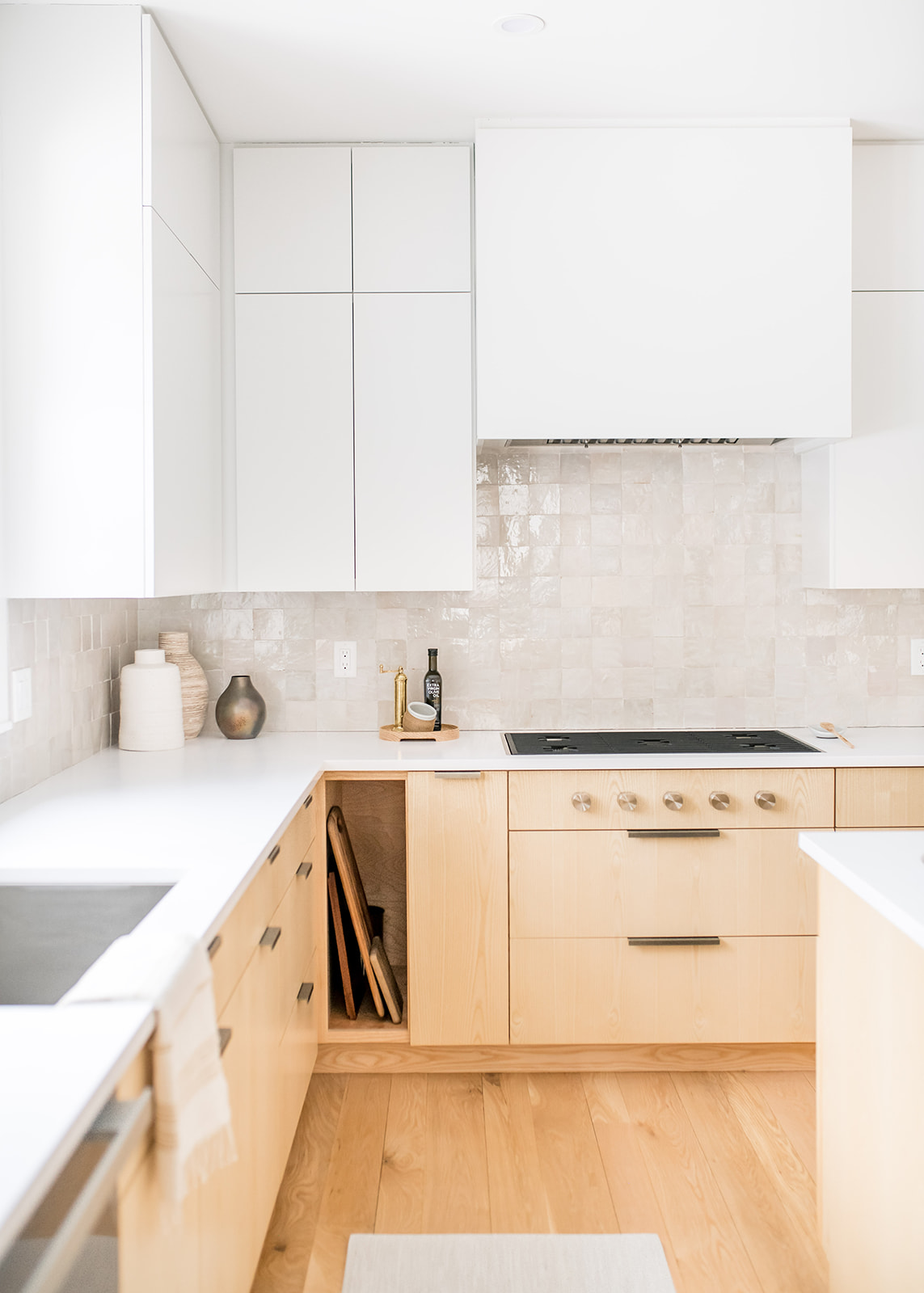
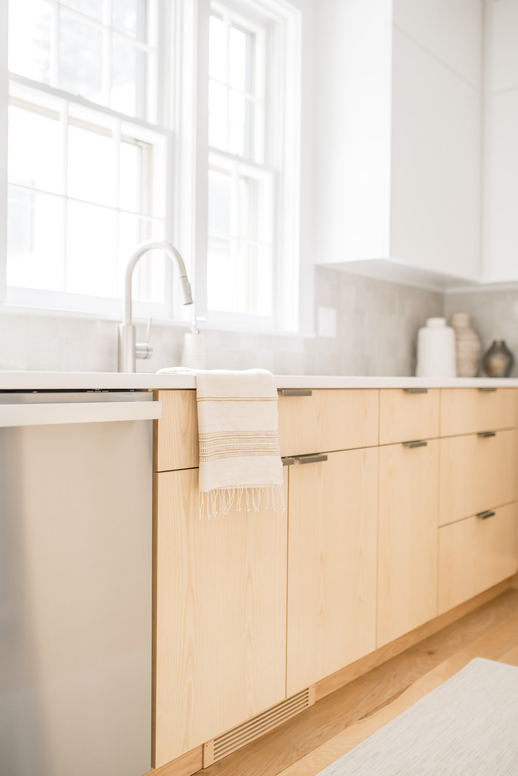
We did a floor to ceiling pantry with ample space and next to that had a message center built. The old island was an odd shape and two different heights and it was hard to reach across when the girls would be up there eating and it was overall too big for the kitchen so we created a custom island with lots of storage underneath, took it down to one level and added in a beverage fridge.
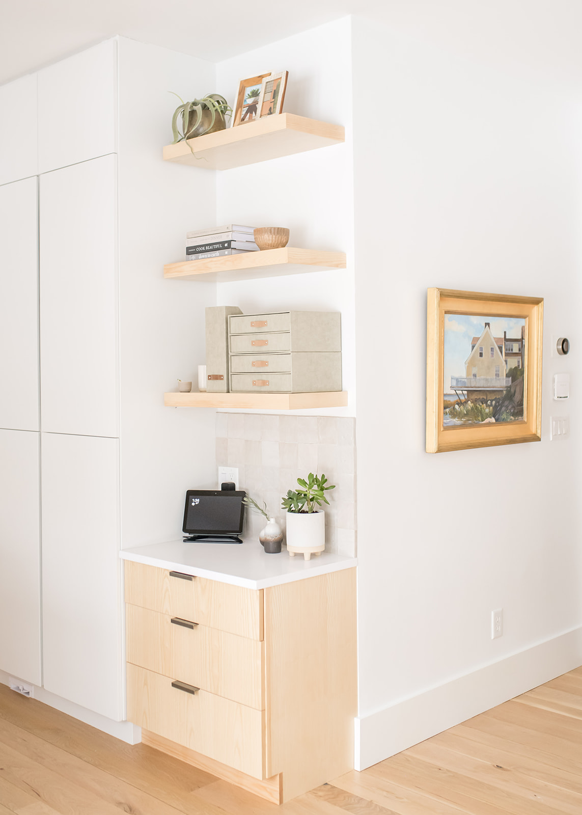
We also removed all of the crown molding in both the living room and kitchen, which helped to open up the ceilings even more. With the crown molding removed, we were able to do double stacked upper cabinets. Everything has a home in their new kitchen with plenty of drawer organizers so that they can keep their countertops clutter-free.
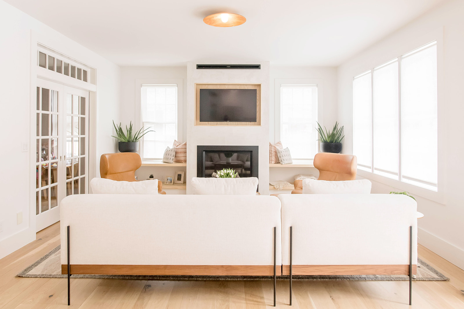
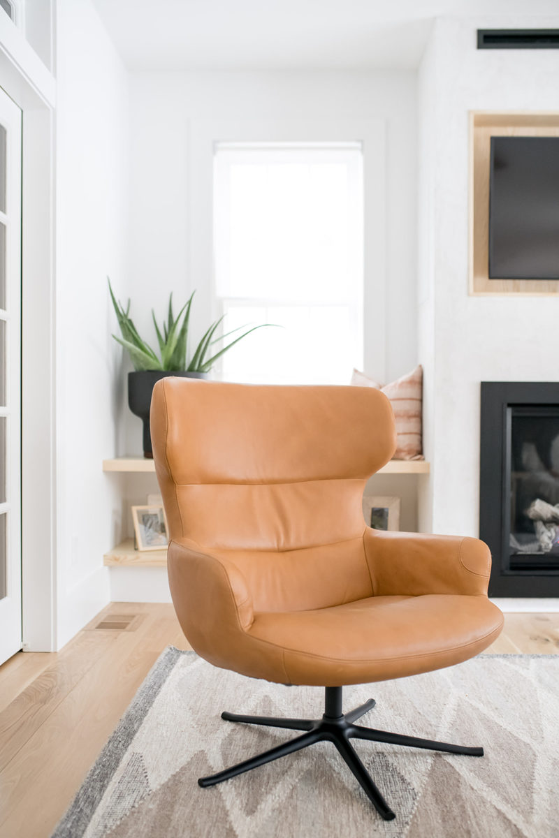
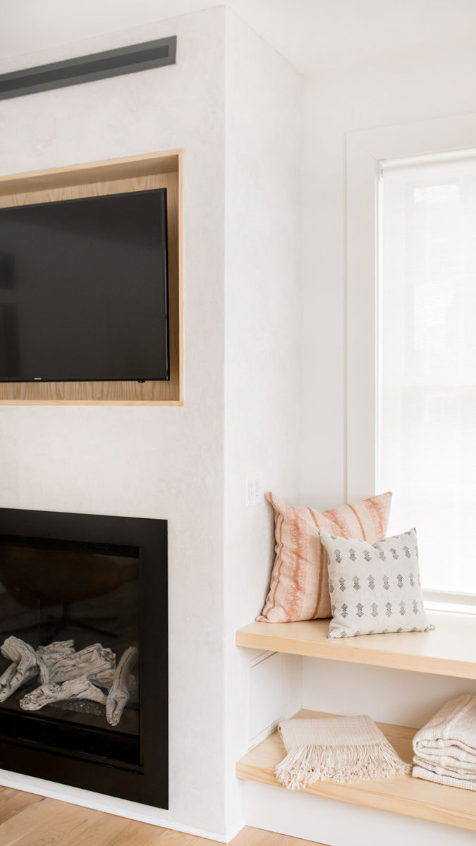
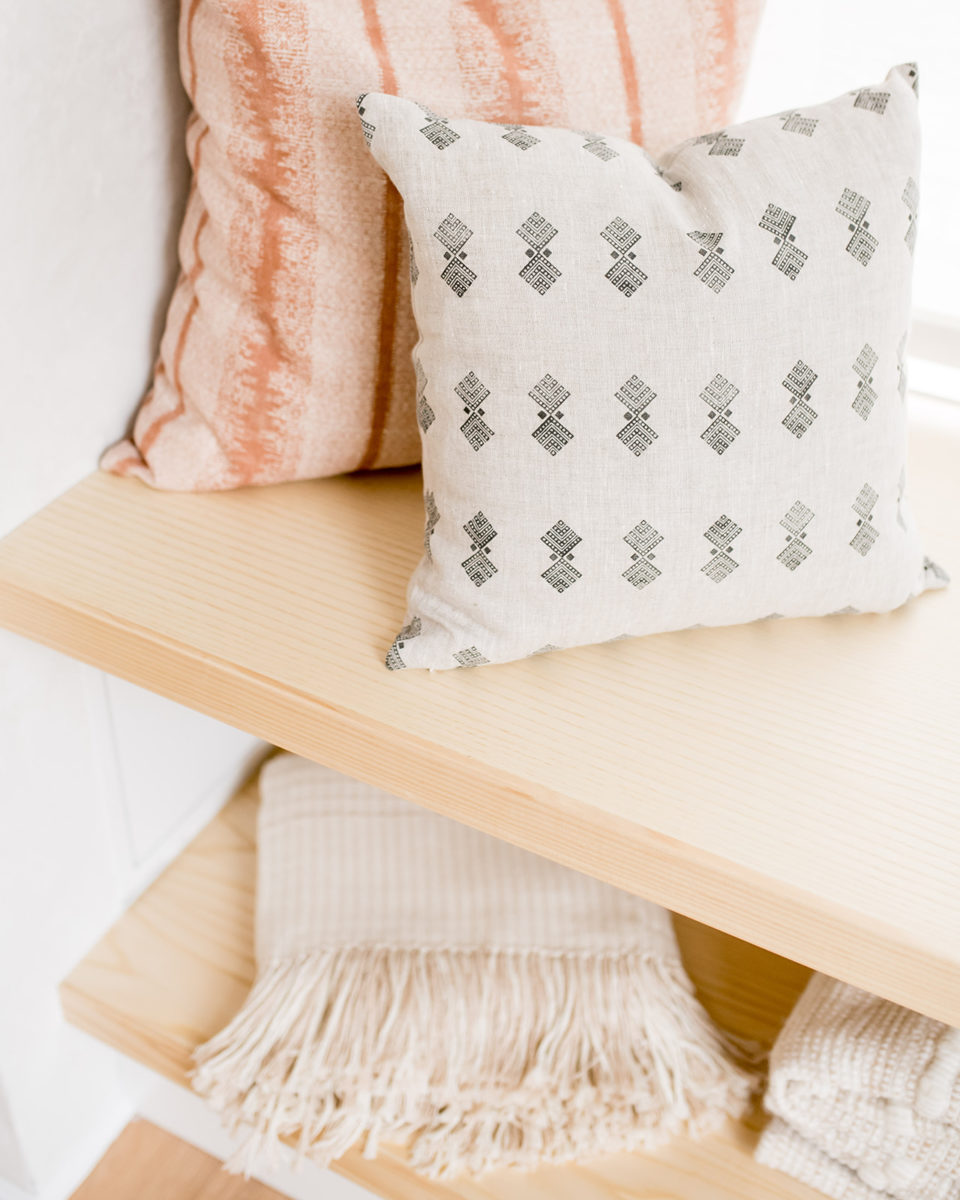
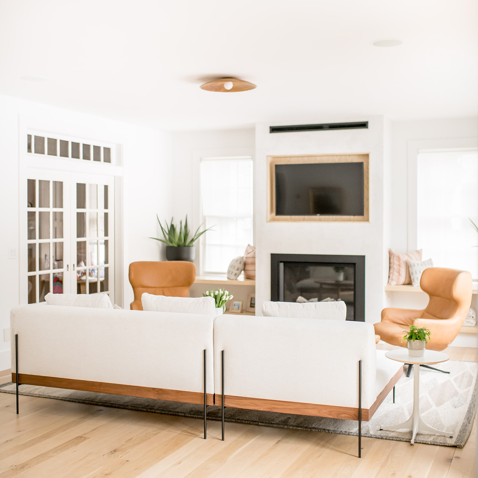
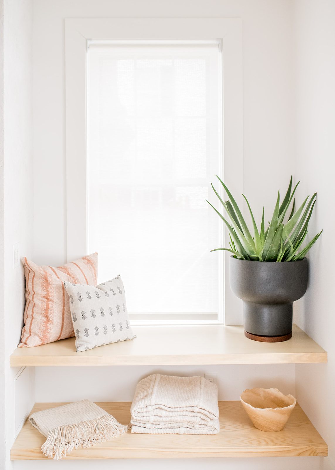
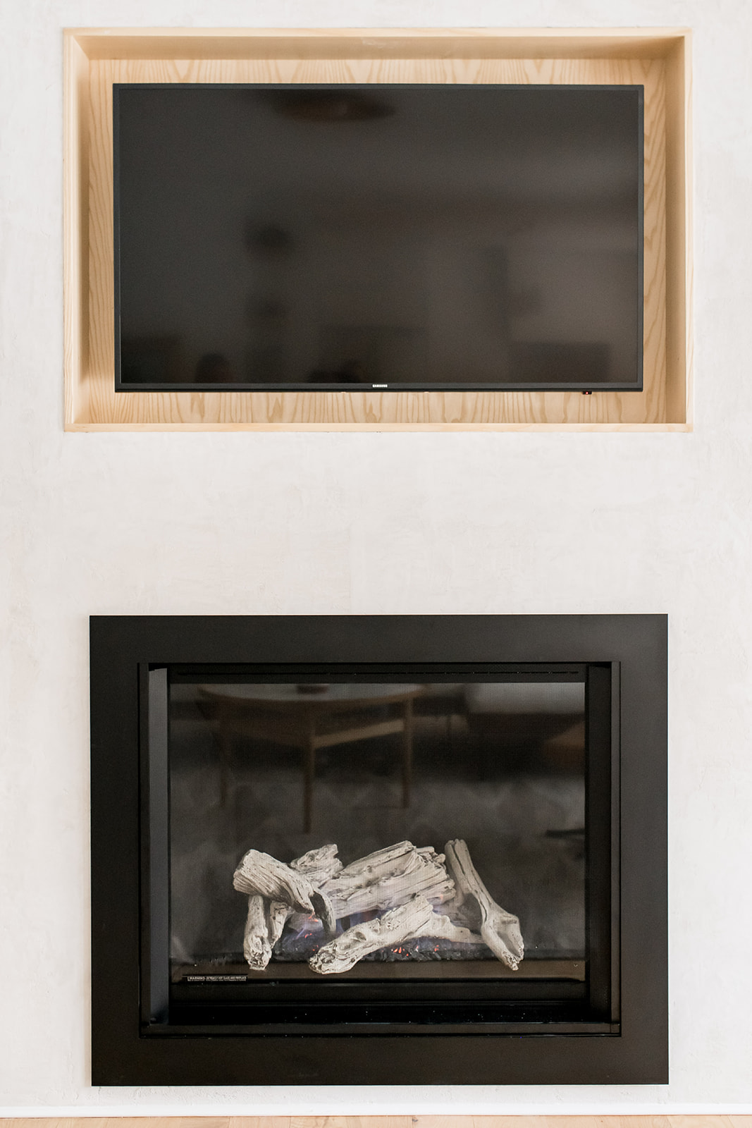
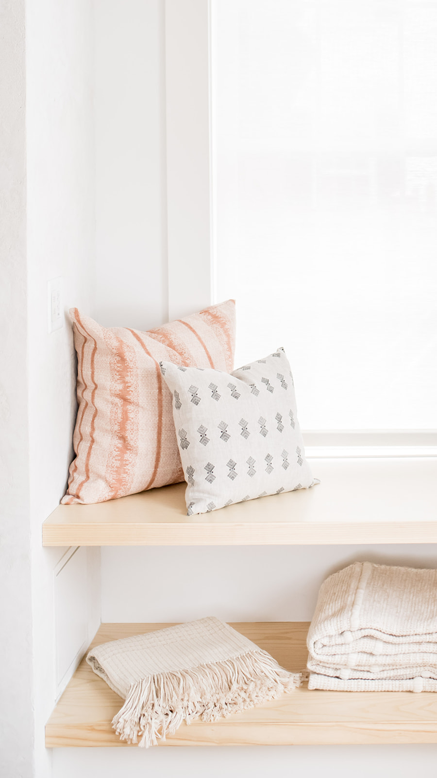
In the living room, we had a gas fireplace installed and brought over the ash wood in the cabinetry by way of floating shelves and also that same wood frames the TV. We designed the TV and fireplace so that not only it was aesthetically pleasing but they had had shelving to display on and for the girls to curl up on to read a book. We gave the fireplace a stucco finish to give it a pop, while complimenting the clean look we were going for in the living room.
Can you tell us about some of the custom pieces in the home?
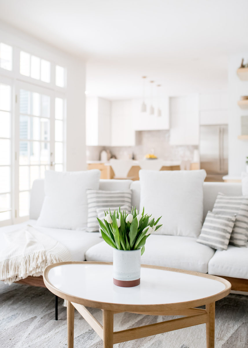
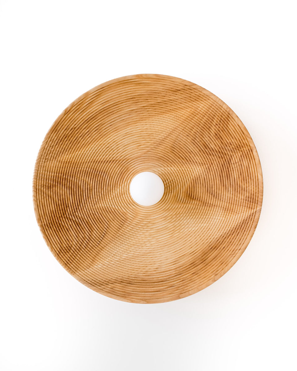
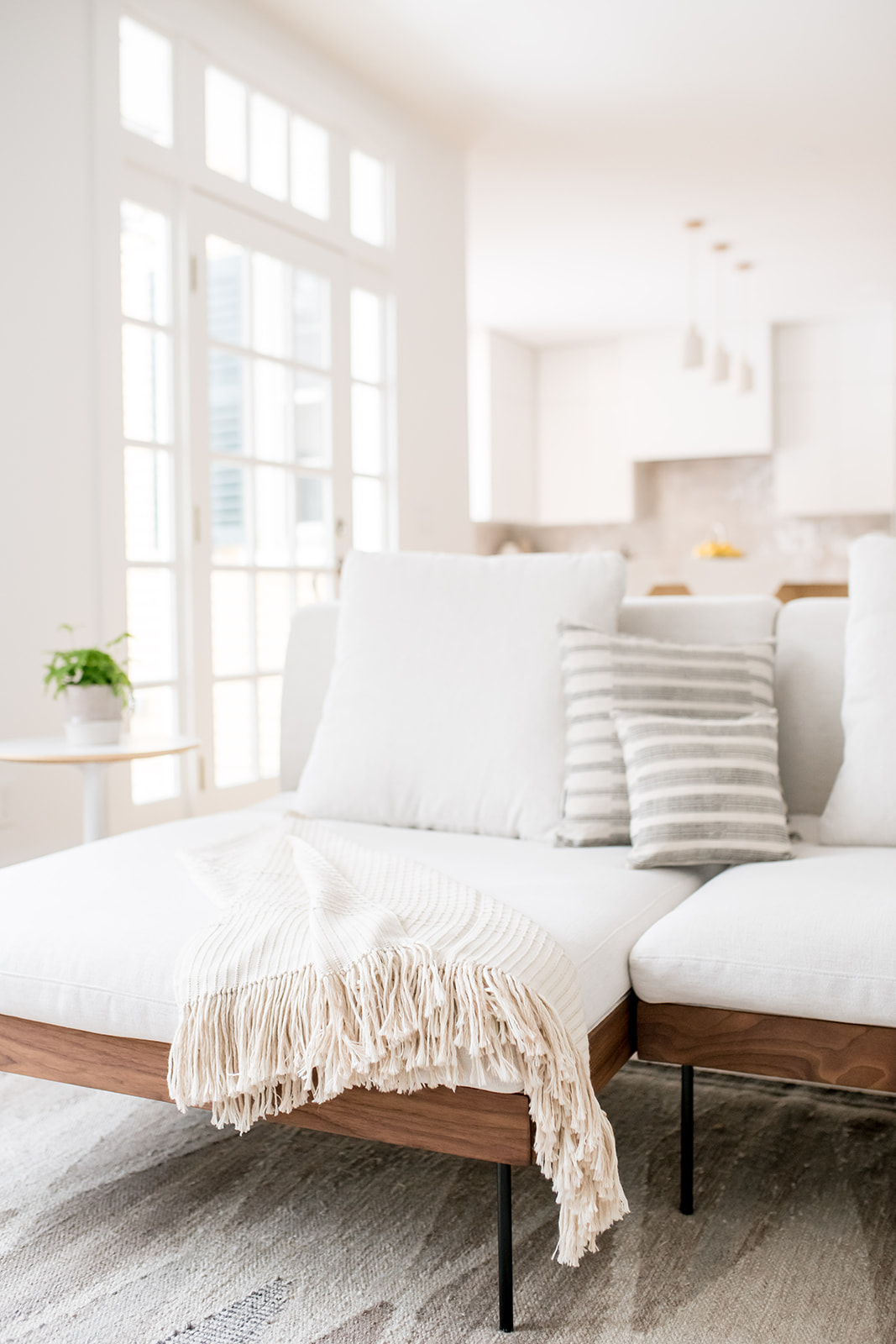
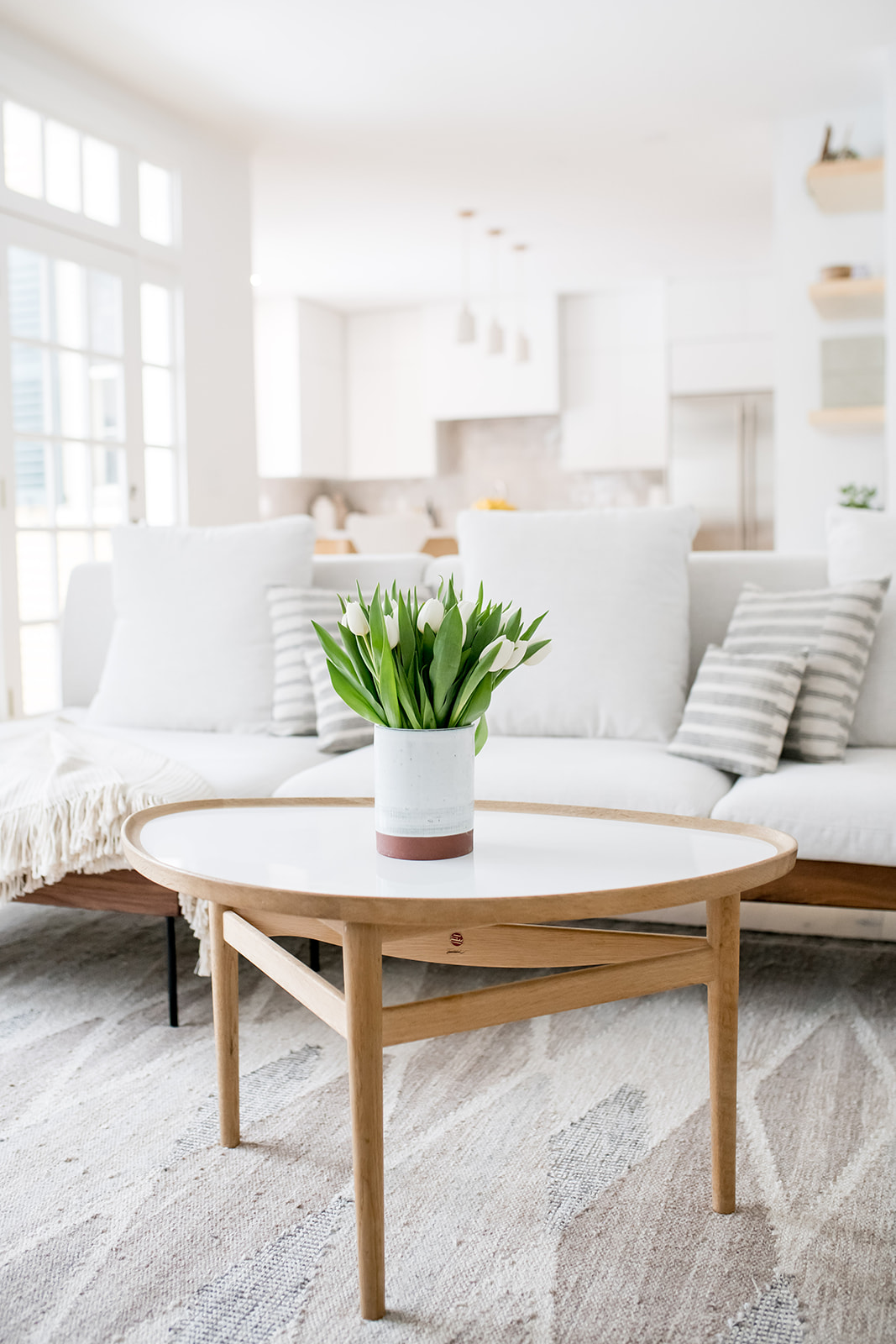
We waited 13 weeks for the ceiling mount lighting, which was hand-made in New York and we love it!! It was truly worth the wait! The sofa was custom made in LA and the leather chairs were also two pieces we couldn’t wait to bring in. The rug ties all of the beige/taupe tones together and really anchors the room.
Were there any big must-haves for your clients?
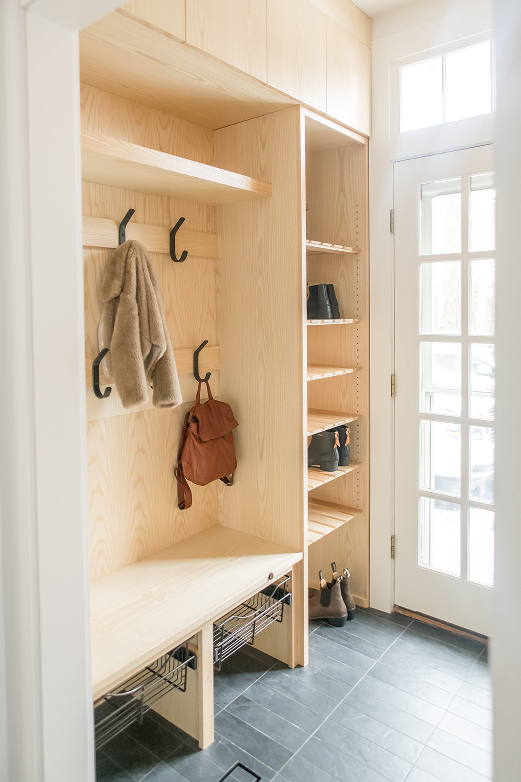
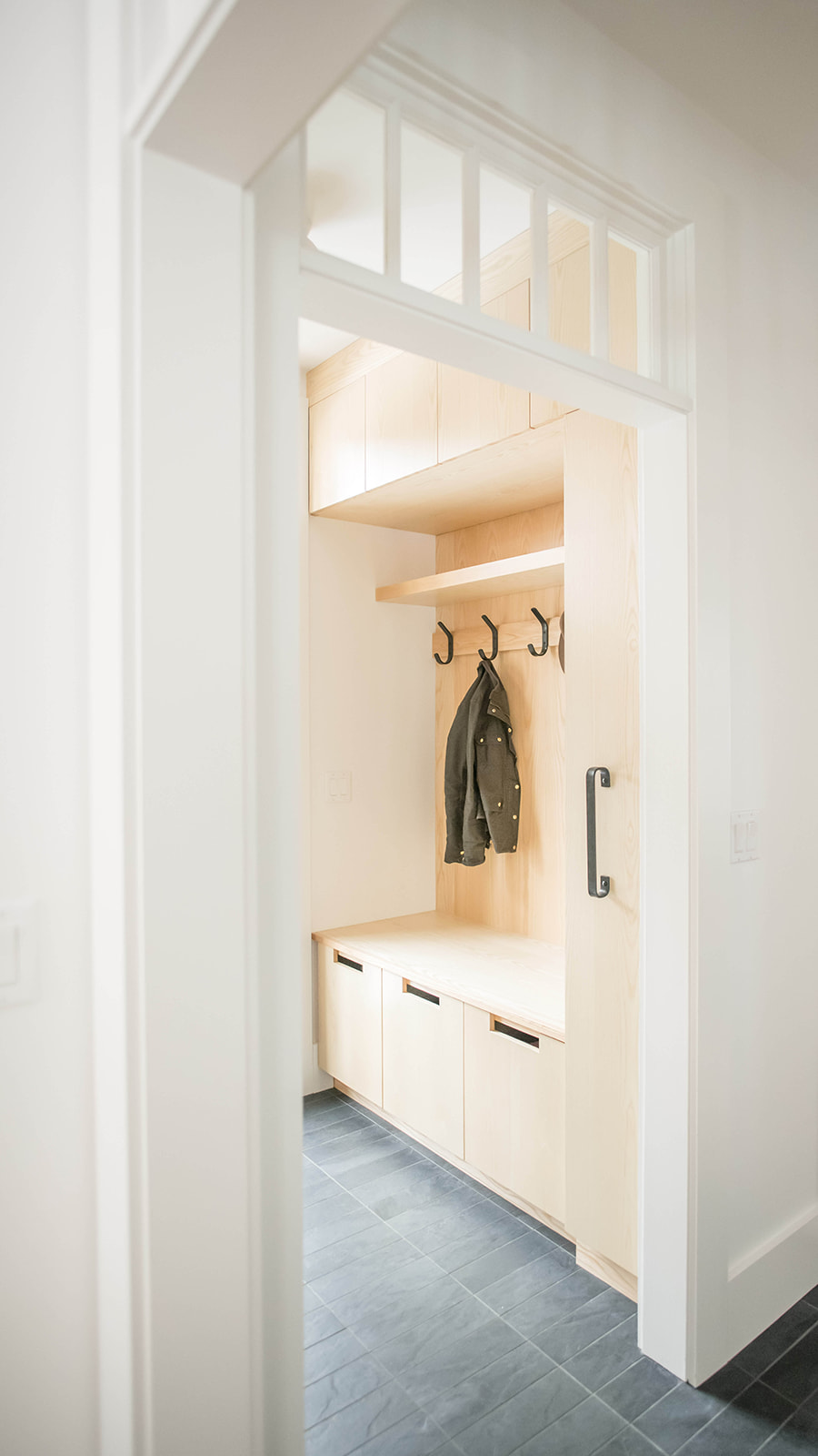
Yes, the mudroom! We were able to move that one wall out a few inches and it allowed for built-ins and a small bench for their girls to sit on in the mudroom. Again, we used the same custom cabinetry company and Ash wood. The adults have their side with hooks, upper cabinets and pull out drawers and the girls have their side with hooks, cubbies and their own drawer. We also did a floor to ceiling shoe tower. We also did a thin, linear broom closet that pulls out to accommodate cleaning items and dog leashes.

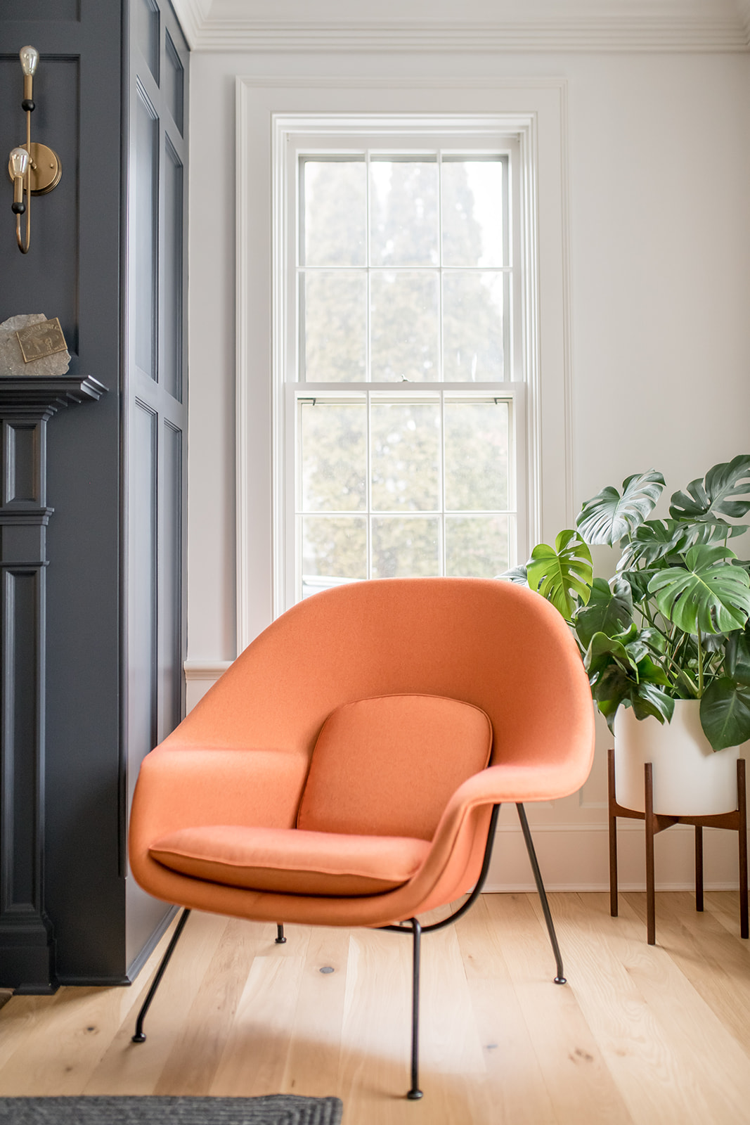
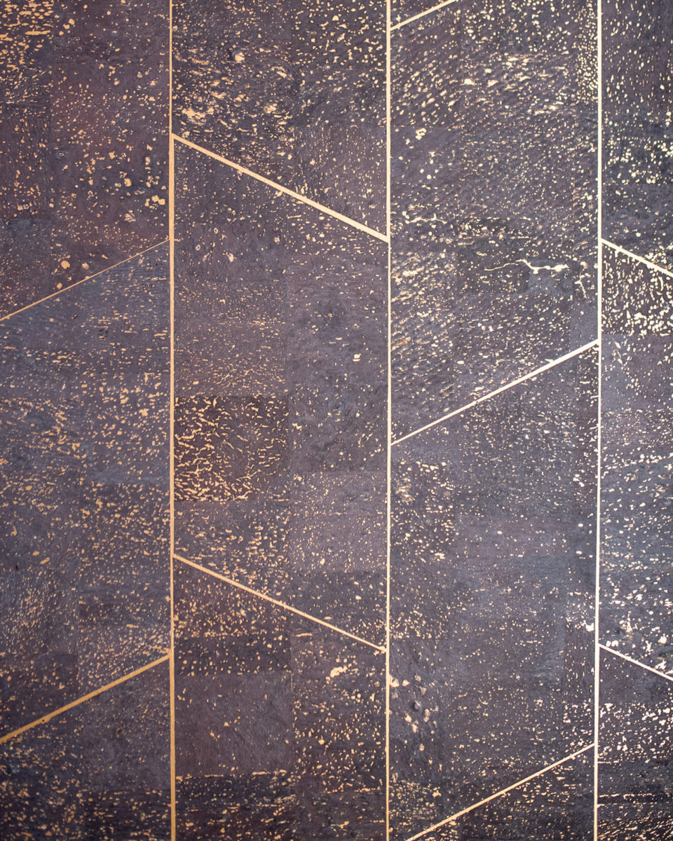
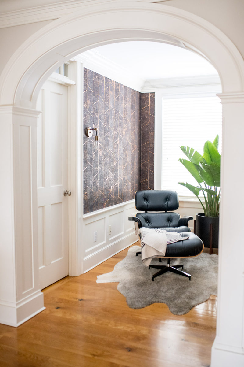
For the rest of the house, we did lots of cool wallpaper from Phillip Jeffries and Eskayel. My client loves mid-century modern furniture so you will see that throughout the house. We painted the dining room fireplace a deep blue to make it pop and chose mid-century modern furniture so that the space didn’t feel too traditional.
