This ranch renovation is many things: modern, warm, minimalist and most notably a labor of love. When designer, Jenny Judge, fell in love with this house she knew it had huge potential and firm limitations. In today’s tour, Jenny shares the choices she made to add size and value to her home as well as links to the finishes she used! Take a peek at the serene snaps by the talented SEN Creative and see for yourself how this home went from worst to first.
From the designer… My husband and I had just begun looking for a home renovation project of our own in the San Francisco Bay Area. At the time, we were ready to move out of the city as we had just learned we were expecting our first child. We were eager to get our hands on a project and we weren’t afraid of a challenge. A few months into our search, we found a 1950’s ranch style home just minutes from where I grew up in Burlingame, California, a suburb 30 minutes south of San Francisco.
You know that theory of buying the worst house in the best neighborhood, well we did exactly that – a crumbling roof, unruly landscape, a brick wall in the entryway and a BBQ (yes, BBQ) in the middle of the kitchen – and I immediately fell in love with the potential of the home with its high ceilings, natural light, single level and flat yard. But, apparently, so did a lot of others, as we were one of over 20 groups to place an offer on the home. We were sure we didn’t stand a chance.
With the help of our amazing realtor and childhood best friend, we found out our offer was accepted a few days later. This also happened to be my birthday so I always considered that a great omen. After months of planning our renovation, a lengthy permit review process with a few set-backs along the way, and now with a new baby in tow, we were able to start our project in January 2020. Little did we know what the next few months would have in store for us.
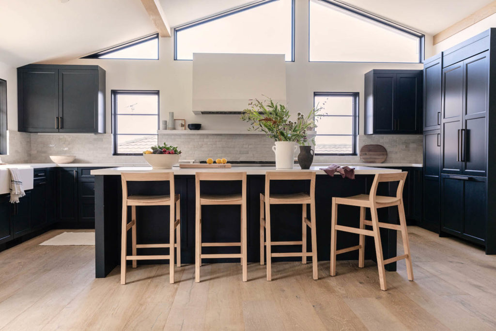
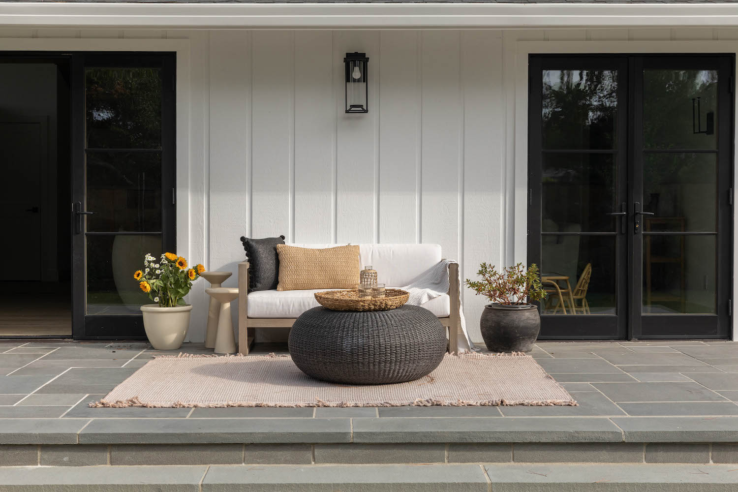
The house sits on a hill overlooking the San Francisco Bay so building up was not an option as it would not pass by the hillside review committee. So, we had to get creative to think of other ways to add more value to the home. We were able to keep the roofline the same by enclosing an existing outdoor patio, building up the home’s foundation and creating a 200 square foot Chef’s Kitchen which became the new heart of our home. We removed a large brick wall that stood in the middle of the house to create a large open concept living space. To do so, large steel beams were installed to maintain the structure of the home which we wrapped in white oak to complement the new flooring. We added a pair of wide French doors to the patio that flanked the living room fireplace creating a seamless indoor-outdoor living space ideal for our young growing family to enjoy the newly designed yard thanks to our friends at Yardzen who helped make our landscaping dreams a reality.
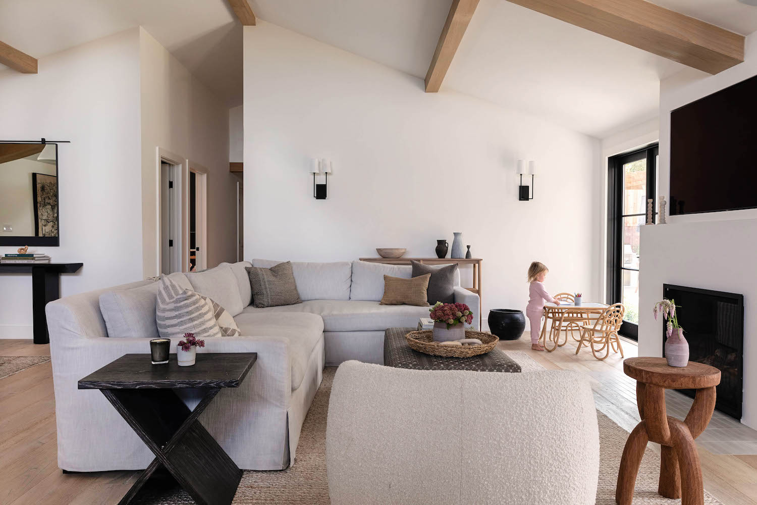
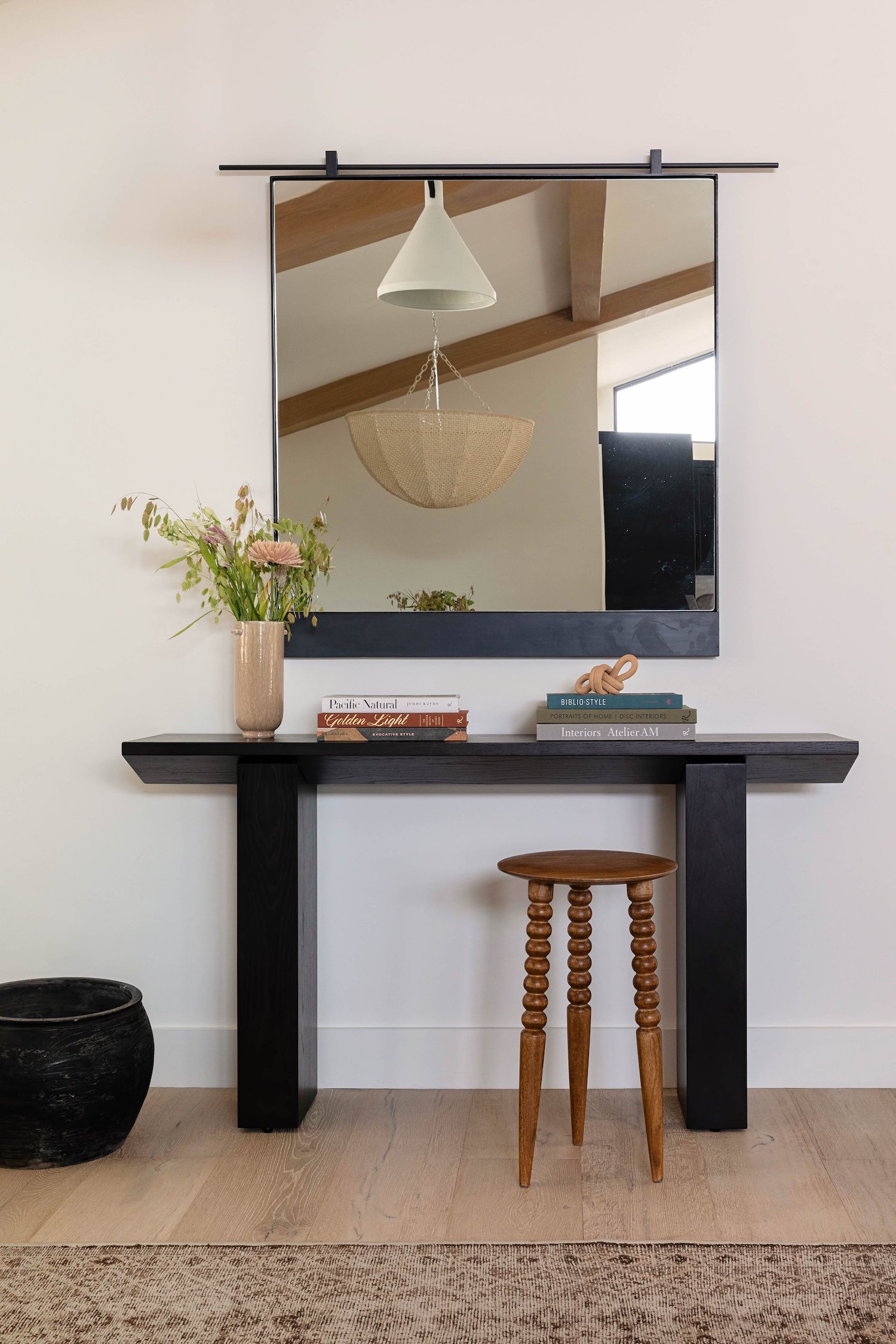
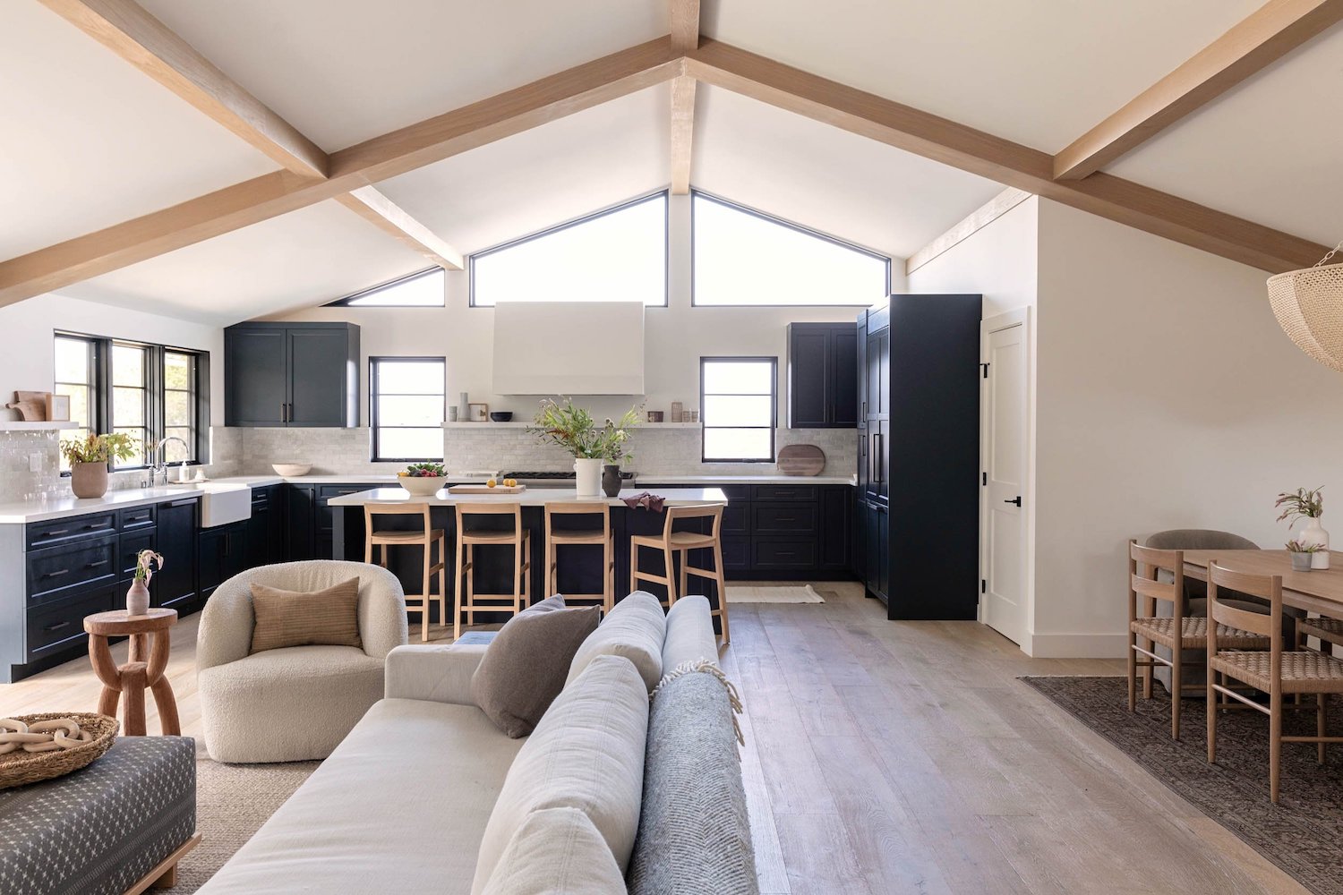
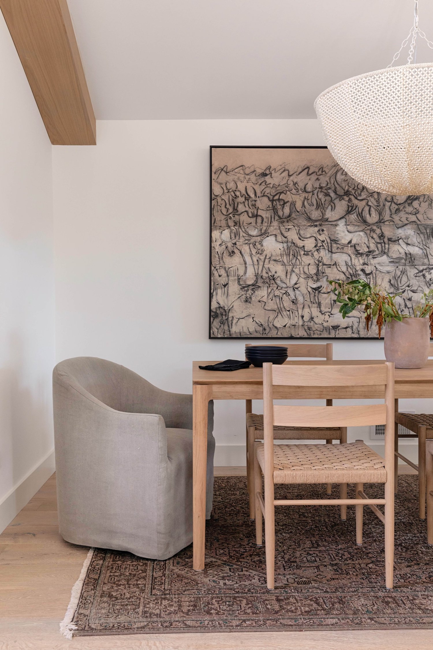
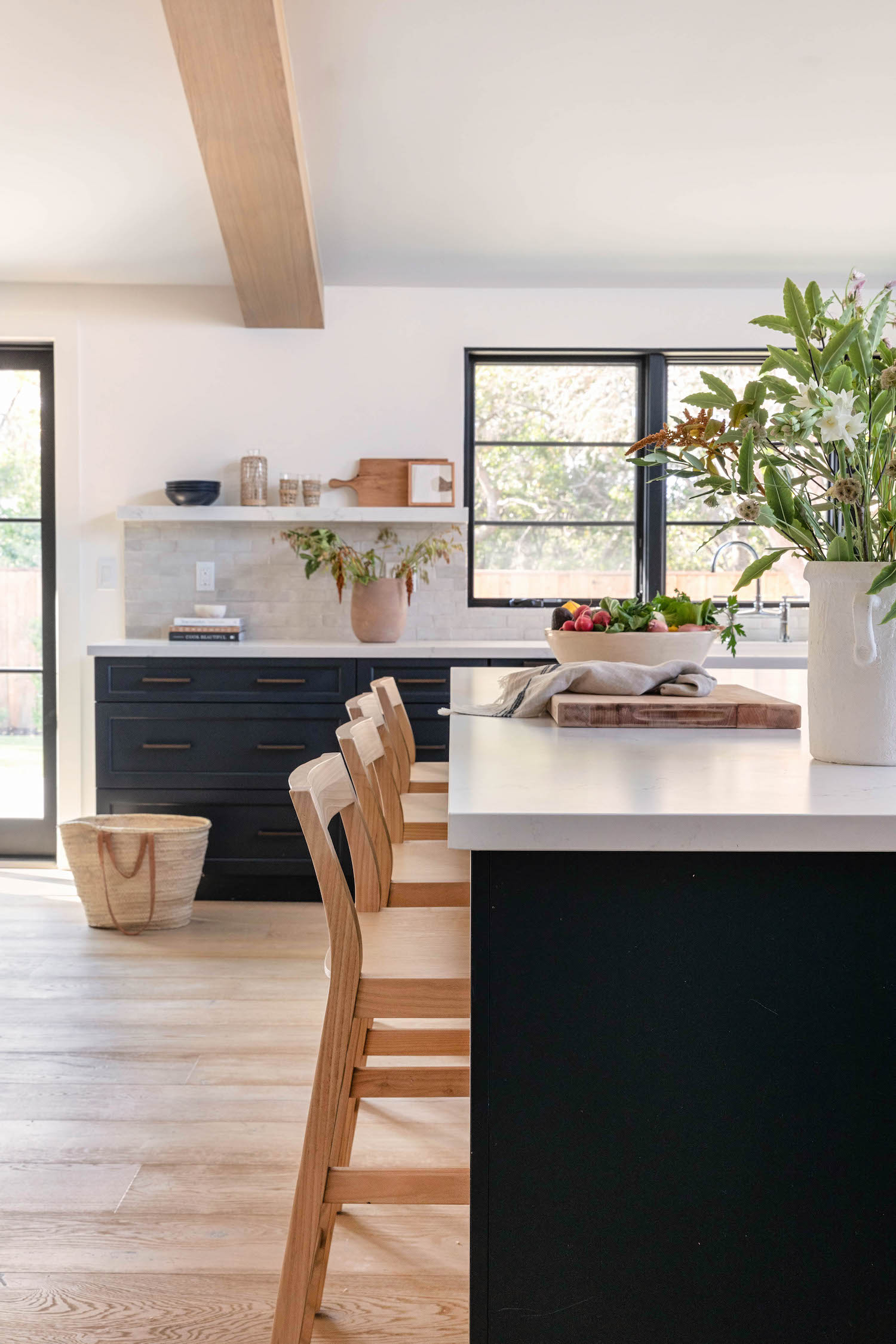
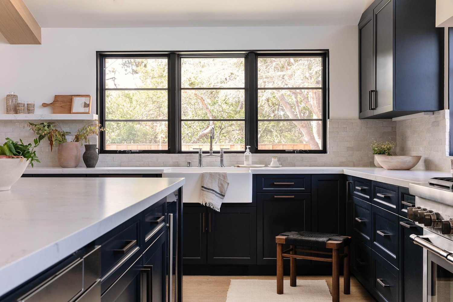
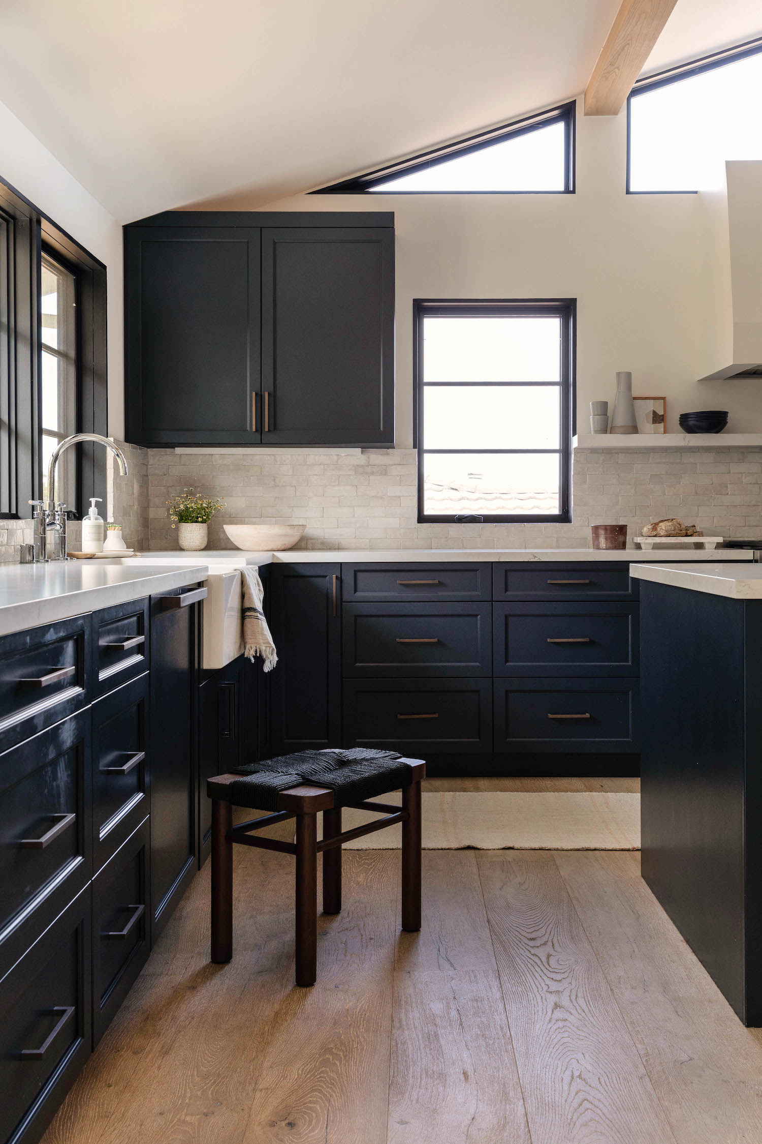
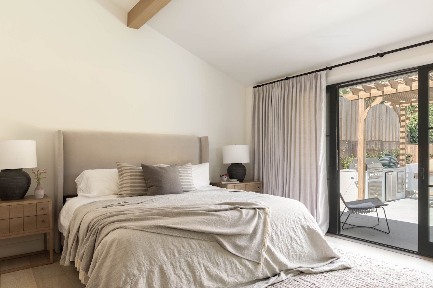
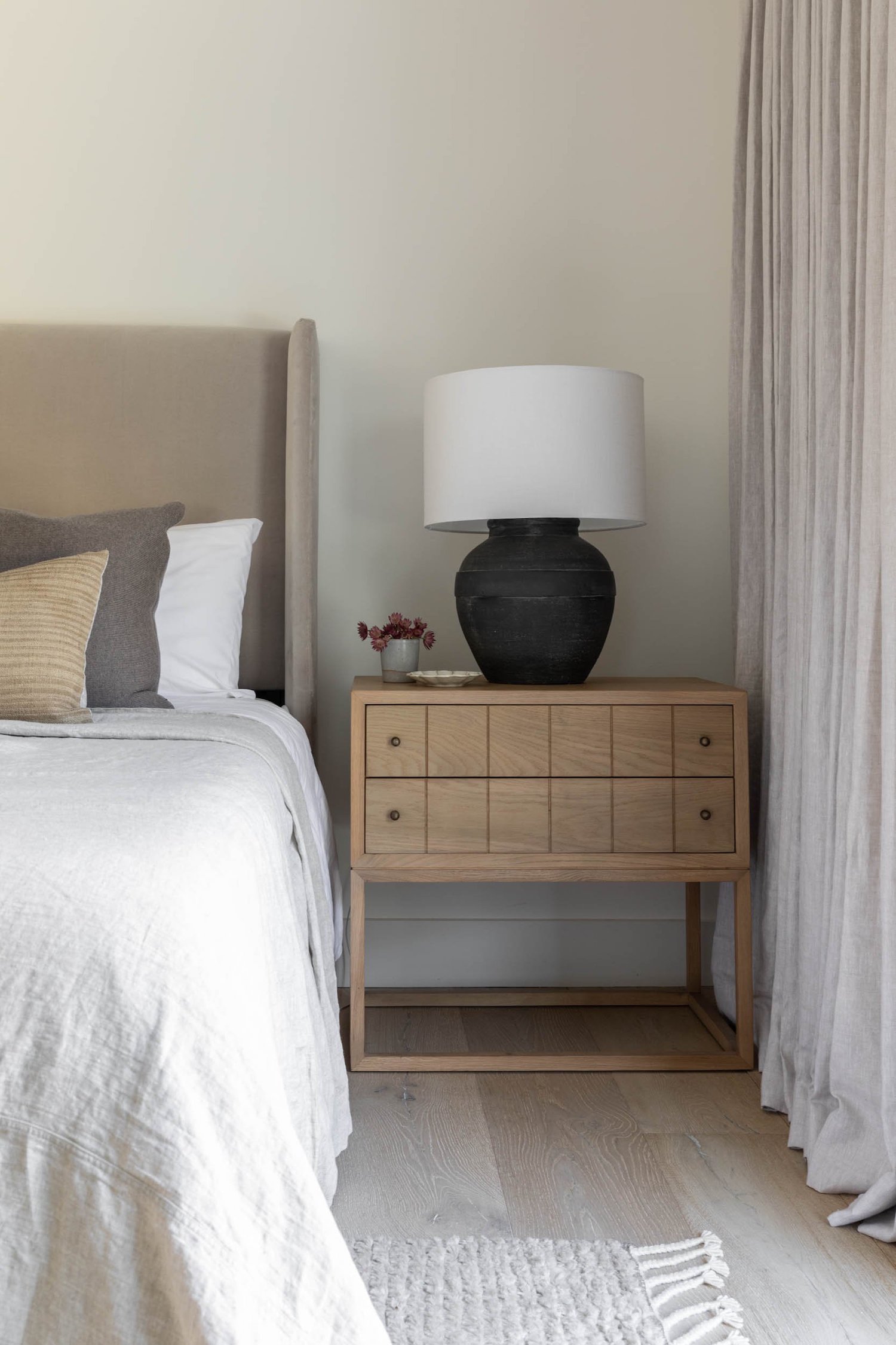
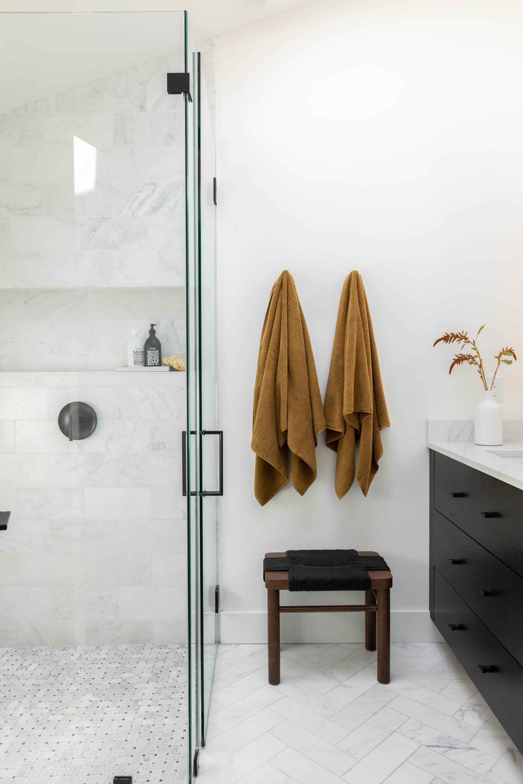
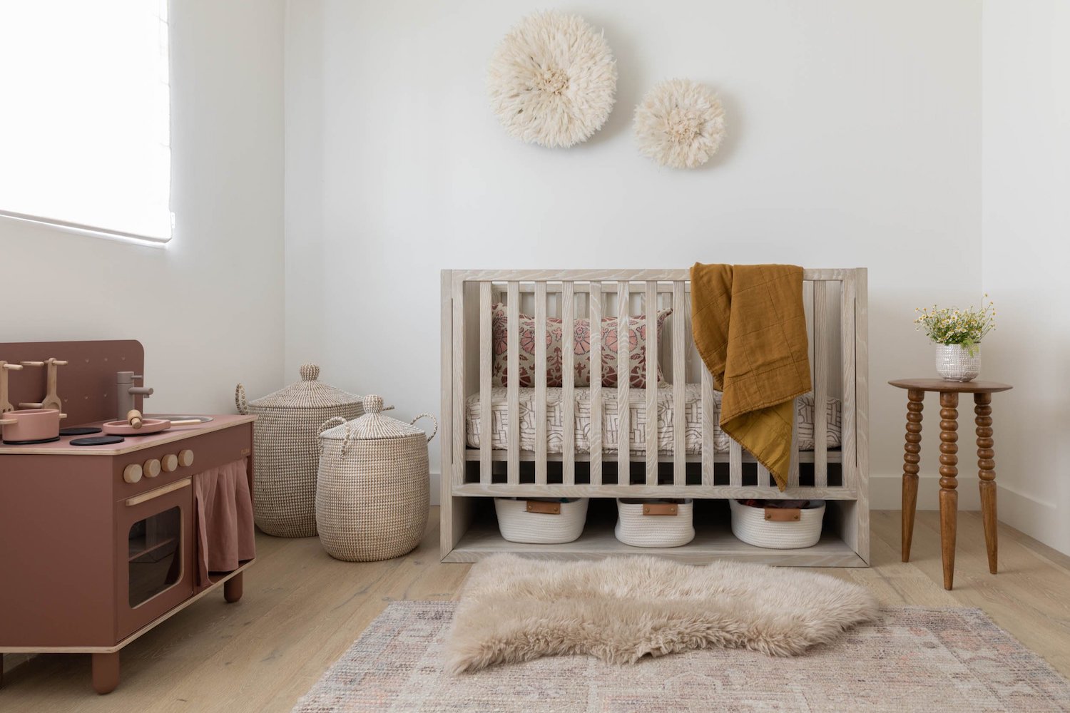
My design goals were to create an environment that was family friendly – nothing too fussy or precious, just a beautiful backdrop for creating lasting memories with our friends and family. I love neutral and earthy textures and to mix modern and vintage pieces together for a curated look. I love things to have an organic feel so incorporating natural wide-plank white oak floors was a must for me (We chose Manor Plank Flooring, Walden Line). We chose to install Marvin Windows (Elevate) for our windows and doors, taking our design in a more modern direction. Given the new open concept layout, I wanted to make each area – entry, kitchen, living and dining – feel like their own unique space while still keeping a cohesive feel. We chose to go with dark cabinets in Benjamin Moore Soot to hold weight in the space and paired them with matte bronze hardware, honed quartz countertops and handmade zellige tile (Cle Tile). We also incorporated open shelving to display some collected pieces and vintage glassware. Rugs are also mostly vintage or made of quality natural materials by Armadillo & Co. Natural wood tones and vintage pieces paired with wood beams and subtle curves in furniture and light fixtures balanced the sharp roof lines.
The end result has proved to be the perfect gathering place, a dream for our growing family.
Like what you see? Take a peek at the talent behind the story… Interior Design: Jenny Judge Design · Photography: SEN Creative · Contractor: Barron Construction
