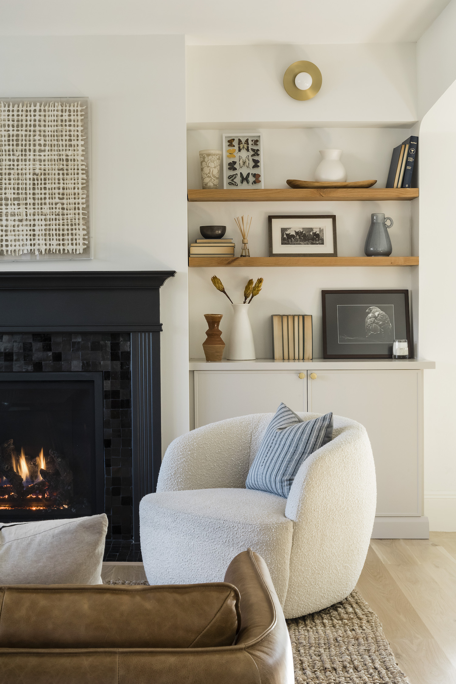
When Hannah Oravec, of Lawless Design, was called in to redesign this classic Victorian, she wanted to update the look without comprising the character. Despite this project being a full gut job, you’d never know it from the hints of classic architecture added back into the home during renovation. By fusing classic Victorian characteristics and juxtaposing them with modern elements they created an eclectic space like no other. Take a tour of this incredible home for a prime example of how to bring a Victorian house into the 21st century.
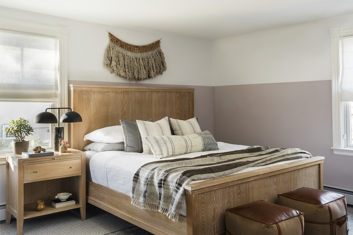
We had our initial consultation in March 2019 and we wrapped up by November 2020. The first phase was the kitchen, powder room, master bedroom, closet and bathroom. The second phase was the dining room, living room and entryway.
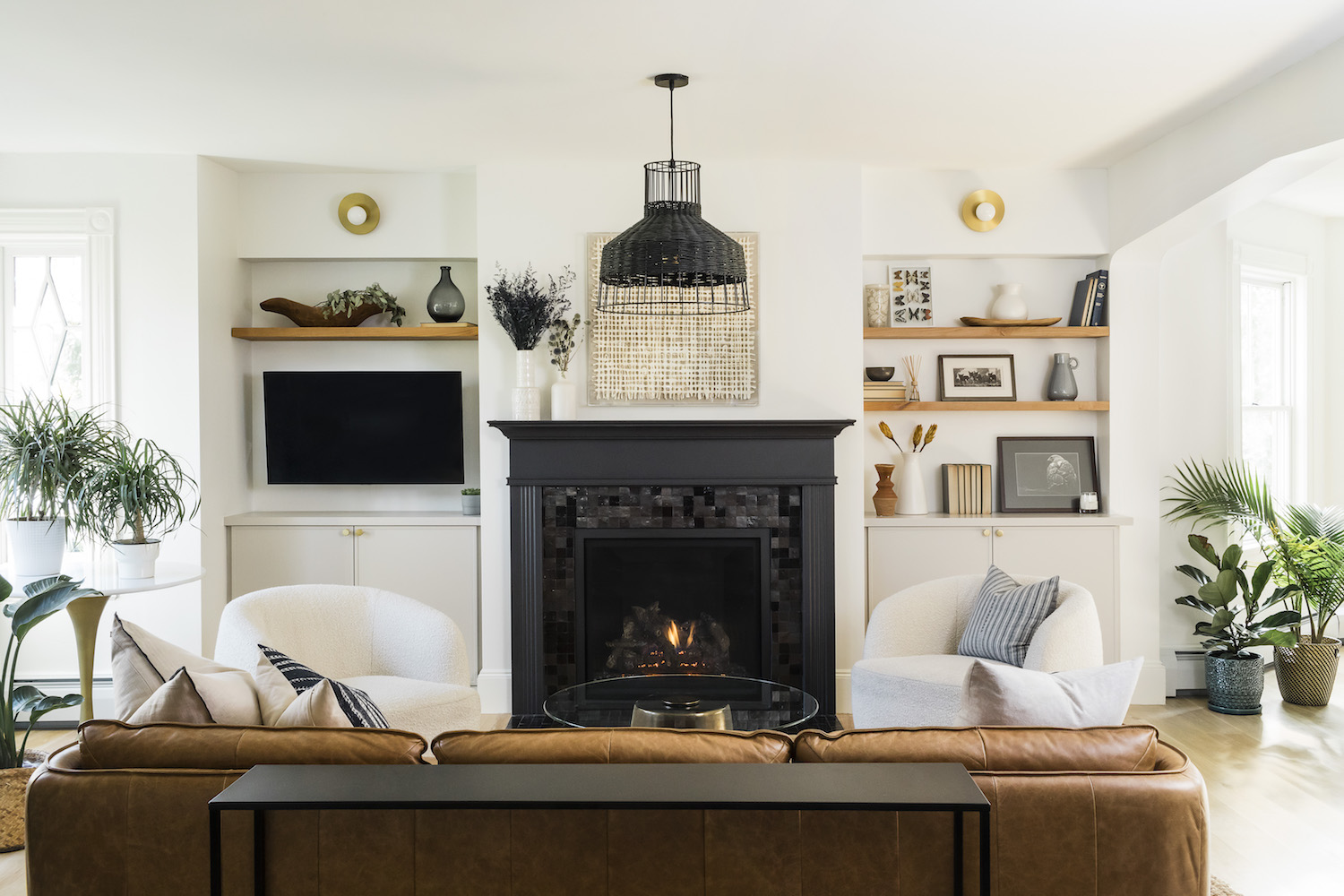
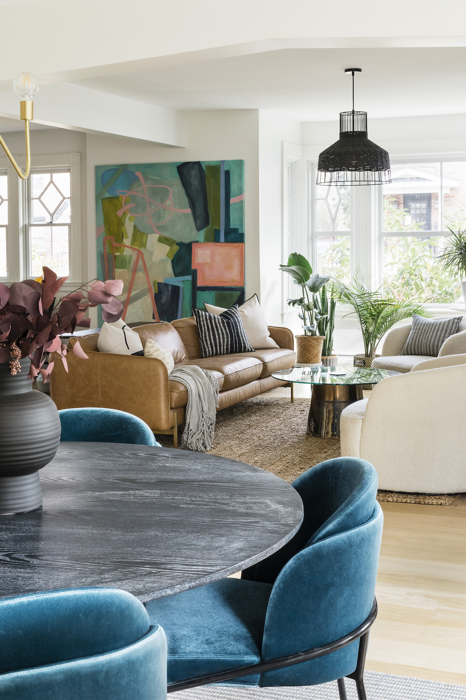
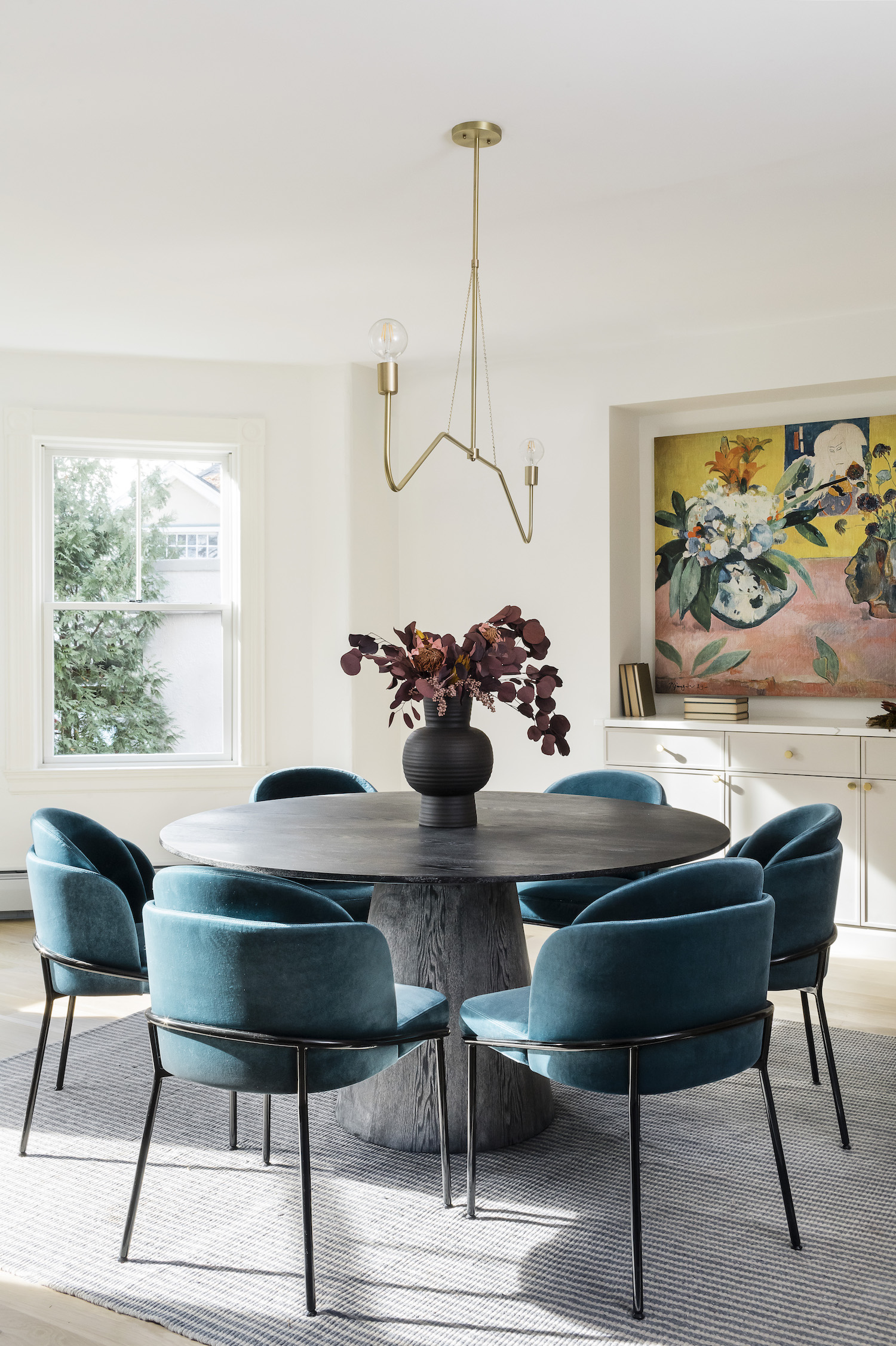
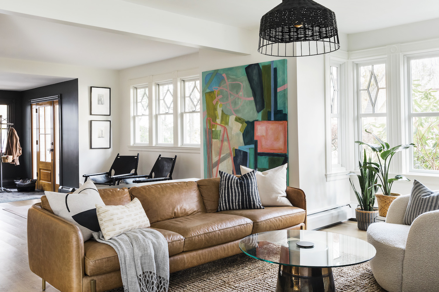
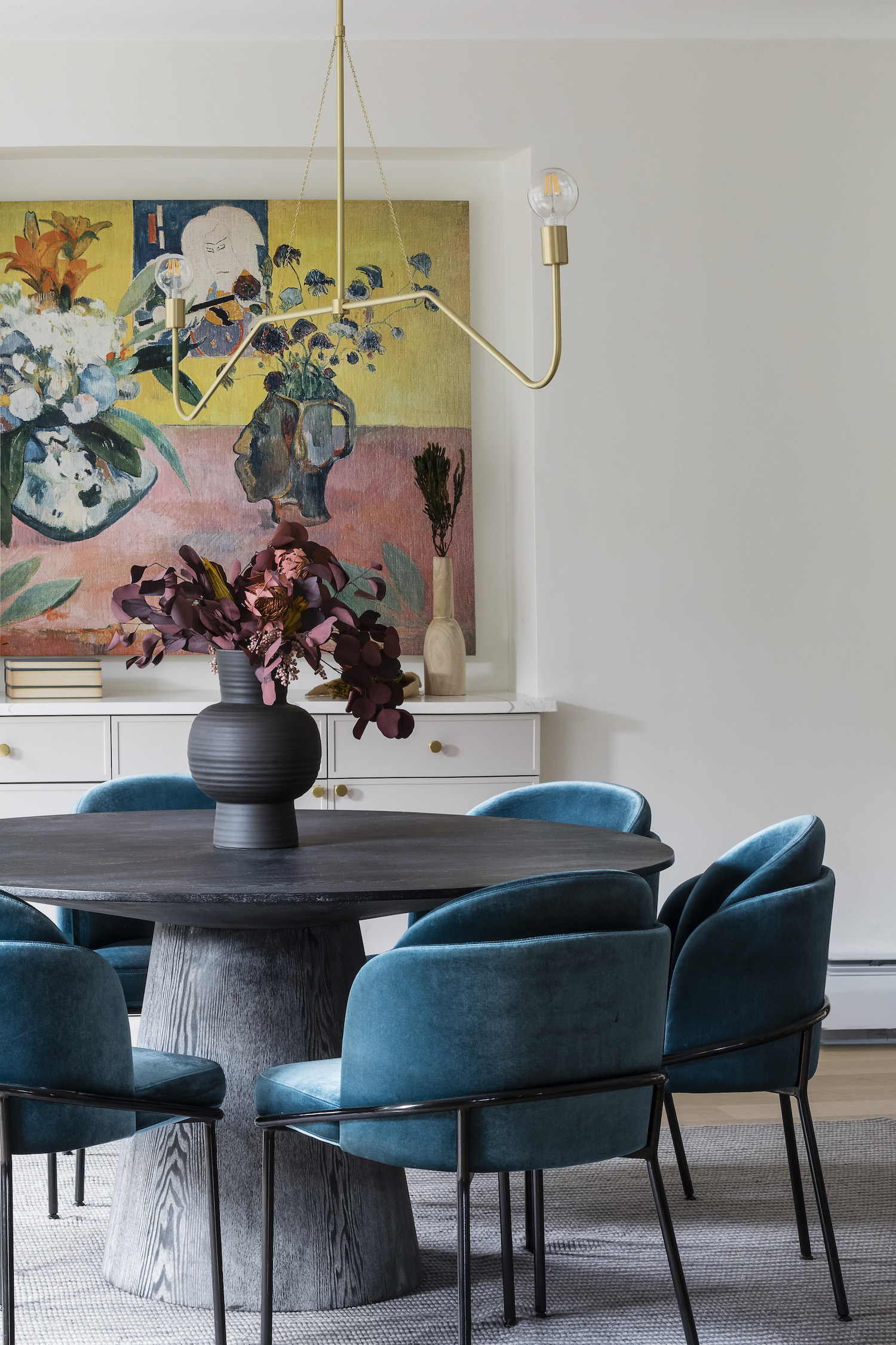
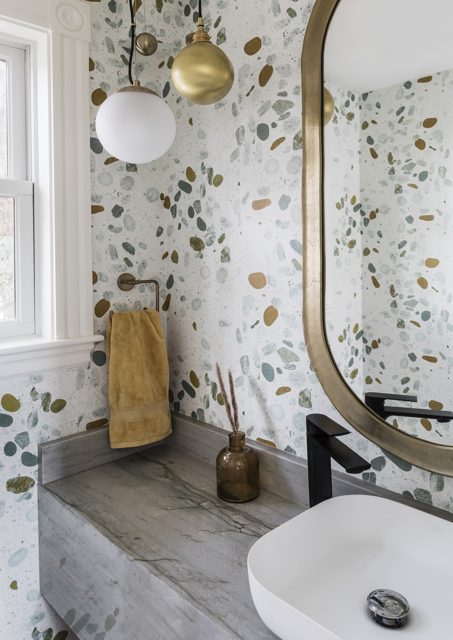
My clients were a couple with young children. They wanted something unique and different, without straying too crazy, a space that was Scandinavian with a twist. They wanted it to feel open and airy while also having contrast through texture. Part of what made the project exciting was the client was also eager to take some design risks. (Entry tile, zellige tile pattern, powder room wallpaper) We kept the foundation of the home neutral and added in little splashes of color with the dining room chairs and some artwork. Overall, my favorite elements of the home are the tiles. I think they added a charm to the space that porcelain tiles wouldn’t have been able to achieve.
The biggest must-have was a cool powder room. That was one of the most fun spaces to design! Another must was to create lots of storage needs for a growing family. We added garage door cabinets in the kitchen to utilize the full space. We also added custom built-ins in the dining room and living room to accommodate all their storage needs. We utilized some of the unused bedroom space to create a custom walk-in closet. With that, the furniture had to be aesthetically pleasing, but also functional. We went with a lot of cozy seating options paired with round tables with no sharp edges.
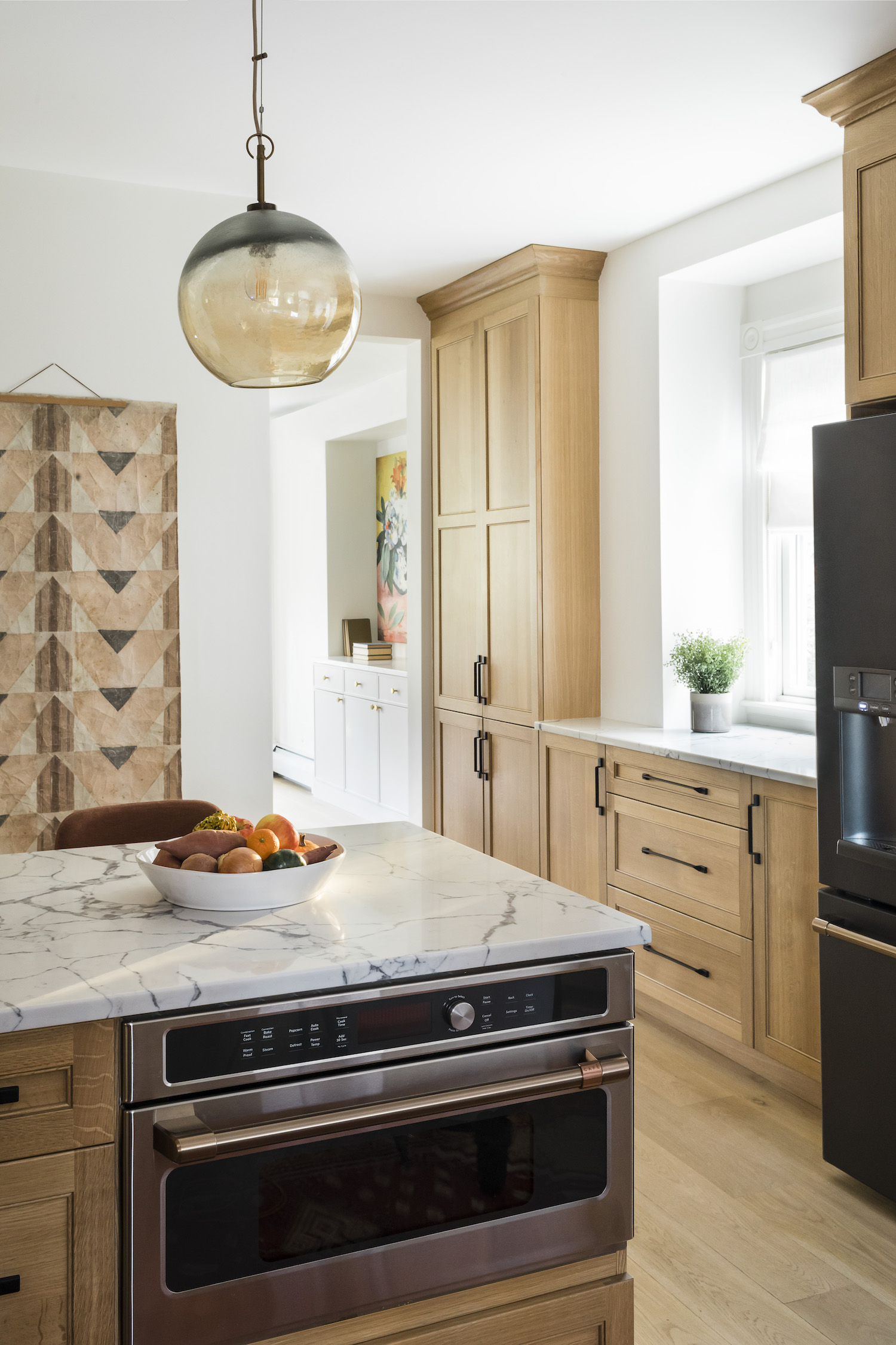
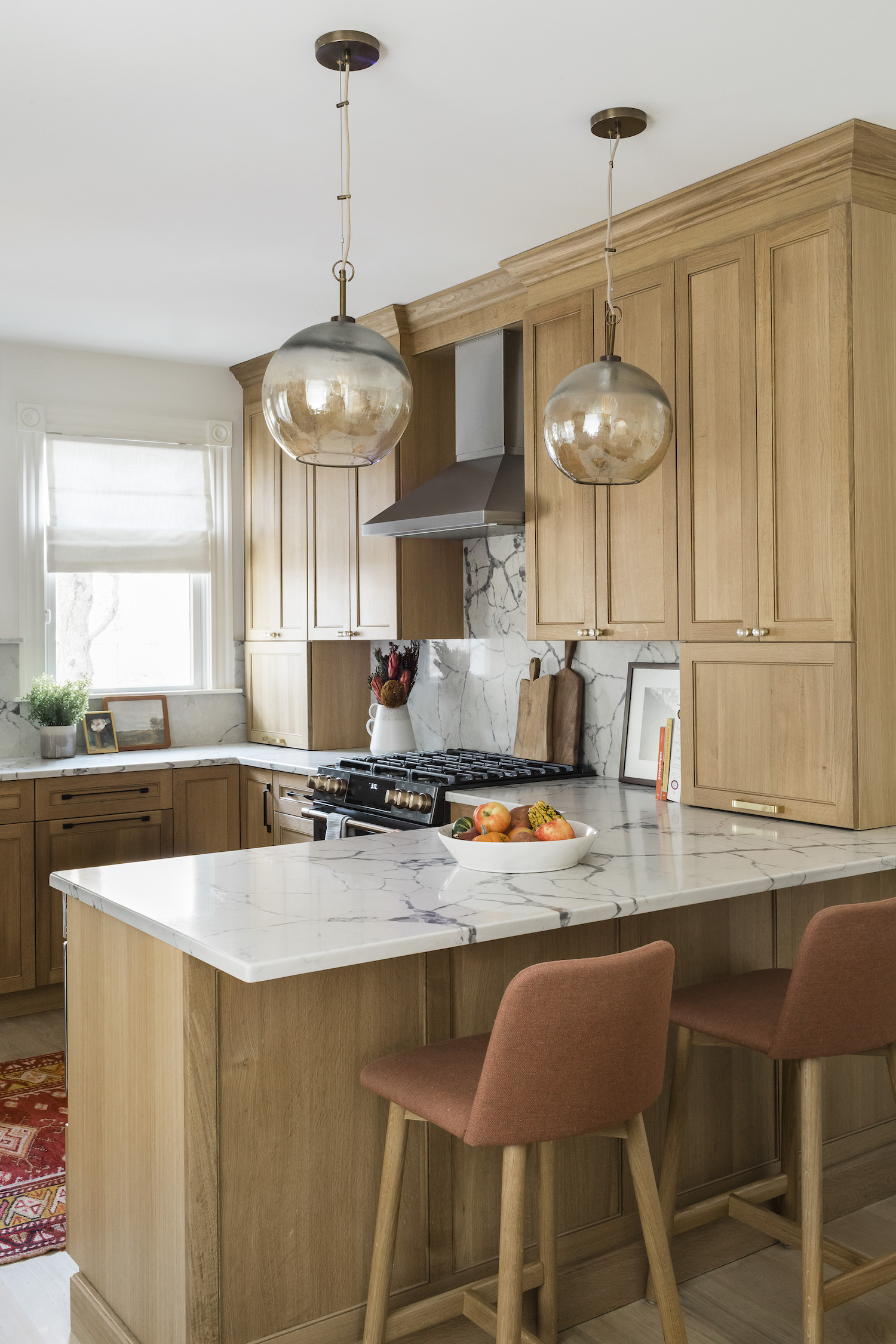
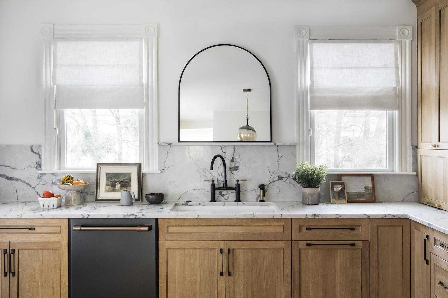
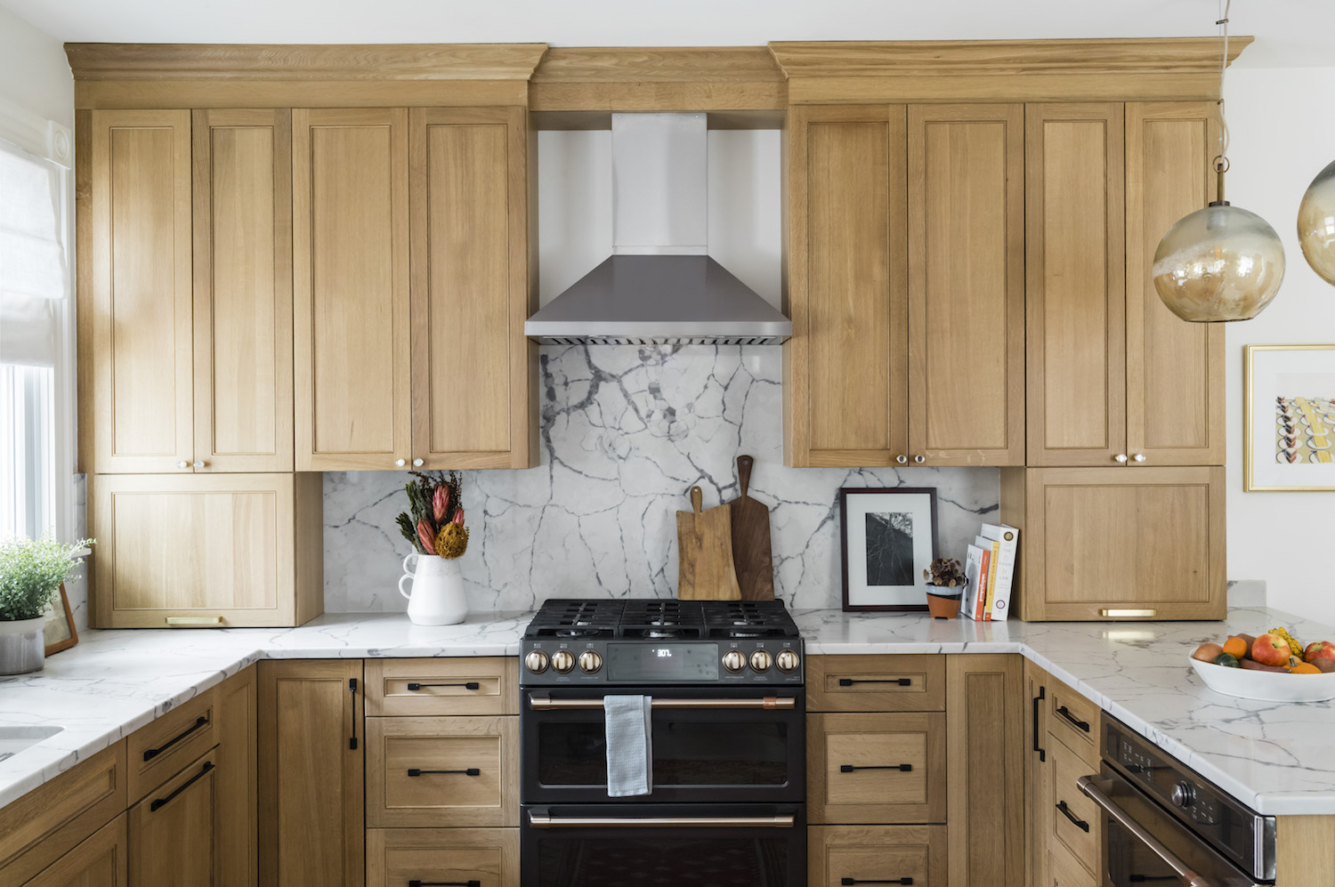
For the kitchen, we originally selected the floor tile in the entryway for the kitchen. Given the tile thickness, we ended up switching to an oak wood floor, which we carried throughout the entire first floor. To not overpower the room with the oak cabinets, we used a whitewash stain to lighten the flooring. The original layout of the kitchen didn’t utilize the space to the fullest of its ability. There was a small eating space, but the cabinets stopped abruptly and weren’t functional for the family. To add as much storage as possible, we opted for a layout that included a peninsula. That way, the client could still have seating in the kitchen, without comprising on cabinet space. We went through lots of different types of wood cabinets but ended up selecting a simple oak shaker cabinet with a natural finish. It gave the room a light and airy feel, while also bringing warmth into the room. We wanted the room to have a Scandinavian feel, so we carried the marble looking quartz up as the backsplash and added a shelf for extra decor. Appliances can either make or break a kitchen design in my opinion. Cafe Appliances have a great line that really adds a nice touch to the space. To finish off the room, we added in some glass globe lights.
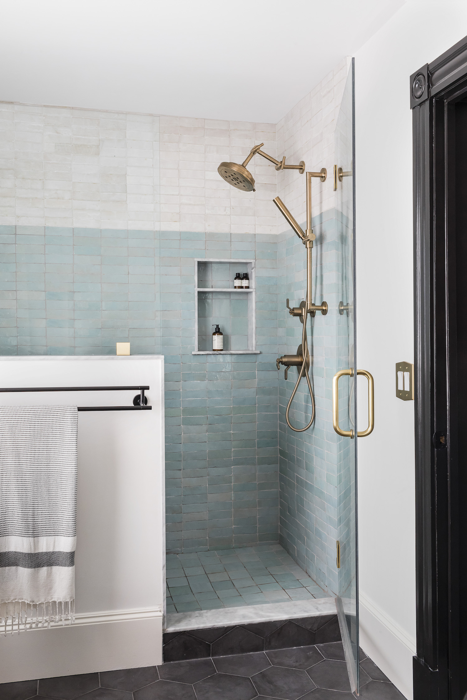
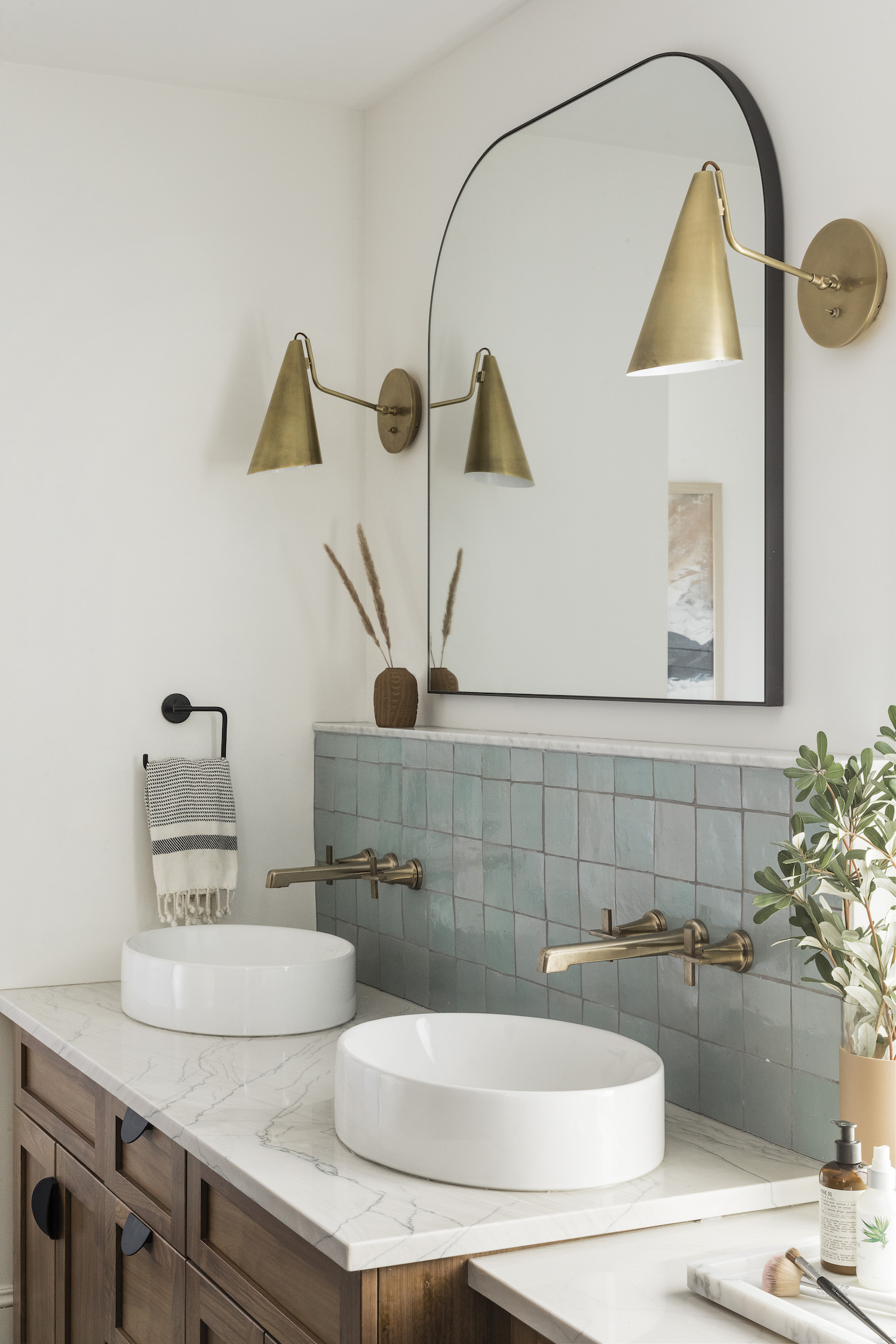
Given the owner’s suite bathroom was completely unpractical, we had to rework the layout. (The original bathroom also had carpet for the flooring!) We gave more space for the shower by flipping it to the opposite side, which in turn, led to having room for a custom double sink and an extra beauty vanity. We opted for a two-tone zellige tile, using both 4x4s and 2×6’s. The bathroom is still neutral, while the blue gives the bathroom that extra pop and wow factor. Because the zellige was the showstopper, we kept the flooring simple with a black hexagon. We added in a custom vanity with vessel sinks along with carrying the zellige tile up and adding in an extra little shelf.
Like what you see? Take a peek at the talent behind the story… Interior Design: Lawless Design · Photography: Joyelle West · Builder: McDonald Contracting
