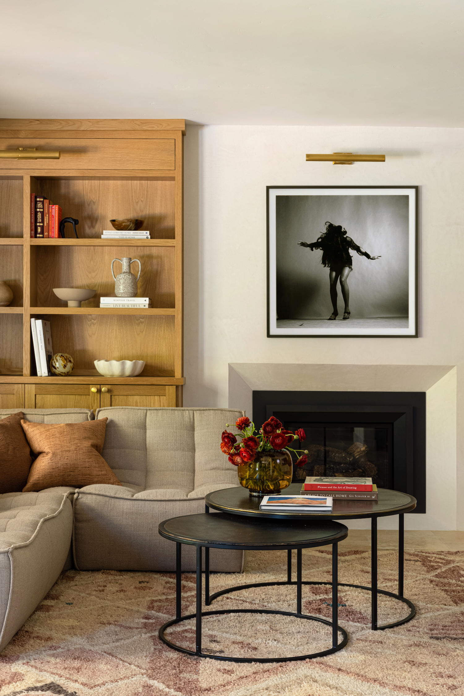
When Carmit Oron first laid eyes on this home in Northern California, it wasn’t ‘inspiration at first sight’. But she credits this for the beautiful results we see here, photographed by Vivian Johnson. By stepping back from the design process and letting the space reveal itself bit by bit, this incredible home was built. Learn what sparked Carmit’s creativity and how she took this home from old to bold in the story below.
From the designer… This project came from a returning client. I initially designed their house in 2018. When they bought a bigger house they reached out to me again. Returning clients are something I’m forever grateful for. It means so much to me that even if my schedule is fully booked I’ll always find time for them. The fact they trust me enough to ask me to transform their space again, and work together again, is something that I don’t take for granted.
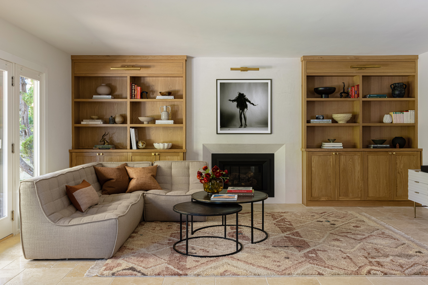
Their new house in Mountain View, in the Bay Area of Northern California, is 2700 sqft. It was in good shape but needed a facelift. The kitchen and family room are, hands down, my favorite spaces in this home. I think it’s because when I first set foot in these spaces I felt no inspiration at all. This feeling was unnerving and scared me for a moment. Usually, when I’m in a space I have a vision of how I think it should look. But in this case, I drew a blank. What I did know is that I wanted to level the sunken floor to make it flush with the kitchen floor, which would ultimately lend more floor space for a kitchen table or breakfast nook. The best thing to do, in this uninspired situation, was to begin with what I knew for sure had to be done. Hopefully this starting point would result in a spark of creativity.
Firstly, we decided to change the flooring. Originally the floors on the ground level of the house had 2-inch white oak wood planks, and some of the areas had wall-to-wall carpeting. My client didn’t want wood flooring in the kitchen, the remedy would be some sort of tile flooring, but the challenge was to decide where the tiled section would start and where it would finish. The tile choice, and layout design, would ultimately set the tone of that entire area. After some deliberations, we honed in on their aspirational aesthetic, and then I knew that an Ivory Travertine tile, in a french pattern layout, would best suit this space. Once this decision was made it was clear that wide-plank white oak engineered flooring would blend well in the dining area and living room on the ground floor. To create a sense of natural continuation we continued the oak flooring upstairs, on the second floor of the house. From this point all the other design elements of the house naturally fell into place in my head.
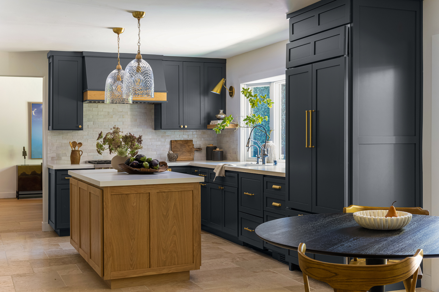
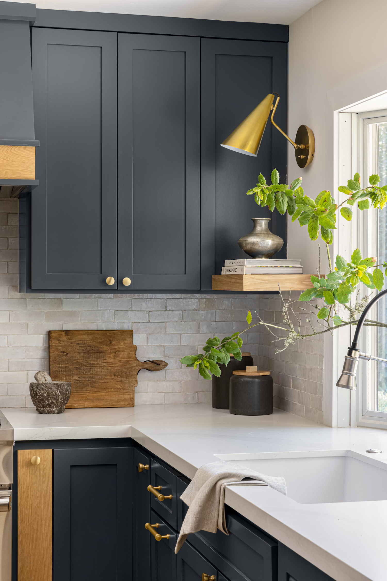
The next step was the kitchen. Since the kitchen cabinets were fairly new, and structurally in great shape, we felt that it would be wasteful to replace them entirely. Instead, we opted to replace only the cabinet doors. To give them some dramatic yet classy oomph, we painted them in a bold dark gray. The kitchen island was replaced because it was not only too long and narrow, but it also blocked the fridge and access to the table. To mirror the family room bookcases, the island is built from white oak. All this against the backdrop of the white travertine floor tiles is gorgeous to look at and gives this combined space an elegant aura.
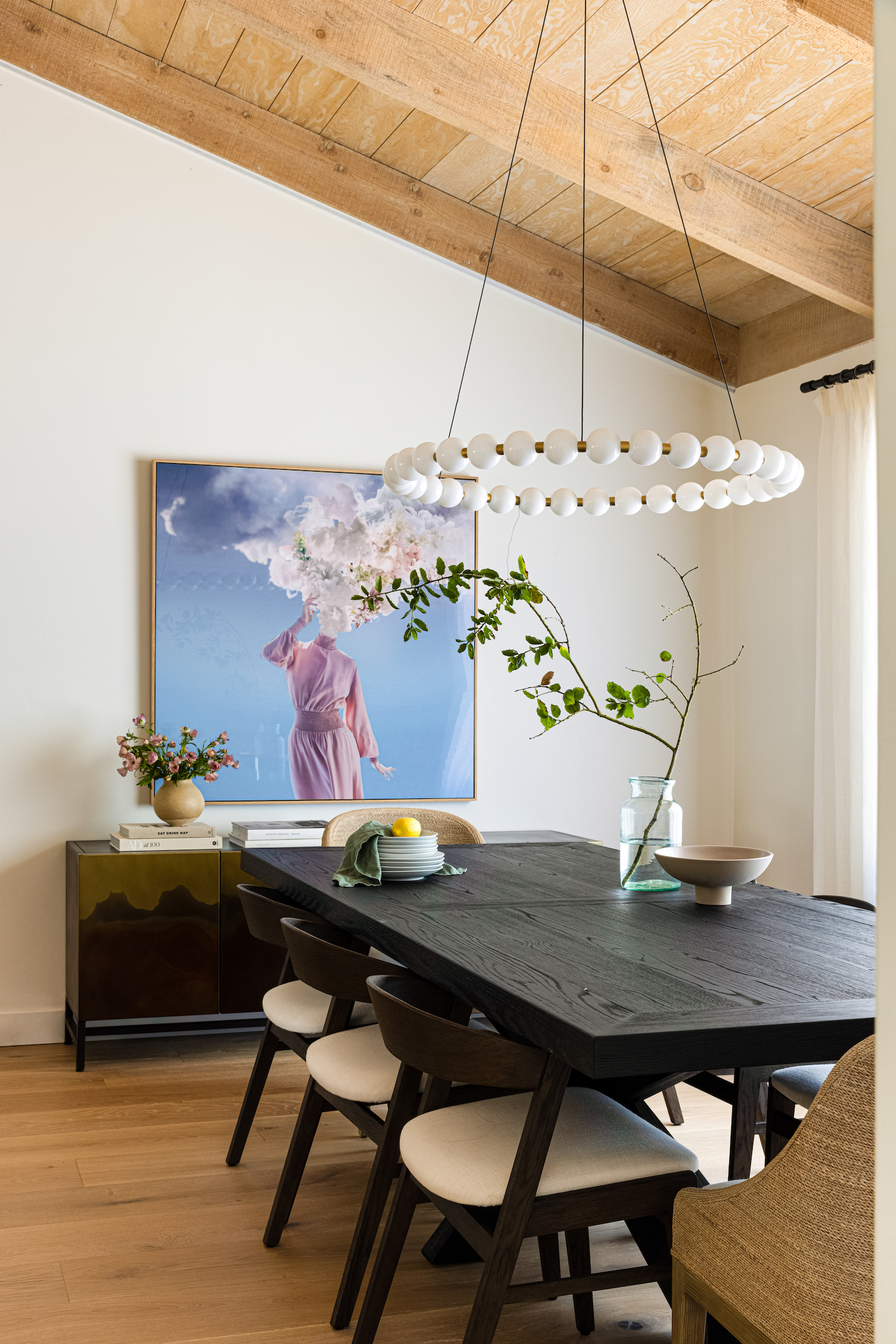
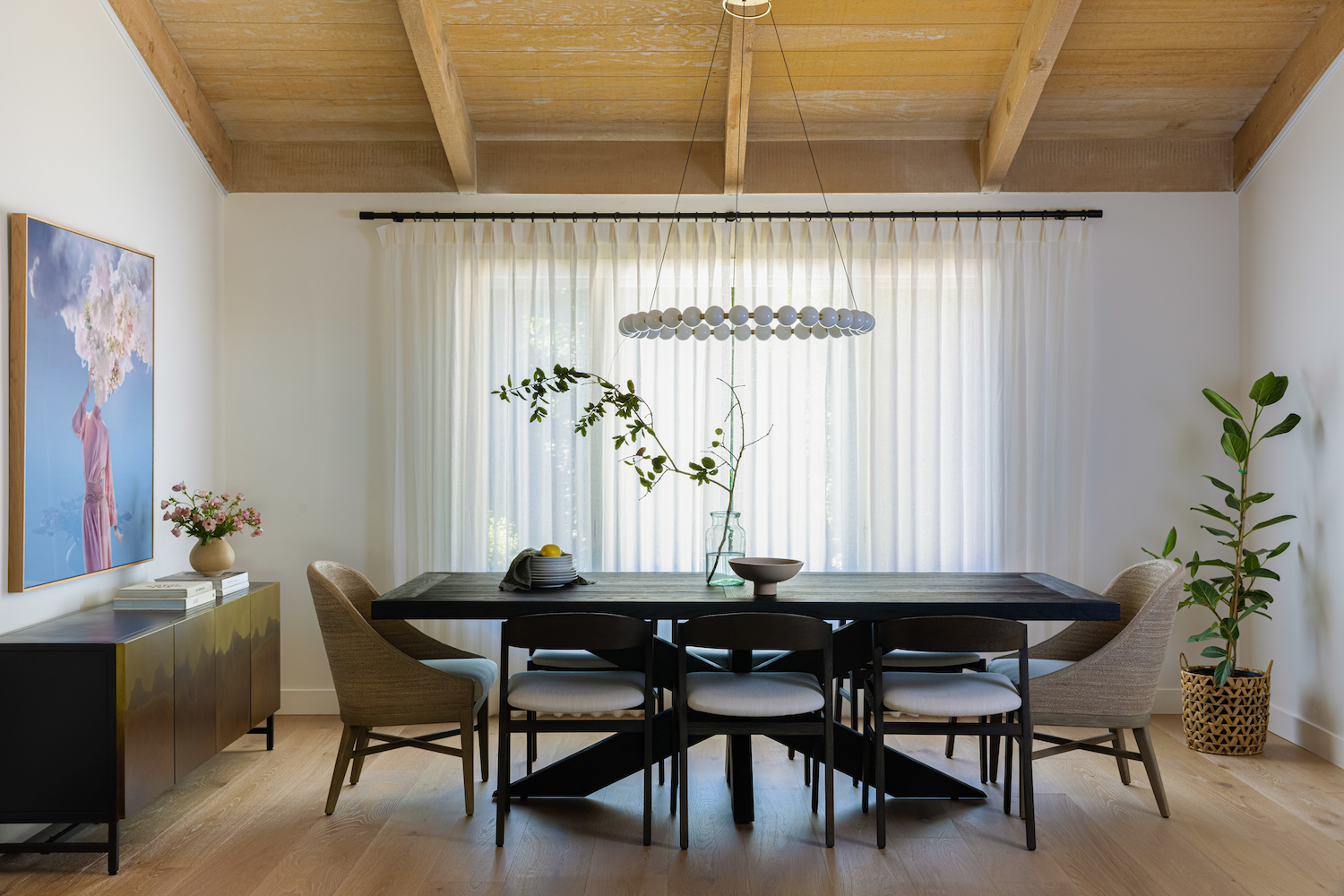
Above the dark wood dining room table we hung a modern hooped chandelier. The second I laid my eyes on it I knew that someday it would bring a room to life. I’m thrilled that my clients loved it as much as I do.
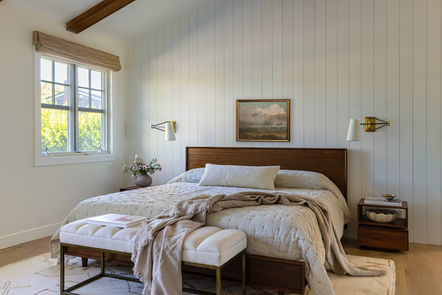
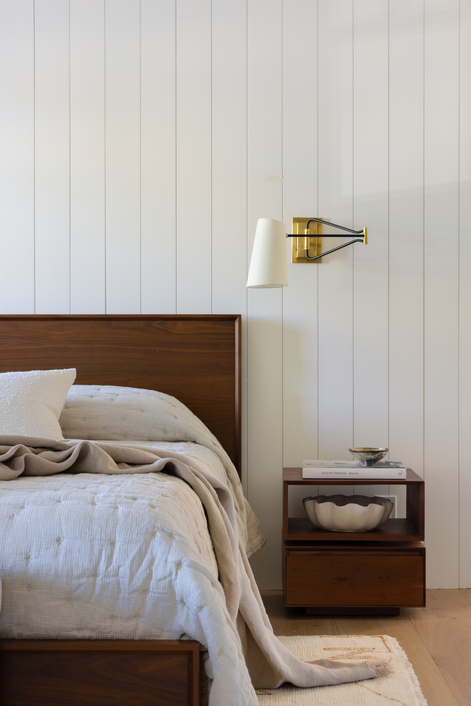
In the primary bedroom my clients initially had their bed placed against the windows, but it didn’t look great. By changing the doorway from double doors to a single door, we created more wall space and were able to reposition the bed to this wall, which we decided to make into a focal wall. Vertical shiplap adds visual interest and the brass and black sconces on each side of the bed lend a modern nod. My clients bought new furniture for other rooms in the house, but decided to bring their bedroom furniture from their previous house that I designed, because it was new and they still love this Mid Century vibe, which works wonderfully in a classic modern farmhouse. The only new item in this room is the rug.
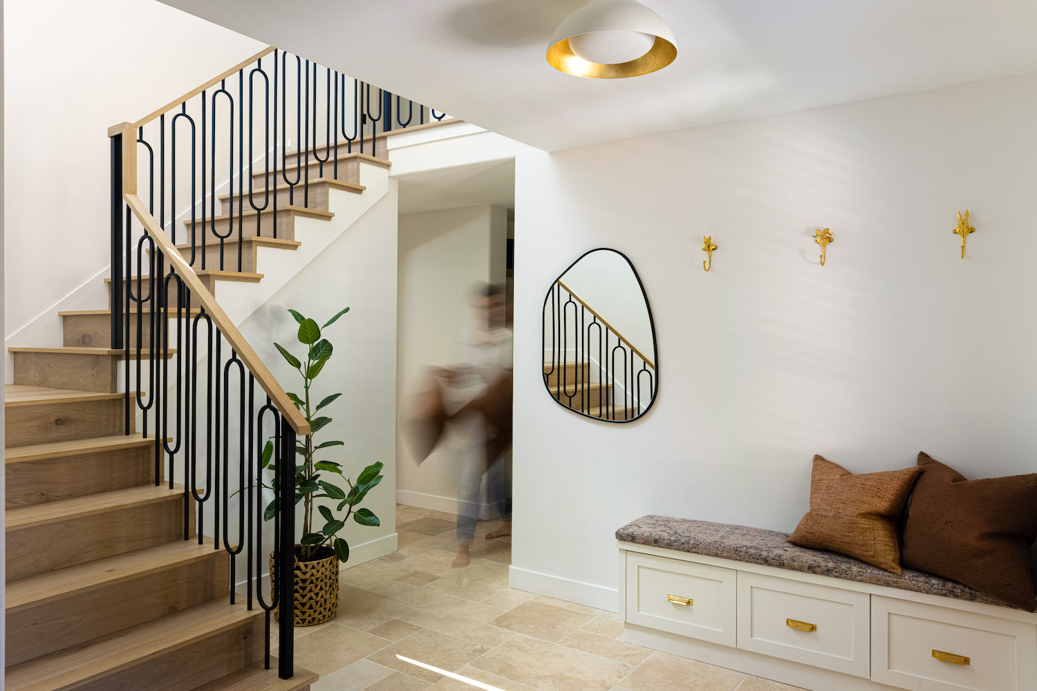
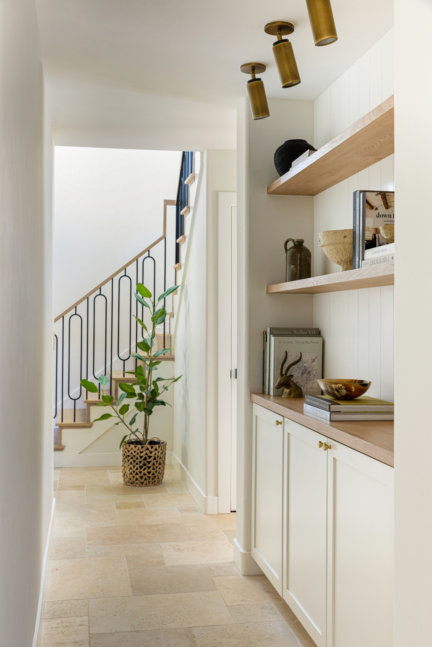
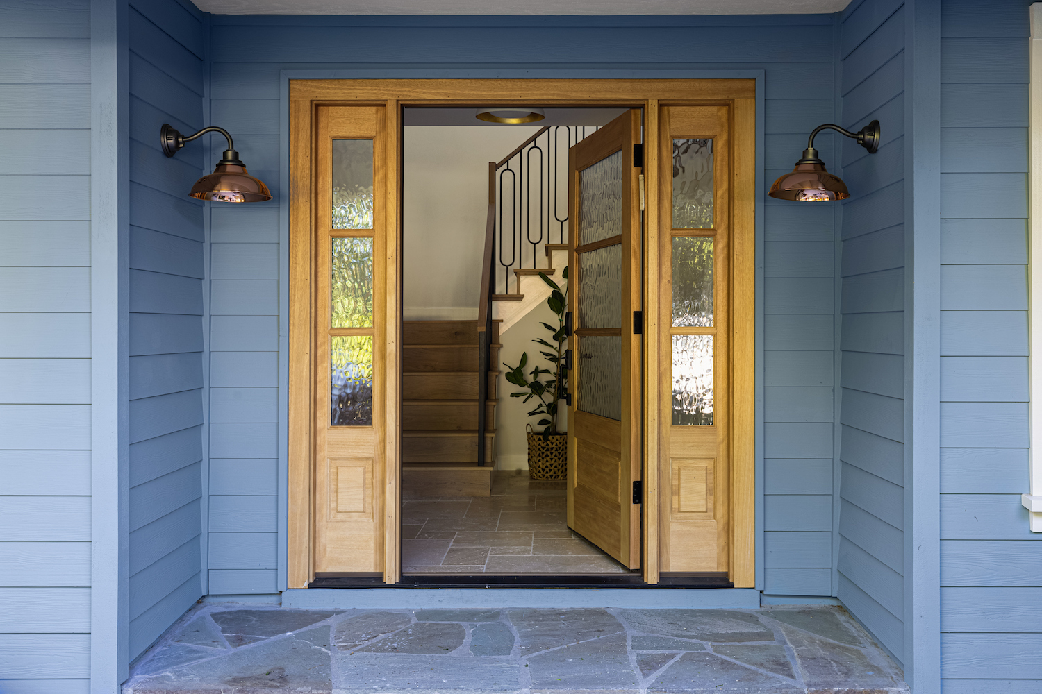
Upon entering the house, you immediately see a harmonious combination of travertine tile floor in a french layout, and wood floors and stairs – framed by classic modern black stair railing – that in my opinion steals the show. This stair rail style is one that I had been wanting to try out for a long time. Luckily, my clients loved the idea and I love how it turned out.
Like what you see? Take a peek at the talent behind the story… Interior Design: Carmit Oron Interior Design · Photography: Vivian Johnson · Stylist: Rachel Wanty
