AEF Interiors has crafted a divine sanctuary, seamlessly merging subtle feminine touches, European elegance, and the timeless allure of classic California style. Inspired by the homeowners’ passion for travel and nature, this abode boasts natural elements and thoughtfully appointed furnishings that create an everyday home that feels like a deluxe vacation destination. You’re invited to tour this gorgeous home through the lens of Stephanie Russo and discover the story behind its creation below.

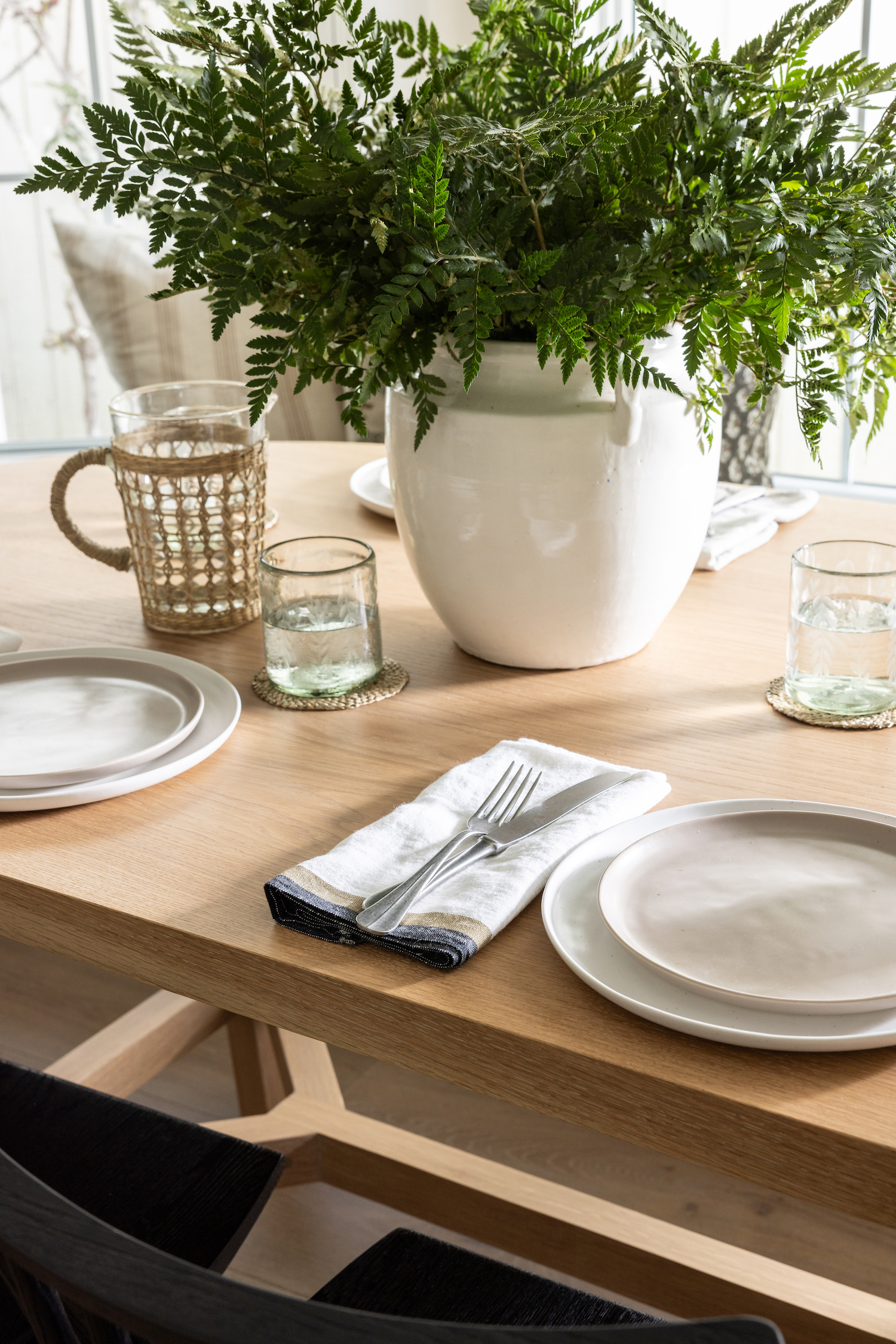
From the designer… When it came to design must-haves, our clients had a few main requests in mind. First, they wanted a space that was inspired by their travels. They’d stayed in a variety of Airbnb’s, and wanted to incorporate some of their favorite design details from the places they’ve traveled into their own home. You’ll see this in a variety of the design details including the English Cottage inspired dining room (featuring one of our favorite elements – the stone fireplace), the marble countertops throughout the kitchen, dining, and bathroom (a material that has withstood the test of time throughout the world, and holds so much history, especially throughout Europe), and the European-Femme-inspired living room space with little details like ruffles on the pillow edges and floral fabrics, the scalloped side tables, and the rustic wood coffee table).
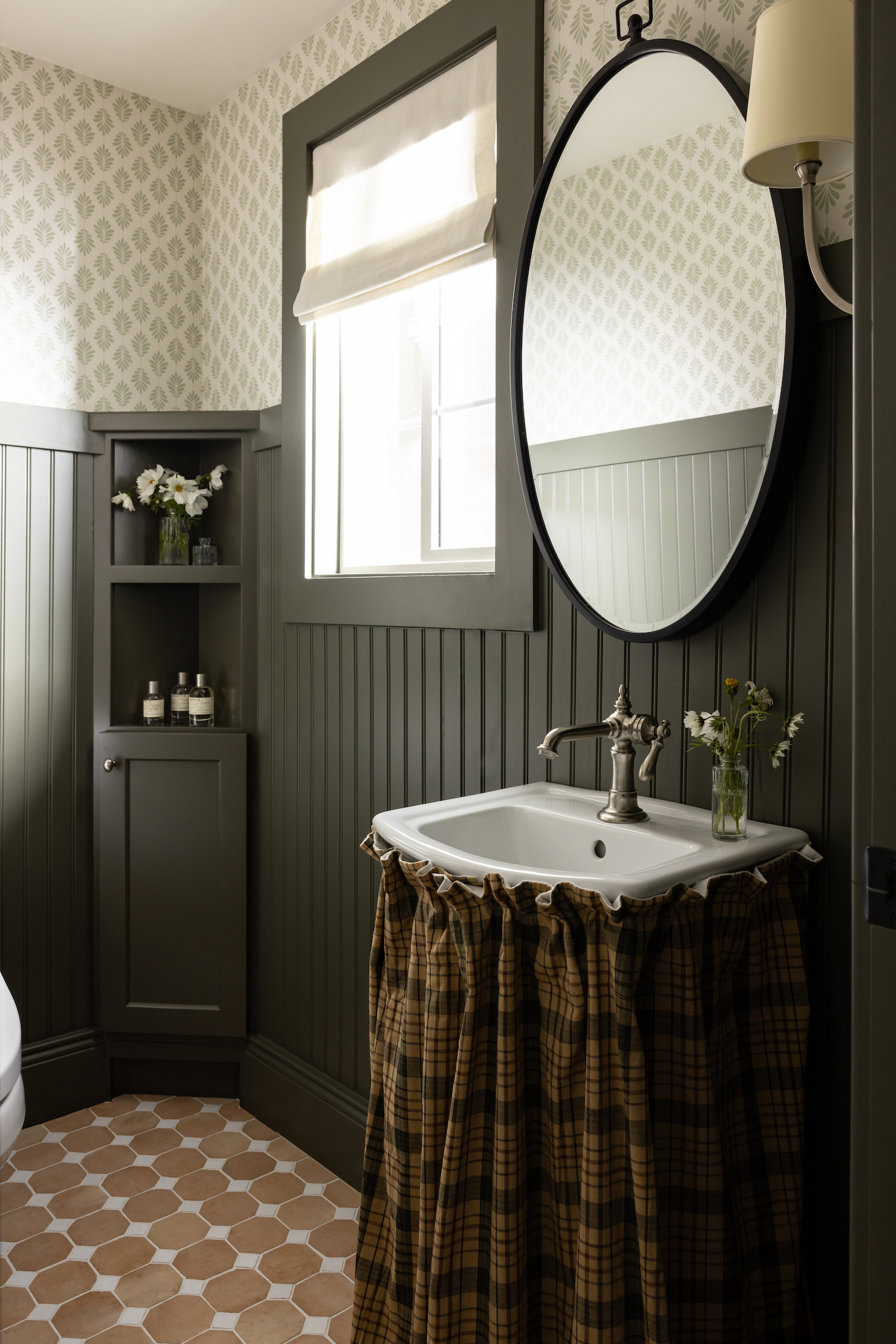
Second, they’re huge nature people, so we really wanted to bring that personalization into the home as well. We did this in a variety of ways, including the natural color palette (think soft whites, beiges, greens, browns, and blues), using natural materials (the reclaimed wood fireplace mantel and kitchen hood, the vintage wool rugs, the marble countertops, and the natural clay tiles in the bathrooms).
While we wanted to infuse quintessential California living elements into this home, we knew we didn’t want to go for the classic white, bright + beachy aesthetic that we’ve gone for in the past. Character was the name of the game in this remodel, and we wanted to bring in as much of it as possible, starting off with the kitchen + dining space, or what we lovingly refer to as the “Ditchen”.

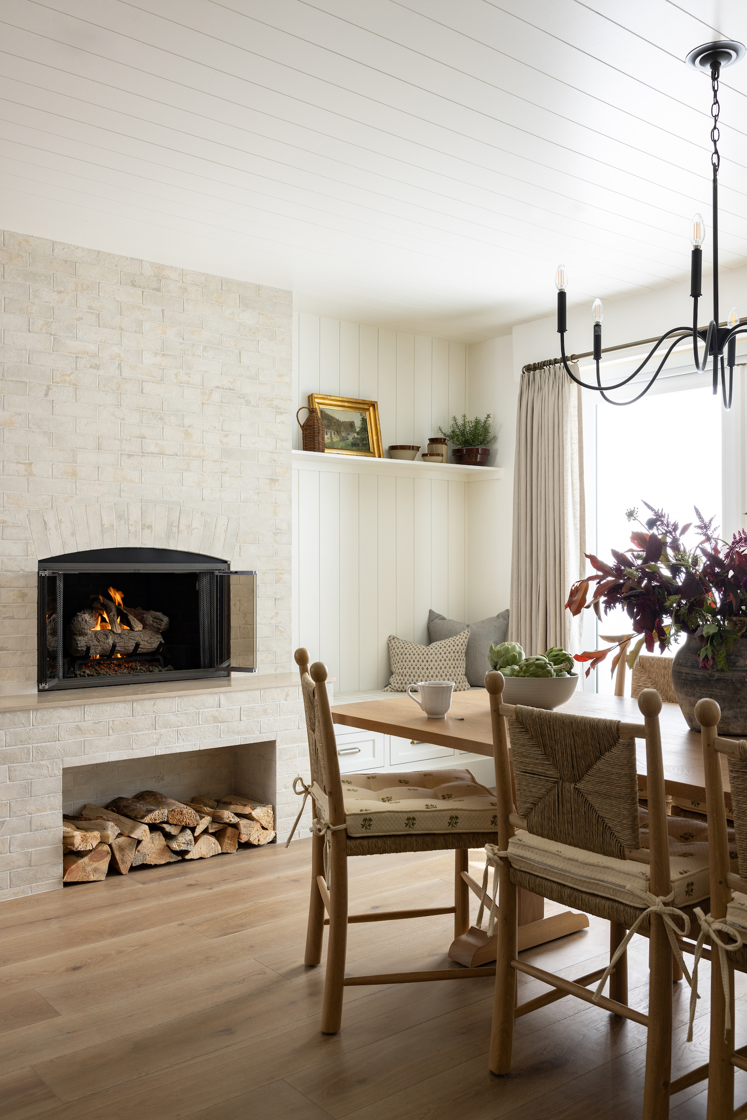
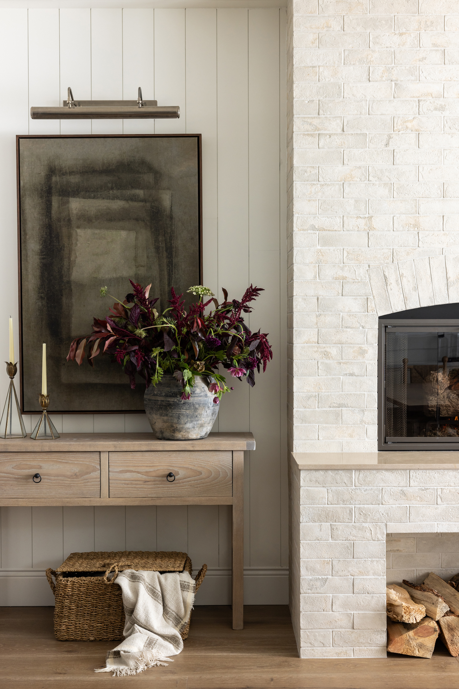
One of our favorite elements in this entire space is the fireplace in the dining room. This space actually used to function as the living room, but while there was already a fireplace in this space, it needed a major upgrade. We played around with a few different options before deciding on a stone fireplace that really emulated the perfect mix of English countryside design and traditional East Coast seaside design. It brings so much warmth to the space and is the perfect way to make everyone feel at home since our clients love to entertain.
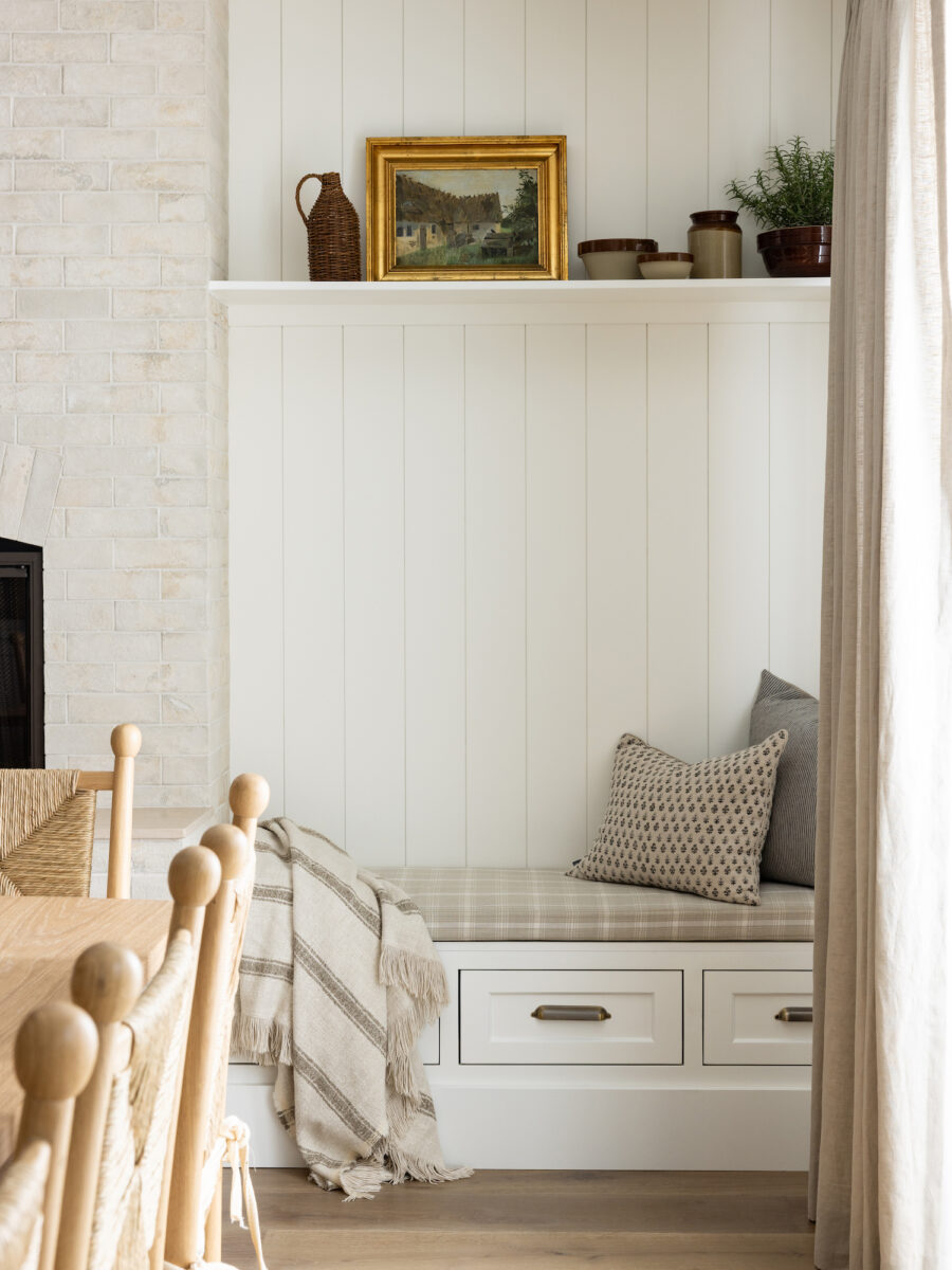
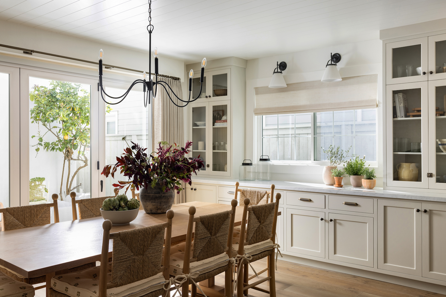
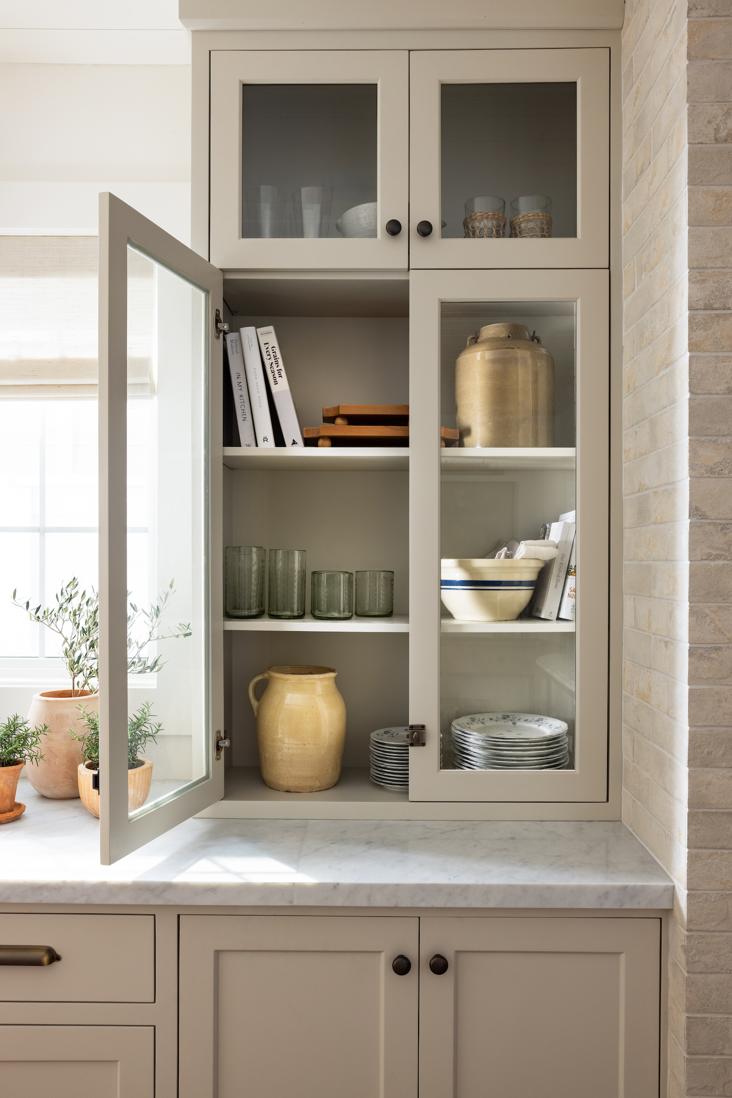
We knew we needed to put something pretty substantial on the wall opposite the fireplace to make sure the space was balanced, and we love a good built-in moment. We took out the original window and put in a new one that was both larger and centered it between these gorgeous flanking built-ins we designed for our clients to showcase their treasures up top in the glass case, and hide all of the not-so-pretty stuff below.
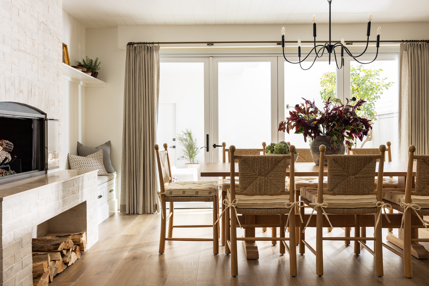
Finally, in the dining area, we incorporated these folding glass patio doors to not only bring a ton more light into the space, but to also really take advantage of the opportunity we have for indoor-outdoor living here in Southern California. Bringing as much of the outside in was such a huge part of so many of our design choices for this project!
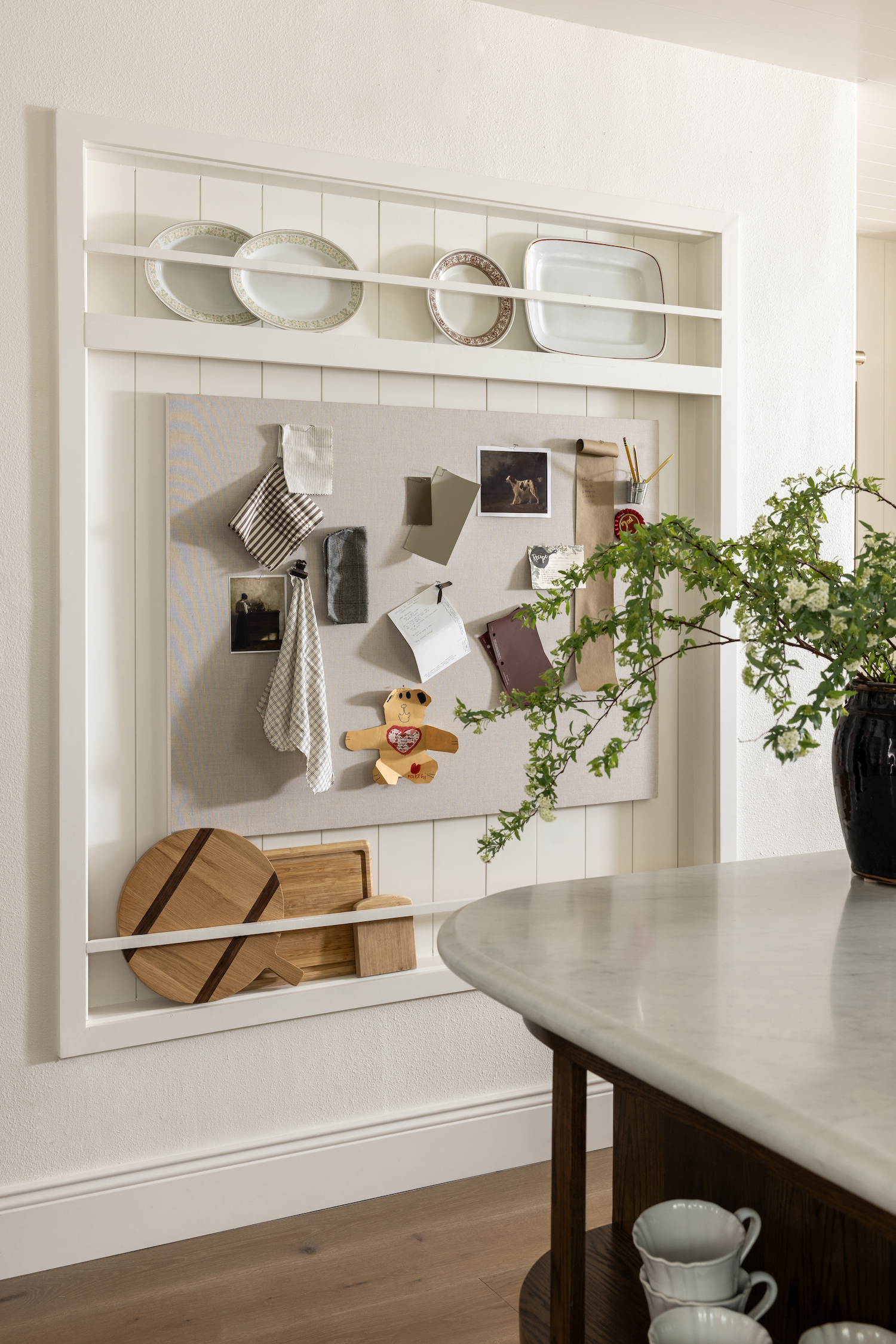
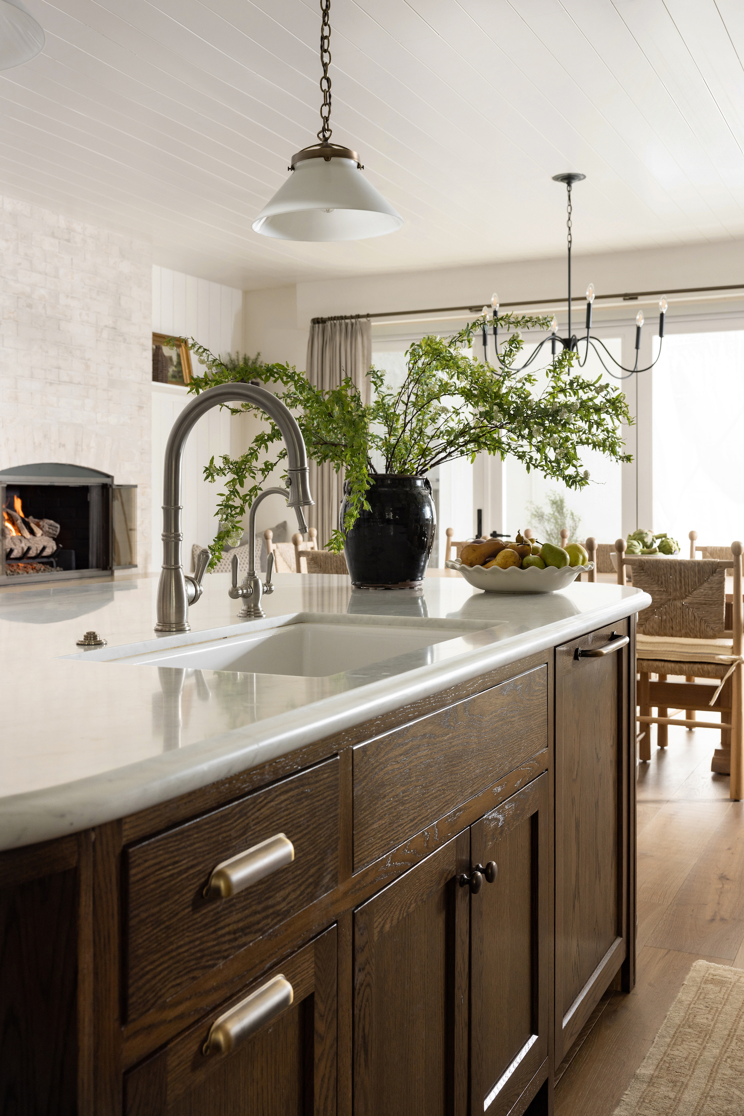
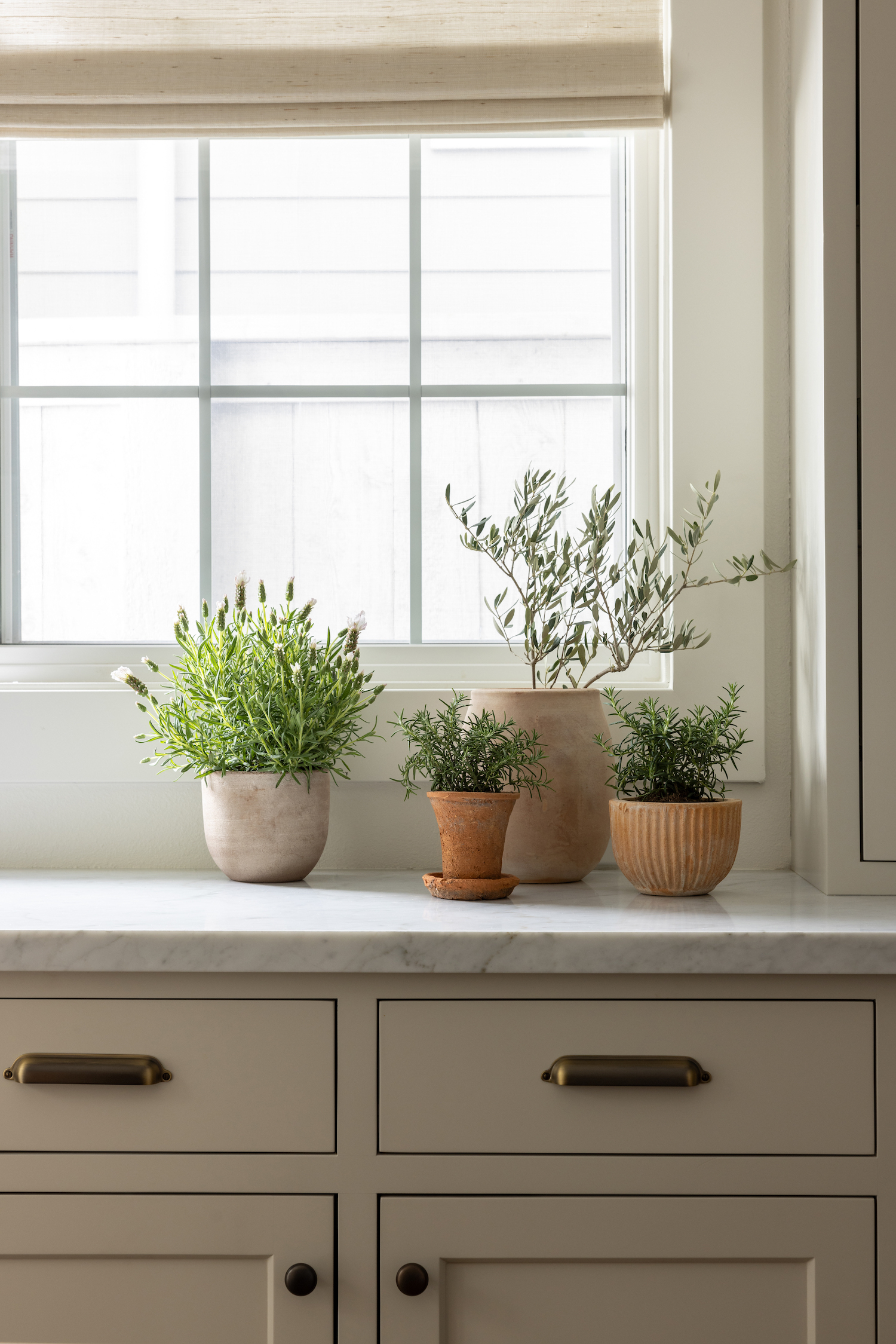
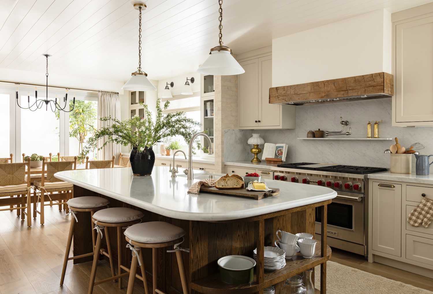
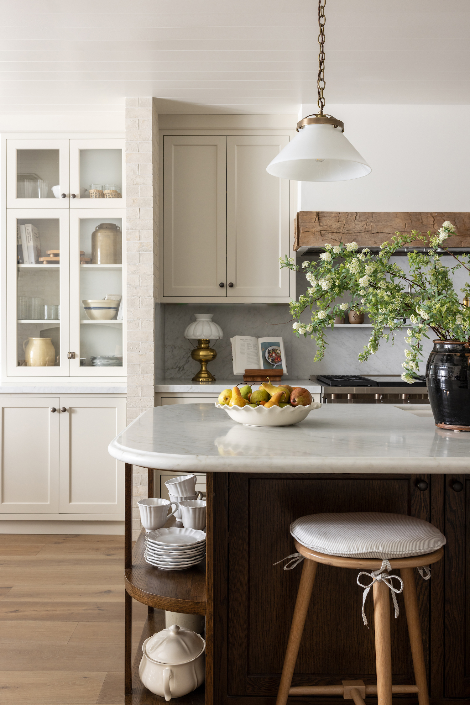
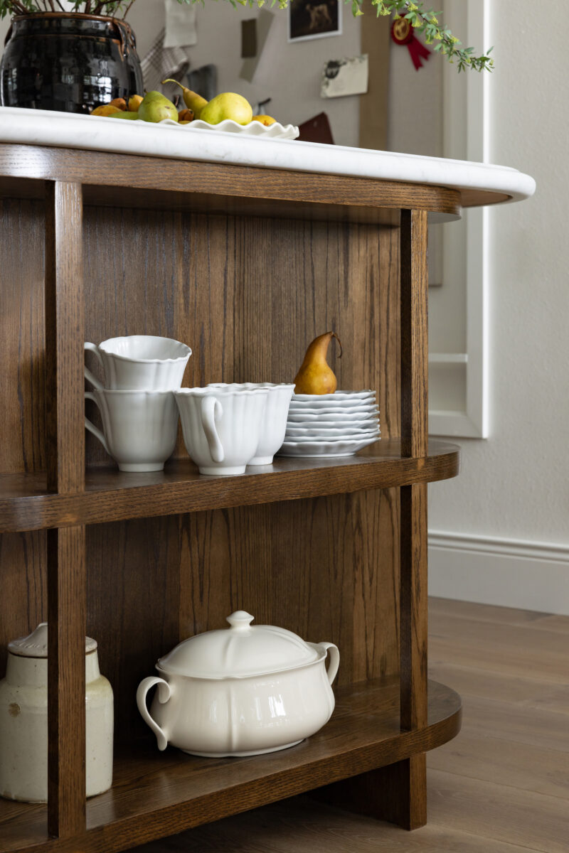
The kitchen at the Seal Beach project is pretty special to us as well, and we added a ton of little details to really take the design up a notch. At the top of that list is the kitchen island. Our clients are big into hosting so we wanted to bring that to the forefront of design. In terms of functionality, we expanded the kitchen island to provide more room, and we also moved the sink from the corner of the space to the island, to make it an ideal setup for open communication, even while doing dishes or cooking.
We also went with a rounded edge instead of a traditional 90-degree corner on the island to really warm up the space and make sure it was as cozy and inviting as possible. In terms of materials, we opted for a marble countertop which allowed us to create a gorgeous edge detail, and then a deep warm wood stain that perfectly complements the warm white cabinetry. We also incorporated this reclaimed wood piece on the kitchen hood (which you’ll also see showcased as the living room mantle) that brought so much warmth, history, and nature into the space as well.
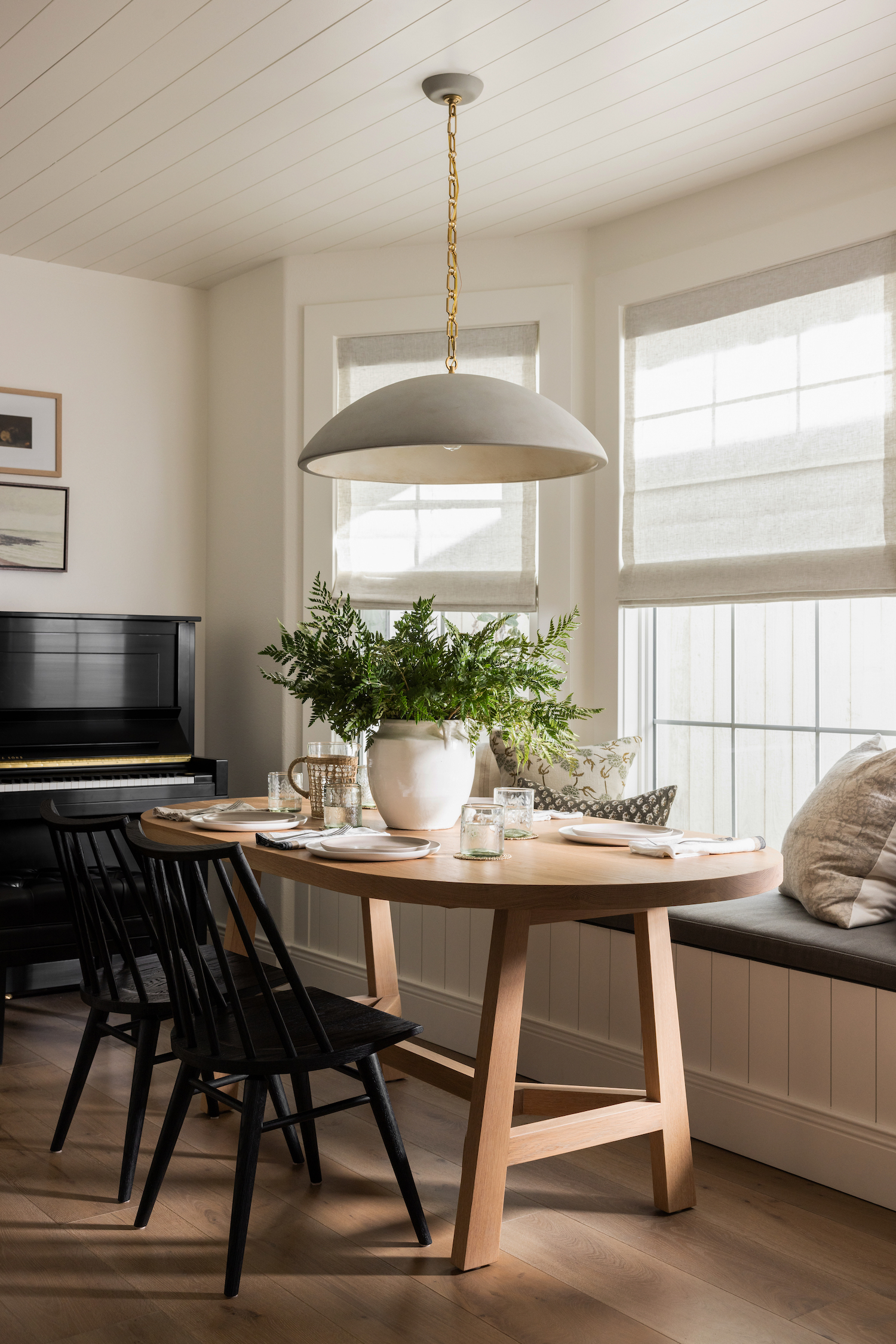
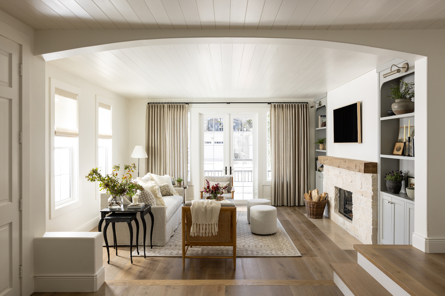
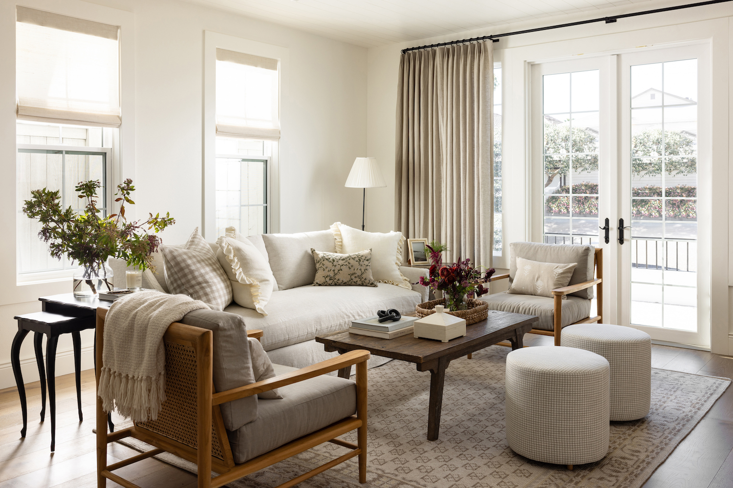
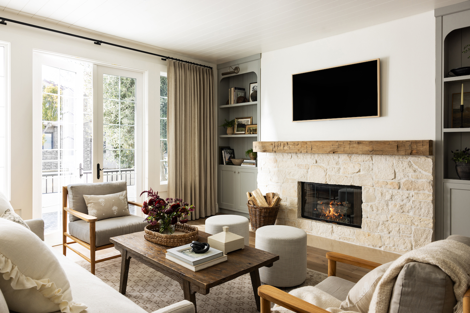
The living room was an interesting space to figure out for a few reasons, but we love a challenge! As we mentioned before, we converted the casual living room off of the kitchen into the dining room, so this space was now becoming the only living room. As a family with two young kids, most people would probably opt for a sectional, but since our clients love to entertain, we wanted to make sure this space was comfortable but also had a level of elegance fit for hosting. We ultimately decided on a layout featuring one sofa, two chairs and two ottomans, so not only does the space fit a ton of people, but it also allows for movement and adjusting based on the situation.
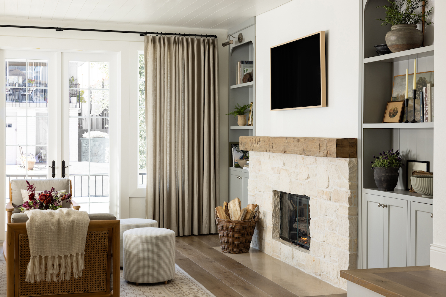
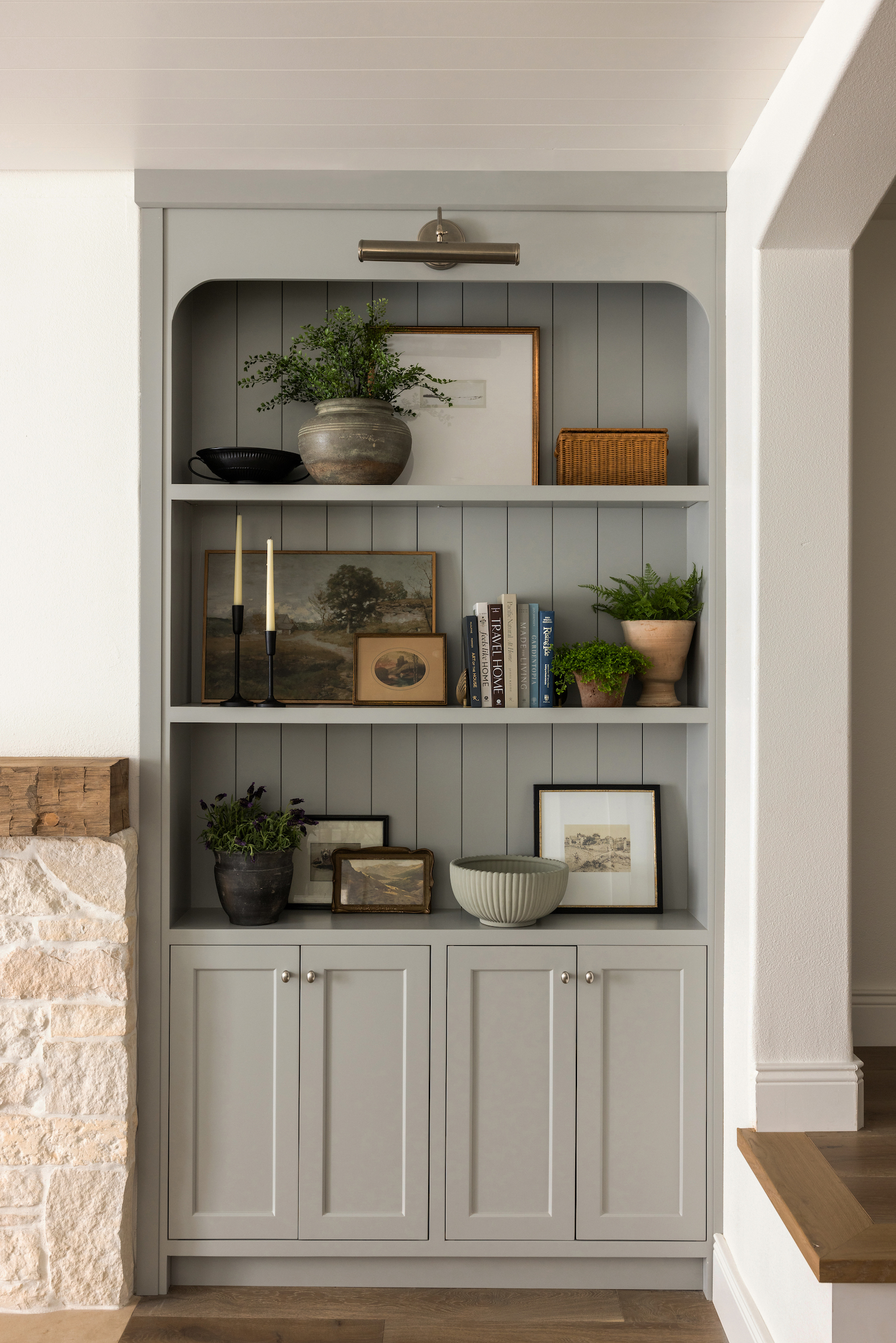
Another one of our favorite elements in this space is the seaglass colored built-ins that flank the fireplace. When looking at the space for the first time, we saw that the fireplace in this room wasn’t centered, and while that can irk a ton of people, sometimes it’s just not feasible to move it over a few inches when you could spend that money elsewhere. So we worked around it! We created these gorgeous open-shelving built-ins with a rounded top and tongue and groove at the back that provide interest that distracts from them not being perfectly symmetrical. In the middle, we opted for a reclaimed wood mantle (that’s mirrored on the kitchen hood) to add warmth and really ground the space. Interior design is all about balance and we love how that came into play in this space!
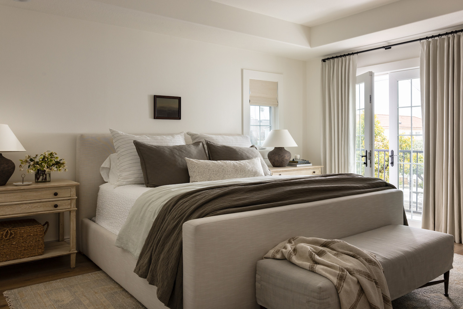
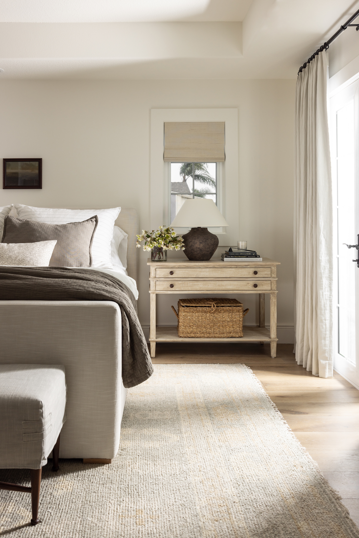
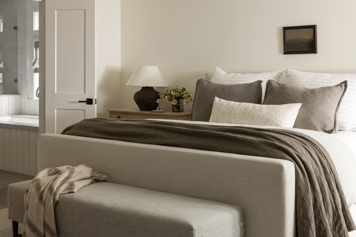
When our clients described their perfect bedroom space, there was only one word that we could think of: retreat. We wanted to make this space the perfect little getaway inside their own home, especially given their love of travel and appreciation for all the places they’ve stayed throughout their lives. We kept the palette super neutral in this space to be a calming retreat that feels like you’re on vacation at the beach (even though that’s their own backyard!).
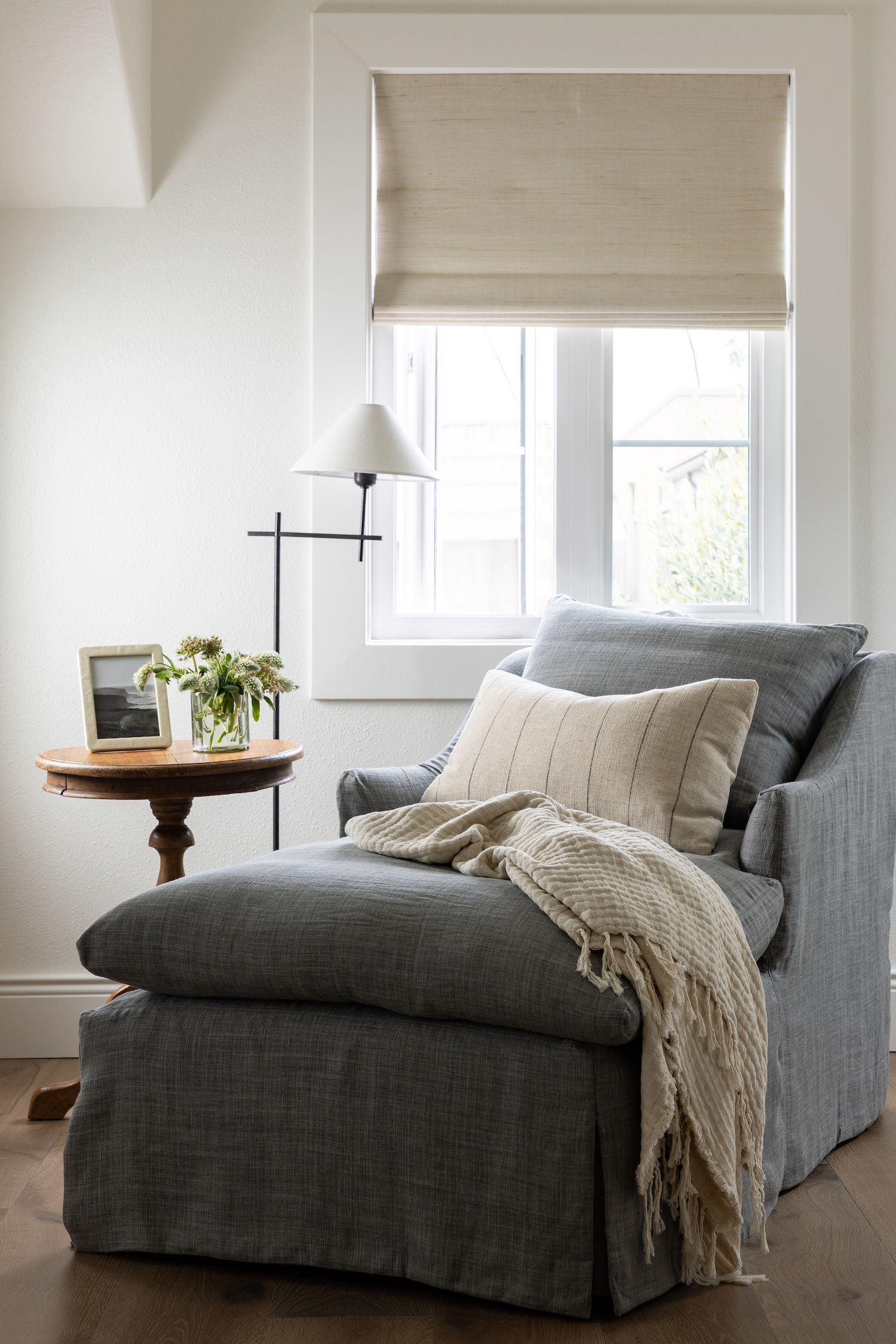
We originally were leaning towards a desk in the little nook in the corner of the space, but who wants to work on vacation? After some brainstorming and knowing that our clients love to read, we opted for a little reading nook space with a chaise lounge that fills the space and makes it the perfect little cozy hideaway.
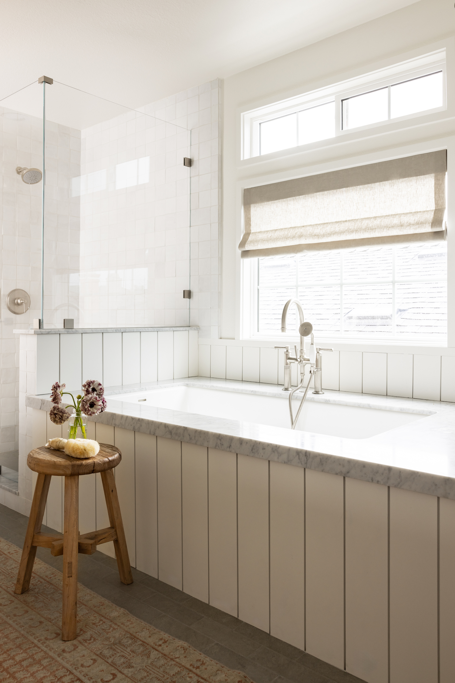
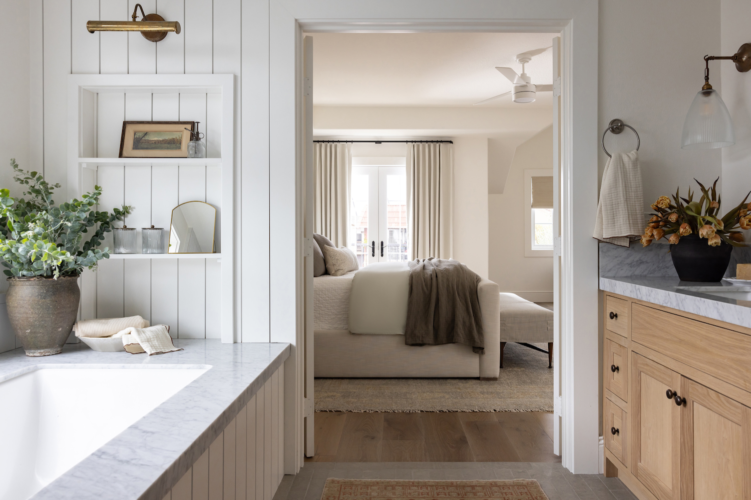
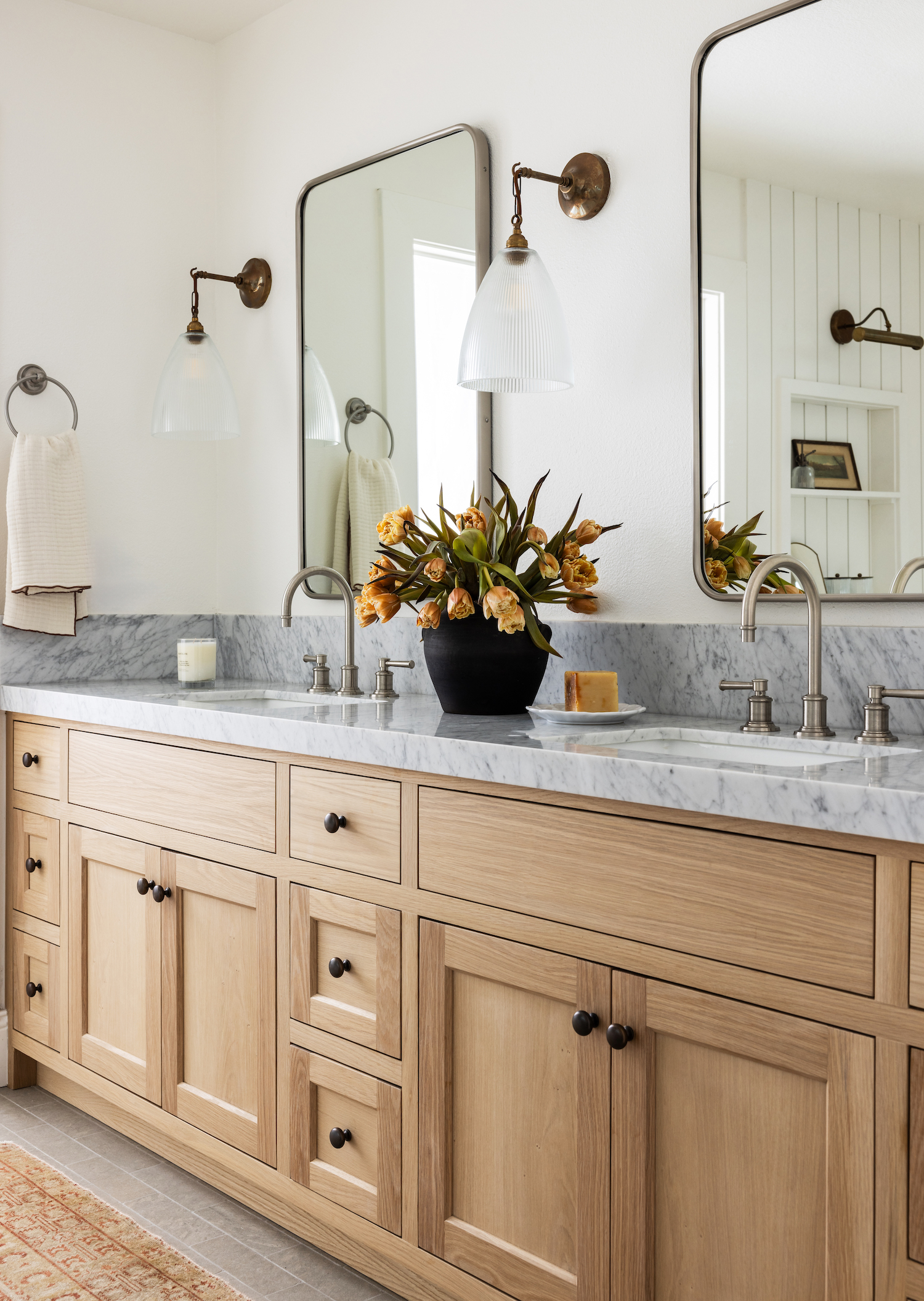
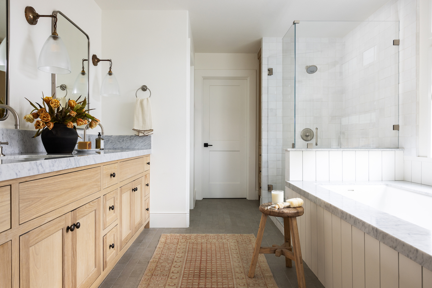
While we absolutely love the main bedroom, the real showstopper in our opinion is the main bath. This space took a bit of reworking to make it just right, but it was well worth it. Between the marble and tongue and groove tub, the zellige and glass shower, and the double vanity, it’s hard to pick a favorite element in this space. When we work with stain-grade cabinetry, we always want to make sure it’s just right, and we won’t lie, this vanity took a few tries to get right. But we’re big on not settling for less than perfect, and the end result is just that!
Like what you see? Take a peek at the talent behind the story… Interior Design: AEF Interiors · Photography: Stephanie Russo