This Minneapolis home underwent a transformative renovation, converting underutilized spaces into functional family areas. Oho Interiors achieved a balance of warm tradition and modern freshness, culminating in a space adorned with timeless finishes like marble countertops and unlacquered brass fixtures, all wrapped in an atmosphere that is warm and inviting. Keep reading to learn how it was done and which beautiful feature in this home is a result of one of their biggest challenges.
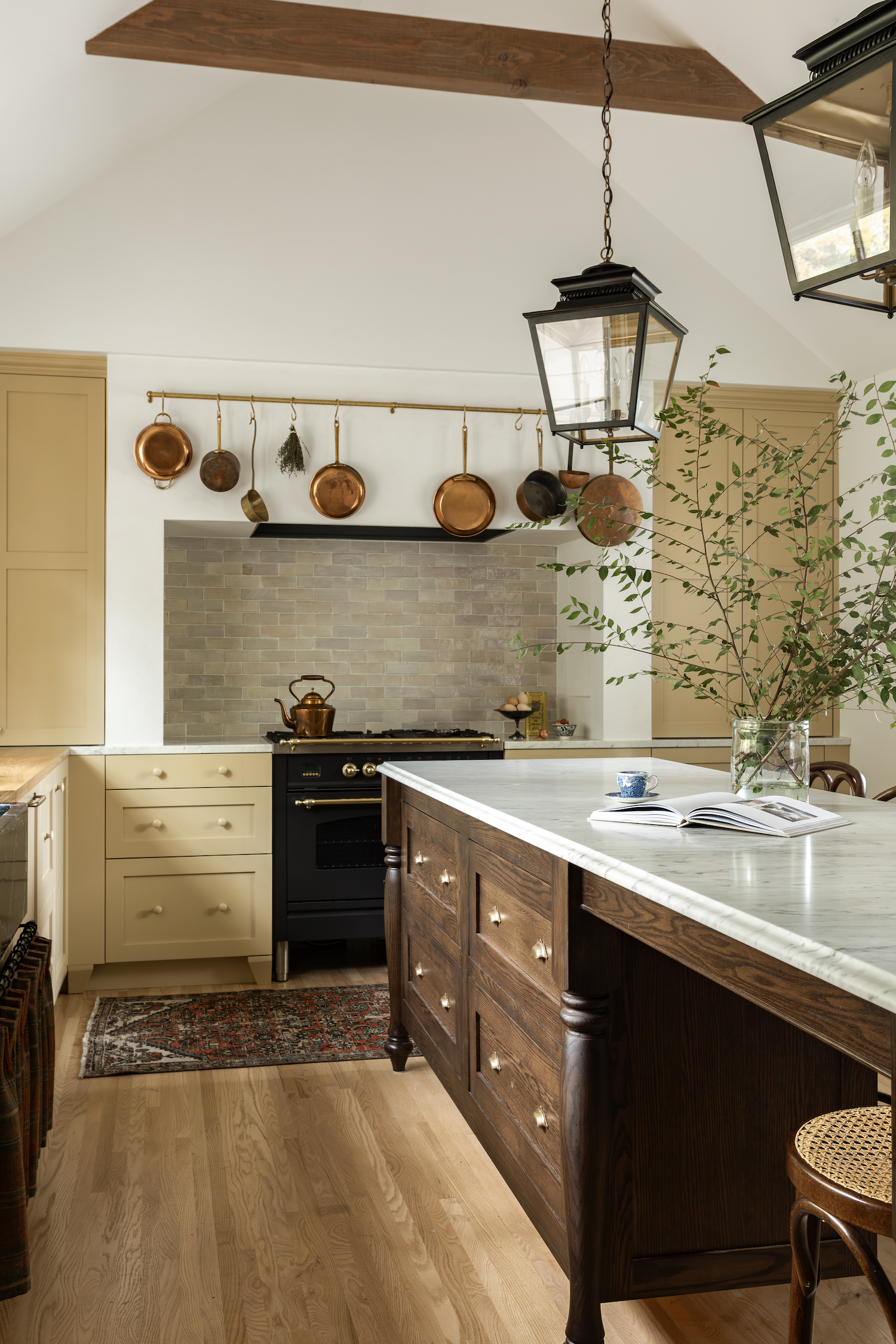
From the designer… Golden Oaks Heritage is a special project. Our clients raised their family in this house and every nook and cranny held importance and memory as they truly lived in and used every bit of the kitchen, screened porch, and living space. The front of the house was largely unused, and while charming, with a beautiful wood burning stove fireplace that often was filled with glowing embers, the layout of the space was just not working for how their busy family needed the space to function.
Andy from ACDC Studio and Oho Interiors collaborated on thinking about space planning and ultimately landed on turning the screened porch into a formal addition to the house, creating a generous family room, and moving the kitchen into the existing family room leaving the existing kitchen as the perfect spot for a dining table. This allowed the front of the house to be transformed with purpose, forming a library space that could pull double-duty as a perfect entry spot and creating an office space to the left of the stairs.
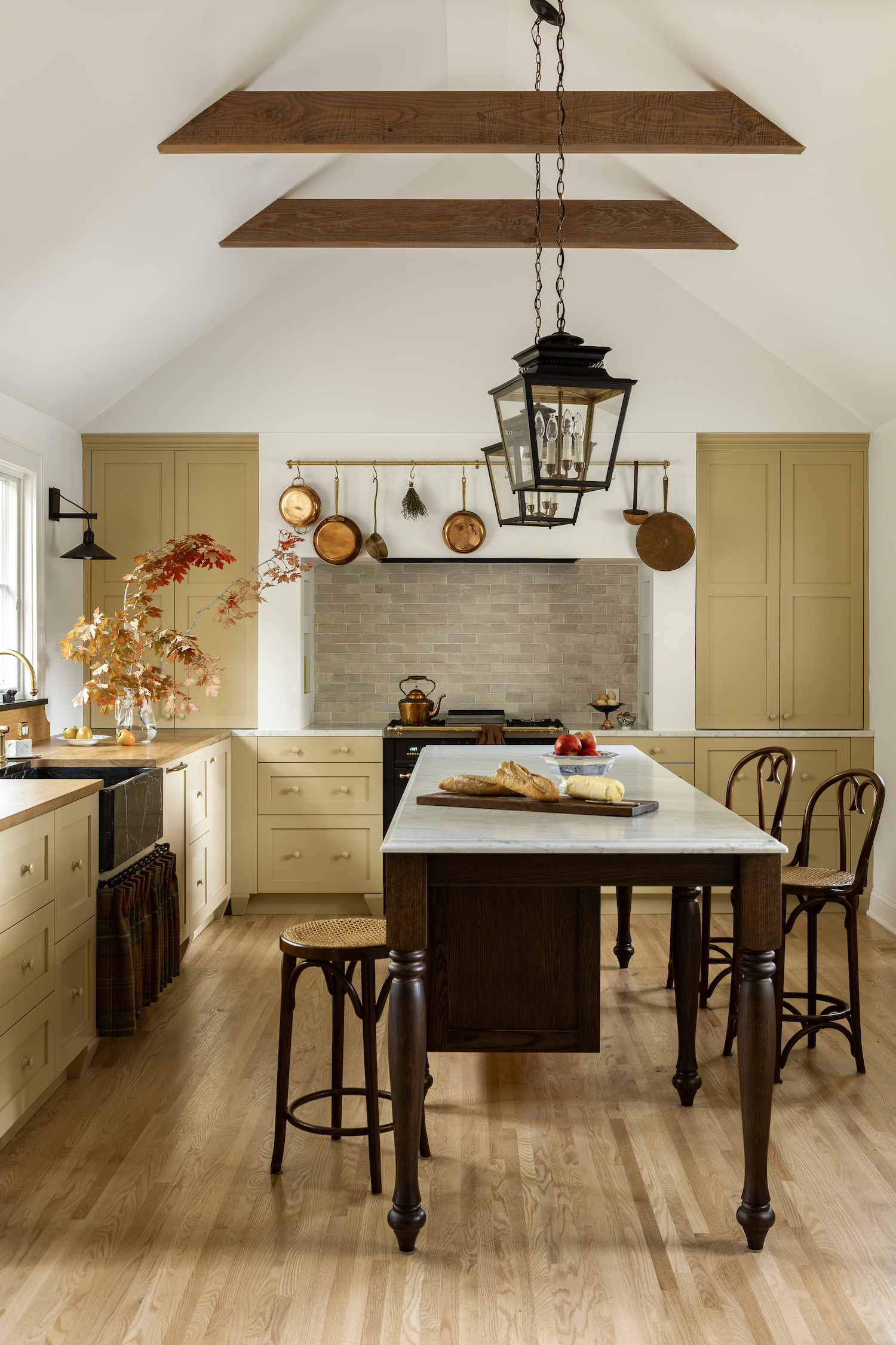
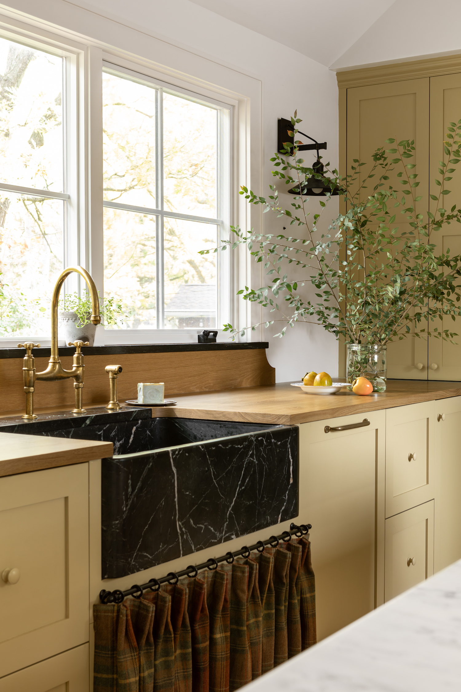
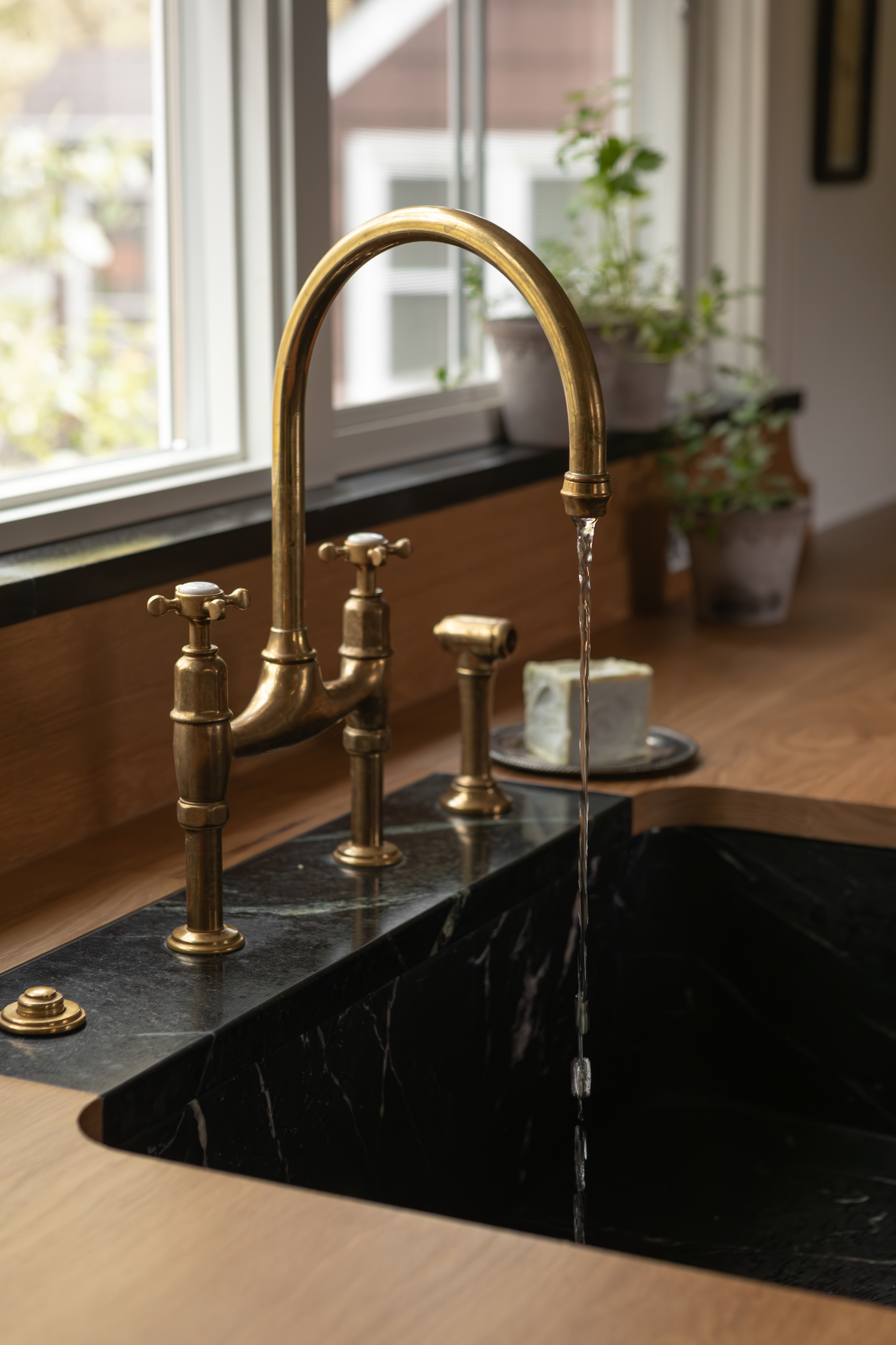
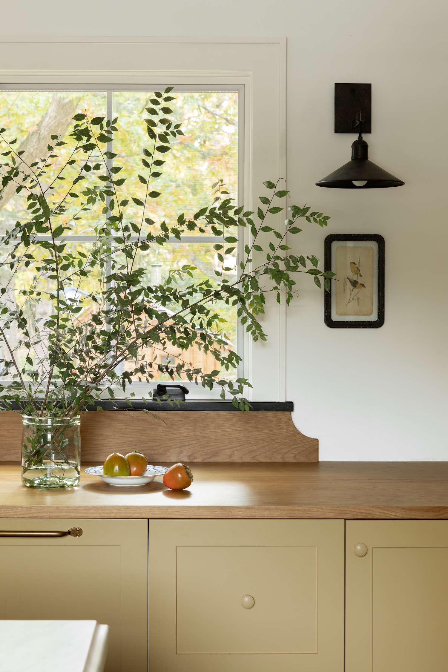
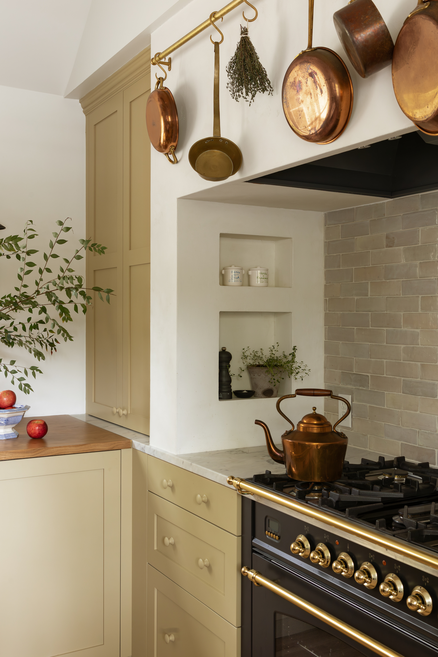

From the very beginning of ideating on the project, our client had a specific vision of having a space that felt warm and traditional but with elements that felt updated and fresh for today. The many gorgeous deVOL kitchens were a jumping off point for us as we balanced English simplicity with ensuring that all finishes would just look and feel better as they aged. Marble and white oak countertops, a soapstone sink, unlacquered brass hardware and fixtures, hardwood floors, and our paint color choices will stand the test of time and create a warm, enveloping feel as you move through the spaces. The result is somehow deep, welcoming, relaxed, light, and moody all at the same time.
One of the most interesting challenges of the project was the vaulted ceiling in the new kitchen space. The room previously had an asymmetrical vault and while you hope and pray that once the ceiling comes down a symmetrical vault can be achieved – it is always a bit of a guessing game until that moment. The challenge of the new vault was that our original design plan added stained beams that followed the angle of the vault, however, we found out that it required collar-ties for structural stability which created a design element we all were really excited to see in execution. As it often goes, those pivots end up being one of our favorite design elements and the stained collar-ties are no exception to that!


Like what you see? Take a peek at the talent behind the story… Interior Design: Oho Interiors · Photography: Judith Marilyn · Stylist: Charest Valentine · Architect: ACDC Studio · General Contractor: Sheltek Build · Kitchen Island, Range Hood & Custom Cabinetry: PCF Woodworking · Range Hood Plaster: Novacolor Near Me by Beth Schafer