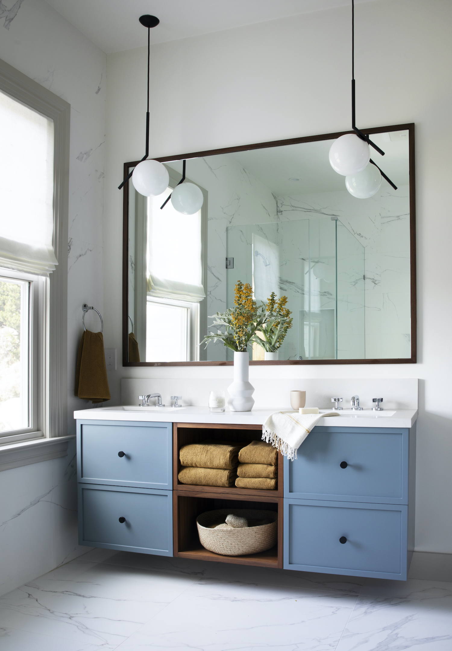
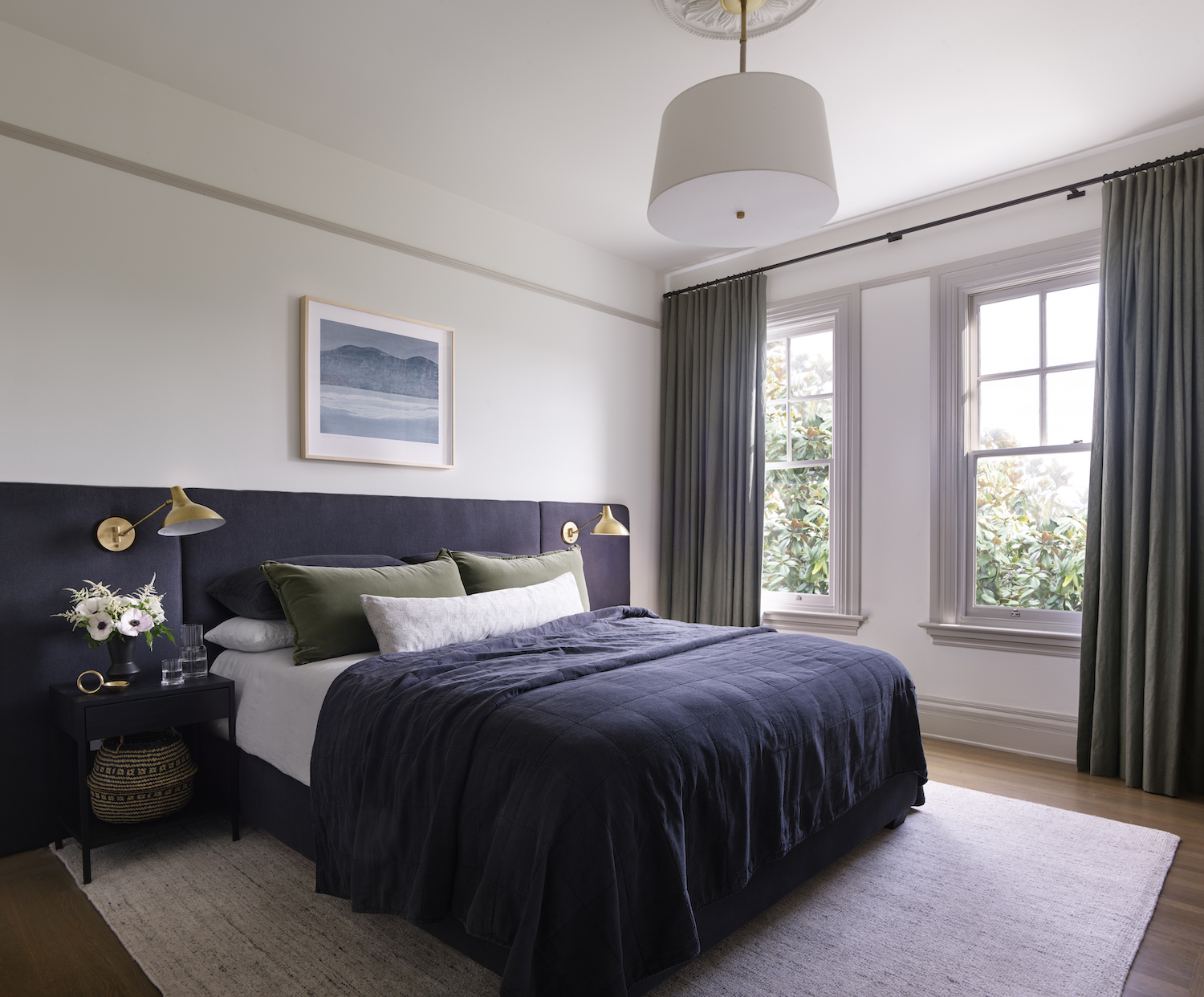
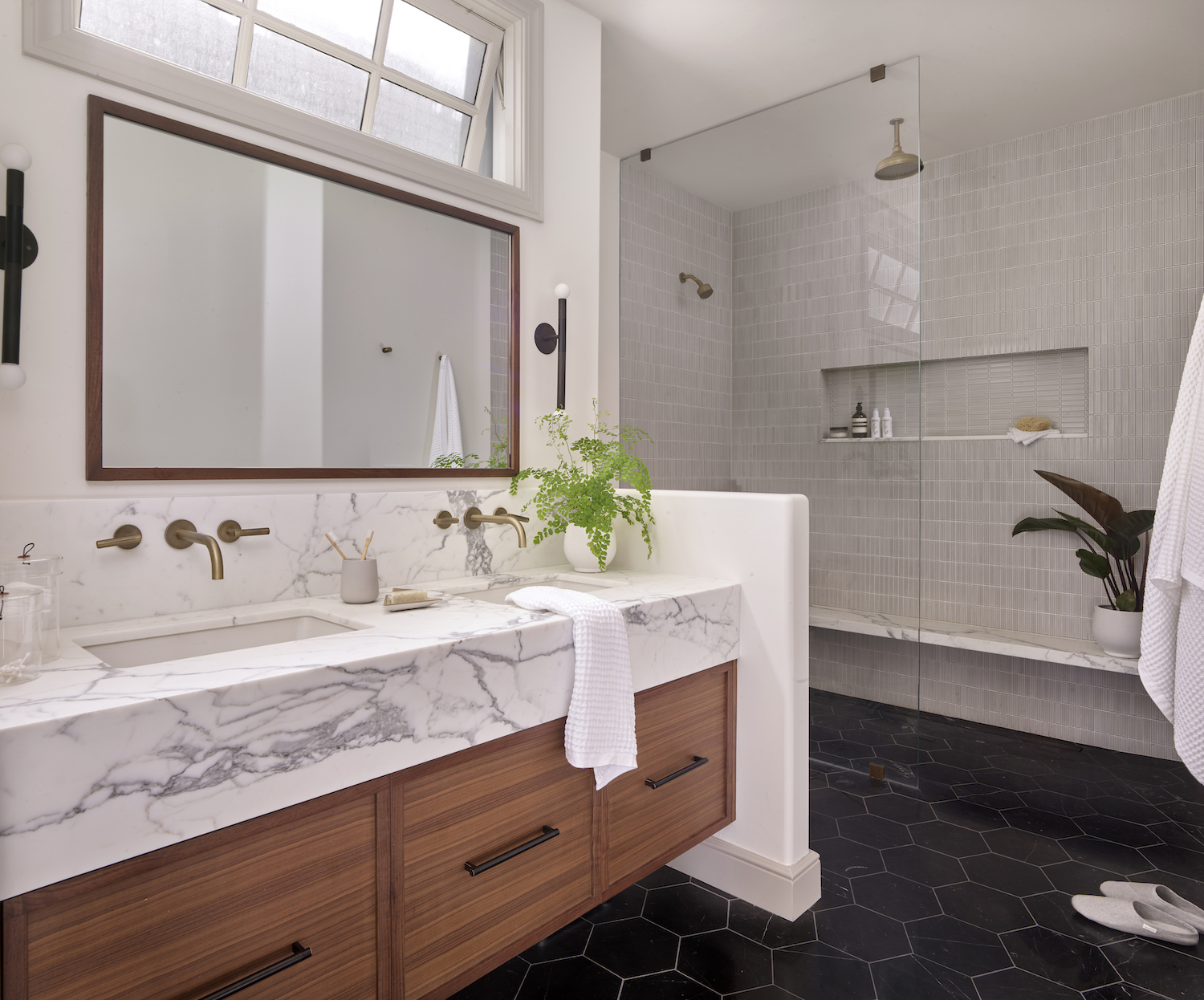
HKB Interior Design and their clients knew that the Edwardian details in this home were going to stay, but the old layout had to go. Heather used the original footprint of the home and cleverly rearranged the layout to create a functional family home where modern furnishings play off the original architecture. See how these elements come together in the tour below.
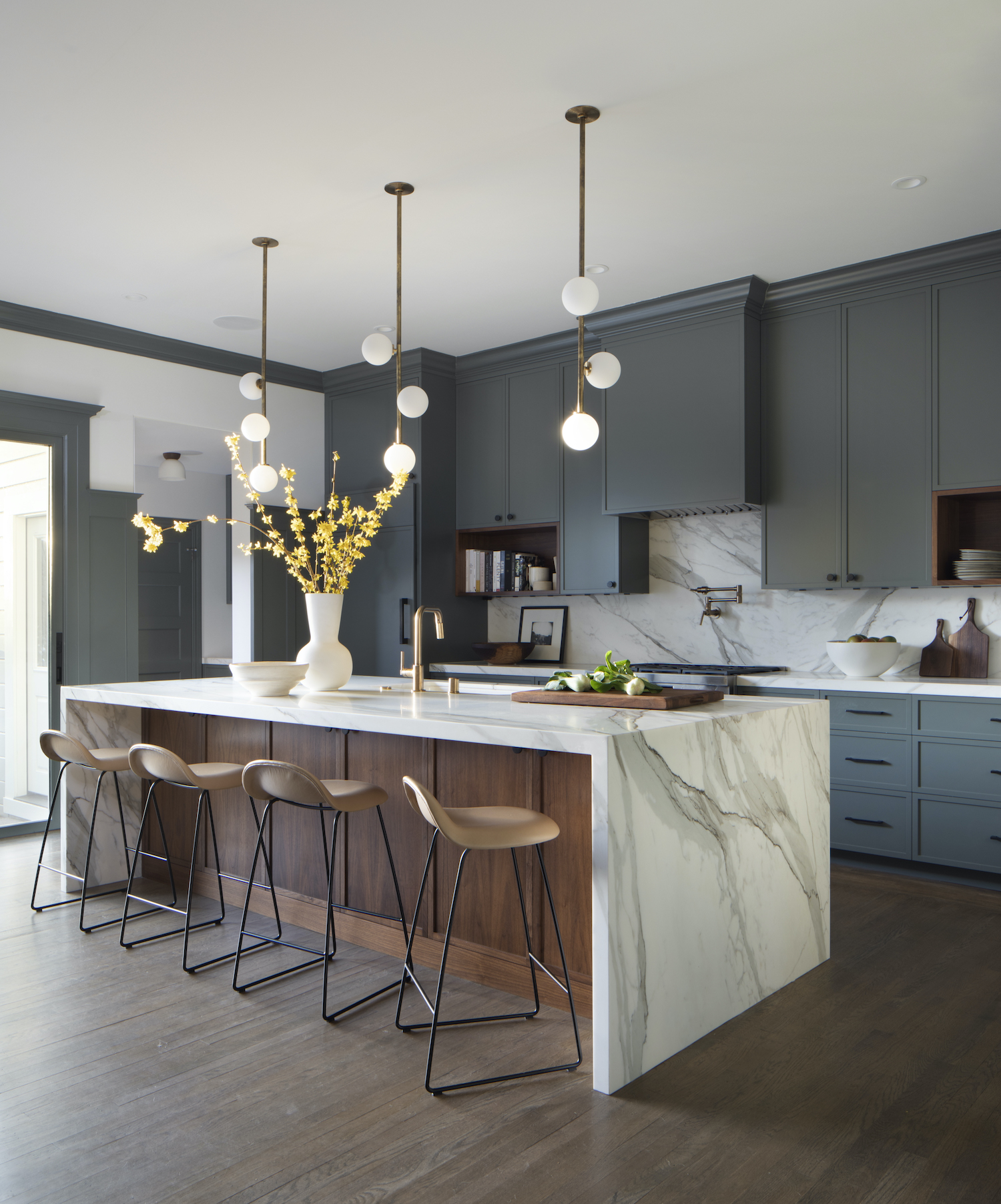
From the designer… The Edwardian-style house is located in the Lake District of San Francisco. The location was one of the things that drew our clients to this home because it has a family-friendly neighborhood feel while still being immersed in the heart of city life.
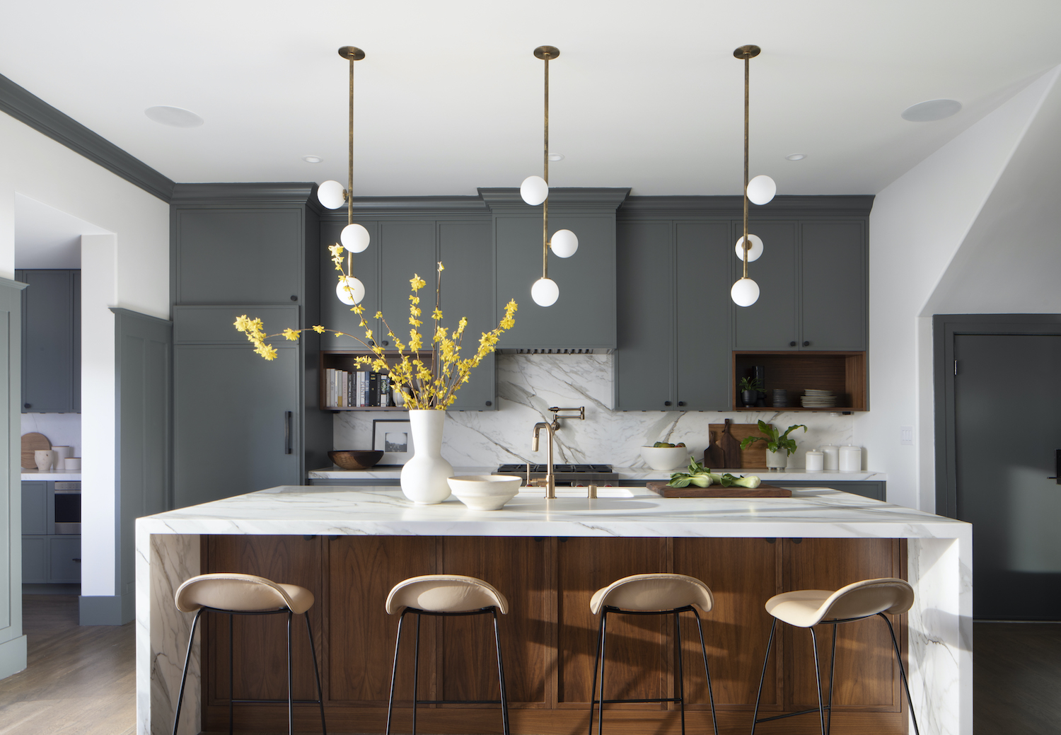
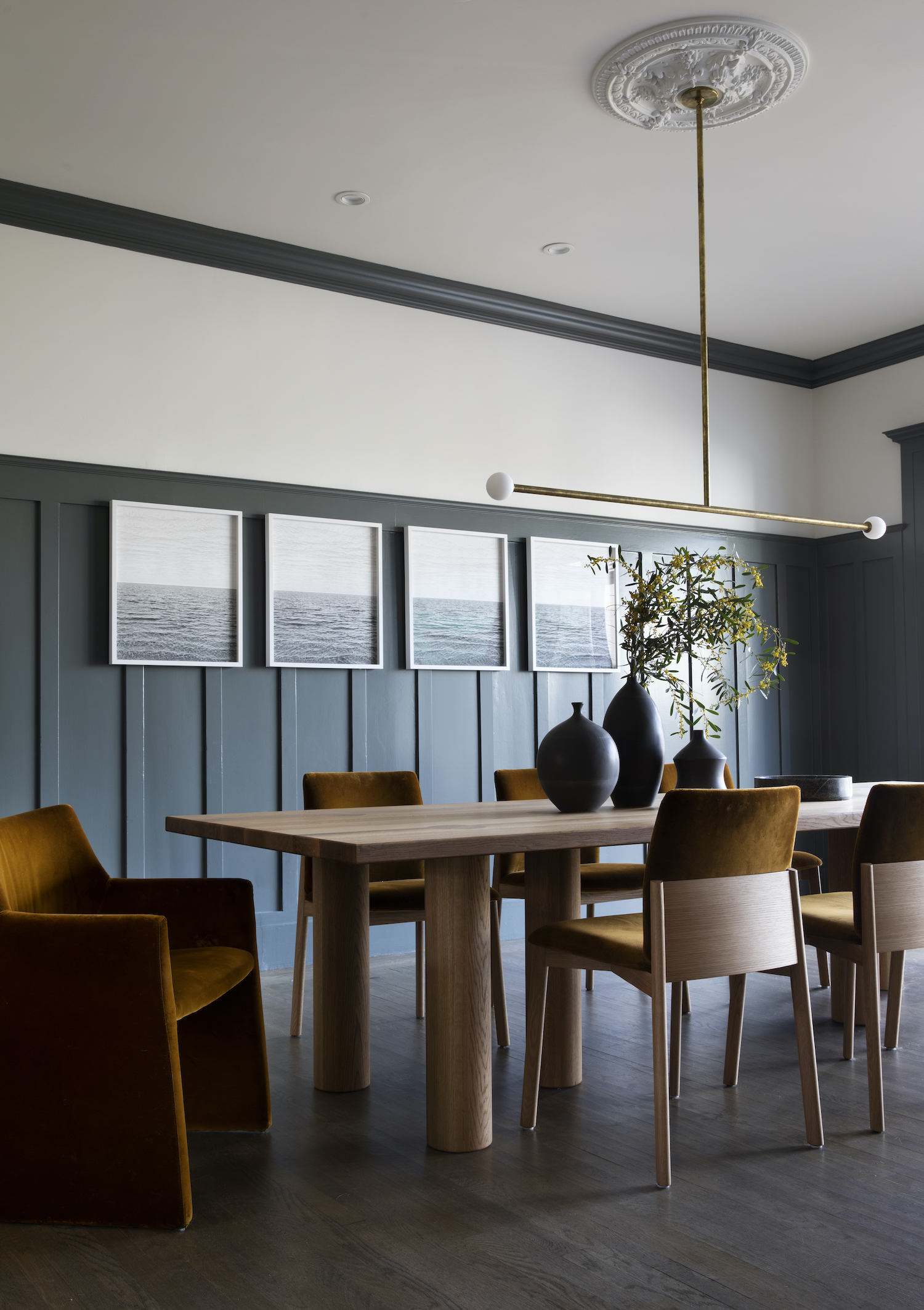
From the beginning, there was a love of the original details of the home that all involved wanted to preserve and highlight, while at the same time reform the layout and functionality to fit what the young couple starting a new family needed and wanted. The aesthetic was a mixture of traditional architectural components with a dynamic, colorful, and modern layer of materials, fixtures, and furniture.
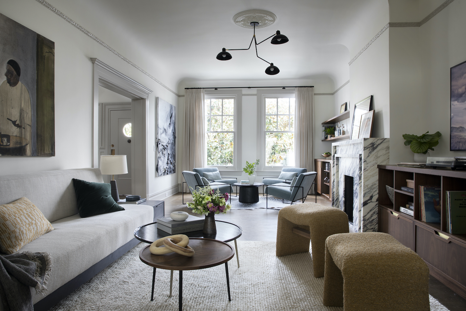
The largest challenge we encountered was fitting all of our clients’ needs and wants into the long and skinny living room. Their requirements for the space included a comfortable space to watch tv, a music center, and a bar/lounge entertaining area. Because it was a smaller space (and what you saw right when you entered the house) it needed to feel cohesive as one space, but we used an unconventional layout with the fireplace separating two seating areas. One area focused on the TV/music center and the other side a bar/lounge area.
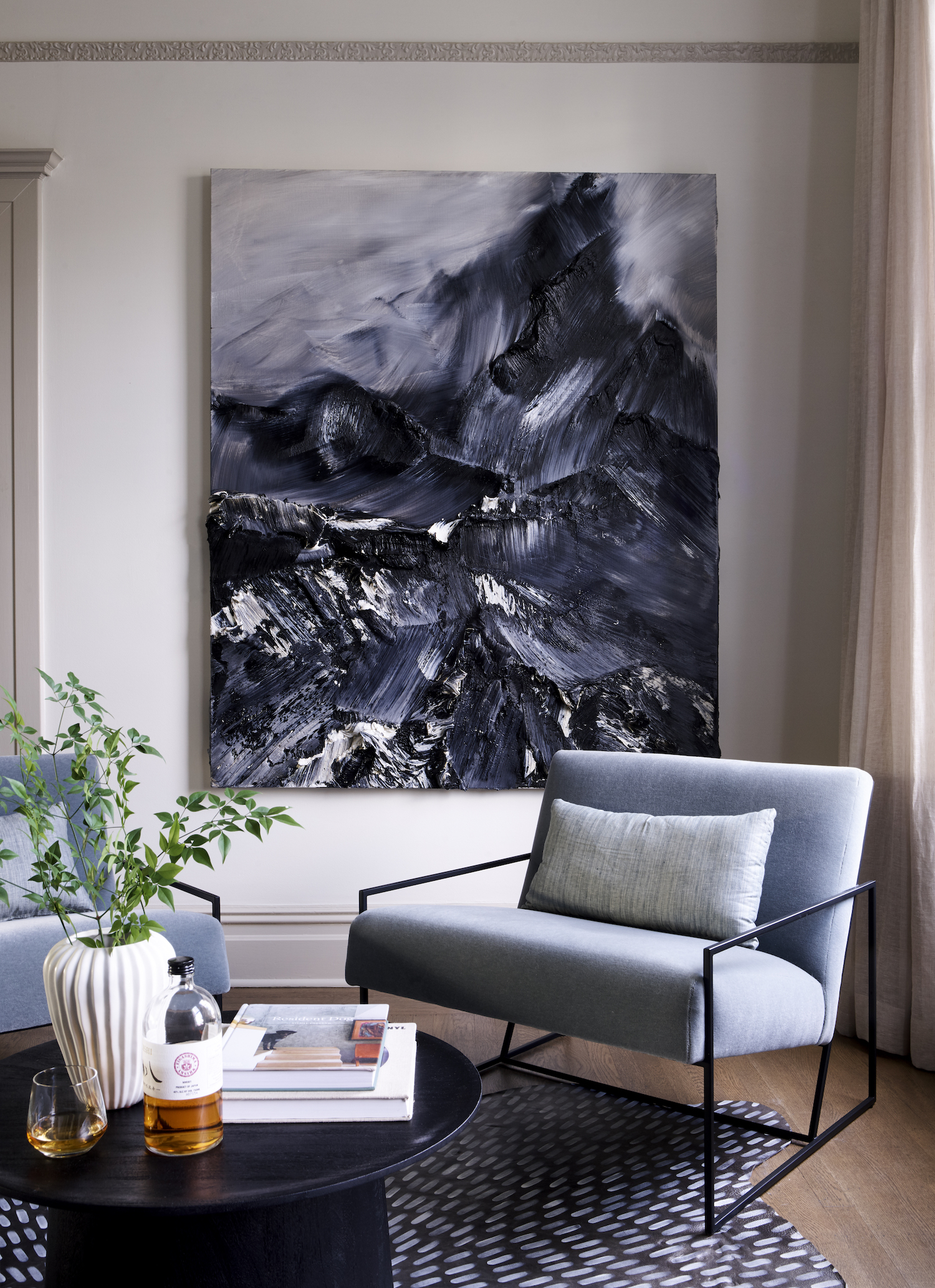
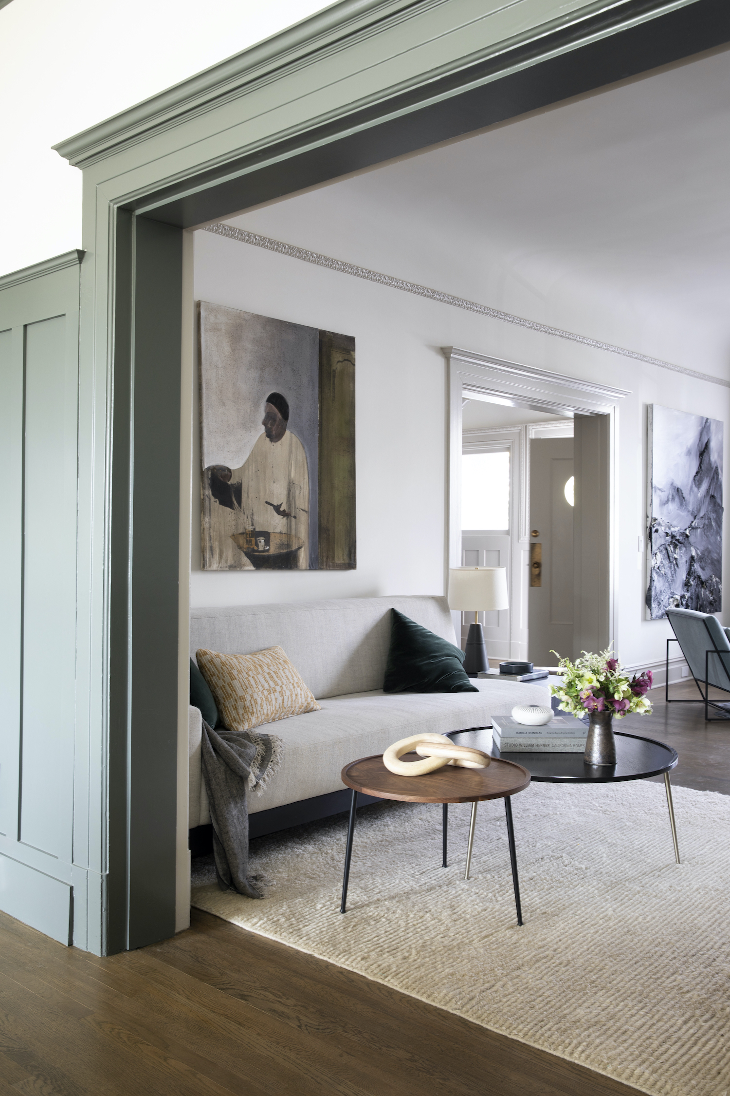
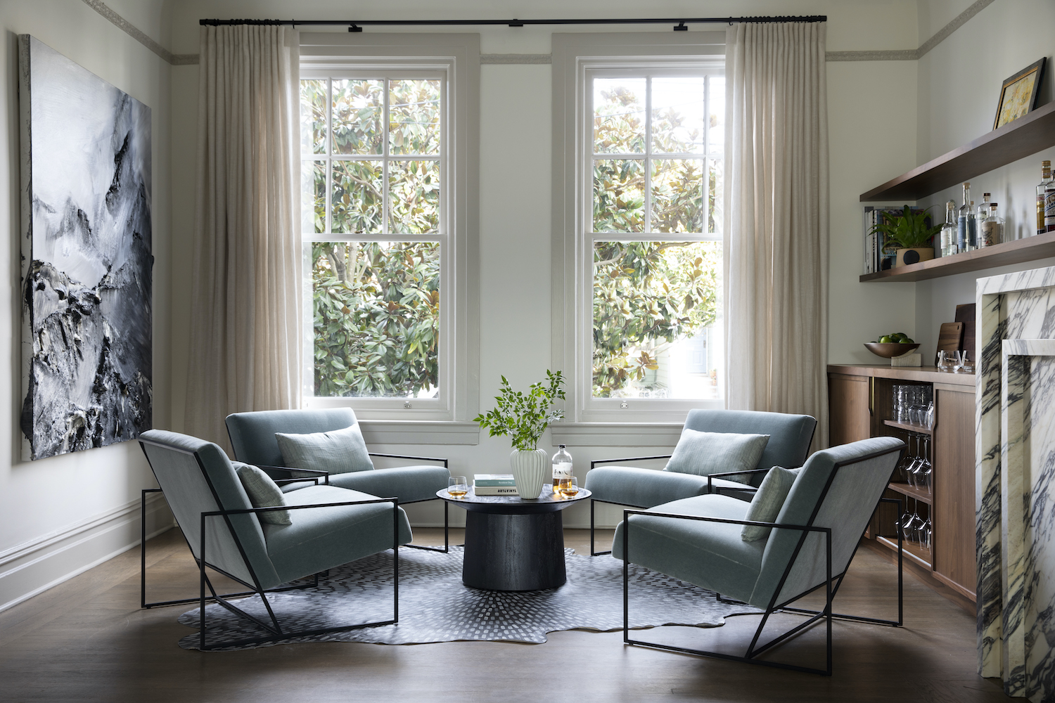
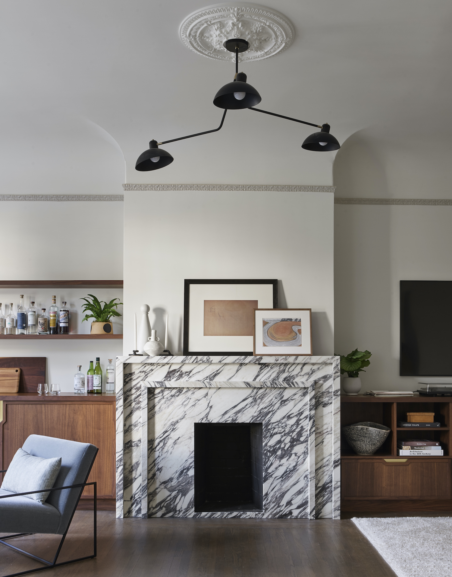
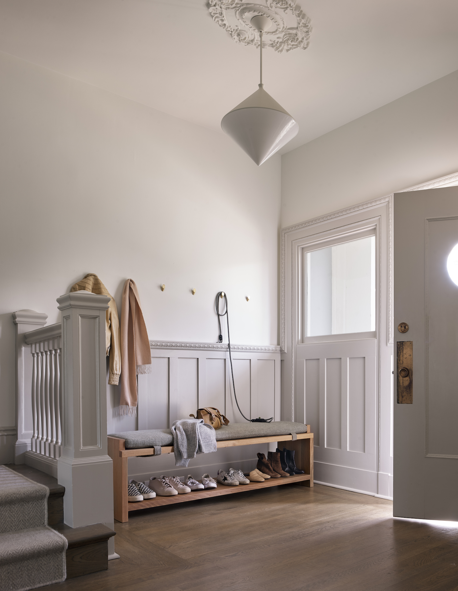
We painted the trim darker than the walls for a beautiful contrast. We love how making the trim stand out helped remind you of the old Edwardian feel while still feeling contemporary and bold.
Like what you see? Take a peek at the talent behind the story… Interior Design: HKB Interior Design · Photography: Paul Dyer Photography · Stylist: Allegra Hsiao · Architect: Brooks McDonald Architecture · Builder: Andrew Gallagher Construction