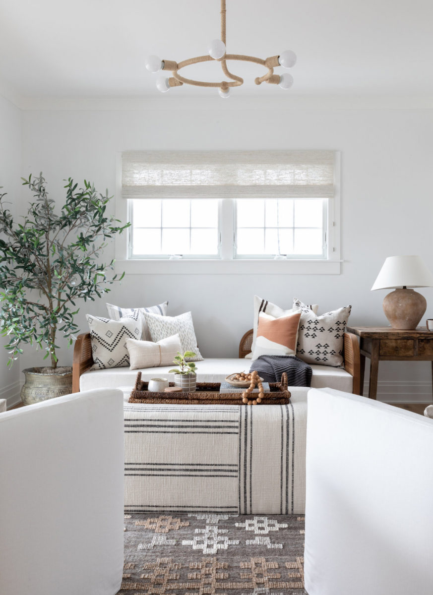
Imagine walking through your front door to be greeted by a scene reminiscent of your most memorable vacation; therefore, recalling a vibe that brings you back to a place you love, for a place you live. That’s just what the Salt Design Co. team did for the owners of this Spring Lake home renovation—transforming it into a dwelling evocative of Italian and French coastlines. Raquel Langworthy‘s images will invite you in and you may not want to leave.
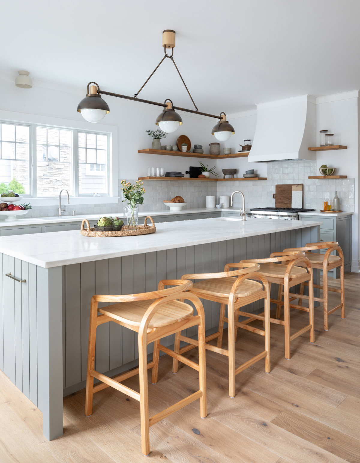
Tell us about this serene home and the inspiration behind the overall look.
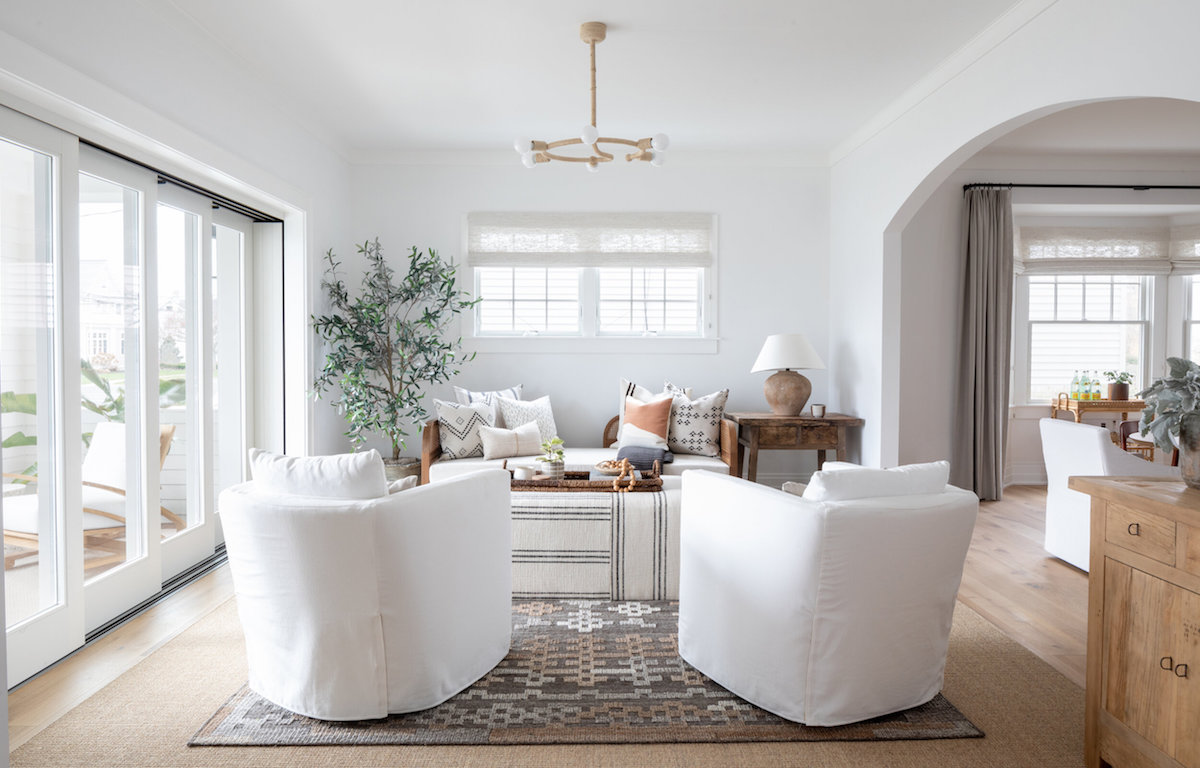
This beach house decor was inspired by some of the most beautiful coastlines of Amalfi, Ischia, and Cannes. Having spent much time in such wonderful places, the homeowners wanted the decor to be reminiscent of their travels while maintaining a clean look and neutral color palette.
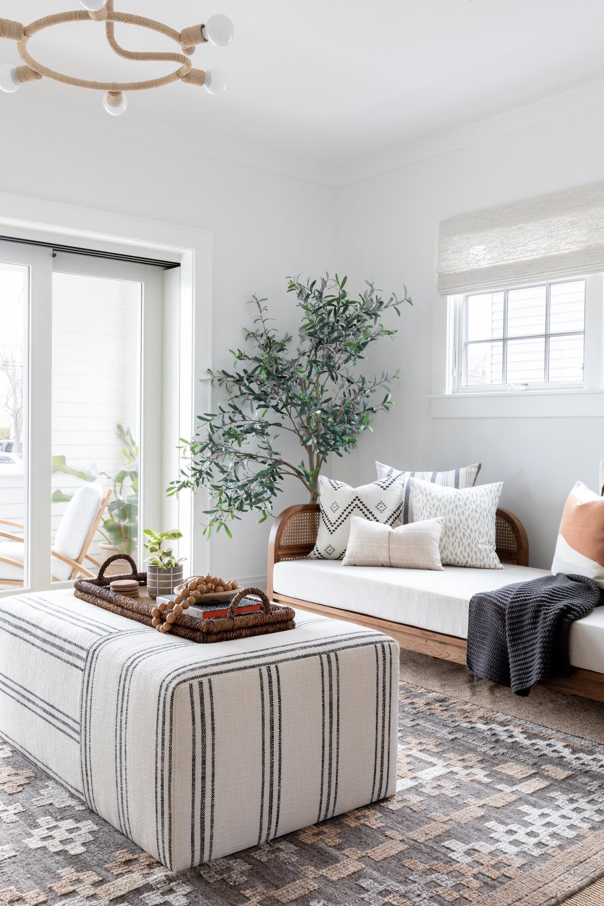
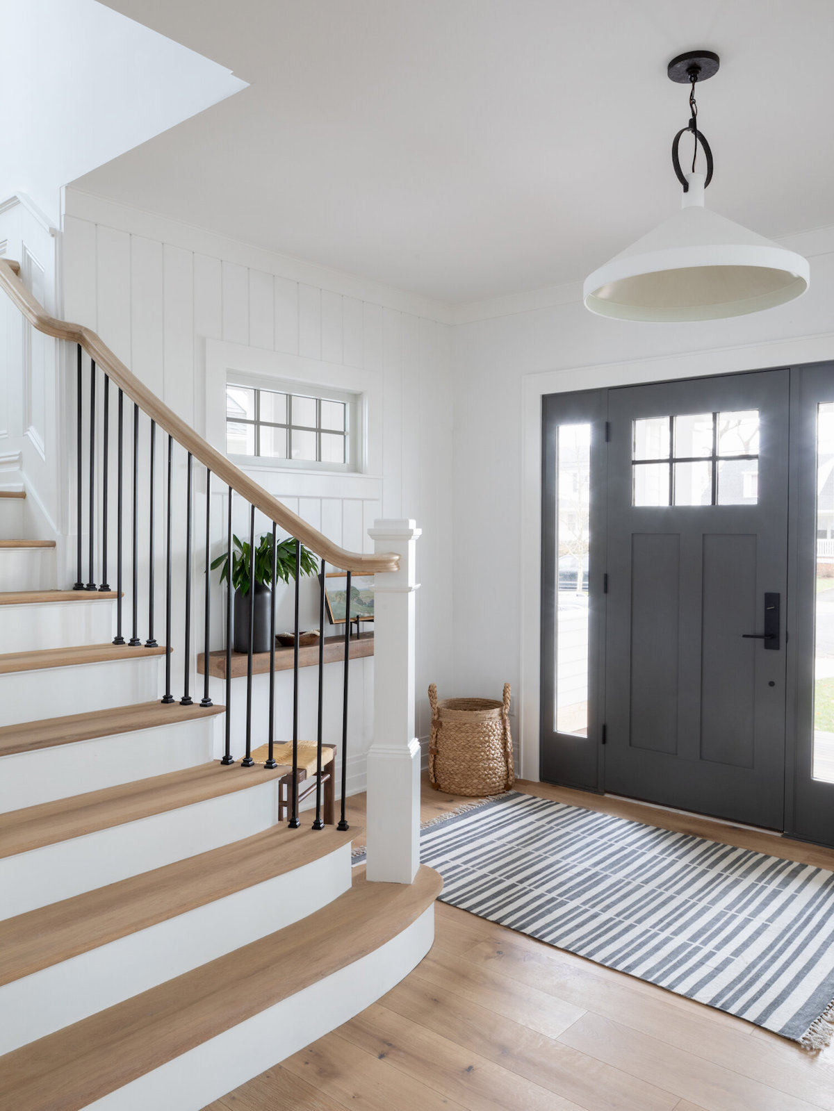
Walk us through the beginning stages of this project. Where did you kick things off?
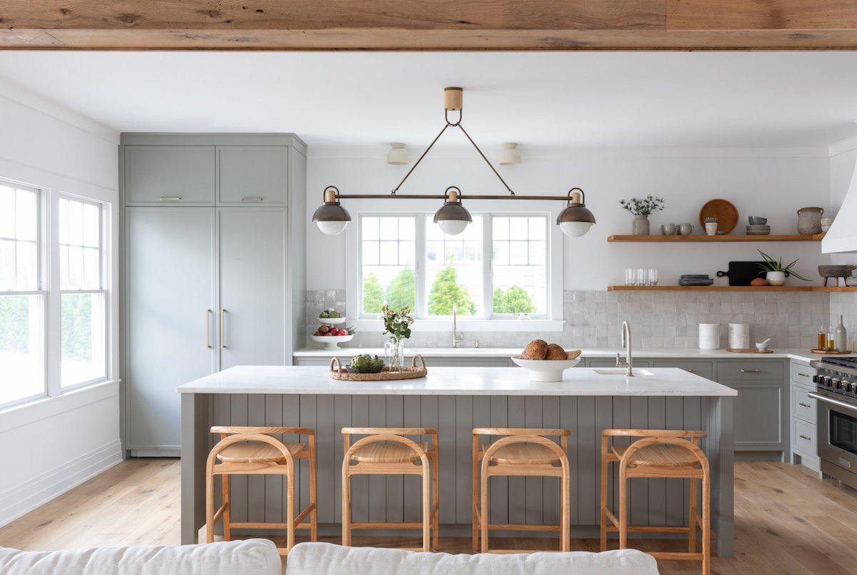
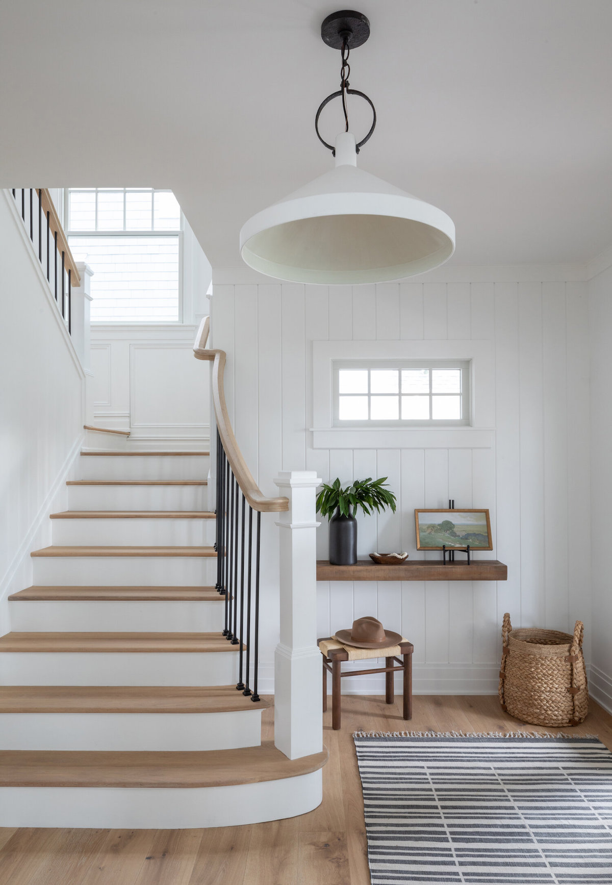
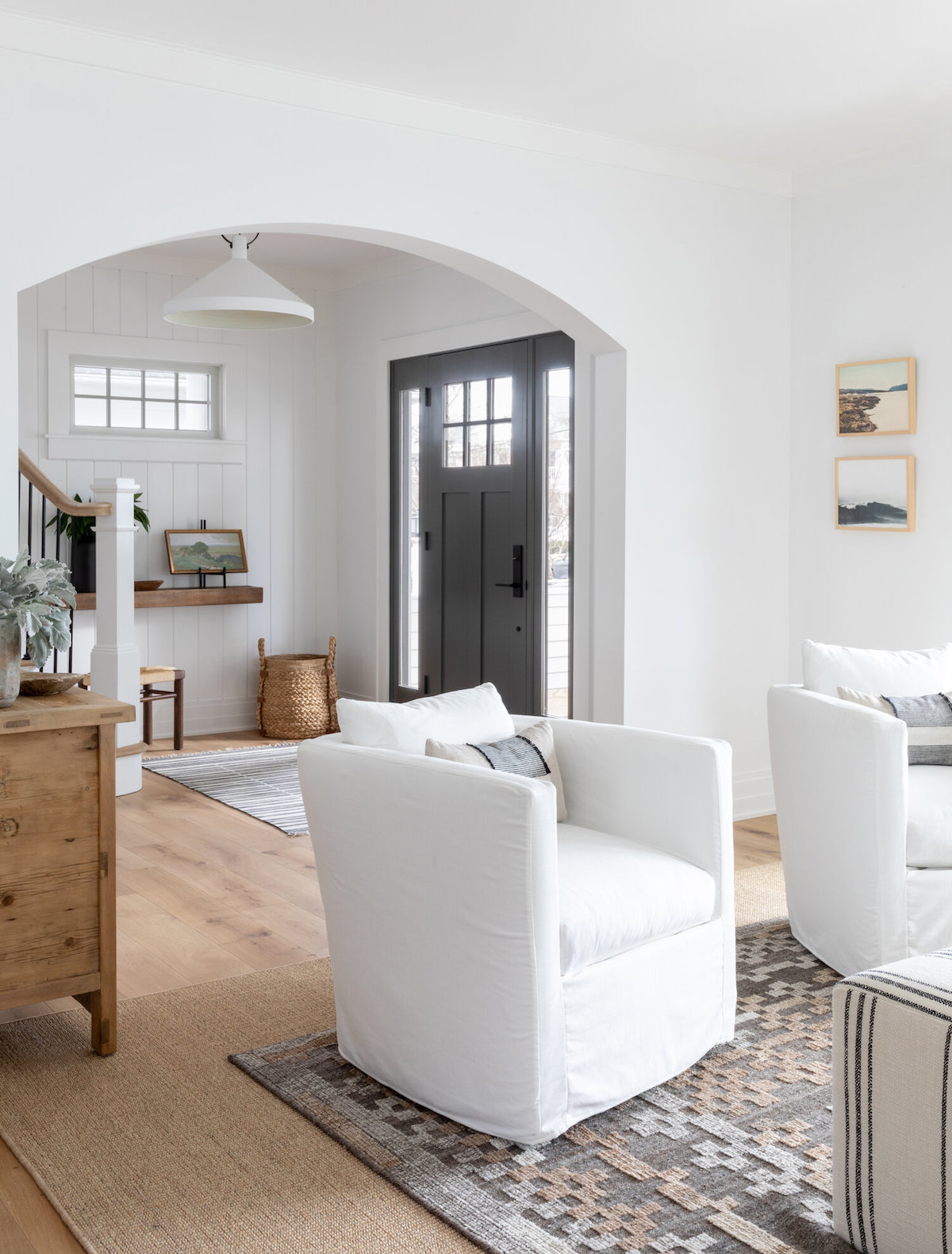
When the homeowners purchased the house, it was just shy of 10 years old and was originally built as a spec house. While it had great bones, the first-floor layout felt a bit forced, and some of the design details felt too opulent for a family beach house. We started on the project in the early stages, working alongside architect Paul Grabowski to primarily reconfigure the first floor. We moved a couple of windows, centered the front door, added a screened-in area to the porch, and reconfigured the powder room and kitchen. We drew inspiration from our clients’ travels and decided to create a functional, family-friendly coastal oasis for these lovely people to enjoy for years to come.
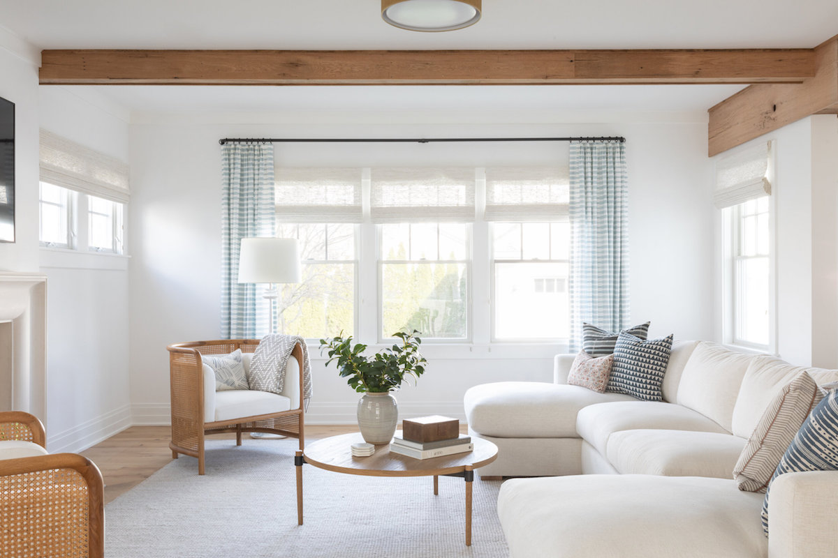
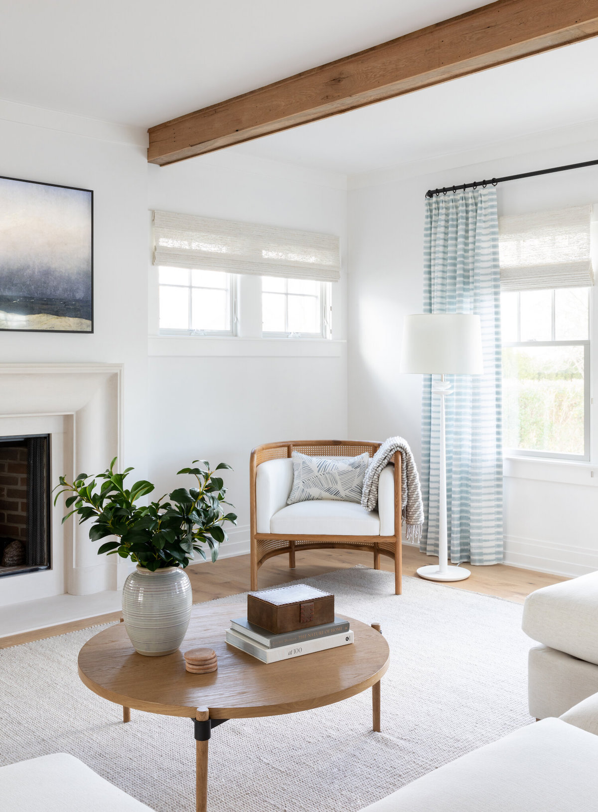
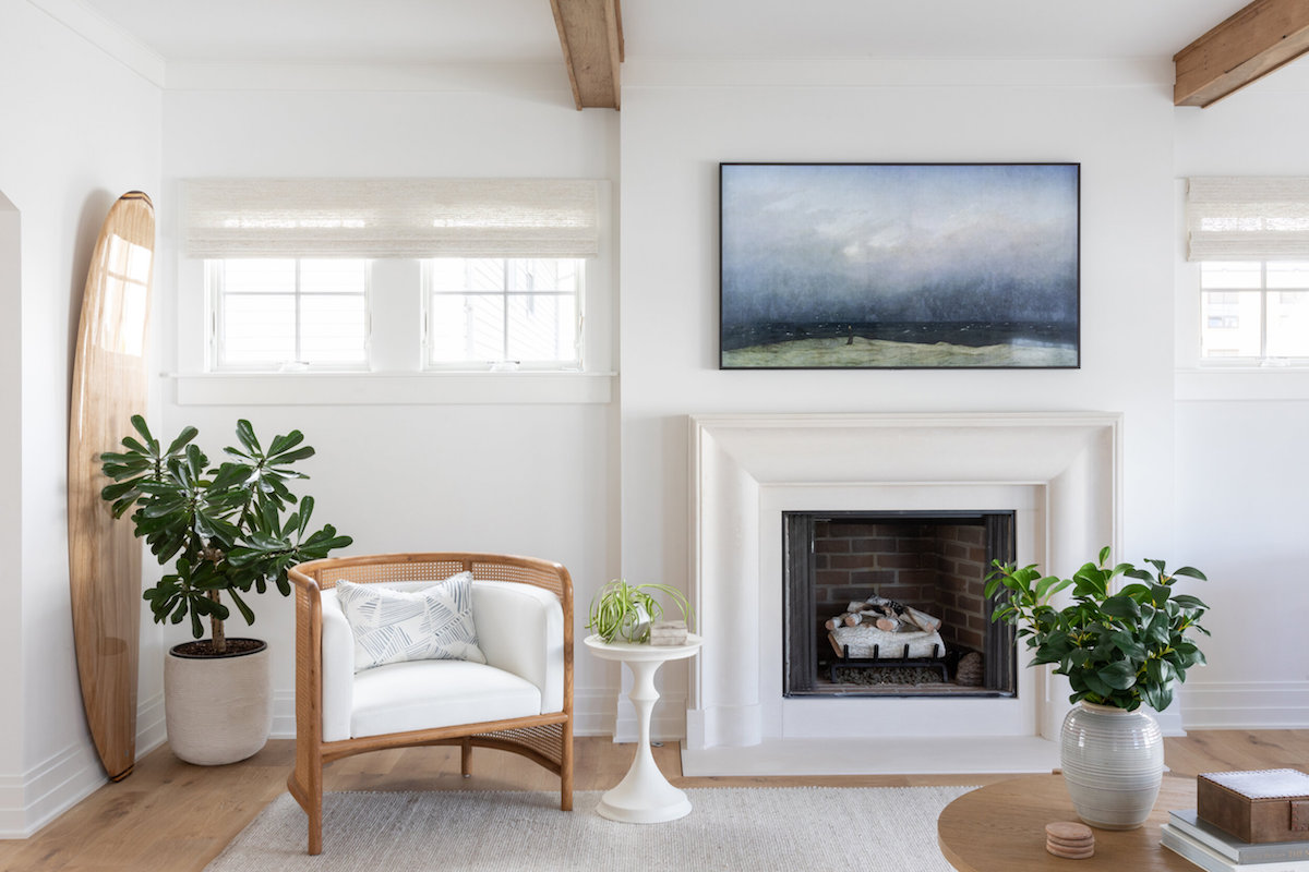
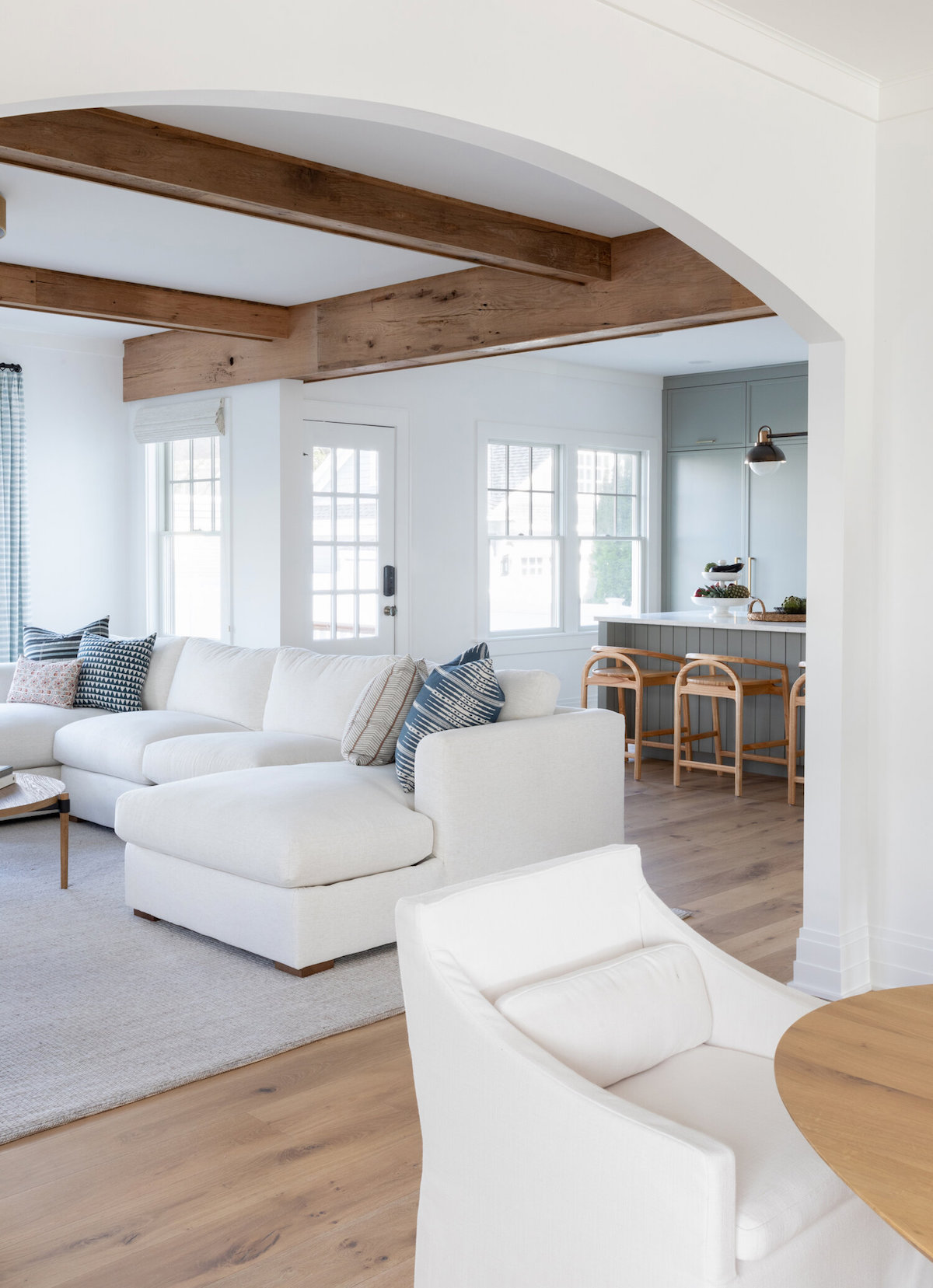
Whether it’s a particular room or a specific piece of art, what’s your favorite design element of this project?
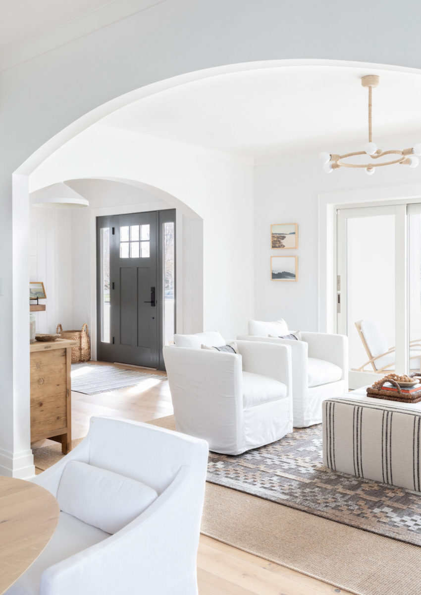
Hands down my favorite design element of this project is the untrimmed archways separating the different rooms. Originally the doorways were complicated and ornate. They were heavily trimmed and each had decorative columns. I went out on a limb suggesting these untrimmed archways to simplify and soften the transition between the spaces, and I am so glad I did. They help maintain the simplicity and organic nature of the design, adding interest without distracting you from the other elements in the room.
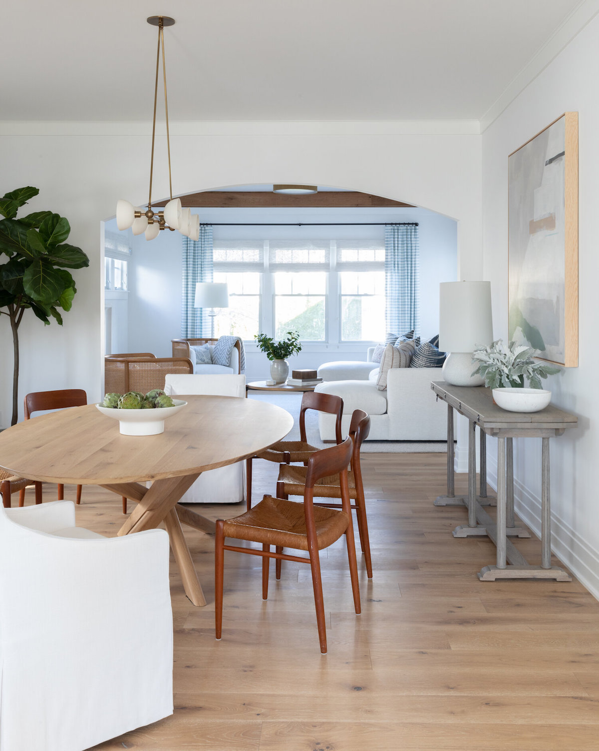
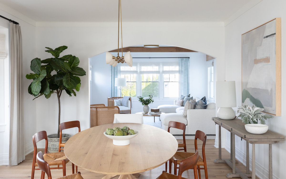
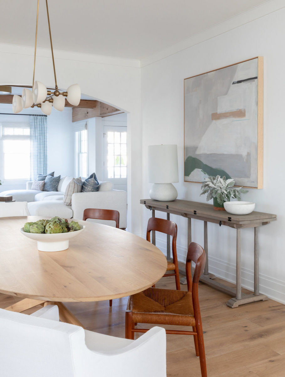
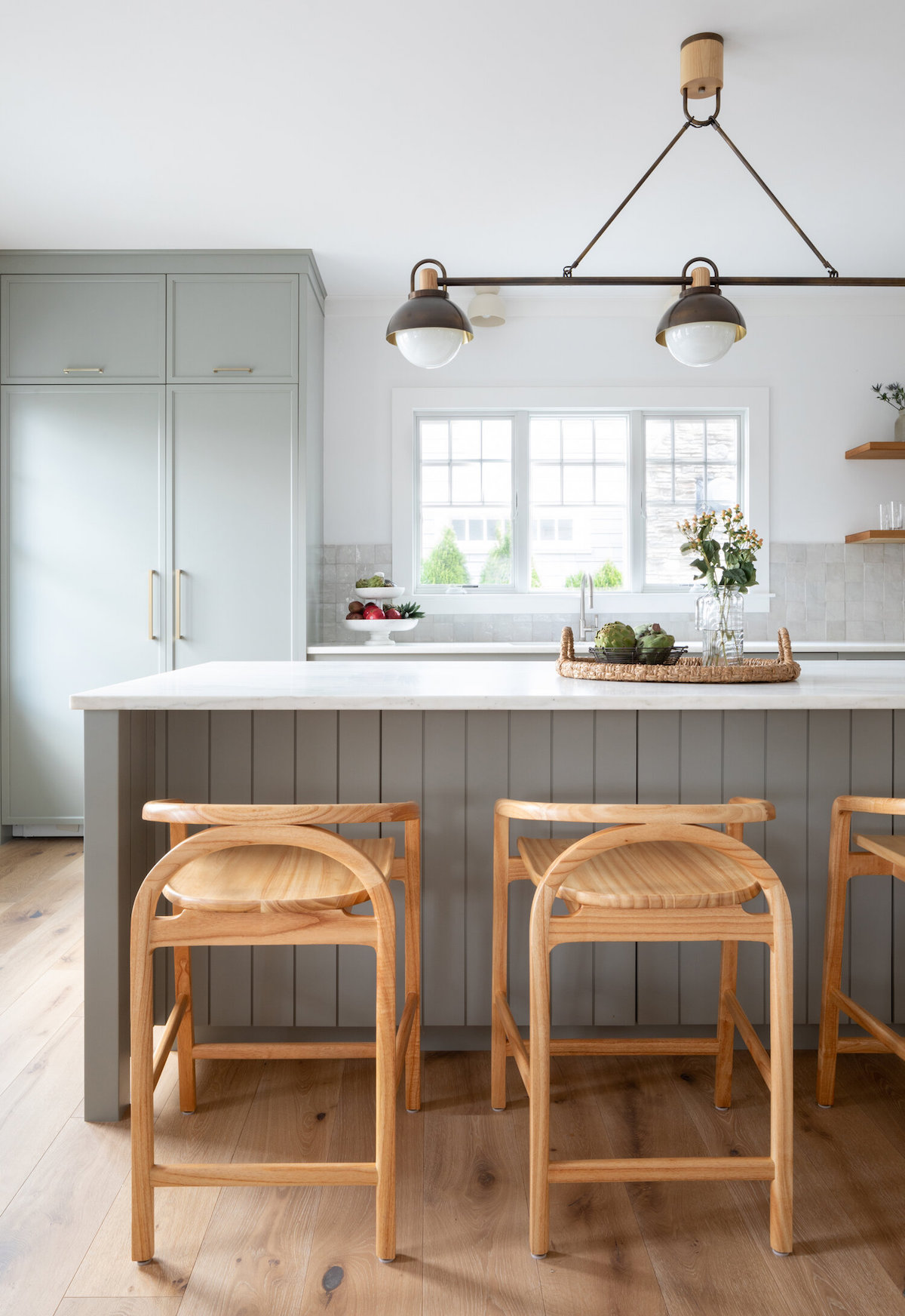
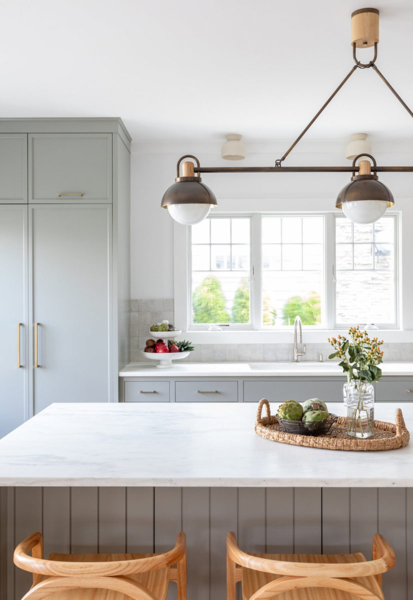
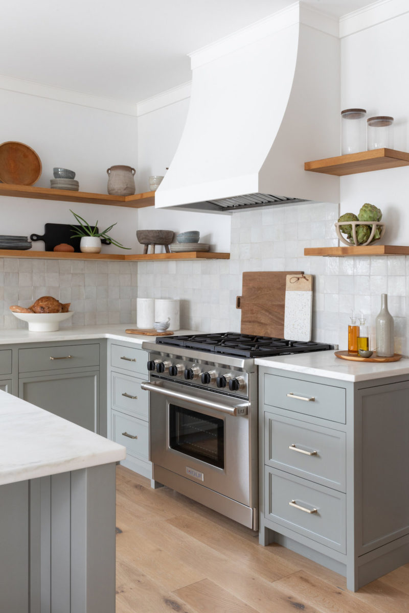
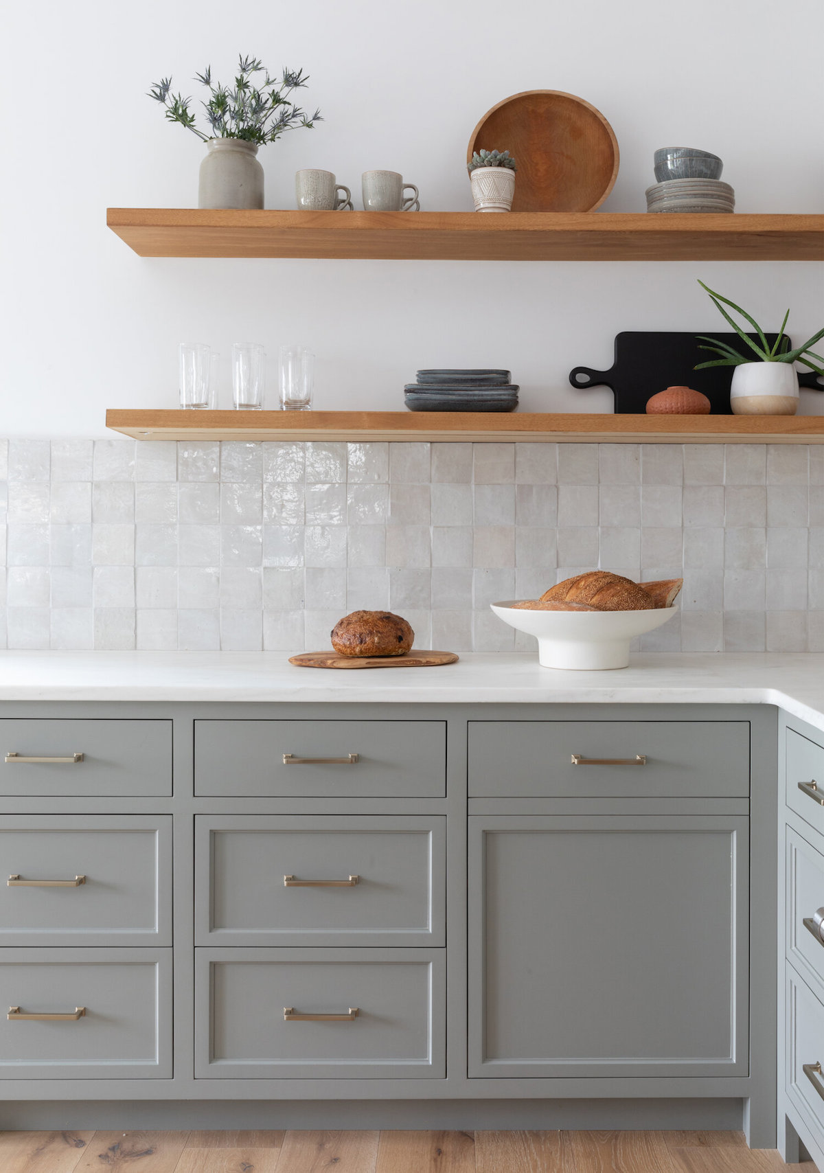
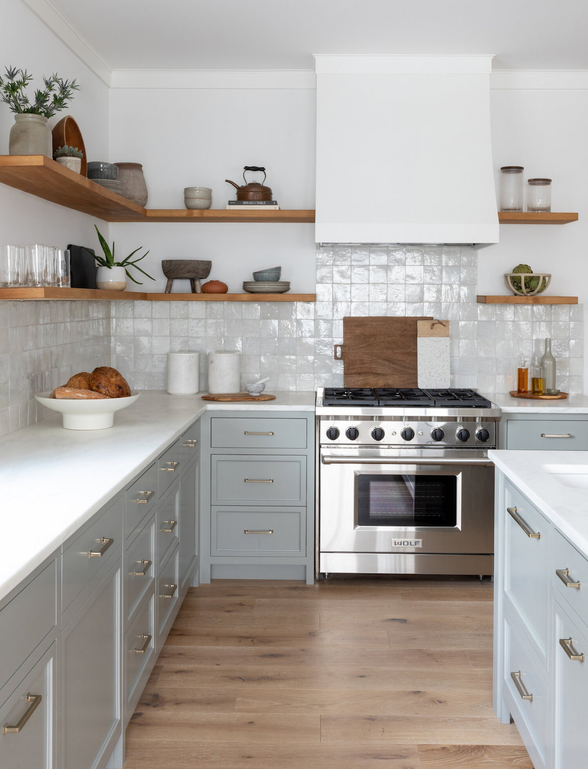
Let’s talk about this lovely kitchen! That gray is absolute perfection. Do you mind sharing the paint color for any gray-obsessed kitchen lovers out there?
Thank you! These cabinets are painted Farrow & Ball Pigeon, in my opinion—the perfect shade of green-gray. This has always been my favorite color, so I was very excited when the client was on board for going outside of the box.
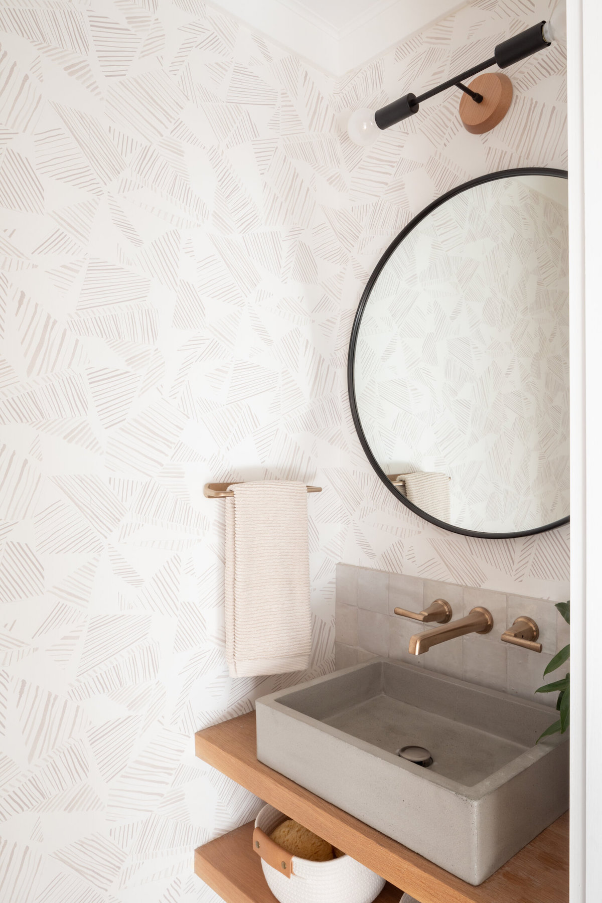
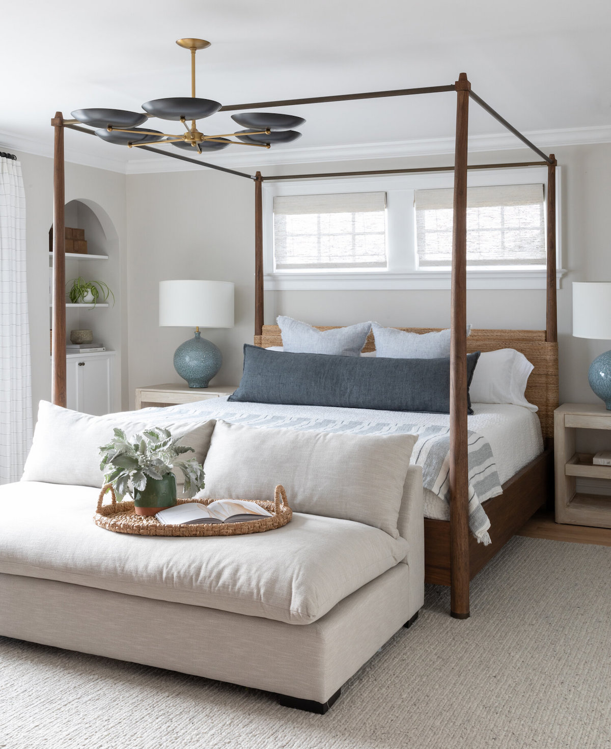
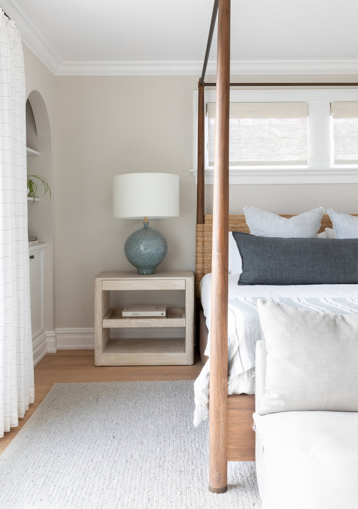
Love what you see? Take a peek at the talent behind the featured image… Interior Design: Salt Design Co. · Photography: Raquel Langworthy · Builder: Nick Mancini of Miana Properties · Architect: Paul Grabowski of Virtuoso Architecture · Cabinetry: Sean Taylor of Taylor Custom Woodworks
