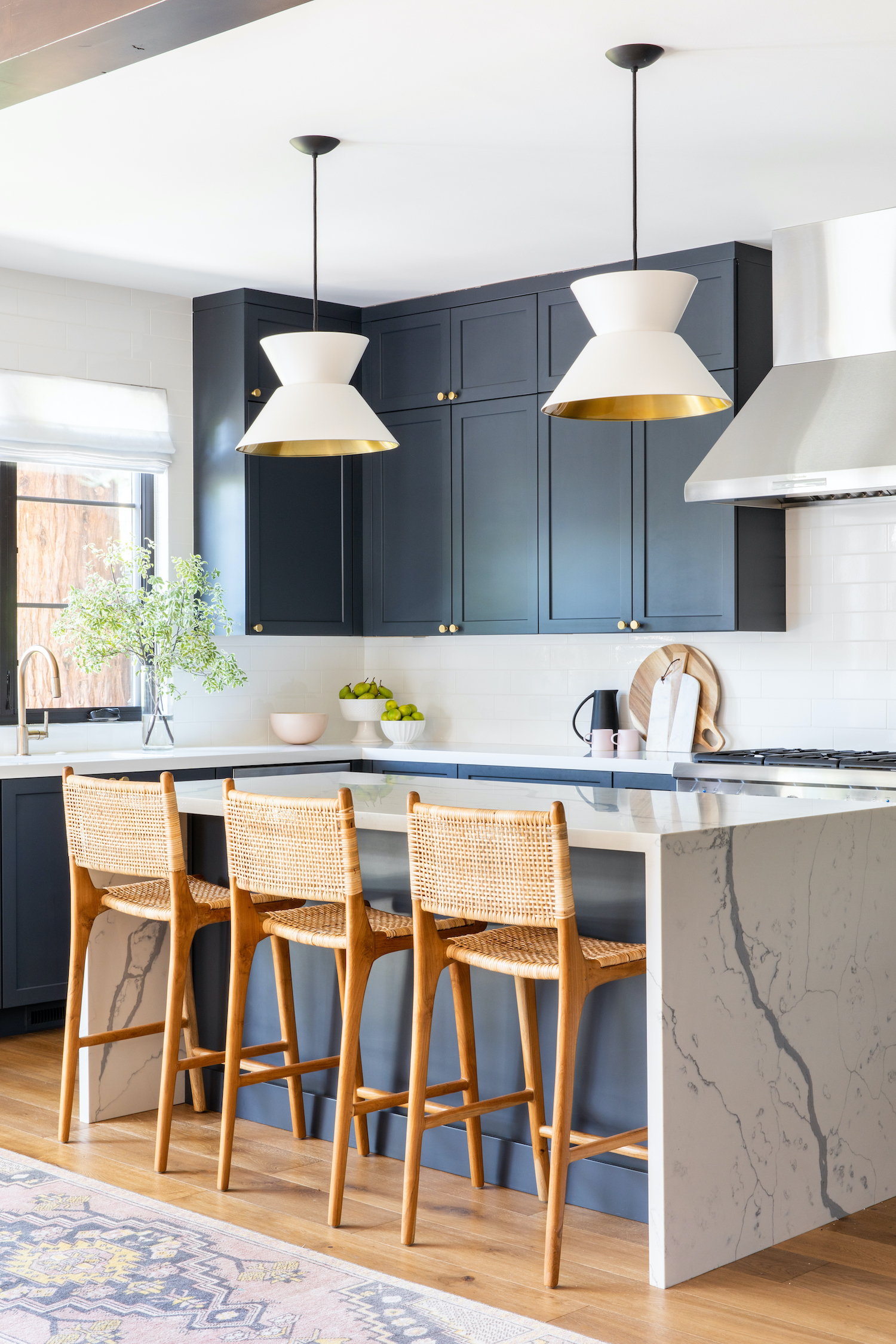
This modern Tudor, located in the heart of Silicone Valley, was a true exercise in balance. Emily Kates Design beautifully fused the homeowners’ contrasting design aesthetics to create a home that unites their unique styles. The result is a polished, fresh home filled with purposeful pops of color. Photographer, Vivian Johnson, captured how it all came together in the lovely photos below.
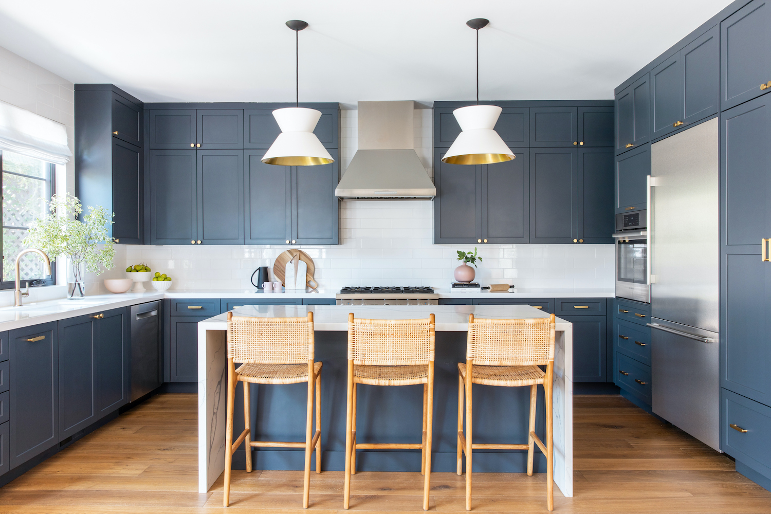
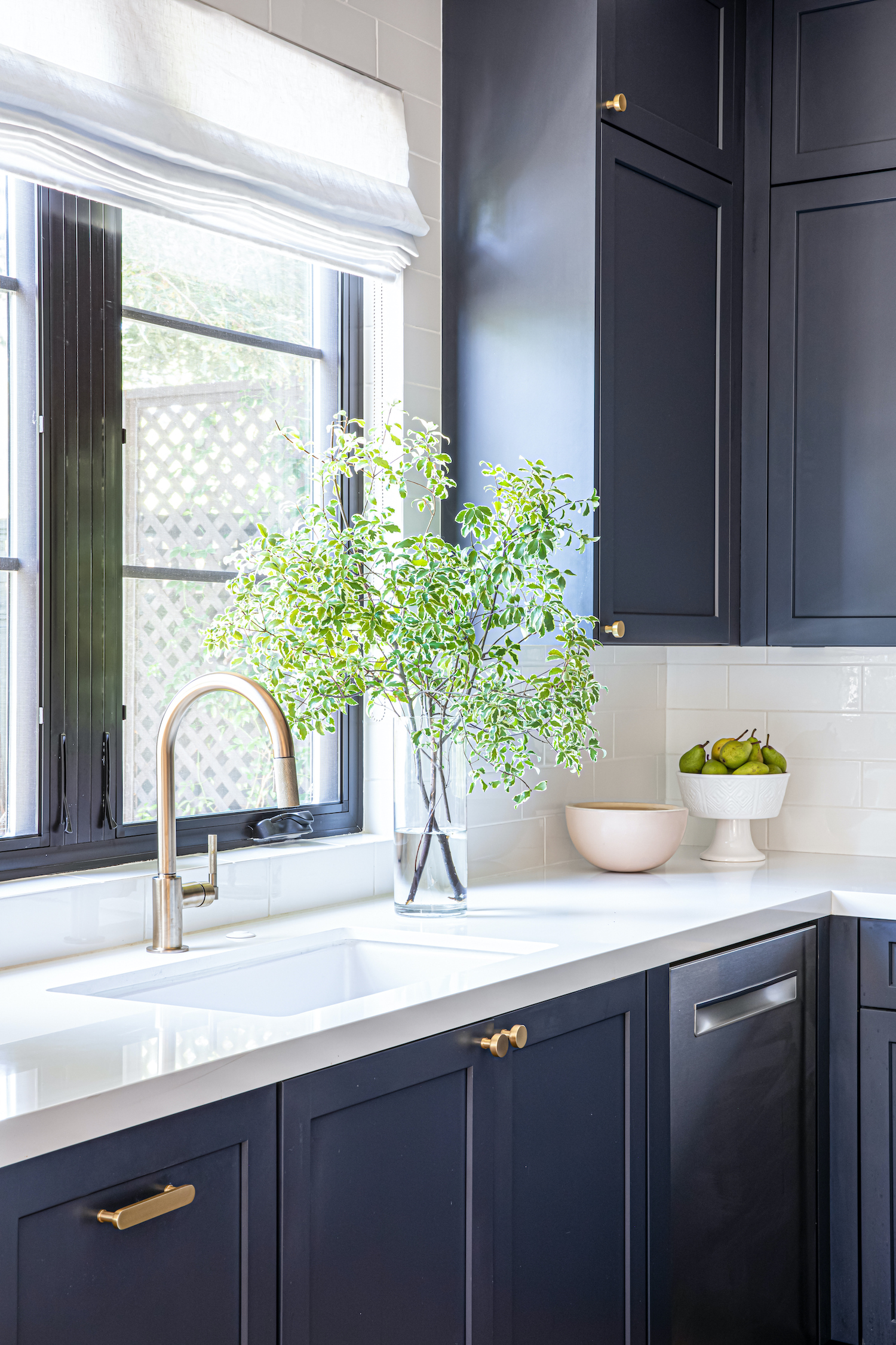
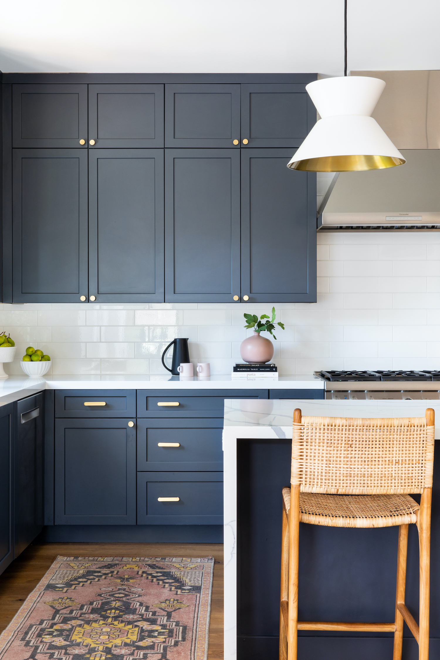
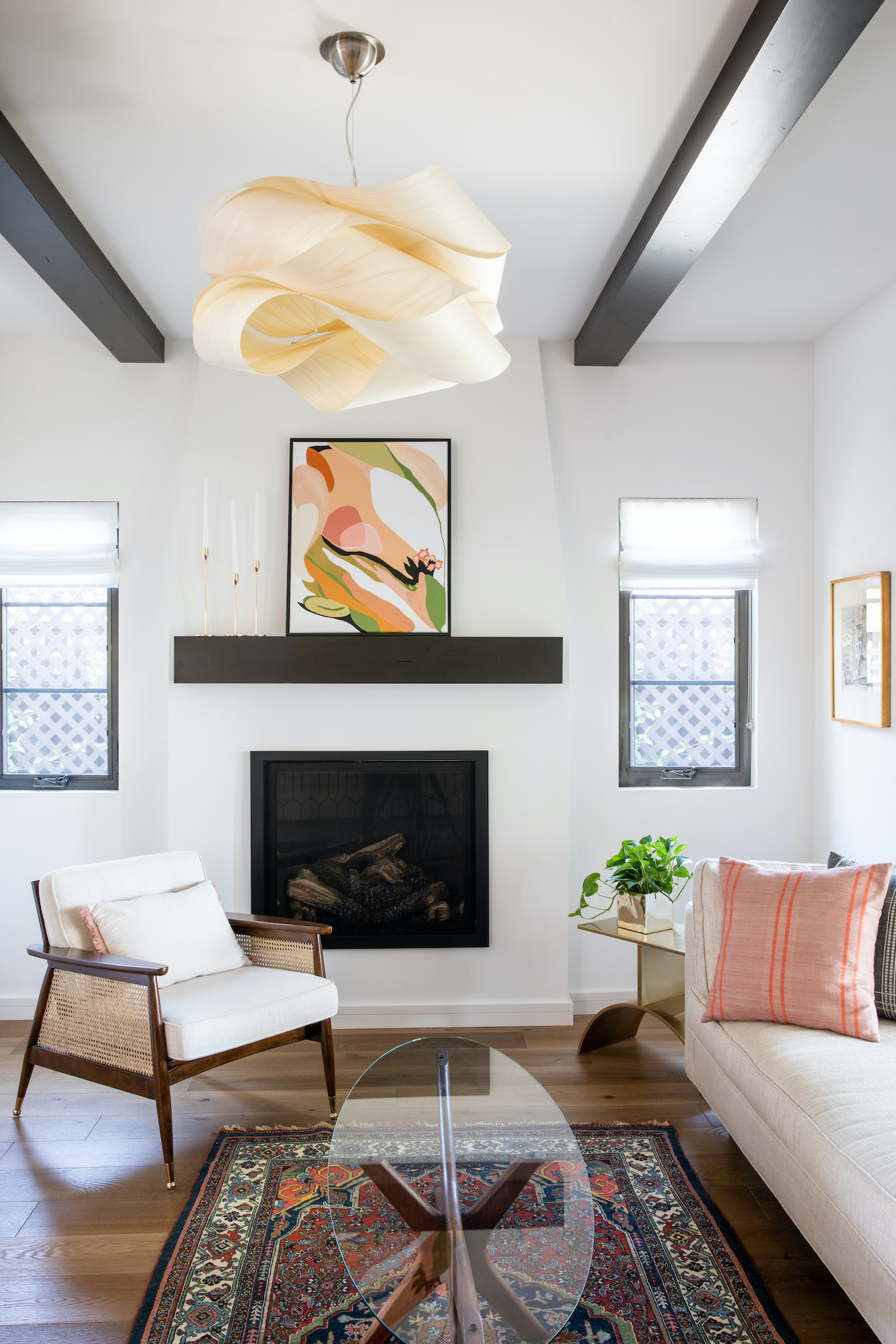
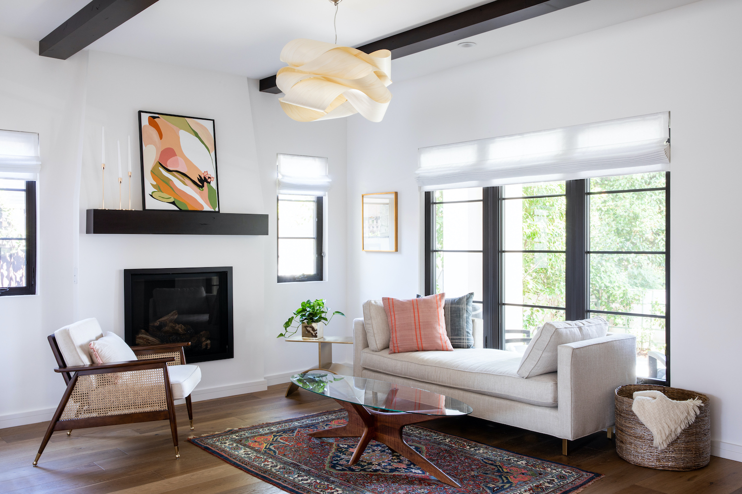
From the designer… Our clients were wonderful and shared kind hearts and great style, but it turned out that their aesthetic goals diverged a bit when it came to their new home. His love of clean lines and unfussy, uncomplicated forms had to balance with her penchant for a more bohemian, beachy feel harkening back to her SoCal and Cuban roots. It was a delicate balancing act to unite these two points of view in a seamless way. Ultimately, the right formula turned out to be keeping a really light and simple envelope, but infusing it with purposeful injections of texture and color. We skipped any superfluous millwork, opted for crisp lines and materials, and washed the walls in fresh white paint.
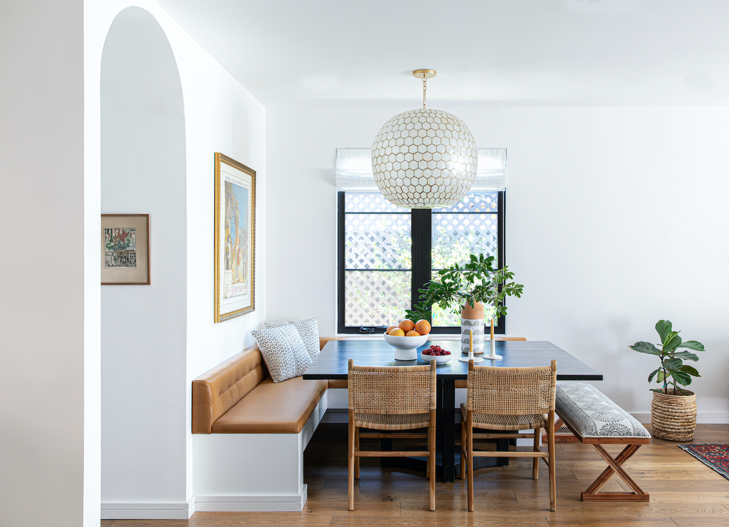
Given this home’s more compact footprint, I suggested we forgo all walls between the living, family, dining area, and kitchen. It worked out beautifully in that we laid out the spaces so that each area was open, but well defined in its own right. Our original plans included a traditional dining table set up, but it just wasn’t feeling right to me, both from a circulation and visual perspective. This home was heading towards more of a chic, relaxed vibe, and it seemed like a great opportunity to tuck it into a sunny corner with a tailored banquette.
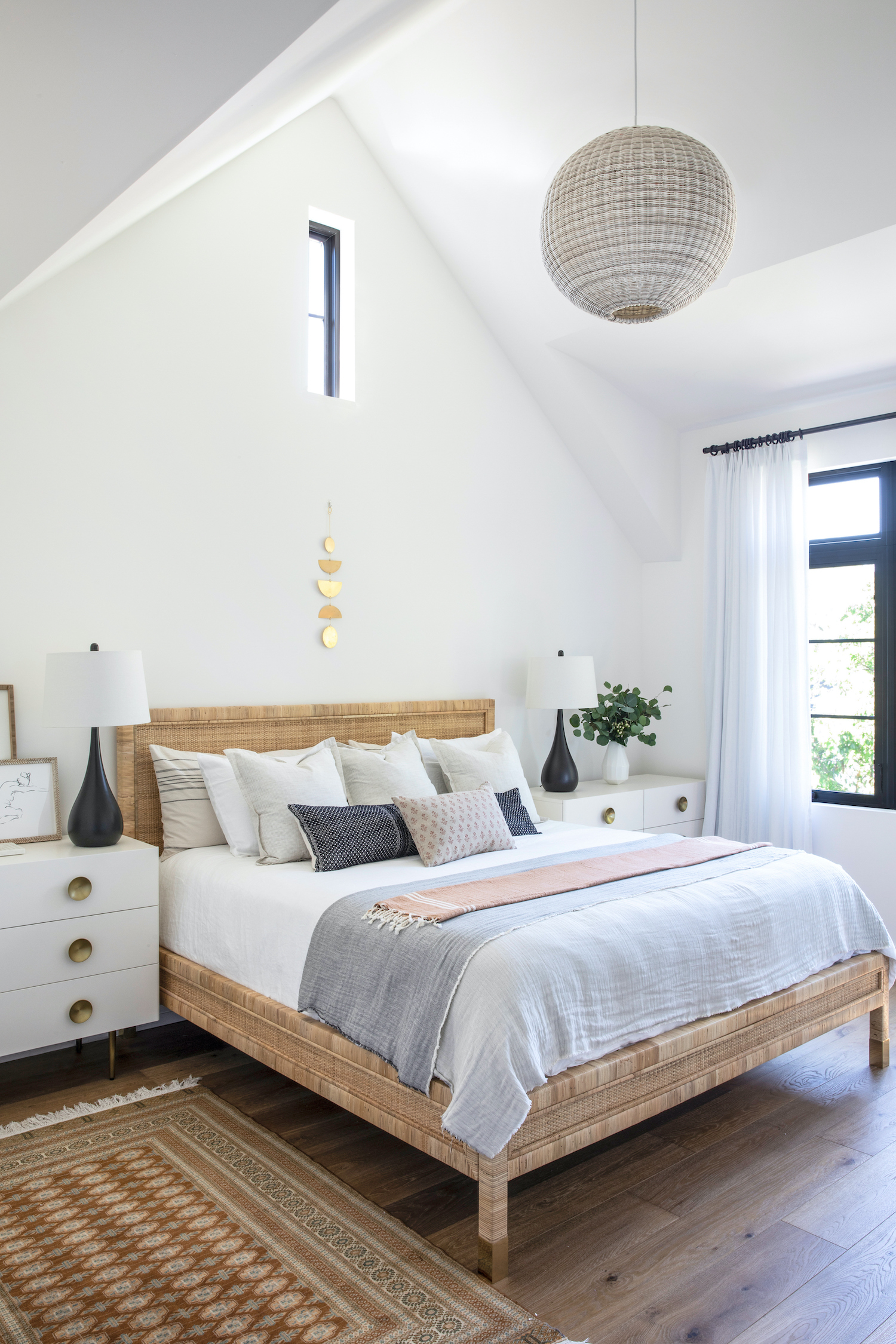
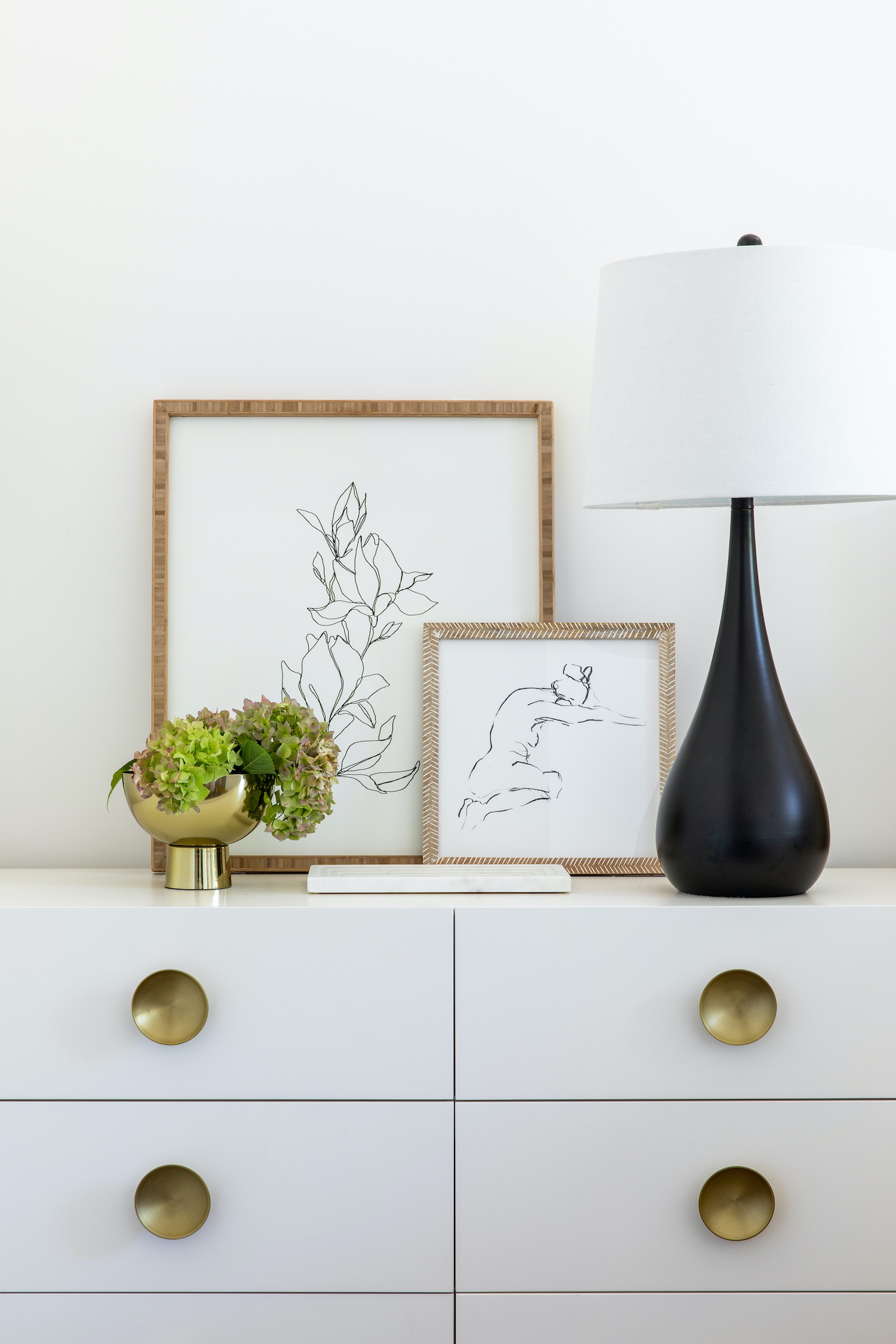
The bedroom is one of my favorite rooms in the home, both for its airy proportions and also for the layers of tone and texture. It feels totally clean and uncomplicated, and yet enjoys so much warmth from the peach and russet textiles, the antique silk Persian carpet, and the woven bed.
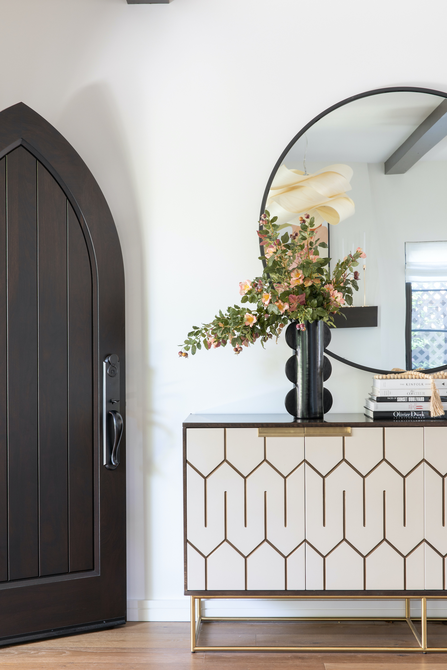
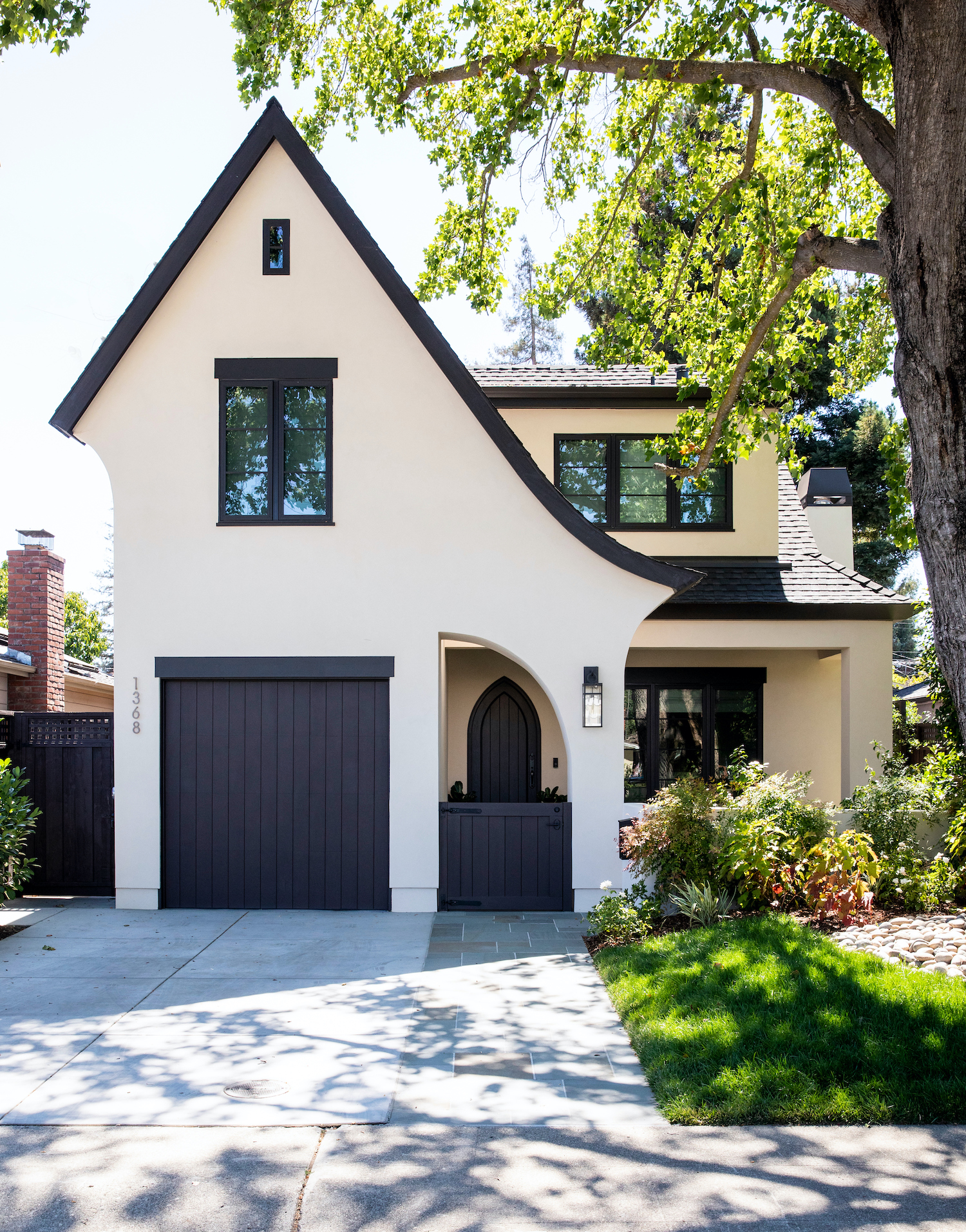
The architectural vision of this new home was to connote a light-touch Tudor feel, but in a really fresh and edited way. Architect, Natalie Hyland of Hyland Design Group, did an incredible job taking the classic architectural cues and articulating them in a contemporary way. The idea was to suggest the classic style, without being too obvious or literal in the application.
Like what you see? Take a peek at the talent behind the story… Interior Design: Emily Kates Design · Photography: Vivian Johnson · Styling: · Architect: Natalie Hyland · Builder: Terry Babb
