As I sit here and type, my two-year-old is playing in the room adjoining our sunroom (which doubles as a space for me to sneak in some extra work). The work/life juggle is real, friends! I’ll take any kid-friendly home advice I can get. I’m betting that the majority of you reading right now may have also been hooked by that word ‘kid-friendly’ in this title… because don’t we all strive to have a home as beautiful as this one, achieving that sought-after illusion most of us parents crave?
Designed by Crystal Palecek (also a mama to two sweet boys!), this San Fran Victorian remodel packs a punch with charm, yet it’s still so approachable for this growing family. Layered in the most soothing grays and blues, you’ll find character woven throughout in a thoughtful way thanks to Crystal’s design genius, not to mention her own experience as a parent! She’s walking us through the inspiration behind the design today, along with ALL of the paint color sources and her biggest tip for keeping things sophisticated without sacrificing style when you’ve got little ones.
Can you tell us a bit about the inspiration behind the design? What were your client’s needs/priorities for this project?
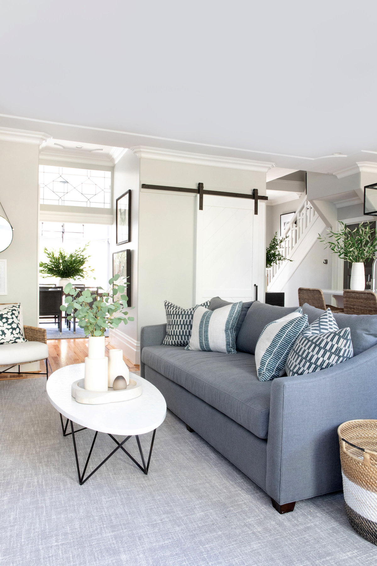
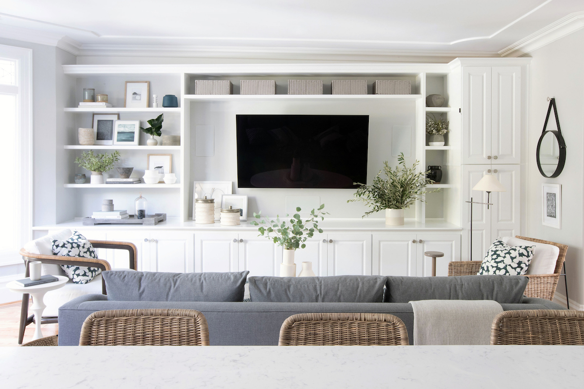
The inspiration really started with the soothing color palette. My clients love blues and grays, which I also adore, and wanted a space that felt sophisticated and elegant yet approachable and inviting. They both work long hours and craved a comfortable oasis to come home to that felt stylish enough for all their entertaining. In addition, they have a one-year-old daughter so I knew the materials needed to be forgiving and to really perform. For that reason, in the family room, I used a 100% wool rug, which is naturally stain-resistant, and a dark fabric on the sofa to help conceal any mishaps. I also had the two white chairs upholstered in an indoor/outdoor fabric so any spots could be easily cleaned (the dining room chairs, too!). Lastly, I made sure all the furniture pieces were kid-friendly, like sourcing an oval-shaped coffee table to ensure there were no sharp edges their daughter could inadvertently bump into.
How would you define the style of this space in just a few words?
To me, this space feels very classic. There are traditional elements peppered in with modern lines and fabrics.
The combination of grays and blues are stunning in this home. Can you share some of the paint colors you used?
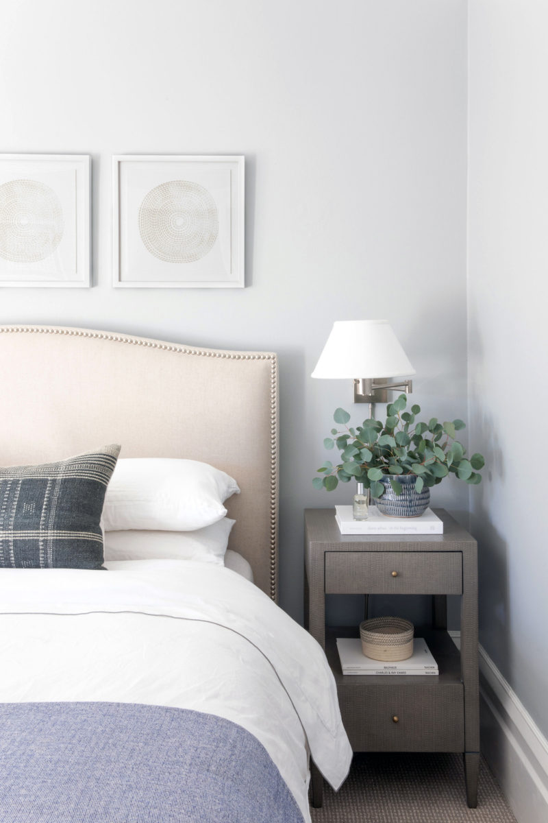
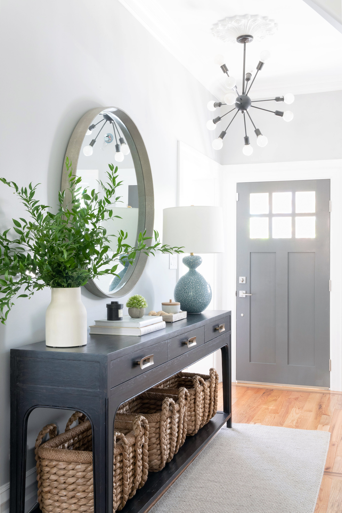
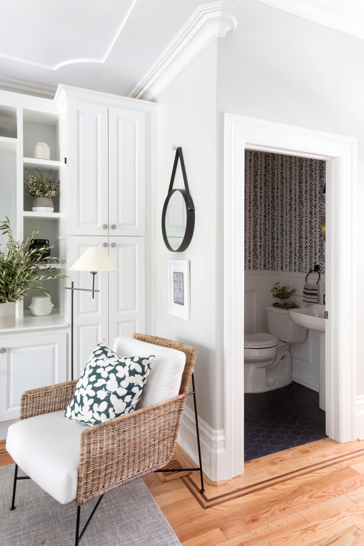
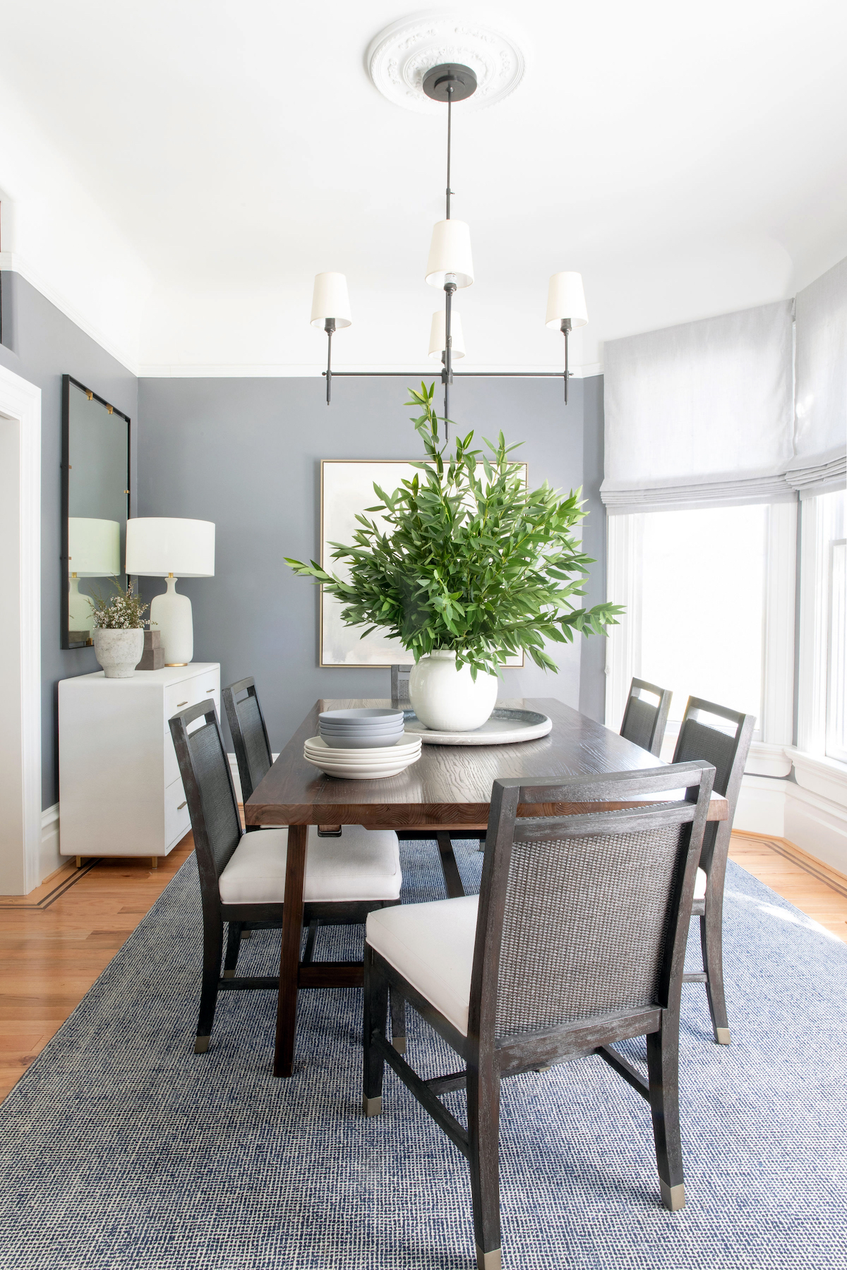
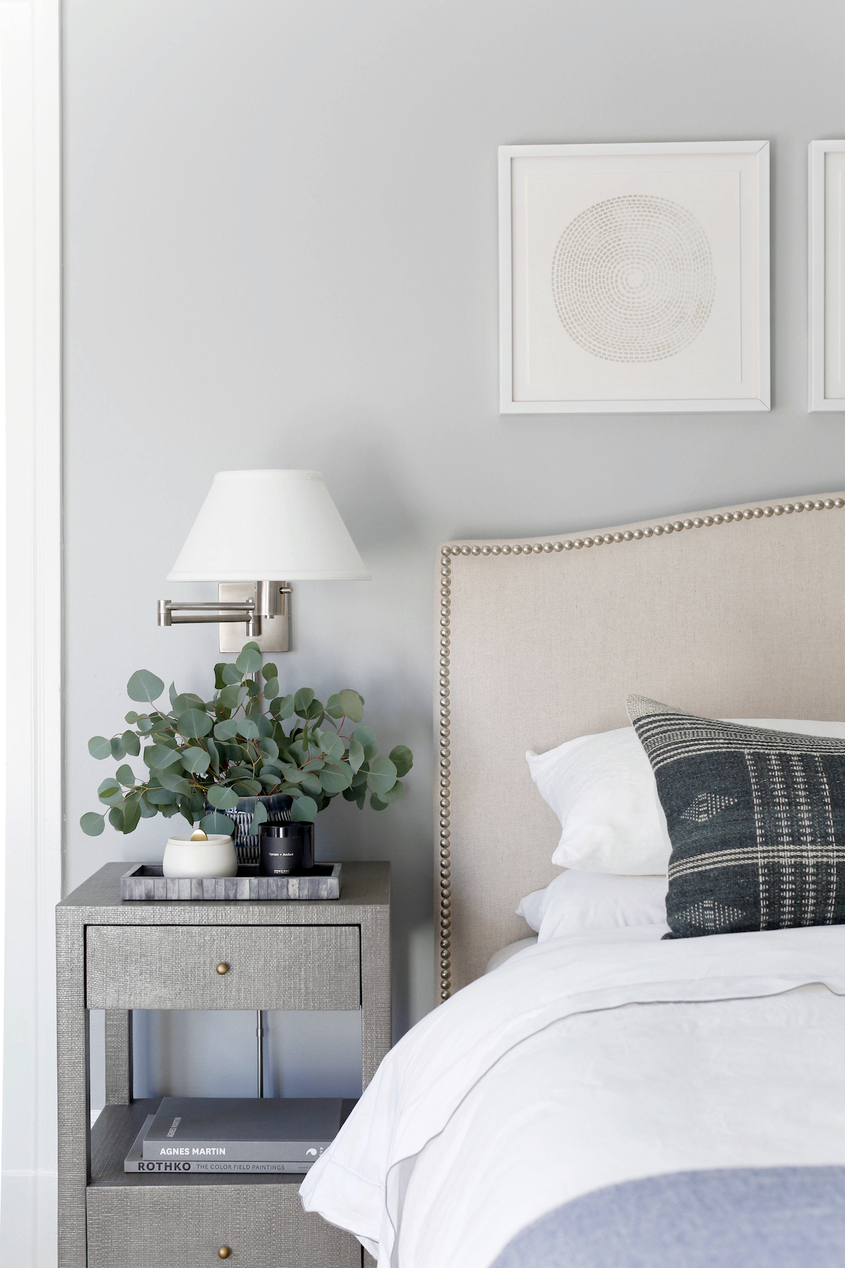
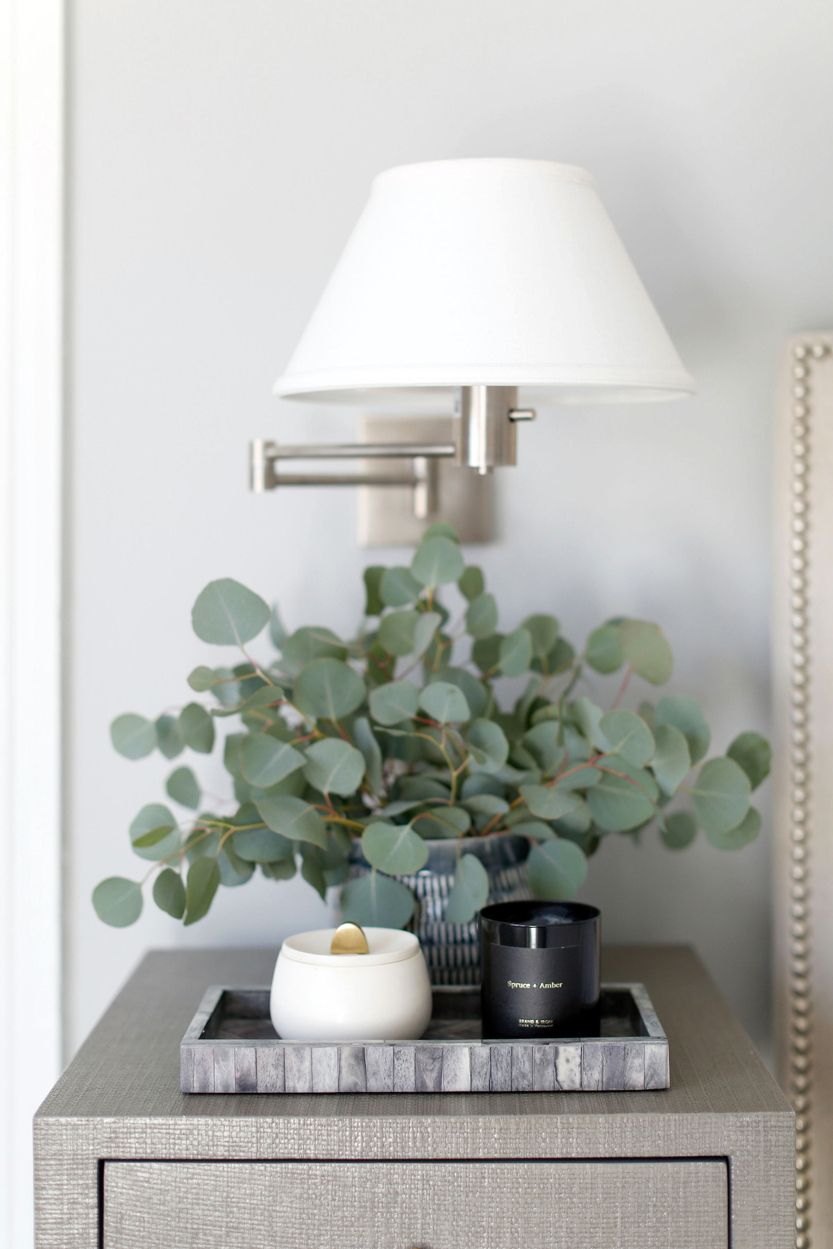
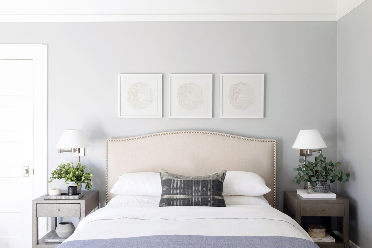
Of course! I used Stonington Gray throughout most of the home, which is a gorgeous cool gray with no red undertones (something I always like to check for). My clients previously had dark blue on the walls and once we lightened it up the entire space felt so much more expansive. For the dining room, I wanted something a little moodier to make the room feel distinct and special from the rest of the first floor and went with Dior Gray. All the doors are painted in Kendall Charcoal – an all-time favorite dark gray of mine that I use time and time again. Upstairs, we painted the master in Coventry Gray, which is a bit darker than the Stonington Gray we used downstairs and is very calming. All colors are by Benjamin Moore.
Were there any challenges you encountered while designing this project?
I am so fortunate in that this particular project came together very effortlessly. The clients were extremely trusting of my vision and allowed me to execute my ideas generously. It then became my task to make sure both spouse’s preferences were addressed and balanced. Overall, I could not be happier with where we ended up.
What is your favorite design element in this home?
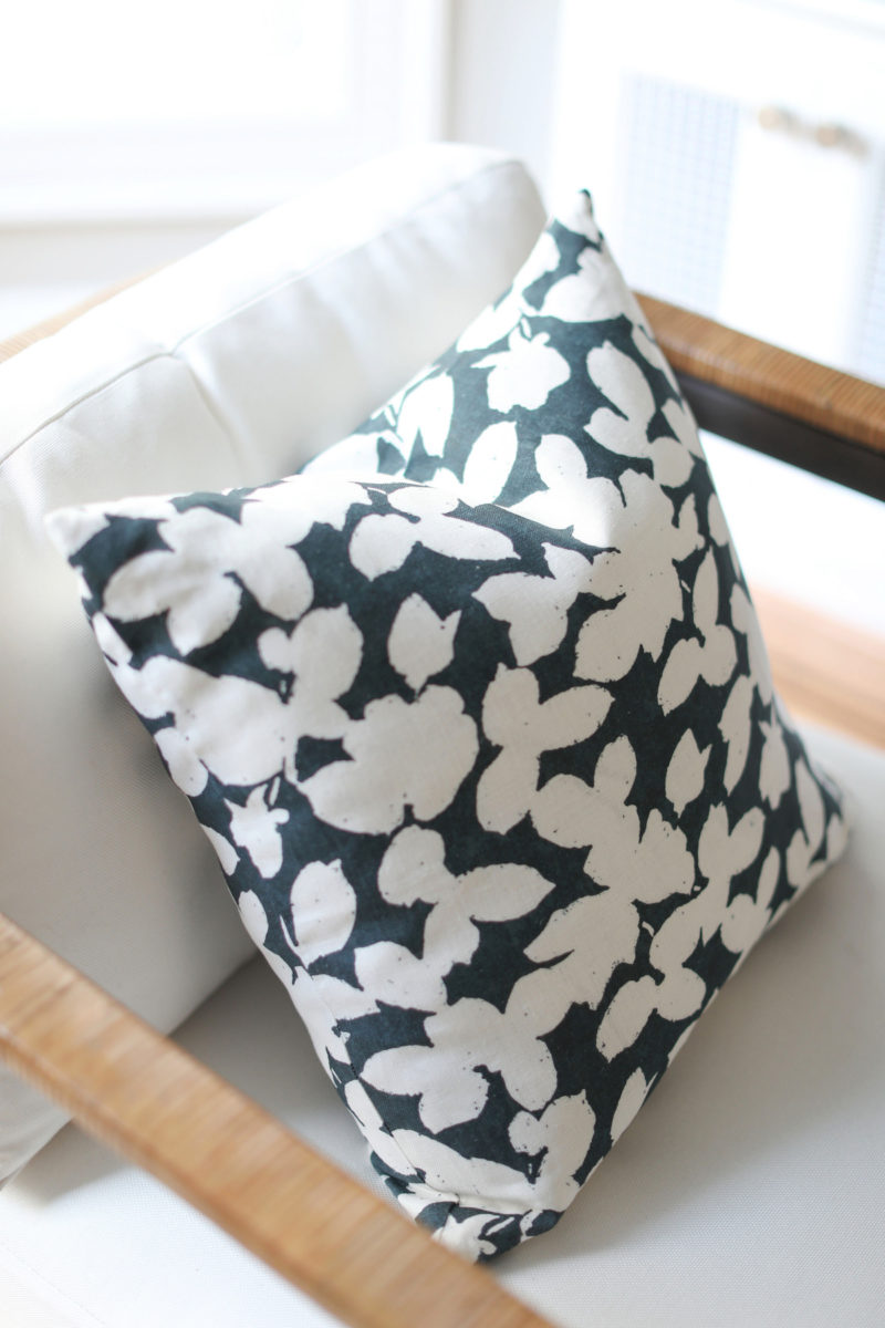
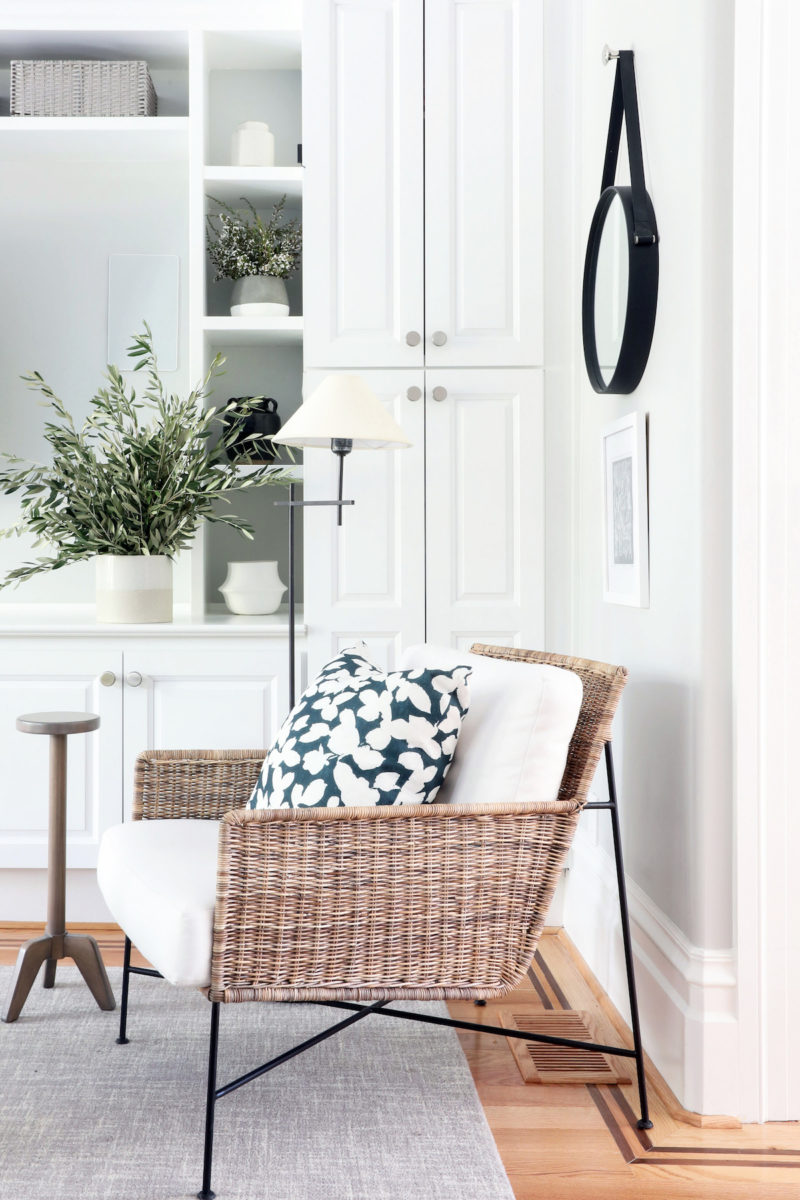
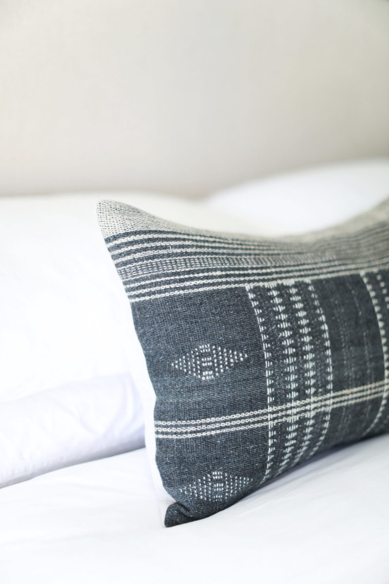
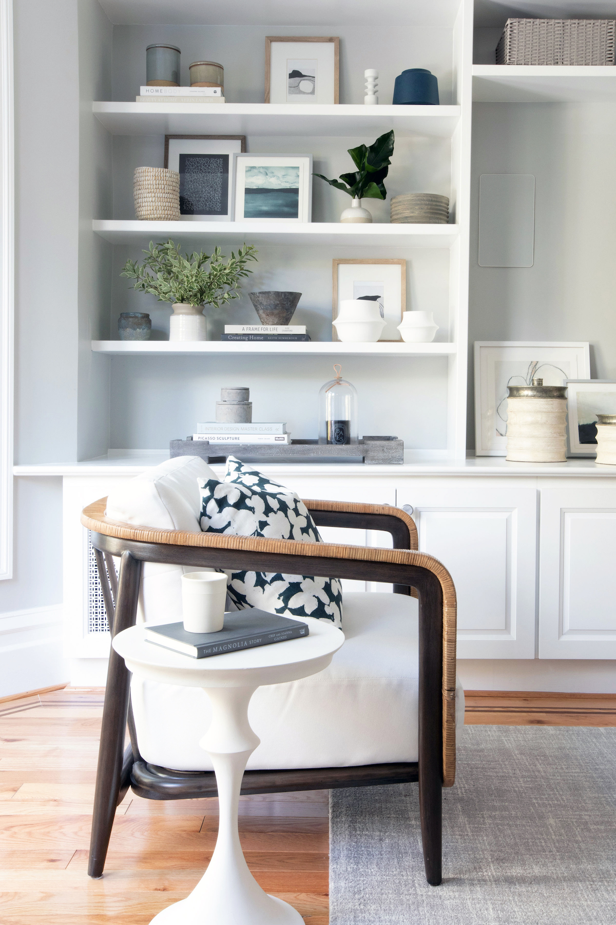
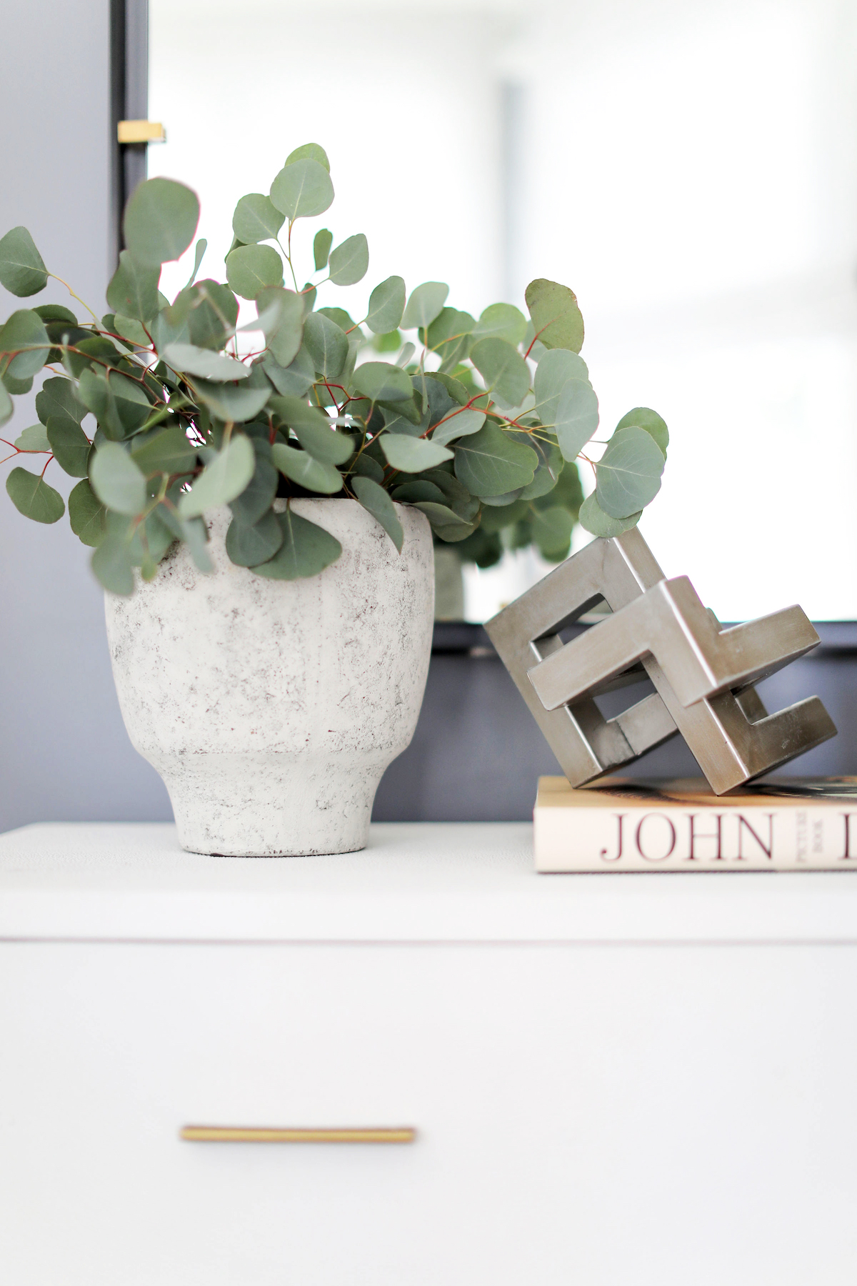
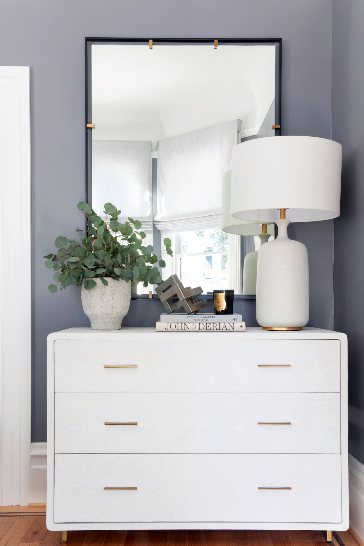
Beyond the calming feel of the blues throughout, I absolutely love all the woven moments in the home, which help give the space that warm and inviting feeling through texture. From the two rattan chairs in the family room to the weaving of the kitchen bar stools, and the cane matting on the dining room chairs, the entire home has a beautiful tactile quality to it. I also love the sporadic hits of black throughout the home as a juxtaposition to the light and airy quality overall.
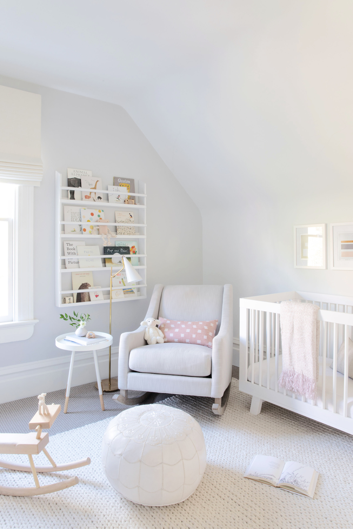
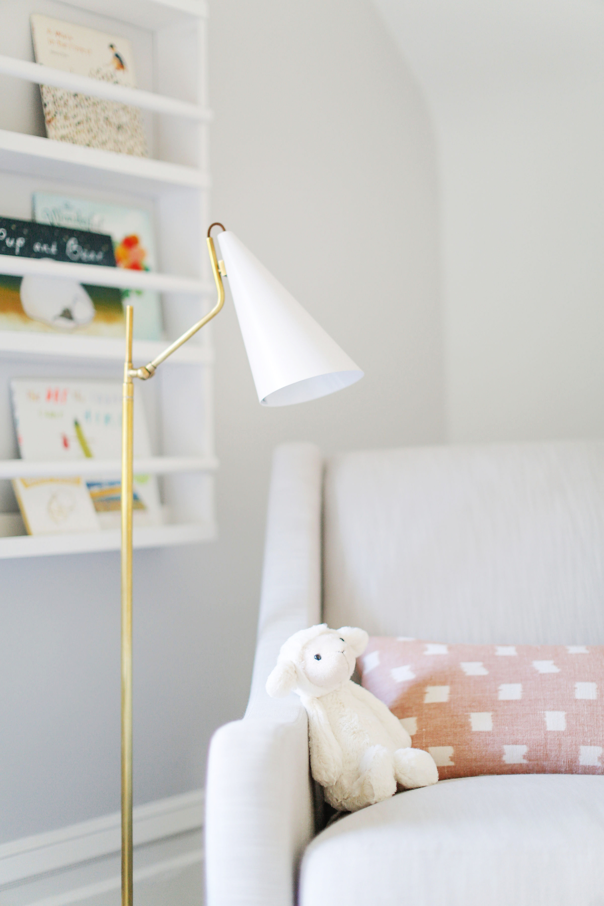
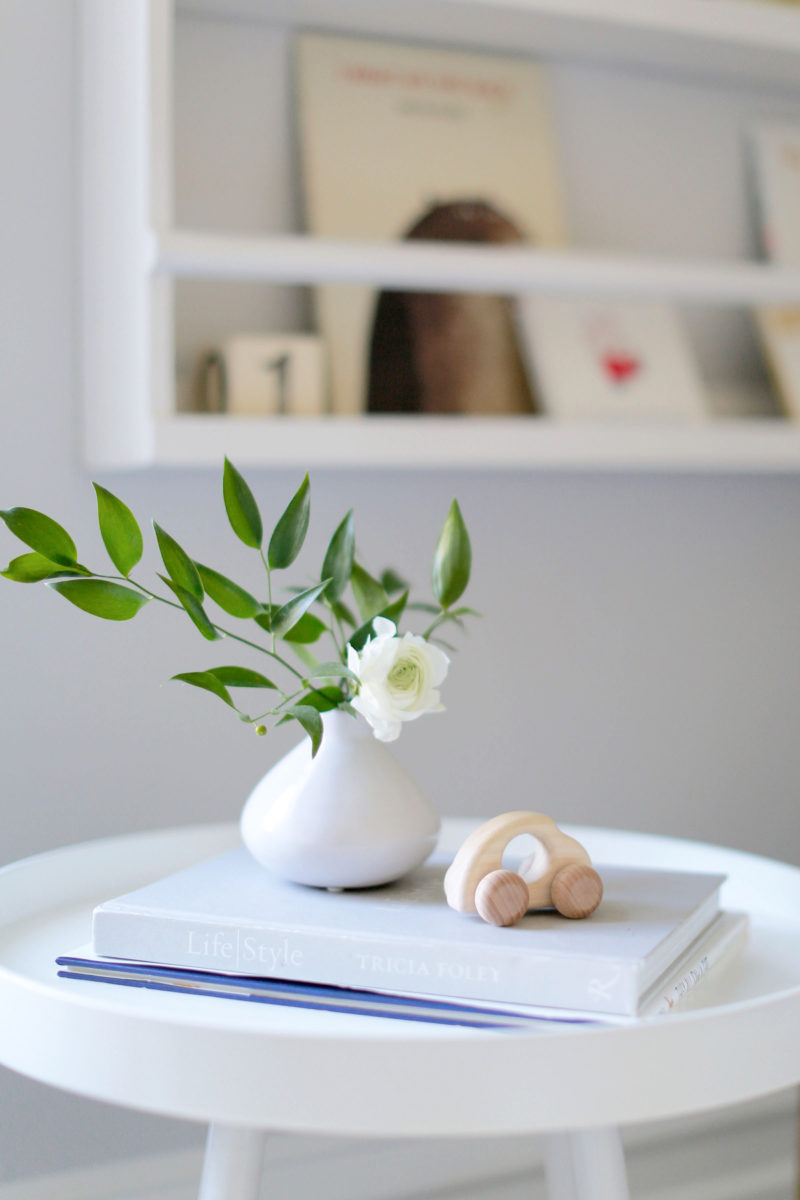
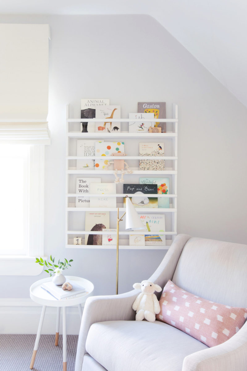
Until we saw the nursery, we would never have guessed a one-year-old lived here, too! How did you achieve this sought-after illusion most parents crave?
Closed storage is definitely the key! The cabinets in the family room built-in hold toys and books for my clients’ daughter. What I love is that during the day she can pull everything out to play with but it all goes right back in at night. I am always cognizant of how much closed storage is in a home because I find that the less stuff we see the clearer our hearts and minds feel. As a mom to two young boys myself, I really enjoy working with other families to help them make their space work for both the parents and the kids. I’m a firm believer that children can and should be taught to respect their homes and the belongings in it and that having kids doesn’t mean your home’s style has to be sacrificed. It can still feel grown-up and sophisticated but be comfortable for the kids, too.
