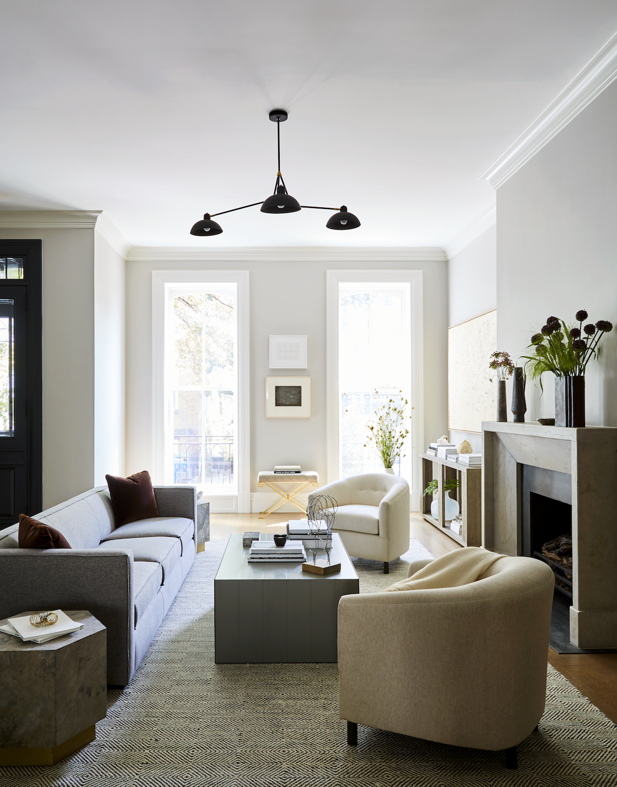
Joan Enger may have spent the first fifteen years of her career in branding for clients like Ralph Lauren Home and Estee Lauder, but her ardor for interior design found her pursuing a lifelong dream. As the Founder of Hoboken-based firm, J. PATRYCE DESIGN, she’s known for blending clean lines with classic elements to ensure elegant, inviting environments—like today’s 100-year-old brownstone. We sat down with Joan for a look inside this charm-filled spec home captured by Christian Harder, her journey to becoming a designer, and more.
Tell us a bit about your journey to becoming a designer. How and when did J. Patryce Design come to life?
I first began cultivating my skills during a successful run in luxury branding for Estee Lauder, Godiva, and Ralph Lauren Home. After fifteen years in, I decided to pursue my lifelong passion and head back to interior design school. Upon completing several years of coursework at NYSID, I was hired by Claremont to assist high-end design firms with some of the best textiles on the market. Still eager to be on the design side, I was fortunate to secure a position with Shostak & Company as a junior designer where I spent almost four years absorbing the ins and outs from an excellent mentor with impeccable standards. Eventually, I used my experience to set off on my own and establish JPD. I’ve never looked back!
If you had to describe your design style like a cocktail, what would it be?
A crisp, chilled glass of Italian Prosecco
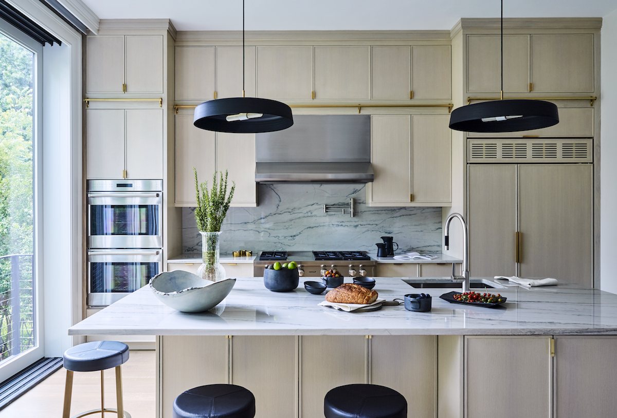
Tell us about the renovation of this 100-year-old brownstone that we’re featuring today.
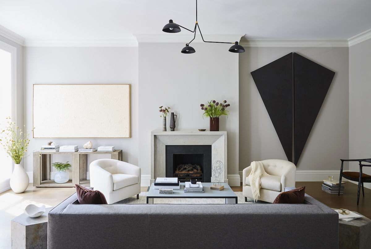
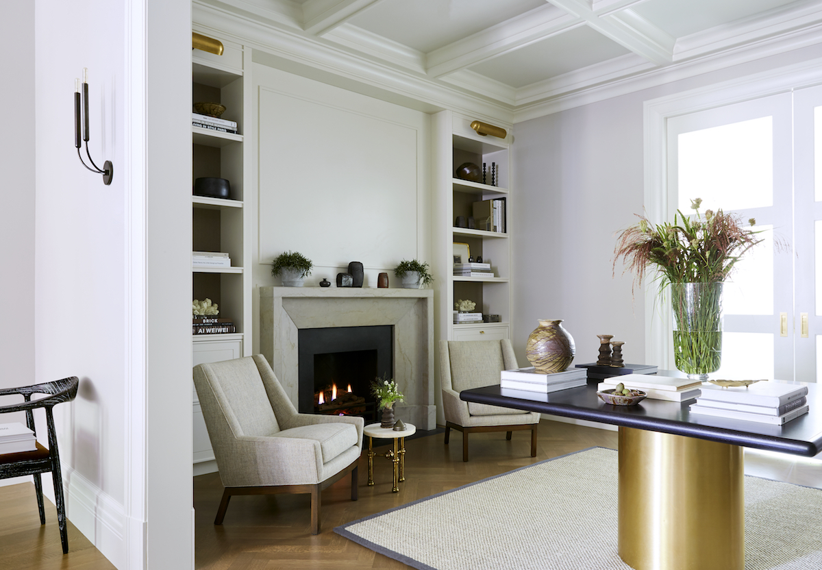
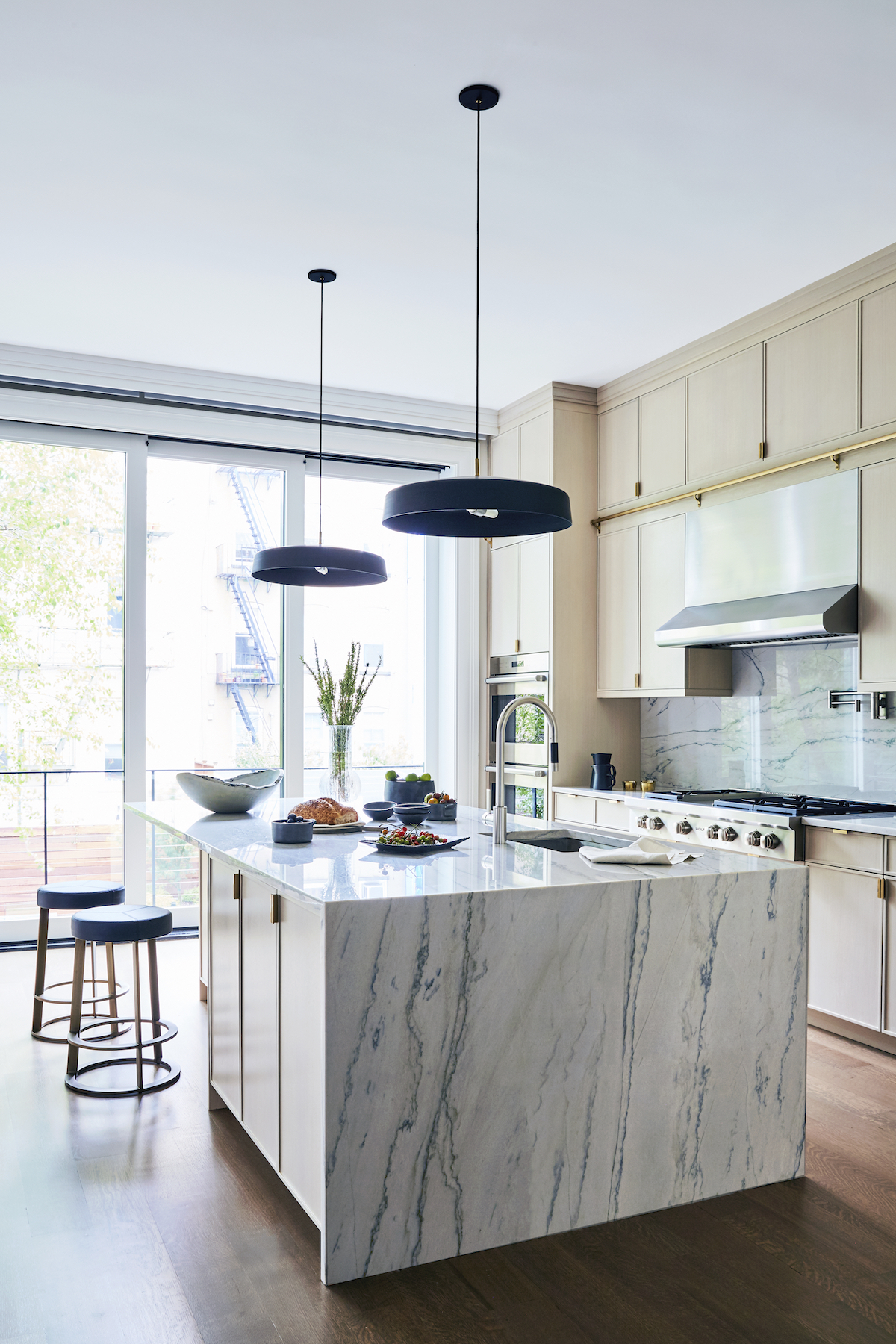
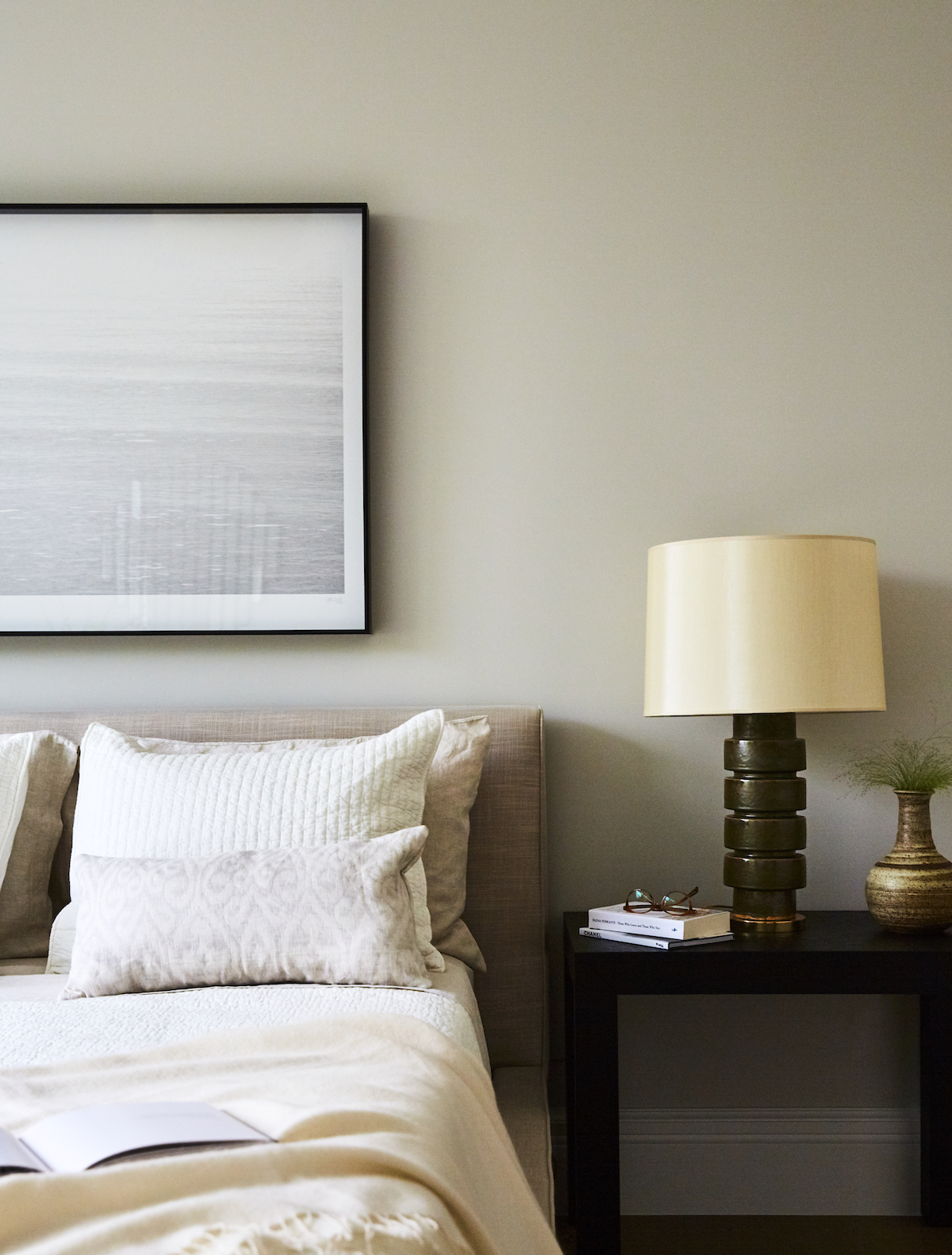
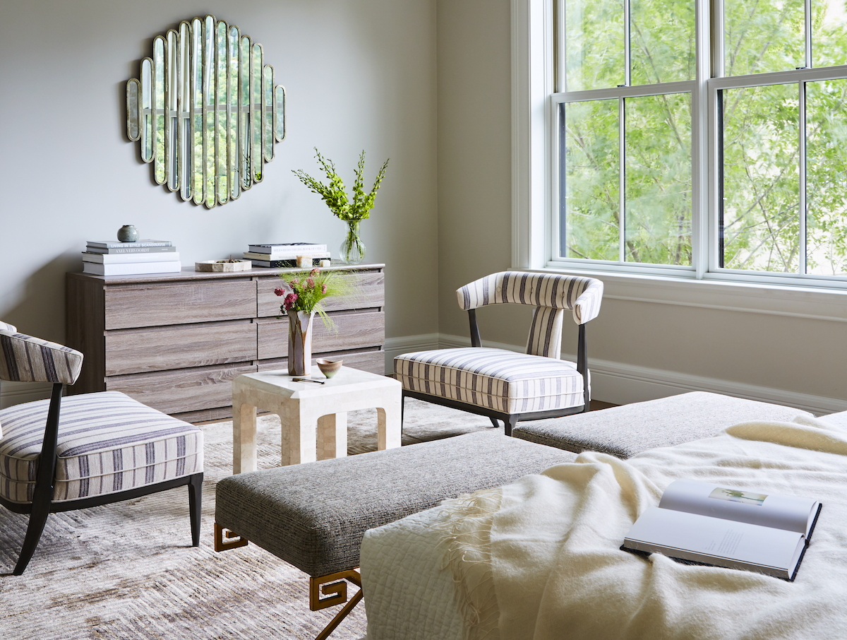
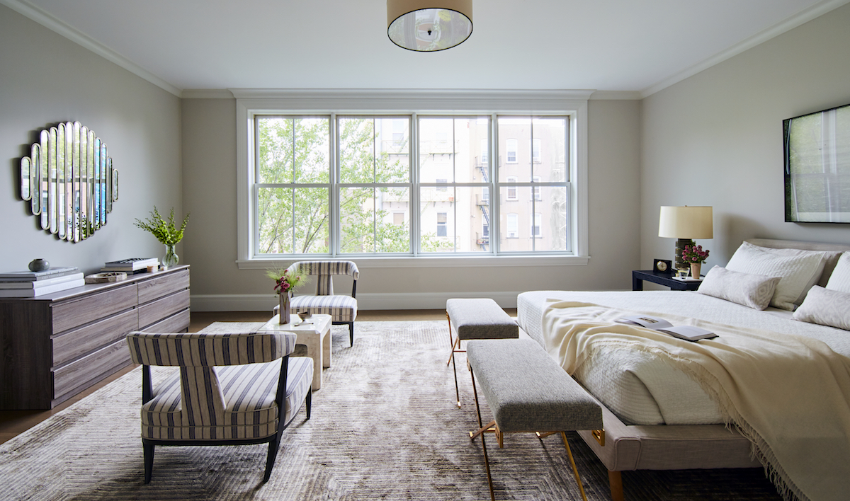
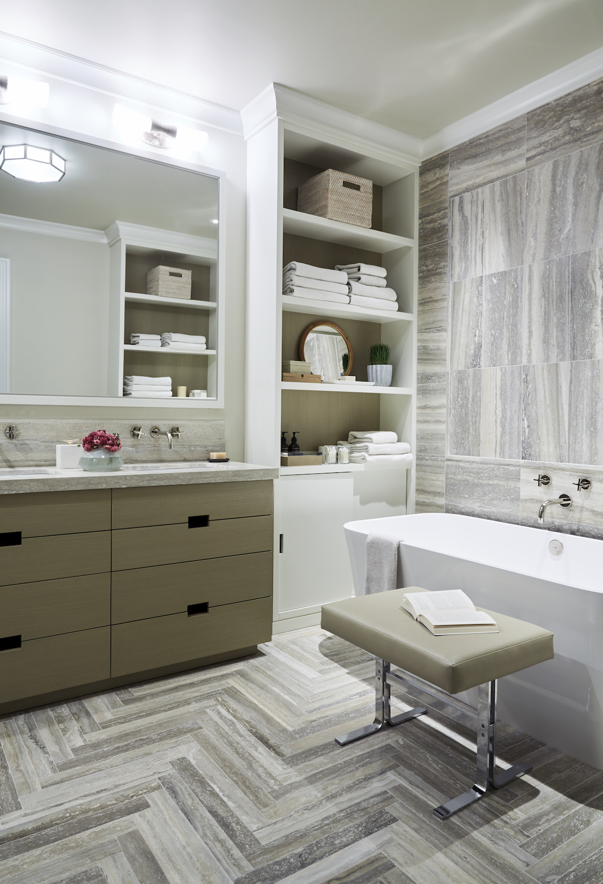
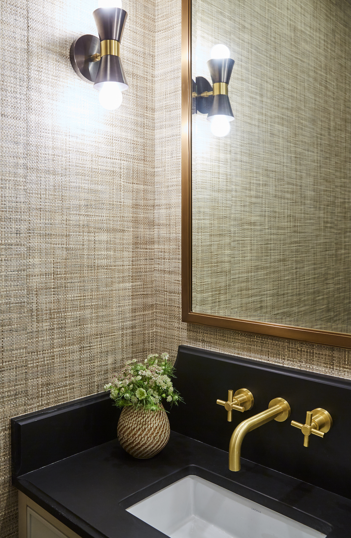
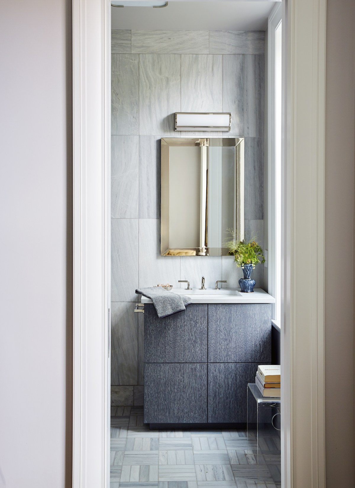
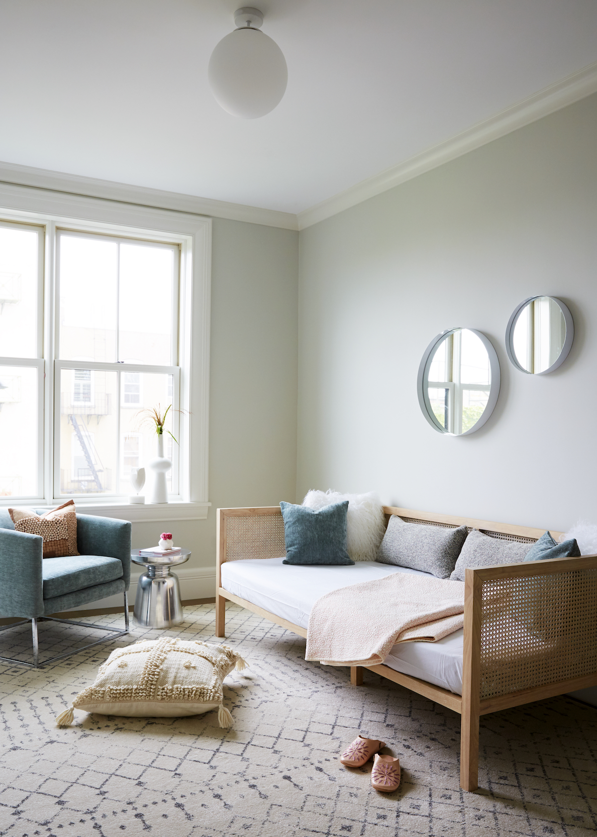
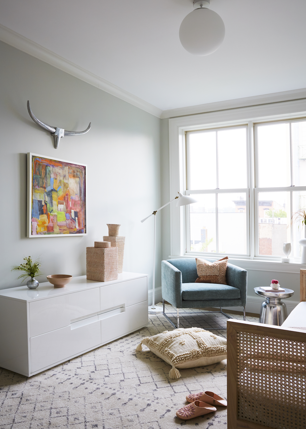
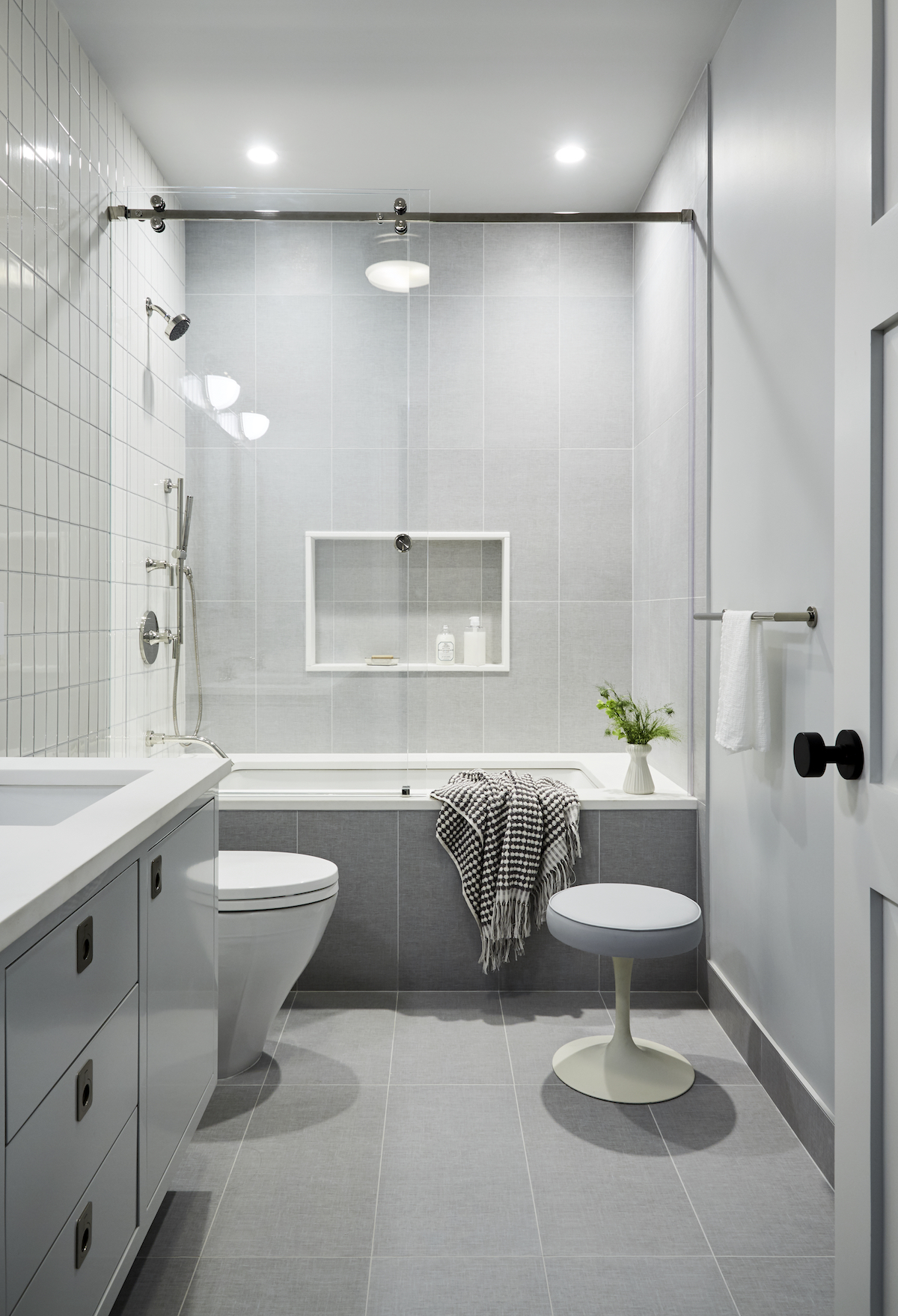
This would be the second single-family spec home that my firm along with my husband’s development company would partner on. When this 22’ wide, 100-year-old beauty came to market, we jumped at the chance to purchase it. We researched and included all of the latest design and technology features, and thoughtfully designed every inch of the spacious, custom brownstone as if we were moving in ourselves!
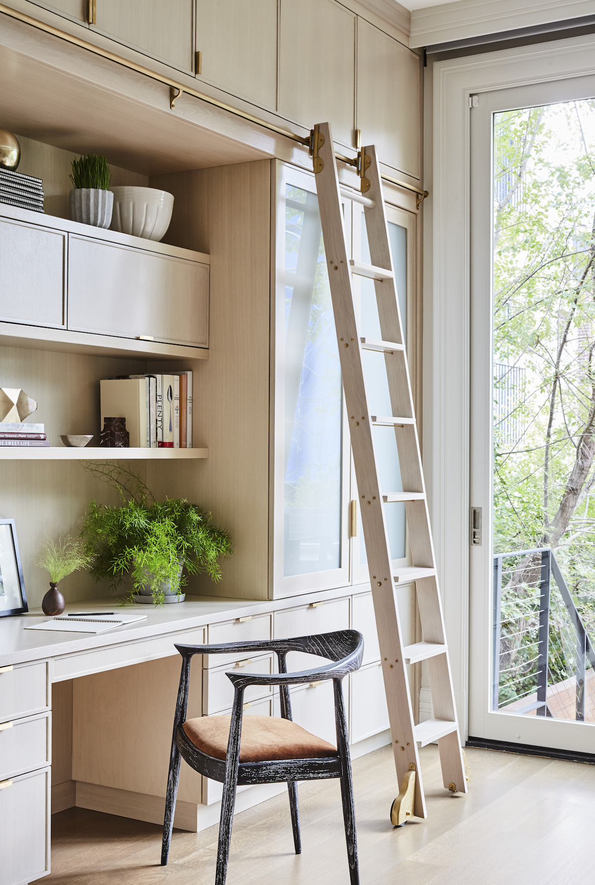
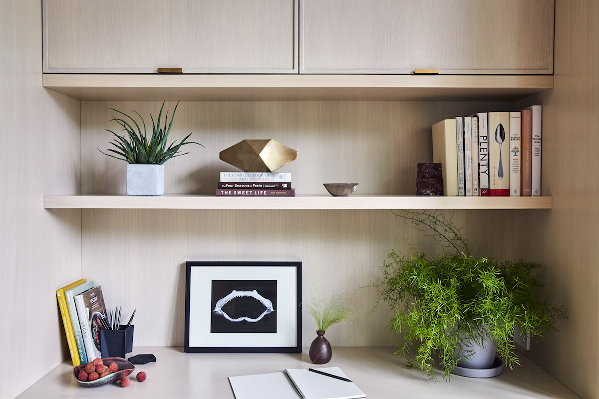
How did you honor the classic character of the home while infusing a modern aesthetic?
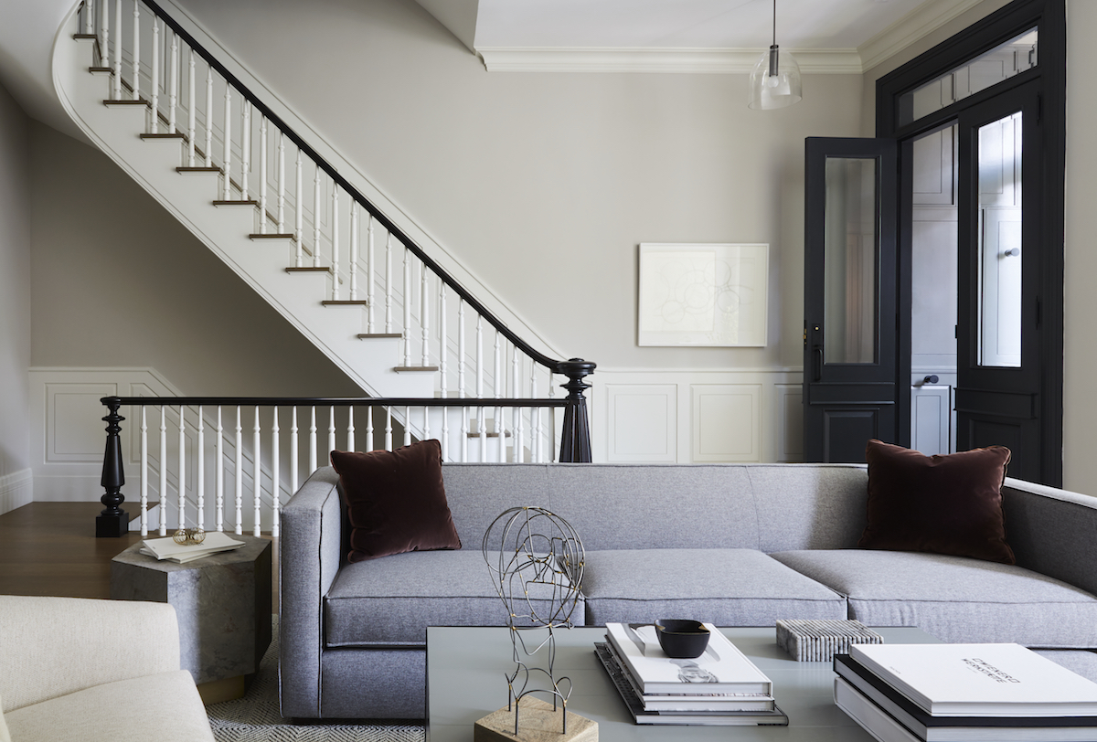
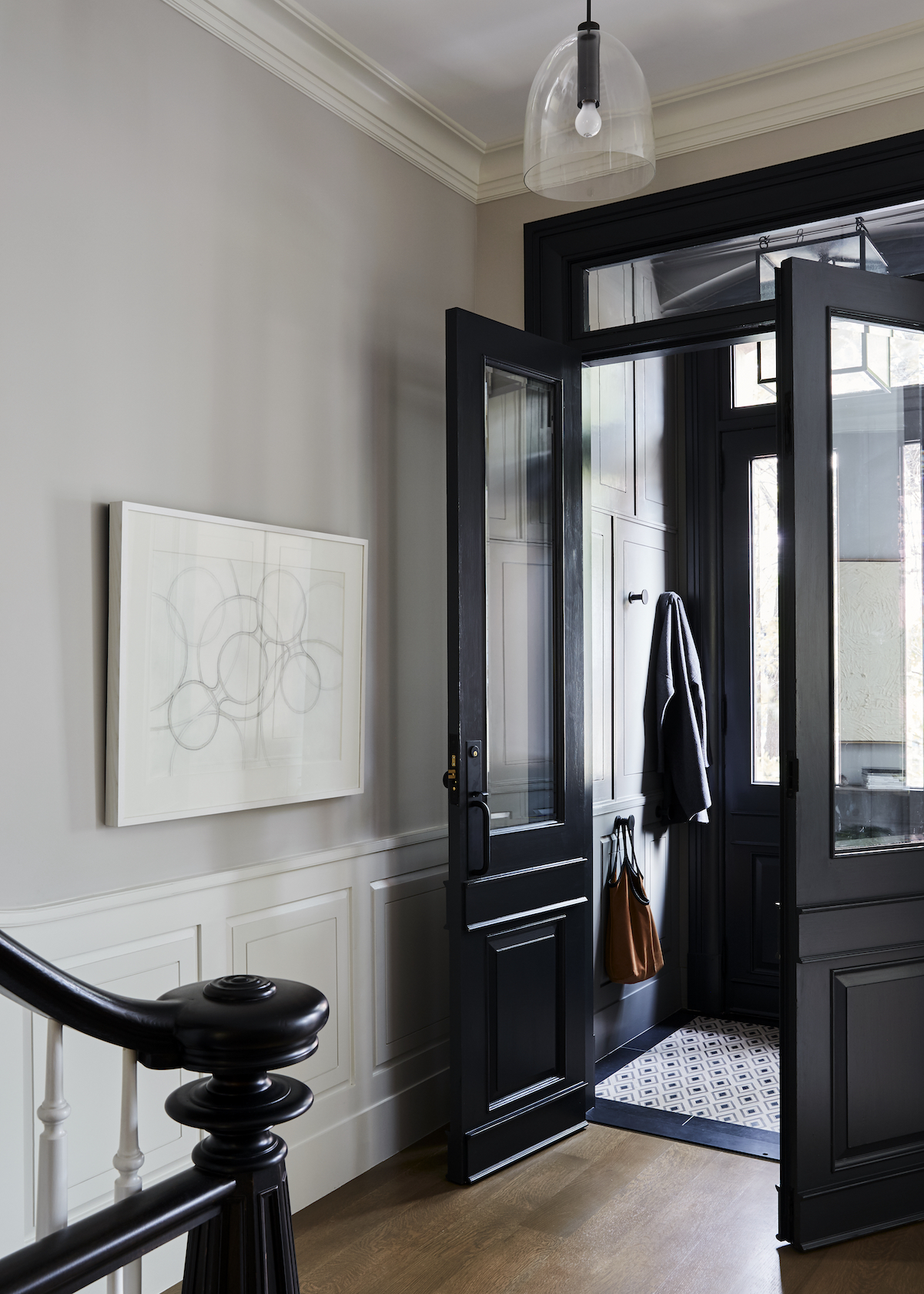
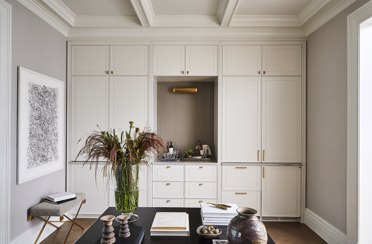
The front doors and large parlor windows were restored to their original proportions to honor the prevailing neighborhood and architecture. We expanded and updated the remainder of the home in a classic, yet modern aesthetic that would appeal to the most discerning buyer. We customized all of the casings, base moldings, and crown to honor what was originally there, with a slightly cleaner touch. We opened the floor plan but did not completely remove the walls to allow for individual uses for each room.
What does your morning ritual look like? What are a few things you do to set the tone before you begin a busy day at JPD?
Rise at 6:45, lemon water, 30-45 minute workout, coffee with my hubby, email, shower, green shake, GO!
What does a well-lived home mean to you?
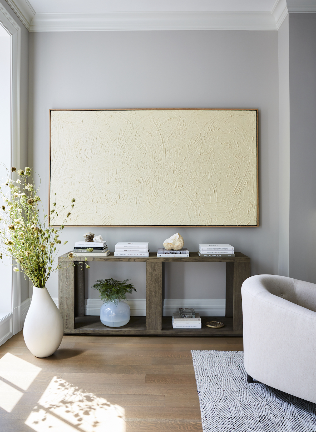
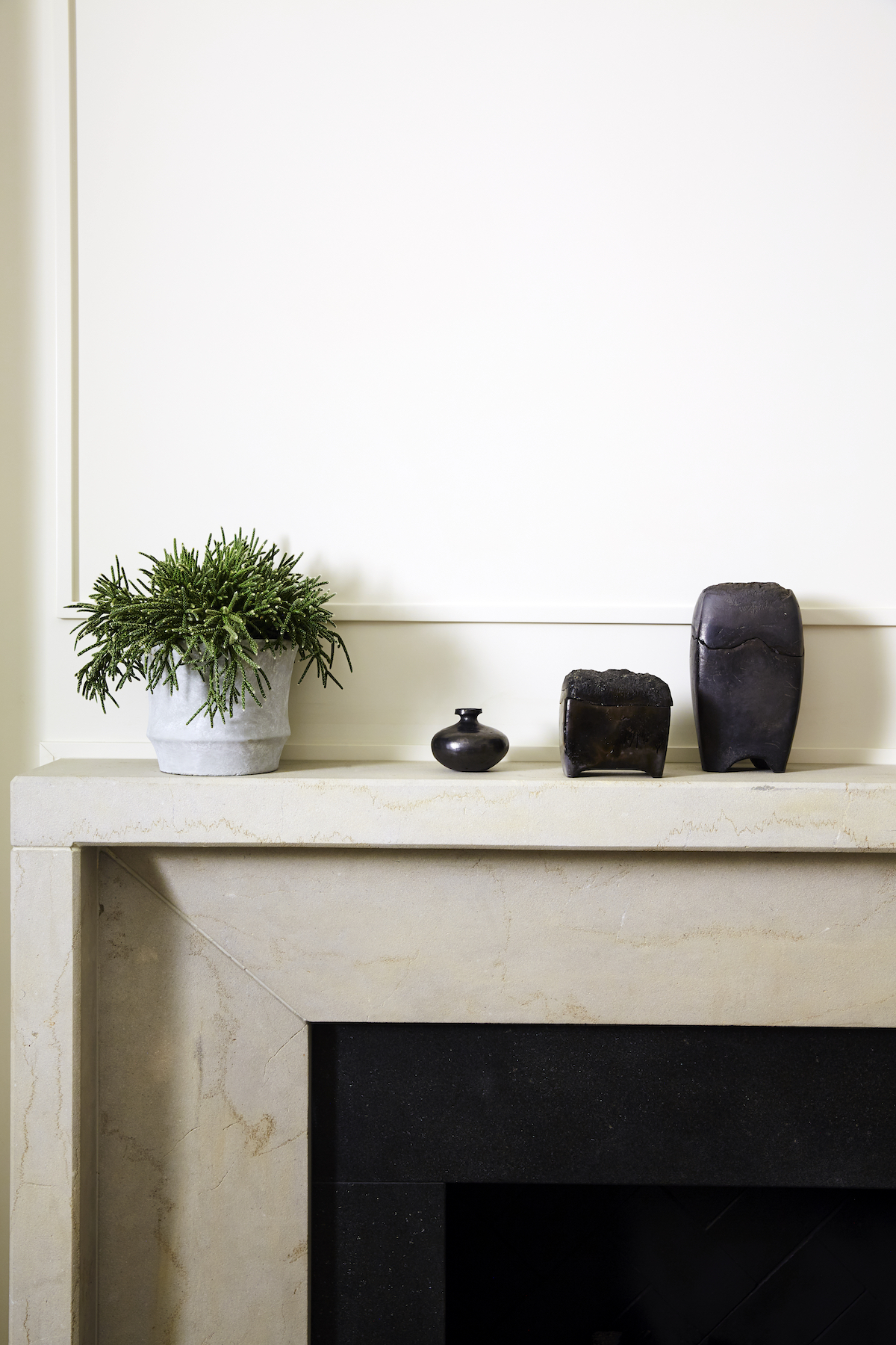
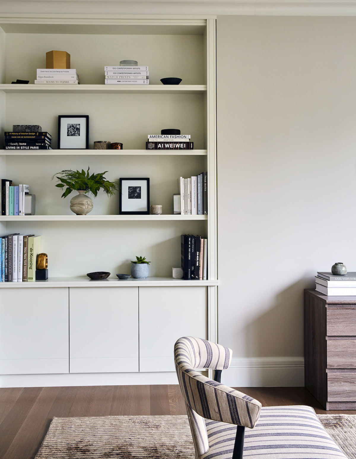
We are fortunate enough to see the profound effects of a beautifully designed home—it is probably one of the best parts of our job. It begins with a functional layout and flow. I encourage clients to clip fresh flowers and branches from the yard or gather pretty rocks or shells from the shoreline. Art and objects should be collected over time from travels or weekend sojourns – they don’t have to cost a fortune to be special. I have found some of my favorite treasures for close to nothing!
I believe in some level of order and organization—it helps the soul rest a little easier, which we could all use a bit more of right now.
What’s one piece of advice you’d go back and tell yourself in your first few months of business?
Start out slowly and don’t worry about the money, it will come. I worked nearly for free when I began, for anyone who would trust me enough to help them. Don’t just sit in front of Instagram or your computer, go to art and furniture exhibits, read every shelter and trade magazine you can and soak it all in. You learn by seeing, touching, talking to others, and experiencing design.
We’re not a big fan of the term ‘trends’, but have an appreciation for beautifully enduring design moments. Are there any timeless design elements you’re looking forward to using in your upcoming projects?
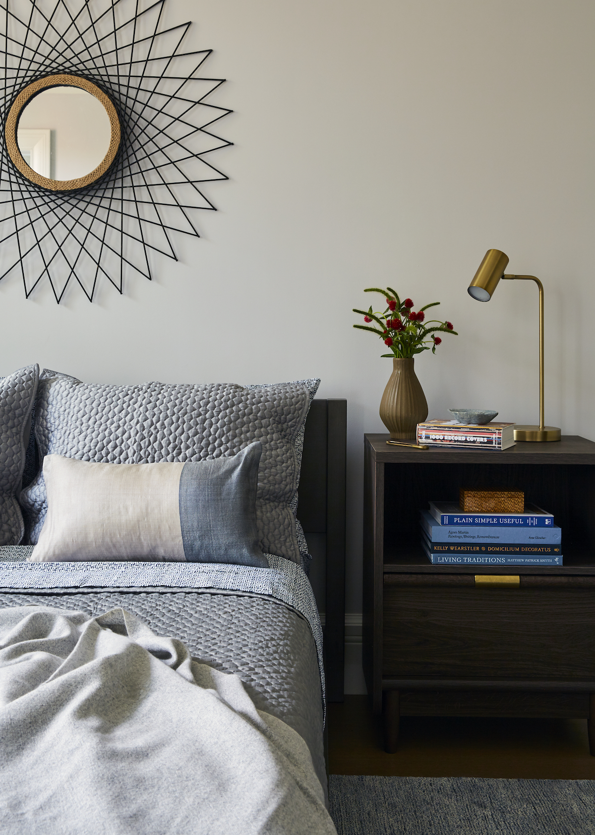
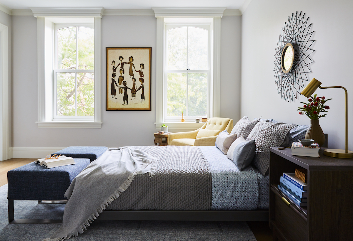
Warmer woods and warmer colors, in general, seem to be very desirable at the moment.
We’ve been incorporating a lot of flat sawn grains (vs. rift) and vintage and antique pieces to add richness. We’ve also been experimenting with lime wash and new/old types of wall paint finishing. At the end of the day, we enjoy a well-edited space, but it always has to feel warm and welcoming, otherwise, it doesn’t feel like home.
Can you share a few sources of inspiration that fuel your creative design process?
Instagram is a huge source of inspiration. I have met design colleagues/friends, new clients, resources/shops, artists, and great recipes (a 2nd passion)—all through Instagram! I also love vintage and antique markets. We include a lot of vintage in our projects, it makes it much more unique and layered.
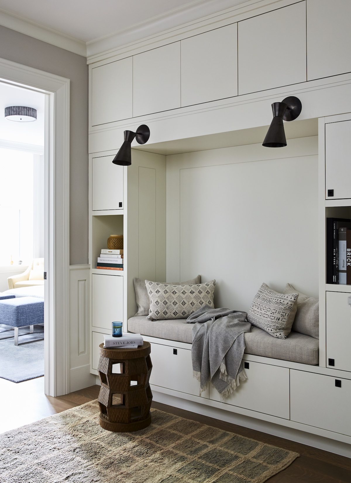
Love what you see? Take a peek at the talent behind the story… Interior Design: J. PATRYCE DESIGN · Photography: Christian Harder · Architect: Jensen Vasil · Contractor: The Mex Construction
