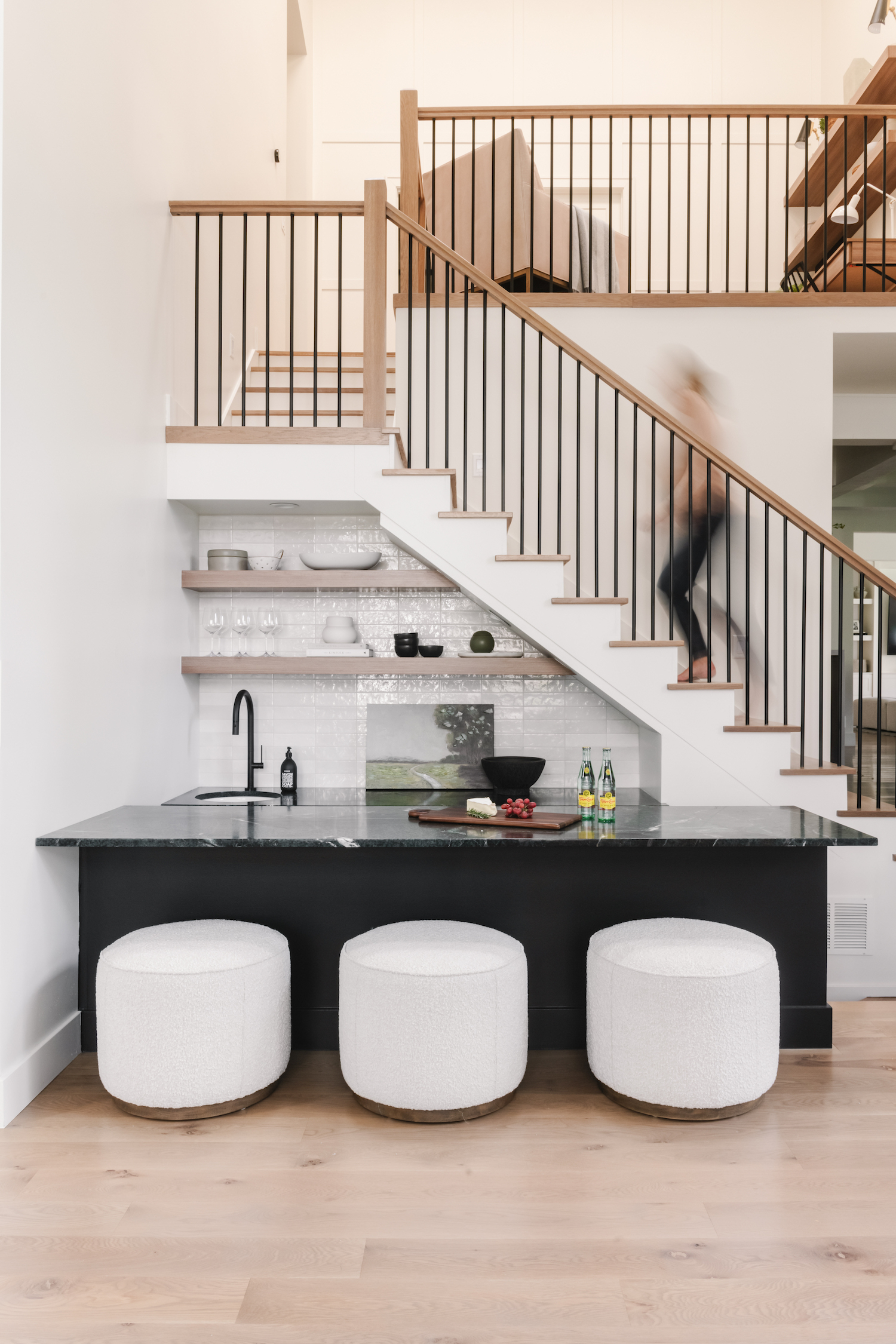
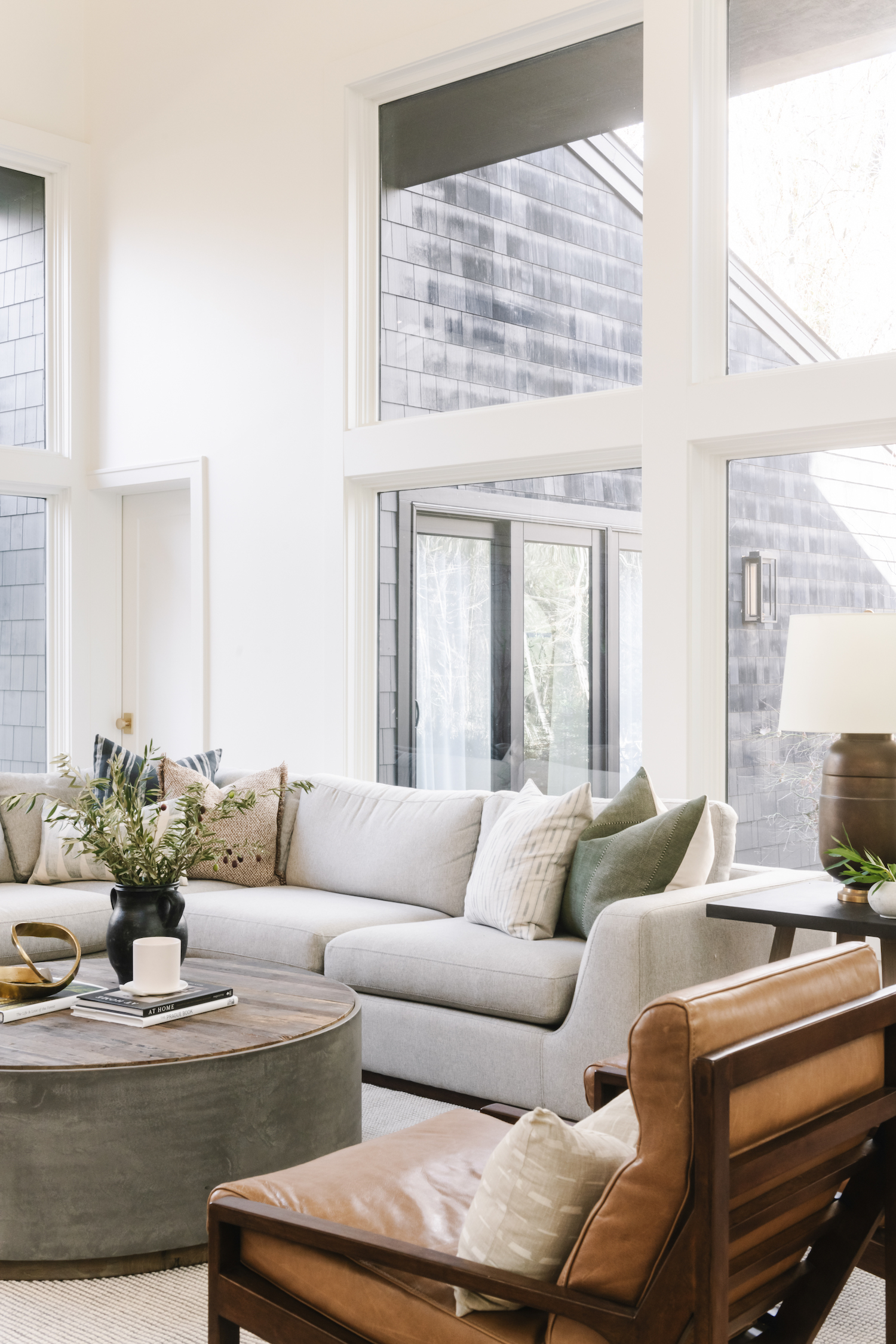
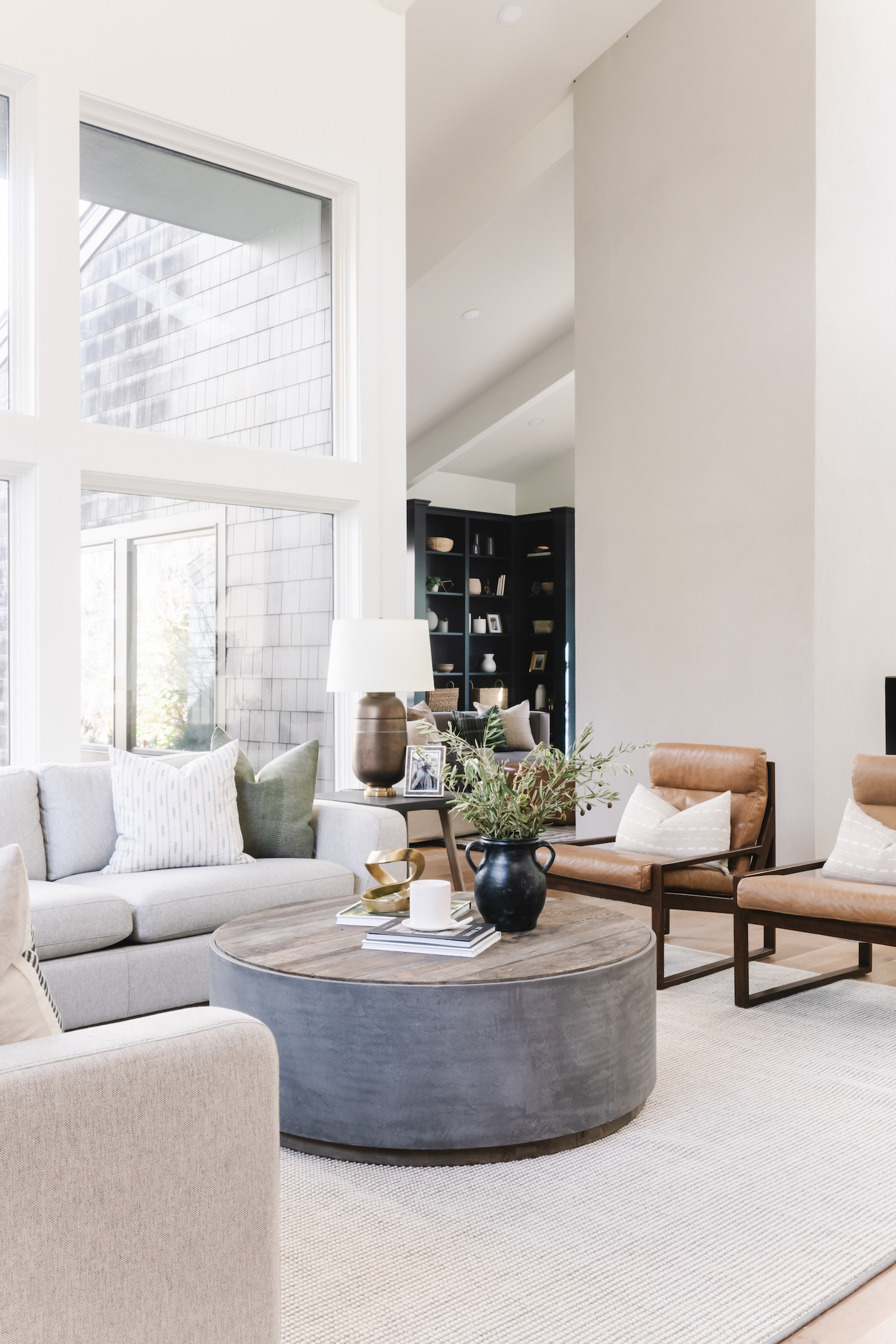
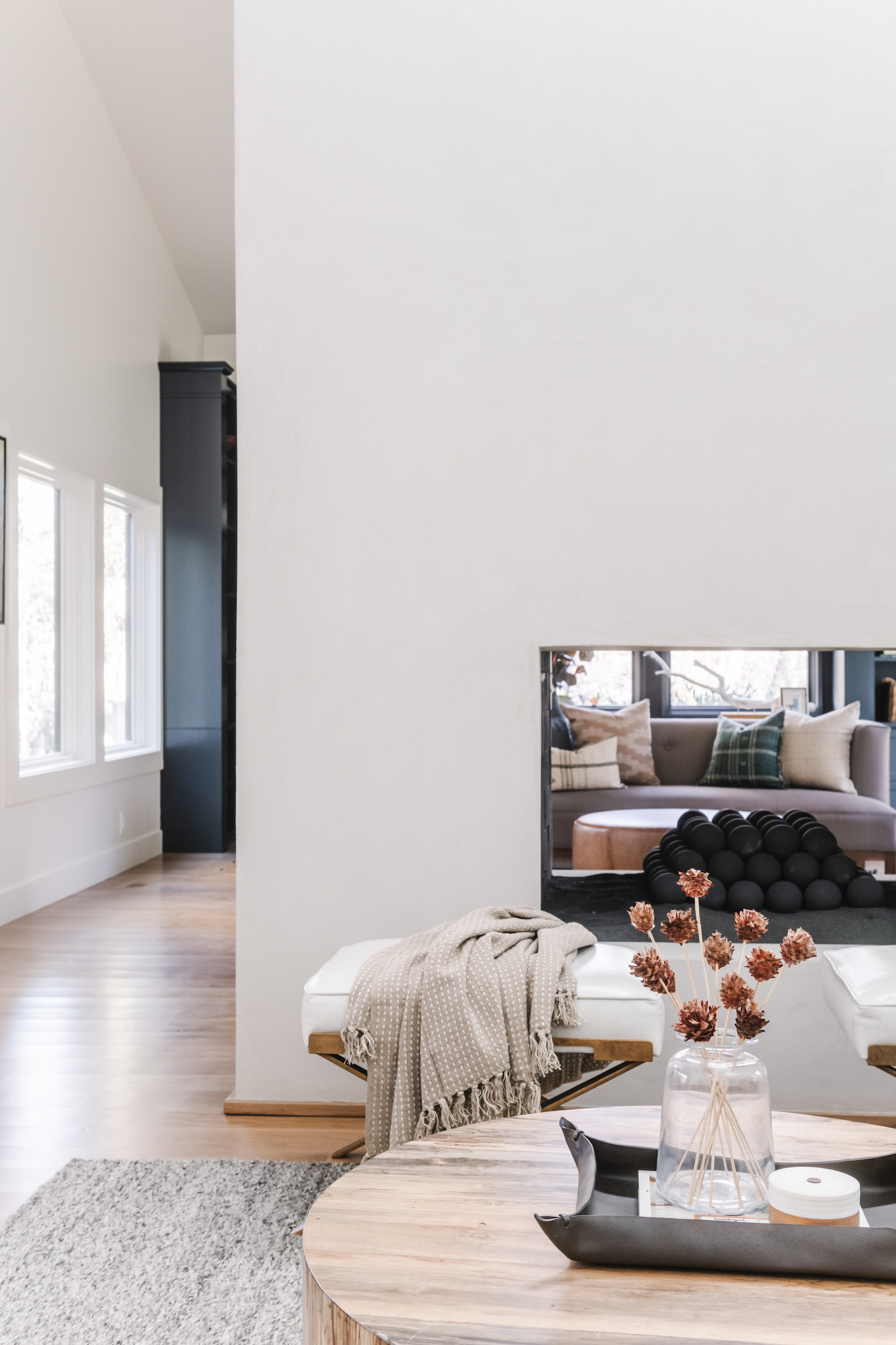
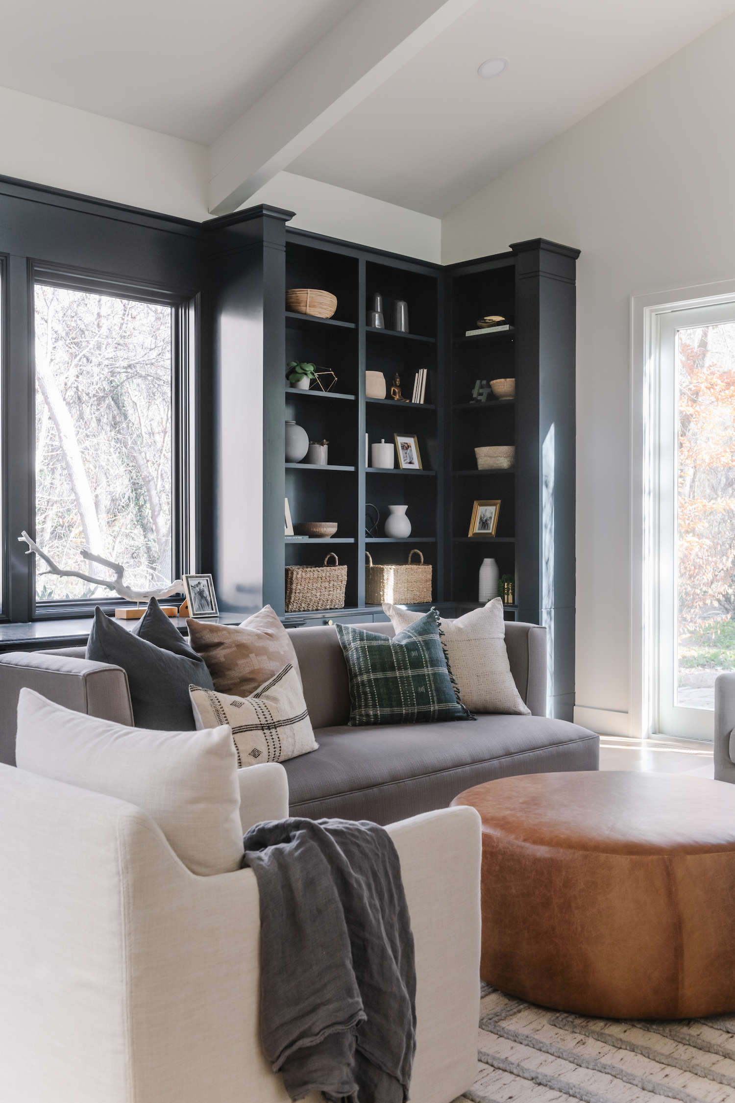
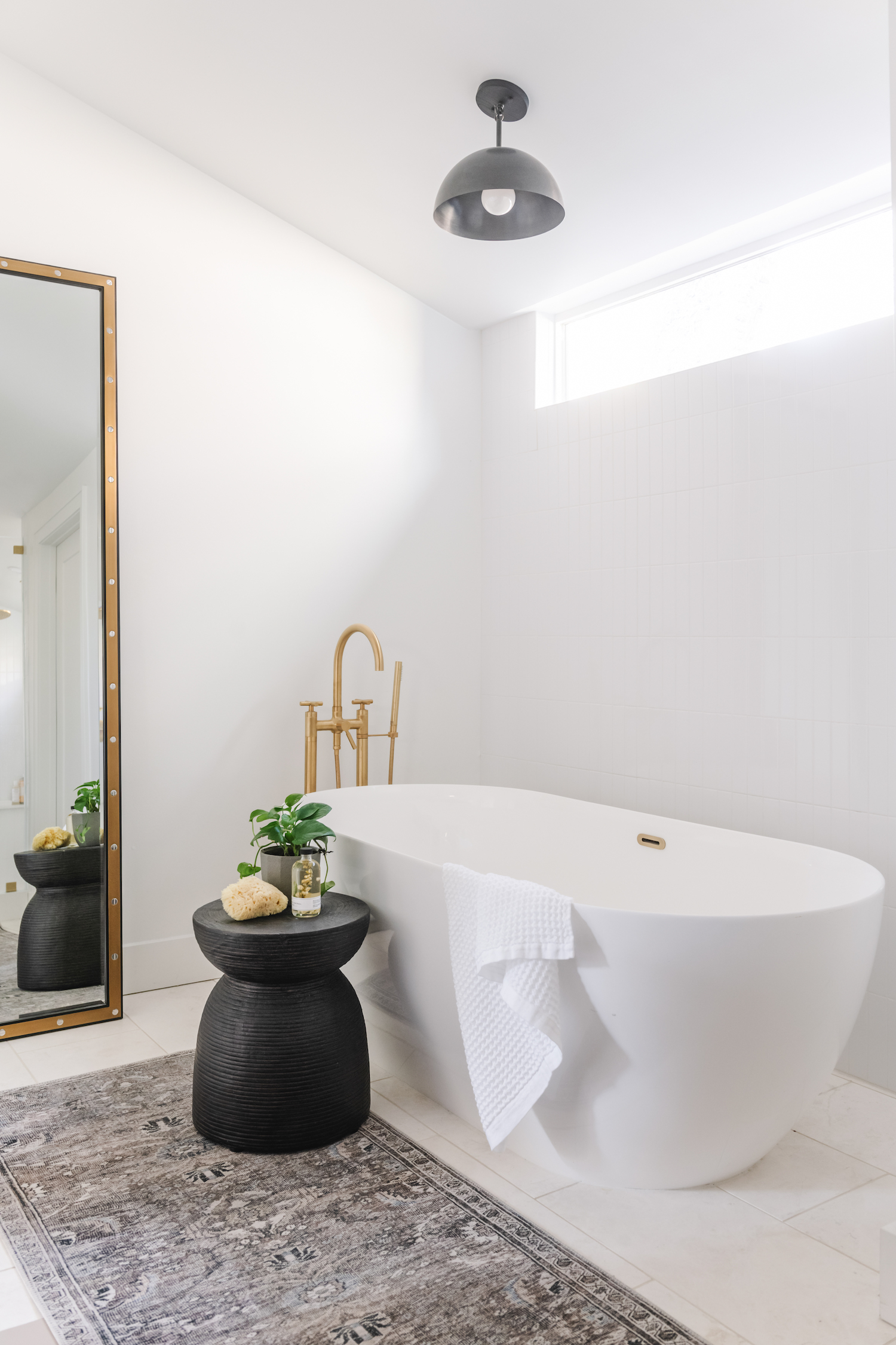
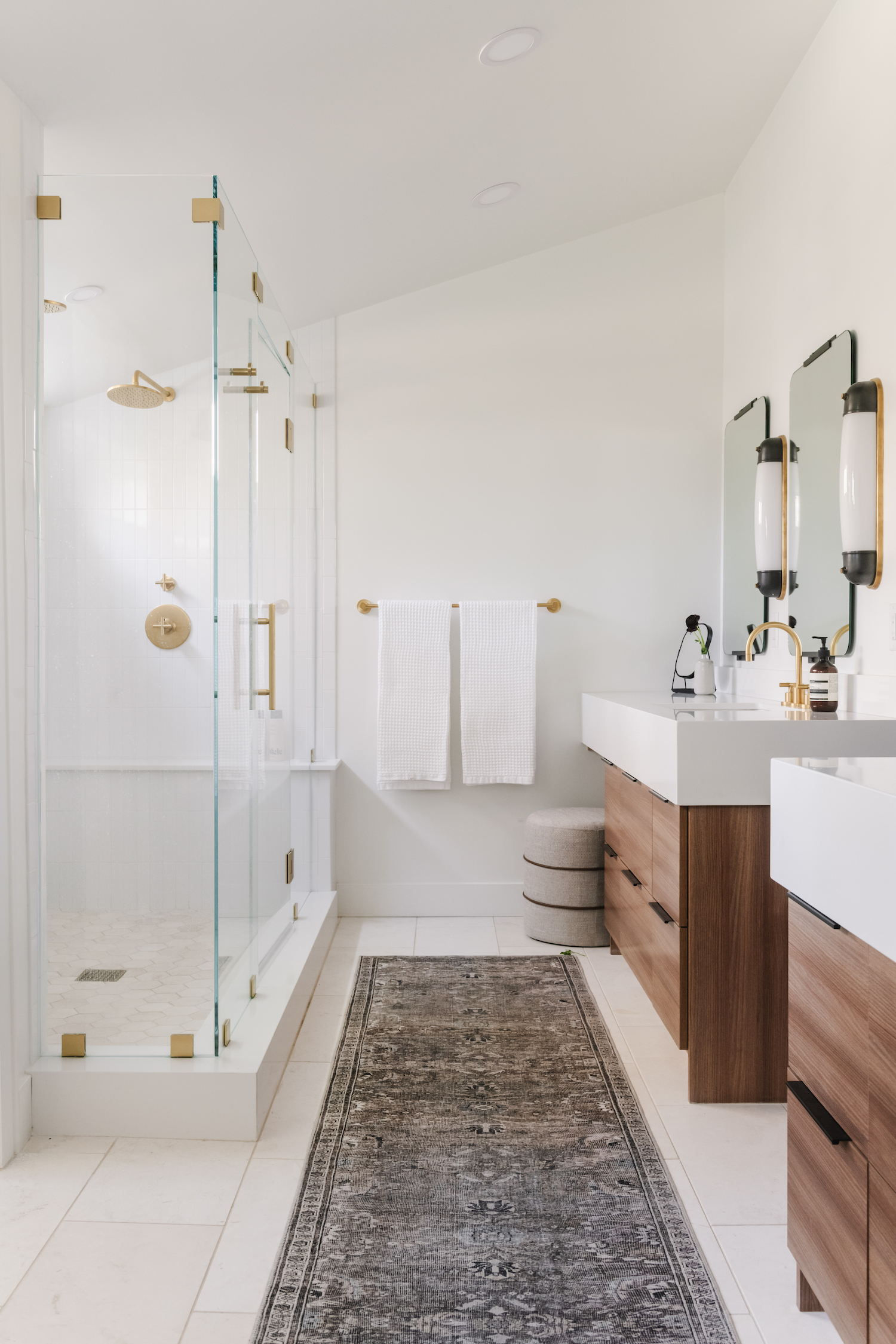
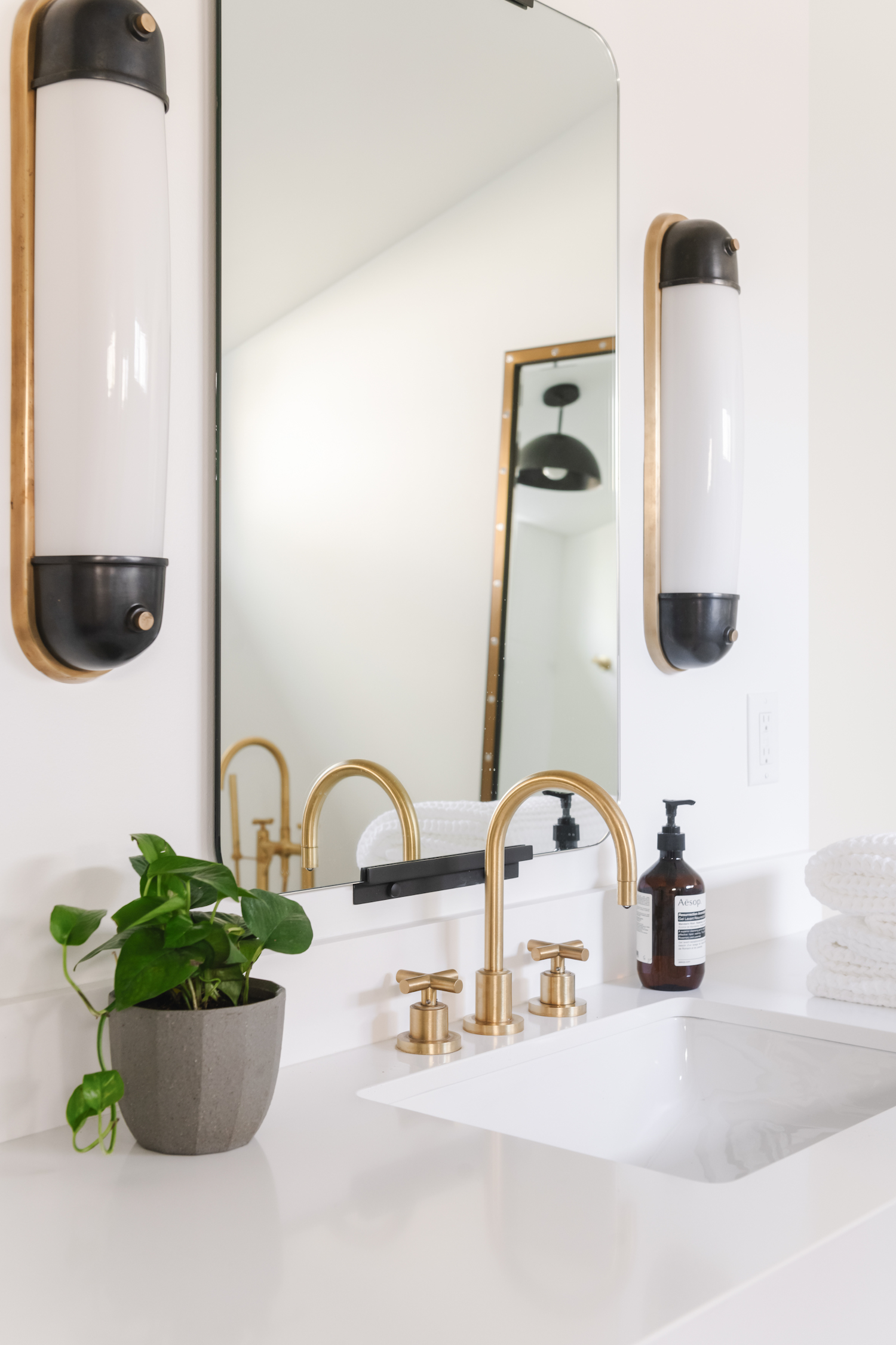
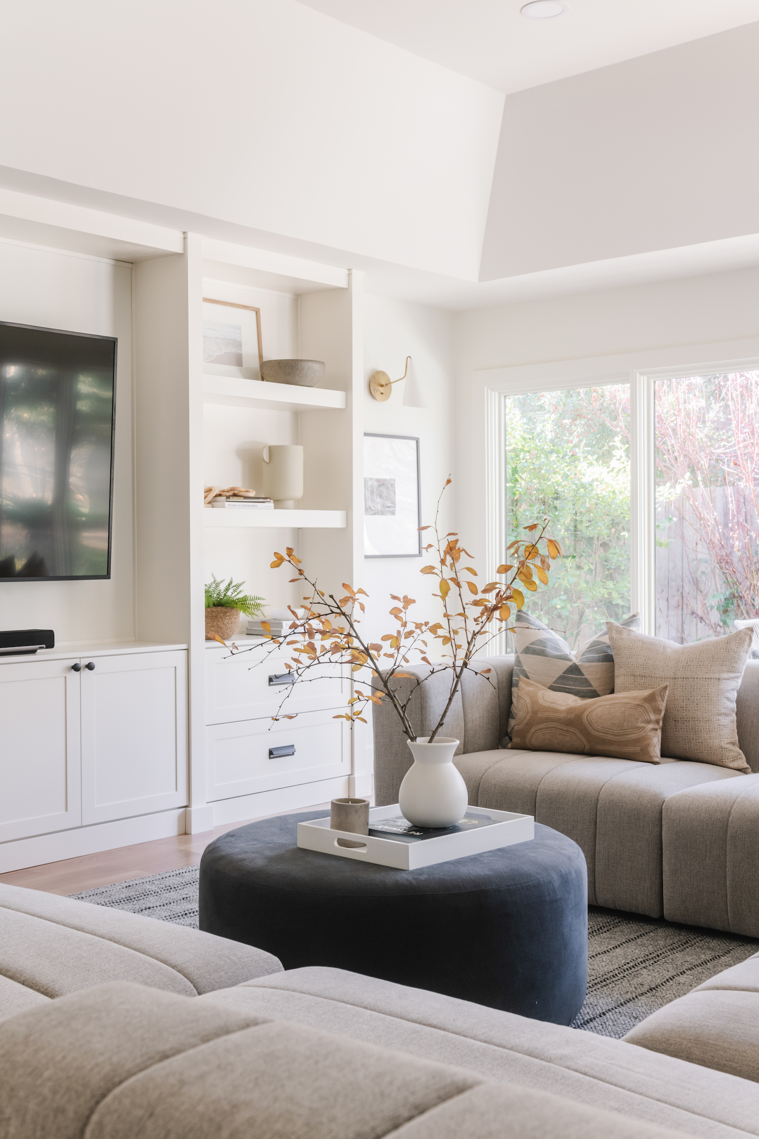
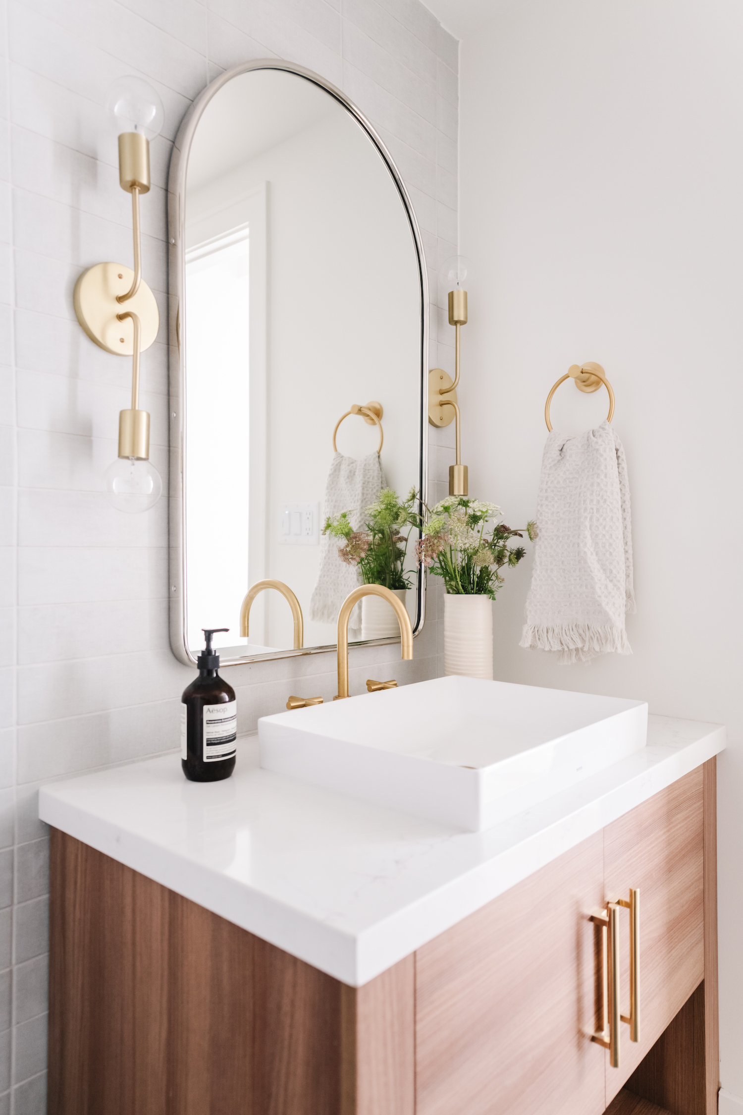
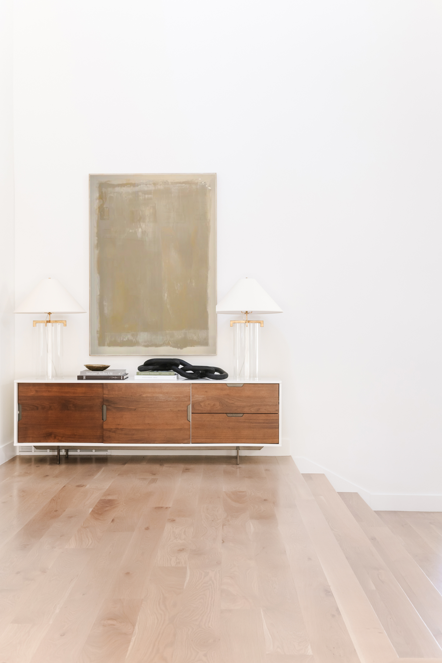
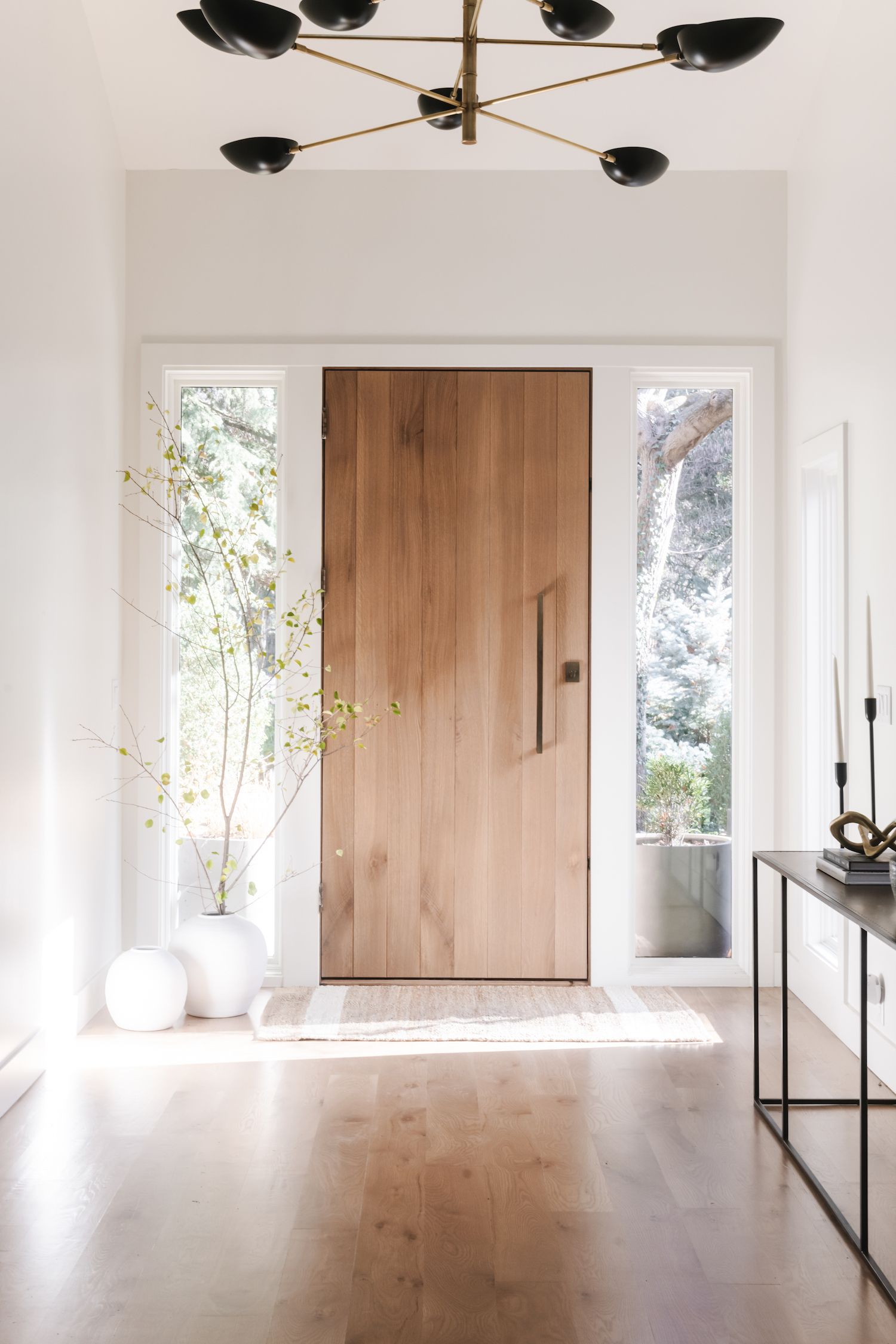
Brittany Gearhart, of Canvas House Design, was brought in to remodel an outdated home that had great mid-century modern bones. By applying her client’s needs to the home’s existing footprint and using a streamlined palette she created a space that is a platform for her clean design and is a comfortable place to call home. Keep reading to see how this dated house became a mid-century marvel!
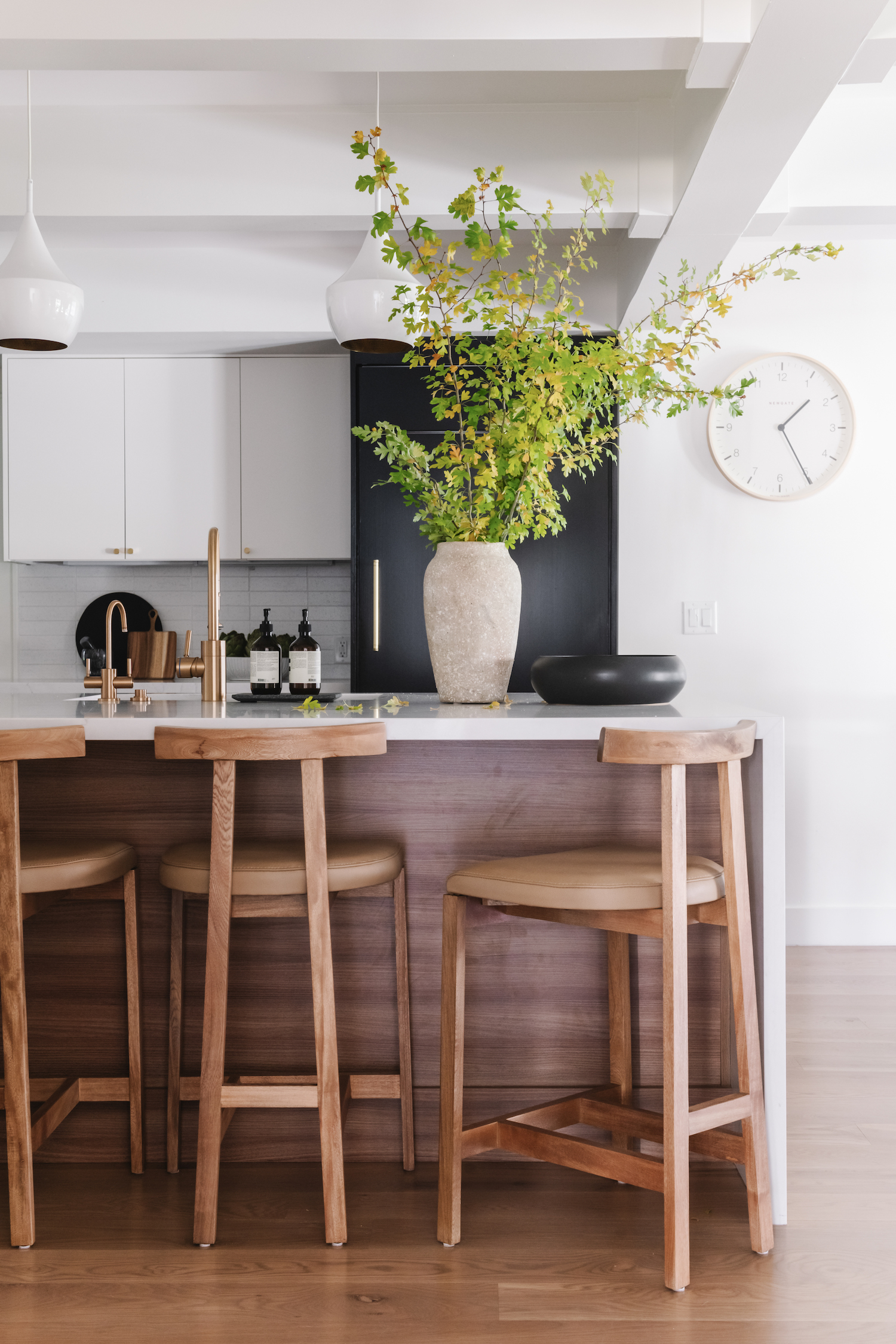
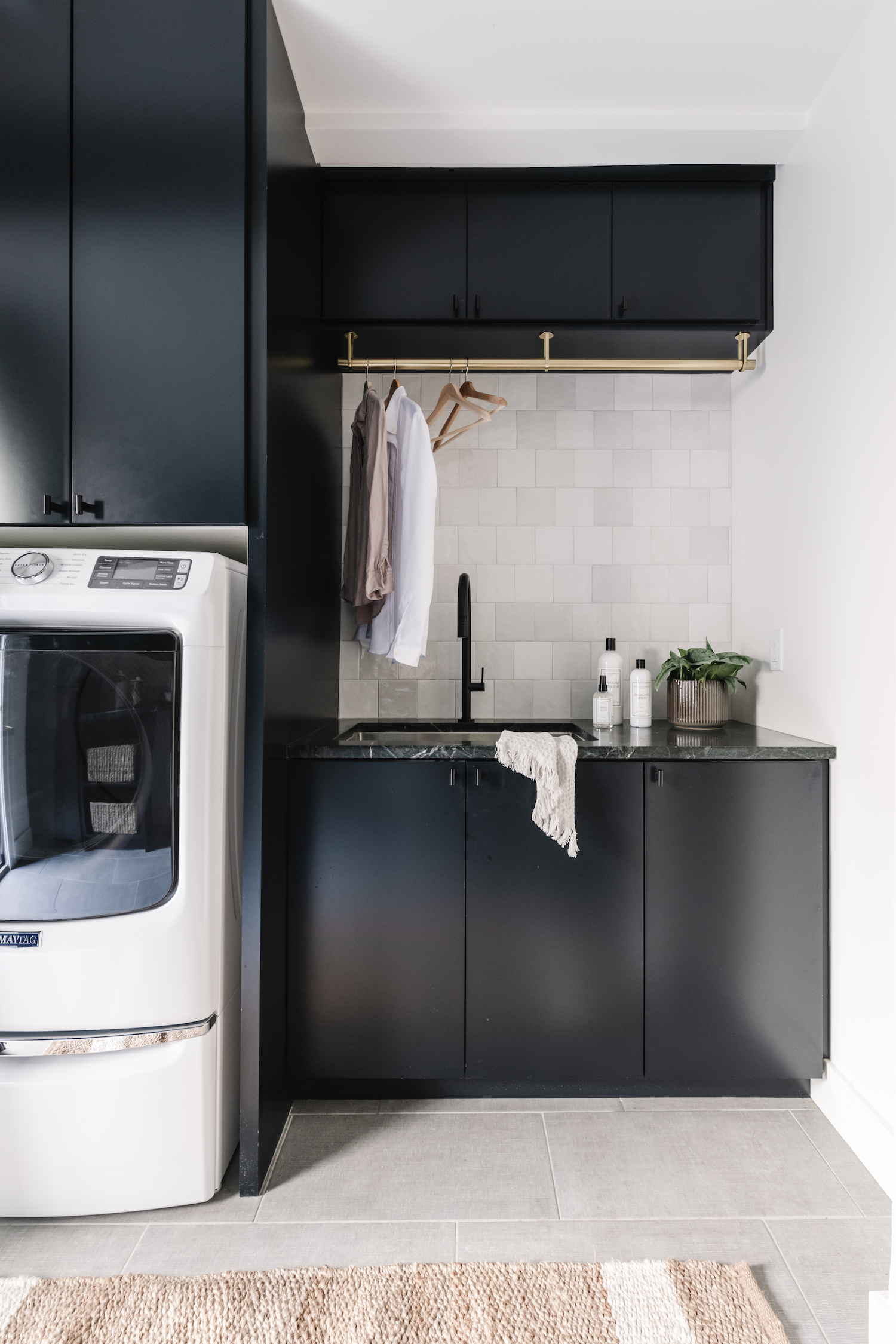
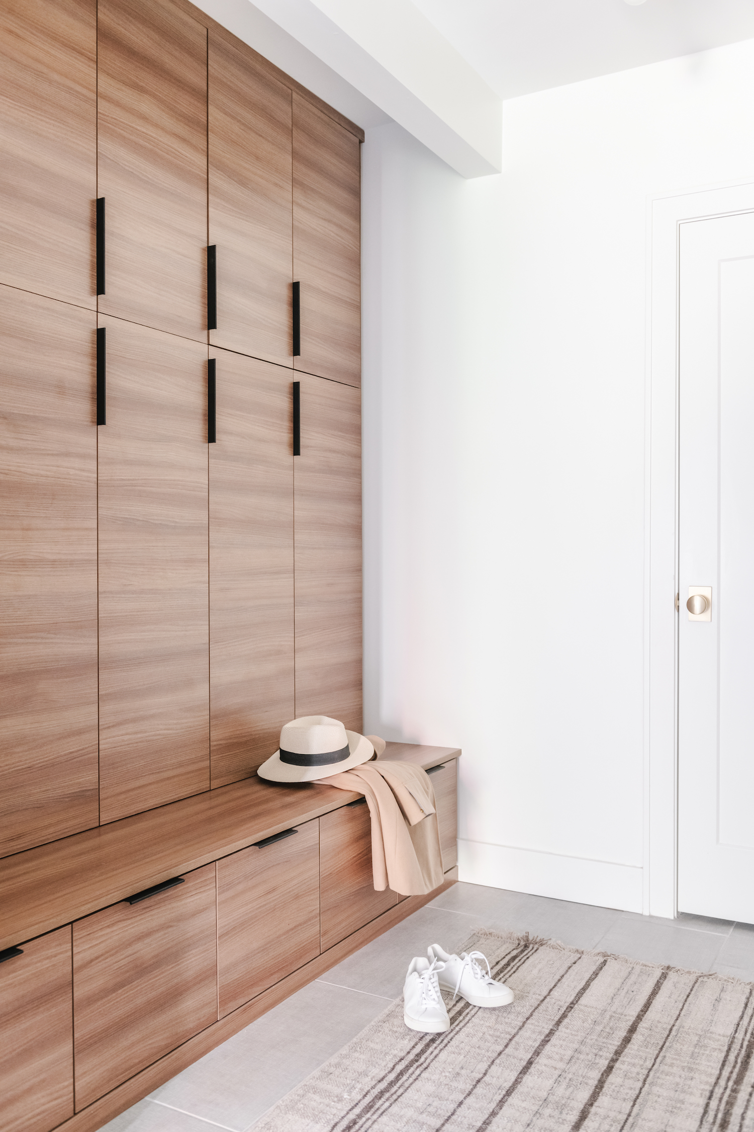
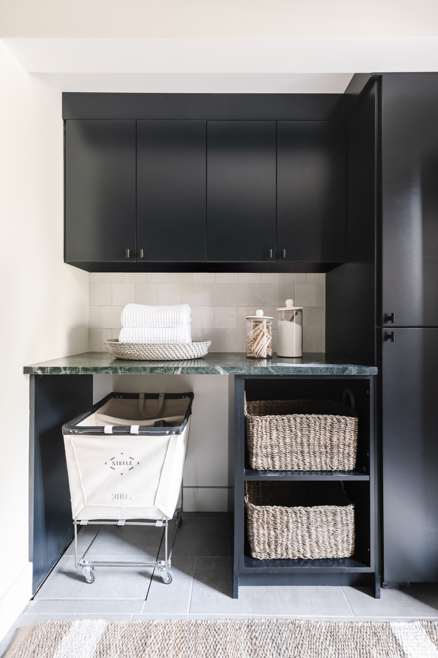
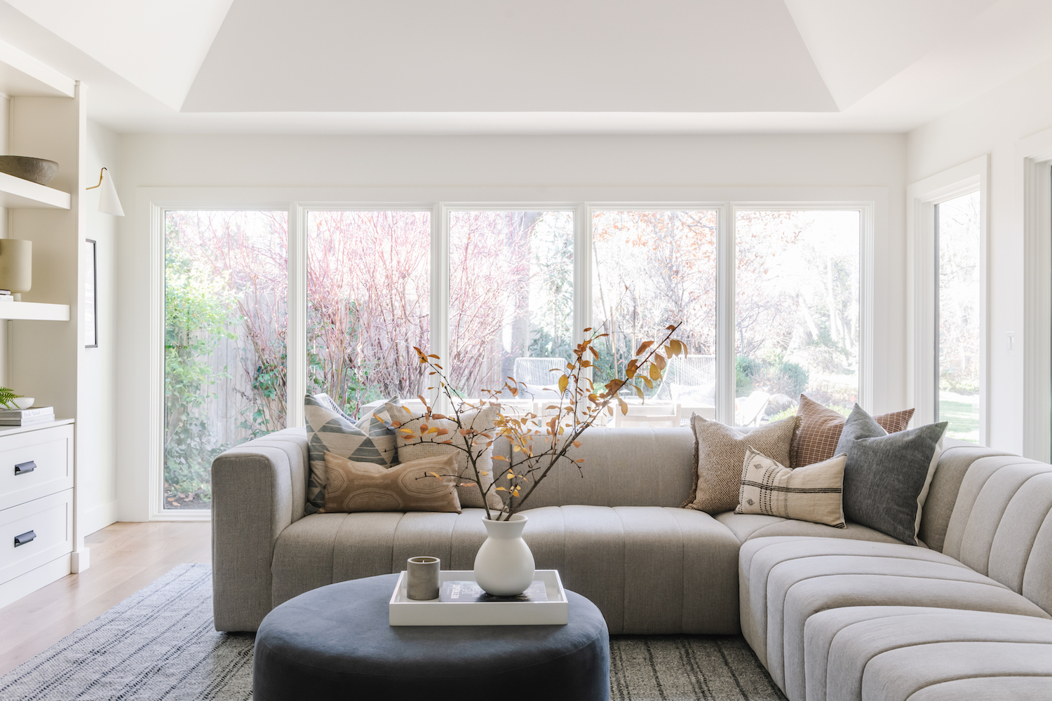
From the designer… Our client has always loved this particular area of Utah so when they were looking for their forever home they already had a good idea of where they wanted to set down roots. They found the most gorgeous property tucked away from any main roads with an existing home that had a lot of potential. They have always had a love for simple, modern design but the home sitting on the property needed a lot of work to get to that point. The home had great mid-century modern bones that would be a perfect fit with our client’s taste. We kept the main footprint of the home but made a complete 180 by replacing outdated finishes and updating the areas that needed some refining.
Working with an existing footprint brought its own challenges and we learned to be more thoughtful and flexible throughout the design phase. There were many areas we had to work around to make everything flow but it really gave us the opportunity to get more creative within the restrictions of each space. In the end, the character of the floor plan and unique spaces really shined!
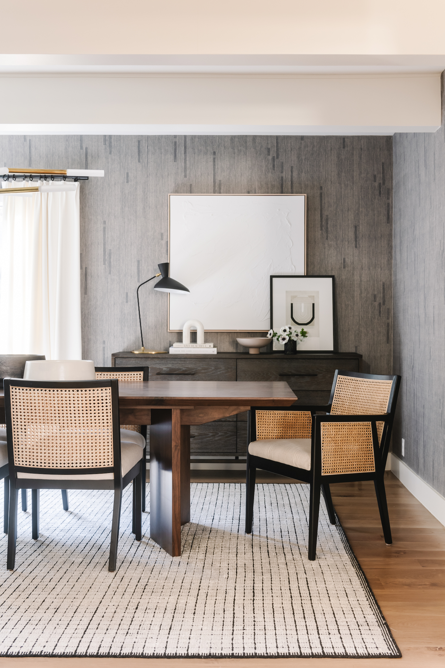
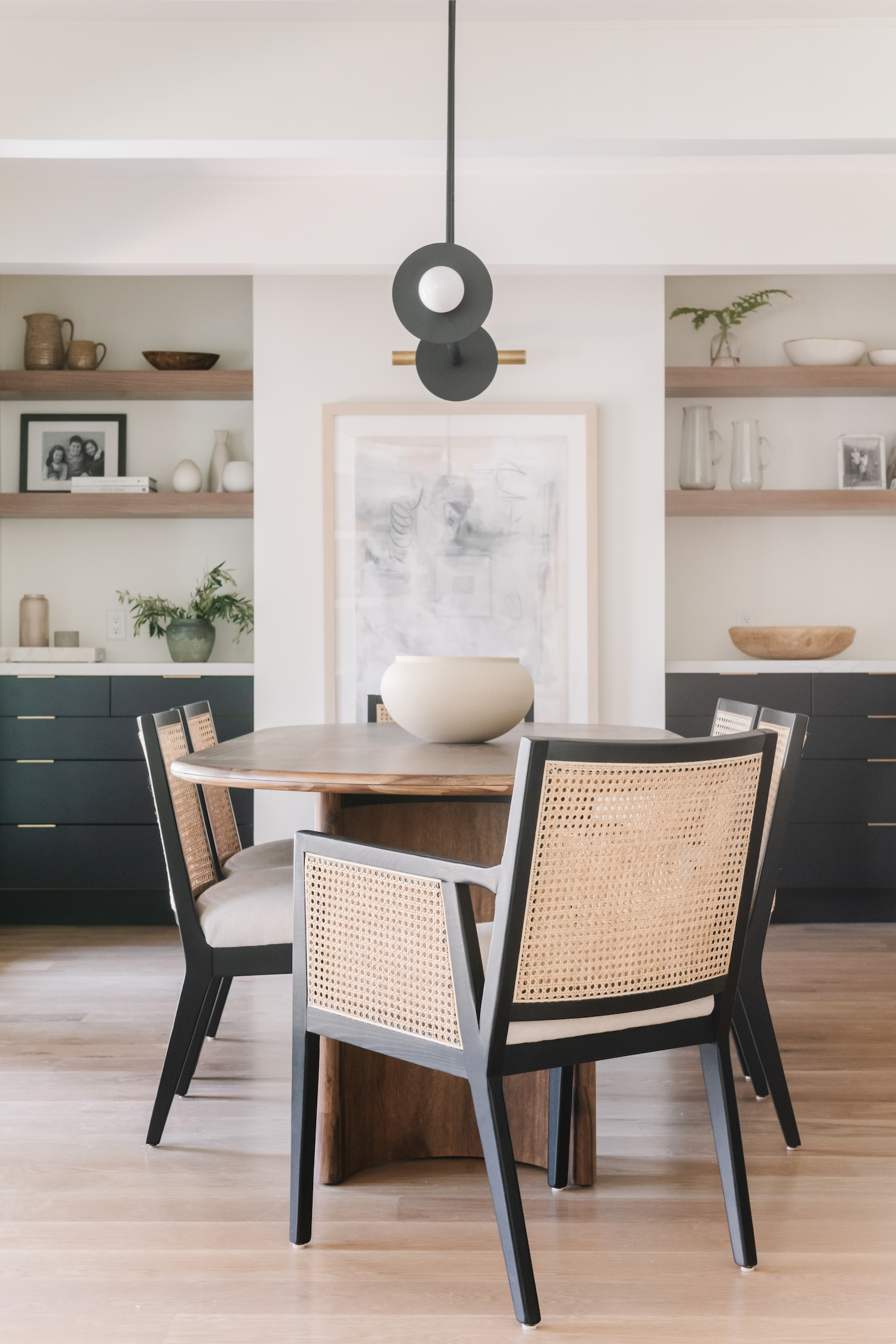
One of my favorite spaces turned out to be the dining room in this project. This space sits right off of the entry so we knew we wanted it to have some depth and personality. This room has a dropped ceiling with an intimate feel so we selected a dark blue grasscloth wallpaper with a modern line design that would compliment the size of the space. I love the way it brings a moody feel to the room! A statement chandelier sits above a large custom table where many friends and family can gather together. To contrast with the darker feel of the space, we added lighter materials like the rug, artwork, and drapery that stand out against the walls.
Like the dining room, each space of the project was revived with new life and prepared for the memories my clients family will share together.
Like what you see? Take a peek at the talent behind the story… Interior Design: Canvas House Design · Photography: Rebekah Westover Photography · Stylist: Jen Paul