With some clever calculating and trusting clients, Melody Gangi, proves that you can have a coastal farmhouse oasis in the middle of the desert. Massive beams and black hardware contribute to a feeling of earthy antiquity while the cool blue tones throughout the house practically create a crisp breeze that you can feel. Come take a look at how House of Four designed the perfect coastal escape in a sea of sand.
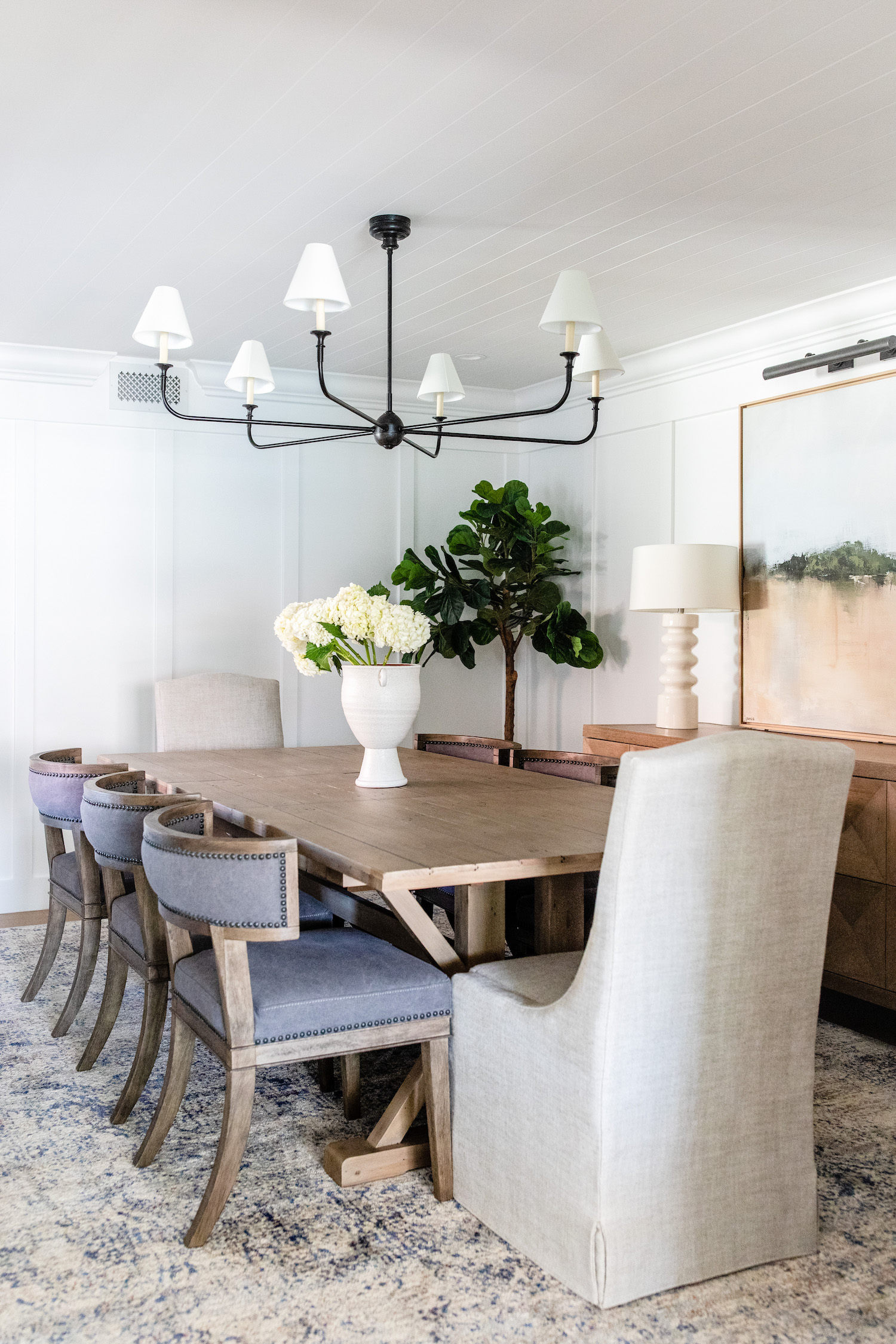
From the designer… Our Oakmont Ranch Project turned out to be such a jewel box! Our clients were a dream and trusted our team’s vision and experience from start to finish. They are a young couple, with no prior renovation experience, who wanted to make sure they made all the right decisions while remodeling their forever home. The home itself is a 40 year old, single story property that was in need of a full gut remodel. Our inspiration for this home was bringing a California feel to the desert. With laid back furnishings and timeless finishes throughout, we feel like we captured it!
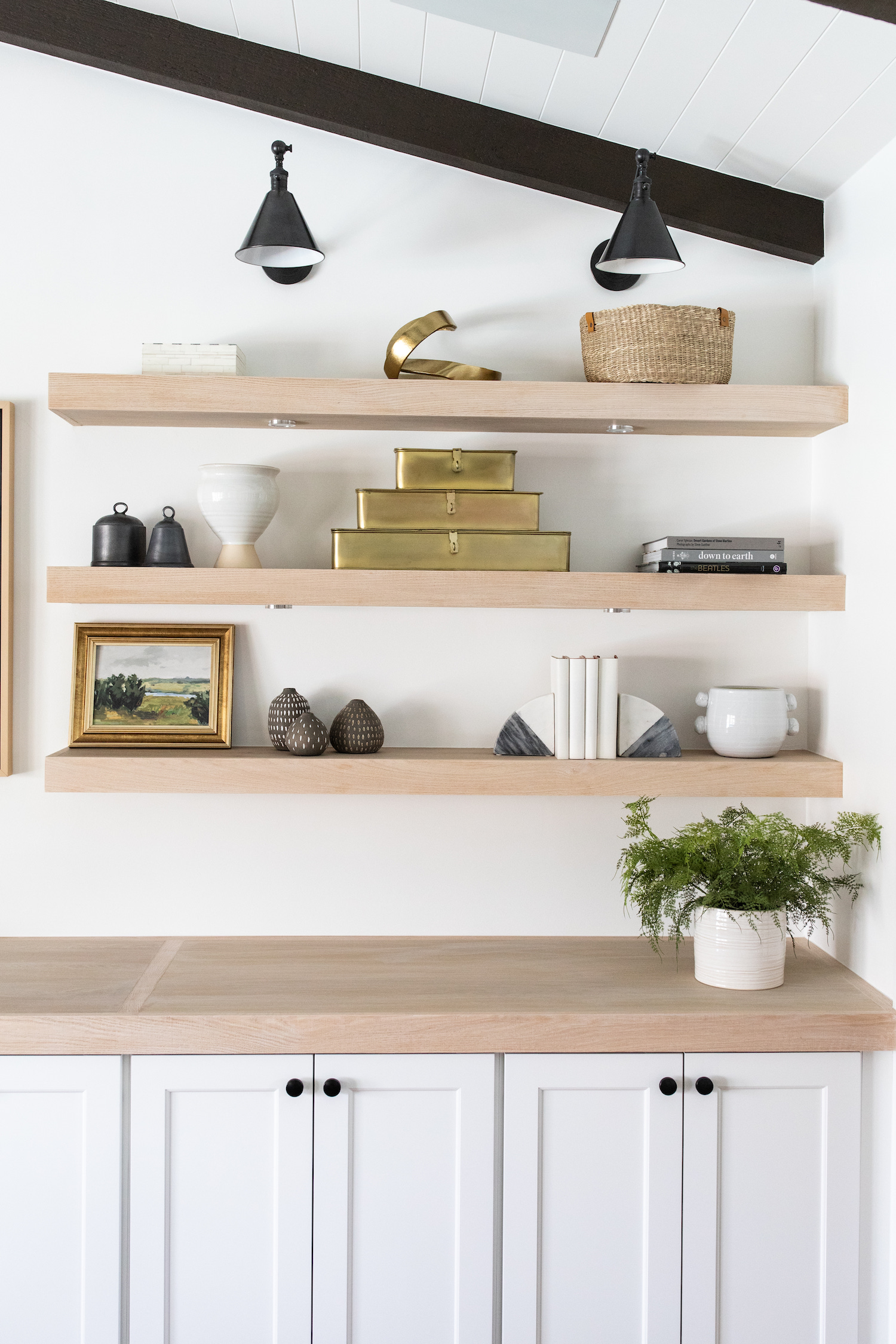
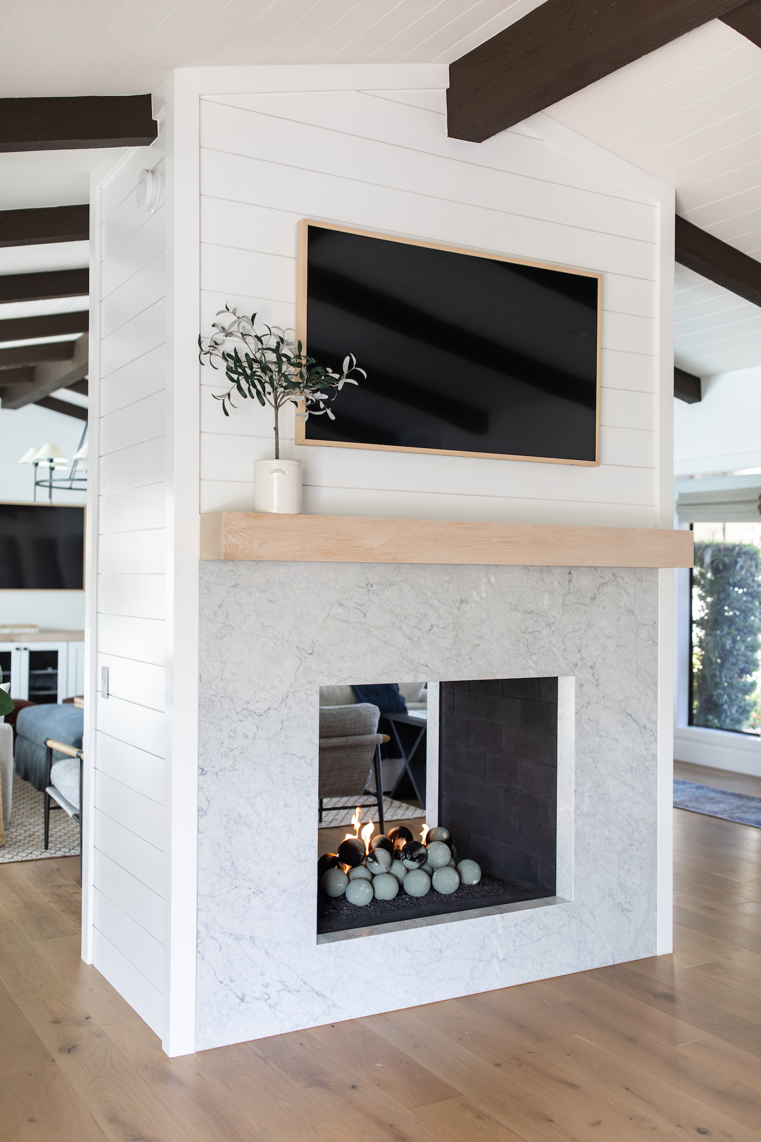
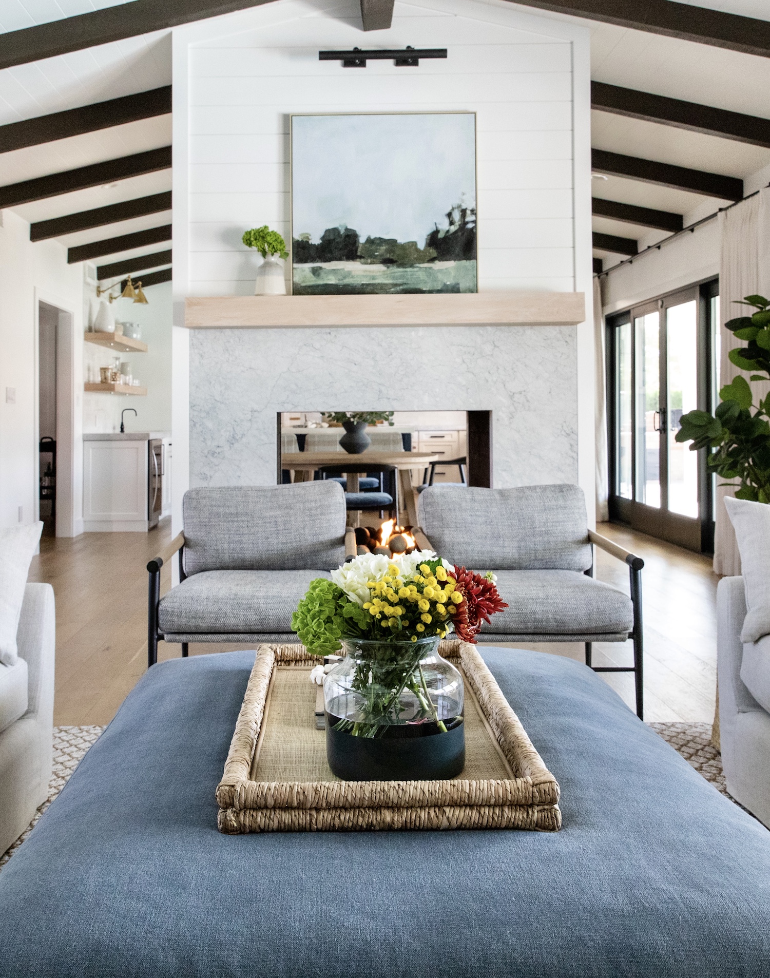
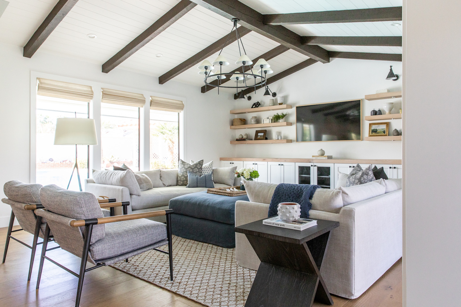
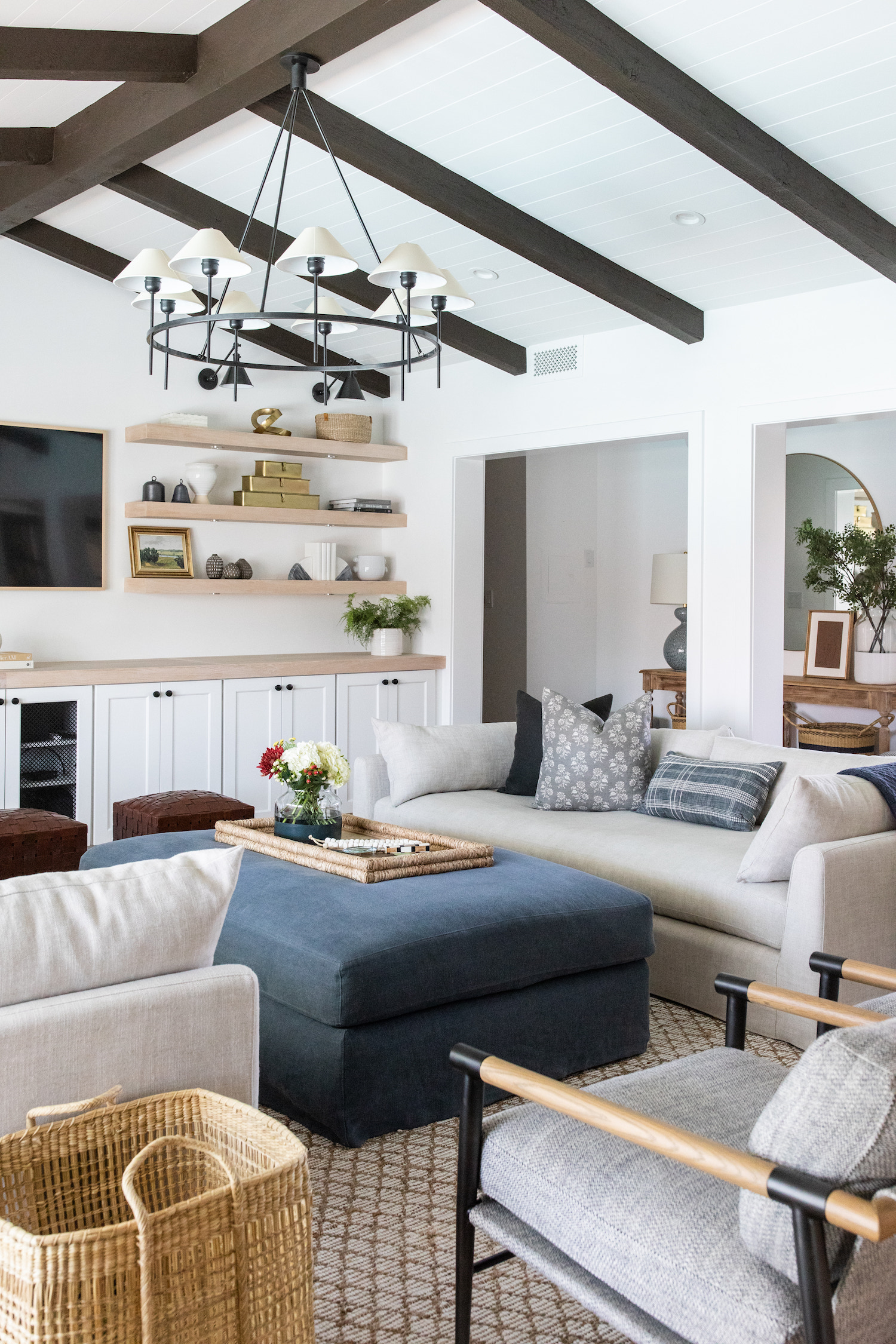
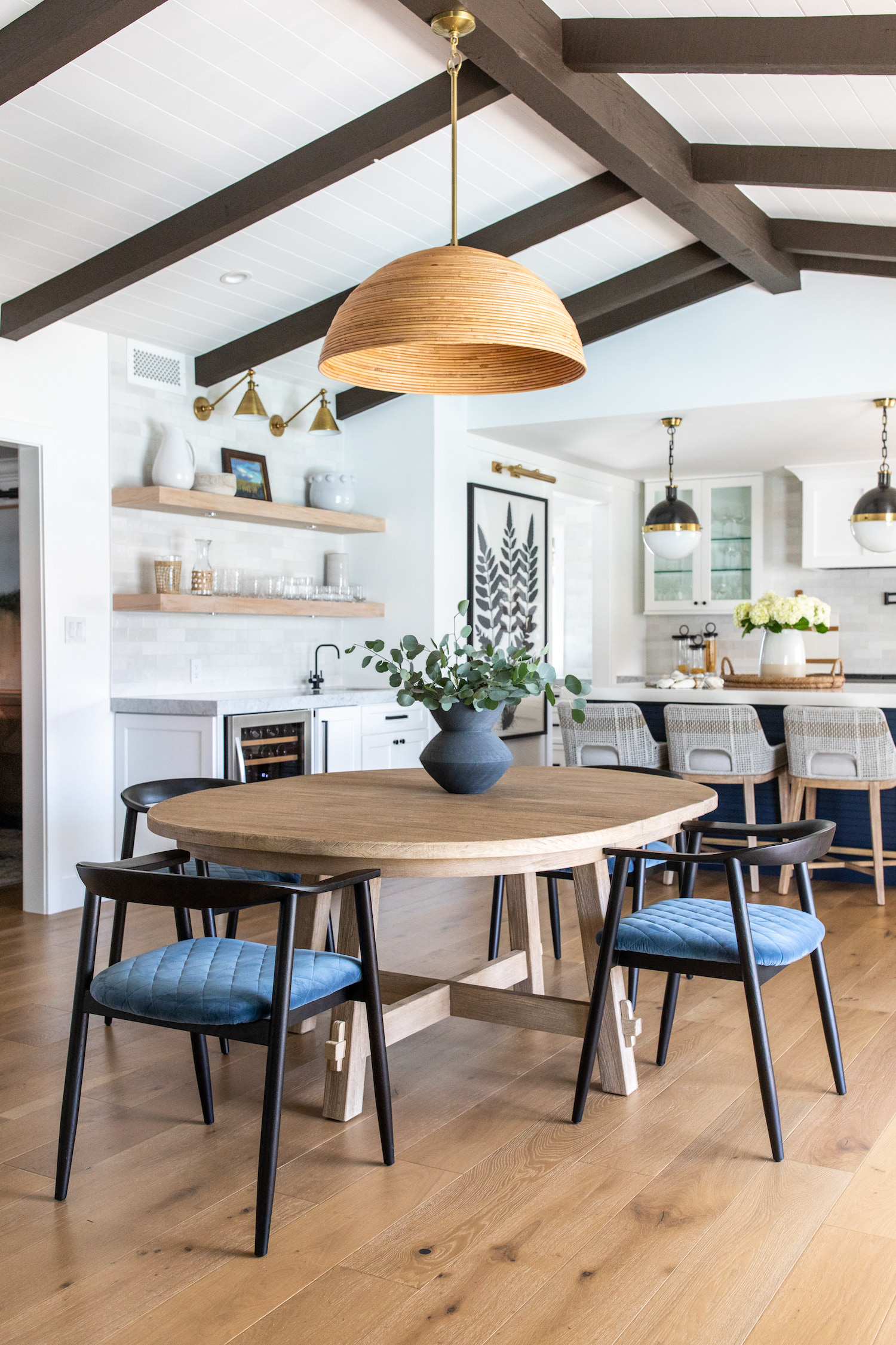
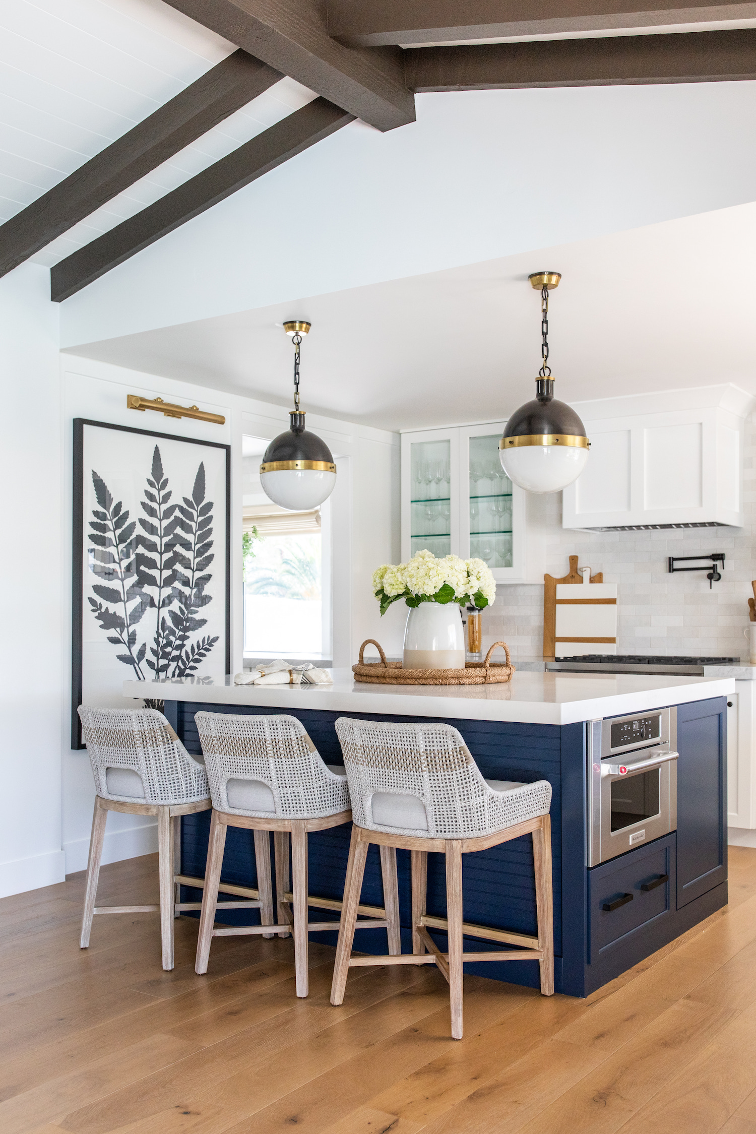
Some of the stand out stars in this home happened to be some of our biggest design challenges. Our clients fell in love with the existing pitch ceiling and double sided fireplace, as these are unique features in Las Vegas homes. However, the ceiling and fireplace needed to be reimagined, as they were initially eye sores. We cleaned up the ceiling by staining the beams a rich espresso color and adding crisp white shiplap in between. What we didn’t know at the time was that the ceiling is actually the roof and the beams were not lined up perfectly, so adding shiplap in between proved to be a craftsmanship challenge for our crew. However, in the end, the new finishes brightened the space and feel like they were always part of the home, which is what we love to do! We also carried the shiplap onto the double sided fireplace in addition to the Carrara Marble slab surround and french oak mantles on either side. This fireplace carried the theme of crooked lines, and again, put our crew to the test. Thankfully, one of our construction team’s strengths is craftsmanship and the finished product is next to perfect.
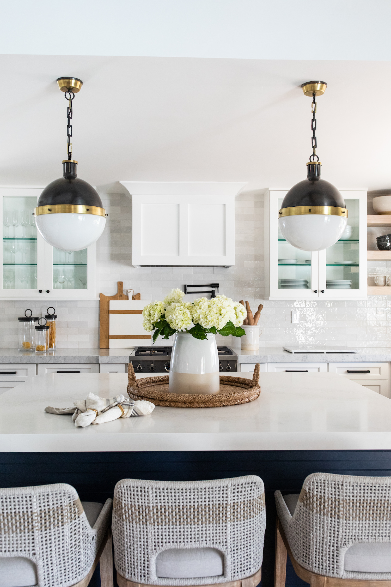
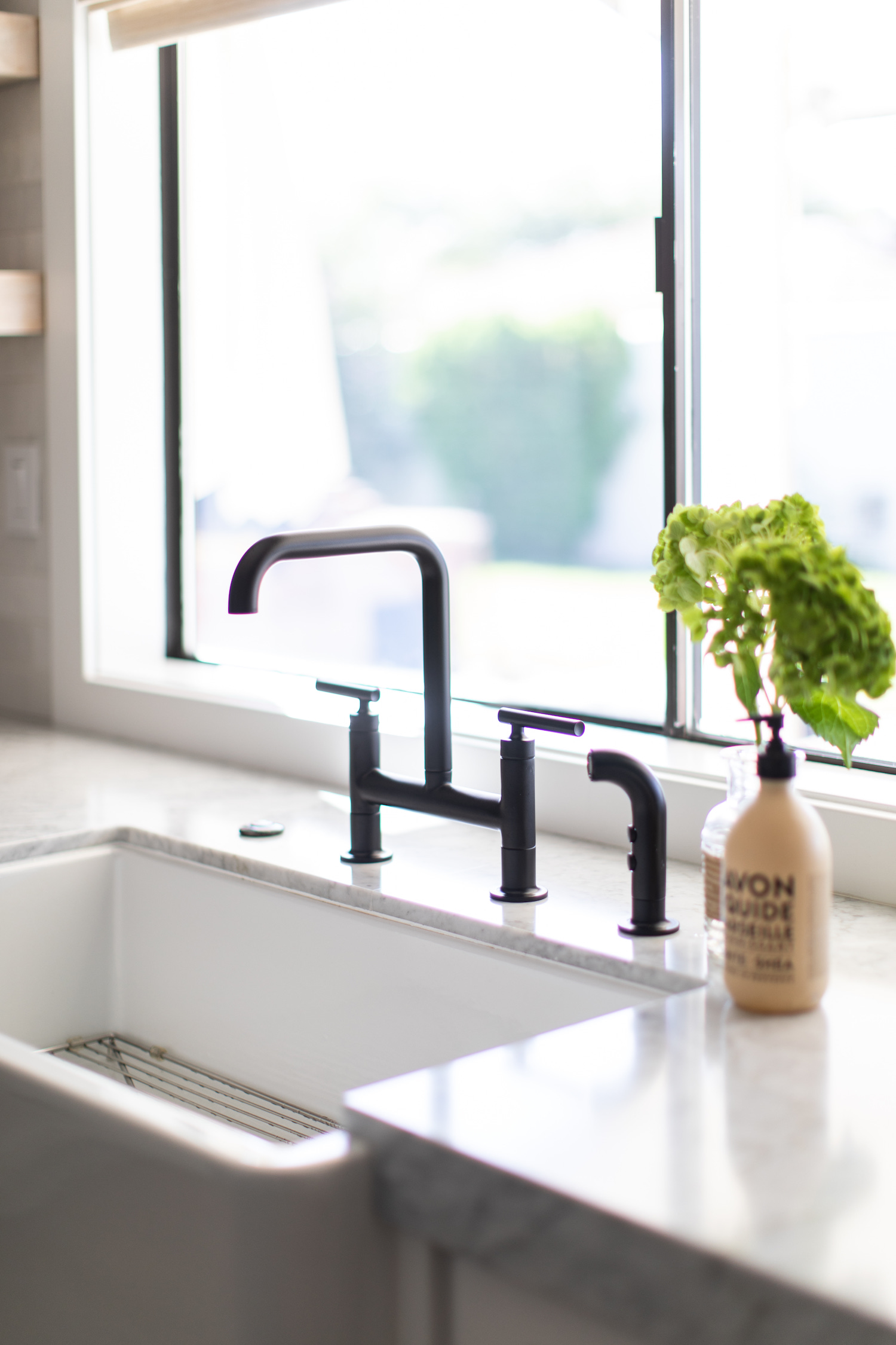
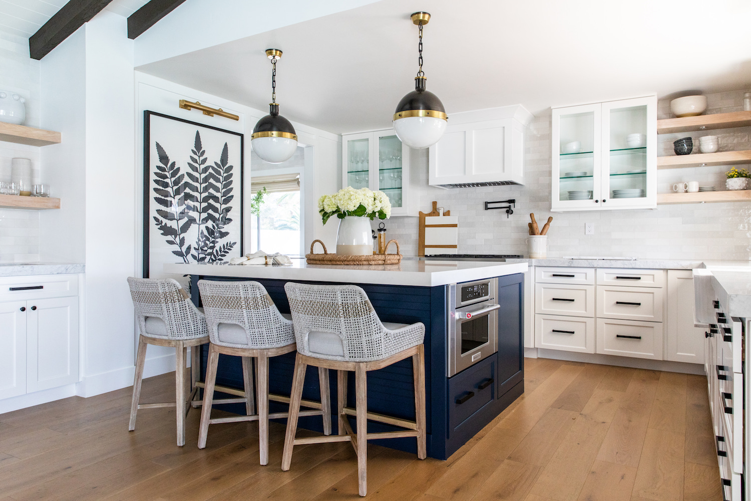
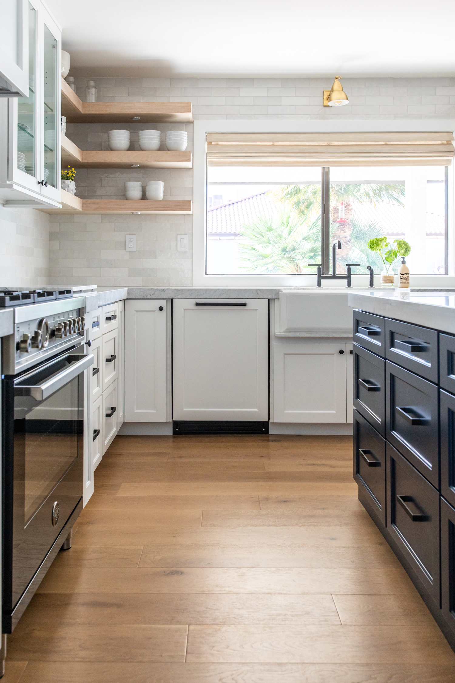
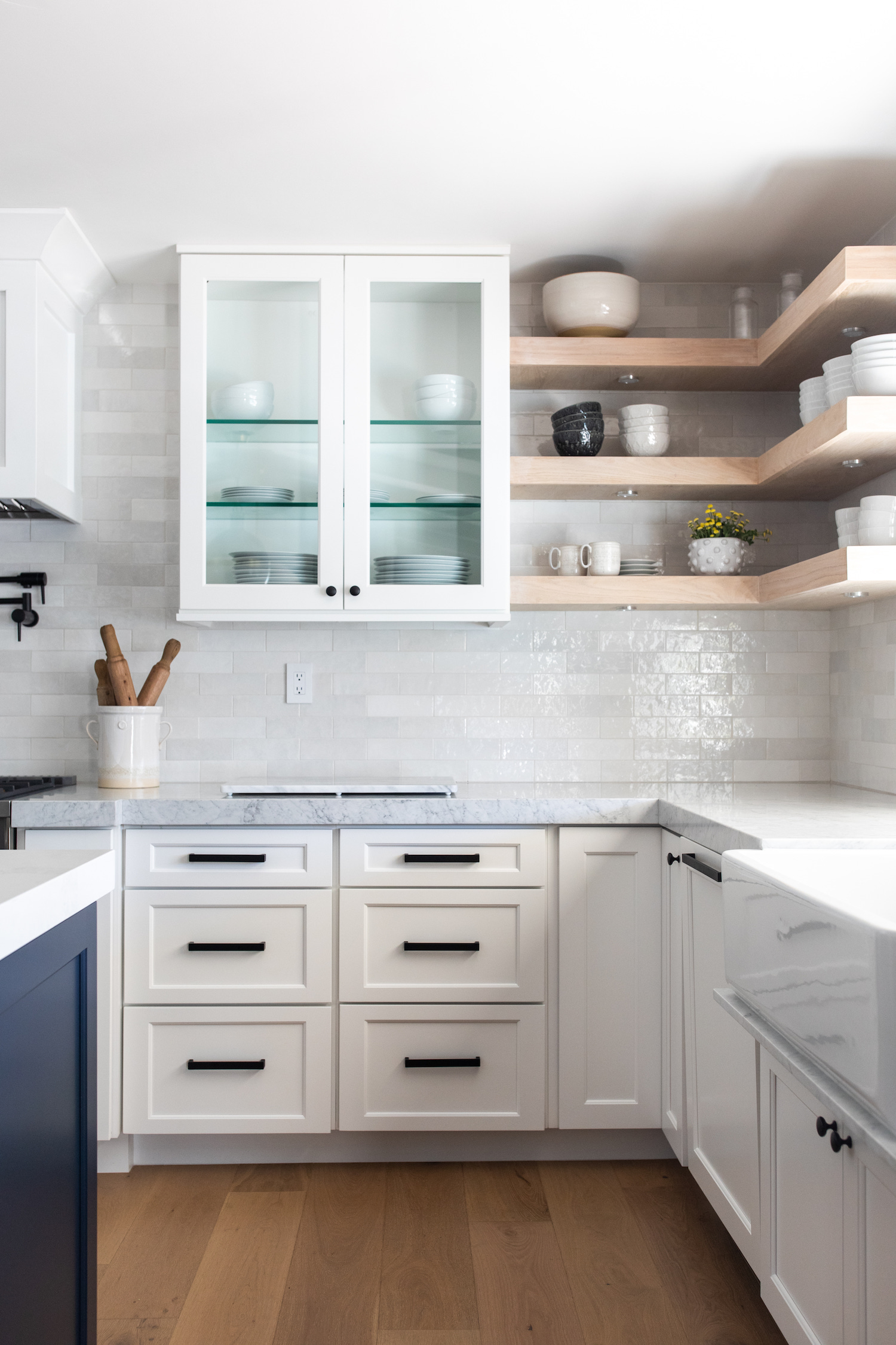
One of the major renovation spaces in this home is the kitchen. We continued the house engineered hardwood into the kitchen. All of the cabinetry in the home is a shaker style. The perimeter cabinetry is classic and white, but the island is Sherwin Williams – Naval. A blue island was one of the few requests from our client and we were happy to do it! We think it was perfect for the space. This kitchen’s backsplash is Bedrosians Cloe in White. It’s one of our favorite materials and is one of our go to’s for adding character, while still keeping things classic. The plumbing and hardware are all a matte black finish. They coordinate with the matte black Bertazzoni range. For the countertops in the space, we did a honed Carrara Marble on the perimeter of the island and a white quartz on the island. Having two different stones in a kitchen can add visual interest if it’s done the right way! A question we always get about this kitchen is “where is the refrigerator?” Good question! This kitchen layout before had the fridge where the artwork is. We moved it’s location into the pantry since it was open to the kitchen. This was the perfect solution for the lack of space in the main kitchen! The pantry turned out to be a great extension of the kitchen and we love how it turned out!
Like what you see? Take a peek at the talent behind the story… Interior Design: House of Four Design · Photography: Kayla Bowen Photography · Contractor: CM Home Designs
