


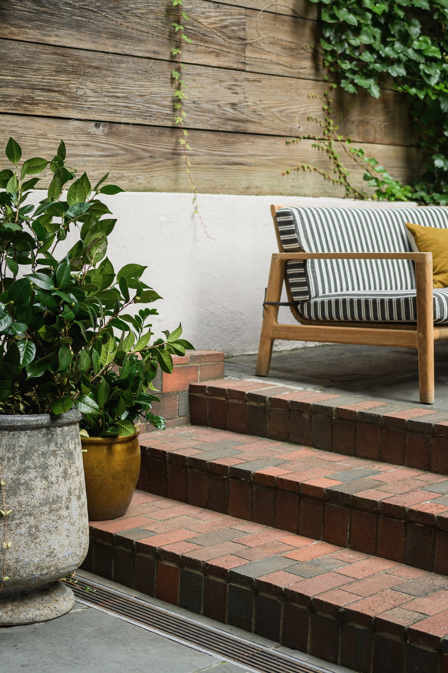
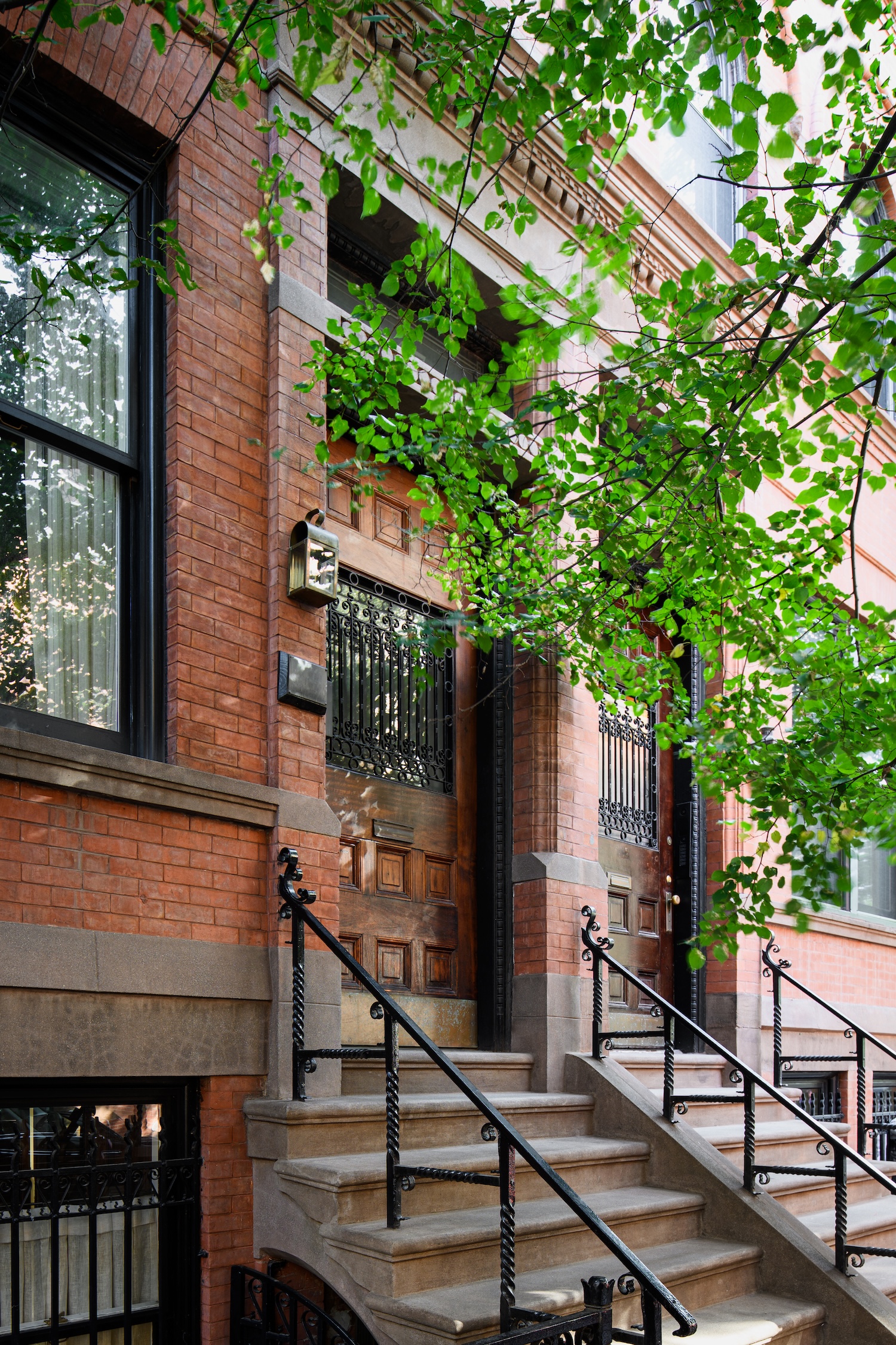
This late-19th-century townhouse renovation by Ward + Gray brings a warm, modern sensibility to a historic West Village home. Drawing from original architect William Tuthill’s archival work, the team reinterpreted Gilded Age detailing through a contemporary lens, balancing architectural gravitas with comfort and personality, as captured by Kelly Marshall (interiors) and Alan Tansey (exterior & garden).
From Ward + Gray…This townhouse was designed for a young couple in their mid-30s as their primary New York City home. The house dates back to the late 1800s and had undergone partial renovations in the 1960s and 1980s, so our scope involved a full interior renovation across all four floors. In addition to new finishes, furniture, and lighting throughout, we introduced custom wall paneling and millwork and reconfigured the layouts to better suit contemporary living. We collaborated closely with Shadow Architects and Green Conversions, Inc. to bring the project to life.
Early on, we came across a book written by the original architect of the house, William Tuthill, which documented interior details from projects he completed throughout his career. We studied it carefully, focusing on work from the period when the townhouse was originally built, and shared these references with our clients to help illustrate what the home might have looked like in the late 19th century. Many of those historical details became the foundation of the design, reinterpreted for modern life.
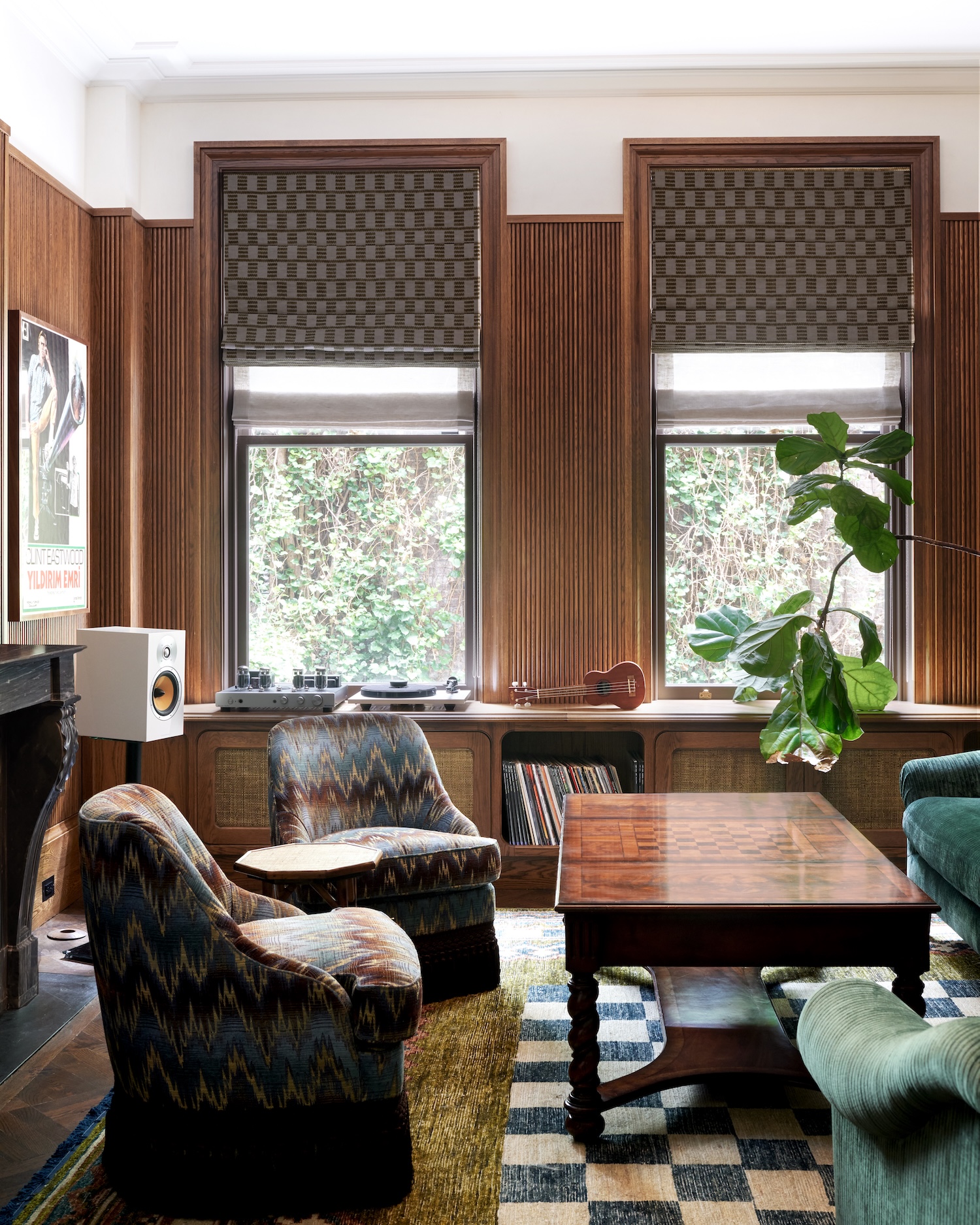
One particularly influential reference was a pharmacy shelving design by Tuthill, which inspired the custom millwork in the den. We paired it with stained wood tambour paneling to make it feel current and appropriate for a young couple. This was one of the most playful spaces. We used a teal corduroy sectional paired with Watts of Westminster Florentine Bargello swivel chairs and carried that boldness into the rug with a custom checkered pattern that references the parquet chess-pattern coffee table layered on top.
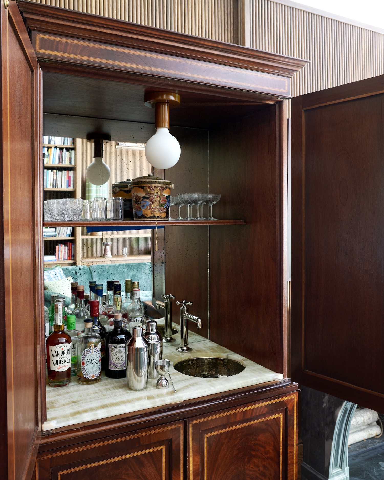
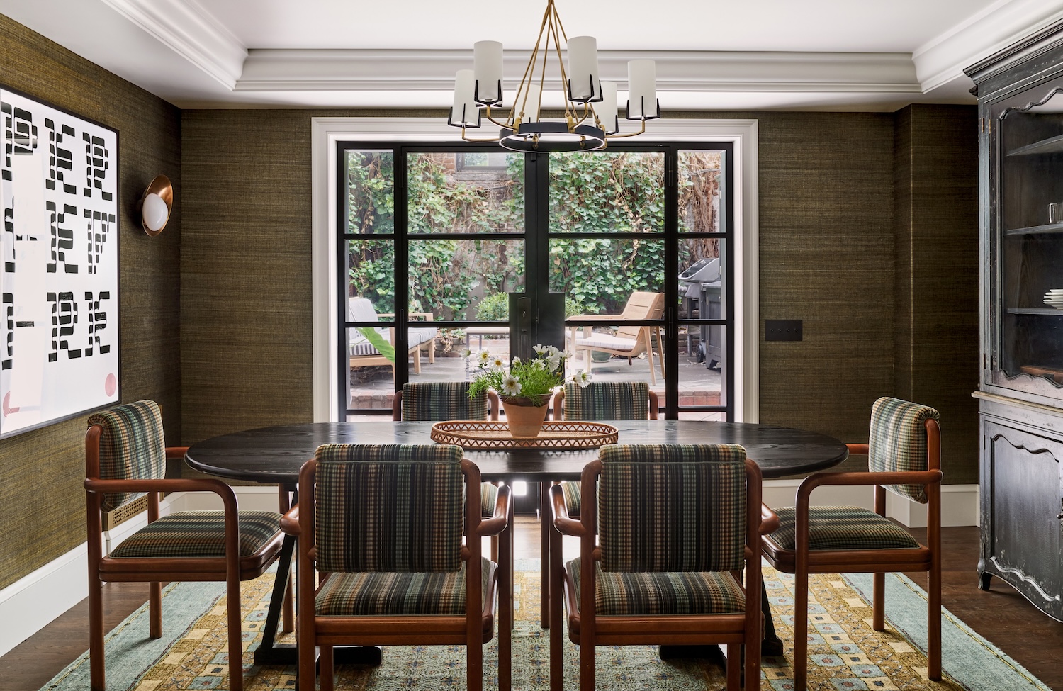
Because this is the clients’ primary residence, they wanted it to feel distinctly like their city home, sleeker and more sophisticated than their upstate house, which serves as a country escape. While they were drawn to a more refined aesthetic, comfort and functionality were equally important. We designed a cozy den for movie nights, complete with a hidden bar, and a formal living room for entertaining friends and family. Dining was also a priority, so we incorporated both a casual breakfast nook for working or informal meals and a more formal dining room.
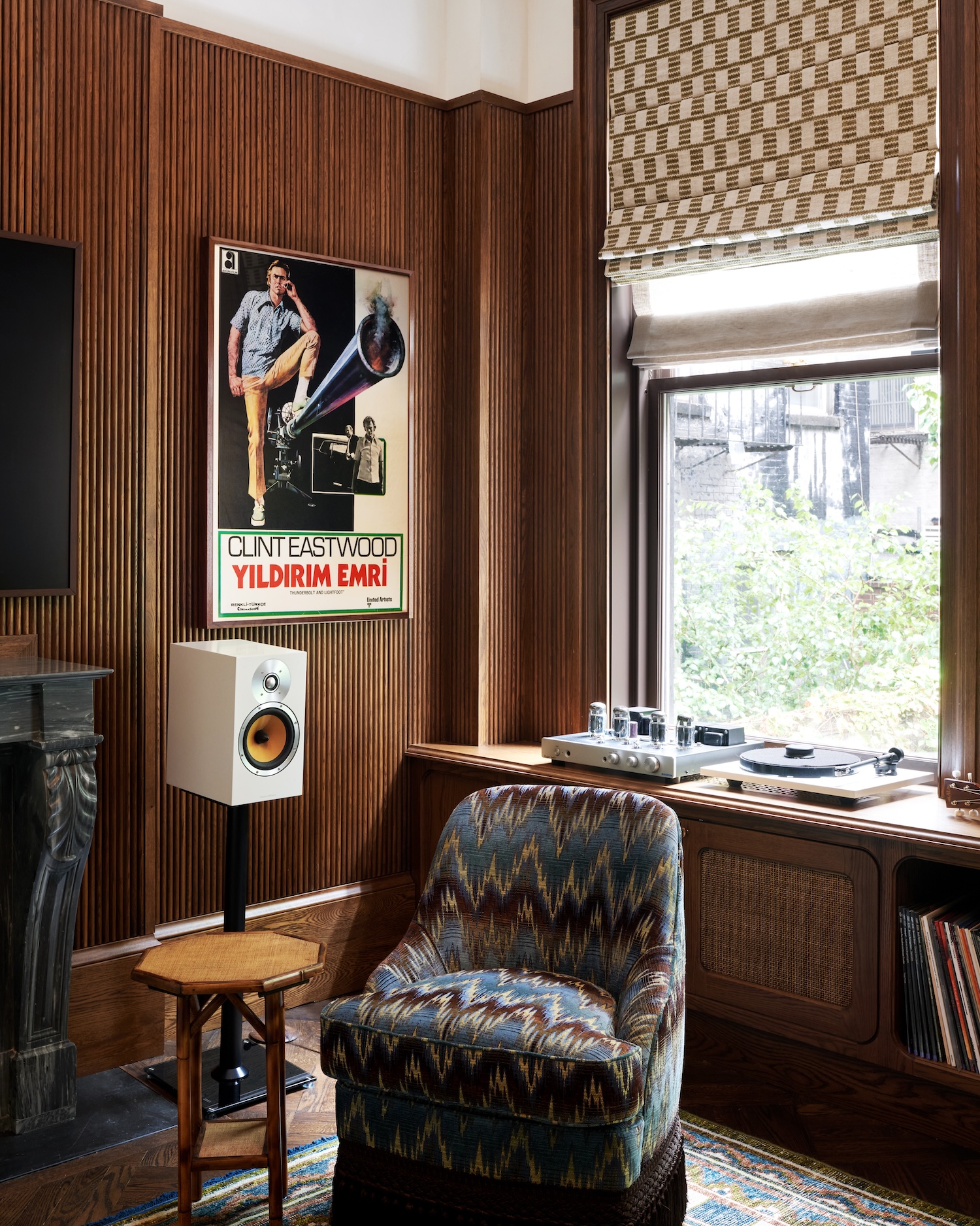
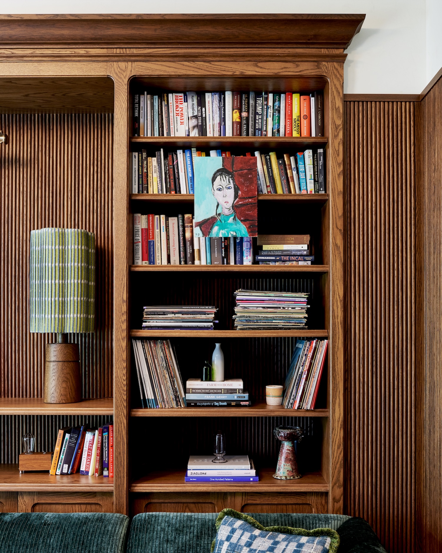
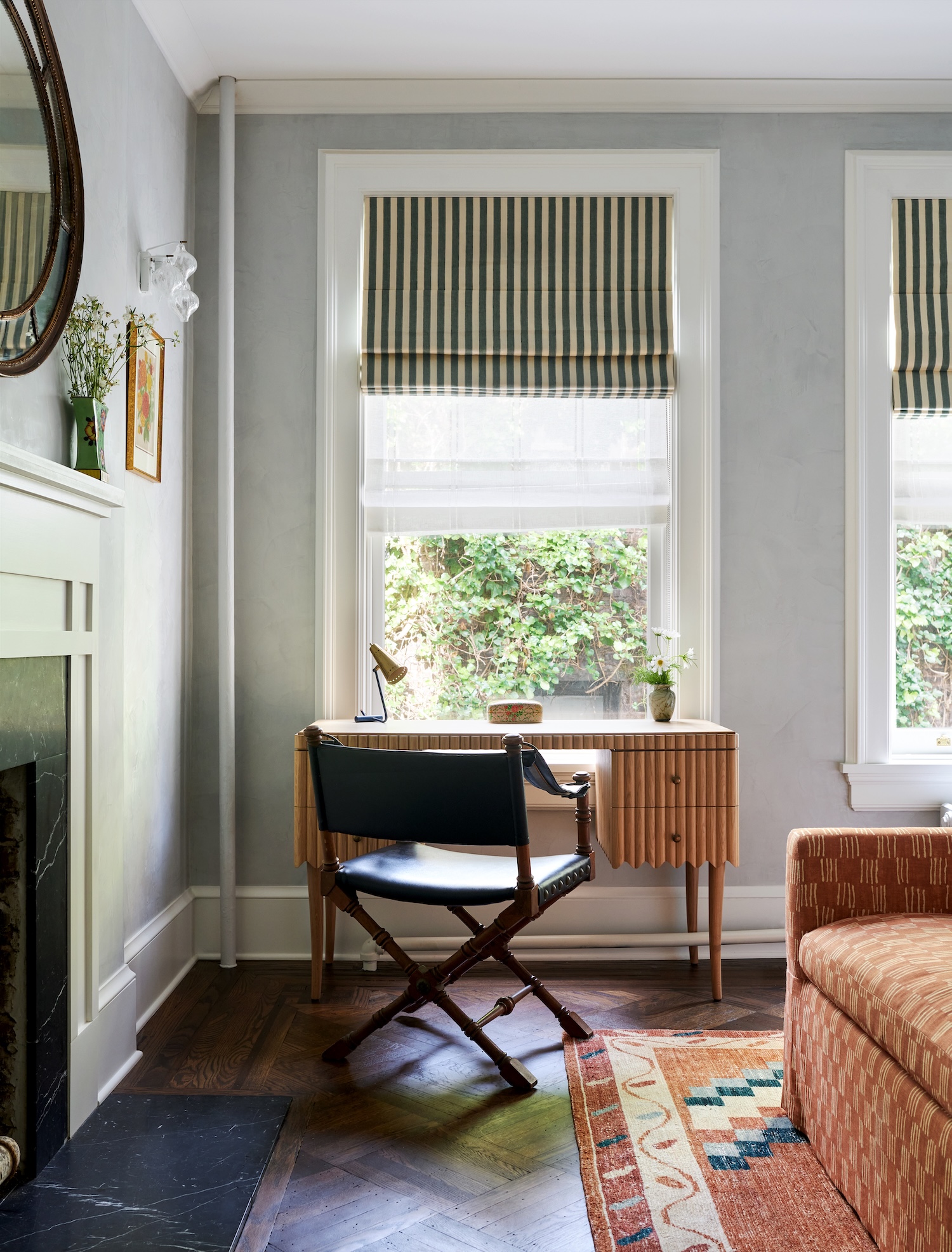
From the beginning, we were careful not to make the furniture and finishes feel too serious. The architecture already carries a lot of formality, and while it was important to respect that, the home needed to feel relevant and livable for a young couple. We custom-designed most of the furniture and sourced largely vintage lighting to create a collected, layered feel. When designing custom pieces, we intentionally embraced finishes that felt worn and imperfect. We worked with a furniture maker in the UK who creates new pieces that appear aged, using patinated metals and intentionally distressed wood so everything feels as though it has always been there.
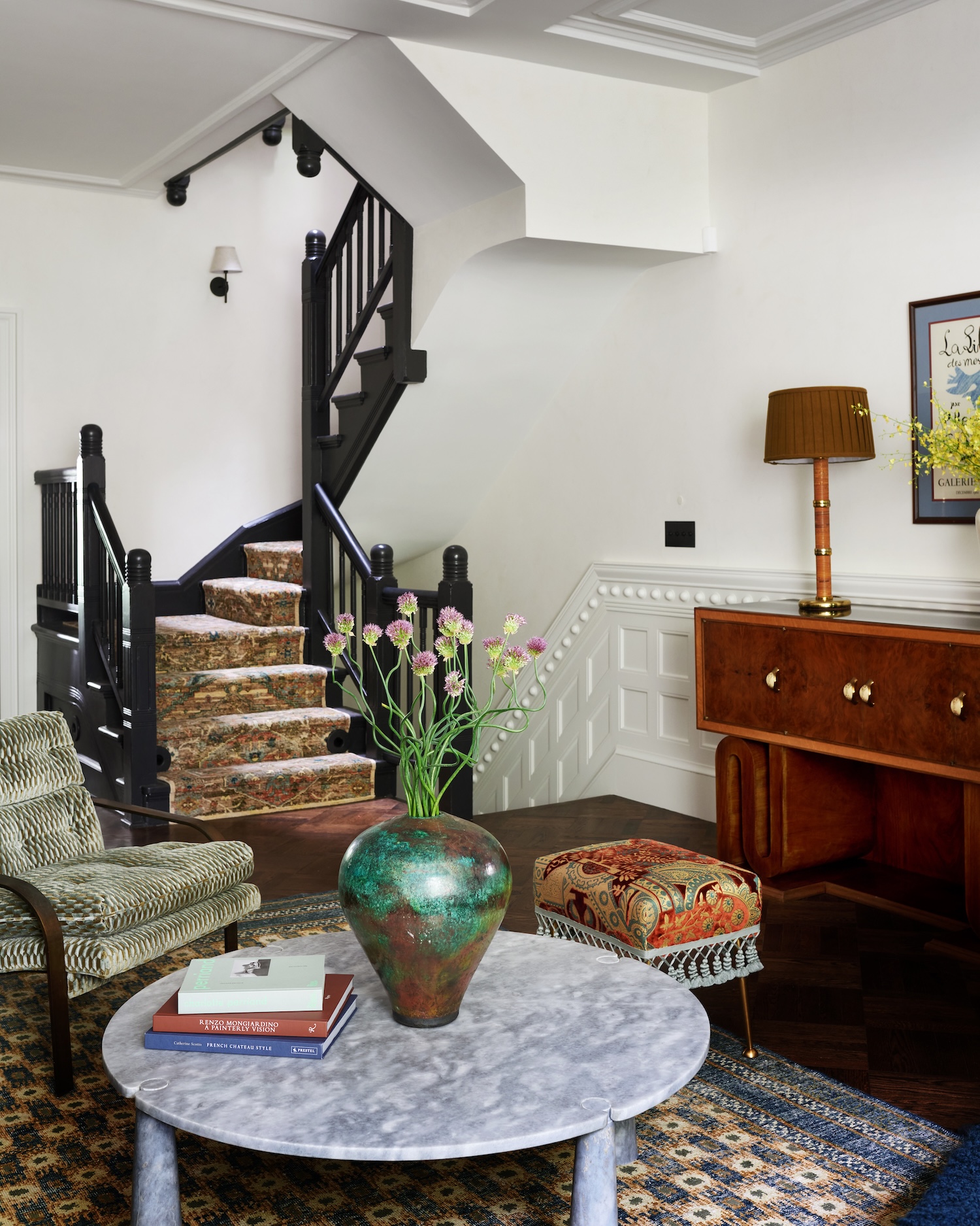
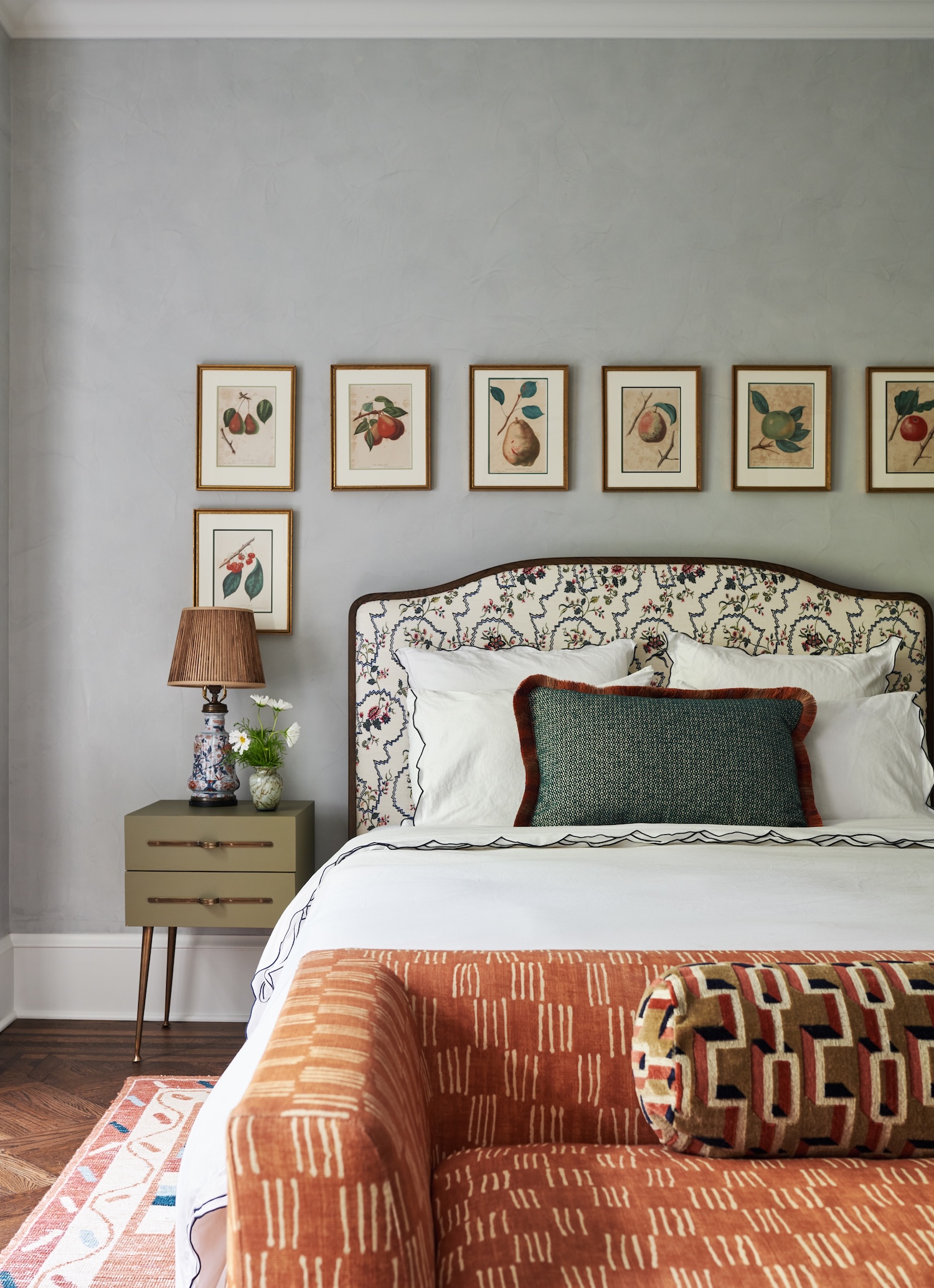
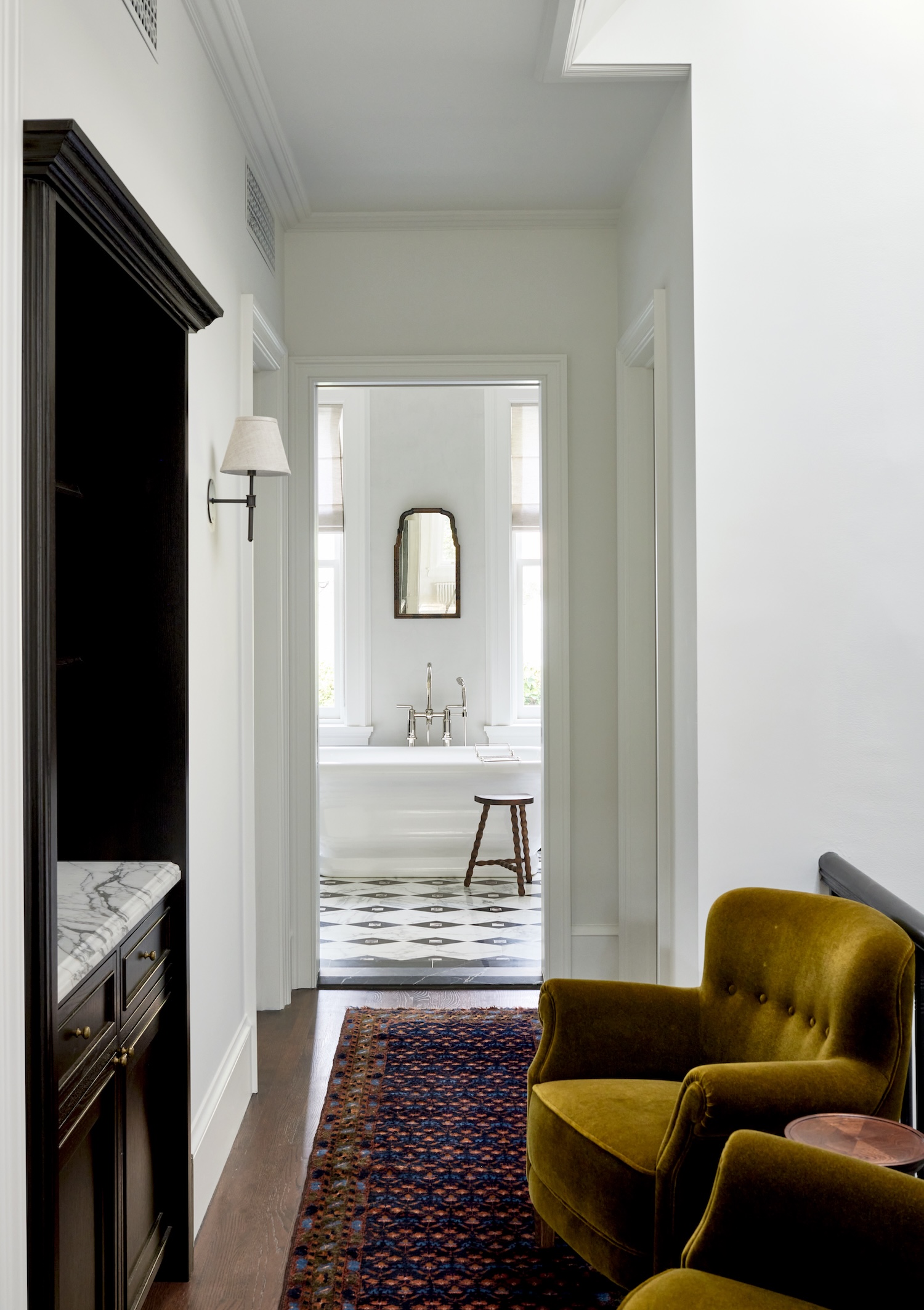
We also designed nearly all of the rugs in the house, with the exception of the antique runner leading into the primary bathroom. Given the narrow proportions typical of townhouses, custom sizing and patterning felt essential. We drew inspiration from period textiles and rugs, using them to bring warmth and life to each space, and selected wool colors that tie back to the furnishings and fabrics in each room.
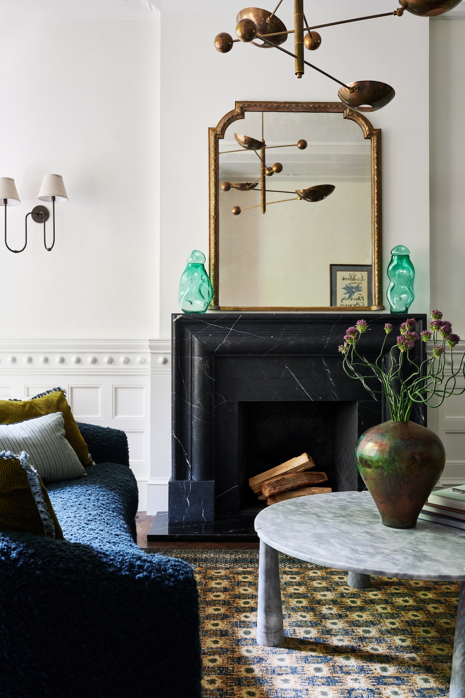
A detail we loved was a traditional paneled wall design with an unexpected round medallion near the chair rail molding. It felt quirky and playful, something we hadn’t seen before, and it allowed us to inject a sense of lightness into what might otherwise be a very formal living room.
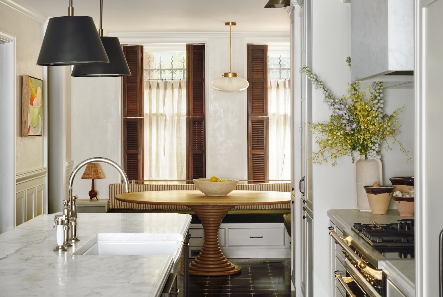
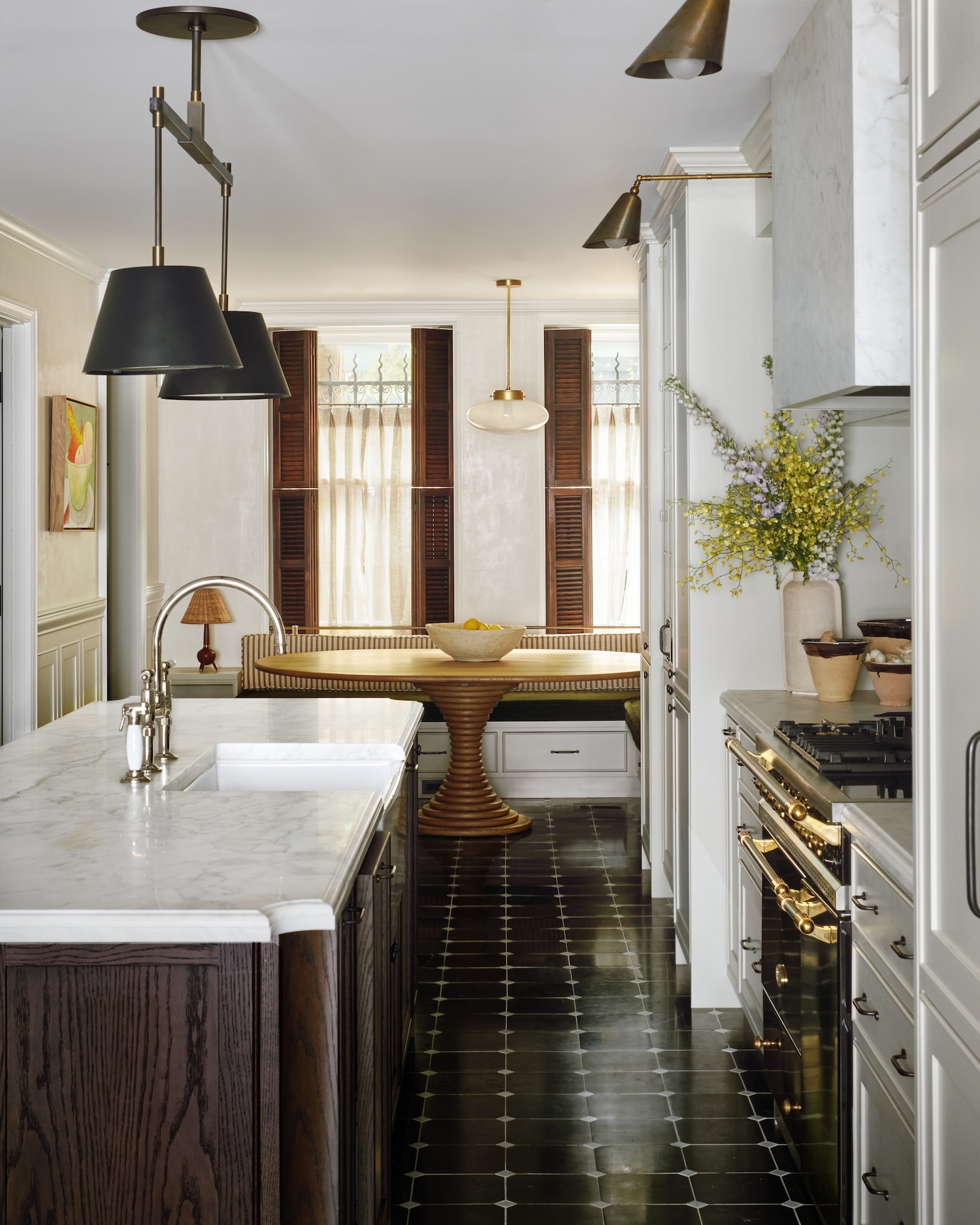
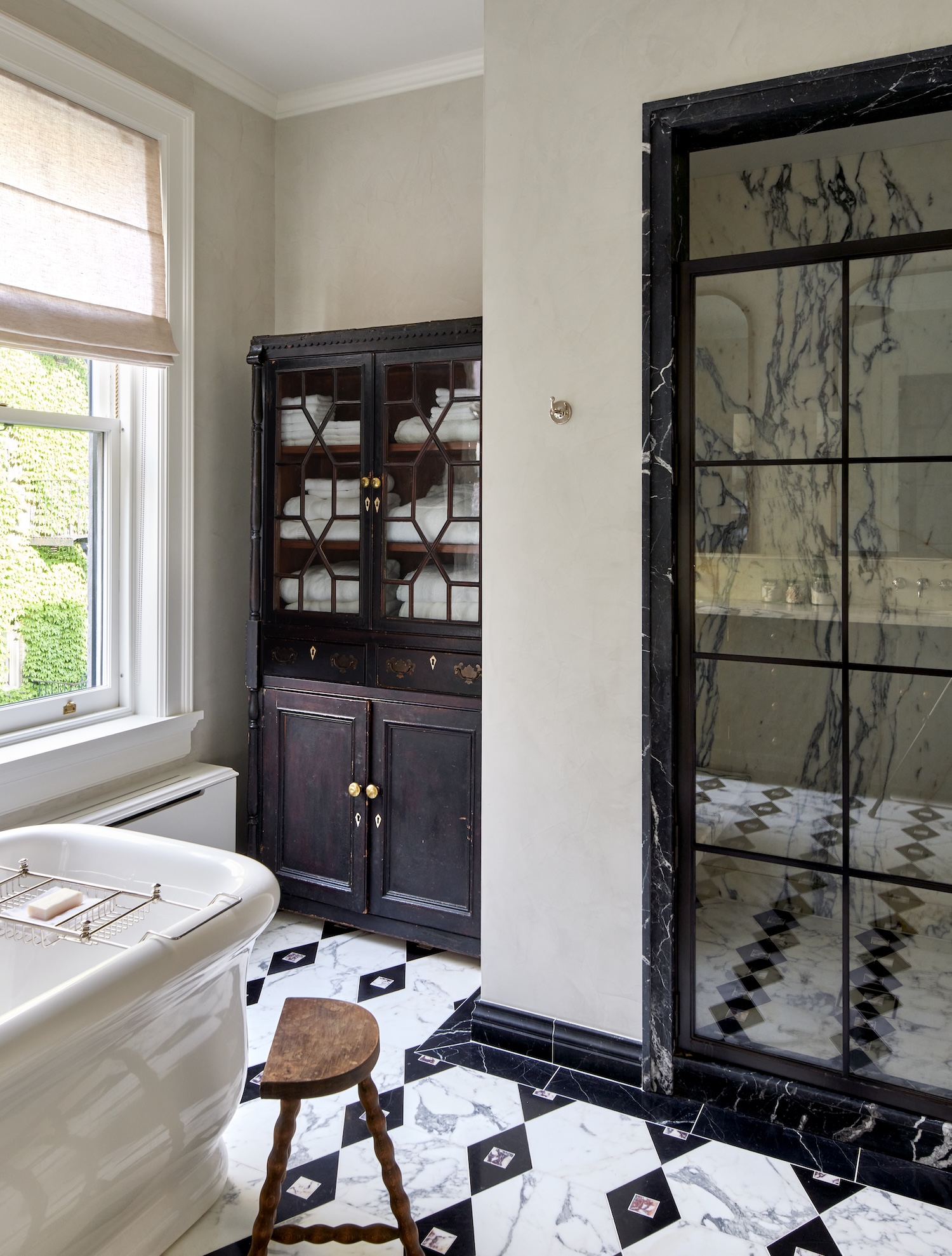
Antiques played an important role throughout the house, helping to ground the interiors in history. In the dining room, we sourced a 1950s English oak bookshelf whose beautifully patinated, ebonized finish echoes the Nero Marquina marble floor tiles in the adjacent kitchen. In the primary bathroom, an 1820s Irish bookshelf was repurposed as a linen cabinet.
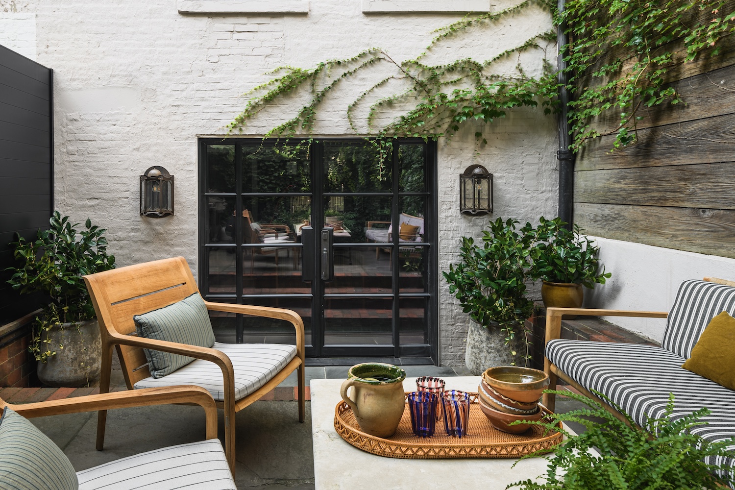
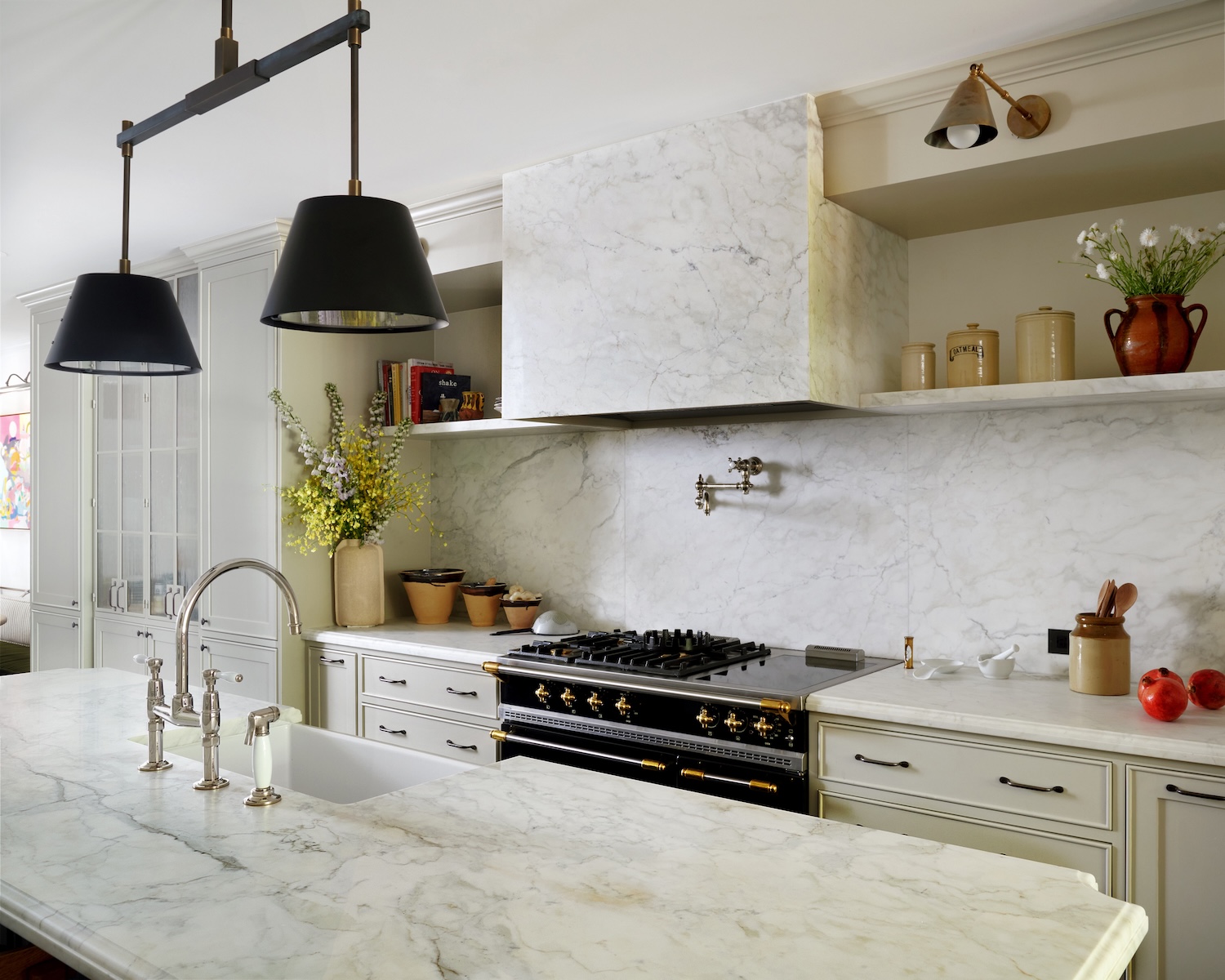
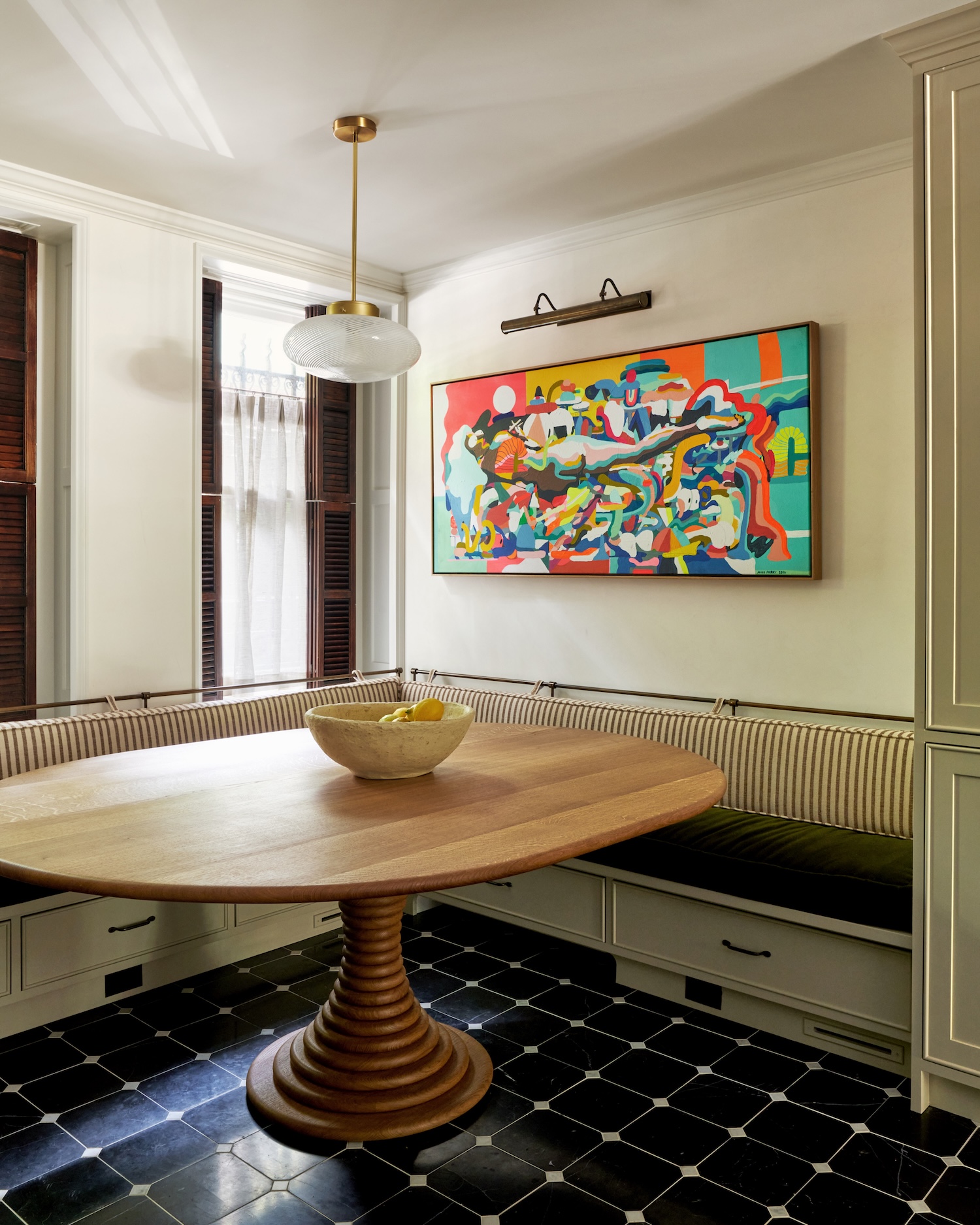
On the garden level, the kitchen and dining rooms are now filled with light thanks to new metal-and-glass patio doors and color-adjustable Ketra lighting.
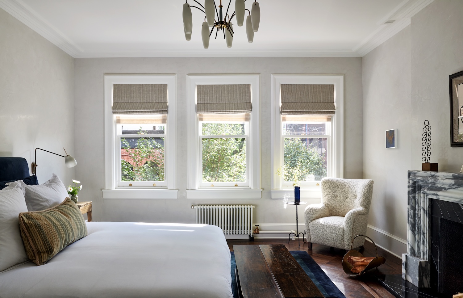
At the top of the house, the primary suite unfolds beneath a large stair skylight. A freestanding tub anchors one end of the floor, while a custom fireplace made of honed Nero Marquina marble defines the bedroom at the other. Working with the architects, we reconfigured the floor plans throughout the house, most notably on the garden level and the top floor. One small but meaningful request from the clients was to have a coffee station on the upper level near the primary bedroom so they wouldn’t have to travel all the way downstairs in the morning.
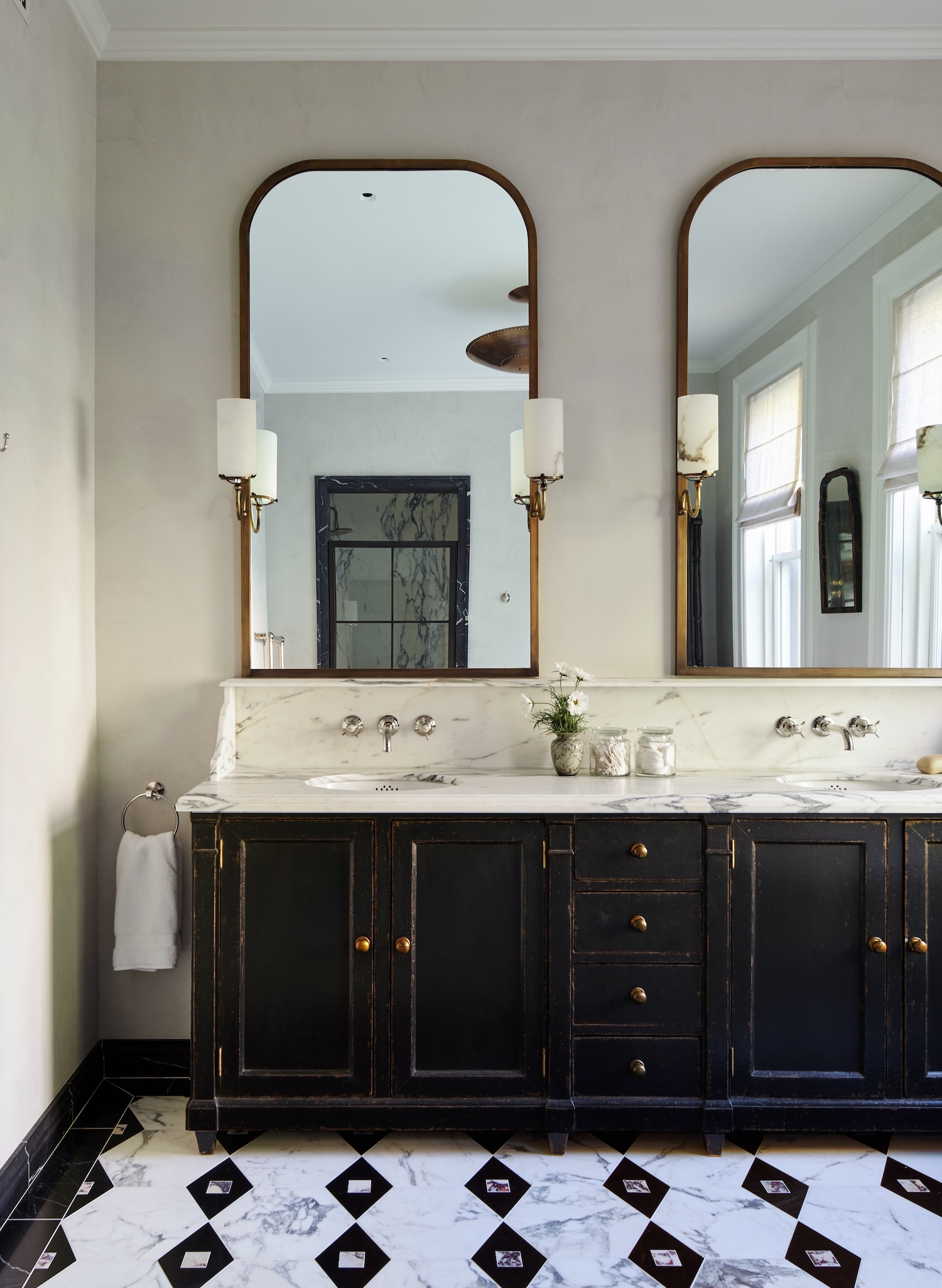
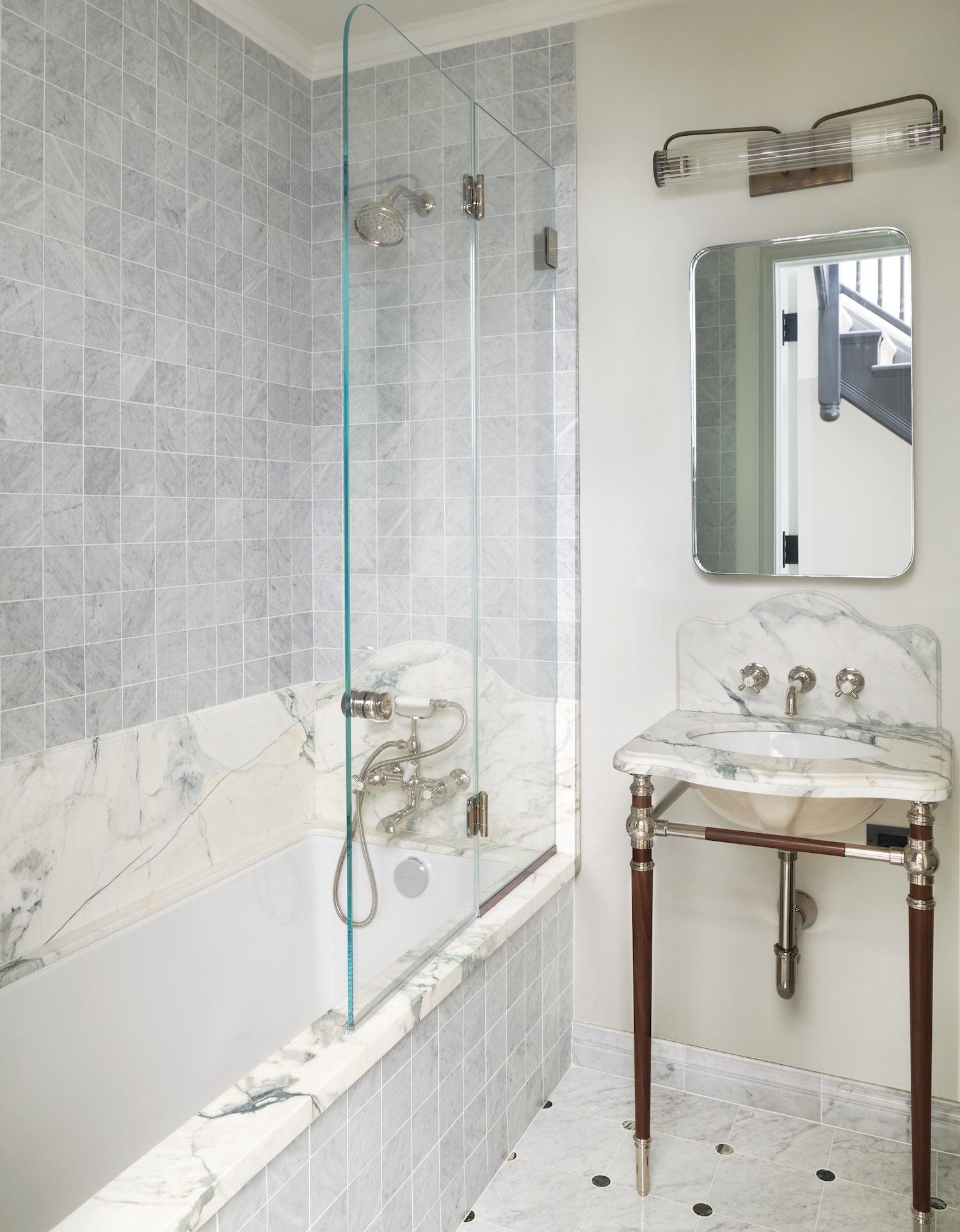
The primary bathroom vanity was designed with a worn, ebonized oak finish, paired with Arabescato Corchia marble used throughout the bathroom, from the countertop to the shower walls, to create cohesion.
Discover the talent behind the story… Interior Design: Ward + Gray · Interior Photography: Kelly Marshall · Exterior & Garden Photography: Alan Tansey · Architect: Shadow Architects · GC/Builder: Green Conversions, Inc.


