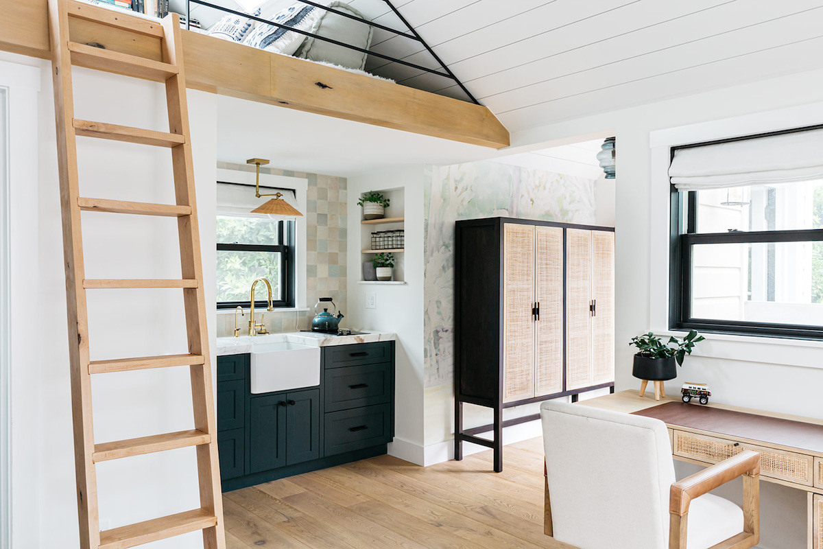
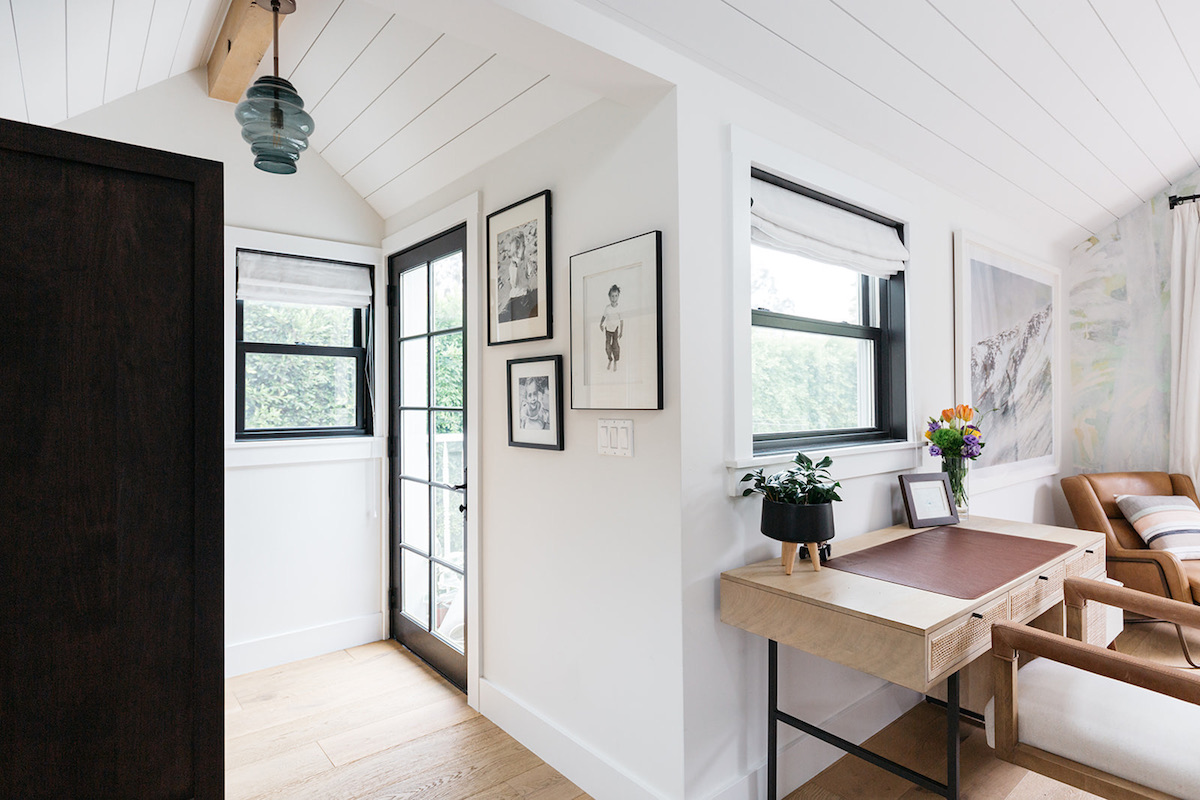
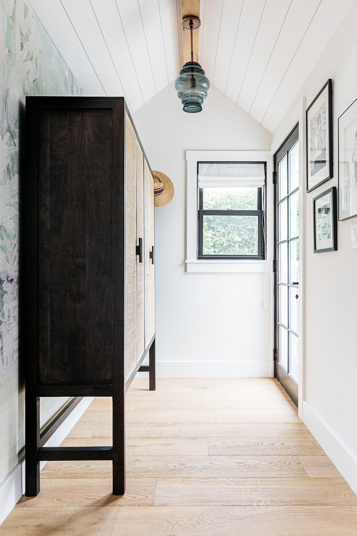
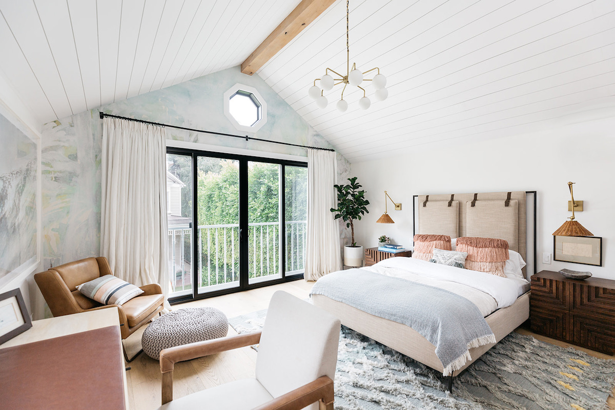
When Courtney Bates Design set out to remodel this ‘bonus’ home, she knew they’d be short on space, but big on design. The homeowners wanted a departure from their traditional Victorian, so this serene hideout on the property became an expression of the modern and beachy vibes they yearned for. Take a scroll through the beautiful photos by Christopher Lee to see how Courtney expertly used every inch of space to give them this dreamy escape.
A scroll through your Insta showcases an eclectic mix of family pics, fine art, architecture, and even some Star Wars. How does your life inspire your designs?
Friends have always enlisted me to figure out their homes. I have a natural sense for space planning, CAD ability, and no shortage of strong opinions. A close friend encouraged me to pursue design professionally, but at the time it seemed unattainable, reserved for more impressive people who started earlier. Sometimes it just takes another voice to say ‘you can do this.’ I think about this pep talk all the time. It completely changed my trajectory.
Can you share a bit about your desire to become a designer and the journey that got you to where you are today?
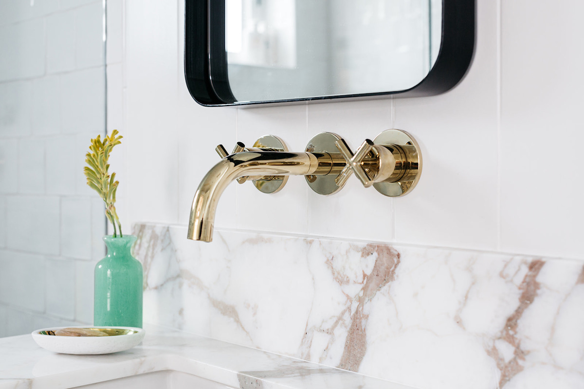
My favorite thing to do is wander around European cities and marvel at the architecture. I’ll often quote Carmella Soprano, “Who could have built this?” I’m fascinated by things done the old way. My iPhoto library is full of shots of ancient tile work and old plumbing fixtures. Whenever I’m traveling, I make sure to book dinner in the oldest restaurant in town. The ambiance never disappoints.
How would you describe your design style? If we were to tour all of your homes what common thread would hold them all together?
My design style is warm and thoughtful. The key factor in all of my projects is scale and proportion. Maybe because I’m a very tall person, I put more of an emphasis on roominess. Every space is planned down to the inch in 3D. This way, I can create a comfortable environment with furniture that is as generous as possible without going over.
You’ve designed for both residential and commercial spaces. What challenges does a commercial space bring to the table that a residential space doesn’t?
I find commercial spaces enjoyable and significantly easier than residential. Clients seem to hand over the reins more, and trust the designer when it comes to their businesses. The challenge becomes pleasing all of the people who work in the space. I try to get to know the folks who work there, and involve them in the process.
Please tell us about the inspiration for this home’s design. Where did you begin?
My clients are writers that wanted a serene hideout on their property to escape family life and write their television scripts. They wanted a break from the traditional look of their main house which is a spectacular victorian. I took a cue from the playful decor in the main house, and also considered the proximity to the beach.
This home features many pastel hues that feel modern and fresh. Can you share how you decided on this palette?
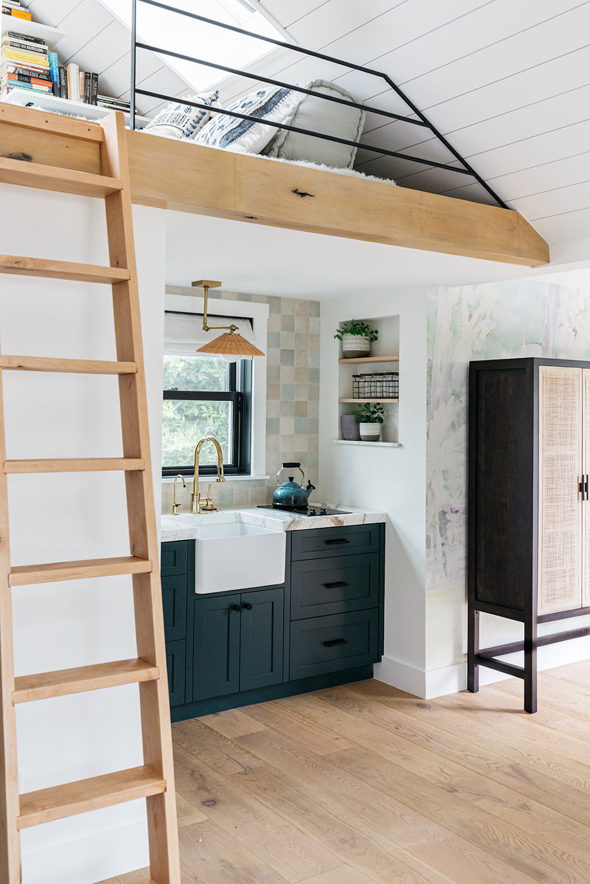
When I joined the project, there was one finish my client had already decided on–this cool bright green fish scale ‘mermaid’ tile for the bathroom floor. I had just wrapped filming the kitchen for HGTV where (after pushing for a ridiculous amount of color samples) I found the most perfect dark green cabinet color. I suggested warm leather tones to complement the green and it all worked beautifully.
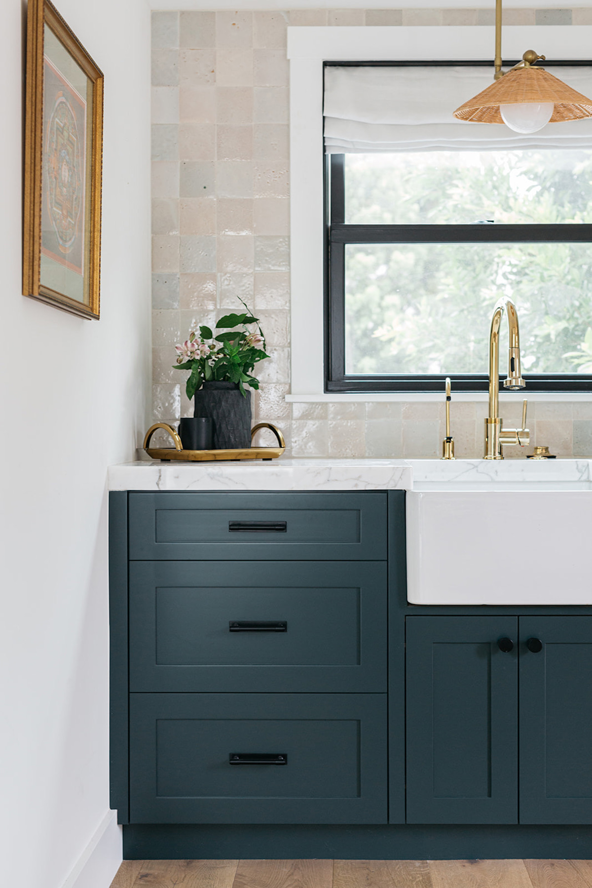
Home redesigns can have their own set of challenges, yet reap the biggest rewards. Were there any hurdles or ‘aha’ moments that helped shape the outcome of this home’s design?
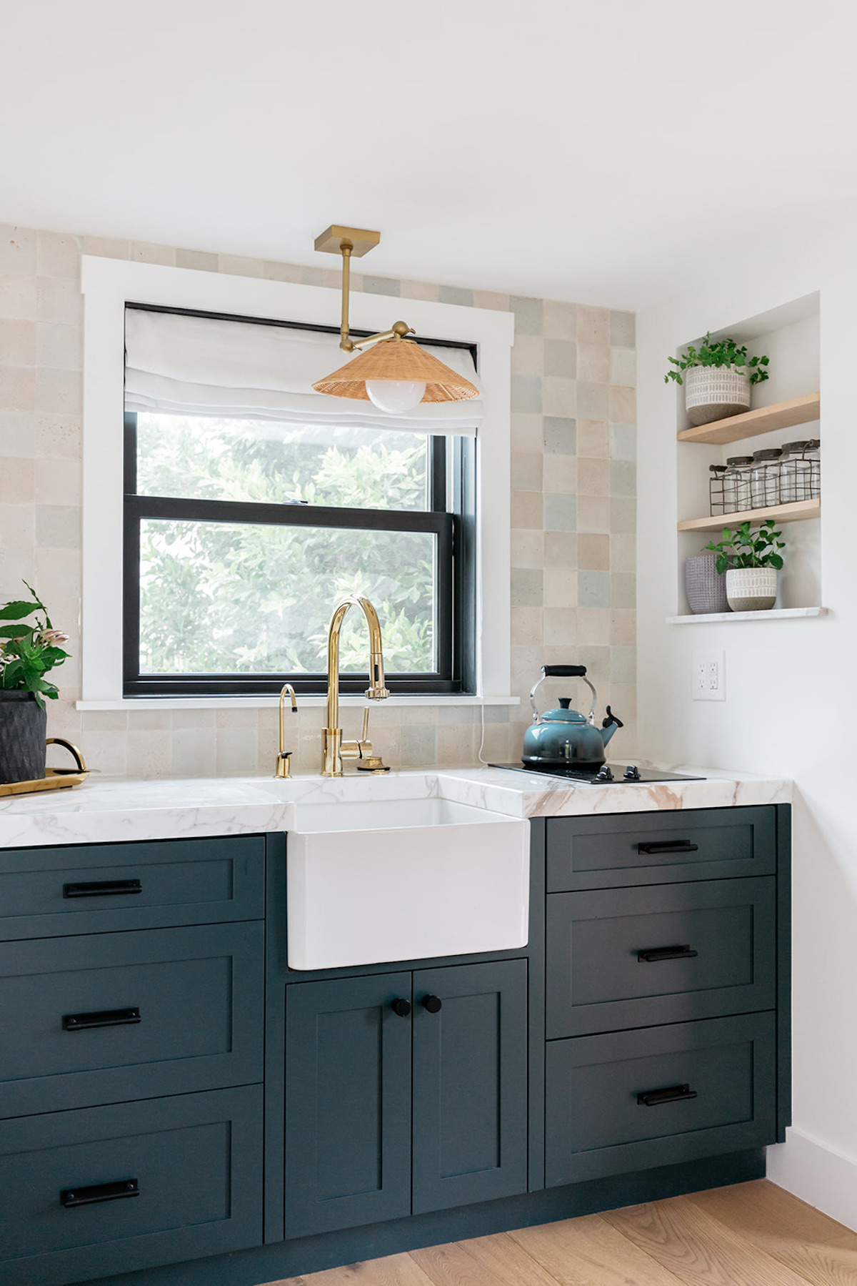
Storage was an issue as there are no closets or room for upper cabinets in the kitchenette. We decided to niche out the wall for some kitchen shelving and add built-in bookcases.
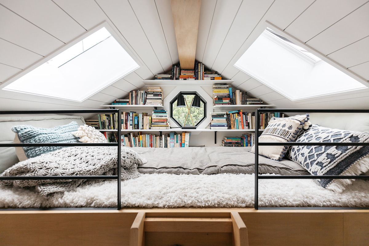
This home looks so cozy, I want to crawl into the book-nook and take a nap. How do you bring the element of comfort into your designs?
Texture does a lot of work. In this case, I bought the fluffiest shag rug I could find and cut it down to fit the nook exactly. I topped it with pillows and a floor cushion for maximum coziness.
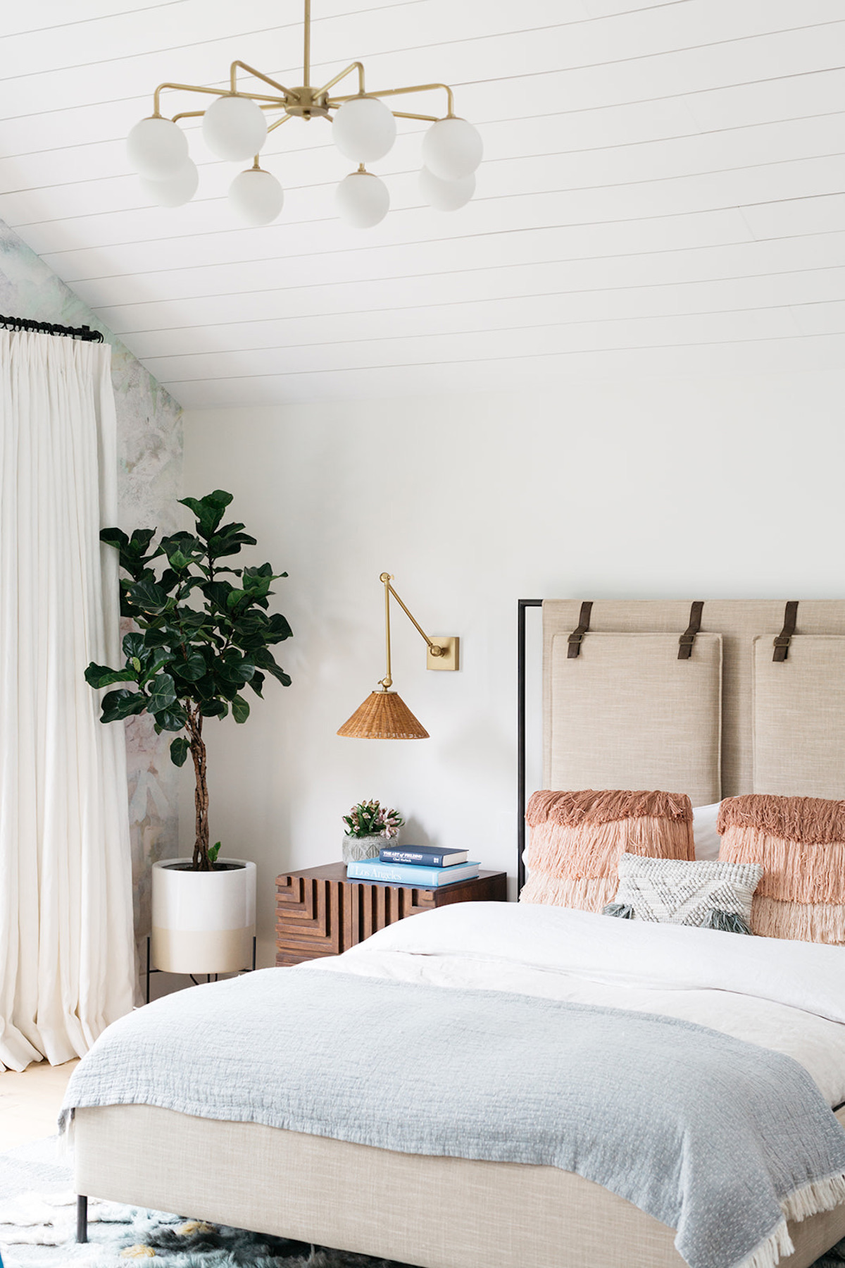
What is one piece/feature that this home wouldn’t be complete without?
I love the sexy ombre fringe pillows on the bed. They represent my client’s effervescent personality perfectly.
Your work has been featured in several publications, as well as on HGTV! What was it like to see your work on television? Can you share some insight into the publication process?
Designing for television is unique because the show airs long after the project is completed. By then, I am seeing my work with fresh eyes right along with the viewer, which feels surreal. The best part is sharing behind the scenes tidbits with my friends and family while watching the show.
It’s not often we meet a designer who does interiors and landscape design! How does the process for each of these compare?
Landscape design offers more flexibility. An outdoor space can become anything–dining, lounging, an outdoor movie theatre, or a bocce ball court. Limitless possibilities. When working inside the home, spaces are usually predesignated for their function.
The past year has challenged many of us to reevaluate what needs our homes meet. What does a well-lived home mean to you?
This past year I have fallen deeply in love with my home. (Stockholm syndrome perhaps?) It has become our gym, our office, our movie theatre, and our favorite bar/restaurant. My husband and I love our outdoor space now, even though we ignored it pre-pandemic. A well-designed home can do that for you. It can rise to the occasion and be everything you need it to be.
Love what you see? Take a peek at the talent behind the story… Interior Design: Courtney Bates Design · Photography: Christopher Lee Foto · Architect: Amelia Stephenson of Kingsley Stephenson Architecture · Shiplap on Ceiling: Timeline Wood · Marble: Walker Zanger · Pillows: Loloi · Lighting: Arteriors · Kitchen Backsplash: Clé Tile