


Sometimes new cabinetry and a fresh coat of paint just won’t do the job. The redesign of this 1920’s home, by Tanya Saban and Mariah O’Brien, required a complete gut down to the studs. What rose from the rubble is a gorgeous home laden with architectural elements and timeless finishes that make this home look as if it was always meant to be this way, and perhaps it was. See how this placid home took shape in the photos below.
From the designer… The house was originally built in the 1920’s and had just two owners in its history. It lacked a strong architectural identity, but there were a few nods toward colonial Spanish design—so we went with that as our jumping-off point. The architectural goal was to create a balance between old world European design elements and materials, against a canvas that was malleable enough to house different styles of interior design.
When we took on this project, we knew immediately it would need to be stripped down to the studs. The infrastructure would not survive a renovation. There were significant problems with the foundation, electrical, plumbing, termites and mold to name a few. This is a designer’s dream (when there aren’t architectural or historical details to preserve, of course) because you really get to start from scratch without dealing with the permitting process of a ground-up. Like I said, the house didn’t have a distinct identity, so it didn’t pang my heart to demo it to near completion.
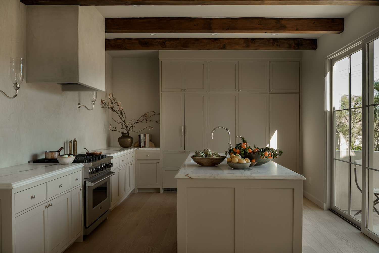
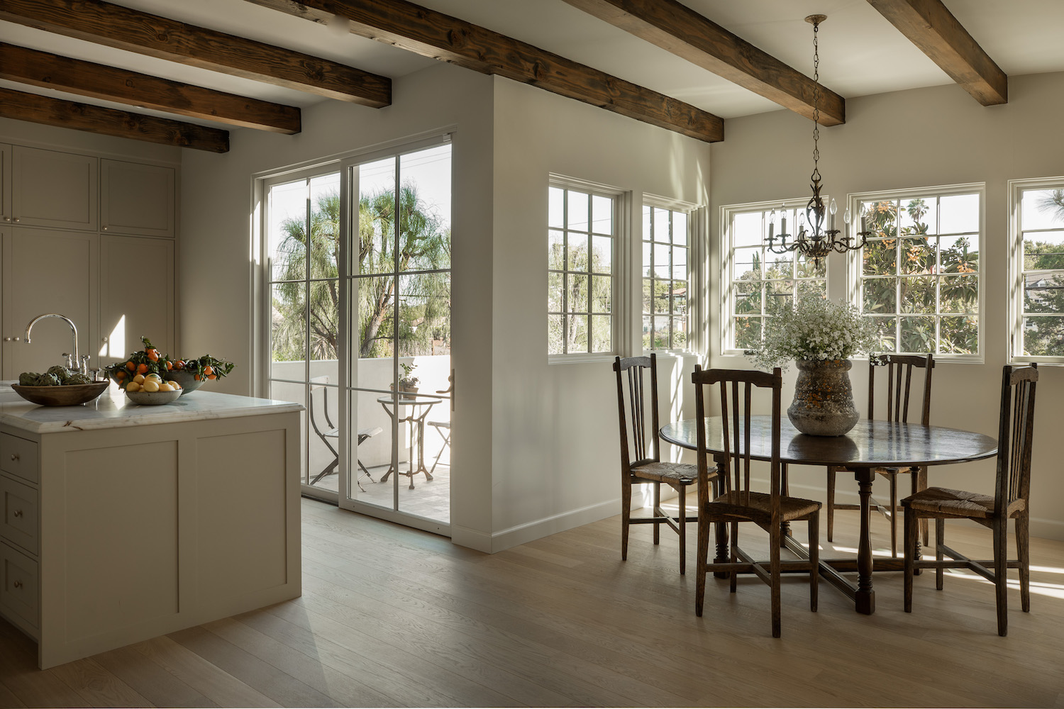
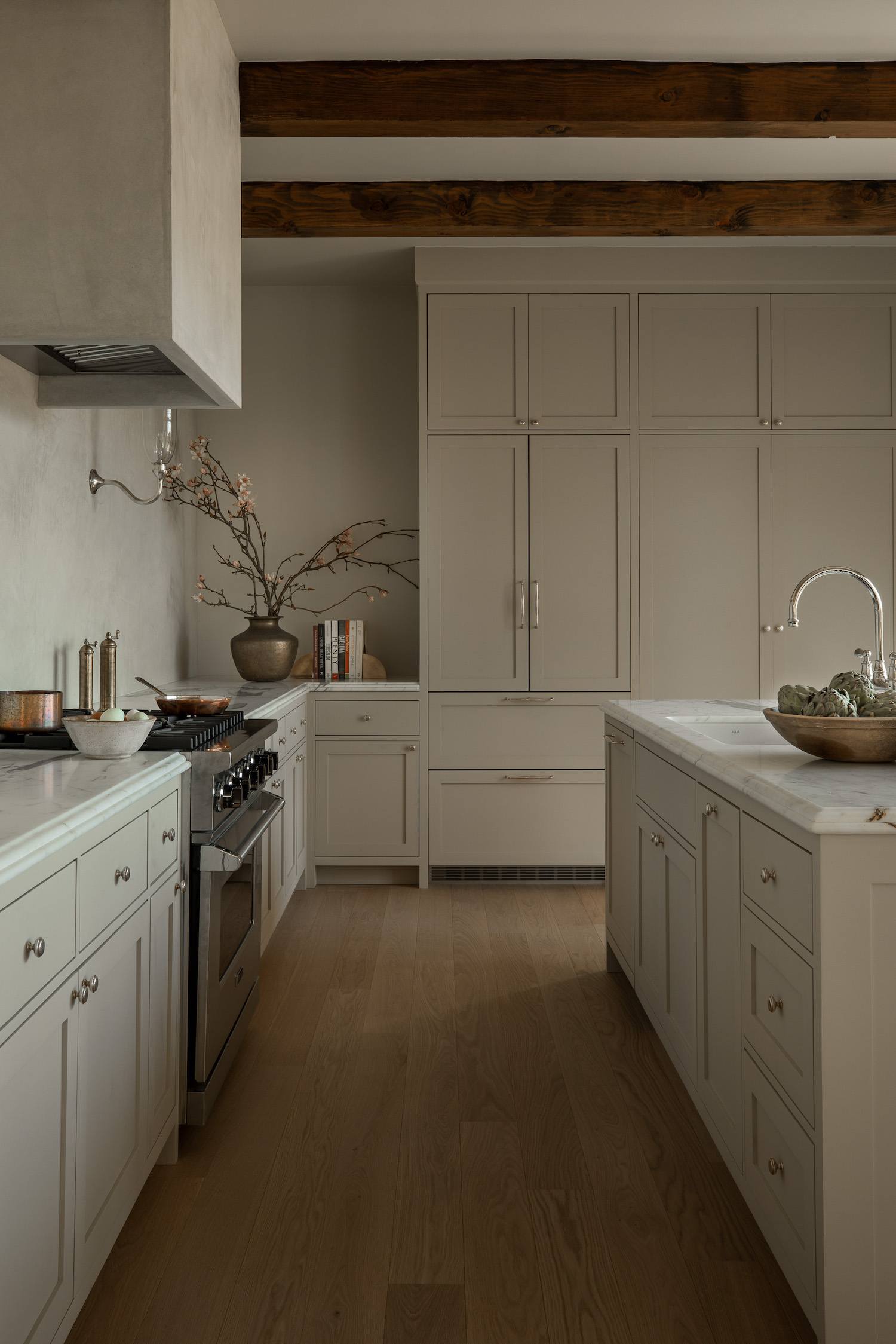
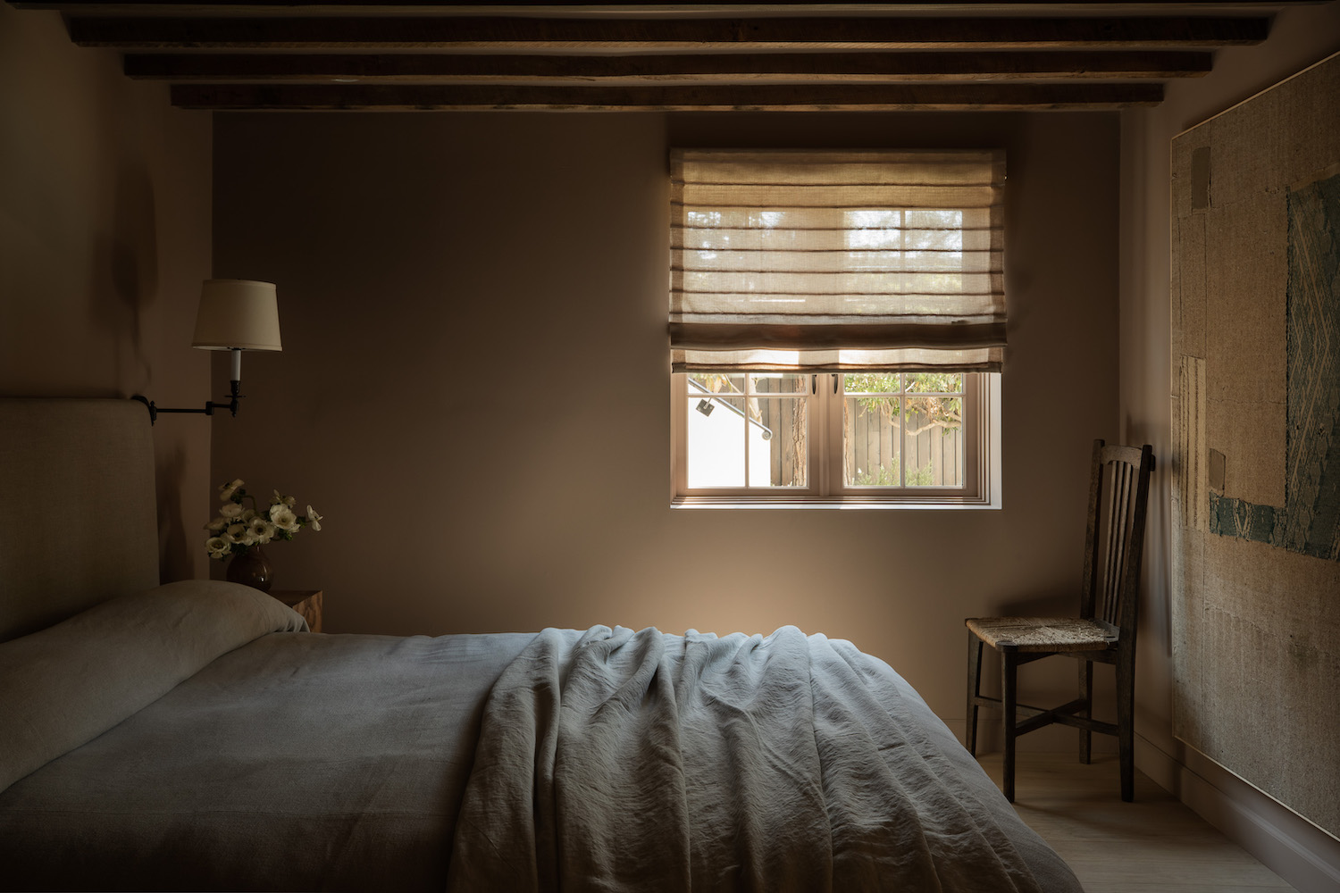
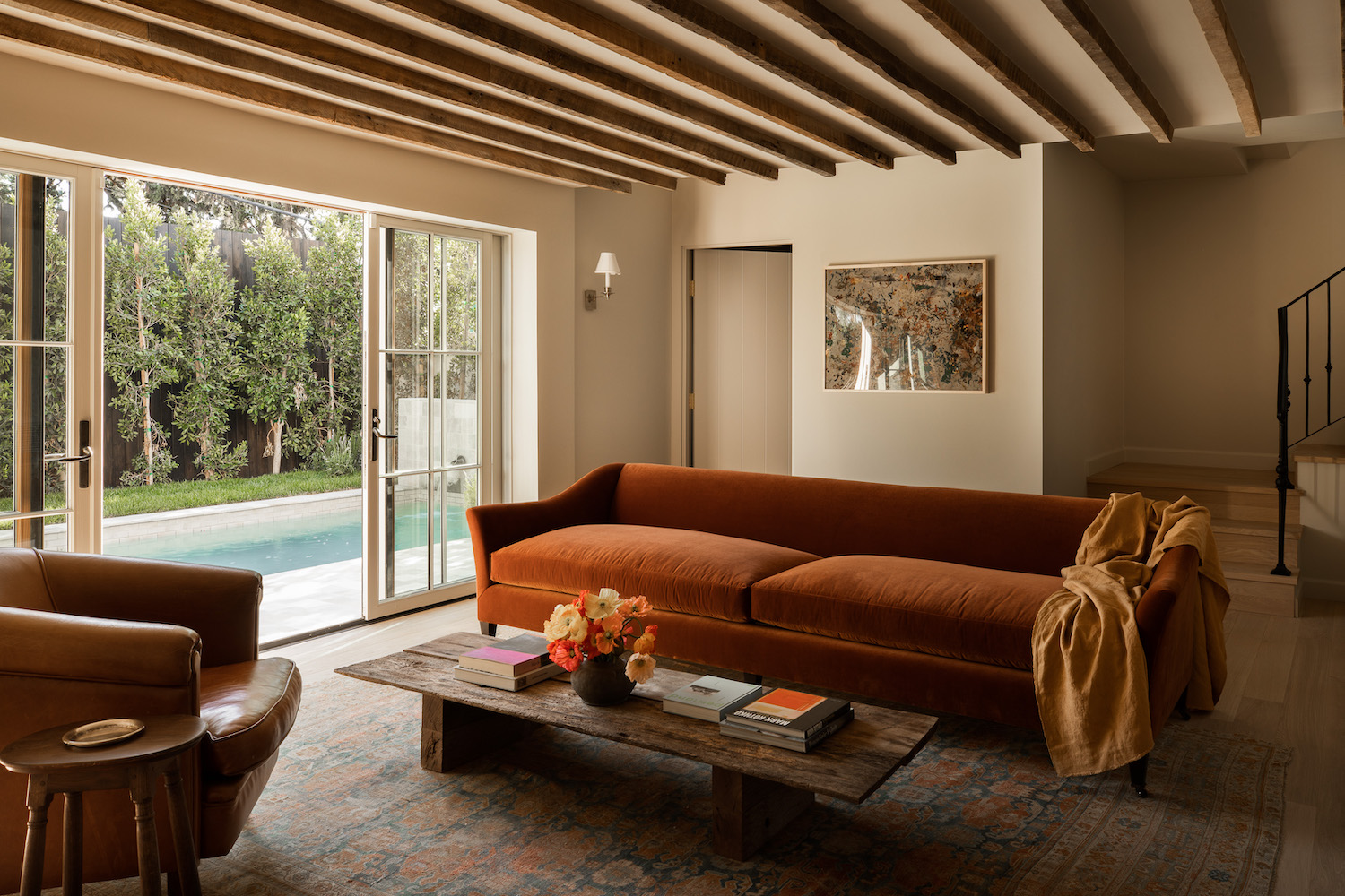
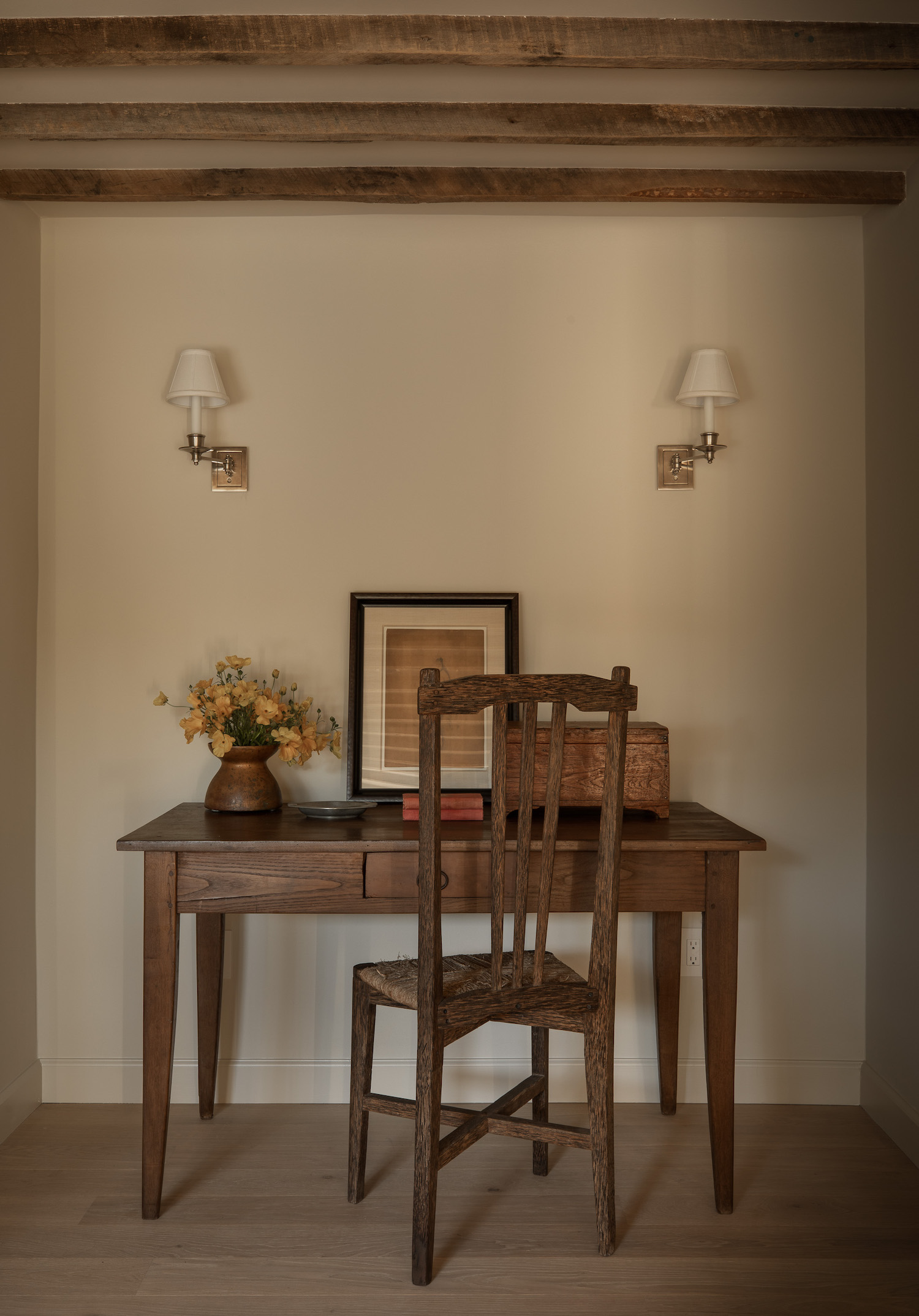
We did a structural addition to create the primary suite, enclosed a patio for the dining space, moved the kitchen entirely, and sat in limbo for 14 months in our fight to legalize an existing basement that would increase the square footage of the house significantly. In the end, it was a photocopy of a tax assessor’s inspection from 1930 that saved the day and allowed us to include the basement as what is now the second floor of the home. This was undoubtedly the most challenging aspect of this project, but well worth the wait. We added a staircase to connect the two floors and the second story now holds an additional guest room, bathroom, and den that leads out to the pool area. The ceiling height did not meet the minimum code requirement, so we trenched down into the foundation—another major permitting hurdle—to gain some height. It still felt a bit cavernous, so we decided to lean in and add reclaimed wood beams to the ceiling. We picked each of them out by hand and had our millworker slice them in half, so they didn’t take up too much vertical space. Best decision I’ve ever made. I will forever add wood beams in low-slung rooms. It makes the height feel intentional somehow.
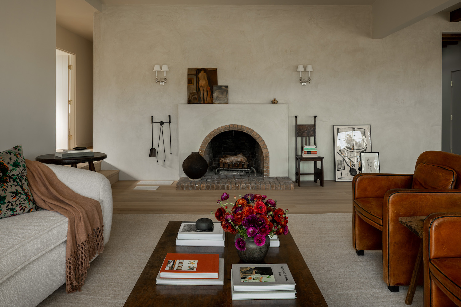
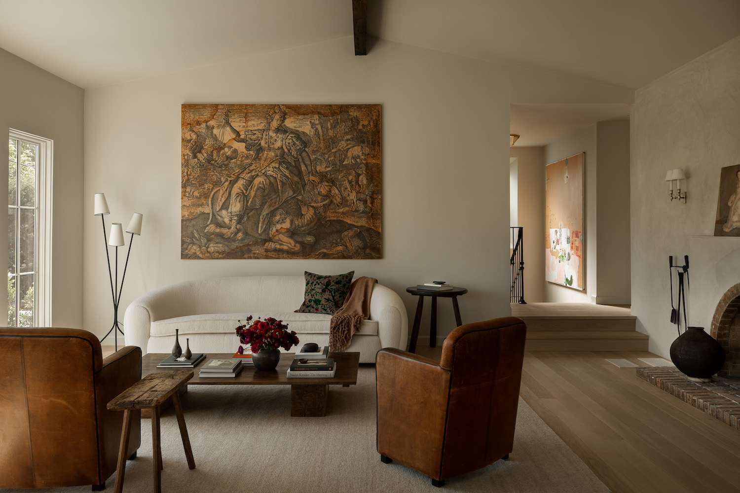
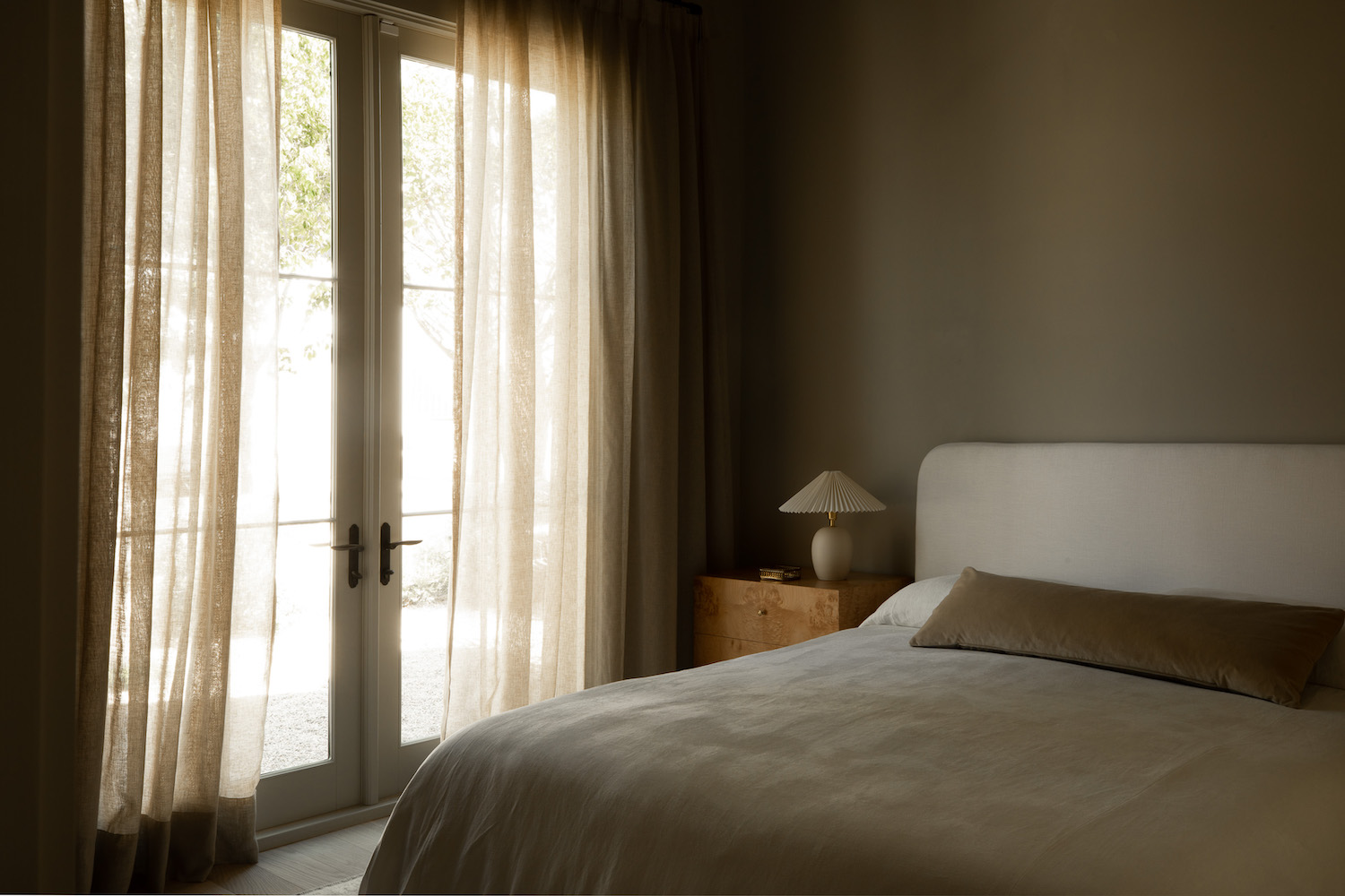
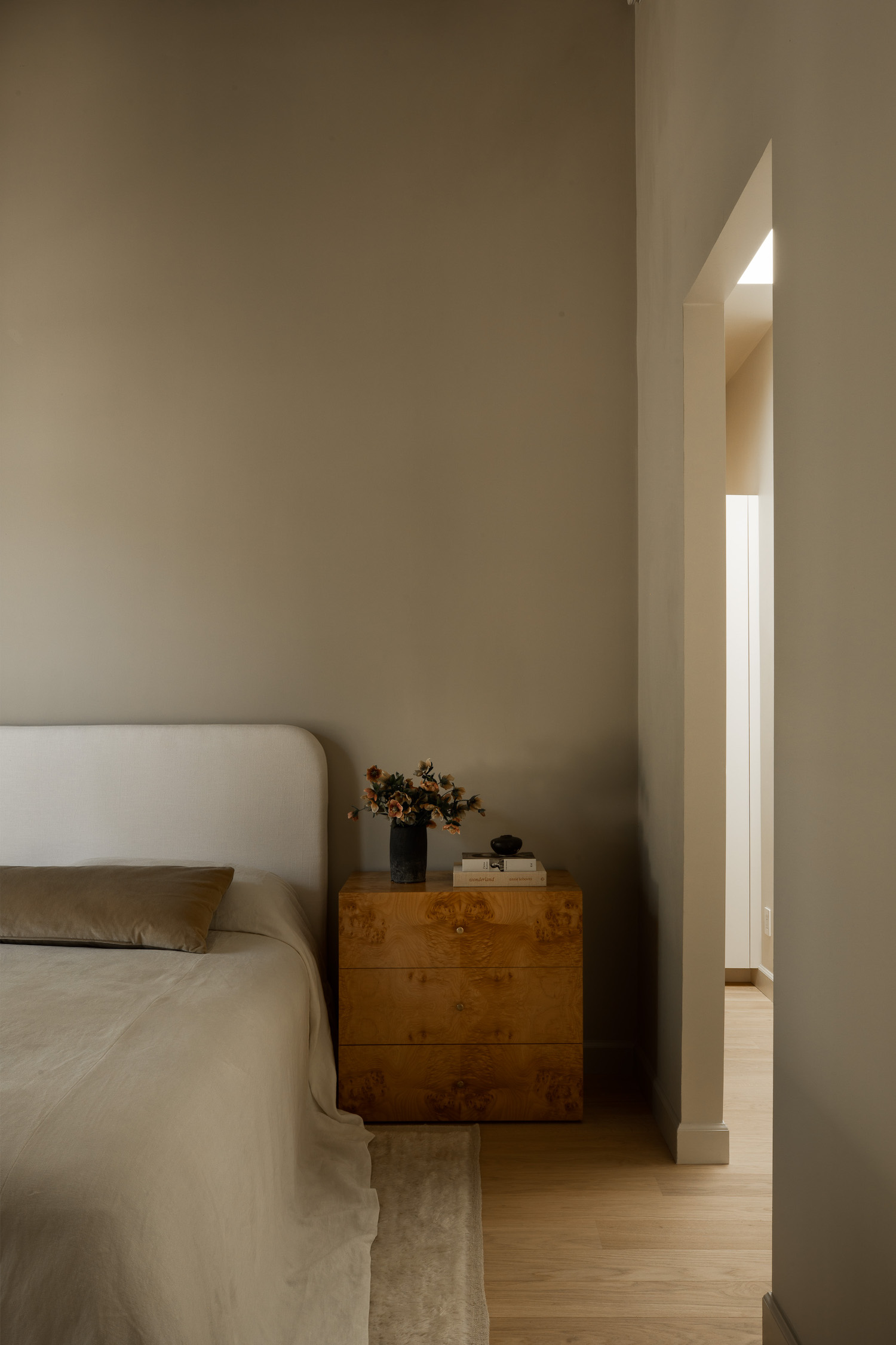
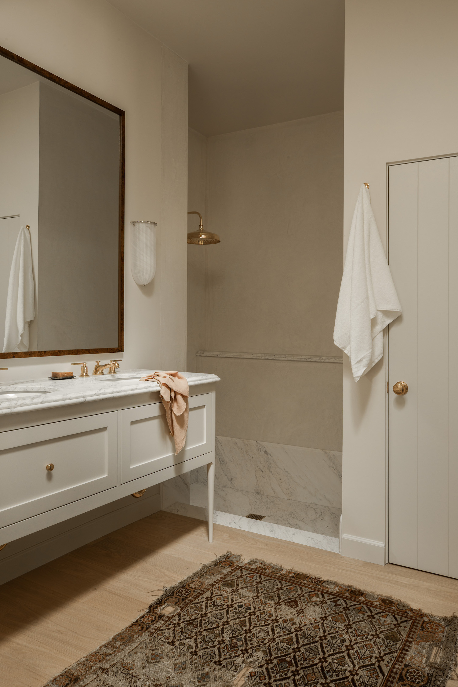
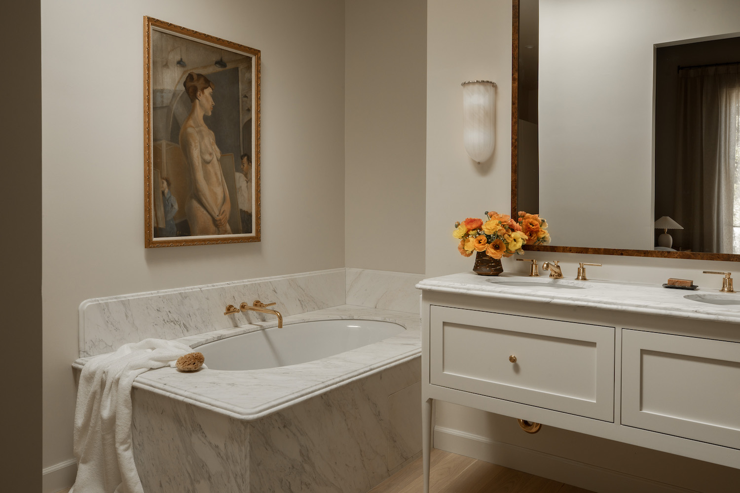
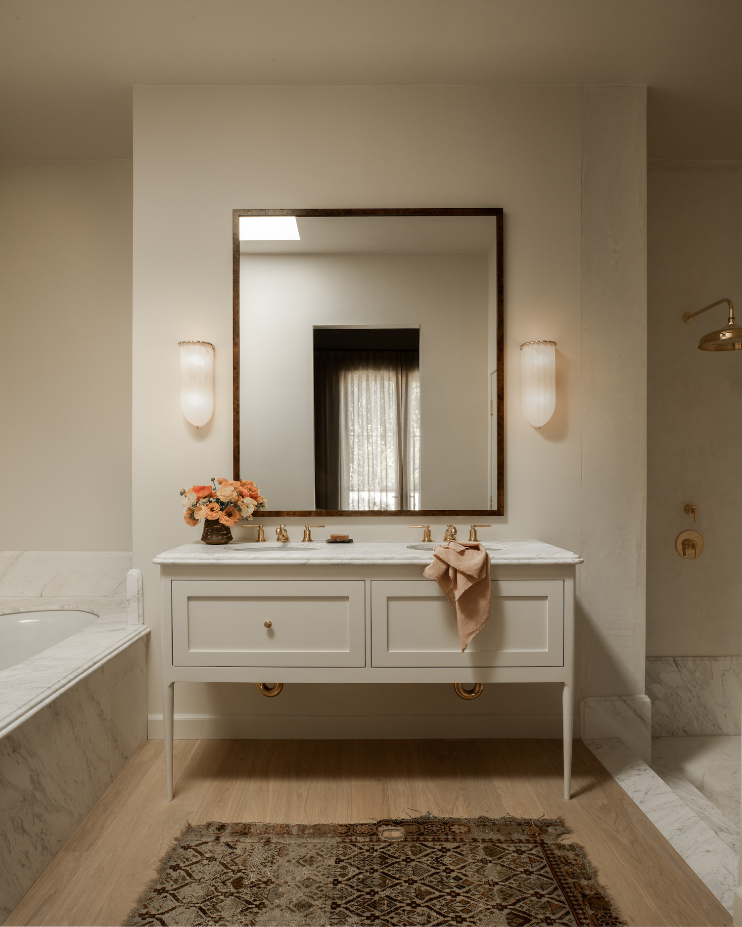
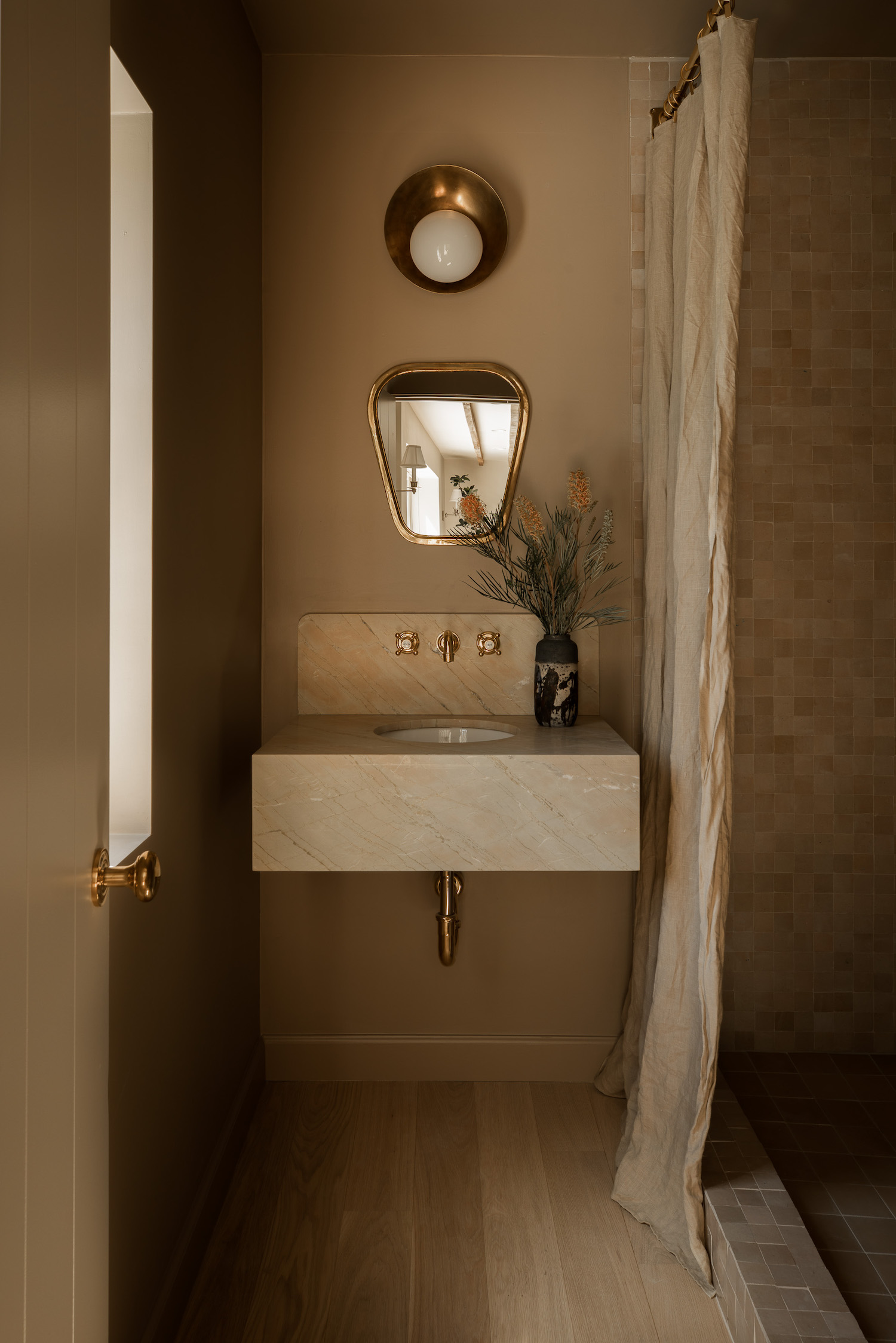
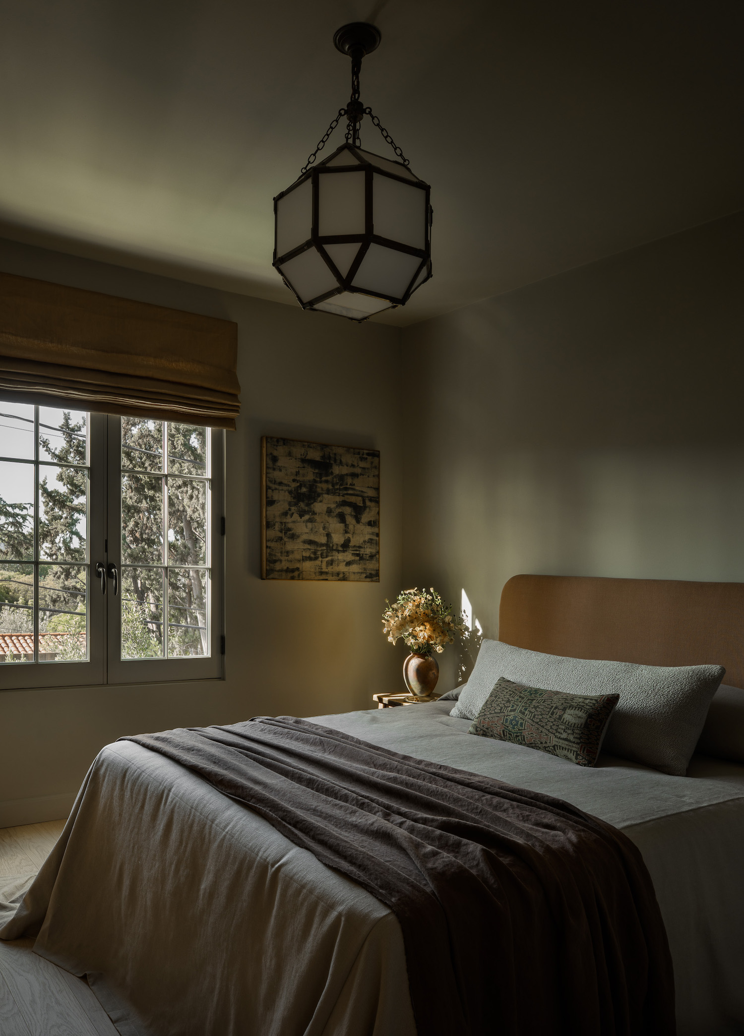
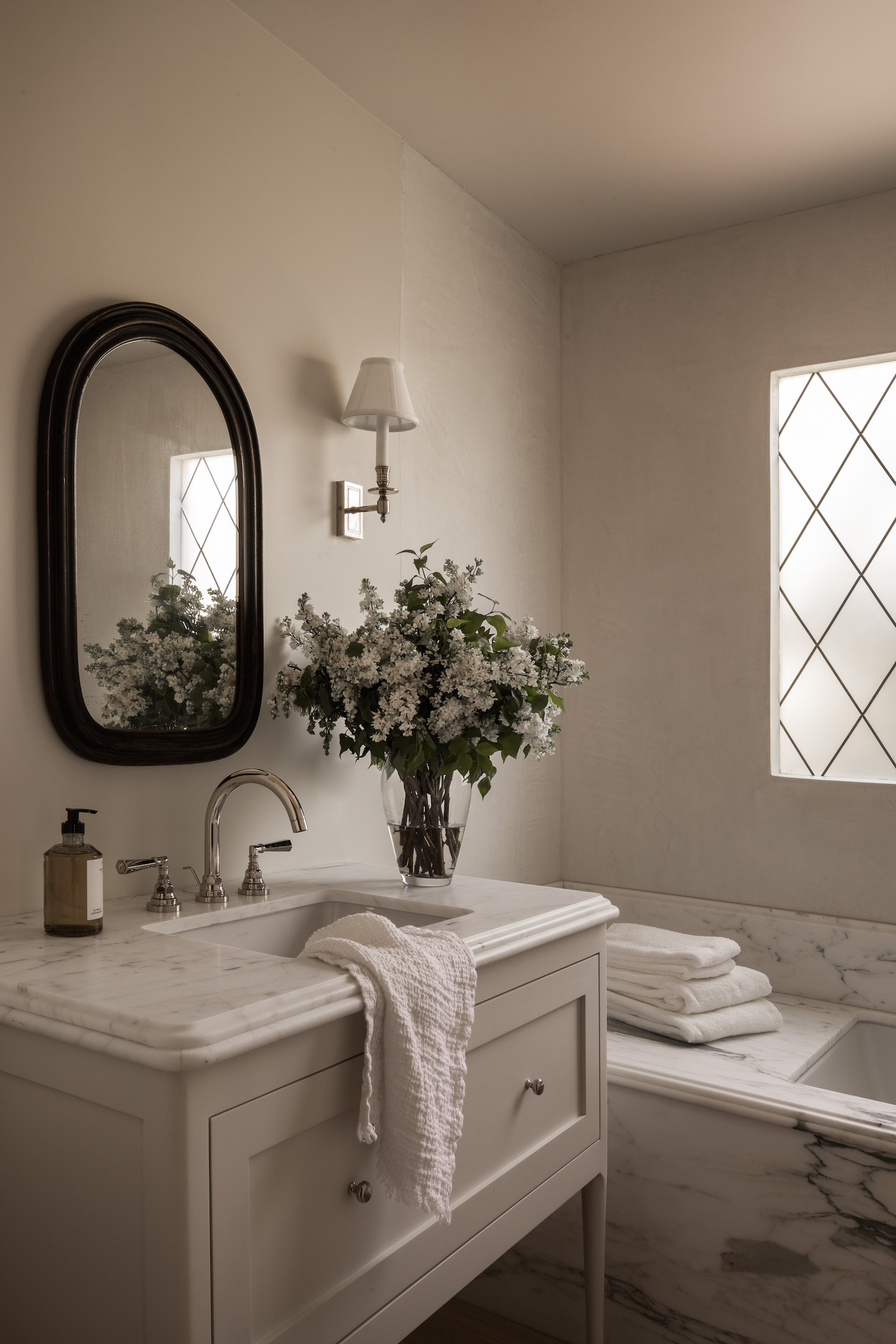
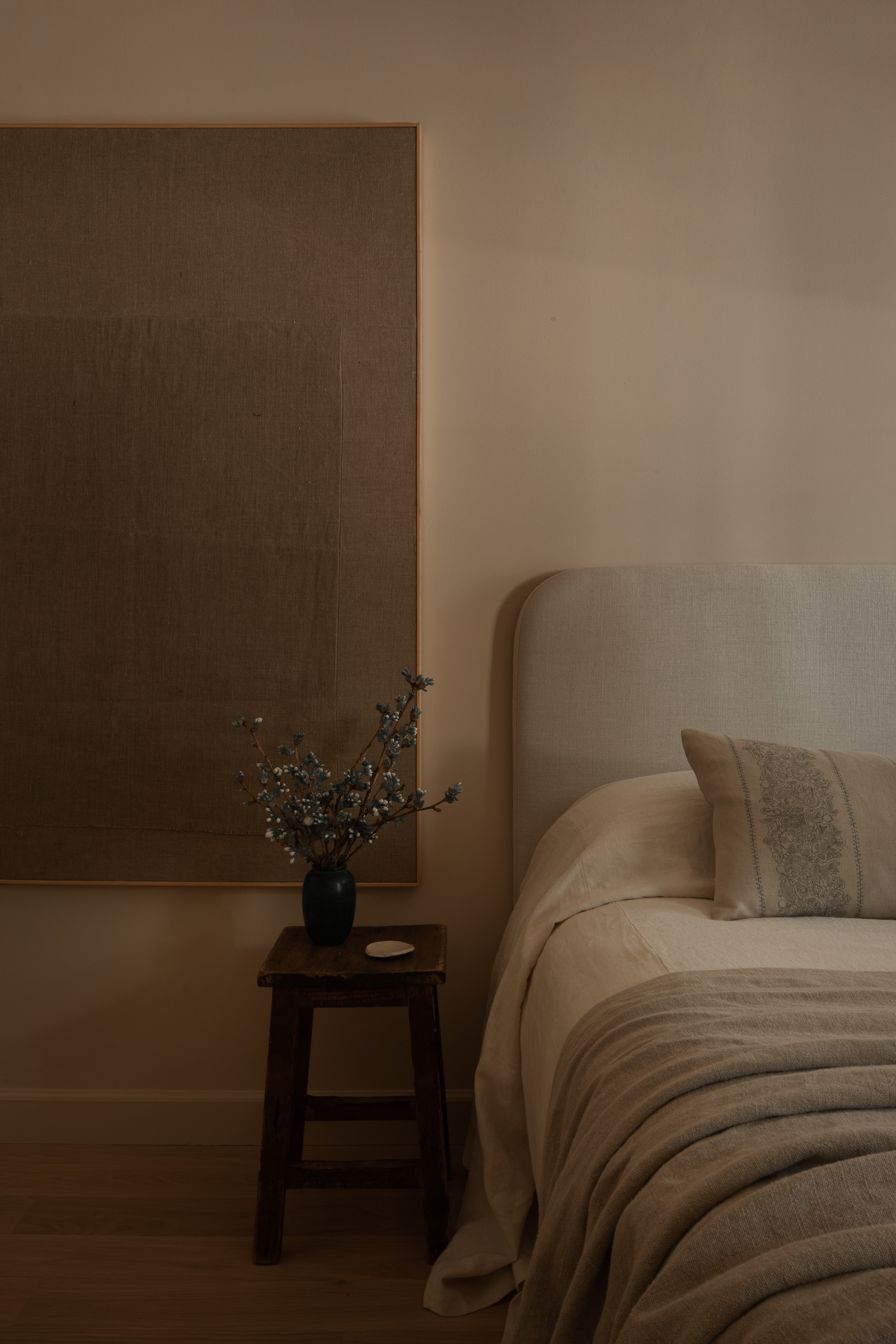
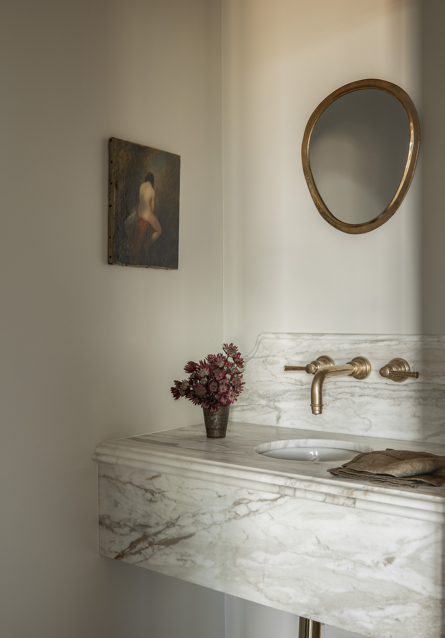
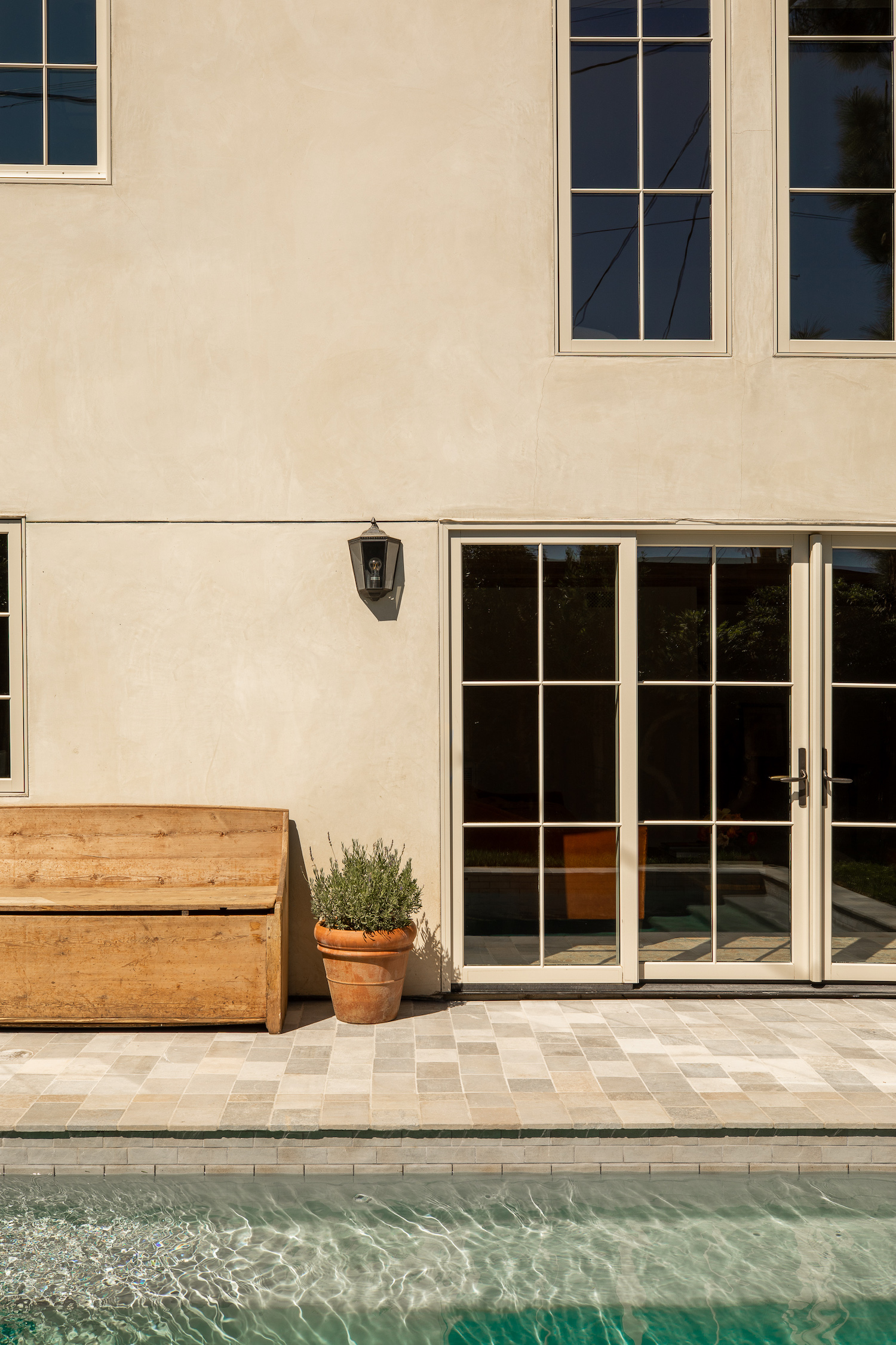
I would say the second most challenging thing for us as designers, was to create an aged feel in what was ostensibly a brand new, modern home. For this, we brought in a lot of wood beams, ogee edge details on all but one of the marble slabs, unlacquered finishes on all hardware and plumbing, tumbled stone pavers, mineral paints, plastered walls, leaded windows, and we ran the wood flooring into every bathroom—a choice many designers make, but one that usually gets a lot of pushback.
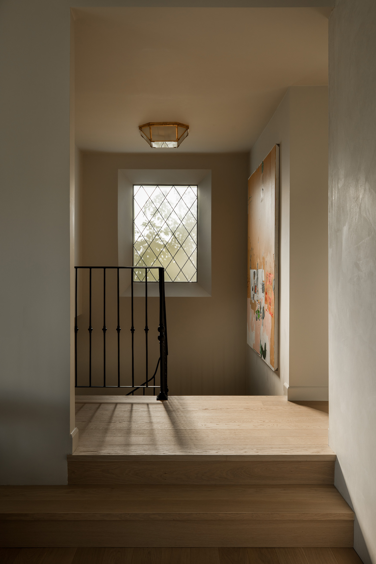
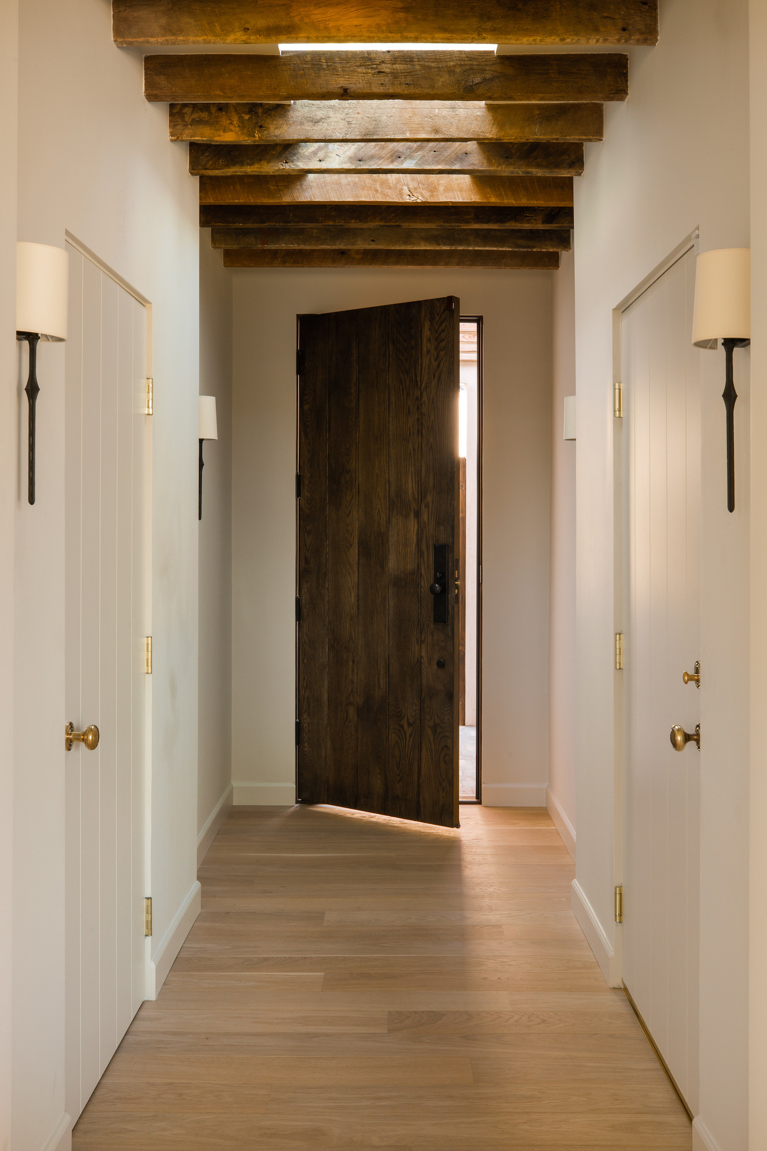
My favorite moment in the entire house is the inset leaded window above the stairwell. We learned in our research on Spanish design that insetting windows and angling drywall spreads the light significantly more than a standard, flush window. This is common in Spanish colonial homes where the walls are thicker. We didn’t have the wall thickness, so we framed it out and chose to install the window without any casement or trim so the natural light could really be the focus. Because of the neighboring house, we chose to sandblast the glass to maintain the same level of privacy that exists everywhere else in the home. In hindsight, cathedral glass may have been the better choice here. Live and learn. Nonetheless, this little moment takes the cake for me. As a designer, few things make me happier than a proper spread of natural light, iron, and wood all married together in one view.
Like what you see? Take a peek at the talent behind the story… Interior Design: Tienn Studio · Co-Interior Designer: Mariah O’Brien · Photography: Shade Degges · Stylist: Lisa Rowe · Art: Creative Art Partners


