There is nothing more motivating when your client is a couple with opposing styles. Throw into the mix a home that goes from closed-off spaces to an open space plan, and the challenge becomes inspiring. This is the type of project Linda Hayslett of LH.Designs loves.
The client? A young couple who had just bought their first home. The idea was to transform the Palos Verdes property with its uninviting, awkward kitchen, dated bathroom, and cramped spaces to a more light-filled uplifting home.
In its place, the owners wanted a home they could entertain and relax in with an open space plan that would be more inviting to them and their guests. When Linda first saw the project, she was confronted with a time capsule that needed a lot of work from top to bottom.
She explains, “When I went up the stairs to the second floor, it looked like I had walked into a hall of mirrors at the county fair. It didn’t have any personality and needed an update.”
The house was suffering an identity crisis. Some of the rooms had a distinct 1980’s vibe, which Linda likened to the style you see in movies like Weird Science and The Karate Kid.
Linda recalls, “They had that typical white 1×1 tile on the floors with big grout lines and cabinet doors with thick beveled edges. The faucets had handles that were meant to look like crystal but were those chunky, clear plastic knobs. It needed a lot of love and care!”
Meanwhile, other areas were also in dire need of a makeover from their plain Jane 1970’s look.
Linda says, “Cooking and socializing in the kitchen was very tight for two people, let alone entertaining. And when my clients were in there, they’d miss out on any conversation in the dining or living room area.”
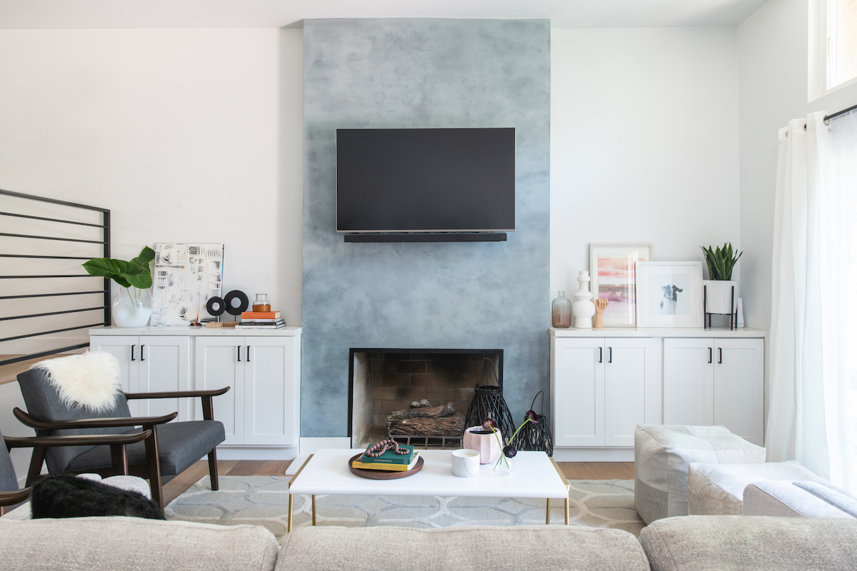
The couple who owned the property were also looking for opposing looks for the property. They wanted something illustrative of a mid-century modern home with the feel of a farmhouse but also wanted to incorporate the essence of a relaxed, fun vibe.
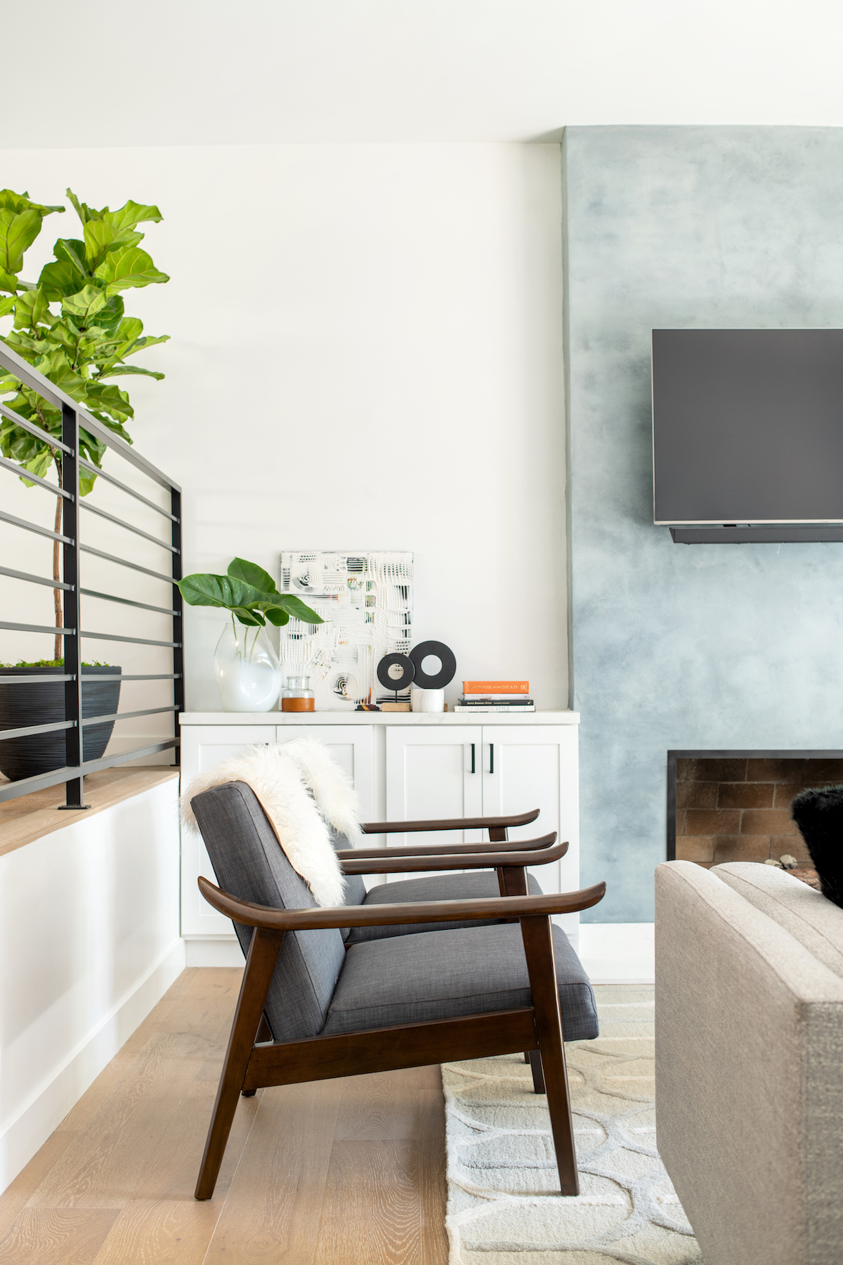
Linda knew the bones were there in the property to create something beautiful, but she had her work cut out for her. Taking on board both of her client’s preferences, she came up with an inspirational plan to marry their tastes: “I looked at the different elements of each style and combined them in a way that made sense, but wasn’t random.”
Her process? Pouring over tons of pictures to establish what they gravitated towards. For Linda, the devil was in the details: “I noticed they liked the warmer, neutral wood floors and gray/white color palette of a farmhouse. But they also pulled towards the openness, clean lines, and pops of color in mid-century modern.”
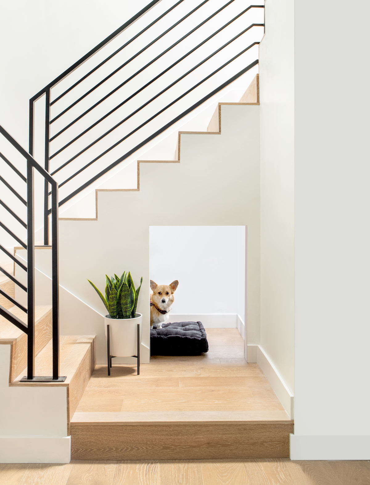
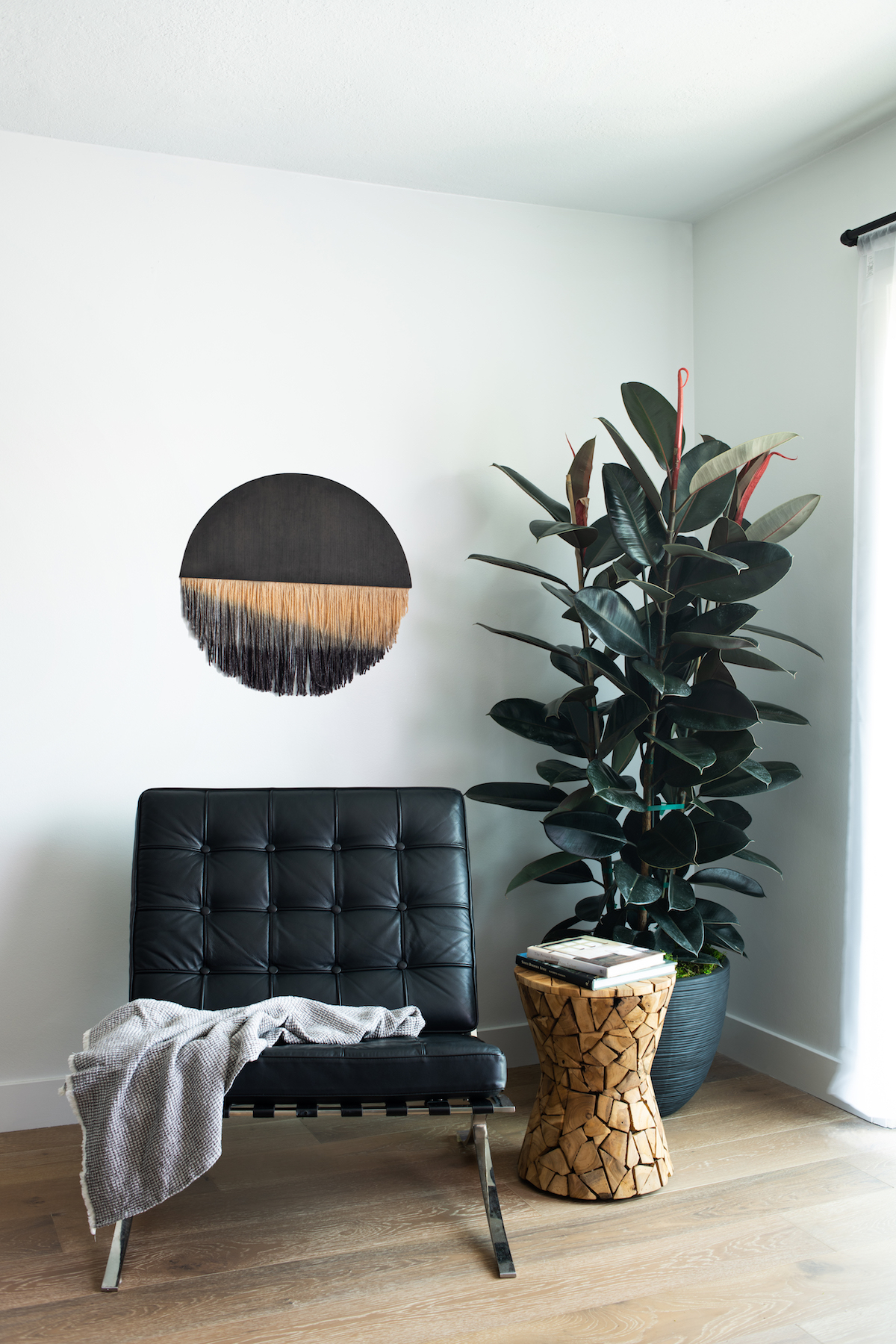
The common ground was the color black, which Linda threaded through her design plan and palette. This was how she designed a beautiful home for the couple, which checked off all the right boxes.
The project took eight months to complete and LH.Designs turned every nook and cranny into a luxuriously relaxing and straightforward space.
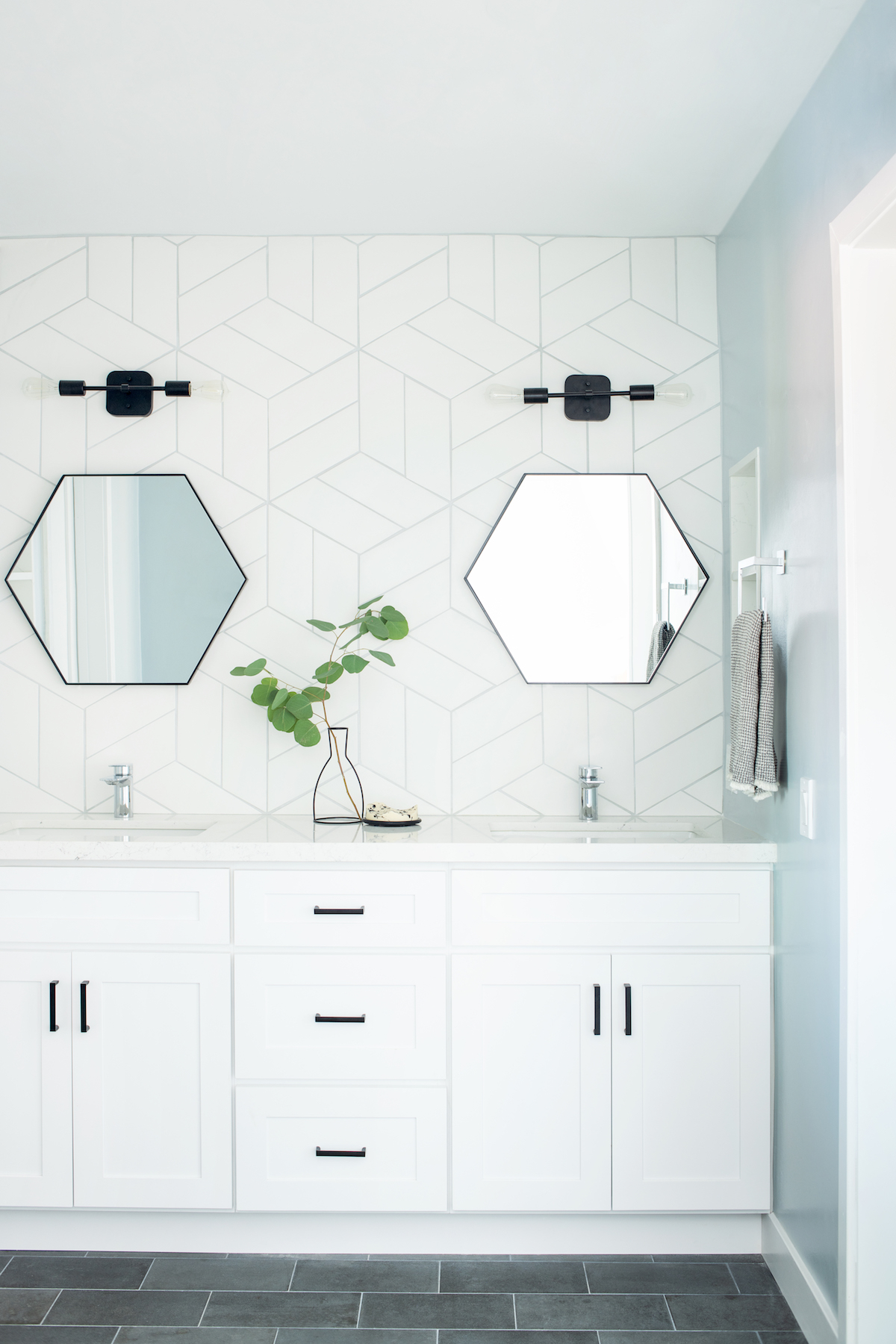
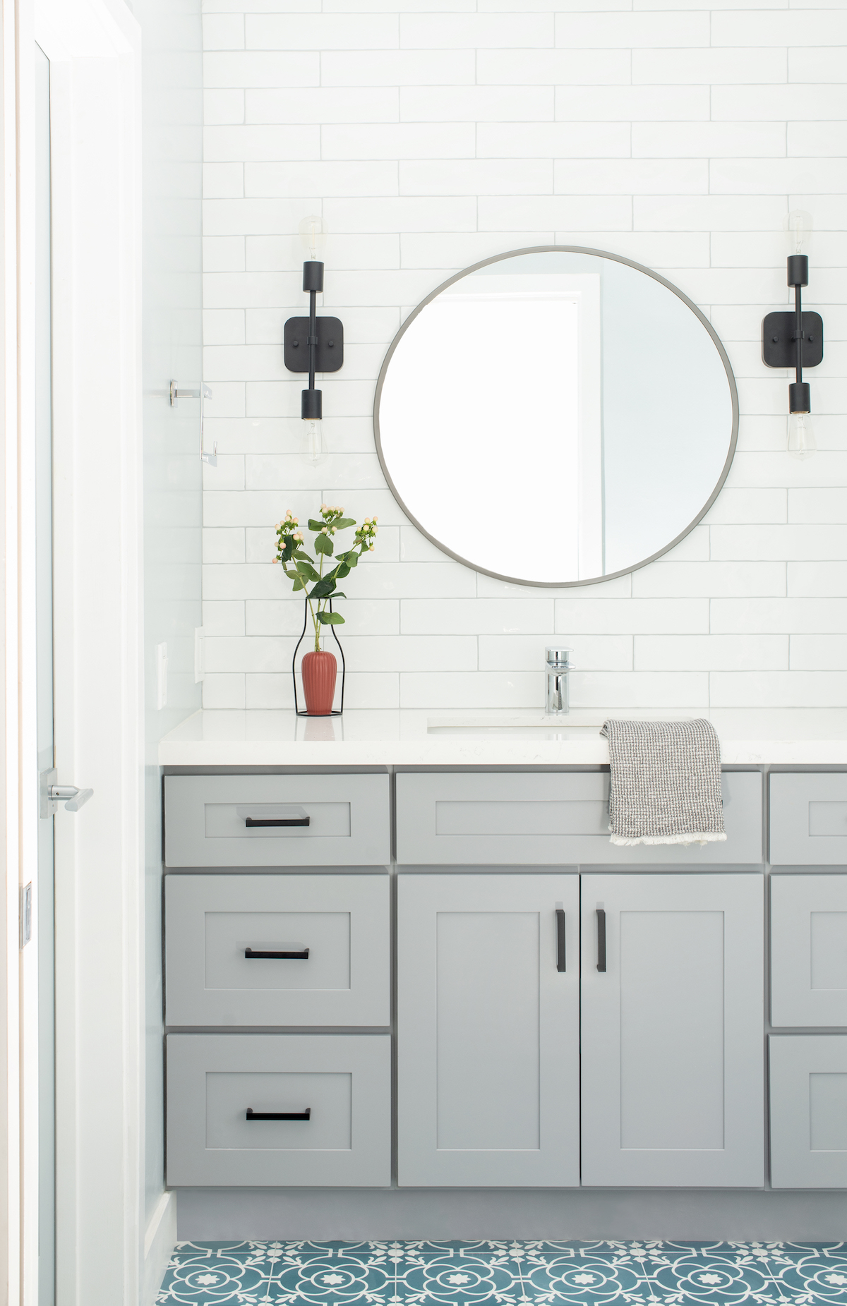
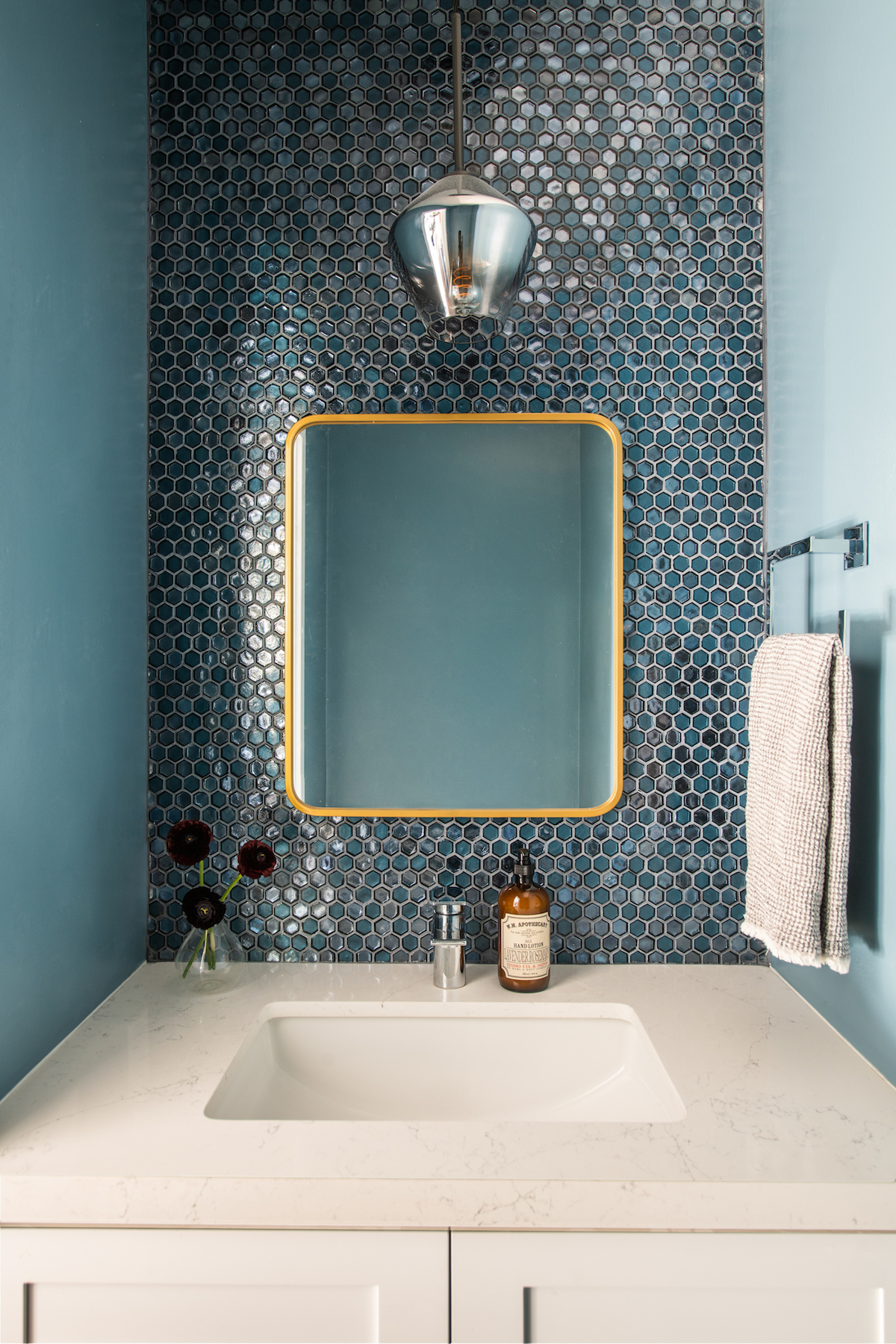
All the bathrooms were updated. The addition of dark blue geometric tiles and futuristic light fixtures brought the ambiance firmly into the 21st century.
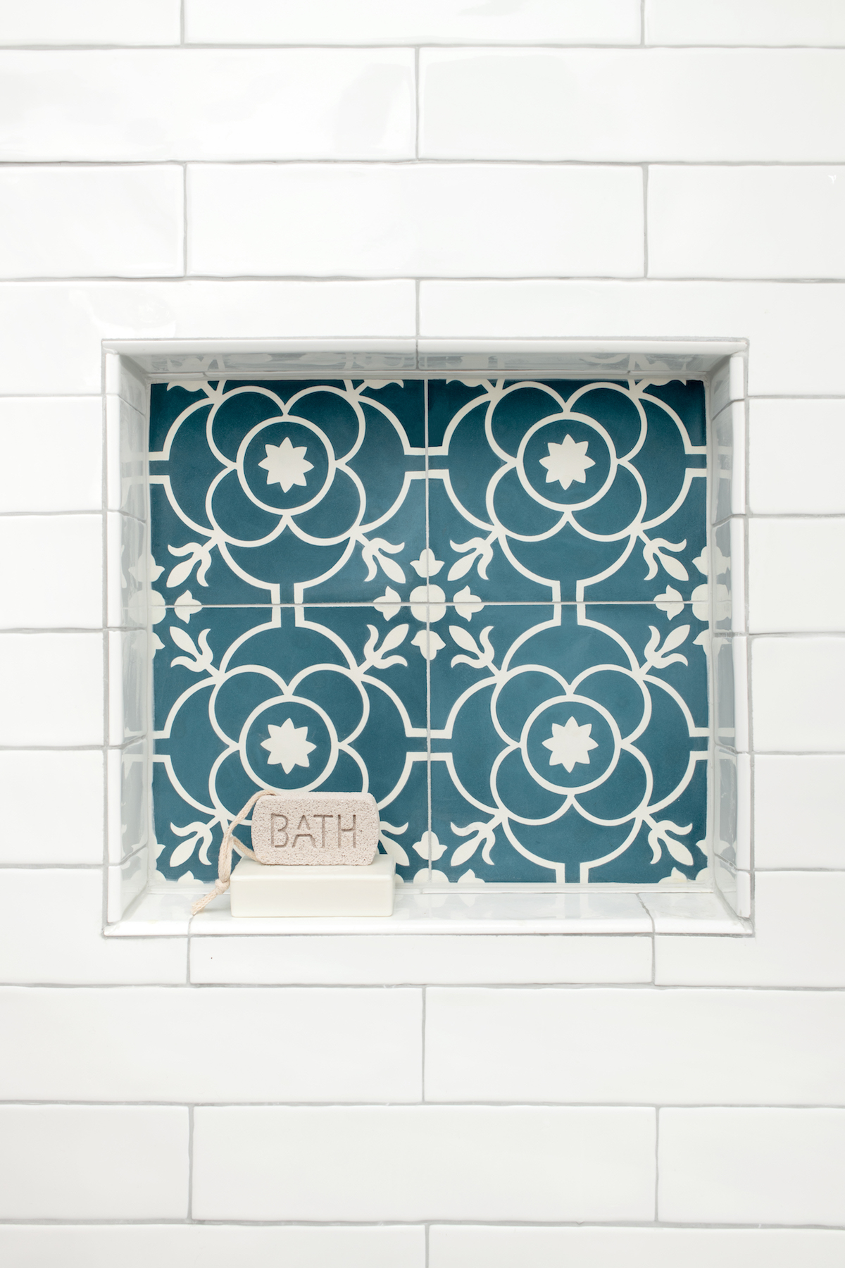
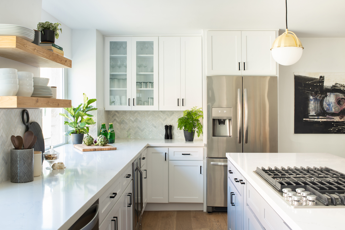
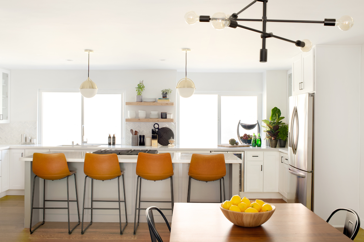
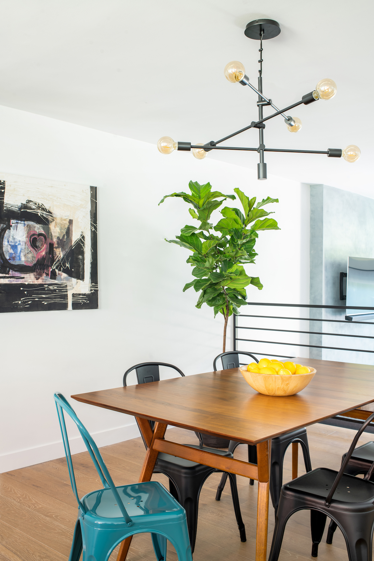
The first floor was opened up to increase the size of the kitchen by 2 ½ times. Cozy white fur throws were placed in the living room, and a crisp color palette with accents of teal in the dining and powder room added pizazz and pop.
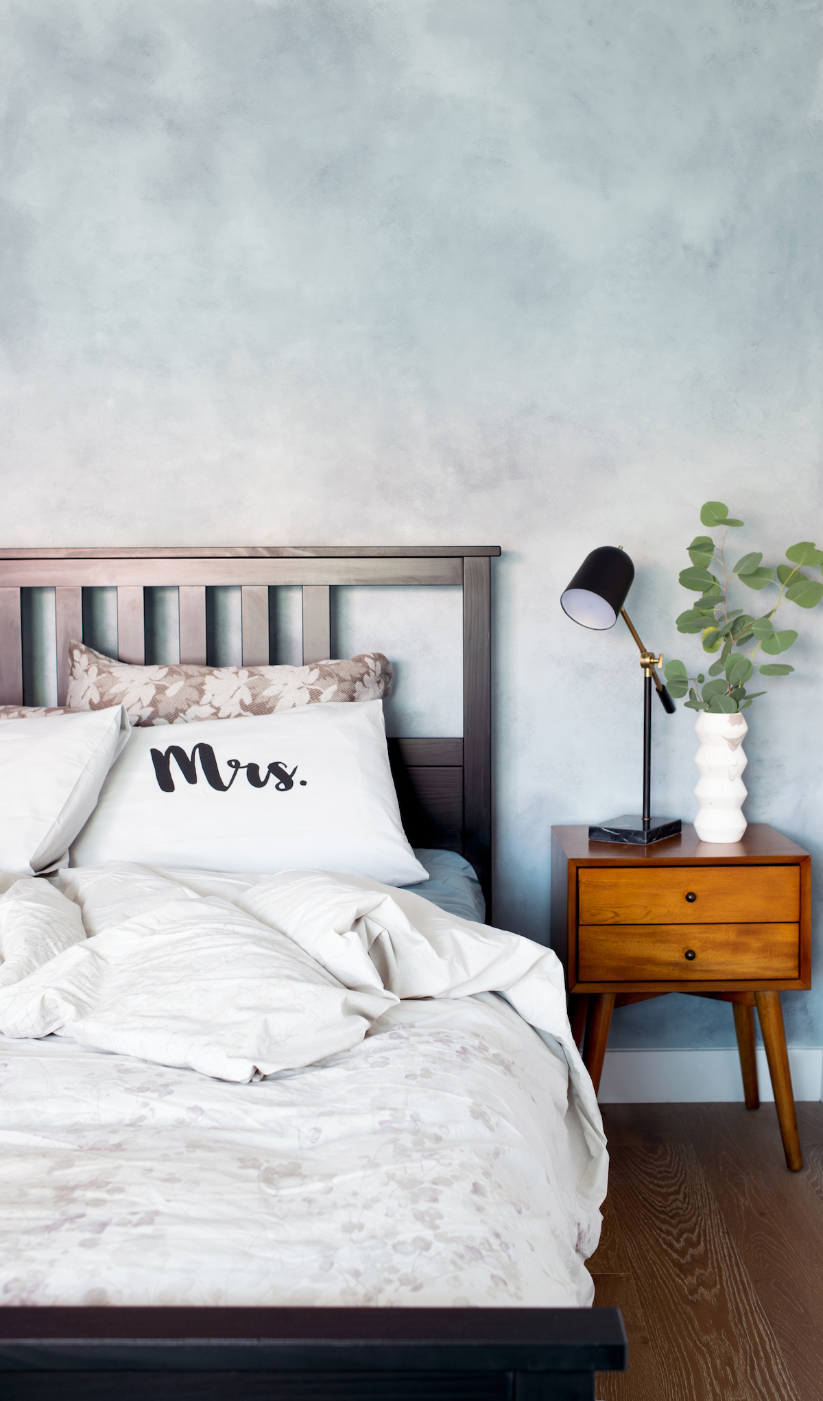
Linda pulled out brass and vibrant wood colors in the mid-century style for the furnishings and fixtures. Then she added in blue as a dash of color through the rooms. Gray and white added the neutrality needed to ground the home with the natural and deep wood tones.
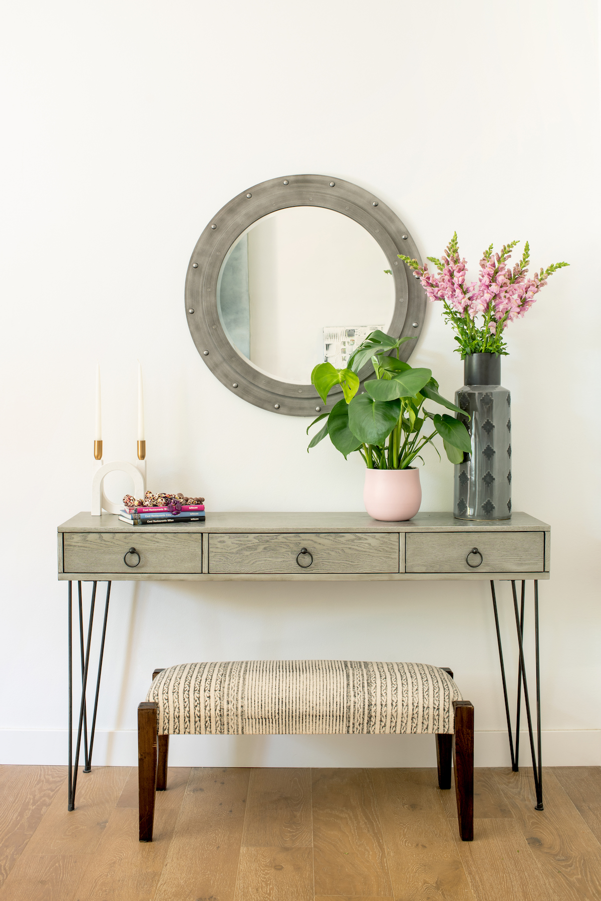
The pièce de résistance was the addition of new furnishings, including plants, artwork, and accessories: “I truly felt like I had brought their home Back To The Future,” Linda laughs.
There is no bigger compliment on your design than when the neighbors want to come in for a tour of the renovation they have seen unfold before their eyes. And they were lining up to take a look at the refreshed space.
Linda says the combination of working with the two styles on the property brought out the aspects of the couples’ differing personalities: “Bringing these two styles together, made it unique to them. It’s designed to have a completely personal feel, which they won’t need to update for many years.”
Love what you see? Take a peek at the talent behind the story… Interior Design: LH.Designs · Photography: Lauren Pressey
