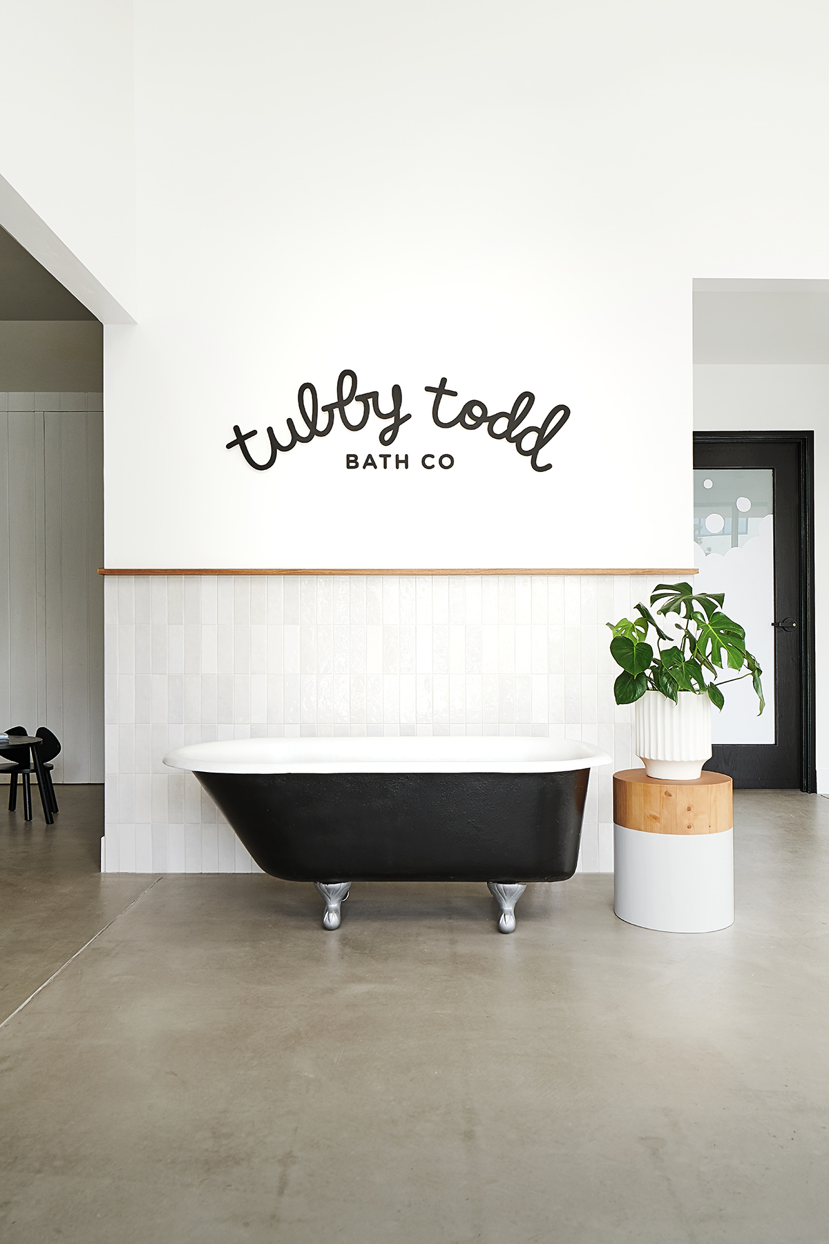
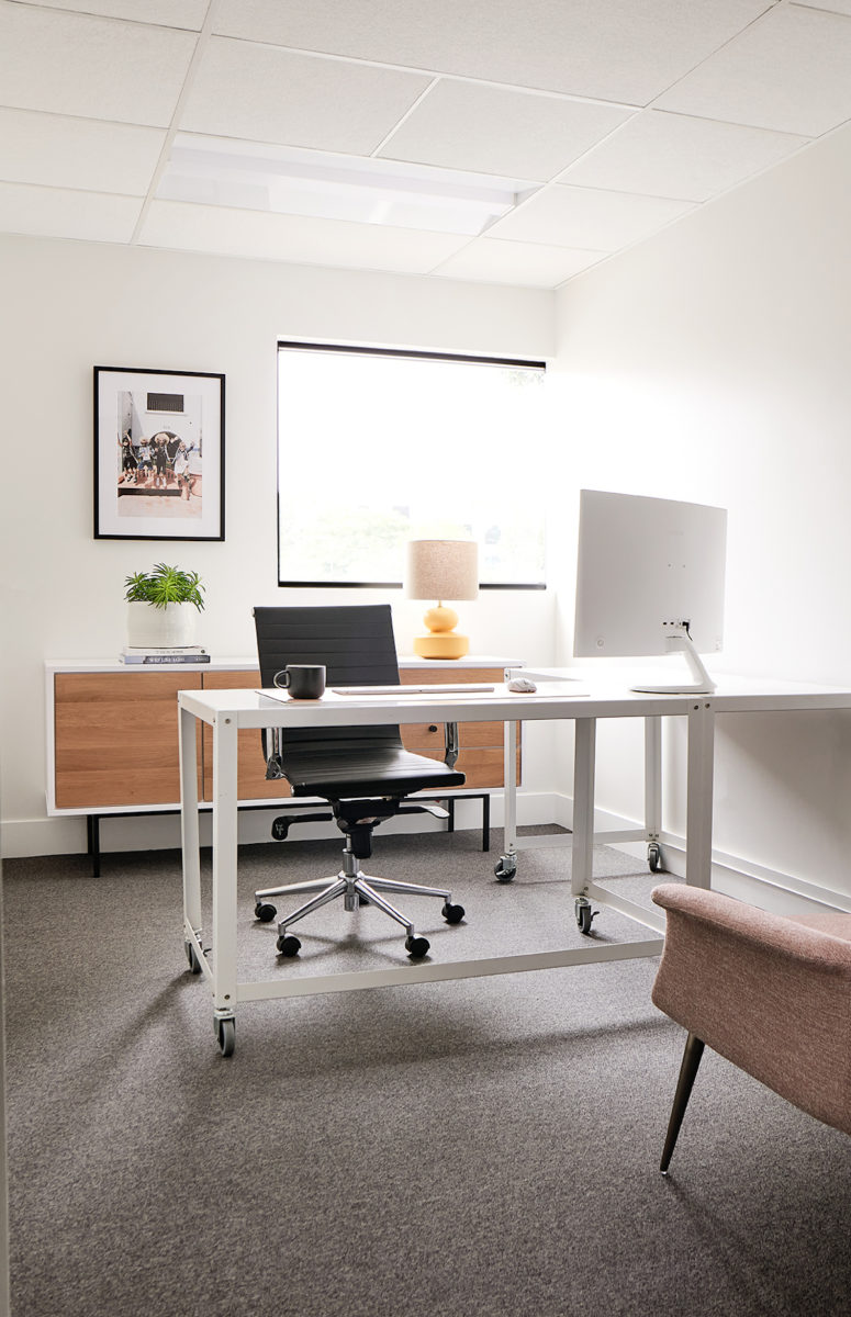
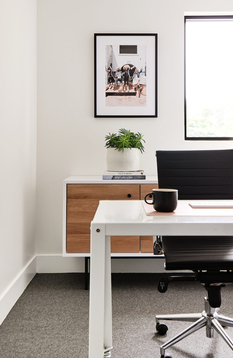
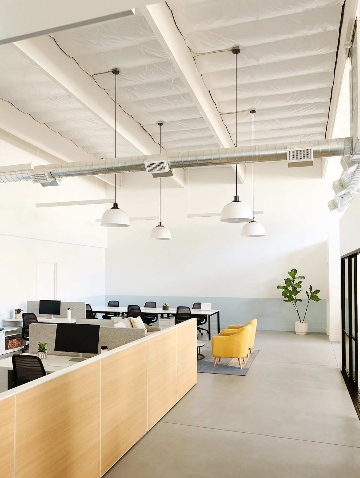
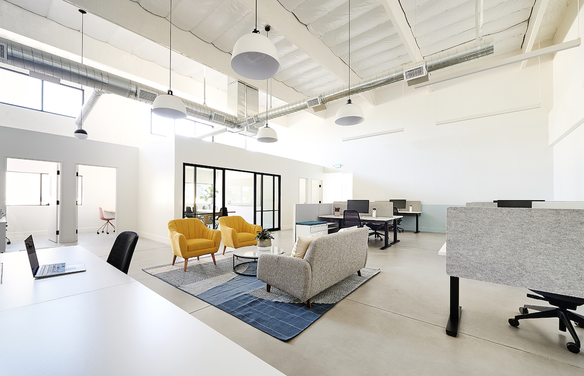
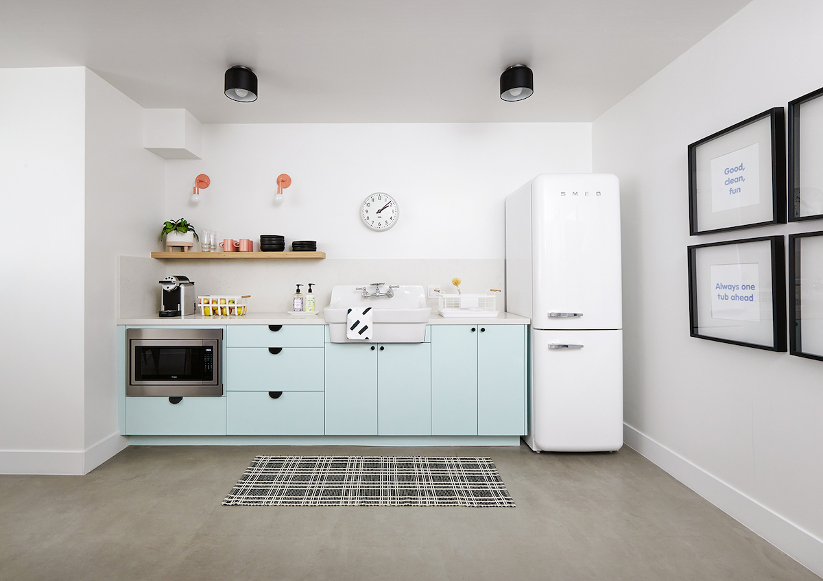
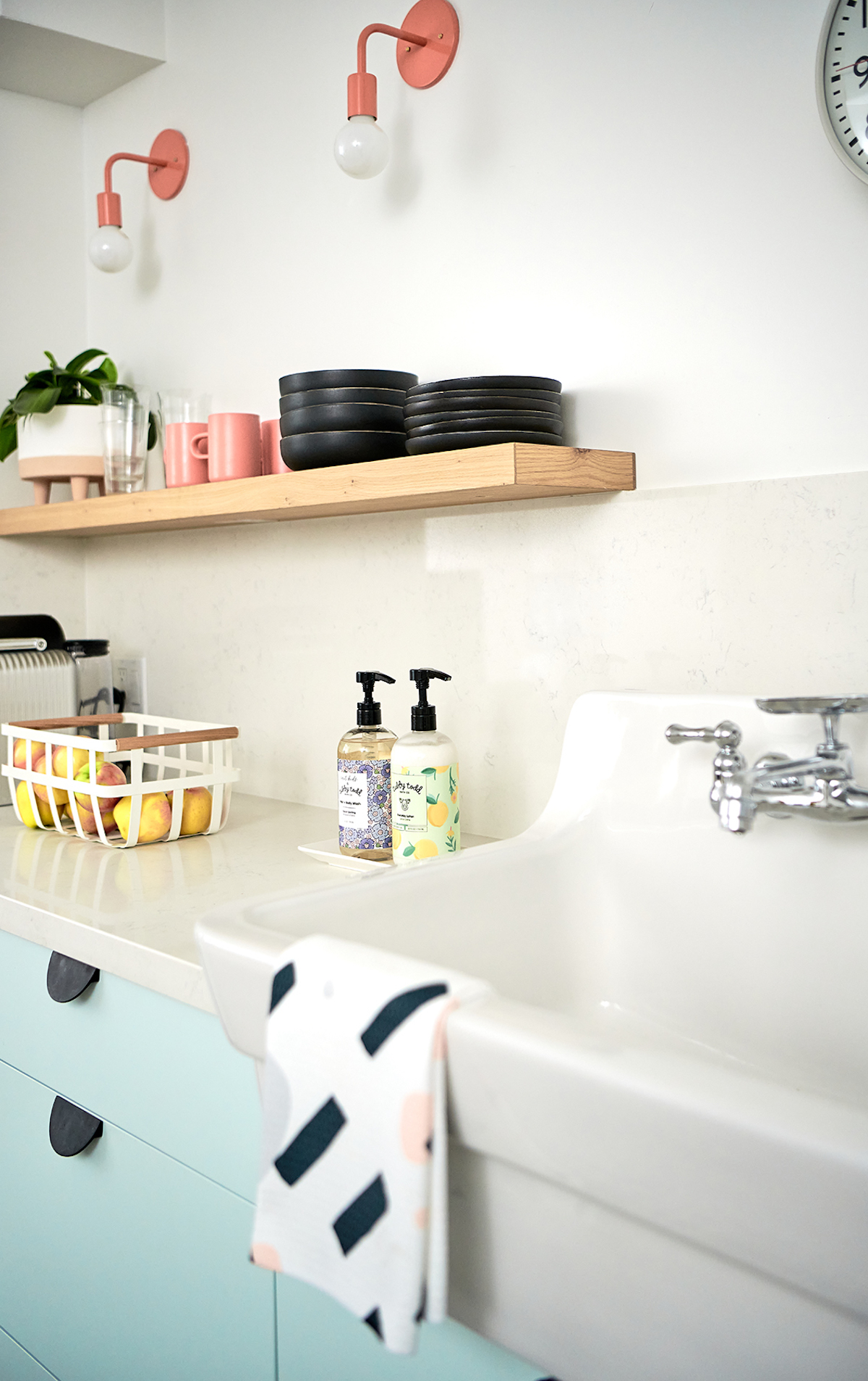
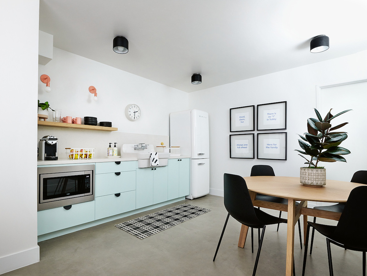
Today’s tour isn’t our usual setting of a cozy abode, but rather—the cutest office space ever and it’ll surely provide you plenty of inspo if you’re looking to transform your own workspace. We’re stepping into the playful headquarters of Tubby Todd, designed by HAVEN member, Becky Fuller of BEX Studios. Becky infused her fresh California style into this office space to create a fun, collaborative, and productive zone for the brand’s team. If the entry is any indication—how amazing is that logo over the black tub?!—you’re in for some brand design goodness. Plus, Becky is sharing how you can infuse your own brand into your workspace. Pun fully intended—dive in below!
Tell us about this fun project! What were your client’s goals?
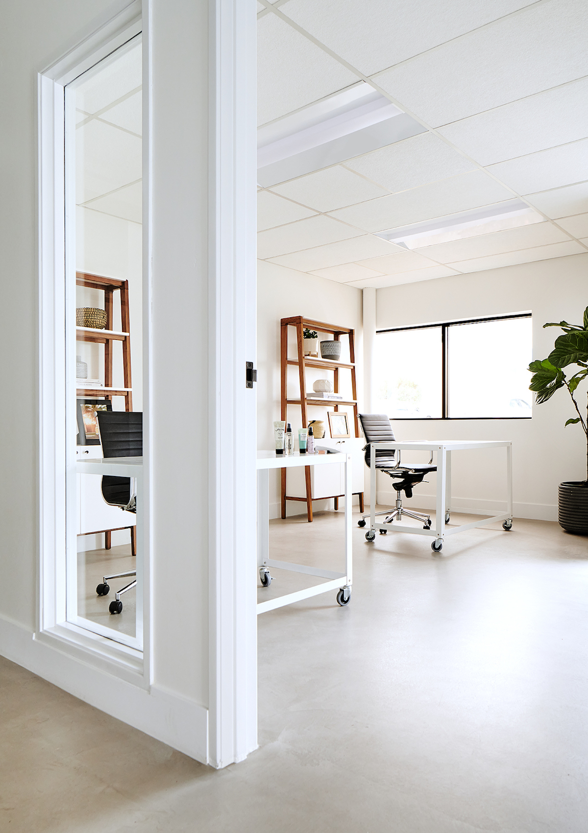
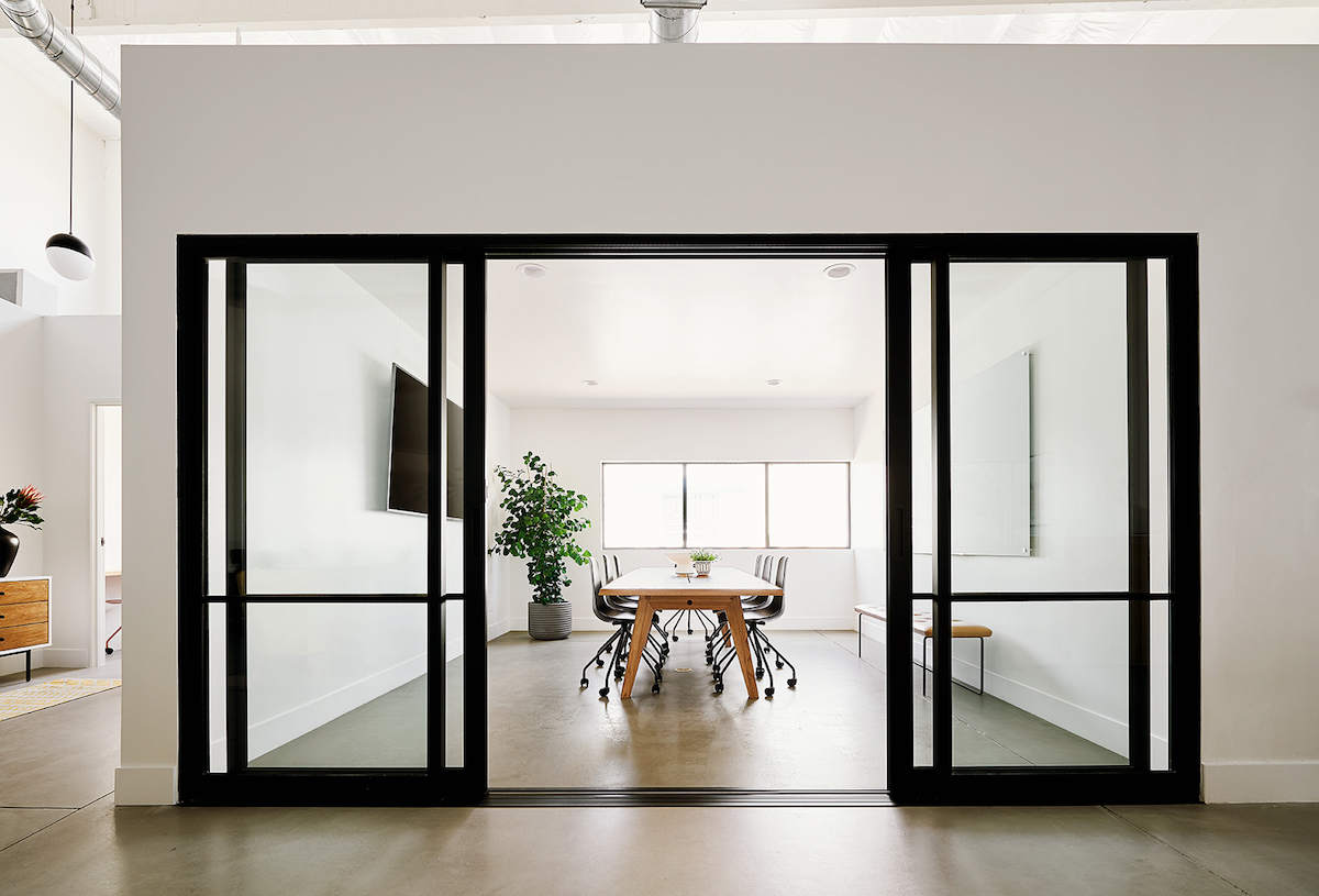
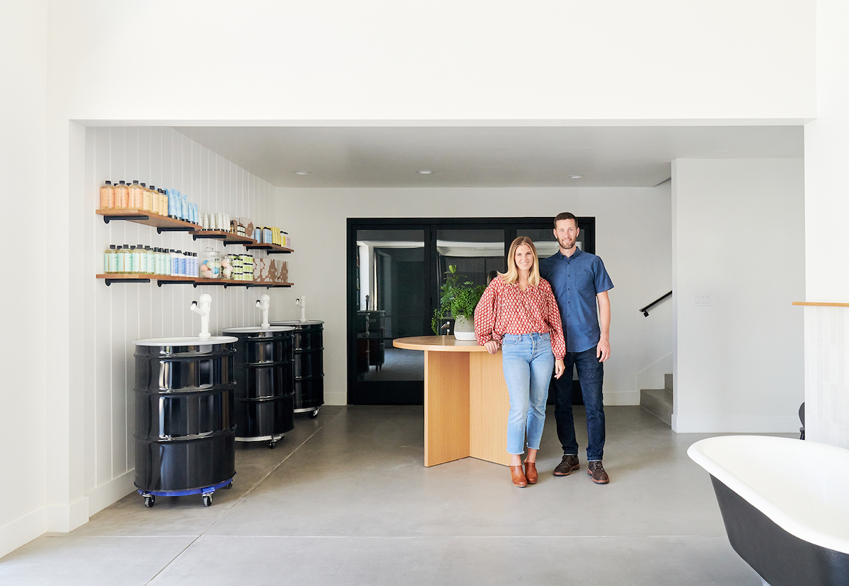
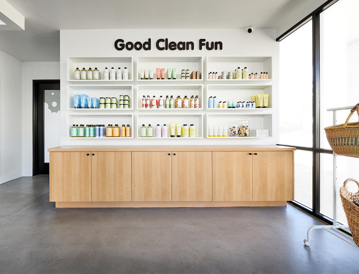
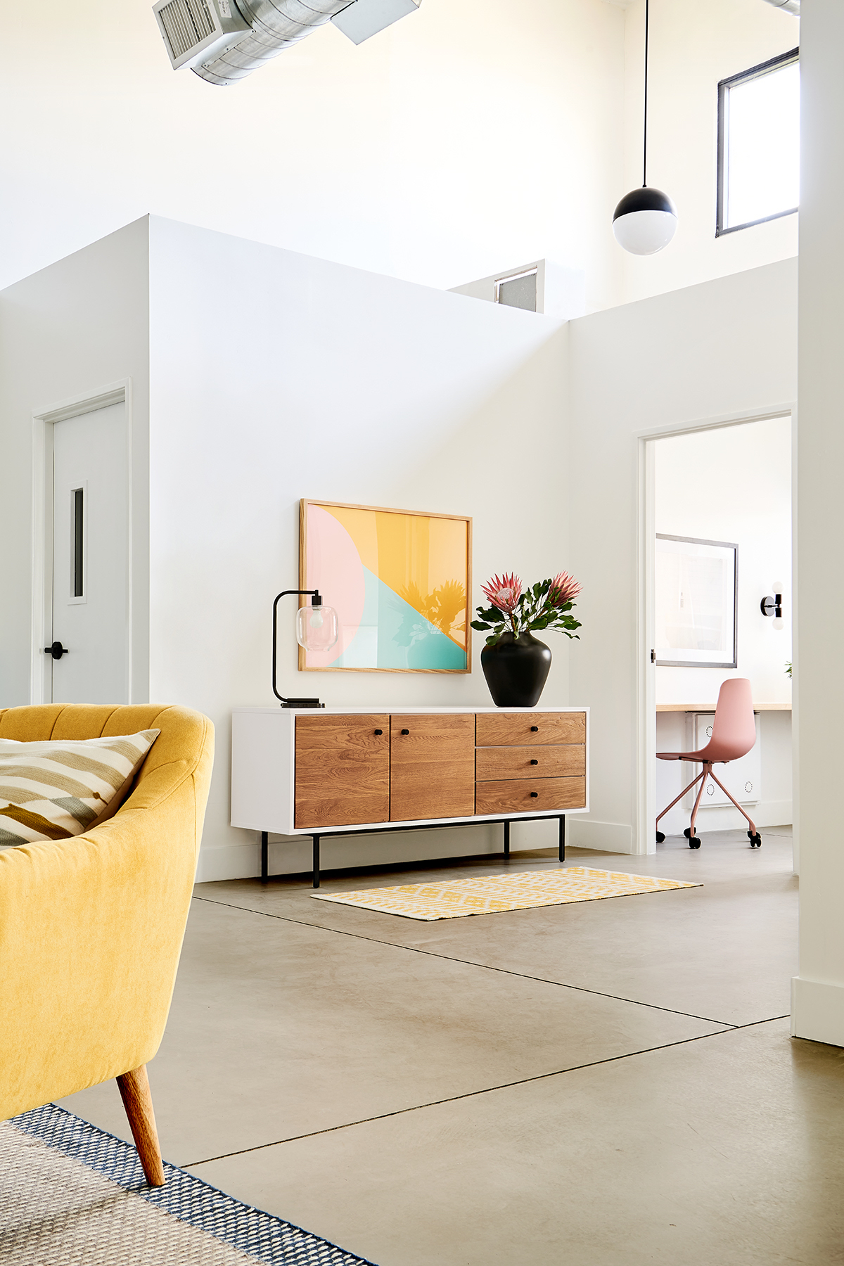
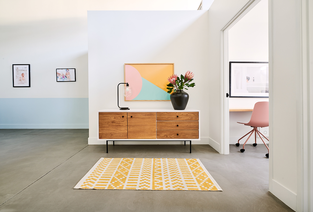
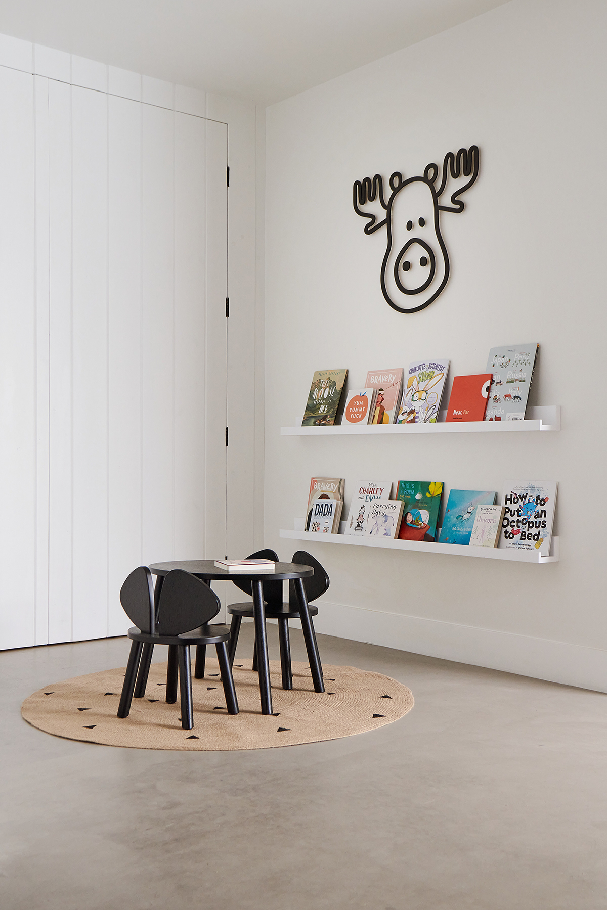
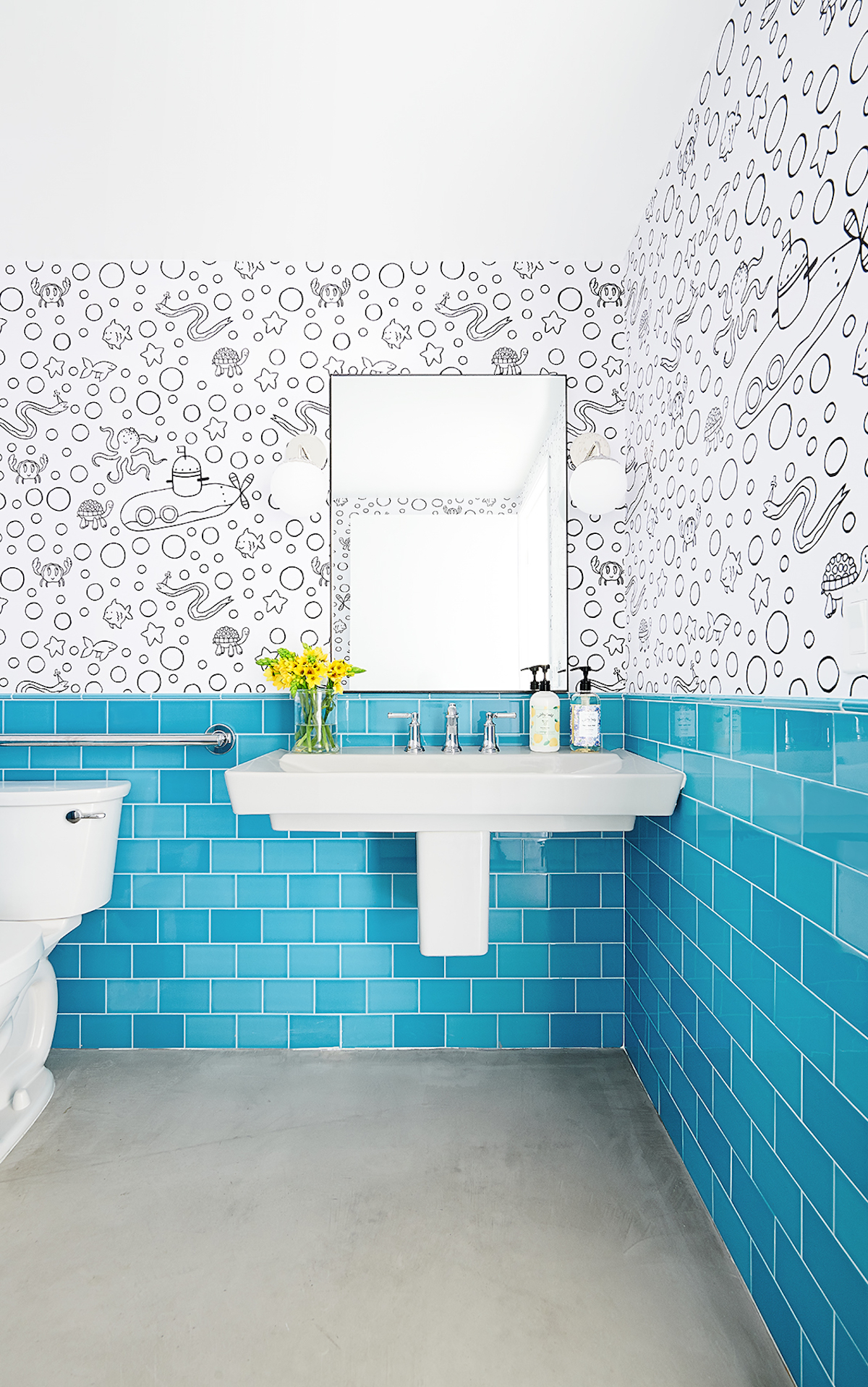
I recently completed this project—from inception to “Tub Hub”—for the popular, playful bath care brand, Tubby Todd. The industrial office was renovated to tell the brand story within its new retail space and headquarters in Carlsbad, CA. The Tubby Team puts a big emphasis on their community, so we wanted to create a space where parents could casually shop with their kids in tow. The office is an open, interactive, and inviting place that allows collaboration as well as private offices. White walls and black accents mimic their packaging, black metal “refill drums” in the office’s entry create an interactive brand experience where customers can refill their empty product bottles, and glass bubble pendants are a sophisticated nod to their flagship product, bubble bath.
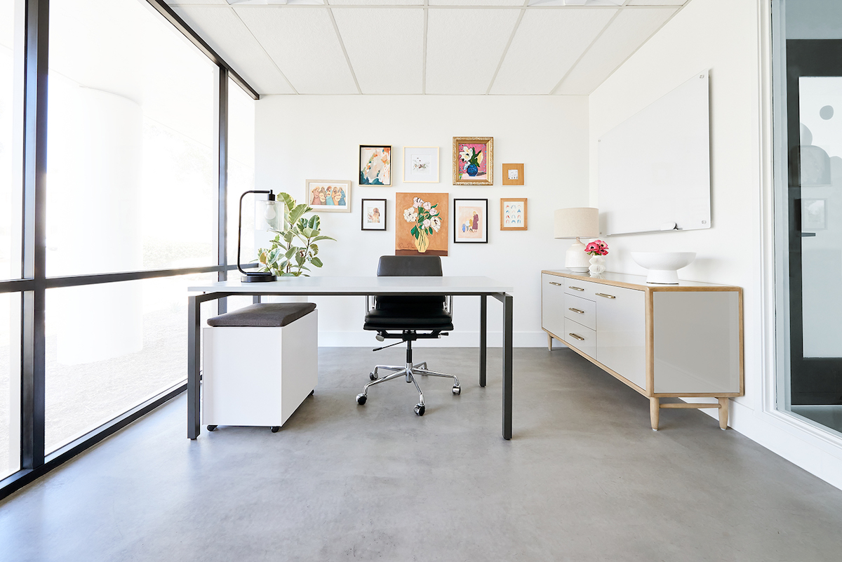
A large conference room was a must, and we incorporated various seating areas for small breakout meetings, as well as two “quiet rooms” where employees can go to make phone calls. The Tubby Team is growing so we configured the furniture to accommodate future employees as well as a large communal table for work-from-home employees to pop in and use. The desks are sit-to-stand which is quickly becoming the norm for office space, especially for a team that loves to dance. Every detail was considered to ultimately inspire creativity and bring families together.
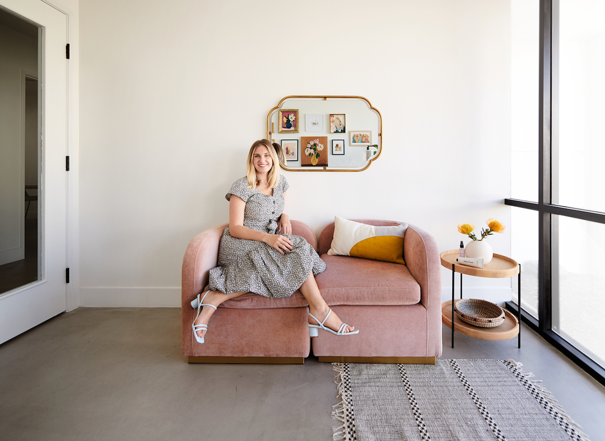
Talk to us about commercial vs. residential. Do you approach the two differently?
My approach to commercial design is similar to residential in that I spend a lot of time getting to know the brand. I love to emphasize the homeowners’ personalities in residential design and do the same with a brand’s story and branding details in commercial spaces. I spend a significant amount of time researching the brand’s website design, packaging, and their customers to find the right design direction. We then dig deep into the programming phase, where we determine the functional needs of the space; the number of offices and workstations, how many people will be coming through the building, where and how frequently they hold meetings, and the overall flow of the office. There are a lot of codes that we have to abide by in commercial design so, in this project, we worked closely with the architect and builder to make sure that the building met all requirements.
Can you share a few tips on how others can infuse their own brand into their workspace?
Know your brand. When designing an office space, we like to take cues from the company branding so we pull ideas from the website and packaging. While incorporating the company logo is obvious, it’s easy to go overboard. In the Tubby Todd building, we used their logo front and center over the original “company tub” at the entry, and nowhere else throughout the space. We left the retail space fairly plain so their playful packaging could really have the spotlight. Pair brand colors with other compatible colors and textures to keep things interesting.
Love what you see? Take a peek at the talent behind the story… Design: BEX Studios · Photography: Weston Fuller
