When it comes to ‘light & bright’ homes, Nicole Salceda of Eye for Pretty delivers every. single. time. Just take a peek at her own home and this bathroom we previously featured for the proof. Today’s tour is yet another refreshing space filled with natural light, a white kitchen to envy and a master bath to end all master baths. Designed for a growing family (can you believe three boys reside in this white-splashed home!), Nicole is walking us through each room below, along with photos by Amy Bartlam.
From Nicole Salceda of Eye for Pretty… When I met my sweet client she was pregnant with her third baby and embarking on an entire gut job of their new home. I was happy to come on board and help make decisions that would make their home more functional and work for their growing family. The house had some challenges included an awkward layout in the kitchen and lots of small, choppy rooms that made it feel tight. We took down some walls and embraced the open concept living as well as reworked the kitchen and dining area in a way that made sense for them. Pretty much every surface was touched and we couldn’t be happier with the finished project!
Luckily these clients were so easy to work with. They already had great taste (which translated perfectly into their choices) and were able to make decisions quickly (which is the best!) They wanted their home to feel open and bright while taking into account their three little boys and all the entertaining they like to do. The challenge after we took many walls down, was to create separate spaces for living. By picking the right pieces of furniture and reworking the layout we were able to do that. We joined the kitchen and dining areas, then moved the living and playing spaces next to each other so the family can all be together.
Shop the Look
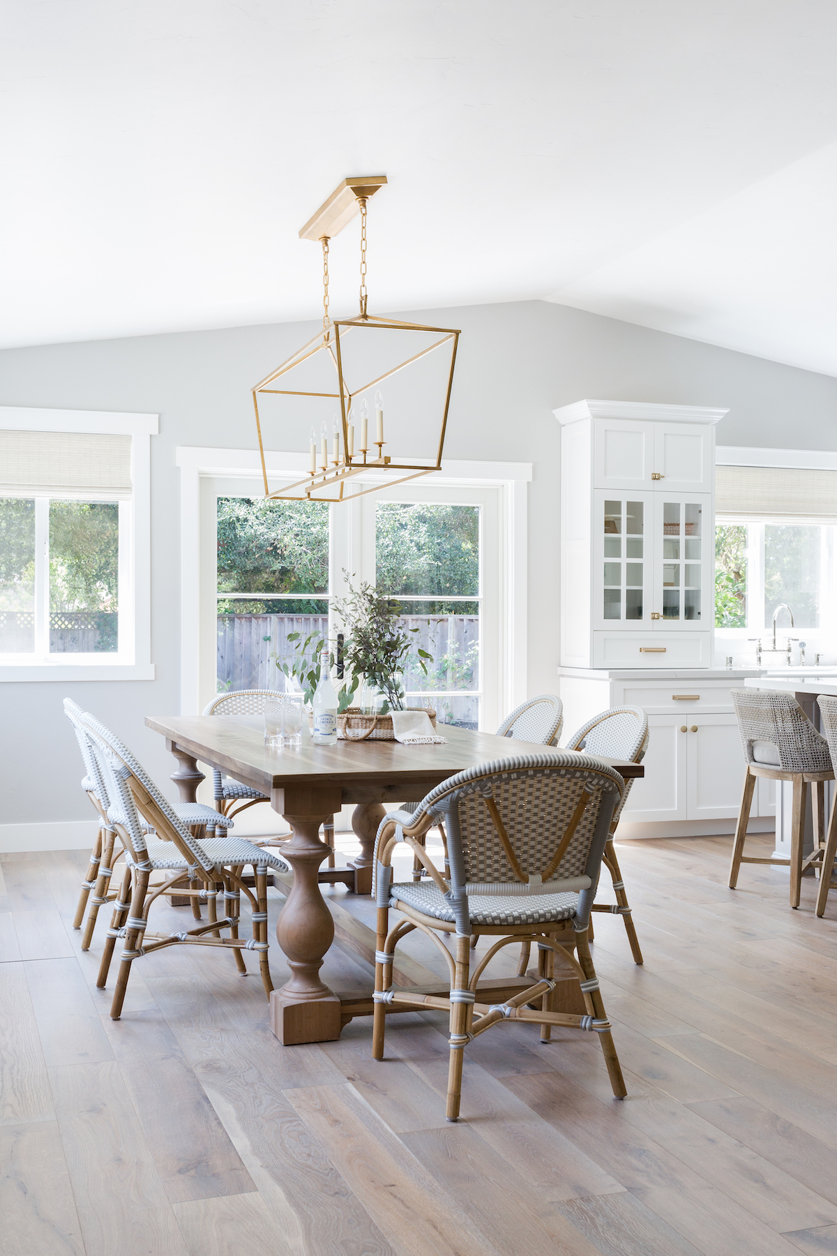
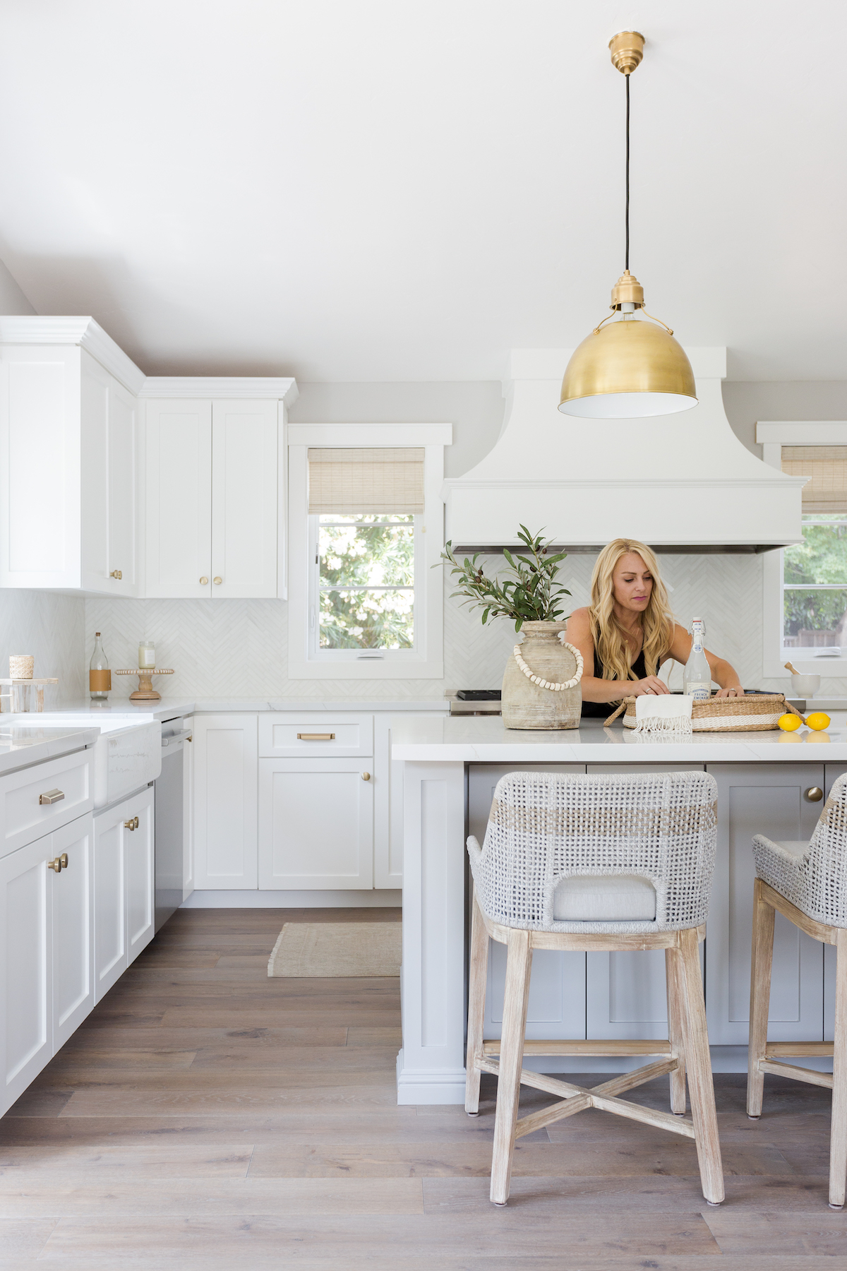
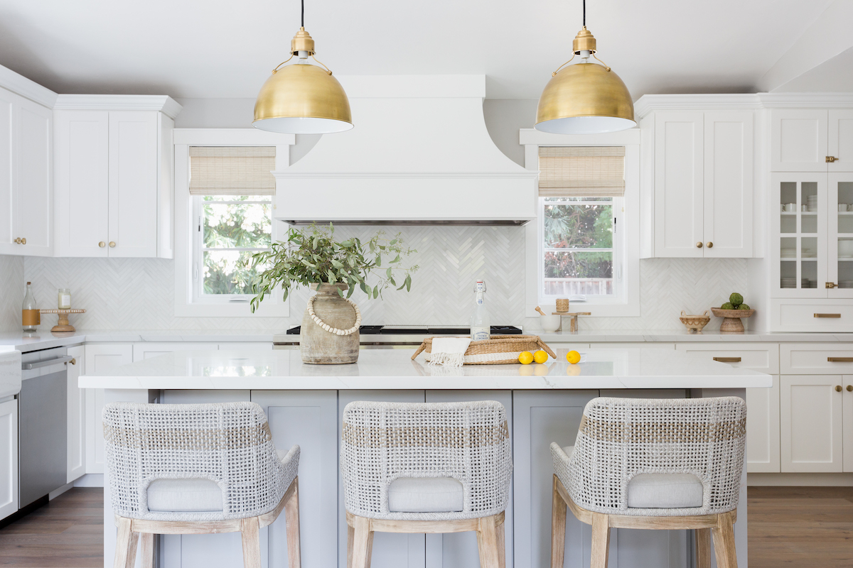
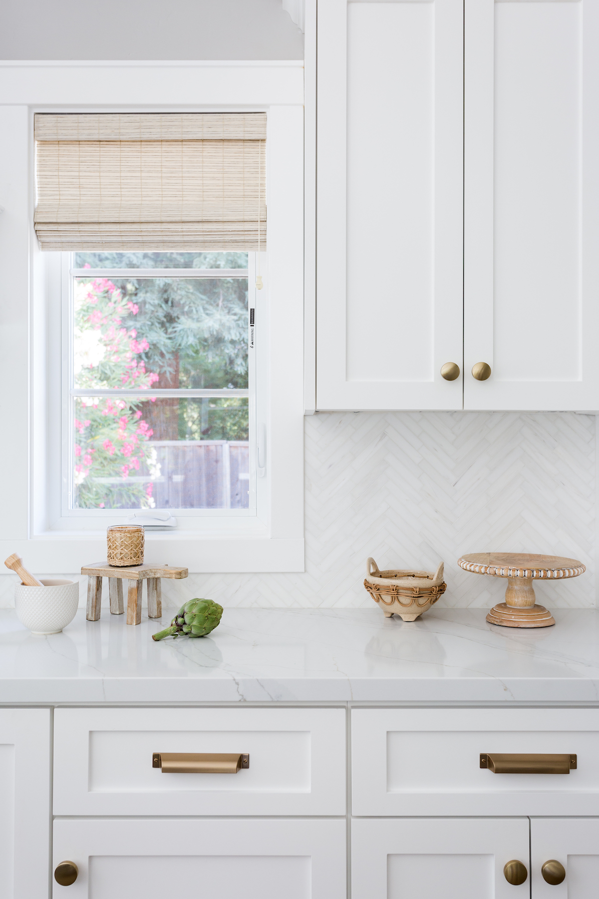
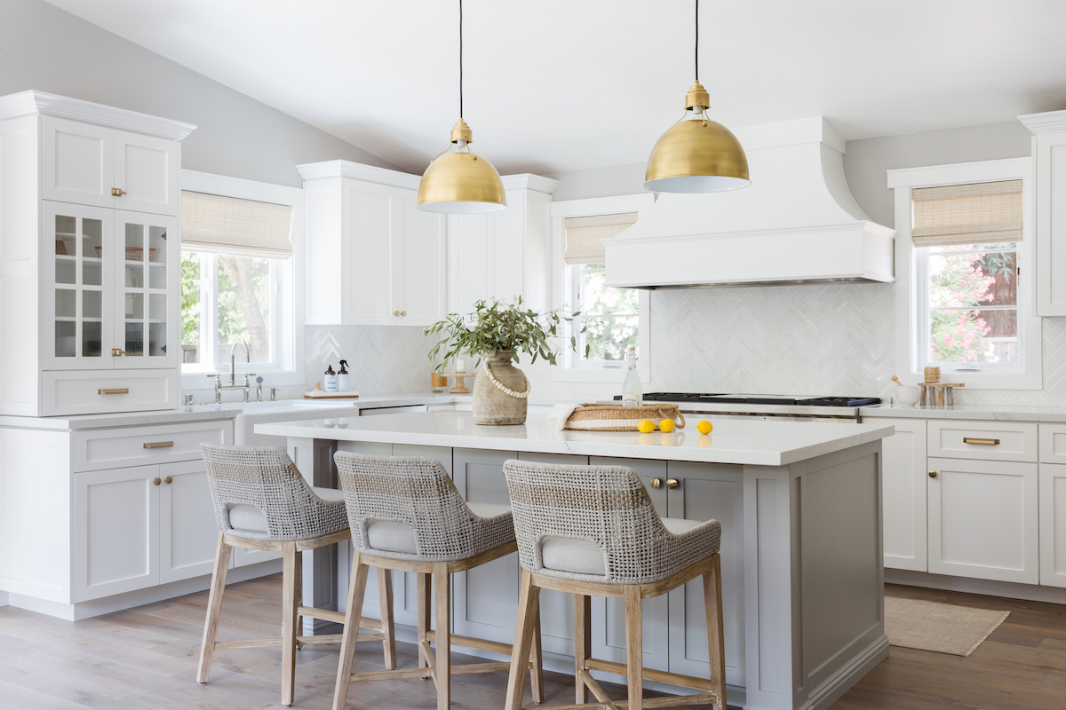
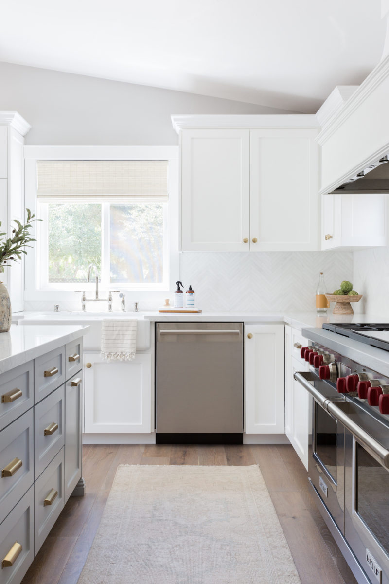
The kitchen is a showstopper with the gorgeous hood we designed taking center stage. Before, the kitchen had two small windows that didn’t make sense and there were a few floating upper cabinets that were random. We added in another window so we could balance the range with the island and put two hutch cabinets on either side of the kitchen for additional storage. The mix of materials used from the Calacatta herringbone mosaic splash to the brass hardware and soft greige tones in the cabinetry all pare really well together. We used some of our favorite counter stools and woven shades for another layer of texture and warmth. One of my favorite parts of their kitchen is the Compaq quartz counters. The coloring and movement are so pretty in person!
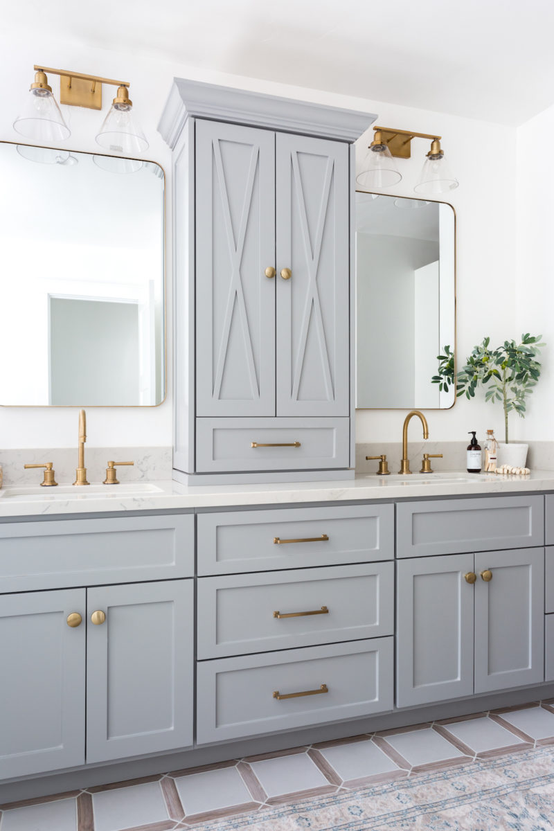
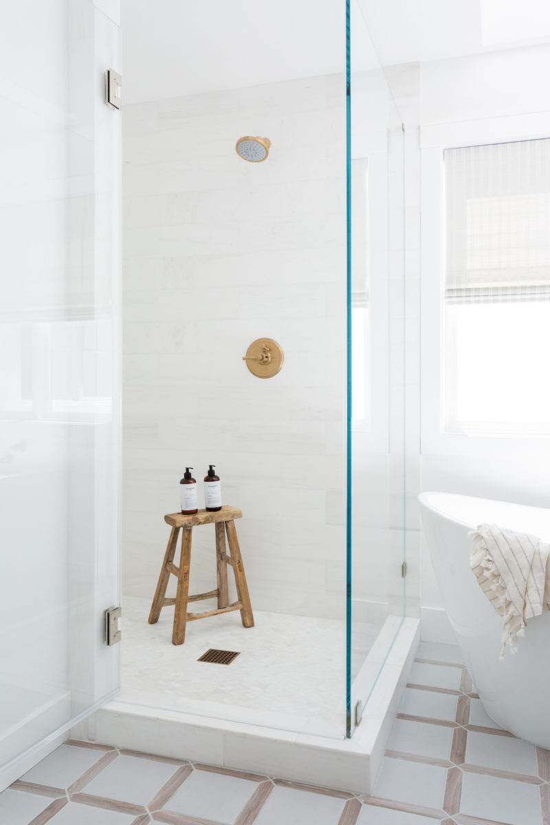
The Master Bath was actually two separate spaces that we made into one. The separate vanity and sink area didn’t make sense, plus it had carpet in it! We ended up gutting the entire thing which allowed us to fit a new walk-in shower, freestanding tub (which this busy mama deserves) and a walk-in closet as well. This is a perfect example of how making a few small changes can make a huge impact… even if you don’t have the largest space to work with.
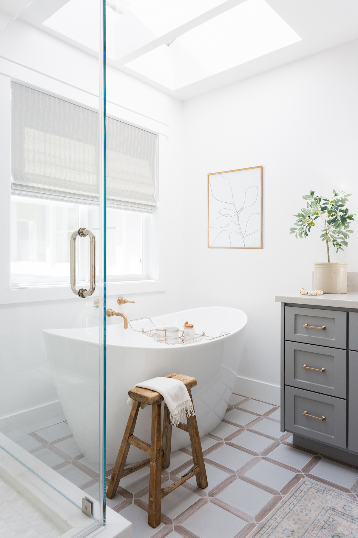
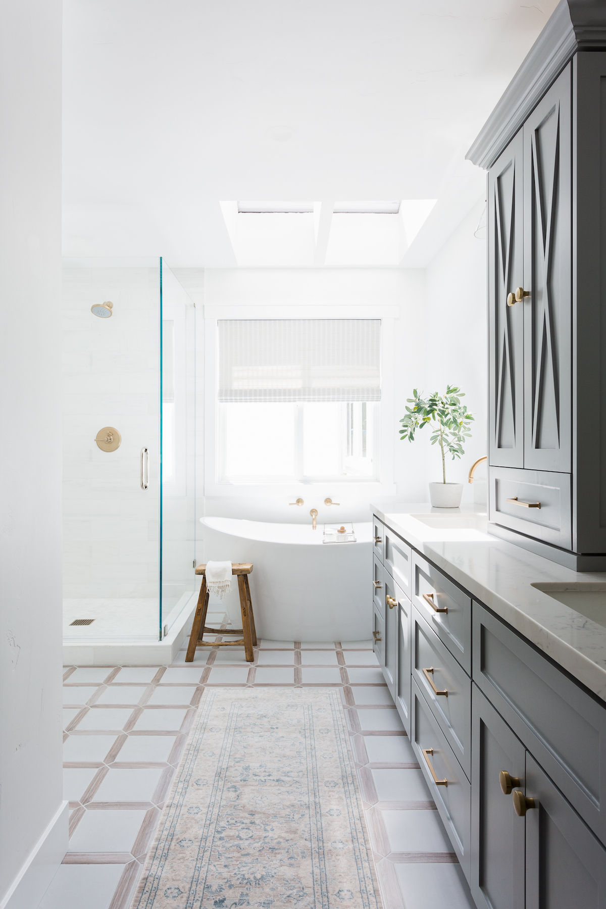
I have two favorite elements that I can’t decide between. One is the kitchen hood. I love its subtle curves and the scale of it. It’s pretty without being overly feminine and makes a statement in the kitchen. The other is the master bath tile. I love the contrasting pickets with the gray squares. Everyone asks if it’s wood, it’s porcelain which is perfect for bathrooms, especially around water! It’s unique and special but classic at the same time. I hope this is a home they will love for a long time with their sweet boys!
