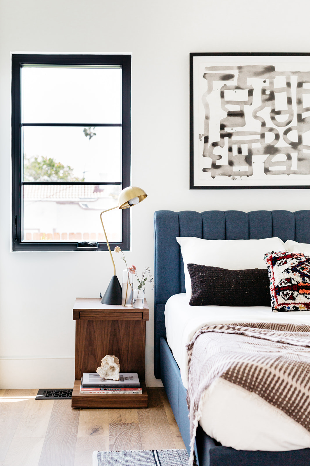
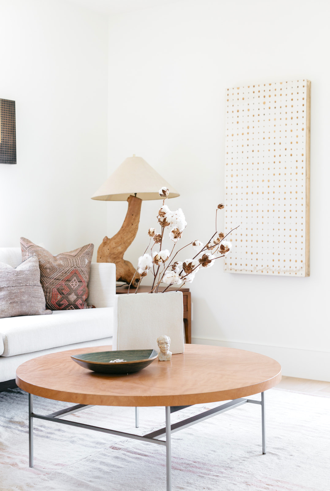
Friends, we have been sitting on this tour for weeks now and I’m simply delighted to share it with you all today. It came by way of Christopher Lee (whose work we adore!) and it was our first introduction to designer, Nicole Palczynski of Vein Design. In usual fashion, we just had to chat with Nicole about the inspo behind the design. You’re going to DIE when you see the character within its’ walls that was lovingly restored with a modern touch. Take a peek below!
Can you tell us a bit about the history behind this home?
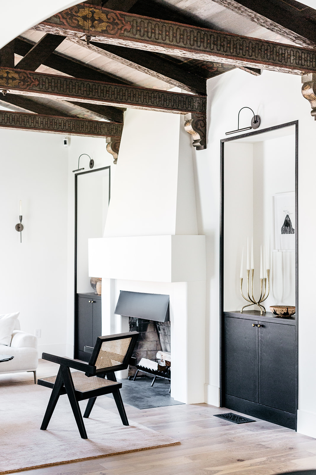
Walking into this TOTAL fixer for the first time my breath couldn’t help but be swept away by the stunning architectural details-regardless of how badly kept. Originally constructed as an exhibition home in downtown Los Angeles (for what we were never certain), the home was moved in 1931 to its still current location in View Heights. What with the unique exterior stucco details, soaring ceilings, and hand-painted cedar beams, I knew I had to have it and I told my partner so as soon as I walked out! We bought it quickly and plans began immediately on how to both shelter and highlight the history that was within while still adding square footage and raising the value of the property for profit.
How did you infuse a modern touch to the age-old character?
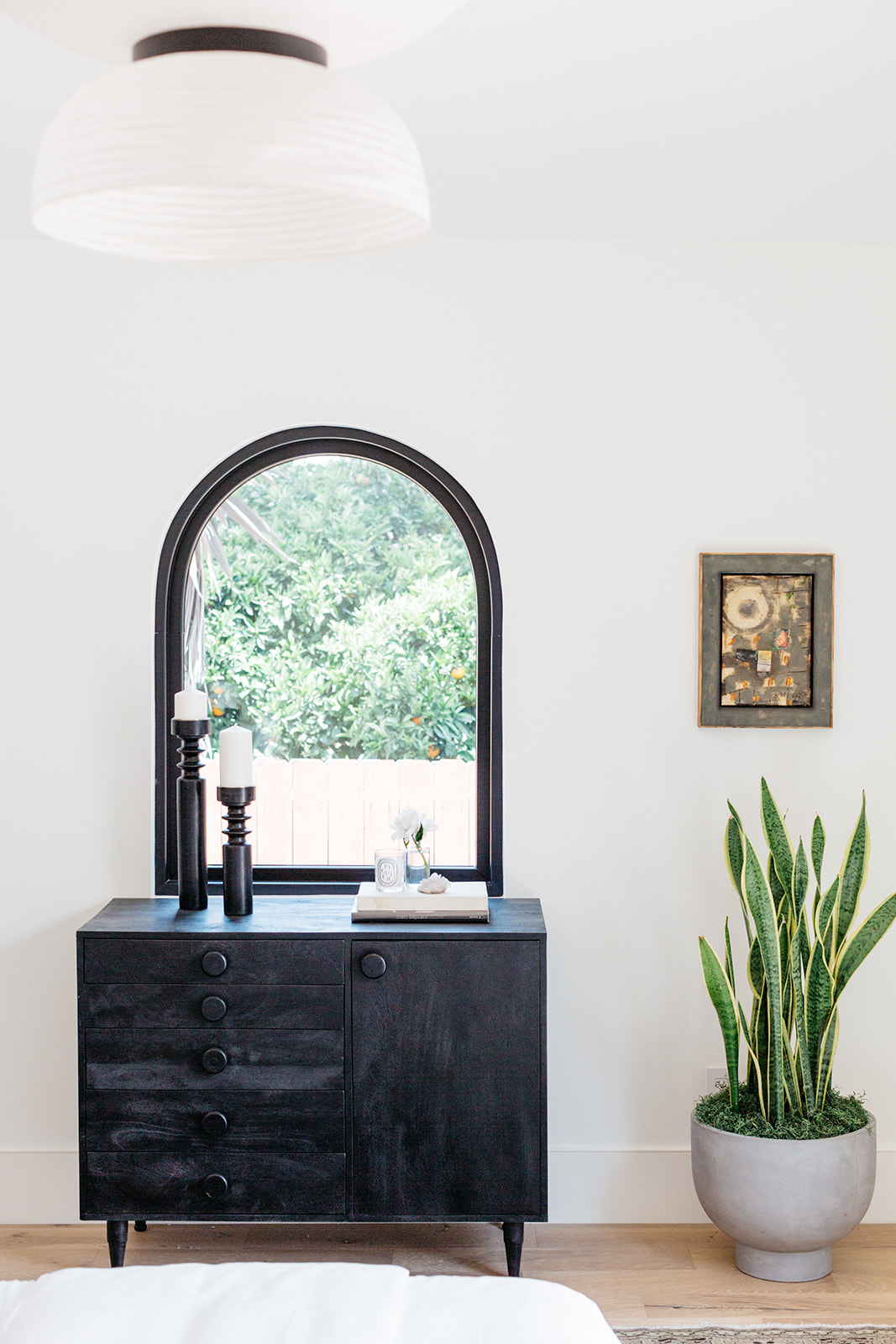
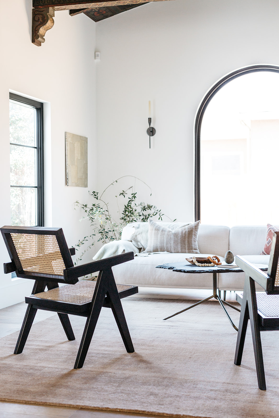
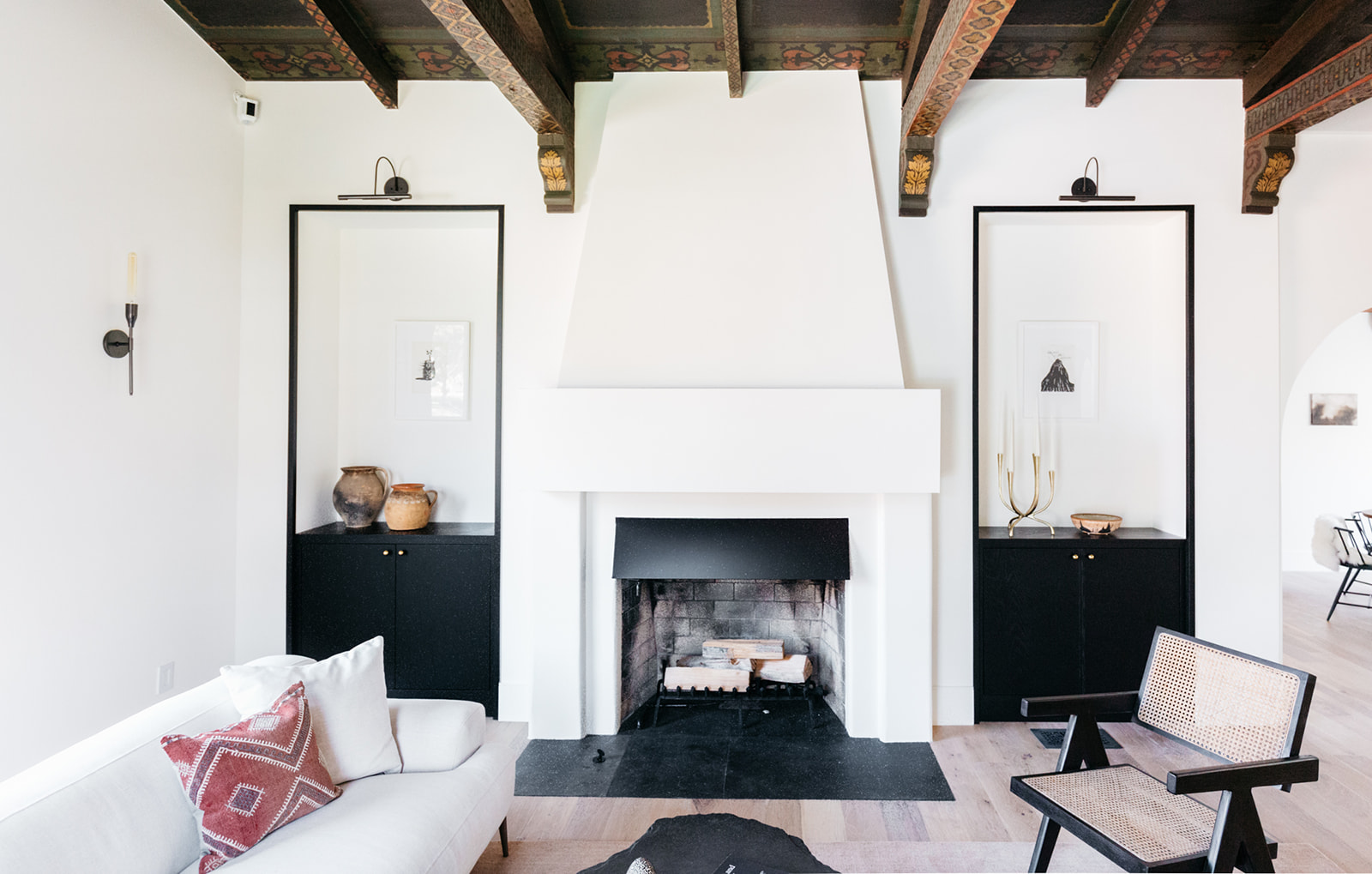
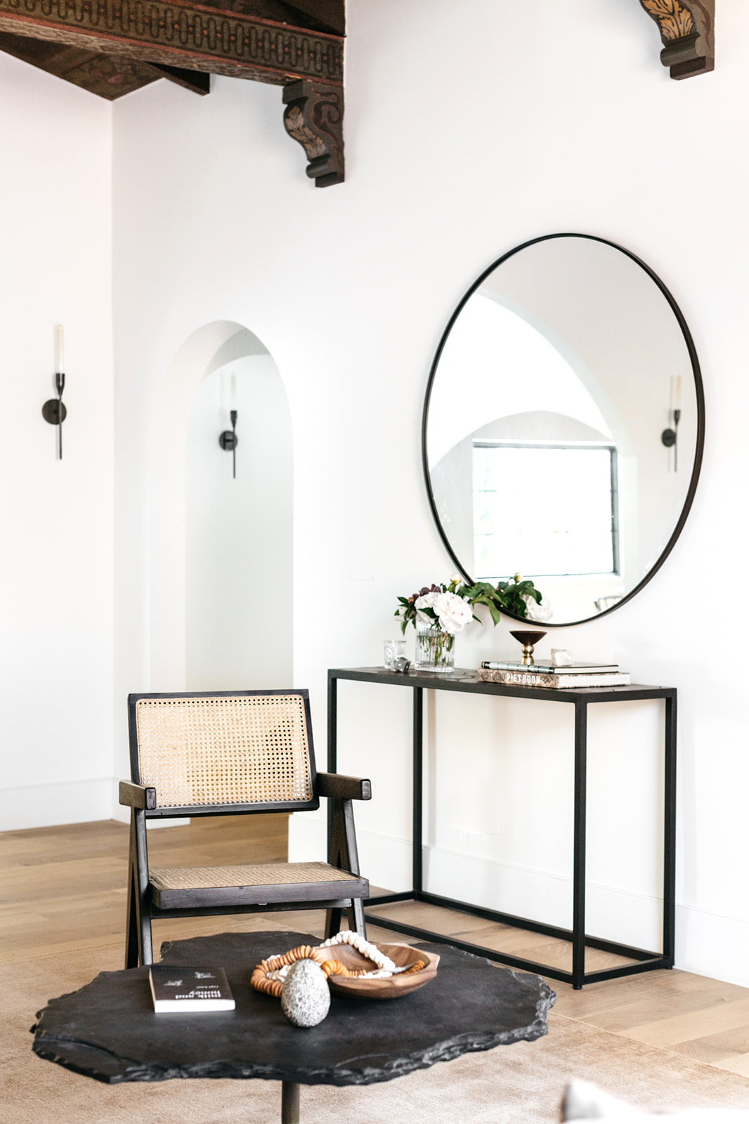
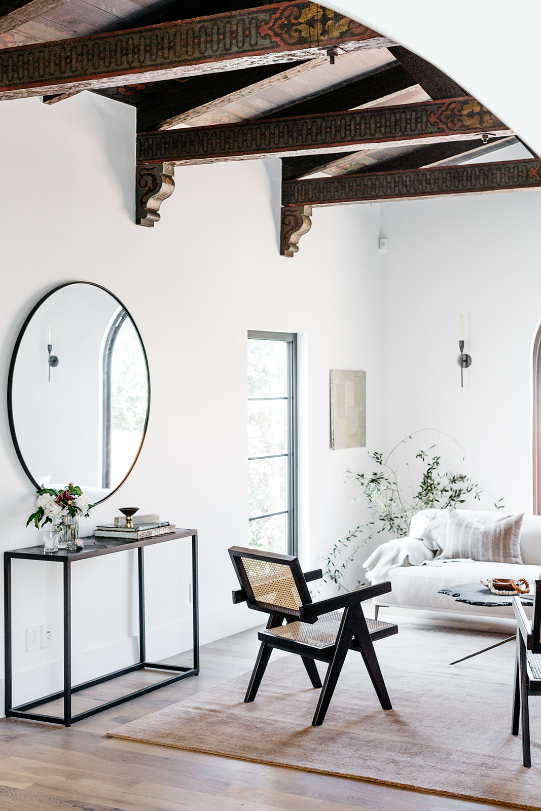
Throughout the process, it was really important to me to create a rich juxtaposition of modern and antique in the lines and therefore the finishes of the home as well. We hired an artist to painstakingly restore the original grandeur of the handprinted wooden beams, but we also blew out walls here and there, raised ceilings, and installed new flooring, windows, and bathrooms as we added the additional square footage. While the beams were what drew me in from the beginning—opening ceiling heights and reiterating the single entry arch throughout all of the hallway thresholds really brought those same beams to life and somehow gave them a new purpose!
Where did you begin when marrying the old and new?
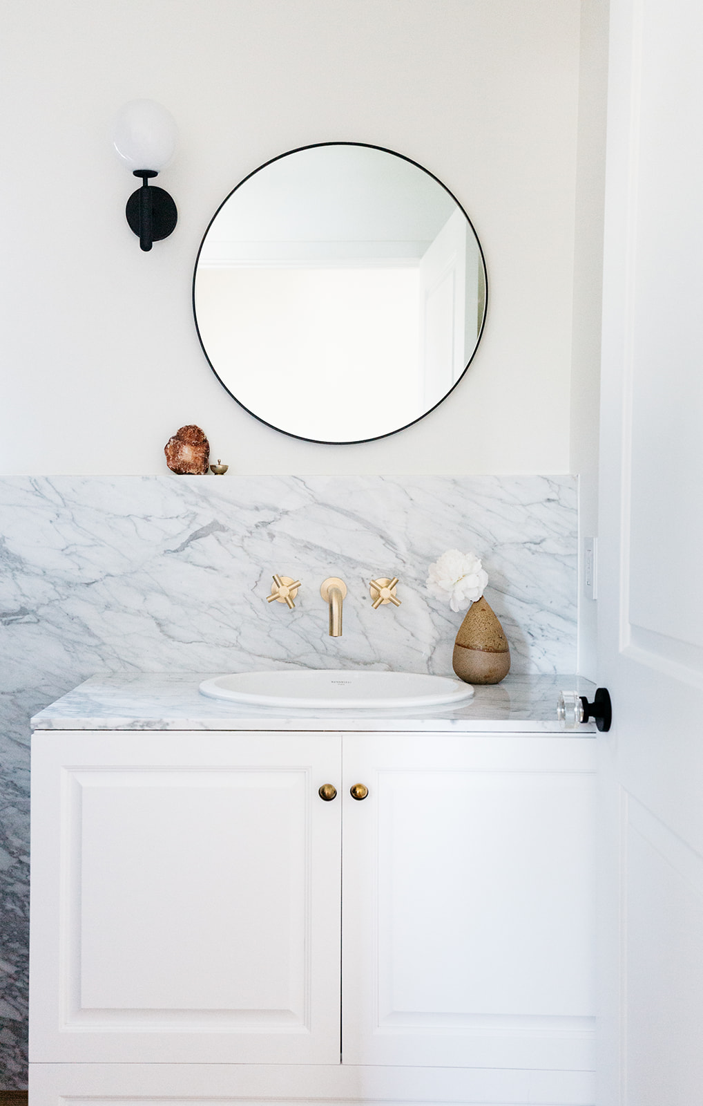
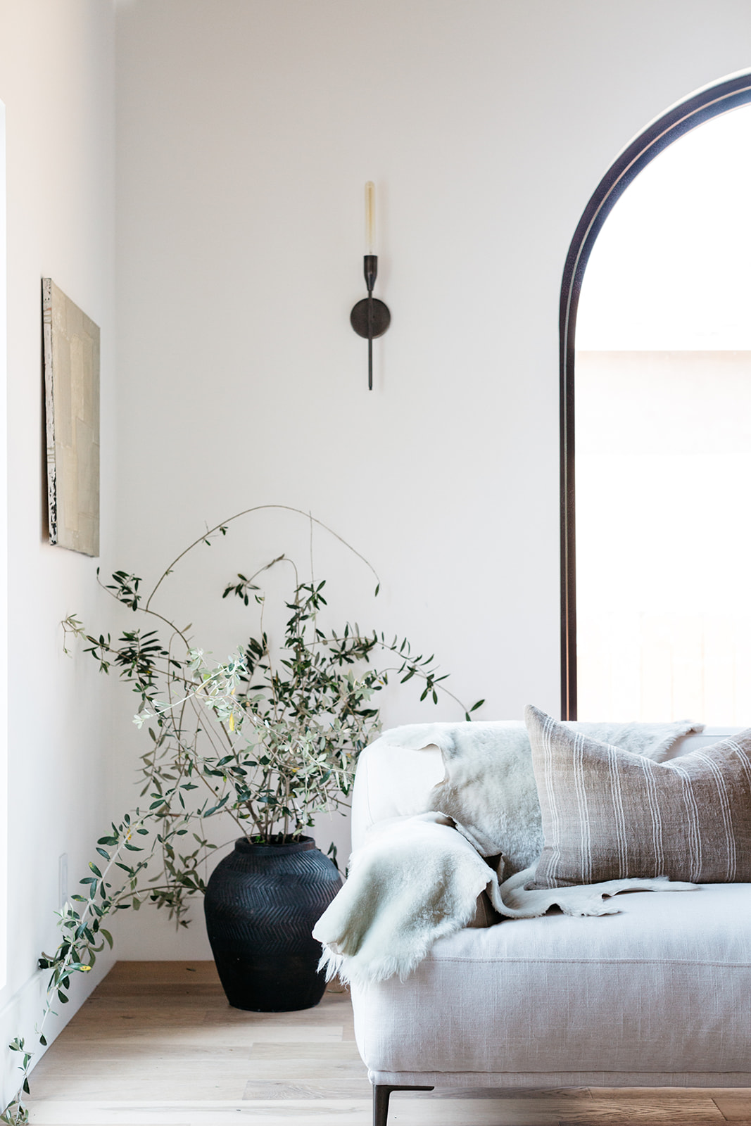
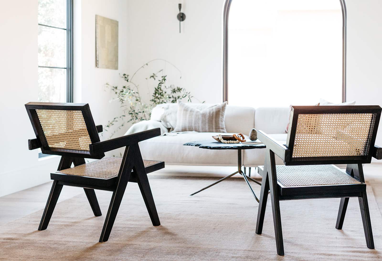
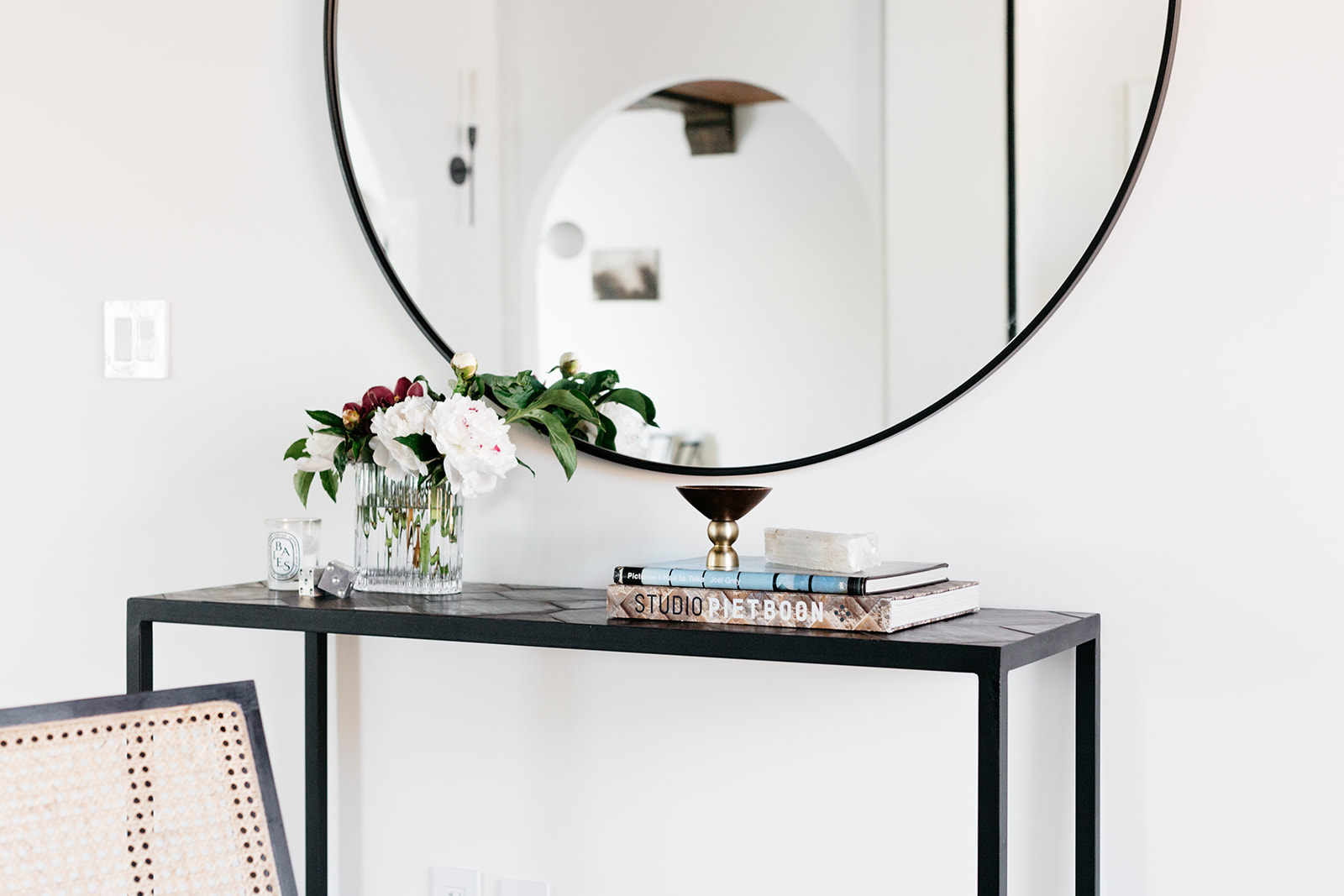
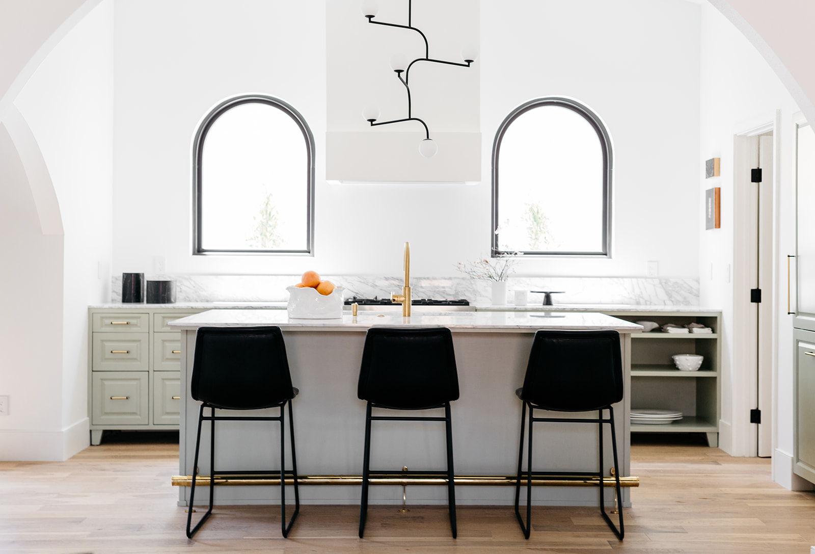
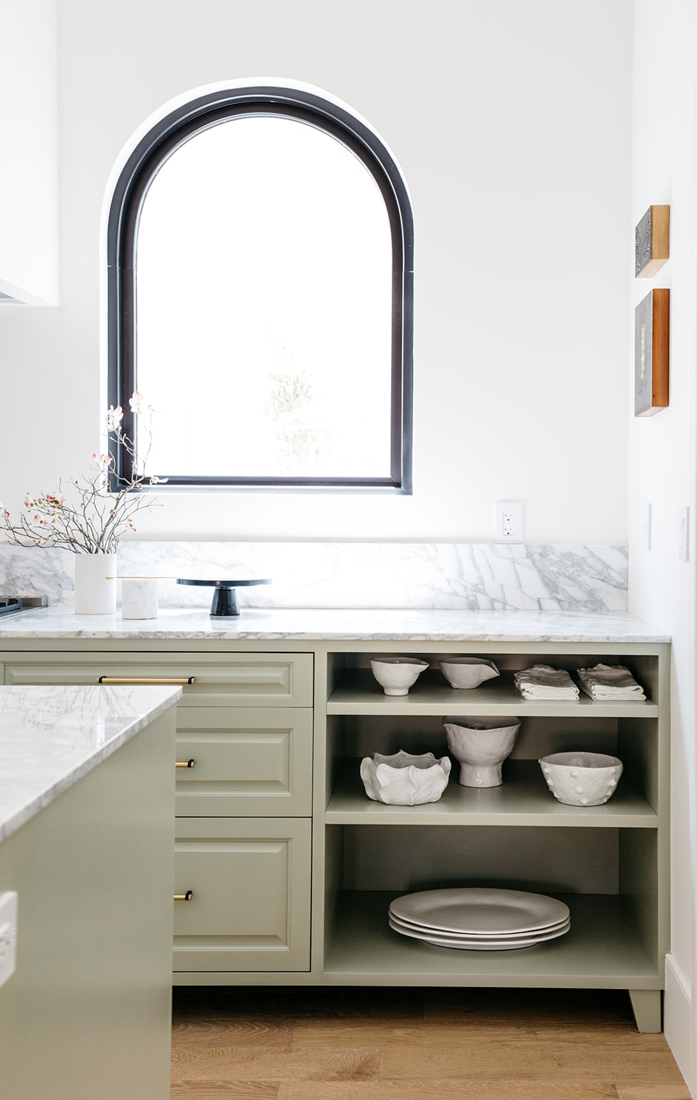
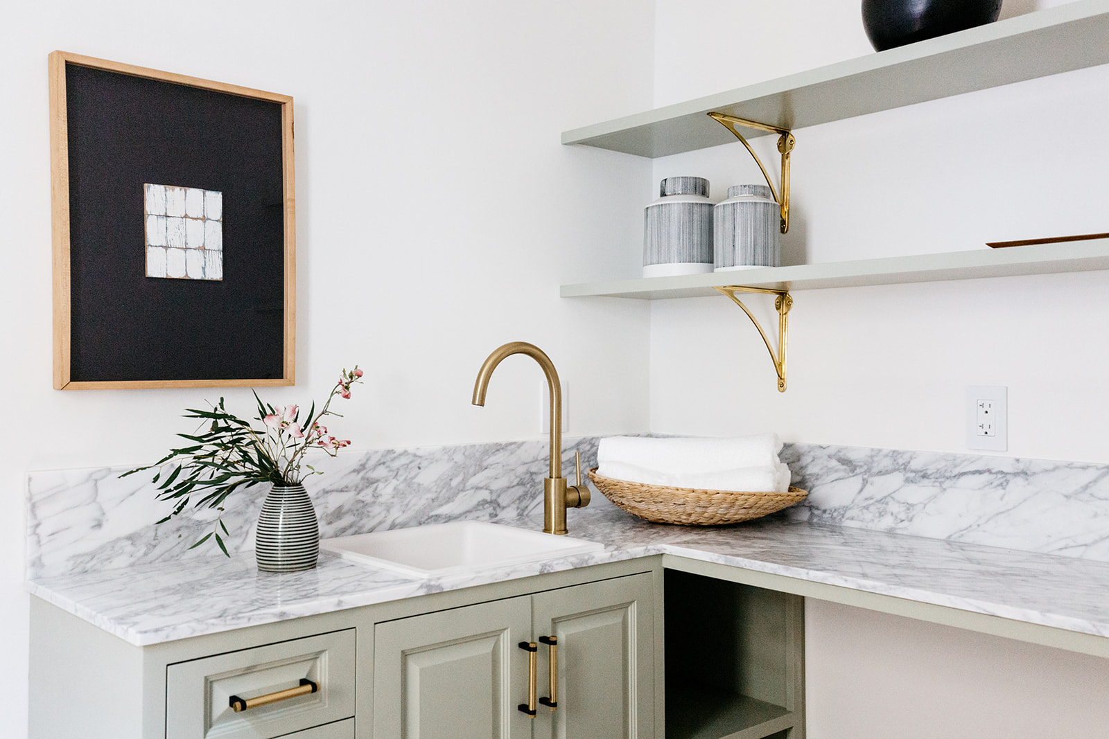
Designing for an unspecified end user allowed the bones of the home to truly guide my decisions and preferences. I wanted to keep a palette that spoke to the original painted designs but within a clean-edged and modern framework. Plumbing fixtures were austere and bold, the flooring a clean and fresh white washed oak, the formatting of the open concept kitchen very of the moment – but the dance between the original details and these new decisions was lovely together.
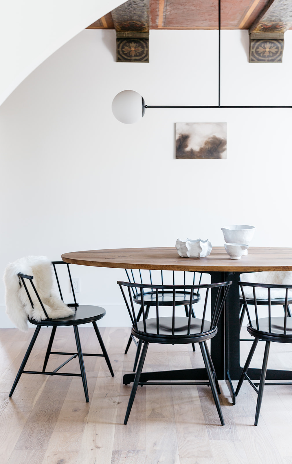
What stand out elements do you feel spike personality an interest?
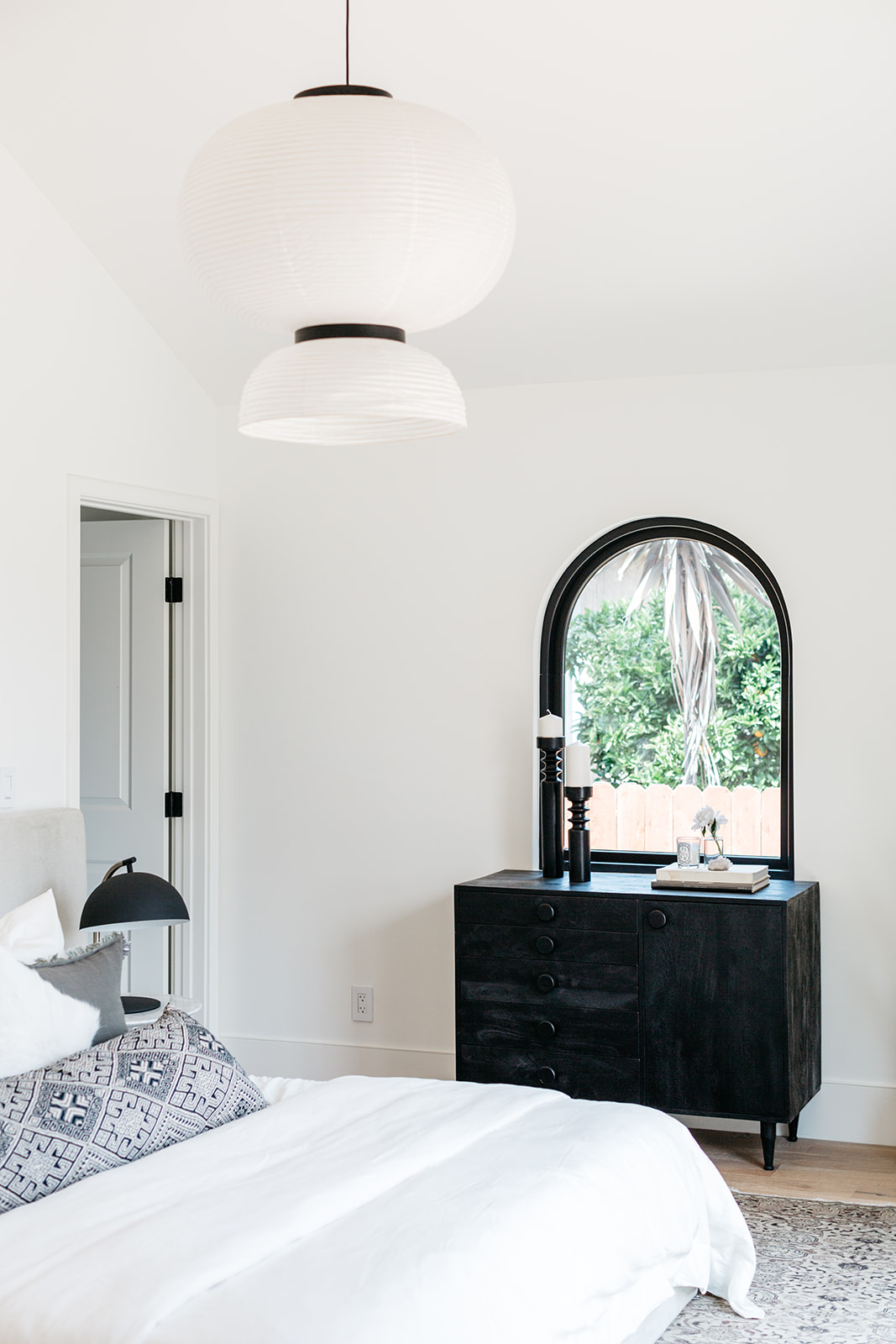
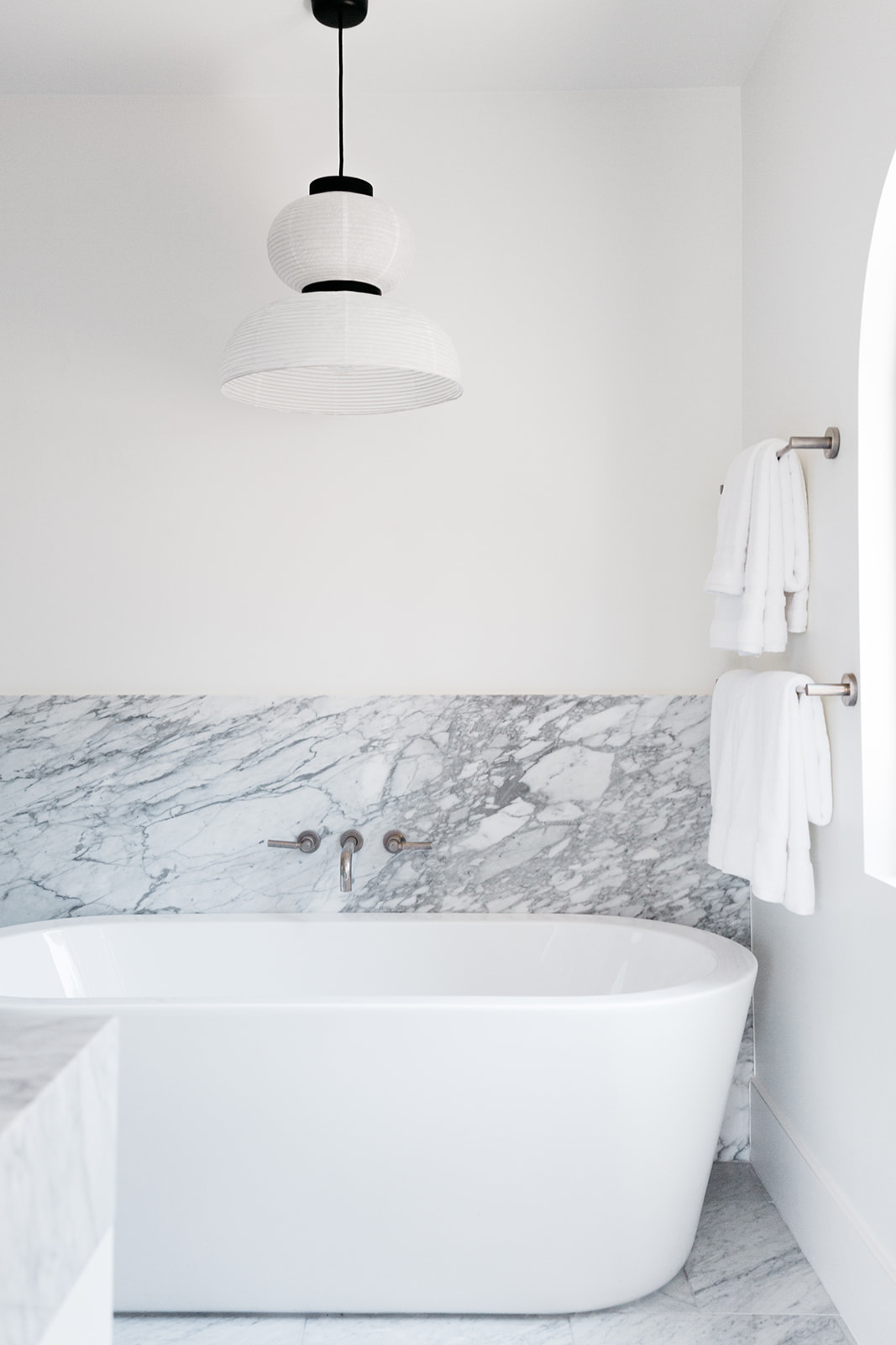
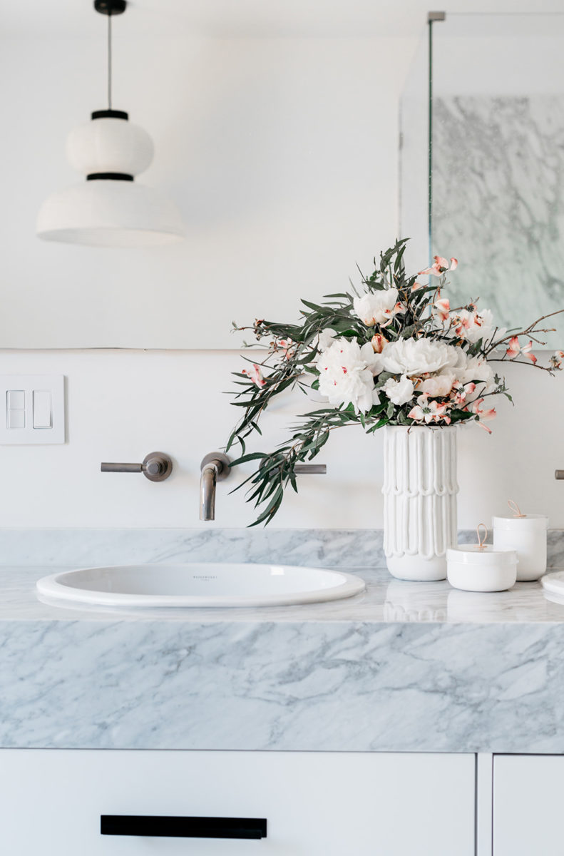
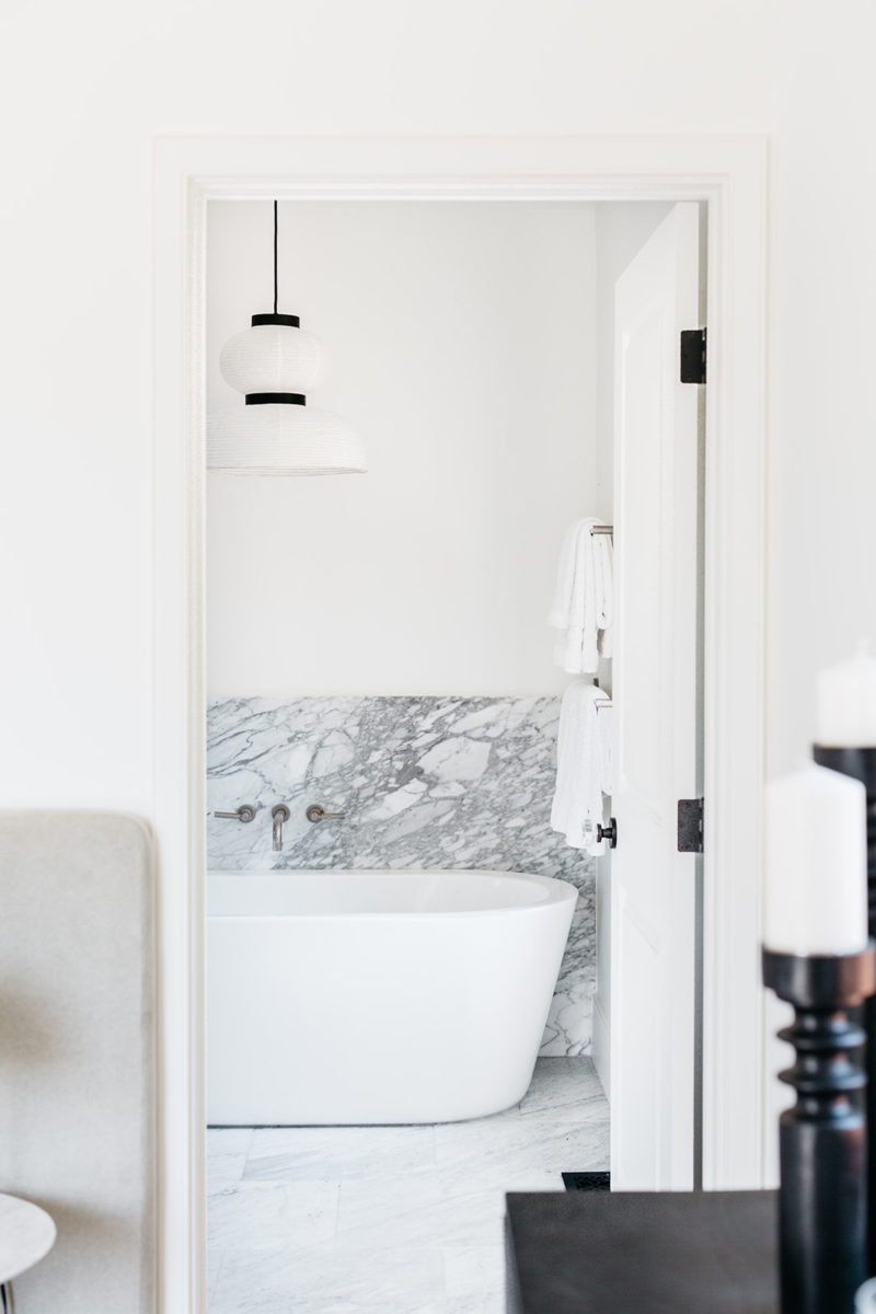
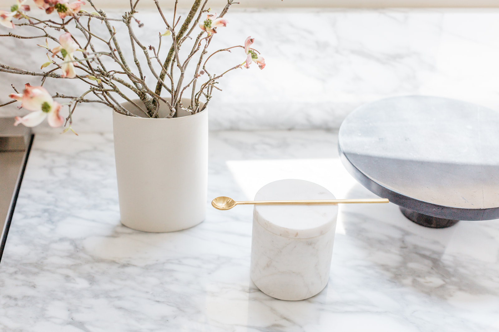
The lighting fixtures brought a lot of life and unexpected character to the home as well with their unexpected baubles and volumes. I aimed for them to funk up slightly the spaces for another layer of edge and interest. Similarly, in purchasing the marble I sought bold striking veining to do the same and yet used the same batch of slabs for a counterpoint to the bold pattern with regularity and consistency.
All in all the project was a blast and I fell so hard for the neighborhood and 1930’s Spanish style that I bought a similar fixer for my family up the street!
