It was a year ago (almost to the week!) that we hosted Kate Lester of Kate Lester Interiors for one of my favorite interviews to date. Remember this one?! Kate is like no one else I’ve ever met in the best kind of way; radiating a kind of confidence that is magnetic, yet with a calm, cool and fun-loving heart. This is exactly why we invited her to come and speak at the HAVEN Workshop and show our girls the ropes. She rocked it, they loved her and I’m so grateful to have finally met this boss lady who has inspired by own journey.
Today, we’re stepping inside a 6,000 square foot home in Manhattan Beach that Kate and her team transformed and is dubbing “Spanifornia” Meets French Chateau. Best style description ever? I think so. In our little interview below, she spills all the deets!
Can you tell us a bit about the inspiration behind the design?
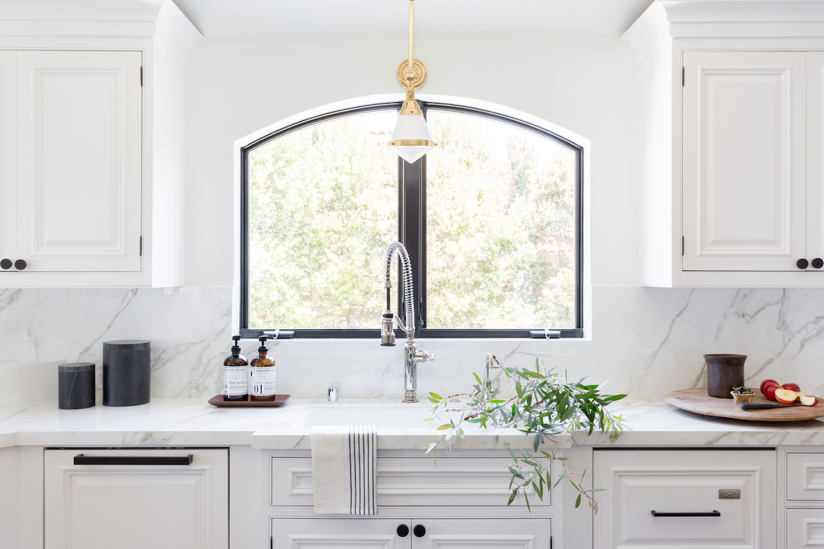
The home sits atop the coveted “Hill Section” of Manhattan Beach California, is 6,000 square feet, and was custom built in the 90’s. When our clients purchased it about 10 years ago and moved in with their two children, they did an extensive remodel but maintained its dark and heavy Mediterranean style. By the time they hired us on in 2018, they wanted something different. I knew the home had good bones, but it needed a dramatic facelift. Our clients’ main concern, (they are both in real estate) was that if we went too trendy, it would be dated in another 10 years. We were all in agreement, so the design plan was to keep it crisp, clean and classic. Natural wood tones, white-based marbles, and a really neutral simple palette anchored the design.
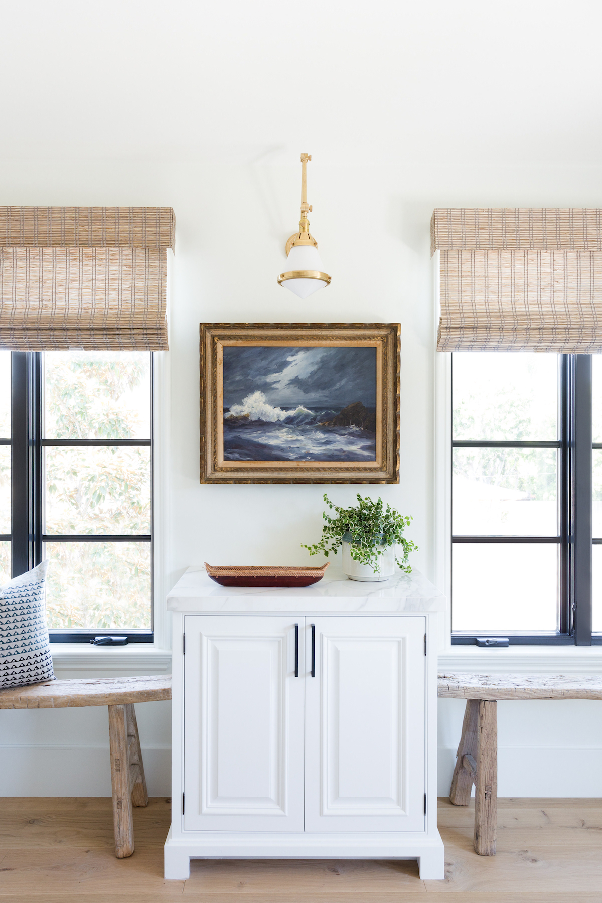
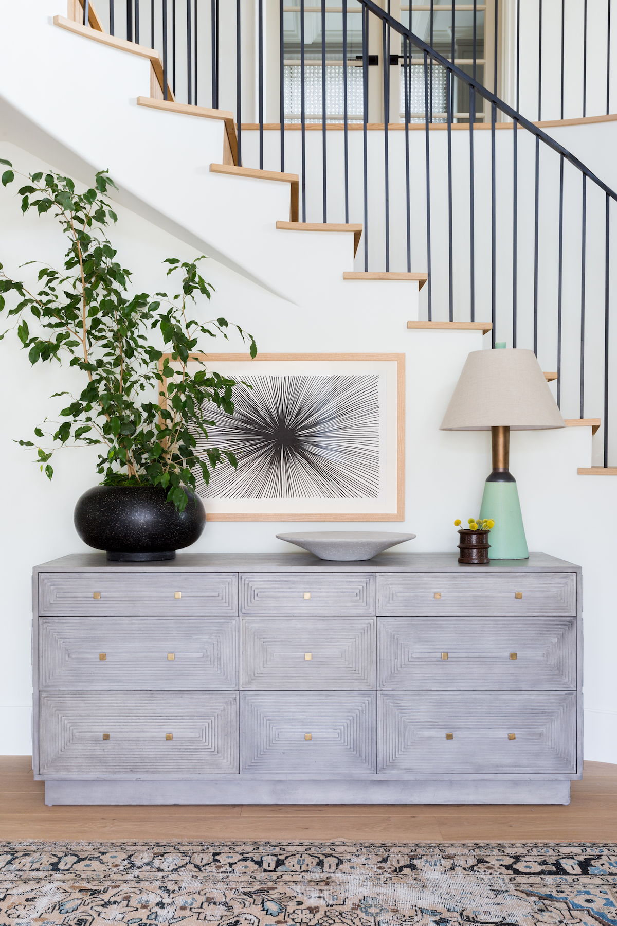
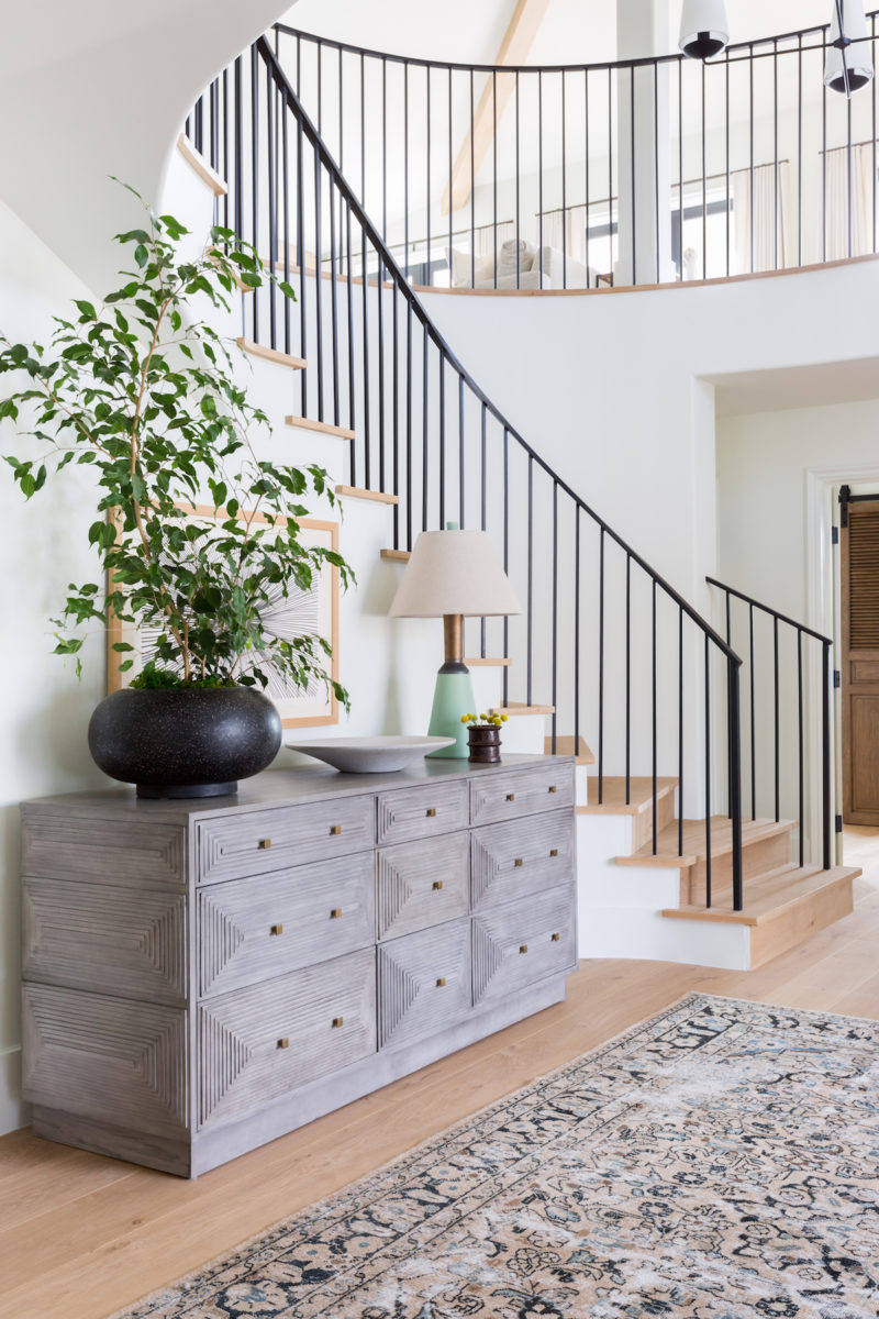
We threw around names like “Spanifornia” and “Modern French Chateau”, but the main idea was that we keep some of the home’s more interesting details, like the curved precast window in the dining upstairs hallway, or the arch detail in the kitchen. My main focus was to eliminate anything that was unnecessary. Streamline and simplify. We removed heavy crown moldings, dark flooring, and outdated columns. This immediately opened up the home and made it feel more welcoming. A fresh coat of Simply White paint throughout was really our saving grace. This perfectly balanced white breathed new life into the home and allowed the furnishings, rugs and vintage art and accessories to take center stage.
What were your client’s priorities in this project?
Our client was a referral from another existing client, and she patiently waited over three months to work with us. I knew I wanted to work on this project right away because it was such an open and gorgeous floor plan I could see the potential right away. Behind all of that cream paint and heavy marble and molding, I knew there was a diamond in the rough. Being by the beach, so much of our work has a coastal influence, it was refreshing to take on a project that was something completely different. I knew this dated Mediterranean would one day be my “Spanifornia meets French Chateau” masterpiece!
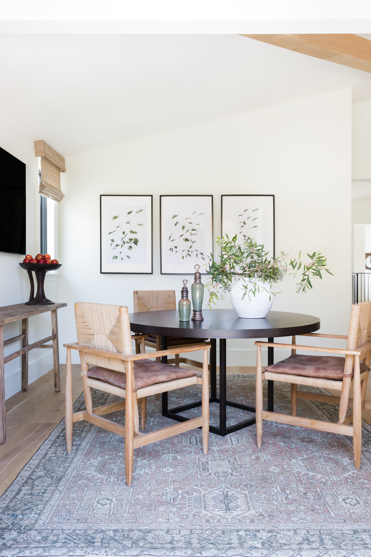
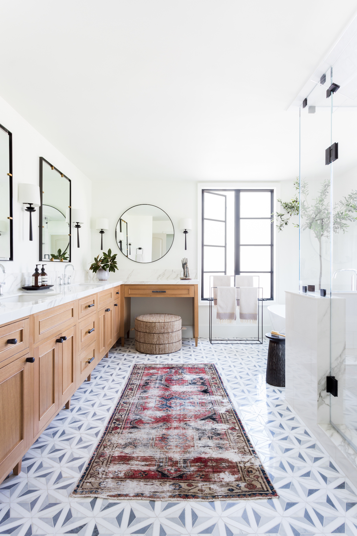
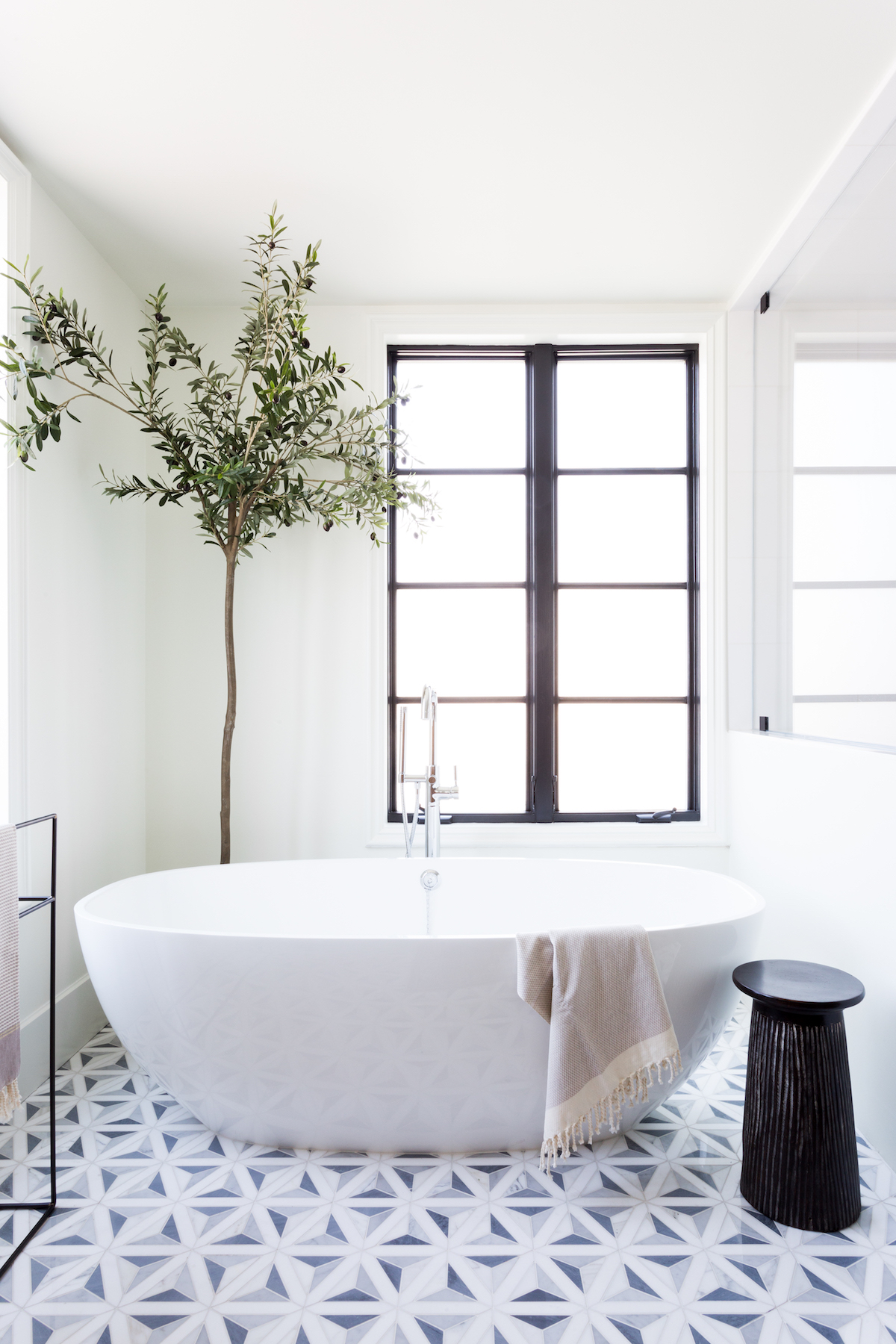
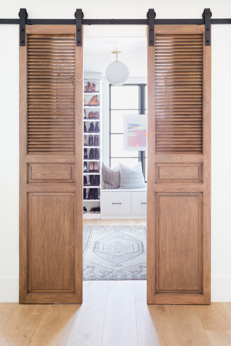
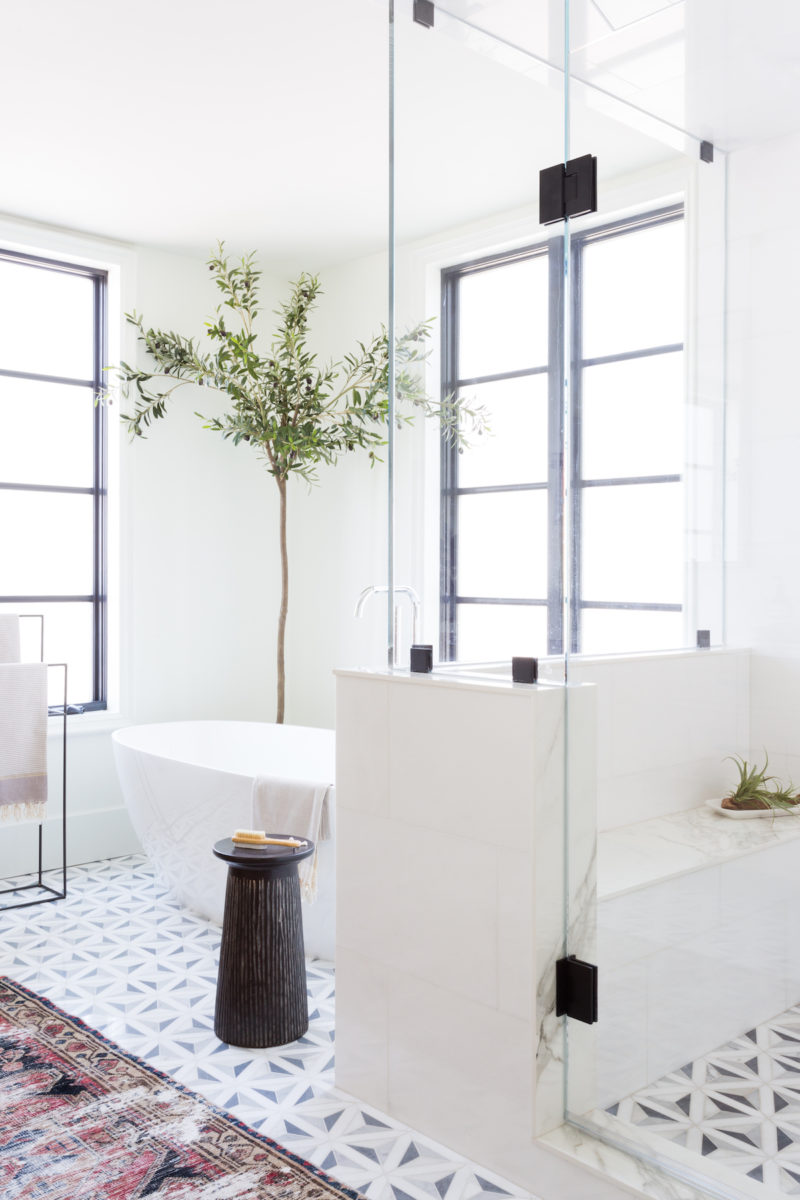
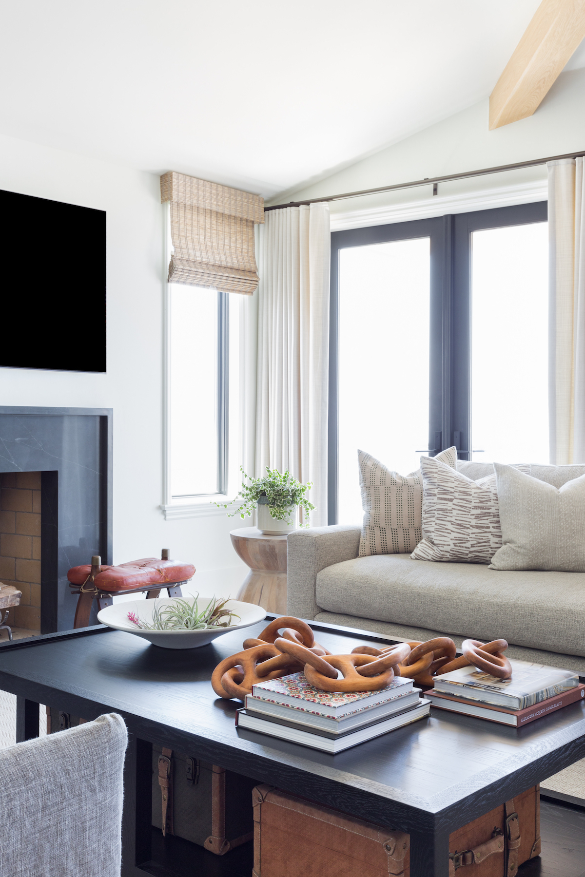
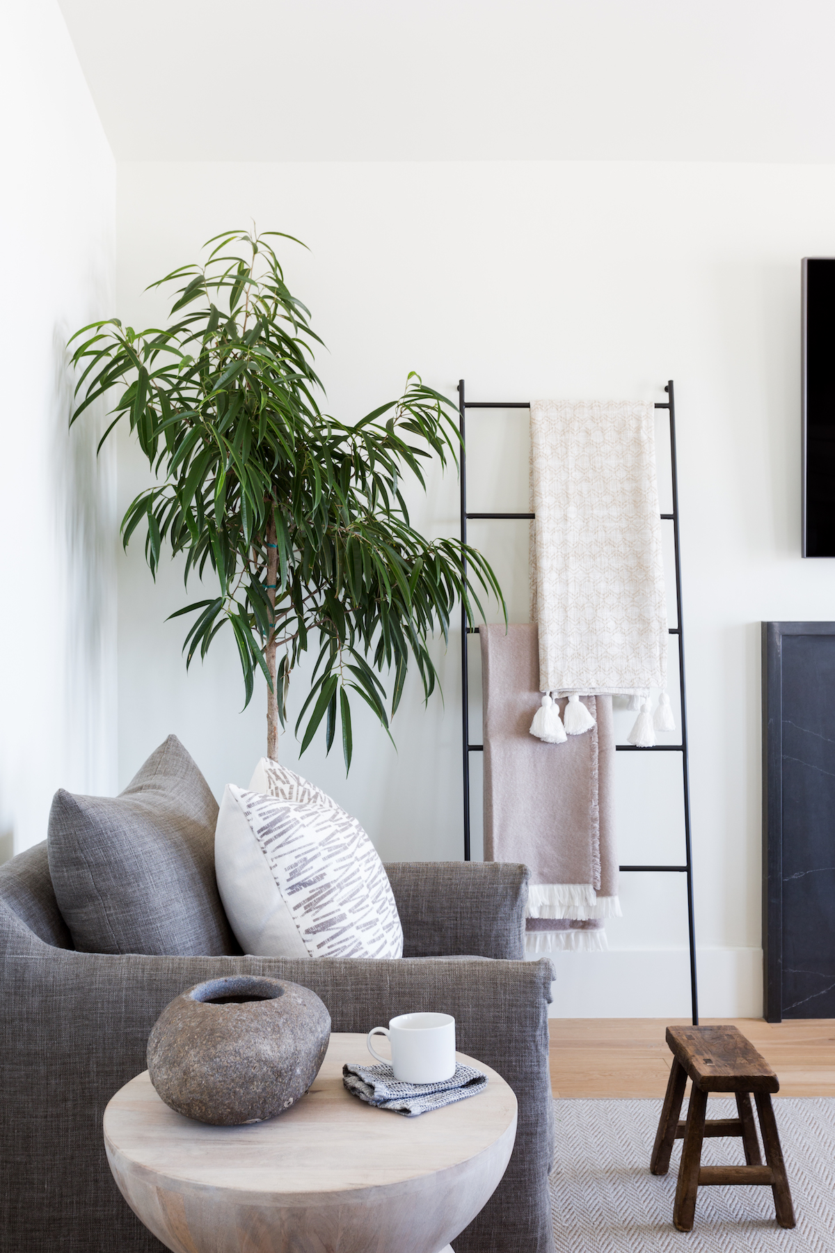
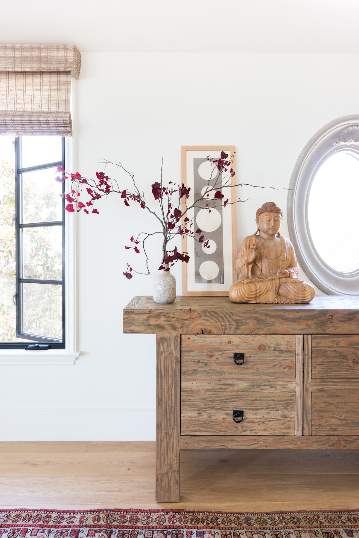
Our client’s mother in law had recently passed, and she was in the process of clearing out and selling that home. She randomly showed us some images of what was going to be donated, and I just about died. It was a treasure trove of vintage fabulousness. Many of the unique vintage pieces that are woven throughout the home were actually in the “donate” pile at her mother-in-law’s home and we rescued them! Now they have taken on a new life in this home and are a token of remembrance as well. As far as the layout goes, our clients had done a pretty extensive remodel to the home about 10 years earlier so the overall layout was pretty solid. My main focus was on opening up the master bathroom, giving our client a more cohesive closet space, and updating the overall style.
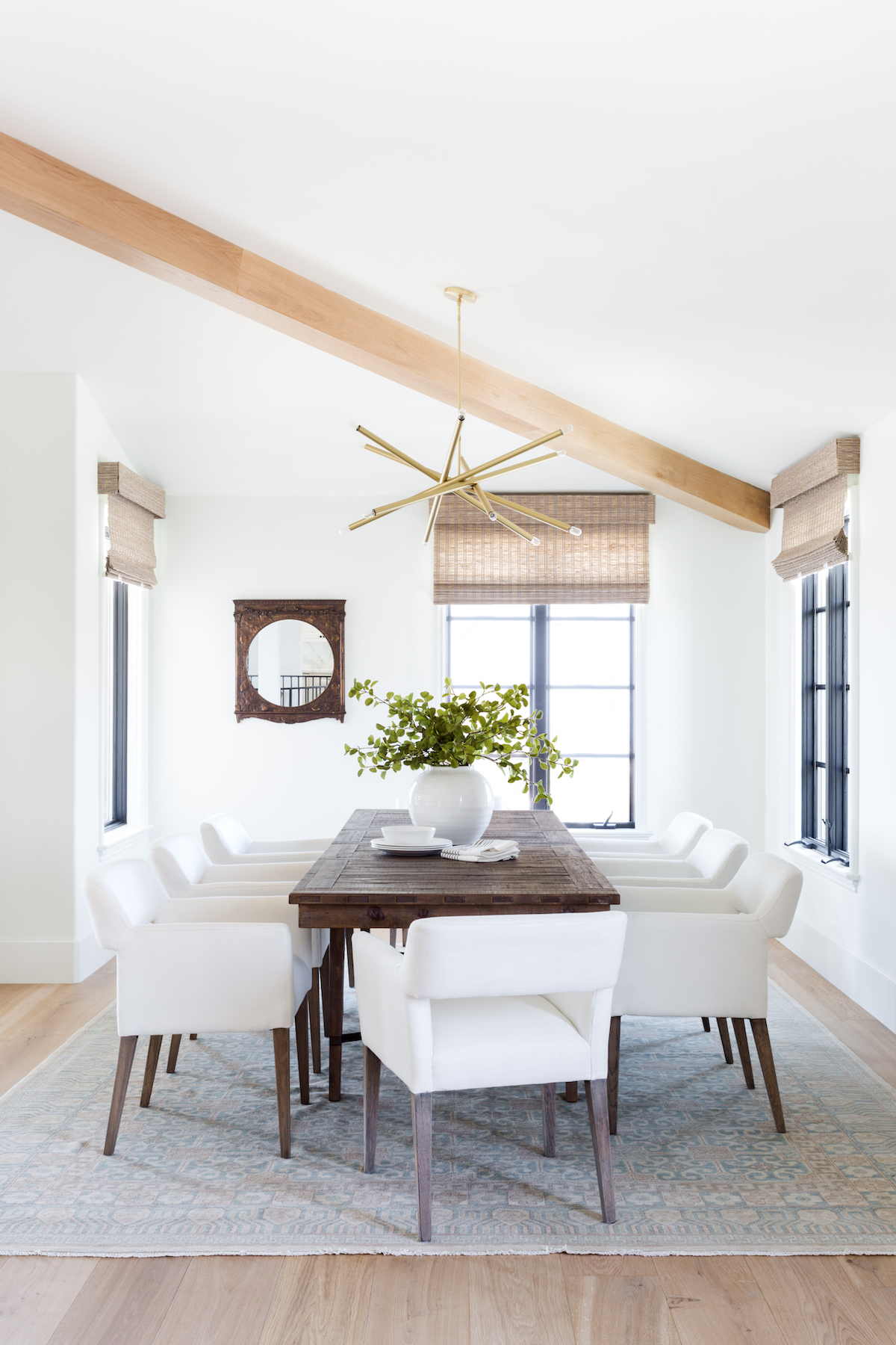
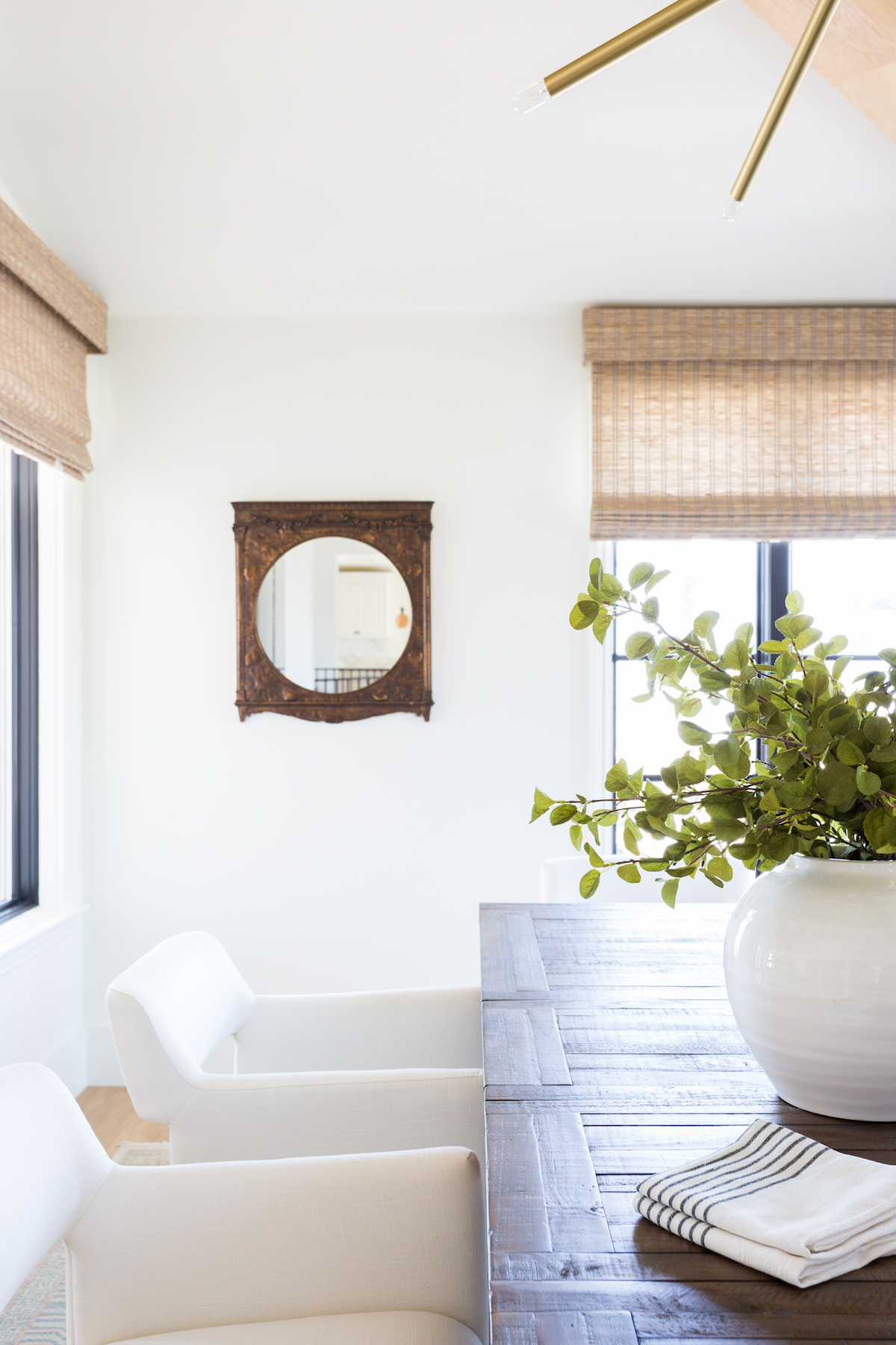
How would you define the style of this space?
I just really think the overall “feel” of the home is completely different. When I first walked in before we started the process, it felt dark, dated and so serious. Lots of gold and crystal. Not at all what I saw when I looked at our clients and their sweet family. The home had been decorated, but not specifically for them. It lacked personality, so I knew that infusing that would be goal number one. We also lightened everything. We ripped out all of the travertine floors and introduced a custom European oak floor throughout. This not only added texture and dimension, but it also made the whole home instantly warmer and more welcoming.
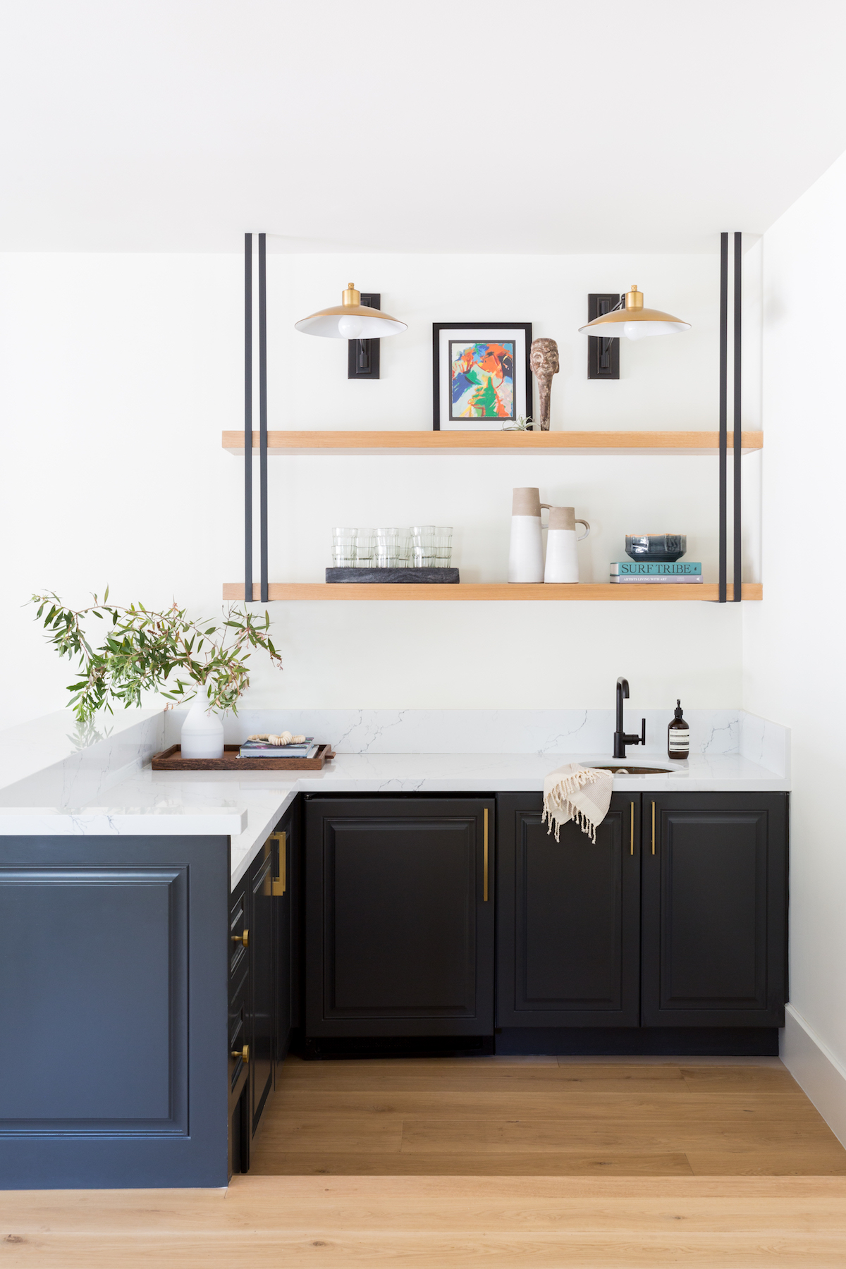
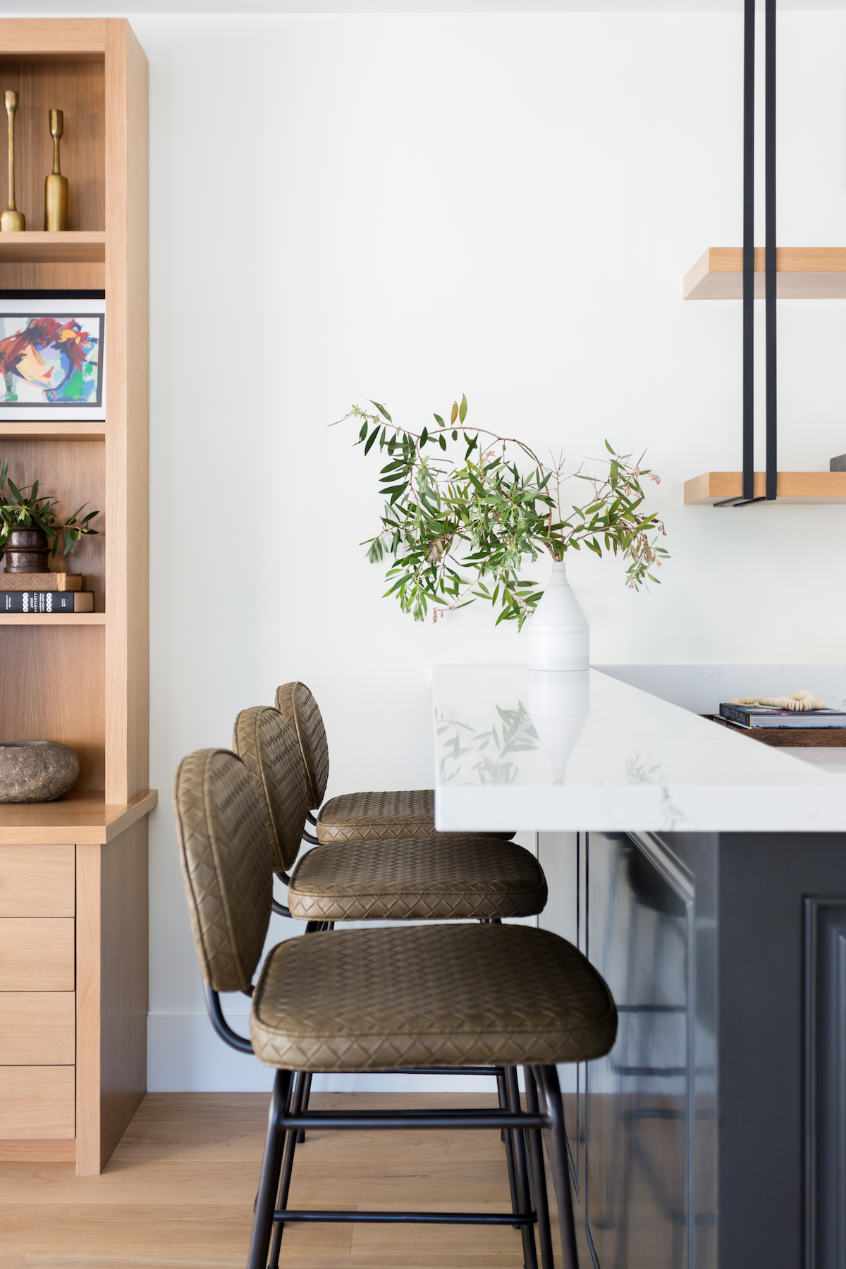
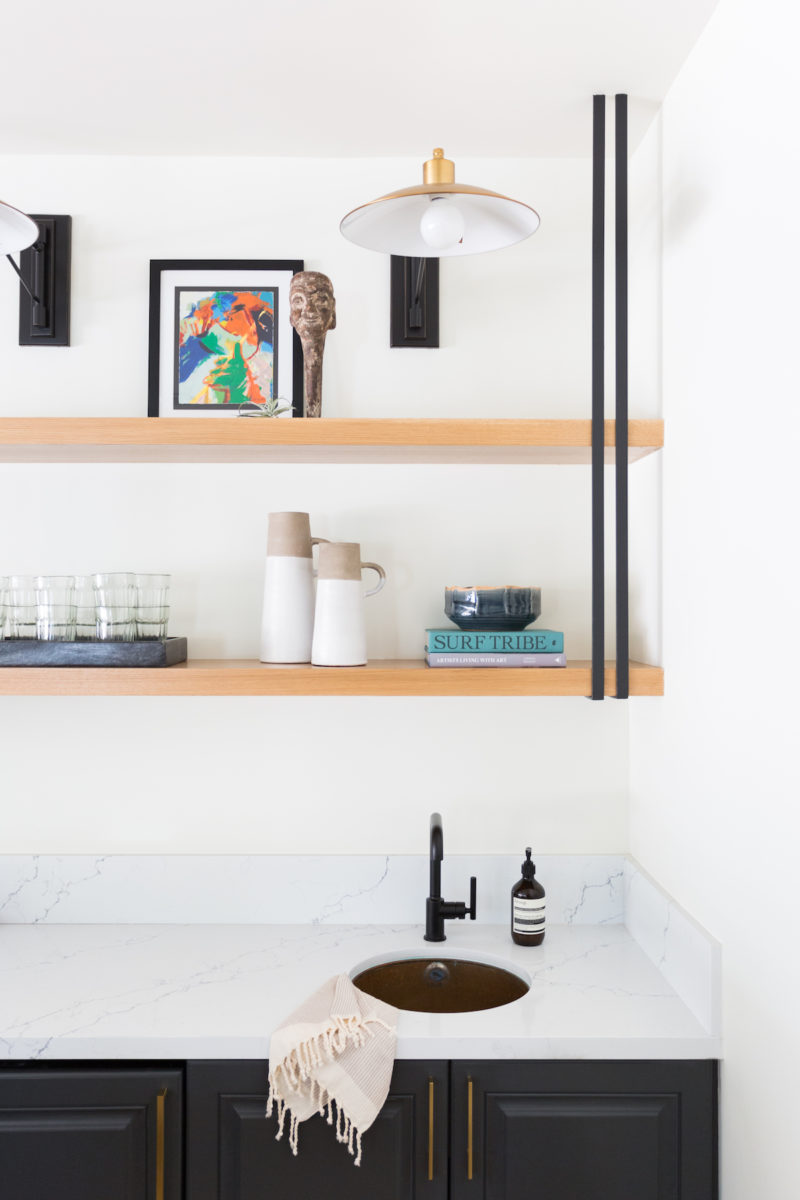
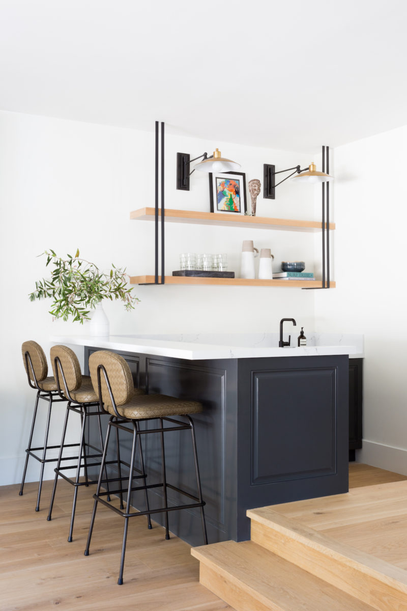
The one thing that was really unique to this project, is that in the kitchen and bar, the existing cabinetry was in great shape and the layout was good, so we kept it. We contacted the cabinetmaker who had originally built these cabinets and he helped us update them by changing out the molding, hardware, and some of the wood finishes. It made me really happy that we were able to re-use some of the existing cabinetry. I like being smart about my budgets, and I knew I could get the look I wanted with a few tweaks and then use that money somewhere else!
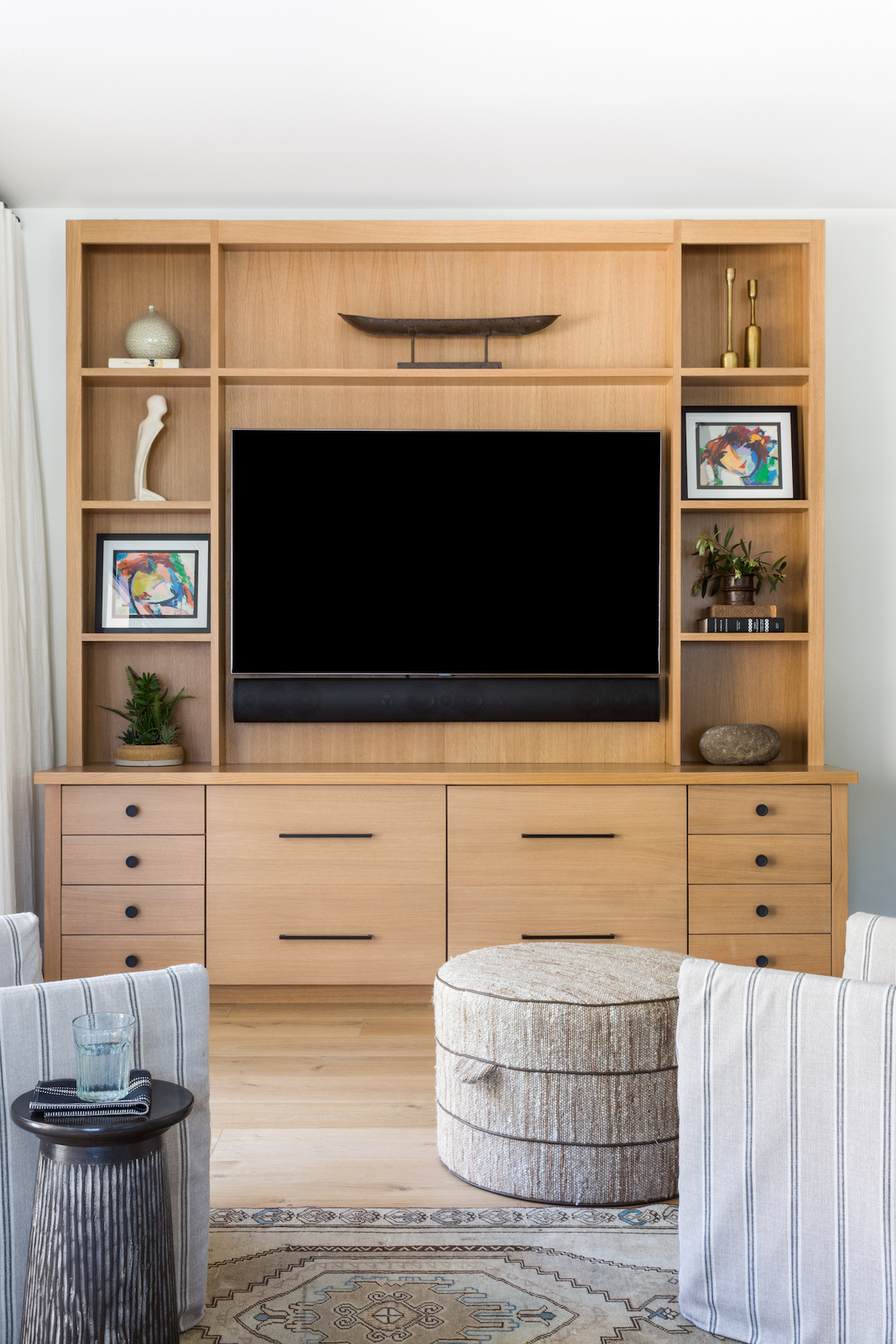
Our client is a pretty fierce and savvy businesswoman, so I prepared myself for her to not be overly emotional like some of our other clients during the big reveal. Needless to say, when we opened the doors and she got tears in her eyes, so did I! It is really one of the most wonderful feelings when people are so happy with the finished product that they become emotional. It is a gentle reminder that not only are we in the business of creating gorgeous spaces, but we are also creating backdrops for people’s memories.
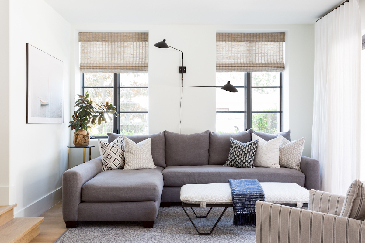
You have a way of infusing a ‘casual sophistication’ in every home you touch (which is why we love you!). Can you share a tip or two on how others can achieve this?
I think it’s important not to take yourself too seriously when designing a space. We always start with function…“what are you going to DO in this space, how are you going to LIVE?” Then we build from there. My mantra is really that white is never a bad idea, contrast is a must, (not only in paint and textiles but also in textures), and never forget to add a pop of black. Found objects and unique art add interest and ultimately give our spaces a curated, timeless appeal.
Were there any challenges you encountered while designing this project?
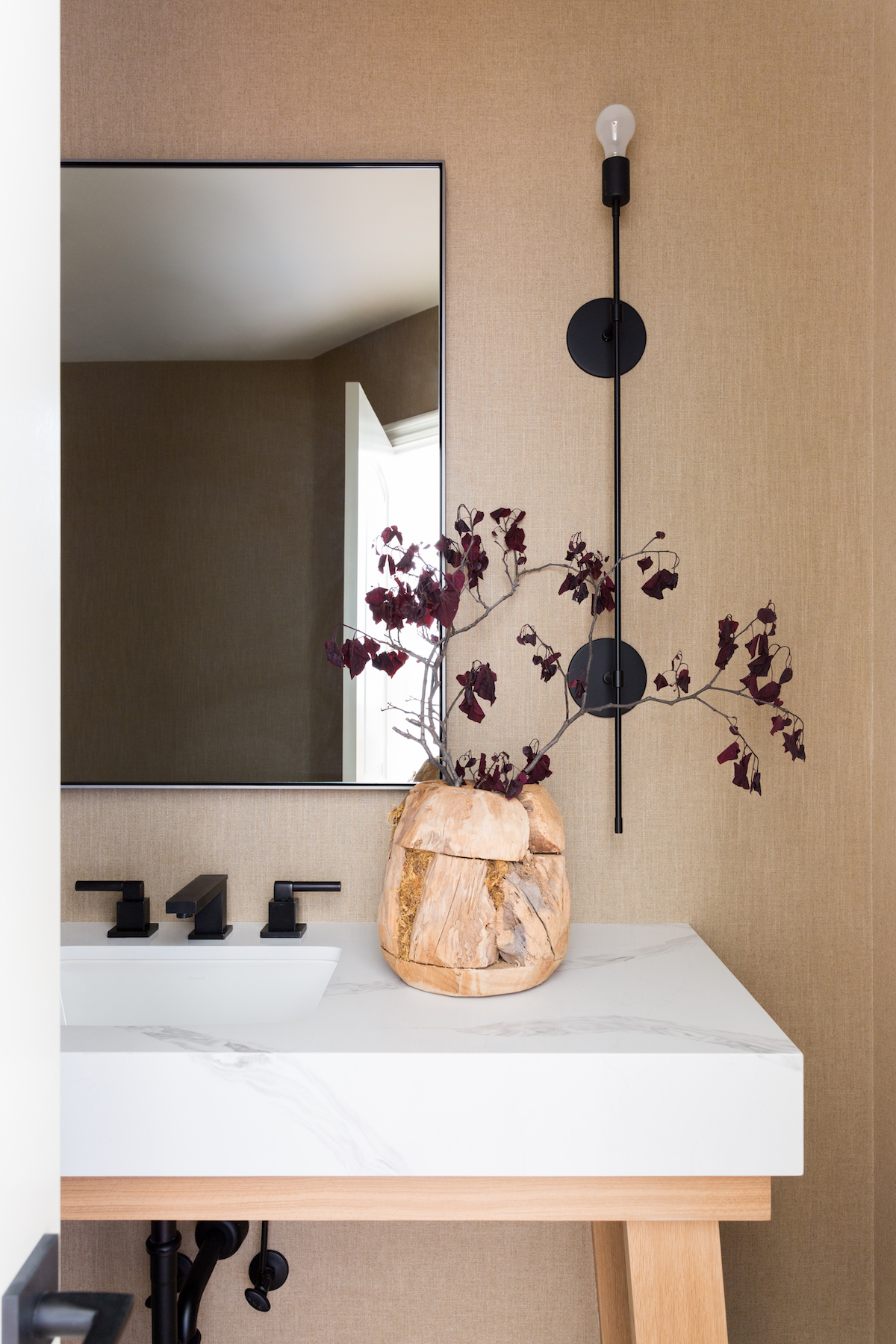
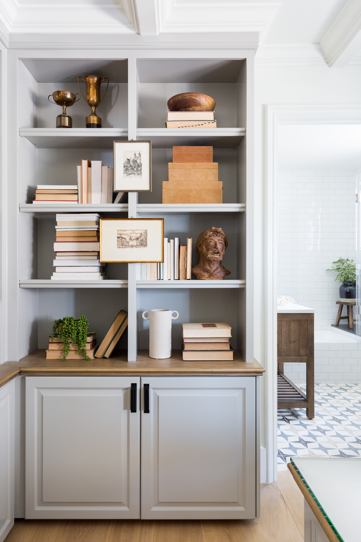
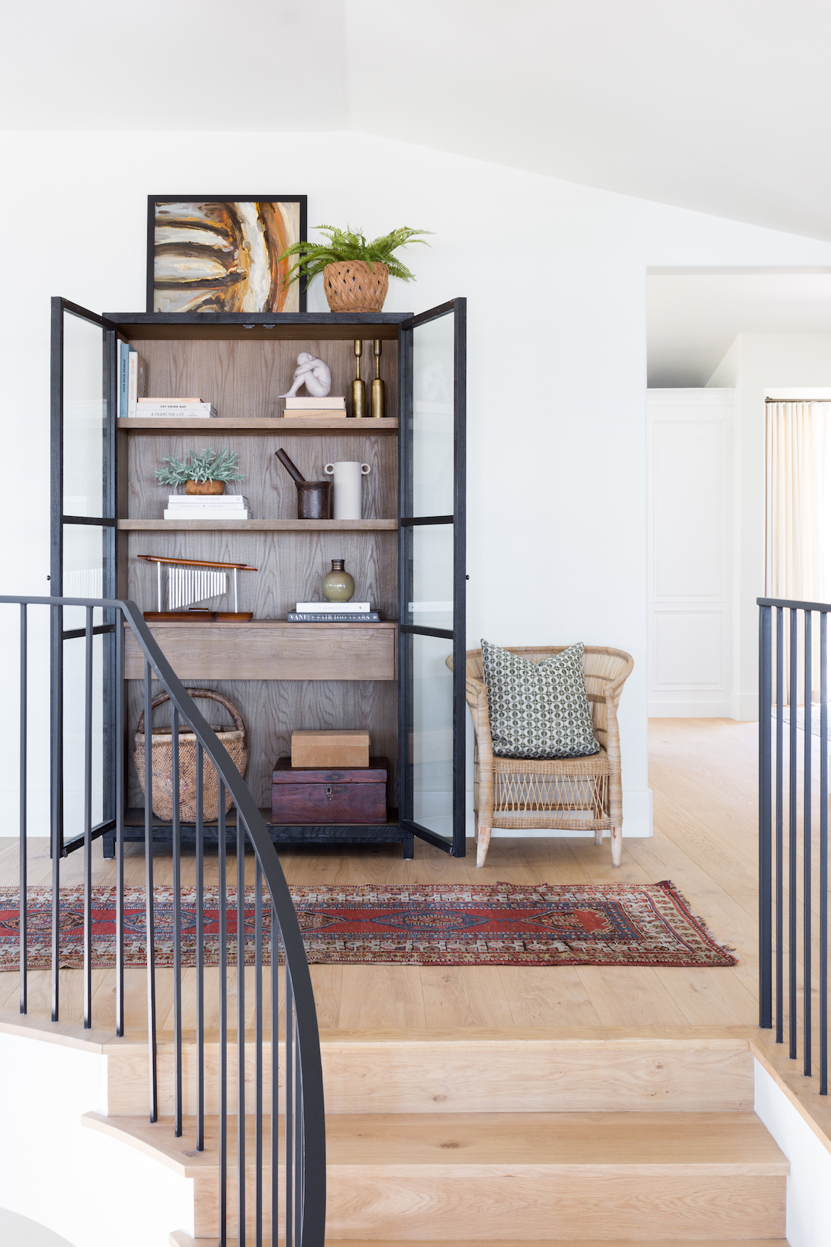
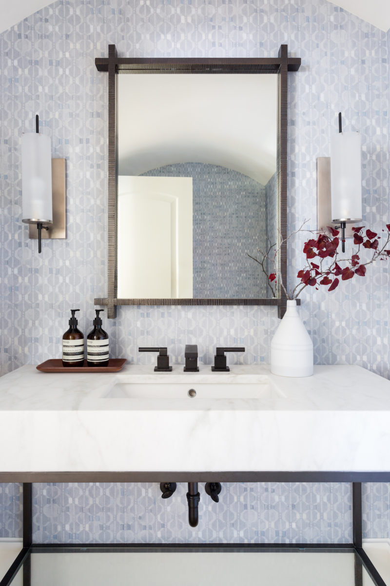
Upstairs is the main living area. It’s essentially all one large open space, which some people may see as a challenge to design but we really embraced it. On this floor is the kitchen, living room, dining room, second (blue wallpaper) powder room and office/library. We made sure everything worked together cohesively without feeling too busy.
What is your favorite design element or room in this home?
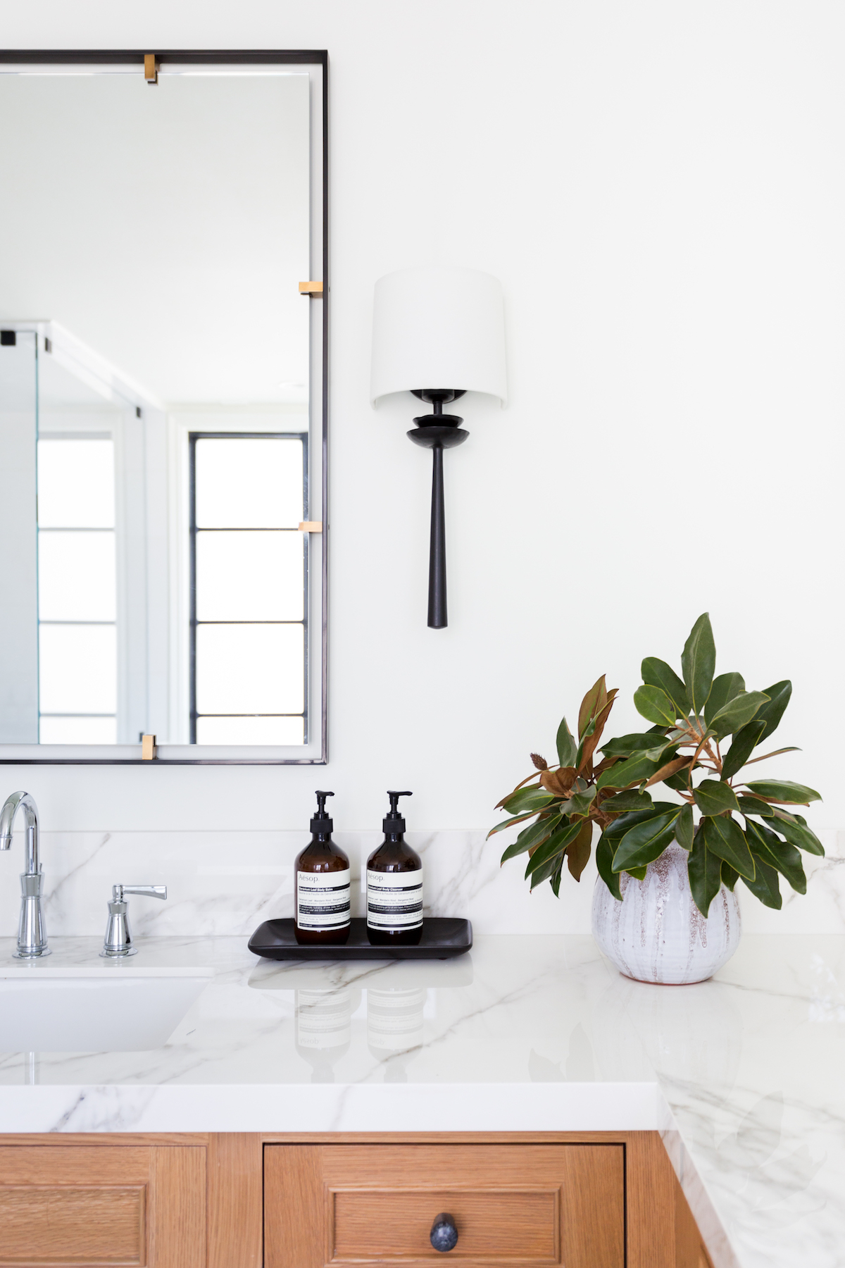
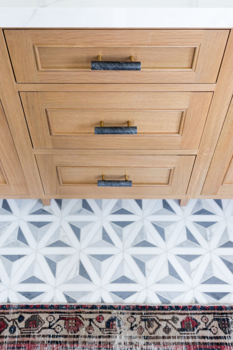
OMG, can I say everything? If not, then I would have to say the master bathroom. We specified these materials long before bleached oak was a “thing” so there weren’t that many inspiration images to show our client what we were thinking. Same for the patterned floor, but thankfully these clients trusted the process! It came together just as we envisioned. It’s bright, sophisticated, unique, and effortlessly cool.
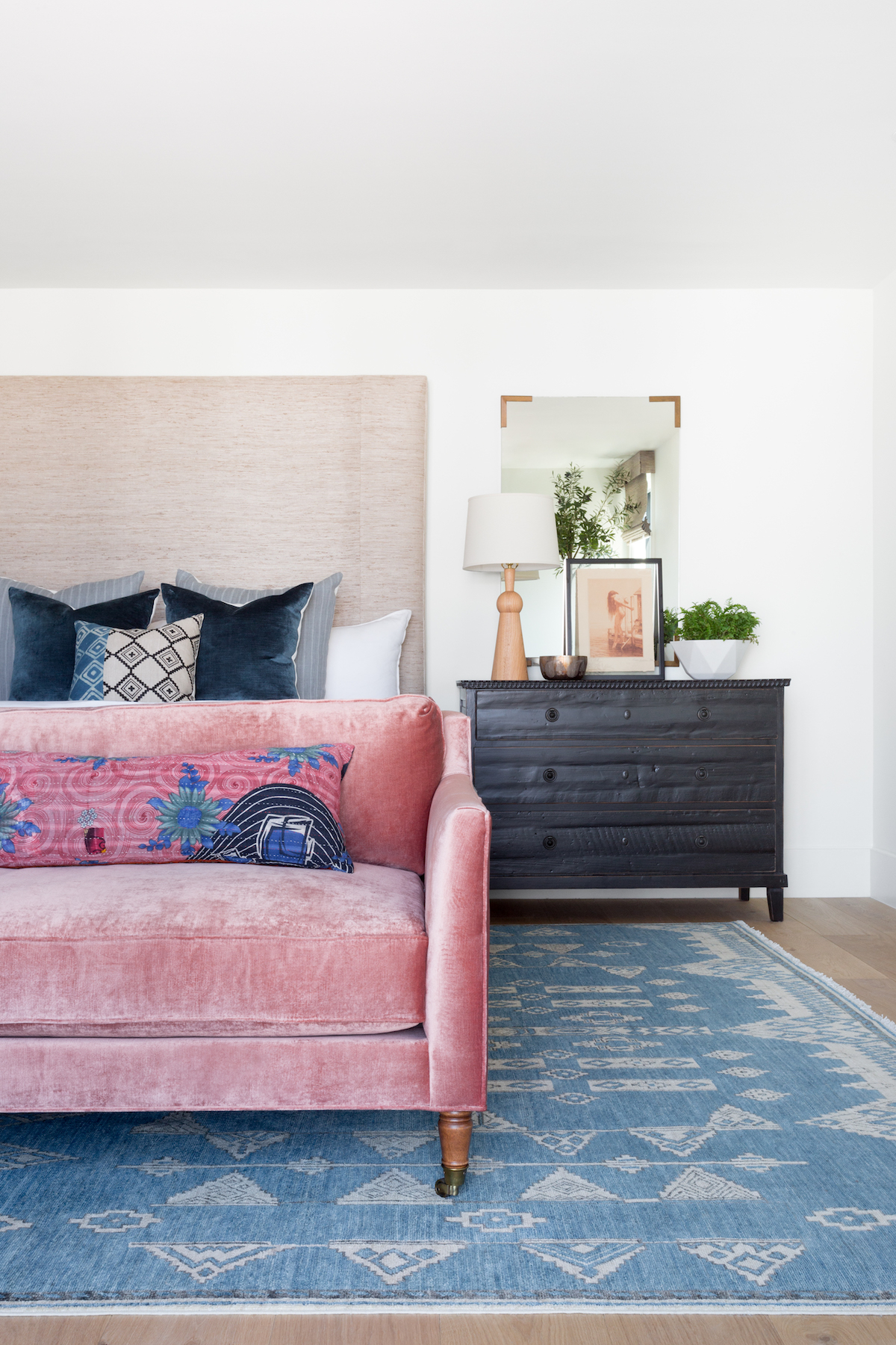
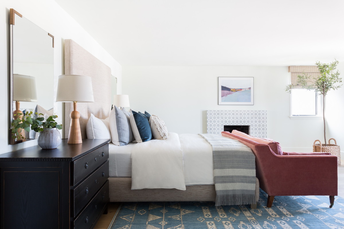
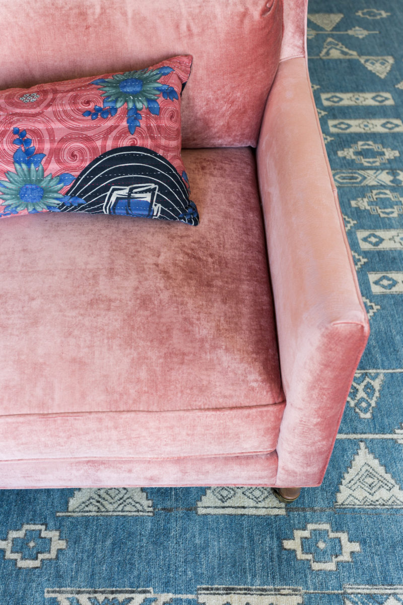
Shop the Pink Sofa
