Today we’re welcoming our newest creatives to The List! When Alessia and Sarah of reDesign home met 20 years ago—while working for the same commercial/retail design firm—they immediately cemented a functional working relationship and close friendship. The result? reDesign home, which was an idea they had both dreamt of for years. When an opportunity presented itself to start working with clients they didn’t hesitate.
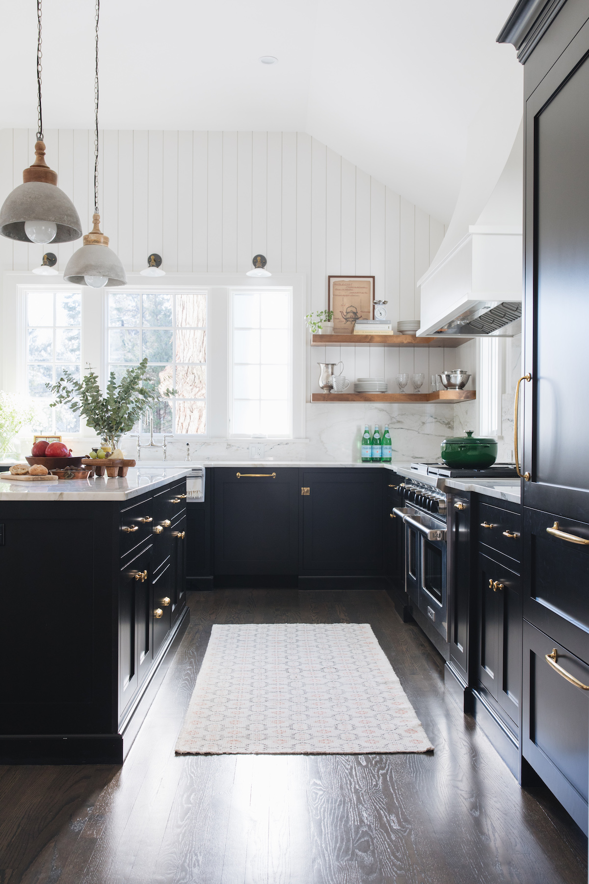
We’re getting a behind-the-scenes look at their successful partnership today, along with a 1920 English cottage-style home that you won’t be able to stop staring at. In short, Alessia and Sarah are down to earth, and truly love what they do. For those of you in the industry, we hope their entrepreneurial journey will inspire you.
Tell us a bit about your story. What was your journey to becoming a designer and how did reDesign Home come to life?
Alessia: One of my early memories of dreaming of becoming an interior designer was during my elementary school years; my mother used to buy a magazine “Cose di Casa” where many articles focused on the before & after and space planning of apartments and I LOVED it, I was always so excited to see the new copy of the magazine coming home with the grocery every so often!! I would stare at each page and imagine my way of reworking the space and the look of the interiors featured in the magazine. I decided to focus on interior design with my schooling and training while in Italy and dove into building a carrier shortly after by collaborating with design studios in Rome, later on when relocated to the United States I experienced working in studios specializing in interiors of hospitality and retail spaces. I am now so very excited to see my own before & after, it never gets old!
Sarah: Although I studied architecture during my college years, interior design turned out to be a better fit for me. Architectural school was a great foundation and way to add technical knowledge to my portfolio of experiences during my formative years but nowadays I can also explore my creative and artistic preferences by designing the interiors of homeowners’ spaces. I love to help people learn what their style is and create a story for their home while renovating or building new and having them love the place they eventually will call home.
reDesign home was an idea we had both carried for years, working directly with clients on residential projects was a wish we shared and connected over when we first met 20 years ago while working for the same retail/commercial design firm. On a Fall morning while spending time with our, at the time babies, we decided to create our interior design studio and dedicate time for what we believed it was a new adventure and opportunity to connect with clients on small remodels and styling projects. Over the course of the years we almost can’t believe how much our business have grown and the beautiful projects we are working on from remodels to new builds.
If you had to describe your design style like a cocktail, what would it be?
Alessia: I would have to say a beautiful balance of bold with feminine touches as per the taste of one of my favorite drinks, Negroni, strong with a distinctive citrus flavor.
Sarah: Vodka tonic, a classic!
Do you have any advice for others looking to start a partnership-model business? What do you love about working with one another?
Communicate, communicate and communicate some more!! A partnership works if you keep every party involved up to speed with what goes on in your mind. Partnering with someone that has different strengths and qualities but shares a common perspective and goals for the business is key to success.
What is the most fulfilling part of what you do?
When a project comes to completion and homeowner can enjoy their improved home is always very emotional and exciting. Being able to see people happy living in a home that we designed is the most rewarding feeling there is for us.
What (if any) challenges did you encounter in your first year of business?
Ah! so many…first and foremost, we are interior designers but not business people, or at least we weren’t when we first created reDesign home. The technicality of owning a business was so foreign and intimidating to us that made us question many times if we were up for the part. But once we started dividing the creative portion of our workload from the business side of things, then everything felt right. We soon learned that we needed to create a structure, a set of rules that was going to fit with the philosophy of the studio and the way reDesign home is known to collaborate with clients, trades, and partners in the industry.
Although we work in a creative environment, setting a guideline for us has been instrumental, therefore creating templates for our questionnaire, estimates, invoices, purchase orders, contracts etc.
For the newcomers in the industry, our advice is to never rush the process and learn from the mistake you make, there is no right or wrong formula to follow, you create your own, the one that works for your team, your philosophy.
What does a beautiful home mean to you and what is your number one tip for crafting a space you’ll love for years to come?
A beautiful home to us is a space where the homeowner can feel comfortable, cozy, at ease, and in their element. Timeless is a character of our design style that helps balance any possible on-going trend. Incorporating unexpected elements in a sober design concept and a functional space planing creates a strong foundation to build on, in time, layers of interests generated from the homeowner’s personal life story as per family photos, heirlooms, down to a growth chart height whatever is on a door jamb or wall or a child school project!
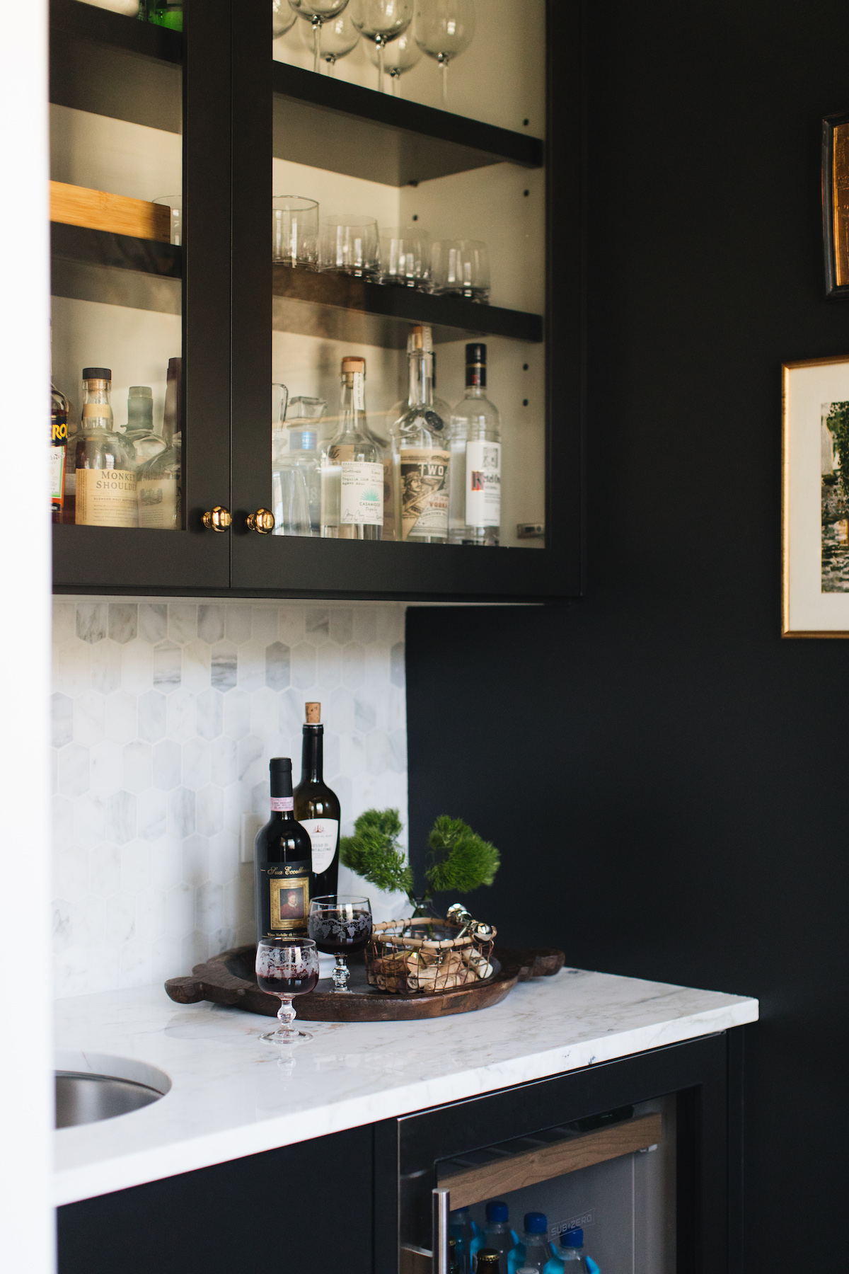
Can you tell us a bit about the home we’re featuring today and the inspiration behind the design?
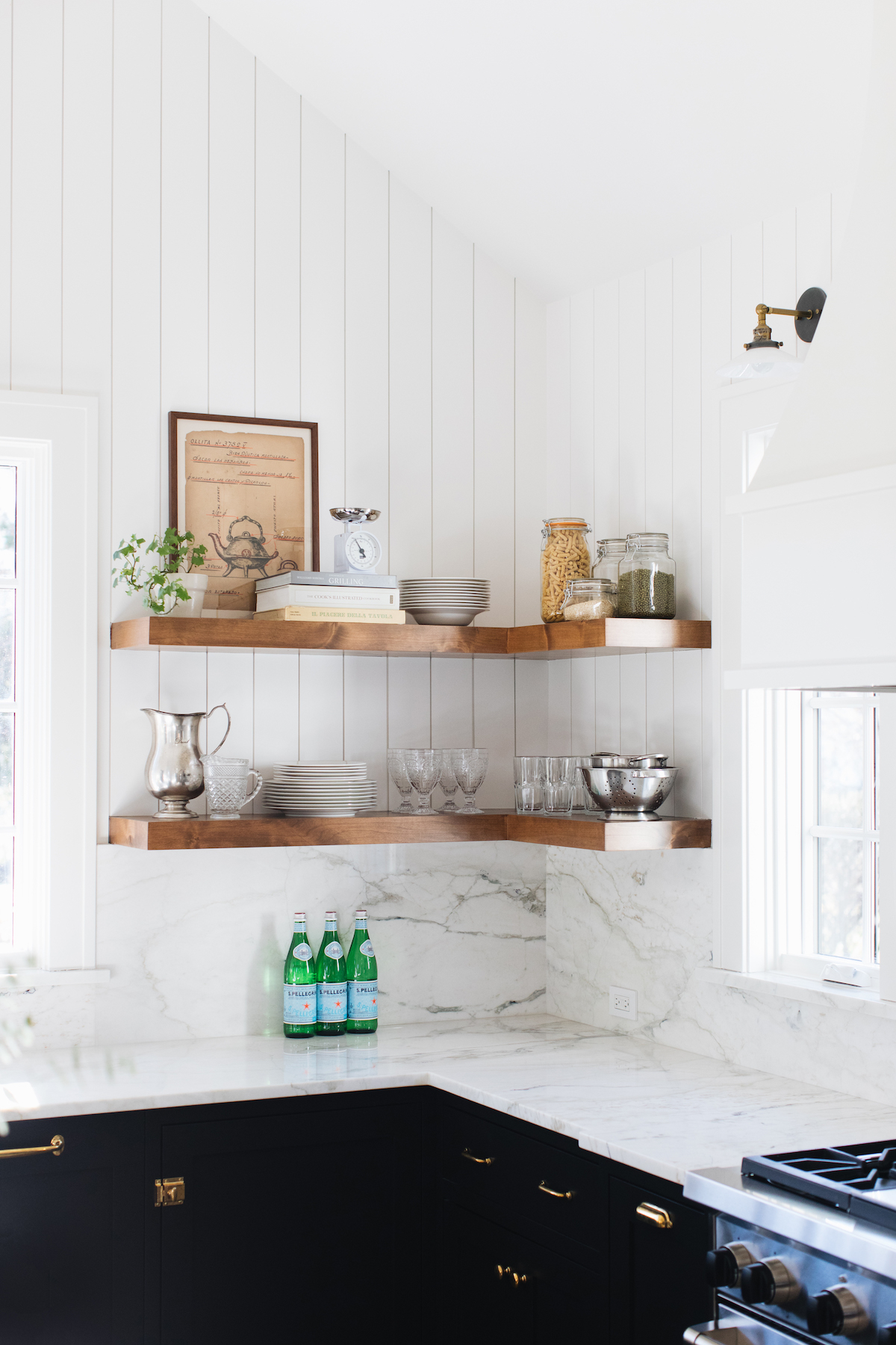
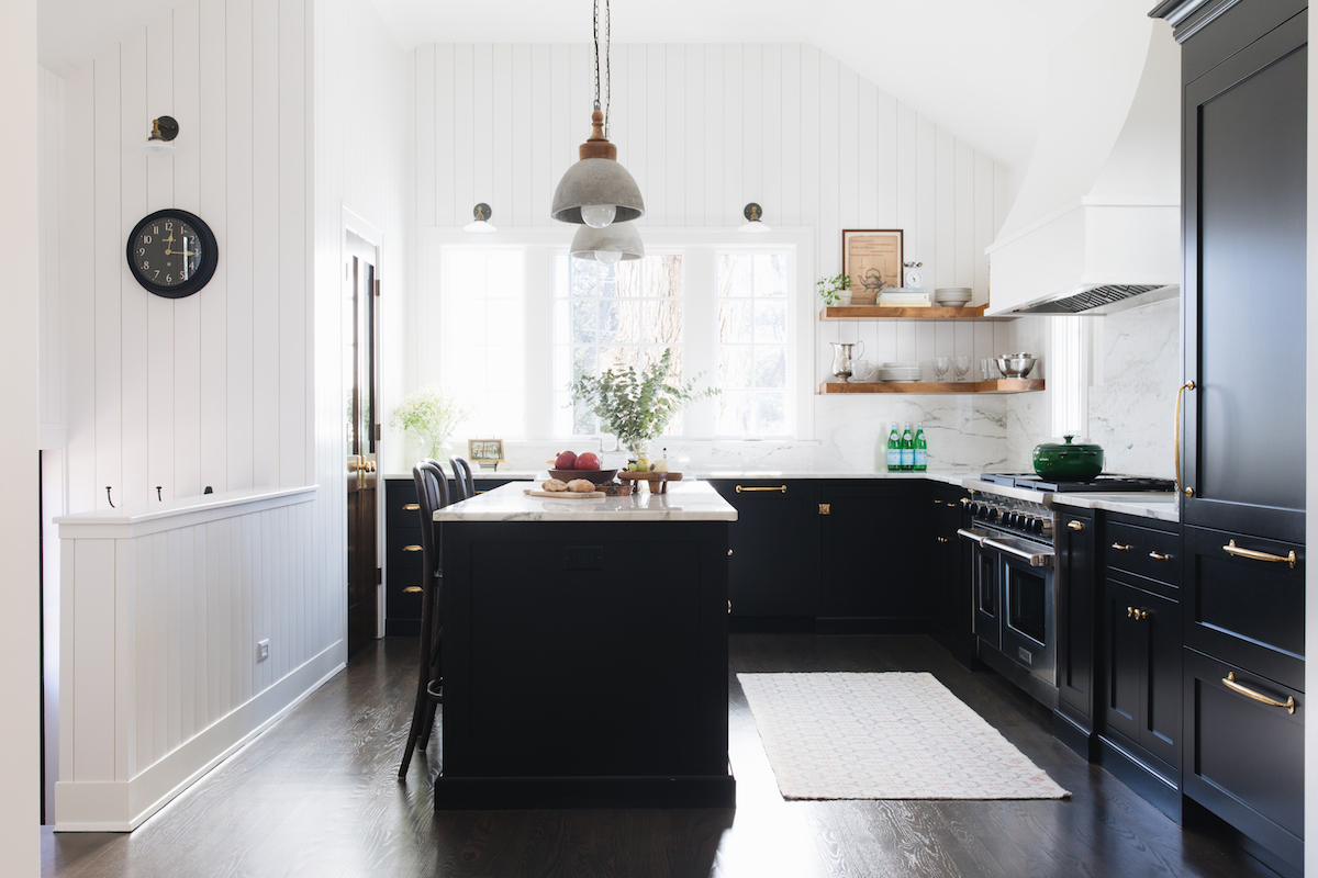
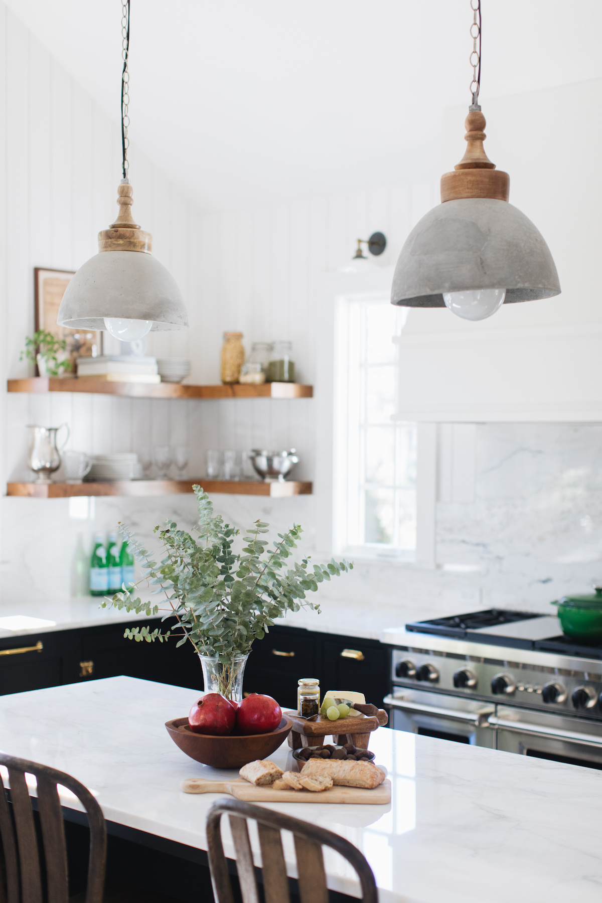
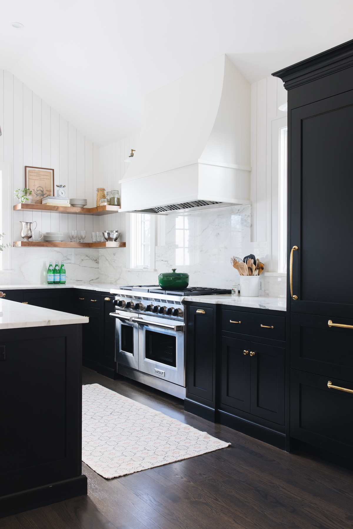
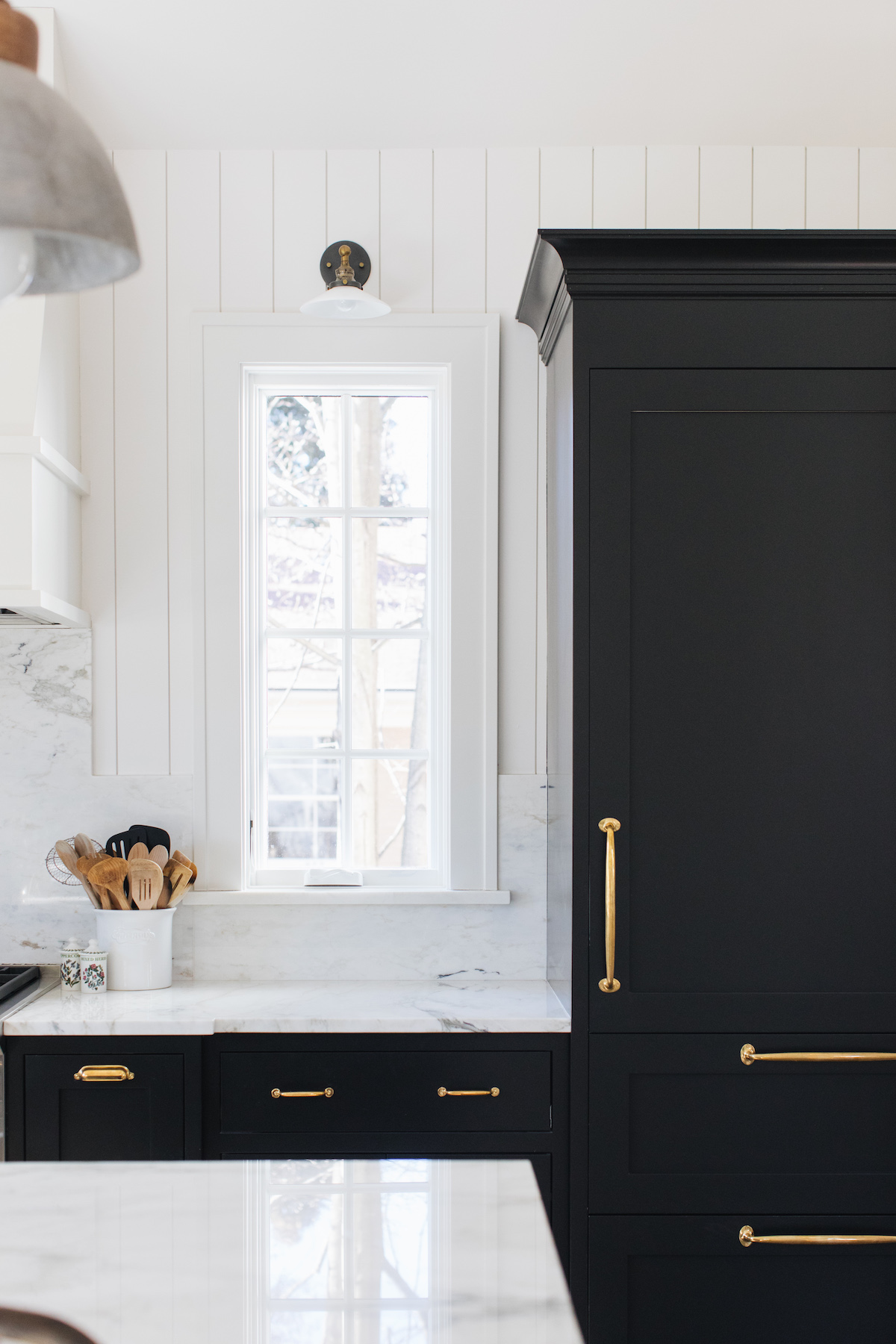
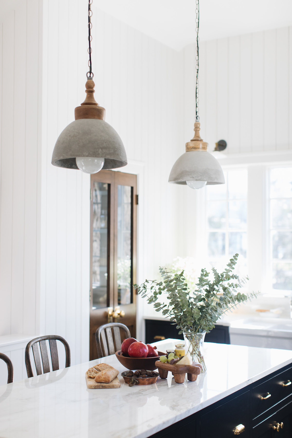
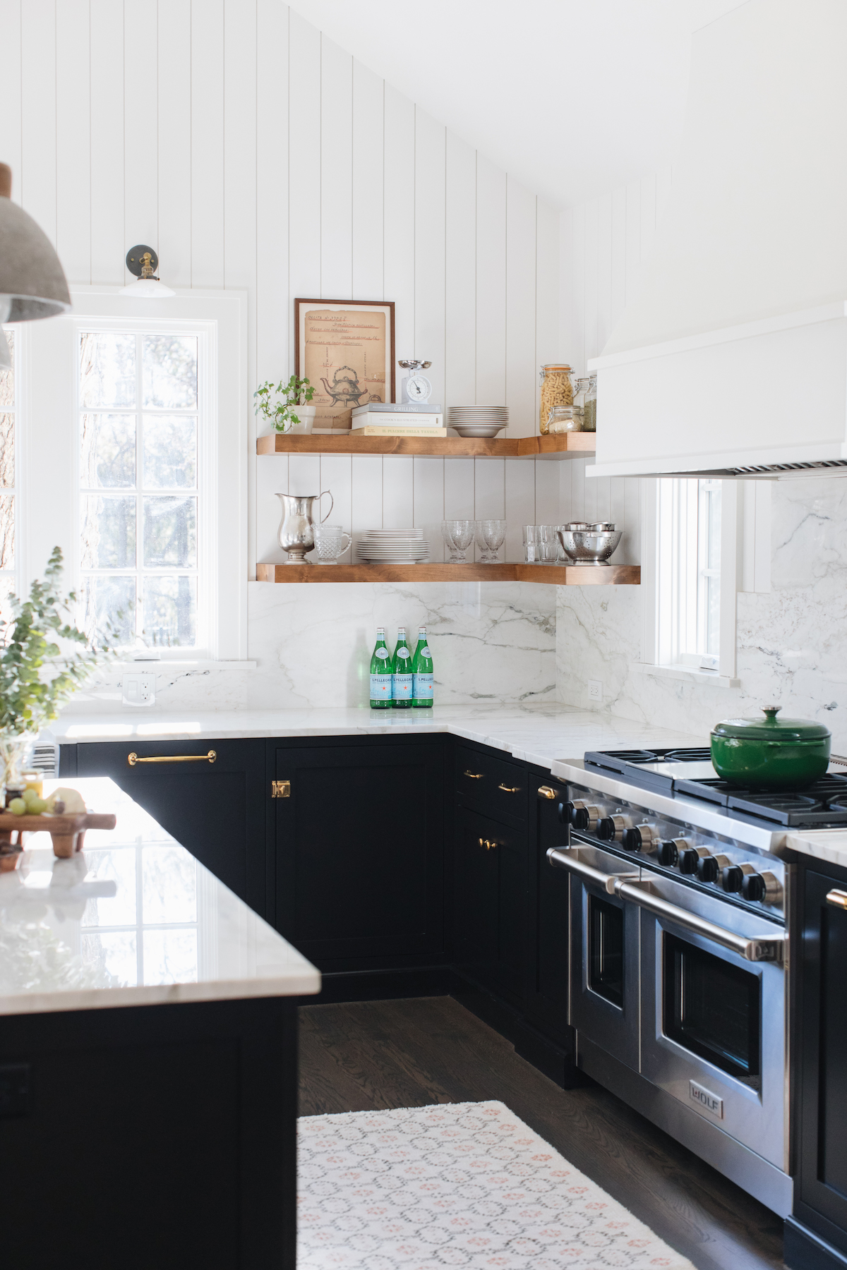
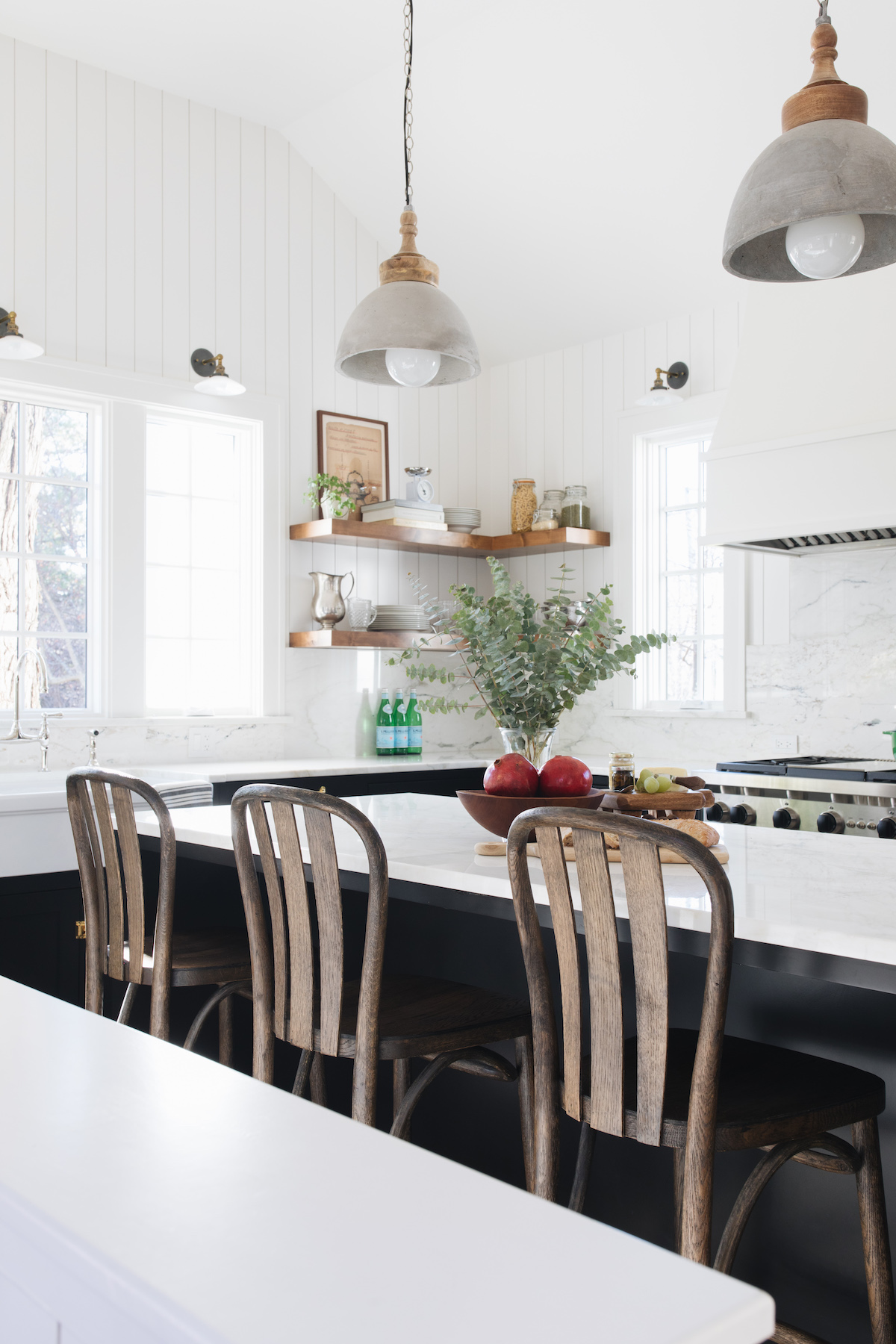
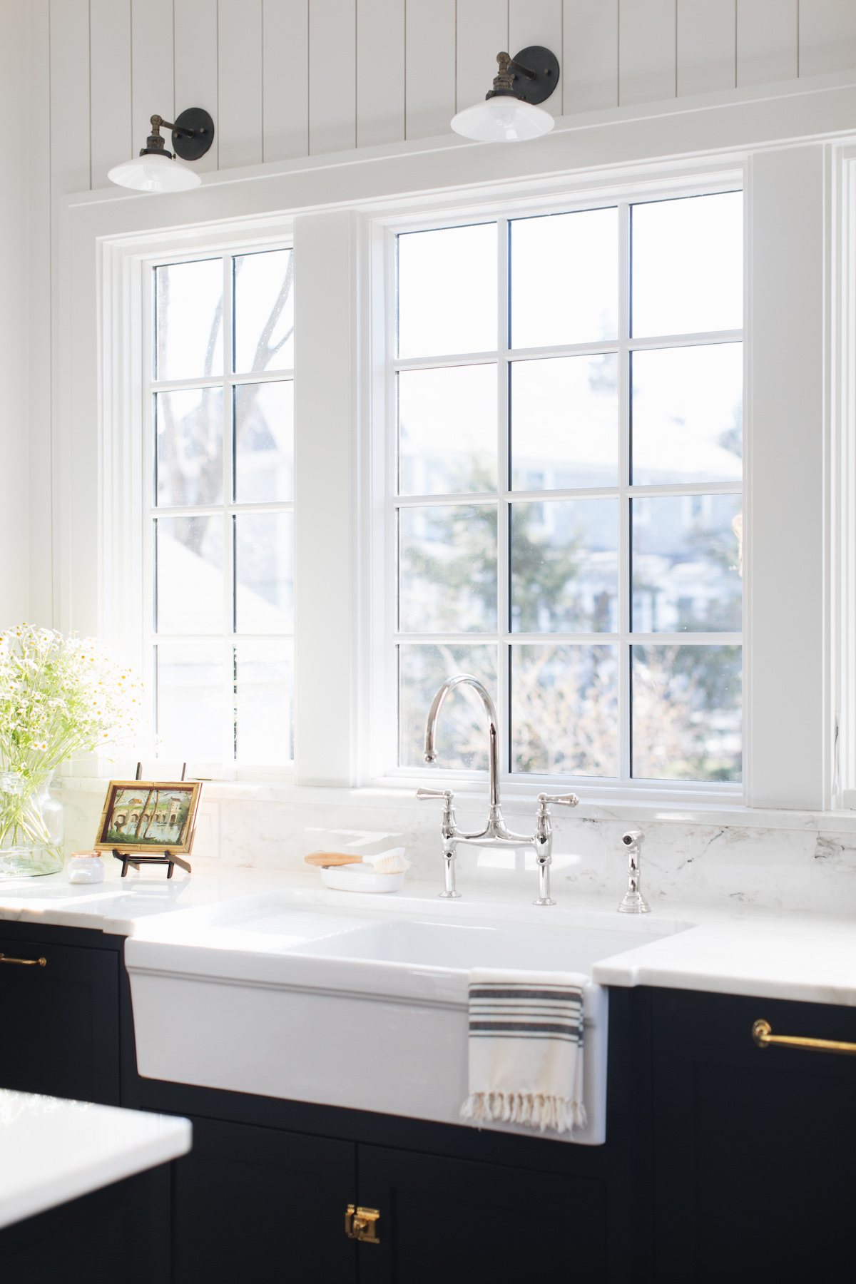
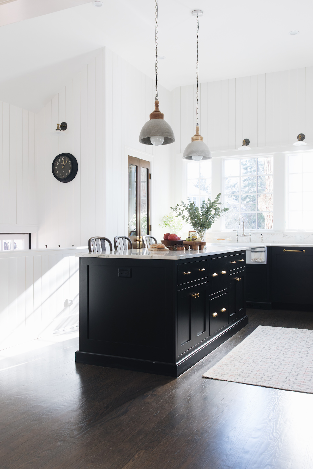
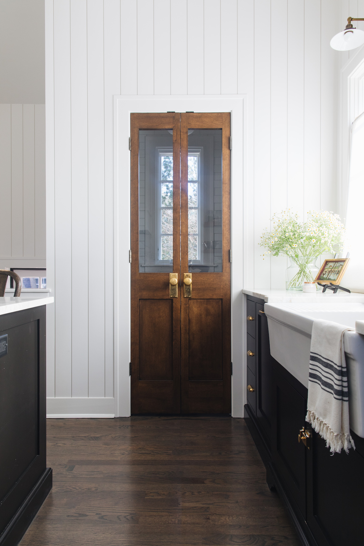
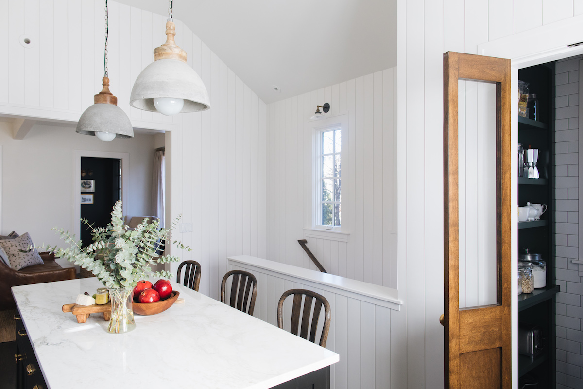
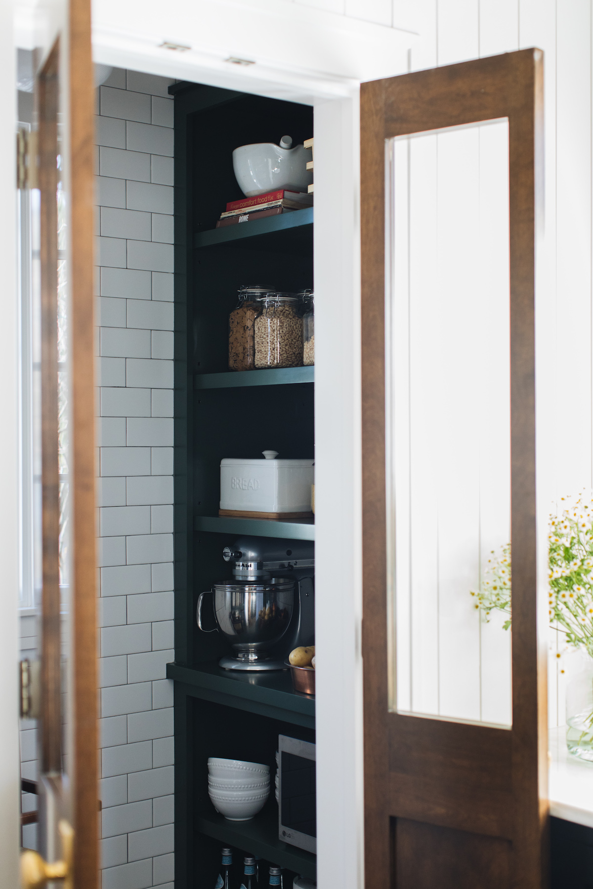
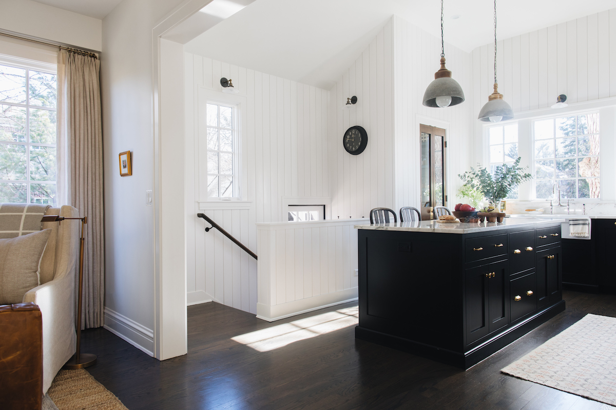
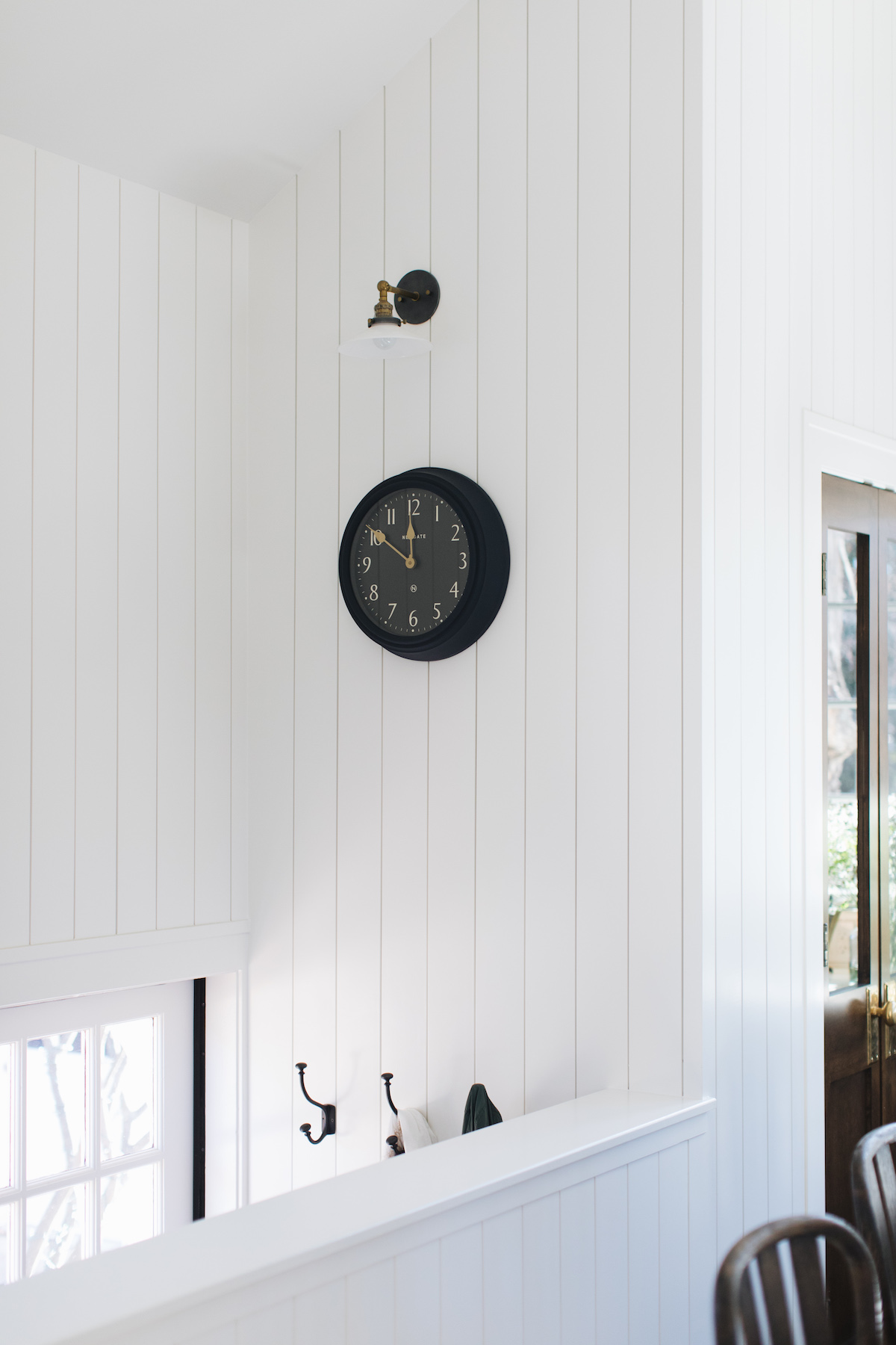
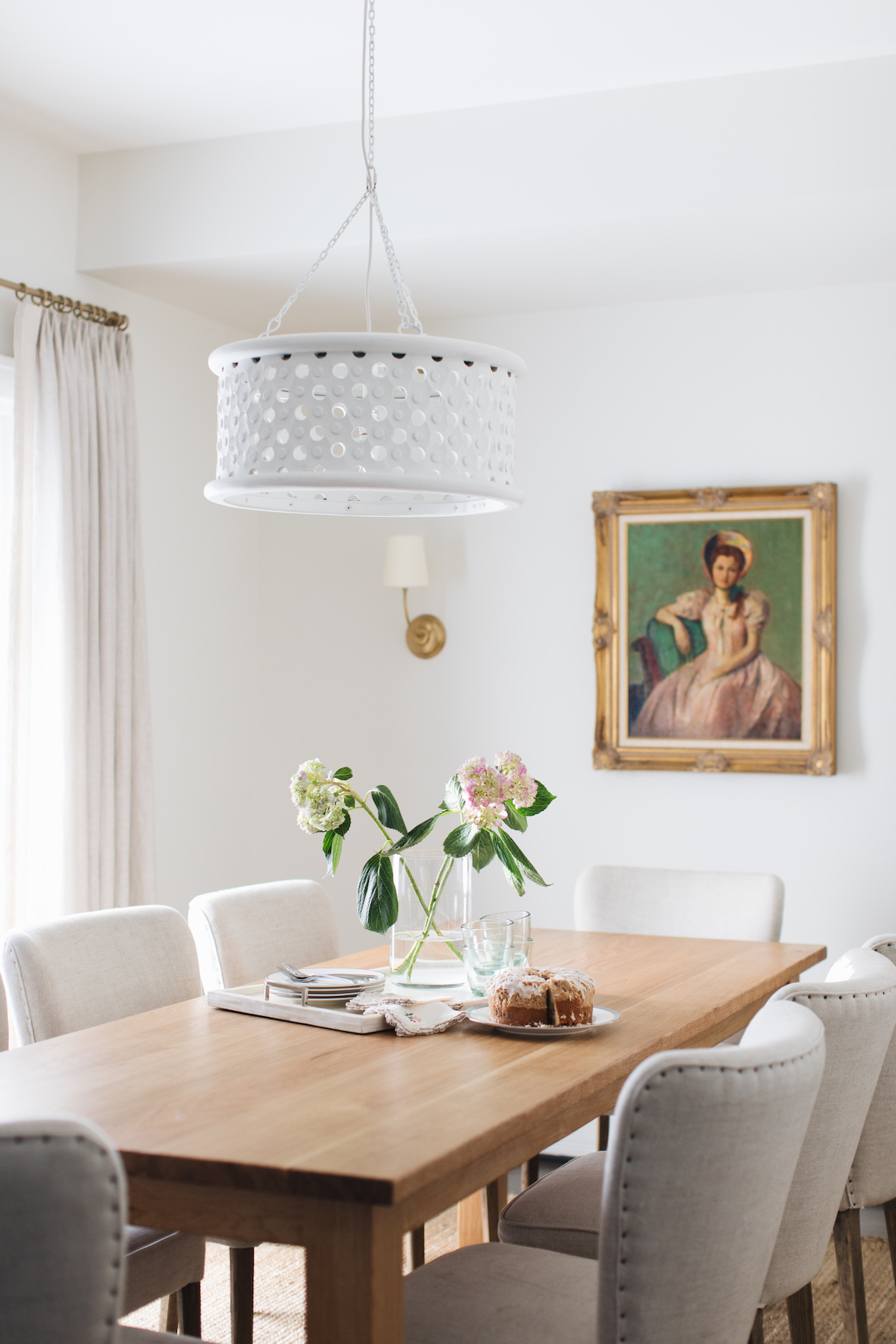
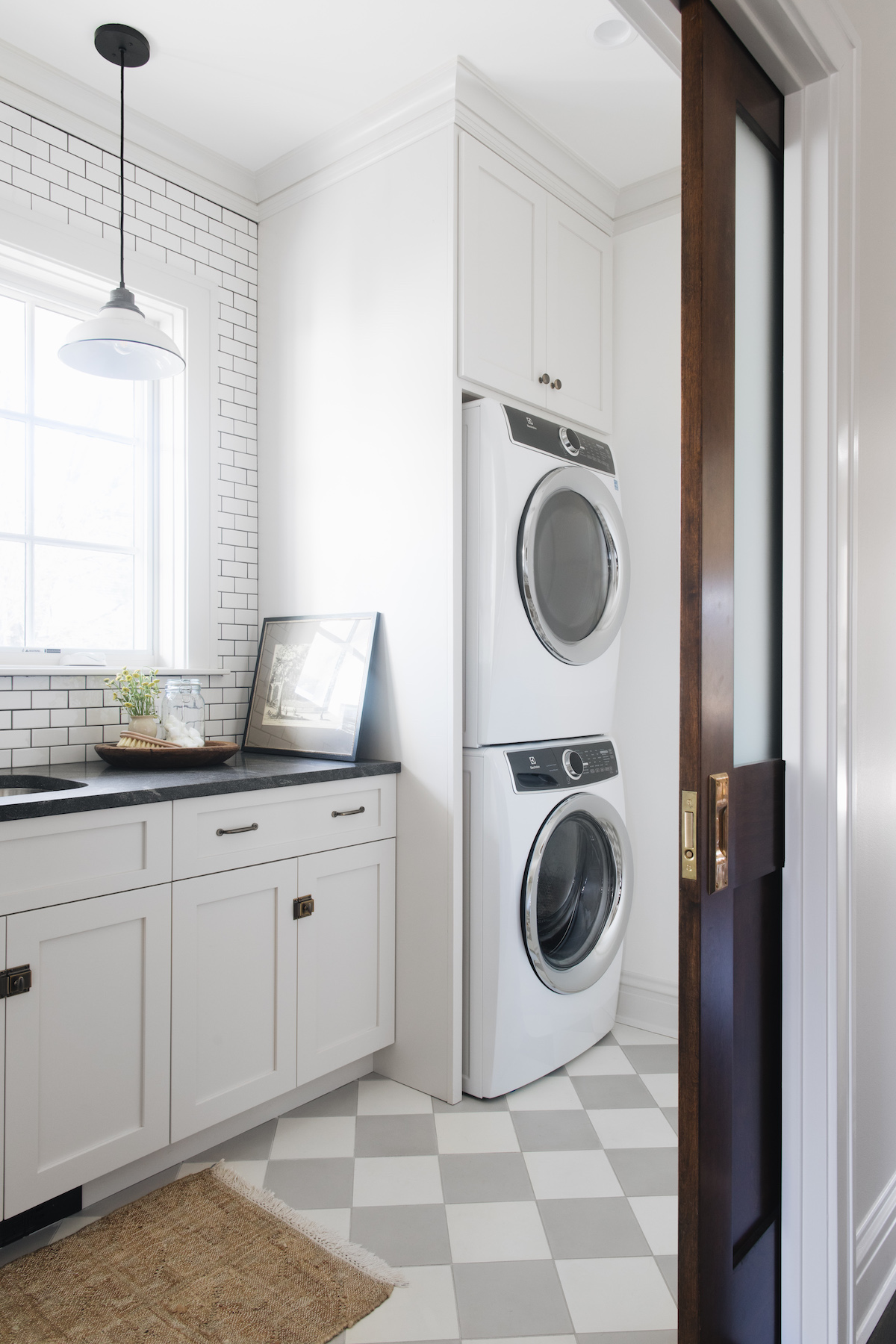
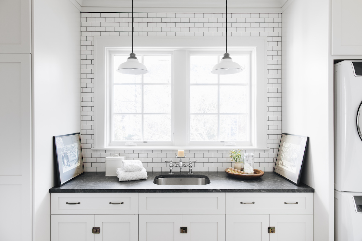
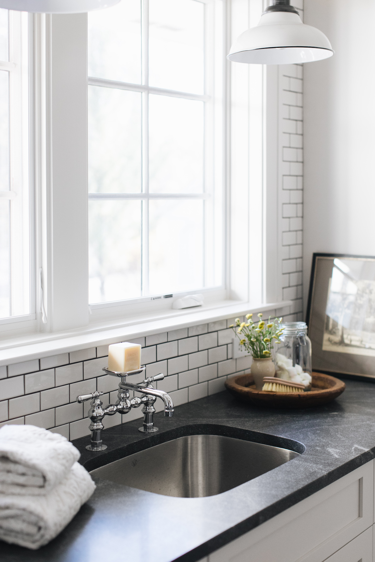
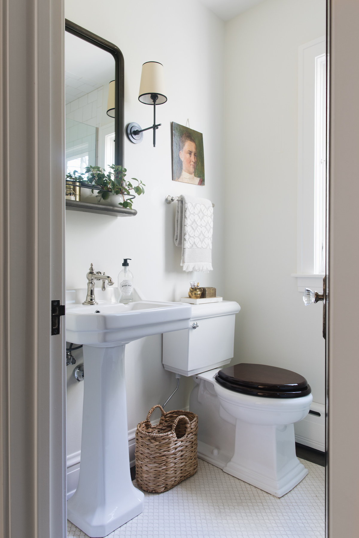
My husband and I fell in love with the charm of our 1920 English cottage-style home. But we weren’t so in love with the tiny, dark kitchen. The kitchen renovation was the most important part of a larger renovation of the first floor. The goal was for the home’s original cottage style to continue into the kitchen, but with updated touches and modern conveniences. The nods to the home’s original architecture include tongue-and-groove paneling, Shaker-style cabinets with latches and simple knobs, period-inspired sconces, casement windows, and classic millwork matching what was found elsewhere in the house. We also included features that reminded me of growing up in Italy. These include marble countertops, backsplash and window sills, a farmhouse sink with a built-in drainboard, a soft color palette, and a classic pattern as per the checkered pattern flooring in the laundry room. The design process was driven by the intent to turn a house into a home featuring classic and timeless interiors.
If you could go to lunch with anyone, who would it be?
Katie Hackworth
Instagram accounts you’re currently inspired by:
Jessica Helgerson, Studio Shamshiri, Katie Hackworth, Heidi Caillier Design, Nam Dang-Mitchell Design
Current favorite book and/or podcast:
Alessia: Quando tutto inizia by Fabio Volo, I am reading it for the second time and cannot put it down!
Sarah: “The Hate U Give”, a book my daughters were reading, excellent read.
3 apps you can’t live without:
Instagram, VSCO, Color Story
Favorite tunes usually playing in the studio:
Alessia: My playlist changes based on the mood I am in. At the Glen Ellyn studio, we listen to Noah Reid, Brock Berrigan, and a mix of Italian music.
Sarah: Album of the week at the Detroit office is Foo Fighters’ “The color and the shape” throwback to my college years!
Interior Design: reDesign home · Photography: Stoffer Photography Interiors