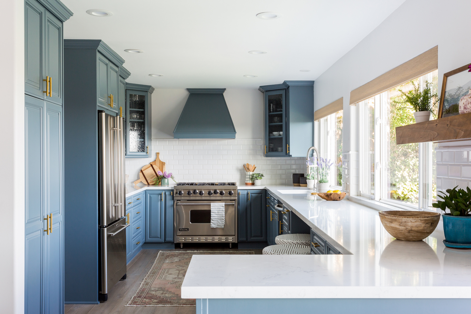
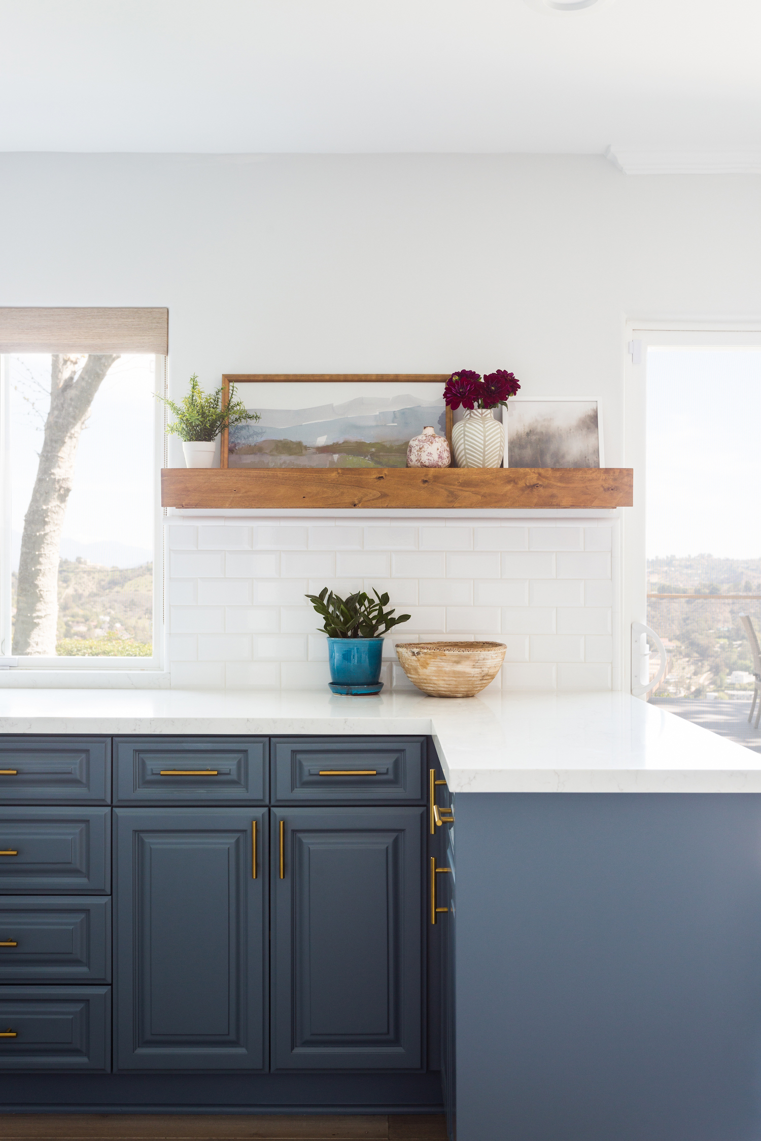
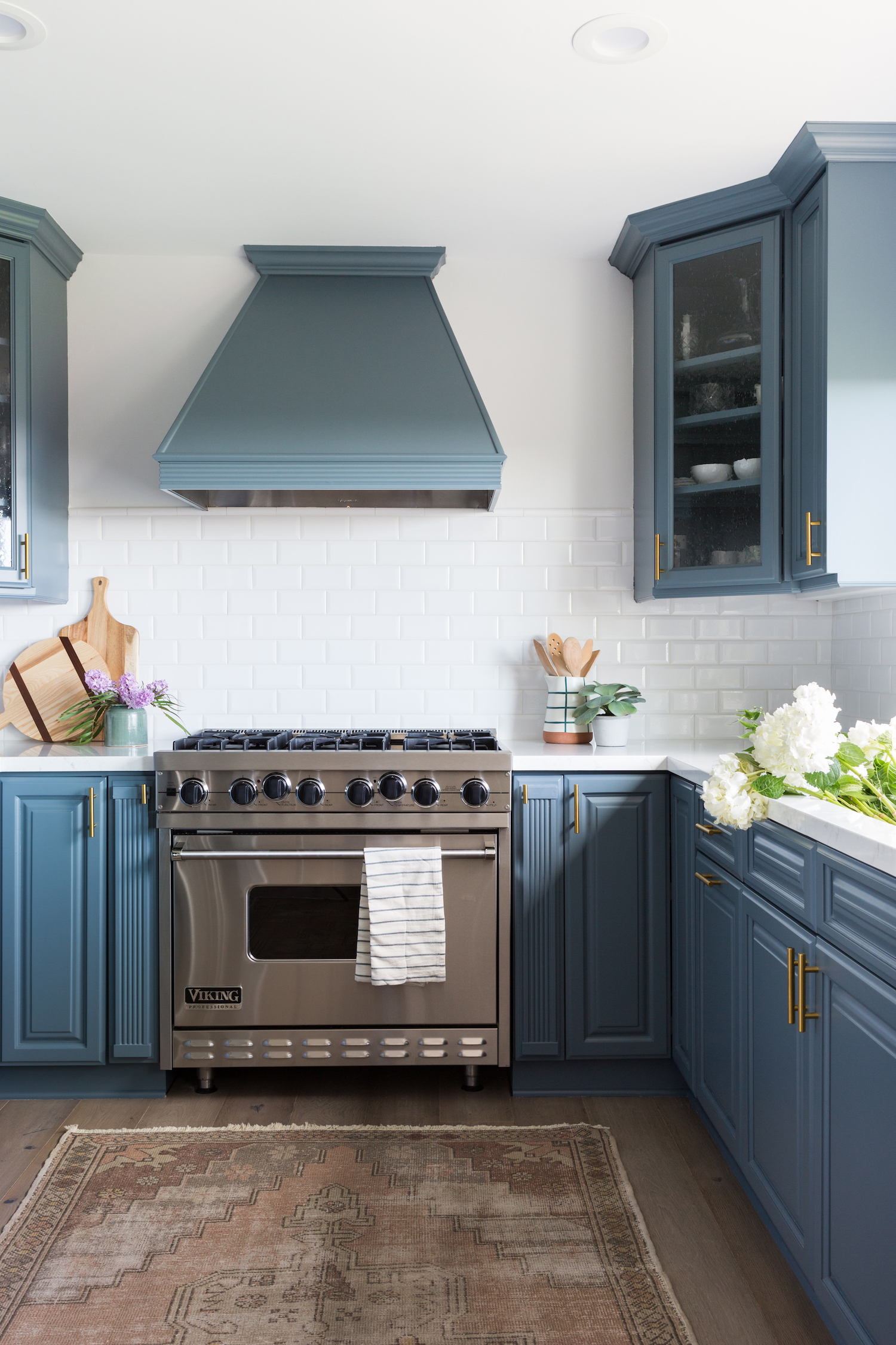
If you scroll our blog or IG feed, it should come as no surprise that we’re big fans of blue, especially in the kitchen! It lends a bit of charm and personality and of course, has a beautifully calming vibe. But with so many blues to choose from, which one is best for the look you’re going for? When we spotted this stunning kitchen from Lindsey Brooke, we had to ask the designer what her go-to blue hues are. From airy to moody, she’s sharing her five faves…

Hale Navy by Benjamin Moore
We used this recently on a kitchen island and LOVE the deep hues so much. This a VERY true Navy blue color that is perfect for an island or statement wall.
Cheating Heart by Benjamin Moore
I LOVE this dark color if you want to make a BOLD statement. We recently painted a boys bathroom this color and it was so dramatic against the white tile and cabinets. Its the perfect blue/black.
Dutch Tile Blue by Benjamin Moore
This is a perfect green/blue color. We just painted a front door at a beach house project and laundry room cabinets this color. Its so soft and pretty against warm wood tones.
Herrington Blue by Farrow and Ball
This is the perfect lighter shade of blue with a tint of grey. You can pair it with brass or silver metals for a really modern look.
Sterling by Behr
This is a grey paint but has undertones of blue. This color would be great for overall cabinets or a two-toned kitchen.

Love what you see? Take a peek at the talent behind the story… Design: Lindsey Brooke Design · Photography: Amy Bartlam · Paint: Hale Navy by Benjamin Moore
