This stunning Newport Beach renovation came with an intriguing challenge: make the kitchen “not feel like a kitchen,” which sparked a wave of creative solutions for the whole home. By juxtaposing historic terracotta tiles with sleek millwork and implementing a limited yet dynamic palette, Interiors by Patrick created a stunning and serene home that surprises around every corner yet depicts old-world familiarity. Joe Schmelzer expertly captured the photos in the gorgeous tour below.
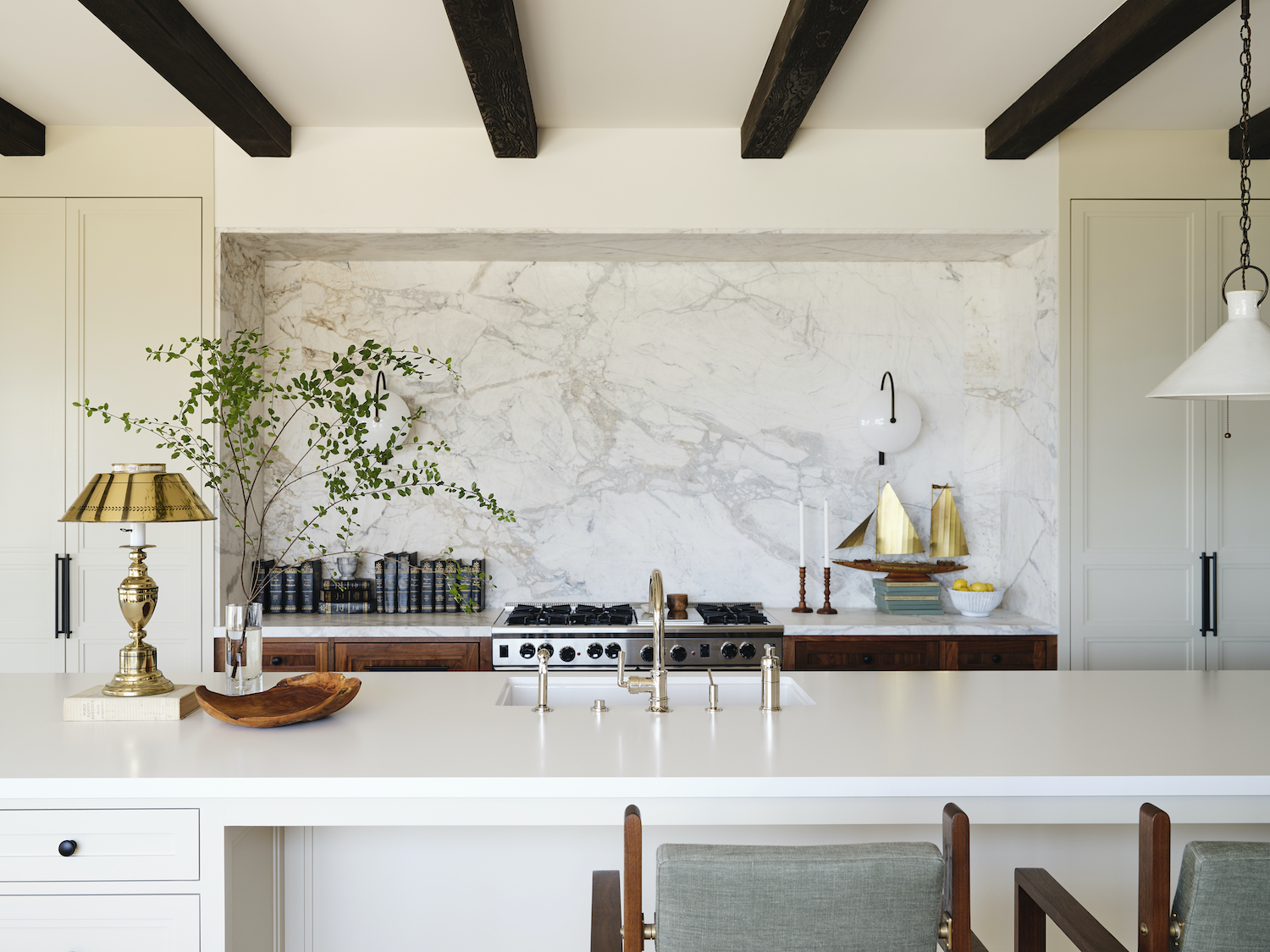
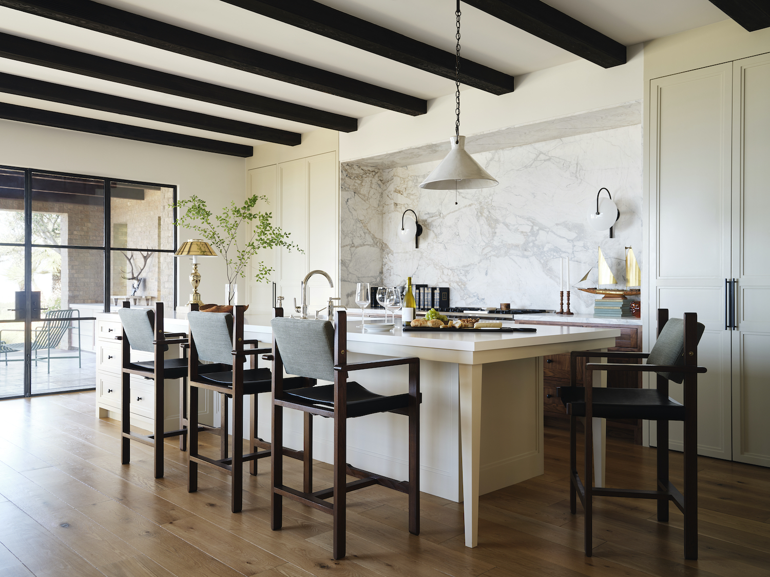
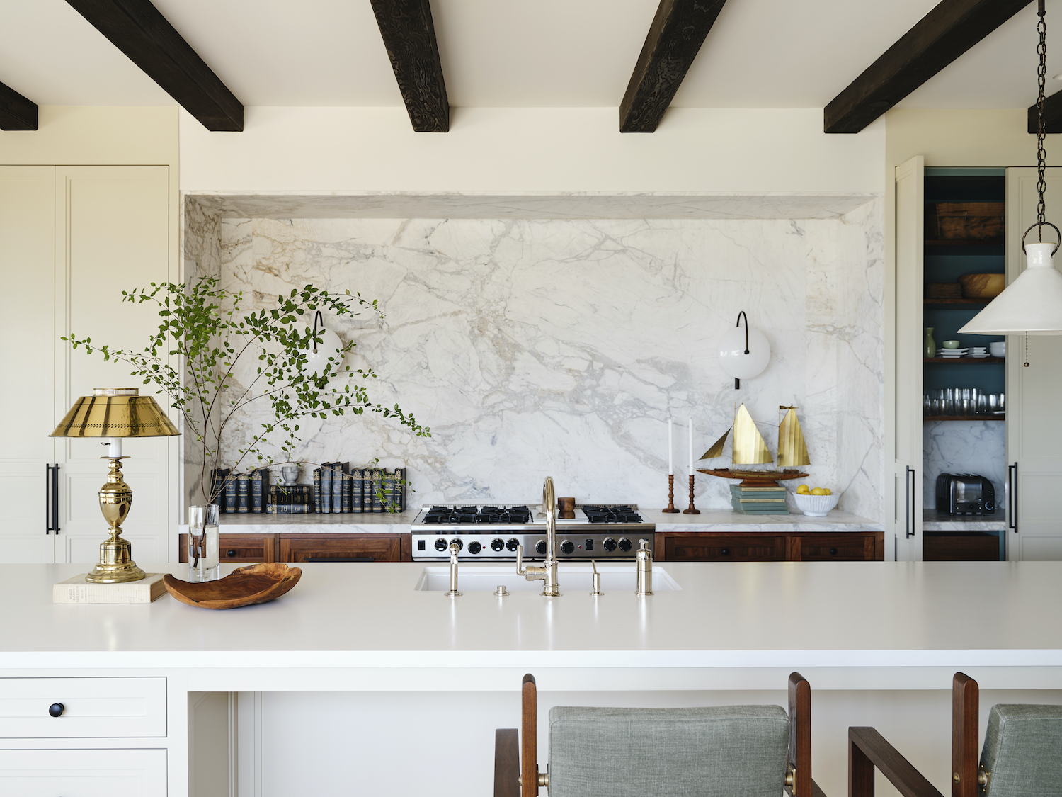
From the designer… This already beautiful property had an interesting and intriguing design request starting with the kitchen. The owner wanted the kitchen to “not feel like a kitchen,” which sounded like a fun design challenge and really got my creative sensibilities active in thinking of how to achieve this request. We immediately decided to hide everything behind pull and pocket doors and give it a very serene simple color palette of white and taupe. When the doors were open we wanted a fun transformation to happen so we painted the interiors of the cabinets a soft green against some stained walnut moments. The range is the only appliance that stays in view so we made that section of cabinetry stained walnut to make it feel more like furniture. We topped it off with a marble framed work area and some sconces that bring in a more living room vibe. We hid the exhaust in the ceiling taking a more traditional kitchen hood away.
Because of the objective, it led me to do some unexpected things with lighting. No predictable symmetrical pendants here! We placed only one thoughtful handmade pendant at the sitting end of the island which acts as the daily place for casual meals with seating on two sides so it is more conversational than everyone facing one direction. At the other end of the long island we installed a plug behind a short drawer so we could have a beautiful vintage brass lamp from the 1940’s. I love a lamp in a kitchen! This really helps make the kitchen feel more like a living room. I think these unexpected lighting choices really help disguise the kitchen feel and the owner loved how it all turned out!
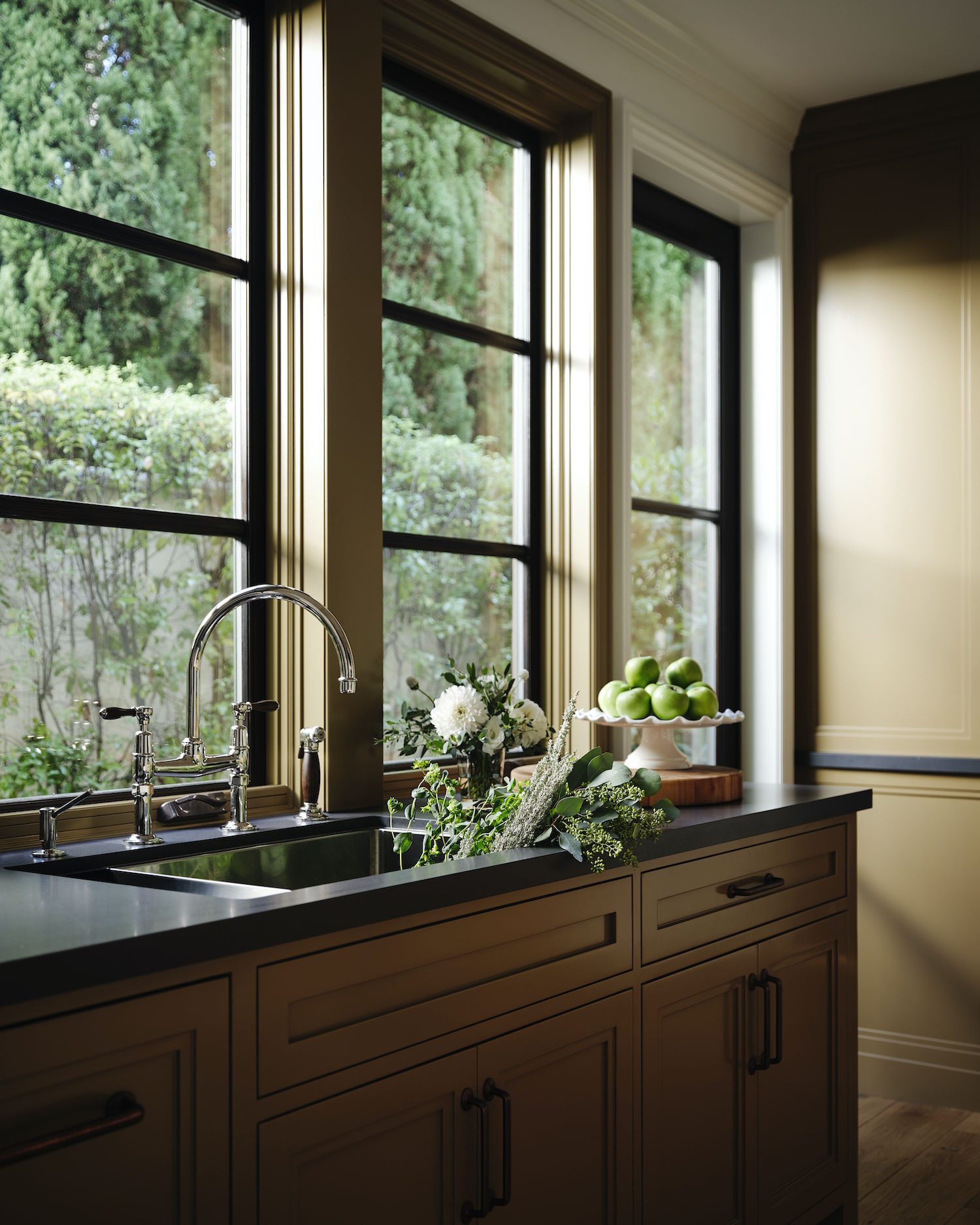
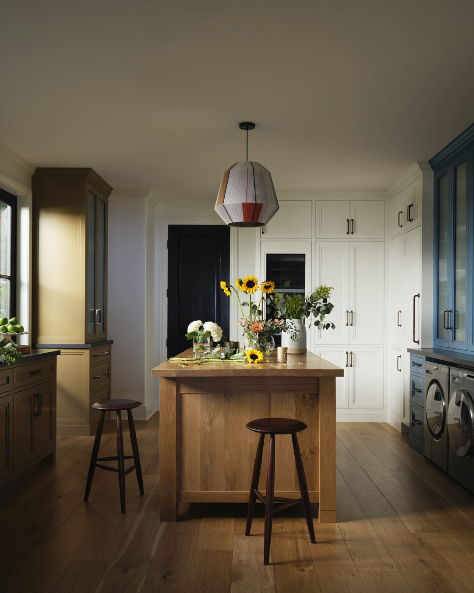
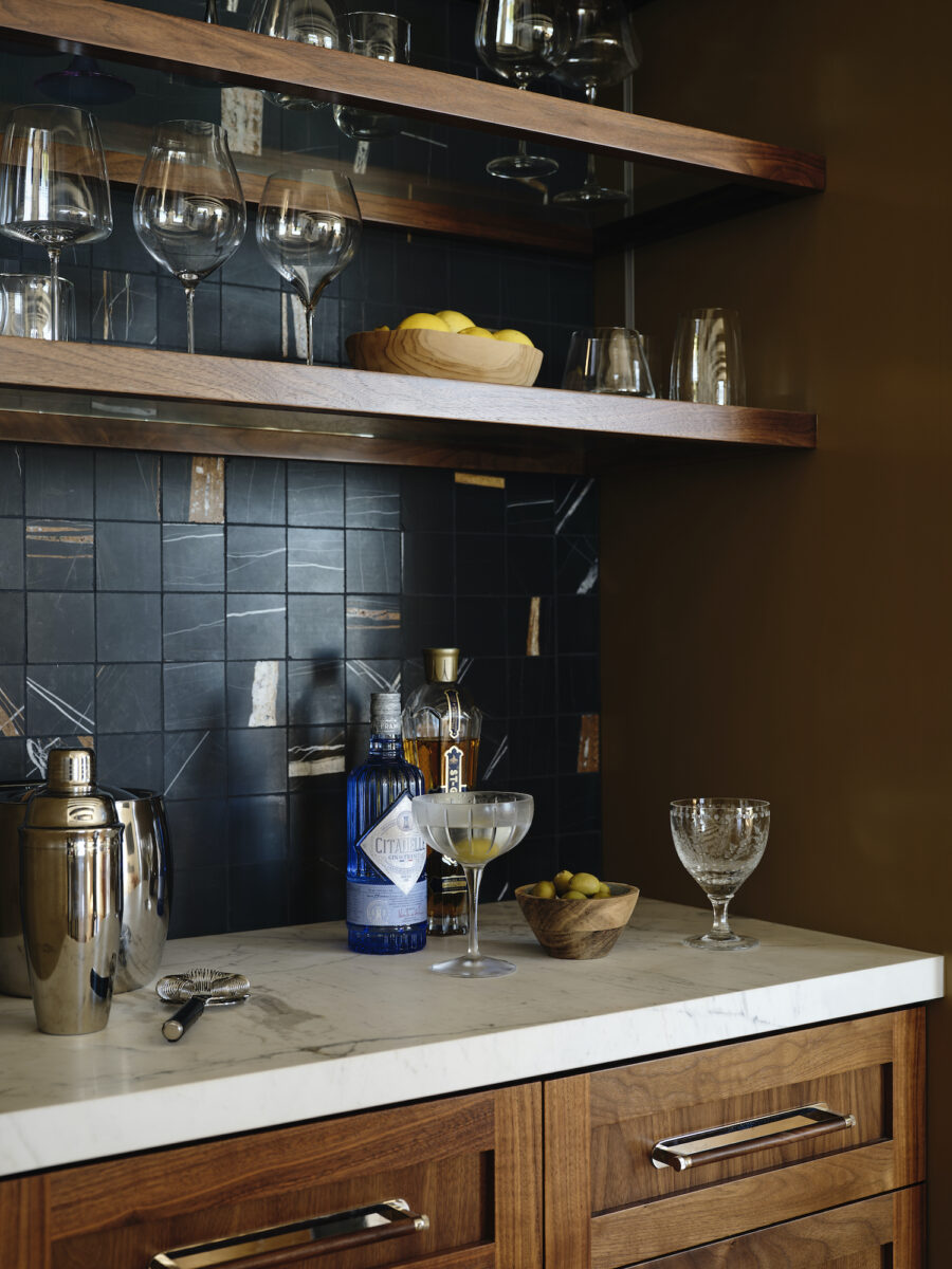
The butler’s pantry is an amazing space that received a big storage upgrade. This space is a workhorse room that acts as a butler’s pantry, laundry room, overflow prep kitchen, wine room, and a great place for hobbies like flower arranging! We added lots of cabinetry including a wine fridge and overflow column fridge and freezer.
The owner and I wanted to play with color here and set off the center section of cabinetry with a vibrant shade of blue to make it feel more like its own piece of furniture. The corner china cabinet and sink cabinet also received a complimentary color to set those pieces apart from the main storage moments making the butler’s pantry feel more like kitchen furnishings. Everything floats around a beautiful custom wood-topped island that again, feels more like furniture than a counter space.
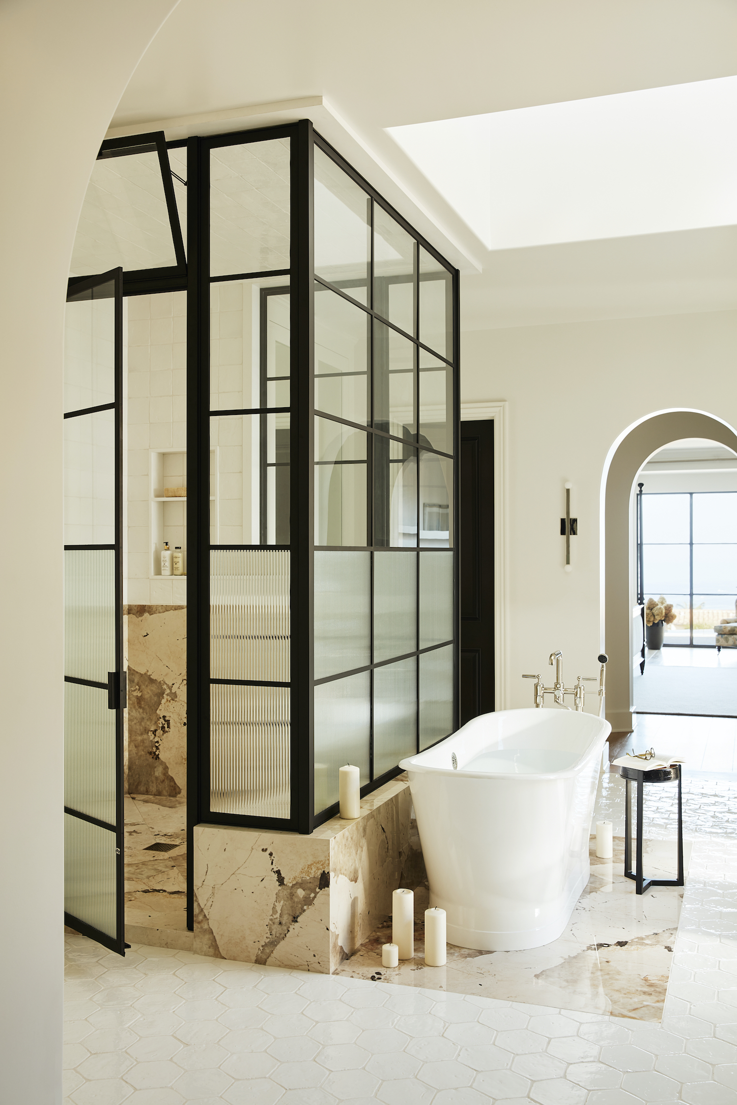
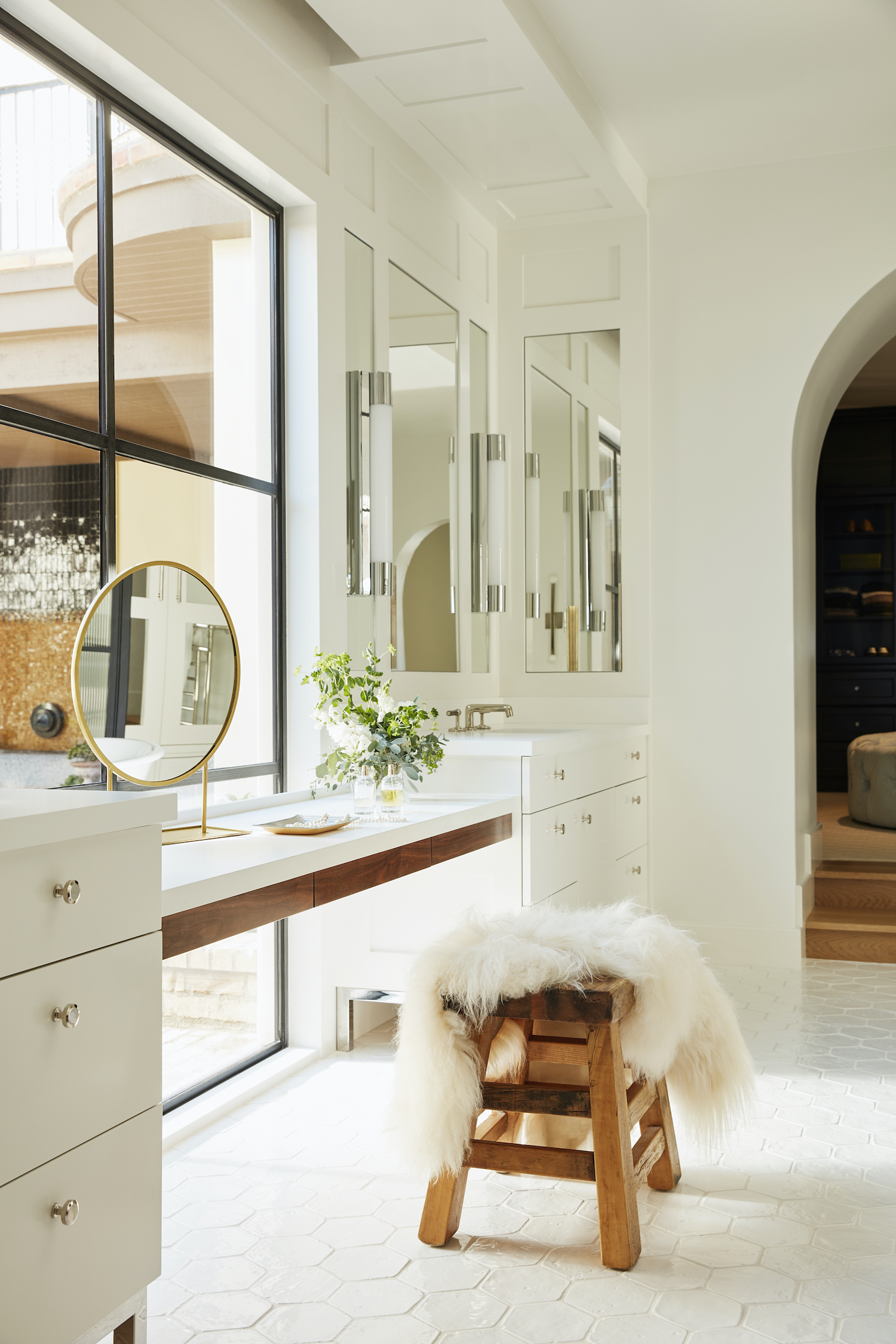
The primary bath was a really dark and gloomy space for a house full of glass. We immediately added a large window to brighten the whole room and took out the old shower “room” and replaced it with a glass surround with reeded and clear glass so there is still privacy but allows the light to bounce around the room. Aesthetically I wanted the design to still feel appropriate to this Spanish-style house but was a bit more contemporary. This led me to find a historic terracotta tile for the floor with all that lovely handmade texture but glazed in white to give it a light and bright contemporary feel while still feeling appropriate for the home. We placed a marble “rug” under the shower and freestanding tub to set those bathing moments apart from the rest of the large open room. Here we also warmed up the space by adding a paneled moment hugging the contemporary vanities and hiding lots of storage. All the mirrors are cabinets!
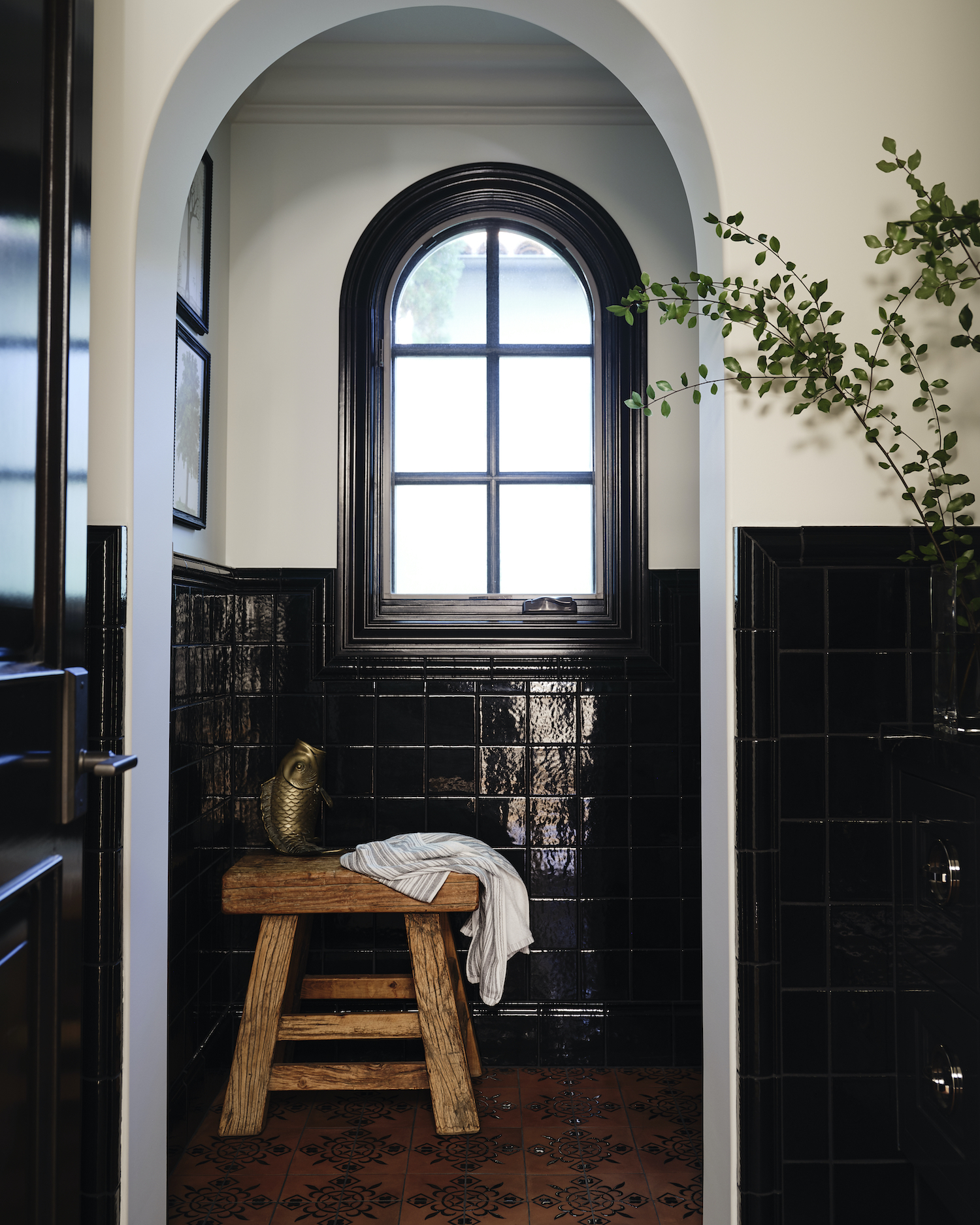
The powder room was a complete inverse design response to the light and bright primary bath design. I wanted this design to be more moody and sexy. So we decided to take a cue from the interesting floor tile and pull the black glaze design into the tile wainscotting and embrace the darkness. This room is both bright and dark. The black tile with historic trim pieces and a baseboard tile really pick up the light and make the room sparkle against the stark plaster walls. I love this room because it feels appropriate for the Spanish-style house but kind of unexpected in the combination of black and terracotta.
Like what you see? Take a peek at the talent behind the story… Interior Design: Interiors by Patrick · Photography: Joe Schmelzer · Architect: Tim Barber Architect · Builder: Corbin Reeves Construction