Ready with myriad blue kitchen cabinet photos in hand, this homeowner knew exactly what they wanted but not exactly how to get it. Thorpe listened carefully to their desires and blended a deep moody blue, stately brass finishes, and casual bleached white oak to create a refined yet casual kitchen that suits this transitional home. See how they did it and learn exactly which blue they used in the tour below.
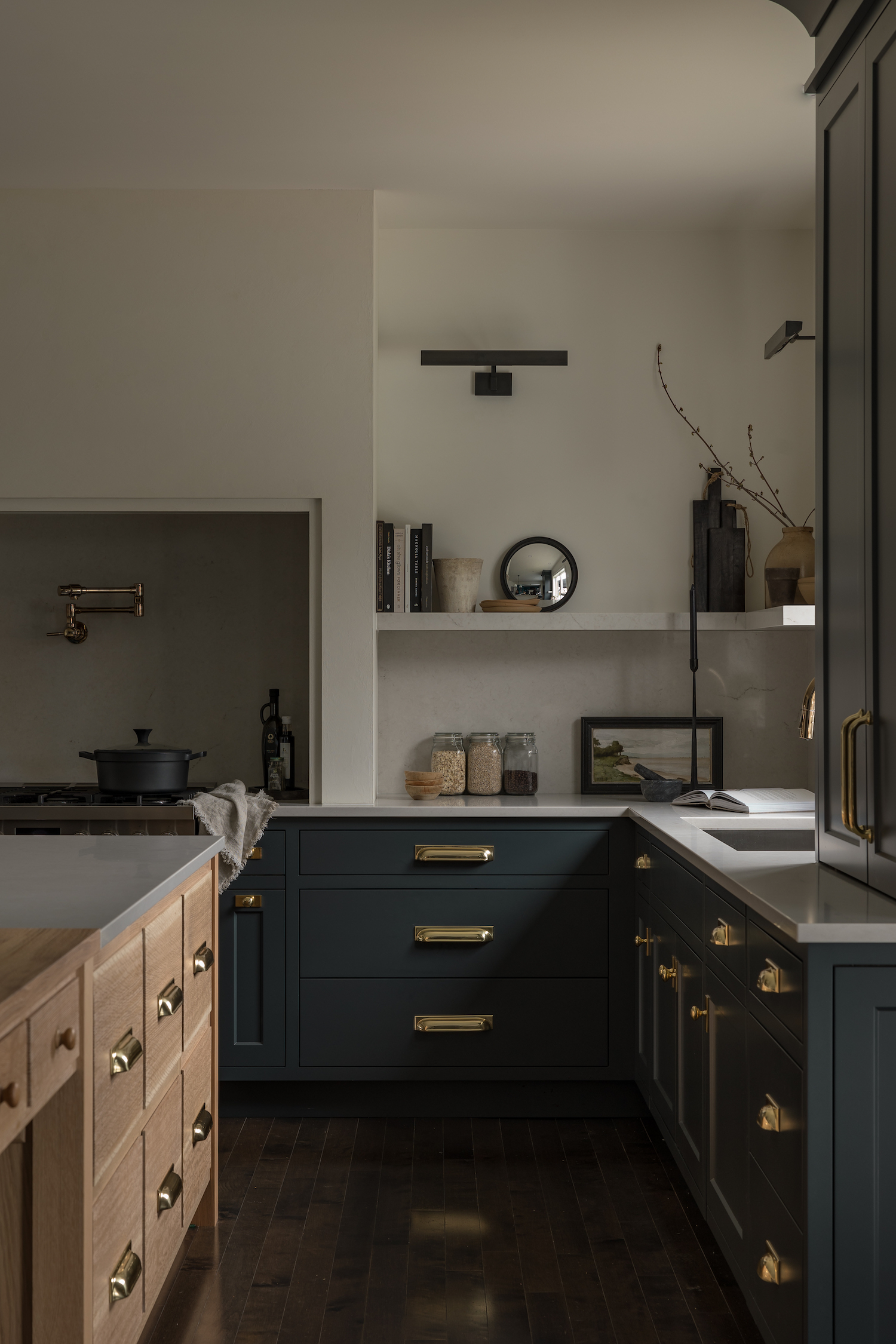
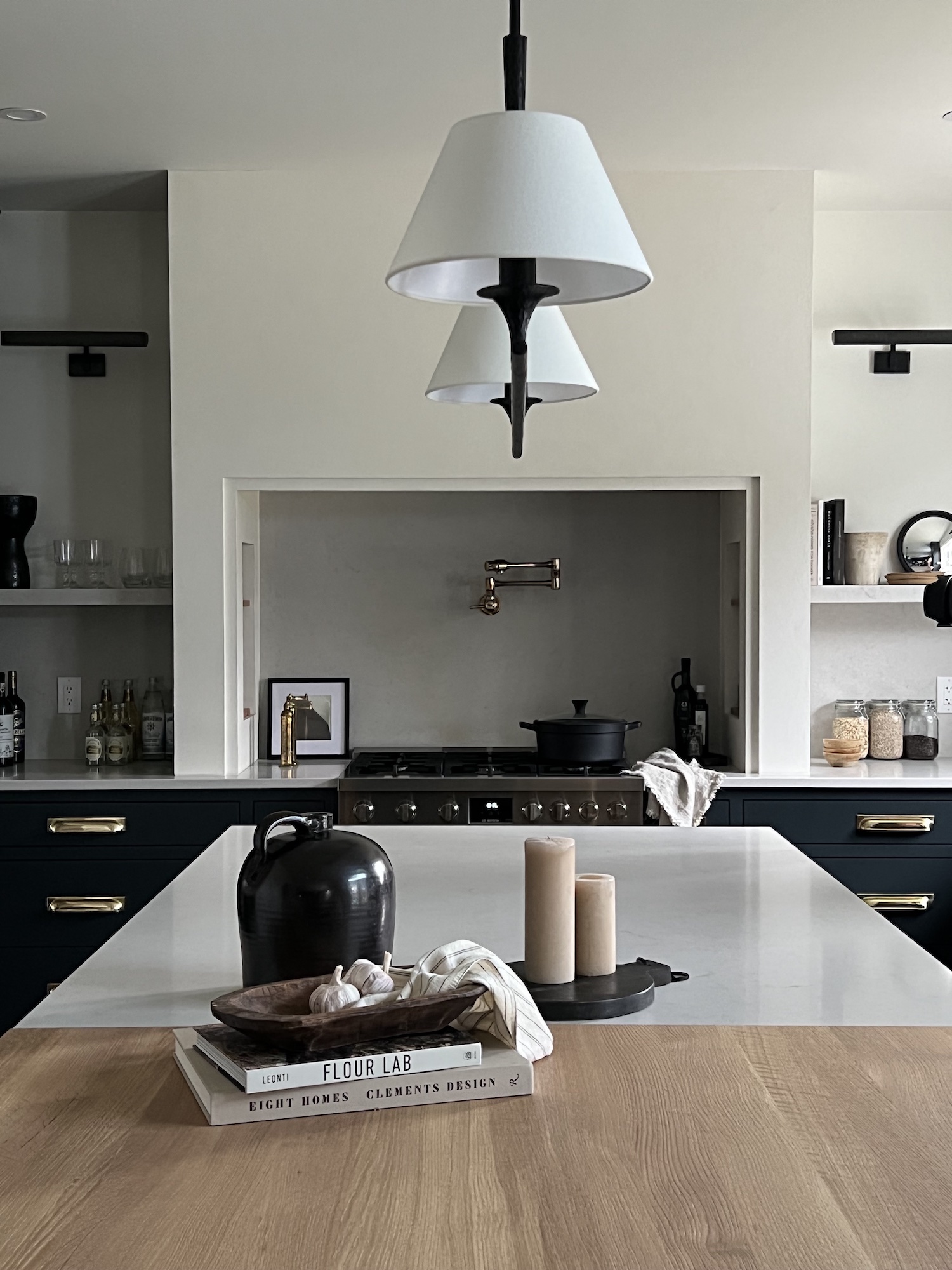
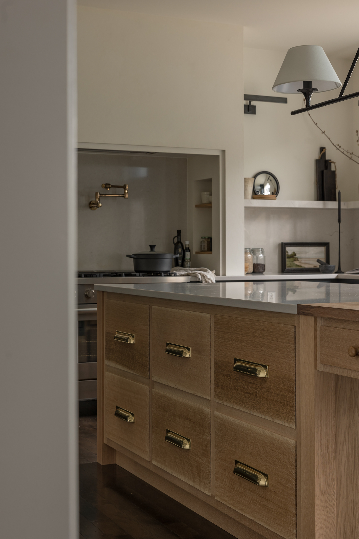
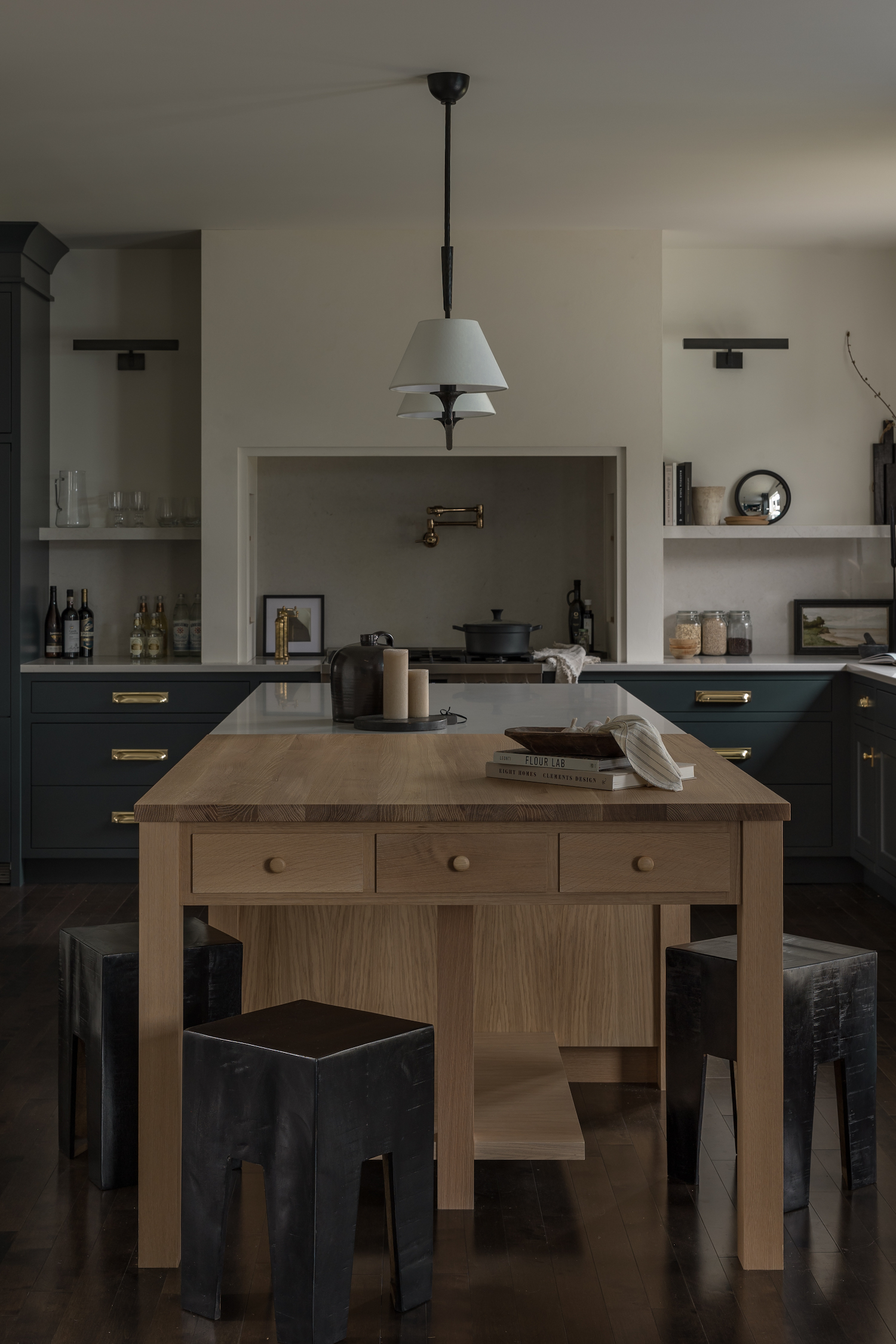
From the designer… Our clients came to their initial consultation for their kitchen renovation with several inspiration photos with a common theme – beautiful deep blue cabinetry. We knew we would need to find the perfect, timeless blue for their new kitchen, and Sherwin Williams “Big Dipper” ended up being that perfect blue. The deep rich colour paired perfectly with the polished brass finishes our clients had their hearts set on. It was a fun challenge to incorporate such a formal finish into the design while still finding ways to keep the space feeling lived in and comfortable. One of the ways that we did this was by incorporating a bleached white oak, bringing balance and contrast to the dark cabinetry and the polished brass.
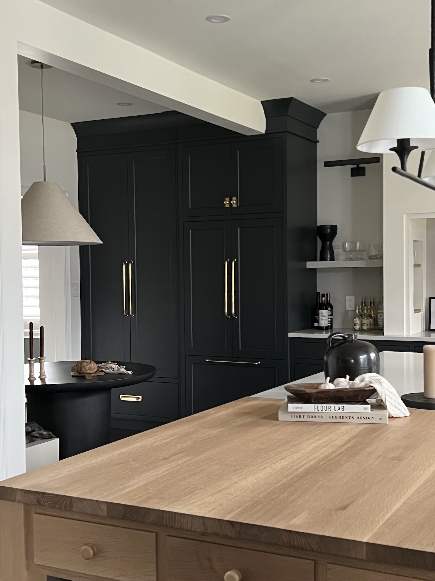
As with every renovation, we encountered a few challenges that forced us to be creative. There was a structural beam that could not be recessed, so we had to find a way to seamlessly transition the bulkhead into the cabinetry. Additionally, the original flooring was in great shape and the clients had their heart set on keeping it, so we worked hard to bring in fresh colours and styles while still staying in harmony with the original floors. The layout also allowed for an extra long island, but we needed to make sure that the space still felt cozy and proportional. We decided to break up the island by adding a solid oak dining top at the end of the run of quartz, providing a functional eating space along with better proportions for the space.
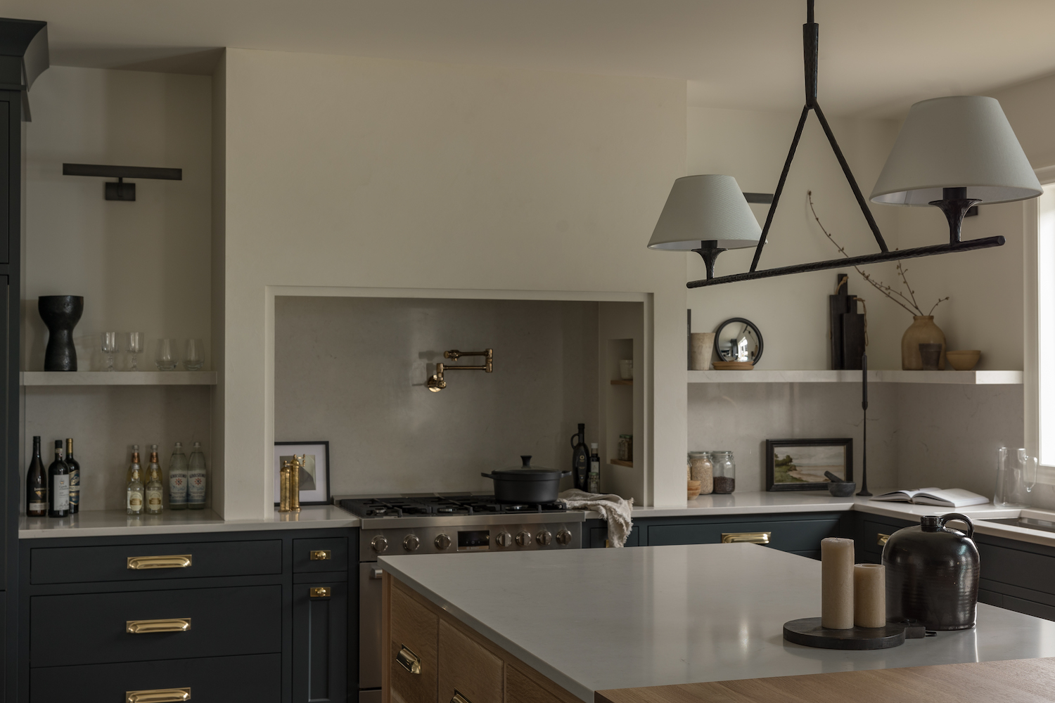
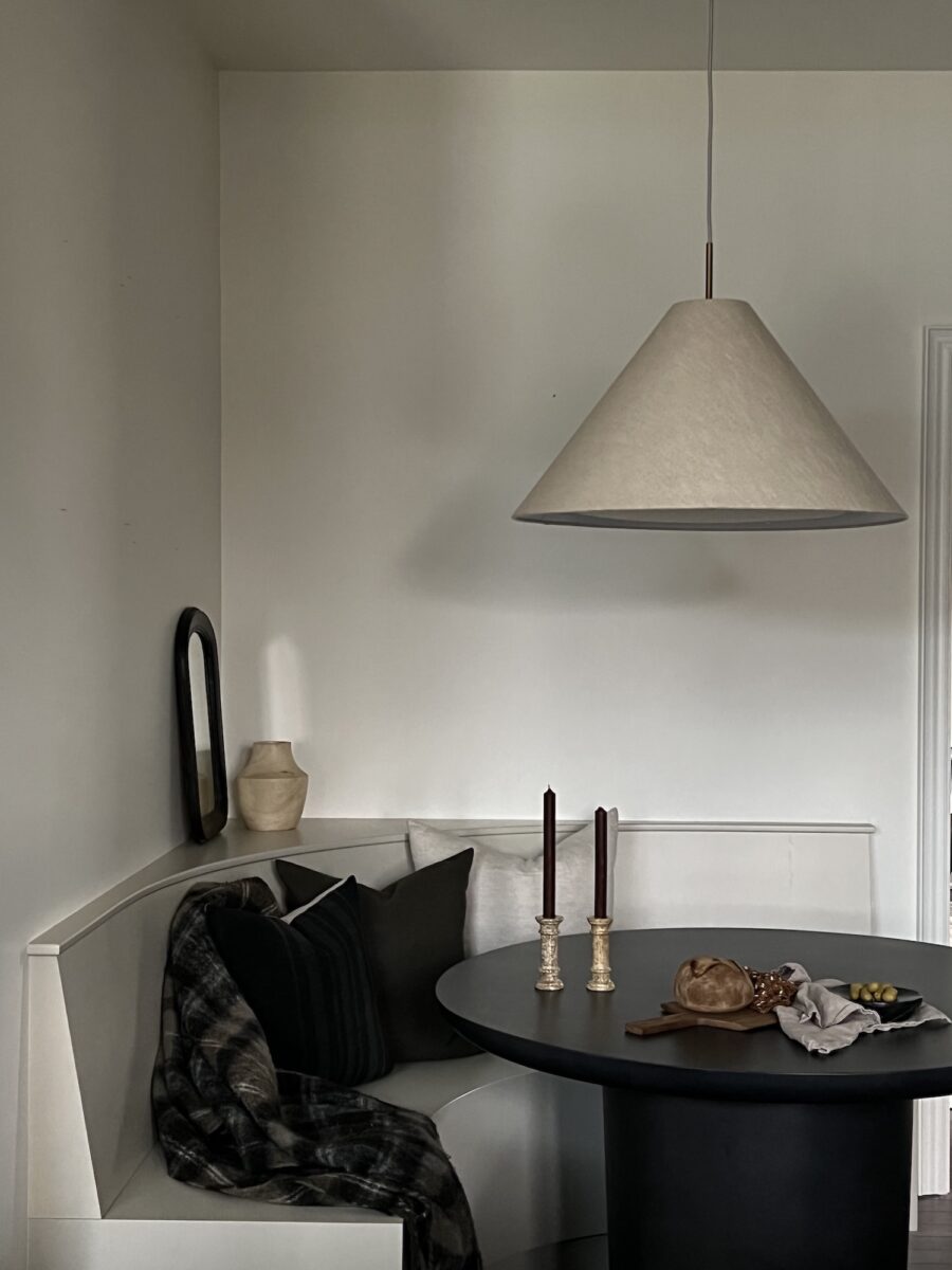
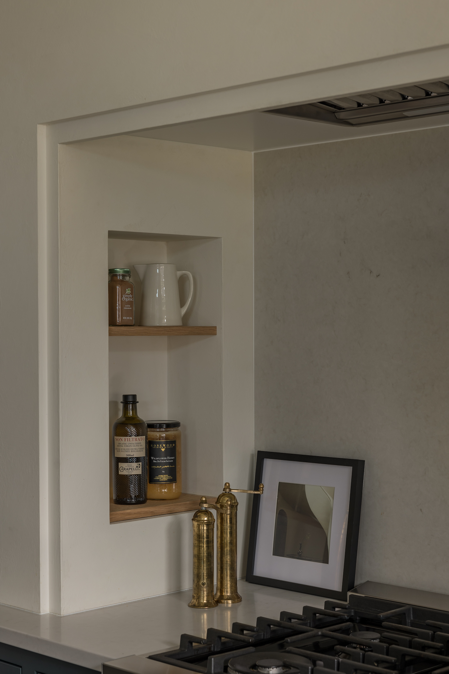
Some of our very favourite elements ended up being the plastered alcove range, including the charming recessed nooks complete with white oak accents that tie to the white oak island. Another of our favourites was the rounded corner banquette, which allowed us to maximize useable space with a great breakfast/conversational space and also really round out the space and make it feel homey and inviting.
Like what you see? Take a peek at the talent behind the story… Interior Design & Cabinetry: Thorpe · Photography: Young Glass Photography · Stylist: Yellow Spaces