Sadaf and her husband knew that buying a home in New York City would be a long and daunting endeavor, but when they saw this unwanted Chelsea apartment in need of an extensive update, they were ready to put in the work. By keeping the palette soft and bright and dividing the loft into defined living spaces Sadaf, of Stone + Birch Interiors, created a gorgeous home that refuses to be overlooked. Keep scrolling to see how her hard work and prescience paid off.
From the designer… My husband and I had recently tied the knot and we decide to start the search for a more permanent home knowing it can take a few months to find the perfect fixer-upper we could turn into a home – especially in NYC! La Casa Chelsea was the very first apt we saw. It was in the heart of winter with snow on the ground and my husband mentioned there was an open house in Chelsea which was the ideal situation and in a neighborhood we loved. When we reached the building we learned the open house was canceled due to weather. We were both a little upset and decided to just move on, perhaps it wasn’t meant to be. The following weekend we saw the open house was rescheduled for that day and so we went to go take a look.
As we entered the apartment, we were both shocked. It was a hidden gem that had so much potential. We also realized why it had been on the market for a couple of years – it was likely hard for people to see beyond the pale green walls, dated kitchen and bathrooms, and the massive bookcases in the middle of the space. For us, we saw an amazing loft with 10-foot ceilings, the potential for a guestroom, two full bathrooms, a walk-in storage closet, a proper foyer upon entry, and a massive primary suite. A couple of months later it was ours and the work to call it home had officially begun.
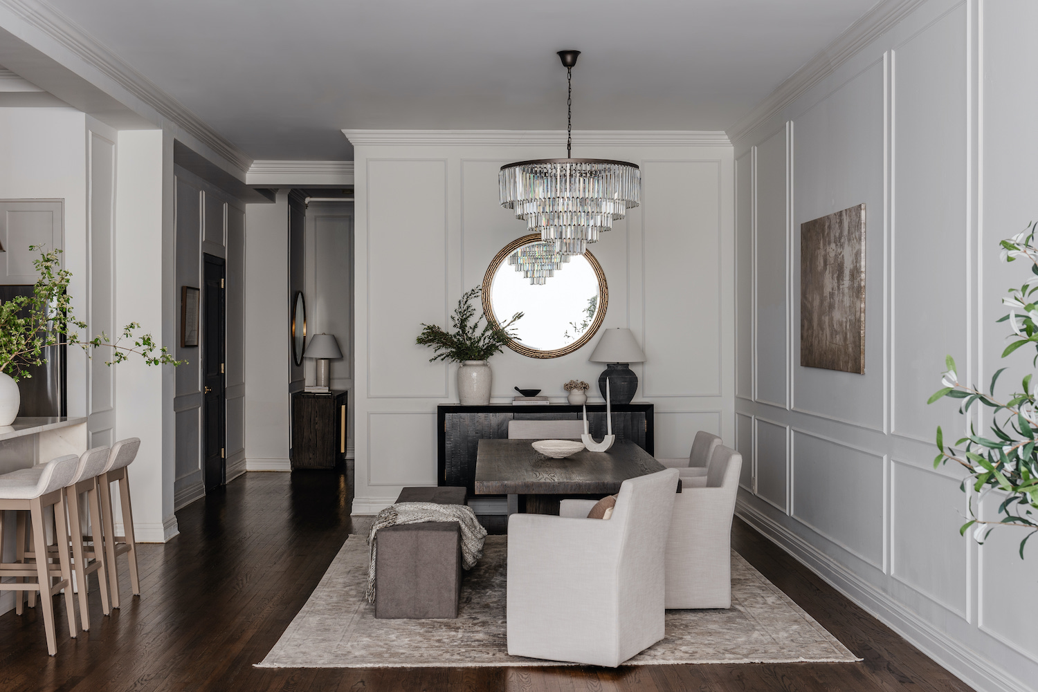
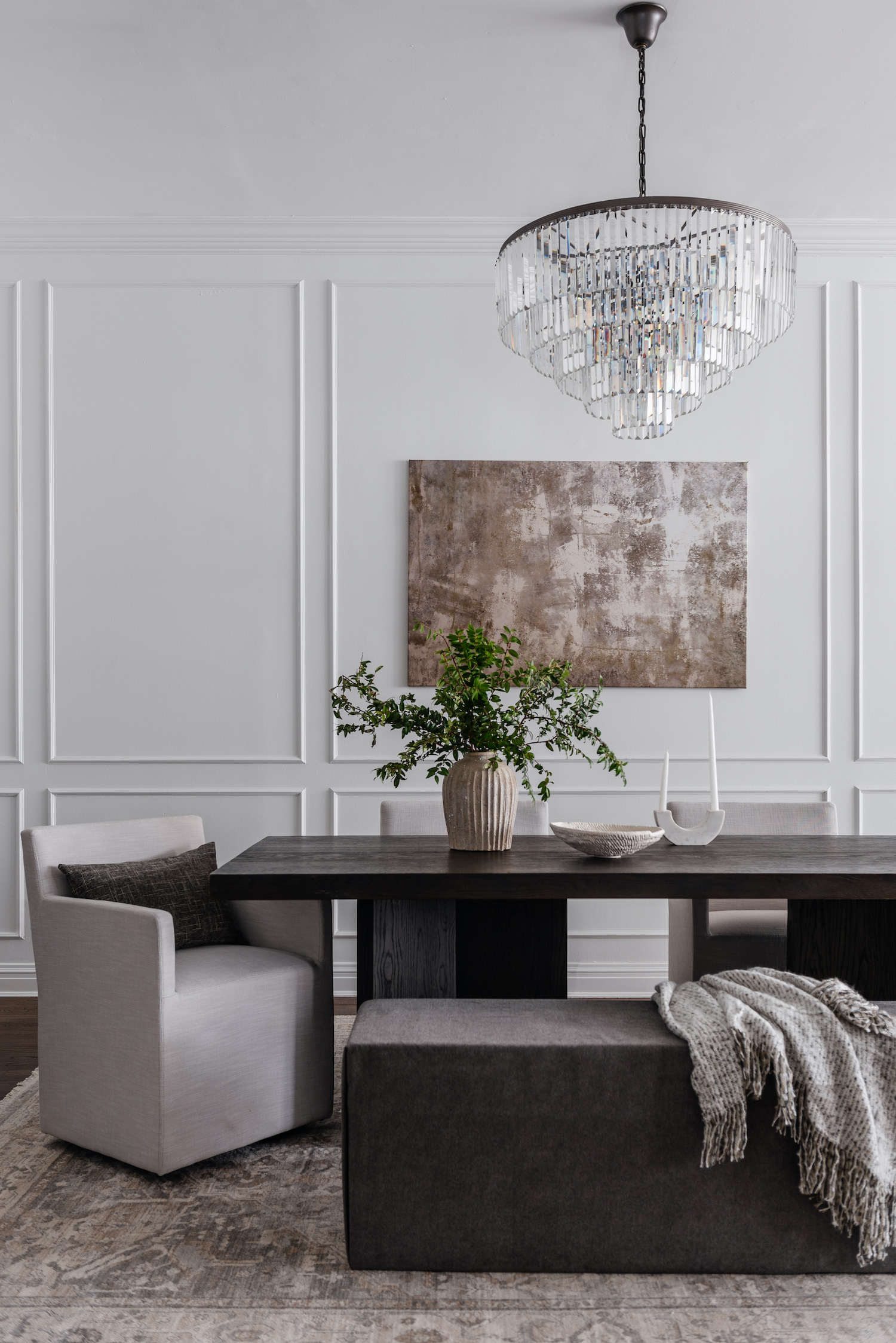
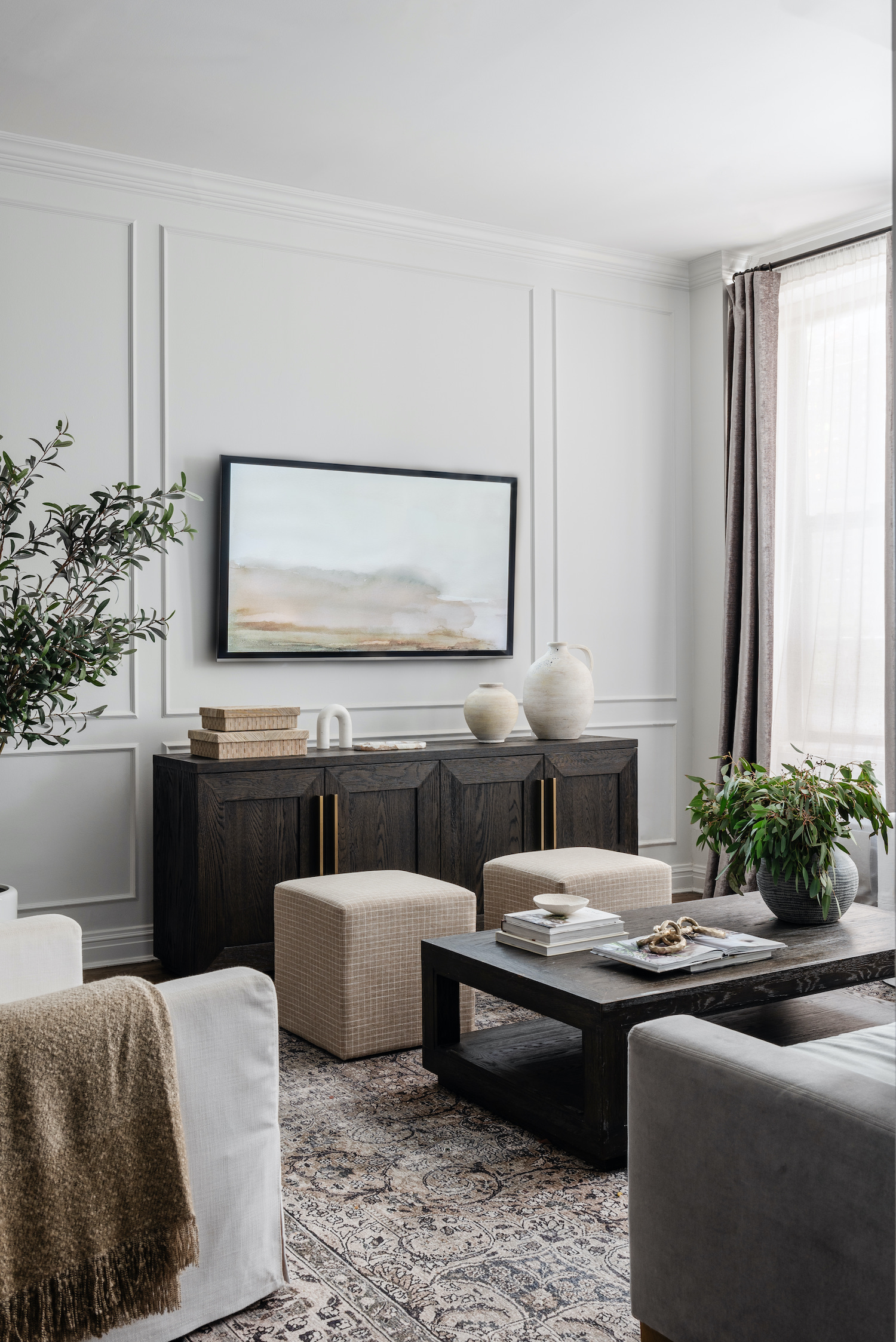
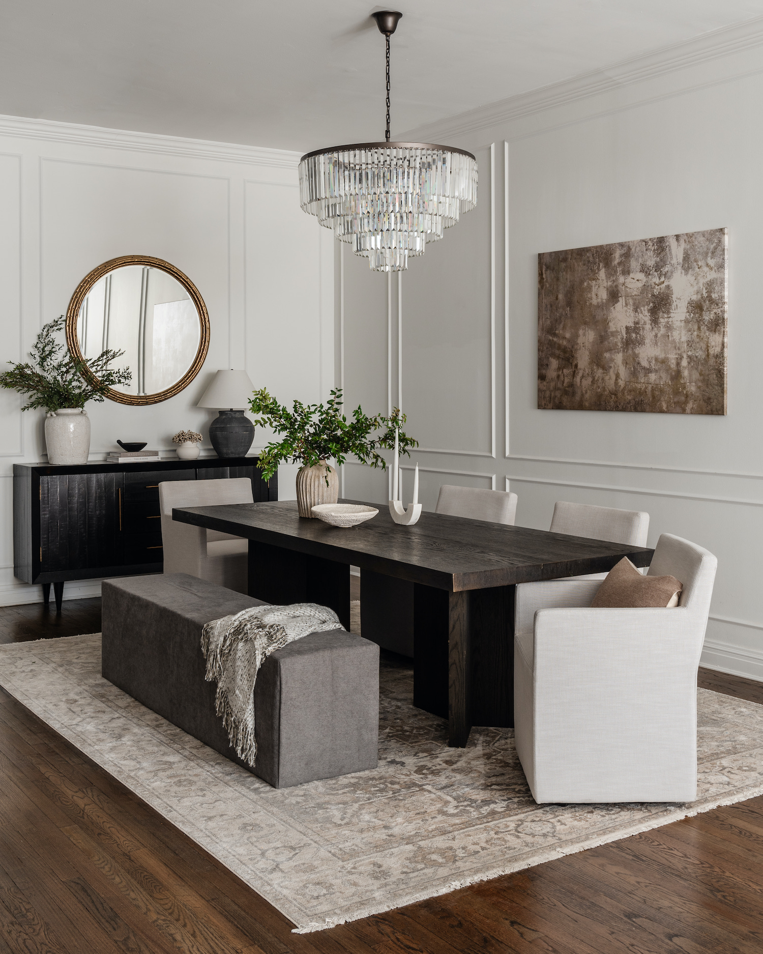
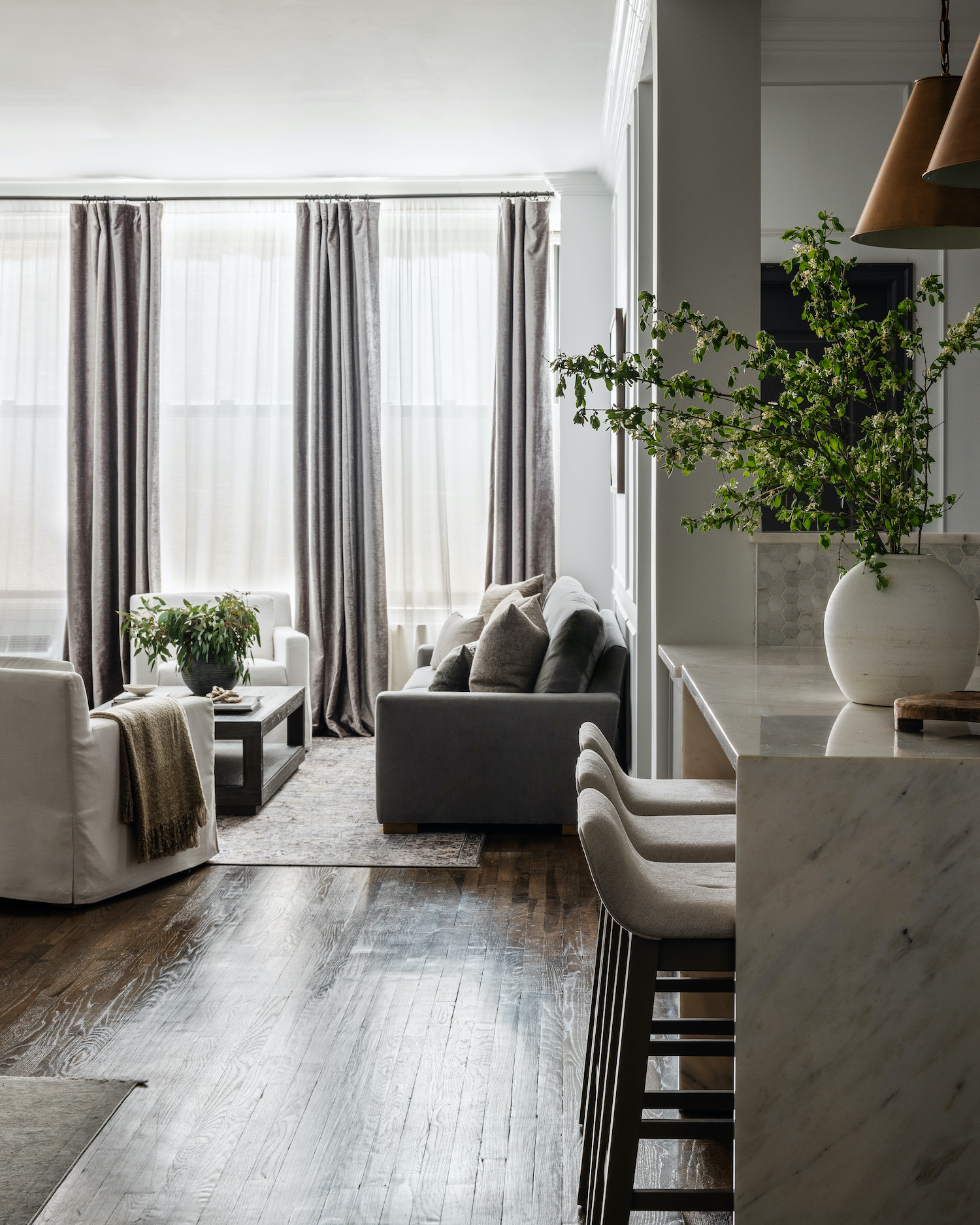
Our goal was to create defined, yet still cohesive living spaces throughout the open-concept loft. We removed the large bookcases in what was previously an office den to create a dining room and carved out a section of the apartment to construct a secondary bedroom. Given the apartment faced the back of the building with limited natural light, we knew we wanted to paint the apartment white to create a light and airy feel. I wanted to also draw the eye to the tall ceilings and create visual interest on the white walls so I opted to add crown and picture molding all throughout the home. This gave so much dimension, texture, and appeal to the apartment.
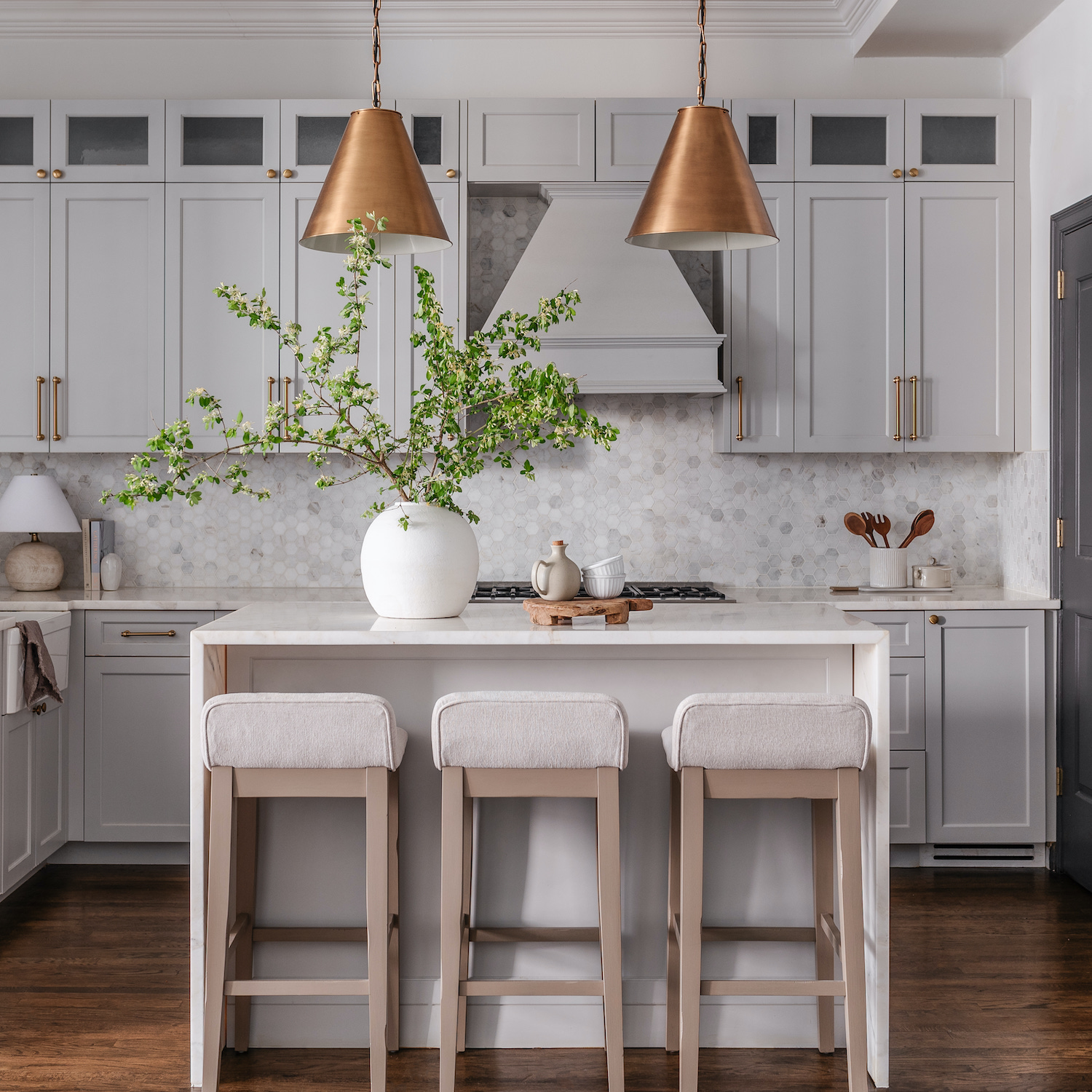
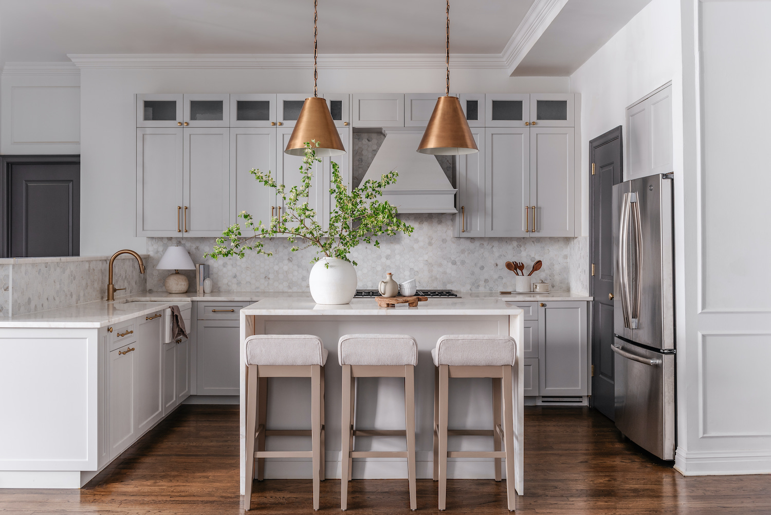
The kitchen remodel was by far our favorite. I have always felt that the kitchen is the heart and soul of a home. It’s centralized for gathering and one of the first spaces that people go to when they come home. So when designing this space I knew I wanted a warm and welcoming kitchen yet classic and timeless. It also needed to be functional and designed to take into consideration the space restrictions of a NYC apartment. We decided to convert the enclosed peninsula into an island which allowed for much better flow and the cohesiveness I was seeking. We selected a very soft shade of gray for our custom cabinetry which kept the kitchen feeling light and bright and finished with brass hardware to add warmth to the space.
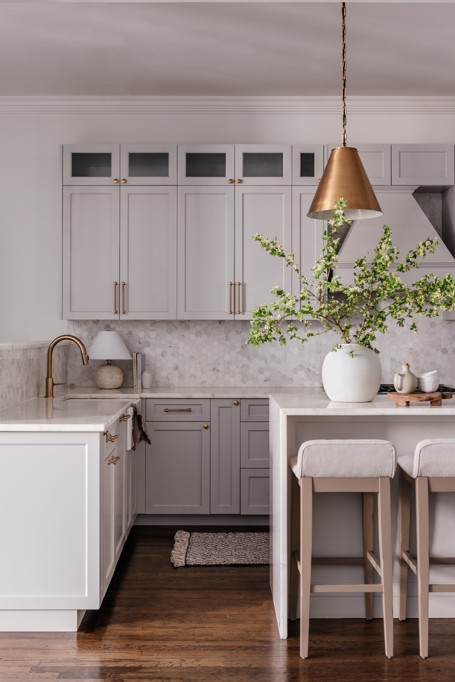
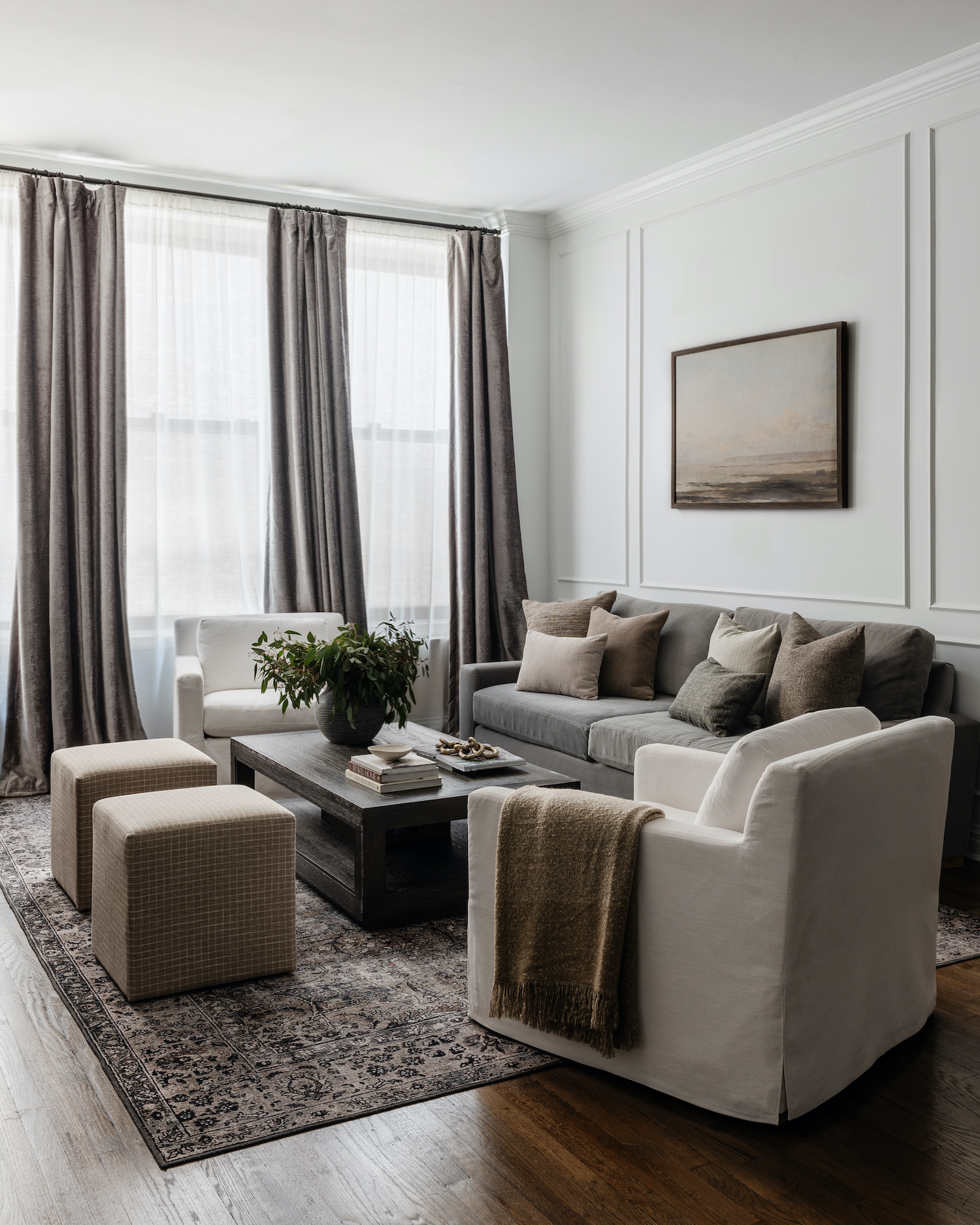
We incorporated several neutral palettes all throughout the home and layered in organic materials that brought depth and interest to all the spaces. Every detail was intentional with thoughtful design to create a beautifully cozy, welcoming home.
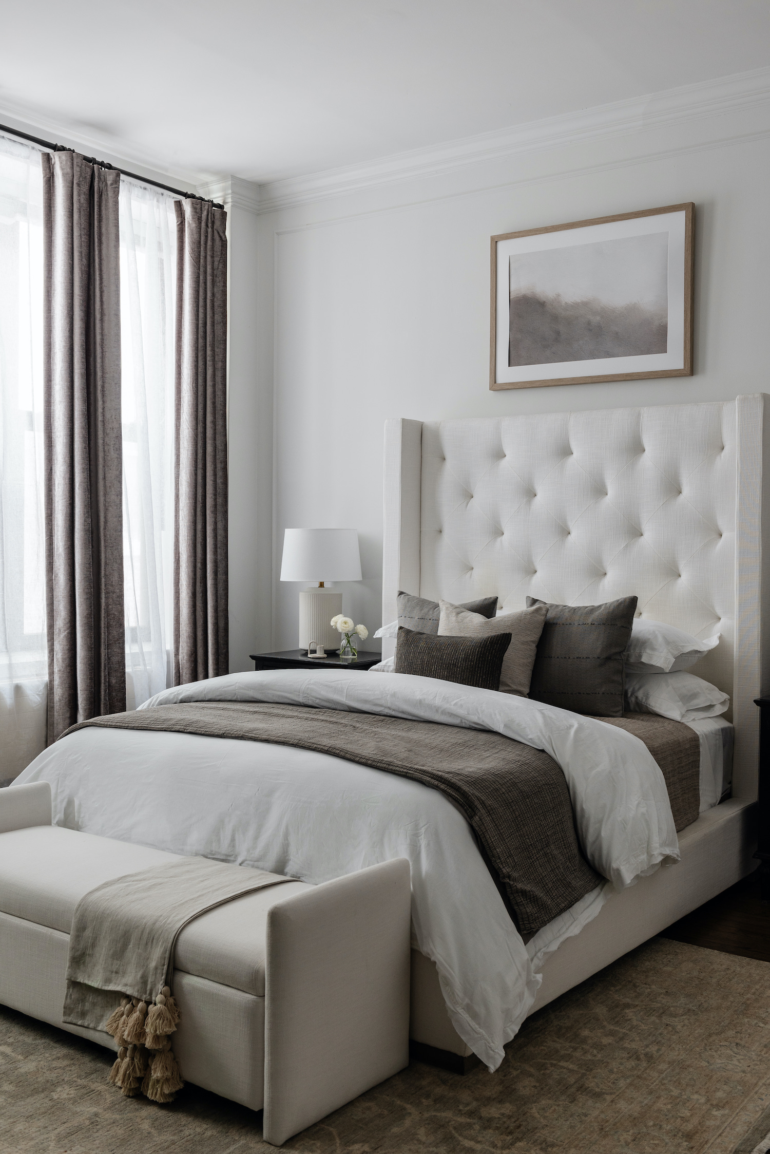
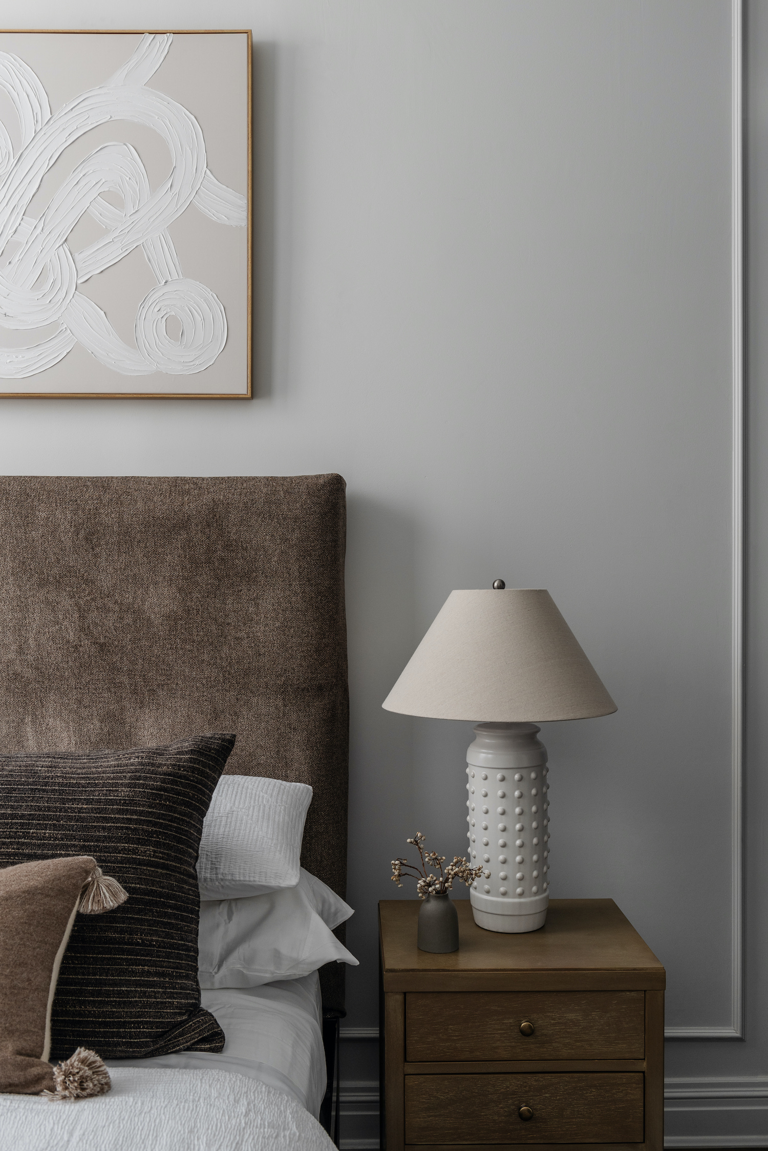
Like what you see? Take a peek at the talent behind the story… Interior Design + Stylist: Stone + Birch Interiors · Photography: Linda Pordon Photography · Architect: Dean Mendez Architect P.C.