This South End home, beautifully remodeled by Hudson Interior Designs, sits on one of Boston’s most historic tree lined streets among houses that were built beginning in the 1850’s. With restaurants and shops within walking distance and a mix of young professionals and families down the block, it’s no wonder Jill’s clients didn’t want to leave the neighborhood. They opted to update this historic home, repairing lost moulding and adding modern amenities, to give this home another lifetime to nurture a family. Keep reading to see how Jill brought this historic home into the modern era.
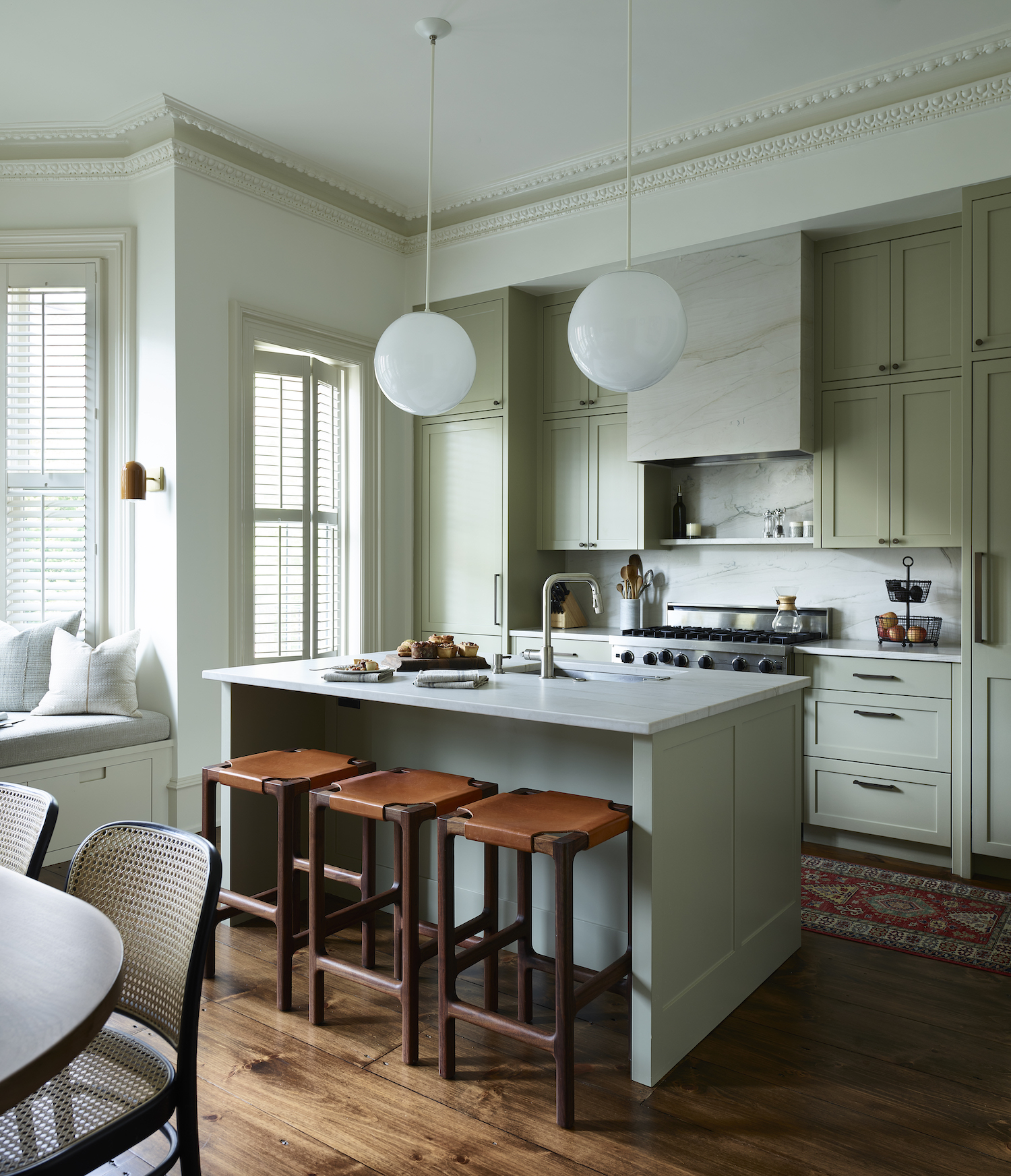
From the designer… Our clients were already residents of the South End when they decided to purchase this fixer upper in the same neighborhood. It had been owned by an older couple, and had not changed much in the last 40 years. These clients wanted to enlarge and change up the footprint of the original parlor level, enlarge the kitchen, and add a powder room and a wood-clad pantry. What was also requested was an updated color scheme which reflected their need for a calm space in the city.
I think everyone’s favorite space is the kitchen. The heart of the home was updated for these clients’ needs for cooking and spending time with family. The space is set up for this family to enjoy meals and time with each other. And it also has a welcoming window seat, where the kids can spend time reading or just hanging out. I also really love the warmth that was given between the ease of the new kitchen cabinetry, and the warmth of the wooden cabinets in the pantry. Very unexpected in this area of the city. These clients also have another home in Maine, and I feel that this was a way to bring their love of nature with them when they are home in the city.
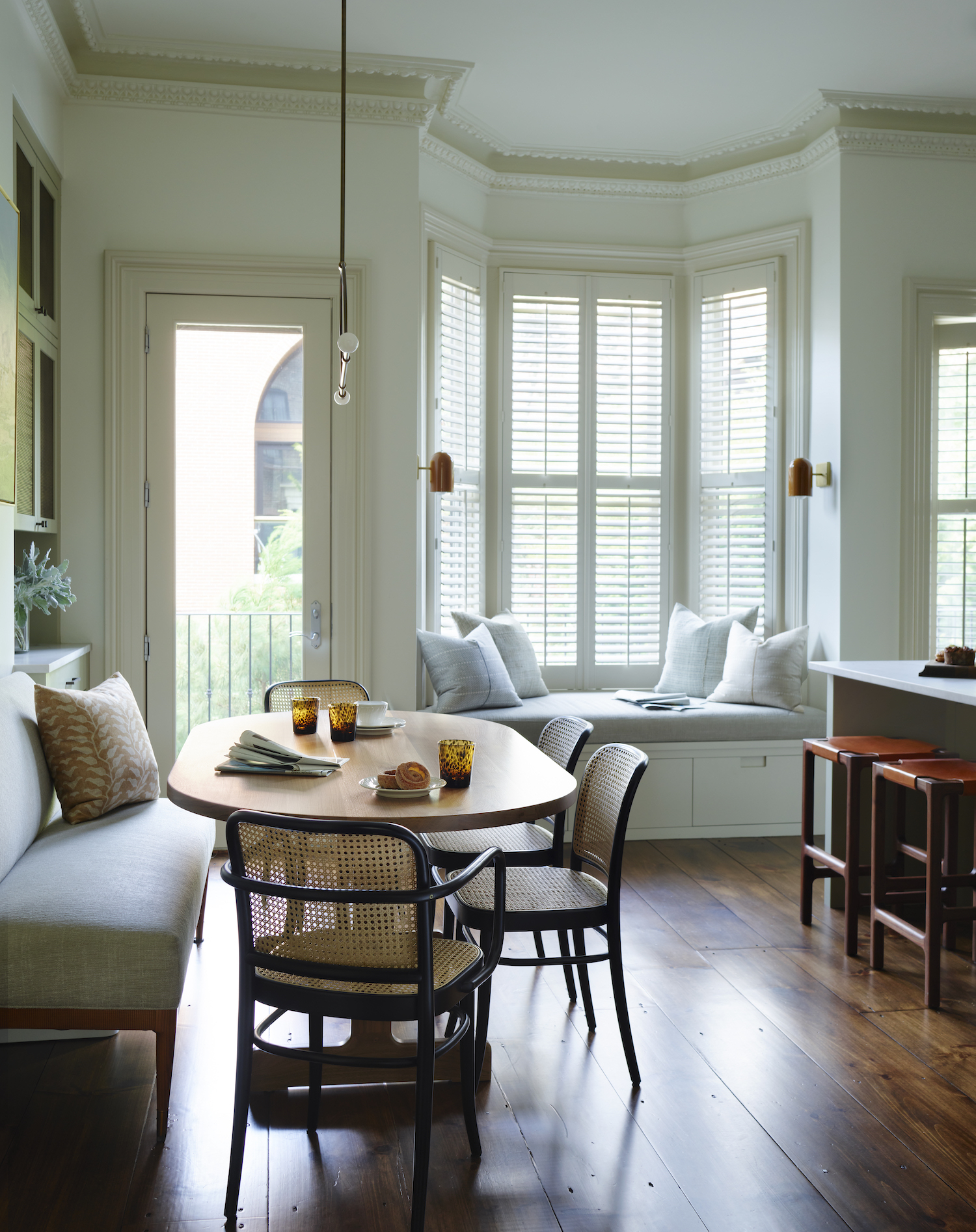
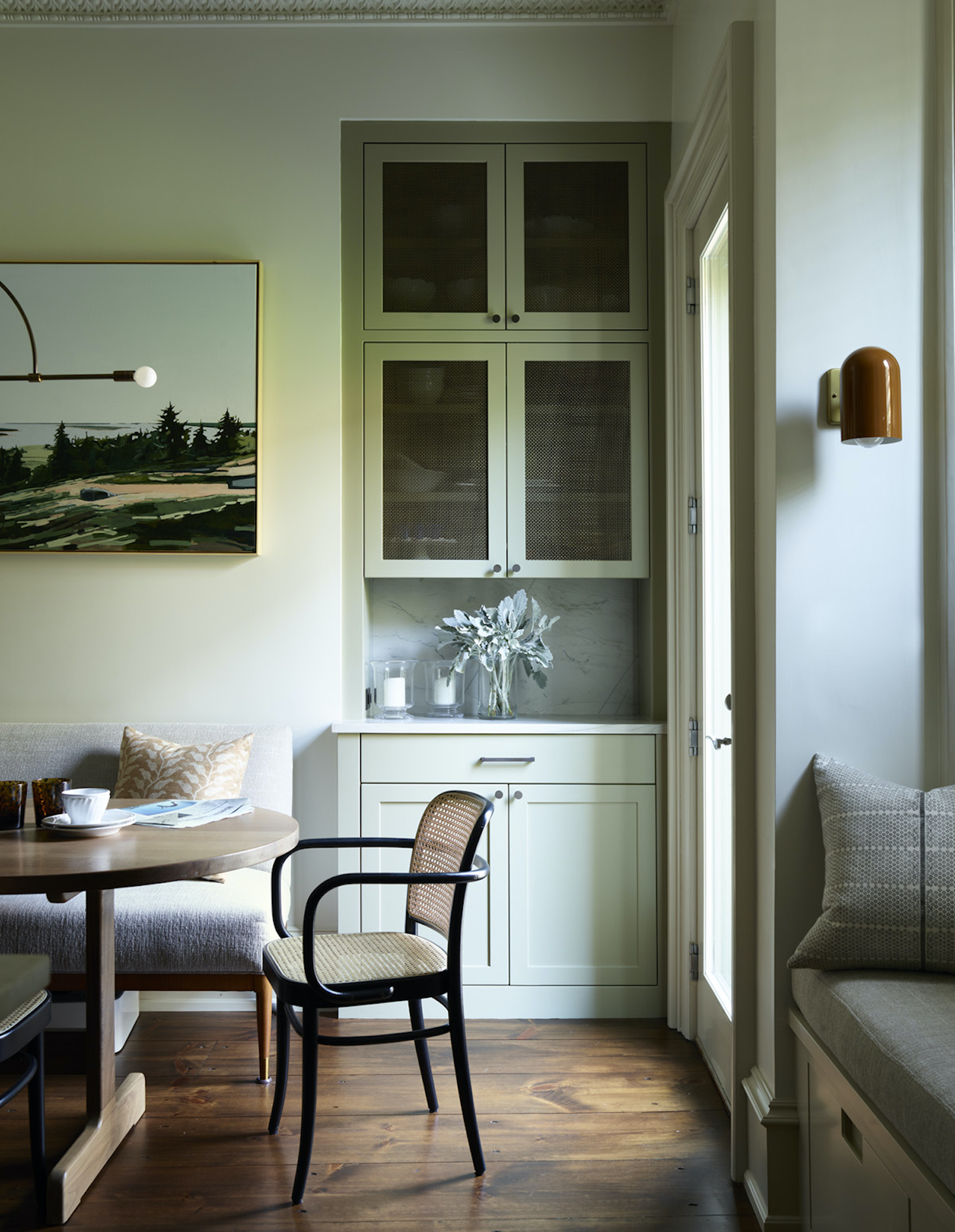
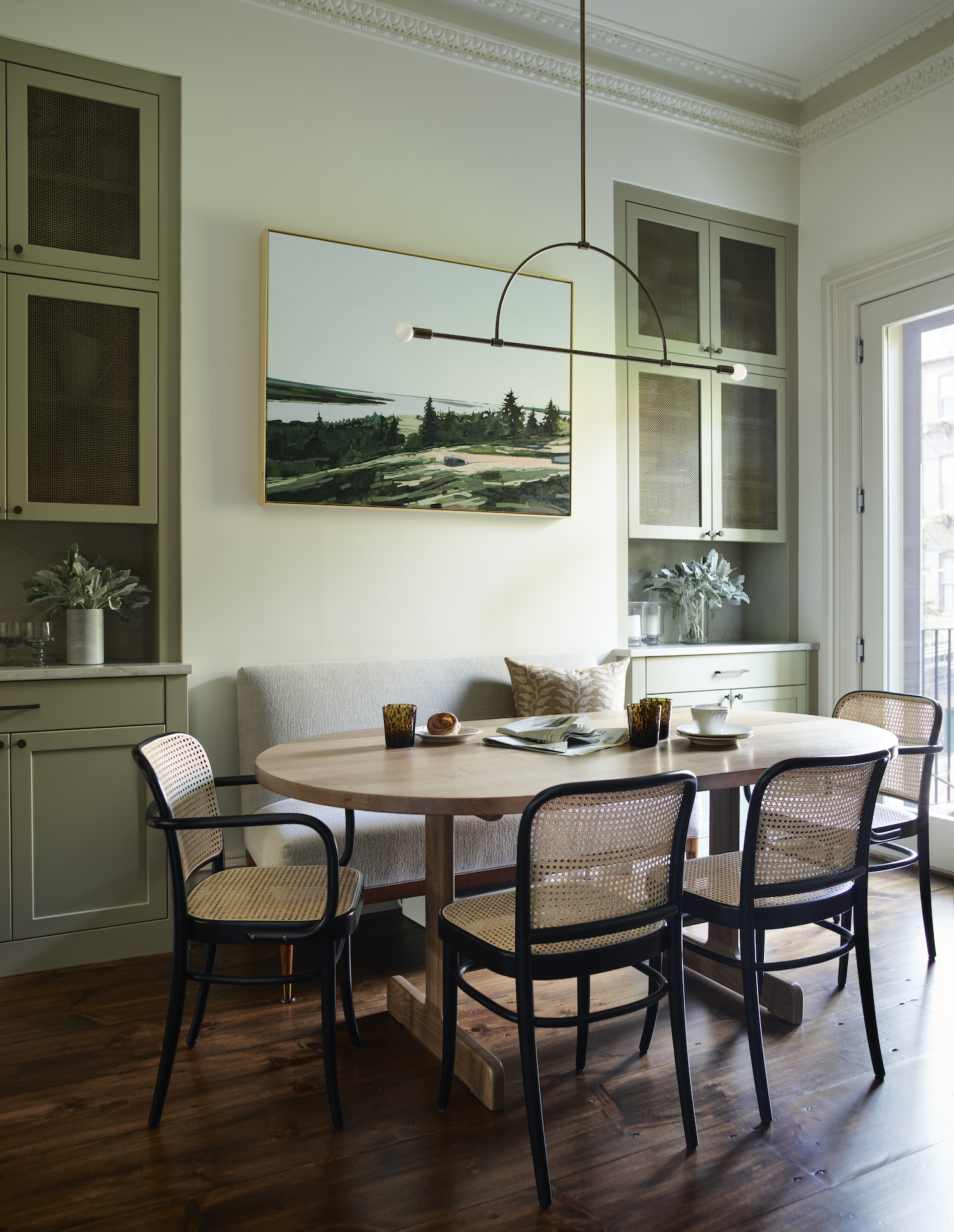
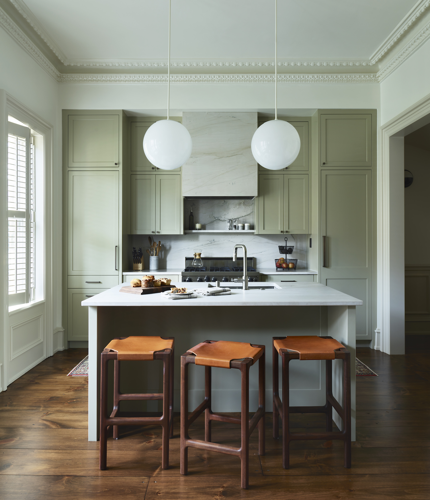
Space is always a challenge in city townhomes. The architect had to become very inventive when setting up the powder room, and the pantry in the center of this level as it shrunk the main living room space. This family liked the idea of an intimate floor plan, so in the end, those things that arose as challenges ended as a plus.
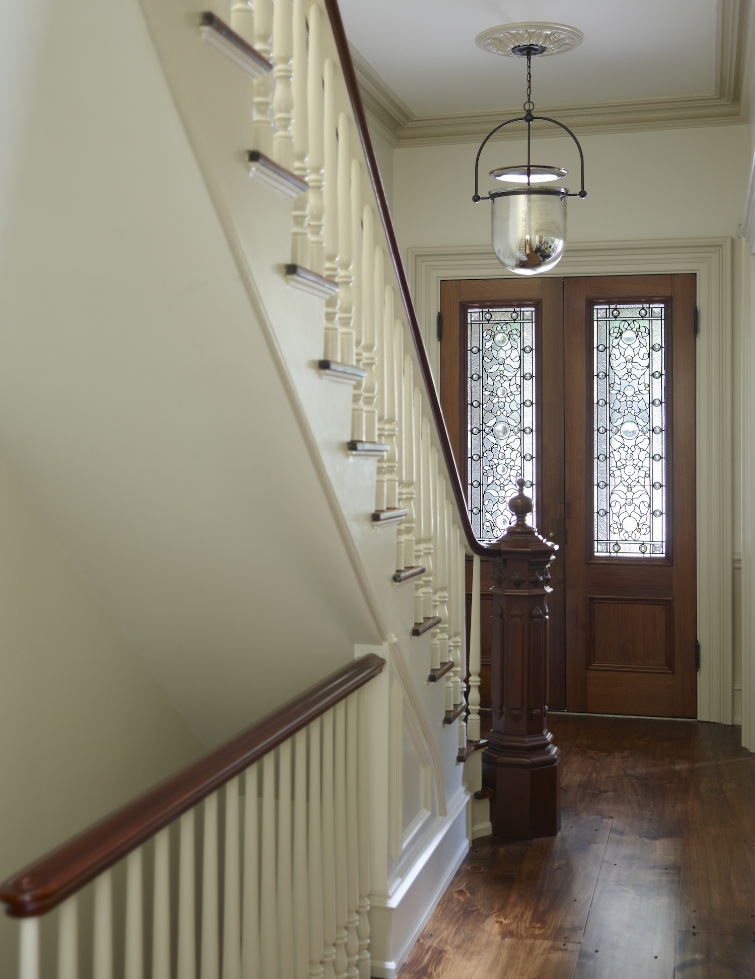
One of the home’s best features is its molding. I like how the original crown molding was incorporated into the new modern design. The builders had to have sections of it replicated, as in the deconstruction of certain areas it was damaged or lost.
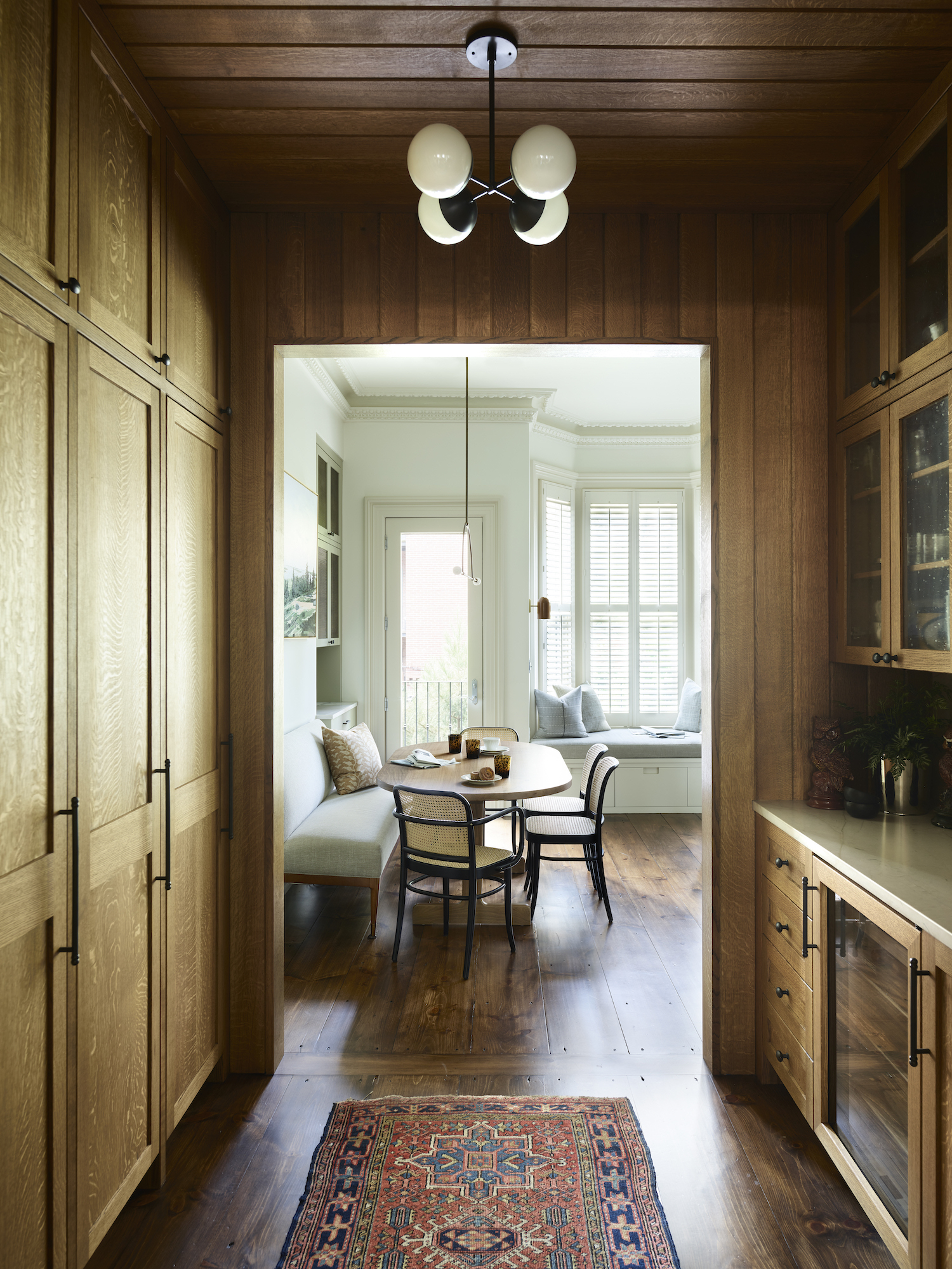
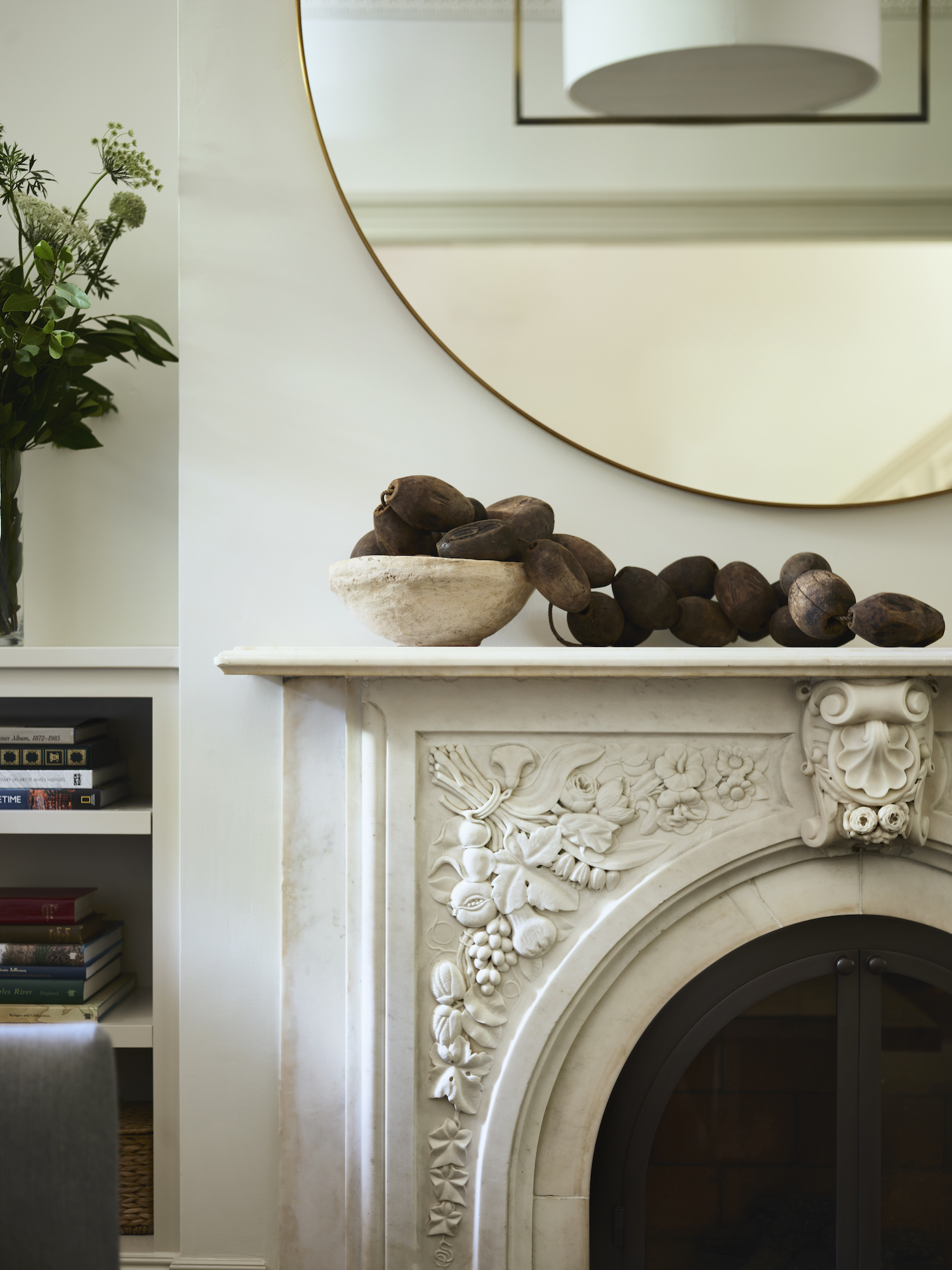
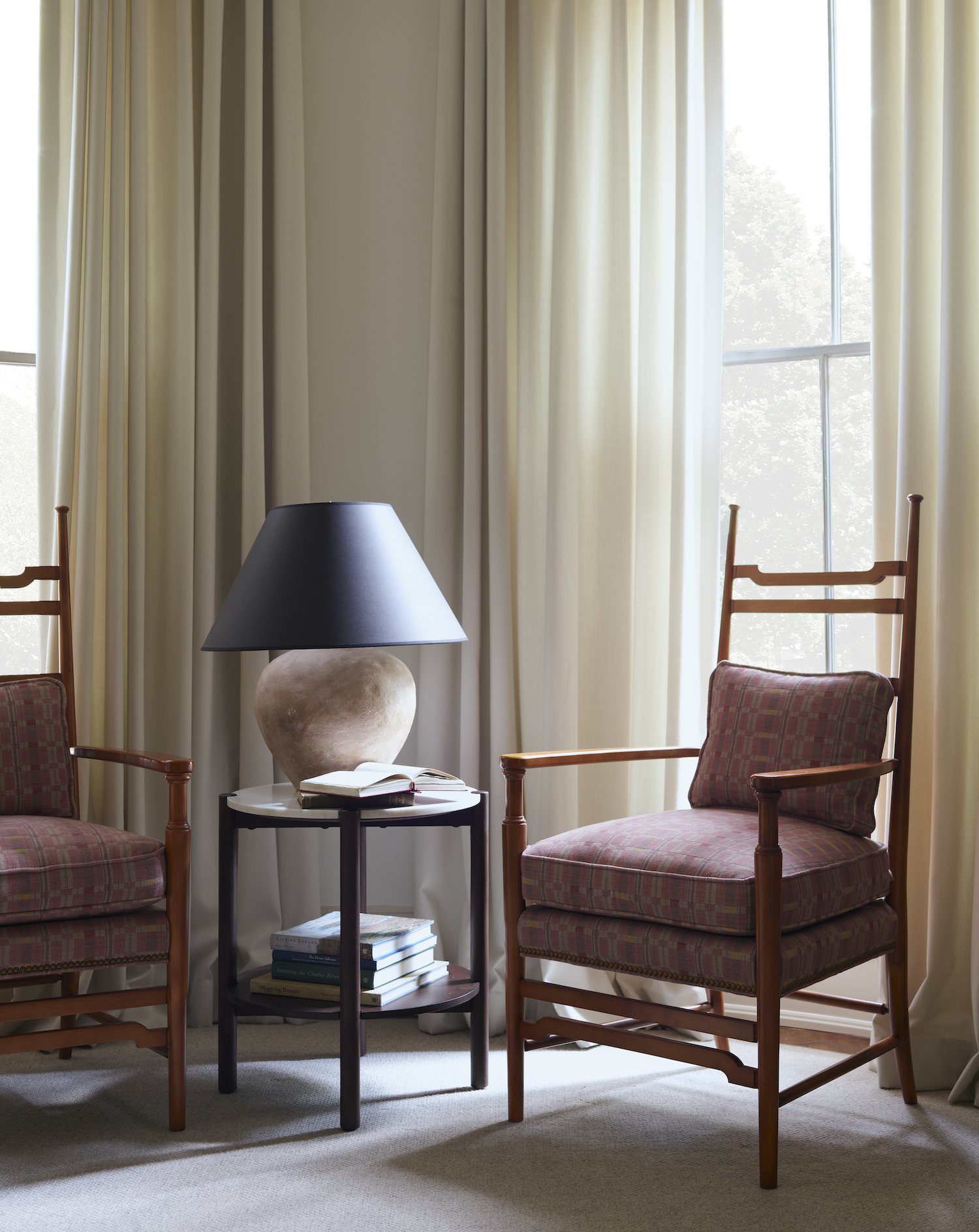
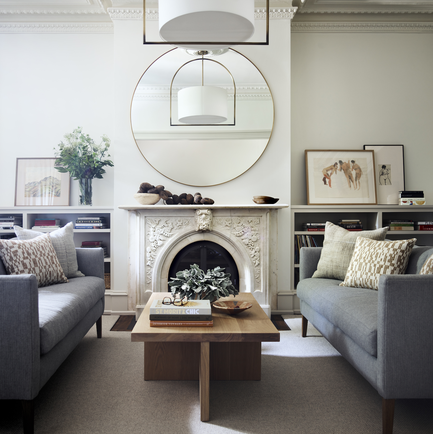
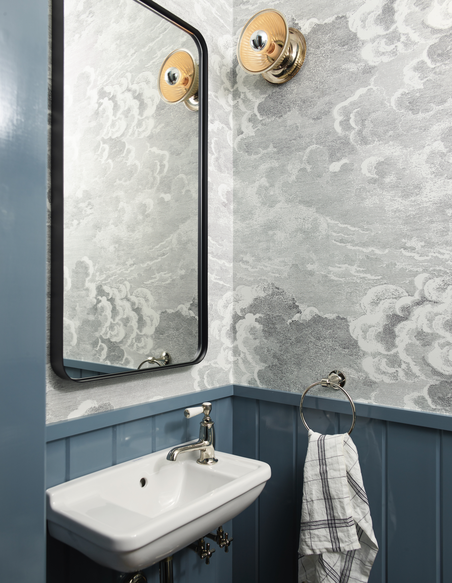
The final result of our remodel was a city home that is chic and elegant, comfortable with soothing colors, and warm materials. This townhome gave them a space to entertain in style, but at the end of the day, a home to recharge in and where they can reconnect with each other.
Like what you see? Take a peek at the talent behind the story… Interior Design: Hudson Interior Designs · Photography: Jared Kuzia · Architect: Noury-Ello Architects · Builder: Brayton-Dee Builders