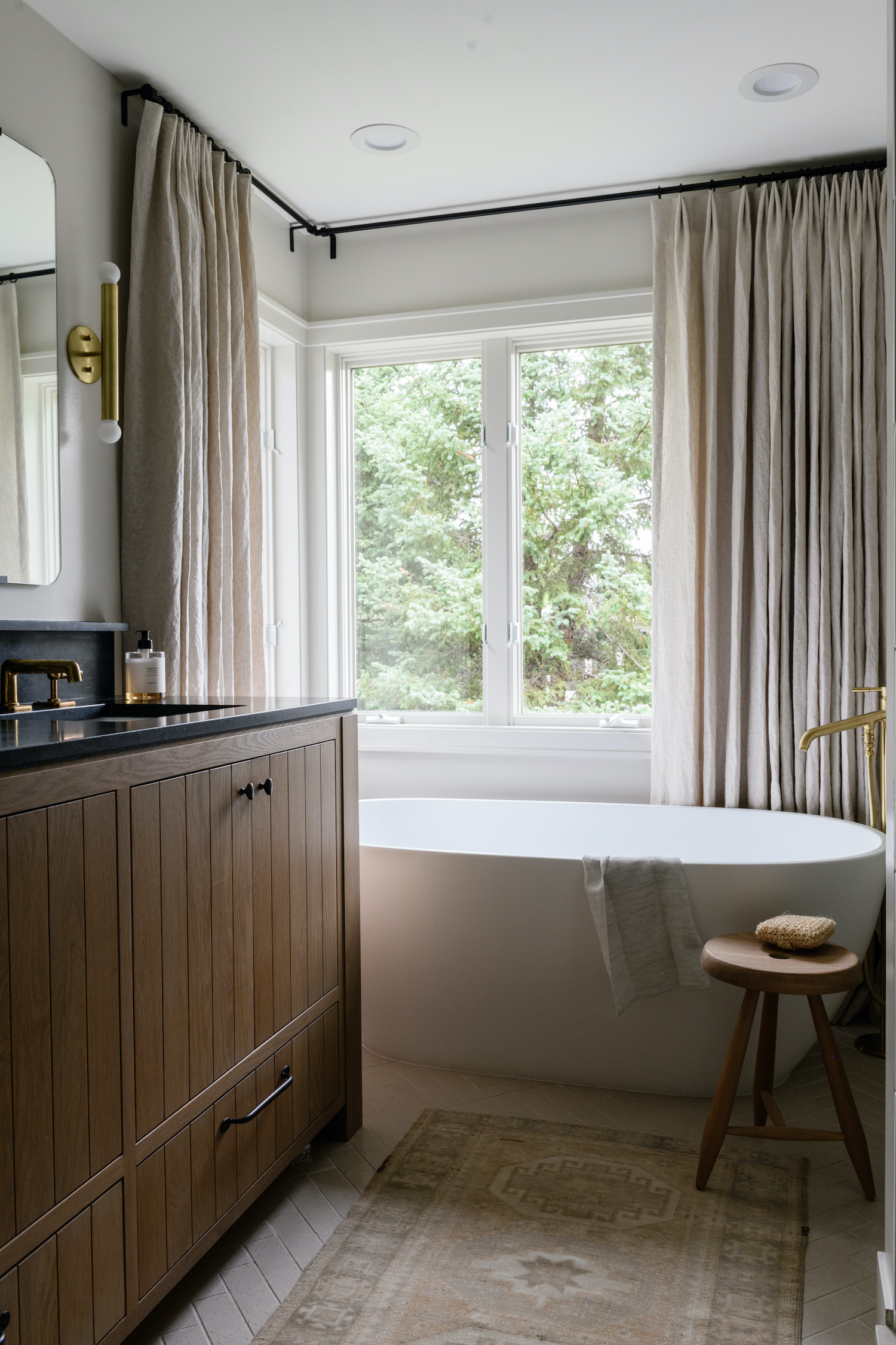
Awash in neutral tones and natural textures, this Minnesota bathroom has a perfectly pared-down aesthetic. When Tiffany Wiess Interior Design remodeled this 90’s bathroom she made clever moves that created satisfying symmetry and an efficient footprint. Take a peek at the beautiful photos by Amanda Marie Birnie to see how the design came together.
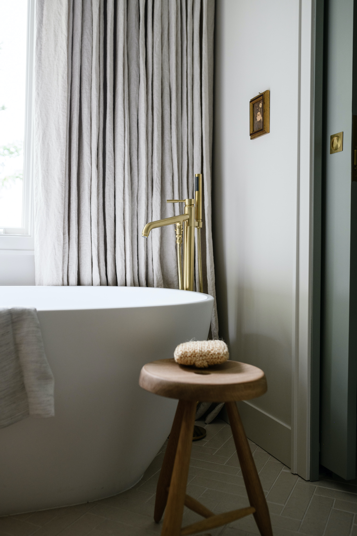
From the designer… This was a typical 90s bathroom with a huge jacuzzi tub surrounded by cream wall tile, 12×12 cream floor tile, cream ill-fitted cabinet doors, and a cream all-in-one countertop, sink, and backsplash. One large mirror behind the vanity and a tiny, odd-shaped shower to top it off. Actually, the tile in the shower was also the same cream ceramic, just in varying sizes!
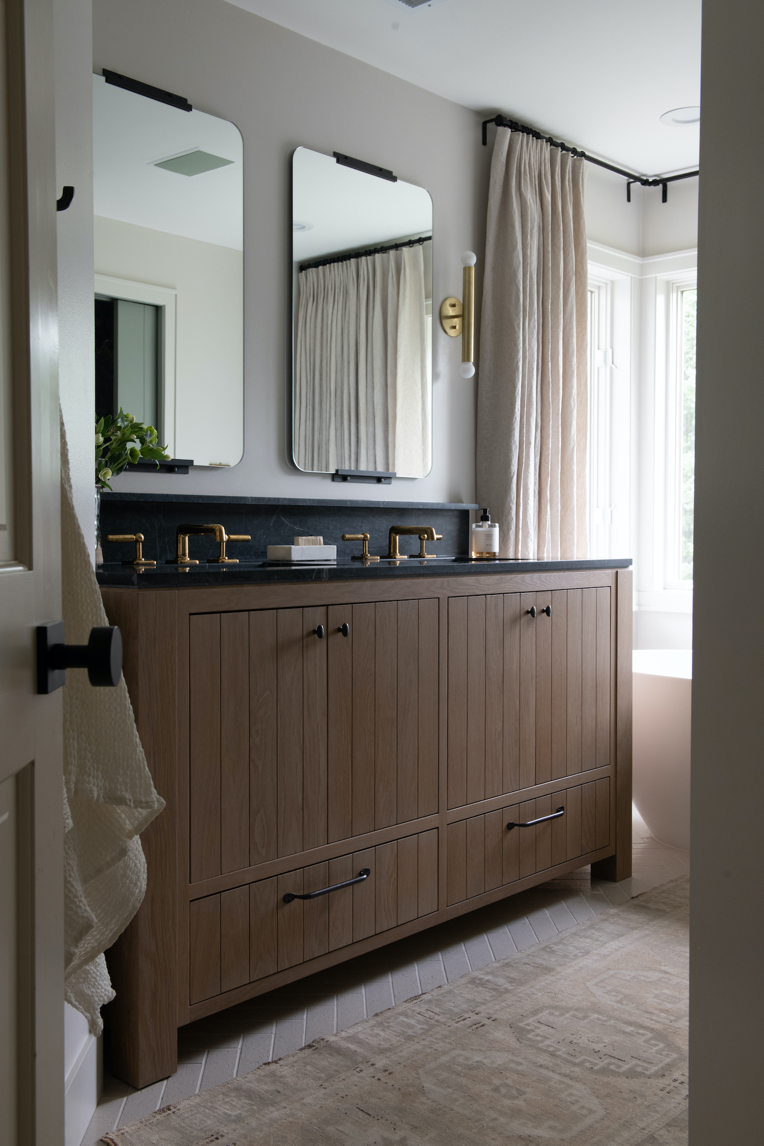
The bathroom is on the small side so needless to say it needed an overhaul not only visually but also functionally. We weren’t able to expand the footprint beyond the existing space but could shift walls within the box. Ultimately, by pushing out two of the shower walls, we gained symmetry and breathing room in the shower and eliminated unnecessary space in the water closet.
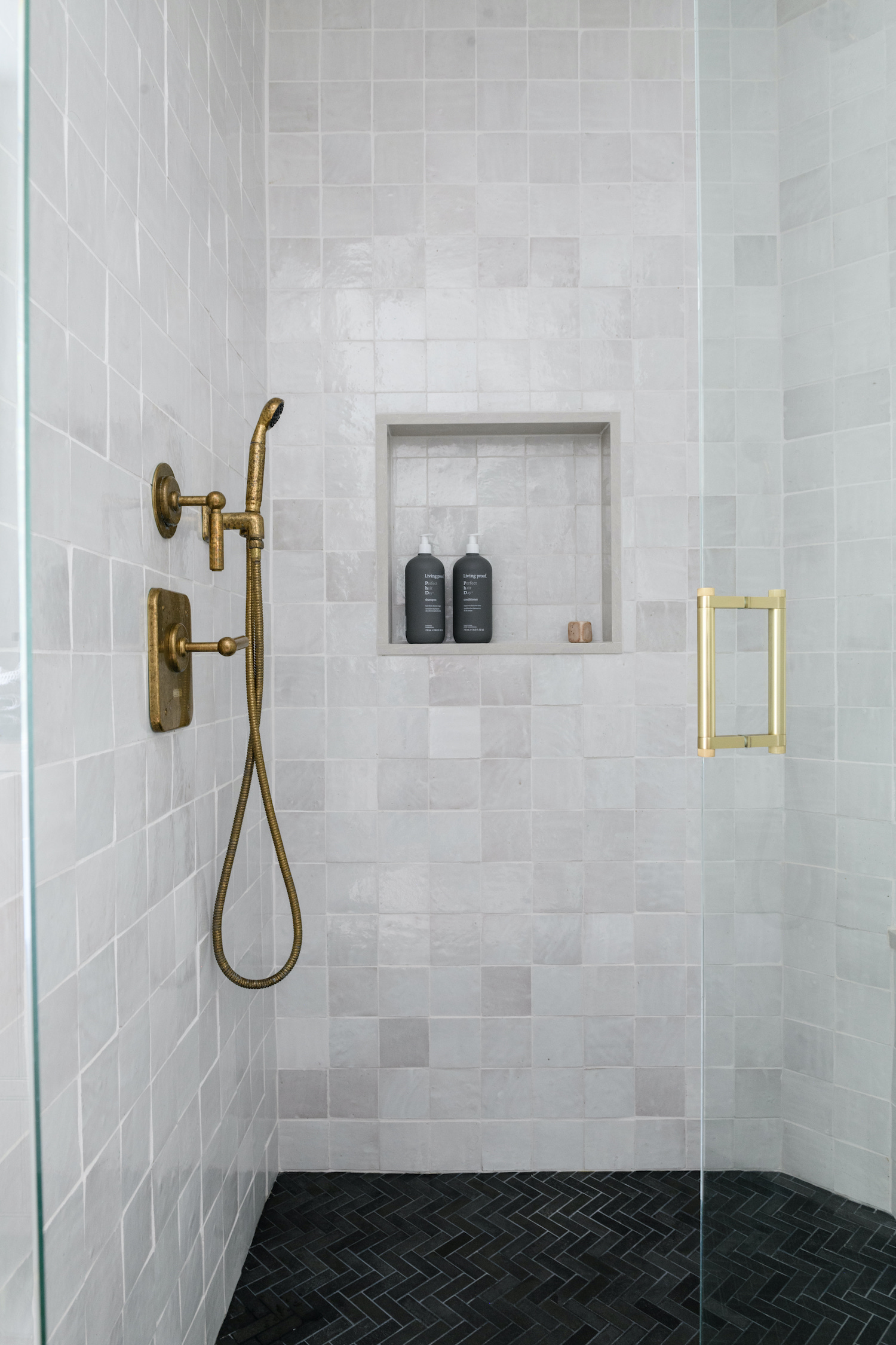
Our first step is always to address the floor plan before moving on to finish selections. During the project’s kick-off meeting, we look at images to get on the same page aesthetically. In this case, we knew the space would lean traditional but not cluttered, it would have a neutral palette, and we had to include zellige tile one way or another! We placed the white, reflective zellige tile on the shower walls to bounce light and added contrast with the soapstone countertops.
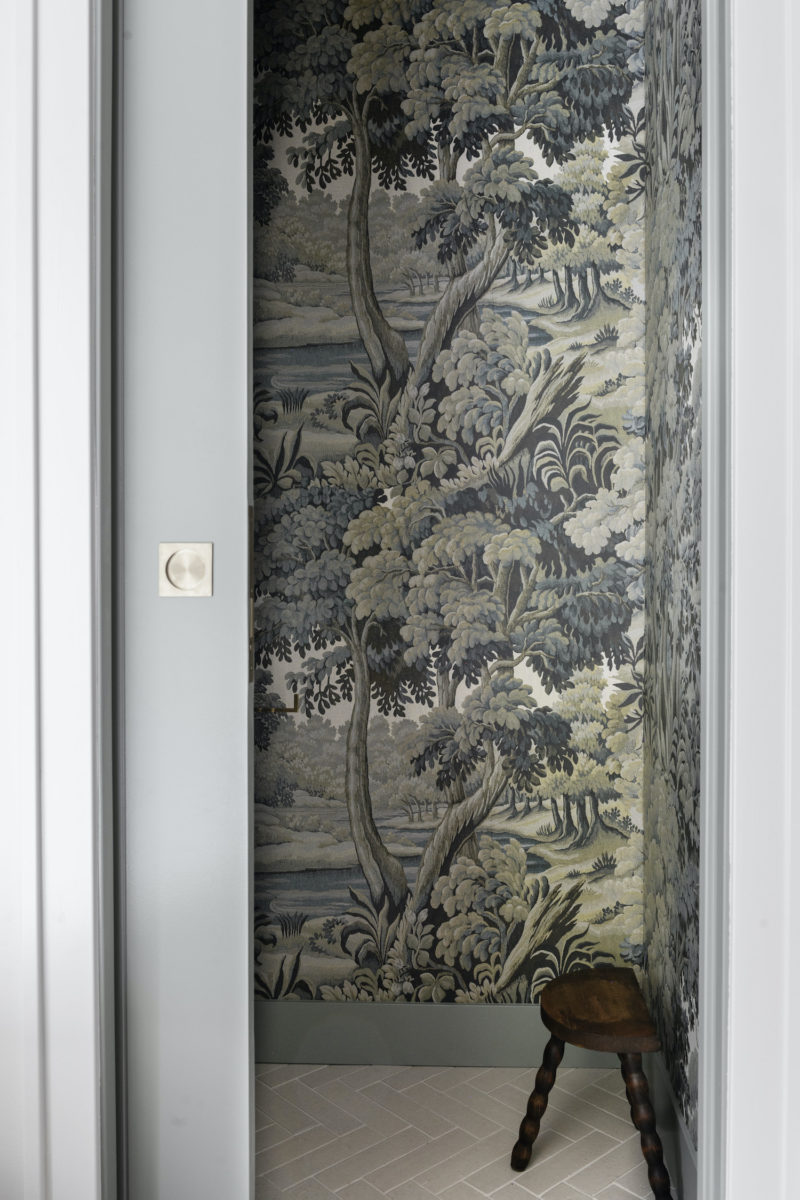
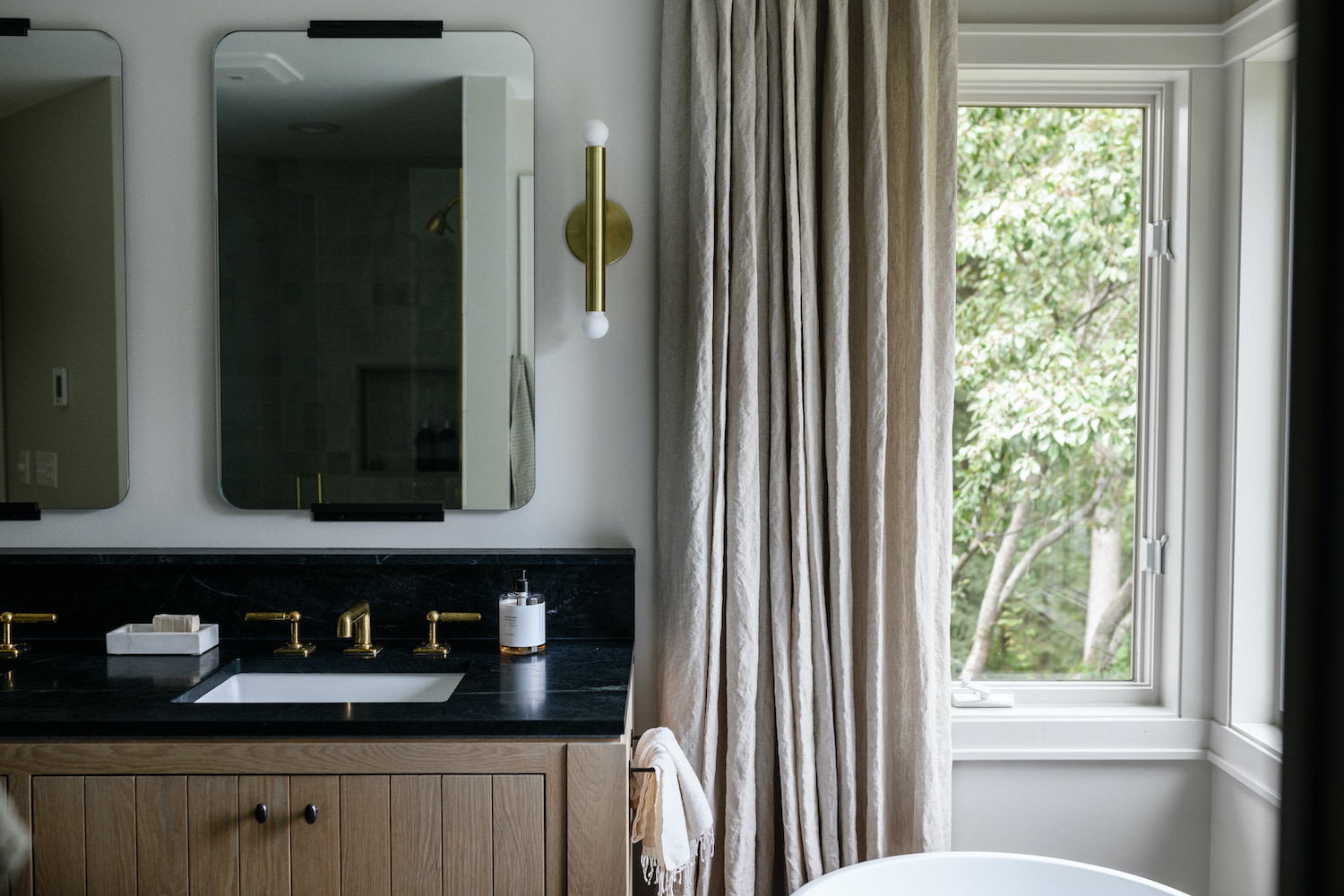
We love to visually heighten a room by using the same paint color on both the walls and trim, so here we used Benjamin Moore’s Athena on both, just in different sheens. The textile appearance of the wallpaper in the water closet also creates the most special moment! The biggest trick of all in the space, that’s not easily spotted, is the drapery flanking the freestanding tub. The windows behind the tub only go about halfway on either side creating such an imbalance. To fix this we added tall, linen drapery to give the appearance of windows spanning the full width of the walls.
The project took longer than expected due to some delayed fixtures, but our clients were amazing and so gracious throughout the entirety of the project. The final outcome is quite magical, especially at sundown with all the natural materials and glowing sconces.
Like what you see? Take a peek at the talent behind the story… Interior Design: Tiffany Wiess Interior Design · Photography: Amanda Marie Birnie
