When Jodie Owen Design took on this kitchen-dining room renovation she knew the layout needed some love. She began by taking down walls and creating a modern and refined open floor plan. Keep reading to see how a last-minute change took this kitchen renovation from quietly comfortable, to simply stunning.
From the designer… The kitchen and dining spaces in this project hadn’t seen any updates in close to 30 years. The dining room was closed in by a set of French doors and housed large bulky furniture and bold floral wallpaper. While the kitchen was certainly functional, it lacked flow and a sense of airiness. Both spaces were from the era of dusty rose, hunter green and well…too much “stuff”. This minimalist designer knew there was a better way.
The clients were ready for a complete makeover in every sense. We decided to take it down to the studs and pave the way for a modern, refined and simplistic experience.
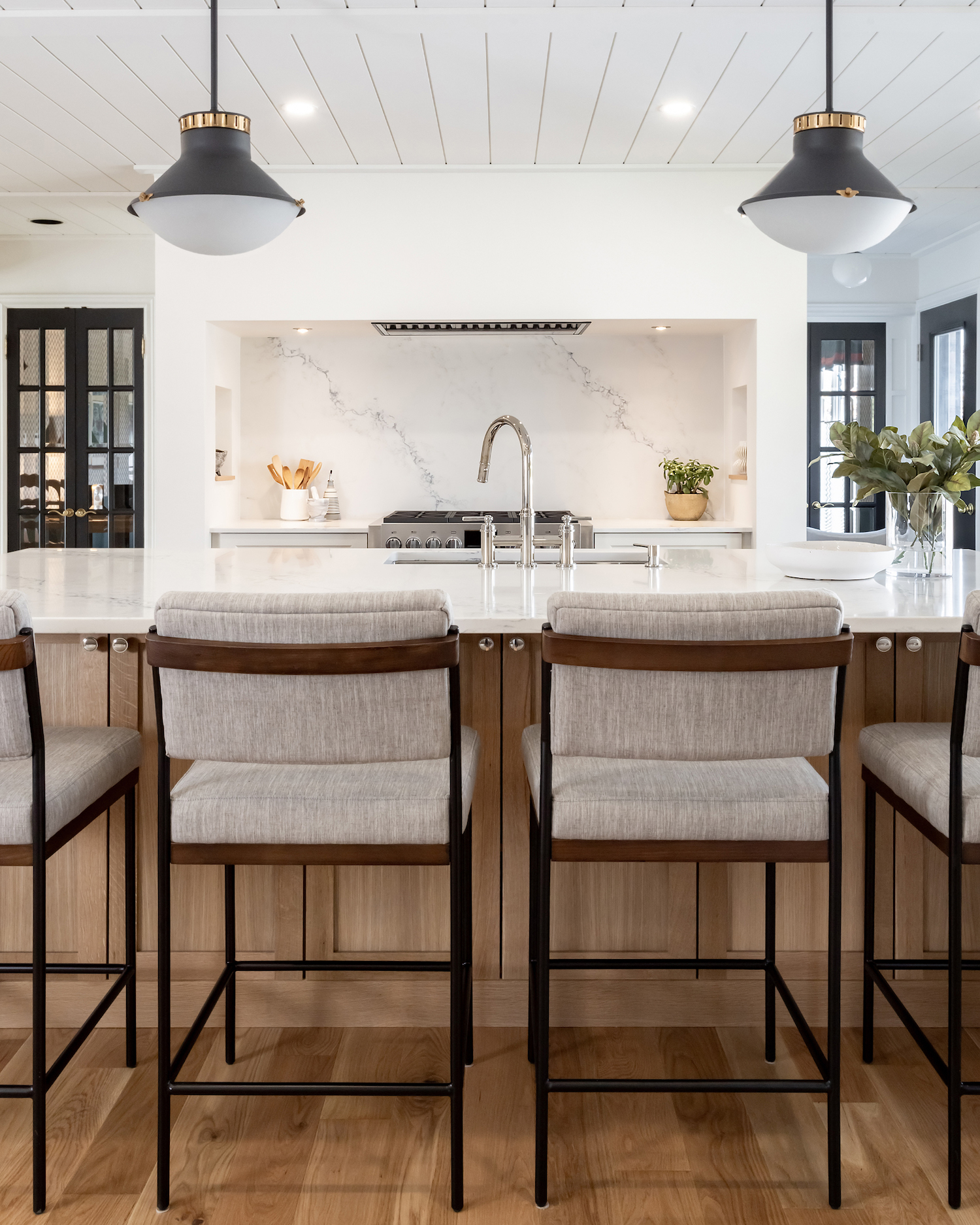
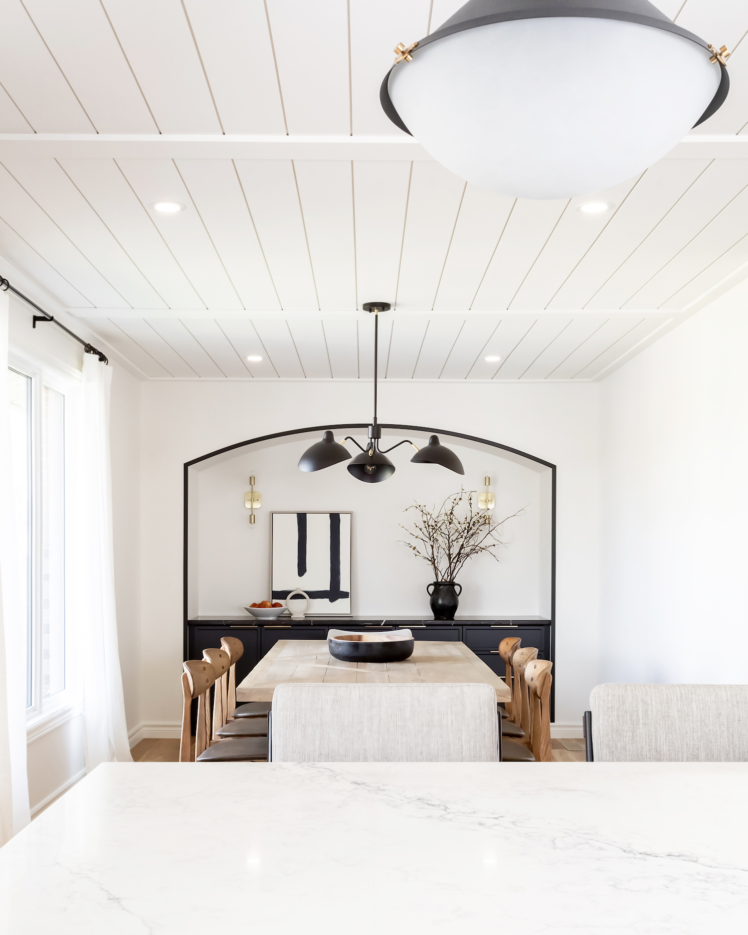
We removed the walls that separated the two areas, as well as a closet pantry to create an expansive cooking and dining space that could be enjoyed from every angle. We were initially playing around with the same kitchen footprint since it really did make sense to do so. But something wasn’t quite hitting the mark for me. At the witching hour (literally at 10pm the night before the plans were being presented to the cabinetry company), I completely switched up the layout and presented some simple sketches to the client to convey my vision.
Both clients were avid cooks, so my gut told me this new kitchen space needed to feel thoughtful and elevated. Thankfully they were over the moon excited about the last-minute change, and took comfort in my confidence and conviction.
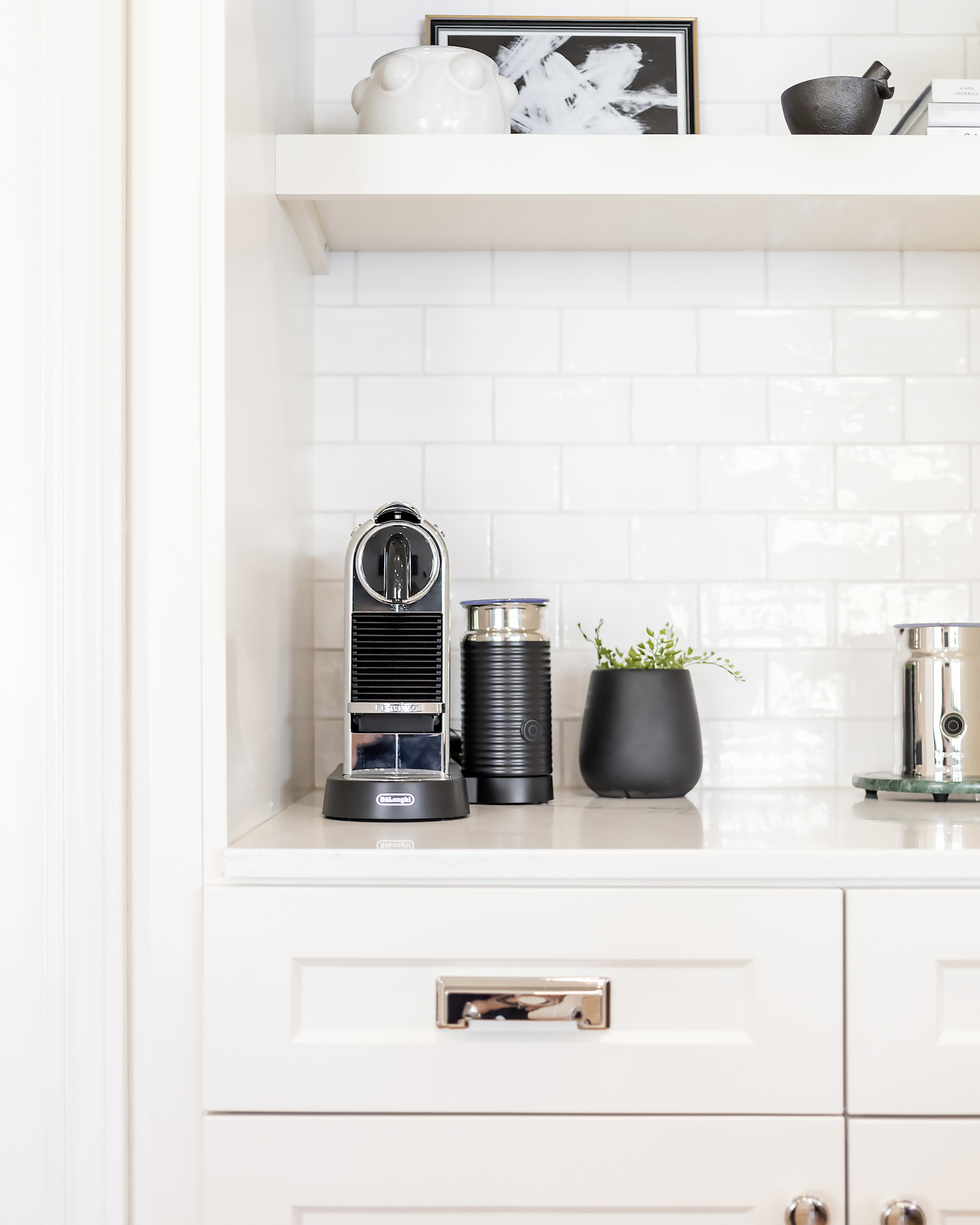
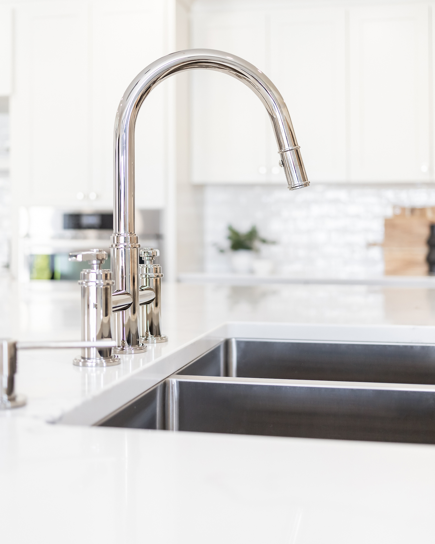
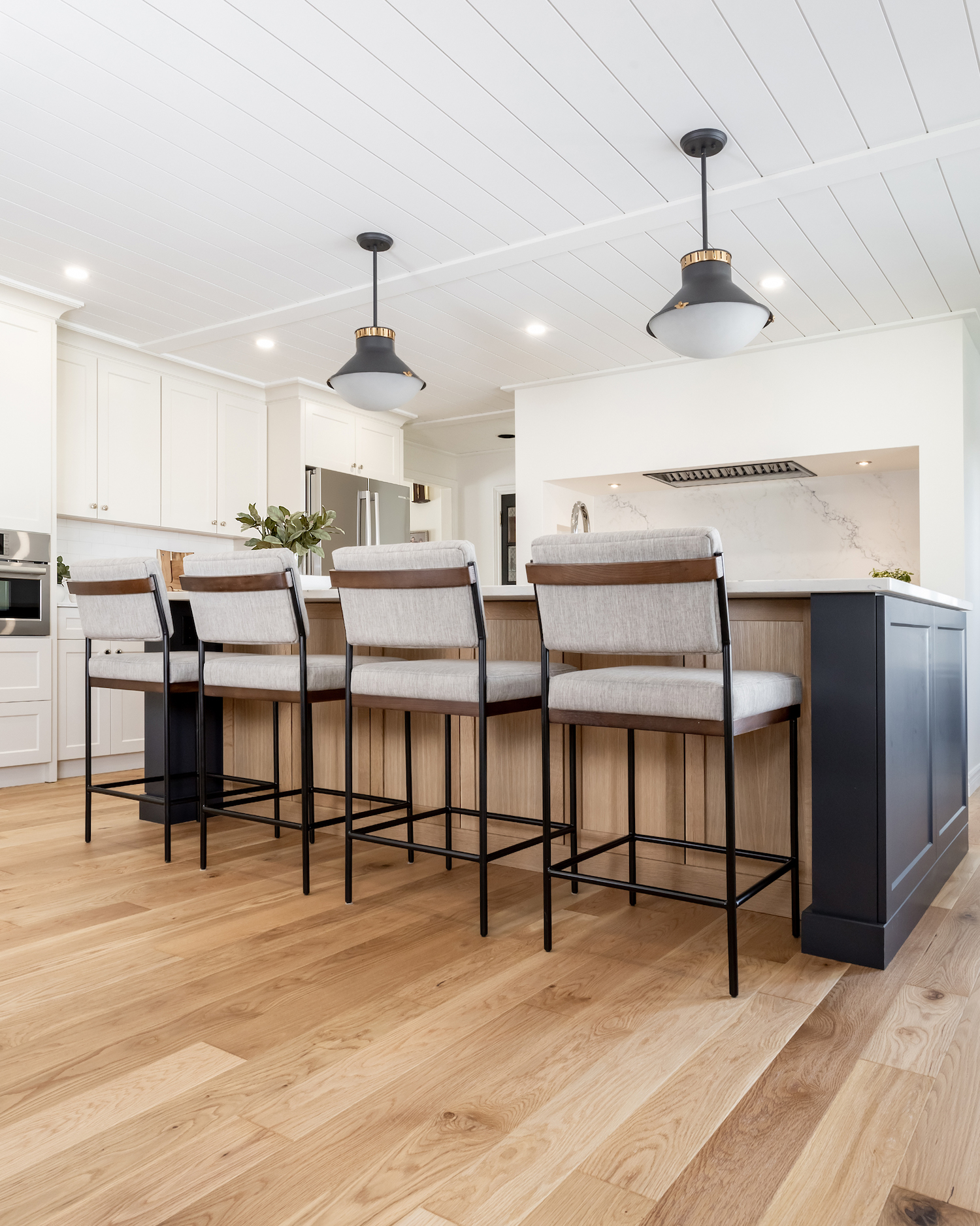
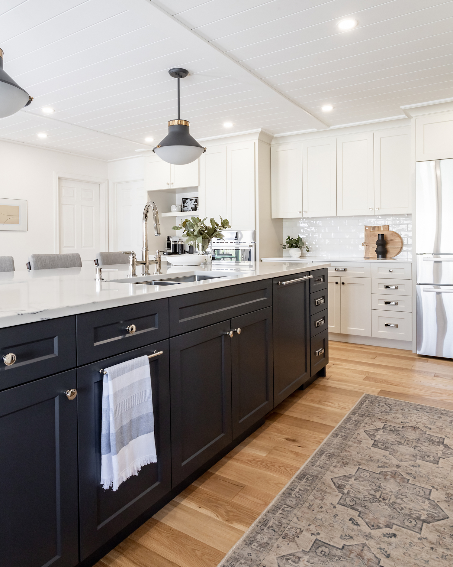
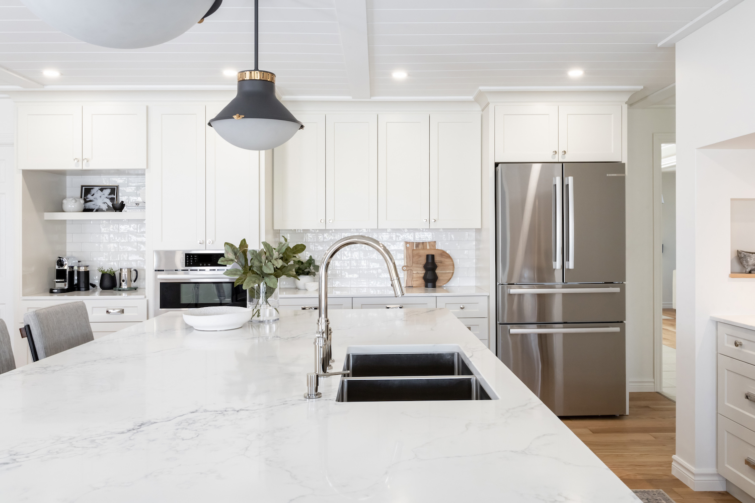
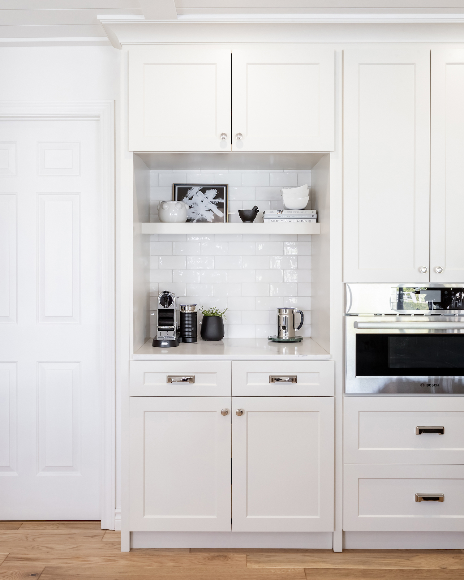
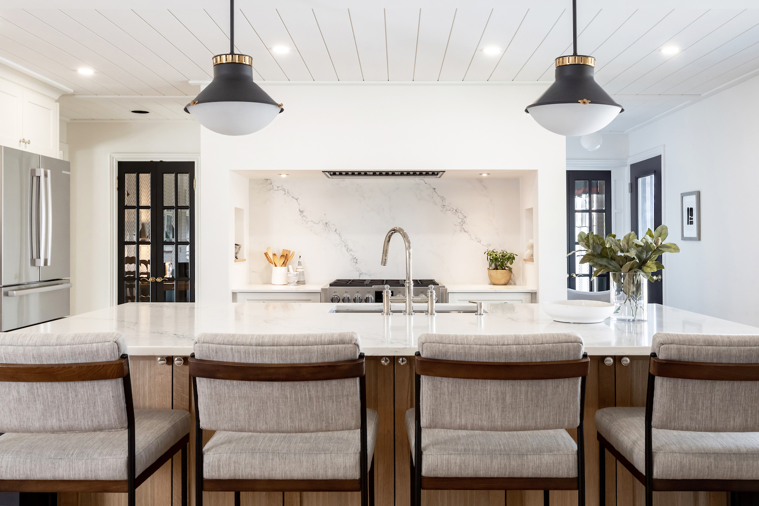
The oven range was now encased within an alcove and became its own stand out entity. The island extended out to 10 feet facing a whole new direction, and the perimeter cabinets housed a dedicated coffee area. Because coffee really does deserve its own station.
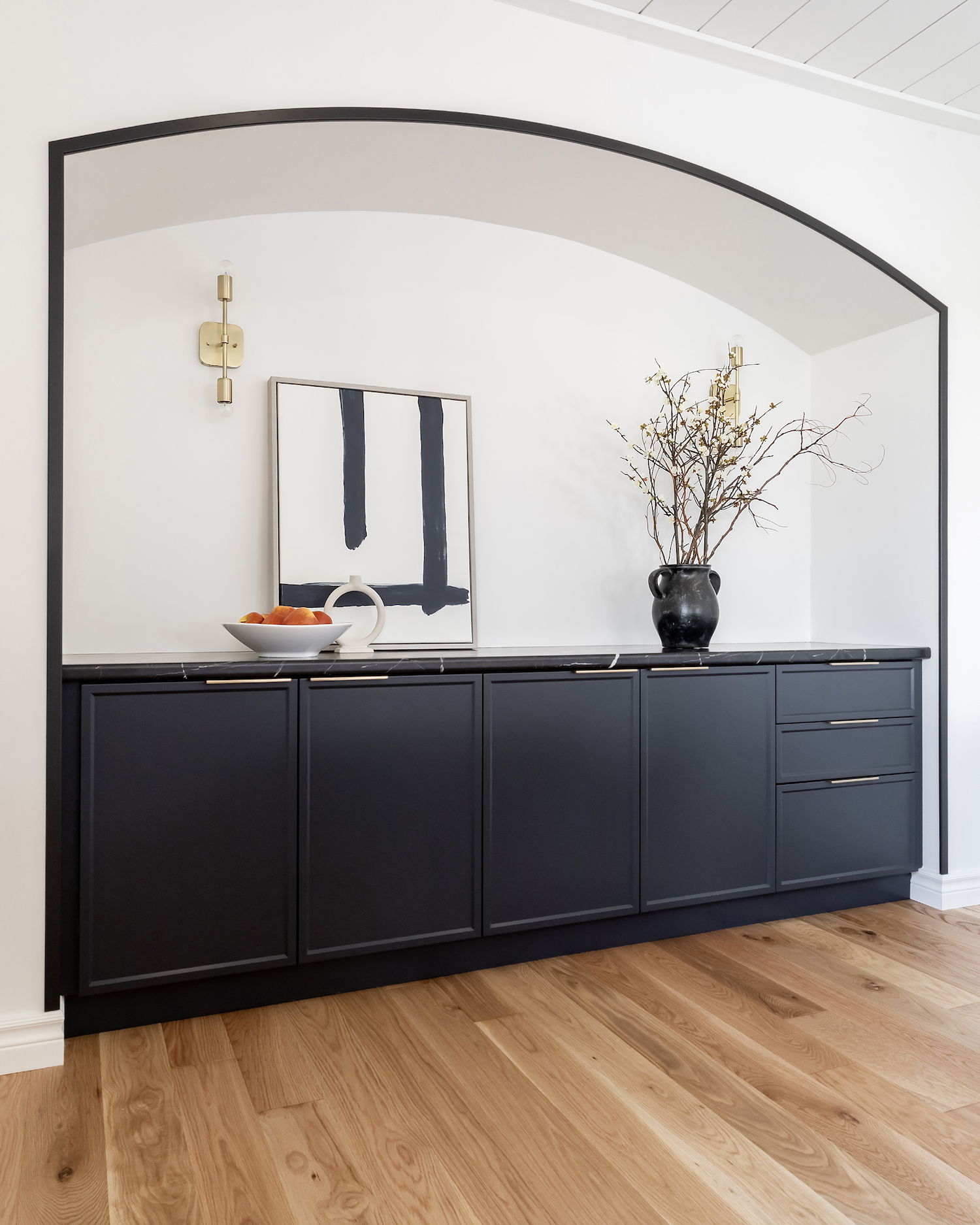
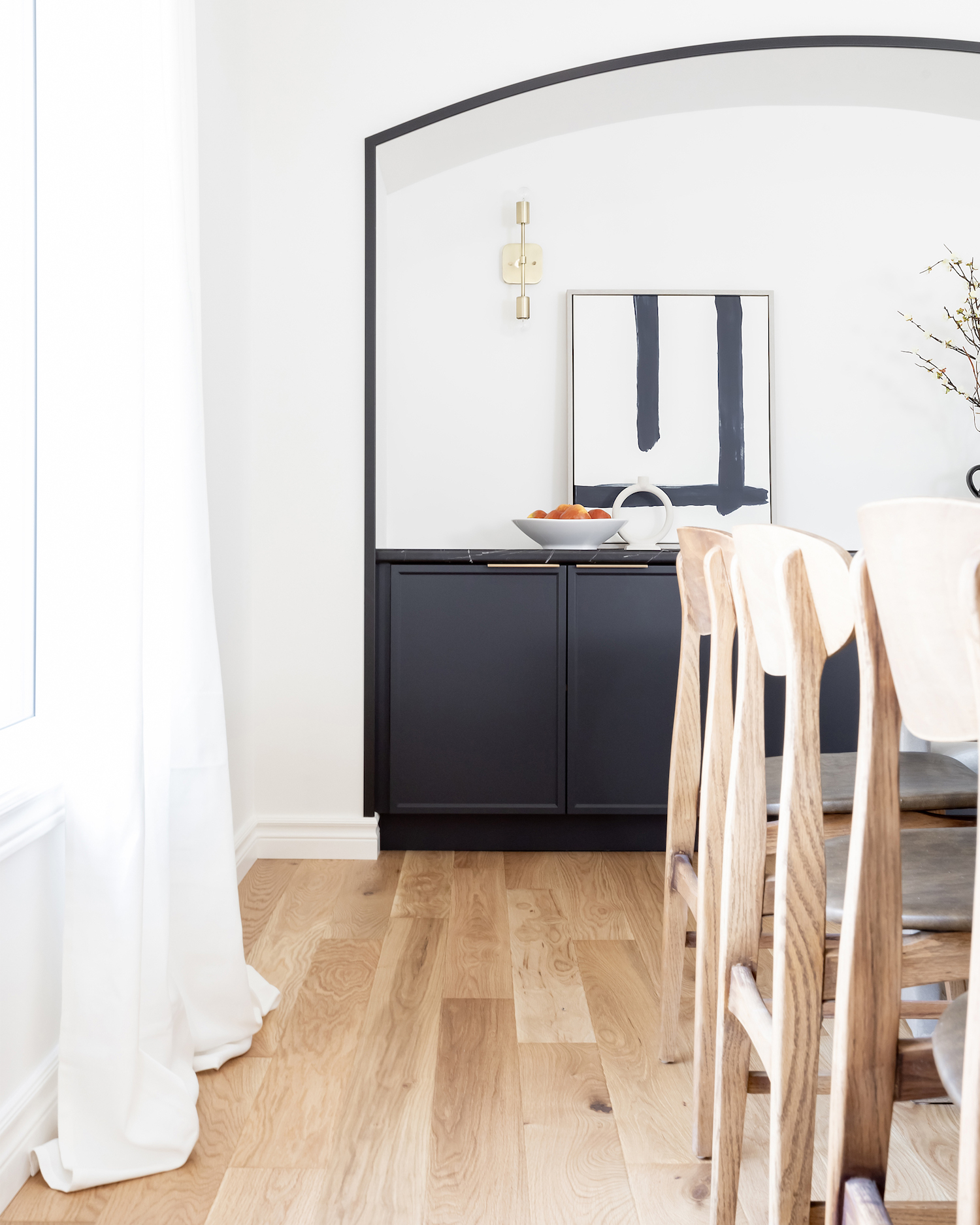
The standard ceramic tile got replaced with beautiful white oak floors, shiplap was installed on the ceiling spanning both areas which elongated the entire space, and an arch with a built-in sideboard gave the dining area a focal yet functional element. Add in black trim and you’ve got the perfect pop of contrast. Putty coloured perimeter cabinets gave the kitchen a touch of warmth and well demarcated quartz showcased understated elegance. We created a sense of cohesion with the kitchen island, by carrying the blue/black colour onto the sideboard cabinetry, but opting for a dark countertop instead to add a little richness.
Completing this renovation during the heart of the pandemic, with clients who lived over three hours away (hello face time efficiency) added a whole new level of design complexity. But walking through the finished spaces, it’s as if this layout was always meant to exist.
I still get texts from the client saying how every morning she walks into her kitchen and cannot believe it’s her haven to enjoy. When I can shift the energy of a client in an instant, that is my true joy in this work.
BONUS: Both clients confirm that their cooking tastes just a little bit better too.
Like what you see? Take a peek at the talent behind the story… Interior Design: Jodie Owen Design · Photography: Art and Spaces · Contractor: Feyen Construction Inc. · Cabinetry: Oak Barrel Cabinetry
