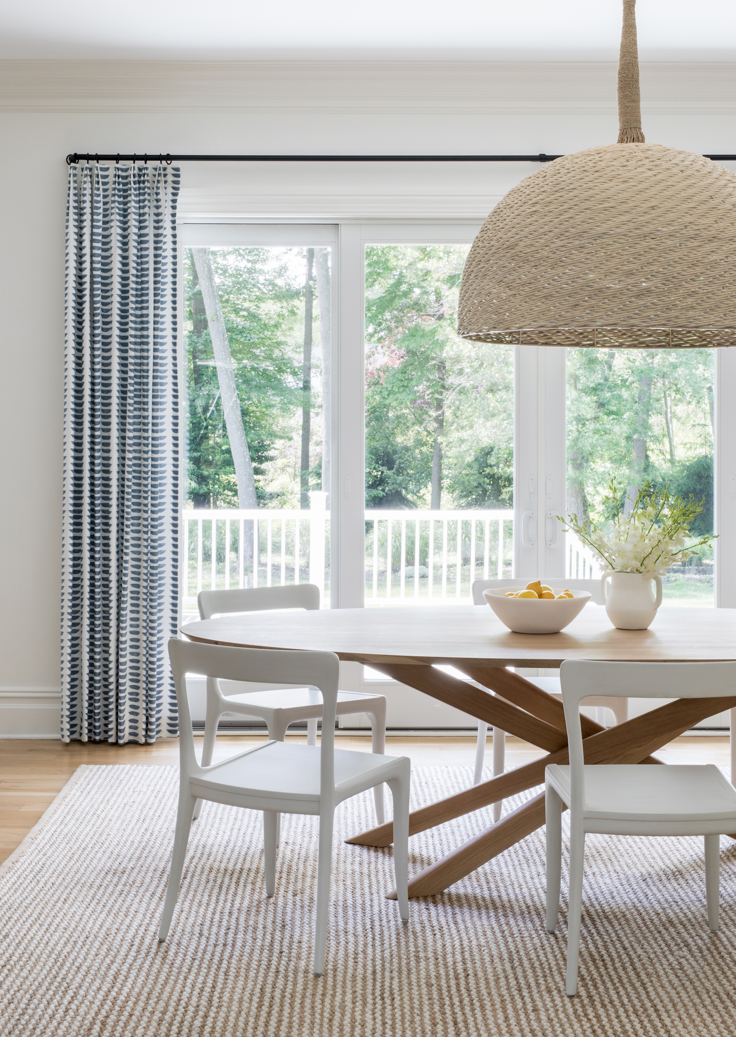
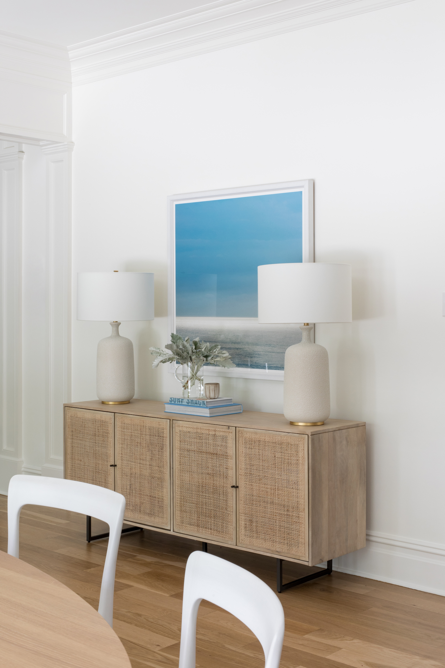
This New Jersey remodel is a perfect example of how to maximize what you have and change on a dime. When Salt Design Company began this major renovation they carefully chose which features from this home they would keep and refurbish, and which they would remove. Operating on the principle that ‘less is more’ and being challenged by multiple product shortages and delays, they pulled off a stunning renovation that showcases an elevated coastal aesthetic.

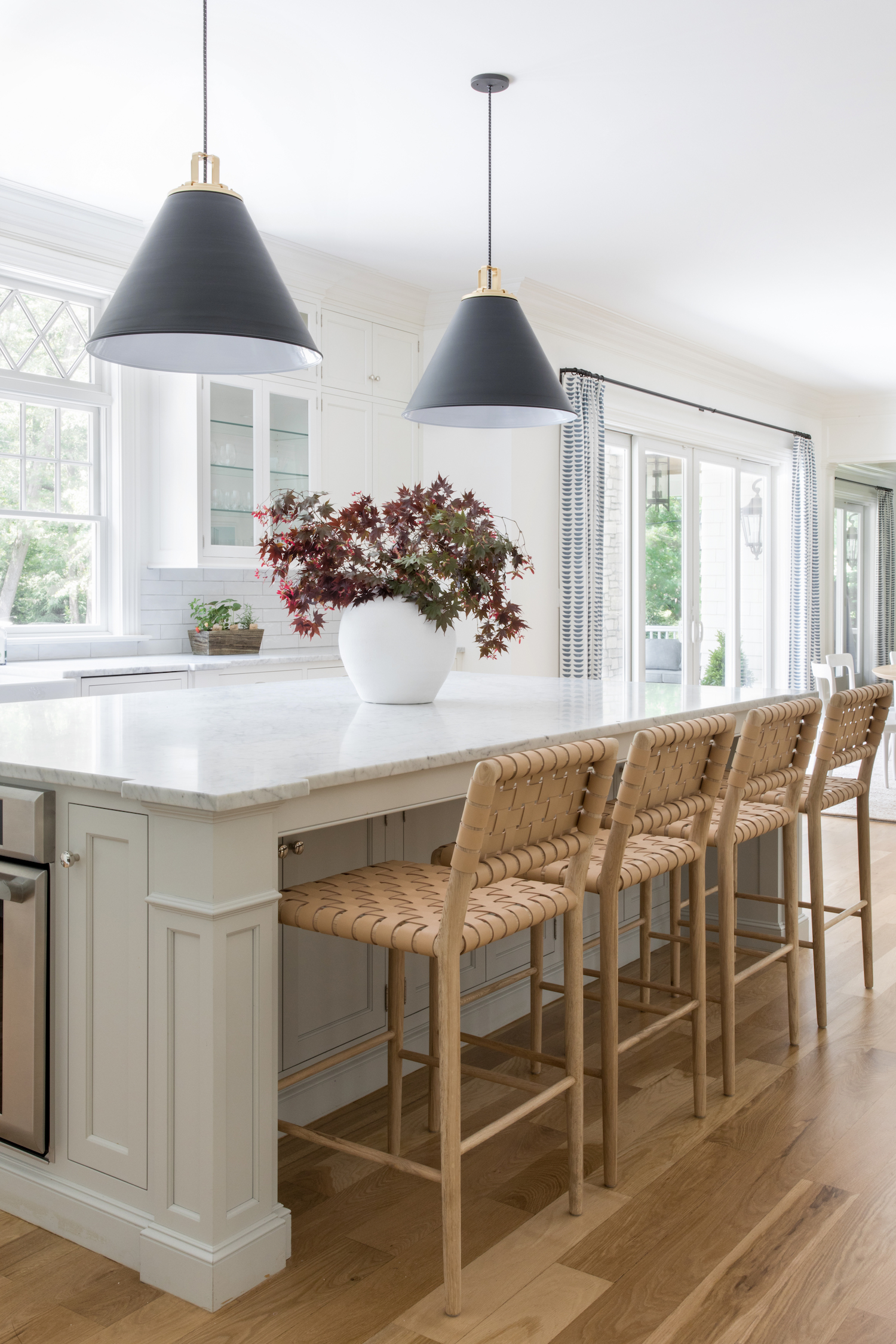
From the designer… We approached this project with the intention of creating a timeless, coastal design. By removing the dark chocolate finish on the hardwood floors to a clear finish on the white oak floors, refacing some of the kitchen cabinets, and changing out hard finishes like the kitchen hardware and lighting throughout, remodeling the fireplaces in the living room and primary bedroom we were able to transform the home into a more casual, coastal feel that was better suited for our clients.
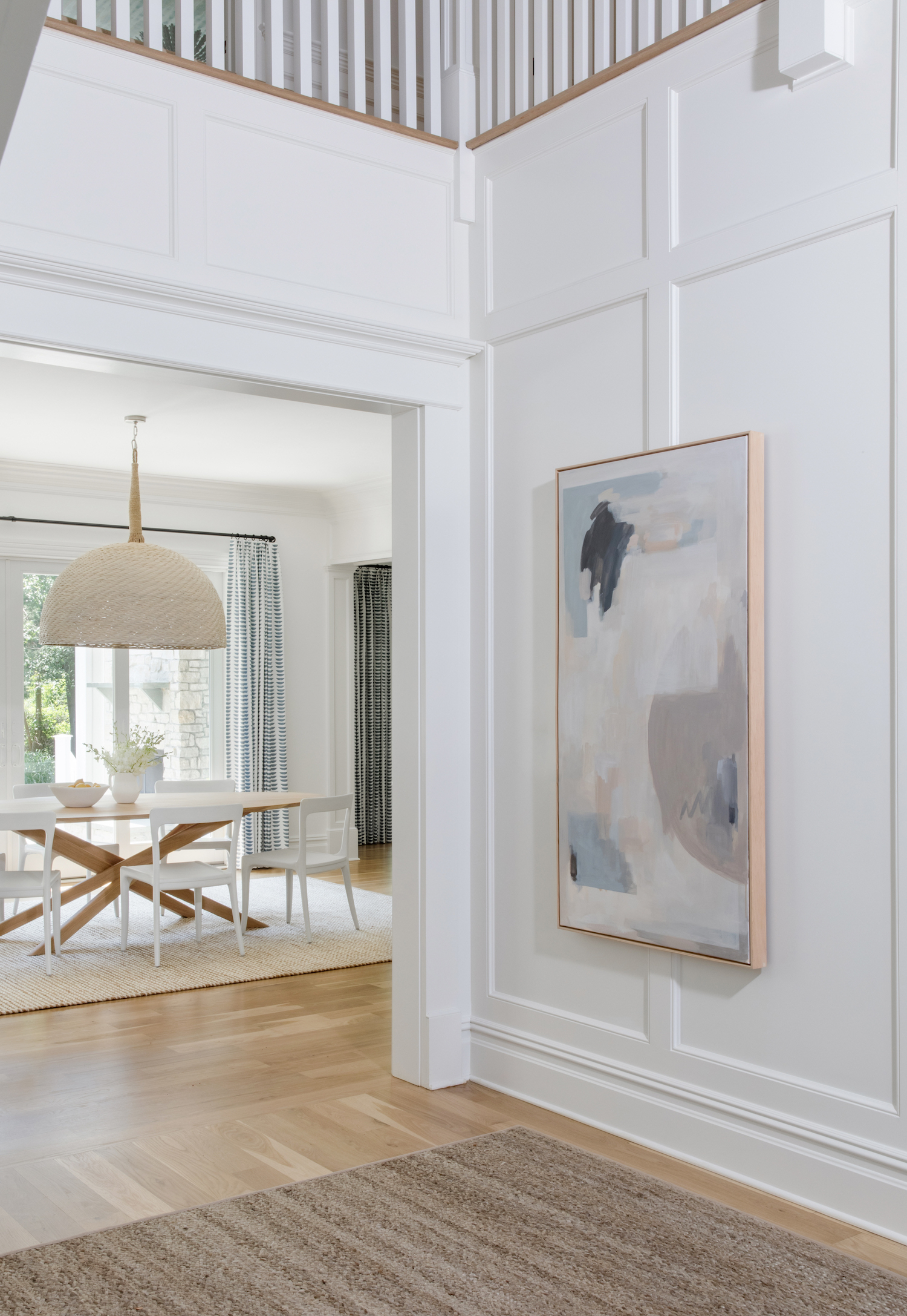
We always believe the entryway or foyer sets the precedent and mood for the rest of the home. In this case, we opted for a more casual, natural fiber rug, offset by beautiful, oversized, custom artwork commissioned by Susan LaConti. From here, there is a direct line of sight into the kitchen dining area where we took the opportunity for an amazing light fixture. The scale of the home is pretty massive so we wanted to make sure we chose pieces that would not only scale appropriately but would also enhance the home’s original, grand features. A major challenge we experienced was trying to create a brighter space but with such a grand entryway, we needed to source lighting that would fit the scale of the space without feeling too heavy. Since the foyer ceiling is 25+ feet high, it was a stressful day seeing the chandelier go up and hit at the exact height we planned for. The front door was also repainted with Benjamin Moore’s Kendall charcoal over the existing dark wood stain so that each angle of the foyer had its own unique moment.
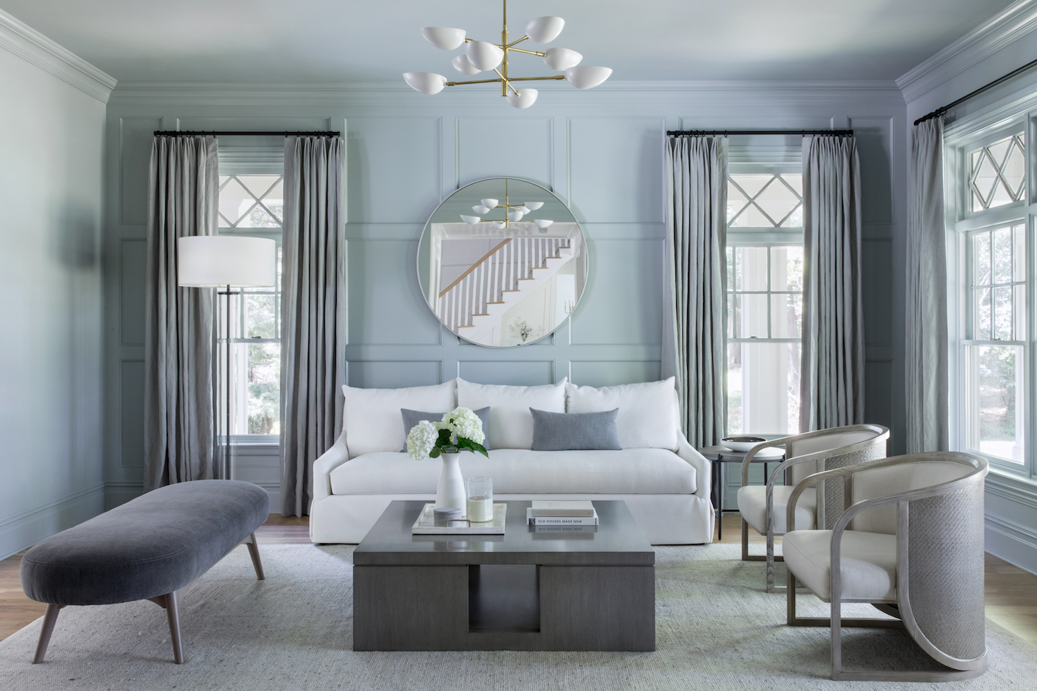
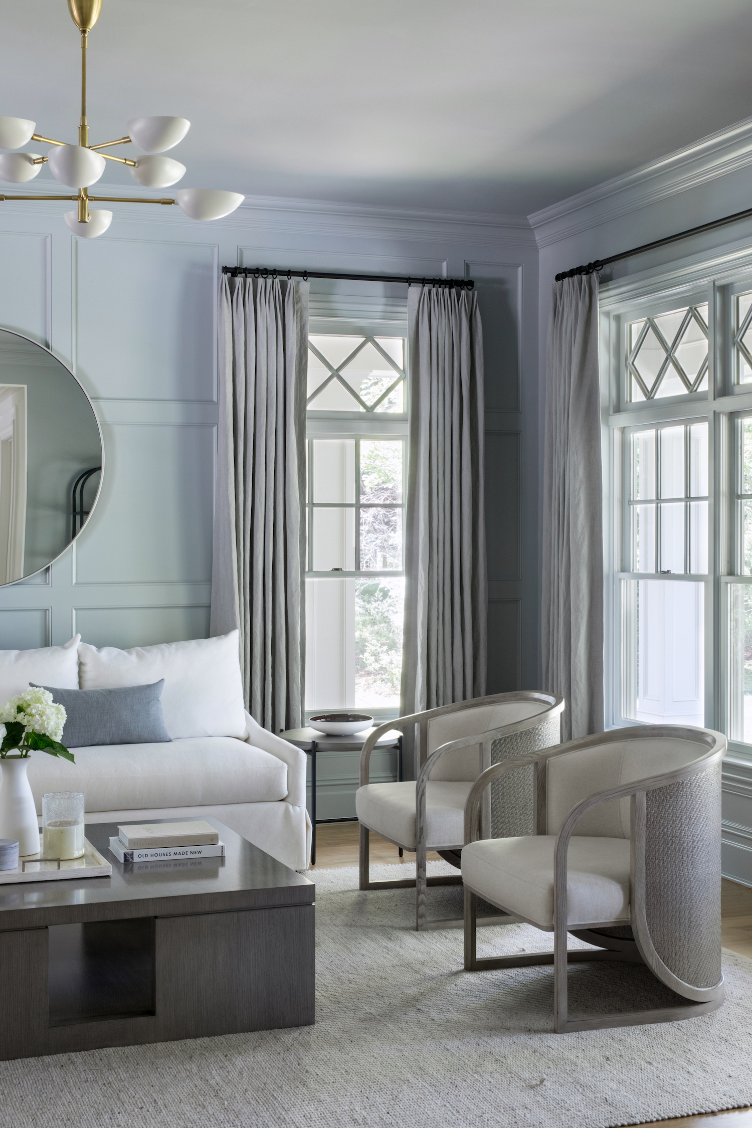
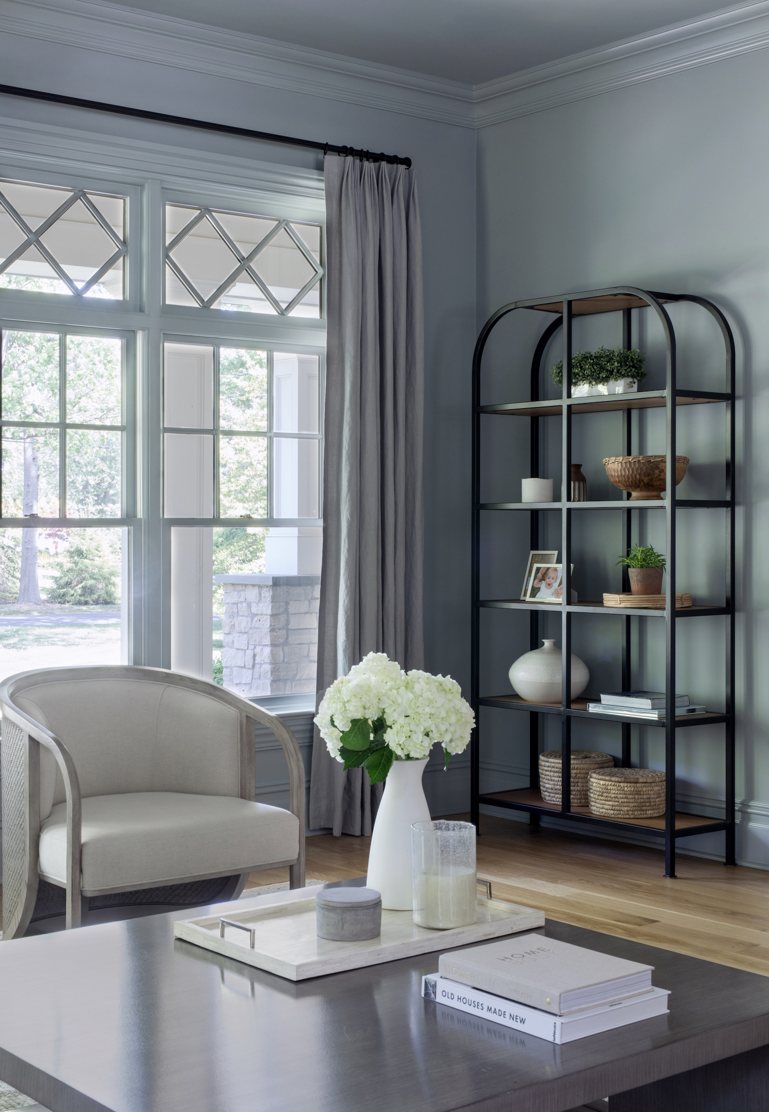
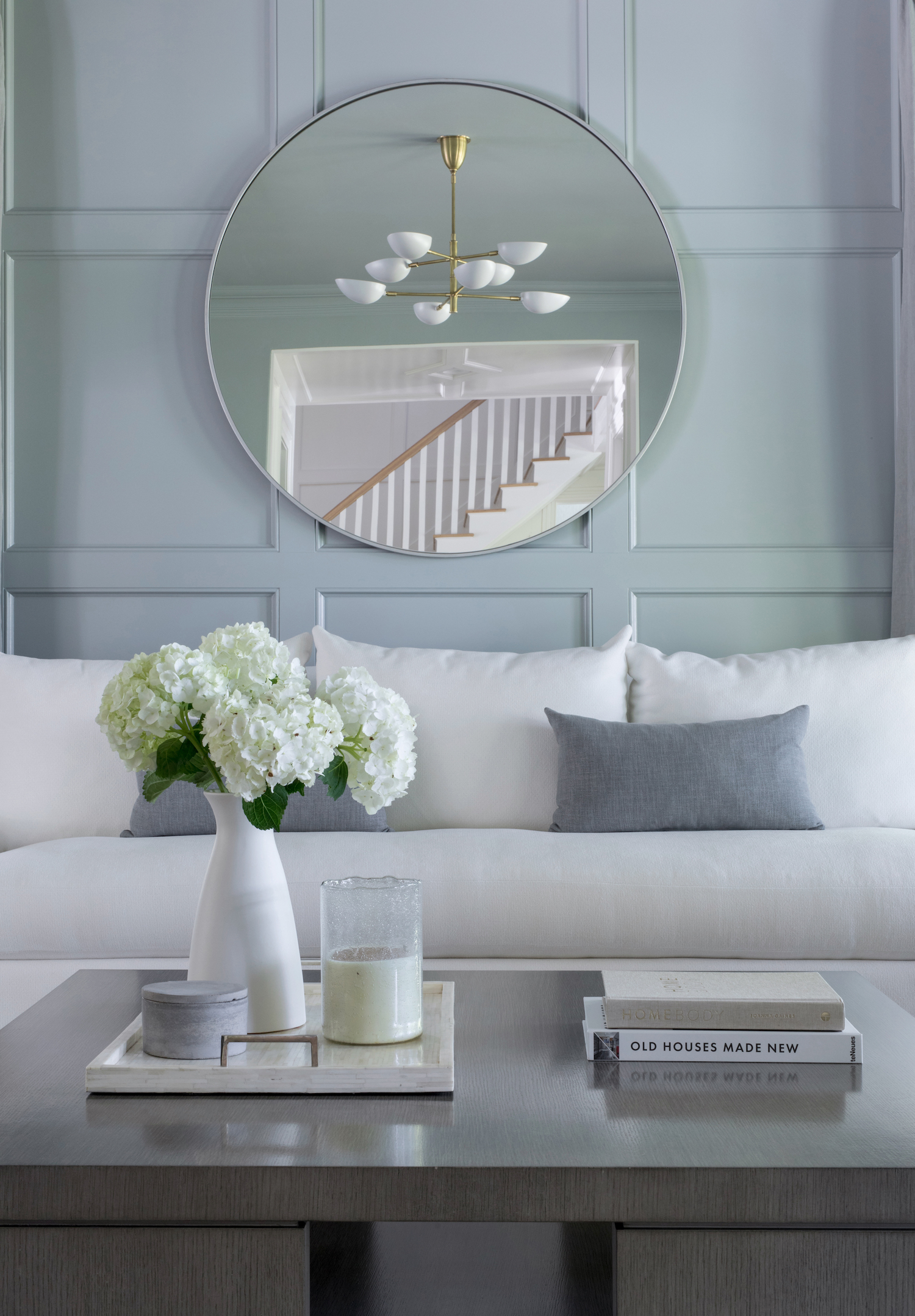
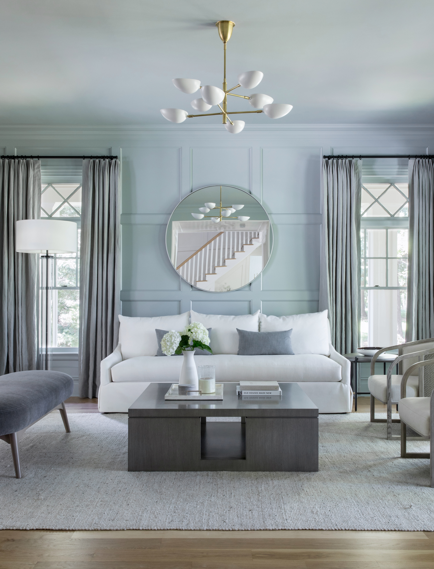
One of our favorite moments is in the formal living room where we opted for a tone-on-tone design. Benjamin Moore’s Boothbay Gray creates the perfect amount of drama in one of the first rooms in the house. A simple can of paint helped to enhance the features of the home’s original build–in this case, the board and batten on the focal wall. A crisp, tailored sofa, unique accent chairs, and a gray lacquered coffee table finished the space for a more boutique, elevated feel.
Having to deal with our industry’s current environment, we were lucky and are grateful to have clients who understood and remained patient with the amount of delays and backorders. There were many moments of re-sourcing and evaluating lead times that worked with items we had already installed. As many interior designers and enthusiasts know, designing a house is a complete puzzle. When you change one item it affects the rest of the pieces. Being that the kitchen and living room are open concept with a line of sight from the foyer and formal living room, we needed to constantly remind ourselves of the surrounding selections when having to reselect new items due to backorders. To achieve our client’s vision of a bright and coastal space, we balanced a lot of the whites, blues, and naturals with some pops of black details to balance the spaces. The black pendants in the kitchen, the black arched cabinet, black curtain hardware, and black console table in the living room were key pieces to create contrast.
The kitchen was one of the first areas we installed as we knew the client absolutely needed an area to have their family sit down and eat. Having moved from New York – we conquered this space first to ensure that they were comfortable until many of the delayed items arrived. We then remodeled the fireplaces with Carlos Kozak, “Built For One” for a sleeker and less bulky look as well as taking down some more of the traditional and heavy trimwork and ceiling details. This project had a recurring theme of “less is more”.
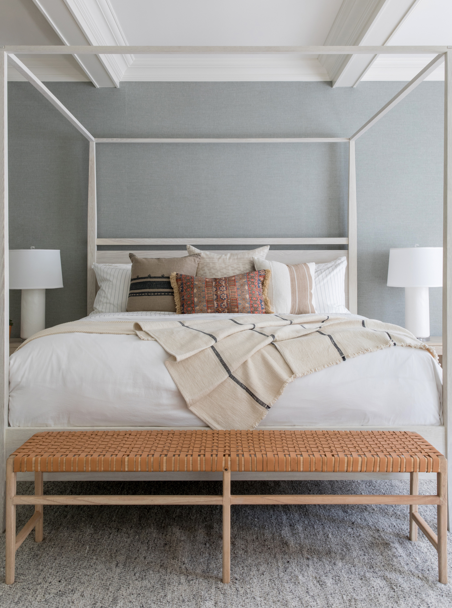
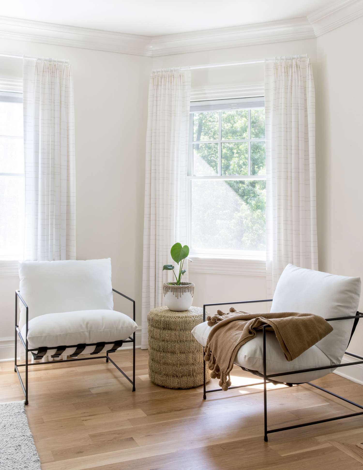
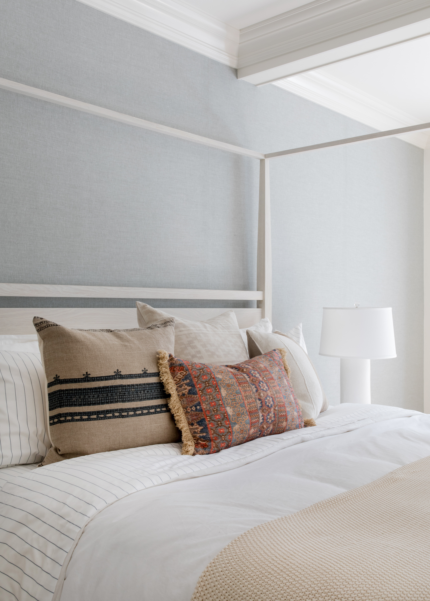
We wanted to create a serene and relaxing space in the primary bedroom. Having a ton of space in here, we immediately wanted to use a white statement four poster bed, we wallpapered the back wall in a chambray denim color, then we created a seating area and filled in the space between the bed and the fireplace with a warm leather bench. To make sure that the fireplace felt less bulky we actually bumped the area above the fireplace out to create less of a depth from the mantle to the back wall.
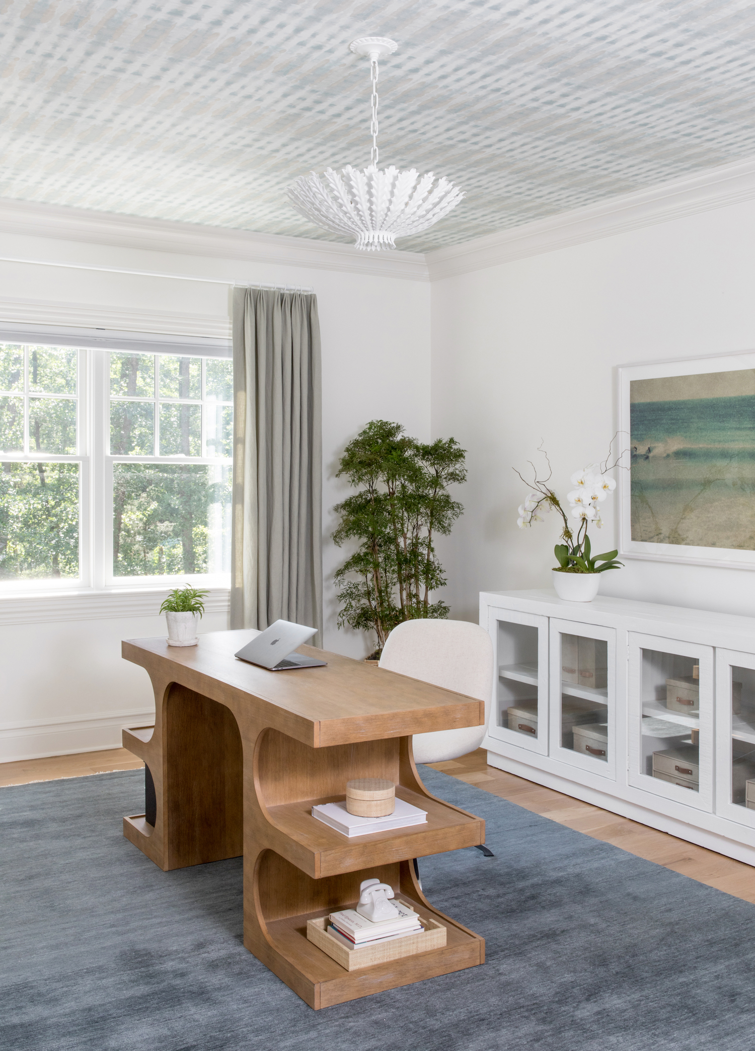
The home office wound up being much more critical than we had anticipated with the work from home element coming into play with our environment at the time. This space works as an area to work on the laptop, take zoom calls, have a peloton ride, and even a space for yoga and stretching in between meetings. The key element in this room is the wallpapered ceiling, creating a funky and exciting pattern and then balanced with a solid blue rug. All of the other furniture pieces in the room have minimal to no pattern to allow for the ceiling to be the focal point.



Like what you see? Take a peek at the talent behind the story… Interior Design: Salt Design Company · Photography: Raquel Langworthy
