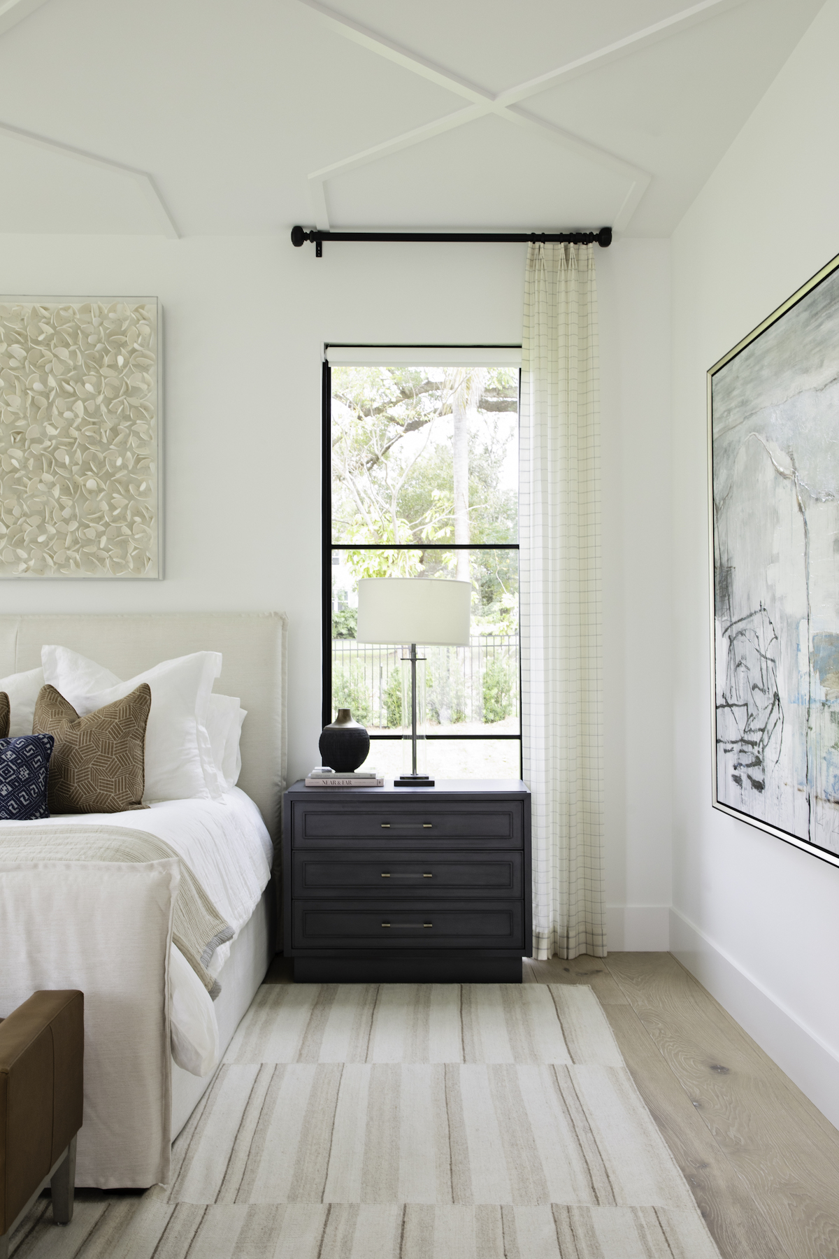
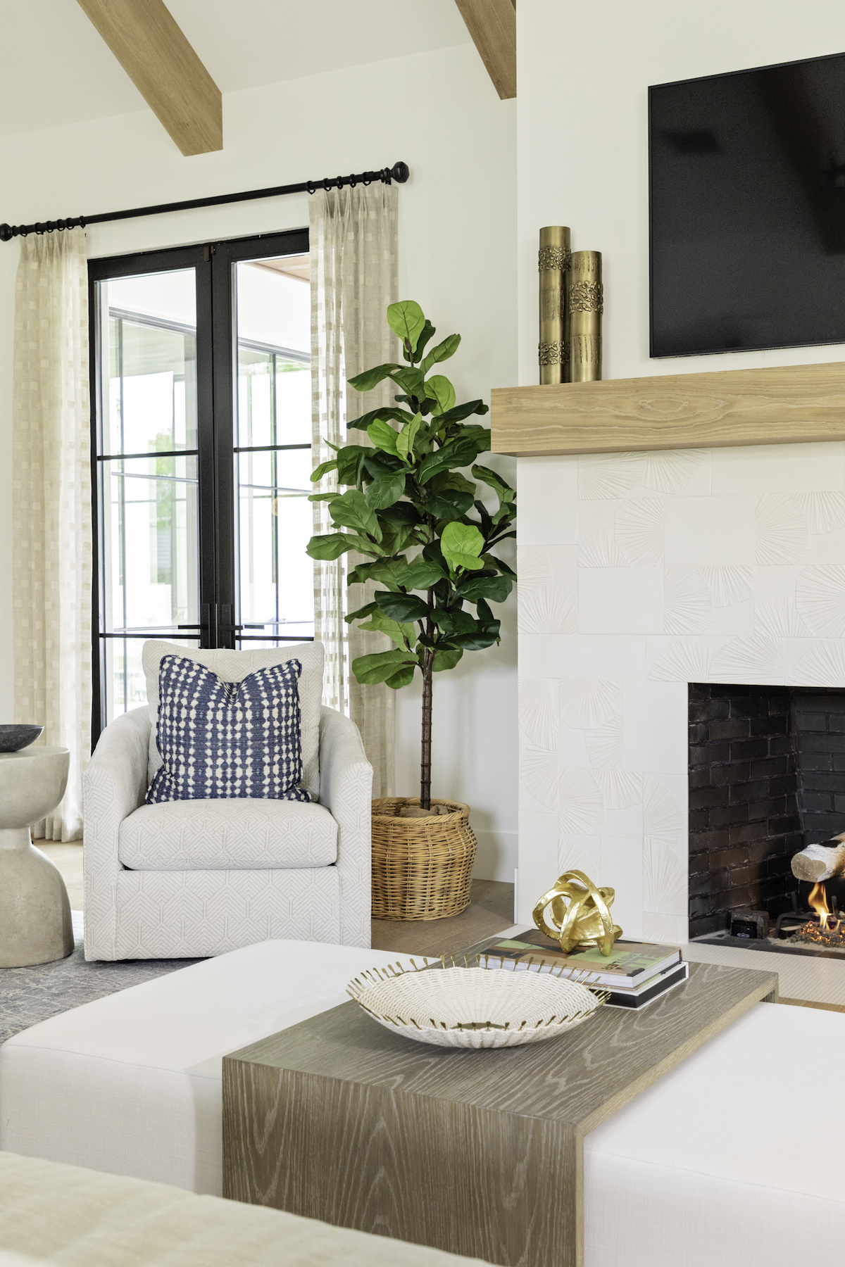
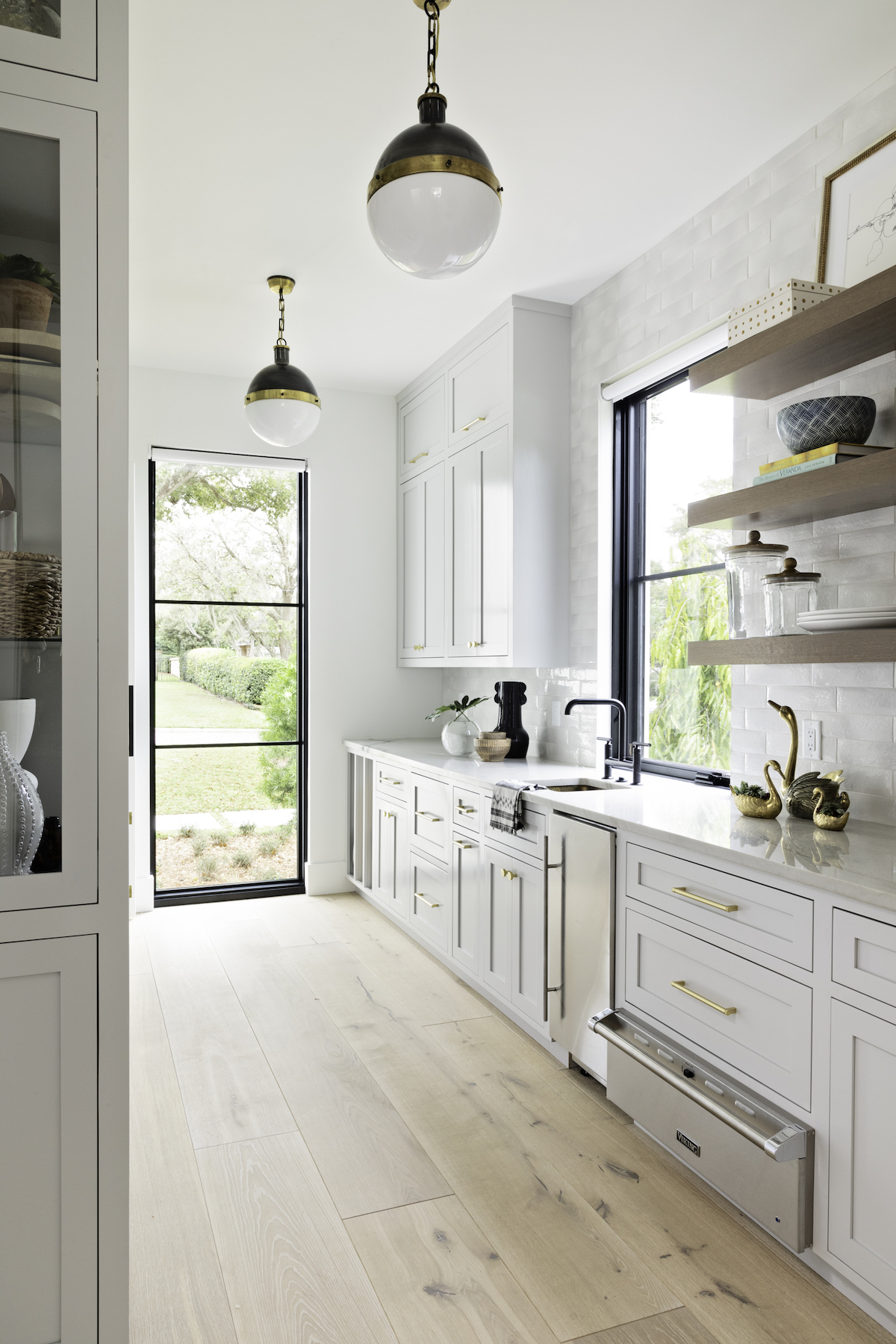
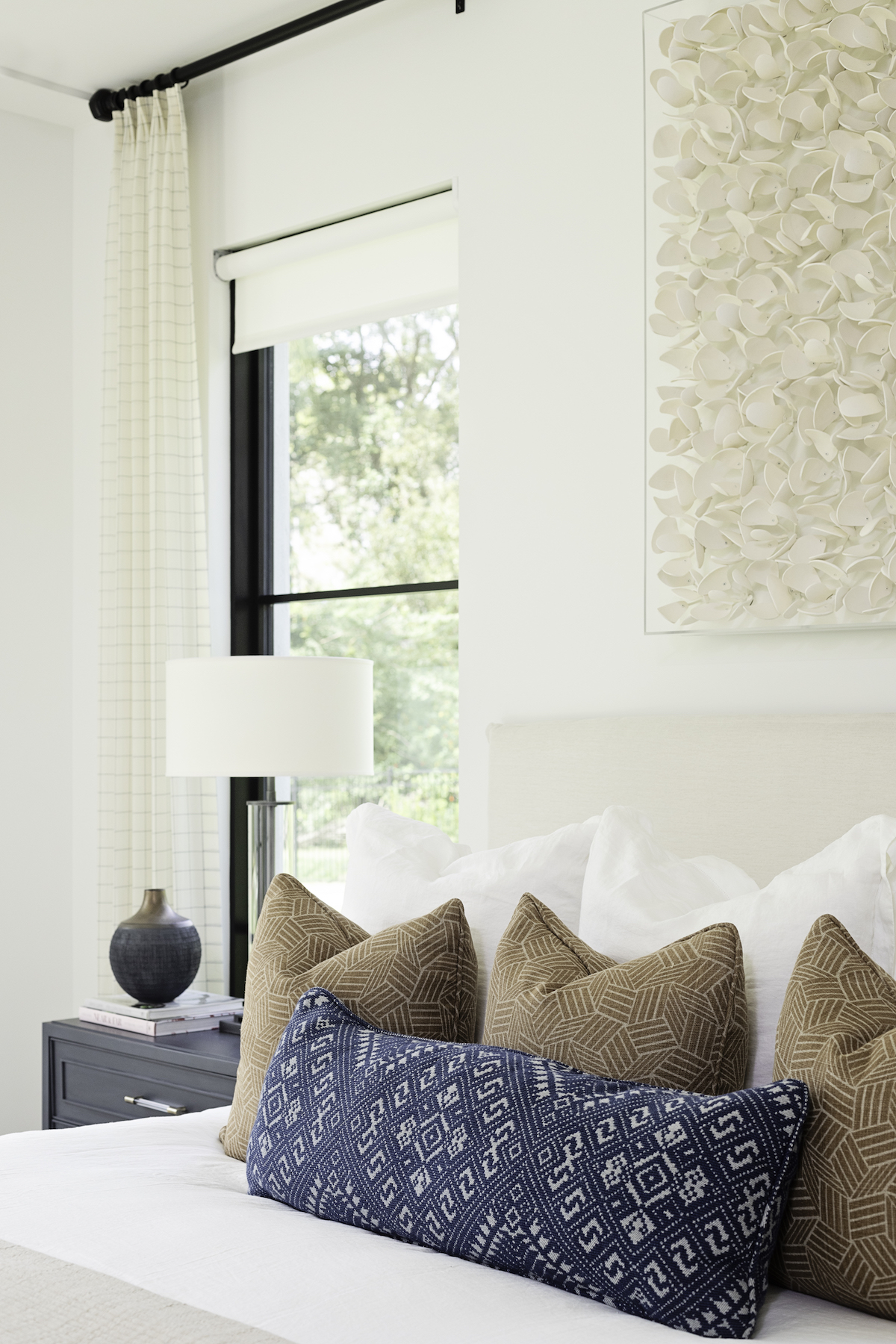
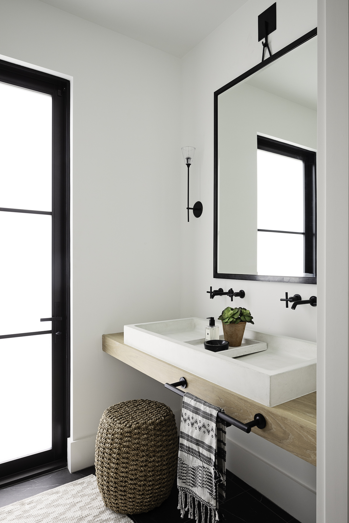
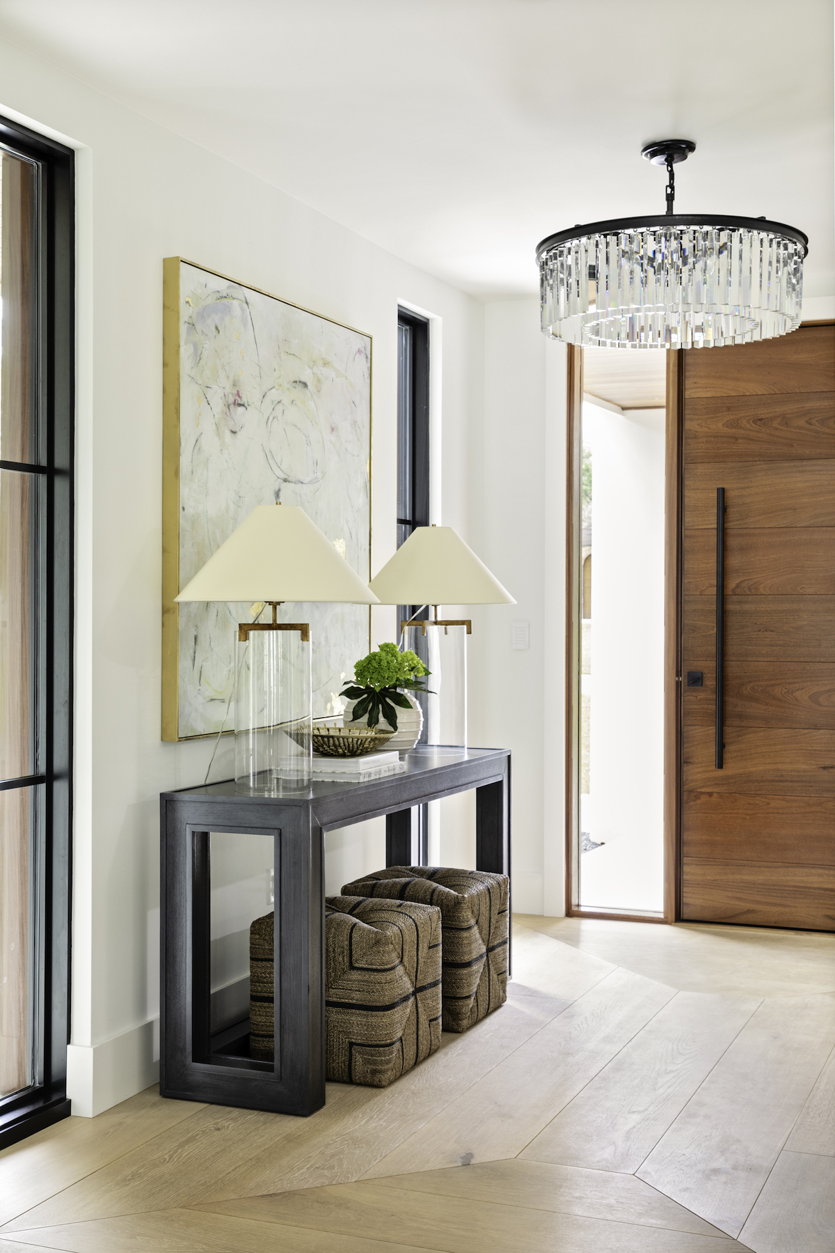
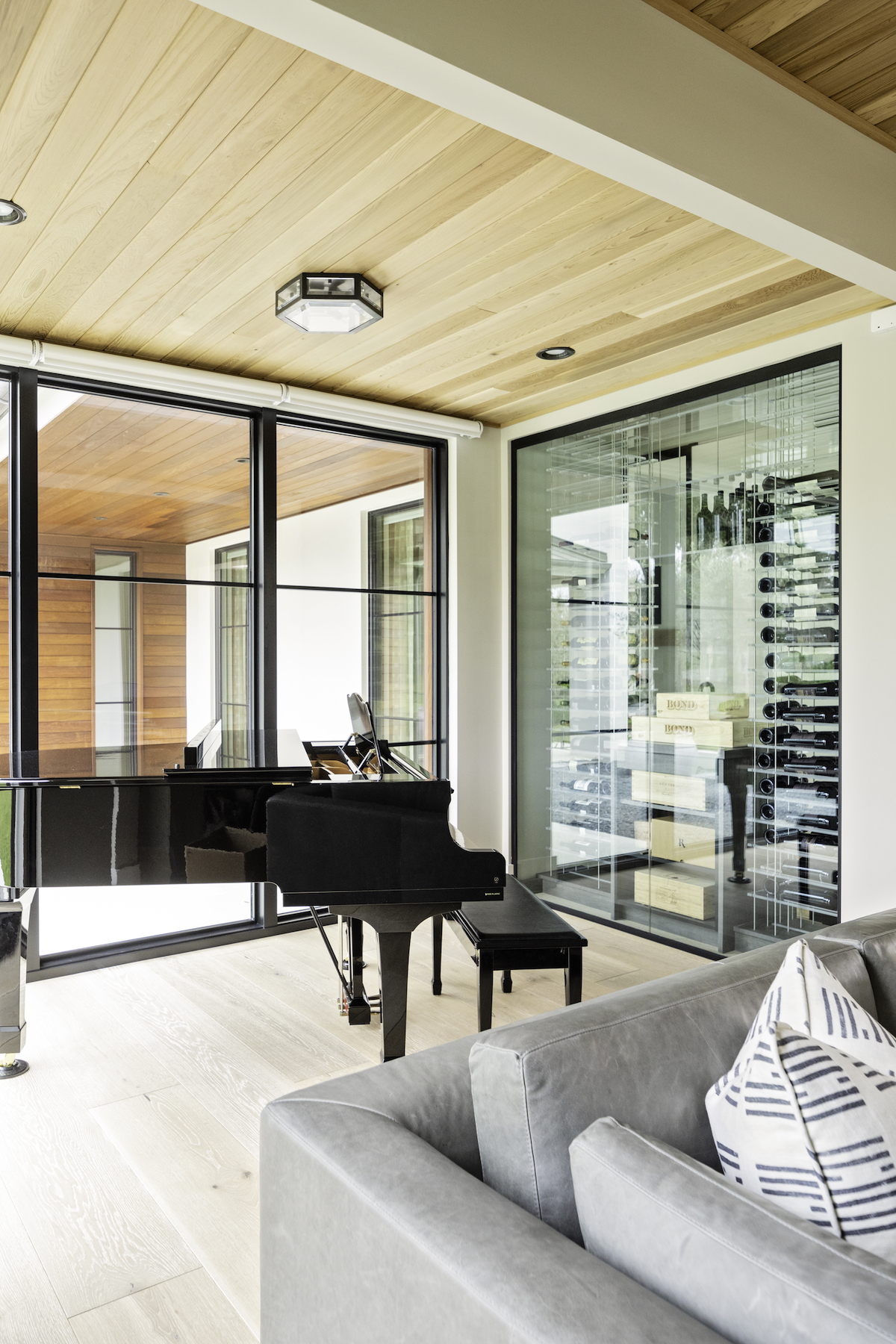
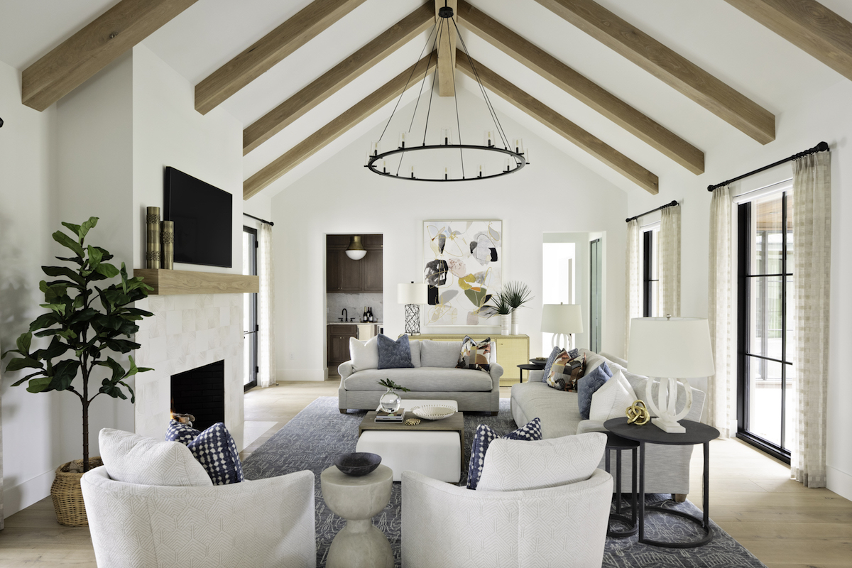
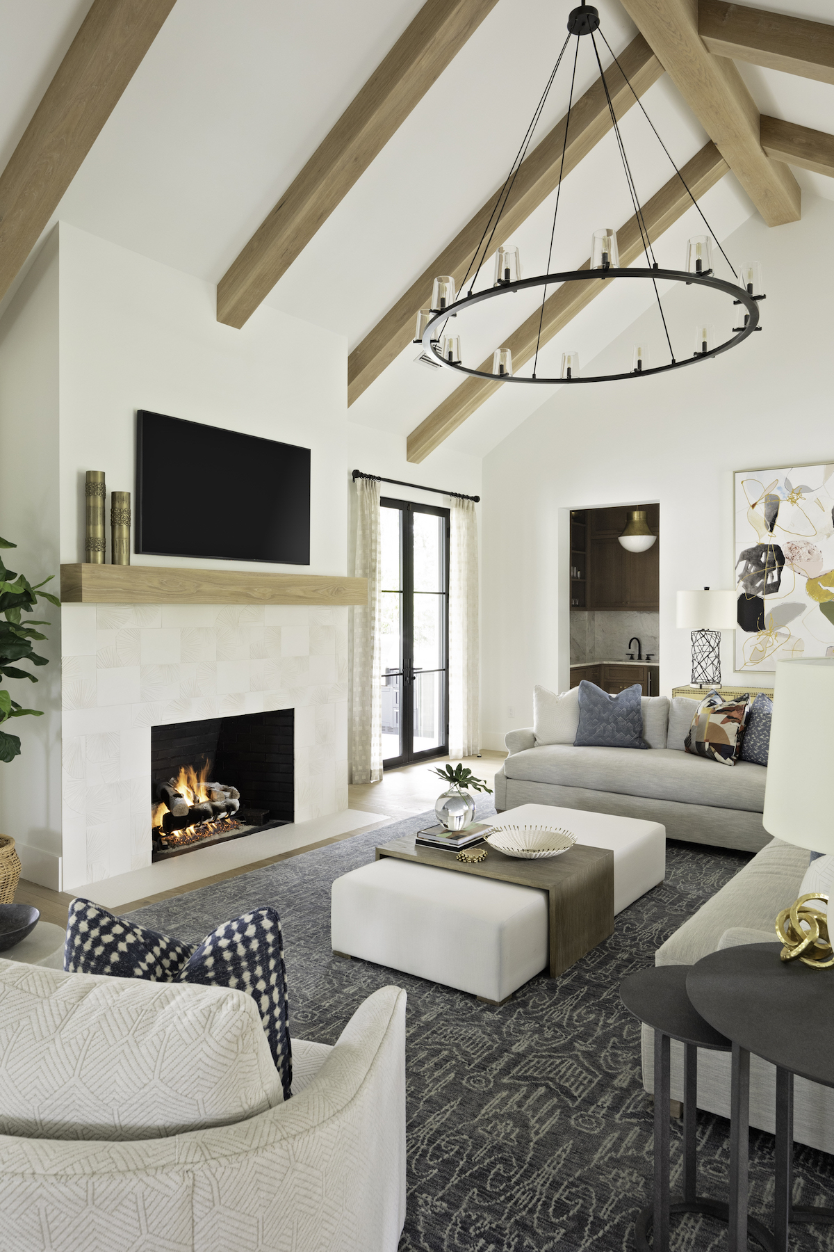
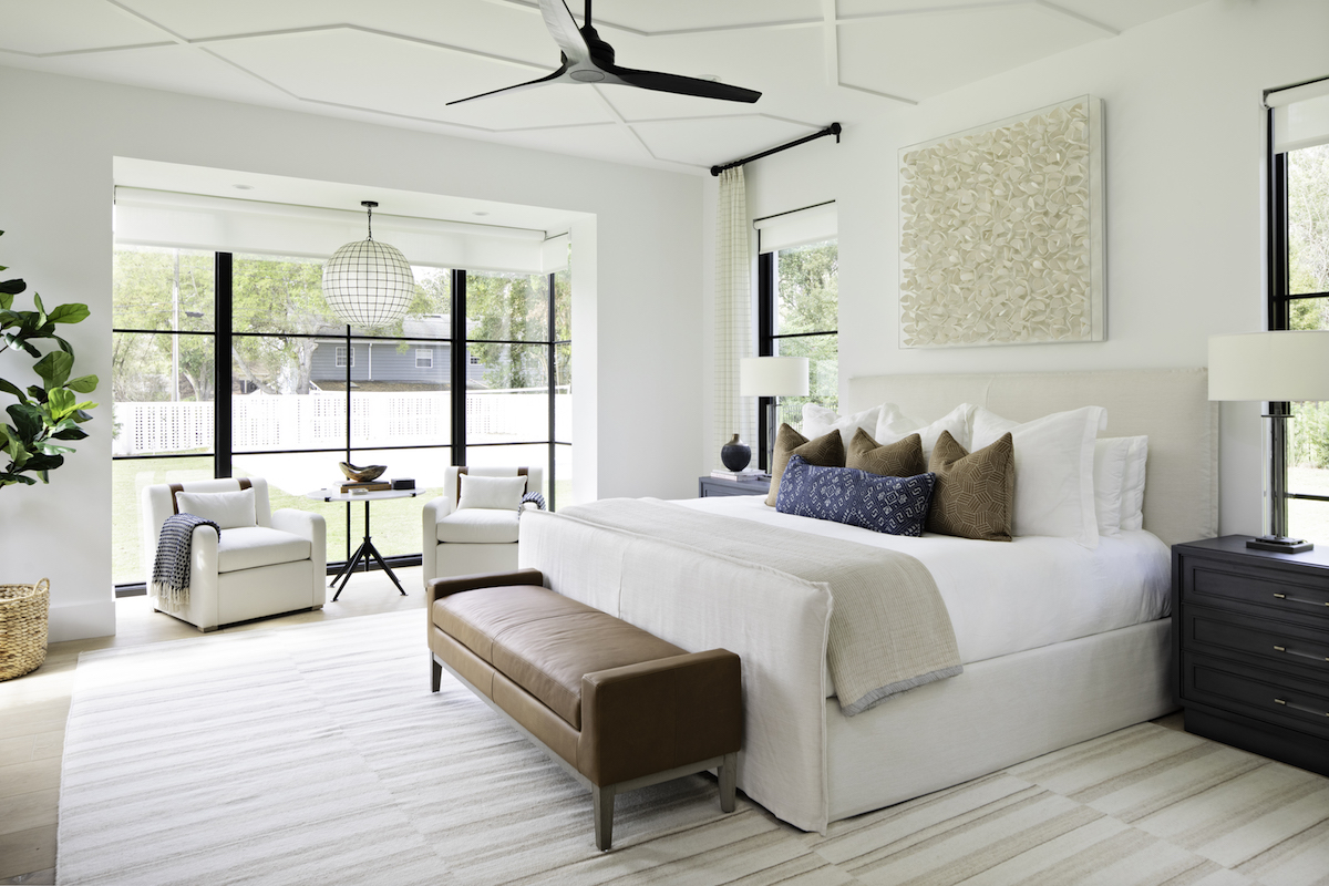
When the team at Ashley Martin Home began work on this open and airy design, it was all about the windows. Their goal was to design a contemporary-classic home that welcomed in the Florida sunshine and that’s just what they accomplished. Take a cruise through these beautiful photos, snapped by Native House Photography, to see how their cleverly devised plan came to fruition.
Where did the desire to start Ashley Martin Home come from? Can you tell us about the journey that led you to where you are now?
I love being creative and building relationships naturally with people. I started by designing a room at a time, my business grew from word of mouth recommendations. My team has grown and now we design whole homes and new construction. I feel so blessed to do a job I love!
The home we’re featuring today feels just as open and airy as the outdoors itself. Please tell us a bit about the inspiration and process behind designing this home.
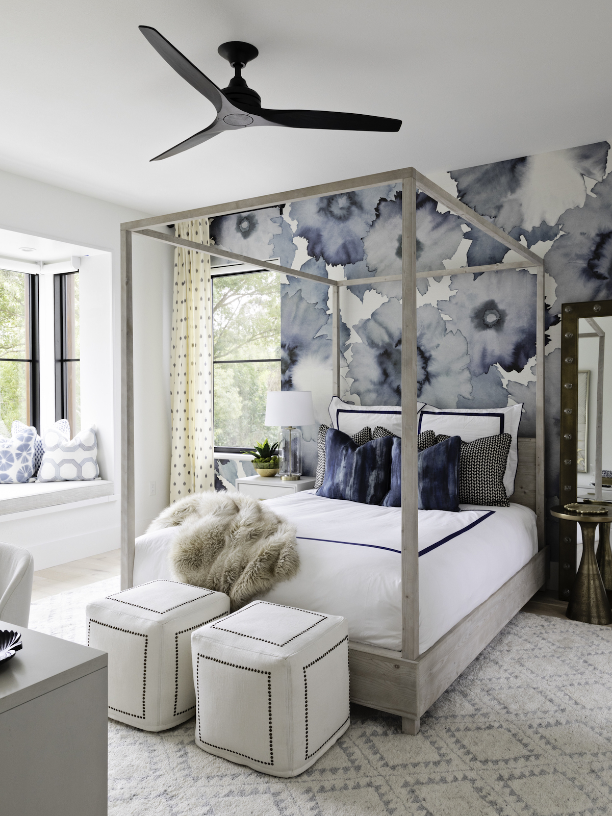
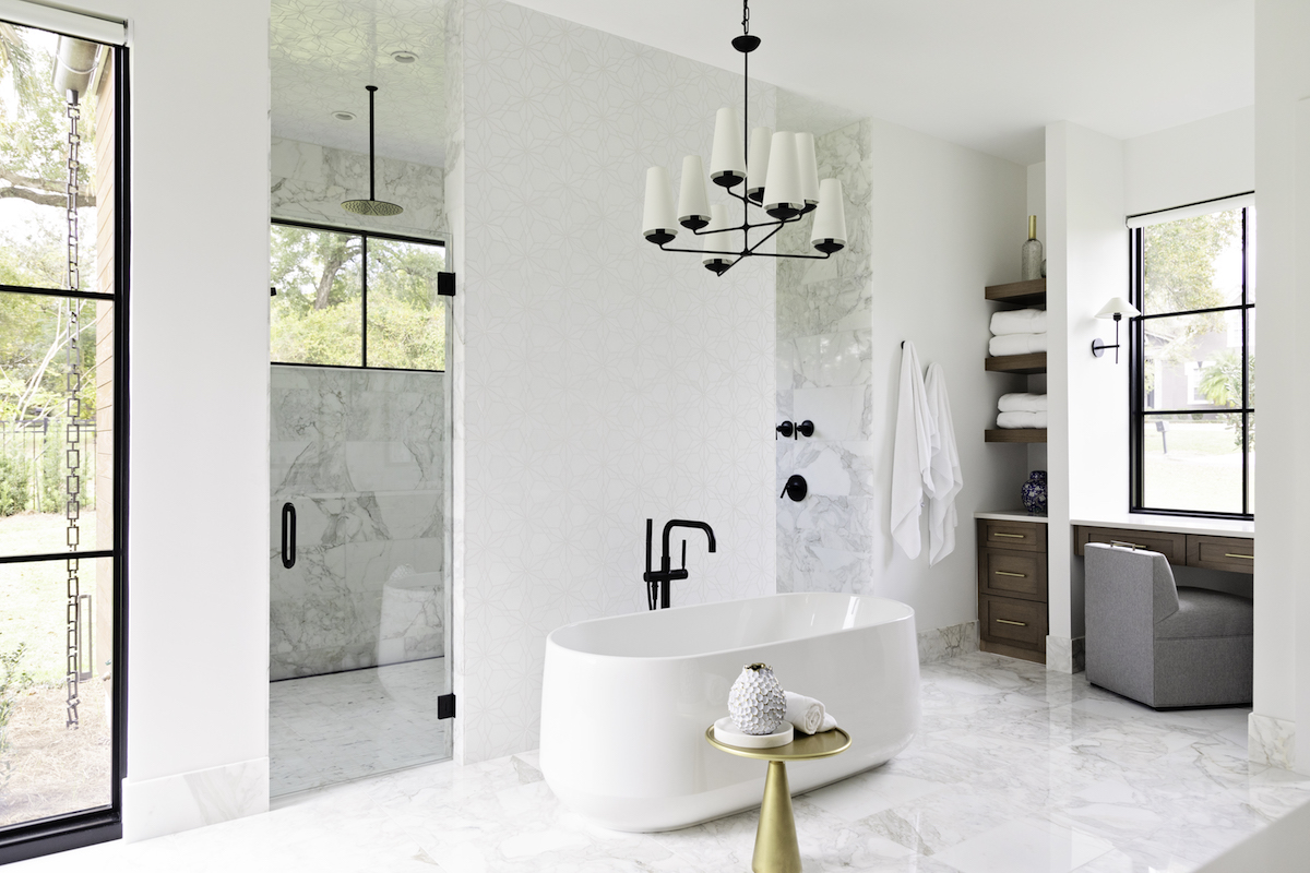
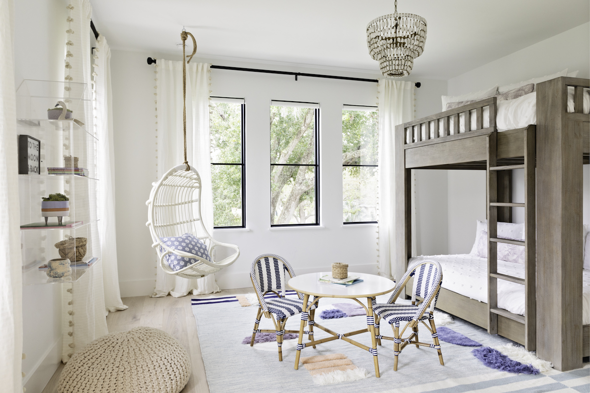
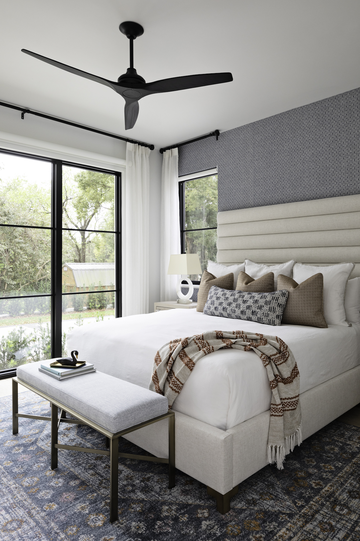
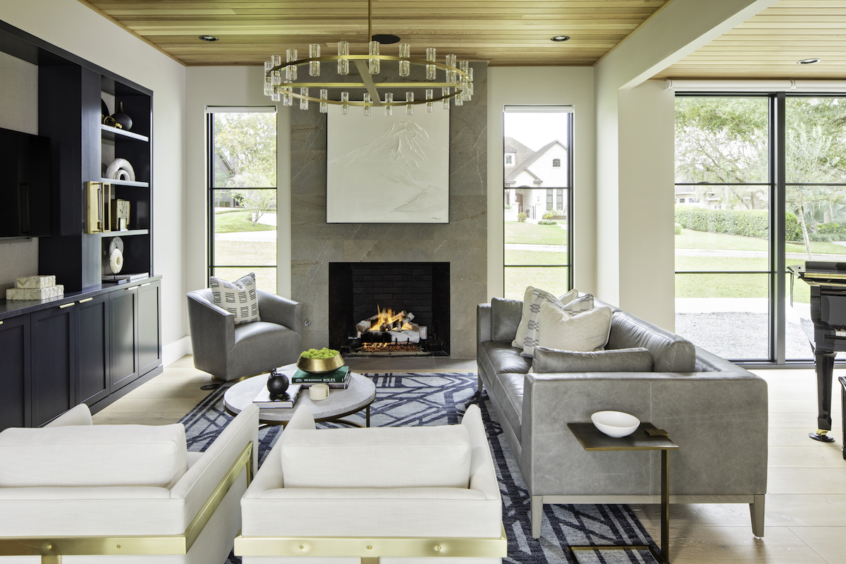
Yes, largely to do with the beautiful large windows. The design of this home was centered around the floor-to-ceiling windows featured in nearly every room of the house. The windows allowed a significant amount of natural light into the home, providing the perfect foundation for the light and airy atmosphere we wanted to achieve with our design.
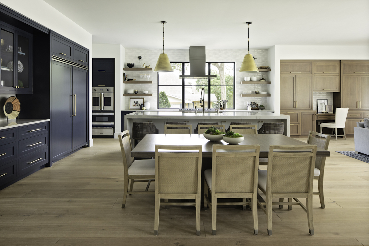
The deep ocean blue and gentle wood tones in the kitchen feel inspired by nature. Please tell us about how this incredible room came together.
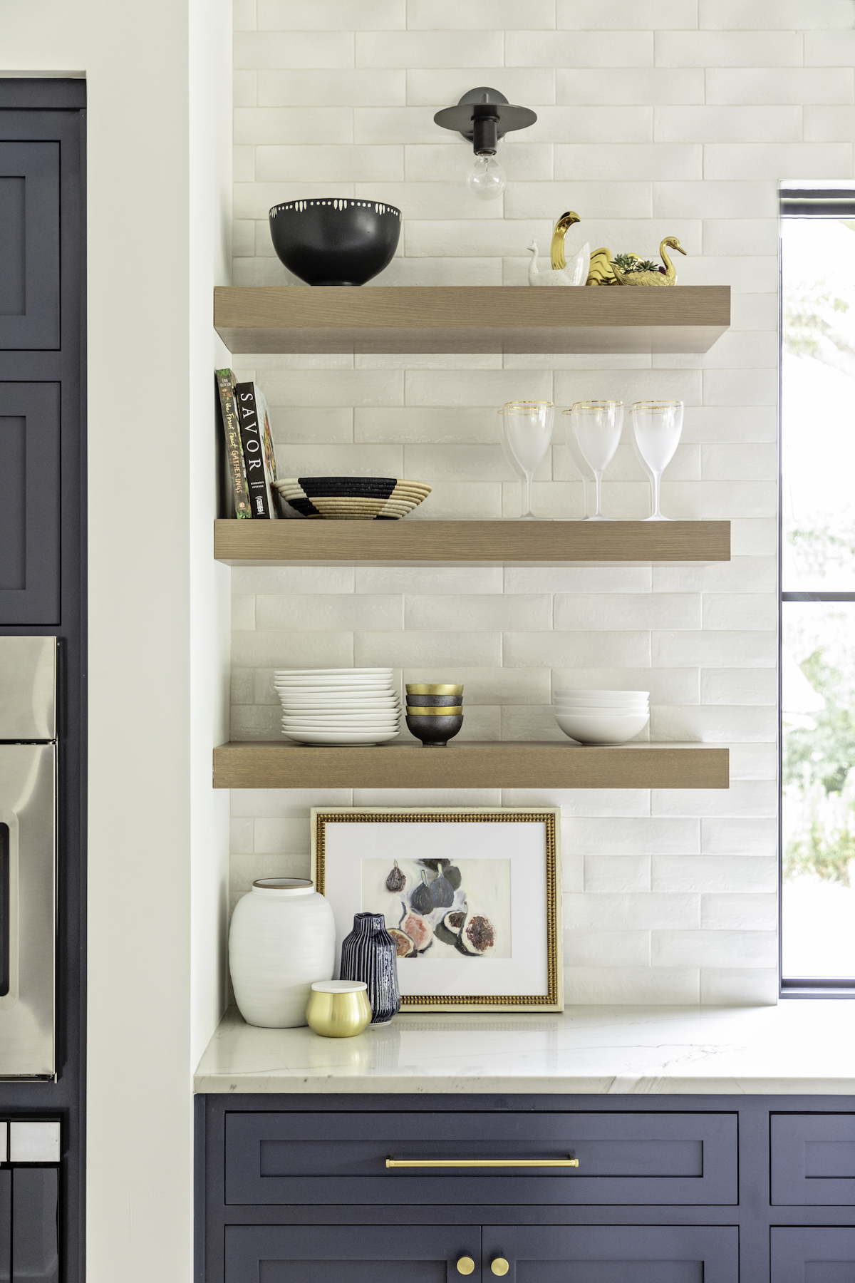
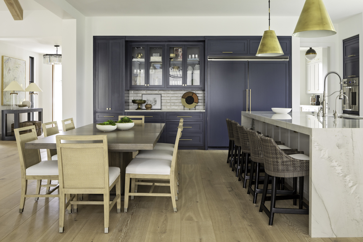
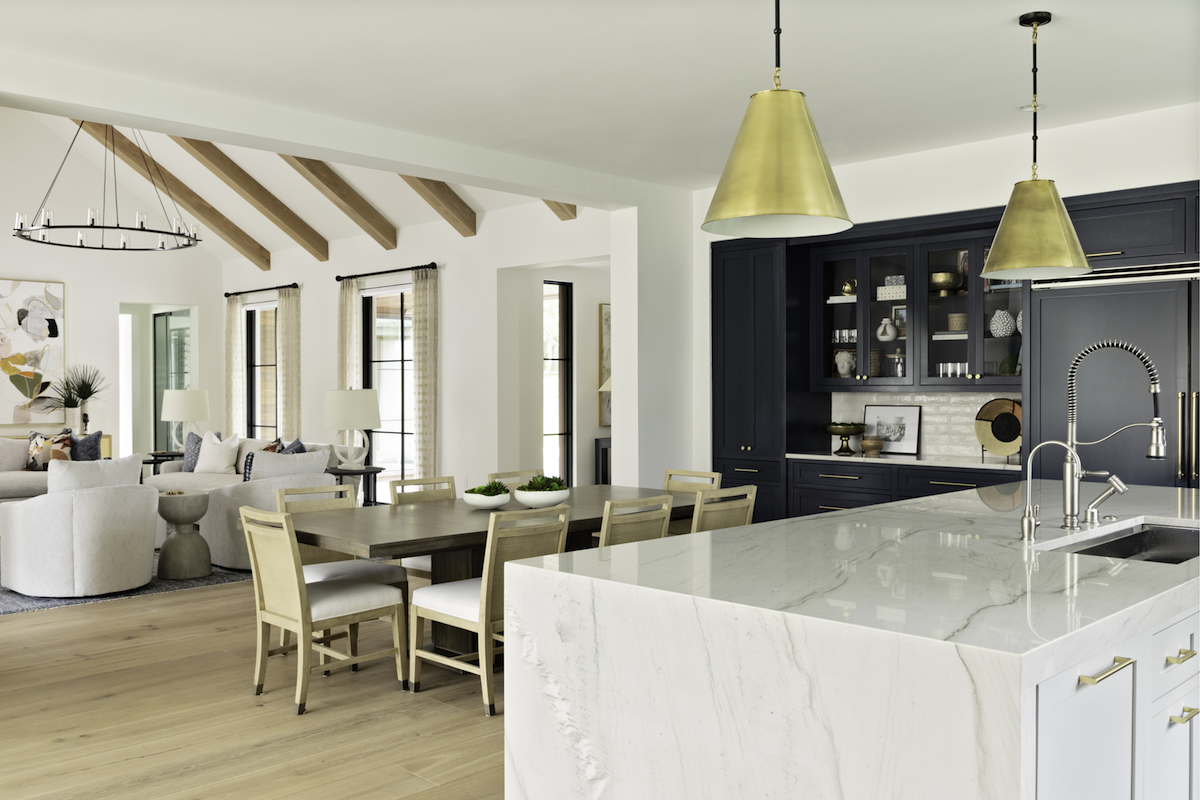
The kitchen is the main gathering area of the home, so we really wanted to use this space to bring the homeowners’ eclectic style to life. With its two-toned cabinetry, waterfall island countertop, open shelving, and counter-to-ceiling backsplash, this kitchen truly has a little bit of everything. All top-level cabinetry opens upward rather than sideways, creating a unique way to access additional storage space.
What is the beautiful blue hue you used on the cabinetry?
Hale Navy by Sherwin Williams.
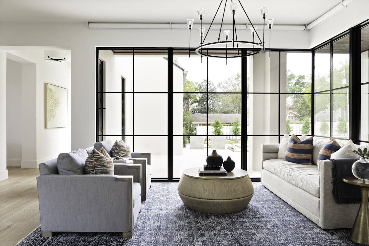
Each room, while unique and breathtaking in its own way, flows right into the next. How do you achieve those seamless transitions with each home you design?
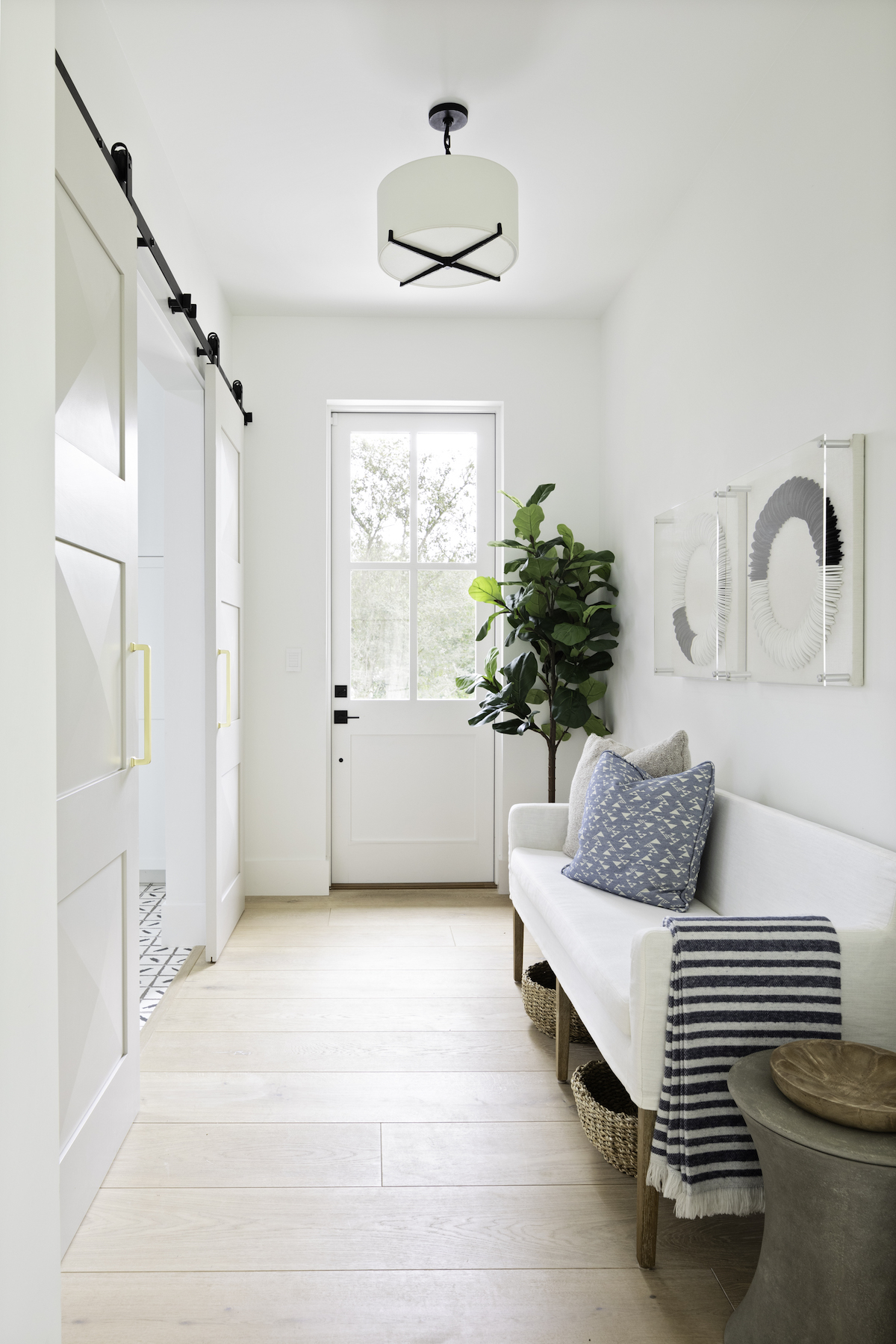
When you walk into your foyer it’s like the beginning of the first chapter of your book as you walk through your home the chapters have more details. We love to design homes that flow like a beautiful book that captures our client’s personality and is timeless!
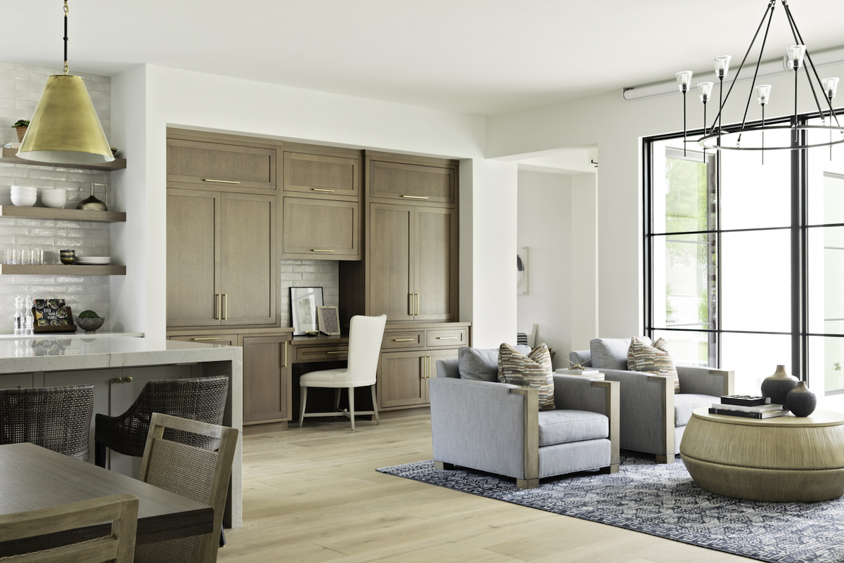
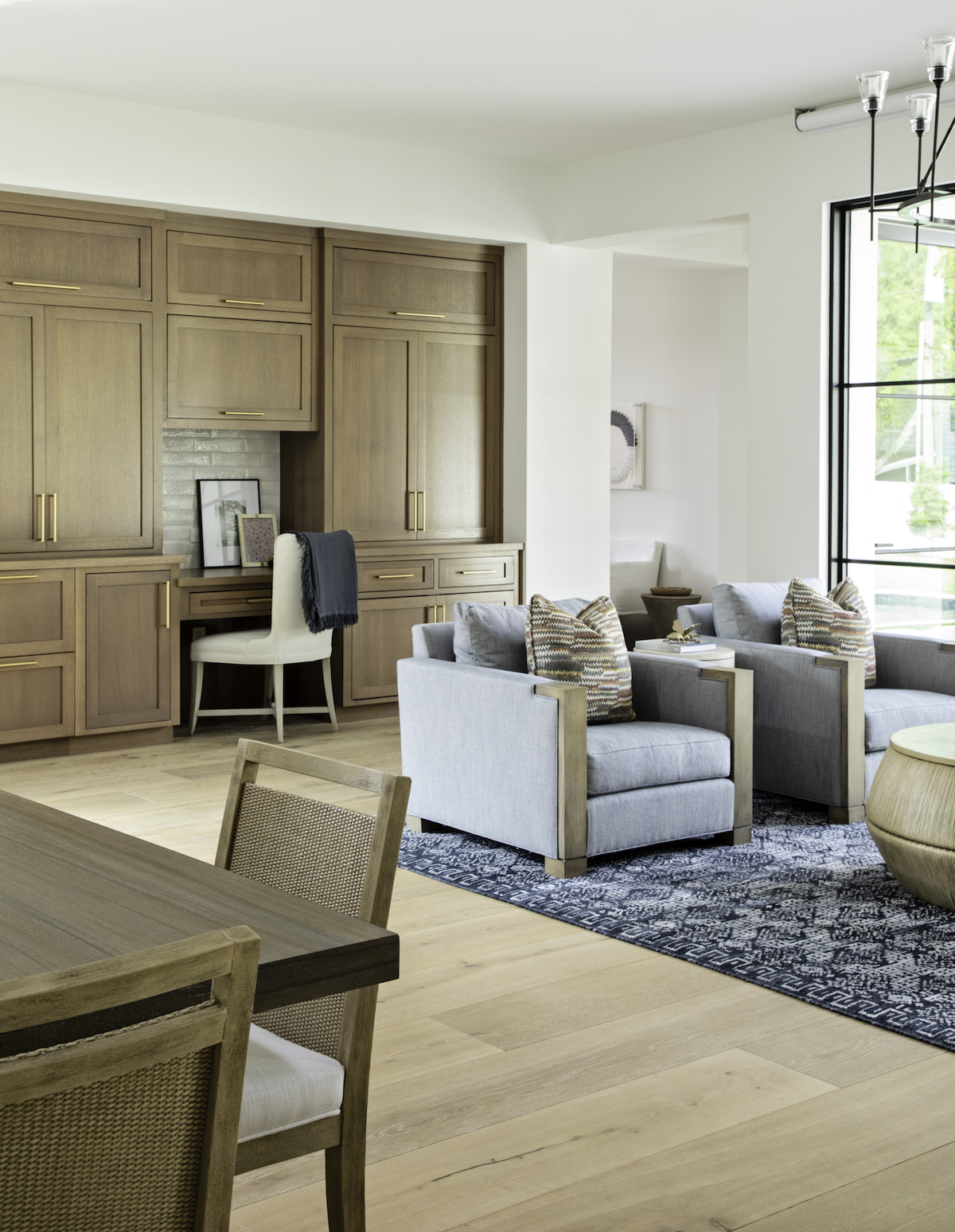
Your work has been featured in several prestigious publications, every designer’s dream! Can you share some insight into this process for those who aspire to publication?
We are so proud to be featured in publications. We have had several publications approach us and we have also pitched and secured our design projects in publications.
With the current travel restrictions, visiting your clients throughout the U.S. must be difficult. Has that changed the way you begin or implement your design process?
Zoom and FaceTime have been our best friends during this time. Most of our clients are located in FL or are from the North East with new homes in FL. We have been able to guide our national clients through all phases of their design process via technology.
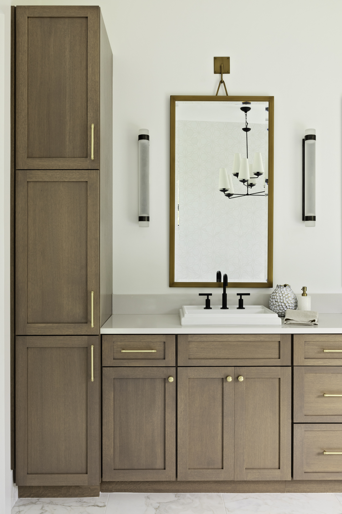
The hardware in this home is beautiful. Can you tell us about the selection of these stand-out pieces?
We used gold hardware throughout the kitchen, paired with two gold-brushed Goodman Large Hanging pendants by Visual Comfort to add warmth to the large space. The gold Hardware is from Rejuvenation.
If you were asked to choose one feature from this home to bring into your own, what would it be?
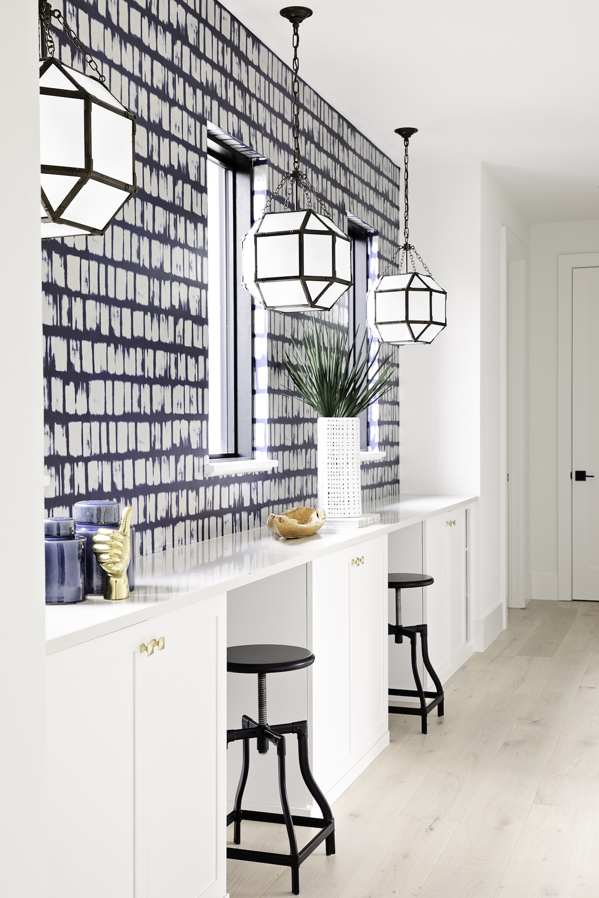
I think most homes over the past year would benefit from an area for kids to school from. We transformed a particularly wide hallway into a usable homework space for the kids. We used visual comfort’s Morris lanterns and Phillip Jefferies’ patterned navy-blue wallpaper to create the perfect study niche.
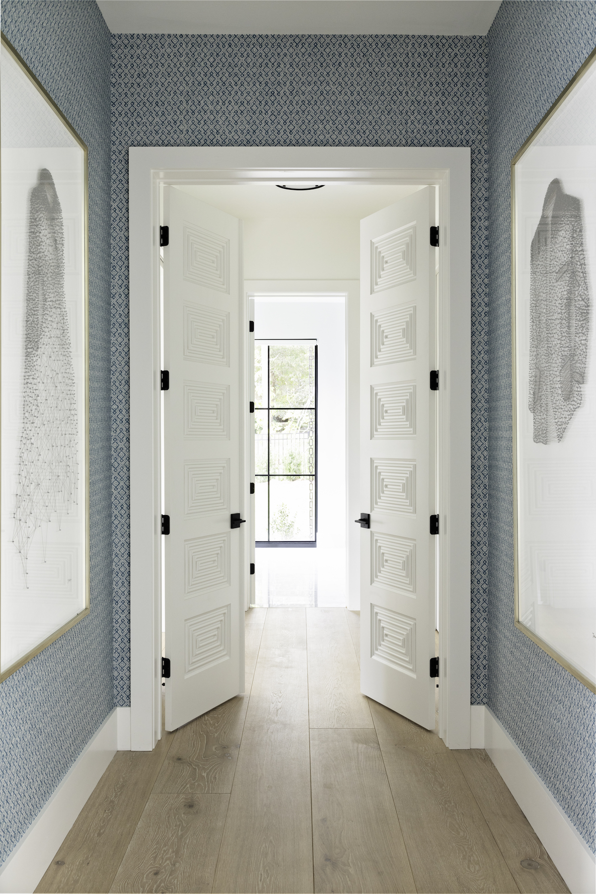
Wallpaper seems to be making a comeback, and it’s featured a few times in this home. How can we incorporate this element into our own homes while keeping it fresh and modern?
I love to use wallpaper in a small space to make it feel warm and cozy! An accent wall in the bedroom, TV space can liven a room and keep it timeless and modern when picking the right wallpaper for the space!
What is your favorite space to design, and why?
The kitchen—I love doing the cabinetry design!
What is your go-to styling tip that will always elevate a home’s look?
Lighting, but also woven and textured fabrics.
We’ve all been spending more time at home throughout the past year, and it has challenged many of us to reevaluate what needs our homes meet. What does a well-lived home mean to you?
In Florida, our outdoor living area is a huge bonus. I love our eat-in dining area, it is often the epicenter for our family.
Love what you see? Take a peek at the talent behind the story… Interior Design: Ashley Martin Home · Photography: Native House Photography
