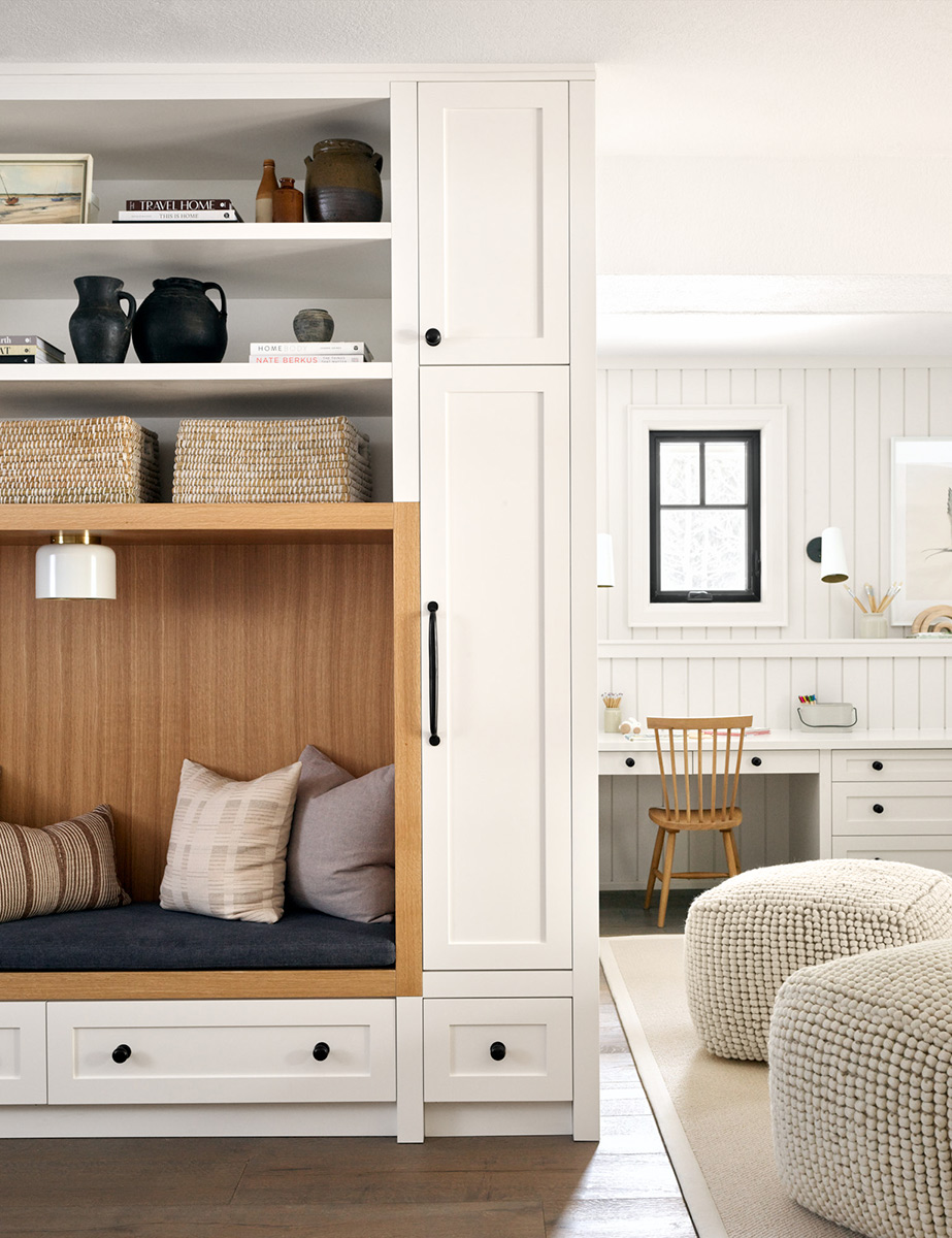
You read correctly… this basement has eight different uses! A pandemic design dream, I suppose—especially if you’ve got kiddos to keep busy. Designer, Tiffany Leigh (who we adore), is the mastermind behind this genius layout. Have a look below to see every intentional detail of this multi-purpose space (it happens to include a movie theater!).
Tell us a bit about the inspiration behind this design. What were your client’s goals for the space?
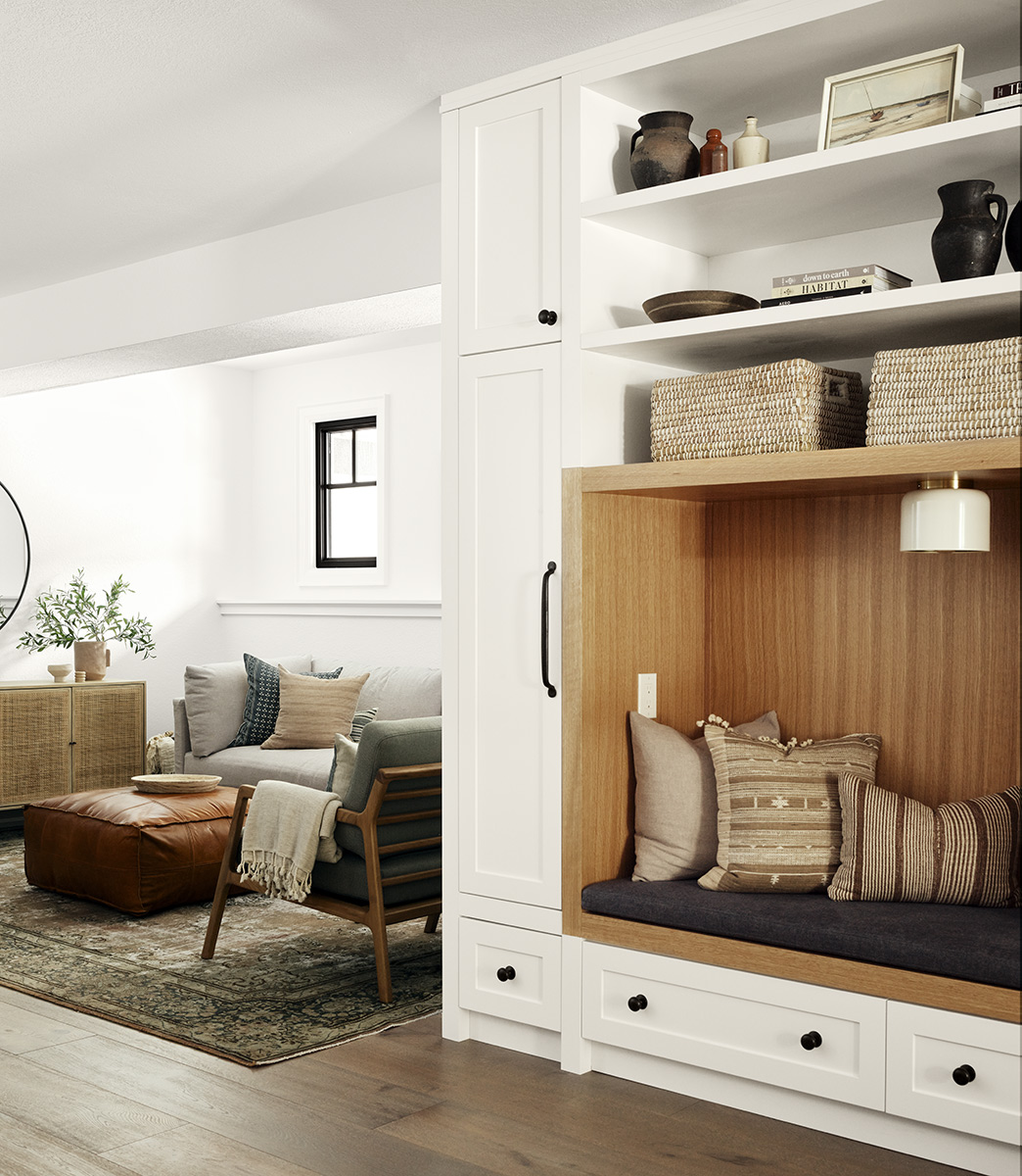
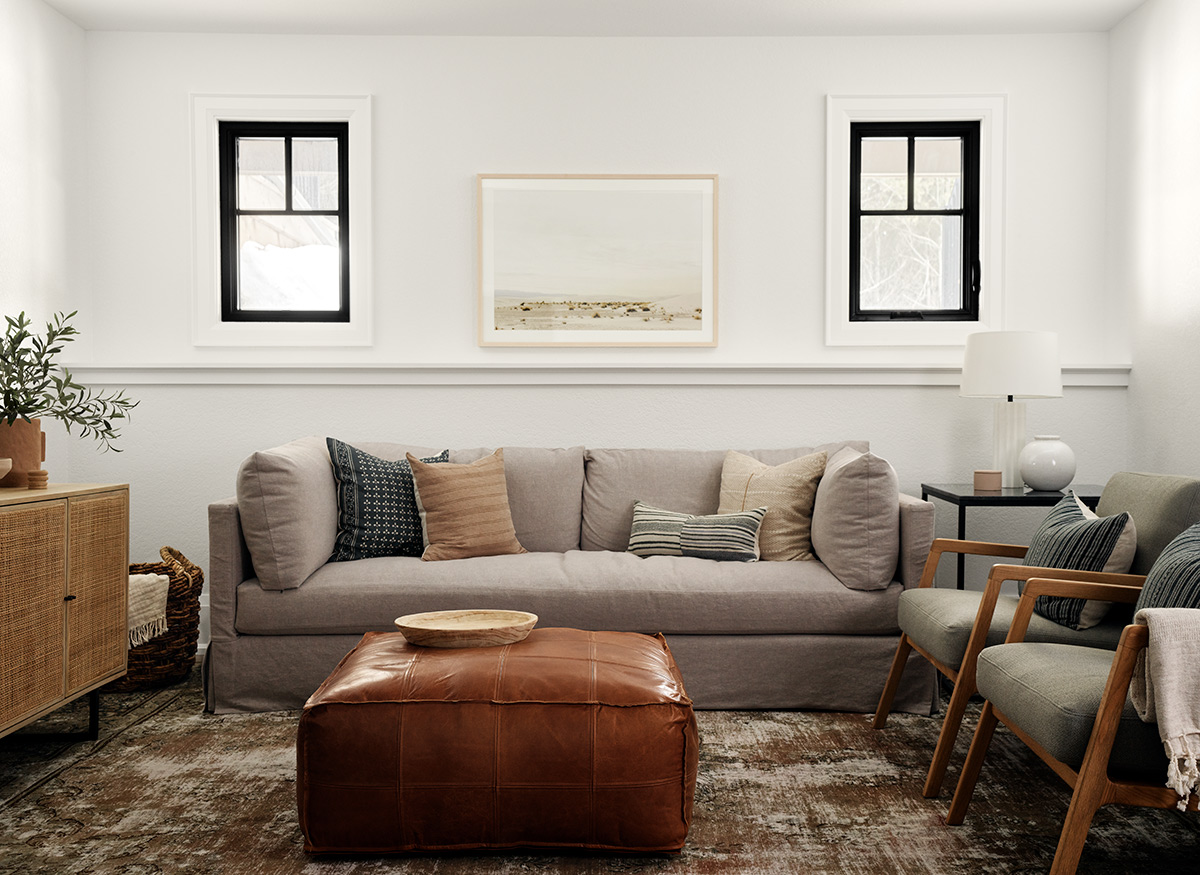
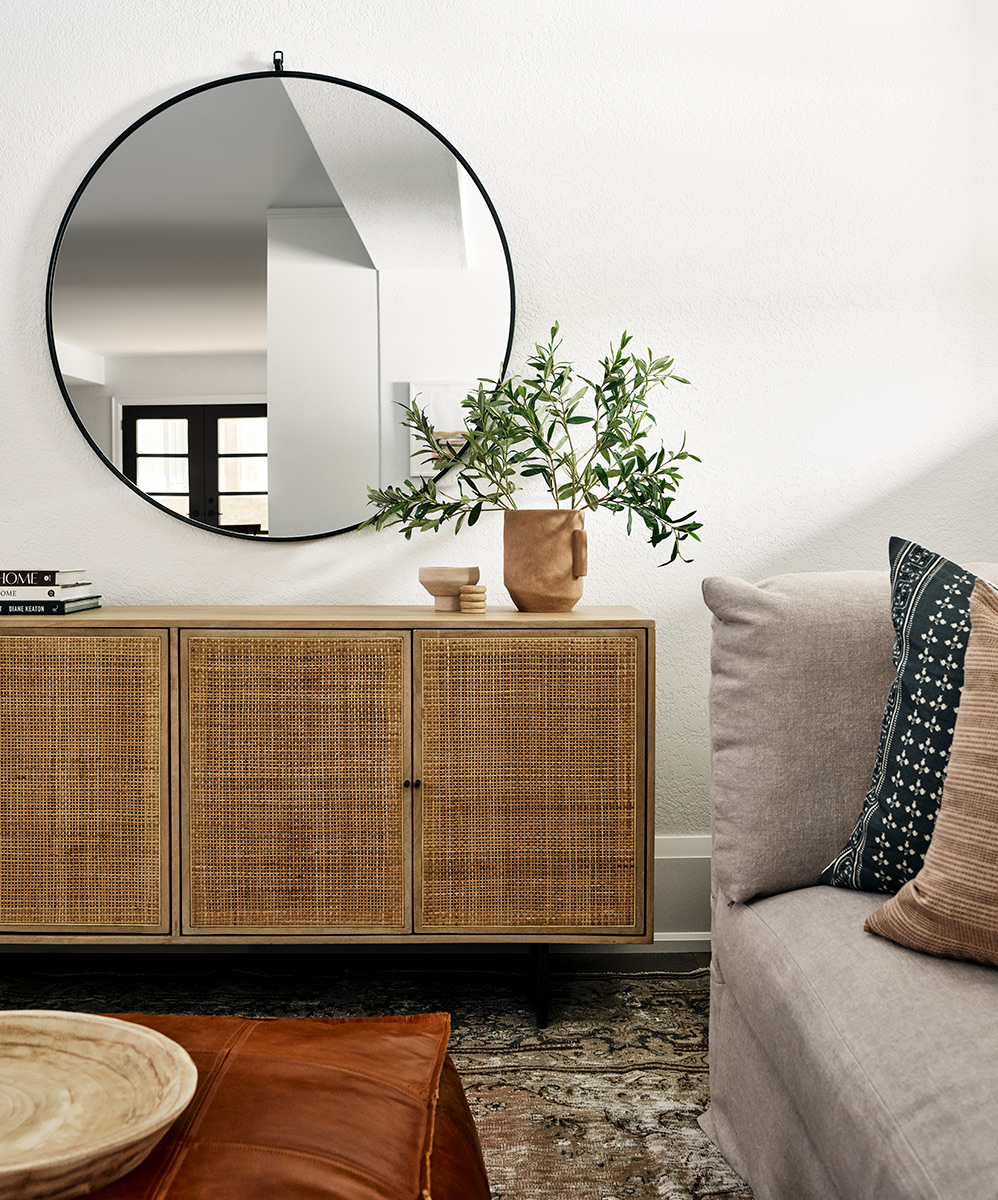
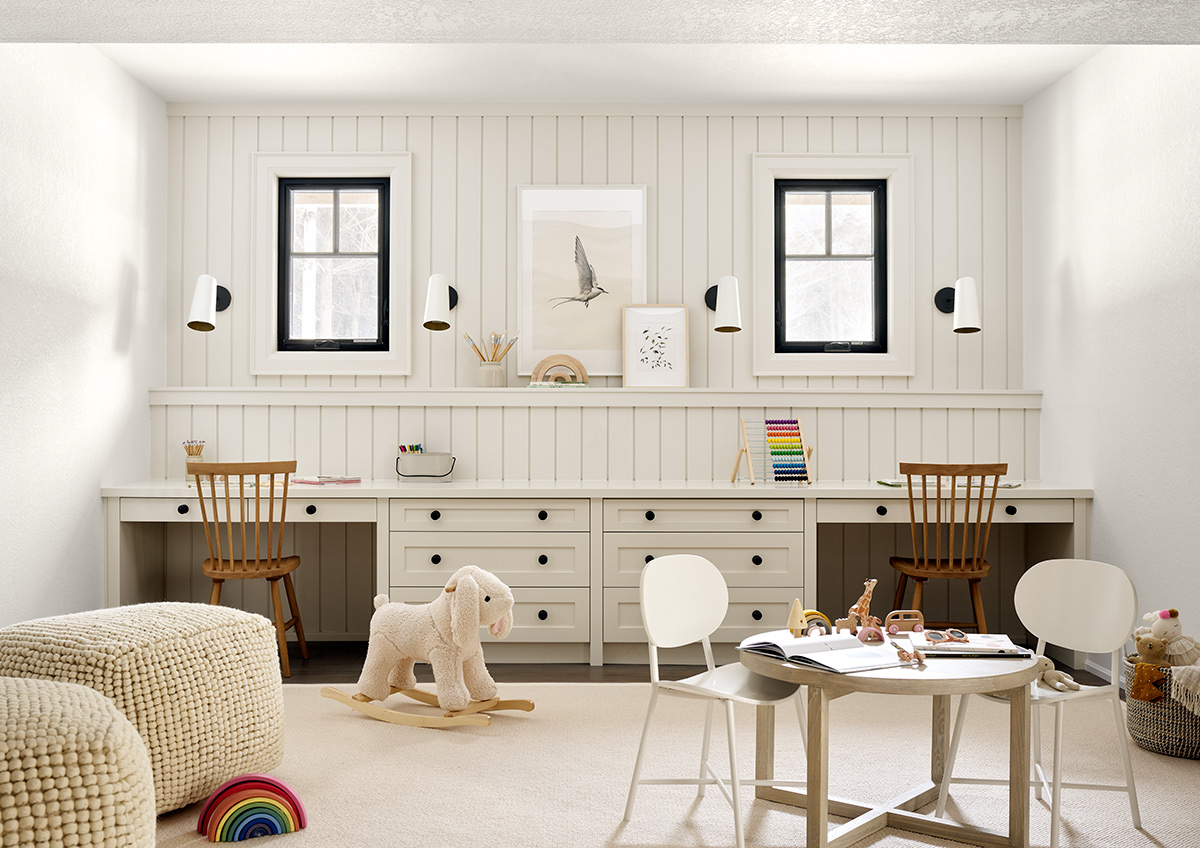
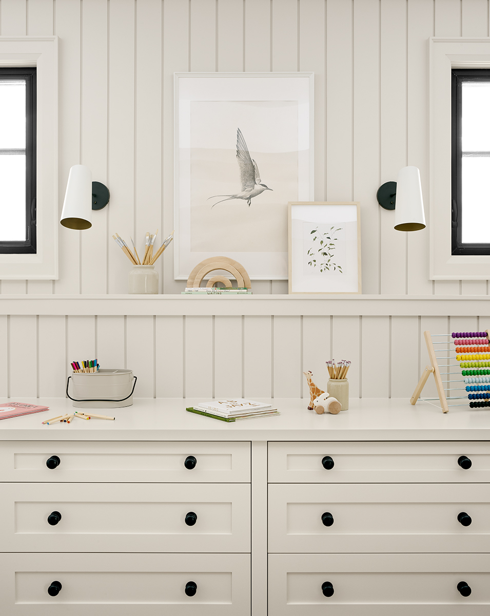
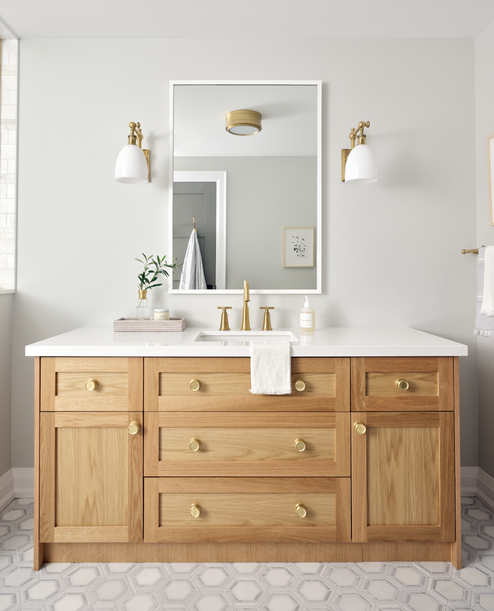
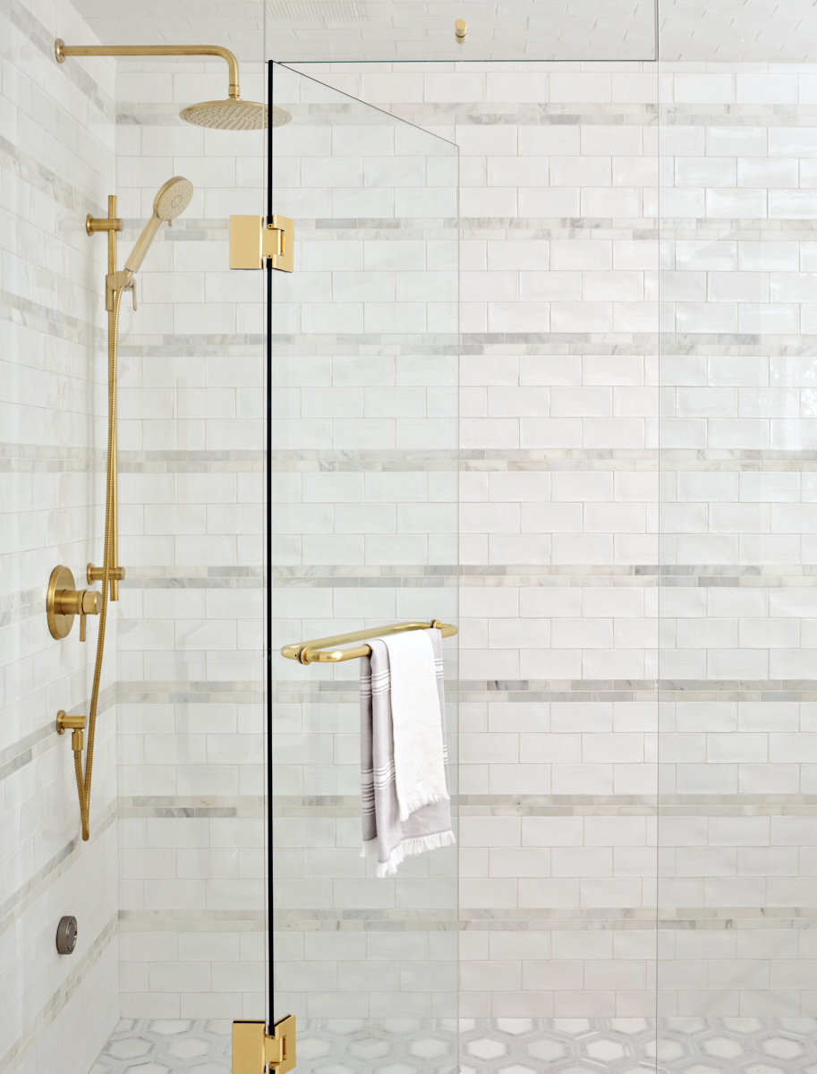
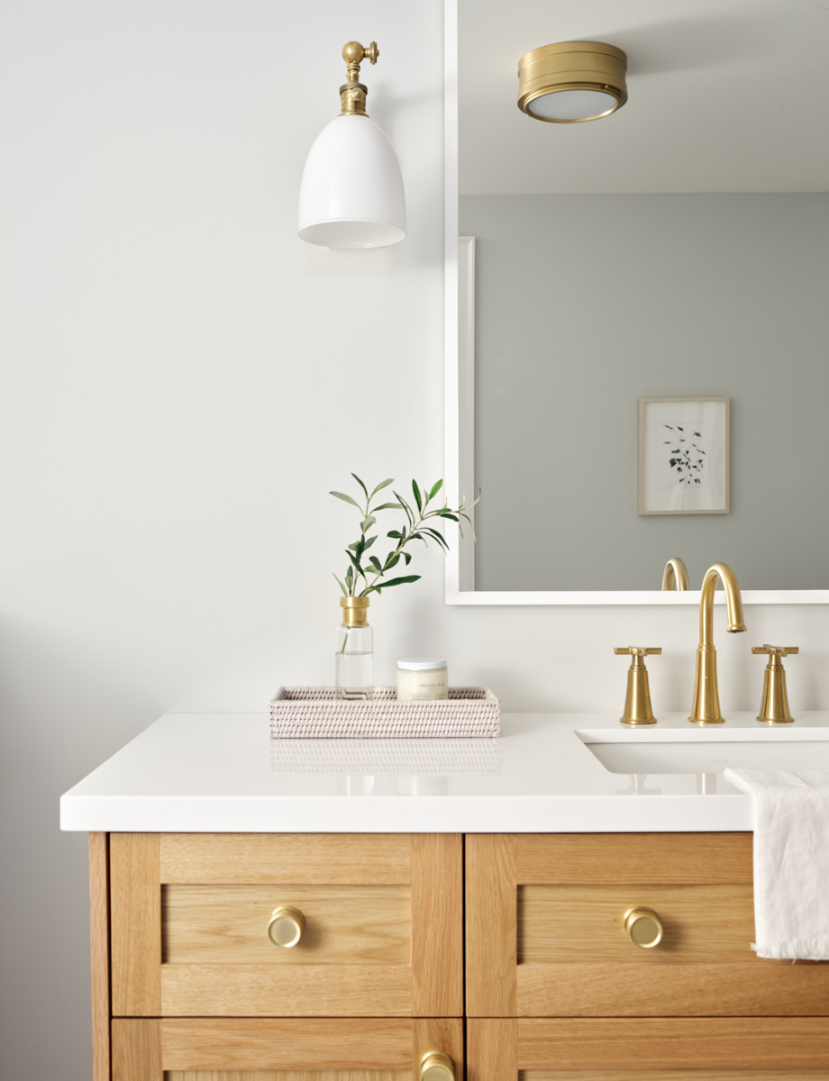
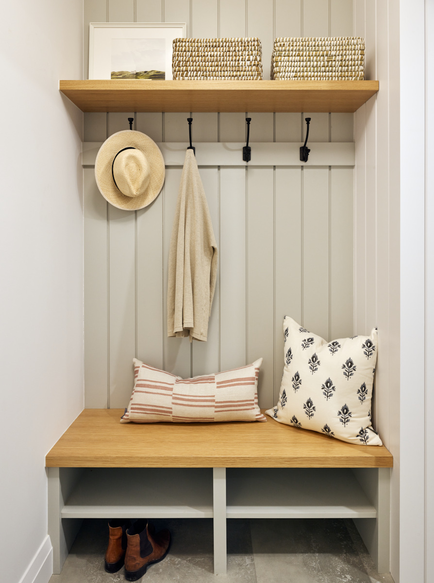
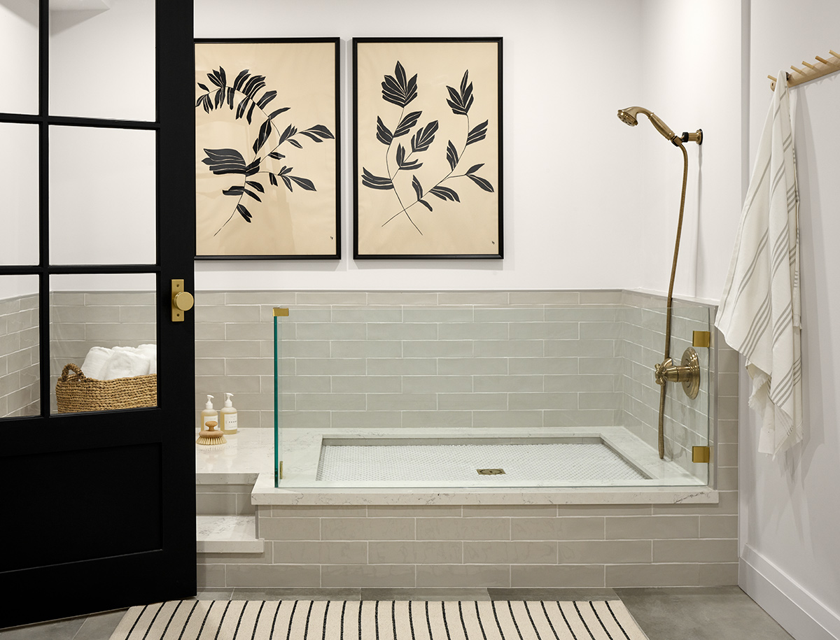
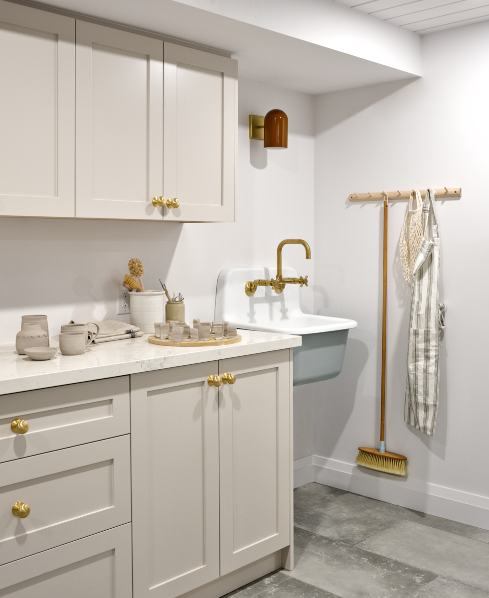
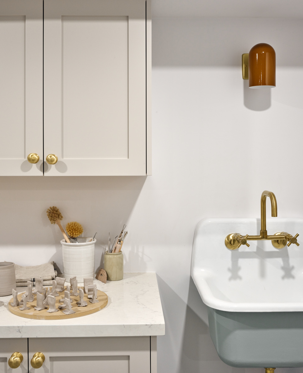
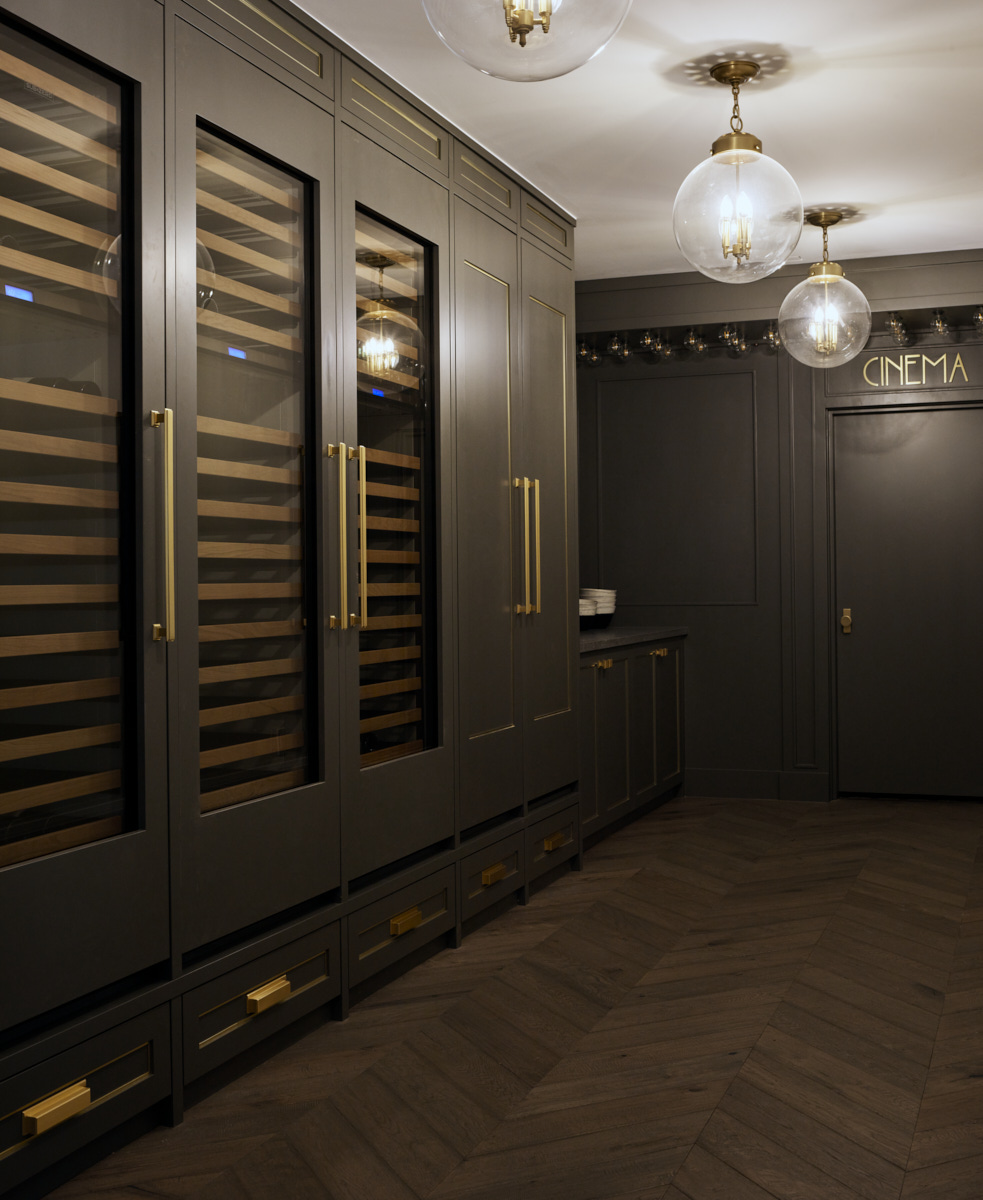
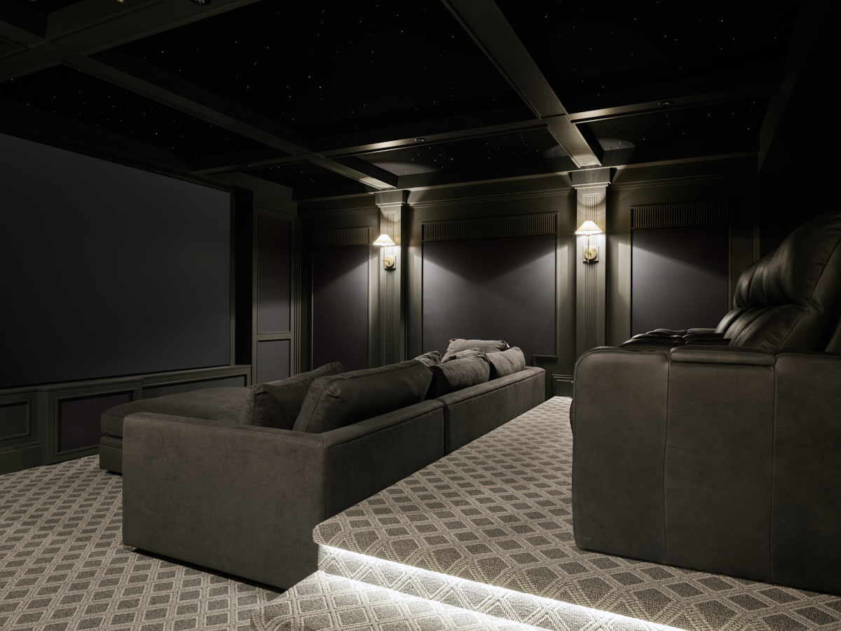
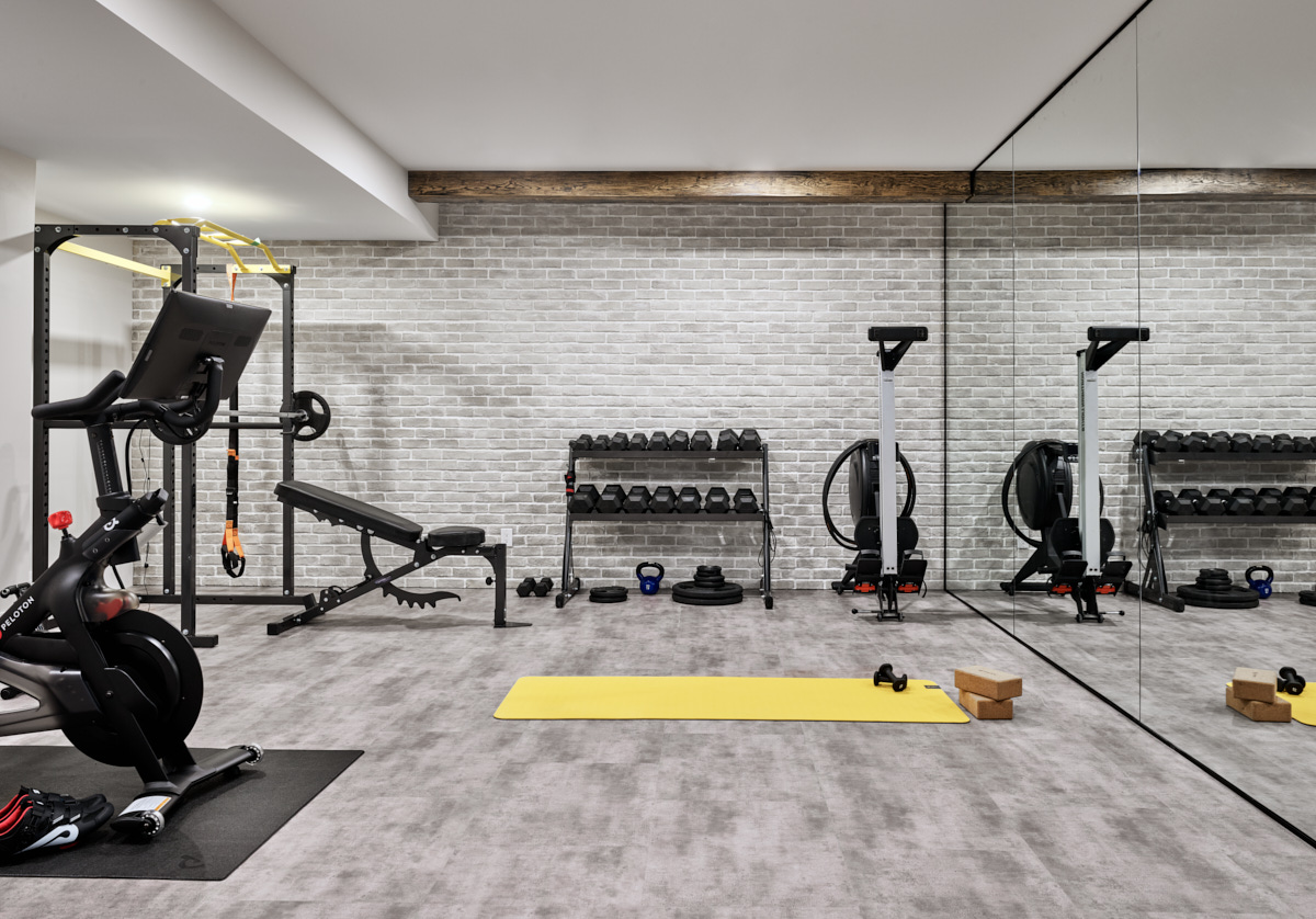
Our clients are a young family with two toddler twin girls. Because the home is in the country, they wanted to include a lot of amenities inside their home and pack in the function. We took a large, unfinished footprint and maxed it out with a playroom, seating area, home theatre, wine hallway, home gym, spa-like bathroom, mudroom complete with dog shower, and a pottery studio! The inspiration behind the design was to keep things light, bright, and functional, using a neutral and textural palette.
What is your favorite feature of this design?
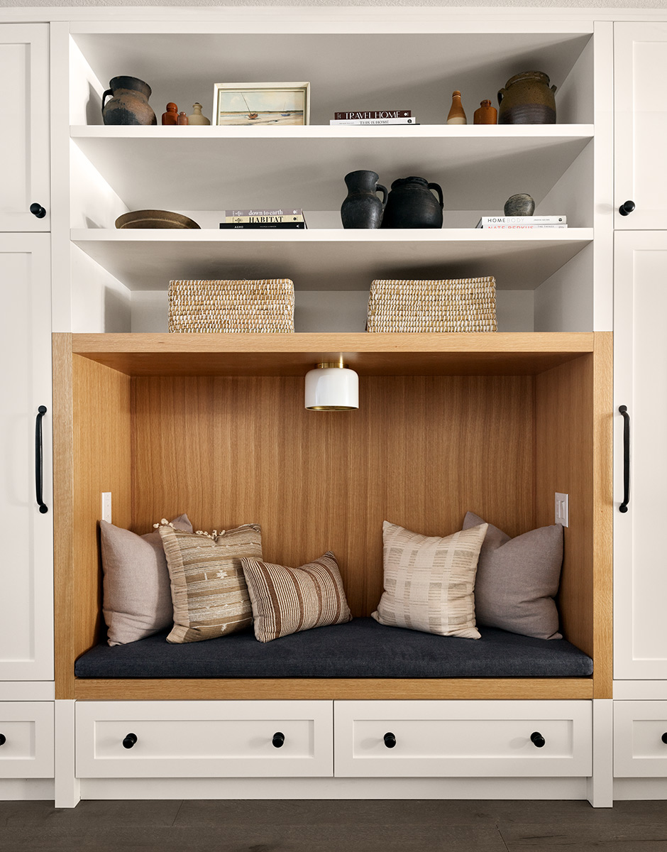
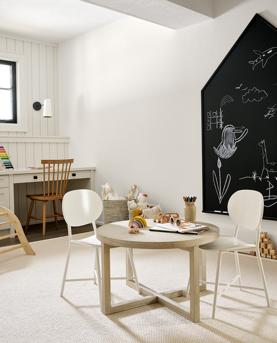
I absolutely love the toy storage built-ins with the cozy ‘book-nook’, complete with cushion and it’s own light! I would have spent all of my time in there when was a little girl (heck, I still would today!).
Where do you recommend homeowners start when renovating a multi-use room?
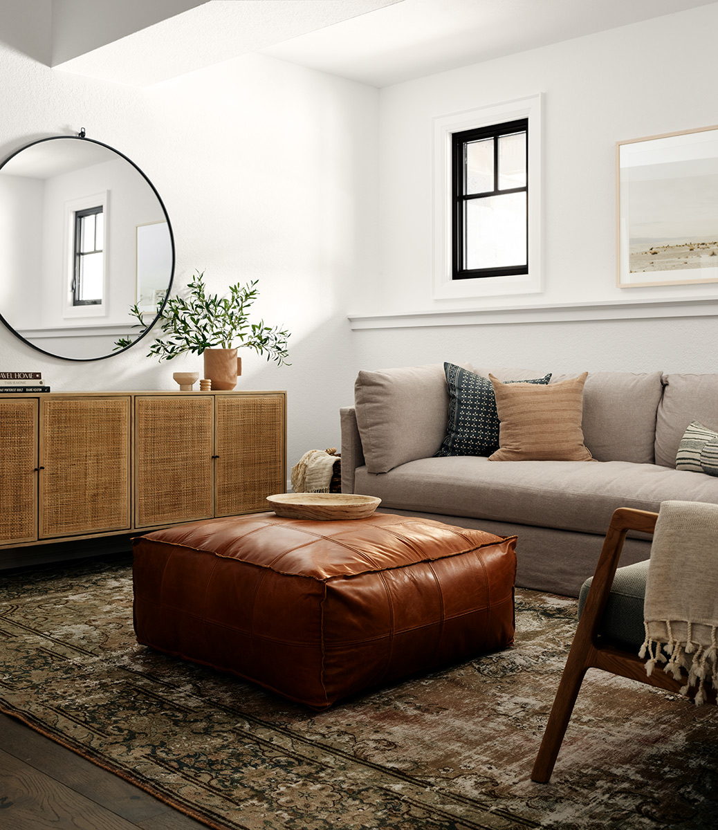
For any homeowner working with their own multi-use space, begin by thinking about how you would like the space to function and use furniture to help define zones and break up the space. For example, we used a plush rug, nubbly poufs, and petite, child-sized furniture to define the playroom zone – there are no walls separating it from the seating zone! If budget allows, consider custom built-ins to really help you maximize the function of your space.
You were able to create a light & bright look here—difficult to do in basements! Tell us how you achieve that?
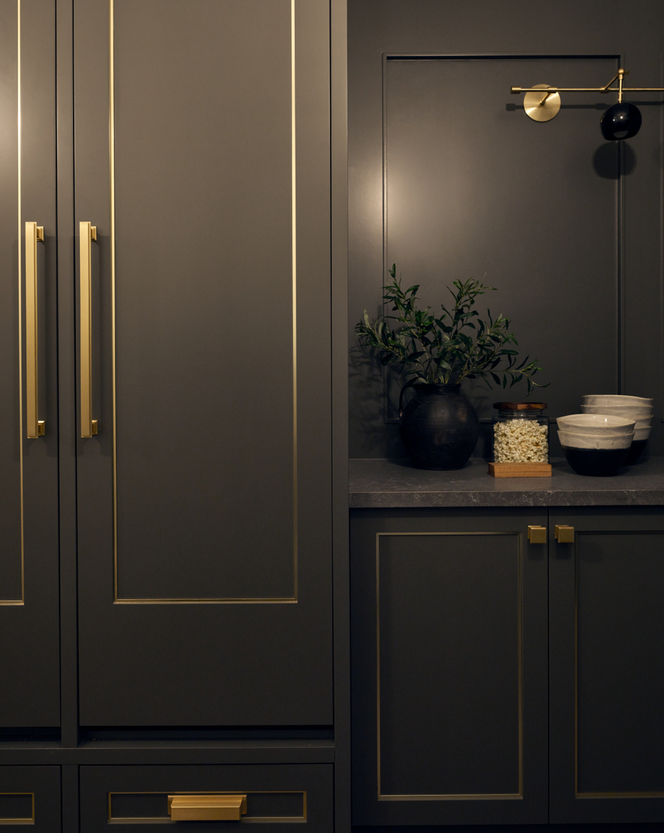
It helped that the basement had some natural light, with larger windows and glass double doors that walk-out to the backyard. I think white walls in basements can be very tricky if you don’t have at least a little bit of natural light, as artificial light can make it feel yellow and dingey. With no natural light, I tend to go dark as I did in the wine hallway here!
If you do have some natural light, go for it with white paint (I like using a mix of tones to keep it interesting), and lighter upholstery and wood tones to keep things light and bright.
Love what you see? Take a peek at the talent behind the story… Interior Design: Tiffany Leigh Design · Photography: Patrick Biller
