Sometimes all you need to prepare for a successful photo shoot is a good blueprint. Today, Raquel Langworthy and Deirdre King, are sharing their industry tips as well as a few hints to level up your styling game. Still not getting the hang of it? They offer remote styling consultations nationally and will help you create a styling board and gather purchase links so you can implement their tips at your next shoot. Want to become a styling pro, keep reading!
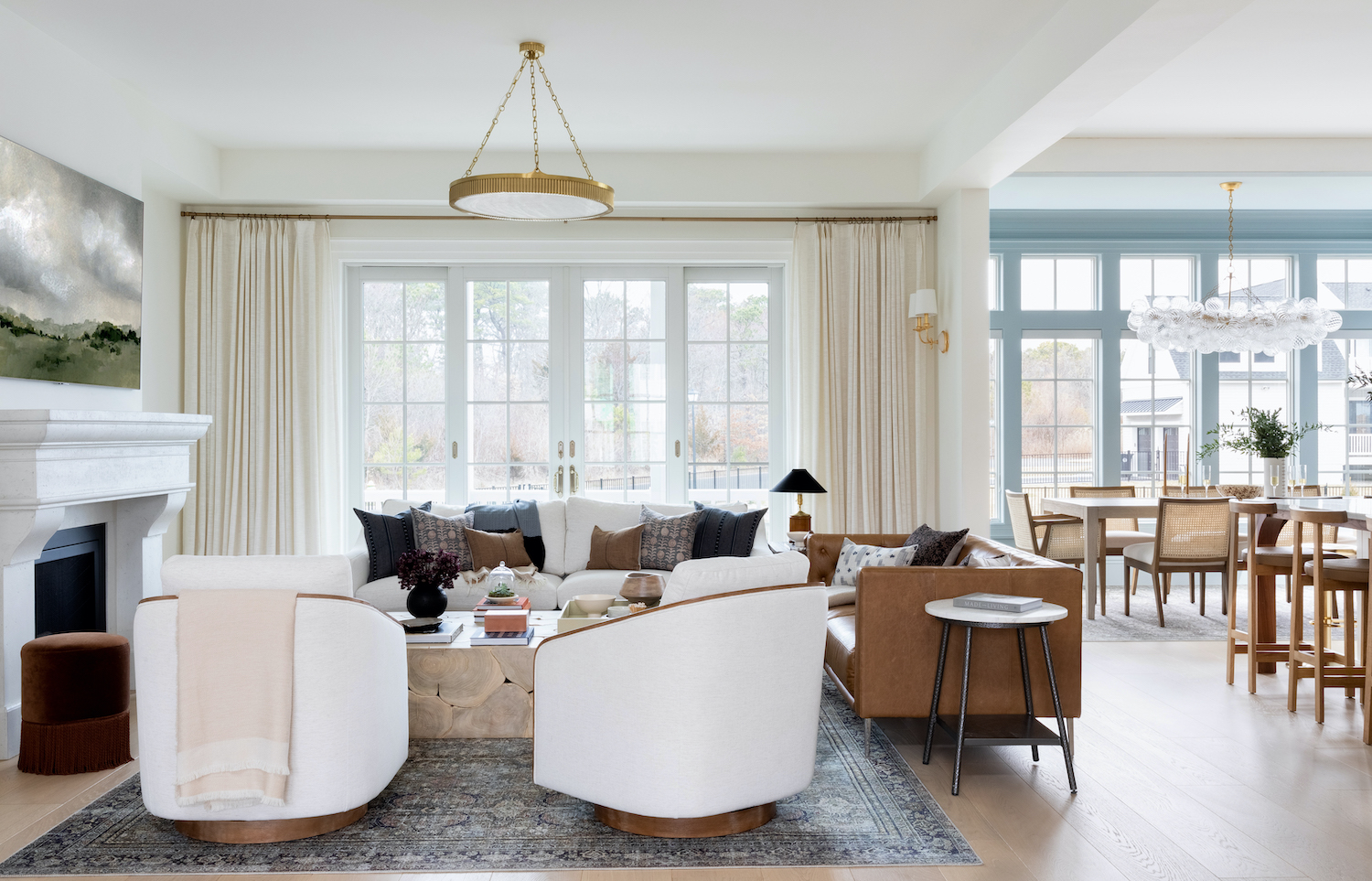
How does working with a stylist on shoot day make an impact for designers?
Photo shoots are a huge investment of time and money for a designer with or without a stylist. So much so that it can be an overwhelming and daunting task to undertake outside of an already packed workload. That means that sometimes props are purchased last minute from mainstream sources, and often too much or too little is spent on florals. A great stylist has a rotating inventory that is combined with solo purchases for a single project. They have an eye for found objects, and the ability to do floral design on-site.
Working with a stylist really allows you to focus on the story you truly want to tell. We can curate a story that’s about you and your vision for the design. We source art for walls that remain bare and create vignettes in spaces that would otherwise not be photo ready. This gives the designer the ability to leave with images that are impactful and smartly planned, making the most of your entire project.
Hint No. 1 – Choose Wisely
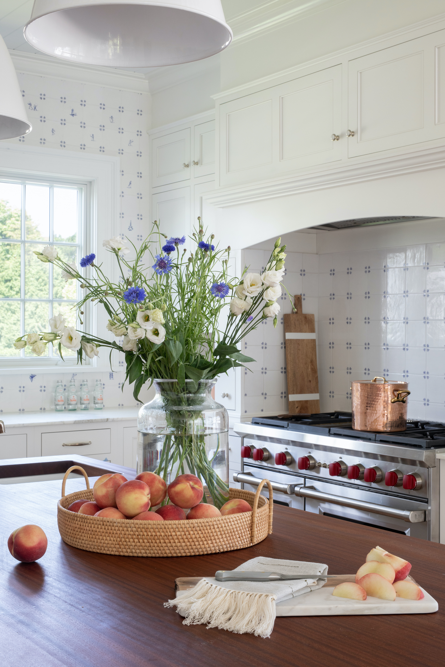
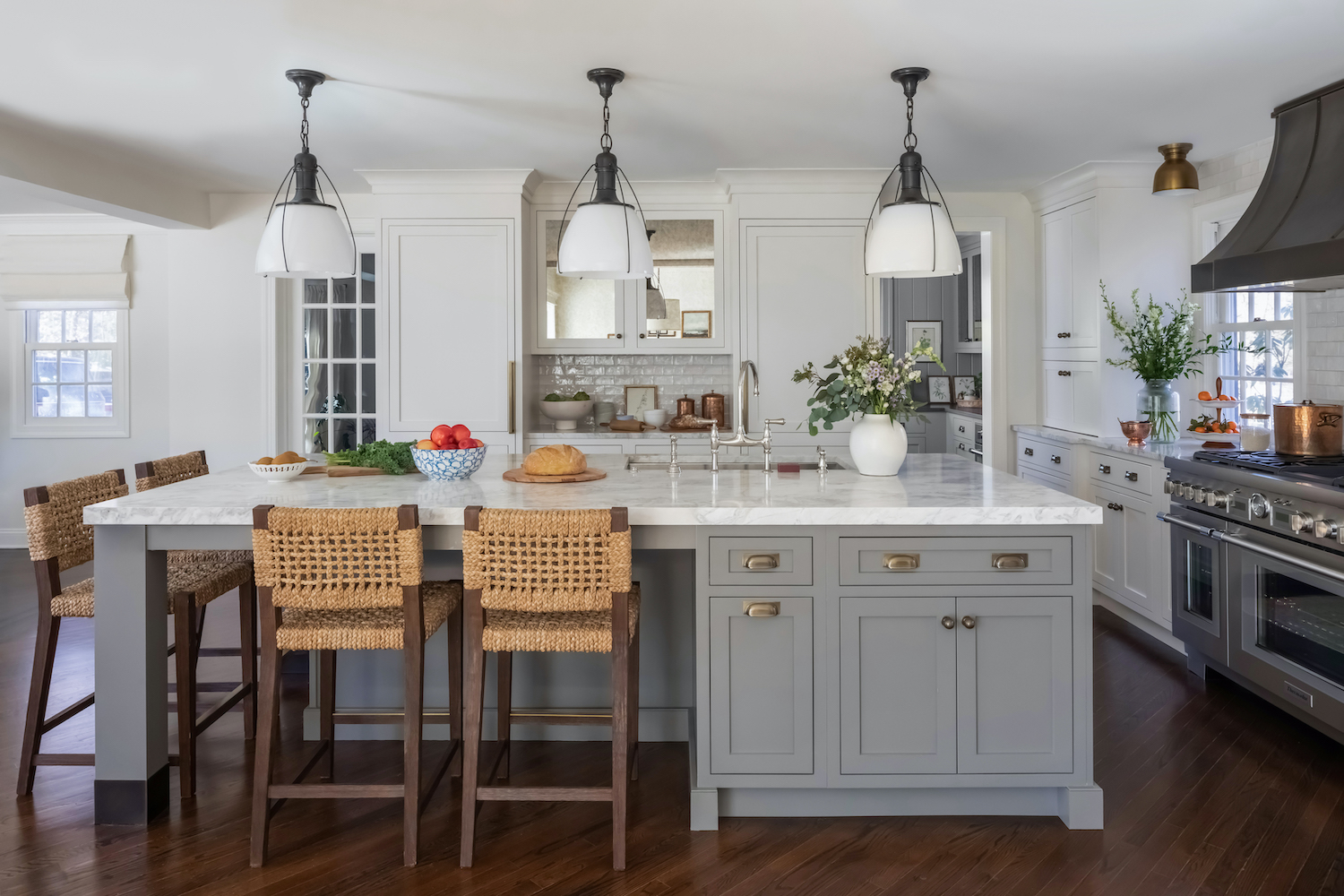
Pick fruits and vegetables the same way you choose textiles for a project. The color and texture of whatever produce you buy really matters. Please stop buying lemons! For some reason this seems to be the styling food of choice. Sometimes lemons are perfect, but yellow is not right for every project. Always pre-plan the vessel that will be holding fruit so that you bring the right quantity. You can prop it up around a towel, but large vessels really do need a lot of fruit. Have enough fruit or food to cut it up – cut food really draws the eye in a tantalizing way. Sometimes vegetables and grains are the better way to go. I remember photographing mushrooms for a vignette and thought their earth tones were perfection for the shot.
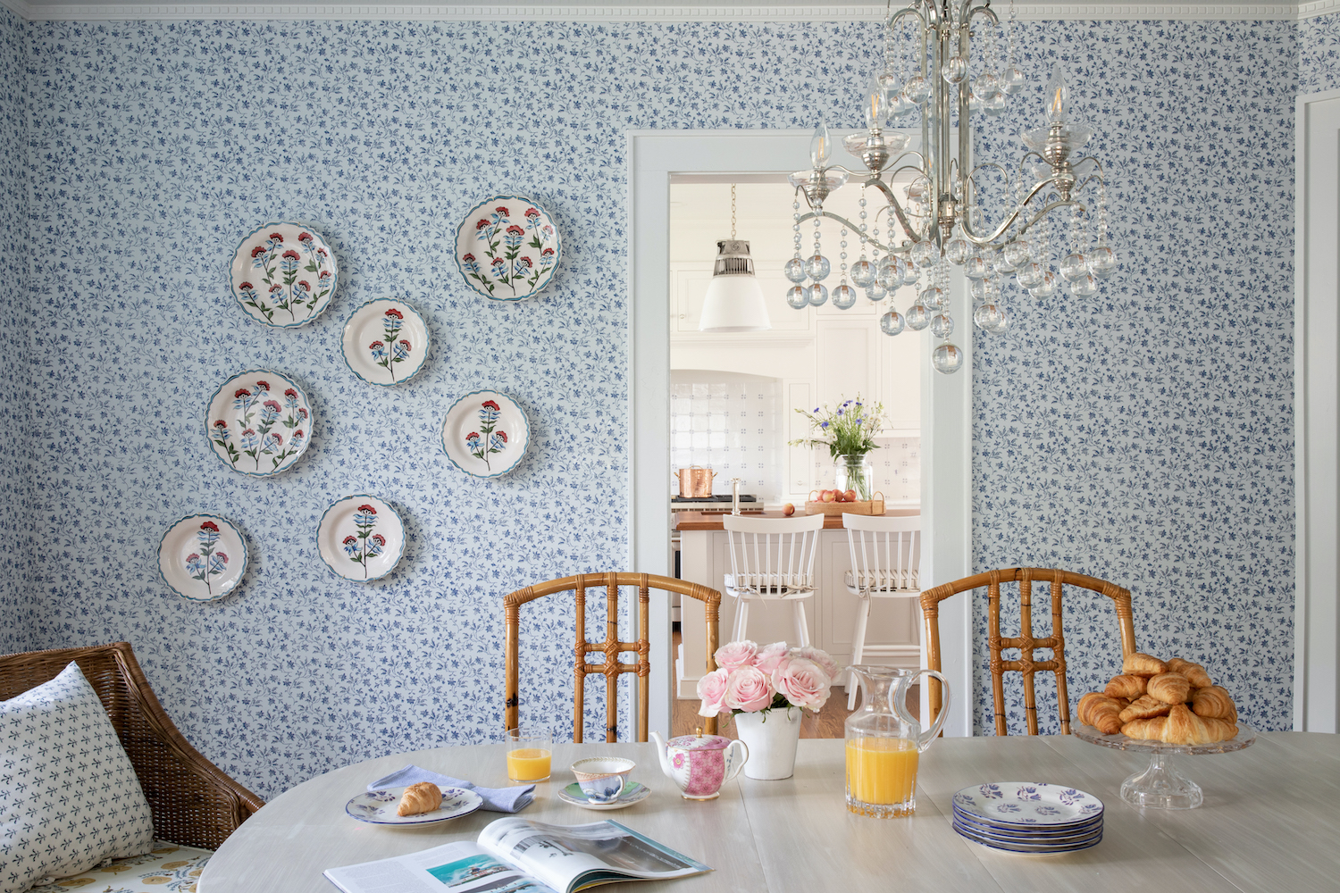
Where do you begin when creating a story for a space?
We start with a styling consultation that is either in person or remote. As a team we walk through each room and discuss the vision and needs for each space. Often this process lets us hone in on visual opportunities the designer may not have been aware of as well. This first step allows us to pinpoint the designer’s aesthetic. Deirdre then puts together a styling board for each room with a list of props and florals.
Hint No. 2 – You Can Pretend
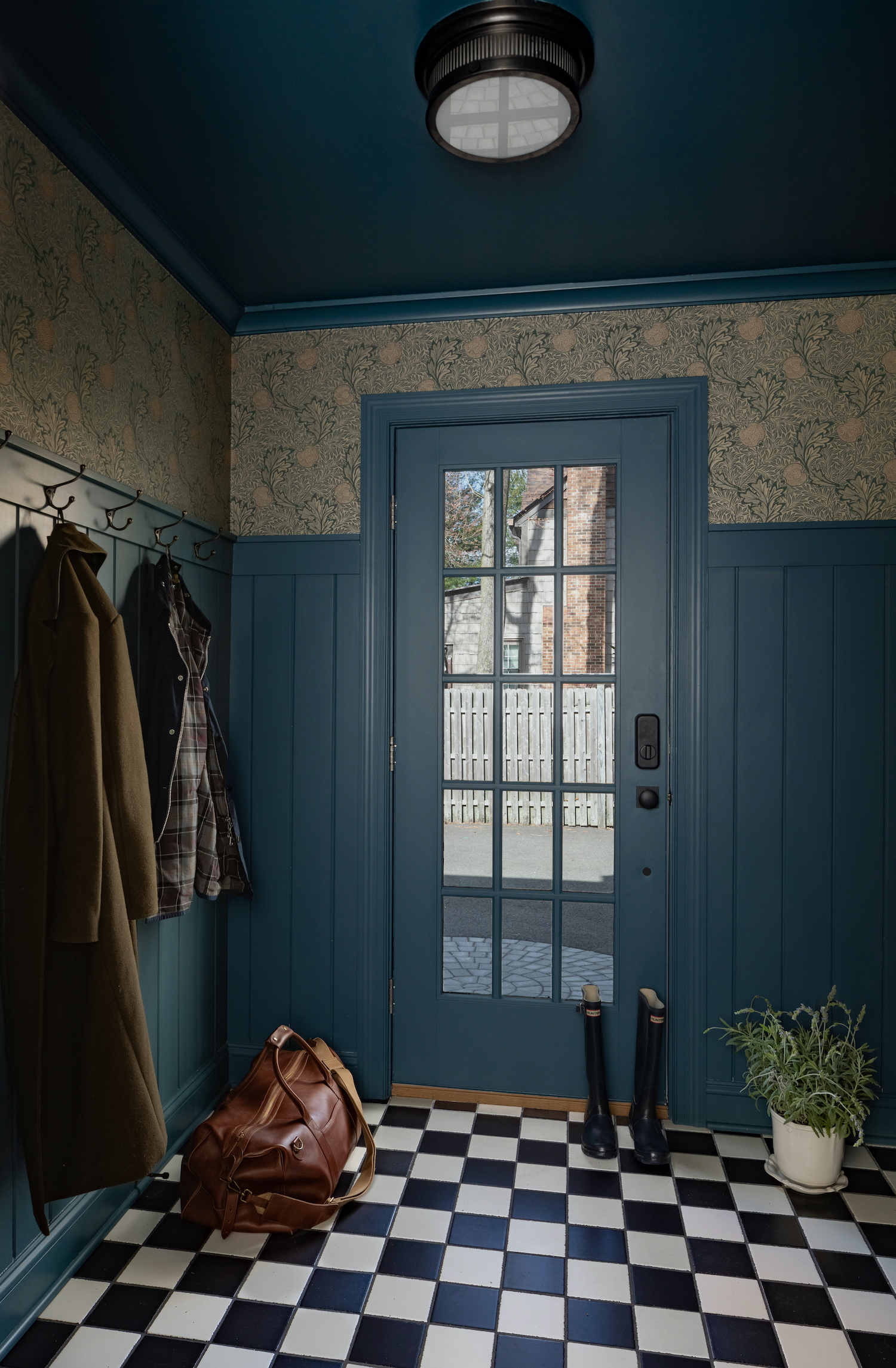
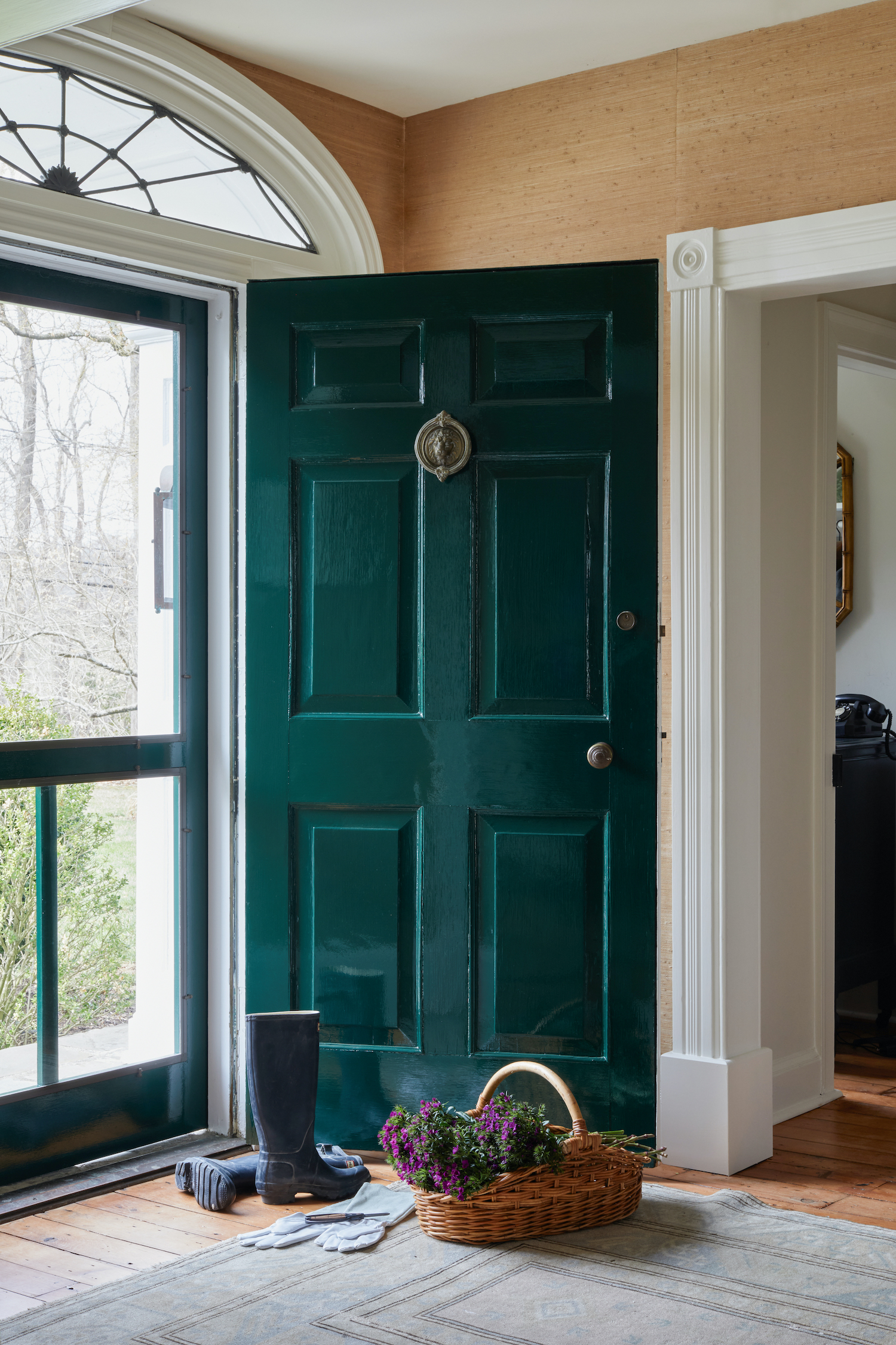
Sometimes a home and property lend a great deal to the storytelling. This is a farmhouse originally built in 1886. We really wanted to showcase the green lacquered front door, but had to do it from the inside. There were so many beautiful plants outside, but due to it shortly being sold, we couldn’t wait for the perfect season. We decided to pretend the season since earlier in the year we’d captured the refurbished covered porch during the height of summer. This collection of props allowed us to do that, and give a nod to the exterior property. It was picked up for a full house tour in print.
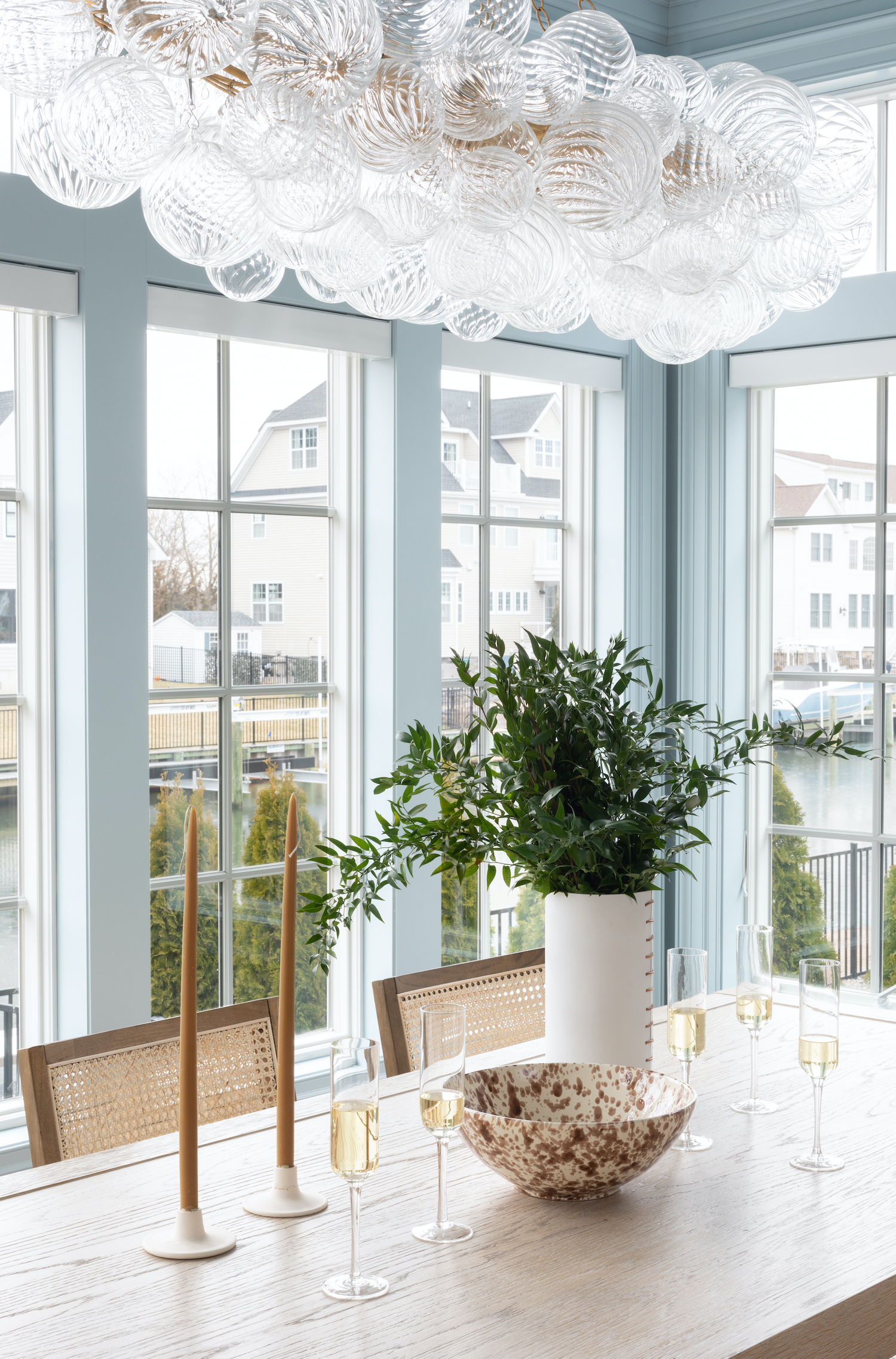
Christine built this home with her father, and its completion truly was a celebration. Alcohol is one of those things you really need to grab in advance. Both as a prop, and potentially as a thank you to your client for the photo shoot. Think about how a bottle or a liquid plays out in certain spaces. It’s very useful to be able to pour alcohol into a vessel, but also have an unopened bottle as well. For this photo we wanted the table to look as though it was “post toast” with glasses at various sip lengths. There’s a romanticism to the variation, but we had to use two bottles to achieve it.
What is your biggest styling tip if you’re aiming to feature your work in a print publication
A stylist will be beneficial for any project, and we offer a paired-down service for smaller projects that are important enough to photograph, but aren’t a full house tour. This paired-down service is also great if your project was less profitable but still useful for your portfolio. Most often designers put their biggest investment in full house projects. An example of a full home would be a kitchen, a living space, dining room, primary bedroom and bathroom. Print publications also appreciate exterior images and bonus rooms as well. It is smart to put the most resources into these projects because they showcase the scope of what you can do.
My best advice is to create a room-by-room styling plan if you want press. This ensures you have unique objects for each room, rather than repurposing. Have fresh throws and florals (and flower clippers). Bring a steamer with an extension cord to your photo shoot. Think about useful food items. Go in advance of the photo shoot to prep the space so that you can focus on photographing and not staging at the shoot. Also, something to be aware of. House tours are always coveted by print publications, but they also can grab one-off spaces for single pages as well. If you have a single space you’re really proud of, there may be a way to get it featured. Don’t underestimate the power of a great single space! Take the time to give it the right look for photographs.
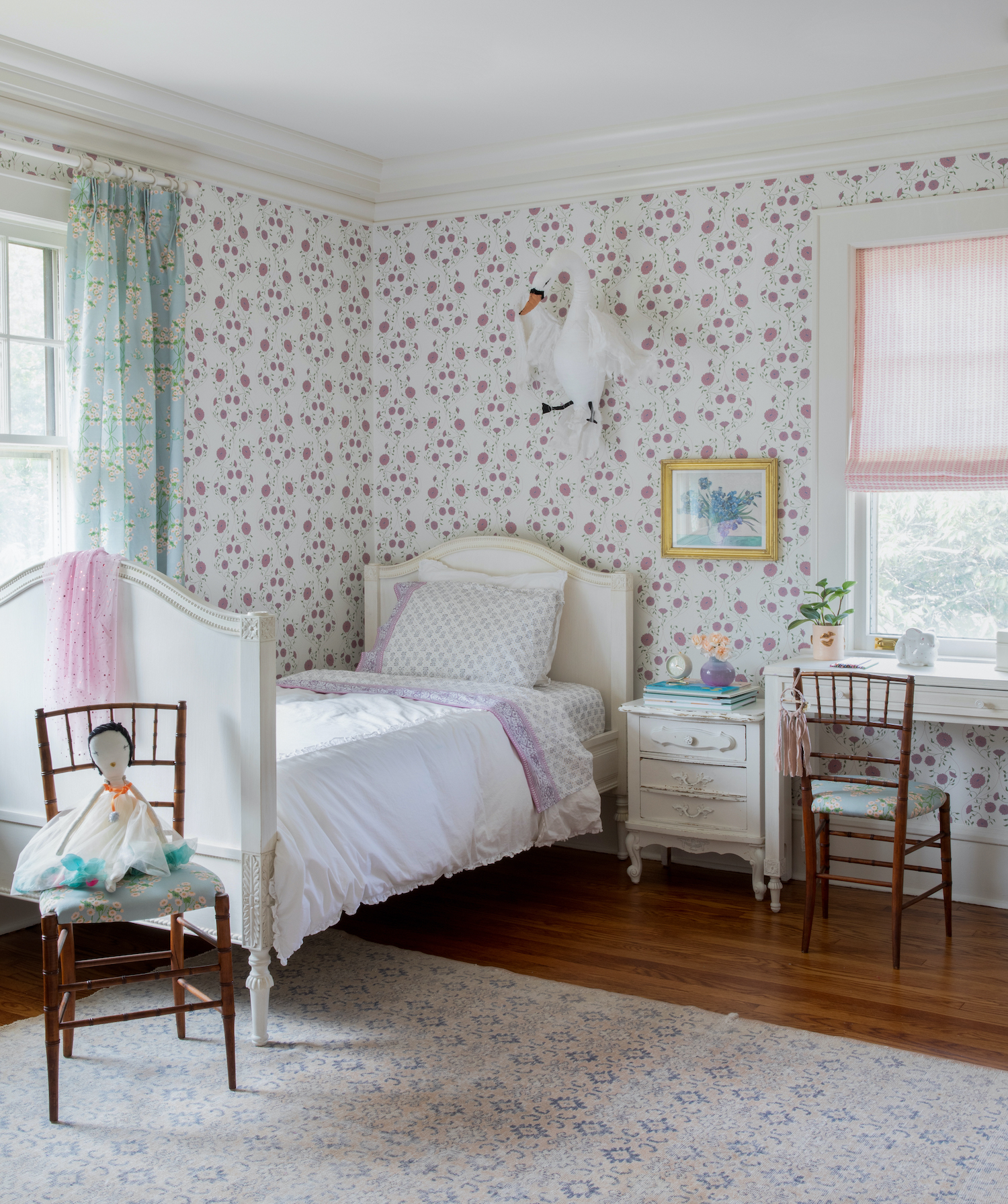
Hint No. 3 – Practicality Need Not Apply
This lovely home houses two small children who aren’t ready to live with pretty props. Allow your photo shoot to take a life of its own beyond the family. The right collection of elegant pillows, throws, plants, and florals take a pretty living space from comfortable to impactful. There was a time when my kids were little that a geode on a table looked like a weapon to me! It’s not necessary to think about practicality when planning styling for a photo shoot.
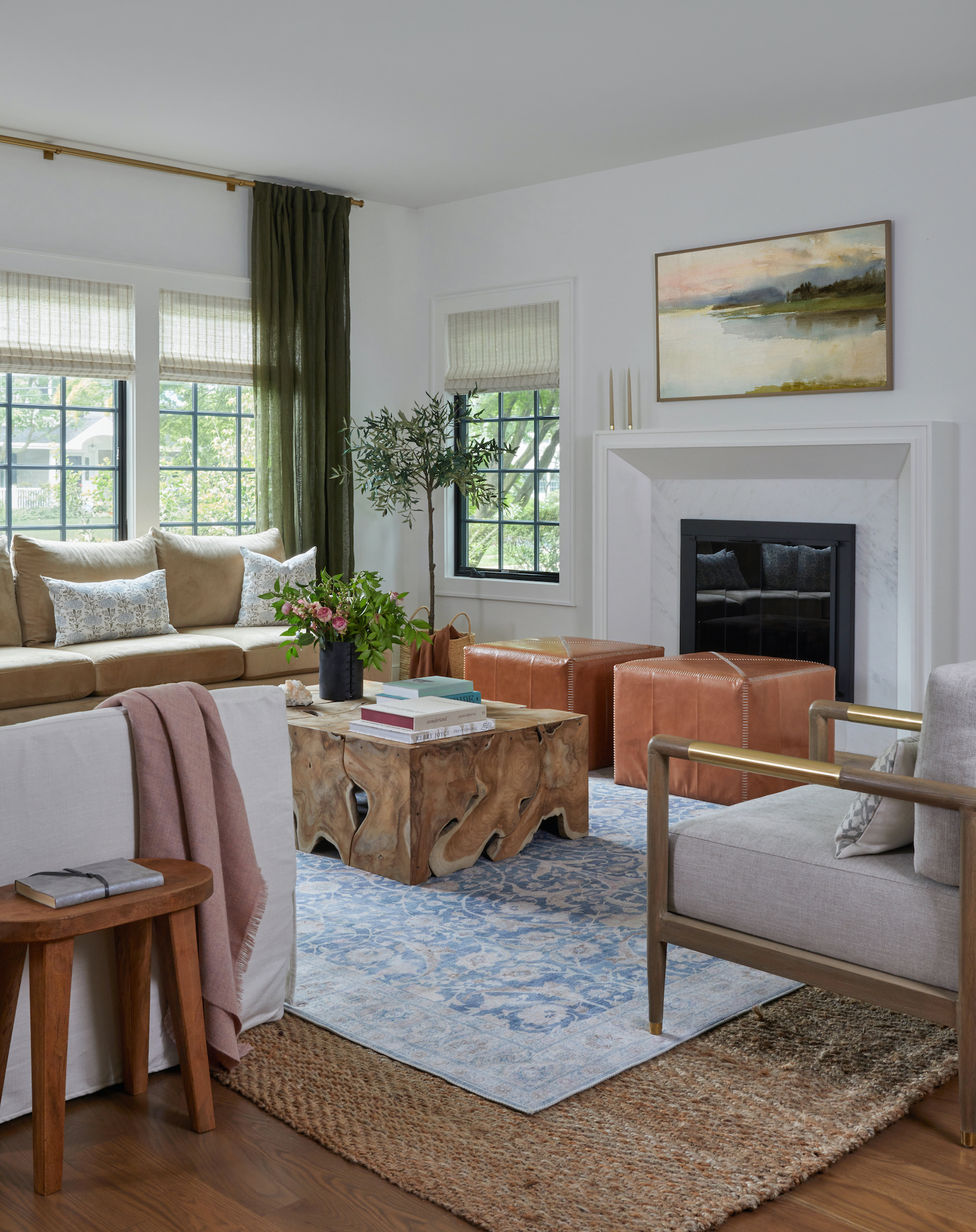
Are there any shoot day styling tips that we can use in our own homes day-to-day?
That’s an interesting question. I was just joking the other day with a client that our coffee tables have styled books on them as though they were about to be captured – ha! I also rotate these books and certain objects by season to make them feel fresh. I have a shelf in my basement where I keep objects that aren’t currently being displayed. One thing that anyone can do is take clippings of flowers, plants and trees from your yard as seasons change. In the spring I cut forsythia and put it in my entry. In the fall a sprig of red maple leaves is so lovely. There’s always a way to bring the outside in. I can’t tell you how many people notice these small touches as they walk through. If you have a power room in your home, freshen up the towels regularly. It adds a nice touch for when guests visit.
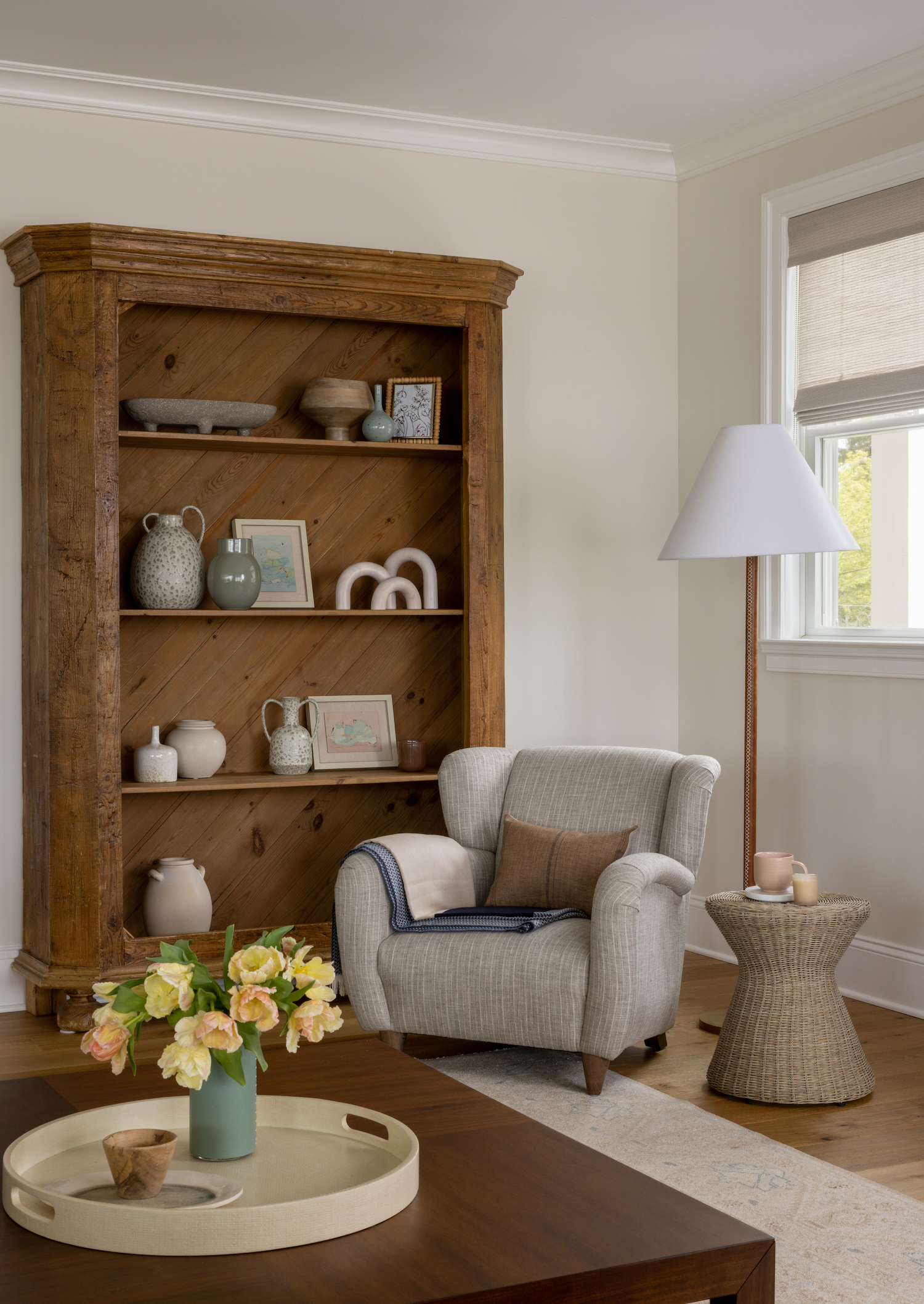
Like what you see? Take a peek at the talent behind the story… Interior Design for Feature Image: RS Design Management · Photography: Raquel Langworthy · Stylist: Deirdre King Creative