When you hear ski chalet, ‘light’ and ‘airy’ probably aren’t the first words that come to mind. A typical après-ski escape is dark and moody, and you don’t think twice about walking in with your boots on, right? Not today’s Ontario gem! Owner and Designer, Andrea McQueen, took this ’86 build and implemented a dreamy renovation plan that resulted in the modern (yet still very cozy) vacation home you see below. If you’re in need of last-minute holiday decorating ideas, the halls are decked and ready to deliver a bit of merry inspo your way.
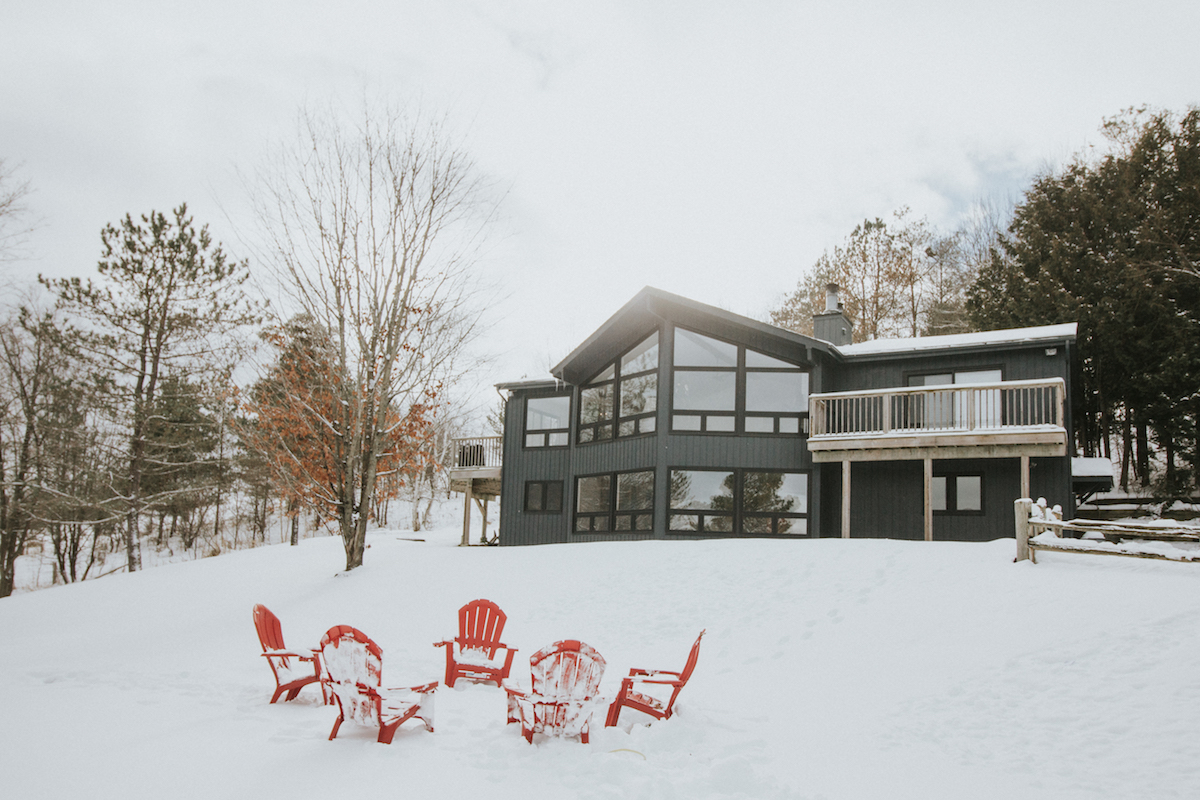
From Andrea McQueen Design… Our chalet is located hillside on a ski club property, just outside of Thornbury, Ontario, Canada. It is a classic A-frame chalet, built in 1986, and was in original condition until our recent renovation. We were drawn to the incredible views (the entire front is windows), open concept layout, and tons of natural light. We loved the fact that our kids could walk to the ski hill and our property offers so much to do, it’s perfect for sledding, hiking, and apple picking in the fall. The 1986 retro vibe felt cozy to us for the longest time, and the views of the Niagara Escarpment are beautiful in every season (especially the winter—you look out the windows and feel like you’re in a snow globe).
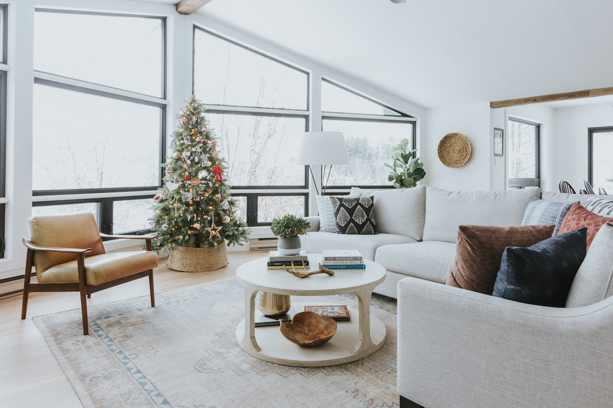
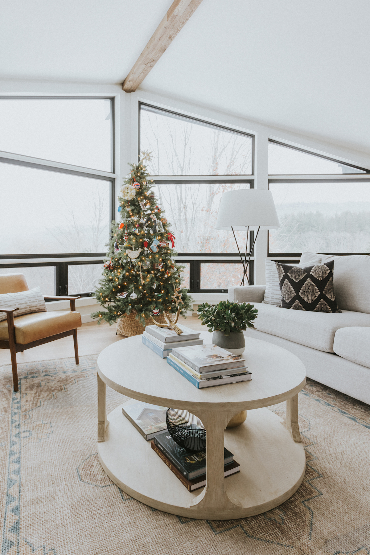
When Covid hit in March, and we began spending more time up north, that’s when I really began to conceptualize the design of our renovation. My biggest inspiration came from the outdoors, we are surrounded by trees and mountain views on all sides. I wanted to let the views be the focus, and the interiors to reflect the look and feel of the changing seasons, providing a cozy and comfortable cocoon for our little family to spend time together and to get away from it all. I, of course, also had Christmas in mind when dreaming up the design, as we spend the holidays here every year. I basically designed the layout of the family room around our giant tree!
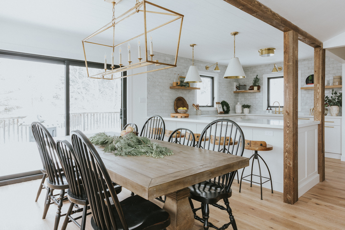
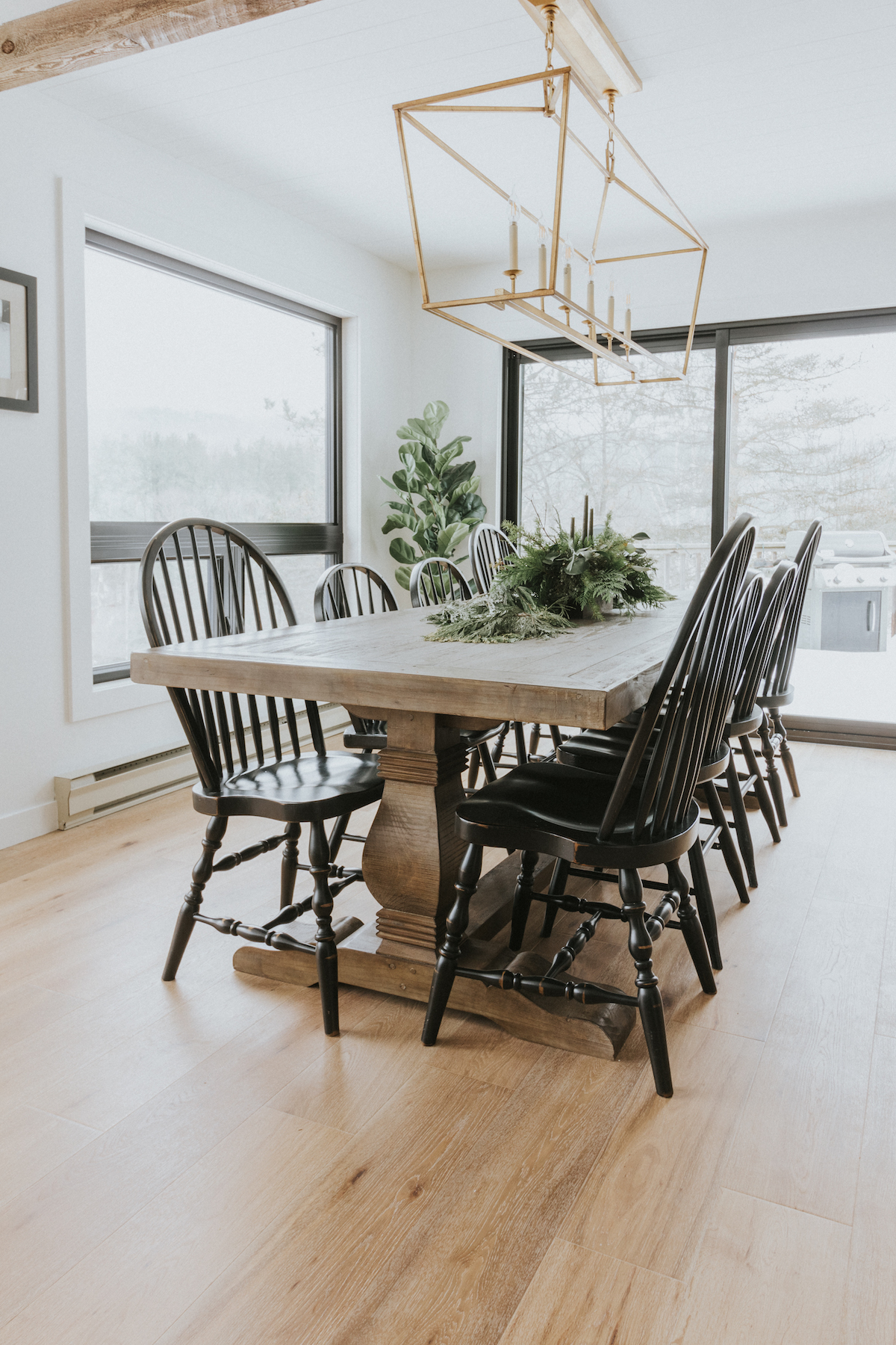
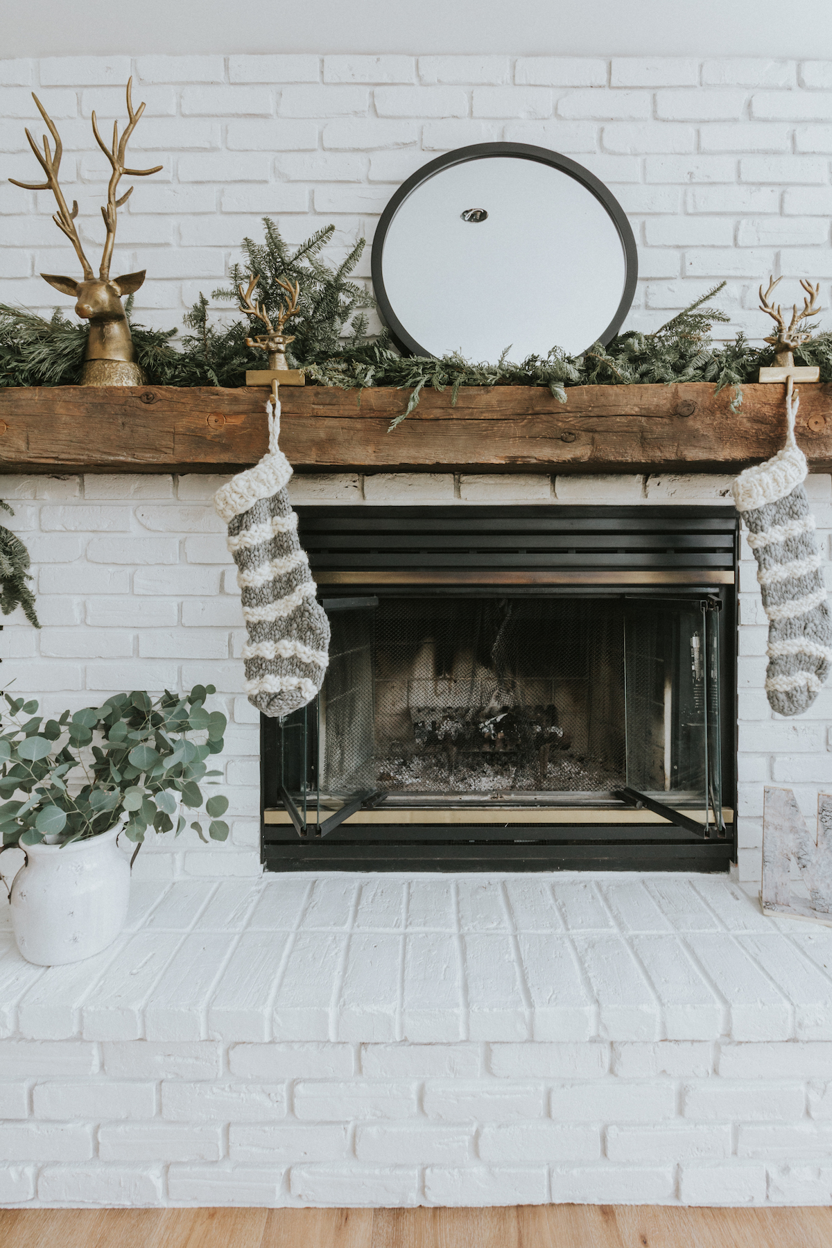
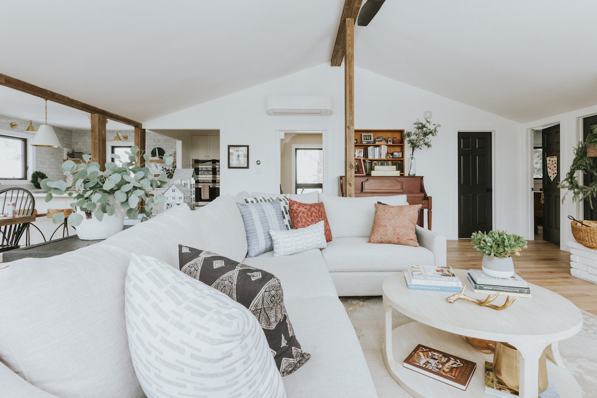
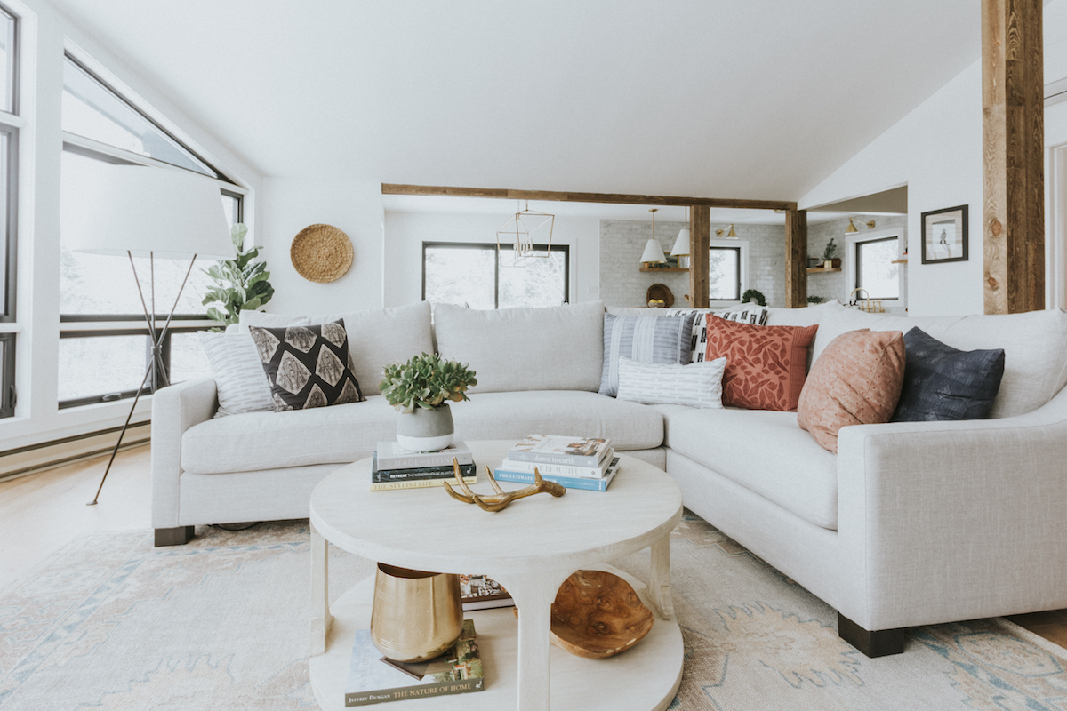
In terms of what needed to be done, all of the windows needed to be replaced, and I wanted to improve the functionality of the kitchen while updating the overall look. The feel that I kept coming back to was “modern cozy chalet” (is that a thing? Can I make it one?). The existing layout was perfect for casual entertaining, with the kitchen, dining, and living area on the main level. We entertain a lot during ski season, and a typical après ski will involve a few families and a lot of kids, so all of the fabrics that I chose are performance textiles and very kid-friendly and livable. I added a big custom sectional, with enough room for everyone to sink into during family movie nights. I wanted the color palette to reflect our surroundings, so I purposely kept it fairly neutral, with whites, greiges, and rustic touches like the reclaimed wood beams, white oak flooring, and original fireplace mantle. Texture was added by layering in textiles (I am obsessed with those Myra Scott pillows), a vintage-looking rug, and introducing warm brass accents and fresh greenery throughout.
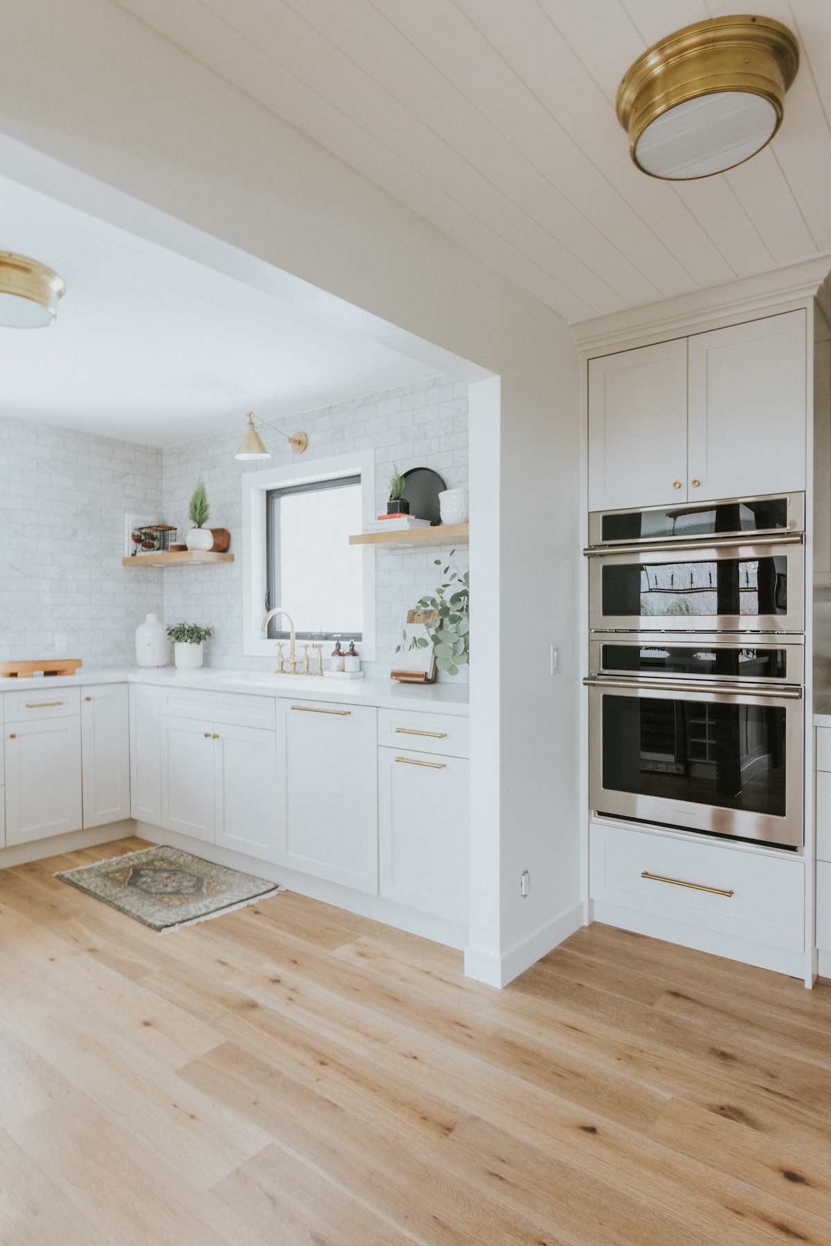
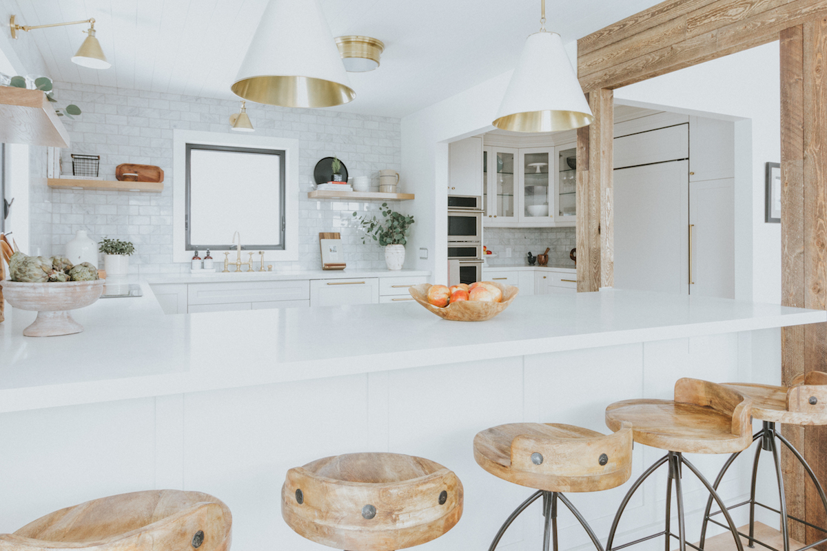
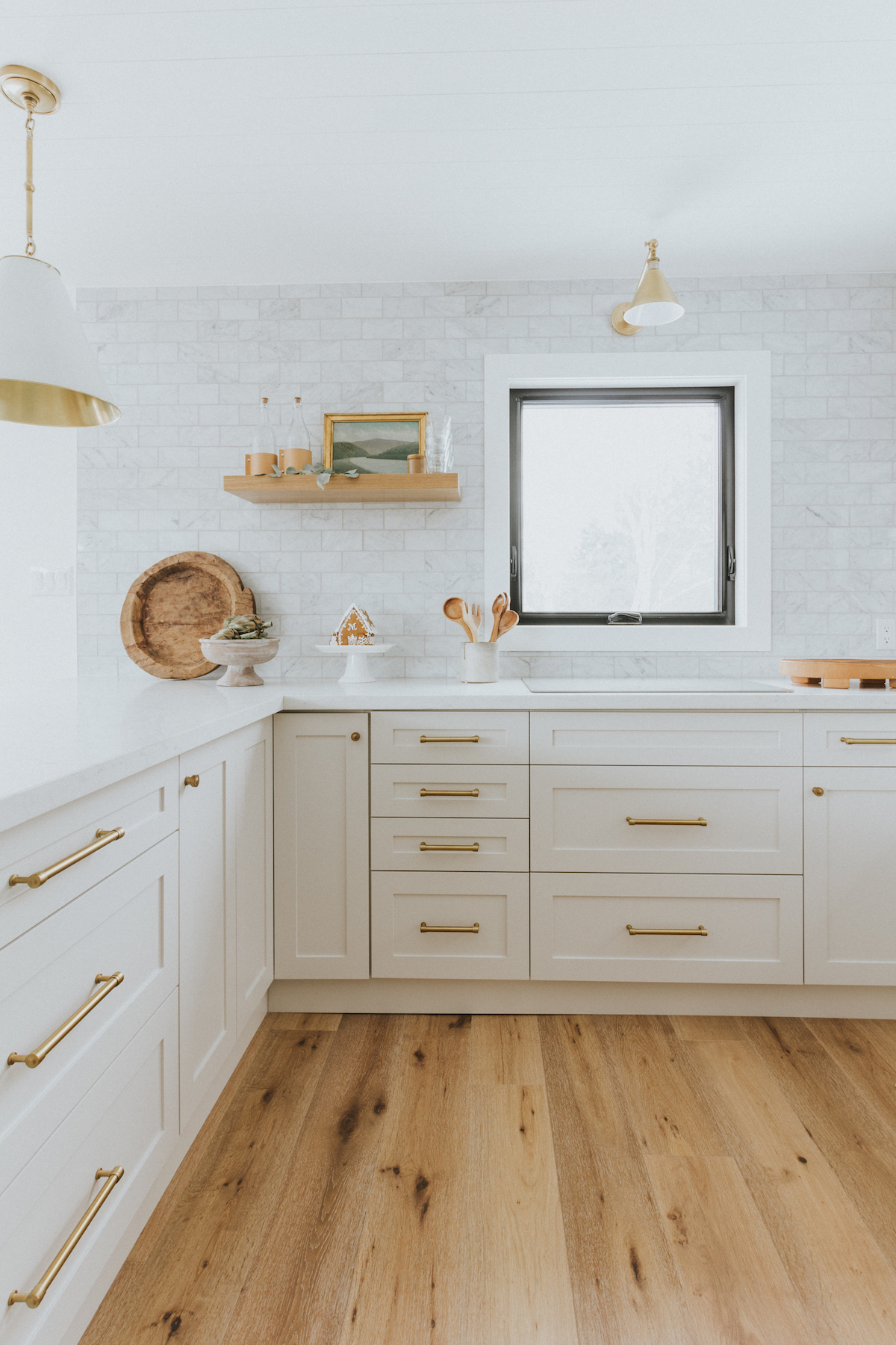
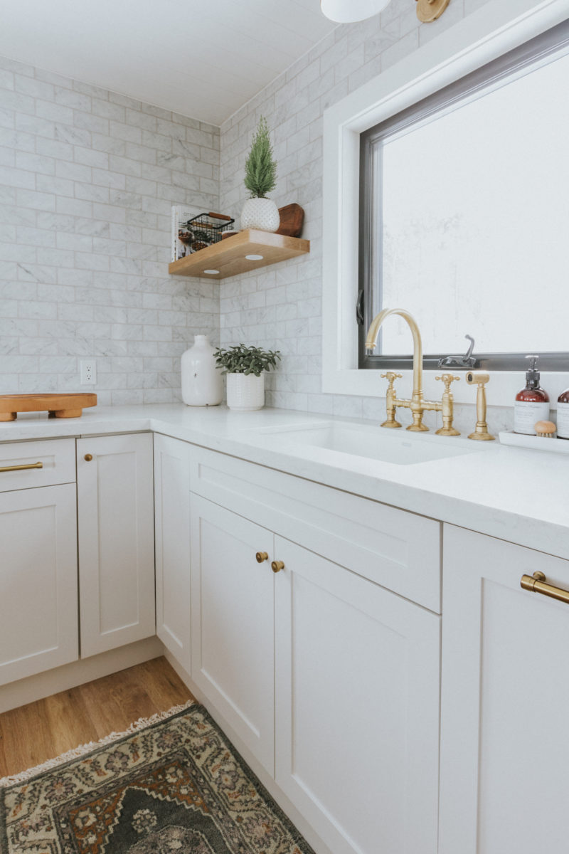
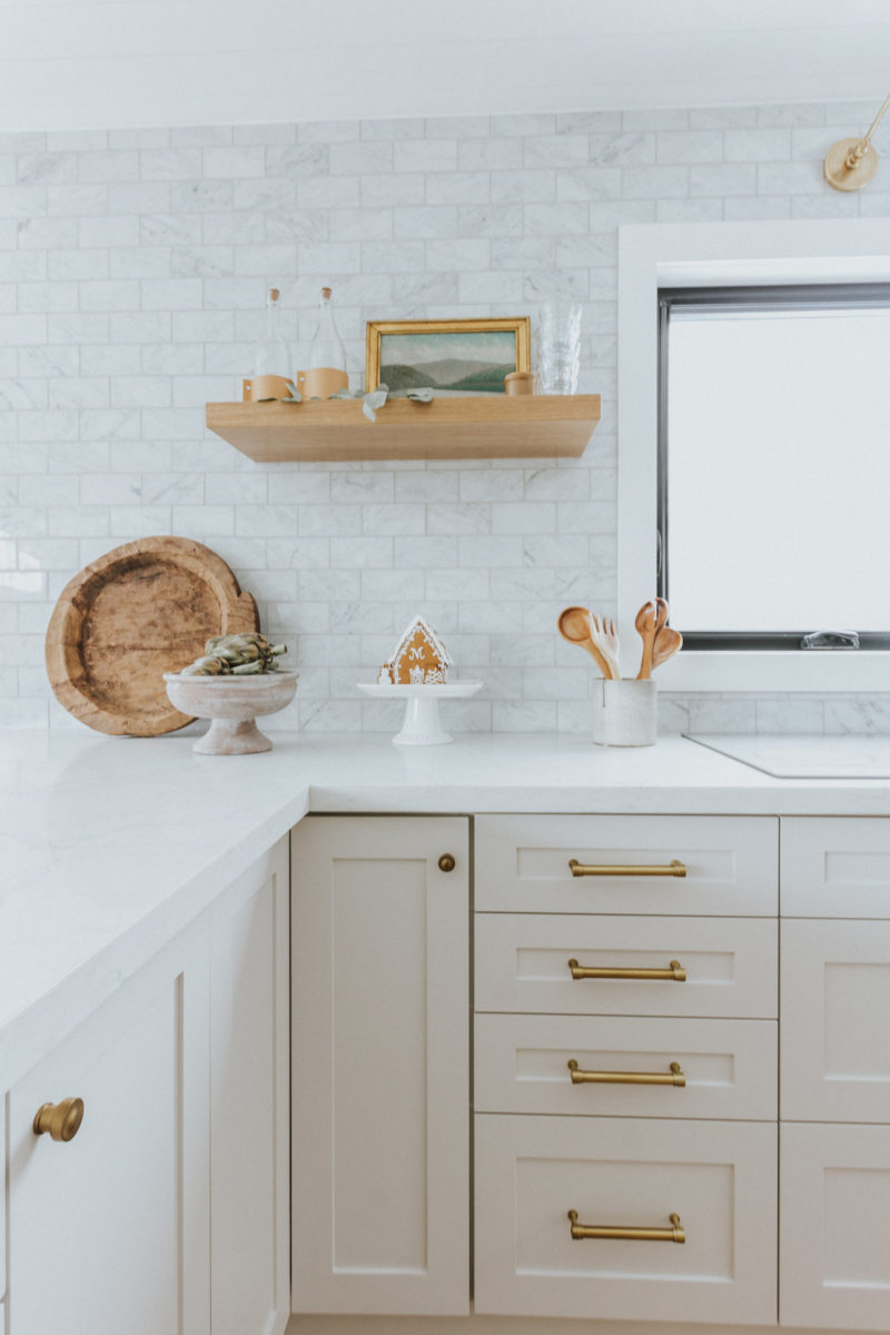
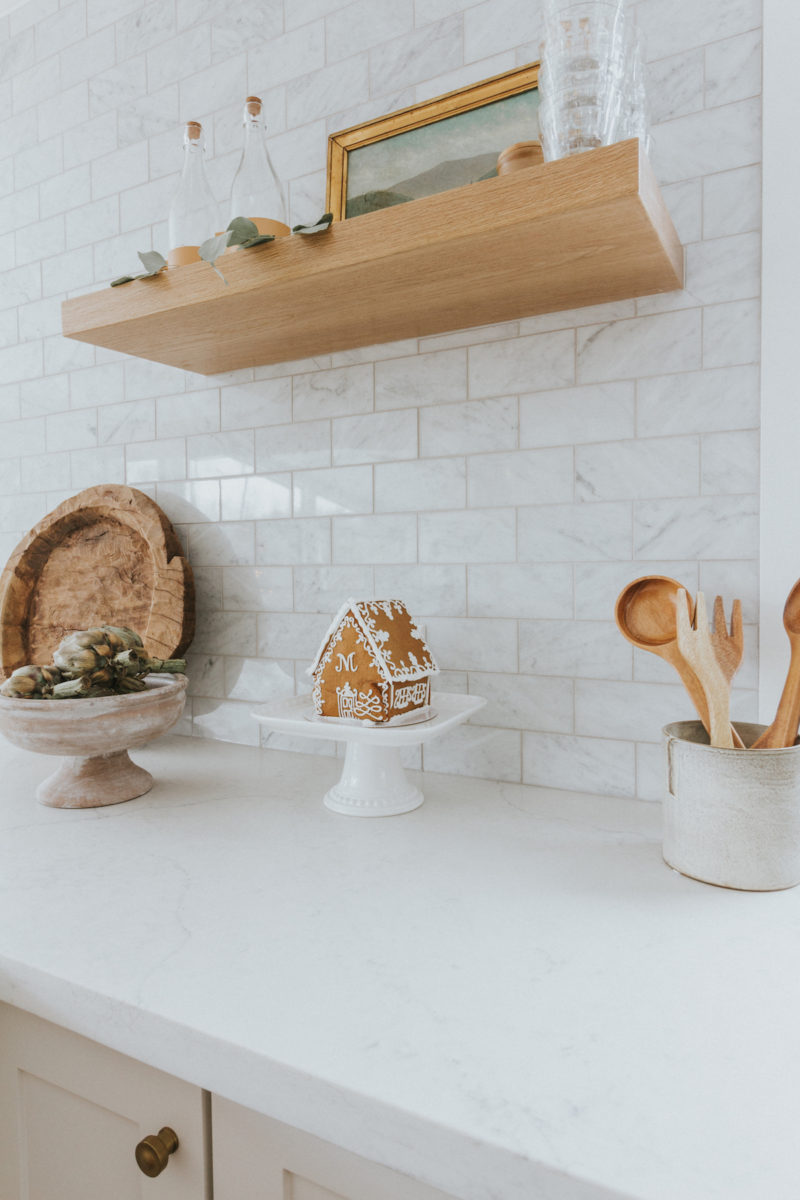
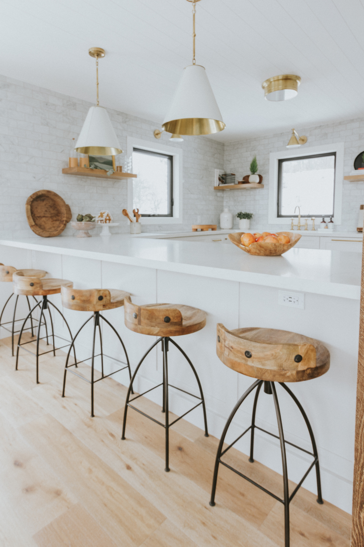
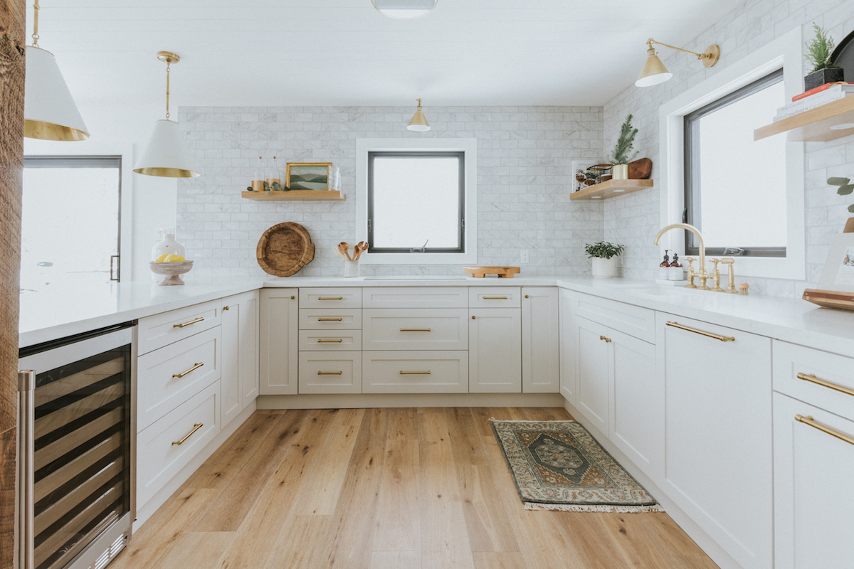
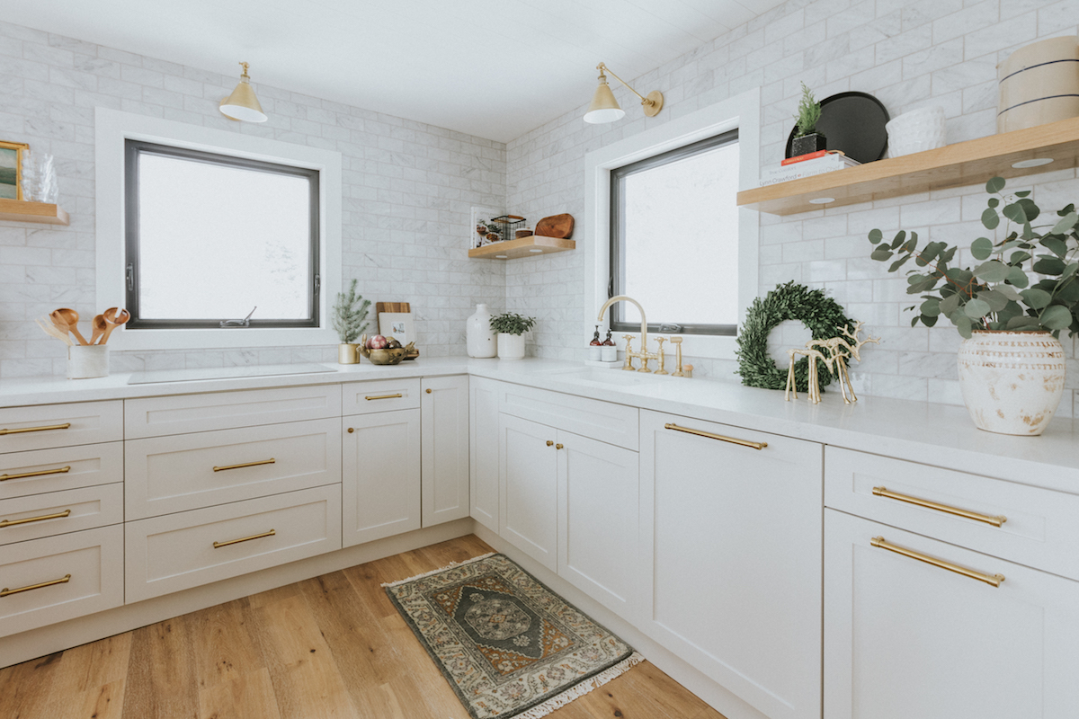
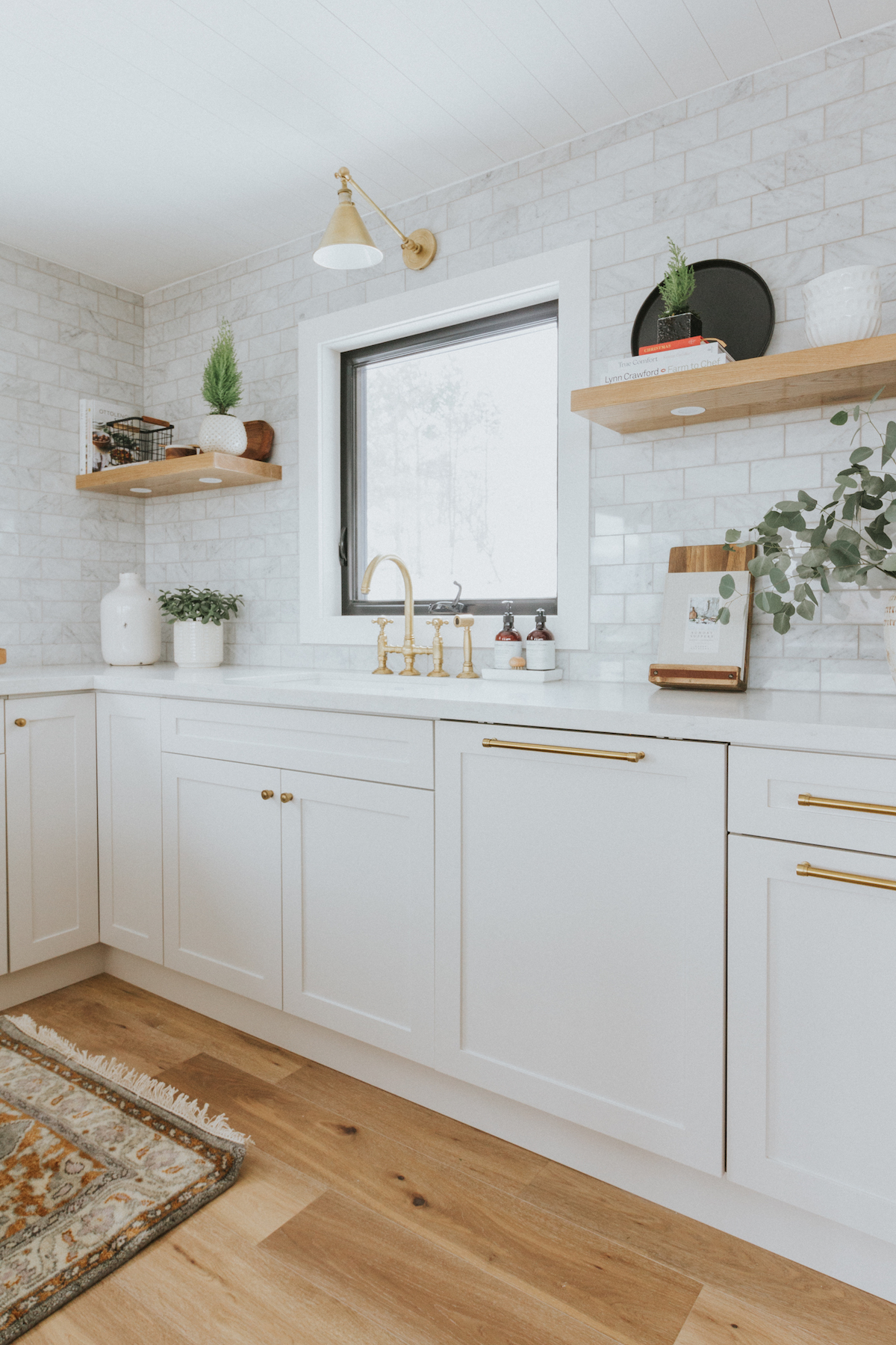
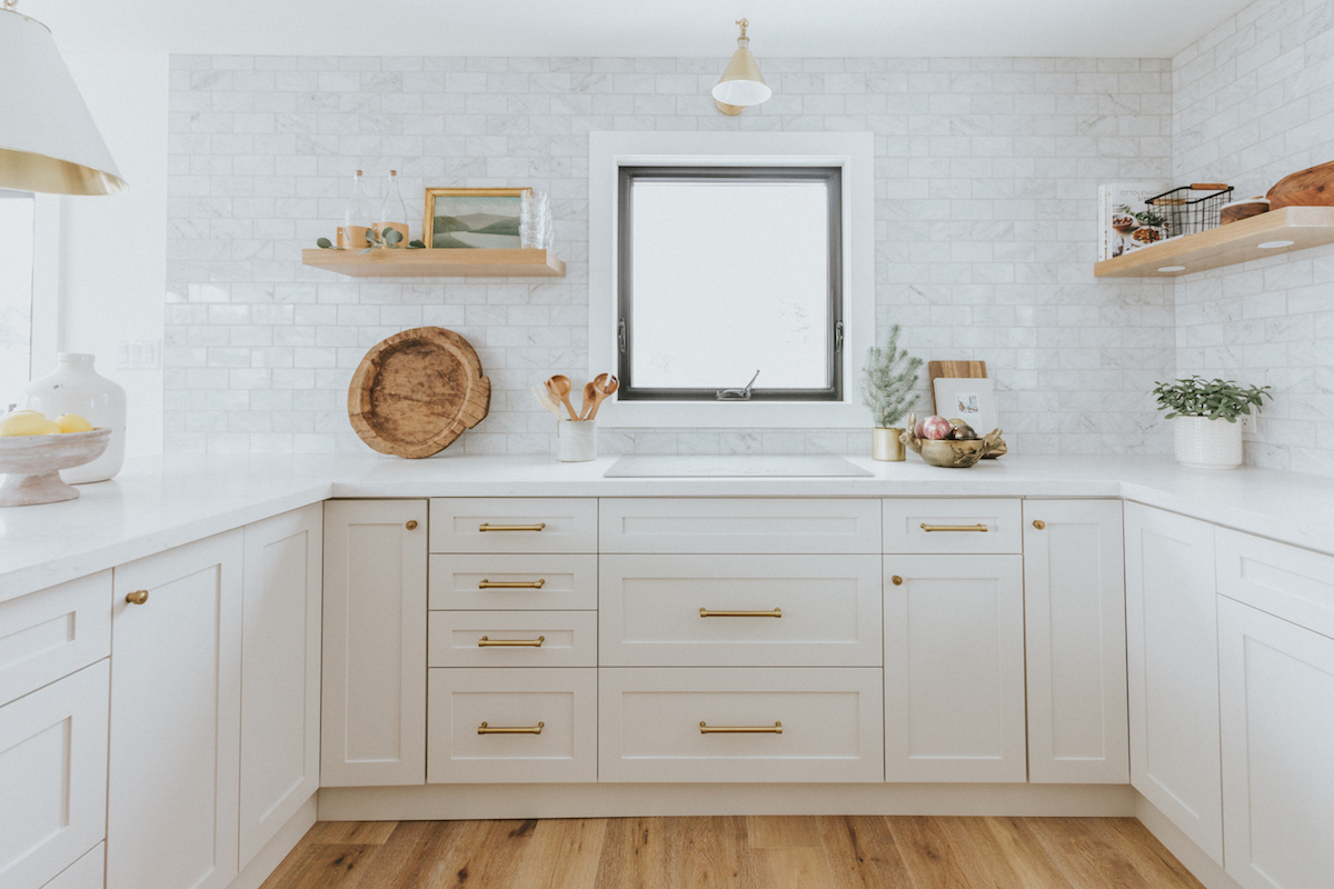
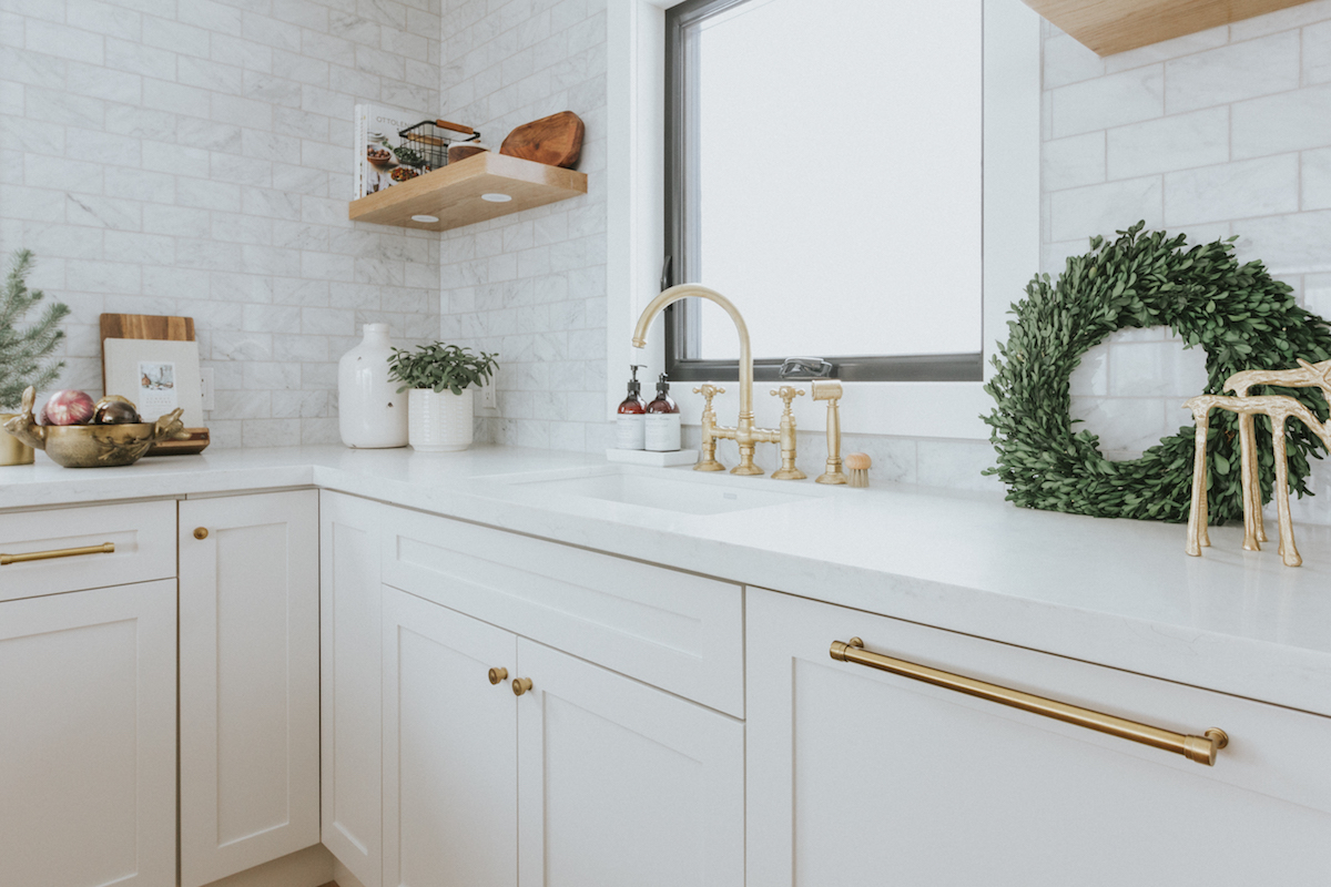
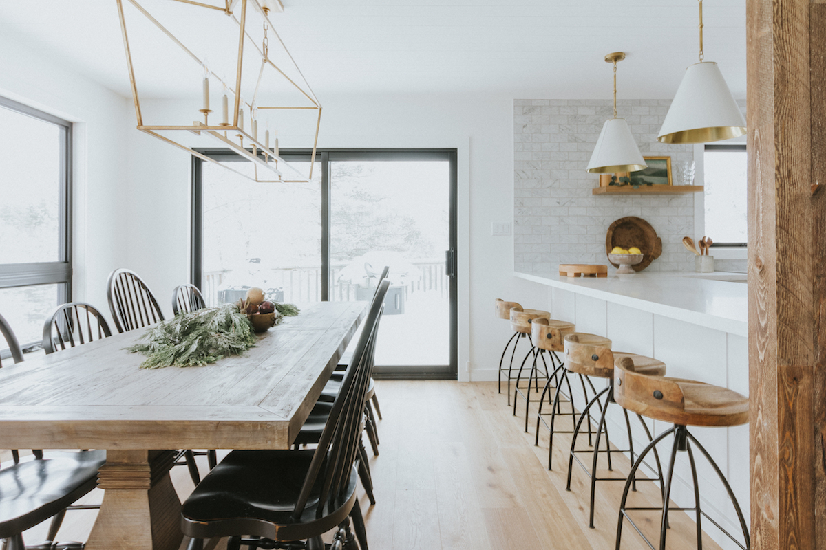
We spend a ton of time in the kitchen, especially during the holidays, entertaining family and friends (when it’s not a pandemic!). I really wanted to focus on improving the functionality and flow, so I extended the island to accommodate extra seating and an under-counter wine fridge and invested in amazing Monogram appliances that have simplified our lives (the speed oven can roast a whole chicken in 12 minutes—Sunday dinner made easy!). We added double ovens, an induction cooktop (which is foolproof and so easy to keep clean), and I paneled the fridge to keep the look streamlined. I broke up the expanse of wall space in the kitchen with custom white oak shelving that keeps everyday items within easy reach, and also displays some of my most loved treasures (like the 300-year-old vintage French landscape painting, it reminds me of the Beaver River, which runs through the property).
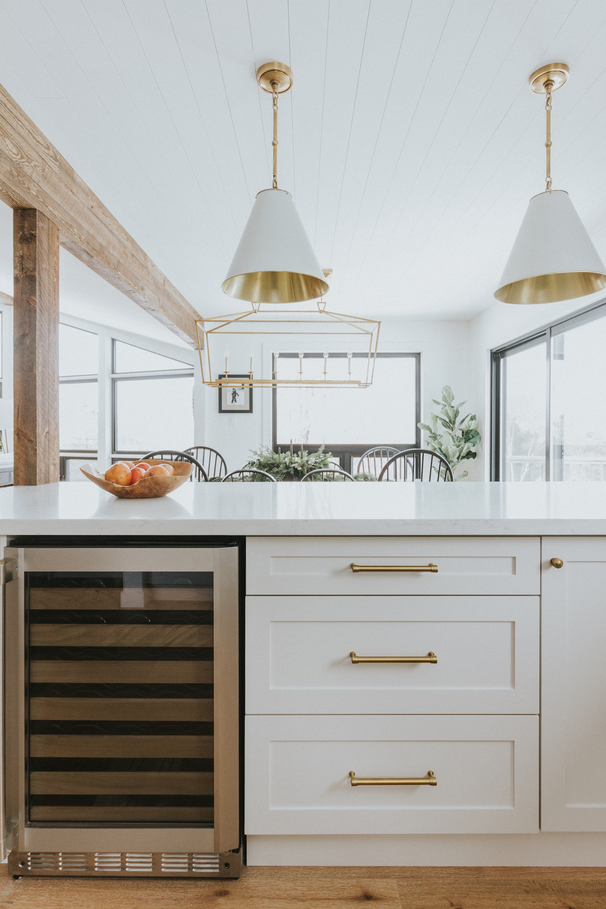
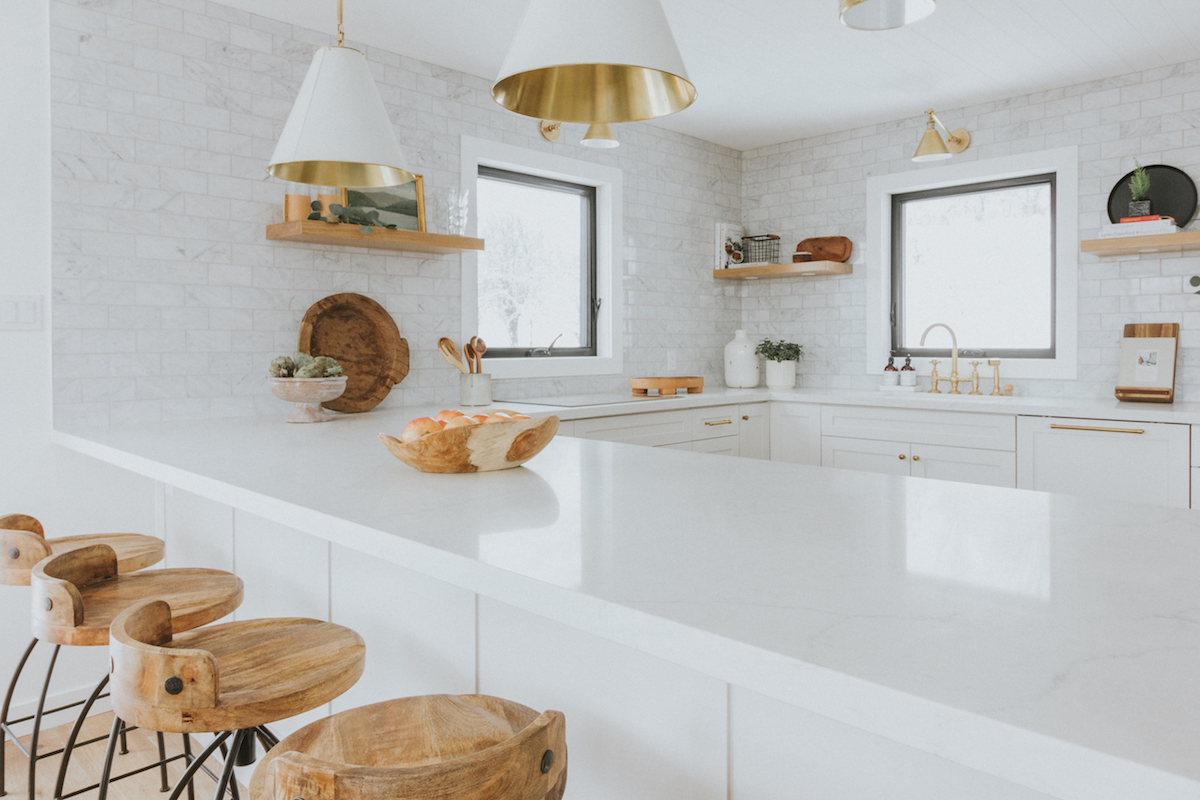
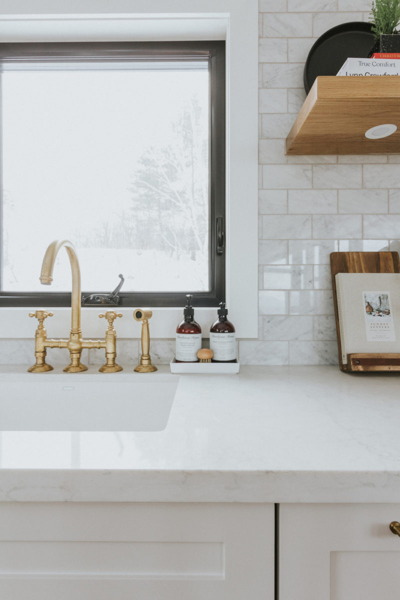
I also purposely stayed away from recessed lighting in favor of a combination of task, under cabinet, and flush-mount fixtures, and put everything on dimmers. This combination makes the kitchen feel warm and cozy. The first items that I sourced for this project were the faucet and the pendants. The faucet is an unlacquered brass with a living finish, which will patina beautifully over time. I really wanted this kitchen to be a space that would still look and feel comfortable for years to come. I’ve had my eye on those pendants for a while now and knew that they’d be perfect for this project. They are fairly modern, so I purposely kept the other elements, such as the Carrara backsplash and counters, more classic. The new kitchen has almost doubled our storage space and is such a pleasure to cook in. My kids love cooking and baking and have been putting it to good use! We are so thrilled with how everything has turned out, and can’t wait to spend the holidays together in our “new” home.
Love what you see? Take a peek at the talent behind the story… Interior Design: Andrea McQueen Design · Photography: Claire Roberts
