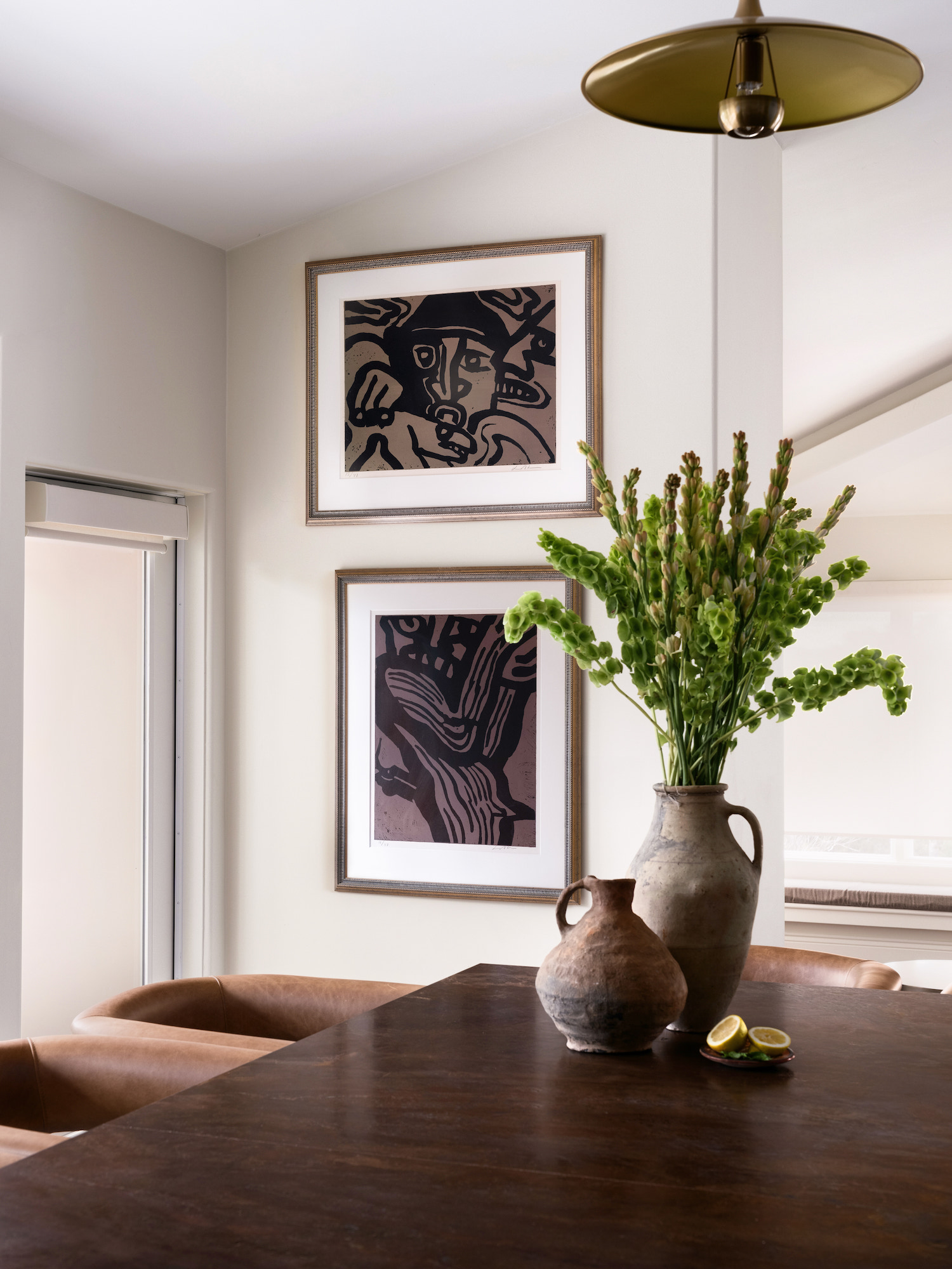
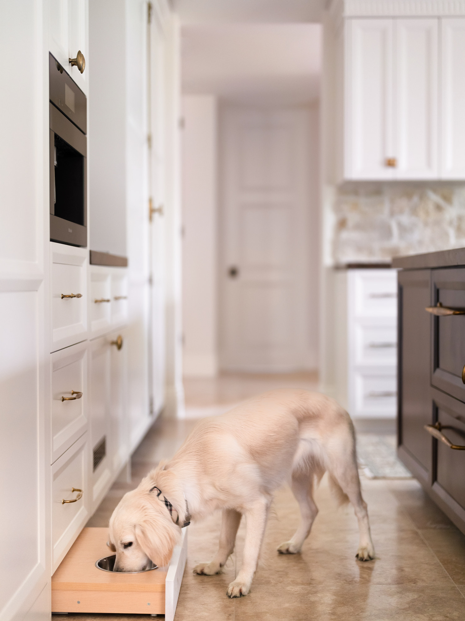
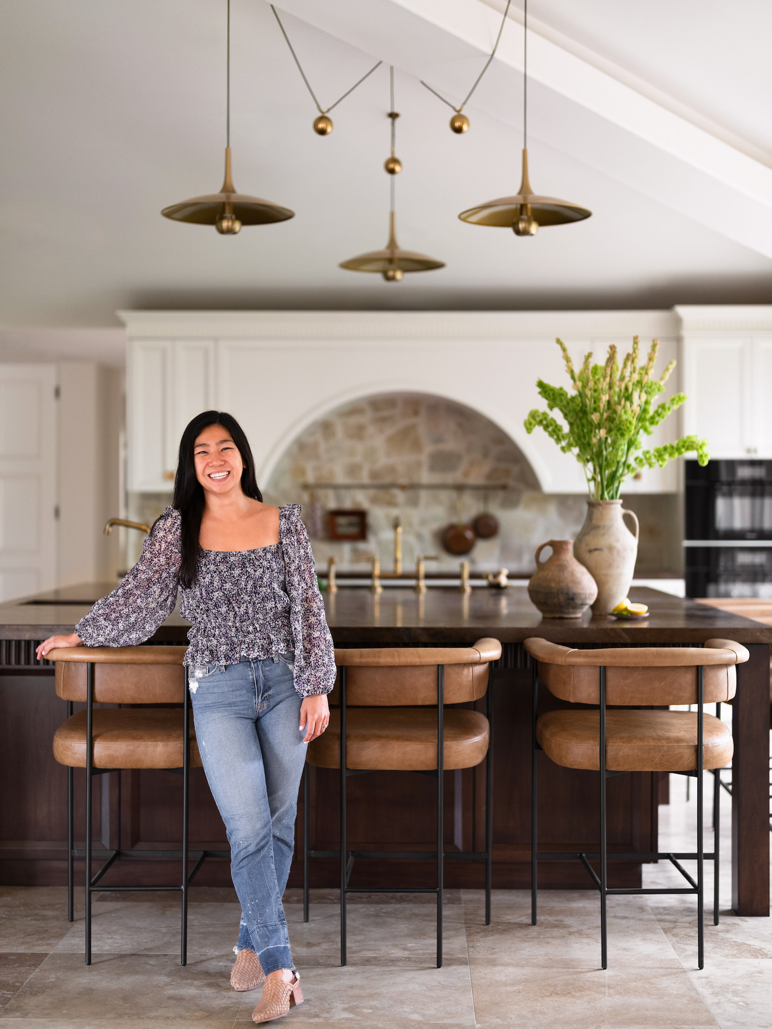
We’re thrilled to bring you the first look at an incredible kitchen transformation in this sprawling 10,000 sq ft estate in Rancho Sante Fe. Designer, Kristyn Harvey, leaned into the home’s Mediterranean Castle charm and blended it with inspiration from a family heirloom to create warm, eclectic, and family-friendly space. James Furman did an incredible job capturing the thoughtful details of this home. Keep scrolling to take the tour!
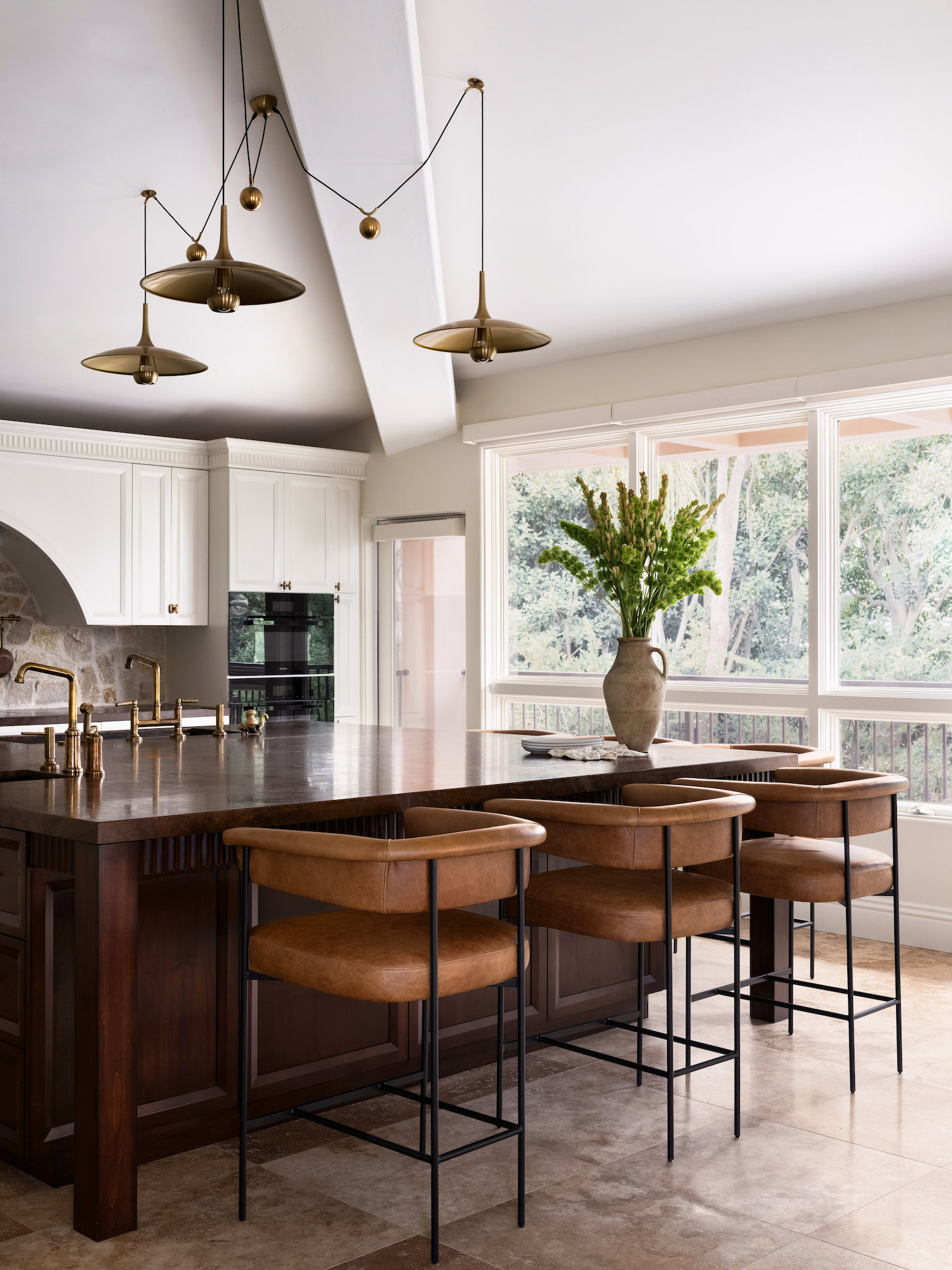
From the designer… This project was a kitchen remodel for a family of six in Rancho Santa Fe, San Diego CA. The painting you see hanging from the pot rail is a family heirloom passed down from our client’s great-grandmother. This client and I bonded over our shared sentimentality and we immediately decided that painting was going to be the inspiration for the new kitchen.
The client wanted a traditional kitchen with modern appliances. The current space was large but lacked light. The dim space was made worse with dark wood cabinetry, heavy mouldings, and corbels. The home is a massive 10,000 sq ft estate with two swimming pools and a sports court built in a Mediterranean Castle style so the client always imagined a grand castle inspired kitchen. The client was very clear about wanting more light but still keeping the space warm and cozy.
Main challenges in this kitchen design was that the family really wanted to keep the large center island that originally was 11ft x 11ft which made having a conversation or traversing the kitchen difficult. We shrunk the island to 9ft x 9ft which improved flow in the kitchen while still maintaining the grandiose feeling of a large island and instead focused on the functionality a large island could provide for the family of six.
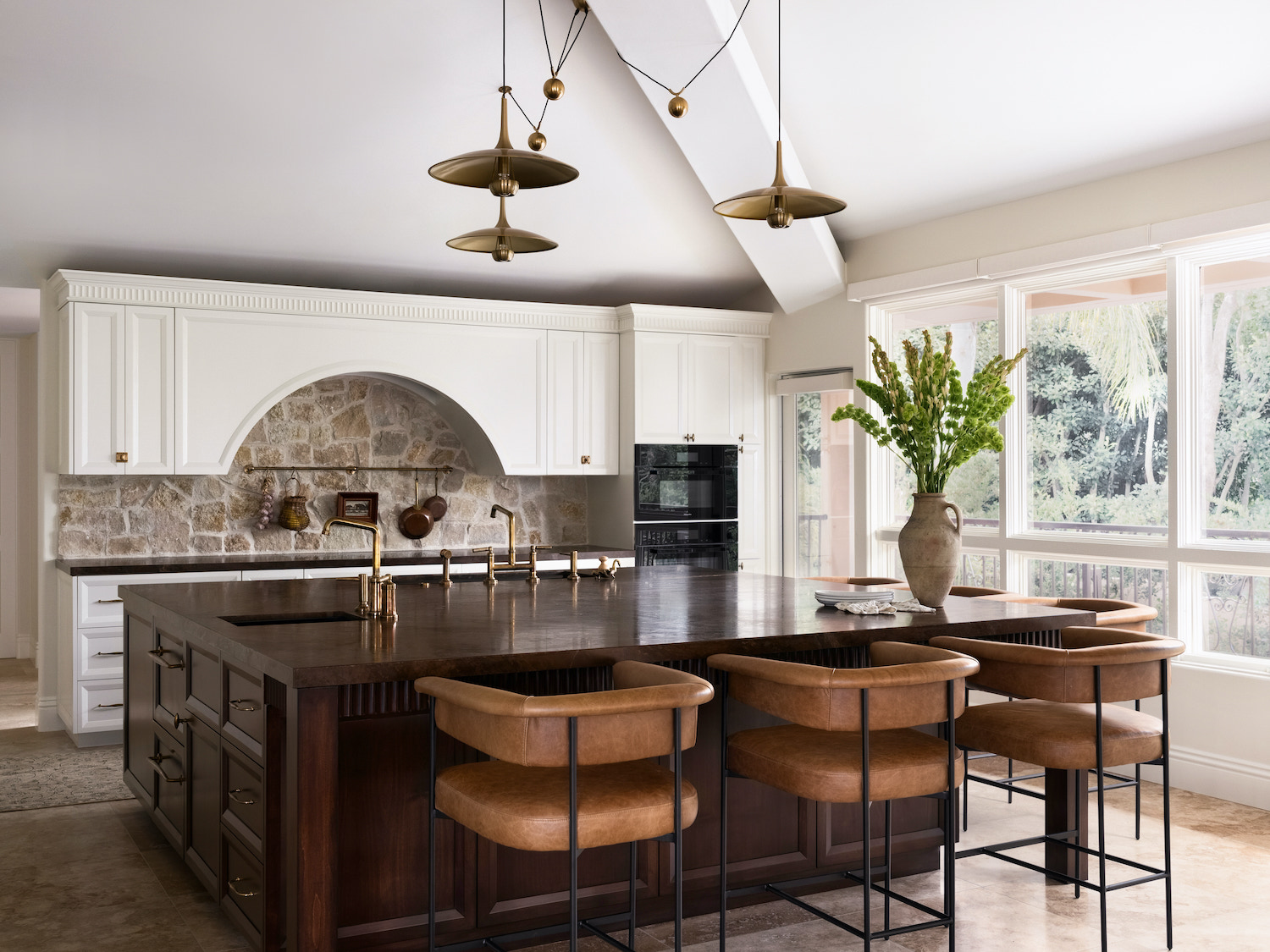
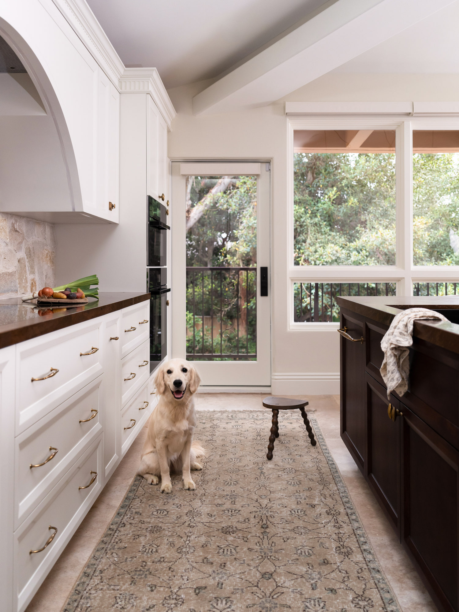
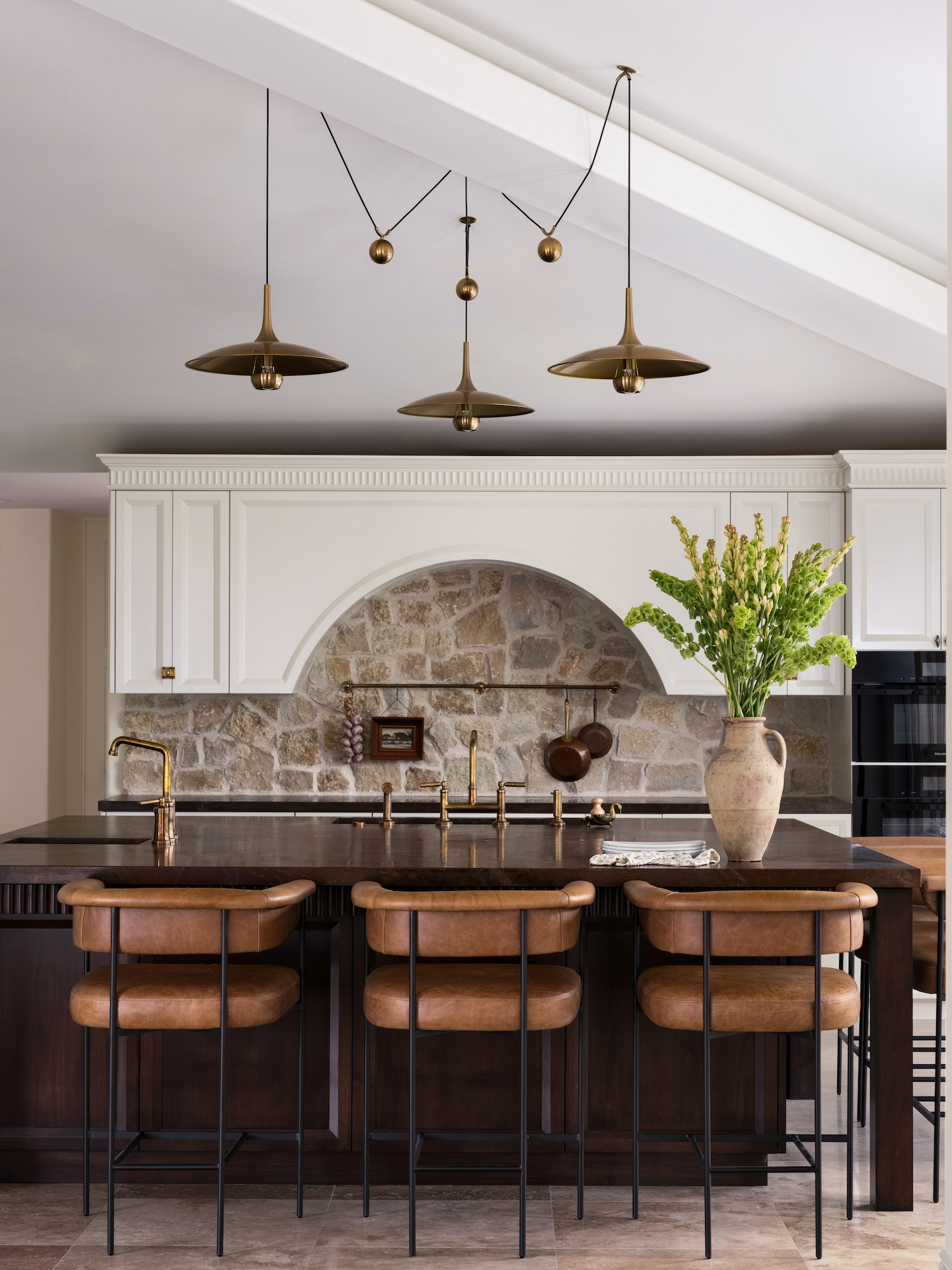
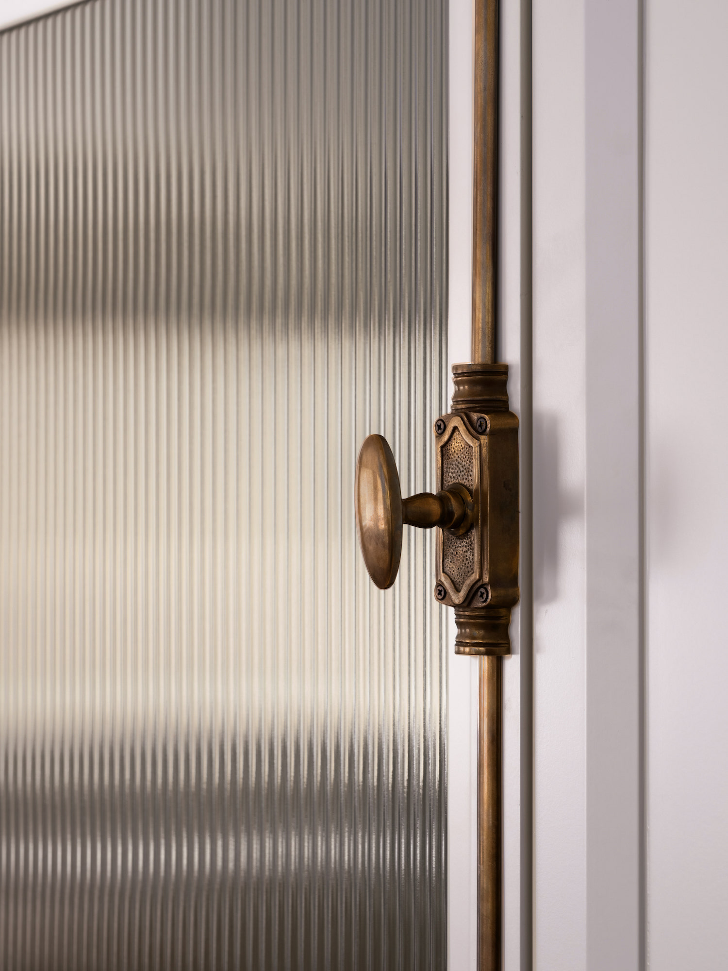
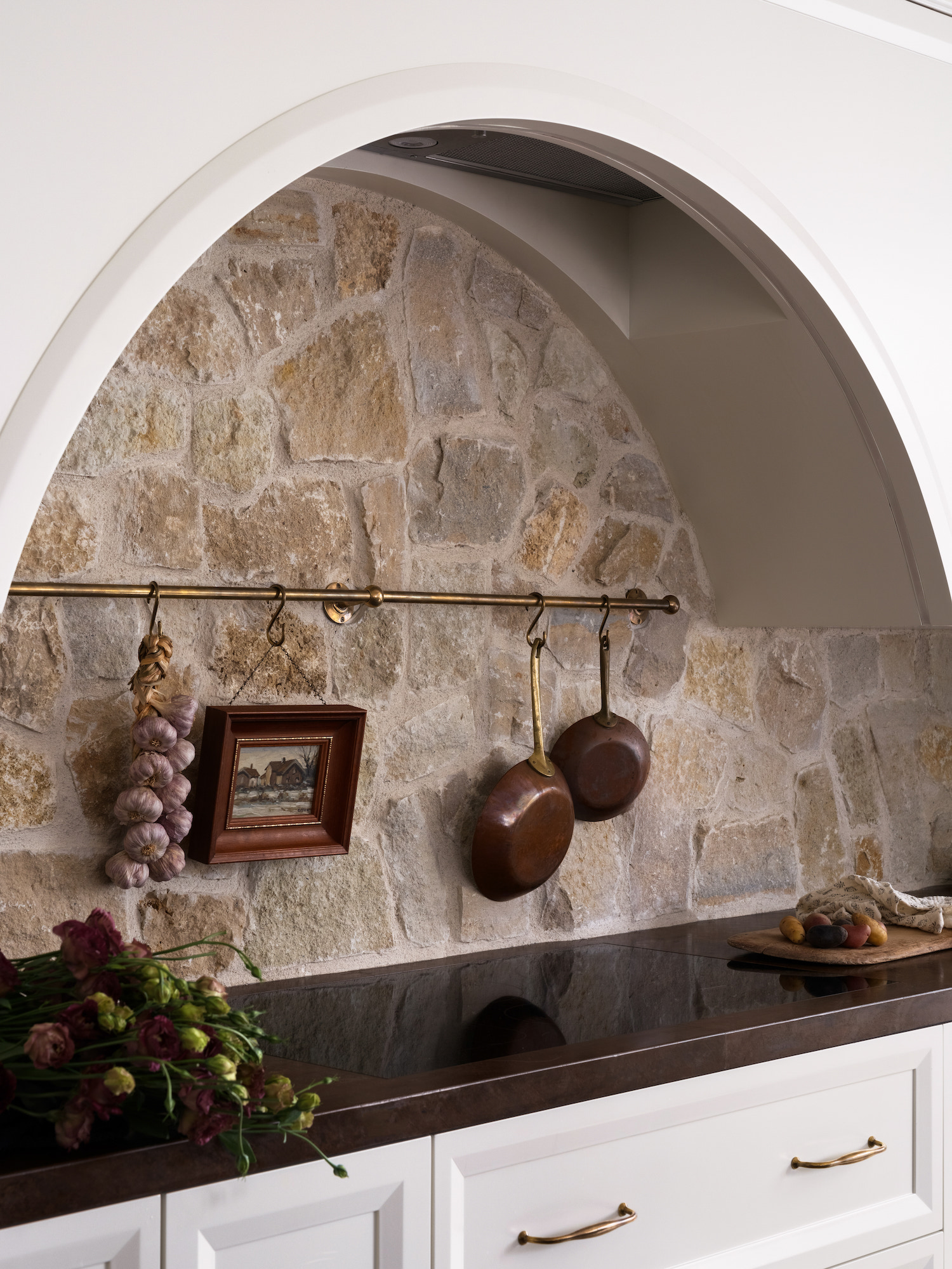
What makes this kitchen special is the thought behind the layout and functionality of every aspect of this kitchen. If you’ve ever seen what mornings look like for a family with four young kids then you know that the goal is to get the kids in, fed, and out the door as painlessly as possible.
We designed the large island to function as a kids’ breakfast buffet that encourages independence. The kids go to a tower of drawers first, they grab utensils from the top drawer, bowls out of the second, and scoop their own cereal out of the third drawer. They keep moving along the island to an undercounter beverage fridge, pour their milk and then sit down to eat. Once done they keep moving around the island, put their dishes in the dishwasher and head out the door. They are not all crowding the same area at once, there is no running back and forth dropping crumbs, just a friction free morning routine.
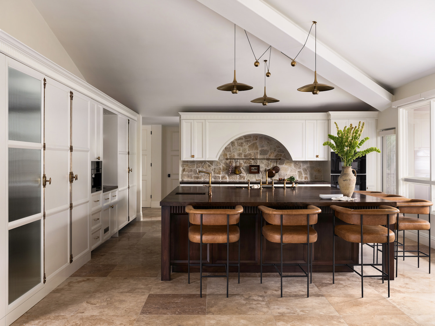
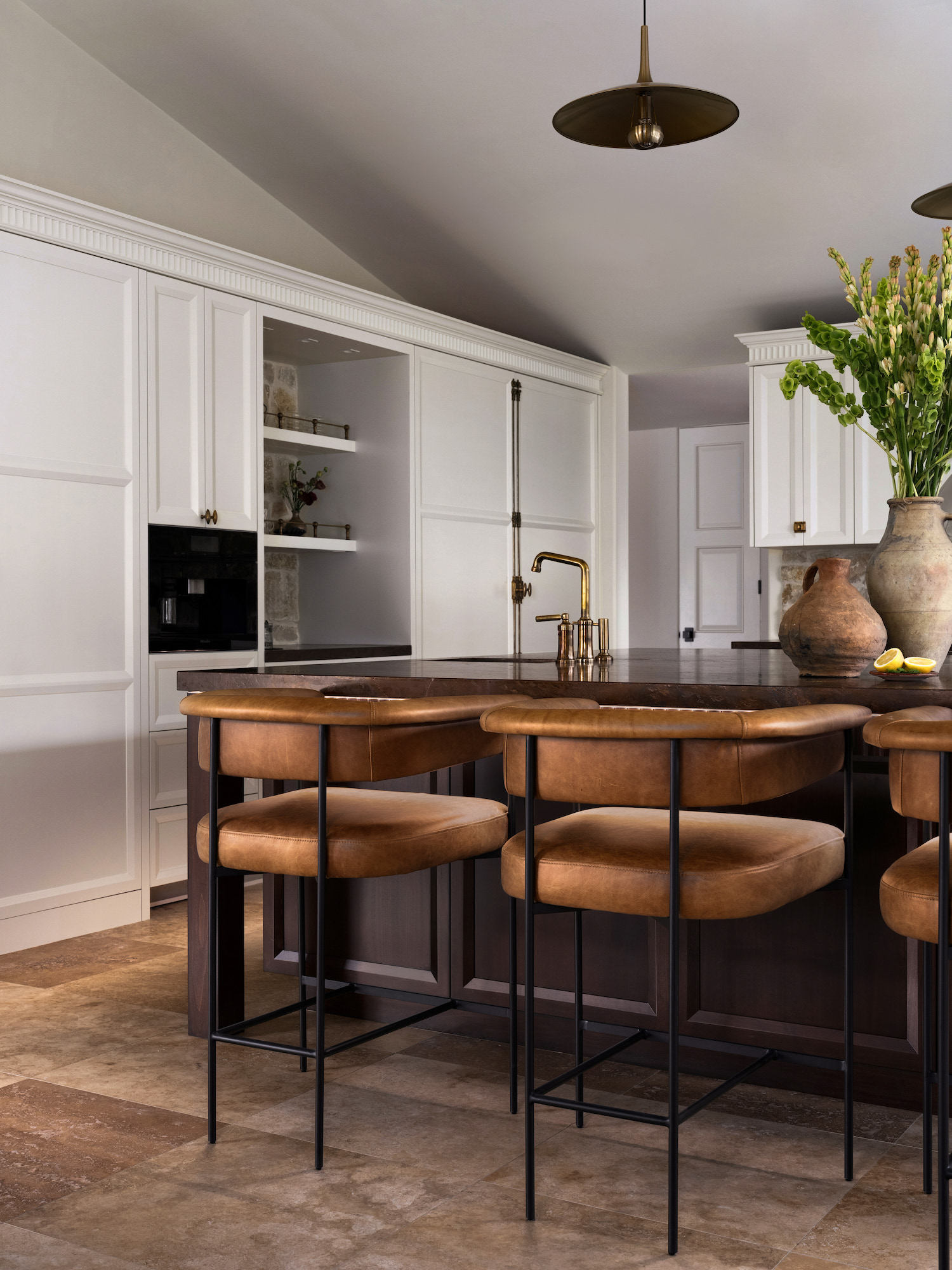
Like what you see? Take a peek at the talent behind the story… Interior Design & Styling: Kristyn Harvey Interiors · Photography: James Furman · Builder: Misael Rojas