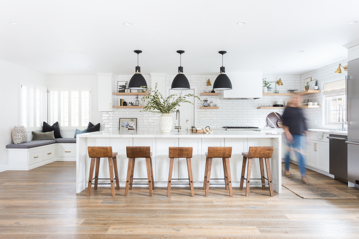
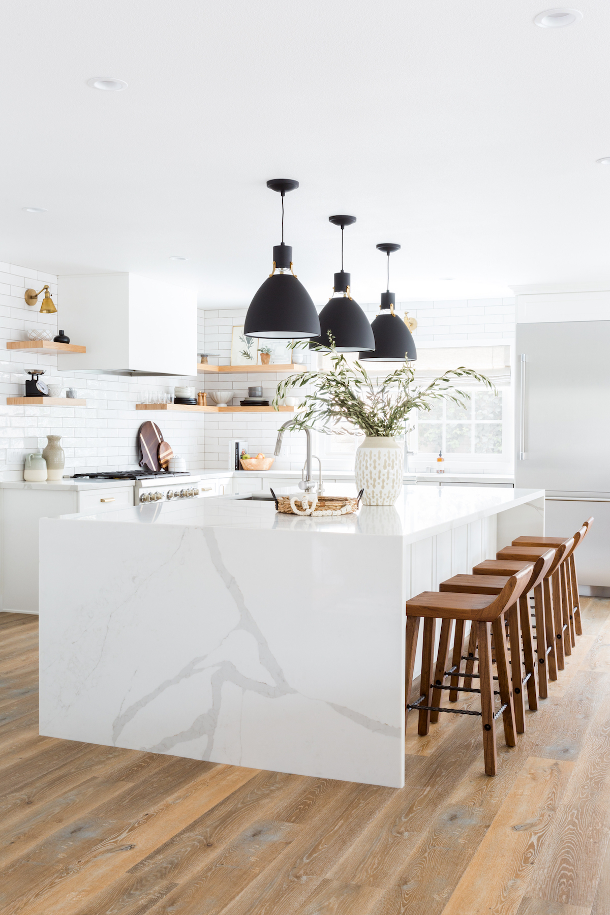
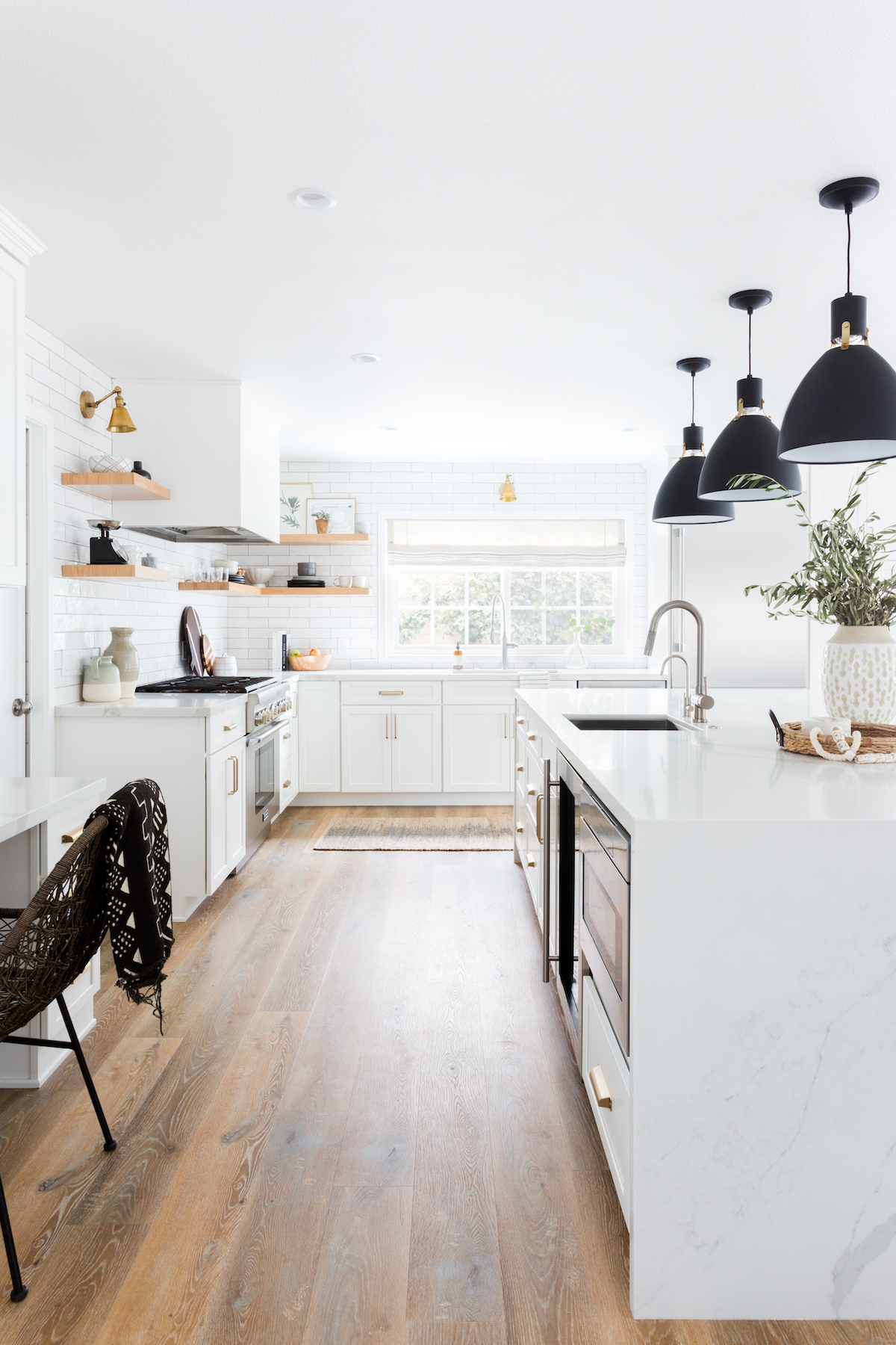
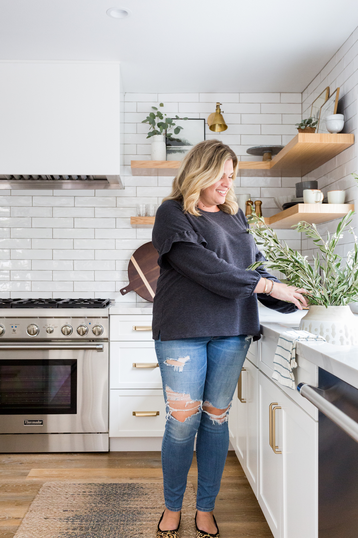
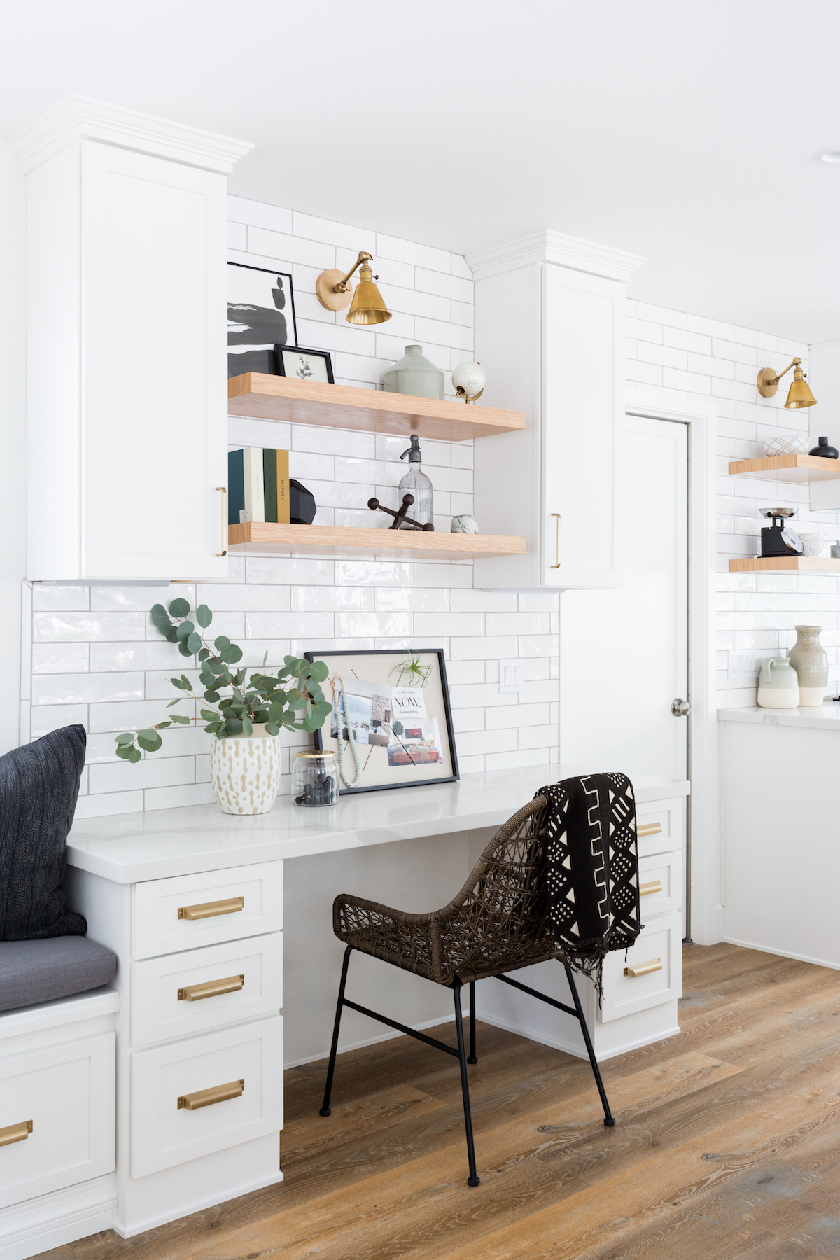
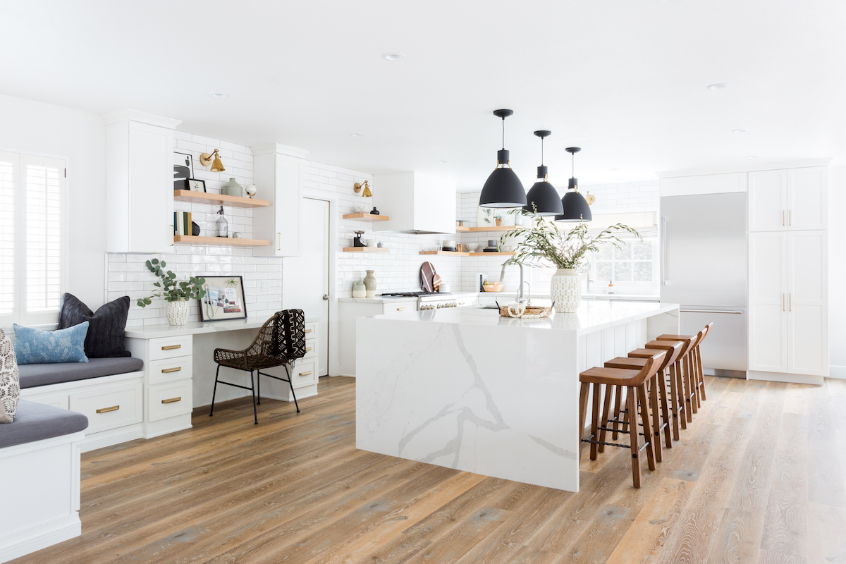
Dream kitchen alert, folks. This stunning remodel, designed by Lindsey Brooke Design, has. it. all. Waterfall island? Check. Statement pendants? Check. Seating nook and in-kitchen workspace? Check. Open shelving? Check. The list goes on. I’m quite certain you’ll be pinning at least a few of the images for safe-keeping. Lindsey is walking us through the design below, paired with snaps from Amy Bartlam, and she’s also sharing her secret tip on how to style open shelves!
Tell us a bit about this kitchen design and the clients needs. Was it part of a remodel, new build?
Our clients had a very beautiful home to start but everything was compartmentalized. They got in touch with me for a kitchen remodel but we ended up opening up the whole house in the process to make it one giant gorgeous space. We re-did the floors and raised parts of the ceiling to make it feel large and airy.
What were the top design priorities for this space?
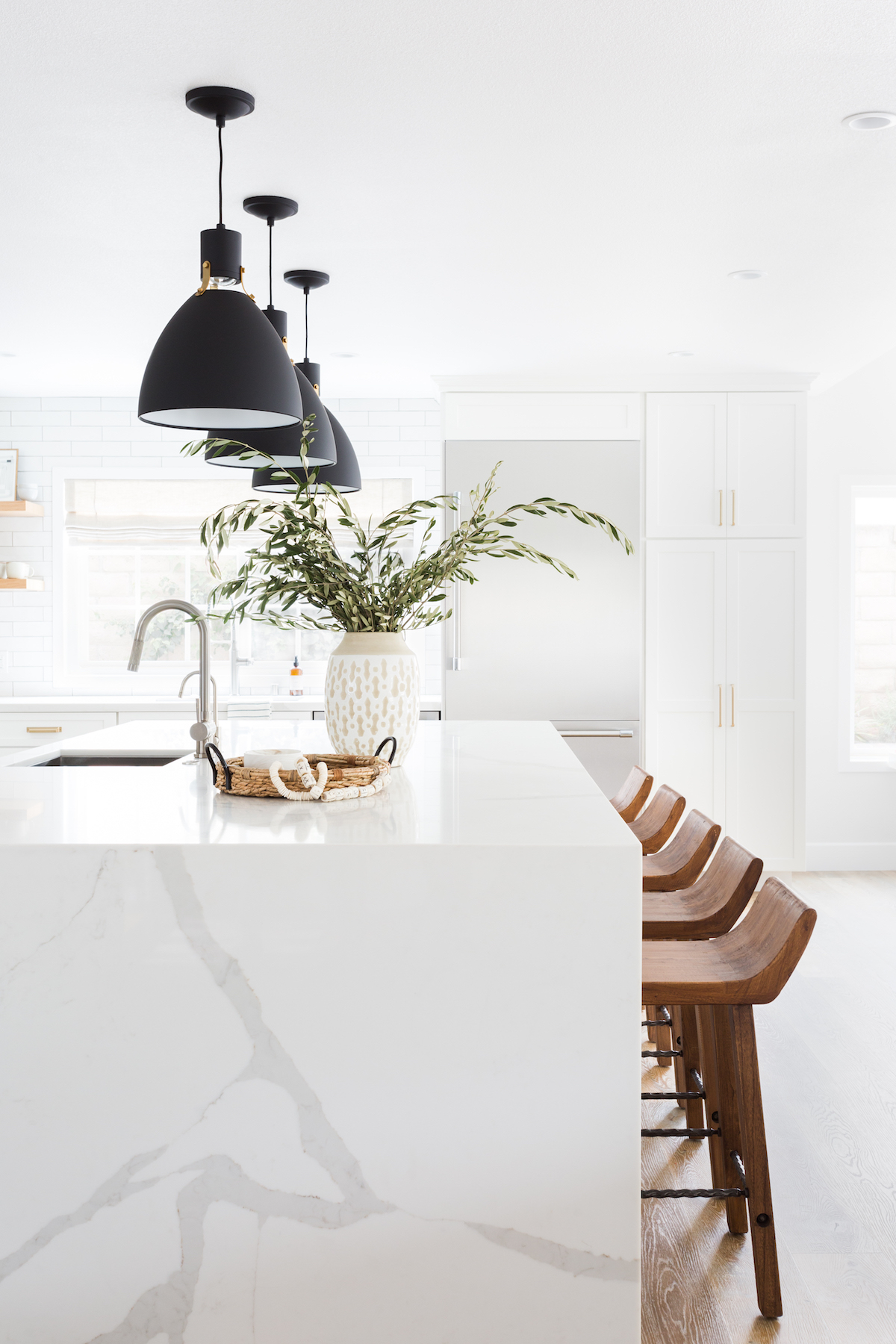
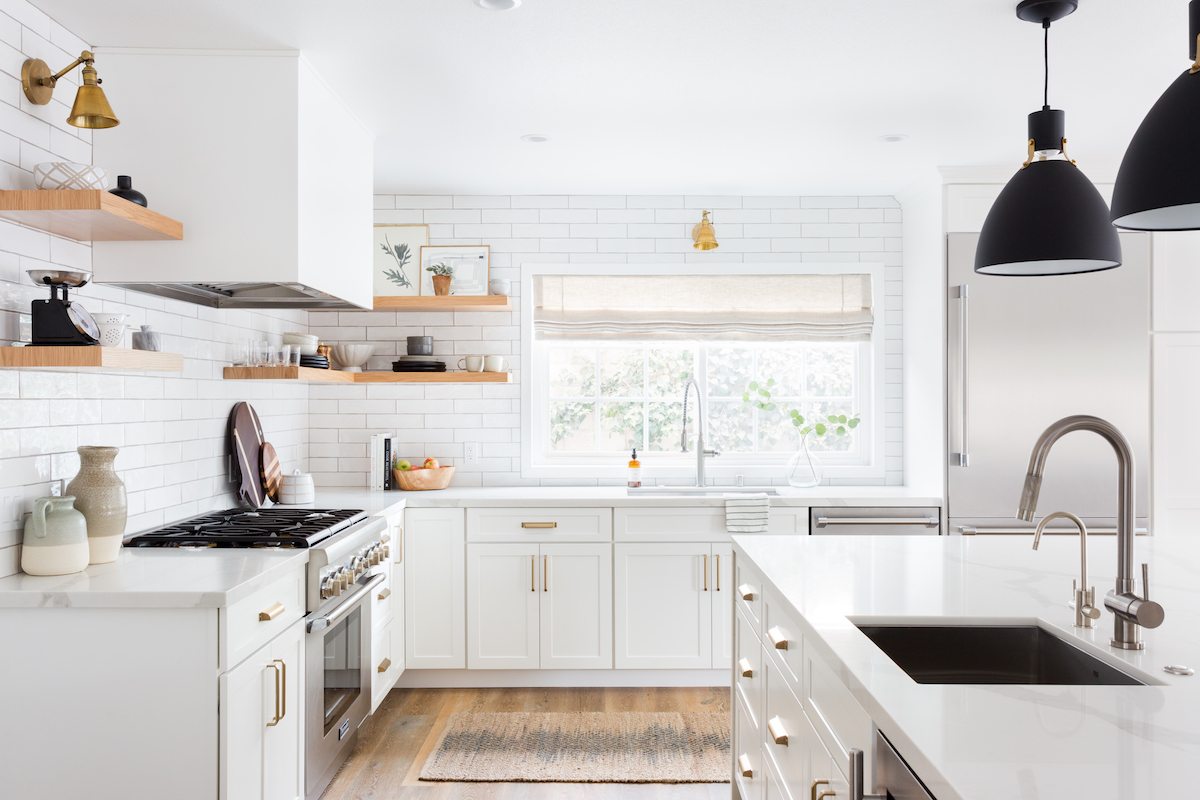
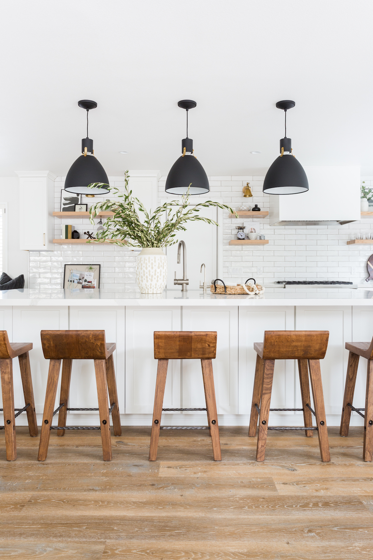
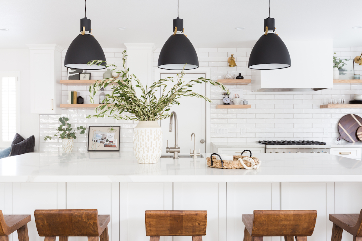
They really needed more storage as far as function goes and wanted a second sink in the island other than that is was more about making the design classic and timeless with a little edge. They for sure took risks in the design (like no upper cabinets) and that HUGE 12 foot island with waterfall edges. It was so fun to stretch our clients a little bit and see what they are comfortable with. When our clients fully trust us magical things happen.
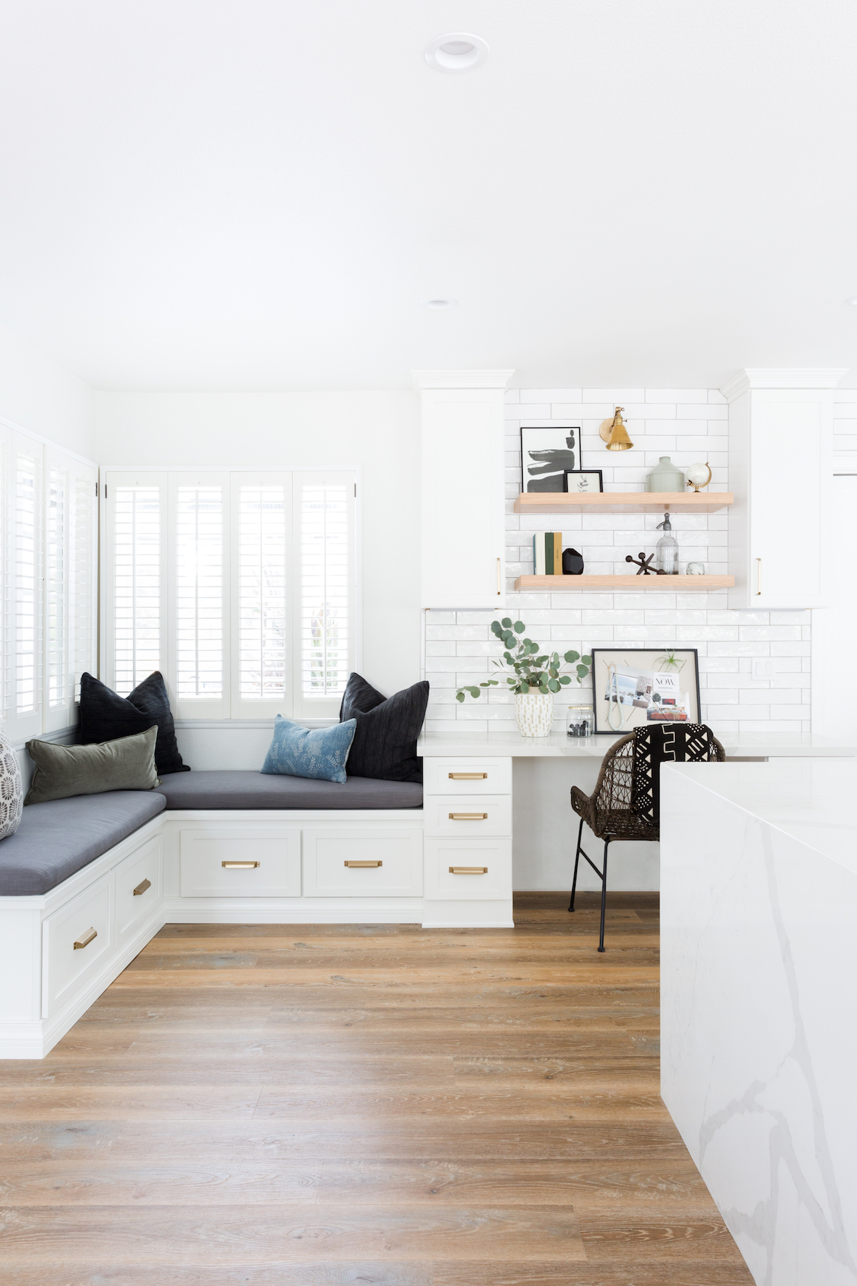
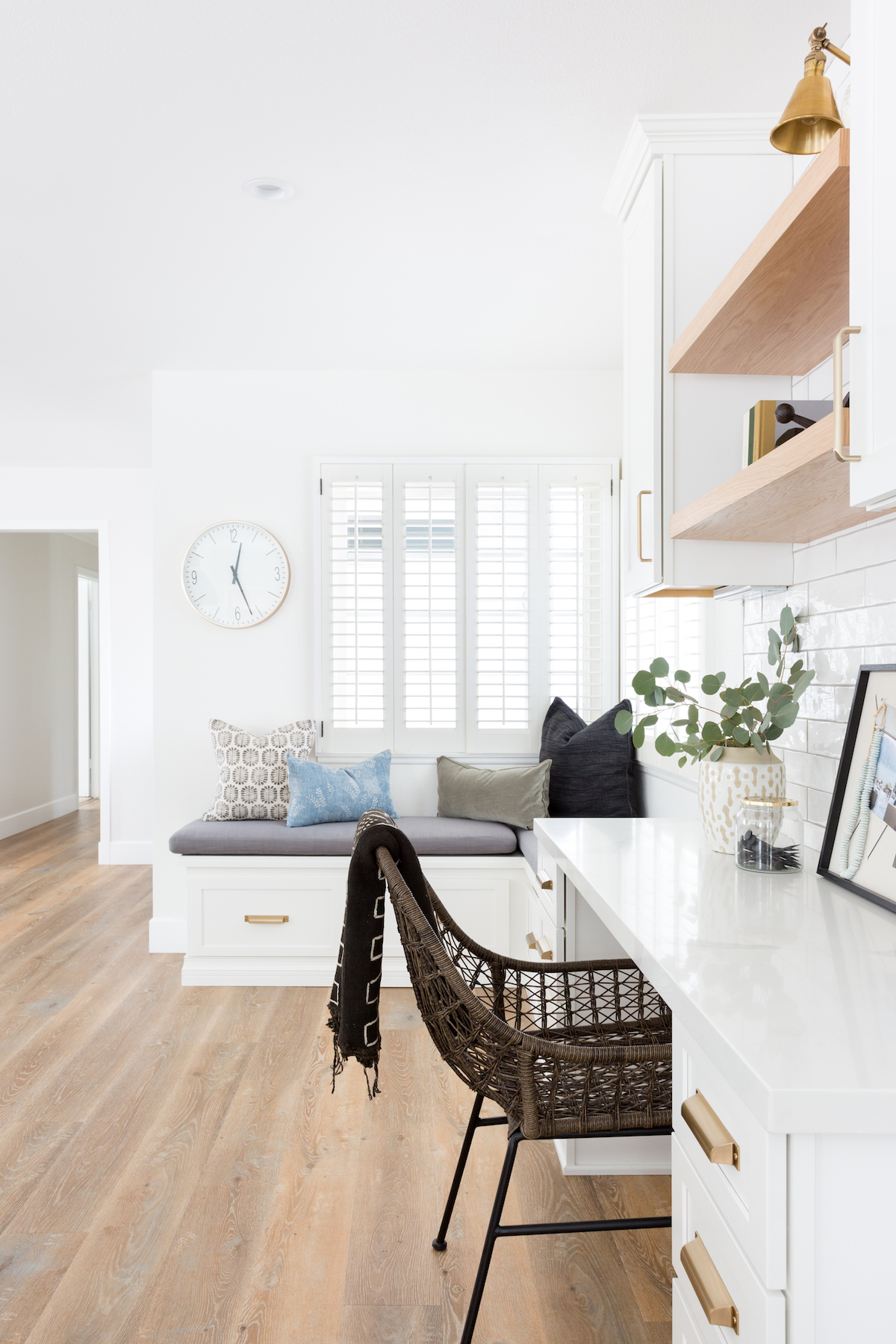
Can you talk about the style goals for this project?
My client loves the “California cool” vibe/design. So we took out her existing dark floors and did a beautiful warm tone to soften the space. Everything we wanted to add we wanted to feel very warm, organic and collected not really designed if that makes sense.
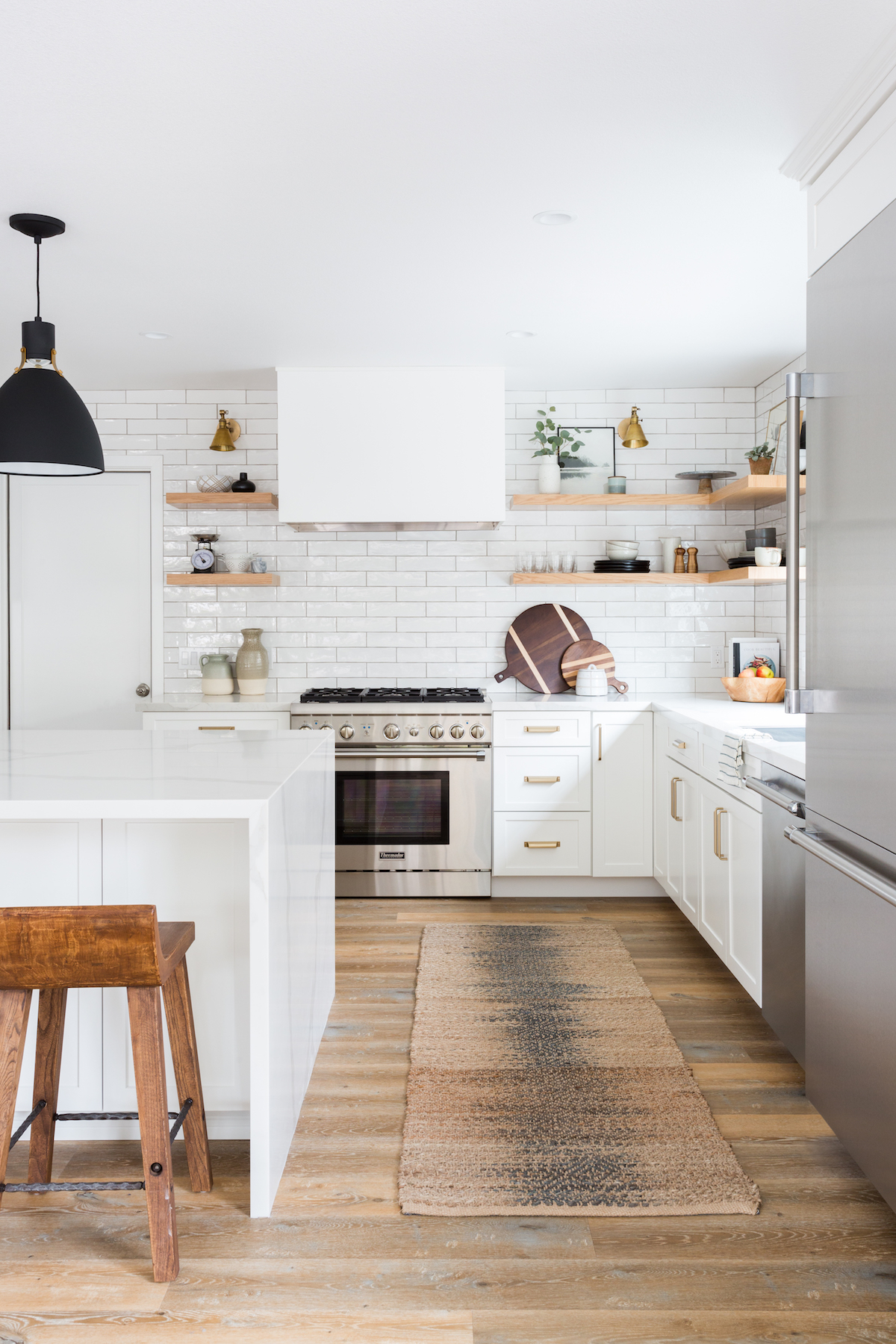
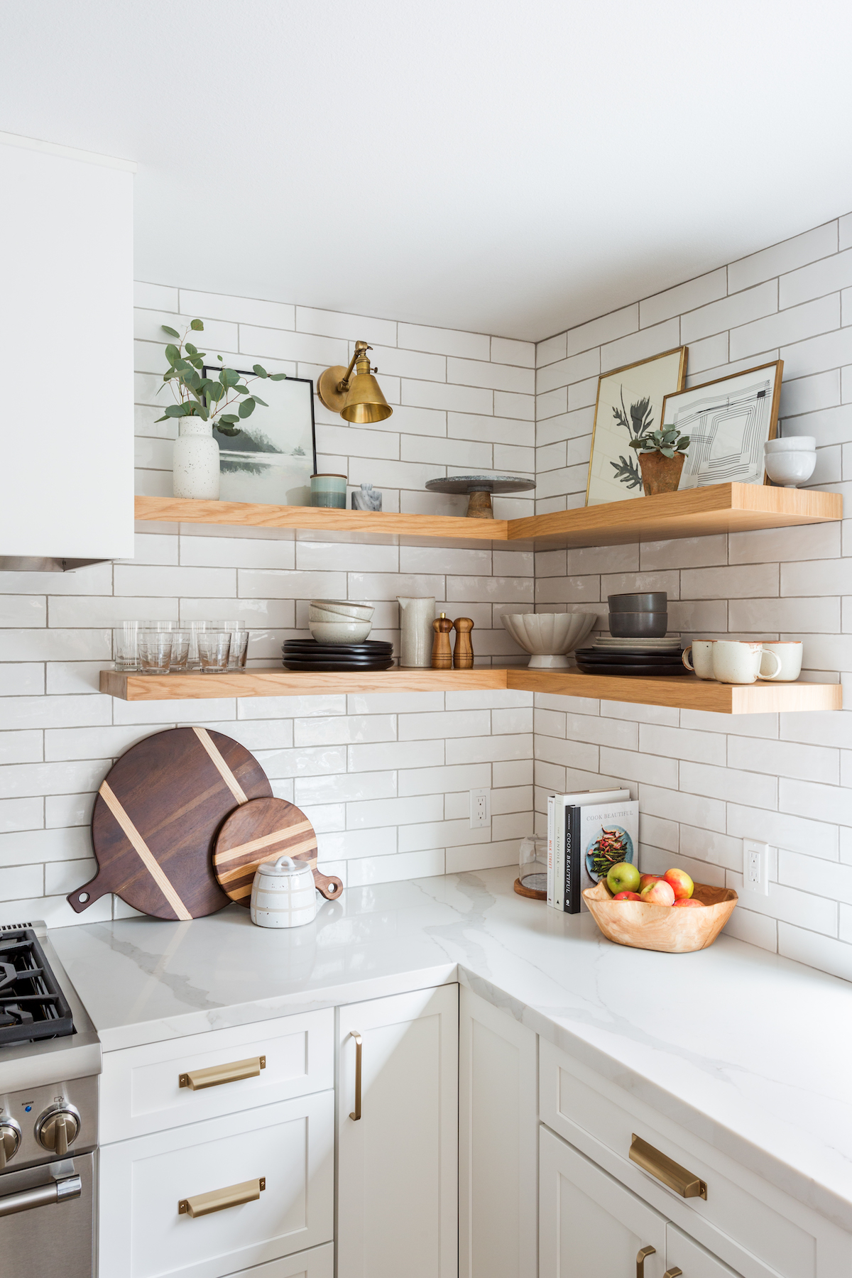
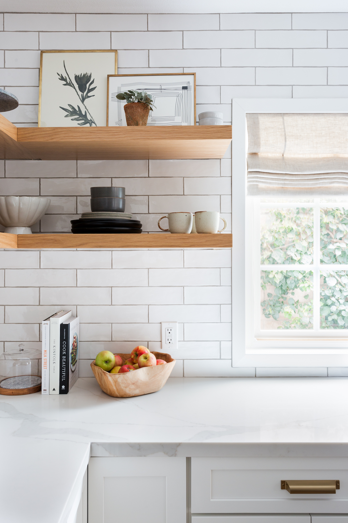
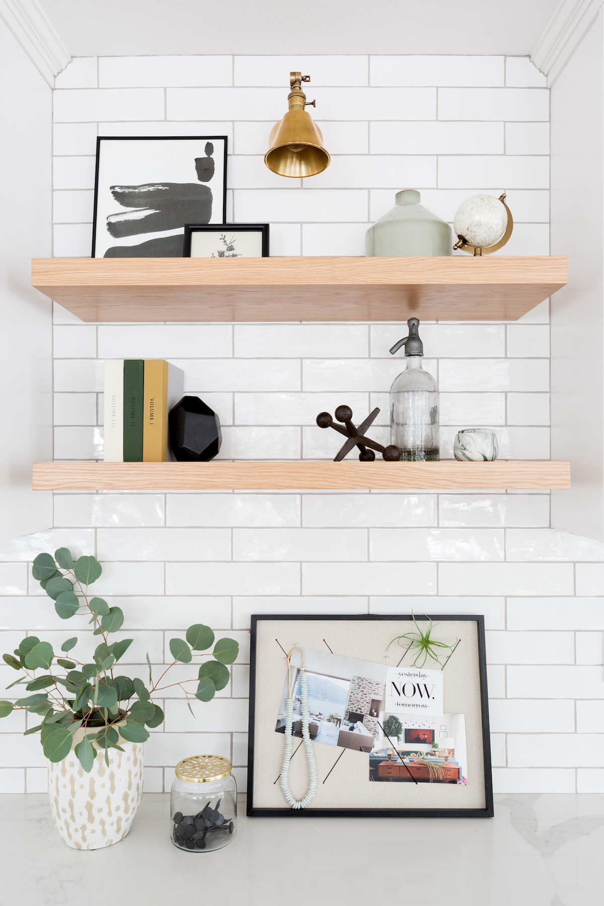
We love the open shelving! Any tips for styling open shelving in a kitchen, without feeling cluttered?
Less is more, we made sure the stuff they use everyday was on the shelves and kept the colors all cohesive so it wasn’t overwhelming when you looked at it. So ALL dinnerware was the same color, all glasses etc. For colors I like the 70, 20, 10 rule. Your more dominant color or color you have the most of will be 70% of your items, then your accent color will be 20% and then a pop for 10%. Play with different heights and textures to add dimensions and you should be good to go!
What is your favorite design element in this space?
Oh man its hard, The island is REALLY hard to not love, but I also love the simple custom hood we made and also the little seating nook we made. I guess I can’t choose!
Interior Design: Lindsey Brooke Design | Photography: Amy Bartlam