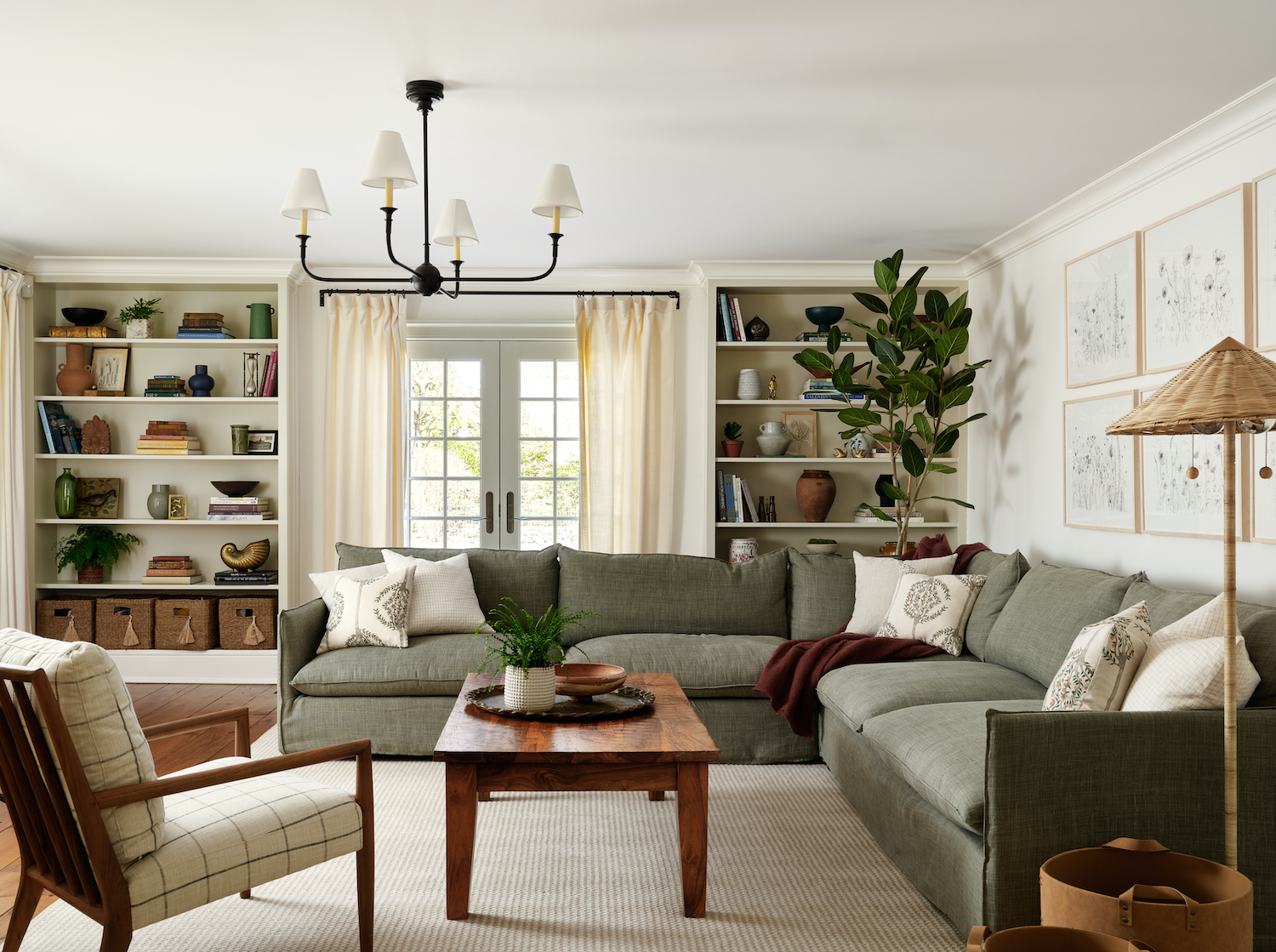
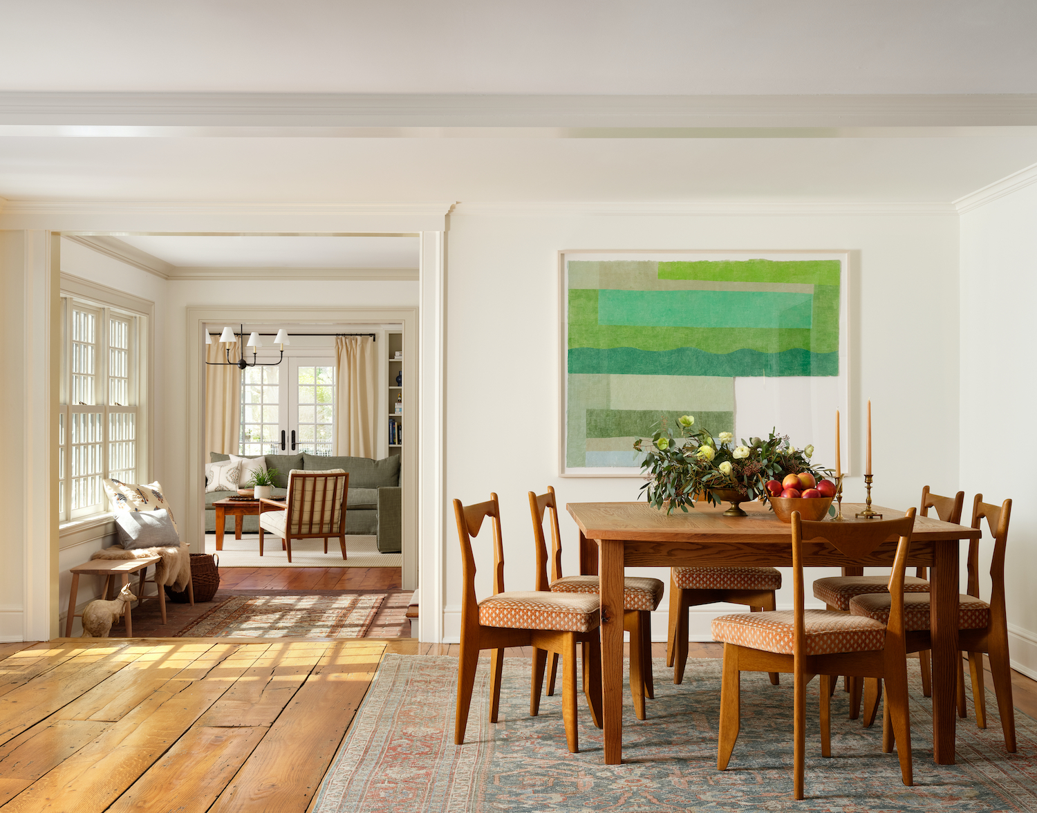
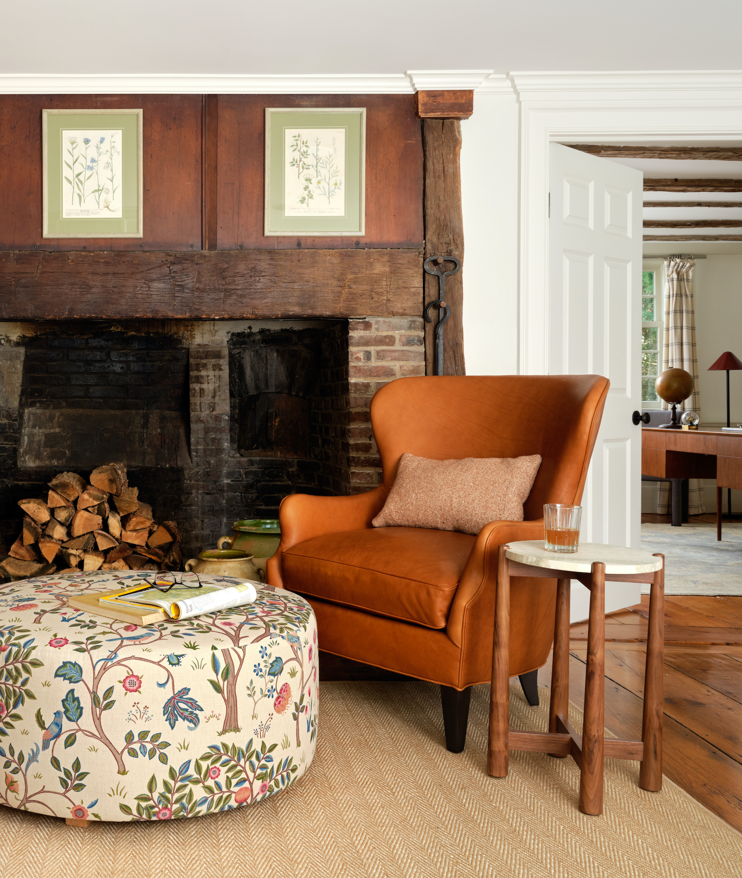
This home, with its storied past stretching back to the 18th century, is a remarkable tapestry of original features, from its antique floors and fireplaces to a hidden spiral staircase. Lex & Hudson approached the renovation with a careful blend of historic reverence and modern sensibility, balancing the home’s rich legacy with fresh, contemporary updates. Sean Litchfield’s photography beautifully captures this fusion, showcasing the classic elements and myriad patterned textiles that unify this space.
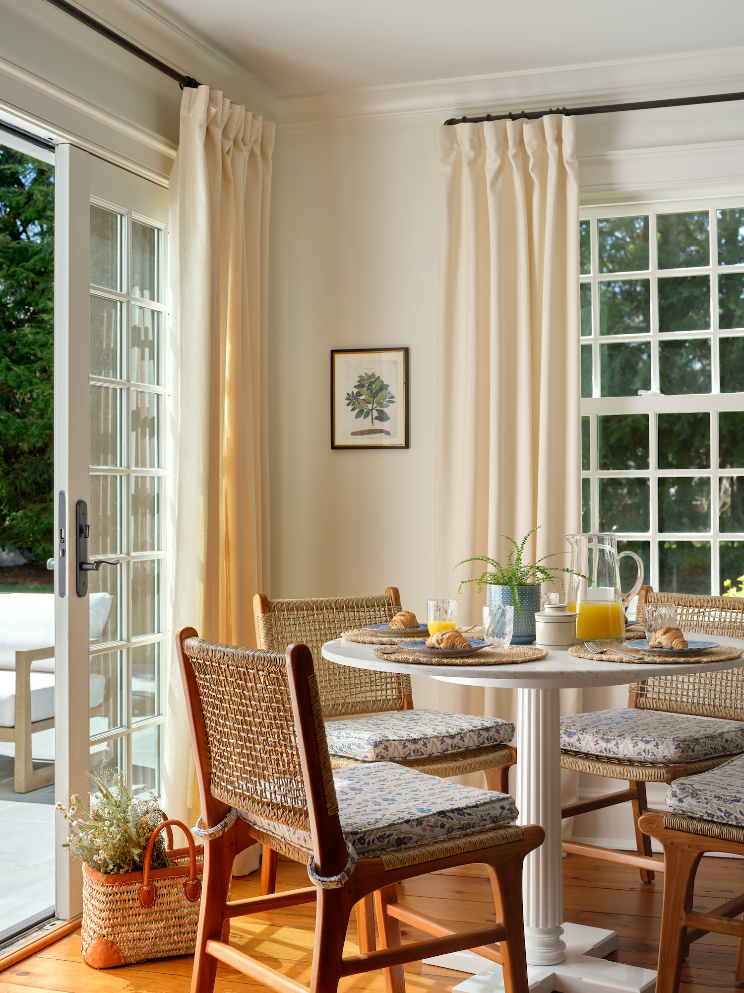
From the designer… This home has an incredible history dating back to the 18th century. The floors, beams, some plaster walls and fireplaces all are original to the home. There’s even a tiny spiral staircase behind the front door adorned with original lead glass that leads from the first floor to the third floor attic. It was an exposed opening in the wall and focal point upon entry with crumbling bricks. The previous owners celebrated this but our clients thought it unsightly. We implored them not to sheet rock over it this inherited piece of history and such a unique one at that. We compromised and designed a push-to-open framed antiqued mirror over the opening. Now it’s a secret staircase, but still a special one. This really serves as a metaphor for how we approached the home. We sought to balance the history of the home with more modern tastes.
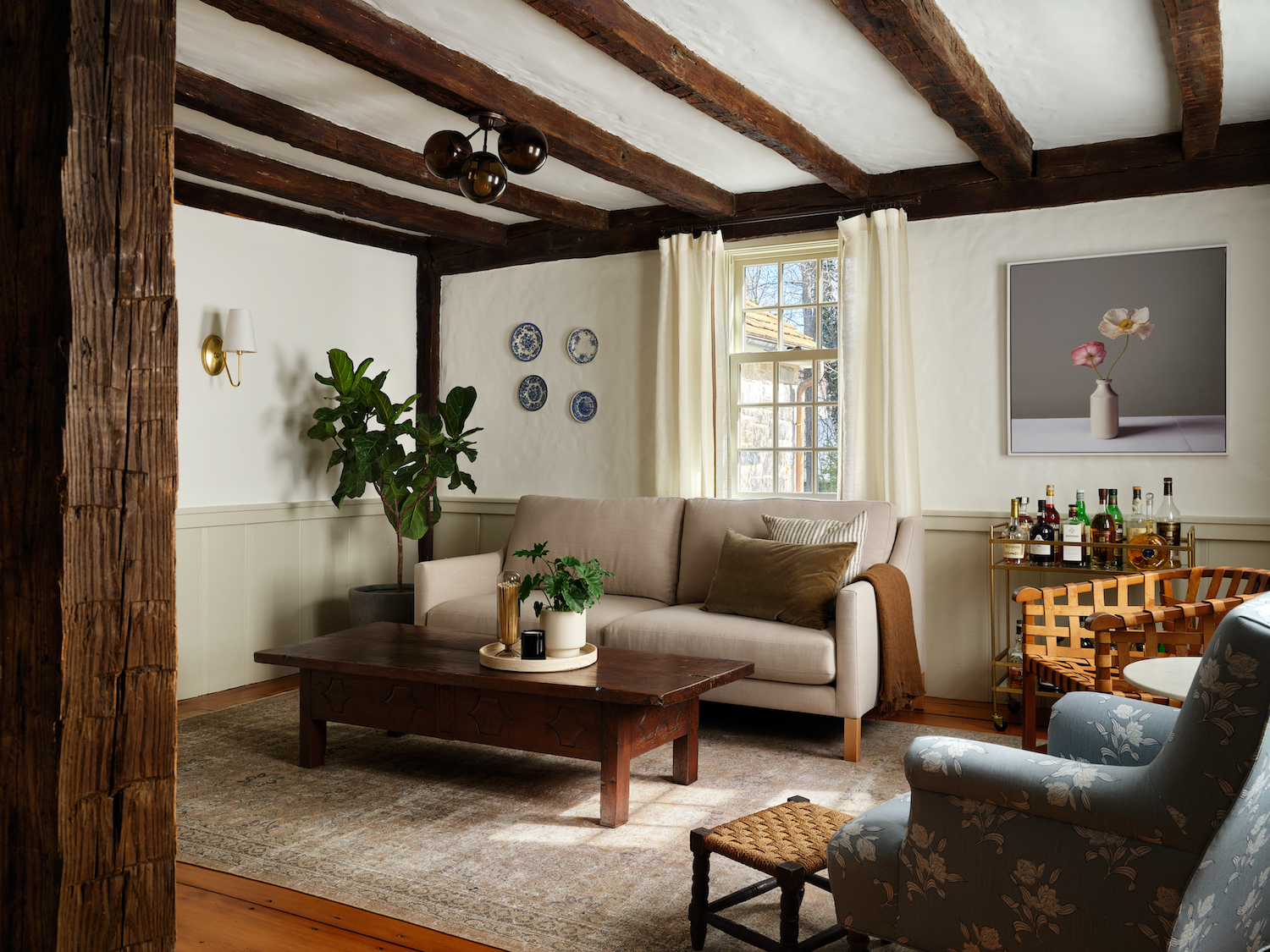
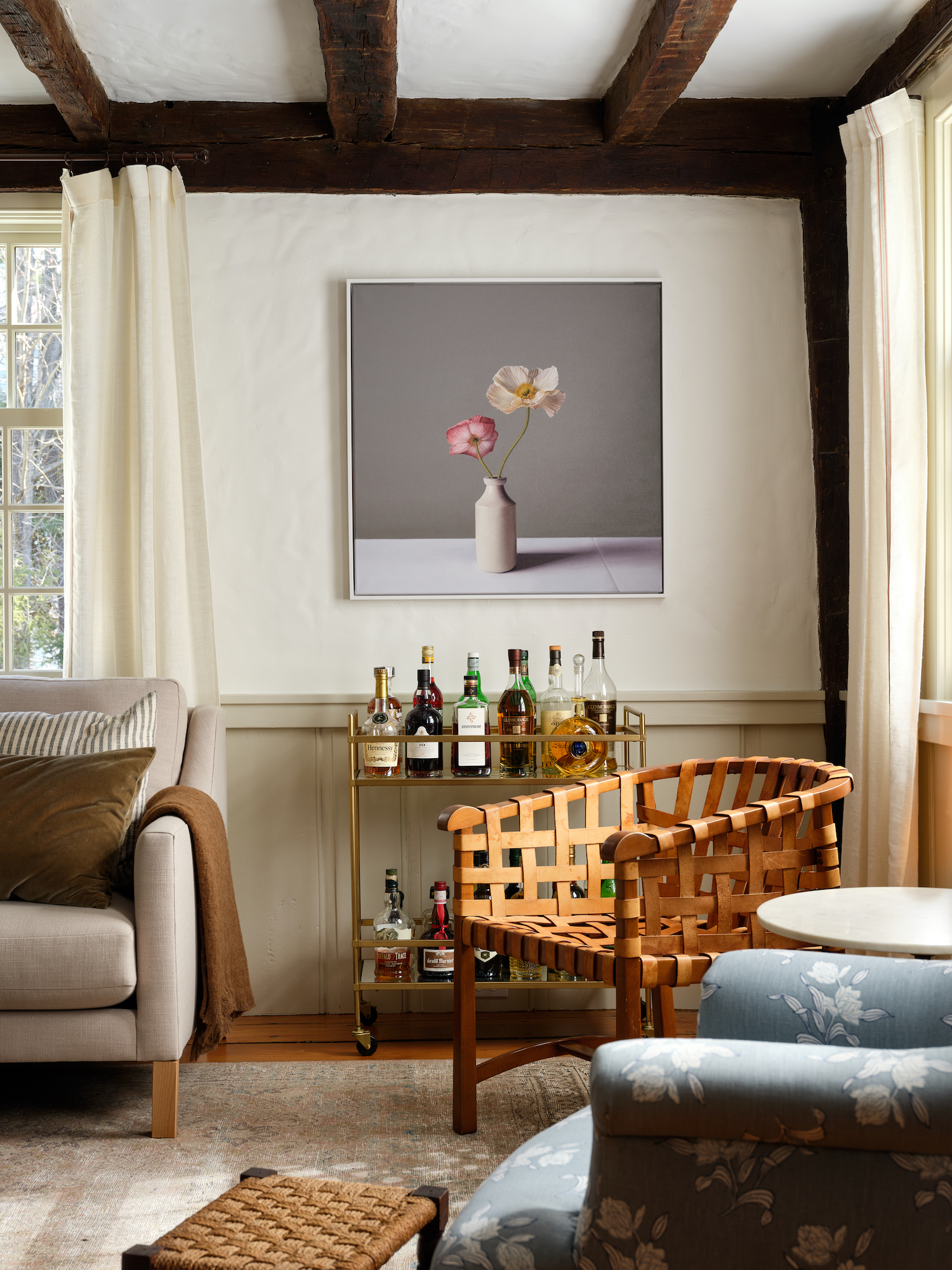
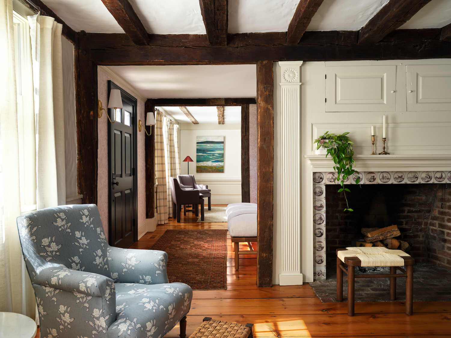
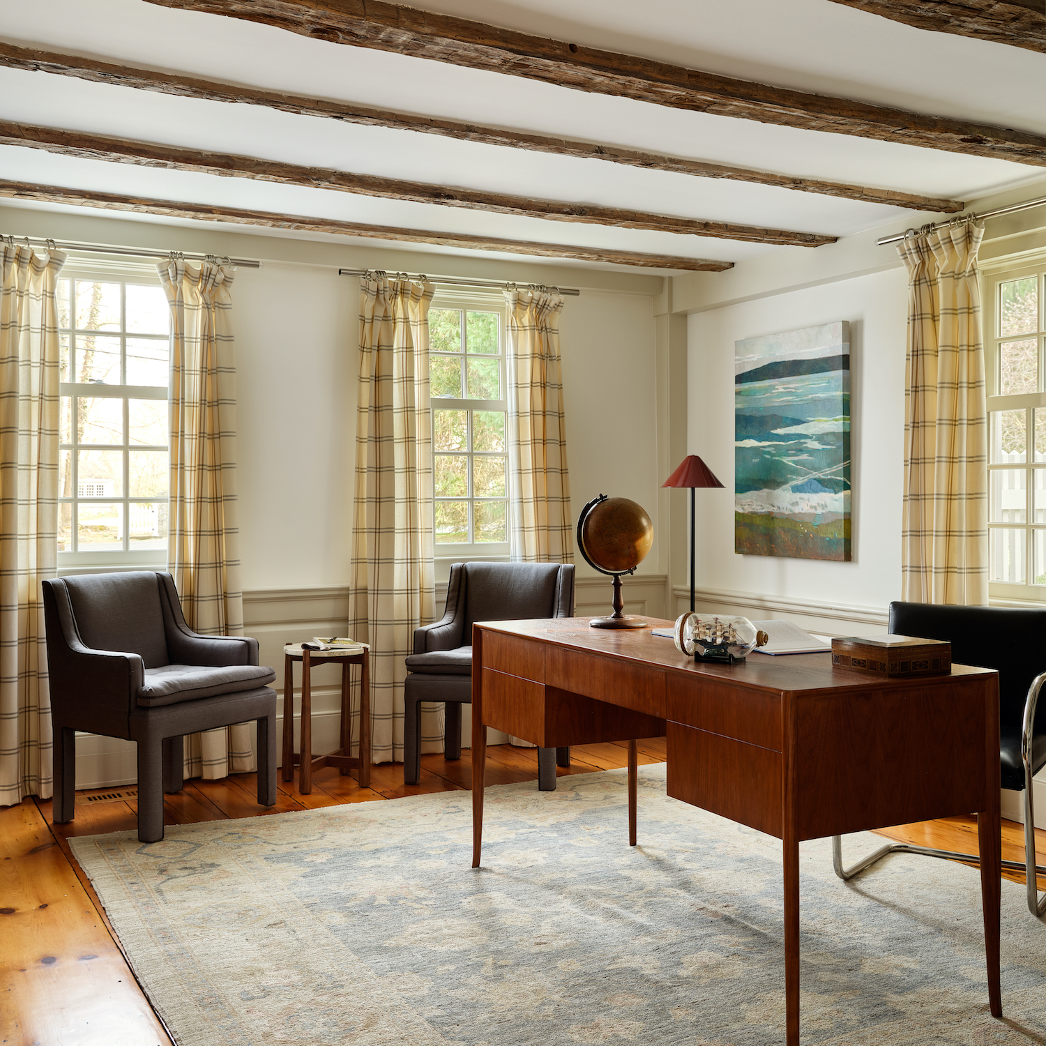
The office on the first floor, in one of the oldest rooms in the house, has a classic saber leg mid century modern desk legs anchoring the space. Guest chairs in the office are fully upholstered through the legs as opposed to a wingback for instance. The vintage Oushak rug and plaid drapes add dimension to the space that’s the perfect blend of old and new.
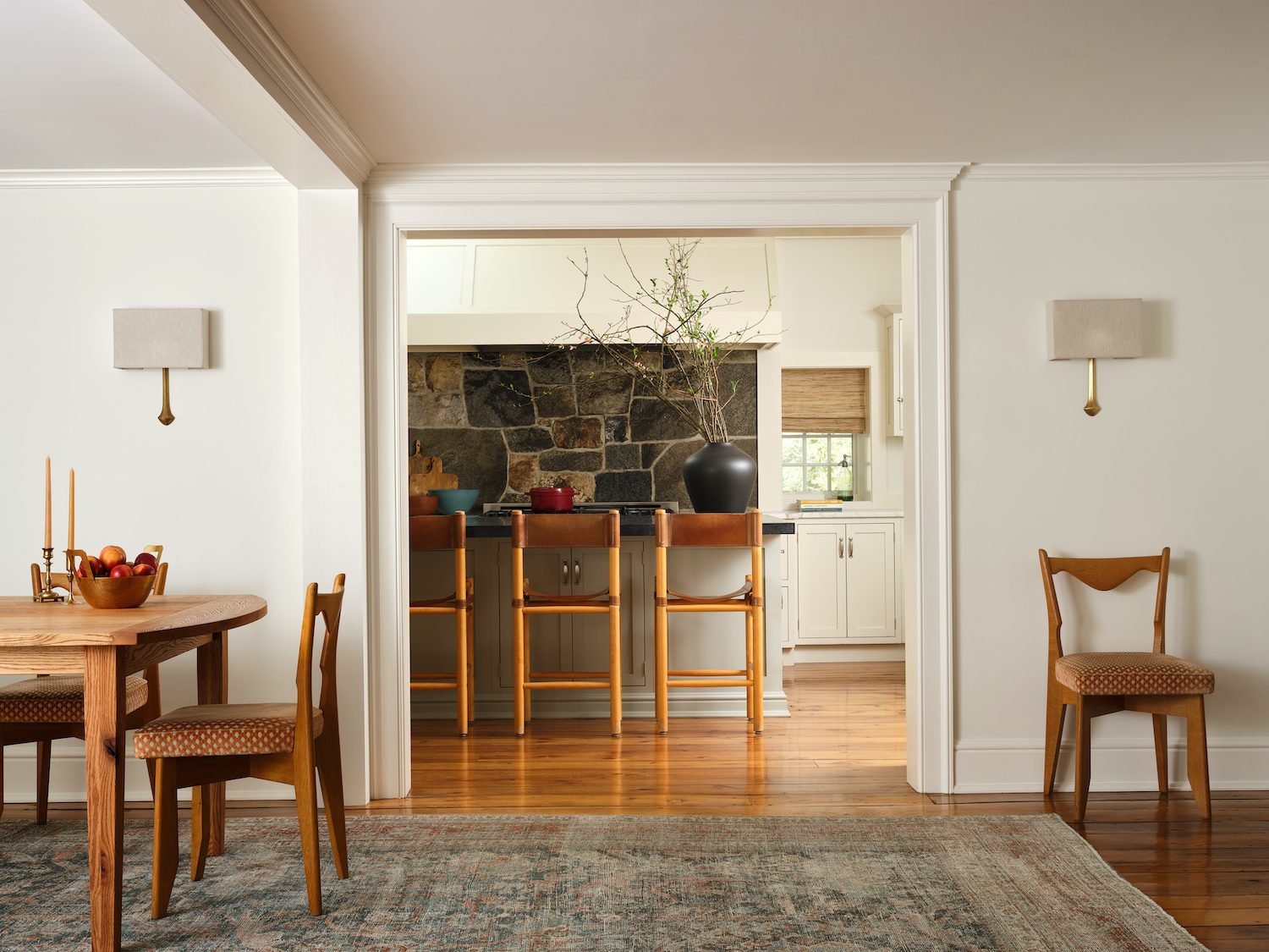
Another example would be how we approached the kitchen. It was classic and had been renovated somewhat recently. It had white shaker cabinetry and Carrara countertops. While it was classic we sought freshen up the space. We painted the island a lichen green, replaced the Carrara with a patinated soapstone and replaced the corner legs of the island and installed under countertop brackets with a simple and clean overhang.
Like what you see? Take a peek at the talent behind the story… Interior Design: Lex & Hudson · Photography: Sean Litchfield