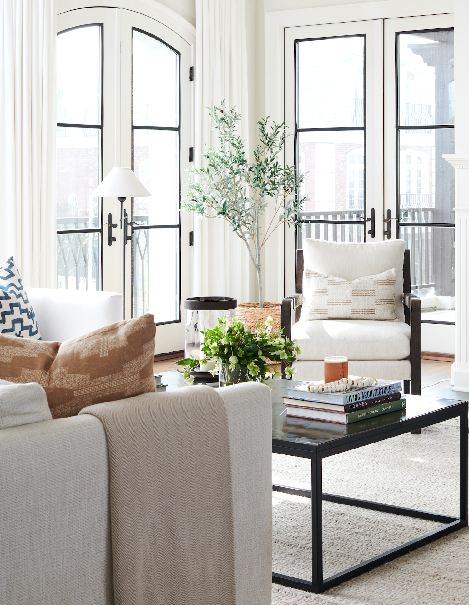
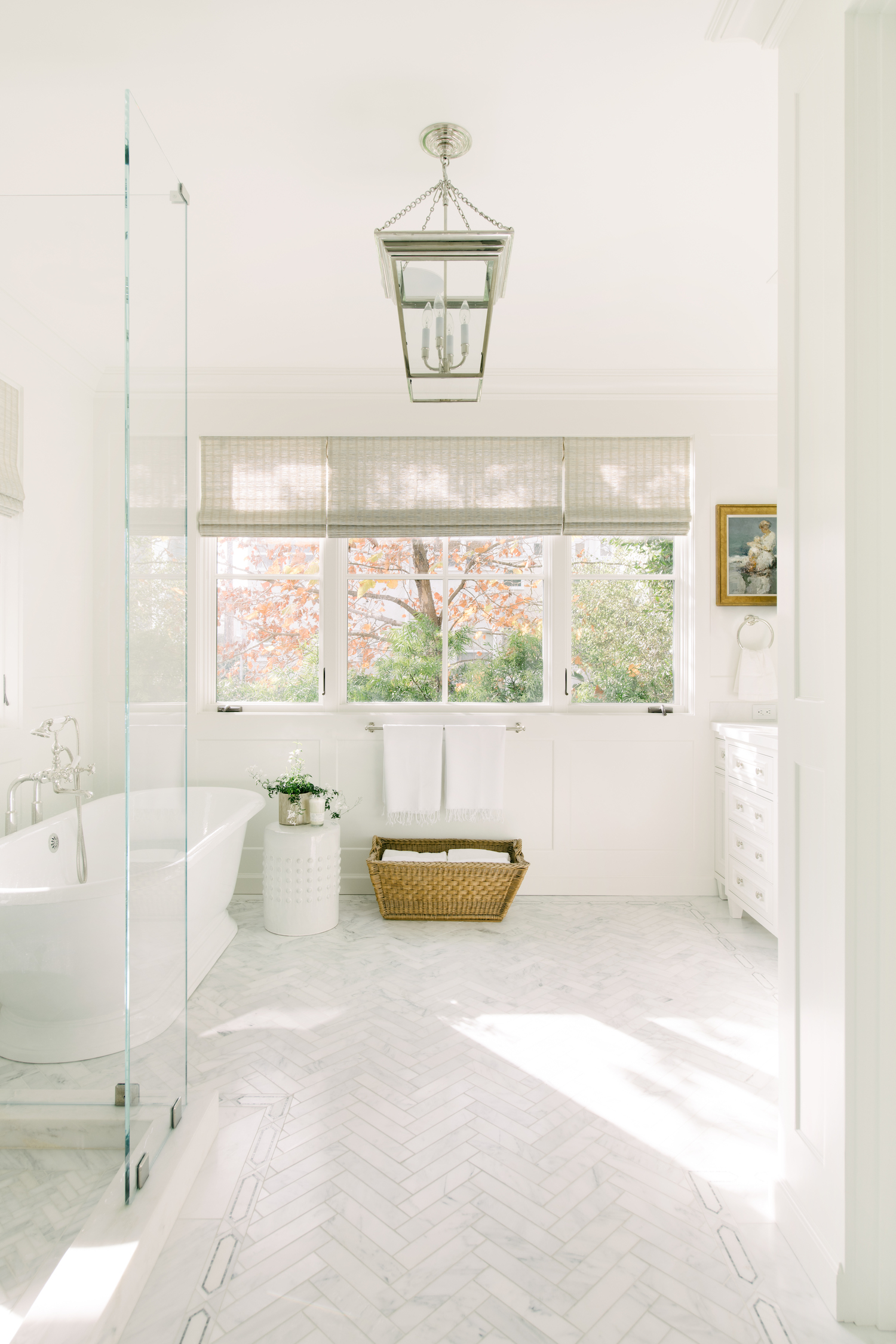
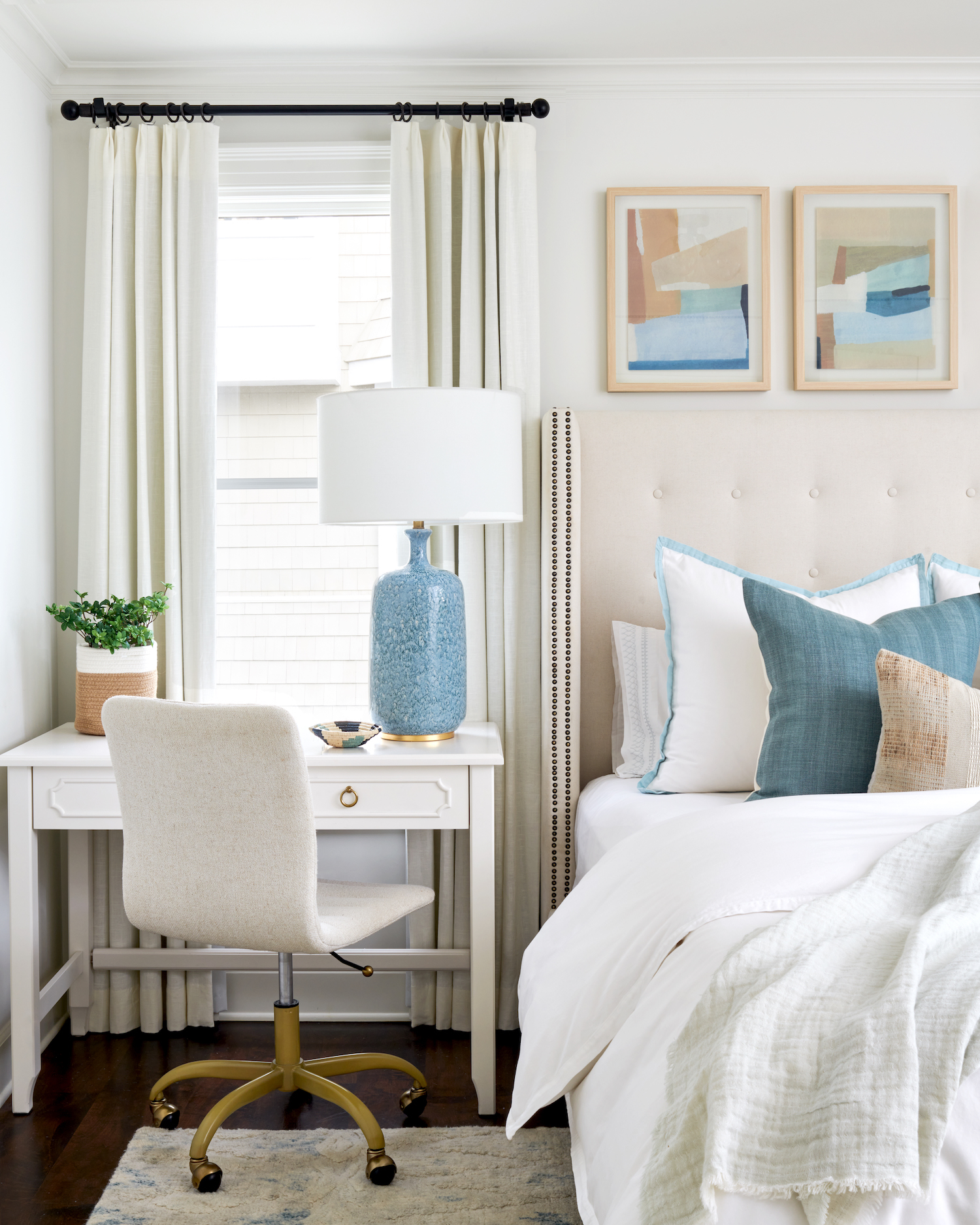
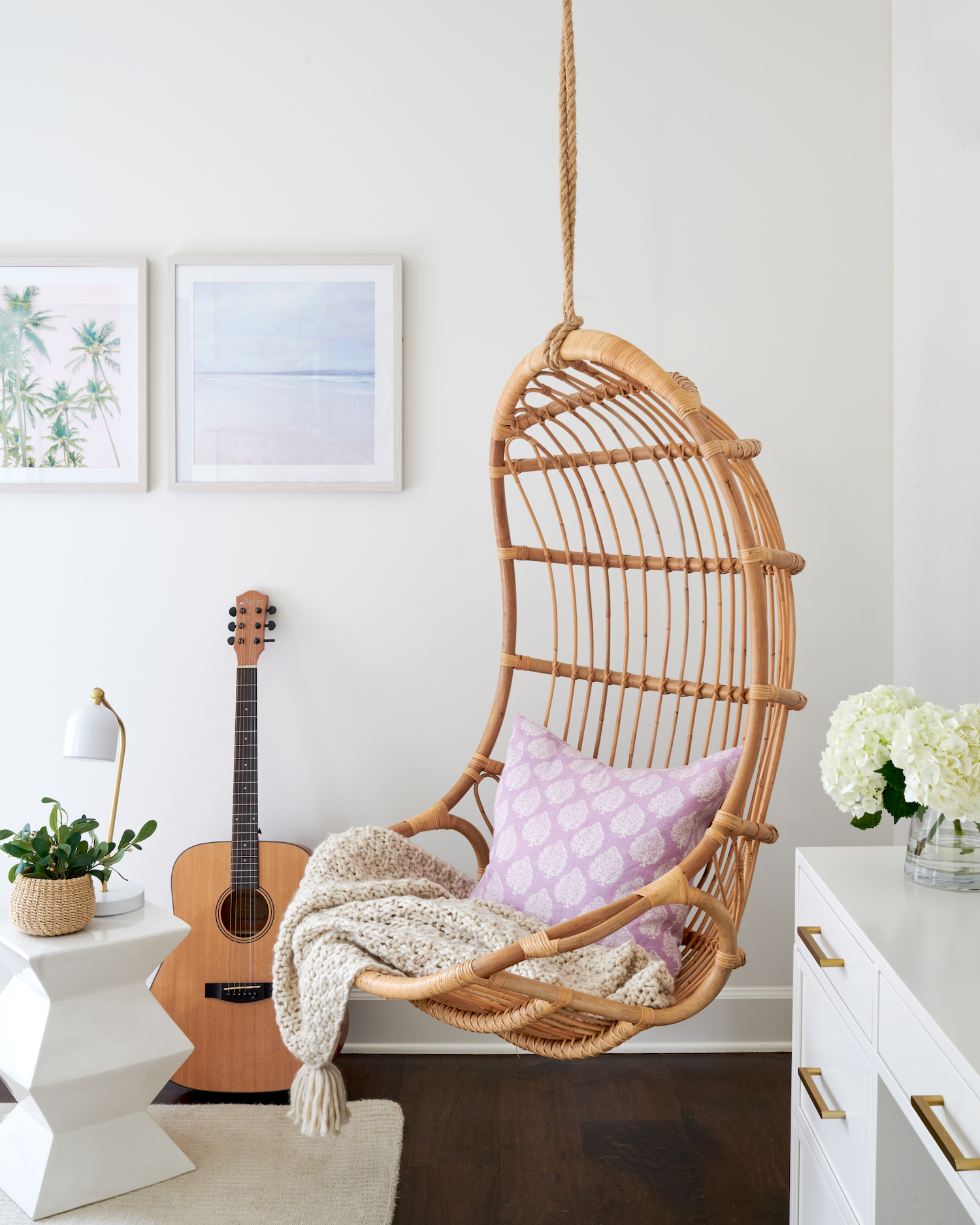
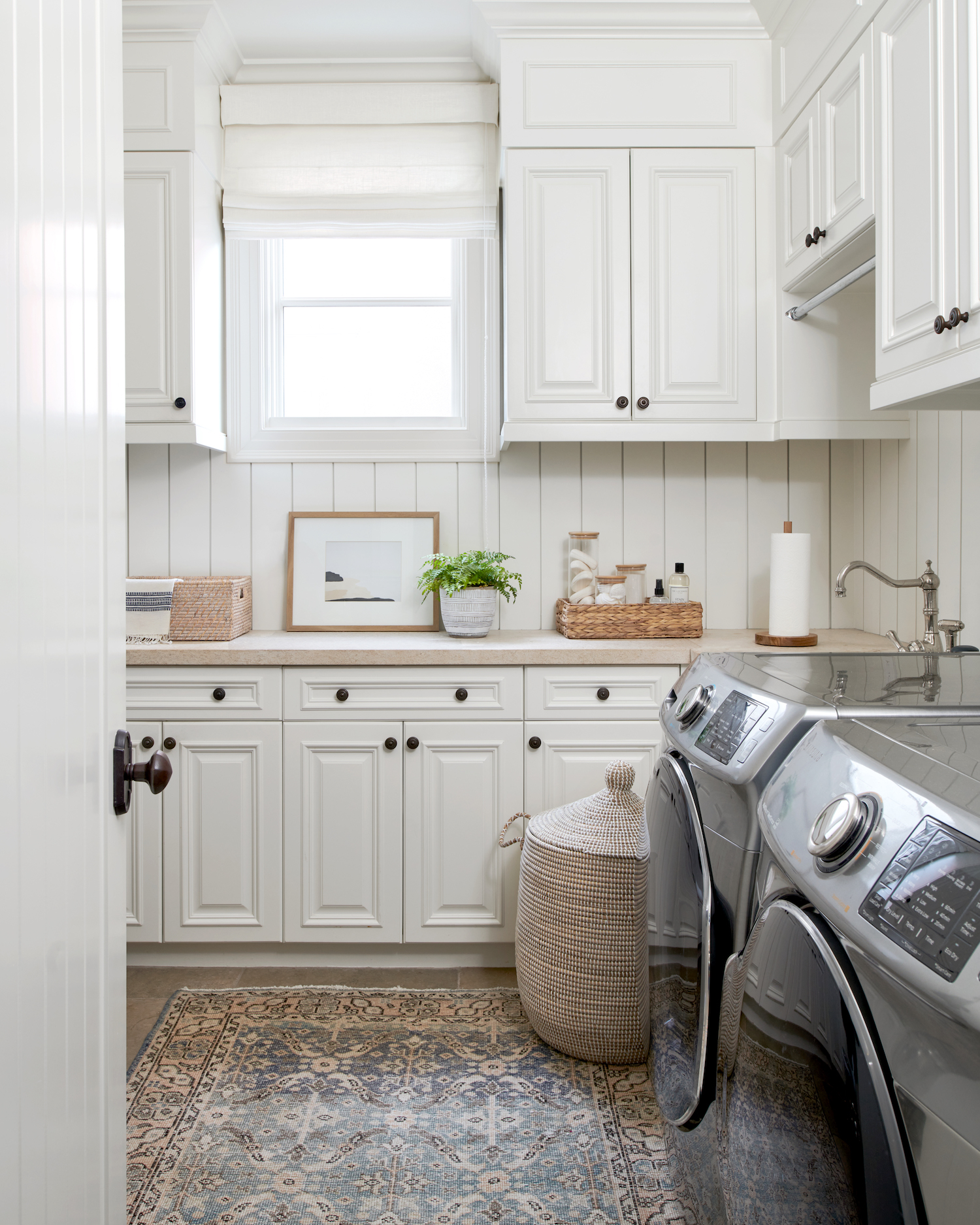
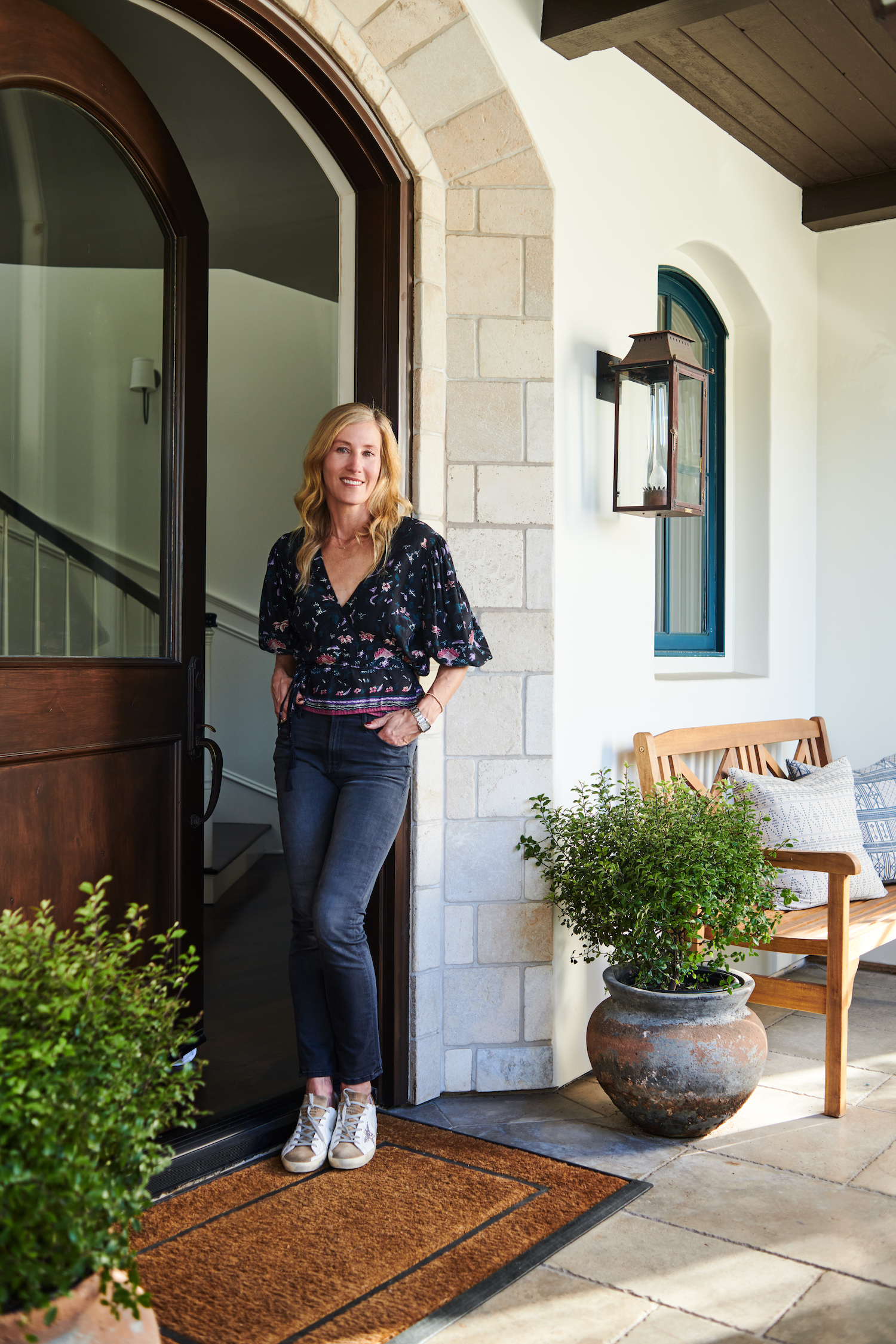
When Mary Beth, of MBC Interior Design, purchased her home in 2017 few saw her vision for what it could be. A dark and dated interior spanned this 5,000 sqft home leaving much to be desired. By implementing her East Coast meets West Coast style and pulling in casual and bright finishes, Mary Beth polished this diamond in the rough and created a true gem. Lauren Pressey Photography captured it all beautifully in the photos below.
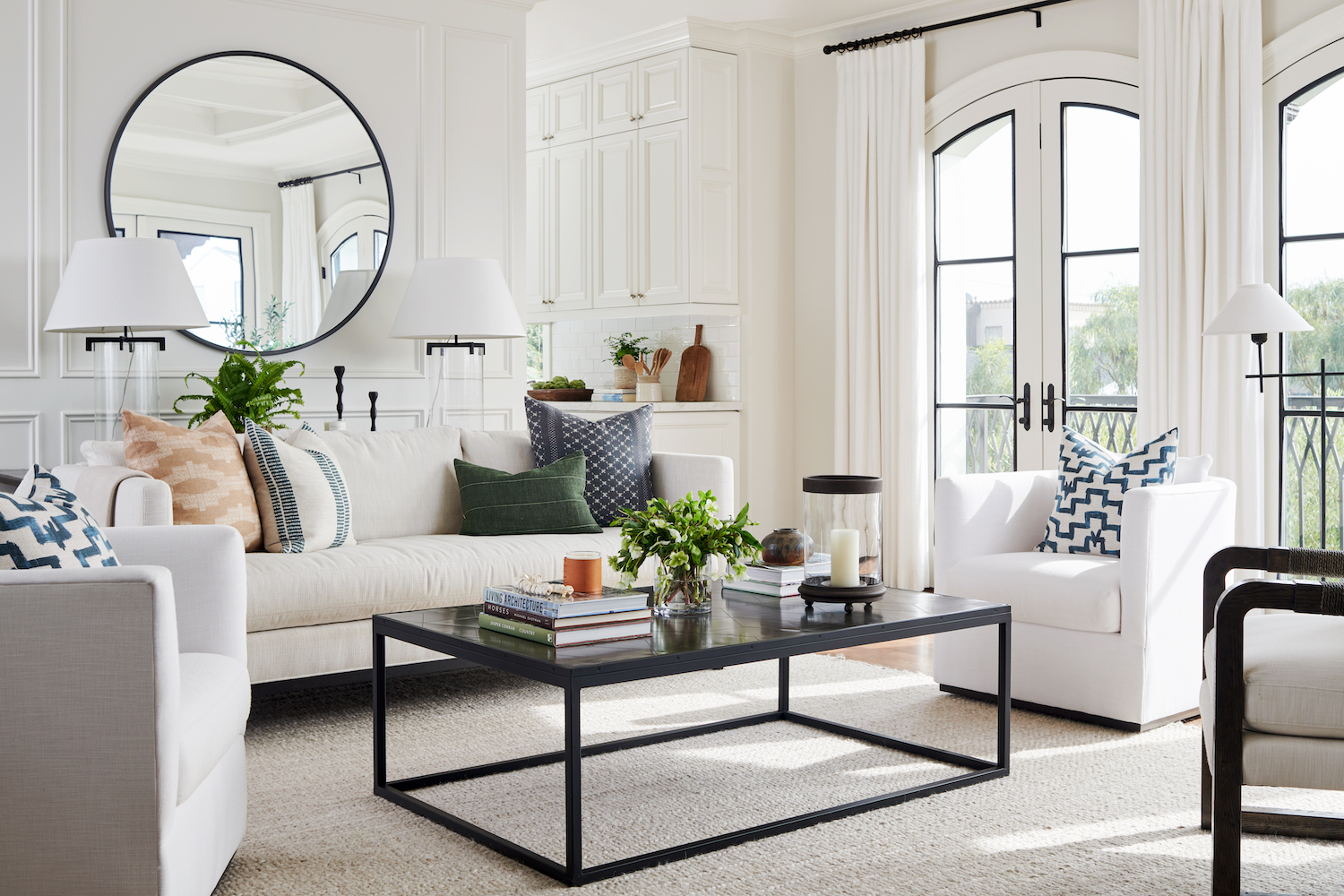
From the designer… After months of searching for a home in Manhattan Beach and not finding the right thing, this one popped up on my online search. When we called our realtor about it, she said it was really dark and dated and she didn’t think we would like it. It was in a great location, had great bones, and tons of natural light, but the original finishes in the home did make it feel very dark. I’m actually really grateful for all of those original details because for one, of course, I love a project, but two, it’s because of those finishes that caused the home to be overlooked by others, including (ironically) our own real estate agent. It really was a diamond in the rough and meant to be our home.
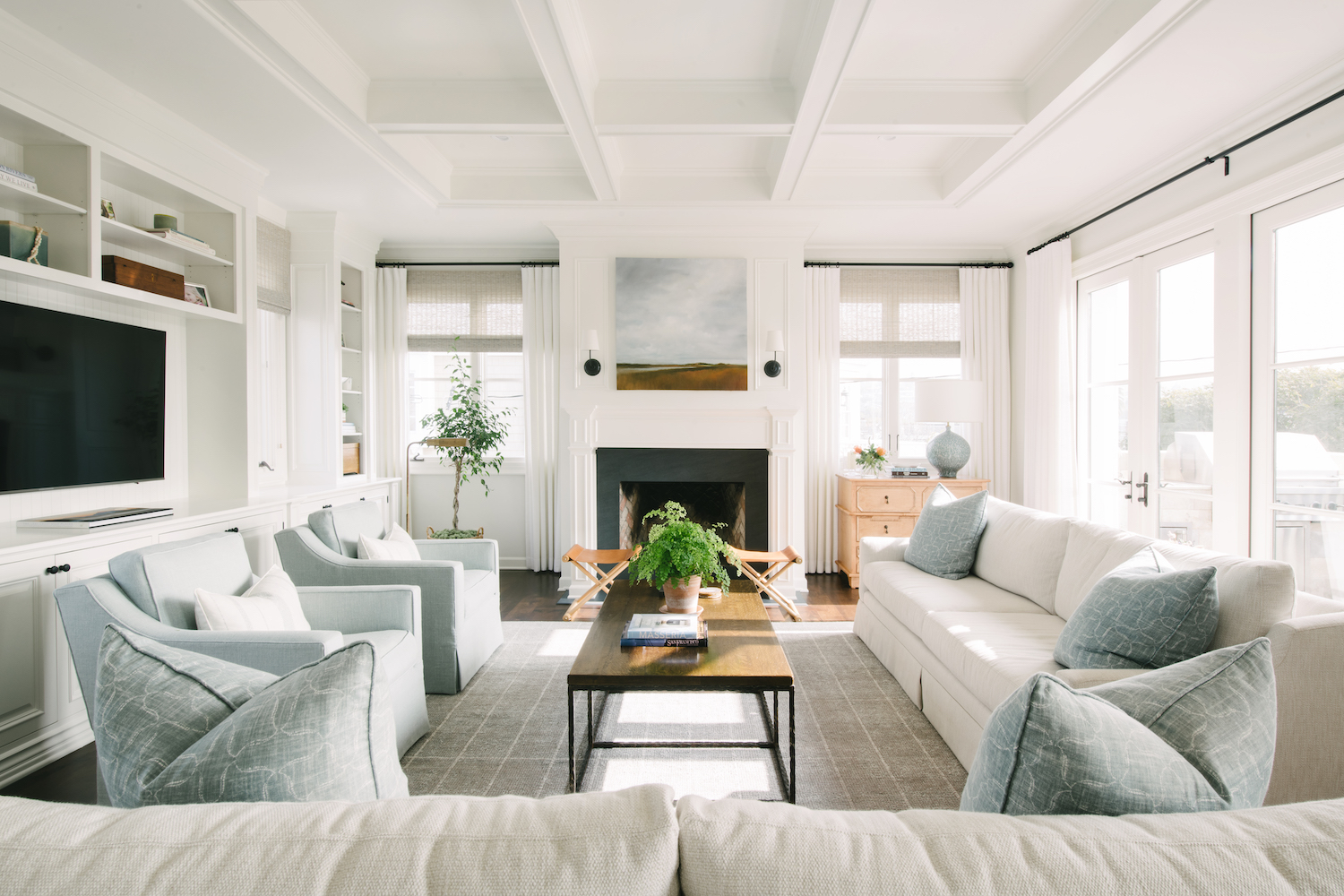
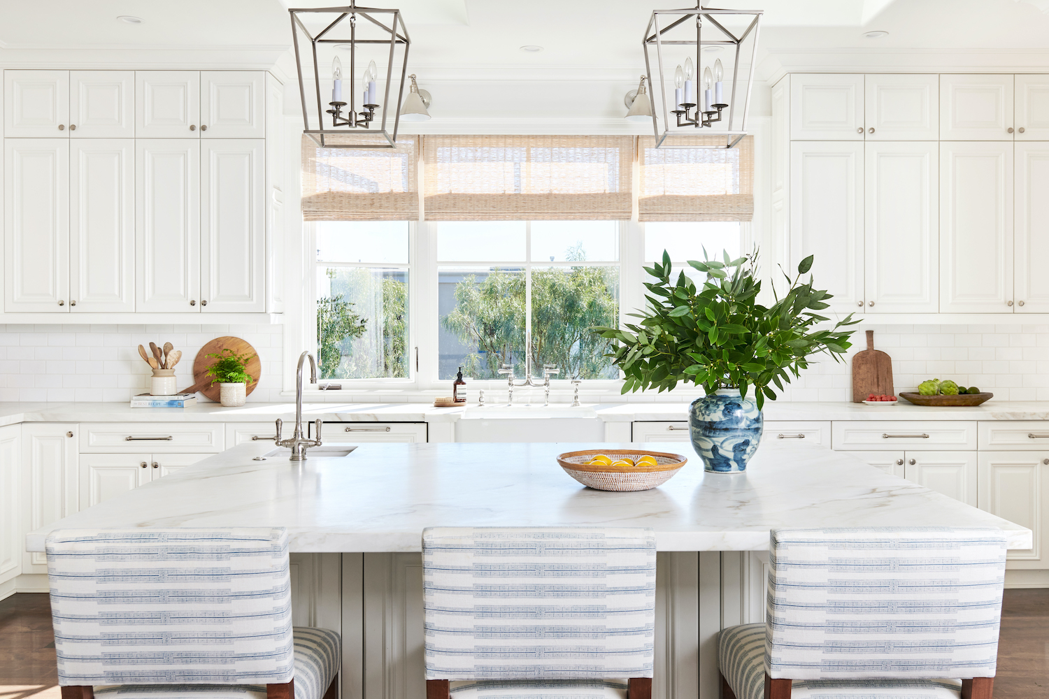
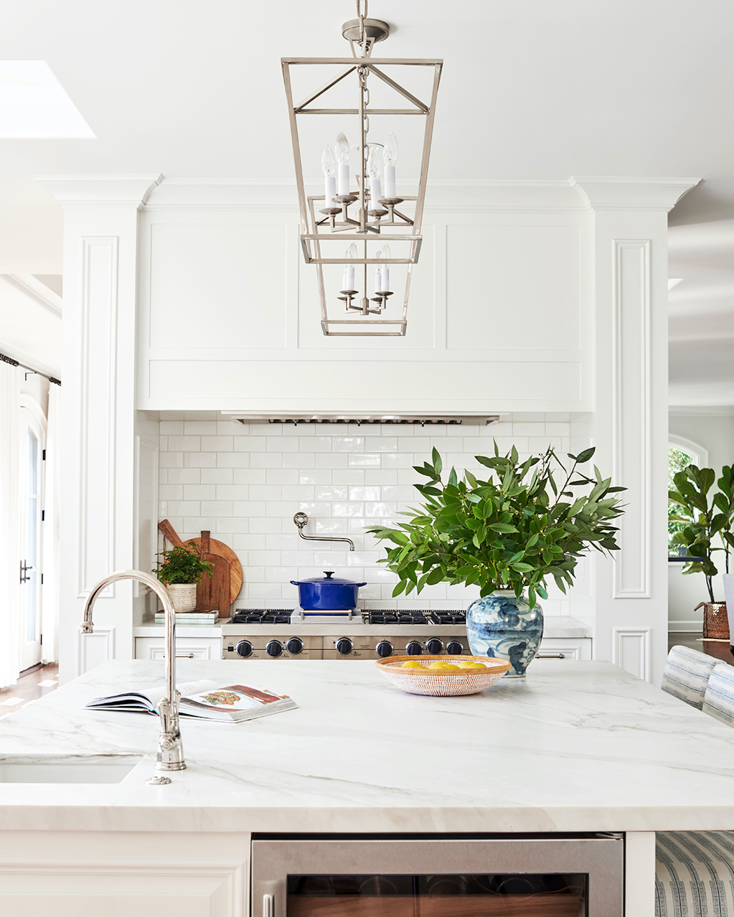
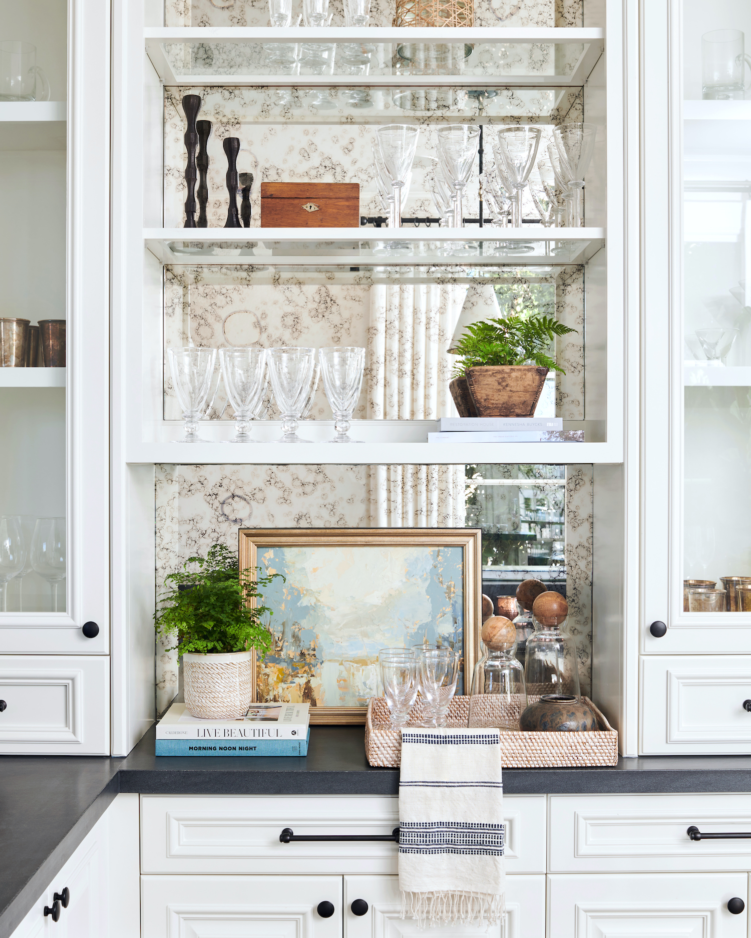
I had never had an all-white kitchen and always wanted one, so that’s what we did here. Now, five years later when the trend is more about color and natural wood tones, I’m still not sorry. While I really love what’s happening with kitchens right now, a white kitchen will always be timeless and it’s also a blank canvas. You can easily update it by adding in color and natural wood and woven tones with counter stools, baskets, canisters, and other kitchen accessories and really make it your own, rather than just chase a trend and regret it later.
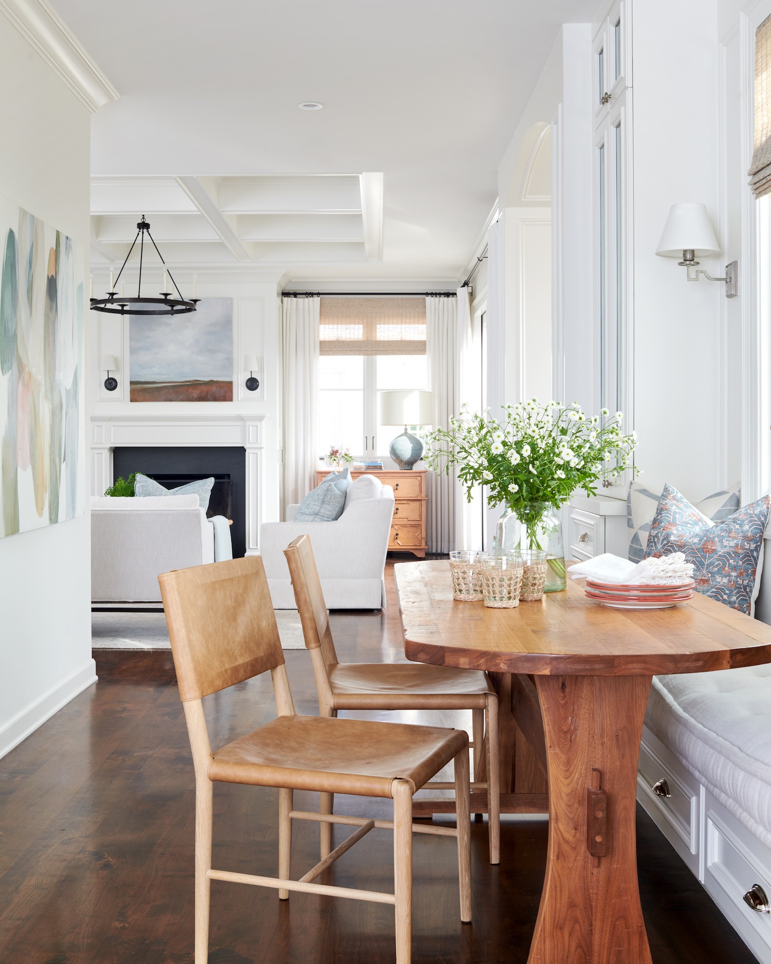
The design of the breakfast room was a bit of a challenge and it took my contractor some convincing to be on board with the idea. The original breakfast room, while a lovely space with French doors, seemed too far away from the kitchen. I needed an office, and the space seemed perfect for that since it was open to the rest of the home, but still tucked away into its own little space. In order to get my family on board with the idea, I knew we needed to figure out how to create a new space for the breakfast room. Luckily the original kitchen wrapped around the corner, and it seemed the perfect spot for a built-in breakfast banquette. It was hard to visualize at first and both my husband and our contractor were resistant to the idea; then after weeks of debating, we finally decided to go for it. I love the design of the space, it was long enough to add a built-in bench under the windows and flank it with two china cabinets on either side of it. Not only did we get back the storage we lost by replacing that part of the kitchen, but it also feels like a really purposeful space that blends in beautifully with the rest of the kitchen. (FYI, our contractor loves it too!)
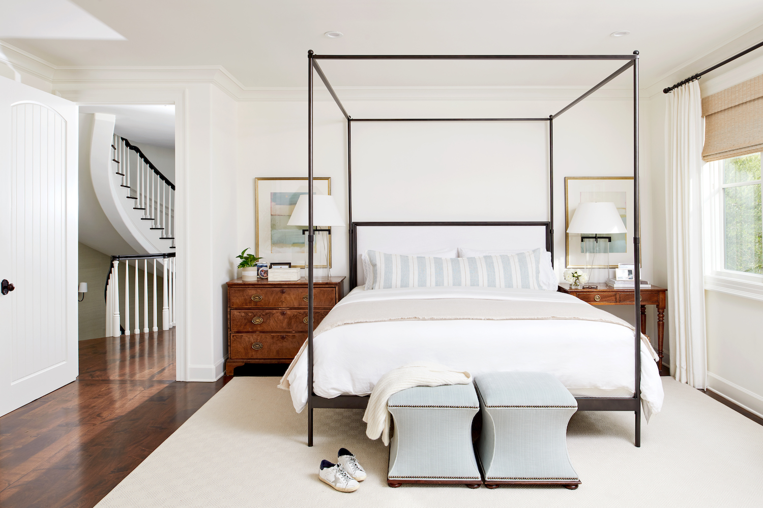
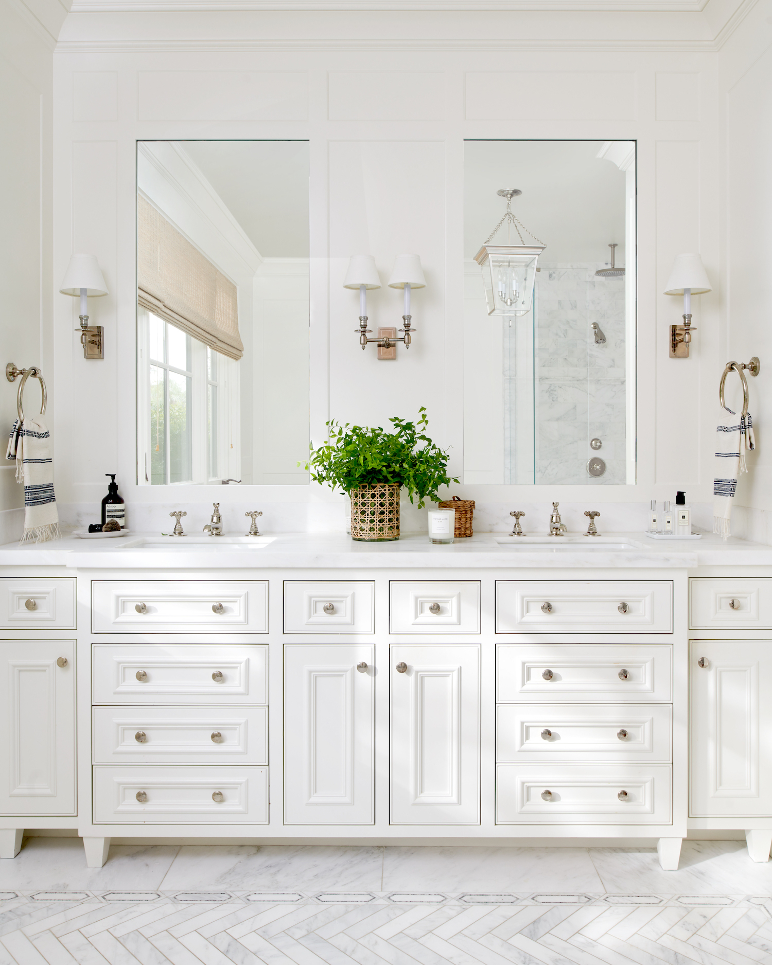
Ironically, what I love most about the house is what I loved about it before we did the renovation – the natural light. The things we did to change the home just enable you to appreciate it even more.
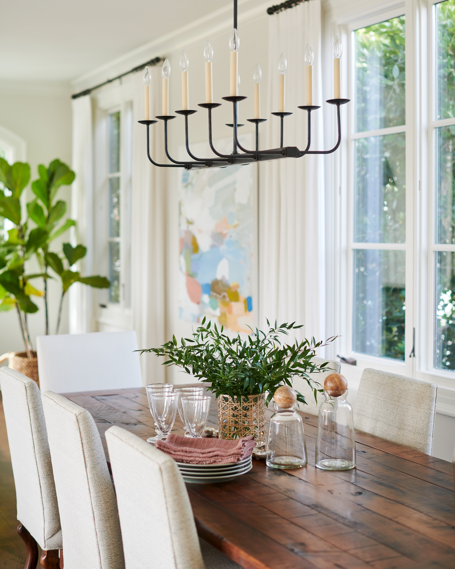
It’s definitely way more challenging to design my own home vs designing for a client. When it’s someone else’s home it’s much easier to visualize what it could be and how to get it there. I think that as designers, we’re exposed to so many different resources, options, and choices, it’s easy to get distracted and chase shiny objects. I find that sometimes I go round and round on something as simple as a ceiling fixture for my dining room, but more times than not I end up going back to the one I first selected. I guess the lesson there is to trust my gut with my own home as much as I do with a client’s.
Like what you see? Take a peek at the talent behind the story… Interior Design: MBC Interior Design · Photography: Lauren Pressey Photography · Builder: RJ Smith Construction
