With nods to nature’s palette and cues from contemporary design, JPZ Interiors‘ remodel of this 1942 Toronto home included a new open floor plan, large windows, and warm wood tones. Clever kitchen solutions, like integrated appliances and hidden storage, meet the demands of family life creating a space where memories are made with ease and without clutter. Lauren Miller beautifully captured this home’s transformation in the tour below.
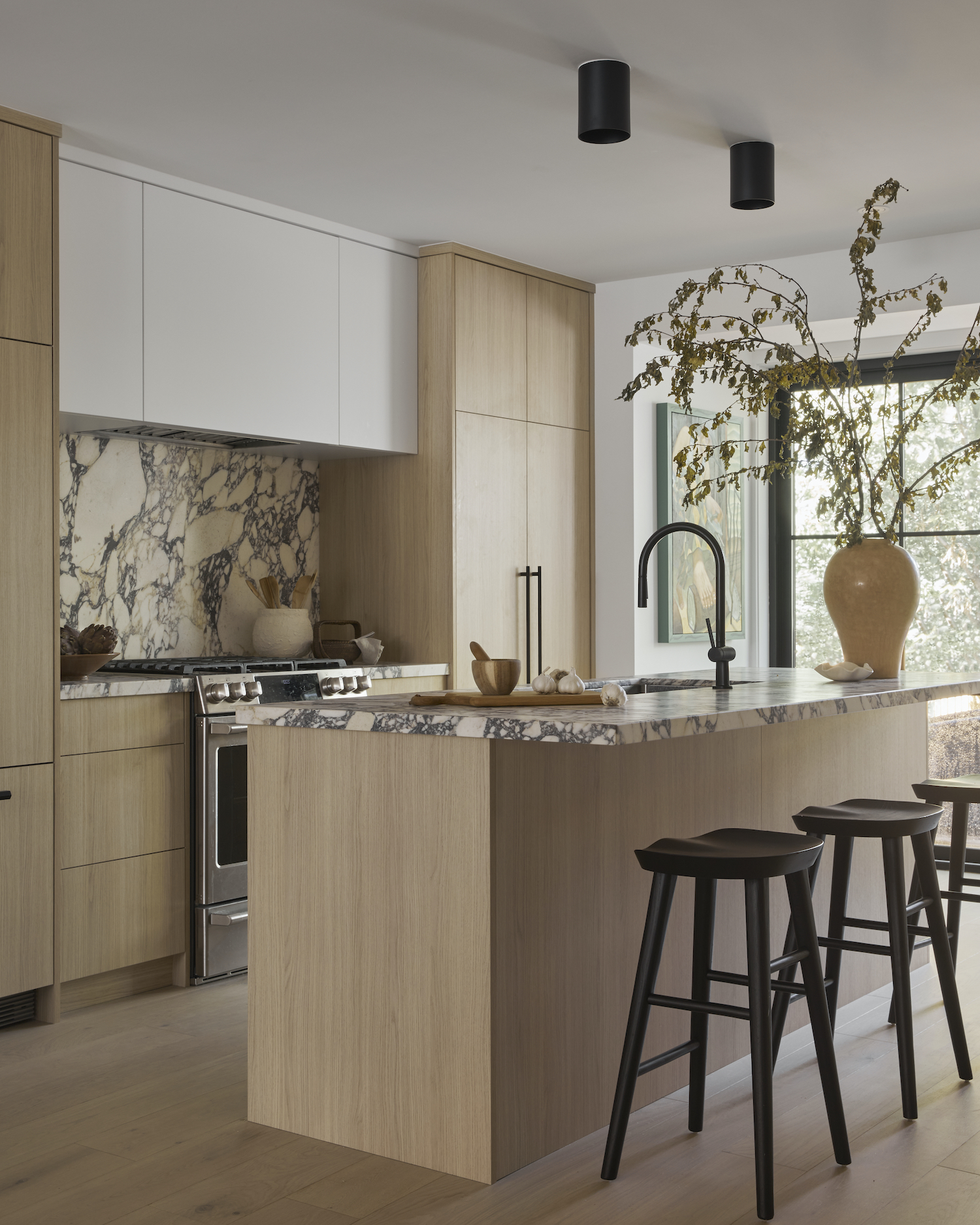
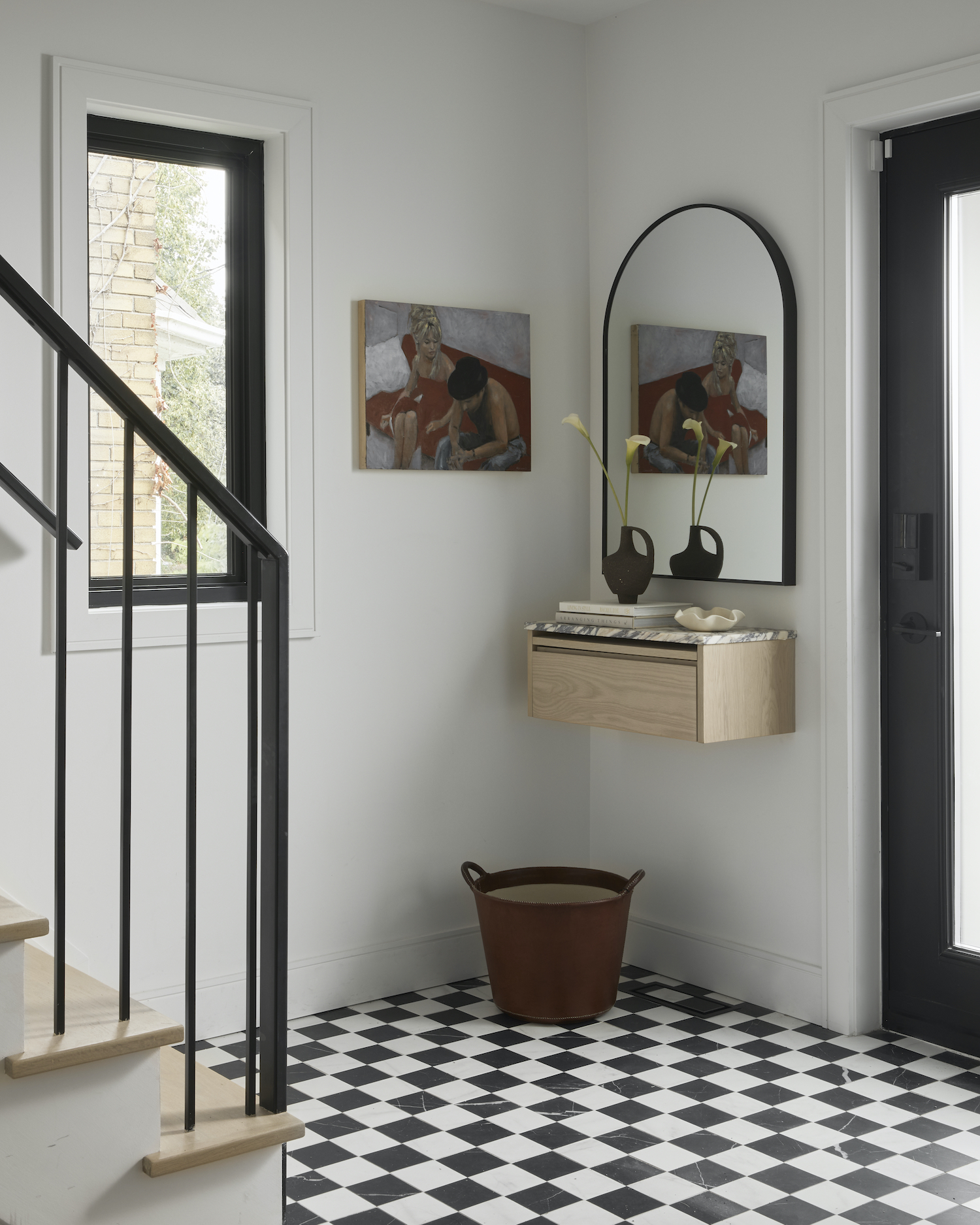
From the designer… The house originally had a closed off floor plan and was super dated. Originally built in 1942, it was time for an upgrade. My client wanted to completely gut the house and bring in new modern elements like large black windows and create an open concept floor plan for their growing family. I came up with a floor plan for them that would maximize all of the living spaces making the house look and feel so much bigger without even adding an extension. Being only a few steps away from one of the most beautiful ravine trails in the city, we drew inspiration from nature itself using neutrals and light wood tones. To add a modern touch, we added some contrast with black windows and fixtures. We added a large sliding window in the back of the house where the kitchen is to get a view of the beautiful backyard and surrounding nature.
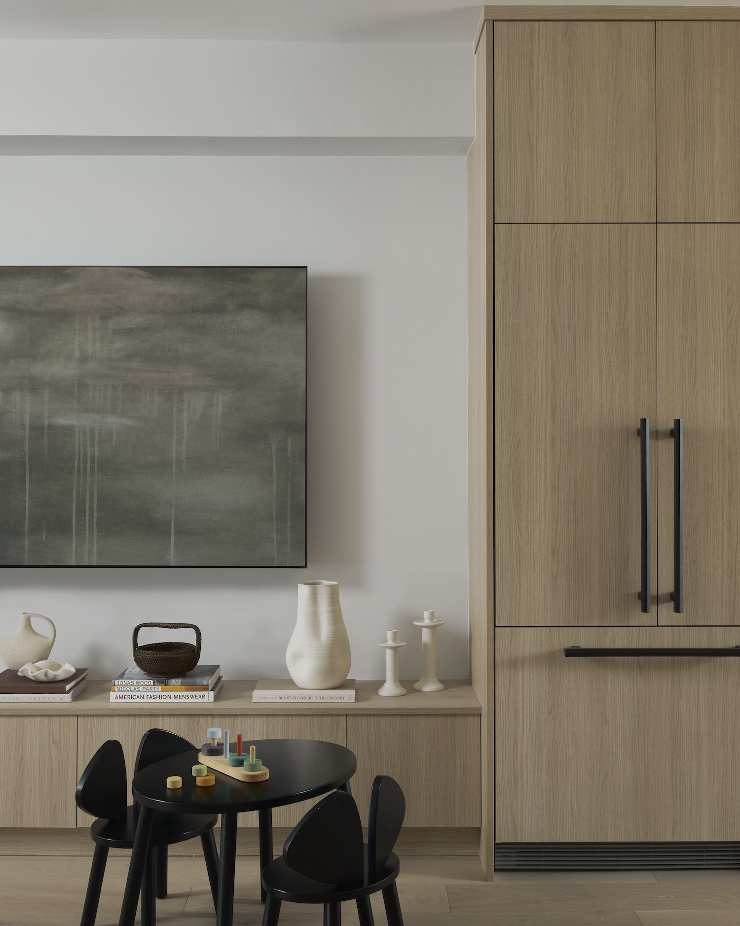
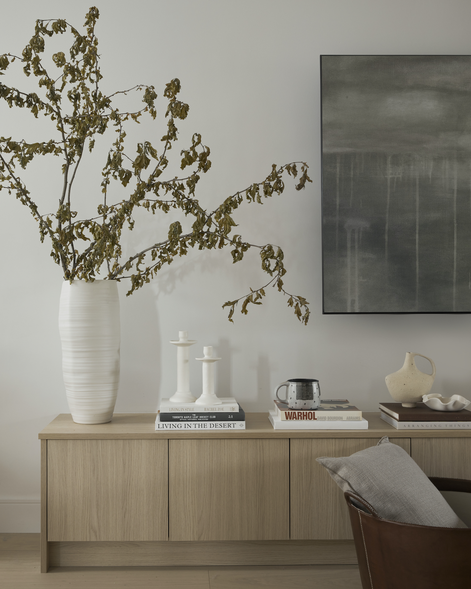
Because my client has young kids we wanted the family room to be open with the kitchen. In order to create a seamless look we continued the millwork from the kitchen into the family room to create storage drawers below the frame TV to house toys and books for their kids.
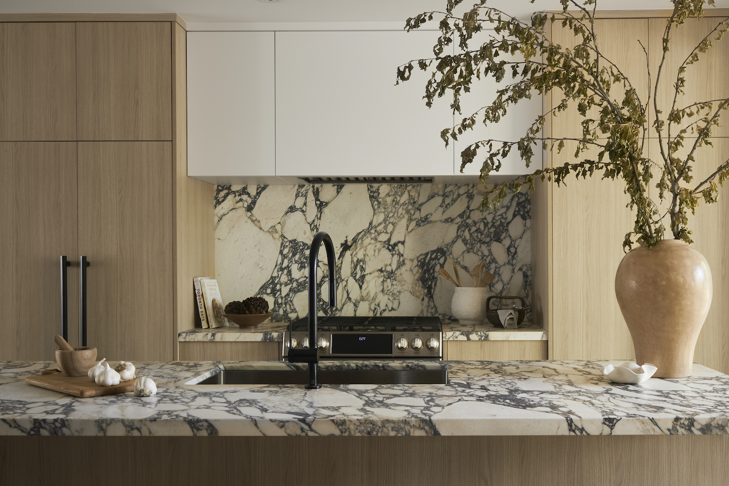
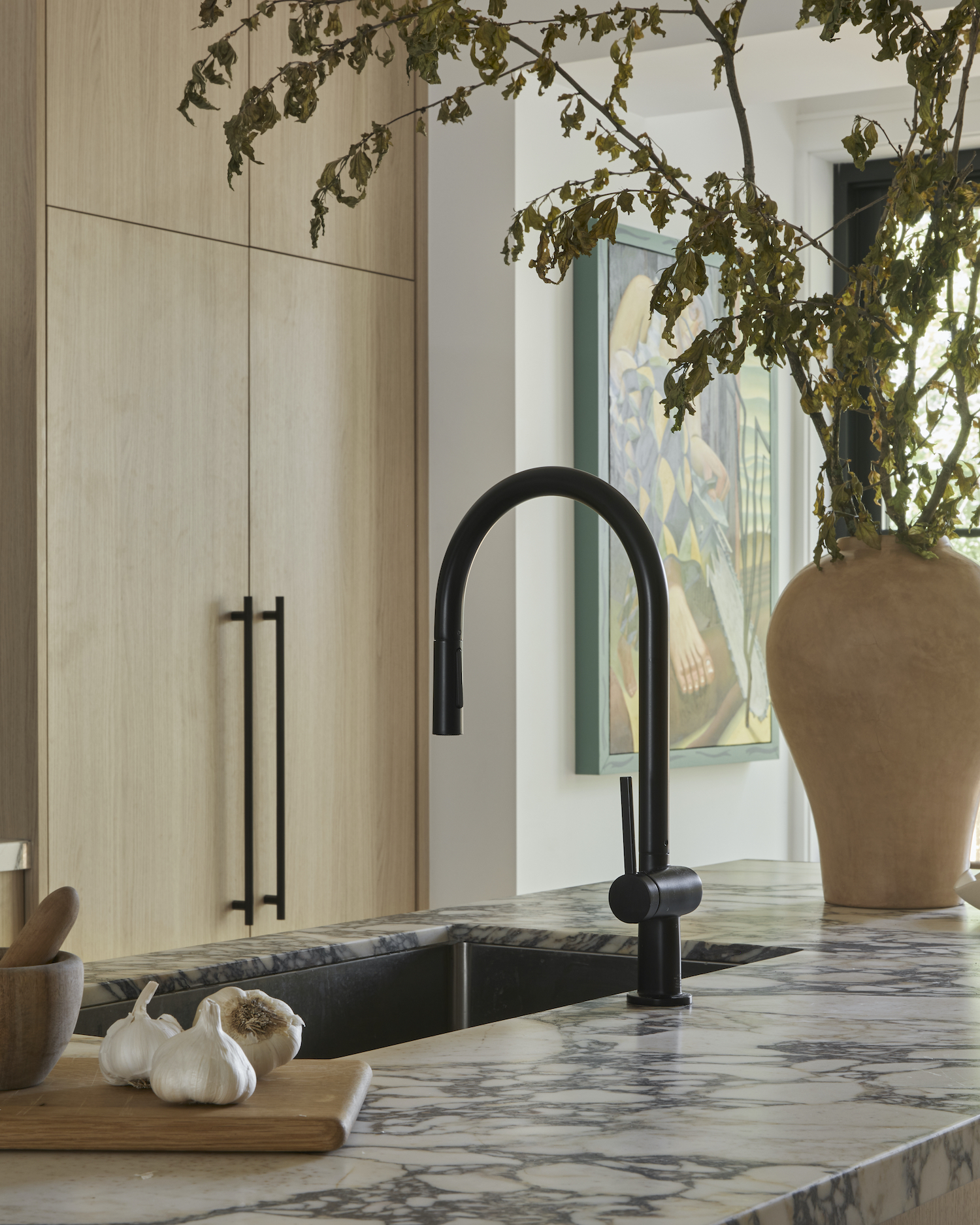
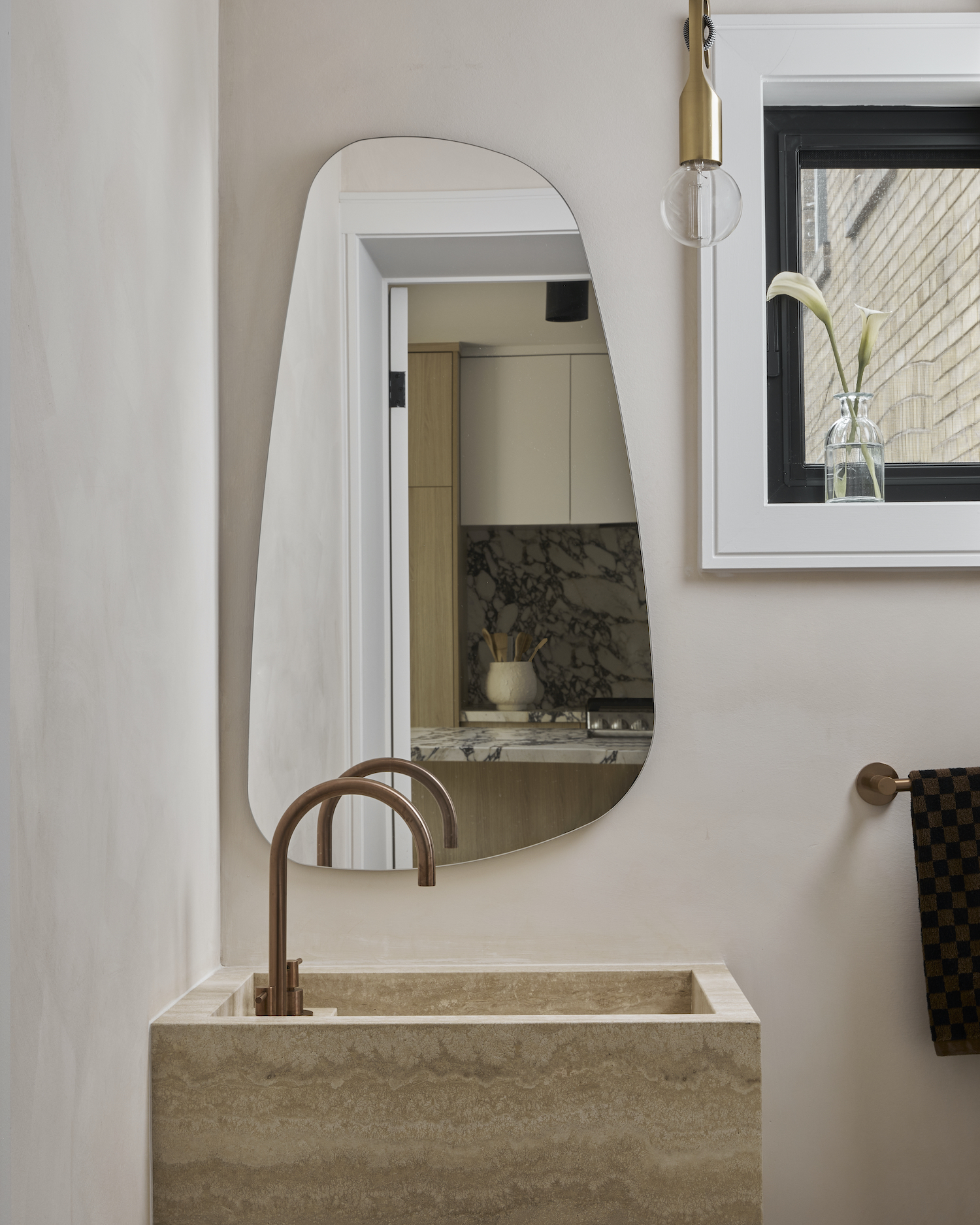
One of the most unique features and a standout moment of the of the house are the Calacatta viola countertops we used in the kitchen. The natural stone itself brings such a beautiful element to the design. I wanted to keep consistency in the stone throughout the entire kitchen including the stone on the island, backsplash and countertops. One of the challenges with the home was designing the kitchen in a way that could house all of the appliances while at the same time maintaining enough space for all of the kitchenware. We did this by using an integrated fridge/freezer and then mimicking the style of it on the other side of the range which also serves as an appliance garage. There is also a concealed hood with extra storage on the sides.
Like what you see? Take a peek at the talent behind the story… Interior Design: JPZ Interiors · Photography: Lauren Miller