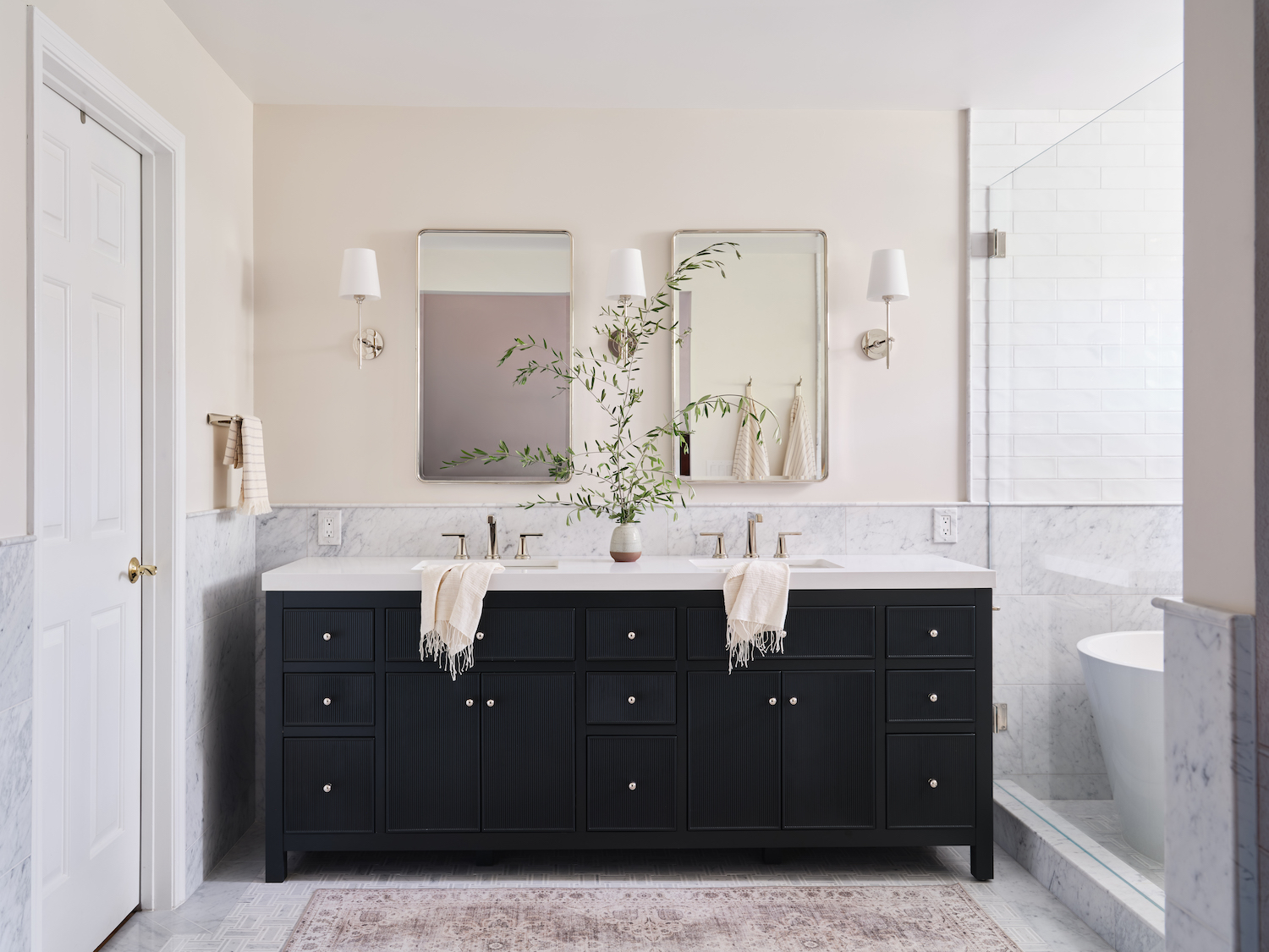
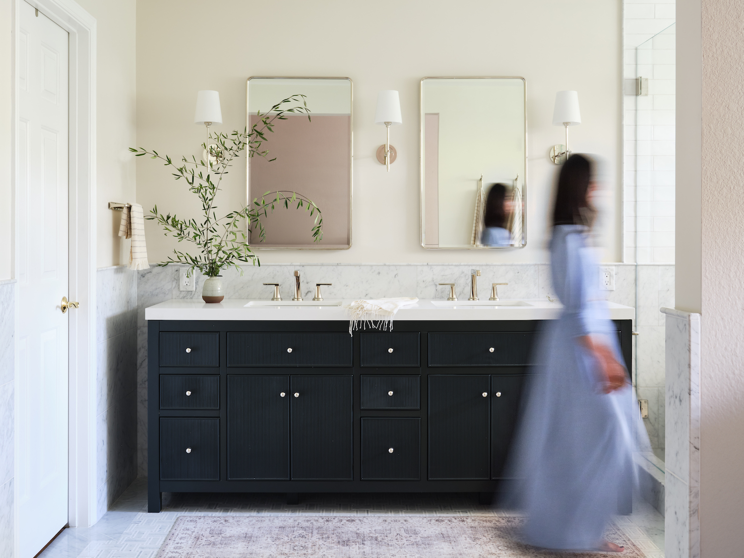
Today’s bathroom tour was 40 years in the making. Originally built in the 80’s this room was compartmentalized, dark, and in need of some updating. Thirteen Oak was brought in to renovate and it’s now brimming with luxe finishes that accentuate the bright and open space it’s become. Jessica Burke Photography captured the classic space in the beautiful photos below.
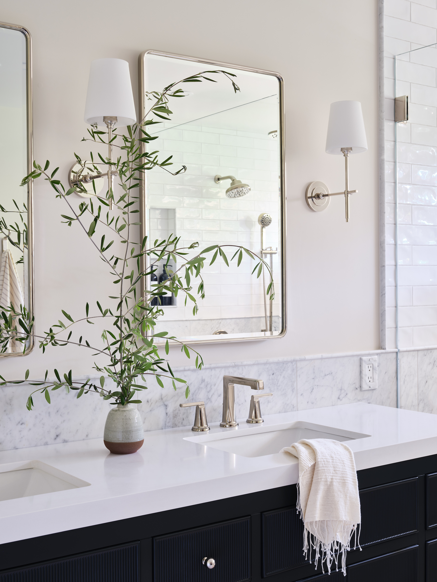
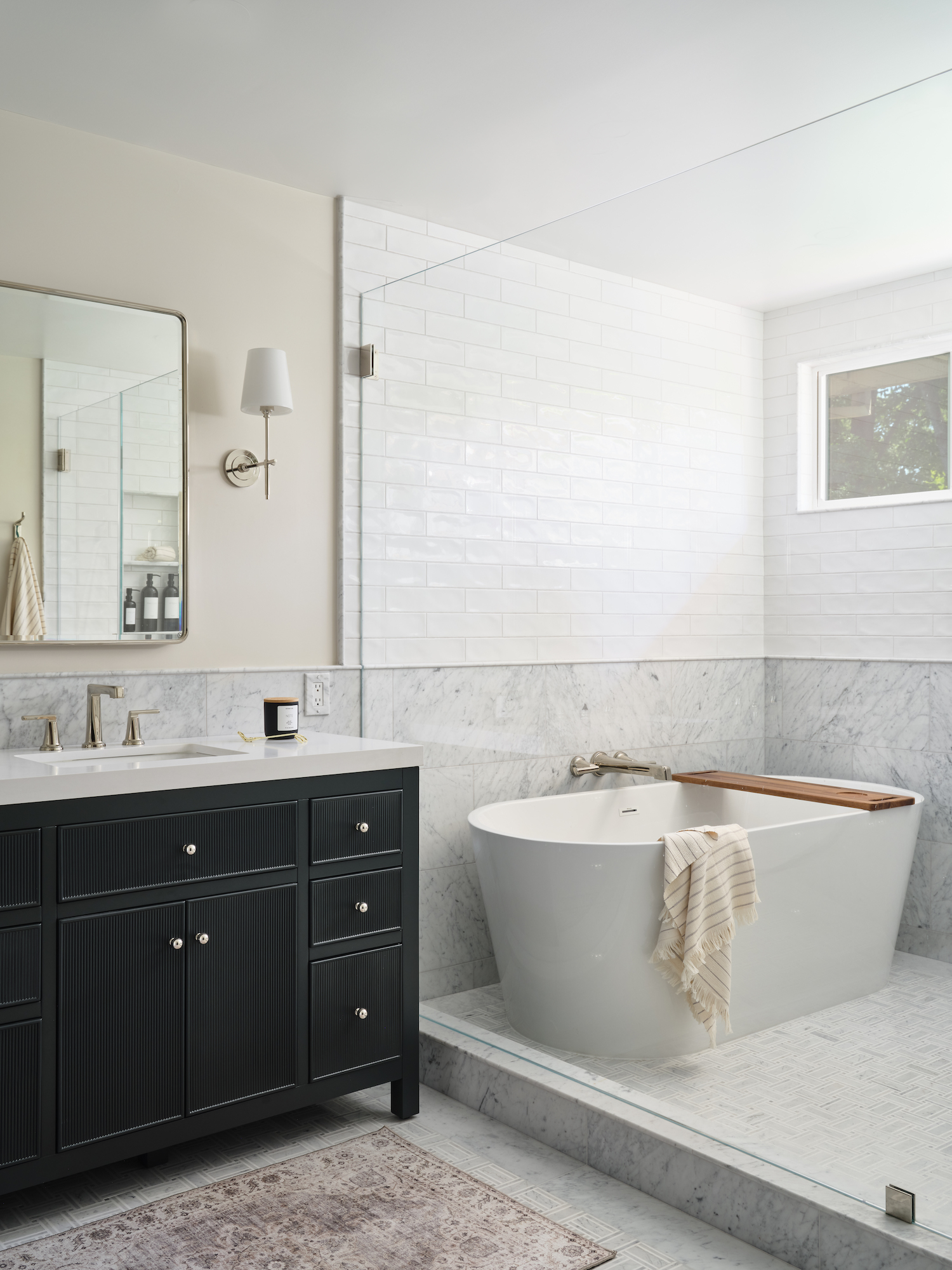
From the designer… There was so much unused space in this large bathroom to begin with. Built in the early 80’s the tub and shower were separate and divided by a wall, vanity was divided by a wall and the lighting was less than spectacular. We took down walls, raised ceilings, added new windows, and brought in all the natural light and brighter finishes to open the space up.
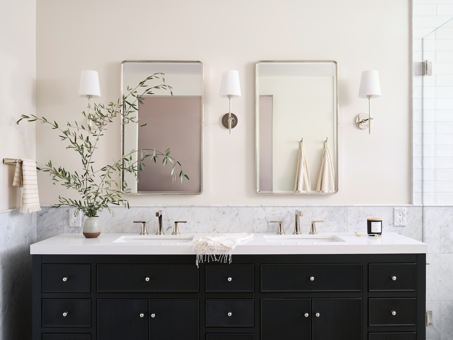
Classic was the inspiration behind the design; a timeless mix of classic materials used in a contrasting way. The client loved the idea of mixing light and dark using the marble as the wainscot and the elongated subway for the upper portion. A stand-out moment was the client realizing just how large the bathroom really was once we opened the space up. It always seemed small and compartmentalized to them, so we made a huge impact on the overall space.
This renovation was a family affair! The house is the home my husband grew up in and it was such a pleasure designing this space for my in-laws. My father-in-law was my toughest client & my mother-in-law was my easiest.
Like what you see? Take a peek at the talent behind the story… Interior Design: Thirteen Oak · Photography: Jessica Burke Photography
